Free Agent Profile: Yoenis Cespedes

Yoenis Cespedes will be one of the most watched upcoming free agents this winter. He has become a coveted player on the market that has earned a huge payday. Cespedes defected from Cuba and signed a 4yr/36m deal (’12-’15) with the Oakland A’s in 2011. He immediately burst onto the scene as an offensive force hitting 20+ home runs, driving in at least 80 runs and slugging .450+ in each of his three seasons. After his success in Oakland, he became a journeyman over the last two seasons being traded to Boston, Detroit and then to the New York Mets this past July.

As a Met, he’s hitting .302 with 17 home runs and 42 RBI in 42 games after a week of hot hitting. Cespedes has totaled 2.9 Wins Above Replacement (WAR) with the Mets and his 6.9 WAR for the 2015 season ranks in the top 10 in the major leagues between both pitchers and hitters. Cespedes is a free agent this off-season but is a special case, as he can’t receive a qualifying offer for a draft pick. When Oakland signed Cespedes as a free agent out of Cuba, they took a significant gamble that he would be major-league ready, inserting him into their lineup right away. Cespedes’ contract requires that he be released after the season without the qualifying offer. The Mets would’ve retained exclusive negotiating rights for the first five days following the conclusion of the 2015 World Series. After that, they couldn’t negotiate with Cespedes until May 15, 2016. But due to the recent success and big gamble of a new payday from New York, Cespedes waived that part of his contract and will now be able to sign with New York at any time in the FA period.

Career Numbers

Cespedes’ value with the Mets is astronomical. After acquiring him on July 31st the Mets have scored the most runs (311) in the majors since that time. Before the acquisition the Mets were 28th in the league! They had what was considered a minor-league offense. Although they did acquire Kelly Johnson and Juan Uribe, none have made more of an impact than Cespedes. What Cespedes brings to a team is power and pure run support. He became a catalyst for a struggling team and propelled them into first place. Almost all the hitters in their lineup have boosted numbers since that time as well. Pitchers can’t afford to pitch around batters in front of Cespedes. More guys are getting more pitches to hit resulting in more men on base for Cespedes to drive home. He also plays average defense and has a cannon for an arm.

metsweb2s-3-web


INTERESTED BUYERS:
I can see Cespedes re-signing with the Mets if they have a successful postseason. The fans along with the media would grill the front office/ownership if they did not get him back. That was the case this past trade deadline when GM Sandy Alderson was scrutinized for not making any moves until the final days leading up to July 31st. Roc Nation has the rights to negotiate his contract and as we saw from Cano’s FA market in 2013, they may try to get the most lucrative deal by waiting it out and reaching out to all interested teams. If the Mets want him back they are going to have to give him a big payday.

Some other clubs I can see having interest in Cespedes could be Baltimore, Houston, Miami, and San Diego (if they lose Justin Upton). I think the ones that just makes the most sense are Houston and Baltimore — they need to have more consistency, especially in their OF positions. Houston has Rasmus, Gomez and Springer. But Rasmus is a FA this offseason and Gomez has struggled. I think Cespedes provides that jolt to an offense that’s hard to find. He produces runs, which any offense needs. They could have Altuve, Correa and Springer/Gomez hit in front of Cespedes. That would be an incredible lineup. Throw in their great young staff and a decent back end of a lineup. That’s a scary team. Plus, they have the payroll to go out and get him. Right now its only about $72,000,000, but we’re not sure if ownership wants to go out and spend on one guy. They may try to find value elsewhere for cheaper which is something that General Manager Jeff Luhnow likes to do.

As for the Baltimore Orioles, they have Adam Jones in CF and could sign Cespedes to play LF. He has better defensive numbers in left and if the Orioles cannot sign 1B Chris Davis back I think they will strongly consider Cespedes. Baltimore has a ton of money coming off the books having only $41 million committed to next year so it seems as if they will have a lot of changes coming their way.

San Diego could be a good fit only if Justin Upton signs elsewhere, otherwise he’d be useless on a team that has three solid outfielders and no DH. We know AJ Preller could wave his magic wand at any moment and make something happen. Lastly, Miami could be a dark horse. They cut back on their spending in the last couple years but could look to make another “Marlin splash” with Yoenis Cespedes. Miami plays in a big Hispanic market and considering they are located not too far from Cuba, that could be influential in their decision-making.  The excitement from the fans and a power-filled lineup would be tremendous. Just imagine facing a lineup with Dee Gordon, Yoenis Cespedes and Giancarlo Stanton…someone call Jack McKeon to manage this squad.

In the end, I think Cespedes does sign back with the Mets, especially if they have a deep postseason run. The Orioles are the second favorite. I think the fans/media will get on the front office/ownership to sign him back. The Wilpons might be cheap but after seeing this postseason run they are going to ask themselves, how could they not? Cespedes seems to like being the top dog on a team; with the Mets he’s exactly that. As Reggie Jackson would say, “the straw that stirs the drink.” Without him, they are very vulnerable, as shown before his acquisition.

In terms of his deal, I think he will get around $26 million average annual value (AAV). The big part is how many years he will be able to get. After seeing Roc Nation get Cano to sign for 10 years, I don’t think we will see another double-digit figure like that. It seems that most teams are trying to shy away from that long-term deal and rather give a 6/7/8yr contract with more AAV. So I believe Cespedes will most likely go for about 7 years but higher AAV. Although I don’t think we will be surprised if a front office came up to 8-9-10 years…it’s not every day a .290, 30+HR, 100+RBIs, 7 WAR guy comes on the market.

Similar players we can compare to: Shin Soo Choo – 7yr/130m (18m/AAV) and Jacoby Ellsbury – 7yr/153m (21m/AAV). Cespedes has better numbers than both these players, especially in the power department. Choo was a guy known more for getting on base and Ellsbury had his average/legs/defense behind him. There’s no doubt in our minds Cespedes will get more than these two. If we also take into consideration that for every 1 WAR, a player usually gets $7-8 million/yr. Cespedes this season already has 6.9 WAR. That’s incredible but he’s more likely not to keep that up and fall back to his career average of about 4-5 WAR per season. With that being said, 4-5 WAR equates to a very high salary. The Mets/other teams will probably go a bit overboard and give on the higher end as usual. I think he will get to 7 years/182m for 26m AAV. I don’t think any of these teams will go to 8 years or longer because of the history of longer contracts not working out. If anything this deal will contain more AAV.

As Jerry Seinfeld tweeted: “A Cespedes for the rest of us.”
A Cespedes for the rest of us
PROJECTION: 7 years, $182 million with Mets or Orioles.


Why IP Is a Poor Indicator

Innings pitched (IP) seems to be the standard for judging a player’s workload. Sure it will tell you how deep into a game a pitcher went and it’s often used as a measure of pitcher durability, but it tells you nothing about a pitcher’s effectiveness. A far more useful stat is the pitch count during each particular outing, or even better pitches per innings pitched (P/IP). I think we can all agree that all innings are made differently. A pitcher can throw three pitches or it can take 61 pitches as evidenced by Steve Trachsel (1997 – Chicago Cubs) and still get credit for 1 IP. Actually I think it’s possible to throw zero pitches and get 3 outs, but I don’t have the motivation to look up the rule at this particular moment.

Here are some stats for three players in the 2015 season.

Player GS W L IP
Player 1 27 11 10 159.2
Player 2 26 12 7 171.2
Player 3 30 12 10 169.1

All the players in the table above have very similar peripheral statistics, aside from an IP difference of 12 between players 1 and 2. From looking at these stats it’s a toss-up as to who has had the most successful season — do you choose player 2 since he has the most IP or player 3 since he’s made the most starts? In the table above Chris Heston is player 1, Matt Harvey is player 2 and Yovani Gallardo is player 3. What really separates the players is the pitch counts and P/IP.

Chris Heston – 2461 Pitches and 15.4 P/IP

Matt Harvey – 2533 Pitches and 14.8 P/IP

Yovani Gallardo – 2959 Pitches and 17.5 P/IP

Chris Heston has 12 IP less than Harvey but has thrown 72 fewer pitches this season. Harvey and Gallardo have thrown about the same amount of innings, but Gallardo has thrown 426 more pitches this season. The reason I chose Harvey as one of the pitchers for this comparison is due to the very public feud between the Mets, Boras and Harvey. In case you missed it, there was a disagreement with the innings limit imposed on Harvey in his first season after Tommy John surgery. Boras wants the Mets to stick to 180 IP while the Mets thought it was more of a soft cap. I wanted to look at the relationship between the IP in a season and the total number of pitches thrown. Luckily this data was readily available for download via FanGraphs, but only pitch counts back to 2002 were available. Below is a plot showing all pitchers who threw more than 100 innings in a season compared to their pitch counts. The data has a linear relationship, with the red line showing the mean and the outside black lines are the prediction intervals where we would expect 95% of the observations to fall within.

Now based on the 180 IP limit imposed on Matt Harvey, a linear model predicts that a pitcher would throw 2867 pitches in a season with an upper limit of 3158 and a lower limit of 2576. Now this means that at 180 IP we can reasonably expect a pitcher to throw between 2576 and 3158 pitches. Now for a guy coming off a major surgery, doesn’t a range of 582 pitches seem a bit extreme? It basically amounts to a difference of 5 complete games’ worth of pitches. In the plot below I also highlighted an innings range based on the range of innings where a pitcher throws 2867 pitches in a season. Now most importantly this range extends from 160 to 200 innings.

The medical team could just have easily set a limit anywhere between 160 and 200 IP. This is why an innings limit doesn’t work well in this situation; there is just too much variability in the data. In the future it will probably be a better idea for team officials and the medical staff to discuss a pitch limit over a season instead of an innings cap. Since the main goal of limiting a pitcher’s workload is to reduce stress on his arm I think the plot above does a good job showing that innings limits will have very little effect on actually managing a pitch count. Harvey is obviously thinking about the long term here because I know he doesn’t want to go through another surgery. After a second Tommy John the chances of a pitcher returning to the majors drops to somewhere around 30%, not to mention the drop in potential future earnings.

So I’ve shown you why I don’t think IP is a good indicator and now I’m going to show you why I think pitch counts and P/IP should be more important statistics.  Based on the linear model shown in plot 1 the formula to predict pitches in a season is as follows: Pitches = IP*14.5 + 256.9. Now the intercept for this model is 256.9 which suggests that if you don’t throw a single inning in a season you would still be expected to have thrown 257 pitches. Obviously there is something going on at the lower inning totals, but we are going to ignore that for the purpose of this article. As an added note, the lower prediction interval from plot 1 has an intercept of -33.975, so we are very within range of showing 0 pitches for 0 IP from this model.

Player IP P/IP P/IP Rank Actual Pitches Expected Pitches Difference Predicted IP
Chris Heston 159.2 15.4 24 2461 2565 -104 152
Matt Harvey 171.2 14.8 11 2533 2739 -206 157
Yovani Gallardo 169.1 17.5 84 2959 2708 251 186.1

Heston and Harvey both rank very high in P/IP among qualified starters while Gallardo is dead last among qualified starters. Efficiency is key here. Should Harvey be directly compared to Gallardo based on IP? No, absolutely not, Harvey is among the most efficient pitchers in the game this year. He has been able to get through innings while keeping his pitch count down and most importantly reducing stress on his arm. An inverse prediction based off pitch counts was used to predict the IP in the table above. Based on their pitch totals from this season Harvey and Heston have “thrown” less than their IP totals suggest and Gallardo has actually thrown quite a bit more. This has a big effect on that innings cap imposed on Harvey for this season. His stats show that he’s thrown 171.2 IP, but based on the number of actual pitches he’s thrown in game situations his number may be closer to 157 IP. Does that mean he should have the equivalent of 23 IP left in the tank for this season? Well that’s not up to me, but IP should less important than total pitches.

One thing I didn’t look at this article was the proportion of pitches thrown throughout the 2015 season. It’s been in the back of my mind, but I don’t have a reference for what the most stressful pitches are on a pitchers arm. I think it’s safe to assume that all pitches are not equal. Let’s think a Dickey knuckleball vs. Chapman fastball. The amount of effort needed for each pitch type is likely highly dependent on the pitch speed and type, but to simplify things here I’ve just assumed that all pitches are equal. We also need to realize that all pitchers are not equal, whether it be mechanics or individual variation in abilities. I was curious to see where Mark Buehrle’s pitch count (leaderboard here) lined up with all other pitcher since 2002 and lo and behold he’s thrown the most pitches since records became available. Obviously he doesn’t throw as hard as many of the other guys in the league, but that hasn’t stopped him from being a workhorse and one of the most effective pitchers over the last decade.


Stop Thinking Like a GM; Start Thinking Like a Player

Like many baseball fans, I have played a lot of baseball in my life. I wasn’t anything special—Just A Guy in HS-age select ball, a starter in college only by virtue of attending a notoriously nerdy institution, and a player in the kind of adult league where a typical pitcher throws 80 and a double play ball has about a 50/50 shot of actually becoming a double play. What might be atypical about me is that as both a player and fan of baseball, I never had to struggle with sabermetrics upending conventional wisdom. For me sabermetrics was conventional wisdom from the very beginning. I grew up in a house with every single Bill James book ever published on the bookshelves and knew who Pete Palmer was when I was twelve.

Here’s the honest truth: Sabermetrics provided essentially no help in making me a better baseball player.

If a sabermetrician (or saber-partisan) wonders why the larger baseball world has not discarded Medieval Superstition for Enlightened Science, foregoing the burning of witches to instead guillotine the likes of Hawk Harrelson, he should think about all that is implied by the above.

Sabermetrics has immeasurably improved the management of baseball, but has done comparatively little to improve the playing of baseball. The management of baseball (meant generically to encompass front office as well as in-game management) is primarily an analytical task, but the playing of baseball is at heart an intuitive one. Getting better at managing involves mastering and applying abstract concepts. Getting better at playing involves countless mechanical repetitions with the goal of honing one’s neurology to the point at which certain tasks no longer require conscious attention to perform.

It is not terribly surprising that sabermetricians, being almost by definition analytically inclined, have gravitated towards finding management to be a more interesting problem than playing. That attitude has gotten sabermetrics a long way but is now a problem. Traditional sabermetric lines of inquiry are on multiple fronts running into limits, beyond which sabermetricians are declaring, “Everything past here is just luck!” Breaking new ground is most definitely possible, but it will require sabermetricians to ask different questions. To ask those questions, a perspective change has to occur: going forward, the sabermetrician will need to look at baseball through the eyes of a player, not the GM.

The Cultural Divide

To come at this dichotomy from another, roundabout direction, let’s consider a hypothetical player who has just been through a 3-for-20 (with a walk) slump. Two statements are made about him:

Statement A: 21 PA’s is far too small a sample size to make any definite judgement about him. His anomalously low .200 BABIP is driven by a IFFB% well above his career average, so in all likelihood he’ll regress towards his projection.

Statement B: He is letting his hands drift too far away from his body, so pitchers are busting him inside, and he’s popping up what he isn’t whiffing.

Start with the obvious: The reader does not require n = 600 to expect with 95% confidence that he is more likely to read statement A rather than B at FanGraphs, Baseball Prospectus, Grantland, or FiveThirtyEight, and that with nearly equal confidence he would expect to hear statement B rather than A from a color announcer on a broadcast. Furthermore, someone making statement A will often imply or suggest that Statement A is Responsible Analysis and that Statement B is an attempt to Construct a Narrative (“Construct a Narrative” being the polite datasplainer way to say, “Bullshit”). Most people making statement B look at statement A and roll their (glazed) eyes.

Tribal affiliations established, let’s analyze the two statements in the critical literary sense. Who is the intended audience of the respective statements? A is a probabilistic statement about the future that implies lack of direct control but supposes its audience needing to make a decision about the player. The appropriate audience for such a statement is a manager or general manager. B is a definite statement about the present that implies direct, controllable causality and implicitly suggests a course of action to take. The appropriate audience for such a statement is the player himself.

Now of course, neither statement is really made for the GM or player but both are rather made for the fan who vicariously stands in for one or the other. What fundamentally defines a fan is that he identifies with the team and internalizes such statements as if he were actually a participant. The faux-audience of the two statements thus reveals a difference in how the real audience identifies with the team: A is made for fans who primarily identify with the GM, or more likely, fans who have fantasy teams (a variation on the theme).  B is for fans who primarily identify with the players. The use of “primarily” implies that the division suggested is of degree rather than kind—any fan of a mind to be critical, from the bleacher creature-est to the most R-proficient, will do both—but to implicitly adopt the viewpoint of management carries an inherent elitism.

To say the viewpoint of sabermetrics is elitist is not to say it is wrong—quite the opposite. As a system for framing and evaluating management decisions it has proven spectacularly right. It has been over a decade now since Bill James got his ring, and today every single MLB franchise employs people whose sole job is to produce proprietary statistical analysis. The premier saber-oriented publications have difficulty retaining talent because said talent is routinely poached by said franchises. Were an alien to arrive on earth and learn Western Civ from Brad Pitt movies he would judge Billy Beane a greater hero than Achilles. The revolution is over, and the new regime is firmly ensconced. To point at any remaining Tallyrands who have managed to survive the turnover is to ignore the amount of adaptation that has been required of them to do so.

No, to say sabermetrics is elitist is instead to say merely that its assumed perspective is managerial. It asks and answers questions like, What is the optimal strategy? or, How do I compare the value of different skillsets? or the real, ultimate, bottom-line bone of contention: How much does this guy deserve to get paid? That sabermetrics adopted this perspective was not necessarily inevitable. Sabermetrics grew out of the oldest of fan arguments: Who is the (second) greatest? Who deserves the MVP this year? Should this guy be in the Hall of Fame? These questions are about status, and status ultimately rests on subjective values. The declared purpose of sabermetrics is to answer those questions objectively. More modestly stated, the purpose is to force people arguing over subjective values to do so in the context of what actually wins baseball games. More cynically stated, it can be a way of humbugging that dispute by presenting a conclusion dependent upon a particular value judgement as precise, objective truth and its detractors as retrograde obscurantists.

The cynical way of stating sabermetric purpose is unfair, but it is made possible because the sabermetric solution to this problem of trying to referee aesthetics with numbers was to assert a specific conception of value as normative: that of a general manager whose job is to assemble a team to win the most baseball games in the specific context of free-agency era Major League Baseball’s talent pool and collectively-bargained labor and roster rules. When Keith Woolner looked at the talent distribution of players and proposed that there was a more or less uniform level of talent that was so ubiquitous and readily available that players of that skill level should be considered to possess zero scarcity value, he established something that could serve as an objective basis for value comparison. The existence of such a talent level meant that an optimally-operating GM should evaluate players by their skill level in reference to that baseline and naturally allocate the franchise’s finite resources according to this measure of talent scarcity. Woolner didn’t merely propose the idea. He demonstrated, quantified, and named it: VORP. Value Over Replacement Player. Regardless of how an MVP voter wished to philosophize “value”, this was clearly the correct way for a general manager to conceive of it.

“Replacement Level” is one of those ideas that, once one understands it, one immediately recognizes its intuitive obviousness and is embarrassed to have not thought of it before. It cannot be un-thought, and the difficulty of re-imagining what it was like to lack it in one’s mental toolkit makes it easy to forget how revolutionary it was. Overstating this revolutionary impact is exceedingly difficult, so here’s a go: In an alternate universe where Woolner chose to stay at MIT to become an economist instead of going to Silicon Valley, in which he published VORP about a normal profession in an economics journal with Robert Solow as his advisor rather than doing it as a baseball nerd in his spare time at Baseball Prospectus, he’d probably have a Nobel Prize (shared with Tom Tango and Sean Smith). That VORP as a statistic has been superseded by the more comprehensive WAR should not diminish its revolutionary status; VORP is to WAR what the National Convention is to Napoleon. “Replacement Level” labor was the most analytically powerful conceptual advance in economics since Rational Expectations. That some actual labor economists have had difficulty with it and have yet to adopt it as a common principle of labor economics is nothing short of mind-blowing. While it was developed to explain such a unique and weird labor environment, with minor modifications it could be applied widely.

WAR of the Worlds

WAR has conquered the baseball world, but no war of conquest is ever won cleanly. Amongst the common vices: looting. The best example of such is catcher defense. Establishing the level and value of pitch-framing ability has been a hot project in sabermetrics for several years now, enabled by a sufficiently large PITCHf/x database. Quantifying this ability may be a new thing, but anyone who claims the discovery of its existence belongs in the sabermetric trophy case is like a Frenchman claiming the Louvre as the rightful place of Veronese’s Wedding at Cana. The old-school baseball guys shoehorned into the role of bad guys in Moneyball were nearly uniform in their insistence on the value of a catcher’s defensive ability. The great unwritten story of sabermetrics of the last five to seven years is how much of the previously-derided, old-timey wisdom of the tobacco chewers has been validated, vindicated, and… appropriated. There is little better way to see this (r)evolution in opinion than reading the player blurbs on Jose Molina from several editions of the Baseball Prospectus Annual:

2003: My God, there are two of them. Jose has a little more pop than Ben, which is among the faintest praise you’ll read in this book. The Angels would be well served to go out and find a left-handed hitting catcher with some sock, just to bring off the bench and have a different option available. No, not Jorge Fabregas.

2004: Gauging catchers’ defense is an inexact science. We can measure aspects of it, but there’s enough gray area to make pure opinion a part of any analysis. So consider that a number of people think that Jose, the middle brother of the Backstopping Molinas, is a better defender than his Gold Glove-laden sibling. Although the two make a great story, the Angels would be better served by having at least one catcher who can hit right-handers and outrun the manager.

2005: At bat, both Molinas combined weren’t as productive as Gregg Zaun was by himself. That’s the value of getting on base; the difference from the best defensive catcher to the worst isn’t nearly as wide as the gulf created when one player uses his plate appearances effectively and the other toasts them like marshmallows. The younger Molina is a poor fit to back up his bro, given their too-similar skill sets.

2009: Since 2001, 66 catchers including Molina have had a minimum of 750 PAs in the majors. Of those, exactly two—John Flaherty and Brandon Inge—have had lower OBPs than Molina’s .275 (as a catcher only, Inge is lowest at .260). If OPS is your preferred stat, than just three backstops have been lower than Molina’s 614. Compared to Molina, Henry Blanco is Mickey Cochrane. The wealthiest franchise in sports could have had anyone as their reserve catcher, but in December 2007, Cashman decided they would have Molina for two years. He then climbed Mt. Sinai, shook his fist at the Almighty, and shouted, “I dare you to take Jorge Posada away from us, because we have JOSE MOLINA!” Thus goaded, the Almighty struck Posada with a bolt of lightning, and the Yankees hit the golf courses early. The moral of the story is that hubris sucks. P.S.: Molina threw out an excellent 44 percent of attempting basestealers, which is why he rates seven-tenths of a win above replacement.

2010: Nothing about Molina surprises. He could be caught in a hot-tub tryst with two porn starlets and a Dallas Cowboys linebacker and you’d still yawn, because it wouldn’t change a thing: he’s a glove man who can’t hit. In the last two years, he has posted identical 51 OPS+ marks, batting .217/.273/.298 in 452 PAs. He accumulated that much playing time because of Posada’s various injuries and scheduled days off. Though Molina’s good defense stands in direct contrast to Posada’s complete immobility behind the plate (so much so that Molina was used as A.J. Burnett’s personal catcher during the postseason), the offensive price was too high to pay. Molina is a free agent at press time; the Yankees are ready to turn his job over to Cervelli.

2013: Molina owes Mike Fast big-time. Fast’s 2011 research at Baseball Prospectus showed Molina to be by far the best pitch-framer in the business, turning him (and Fast, in fact) into a revered hero almost overnight. The Rays pounced for $1.5 million, and Molina rewarded them by setting a career high for games played (102) at age 37. He’d have played a few more were it not for a late-season hamstring strain, which also interrupted a Yadier-like, week-long hitting spree that separated the offensively challenged Molina from the Mendoza line for good. The Rays were glad to pick up his $1.8 million option in 2013 and hope for similar production.

2014: Arguably the best carpenter in the business because of his noted framework (*rimshot* *crickets*), Molina continued to handle a steady workload for Tampa Bay as he creeps toward his 40th birthday. The middle Molina receives a lot of praise for his work behind the plate, but his best attributes might be imaginary. He has been the stabilizing force for a pitching staff that perennially infuses youth as well as a role model for the organization’s young backstops. These traits are likely to keep him around the game long after he has stolen his last strike. For now, the framing alone is enough—the Rays inked Molina to a new two-year deal last November.

There is much to unpack from these blurbs, too much in fact to do systematically here. I selected them not to pick on Baseball Prospectus specifically (they did after all correctly identify the moral of the story), but because BP is a flagship sabermetric publication whose opinions can serve as a rough proxy for all of sabermetrics and because Jose Molina can serve as the avatar of catcher defense. I have omitted 2006-8 and 2011-12 partially for brevity and partially because it brings into high relief distinct eras of sabermetric consensus: In 2003-5, there is an acknowledgement that he might be a truly elite defensive catcher, but this view is a) not actually endorsed, b) assumed to be of minimal importance even if true given the then-saber consensus that OBP trumps all. In 2009-10, the opinion of him hasn’t really changed but the tone has—the writers acknowledge no uncertainty and are openly offended at his continued employment. By 2013-14 there has been a complete sea change in attitude. Not only does the writer appreciate the value of Molina’s skill, he confidently claims that it was because of Baseball Prospectus that he was now properly appreciated by an MLB franchise!

Fast’s research was genuinely outstanding (as was Max Marchi’s). He deserves enormous credit for it and has received (as has Marchi) the ultimate in sabervalidation- to be hired by a franchise to keep his future work exclusive. What he doesn’t deserve credit for is Jose Molina remaining employed. For someone (it wasn’t Fast) to claim that Molina owed BP a thank-you note for being paid less than he had been as a Yankee is astonishing on several levels, even granting that such blurbs are supposed to be cheeky and entertainingly irreverent. For starters, BP is confident that the overlap between front offices and saberworld is tight enough (and BP influential enough) that someone at every single franchise would have read Fast’s work. This part is at least true. The claim of being so influential as to be the primary reason Jose Molina was signed by the Rays is most likely false.

In February, Ben Lindbergh wrote at Grantland about his experience as an intern at the Yankees, during which time he had firsthand knowledge that the Yankees baseball ops department seriously debated as early as 2009 the possibility that Jose Molina was better at helping the Yankees win games than Jorge Posada, possessor of a HOF-worthy (for a catcher) .273/.374/.474 career slash line. Not only did he witness this argument, he proofread the final internal report that demonstrated this possibility to be reality. When Fast published his research at BP in 2011, Lindbergh was an editor there. Fast’s result was already known to him (although possibly NDA’d). When the blurb in the 2013 annual was published, Lindbergh had risen to Managing Editor. For BP to claim that Fast’s research drove Tampa Bay’s decision (as opposed to their own) was to claim that a front office renowned for its forward-thinking and sabermetric savvy was two years behind two of its division rivals (Molina having just finished a stint in Toronto).

About two weeks before the Rays signed Molina in November 2011, DRaysBay (the SBNation Rays site) had a Q&A with Andrew Friedman, which touched on framing (my emphasis):

Erik Hahnmann [writer at DRaysBay]: Recently there was a study by Mike Fast at Baseball Prospectus on a catchers’ ability to frame pitches and how many runs that can save/cost a team over the course of a season. A catcher being able to frame a pitch so that it switches a ball into a strike on a close pitch was worth 0.13 runs on average. The best can save their team many runs a year while the worst cost their team runs by turning strikes into balls. Is this a study you’ve looked at, and is receiving the ball and framing a pitch a skill that is valued and taught within the organization?

Andrew Friedman: We place a huge emphasis on how our catchers receive the ball. Jamie Nelson, our catching coordinator, pays close attention to each catcher’s technique from day one, and he and our catching instructors have drills to address different issues in that area. As with any skill, some players have to work more at it than others. The recent studies confirm what baseball people have been saying for decades: technique matters, and there’s more to catcher defense than throwing runners out.

To some extent every GM is a politician when it comes to communicating the fanbase, so we can’t necessarily take what Friedman said at face value. Friedman did after all employ Dioner Navarro for years. With that caveat though, those are not the words of a recent convert. Friedman is also the guy who traded for the defensively superb Gregg Zaun in 2009 and for whom Zaun most wanted to play after the 2010 season (he ultimately retired, unable to get an offer coming off of labrum surgery at 39). The weight of evidence, most heavily that the famously low-budget franchise had a full-time employee whose title was “Catching Coordinator”, is that the Rays front office valued catcher defense before it was cool.

The point is not to be too hard on Lindbergh, who is a joy to read and whose linked article above is in part a personal a mea culpa for his original skepticism. The point is to be hard on sabermetricians as a tribe who, having discovered for themselves the value of pitch framing in 2011 and refined their techniques subsequently, rarely if ever made similar mea culpa for belittling the folks who were right about it all along. Imagine the view from the other side: you’re a grizzled scout, a career baseball guy, a former-player color announcer who knew in your bones and always insisted that a catcher’s receiving ability was crucial. Your name might be Mike Scioscia. You were castigated as an ignoramus for more than a decade by a bunch of nerds who couldn’t see the dot on a slider if it Dickie Thon-ed them and who relied almost exclusively on CERA, a statistic so quaintly simplistic it was created before anyone would have thought to construct it as C-FIP. Then all of a sudden, one day the statheads not only show that you were right the whole time, they also show that you are good at judging this ability, and they make no apologies. One can perhaps forgive such a person for not bowing too deeply to his new overlords.

Science?

While Michael Lewis no doubt exaggerated the scout/sabermetric culture clash, especially within actual front offices, he certainly did not invent it either. It is epistemological at heart—whether or not one prefers an intuitive or analytical basis for knowledge. Keith Woolner (can’t win ‘em all) in his above-linked 1999 research on catcher defense stated the sabermetric viewpoint most succinctly, “Currently, the most common way to evaluate game calling in the majors right now is expert evaluation — in other words, managers’ and coaches’ opinions and assessments. Ultimately, this approach is contrary to the spirit of sabermetric investigation, which is to find objective (not subjective) knowledge about baseball.” Given that attitude and the evidence available in 1999 Woolner was, in a limited sense, correct. The best evidence available did not show much differentiation in catcher defensive value. Where he (and saberworld generally) erred was in succumbing to the empiricist’s seductive temptation: declaring absence of evidence to be evidence of absence. It is oh-so-easy to say, “The answer is no” when the technically correct statement ought to be, “There is no answer.” What makes this subtle sleight-of-hand tempting is that on some level everyone understands what’s at stake: Saying, “There is no answer” when a rival epistemology plausibly claims otherwise amounts to betting the entire belief structure that the rival is wrong, a bet for which, by construction, an empiricist has insufficient evidence to make. Authority is up for grabs, and pilgrims do not tolerate silence from their oracles.

Woolner’s apt summation of the sabermetric viewpoint implies the grander ambition: Sabermetrics aspires to Science. Unfortunately, it cannot be Science in the most rigorous sense of the word. It is like economics, faced with complicated systems producing enormous amounts of data, nearly all of which is tainted by selection bias. One can wield the mathematical tools of science, but one is unable to run controlled experiments. Worse, also like economics, in order produce results of even remote usefulness one must often make unfalsifiable assumptions of questionable validity.

For a more concrete illustration of this problem, let’s continue drawing from the catcher framing well. We can measure with high precision the first-order effect of a catcher’s impact on called balls and strikes with PITCHf/x, and with linear weights we can calculate good context-independent estimates of the consequent run & win values. We do this calculation and tacitly assume that this first-order effect is, if not the whole story, at least 70-80% of it. We also know that a catcher’s receiving ability affects pitch selection (type and targeted location), both because we have testimonial evidence to that effect from actual major league pitchers and because it is intuitively obvious. Anyone who has ever toed the rubber with a runner on 3rd has at some point gotten queasy when the catcher signals a deuce and shaken it off. While this effect is openly acknowledged by absolutely everyone who studies framing, it is just as soon ignored or dismissed with prejudice by hand-wavy arguments. Should it be? Who knows? Certainly not anyone who considers Sabermetrics to be Science, because there has never been any rigorous attempt in saberworld to quantify the selection effect. No one has yet laid out a convincing methodology to do so with the extant data.

Yet, the potential second-order effect of pitch selection dwarfs the first order one- only a small fraction of pitches thrown form the basis of the first order calculation, and by definition this sample excludes every single pitch on which a batter swings. One logical possibility would be supposing that a pitcher who knows he has a good catcher is more likely to test the edges of the zone and less likely to inadvertently leave pitches over the middle of the plate. From 2012-present the team-level standard deviation of HR/9 allowed is 0.15. At 10 runs/win and a 1.41 R/HR linear weight, over a 120-game catcher-season it would only take a 0.06 difference in HR/9 to make for a whole win of value. 0.06 HR/9 equates to 1 HR per 17 games, during which time a typical starting catcher will be behind the dish for 2400 pitches, give or take. To repeat: +/- 1 meatball every 2400 pitches could drive 1 win of value. Raise your hand if you want to bet your reputation, with zero statistical evidence to back you up, on the triviality of something that we know exists and only takes 1 HR per 2400 pitches to equate to 1 WAR, let alone whatever effects it has on balls in play. The selection effect could easily be that big and be completely lost in the noise. It could be thrice that big and still look like randomness. Yet, because we can’t measure it, we ignore it. How many Molina-caught pitching staffs (any Molina) would you guess have been on the wrong side of average in HR/9?

The issue of known-but-unmeasurable effects is a big enough practical problem, but the issue of falsifiability is the sub-surface rest the iceberg. Scroll back to the beginning of this essay and compare the two hypothetical statements, this time not from a sociological or literary standpoint but rather from a Popperian, scientific one. Which is falsifiable? The “sabermetric” piece of analysis (A) is a single, probabilistic statement about the future. “The future” has sample size n =1, much too small to reject any distributional hypothesis. Any single statement about the future becomes impossible to falsify once it is hedged with the word “likely”. That by no means makes such statements incorrect, but it does mean that in order to believe it one must implicitly suspend the strict epistemology of Science for the purpose in question. That’s the cost of shifting into a probabilistic view of the world. A set of probabilistic statements made under identical methodologies can potentially be subject to falsification, but that has no bearing on any individual one. That such statements most likely (oh, snap! meta-meta!) are indeed correct ought to present any saberperson with a troubling level of cognitive dissonance.

We’re deep into bizarro world when we’re declaring statements correct but their underlying epistemology questionable, so let’s get a little less abstract and ask what ought to have been the most straightforward question about our hypothetical statements A and B: Are they true? Being hypothetical, there’s of course no way to know, but anyone who has followed baseball ought to be comfortable with the idea that either, neither, or both could be true. If either, neither, or both could be true, does that mean the truth values of the two statements are independent of each other? NO!

Wait, huh? Dig into the assumptions. Statement A is premised upon a body of research that shows that over small sample sizes, performance can vary widely, and that as a statistical matter career-to-date performance is vastly more predictive of future performance than is the most recent 21 PA. All of the data forming the basis of that research has a common feature: It was generated by actual professional hitters on actual professional teams, all of whom have had managers, hitting coaches, and teammates observing them, precisely so that flaws get spotted as soon as possible. When a hitter goes into a slump, it is the hitting coach’s job to point out flaws that might be a factor. A hitting coach who makes Statement A to the player instead of B is simply not doing his job. If he doesn’t say statement B exactly, he will say something like statement B. Being strictly hypothetical, it’s all the same.  If a mechanical flaw is the cause of the slump, then the player or his coach will discover it, and the combined forces of survival instinct, competitiveness, income maximization, and simple professional pride will lead the player to correct it. This is the normal ebb and flow of baseball. This normal ebb and flow of baseball forms the entire sample for the research upon which statement A relies. Hello again, Selection Bias, glad you came back! Statement A is true only if Statement B, or something like Statement B, is true. Furthermore, if B is true, then A is true only if the player realizes the truth of B, either by being told by a coach or discovering it himself.  Alternatively, If the real reason a hitter has started popping up and missing a lot of pitches is instead that he’s lost batspeed due to aging or injury, then statement A is false. Near-term mean-reversion is not likely in those cases. To say that statement A is likely true is simply to say that correctable flaws are much more common than uncorrectable skill declines, and that as a historical matter, players have been expeditious about correcting the easily correctable before generating large sample sizes.

Let’s resume our Popperian examination, this time with “narrative-constructing” Statement B. On close examination, it very much is falsifiable, on several levels: 1) It makes definite, unhedged assertions about observable reality that can be objectively and transparently evaluated, and 2) it proposes a causal mechanism that can be tested and begs for an experiment.  That sounds a lot like proper science. Ah, but there’s a catch: only the player himself has the ability to run the suggested experiment. The literary and the sociological factors return! The saber-inclined reader can easily miss the testability of the statement if he identifies not with the player but with management, because management cannot run such a test.

If the reader began this essay agreeing with the “sabermetric” view that statement ‘A’ is the scientific, responsible piece of analysis and ‘B’ the empty bullshit and hasn’t gotten the point yet, it’s time to level the boom: The truth is the reverse; it is statement ‘B’ that is genuinely scientific and ‘A’ that is the empty bullshit.

The Way Forward

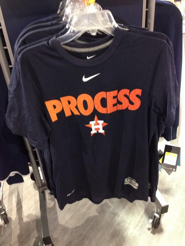
What should be done in light of this truth? If there is a single phrase that expresses the ‘progressive’ management model to which most of saberworld adheres, it is “Process over Results”. That phrase, and the sentiment it expresses, are now sufficiently ubiquitous to be entering the MBA lexicon. Nike sells that T-shirt. It is a good general principle to live by, but once consultants figure out that it is also an infinite excuse generator for mediocrity and outright failure, it will shortly thereafter occupy a spot on the business buzzword bingo board alongside “Synergy” and “Leveraging Core Competencies.” Before that sad day arrives, cutting-edge baseball analysis ought to apply it in a way it has not yet done.

Sabermetric analysis has been very good in applying that principle in the evaluation of management decisions. That’s the easy part, since saberworld identifies with that process closely enough, and feels sufficiently knowledgeable about it to pass judgement. Conversely, sabermetrics has rarely if ever taken that viewpoint regarding its evaluation of players. On that front it has always been and remains resolutely results-oriented. Shifting from AVG to OBP to wRC+, or ERA to FIP, or E to UZR is not shifting from results to process. It is merely identifying a superior, more fundamental, more predictive result upon which to make judgements. Even at the most fundamental level possible—batted ball speed / launch angle/spin—one is still looking at a result instead of a process.

Players themselves, even the most saber-friendly, when asked about advanced stats typically give a highly noncommittal answer. Usually, it’s something along the lines of, “The numbers don’t really tell the whole story.” Saberfans usually assume this response is the meathead’s answer to Barbie. Math class is tough! Let’s go hit fungos! The post-structuralist-inclined will also usually think that the players’ refusal to unreservedly accept the definitiveness of sabermetrics is driven by a subconscious, defensive instinct to retain “control of the narrative.” That both of these explanations have an element of truth makes it easy to think they are the whole truth. They are not. Players are just operating on the same premise we have already endorsed: Process over Results. Because they are young, unacademic, and routinely measured against a ruthlessly tough standard, it is easy to forget that they are professionals operating at the most elite end of the spectrum. The difference between the players and the sabermetricians is that the players see Process in a way the rest of us can scarcely imagine and make their judgements accordingly. Should we accept those judgements uncritically? Of course not. Players like everyone are subject to all the biases datasplainers love to bring up when they are losing arguments (Decrying, “Confirmation Bias!” every time someone presents evidence one dislikes should be a punchinthefaceable offense). We should instead try to figure out how to test them. That means looking at Process through their eyes.

What does Process mean to a player? It means two things: mechanics and psychology. The psychological may always remain opaque to the outside observer, but the mechanics need not. On the contrary, the mechanics are there, open for all to see, and nowadays recorded from multiple angles at 240 fps. There is a wealth of data waiting to be captured there. When conjoined with PITCHf/x and Statcast, we can now have a complete physical picture, literally and figuratively, of what goes on for every single pitch in MLB. We should make use of it.

The gif-ability of pitches has already rapidly changed online baseball writing. No longer must a writer attempt to invent new superlatives to describe the filthiness of a slider when a gif can do it far better than words. It has also opened a new seam of sabermetric inquiry that has only barely begun to attract pickaxes–How do mechanics lead to batted-ball outcomes? Dan Farnsworth has written some great posts at FanGraphs starting down that path, as has Ryan Parker at BP. Doug Thorburn, also at BP, writes articles along these lines on the pitching side. As fascinating as those articles are, the problem they all share is that they take the form of case study rather than systematic compilation. The latter ought to be attempted.

It is fortunate that sabermetric semantics has settled on “luck” rather than “randomness” as the converse of “skill,” because nothing that transpires on a baseball diamond is truly random, and to insist otherwise is fatalistic laziness. Baseball exists in the Newtonian realm; the dance of a knuckleball is an aerodynamic rather than quantum phenomenon. “Random” in baseball is just a placeholder for anything with results that seem to adhere to a distribution but whose process remains mysterious. The goal of sabermetrics going forward ought to be shrinking that zone of mystery. Between physicists, biomechanical experts, hitting & pitching coaches, and statisticians it should be possible to answer some important questions–Is there such a thing as an optimal swing plane? If not, what are the trade-offs? Can we backward-engineer from outcomes the amount of torque in a swing and identify what hitters are doing to generate it? Ash or Maple? Is topspin/backspin something a hitter can actually affect? On the pitching side, can we actually identify a performance difference from a “strong downward plane”? Is Drop & Drive a bad idea? All of these questions are susceptible to scientific analysis, because they are fundamentally physical questions. With high speed HD cameras, PITCHf/x, and Statcast the answers may be out there.

Answering questions such as these will not only make for interesting SABR conferences. It would go a long way to bridging the gap between saberfans and ordinary fans. It would improve everyone’s understanding of the game. Above all, it would improve the actual quality of baseball at all levels. Anyone who has been involved in competitive baseball has encountered dozens of hitting and pitching “philosophies” and has had no way other than personal trial and error to judge between them. At present there is just no way to tell if the medicine a coach is prescribing is penicillin or snake oil. That “philosophies” of pitching & hitting are promoted as such is an implicit attempt to wall them off from empirical rigor. This shouldn’t be tolerated any longer than it has to by the saber set. Sabermetrics began as an attempt to measure greatness. Its greatest legacy to baseball could be in helping create it.


How Rare Is a Chris Davis Comeback?

The Orioles are having a rough go of it. After being tied with the Yankees for first place in the AL East on July 2nd with a 42-37 record, the Orioles have gone 26-36 since and, as of September 13, are just a half-game above the last place Red Sox.

However, the standings don’t appear to be having an effect on Chris Davis, the slugging Orioles first baseman who is in the midst of a hot streak that includes 6 HR and a .493 OBP in his last 15 games. Davis’ recent performance continues his resurgence, bringing his average up to .261 and his home run total to 41 on September 13. Davis struggled mightily last year before a suspension for unapproved Adderall use cut short his season, finishing with 26 HR and a miserable .196 BA. A power surge couldn’t come at a better time for Davis, who is looking to make more money in the free-agent market this offseason.

Just how rare is Davis’ comeback, however? Davis was an established major-league player before this season, having played 723 games while averaging 2.0 WAR per 162 Games. His Oriole-record 53 homers in 2013 (which included 7.1 WAR) made him a star while his forgettable 0.8 WAR in 2014 made him just another one-hit wonder.

Examining position players with at least a full season’s worth of games played before their comeback season, we’ll set the following criteria for a comeback:

  • At least 2.0 WAR per 162 Games prior to the comeback year
  • The WAR for the comeback year is at least 4.0
  • The WAR for the previous year is less than 1.0

These baseline cutoffs are very similar to Chris Davis’ 2015/2014 experiences. Noting these, we find 70 comeback seasons since the beginning of the expansion era (1961) that fit the criteria.

Davis’ 2015 is bunched around Coco Crisp’s 2007 with the Red Sox and Victor Martinez’ 2014 with the Tigers. These players all saw their WAR increase by about 4.3 from their previous years.

The most impressive comeback in terms of WAR improvement was Jacoby Ellsbury’s 2011 with the Red Sox, when he put together a 9.4 WAR season after an injury-shortened -0.2 WAR season.

Overall, a comeback like Davis’ isn’t all that rare. In fact, comebacks as or more impressive happen about five times every four years. That shouldn’t deter Davis, however, whose performance is one of the bright spots on a struggling Orioles team.


Hardball Retrospective – The “Original” 1986 New York Mets

In “Hardball Retrospective: Evaluating Scouting and Development Outcomes for the Modern-Era Franchises”, I placed every ballplayer in the modern era (from 1901-present) on their original team. Therefore, Ozzie Smith is listed on the Padres roster for the duration of his career while the Senators II / Rangers declare Jeff Burroughs and the Rays claim David Price. I calculated revised standings for every season based entirely on the performance of each team’s “original” players. I discuss every team’s “original” players and seasons at length along with organizational performance with respect to the Amateur Draft (or First-Year Player Draft), amateur free agent signings and other methods of player acquisition.  Season standings, WAR and Win Shares totals for the “original” teams are compared against the “actual” team results to assess each franchise’s scouting, development and general management skills.

Expanding on my research for the book, the following series of articles will reveal the finest single-season rosters for every Major League organization based on overall rankings in OWAR and OWS along with the general managers and scouting directors that constructed the teams. “Hardball Retrospective” is available in digital format on Amazon, Barnes and Noble, GooglePlay, iTunes and KoboBooks. The paperback edition is available on Amazon, Barnes and Noble and CreateSpace. Supplemental Statistics, Charts and Graphs along with a discussion forum are offered at TuataraSoftware.com.

Don Daglow (Intellivision World Series Major League Baseball, Earl Weaver Baseball, Tony LaRussa Baseball) contributed the foreword for Hardball Retrospective. The foreword and preview of my book are accessible here.

Terminology

OWAR – Wins Above Replacement for players on “original” teams

OWS – Win Shares for players on “original” teams

OPW% – Pythagorean Won-Loss record for the “original” teams

Assessment

The 1986 New York Mets          OWAR: 59.3     OWS: 299     OPW%: .589

GM Frank Cashen acquired 54% (27/50) of the ballplayers on the 1986 Mets roster while Joe McDonald procured 34% (17/50). Based on the revised standings the “Original” 1986 Mets cruised to the pennant with 95 victories, easily outdistancing the runner-up Phillies and pacing the National League in OWAR and OWS.

The Metropolitans’ rotation featured two future Hall of Fame hurlers (Tom Seaver and Nolan Ryan) alongside the 1985 and 1986 NL Cy Young Award winners (Dwight Gooden and Mike Scott). Scott wielded a wicked split-finger fastball against the opposition and the results were astonishing. He led the Senior Circuit with a 2.22 ERA, 0.923 WHIP and whiffed 306 batsmen in 275.1 innings. Gooden aka “Dr. K” followed his dominant 1985 campaign with a 17-6 record and a 2.84 ERA while recording 200 strikeouts for the third consecutive season. Floyd Youmans tallied 202 punch-outs and notched 13 victories despite allowing a League-worst 118 bases on balls. Roger McDowell posted 22 saves and accrued 14 victories in relief. Jeff “Terminator” Reardon contributed 35 saves and Calvin Schiraldi fashioned a 1.41 ERA while closing out nine contests. Greg A. Harris added 10 wins and 20 saves as a part-time closer.

ROTATION POS WAR WS
Mike Scott SP 8.3 26.61
Dwight Gooden SP 4.06 17.76
Tom Seaver SP 2.79 10.2
Floyd Youmans SP 2.68 13.06
Nolan Ryan SP 2.26 11.31
BULLPEN POS WAR WS
Calvin Schiraldi RP 2.37 10.45
Greg A. Harris RP 2.16 14.78
Roger McDowell RP 1.15 15.71
Juan Berenguer RP 1.07 5.42
Jeff Reardon RP -0.17 10.26
Tim Leary SP 2.47 10.83
Neil Allen SP 1.72 7.95
Rick Anderson SP 0.81 3.75
Roy Lee Jackson RP 0.55 3.57
Rick Aguilera SP 0.54 5.91
Jay Tibbs SP 0.51 7.68
Cliff Speck RP 0.26 1.78
Dave Von Ohlen RP 0.07 0.82
John Pacella RP 0.03 0.51
Rick Ownbey SW 0.02 1.61
Jeff Bittiger SP -0.03 0.48
Doug Sisk RP -0.03 4.2
Wes Gardner RP -0.04 0
Randy Myers RP -0.05 0.3
Bill Latham SP -0.35 0

Lenny “Nails” Dykstra achieved full-time status in his sophomore season and responded with a .295 BA with 31 stolen bases. Darryl Strawberry slammed 27 long balls, knocked in 93 runs and pilfered 28 bags from the cleanup slot. Jody Davis drilled 27 doubles and 21 circuit clouts. Mookie Wilson (.289, 25 SB) wreaked havoc on the basepaths and Wally Backman contributed a .320 BA. Kevin “World” Mitchell delivered a .277 BA with 22 two-base knocks in a utility role.

Seaver ranked sixth among pitchers according to Bill James in “The New Bill James Historical Baseball Abstract.” Eight ballplayers from the 1986 Mets roster placed in the “NBJHBA” top 100 rankings including Ryan (24th-P), Dykstra (44th-CF), Strawberry (47th-RF), Mitchell (51st-LF), Gooden (76th-P), Brooks (89th-3B) and Davis (90th-C).

LINEUP POS WAR WS
Lenny Dykstra CF 4.94 23.9
Mookie Wilson LF 3.38 16.81
Hubie Brooks SS 2.43 14.8
Darryl Strawberry RF 3.94 24.43
Kevin Mitchell 3B/LF 2.12 14.39
Jody Davis C 2.02 18.16
Wally Backman 2B 2.28 16.38
Lee Mazzilli 1B/LF 0.69 5.21
BENCH POS WAR WS
Alex Trevino C 1.44 7.6
Mike Fitzgerald C 0.96 7.43
John Gibbons C 0.57 2.38
Jose Oquendo SS 0.53 4.21
Dave Magadan 1B 0.19 1.25
Rusty Tillman RF 0.07 1.07
Stan Jefferson CF 0.02 0.51
Brian J. Giles 2B -0.06 0.28
Eddie Williams LF -0.09 0
Kevin Elster SS -0.12 0.72
Barry Lyons C -0.13 0
LaSchelle Tarver CF -0.32 0.18
Herm Winningham CF -0.34 2.6
Ronn Reynolds C -0.35 0.98
Dave Cochrane 3B -0.42 0.24
Manuel Lee 2B -0.44 0.91
Billy Beane LF -1.25 0.94

The “Original” 1986 New York Mets roster

NAME POS WAR WS General Manager Scouting Director
Mike Scott SP 8.3 26.61 Joe McDonald
Lenny Dykstra CF 4.94 23.9 Frank Cashen Joe McIlvane
Dwight Gooden SP 4.06 17.76 Frank Cashen Joe McIlvane
Darryl Strawberry RF 3.94 24.43 Frank Cashen Pete Gebrian
Mookie Wilson LF 3.38 16.81 Joe McDonald
Tom Seaver SP 2.79 10.2 George Weiss
Floyd Youmans SP 2.68 13.06 Frank Cashen Joe McIlvane
Tim Leary SP 2.47 10.83 Joe McDonald
Hubie Brooks SS 2.43 14.8 Joe McDonald
Calvin Schiraldi RP 2.37 10.45 Frank Cashen Joe McIlvane
Wally Backman 2B 2.28 16.38 Joe McDonald
Nolan Ryan SP 2.26 11.31 George Weiss
Greg Harris RP 2.16 14.78 Joe McDonald
Kevin Mitchell LF 2.12 14.39 Frank Cashen Pete Gebrian
Jody Davis C 2.02 18.16 Joe McDonald
Neil Allen SP 1.72 7.95 Joe McDonald
Alex Trevino C 1.44 7.6 Bob Scheffing Nelson Burbink
Roger McDowell RP 1.15 15.71 Frank Cashen Joe McIlvane
Juan Berenguer RP 1.07 5.42 Joe McDonald
Mike Fitzgerald C 0.96 7.43 Joe McDonald
Rick Anderson SP 0.81 3.75 Joe McDonald
Lee Mazzilli LF 0.69 5.21 Bob Scheffing Nelson Burbink
John Gibbons C 0.57 2.38 Frank Cashen Pete Gebrian
Roy Lee Jackson RP 0.55 3.57 Joe McDonald
Rick Aguilera SP 0.54 5.91 Frank Cashen Joe McIlvane
Jose Oquendo SS 0.53 4.21 Joe McDonald
Jay Tibbs SP 0.51 7.68 Frank Cashen Pete Gebrian
Cliff Speck RP 0.26 1.78 Bob Scheffing Nelson Burbink
Dave Magadan 1B 0.19 1.25 Frank Cashen Joe McIlvane
Dave Von Ohlen RP 0.07 0.82 Joe McDonald
Rusty Tillman RF 0.07 1.07 Joe McDonald
John Pacella RP 0.03 0.51 Bob Scheffing Nelson Burbink
Rick Ownbey SW 0.02 1.61 Frank Cashen Pete Gebrian
Stan Jefferson CF 0.02 0.51 Frank Cashen Joe McIlvane
Jeff Bittiger SP -0.03 0.48 Frank Cashen Pete Gebrian
Doug Sisk RP -0.03 4.2 Frank Cashen Pete Gebrian
Wes Gardner RP -0.04 0 Frank Cashen Joe McIlvane
Randy Myers RP -0.05 0.3 Frank Cashen Joe McIlvane
Brian Giles 2B -0.06 0.28 Joe McDonald
Eddie Williams LF -0.09 0 Frank Cashen Joe McIlvane
Kevin Elster SS -0.12 0.72 Frank Cashen Joe McIlvane
Barry Lyons C -0.13 0 Frank Cashen Joe McIlvane
Jeff Reardon RP -0.17 10.26 Joe McDonald
LaSchelle Tarver CF -0.32 0.18 Frank Cashen Pete Gebrian
Herm Winningham CF -0.34 2.6 Frank Cashen Joe McIlvane
Ronn Reynolds C -0.35 0.98 Frank Cashen Pete Gebrian
Bill Latham SP -0.35 0 Frank Cashen Joe McIlvane
Dave Cochrane 3B -0.42 0.24 Frank Cashen Joe McIlvane
Manuel Lee 2B -0.44 0.91 Frank Cashen Joe McIlvane
Billy Beane LF -1.25 0.94 Frank Cashen Pete Gebrian


Honorable Mention

The “Original” 1990 Mets       OWAR: 49.2     OWS: 294     OPW%: .551

Lenny Dykstra (.325/9/60) swiped 33 bases, led the National League with 192 base hits and a .418 OBP while earning his first All-Star appearance. Darryl Strawberry launched 37 long balls and recorded a career-high 108 RBI. Kevin Mitchell belted 35 round-trippers and plated 93 baserunners following his MVP campaign in 1989. Dave Magadan registered a .328 BA and Gregg Jefferies paced the circuit with 40 two-baggers. Nolan Ryan aka “The Ryan Express” whiffed the most batsmen (232) for the fourth consecutive year. Dwight Gooden delivered a 19-7 mark with 223 strikeouts. Randy Myers notched 31 saves with a 2.08 ERA and finished fifth in the balloting for the NL Cy Young Award. Rick Aguilera saved 32 contests and fashioned an ERA of 2.76.

On Deck

The “Original” 1979 Expos

References and Resources

Baseball America – Executive Database

Baseball-Reference

James, Bill. The New Bill James Historical Baseball Abstract. New York, NY.: The Free Press, 2001. Print.

James, Bill, with Jim Henzler. Win Shares. Morton Grove, Ill.: STATS, 2002. Print.

Retrosheet – Transactions Database

Seamheads – Baseball Gauge

Sean Lahman Baseball Archive


The Best of Leagues, the Worst of Leagues

As with every year, there have been storylines that are unique to the 2015 baseball season. The remarkable infusion of young talent to the game. The relevance of the Cubs and Astros after years of being doormats. The disarray in Boston and Detroit. And, of interest here, the general ineptitude of the American League.

Many commentators have bemoaned how weak the American League is this season. You can get a sense of that by just perusing the standings. All data here are as of the start of play on Sunday, September 6.

  • The Red Sox, Mariners, Tigers, White Sox, and A’s–all expected to be good teams this year, picked by many to win their divisions or qualify as wild cards–have the five worst records in the league.
  • Two divisions have only two clubs with winning records, and there are only six teams in the entire league more than a game above .500.
  • In the East, Toronto’s gotten hot, but the team had a losing record as recently as July 28. The Yankees’ two best offensive players are old, one’s hurt, and the other has the second-lowest OPS in the league in over the past 30 days. Nobody else in the division is above .500.
  • The Royals lead the Central with the American League’s best record despite having the fourth worst starting pitcher ERA and FIP along with, this being the Royals, the fewest home runs and walks on offense. The second place Twins have been outscored. Again, nobody else in the division is above .500.
  • The National League West is led by the Astros, a year after losing 92 games and two years after losing 111. Many of the players in their lineup have an on base percentage below .300 with the team. The Rangers are in second after losing their ace pitcher in spring training. The defending divisional champ Angels are treading water, just a game above .500.

Given that, one could argue that at least four of the best teams in baseball this year are in the National League, though one would get a counter-argument emanating along the Missouri/Kansas border. In any case, the Cardinals have the best record in the majors, the Pirates and Cubs third and fourth, the Dodgers tied for fifth, and the Mets eighth. The National League has the best teams, with the best records, making it the best league, right?

Except for one number: 89-73.

That’s roughly equal to the projected won-lost record for the Mets and Astros this year. That’s a good record. It’s good enough to win a soft division, good enough to make the playoffs in almost every year. An 89-73 team is a good ballclub.

But I didn’t list the 89-73 record because of the Mets and Astros. Rather, it has relevance for another reason: 89-73 is the record of American League teams against National League teams this year. Actually, it’s 151-123, but prorated over 162 games, it’s 89-73. The American League, on average, is the Rangers or Nationals playing against the Orioles or Red Sox: A .525 team playing a .475 team. The American League is, overall, clearly the superior league. And this shouldn’t come as a surprise; as Jeff Sullivan pointed out last year, the same occurred in 2014. And it happened in 2013. And 2012. And 2011. And every single year beginning in 2004.

How can that be? How can the top of the American League be unimpressive, the rest of the teams deeply flawed, yet the league is easily beating up on the National League?

There are two reasons. First, the National League may have the best teams, or at least most of them, but it absolutely runs the table on bad teams. The worst record in the majors this year is owned by the Phillies. They’re followed by the Braves. Then the Reds. Then the Marlins. Followed by the Rockies. The A’s are the next-worse, but then we return to the National League, with the Brewers. Six of the seven worst teams in the majors this year are in the National League. Those six teams, cumulatively, are 334-478, a .411 winning percentage, and 38-72 against the American League.

The second reason, closely related to the first, is parity. Yes, the American League doesn’t have the talented teams that the National League claims. But neither does it have the clunkers.When it comes to team performance, the National League is a stars-and-scrubs, penthouse-and-outhouse type of league. The American League is much more egalitarian. The teams with the six worst records in the American League are the A’s, Tigers, Red Sox, White Sox, Mariners, and Orioles. Those are six hugely disappointing teams, but they’re disappointing because they have talent, if underperforming talent. Those six teams, cumulatively, are 376-434, a .465 winning percentage, and 56-54 against the National League. Compare that to the six listed in the last paragraph.

Put this another way: You probably remember the term standard deviation from statistics classes. Without getting into the formulae, the standard deviation is a measure of variance. Given a normal distribution, about two-thirds of values (68.2%, to be precise) fall within one standard deviation of the mean. It’s a more precise term for “plus or minus.” Since 1998, the inaugural seasons of the Tampa Bay Rays and Arizona Diamondbacks, there have been 30 major-league teams. During that time, the average team won/lost percentage is .500 (duh). The standard deviation is .071. Over the course of a 162-game season, then, the average number of victories is 81 games (162 x .5), with a standard deviation of 11.6 games (162 x .071). If there’s a wide variation between teams in a league, its standard deviation will be higher. If there’s parity, it’ll be lower.

I calculated the standard deviations of team winning percentage for every season in each league from 1998 to 2015, giving me 36 league-seasons in total. I multiplied the result by 162 to express it in games. Again, in those 18 years, the average team wins 81 games, plus or minus 11.6. Here are five the seasons with the greatest standard deviations:

       Year   Lg    SD
       2002   AL   17.1
       2001   AL   15.9
       2003   AL   15.8
       1998   NL   14.3
       2004   NL   14.0

The 2001-2003 American League was the most unequal since 1998. The Mariners, with 302 wins in 2001-2003, including 116 in 2001, led the league in wins over the three seasons, which also featured outstanding teams in Oakland (301 wins) and New York (299). On the other side of the coin, Baltimore (288 losses), Tampa Bay (305 losses), and especially Detroit (321) were perennial doormats. This year’s National League, to date, is close to breaking the top five. It has a standard deviation of 13.2 games, which ranks eighth among the 36 league-seasons. It’s been a year of inequality in the Senior Circuit.

At the other extreme, here are the five seasons with the lowest standard deviations:

       Year   Lg    SD
       2015   AL    7.8
       2007   NL    7.9
       2006   NL    8.0
       2000   AL    8.7
       2005   NL    8.8

The 2005-2007 National League had only one team win 100 games (the 2005 Cardinals) and only one lose as many as 96 (the 2006 Cubs). In 2007, every team had between 71 (Giants and Marlins) and 90 (Diamondbacks and Rockies) wins. But that level of parity doesn’t match the 2015 American League so far. This year’s American League is on pace for the most egalitarian distribution of wins and losses in the 30-team era. It’s Sweden to the National League’s Honduras! Or something like that.

So what’re the takeaways? The record level parity in the American League to date has smoothed out the top and bottom of the league, resulting in hardly any notably bad or notably good teams. But that parity shouldn’t be mistaken for weakness. The American League is the better league overall, as evidenced by its clearly superior record in interleague play. The National League may have the best teams, but the American League remains the best league.


The Ray Searage Effect

Much has been made of Ray Searage, and his ability to get the most out of Pitchers. In April Jeff Sullivan wrote an article on FanGraphs about Ray Searage’s work on Arquimedes Caminero and his rise in fastball velocity. Another article was written on Rant Sports last October about how the Pirates are lucky that Searage has not been offered a manager’s job due to his proven ability to get the best out of his pitchers. There have definitely been numerous examples of pitchers who have improved once they got to Pittsburgh, including Burnett, Liriano, Volquez, Worley, Caminero (as mentioned in Sullivan’s article) and this year J.A. Happ. Happ was the pitcher who motivated me to do this article, since he has had so much success after coming over from Seattle, with another great outing last Friday night against the Cardinals. With all these examples of pitchers improving on the Pirates, it seemed like there might be something here that could be quantified.

cFIP

I wanted to use Jonathan Judge’s new statistic cFIP (FIP in Context) to quantify the pitchers’ success, since it adjusts for ballpark, league, defense and many other things, including opposition quality which many other statistics fail to do. cFIP, much like FIP-, is set to a scale on which 100 is average, and 100 – x means the player was x% above average. If a player is x above 100, they would be x% below average (For example, a cFIP of 90 would be 10% above average, and a 110 would be 10% below average). This stat will account for almost any advantage you can think of when switching teams, so whether it was a hitters or pitchers park, strong or weak division, it should not matter. Not only that, but this article by Judge for the Hardball Times shows how cFIP is better than pretty much every alternative in predicting future performance, and shows what the player’s true-talent level is. If there is a consistent improvement in cFIP for these pitchers, it would point to a change in skill which could be attributed to Searage. On the other hand, if the cFIP did not seem to change considerably, then it would be more likely that either the Pirates were good at finding players who had an unlucky season (which cFIP can show) the year before and the uptick in success could be them preforming at their true-talent level. Either that or as always possible, the Pirates could just be getting lucky. Of course this could also be the case, if the pitchers did see an increase in cFIP.

The Process

First, I found all the pitchers who played one full season with the Pirates and one full season not with the Pirates in consecutive seasons. I grouped them based on whether or not they played with the Pirates on the first of the two seasons. Their Pirates season had to occur in 2011 or later, since that was Searage’s first full season as pitching coach. I limited the group to just starting pitchers who had started at least 10 games both seasons. I found the players cFIP on Baseball Prospectus and put it in an Excel spreadsheet. Unfortunately, players like Happ who switched to the Pirates mid-season could not be included, since cFIP was not recorded for players before and after they were traded, and only for the full season of data. I found the difference in cFIP between the Pirate and non-Pirate seasons (first season minus the second season), and used that to find a weighted difference based on their total games started between the two seasons (cFIP Difference * Games Started). I then averaged all players weighted differences in the group, to get the averaged weighted difference. For example, let’s say pitcher A has 50 total games started with a cFIP difference of 4 and pitcher B has 25 games and a difference of -6. The weighted average would be pitcher A’s games * difference + Pitcher B’s games * difference all divided by total games (You could add in a third, fourth, fifth pitcher and so on). This would turn out to be (4*50) + (-6*25) / (50+25) = 50/75, which is a 2/3% improvement.

Results

Here are the two tables of results with the weighted average difference in the bottom right corner.

Pitchers Joining the Pirates

Name Year Team GS cFIP Total GS Weighted Net cFIP Average cFIP Improvement
A.J. Burnett 2011 NYA 32 102
A.J. Burnett 2012 PIT 31 97 63 315
A.J. Burnett 2014 PHI 34 113
A.J. Burnett 2015 PIT 21 95 55 990
Edinson Volquez 2013 TOT 32 112
Edinson Volquez 2014 PIT 31 111 63 63
Francisco Liriano 2012 TOT 28 92
Francisco Liriano 2013 PIT 26 84 54 432
Kevin Correia 2010 SDN 26 117
Kevin Correia 2011 PIT 26 122 52 -260
Vance Worley 2013 MIN 10 124
Vance Worley 2014 PIT 17 101 27 621
Total 196 856 4.37

Pitchers Leaving the Pirates

Name Year Team GS cFIP Total GS Weighted Net cFIP Average cFIP Improvement
A.J. Burnett 2013 PIT 30 81
A.J. Burnett 2014 PHI 34 113 64 -2048
Edinson Volquez 2014 PIT 31 111
Edinson Volquez 2015 KCA 26 105 57 342
Erik Bedard 2012 PIT 24 100
Erik Bedard 2013 HOU 26 102 50 -100
Kevin Correia 2012 PIT 28 123
Kevin Correia 2013 MIN 31 116 59 413
Paul Maholm 2011 PIT 26 106
Paul Maholm 2012 TOT 31 105 57 57
Total 287 -1336 -4.66

As the tables show, when pitchers joined the Pirates, they gained a little more 4% on the league, but when pitchers left, they lost that 4% and even a tiny bit more. If these results were accurate, it would seem that the Pirates helped their pitchers in a way that could not be attributed to anything on the field, such as defense, since that is accounted for in cFIP. It could have to do with some sort of chemistry or some other sort of edge, that didn’t stay with them when they left. One hypothesis is that it could be attributed to the fact that they are one of the few teams to have a clubhouse traveling statistician who relays information to the players from the front office. I decided to take a little bit further look at these tables, however, and I found some other interesting results.

In the first table, the only pitcher to pitch on the Pirates in 2011 was Kevin Correia. This was Ray Searage’s first year as pitching coach, and you could easily say that he was still learning on the job, and that if he was giving some sort of edge, he had not mastered his skills yet. If you take out players who pitched for the Pirates in 2011, here is the new table.

Pitchers Joining the Pirates 2012-2015

Name Year Team GS cFIP Total GS Weighted Net cFIP Average cFIP Improvement
A.J. Burnett 2011 NYA 32 102
A.J. Burnett 2012 PIT 31 97 63 315
A.J. Burnett 2014 PHI 34 113
A.J. Burnett 2015 PIT 21 95 55 990
Edinson Volquez 2013 TOT 32 112
Edinson Volquez 2014 PIT 31 111 63 63
Francisco Liriano 2012 TOT 28 92
Francisco Liriano 2013 PIT 26 84 54 432
Vance Worley 2013 MIN 10 124
Vance Worley 2014 PIT 17 101 27 621
Total 144 1116 7.75

You can see that the results are changed pretty dramatically, as now pitchers are improving by about 8% compared to the average pitcher. This is very significant, and we will get back to it later. Another change you could make to the Leaving Pitchers table is to take out Burnett, who seems to be an outlier (-2048 cFIP). This could lead to some interesting results, although there isn’t as much of a reason to take him out. After removing Burnett, as well as Maholm who pitched for the Pirates in 2011, you are left with only 3 players, but here are the results.

Pitchers Leaving the Pirates 2012-2015 (minus Burnett)

Name Year Team GS cFIP Total GS Weighted Net cFIP Average cFIP Improvement
Edinson Volquez 2014 PIT 31 111
Edinson Volquez 2015 KCA 26 105 57 342
Erik Bedard 2012 PIT 24 100
Erik Bedard 2013 HOU 26 102 50 -100
Kevin Correia 2012 PIT 28 123
Kevin Correia 2013 MIN 31 116 59 413
Total 166 655 3.95

This time the results change even more significantly then before, as now pitchers improve by 4% on the league when they leave the Pirates. I am not suggesting that you can just remove Burnett from this list, as he definitely counts, but the fact that the results do a 180 reversal by removing one player (Maholm would have made the pitchers improve even more) shows two things. 1) That the data isn’t very conclusive, but also 2) that it looks like there is not much of a trend.

Putting this new information together, you can come to another conclusion. It seems recently that pitchers improve rather significantly when they come to the Pirates, but there isn’t much evidence they regress back to their original performance when they leave. This points directly to the option that Ray Searage is improving these players in ways that stick with them once they leave. There is by no means conclusive evidence with such a small data set and there are many other possible hypotheses, but by weeding through this data, it certainly looks like a strong possibility. The Pirates definitely should be thrilled that Searage has not gotten a job as a manager, even though he may provide more of an advantage as a pitching coach, where he can focus solely on helping his pitchers. If he keeps this up however, and a bigger sample size of data backs up these results, you can bet that he will at least get some interviews for a manager’s job.

Questions or comments are much appreciated.


The Year-to-Year Consistency of Contact Quality: Pitchers

A few months ago, I read an article on FiveThirtyEight by Rob Arthur about a pitcher’s ability to suppress hard contact. One of his conclusions was that some pitchers are better at limiting hard contact than others. This makes good sense, and we can see that suppressed contact in guys like Johnny Cueto and Chris Young. He used the Statcast dataset to find, in MPH, how much faster or slower, on average, a ball would come off the bat from a given pitcher. While the Statcast dataset is still a work in progress, and the metrics may not be super reliable at the moment, the basic idea that pitchers can suppress contact quality, and therefore hits, remains.

That’s all fine, but these statistics would only be useful if they are predictive. I want to see if contact quality is consistent from year to year. I went back through the FanGraphs leaderboards and pulled pitcher seasons from 2010-2014 with at least 200 balls in play. I chose 2010 as the start year because it was the first season Baseball Info Solutions (BIS) used an algorithm to determine contact quality, instead of the video scouts’ judgments. I wanted to see how the Hard% compared from one year to the next, so I took the 20 best and 20 worst pitchers by the metric in each year and matched them with the next year’s data.

Now, since I used a 200 ball in play cutoff, some of the top 20 for a given year did not qualify for the next year, so I only used pitcher seasons that qualified in consecutive years. I did the same thing for Soft%, but not Med%, as nobody cares about who gave up the least medium contact. I had to do all this relative to the league average in that season because league average changed drastically each year (league average Soft% was .1716 in 2010 and .2417 in 2011 for pitchers in my sample). Starting with Soft%:

Year AVG Top 20 Diff Top 20 Next AVG Next Diff Next Change
2010 0.1716 0.2201 0.0485 0.2474 0.2417 0.0057 -0.0428
2011 0.2417 0.2905 0.0488 0.1677 0.1565 0.0112 -0.0376
2012 0.1565 0.1956 0.0391 0.1591 0.1499 0.0092 -0.0299
2013 0.1499 0.1877 0.0378 0.1926 0.1810 0.0116 -0.0262
Total 0.1799 0.2235 0.0436 0.1917 0.1823 0.0094 -0.0341
Year AVG Bot 20 Diff Bot 20 Next AVG Next Diff Next Change
2010 0.1716 0.1318 -0.0398 0.2344 0.2417 -0.0073 0.0325
2011 0.2417 0.2019 -0.0398 0.1549 0.1565 -0.0016 0.0382
2012 0.1565 0.1189 -0.0376 0.1364 0.1499 -0.0135 0.0241
2013 0.1499 0.1140 -0.0359 0.1818 0.1810 0.0008 0.0367
Total 0.1799 0.1417 -0.0383 0.1769 0.1823 -0.0054 0.0329

This table is not the easiest to read because, but the columns to focus on in each table are Diff, Diff Next, and Change. Diff is the difference between the Top/Bot 20 average and the league average for that year. Diff Next is the difference between how those same pitchers perform the next year and the league average for next year, and Change is the difference between Diff and Diff Next.

On average, the top 20 pitchers by Soft% had a Diff of .0436 in year one, and .0094 in year two. In other words, they generated 24.2% more soft contact than average in year 1, and only 5.1% more the next year. Similarly, the bottom 20 pitchers generated 21.3% less soft contact in the first year and 3.0% less the next year.

Here are the same results for Hard%:

Year AVG Bot 20 Diff Bot 20 Next AVG Next Diff Next Change
2010 0.3033 0.3462 0.0429 0.2523 0.2465 0.0058 -0.0371
2011 0.2465 0.2853 0.0388 0.2907 0.2858 0.0049 -0.0339
2012 0.2858 0.3282 0.0424 0.3136 0.3066 0.0070 -0.0354
2013 0.3066 0.3530 0.0464 0.3095 0.2917 0.0178 -0.0286
Total 0.2856 0.3282 0.0426 0.2915 0.2827 0.0089 -0.0338
Year AVG Top 20 Diff Top 20 Next AVG Next Diff Next Change
2010 0.3033 0.2606 -0.0427 0.2346 0.2465 -0.0119 0.0308
2011 0.2465 0.1996 -0.0469 0.2692 0.2858 -0.0166 0.0303
2012 0.2858 0.2419 -0.0439 0.3013 0.3066 -0.0053 0.0386
2013 0.3066 0.2570 -0.0496 0.2820 0.2917 -0.0097 0.0399
Total 0.2856 0.2398 -0.0458 0.2718 0.2827 -0.0109 0.0349

The 20 pitchers who allowed the most hard contact allowed 14.9% more than average in year one, but only 3.1% more in year two. The 20 best pitchers by Hard% allowed 16.0% less than average one year and 3.9% less the next.

It is obvious that some regression should be expected for these over- and under-performers. For both metrics, the top and bottom 20 pitchers in one season come much closer to average the next. These quality-of-contact metrics are similar to BABIP in that they are highly volatile from year to year.

The numbers, however, don’t come all the way back to league average in year two. The top 20 pitchers stay slightly above average the next year, while the bottom 20 guys similarly stay slightly below average. This suggests, which is often the case, that a year of these highly variable quality of contact metrics can still carry some predictive value. It is hard to say just how much predictive power they have without knowing how much to regress someone’s Hard%, for example, given some number of balls in play.

While there is some predictive value in a season’s worth of batted-ball data, there isn’t much, so it’s hard to attribute an extremely high Soft% to talent. More likely, these metrics behave similarly to BABIP, in that one fortunate season is not enough to determine the talent level of a player. Batted-ball profiles and BABIP are closely connected, as hard-hit balls tend to fall for hits more often than softly-hit balls.

Groundballs, line drives, and fly balls also have their own expected BABIPs, so we could combine this entire batted-ball profile and come up with an expected BABIP for a pitcher, both within a season and for a career. While we know how many groundballs and how much soft contact a pitcher gives up, we don’t know how many soft groundballs a pitcher gives up. Ideally, we could classify each batted ball into flight type and speed. This is what Statcast tries to do with its launch angle and launch speed data, but that system still has a ways to go. For now, don’t put too much stock into a pitcher’s ability to suppress hard contact in a single season, the same way we don’t put too much stock into a pitcher’s low BABIP for the year.


Performance After Tommy John Surgery

In the past few years a number of high profile pitchers have gone under the knife for Tommy John surgery (TJS). This surgery involves reconstructing the ulnar collateral ligament (UCL) in the throwing arm to re-stabilize a players elbow. I’ve heard a few stories about TJS — firstly, pitchers who get the surgery are able to throw harder after the procedure and another where college pitchers were voluntarily undergoing the procedure and sacrificing a year of pitching due to the belief that they would be able to throw harder or have more stamina. Whether either of these are actually true I have no idea, and I didn’t do any digging to find the answer. Instead I wanted to take a closer look at some pitchers who’ve undergone the procedure in the last couple of years and compare their performances before and after the surgery. In the table below I’ve included 4 players who missed the entire 2014 season or a significant portion of it. Matt Harvey underwent the procedure in October of 2013 while the other pitchers had the surgery sometime in 2014.

Name Season GS IP K/9 ERA FIP xFIP
Matt Harvey 2013 26 178.1 9.64 2.27 2.00 2.63
2015 24 160.0 8.38 2.48 3.34 3.38
Matt Moore 2013 27 150.1 8.56 3.29 3.95 4.32
2014 2 10.0 5.40 2.70 4.73 4.54
2015 6 26.2 5.74 8.78 5.61 5.77
Jose Fernandez 2013 28 172.2 9.75 2.19 2.73 3.08
2014 8 51.2 12.19 2.44 2.18 2.18
2015 7 43.0 11.09 2.30 1.74 2.48
Patrick Corbin 2013  32 208.1 7.69 3.41 3.43 3.48
2015  11 56.1 6.06 3.67 4.02 3.18

In 2013 all of the pitchers had pretty good years. They all made at least 26 starts and threw at least 150 innings. Fernandez and Harvey were both striking out more than one batter per inning, while Moore and Corbin still posted very respectable numbers. Now Harvey and Corbin didn’t pitch at all in 2014 and the other two suffered their injuries early in the 2014 season. Matt Moore only pitched 10 innings so it is tough to draw any conclusions due to small sample size, while Jose Fernandez threw 51.2 innings before he was shut down. His 2014 season was looking very promising posting very high K/9 numbers with a low ERA and his FIP and xFIP were even more favourable.

Now lets jump ahead to 2015. If you want to check over their 2015 stats they are in the table above. I’m not going to regurgitate them for you, but I will give a quick synopsis of each player. Harvey is having an excellent first year in his recovery, and in limited sample Corbin and Fernandez are also throwing really well. Matt Moore has had a season to forget so far, but he is just about return from a stint in AAA where he posted pretty strong numbers so the jury is still out.

Any time a player is coming off a major injury it is entirely within reason that psychological issues, fitness/conditioning or lack of practice has an effect on their performance. Without any first-hand knowledge of their unique situations fans always want a pitcher to just step right back in and perform at previous levels without any decline in performance. It’s tough to only compare stats from a before and after season and say with confidence whether a pitcher has lost any ability. So I wanted to go a step further and look at some PITCHf/x data and take a look at how their fastball, breaking ball and change-up velocities have changed, as well as any changes in the movement of their breaking balls.

Pitch Speeds By Year (MPH)
Matt Moore Patrick Corbin Jose Fernandez Matt Harvey
FF SL CH FF SL CH FF CU CH FF SL CH CU
2011 95.2 82.7 85.8
2012  94.2  82.1 85.8 90.7 78.8 80.2
2013  92.4 81.1  84.5  91.8  80.0  81.0  94.7 80.9 86.3  95.0 89.0 86.7 82.3
2014 91.3  79.7  84.2 94.9 82.3  87.7
2015  91.0  79.0 83.3  92.4  81.2  82.2 95.8 83.2 88.5 95.9 89.3 87.9  83.2
FF = 4-Seam Fastball, SL = Slider, CH = Change-up, CU = Curveball

Let’s start off with fastball velocities. As you can see from the table above Matt Moore has data going all the way back to 2011. His fastball velocities have decreased each year which should be a cause for some concern. The remaining 3 pitchers have all shown increased fastball velocities since their rookie years. Whether this is proof that TJS has an effect on increasing pitch speed I’m not sure and I’m not going to speculate, but I would welcome any comments from people who may have some theories. I’ll let you read through the rest of the table, but in general, Moore is showing decreased speed for all of his pitches this year and everybody else is throwing their stuff just a little bit harder.

OK now that’s enough looking at tables, let’s move on to some pretty graphs. Who doesn’t like a nice graph? So the first one from the set of pitch trajectories that I’m going to show you are the mean fastball trajectories from each pitcher with different colours showing a trajectory from different years. Now I’ll admit that I don’t know much about trajectories and how to analyze them, but the interesting part that I found from these was the release point. Matt Harvey has been remarkably consistent with his fastball release point; Fernandez and Corbin haven’t changed all that much either. But look at how Moore’s arm slot has dropped in the last three years. Now again I’m certainly no expert in pitching mechanics but something seems to be going on there that might be related to the drop in velocity that we saw above.

On to the curveballs! There doesn’t seem to be too much going on with arm slot changes here. Fernandez looks like he changed up his arm slot from the 2013 season and his release point has been almost identical in 2014 and 2015. Harvey on the other hand has slightly dropped his arm, but from my standpoint it doesn’t seem too significant.

Lastly we come to the sliders. Look at Harvey and Corbin! If the pitches weren’t different colours it would be very difficult to tell them apart based on the release point. Moore seems to have dropped his arm slot from the 2013 season, but his release point has remained the same the last 2 years. Corbin is definitely targeting the bottom corner of the strike zone with his slider; it looks like he may be trying to get hitters to chase. Moore and Harvey look like they are also doing a good job of keeping those pitches down in the zone.

For those of you who are not too familiar with stats, I’m going to give you a quick lesson about confidence intervals. In the plots below I’ve included the 95% confidence intervals. Basically if the ends don’t overlap from the coloured bars you can consider the differences from year to year to be significantly different statistically (boring!). On to the fun stuff — the year after Fernandez and Harvey had TJS, the spin rates on their curveballs are considerably lower. I know it’s a little tough to tell if the bars are overlapping on Harvey’s curveball, but trust me, the lines aren’t overlapping. Maybe both pitchers are a little worried about their elbows or maybe it’s just advice from the doctor, trainers, coaches, their parents, who knows. Harvey is also showing a decreased spin rate on his slider from 2 years ago. If we ignore 2013 for Moore, then Moore and Corbin have maintained consistent spin rate from their last season.

And finally we get to our last plot; hopefully I’ve kept you all interested up to this point. This is looking at the pitch movement (in inches). The decreased spin rate illustrated above for Fernandez and Harvey’s curveball has also led to less movement. Fernandez has lost just a little over a 1/2 inch from his curveball since last year, but about 1.5 inches from his 2013 curve. That seems like an awful lot, but I don’t know if there has been any change in the effectiveness of his curveball in that time. Oddly enough after TJS the sliders are showing more movement. Maybe that elbow is a little more stabilized, or maybe it has something to do with increases in velocity, but unexpected on my end to see that.

From what I can tell Harvey, Corbin and Fernandez haven’t lost a step. Moore is somewhat of a mystery though. It’s tough to tell if anything has changed, but he only threw 10 innings last year so any direct comparison to last year would be useless. I’m a little alarmed at Moore’s decreasing fastball velocity since 2011. He’s going to need to start relying on his secondary pitches if he’s going to be successful going forward. But the basic conclusion that I’m going to draw from this analysis is that players are able to come back from Tommy John and still be effective. I’m sure there are articles that argue in favour and against my conclusion, but by showing you some information about pitch speed, release point and spin rate you can go ahead and make you own conclusions.


Where to Bat Your Best Hitter: A Computational Analysis (Part 1)

Prior to the August, 2015, non-waiver trade deadline, the Toronto Blue Jays sent their leadoff hitter Jose Reyes to the Colorado Rockies for Troy Tulowitzki, a classic middle-of-the-order bat. Everyone assumed from his career power numbers that Tulowitzki would slot in the heart of the Jays order, but with Josh Donaldson, Jose Bautista, and Edward Encarnacion already comfortably set at 2-4 (over 200 RBIs between them at the time) they instead used him in the vacated leadoff spot. The move seemed to work as Tulo went 3 for 5 in his first game, and the Jays proceeded to rattle off a tidy 11-0 streak with their new top-of-the-order guy.

Troy Tulowitzki
Shortstop B/T: R/R
.297 / .370 / .510
29 HR 100 RBI 8 SB
TT José Reyes
Shortstop B/T: B/R
.290 / .339 / .432
12 HR 65 RBI 50 SB
JR

One doesn’t mess with success, but everyone knows Tulowitzki is not an ideal leadoff hitter, never having batted there before in his 10-year MLB career, and with all of 3 stolen bases in the last 3 seasons. His above-average pop suggests a traditional run-producing spot: 29 HR and 100 RBI career numbers over an averaged 162-game season (Baseball-Reference.com), but with the Jays on a 22-5 tear, Tulo, touch wood, wasn’t moving anywhere.

A leadoff hitter naturally gets more at bats per season, one reason Jays manager John Gibbons gave for putting Tulowitzki at the top of the order, given his career .297 BA and .370 OBP. But tradition and common sense dictate that top RBI men are more valuable with men on base, impossible for a leadoff man in the first inning, and presumably sub-optimal afterwards. As Tulowitzki’s new teammate 3B Josh Donaldson noted in the midst of an August run that saw the Jays go from 6 back of the Yankees to 1 1/2 up in the AL East, “I feel like every time I’m coming up I have someone in scoring position or someone on base.” Exactly.

Fine-tuning a lineup is an argument for the ages, but can we determine where a power hitter should bat, where his numbers best fit 1 to 9? Should high-average batters hit before the sluggers, or should we just bat 1-9 in order of descending batting average (or OBP)? Can we calculate how to arrange a team’s lineup to maximize the optimum theoretical run production?

Enter Monte Carlo simulations, used to model the motion of nuclei in a DNA sequence, temperatures in a climate-change projection, even determine the best shape and size of a potato chip. In Do The Math!, Monte Carlo simulations were used to calculate where a Monopoly player will most likely land (Jail and Community Chest, followed by the three orange properties: St James, Tennessee, and New York), and whether to hit or stick in Black Jack against any dealer’s up card.

In some cases, algebraic probabilities are difficult (using Markov chains, a continuously iterative system with a finite countable sample space), whereas brute force computation does the trick over a large number of trials. If a picture is worth a thousand words, a simulation is worth a thousand pictures.

BOO V1 (Batting Order Optimization Version 1) is a Monte Carlo program written in Matlab that randomly selects a hit/out event over a 9-inning, 27-out game, averaged over a large number of games, e.g., 1 million. It uses a flat lineup where all hitters have a .333 OBP (roughly the Jays average), but doesn’t include errors, hit batsmen, sacrifices, double plays, stolen bases, etc., or opposing pitchers’ numbers. (In Part II, I will include the hitting stats of a real lineup: 1B, 2B, 3B, HR, BB, K, GO/AO.)

The mathematical guts are fairly simple, essentially a random number generator and some modulo math (think of leap-frogging 3 or more chairs at a time in a circle of 9), and elegantly captures some interesting trends, in particular, the distribution of end-game batters 1-9 and thus the most likely batter to end a game. From such a simulation, we can calculate where best to slot a team’s best hitter to maximize his chances of coming to the plate with the game on the line, another stated reason for putting Tulo in the Blue Jays number 1 spot.

Figure 1a shows the distribution of batters faced (BF) over 1,000,000 simulated BOO games, where the most likely end was 40 batters faced followed by 39 and 41 (the 3-5 hitters), as might be expected with a hard-wired OBP = .333 (binomial p = .33). It seems the custom of having your clutch hitters in the 3-5 slots matches the computational results.

BOOFigure1a BOOFigure1b

Figure 1a: Distribution of # of batters faced   Figure 1b: Distribution of end-game batters

Interestingly, however, the leadoff hitter doesn’t end a game more often than a middle-order batter. Figure 1b shows the distribution of end-game batters (EGB) for a 1-9 lineup, and is perhaps counter-intuitive. In fact, the number 2 and 3 hitters are more likely to end a game than the leadoff hitter, while there is an obvious dip 3-7. Table 1 shows the frequency of end-game batters 1-9 (number and percentage).

1 2 3 4 5 6 7 8 9
# of games ended 18.4 18.6 18.6 18.2 17.8 17.5 17.3 17.6 18.1
% games ended 11.4 11.5 11.5 11.2 11.0 10.8 10.7 10.9 11.2

Table 1: Number of games ended and percentage versus lineup position (OBP = .333)

Initially, I expected a constant drop-off from 1 to 9, or perhaps following some form of a Benford’s Law distribution, for example, in the wear pattern on a ATM pad or the leading digit in a collection of financial data (1 appears about 30%, 2 about 18%, 3 about 12%, 4 about 10%, . . . , and 9 about 5%). Note, if the data were randomly distributed, each number would appear 11.1% or 1/9. But the modulo aspect of a repeated baseball lineup creates another distribution, one that has a clear maximum after the leadoff spot and a mid-lineup dip at batter number 7.

Of course, the leadoff hitter will always have more plate appearances over an entire season, but somewhat surprisingly does not end a game more often. Table 2 shows the number of at bats 1-9 averaged over a 162-game season (I have assumed 8.5% of plate appearances are walks). As can be seen, the leadoff hitter gets about 130 more ABs than the number 9 hitter, or 21% more per season, reason enough to put your best hitter at the top of the order. From one batter to the next, however, the difference is only about 17 ABs (monotonically decreasing), about an extra AB every 10 games. Not that much difference one spot to the next.

1 2 3 4 5 6 7 8 9
# of ABs 757 740 723 706 689 673 657 641 625
% ABs 12.2 11.9 11.6 11.4 11.1 10.8 10.6 10.3 10.1

Table 2: Number of ABs and percentage ABs over 162 games (OBP = .333)

Using BOO, we can also analyse how the EGB distribution changes for a good and a bad team, modelled using an OBP of .250 and .400. The results are shown in Figure 2 including our .333 OBP team. Here, it seems that the lineup order matters more on a bad team than a good team (a practically flat EGB). Indeed, it is often said that you can run any lineup out with a good team. Conversely, losing teams are always juggling their lineups to find the right mix.

BOOFigure2a BOOFigure2b

Figure 2a: Distribution of # of batters faced   Figure 2b: Distribution of end-game batters (OBP = .250, .333. .400)

Of course, baseball is not just statistics over a large number of sample-sizes (or simulations). Baseball is played in bunches and hunches. It would take a little over 400 years to play 1,000,000 games in a 30-team, 162-game schedule. Matchups, streaks, situational hitting, and team chemistry may be more important than any theoretical trends. And, of course, a real, non-flat, batting lineup (which I’ll look at in Part II).

In an actual BF and EGB distribution for the 2014 Toronto Blue Jays and their opponents over a 162-game season, we see the small-sample versions of our super-sized theoretical distributions (Figure 3). The actual BF distribution is comparable to the theoretical binomial/Gaussian BF, though positively skewed, showing the effect of blowouts, not adequately covered in the hit/out simulation. The EGB distribution seems quite random, but late peaks may indicate the use of pinch hitters in the closing parts of a game. It is also interesting to note that BOO “throws” a perfect game about once every 10 seasons, a bit less than the official 23 over the last 135 years.

BOOFigure3a BOOFigure3b

Figure 3a: Distribution of # of batters faced   Figure 3b: Distribution of end-game batters (2014 Toronto Blue Jays and opposition)

So do the calculations mean anything? According to the numbers, your best hitter should bat 2 or 3, that is, if you want him coming up more often with the game on the line. In “The Batting Order Evolution,” Sam Miller noted that “the anecdotal evidence is strong” to put your best hitter in the number 2 spot. The worst spot for heroics is number 7.

Furthermore, a classic run producer such as Troy Tulowitzki shouldn’t bat leadoff, something the Jays found out after he struck out 4 times, almost a month to the day after acquiring him. Dropping him to the number 5 spot, the manager John Gibbons stated, “Maybe this’ll jump-start him a little bit.” Or maybe, he saw the wisdom of inserting the 2014 NL hit leader and speedster Ben Revere in the leadoff spot and using Tulowitzki’s power in a proven RBI position.

Mind you, with a scorching hot lineup that has scored 100 more runs than the next-best hitting team, it may not matter who bats where. That is, if the game is on the line.

Do The Math! is available in paperback and Kindle versions from the publisher Sage Publications, on-line at Amazon.com, and on order at local book stores. Do The Math! (in 100 seconds) videos are on You Tube.