Author Archive

When Slugging Percentage Beats On-Base Percentage

What’s the single most important offensive statistic? I imagine most of us who have bookmarked FanGraphs would not say batting average or RBIs. A lot of us would name wOBA or wRC+. But neither of those are the types of things you can calculate in your head. If I go to a game, and a batter goes 1-for-4 with a double and a walk, I know that he batted .250 with a .400 on-base percentage and a .500 slugging percentage. I can do that in my head.

So of the easily calculated numbers — the ones you might see on a TV broadcast, or on your local Jumbotron — what’s the best? I’d guess that if you polled a bunch of knowledgeable fans, on-base percentage would get a plurality of the votes. There’d be some support for OPS too, I imagine, though OPS is on the brink of can’t-do-it-in-your-head. Slugging percentage would be in the mix, too. Batting average would be pretty far down the list.

I think there are two reasons for on-base percentage’s popularity. First, of course, is Moneyball. Michael Lewis demonstrated how there was a market inefficiency in valuing players with good on-base skills in 2002. The second reason is that it makes intuitive sense. You got on base, you mess with the pitcher’s windup and the fielders’ alignment, and good things can happen, scoring-wise.

To check, I looked at every team from 1914 through 2015 — the entire Retrosheet era, encompassing 2,198 team-seasons. I calculated the correlation coefficient between a team’s on-base percentage and its runs per game. And, it turns out, it’s pretty high — 0.890. That means, roughly, that you can explain nearly 80% of a team’s scoring by looking at its on-base percentage. Slugging percentage is close behind, at 0.867. Batting average, unsurprisingly, is worse (0.812), while OPS, also unsurprisingly, is better (0.944).

But that difference doesn’t mean that OBP>SLG is an iron rule. Take 2015, for example. The correlation coefficient between on-base percentage and runs per game for the 30 teams last year was just 0.644, compared to 0.875 for slugging percentage. Slugging won in 2014 too, 0.857-0.797. And 2013, 0.896-0.894. And 2012, and 2011, and 2010, and 2009, and every single year starting in the Moneyball season of 2002. Slugging percentage, not on-base percentage, is on a 14-year run as the best predictor of offense.

And it turns out that the choice of endpoints matter. On-base percentage has a higher correlation coefficient to scoring than slugging percentage for the period 1914-2015. But slugging percentage explains scoring better in the period 1939-2015 and every subsequent span ending in the present. Slugging percentage, not on-base percentage, is most closely linked to run scoring in modern baseball.

Let me show that graphically. I calculated the correlation coefficient between slugging percentage and scoring, minus the correlation coefficient between on-base percentage and scoring. A positive number means that slugging percentage did a better job of explaining scoring, and a negative number means that on-base percentage did better. I looked at three-year periods (to smooth out the data) from 1914 to 2015, so on the graph below, the label 1916 represents the years 1914-1916.

A few obvious observations:

  • The Deadball years were extreme outliers. There were dilution-of-talent issues through 1915, when the Federal League operated. World War I shortened the season in 1918 and 1919. And nobody hit home runs back then. The Giants led the majors with 39 home runs in 1917. Three Blue Jays matched or beat that number last year.
  • Since World War II, slugging percentage has been, pretty clearly, the more important driver of offense. Beginning with 1946-1948, there have been 68 three-year spans, and in only 19 of them (28%) did on-base percentage do a better job of explaining run scoring than slugging percentage.
  • The one notable exception: the years 1995-1997 through 2000-2002, during which on-base percentage ruled. Ol’ Billy Beane, he knew what he was doing. (You probably already knew that.)

This raises two obvious questions. The first one is: Why? The graph isn’t random; there are somewhat distinct periods during which either on-base percentage or slugging percentage is better correlated to scoring. What’s going on in those periods?

To try to answer that question, I ran another set of correlations, comparing the slugging percentage minus on-base percentage correlations to various per-game measures: runs, hits, home runs, doubles, triples, etc. Nothing really correlates all that well. I tossed out the four clear outliers on the left side of the graph (1914-16, 1915-17, 1916-18, 1917-19), and the best correlations I got were still less than 0.40. Here’s runs per game, with a correlation coefficient of -0.35. The negative number means that the more runs scored per game, the more on-base percentage, rather than slugging percentage, correlates to scoring.

That makes intuitive sense, in a way. When there are a lot runs being scored — the 1930s, the Steroid Era — all you need to do is get guys on base, because the batters behind them stand a good chance of driving them in. When runs are harder to come by — Deadball II, or the current game — it’s harder to bring around a runner to score without the longball. Again, this isn’t a really strong relationship, but you can kind of see it.

The second question is, what does this mean? Well, I suppose we shouldn’t look at on-base percentage in a vacuum, because OBP alone isn’t the best descriptor of scoring. A player with good on-base skills but limited power works at the top or bottom of a lineup, but if you want to score runs in today’s game, you need guys who can slug.

Taking that a step further, if Beane exploited a market inefficiency in on-base percentage at the beginning of the century, might there be a market inefficiency in slugging percentage today? It doesn’t seem that way. First, there’s obviously an overlap between slugging percentage and on-base percentage (i.e., hits), and just hitting the ball hard on contact doesn’t fill the bill if you don’t make enough contact. Recall the correlation coefficient between run-scoring and on-base percentage is 0.89 and between runs and slugging is 0.87. The correlation between run-scoring and pure power, as measured by isolated slugging, is just 0.66. That’s considerably lower than batting average (0.81). ISO alone doesn’t drive scoring.

The second reason there probably isn’t a market inefficiency in slugging percentage is that inefficiencies, by definition, assume that the market as a whole is missing something. In the Moneyball example, other clubs didn’t see the value in Scott Hatteberg and his ilk. It’s harder to believe, fifteen years later, with teams employing directors of baseball systems development and posting for quantitative analysts, that all 30 teams are missing the boat on players who slug but don’t contribute a lot otherwise. Or, put another way, there’s a reason Pedro Alvarez and Chris Carter were non-tendered, and it’s not market inefficiency.


What A Drag It Is Getting Old: Old Guys, Getting Older Faster

As I noted a few weeks ago, batters who were at least semi-regulars in both 2014 and 2015 were less effective in 2015 than in 2014, as measured by wRC+. That seemed directionally unsurprising — after all, players are subject to aging and regression every year — though the magnitude (an average decline of over five wRC+ points, or over four weighted by plate appearances) was a little higher than I’d expected. Was that decline, I wondered, unusual?

To answer, I calculated the change in wRC+ from one season to the next for players with at least 350 plate appearances in each season. I looked at every year from 1969 (four-team expansion, beginning of divisional play) to the present. (Fine print: I didn’t prorate my results for strike-shortened seasons, and I combined both leagues, with their different DH rules for most of the seasons, in the study. We’re looking at over 10,000 player-seasons, so small variations like the 1994 season and the four years in which the AL didn’t have a DH don’t amount to a lot.) Here are the results, with the second year of the pair of the x axis:

This graph should elicit two responses: (1) it looks as if year-on-year performance is declining, and (2) that is one noisy graph.

So I did another graph, taking the rolling three-year average change instead of the single-year change. Again, the second year of the pair is on the x axis, so 1972 refers to the average change for 1969-70, 1970-71, and 1971-72:

That’s less noisy, but it doesn’t change the conclusion: the year-over-year decline in offensive performance is the steepest it’s been in the nearly 50 years since divisional play began. I’ll use rolling average graphs for the remainder of this article.

The obvious question is: Why? What has changed that’s caused players to be nearly four points worse in terms of wRC+ in recent years when the long-term average decline is less than two, and hovered in a range of 0-2 in most years?

The first possibility that came to mind: Is it an age thing? Are players exhibiting different characteristics based on their year of birth? I divided the batters in my sample into four categories: Young (younger than 25 in the first season of the pair), Prime (25-29), Late Prime (30-34), and Old (35 or older). Here’s the decline in wRC+ for Young players. I used five-year moving averages, since limited sample sizes made the three-year moving averages pretty noisy.

Young players have been getting better, not worse, in consecutive years. That makes intuitive sense: we’d expect batters to improve a bit every year up to their peak in their late 20s. So youngsters aren’t the reason batters appear to be falling off more, year over year.

How about Prime years:

That’s the same scale as the last graph. This is a classic “You can go about your business, move along” graph. There’s been no notable change here. Batters entering their prime years have improved by about 1.5 wRC+ points in consecutive years, year-in, year-out.

Late Prime players:

Now we’re seeing declines, along with more noise. Players under 30, on average, improved their wRC+ from one year to the next. On the other side of 30, we see decline start to set in, to the tune of about a 3.8-point wRC+ average. And it’s gotten worse over the last ten years, rising from an average of about 3.1 in 1986-2005 to 4.1 in 2006-2015.

But we haven’t explained the problem yet. There’s nothing in the prior three graphs that would explain why the decline in wRC+ from one season to the next for semi-regular players has risen by over two points, because none of the prior three age groups has fallen off sharply. One more group left; let’s look at the Old players, 35 and up:

Whoa. That’s pretty dramatic. Year-over year, old players who are semi-regulars are declining a lot more now than they have been at any time since the mid-1970s, when trotting out the fossilized remains of Henry Aaron, Deron Johnson, and Billy Williams to play DH seemed like a good idea. This is the noisiest graph I’ve showed you so far, due to the limited number of older players in the game each year, but the marked climb since the 1990s is unmistakable.

Why is that? What’s happening to guys 35 and older? Nothing exactly leaps out, so here are some possible explanations:

Steroids. Admit it — that’s the first thing you thought. Same here. Fifteen or so years ago, you had all these guys in their late 30s putting up .300/.400/.500 lines with a couple dozen (or more, a lot more) bombs. Or at least it seemed that way. And sure enough, the five-year moving average decline in wRC+ for players aged 35 years or older was below the long-term average decline of about five wRC+ points for all but two years between 1989 and 2004. I think this points to a possibility of chemically-delayed aging patterns that have returned to normal, or perhaps even gotten worse.

More old guys. It’s not a secret that baseball players are better when they’re young than when they’re older. But, as noted above, the Steroid Era featured a lot of old guys hitting the crap out of the ball. Maybe that changed the thinking regarding roster construction, and teams are still carrying a lot of older hitters, even though they’re no longer as effective. Well, here’s a graph showing the percentage of players with 350+ plate appearances per season who were 35 or older.

No, GMs aren’t nostalgic for baseball in the late 1990s and early 2000s. There are fewer older players with regular or semi-regular roles today now than at any time over the past 20 years.

Worse old guys. Maybe the problem is just one of quality. Maybe older players today just aren’t as good as they were in years past. Maybe there was something about babies born in the 1970s. (Disco? The clothes? Watergate?) Here’s a chart showing players who were at least semi-regulars in consecutive seasons, aged 35 or older in their first season, and their wRC+ in their first and second seasons.


Nope, the older guys who’re good enough to get at least 350 plate appearances are still good players. They’re just getting worse faster, as evidenced by the widening gap between the red and yellow lines above.

Amphetamines. In baseball, the term performance-enhancing drugs is synonymous with steroids (and, to a lesser degree, HGH) in the public mind. But the list of banned substances is long, including all manner of illegal recreational drugs and, of relevance here, stimulants. Amphetamines — greenies, in baseball vernacular — have been associated with the game dating back to at least the 1960s. Baseball, of course, has a long season, with many more games than any other North American sport. Amphetamines help players improve reaction time, focus, and ward off fatigue. Those benefits accrue to everyone, of course, but they seem particularly relevant to older athletes, who face the inevitability of the aging process, mentally and physically. The amphetamine ban, which began in 2006, has likely had a larger impact on older players than younger ones. Of course, we’re talking about ten years of amphetamine testing, while the decline in older hitter year-on-year performance has lasted longer, so this can be only a partial explanation.

Sunk costs. Regular readers of FanGraphs are well acquainted with the concept of sunk costs; Dave Cameron has written about it repeatedly. Basically, a team should look at its total payroll as a cost of doing business, then allocate playing time in a manner that optimizes its chances of winning ballgames. That’s theoretical, of course. What actually happens is that teams are often reluctant to put high-salaried players into supporting roles. Take the 2016 Yankees, for example. They have a projected 2016 payroll of $230 million. They’ll spend about three quarters of that amount on nine players, all but one older than 30. Ideally, they should be willing to put CC Sabathia ($25 million in 2016, his age-35 season) in the bullpen, or make a DH platoon out of Mark Teixeira ($22.5 million, 36) and Alex Rodriguez ($20 million in each of 2016 and 2017, 40), or release Carlos Beltran ($15 million, 39) if any of them start particularly slowly. That’s what they might do with a 25-year-old making the major-league minimum. But the payroll obligation makes that move harder, even though that obligation’s a sunk cost — the team has to pay it regardless of how much the player plays. Here are the eight players aged 35 or older who, over the past two years, have suffered a wRC+ decline of 25 or more while retaining at least a semi-regular role, along with their contract status beyond the decline season:

All but Beltre and Byrd were below-average hitters in the second year, arguably not deserving of the plate appearances they received. But all but Suzuki, Utley, and Byrd were due at least eight figures after the year of their large decline. By contrast, a decade earlier, in 2004-2005, there were eleven semi-regular batters who, aged 35 or older, who had a wRC+ decline of 25 or more. Of them, only three — Luis Gonzalez and Jim Edmonds in 2005 and Bret Boone in 2004 — were in the midst of unexpired long-term multi-million-dollar contracts. Small sample size warnings and all, but there was a lot more future money committed to declining old batters in 2014-15 than 2004-05. Maybe those players wouldn’t be getting the plate appearances to meet the 350 threshold if it weren’t for the money that’s owed them.

Fastballs. One of the notable changes in baseball in recent years has been that pitchers throw harder. From 2007 to 2015, per PITCHf/x, the average fastball velocity increased from 91.1 mph to 92.4 mph. The increase was 1.3 mph, to 91.9 mph, for starters and 1.5 mph, to 93.2 mph, for relievers. Older batters can take advantage of their knowledge of the strike zone and pitch sequencing, but maybe they just can’t catch up to some pitches.

Granted, I’m guessing here. I’m leaning towards PEDs, both strength-enhancing and amphetamines, faster fastballs, and a tendency to put high-paid players in the lineup regardless of performance as the key drivers. But I’m not sure. This is an interesting trend, and sufficiently well-established that I don’t think we can write it off as a recent fluke. Something’s going on with players in the second half of their fourth decade that hasn’t happened in a long time.


Losing My Religion: Changing Approach and Changing Results

Every year, we hear about batters taking a new approach at the plate that they expect to generate better outcomes. But, as has often been shown, a lot of player tendencies are hard-wired. Players generally don’t change that much. What happens when they do?

In June, I looked at hitters who were pulling the ball a lot less or a lot more than they had in 2014. The conclusion was that it didn’t really make much of a difference, in aggregate, on offensive performance, although some players did markedly better and some did markedly worse. Now that the full season’s in the books, I decided to take another look at the comparison to see how a change at the plate affects hitting.

To look at this, I selected hitters with 350 or more plate appearances in both 2014 and 2015, corresponding roughly to at least half-time play. There were 173 such players. Using that sample set, I evaluated three observations you hear a lot about modern hitters:

  • They pull too much, allowing infielders to get extra outs by shifting. If they’d hit to the opposite field, they’d do better.
  • They try to hit everything into the seats, resulting in too many infield flies and lazy fly balls to the outfield instead of hitting sharp grounders that can become singles.
  • They’re too passive, getting behind the count by watching pitches.

I looked for changes in pull tendency, ground vs. air batted balls, and aggressiveness at the plate, measured by net pull percentage (i.e., percentage of balls pulled minus percentage hit to the opposite field), ground ball/fly ball ratio, and swing percentage as proxies. To gauge the impact of the changes, I looked at change in wRC+, since it is a park- and season-normalized comprehensive measure of hitting.

It’s important, I think, to make a distinction between a change in outcomes to a change in approach. Take pulling the ball. If a batter pulls the ball less from one year to the next, it could be because he’s consciously trying to spray the ball over the field more in order to become less predictable and therefore harder to defend. Mike Moustakas comes to mind. But a batter may pull less because of the effects of age and/or injury, making his bat slower and unable to turn on inside fastballs. Since we can’t divine approach from full-season statistics, we’ll have to satisfy ourselves with outcomes. Among the 173 players in the sample, Victor Martinez had the largest decline in hitting the ball hard, and his wRC+ decline of 90 points was similarly the largest in the group. That doesn’t mean that he went into the season deciding to hit the ball softer, and that his strategy backfired. Rather, it was a reflection of Martinez’s health. A change in outcomes isn’t necessarily reflective of a change in approach.

I ranked the 173 players by their change in pull tendency, ground vs. air batted balls, and aggressiveness at the plate, and divided them into quintiles based on plate appearances. As an example, for pull tendency, the quintiles were players who went the opposite way a lot more (net pull percentage down 7.5% to 25.9%), those who went the opposite way somewhat more (net pull percentage down 3.6% to 7.4%), those who hit about the same (net pull percentage down 3.5% to up 0.1%), those who pulled somewhat more (net pull percentage up 0.2% to 5.0%),and those who pulled a lot more (net pull percentage up 5.0% to 17.8%). I also selected examples of players whose wRC+ was considerably better or worse in 2015 for each quintile. Generally, these were the players at the top or bottom of the rankings, though I did ignore obviously injured underperformers like Martinez and Jayson Werth.

In the tables I’m going to display, there are a lot of negative numbers for change in wRC+. The reason is that among the 173 players with 350 or more plate appearances in 2014 and 2015, the average wRC+ declined by 5.2 points (from 109.6 to 104.4), or 4.3 points (110.9 to 106.6) weighted by plate appearances. While that may be a topic for future research, it’s not a shock, given aging curves, regression, and the emergence of young talent in the majors.

Players who pulled a lot more or went the other way a lot more in 2015 than in 2014 did better than their peers. (Again, the average player’s wRC+ declined by 5.2 points, or 4.3 weighted by plate appearances). Those who went the opposite way a lot more improved relatively, and those who pulled a lot more improved both relatively and absolutely. If there’s a benefit to hitting to the opposite field for pull-happy sluggers who make too many outs by hitting the balls to shifted infielders, we’d see the change in wRC+ decline as the net pull percentage increases. That’s not what happened. Bryce Harper, Chris Davis, and Shin-Soo Choo, among others, benefited from pulling more, not less.

Players’ ground ball tendencies, similar to their pull tendencies, resulted in positive variance at both extremes. Players who hit the ball on the ground a lot more improved relative to their peers, and those who hit it in the air a lot more improved relatively and absolutely. Harper’s an outlier again—he pulled a lot more, hit the ball in the air a lot more, and produced a lot more runs. It’s amusing to see Red Sox teammates Xander Bogaerts and Hanley Ramirez as prime examples of what can go right or wrong if you hit a lot more ground balls.

 The outcomes for players who changed their pull tendency or proportion of balls hit on the ground were equivocal: Players did better at the extremes, but not in the middle. That wasn’t the case for aggression at the plate. In aggregate, batters who swung more did worse than batters who swung less. However, there’s a considerable outcomes vs. approach component here. The players in the bottom quintile—those who swung a lot less in 2015 than 2014—didn’t always have complete choice in the matter, as pitchers rationally chose to pitch more cautiously to hitters like Harper (percentage of pitches in the strike zone declined from 45.0% in 2014 to 41.5% in 2015) and Eric Hosmer (42.7% to 41.1%). But others in that lowest quintile, including Manny Machado, Curtis Granderson, and even A.J. Pierzynski, saw more pitches in the strike zone in 2015 than 2014, but chose to swing less, in and out of the zone, with improved results.

This project turned out to be murkier than I would’ve liked. Did batters who pulled a lot less, or those who it the ball on the ground a lot more, do better in 2015 than they did in 2014? Yes, but so did those who pulled a lot more and hit the ball in the air a lot more. And those are only aggregate figures; in every quintile, there are examples of batters who were a lot better or a lot worse. And we can’t completely tease out the change in approach from the change in a batter’s health or age or the way he’s pitched. About the only thing that seems to be safe to say is that swinging more is a dubious strategy. If a player goes into spring training talking about getting more aggressive at the plate and taking a lot more hacks, we might hope that his batting coach can talk him out of it.


First Blood, Retaliation, and Piling On

Pirates pitchers hit more batters than any team in the majors this year, 75. They also led in 2014. And 2013. That’s unusual. The only teams to have lead the majors in hit batters for three or more seasons since 1901 are the 1921-23 Phillies, 1930-32 Cardinals, 1938-40 Senators, 2002-04 Rays, and the 2013-15 Pirates.

The Pirates also got hit more than any team in the majors this year, with 89 hit batters. On one hand, that makes sense, given baseball’s Book of Exodus stance: A hit batter for a hit batter. On the other hand, and more significantly, it’s been a rare occurrence. Since 1931, only 14 teams have led their league in both pitcher and batter hit by pitches (1943 Giants, 1947 Dodgers, 1955 Dodgers, 1963 Reds, 1966 White Sox, 1968 Astros, 1980 White Sox, 1982 Angels, 1983 Expos, 1996 Astros, 2009 Phillies, 2012 White Sox, and 2013 and 2015 Pirates). Only 8% of teams in that time span have led their league in both hitting batters and getting hit. Pure random chance would put that figure above 9%. It just doesn’t happen very frequently.

I should interject that I fall in the anti-hit batters camp. I don’t like seeing anybody getting hit by pitches. Sometimes they shake it off. Sometimes they miss time. Sometimes it’s horrifying. But when you consider that there were 1,602 batters hit last year, 844 on fastballs, and the average fastball velocity is 92.1 mph—well, they’ve all got to hurt. As I’ve discussed in previous posts, some hit batters are clearly accidents, often occurring when a pitcher, ahead in the count, comes inside on a pitch and misses. But some undoubtedly are a form of message-sending, with the message coming as a hard object thrown at a speed that would constitute assault were it not on a baseball diamond. (A notable case occurred when Cole Hamels hit Bryce Harper in 2012, then justified it on the grounds of “that old-school prestigious way of baseball.”) Intentionally throwing at hitters to exact some sort of vengeance, sorry, is dumb. But how often does it happen?

The Pirates provide a good test case, since by leading the league in hit batters on both offense and defense, they provide a decently large sample size. Here’s how large: Pirates batters were hit 89 times, tying them for 11th among the 1,926 team-seasons since 1931. Their pitchers hit 75 batters, tying them for 43rd. If you saw a lot of Pirates games, you saw a lot of batters getting hit.

And you heard a lot of excuses. The Pirates encourage pitching inside, drawing the ire of other clubs. But Pirates backers also point to the large number of Pirates batters who get hit, and the need for the pitchers to “protect” Pirates batters. You hit my Andrew McCutchen, I hit your Joey Votto. That sort of thing.

How often does that happen? Is protection–really, retaliation–a significant factor in batters getting hit? To try to answer, I classified every hit batter in Pirates games last season—164 in total—into three different categories:

  • First Blood: Named in honor of the great American thespian Sylvester Stallone, the standard by which actors have been judged. (The New York Times memorably described Arnold Scharzenegger as “the thinking kid’s Sylvestor Stallone.”) First Blood (the initial work in Stallone’s Rambo oeuvre) occurs when a batter is the first one hit in a game or series.
  • Retaliation: As a follow-up to First Blood, Retaliation occurs when a batter is hit by the pitcher whose teammate was last hit.
  • Piling On: This occurs when a team, having already had a batter hit, suffers another, with no intervening Retaliation.

(I realize that I’m ignoring hit batters as retaliation for things like inside pitches, hard slides, and being Bryce Harper. Those don’t show up in game summaries, and besides, that’s more two-eyes-for-an-eye and therefore less acceptable.)

The timeframe is important here. Hit batters occur in the context of a game, but the casus belli can stretch out longer. Al Nipper hit Darry Strawberry with a pitch in spring training of 1987, allegedly in retaliation for Strawberry taking a slow trot around the bases after hitting a home run off Nipper in the prior year’s World Series. So I looked at hit batters in three settings:

  • The game being played
  • The series between the teams, to see whether retaliation carries over from one day to the next
  • The season series, to capture longstanding grudges.

For example, on July 12, the day before the All-Star break, the Pirates’ Arquimedes Caminero hit the Cardinals’ Mark Reynolds with a pitch in the tenth inning. The next time the two teams played was on August 11. The Cardinals’ Carlos Martinez hit Pirate Aramis Ramirez in the first inning. That’s First Blood for the game and series, but Retaliation for the season series, since the prior hit batter, albeit a month earlier, was a Cardinal. Two days later, Pirates catcher Francisco Cervelli was hit by a pitch from Lance Lynn in the first inning. That was First Blood for the game, but Piling On for both the series and season series, as it followed his teammate getting hit. The next time the teams played, on September 4, Pirates reliever Jared Hughes hit Reynolds with a pitch in the ninth inning. That counts as First Blood for the game and the series, Retaliation with respect to the season series. The following day, the Pirates’ Starling Marte was hit by Jaime Garcia in the second inning. That was First Blood for the day, Retaliation for both the series and the season series. In the bottom of the second, Charlie Morton hit Jon Jay. That’s Retaliation in the context of game, series, and season series.

(Another aside: I am opposed to the use of plunked as a synonym for hit by pitch. Plunk is what happens when you’re rearranging books on your bookshelf and a paperback falls from a high shelf and hits you in the shoulder, or when you’re walking in the woods and an acorn hits your head. A 92.1 mph fastball is not a plunk.)

You may be thinking: This is pretty stupid, categorizing hit batters, what’s the point? The point is that if the Pirates pitchers are hitting opposing batters for some sort of tribal/protection/vengeance thing, we should see a lot of Retaliation. If that’s nonsense, it’s not the case.

Say a team plays 19 opponents, as the Pirates did (every National League team, plus the American League Central). Let’s also assume that the team’s pitchers hit 75 batters, as the Pirates did, and the team’s batters were hit 89 times, again as the Pirates were. If hit batters are random, we’d expect the team to be throw 19 x 75 / (75 + 89) = 8.7 First Blood pitches and get hit by 19 – 8.7 = 10.3 such pitches in season series. Thereafter, the odds of a hit batter being Retaliation or Piling On would be 50/50, subject to the distributional difference between 75 and 89. So the team would log 33.2 Retaliation and Piling on hit batters, and get hit by 39.3 of each type of pitch. Again, this assumes that hit batters occur completely randomly.

Here are the actual totals:

This kind of refutes the self-defense argument, doesn’t it? A Pirates batter was hit by a pitch before an opponent was in 61 games, accounting for nearly 70% of the team’s hit batters. But Pirates pitchers drew first blood in 56% of their games as well. Overall, retaliation accounted for only 20% of batters hit by Pirates pitchers in games. Over the course of a series, when my hit batter today can result in your hit batter tomorrow, retaliation explains only 32% of Pirates opponents hit. Even with the most liberal definition of retaliation, when it can be spread over the weeks or months of a season series, it still accounts for just 43%, less than half of batters hit by Pirates pitchers. Not that it was different on the other side: Pirates hit in retaliation accounted for only 15% of hit batters in games, 33% in series, and 39% in season series. The majority of hit batters occurred without seeming provocation.

Let’s compare the results of the Pirates games to those of the random distribution presented above. For Pirates pitchers, a random distribution would be 9 First Blood, 33 Retaliation, and 33 Piling On. Actual figures: 9, 32, 34. For Pirates batters, a random distribution would be 10 First Blood, 39 Retaliation, and 39 Piling On. Actual figures: 11, 35, 43. Those distributions (1) are pretty close to random and (2) feature less retaliation than a random distribution would suggest.

So what does it mean? Well, retaliation definitely does occur. We saw it the National League wild card game, when Pittsburgh reliever Tony Watson pretty clearly hit Cubs pitcher Jake Arrieta on purpose, in response to Cervelli and Josh Harrison getting hit by Arrieta, resulting in the silly spectacle of the benches clearing. But the example of the Pirates’ regular season, when there were a lot of hit batters, shows that retaliation isn’t as common as either code-of-honor defenders like Hamels nor hand-wringers like I might think. The numbers instead suggest that hit batters are, in fact, pretty random. Which would seem to make intentionally hitting batters a really uninformed idea as well as a bad one.


The Myth of the Indestructible Catcher Tandem

In the world of sports, the catcher position is kind of weird. Catchers start each play out of bounds, facing a different direction than their teammates. On a more micro level, baseball’s most important in-bounds/out-of-bounds determination, the strike zone, isn’t static as it is other sports; it’s determined on every pitch, and the catcher has a role in making that determination. In a non-contact sport, they’re covered in protective armor. Those of us with lousy knees are in awe just of their ability to do all that squatting.

Catcher is also the only position on modern rosters where there is planned redundancy. Thirteen-man pitching staffs have more or less eliminated platoon tandems, but catching tandems persist. The Pirates don’t carry an extra center fielder to give Andrew McCutchen a rest in the second game of doubleheaders. The Nationals don’t have a second right fielder to play instead of Bryce Harper on day games after night games. The Yankees don’t roster a spare third baseman in case Chase Headley gets hurt or tossed from a game. But every team has to have two catchers, and each of them sees a decent amount of playing time. (The catchers for those three teams in particular, as we’ll see.)

Further, the impact of a catcher injury can be significant. A disabled catcher’s replacement could well be unfamiliar with his pitching staff and opposing hitters’ tendencies, impairing his ability to call a game. He may not know the league’s umpires and their interpretation of the strike zone. He might not be up to speed on his infielders’ shifting tendencies and how that may affect pitch selection and location. And his presence probably means extra work, and extra fatigue, for the team’s other catcher. Just ask a Boston Red Sox fan about the importance of healthy catchers. (That’s a rhetorical suggestion. I don’t recommend actually doing that, unless you want to hear a long exposition about the importance of good free agent signings, a reliable starting rotation, offensive production from your first basemen, keeping your closer and second baseman off the DL…really, it can go on for a while.)

This summer, while attending a Phillies-Pirates game during which the Pirates used both of their catchers, my friend wondered whether the Pirates had the skinniest catchers in the league. (Francisco Cervelli is listed at 6’1″, 205, Chris Stewart 6’4″, 210). While actually putting in the time to figure this out (the answer appears to be “yes,” if you can trust listed heights and weights), I noticed that Cervelli and Stewart had caught all but 17.1 innings for the Pirates in 2015. This was in August, but it remained the case for the entire year. Cervelli caught 1099.2 innings and Stewart 372.2. Combined, that represented 98.8% of all the Pirates’ defensive innings last year. This struck me as notable, as the Pirates had lost the durable Russell Martin to free agency over the winter, replacing him with Cervelli, who’d never played more than 93 major league games in a season previously. The Pirates are famous for their use of analytics, including monitoring player health, with an eye toward injury prevention. Maybe that’s working. Or maybe they’ve figured out something with skinny catchers. Either way, I wondered whether the Pirates’ tandem represented something unusual.

To check, I looked at every team’s catchers since the 1969 start of divisional play. Using this year’s Pirates as my model, I looked for teams for which the top two catchers caught 98.5% or more of all innings. Last year, the average team’s catchers caught 1,446 innings, so I was looking for teams for whom top two catchers were on the field for all but 21.2 innings, on average.

It turns out the Pirates weren’t unique. Brian McCann and JR Murphy caught every inning for the Yankees this year. Wilson Ramos and Jose Lobaton caught all but nine innings for the Nationals. Carlos Ruiz and Cameron Rupp were behind the plate for all but 18 innings for the Phillies. That’s about typical. Since 1969, there have been 240 teams whose top two catchers caught at least 98.5% of all innings during the season, or a little over five per year (closer to four and a half if you exclude strike-shortened seasons).

But totals don’t tell the whole story, since baseball’s expanded from 24 teams in 1969 to 26 beginning in 1977, 28 beginning in 1993, and 30 beginning in 1998. The graph below shows the percentage of teams, per season, with two catchers handling 98.5% or more of the workload. The overall average is 18.6%. There’s a very slight downward trend to the line–the slope is -0.03% (yes, I got the decimals right)–meaning that catchers have been becoming a little less durable over the years, but almost imperceptibly so. (I was tempted to say “a little less durable or managers are giving them more rest,” but other than the occasional Kyle Schwarber, who primarily plays another position but can catch in a pinch, teams just don’t carry three catchers any more, so rest for one catcher in a tandem means playing time for the other.)

(The outlier on the high side is 1994, when there were only 117 games played.)

Teams for which two catchers caught 98.5% or more of innings won, on average, 85 games during the non-strike-shortened seasons. That’s not super impressive, considering the selection bias inherent in this sort of analysis. Specifically, teams with two catchers handling virtually all of the time behind the plate are teams that not only avoid catcher injuries, but also have two catchers good enough that they’d want to have them there all year, contributing to overall team success. In 2014, for example, the Red Sox had three catchers with over 400 defensive innings, in part because none of them could hit: A.J. Pierzynski (540 innings, 71 wRC+), Christian Vazquez (458.1 innings, 70 wRC+), and David Ross (418.1 innings, 71 wRC+). (See, I told you not to ask a Red Sox fan about catchers.)

Still, 85 wins is decent, four games better than .500–that’s the Angels this year. Of the 213 teams for which two catchers caught 98.5% or more of innings in non-strike-shortened years, 77, or 36%, won 90 or more, which is generally good enough to get you into the postseason these days. So there’s certainly an advantage to getting all the work out of two catchers.

So has anybody cracked the code on keeping their two catchers healthy? I looked for teams that had three or more seasons in a row with two catchers handling 98.5% more of innings. If teams have a secret sauce, they should show up on this list with regularity:

Nope. The closest thing there is the Yankees, who had streaks with Thurman Munson in the 1970s and Jose Posada around the turn of the century. The only other teams to appear more than once are the Johnny Bench Reds and two iterations of the Pirates, over a decade apart and 30 years ago. There’s nothing in this table suggestive that it’s a matter of skill, rather than luck, to keep two catchers on the field all season. Specifically, these teams generally had an All-Star caliber No. 1 catcher who avoided injury with various guys in the backup role. That’s about it. No team has cornered the market on that formula.

So maybe that’s making the criteria too tough. Maybe I should be looking just at back-to-back 98.5%-plus inning performances. Given that, on average, 18.6% of teams had two catchers with 98.5% or more innings caught since 1969, random chance suggests that a team with two dominant catchers has about a one-in-five chance of repeating the following year, like flipping a coin that comes up heads 18.6% of the time. A rate of repeat significantly above that could indicate skill rather than luck. Of the 236 teams, 1969-2014, that had two catchers with 98.5% or more innings caught, 60 repeated the following year, or 25%. That’s not a statistically significant difference (using an N-1 chi-square test, if you were wondering). In other words, there’s no reason to believe that a durable catcher tandem is a matter of anything but good fortune.

So feel good about keeping your two catchers healthy this year, Yankees, Nationals, Pirates and Phillies. Especially the Pirates (111 wRC+) and Yankees (104 wRC+), who got above-average offensive performance from their catchers as well. (The 69 wRC+ Phillies and 62 wRC+ Nationals catchers were among the worst in baseball.) Just don’t assume you’ll be able to keep those two guys on the field all of 2016 as well.


Collateral Damage of the Strikeout Scourge

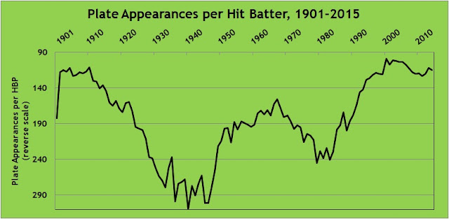
In my first article for FanGraphs Community, I noted, in the summer of 2014, that batters were being hit by pitches at a near-record pace. Here is a graph showing the number of plate appearances per hit batter, from 1901 to present. I’ve reversed the scale—fewer plate appearances between HBP mean that batters are getting hit more frequently—in order to illustrate the steady climb from the World War II years to today. While the hit batter rate has flattened out since 2001 (the high point on the chart), the rate in 2015, a hit batter in every 115 plate appearances, is the 14th highest in major league history.

After I cast about for an explanation for the rise, a commenter came up with what I believe is the best explanation: strikeouts (or, as the Cistulli-designated viscount of the internet, Rob Neyer, has dubbed it, the strikeout scourge). Or, more specifically, the increase in pitchers’ counts vs. hitters’ counts during at bats. When the pitcher is ahead in the count, he is more likely to target the margins of the strike zone, either to try to get the batter to chase or to set up the batter for the next pitch. When the batter’s ahead, the pitcher doesn’t have that luxury, and must focus more on pitching in the zone for fear of losing the batter to a walk. When a pitcher’s aiming for the inside edge of the zone and misses inside, the batter can get hit.

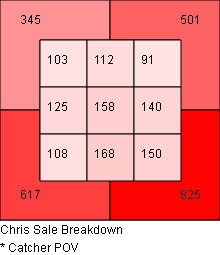
For example, here are career zone breakdowns for Chris Sale (who was a co-leader in hit batters in 2015) against right-handed hitters. At left is his location on 0-1, 0-2, and 1-2 counts. The chart at right shows 1-0, 2-0, 3-0, 2-1, 3-1, and 3-2 counts. The charts are from the catcher’s point of view, so the left side represents inside pitches. When Sale’s ahead in the count, 38% of his pitches are in the five leftmost zones. When he’s behind, that proportion drops to 31%. That’s typical. (What’s not typical is that Sale is ahead in the count a lot more than he’s behind, but you probably already knew that. Images from Baseball Savant.)

              Ahead in the count                          Behind in the count

This dynamic was clearly evident in the past season. When looking at plate appearances that ended when the pitcher was ahead in the count, batters were hit once in every 90 plate appearances. In plate appearances that ended with the batter ahead in the count, batters were hit once in every 254 plate appearances. Batters were nearly three times as likely to be hit by the pitch when they were behind in the count.

This raises a question: what other outcomes are affected by the count? We know that batters don’t do as well in general when the pitcher’s ahead. Are there outcomes other than batting average and slugging percentage that are affected by pitcher’s count?

Before answering that, I wanted to verify that pitchers are, in fact, increasingly ahead in the count. With rising strikeout rates and falling walk rates, this would seem to be tautological, but I checked anyway. I looked at the counts on which plate appearances ended for every year from 2001 to 2015. For example, in 2015, there were 183,628 plate appearances in the majors. 60,513 ended with the batter ahead (1-0, 2-0, 3-0, 2-1, 3-1, 3-2), 62,0553 ended with the count even (0-0, 1-1, 2-2), and 61,062 ended with the pitcher ahead (0-1, 0-2, 1-2). Here’s how they’ve tracked:

I didn’t go back further than 2001, but that’s not because I was being selective; it’s because the data from 2001 forward tells the story. Prior to 2001 the trends simply continued. In 2000, batters were ahead in 38% of plate appearances and pitchers in 28%, compared to 35% and 30% in 2001. The advantage to pitchers has fairly steadily expanded. I think we can say with some confidence that the past two seasons are the first two in modern baseball history in which more plate appearances ended with the batter behind than with the batter ahead.

So, having established that there are indeed more pitchers’ counts, what events are most affected by this change? To find out, I calculated the frequency of outcomes in 2015 on plate appearances with the batter ahead compared to plate appearances with the pitcher ahead. For example, in the 60,513 plate appearances that ended with the batter ahead, there were 13,501 hits. That works out to 4.5 plate appearances per hit. In the 61,062 plate appearances that ended with the pitcher ahead, there were 12,311 hits, or 5.0 plate appearances per hit. The p value for those two proportions, given the sample sizes, is 0. In other words, the difference is statistically significant, and we can safely say there is a difference in hit frequency when ahead in the count compared to behind in the count.

Here’s the full list:

According to this analysis, when the pitcher’s ahead in the count, it results in a decrease in hits, doubles, triples, home runs, and sacrifice flies. When the pitcher’s ahead, it results in an increase in stolen-base success rate, hit batters, sacrifices, and wild pitches. Those mostly make intuitive sense: when the pitcher’s ahead, the batter’s more cautious with his swings, resulting in fewer hits and less power. Similarly, when the pitcher’s ahead, he’ll work away from the heart of the plate, and misses become wild pitches and hit batters. By contrast, when the pitcher’s behind, he works closer in to the strike zone, resulting in pitches that are easier for the catcher to handle, lowering his pop time and increasing the chance of catching the runner on a steal attempt. (Max Weinstein illustrated last year that caught stealings are more likely on pitches in the strike zone.) The increase in sacrifices seems non-intuitive, since 0-2 and 1-2 counts usually shoo away the bunt due to the risk of a strikeout on a foul ball, but 0-1 counts make up for it. Batters were more likely to successfully sacrifice on 0-1 counts (1.4% of 0-1 plate appearances) than any count other than 0-0 (2.7%) in 2015.

Given that pitchers’ counts have increased and hitters’ counts have decreased, this model would predict changes in outcomes for which the differences are statistically significant. I looked at the frequency of hit batters, sacrifice flies, and wild pitches, along with the stolen base success rate, for 1979-1981 (the recent low-water mark for strikeout rate) and 2013-15. I excluded sacrifices because they’re both down sharply due to strategic reasons (managers are calling for fewer bunts) more than anything else. They results are consistent with the model.

  • Strikeouts per plate appearance: up 61%
  • Hit batters per plate appearance: up 98%
  • Sacrifice flies per plate appearance: Down 16%
  • Wild pitches per plate appearance: up 39%
  • Stolen-base success rate: up 7% (though that increase, from 66% to 73%, is probably largely strategic, since there are were 54% fewer stolen base attempts per plate appearance in 2013-15 than 1979-81, even though that may not make sense)

The graphs below, while admittedly busy, track the offensive events for which the analysis of 2015 count-related data indicated statistical significance (again, excluding sacrifices). I’ve selected the past 30 seasons. First, the affected base hits (total hits, doubles, triples and homers):

Offense rose through the 1990s despite rising strikeouts but has fallen since.

Now, the less intuitive outcomes of hit batters, wild pitches, sacrifice flies, and stolen-base success:

As the 2015 count data suggest, increased strikeouts, and therefore increased pitchers’ counts, has yielded more wild pitches, fewer sacrifice flies, a higher stolen-base success rate (though, again, that’s probably a reflection more of strategy), and, most significantly, way more hit batters (73% higher than in 1986; I truncated the scale in order to make the rest of the graph more readable).

This isn’t to suggest that these changes are solely a result of pitchers getting ahead in the count more frequently, but it does seem to be a contributing factor. Admittedly, much of the fallout from the rise in strikeouts is pretty unremarkable. There are more strikeouts and fewer walks now than in the past, so the pitcher’s ahead in the count more and the batter’s ahead in the count less; that’s unremarkable. That’s resulted in less offense — specifically, fewer hits overall and fewer extra-base hits; that’s also unremarkable. What I find more interesting are the other trends trends unrelated to strategy: the increase in hit batters and wild pitches and the decrease in sacrifice flies. It’s easy to get upset about batters getting hit by pitches, pitches rolling to the backstop, and difficulties in driving in runners from third with fewer than two outs. What’s less apparent is the degree to which those events can be linked, like lower scoring, to the rise in strikeouts.


OK, the American League Really IS Sweden

Last month, I wrote about the two leagues, noting that

  1. The American League, perceived as being bad this year, was actually a good deal better than the National League overall, and
  2. The perception of the American League’s weakness was due to a near-record level of parity, with neither great nor bad teams.

Let’s start with the second point. At the time of the post, through games of September 5, the standard deviation of winning percentages among American League clubs was the lowest it has been in the 30-team era. Projected onto a 162-game season, the standard deviation of wins for American League teams was 7.8, barely eking out 2007’s 7.9 as the most egalitarian distribution of wins since 1998.

Since September 5, a .500 record has become a black hole, exerting irresistible gravity throughout the American League galaxy:

  • Of the teams with the six best records in the league on that date–the Royals, Blue Jays, Yankees, Astros, Rangers, and Twins–only Toronto and Texas had a winning record the rest of the season.
  • Baltimore, the sixth-worst team in the league as of the morning of September 6, tied the Jays for the best record in the East thereafter. Boston, then the third-worst team, went 15-12 the rest of the way.
  • Cleveland, four games below .500 at the time, scrambled to finish 81-80.

Overall, parity in the already-equality-loving Junior Circuit increased, by so much that I looked beyond the post-1998 30-team era. I calculated the standard deviation of winning percentages for every league-season since 1901. I then multiplied the standard deviations by 162 to arrive at the standard deviation of wins over a 162-game season. Yes, I know, most of those seasons were shorter than 162 games, but that’s OK; I’m just looking to turn the standard deviation of winning percentages, which is not an intuitive figure (e.g., American League, 1930, 0.1107), into something that is recognizable (17.9 wins). Here are the ten seasons in baseball history with the highest parity, that is, the lowest standard deviation of wins:

The 2015 American League is the most egalitarian, populist, tax the rich/feed the poor, Kumbaya-singing league in baseball history. As I suggested in September, it’s the Sweden of leagues.

(The National League finished 2015 with a standard deviation of 13.1 wins, ranking it 102 out of 230 league-seasons in terms of parity. It was the ninth-most unequal among 36 league-seasons since the expansion to 30 teams in 1998. For Gini coefficient detractors, the most unequal league ever was the 1909 National League, which featured the 110-42 Pirates, 104-49 Cubs, and 92-61 Giants, along with the 55-98 Dodgers, 54-98 Cardinals (Yadi was hurt), and 45-108 Braves.)

Now, as to the other point, the American League’s superiority over the National League despite its group hug ethic, here’s a chart.

Twelve years and running.


The Pittsburgh Pirates and Two Missed Opportunities

1. The Pirates finished the year with a 98-64 record, the second best in all of baseball. That ties them with the 1979 and 1908 clubs for the third most wins in franchise history. (The 1909 Pirates won 110 and the 1902 club won 103.) The Pirates’ record, however, included a losing record against two of the worst teams in the game, the Cincinnati Reds (8-11) and the Milwaukee Brewers (9-10).

Let’s break that down. In games in which the Reds didn’t play the Pirates, they were 53-90. In games in which the Brewers didn’t play the Pirates, they were 58-85. So in their non-Pirates games, the two clubs combined for a 111-175 record, a .388 winning percentage. Had they played at that pace in their 38 games against the Pirates, they would have won .388 x 38 games = 15 games, losing 23. Turned around, the Pirates would have gone 23-15 against the Reds and Brewers.

The Pirates were 81-43 in their games that weren’t against Cincinnati or Milwaukee. Had they gone 23-15 against the two clubs–that, is had they been as successful as the rest of the teams in the majors were–their record would have been 104-58. That would have given the Pirates the best record in baseball. They would be enjoying four off days, looking forward to Wednesday’s wild-card game between the Cardinals and Cubs to see whom they’d face at home to kick off the Division Series on Friday.

2. The Pirates had four relief pitchers who pitched at least 60 innings: Mark Melancon, Tony Watson, Jared Hughes, and Arquimedes Caminero. Of the four, the pitcher with the lowest average leverage index when entering a game was Caminero, wasting his namesake’s leverage expertise.


The Best of Leagues, the Worst of Leagues

As with every year, there have been storylines that are unique to the 2015 baseball season. The remarkable infusion of young talent to the game. The relevance of the Cubs and Astros after years of being doormats. The disarray in Boston and Detroit. And, of interest here, the general ineptitude of the American League.

Many commentators have bemoaned how weak the American League is this season. You can get a sense of that by just perusing the standings. All data here are as of the start of play on Sunday, September 6.

  • The Red Sox, Mariners, Tigers, White Sox, and A’s–all expected to be good teams this year, picked by many to win their divisions or qualify as wild cards–have the five worst records in the league.
  • Two divisions have only two clubs with winning records, and there are only six teams in the entire league more than a game above .500.
  • In the East, Toronto’s gotten hot, but the team had a losing record as recently as July 28. The Yankees’ two best offensive players are old, one’s hurt, and the other has the second-lowest OPS in the league in over the past 30 days. Nobody else in the division is above .500.
  • The Royals lead the Central with the American League’s best record despite having the fourth worst starting pitcher ERA and FIP along with, this being the Royals, the fewest home runs and walks on offense. The second place Twins have been outscored. Again, nobody else in the division is above .500.
  • The National League West is led by the Astros, a year after losing 92 games and two years after losing 111. Many of the players in their lineup have an on base percentage below .300 with the team. The Rangers are in second after losing their ace pitcher in spring training. The defending divisional champ Angels are treading water, just a game above .500.

Given that, one could argue that at least four of the best teams in baseball this year are in the National League, though one would get a counter-argument emanating along the Missouri/Kansas border. In any case, the Cardinals have the best record in the majors, the Pirates and Cubs third and fourth, the Dodgers tied for fifth, and the Mets eighth. The National League has the best teams, with the best records, making it the best league, right?

Except for one number: 89-73.

That’s roughly equal to the projected won-lost record for the Mets and Astros this year. That’s a good record. It’s good enough to win a soft division, good enough to make the playoffs in almost every year. An 89-73 team is a good ballclub.

But I didn’t list the 89-73 record because of the Mets and Astros. Rather, it has relevance for another reason: 89-73 is the record of American League teams against National League teams this year. Actually, it’s 151-123, but prorated over 162 games, it’s 89-73. The American League, on average, is the Rangers or Nationals playing against the Orioles or Red Sox: A .525 team playing a .475 team. The American League is, overall, clearly the superior league. And this shouldn’t come as a surprise; as Jeff Sullivan pointed out last year, the same occurred in 2014. And it happened in 2013. And 2012. And 2011. And every single year beginning in 2004.

How can that be? How can the top of the American League be unimpressive, the rest of the teams deeply flawed, yet the league is easily beating up on the National League?

There are two reasons. First, the National League may have the best teams, or at least most of them, but it absolutely runs the table on bad teams. The worst record in the majors this year is owned by the Phillies. They’re followed by the Braves. Then the Reds. Then the Marlins. Followed by the Rockies. The A’s are the next-worse, but then we return to the National League, with the Brewers. Six of the seven worst teams in the majors this year are in the National League. Those six teams, cumulatively, are 334-478, a .411 winning percentage, and 38-72 against the American League.

The second reason, closely related to the first, is parity. Yes, the American League doesn’t have the talented teams that the National League claims. But neither does it have the clunkers.When it comes to team performance, the National League is a stars-and-scrubs, penthouse-and-outhouse type of league. The American League is much more egalitarian. The teams with the six worst records in the American League are the A’s, Tigers, Red Sox, White Sox, Mariners, and Orioles. Those are six hugely disappointing teams, but they’re disappointing because they have talent, if underperforming talent. Those six teams, cumulatively, are 376-434, a .465 winning percentage, and 56-54 against the National League. Compare that to the six listed in the last paragraph.

Put this another way: You probably remember the term standard deviation from statistics classes. Without getting into the formulae, the standard deviation is a measure of variance. Given a normal distribution, about two-thirds of values (68.2%, to be precise) fall within one standard deviation of the mean. It’s a more precise term for “plus or minus.” Since 1998, the inaugural seasons of the Tampa Bay Rays and Arizona Diamondbacks, there have been 30 major-league teams. During that time, the average team won/lost percentage is .500 (duh). The standard deviation is .071. Over the course of a 162-game season, then, the average number of victories is 81 games (162 x .5), with a standard deviation of 11.6 games (162 x .071). If there’s a wide variation between teams in a league, its standard deviation will be higher. If there’s parity, it’ll be lower.

I calculated the standard deviations of team winning percentage for every season in each league from 1998 to 2015, giving me 36 league-seasons in total. I multiplied the result by 162 to express it in games. Again, in those 18 years, the average team wins 81 games, plus or minus 11.6. Here are five the seasons with the greatest standard deviations:

       Year   Lg    SD
       2002   AL   17.1
       2001   AL   15.9
       2003   AL   15.8
       1998   NL   14.3
       2004   NL   14.0

The 2001-2003 American League was the most unequal since 1998. The Mariners, with 302 wins in 2001-2003, including 116 in 2001, led the league in wins over the three seasons, which also featured outstanding teams in Oakland (301 wins) and New York (299). On the other side of the coin, Baltimore (288 losses), Tampa Bay (305 losses), and especially Detroit (321) were perennial doormats. This year’s National League, to date, is close to breaking the top five. It has a standard deviation of 13.2 games, which ranks eighth among the 36 league-seasons. It’s been a year of inequality in the Senior Circuit.

At the other extreme, here are the five seasons with the lowest standard deviations:

       Year   Lg    SD
       2015   AL    7.8
       2007   NL    7.9
       2006   NL    8.0
       2000   AL    8.7
       2005   NL    8.8

The 2005-2007 National League had only one team win 100 games (the 2005 Cardinals) and only one lose as many as 96 (the 2006 Cubs). In 2007, every team had between 71 (Giants and Marlins) and 90 (Diamondbacks and Rockies) wins. But that level of parity doesn’t match the 2015 American League so far. This year’s American League is on pace for the most egalitarian distribution of wins and losses in the 30-team era. It’s Sweden to the National League’s Honduras! Or something like that.

So what’re the takeaways? The record level parity in the American League to date has smoothed out the top and bottom of the league, resulting in hardly any notably bad or notably good teams. But that parity shouldn’t be mistaken for weakness. The American League is the better league overall, as evidenced by its clearly superior record in interleague play. The National League may have the best teams, but the American League remains the best league.


Going the Other Way

Ryan Howard doesn’t like infield shifts. I’m not making this up, or just surmising it. He said so after recording four outs on balls that probably would have gotten through an unshifted infield:

 “No, I don’t like it at all,” said Howard, who has grown accustomed to seeing four infielders on the right side of the infield when he steps to the plate. “That’s four hits. I mean, again, it’s nothing that I’m doing wrong, I’m hitting the ball hard. It’s just right at guys playing shifts. So, all you can do is continue to swing.”

Back in May, Craig Edwards noted that Jason Kipnis had a rotten 2014 (86 wRC+), likely in part due to an oblique injury in April that affected his performance all year. Kipnis’s 2014 was characterized by an increase in grounders, weak contact, and pulled balls. This season, of course, he’s been a monster (164 wRC+ through June 21, fourth in the American League), in part because, with a healthy oblique, he’s pulling less.

Why, fans and sportswriters ask, can’t more hitters do what Jason Kipnis has done by going the other way? Proliferating infield shifts are taking hits away from the likes of Howard, David Ortiz, and Mark Teixeira. So why don’t those players just hit the ball where they ain’t? I’m not talking about bunting. This is just about pull-happy hitters go the other way, guiding batted balls to the opposite field.

I think pretty much everyone reading this knows the answers why. First, infield shifts are effective against grounders and soft liners, and a batter with fly ball tendencies hits the ball over the shifted infielders more often than not. The Indians’ Brandon Moss is a pronounced pull hitter (48% of batted balls hit to right field) who also hits the ball in the air a lot (0.67 ground ball/fly ball ratio, fifth lowest in the majors). So he goes to the plate trying to hit over the shift. Second, and more significantly, I think, hitting, one hears, is hard. Granted, I never played professional baseball like the people on sportstalk radio who insist that Chris Davis would be a much more productive player if he’d just shorten his swing and go with where the ball’s pitched, dumping singles through the vacated space on the left side of the infield. Changing one’s approach to the plate would seem to have a concomitant risk of decreased production.

But players can and do make adjustments. And, as the case of Kipnis illustrates, those adjustments can lead to better outcomes. How often do batters rely less on pulling the ball, and what does it do to their performance?

To answer this, I looked at every batter who was a semi-regular (which I arbitrarily defined as compiling two-thirds the plate appearances necessary to qualify for the batting title) in 2014 and 2015. (My criteria worked out to 334 plate appearances in 2014 and, depending on the team, 140 or so plate appearances in 2015.) There were, through games of June 21, 186 such players. I calculated their “pull tendency” by subtracting the percentage of balls they hit to the opposite field from the percentage they hit to the pull field. Ryan Howard, for example, has a pull tendency of 31.9% this year, having hit 48.8% of batted balls to right field and 16.9% to left. I then subtracted each player’s 2015 pull tendency from his 2014 pull tendency to arrive at the change, i.e. how much more he’s going the other way in 2015. To determine the effect of the change, I calculated the change in the player’s wRC+ from 2014 to 2015 as well. Here are the 15 players who have most dramatically changed from pulling to going the other way in 2015:

Well now. That’s quite a mix. There’s probably the 2015 poster child for going the other way, Mike Moustakas, leading the way with a vast improvement in wRC+. But the median wRC+ change on the list is negative five points–players who are pulling markedly less are having less, not more, success at the plate. Seven of the fifteen players are having a better year in 2015, while the remaining eight aren’t. Of course, as with any list like this, there are caveats. The change for Moustakas is evidence of a well-executed plan. But you can make a pretty good argument that Carlos Ruiz is pulling less because,at 36, he can’t get around on pitches as he used to, and a fairly airtight argument that Victor Martinez is pulling less because he’s been playing hurt. Danny Santana, he of the .405 BABIP in 2014, was at the top of the 2015 regression list regardless of where he’d hit the ball–a lot more of them were bound to find their way into fielders’ gloves. Josh Harrison is coming off a career year. Alcides Escobar, who cares, the guy’s an All-Star Game starter! But if there’s a pattern there of pull less, hit more, I’m not seeing it.

How about players who have done the opposite–in the face of shifts, they’re pulling the ball more now than they did last year? Here’s the list:

Another mixed bag, with a negligible median change in wRC+ (-2 in this case; seven players doing better, eight doing worse). Pulling the ball more certainly hasn’t hurt Todd Frazier (leading all third basemen in wRC+) or the first two second basemen on the list. By the same token, it’s one of many symptoms of the woes of Robinson Cano (discussed in length by Jeff Sullivan here). As with players pulling less, if there’s a pattern here, that pulling more has a systemic impact, I’m not seeing it.

Admittedly, there are limits to this type of analysis. Hitting isn’t just a product of where the ball is hit. It’s affected by whether it’s hit on the ground or in the air, whether it’s hit hard or soft, whether it’s hit by a healthy batter or an injured one, whether it’s hit off a fastball or an off-speed pitch, and whether it’s hit at all or missed. I looked only at the first comparison: pulling the ball vs. going the other way, because that one characteristic has been harped on by fans and some in the media. And the data indicate that changing one’s approach–going from pulling to hitting to the opposite field, or, for that matter, vice-versa–does not appear to have a systemic change in batting outcomes. It works for some players. It doesn’t work for others. For every Mike Moustakas, it seems, there’s a Todd Frazier, or a David Peralta. When Ryan Howard hits four grounders to Kolten Wong in short right field, turning singles to right into 4-3 putouts, it may frustrate him, but that’s not to say that trying to hit the ball to left wouldn’t frustrate him even more.