Author Archive

The NL West: Time Zones, Ballparks, and Social Investing

I think the National League West is the most idiosyncratic division in baseball. Note that I avoided a more disparaging term, like odd or weird. That’s not what I’m trying to convey. It’s not wrong; it’s just…off. Not bad–it’s home to 60% of the last five World Champions, right?–but different. Let me count the ways. (I get three.)

Time zones

EAST COAST BIAS ALERT!

It is difficult for people in the Eastern time zone to keep track of the NL West. Granted, that’s not the division’s fault. But 47% of the US population lives in the Eastern time zone. Add the Central, and you’re up to about 80%. That means that NL West weeknight games generally begin around the time we start getting ready for bed, and their weekend afternoon games begin around the time we’re starting to get dinner ready. The Dodgers, Giants, and Padres come by it naturally–they’re in the Pacific time zone. The Diamondbacks and Rockies are in the Mountain zone, but Arizona is a conscientious objector to daylight savings time, presumably to avoid prolonging days when you can burn your feet by walking barefoot outdoors. So effectively, four teams are three hours behind the east coast and the other team, the Rockies, is two hours behind.

Here’s a list of the number of games, by team, in 2015 that will be played in each time zone, ranked by the number of games in the Mountain and Pacific zones, counting Arizona among the latter:

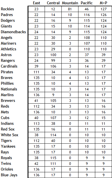
Again, I’m fully on board with the idea that this is a feature, not a bug. But it’s a feature that means that a majority, or at least a solid plurality, of the country won’t know, for the most part, what’s going on in with the National League West teams until they get up in the morning.

Ballparks

OK, everybody knows that the ball flies in Coors Field, transforming Jose Altuve to Hack Wilson. (Check it out–they’re both 5’6″.) And the vast outfield at Petco Park turns hits into outs, which is why you can pencil in James Shields to lead the majors in ERA this year. But the other ballparks are extreme as well: Chase Field is a hitter’s park; Dodger Stadium and AT&T Park are pitchers’ havens. The Bill James Handbook lists three-year park factors for a variety of outcomes. I calculated the standard deviations for several of these measures (all scaled with 100 equal to league average) for the ballparks in each division. The larger the standard deviation, the more the ballparks in the division play as extreme, in one direction or the other. The NL West’s standard deviations are uniformly among the largest. Here’s the list, with NL West in bold:

  • Batting average: NL West 10.1, AL West 7.2, AL Central 6.5, AL East 5.8, NL East 5.2, NL Central 1.6
  • Runs: NL West 26.5, NL Central 7.9, NL East 6.9, AL East 4.0, AL Central 2.8, AL West 2.7
  • Doubles: AL East 20.3, NL West 11.3, NL East 6.2, NL Central 5.9, AL Central 5.1, AL West 2.9
  • Triples: NL West 50.6, AL Central 49.5, NL East 33.6, AL West 28.3, AL East 27.8, NL Central 11.1
  • Home runs: NL Central 30.2, NL West 23.9, NL East 20.0, AL East 18.7, AL Central 11.3, AL West 11.2
  • Home runs – LHB: NL Central 31.6, AL East 27.4, NL West 25.6, NL East 21.7, AL West 14.7, AL Central 11.7
  • Home runs – RHB: NL Central 32.1, NL West 24.0, NL East 20.0, AL East 14.4, AL Central 13.6, AL West 10.2
  • Errors: AL East 17.7, NL West 12.2, NL Central 11.6, NL East 11.5, AL West 11.2, AL Central 8.2
  • Foul outs: AL West 36.2, AL East 18.3, NL West 16.0, NL Central 15.2, AL Central 13.8, NL East 6.2

No division in baseball features the extremes of the National League West. They ballparks are five fine places to watch a game, but their layouts and geography do make the division idiosyncratic.

Social Investing

You may be familiar with the concept of social investing. The idea is that when investing in stocks, one should choose companies that meet certain social criteria. Social investing is generally associated with left-of-center causes, but that’s not really accurate. There are liberal social investing funds that avoid firearms, tobacco, and fossil fuel producers and favor companies that offer workers various benefits. But there are also conservative social investing funds that don’t invest in companies involved in alcohol, gambling, pornography, and abortifacients. This isn’t a fringe investing theme: By one estimate, social investing in the US totaled $6.57 trillion at the beginning of 2014, a sum even larger than the payrolls of the Dodgers and Yankees combined.

Here’s the thing about social investing: You’re giving up returns in order to put your money where your conscience is. That’s OK, of course. The entire investing process, if you think about it, is sort of fraught. You’re taking your money and essentially betting on the future performance of a company about which you know very little. Trust me, I spent a career as a financial analyst: I don’t care how many meals you eat at Chipotle, or how many people you know at the Apple Genius Bar, you can’t possibly know as much about the company as a fund analyst who’s on a first-name basis with the CEO. So there’s no sense in making it even harder on yourself by, say, investing in the company guilty of gross negligence and willful misconduct in a major oil spill, if that’d bother you.

Note that I said that with social investing, you’re giving up returns. Some social investing proponents would disagree with me. They claim that by following certain principles that will eventually sway public opinion or markets or regulations, they’re investing in companies that’ll perform better in the long run. That’s a nice thought, but social investing has been around for decades, and we haven’t yet hit that elusive long run. The Domini 400 Index, which was started in 1990, is the oldest social investing index. It started well in the 1990s, but has lagged market averages in the 21st century. Now called the MSCI KLD 400 Social Index, it’s been beaten by the broad market in 10 of the past 14 years. It’s underperfomed over the past year, the past three years, the past five years, and the past ten years, as well as year-to-date in 2015. The differences aren’t huge, but they’re consistent. Maybe for-profit medicine in an aberration, but acting on that meant that you missed the performance of biotechnology stocks last year, when they were up 47.6% compared to an 11.4% increase for the S&P 500. Maybe we need to move toward a carbon-free future, but stocks of energy companies have outperformed the broad market by over 100 percentage points since January 2000. I think that most social investing investors are on board with this tradeoff, but some of the industry proponents have drunk the Kool-Aid of beating the market. That’s just not going to happen consistently. In fact, a fund dedicated to tobacco, alcohol, gambling, and defense (aka “The Four B’s:” butts, booze, bets, and bombs) has outperformed the market as a whole over the past ten years.

OK, fine, but what does this have to do with the National League West? Well, two of its members have, in recent years, made a point of pursuing a certain type of player, just as social investing focuses on a certain type of company. The Diamondbacks, under general manager Kevin Towers and manager Kirk Gibson, became a punchline for grit and dirty uniforms and headhunting. (Not that it always worked all that well.) The Rockies, somewhat less noisily, have pursued players embodying specific values. Co-owner Charlie Monfort (a man not without issues) stated back in 2006,  “I don’t want to offend anyone, but I think character-wise we’re stronger than anyone in baseball. Christians, and what they’ve endured, are some of the strongest people in baseball.” Co-owner Dick Monfort described the team’s “culture of value.” This vision was implemented by co-GMs (hey, Colorado starts with co, right?) Dan O’Dowd and Bill Geivett. (OK, O’Dowd was officially GM and Geivett assistant GM, but the two were effectively co-GMs, with Geivett primarily responsible for the major league team and O’Dowd the farm system).

Now, there’s nothing wrong with players who are also commendable people. You could do a lot worse than start a team with Clayton Kershaw and Andrew McCutchen, to name two admirable stars. Barry Larkin was a character guy. So was Ernie Banks. Brooks Robinson. Walter Johnson. Lou Gehrig. All good guys.

But holding yourself to the standards set by the Diamondbacks and Rockies also means you’re necessarily excluding players who are, well, maybe more characters than character guys.  Miguel Cabrera has proven himself to be a tremendous talent and a somewhat flawed person. Jonathan Papelbon has a 2.67 ERA and the most saves in baseball over the past six years, but he’s done some things that are inadvisable. Carlos Gomez, a fine player, second in the NL in WAR to McCutchen over the past two years, has his detractors. Some of the players whom you’d probably rather not have your daughter date include Babe Ruth, Ty Cobb, Rogers Hornsby, Barry Bonds, and many of the players and coaches of the Bronx Zoo Yankees.

I want to make a distinction here between what the Diamondbacks and Rockies did and the various “ways” that teams have–the Orioles Way, the Cardinals Way, etc. There’s plenty of merit in developing a culture starting in the low minors that imbues the entire organization. That’s not what Arizona and Colorado did. They specified qualities for major leaguers, and, in the case of the Diamondbacks at least, got rid of players who didn’t meet them. I don’t know what’s wrong with Justin Upton, but for some reason, Towers didn’t like something about him, trading him away. The Braves make a big deal about character, but of course they traded for Upton, so the Diamondbacks went way beyond anything the Braves embrace.

In effect, what the Diamondbacks and Rockies have done is like social investing. They’ve viewed guys who don’t have dirty uniforms or aren’t good Christians or something the same way some investors view ExxonMobil or Anheuser-Busch InBev. Again, that’s their prerogative, but it loses sight of the goal. Investors want to maximize their returns, but as I said, most social investors realize that by focusing on only certain types of stocks, they’ll have slightly inferior performance. They’ll give up some performance in order to hew to their precepts. Baseball teams want to maximize wins, and there really isn’t any qualifier related to precepts you can append to that.

The Rockies and Diamondbacks were living under the belief that by focusing on only certain types of players, they could have superior performance. It’s like the people who think they can beat the market averages through social investing. It hasn’t happened yet. And, of course, the Diamondbacks and Rockies were terrible last year, with the worst and second-worst records in baseball. Just as social investing doesn’t maximize profits, the baseball version of social investing didn’t maximize wins in Phoenix or Denver.

I’ve used the past tense throughout this discussion. Towers, Gibson, O’Dowd, and Geivett are gone, replaced by GM Dave Stewart and manager Chip Hale in Arizona and GM Jeff Bridich in Colorado. (The Monforts remain.) Last year, the Diamondbacks created the office of Chief Baseball Officer, naming Tony LaRussa, a Hall of Fame manager who’s been less than perfect as a person and in the types of players he tolerates. These moves don’t change that these are both bad teams. But by pursuing a well-diversified portfolio of players going forward, rather than a pretty severe social investing approach, both clubs, presumably, can move toward generating market returns. Their fans, after all, never signed on to an approach that willingly sacrifices wins for the sake of management’s conscience.


The Contours of the Steroid Era

One of the things I enjoy most about FanGraphs Community–really, I’m not just apple polishing here–is the quality of the comments. After I came up dry trying to explain the increase in hit batters to near-historical levels in recent years, a commenter led me to what I feel is the correct path: Batters are more likely to be hit when the pitcher’s ahead on the count (and thereby more likely to work the edges of the strike zone, where a miss inside may hit the batter), and the steady increase in strikeouts has yielded an increase in pitchers’ counts on which batters get hit. Similarly, on December 30, when I wrote about how larger pitching staffs have adversely affected the performance of designated hitters, I got this smart comment from Jon L., reacting to my contention that the relative (not absolute) rise in DH offensive performance (measured by OPS+) from 1994 to 2007 probably wasn’t related to PEDs because the improvement was relative to increasing offensive levels overall:

I think it was clearly a PED thing. Players were able to build strength and muscle mass to enhance hitting prowess, and were willing to take the hit on baserunning and agility that comes with toting more weight around. And why not? The money’s in hitting. PEDs were more appealing to players with some initial level of slugging ability, and disproportionately benefited DH-type skills.

That made me think about the Steroid Era (or the PED Era, or, as Joe Posnanski put it, the Selig Era). Generally, I avoid this issue. I listen to SiriusXM in my car, and when I’m on MLB Network Radio and the discussion turns to PEDs, I change the station. I’ve had enough of it for this life, and of course it’ll keep going into overdrive every year around this time with all the Hall of Fame posturing. And, of course, there are commentators like Joe Sheehan who attribute the change in offense since drug testing was instituted to changes in contact rate rather than, as he calls them, “sports drugs.” I’m not making a call on any of that here.

But Jon L.’s comment made me look at the era in a different light. As I noted in my piece, between 1994 and 2007, the average OPS+ for designated hitters was 109. Prior to that, it was 104, and since then, it’s been 106. Those 14 years between 1994 and 2007 represent the high-water mark for DH offense. both absolutely and relatively. In the 42 years in which the American League has had a designated hitter, there have been 28 seasons in which the OPS+ for DHs was 105 or higher: Every season from 1994 to 2007, but just half of the remaining 28 years.

So I’m going to start with the years 1994-2007 as my definition of the Steroid Era. I’m not saying they’re the right answer. They do fit in with the record for DHs, and I’d note that those fourteen years account for 23 of the 43 player-seasons, and 14 of the 23 players, hitting 50+ home runs in a season. (And that doesn’t include 1994, when six players–Matt Williams, Ken Griffey Jr., Jeff Bagwell, Frank Thomas, Barry Bonds, and Albert Belle–were on pace for 50+ when the strike ended the season.) But maybe the Steroid Era started, as Rob Neyer recently suggested, in 1987, following Jose Canseco’s Rookie of the Year season. That’s the same starting point the Eno Sarris points to in this article from 2013. Maybe it ended in 2003, the last year before drug testing commenced. I’ll get to that later.

To test Jon L.’s hypothesis, I looked at Bill James’s Defensive Spectrum, which puts defensive positions along a continuum:

DH – 1B – LF – RF – 3B – CF – 2B – SS – C

For purposes of this analysis, let’s just say that the defensive spectrum rates positions as offense-first through defense-first. (It’s more nuanced, having to do with the availability of talent, but that’s not important here.) DHs, obviously, are asked only to hit, not to field. On the other end of the spectrum, players like Clint Barmes and Jose Molina get paid for the glove, not their bat.

For each position, I looked at their relative hitting (measured by OPS+, the only relative metric I could find with positional splits going back to the implementation of the DH). Obviously, overall offense increased across baseball during the Steroid Era. That’s not at issue. Rather, I’m looking for the contours of the increase: Did some types of players benefit more than others? That’s the beauty of relative statistics. Since they average to 100 overall, they’re effectively a zero-sum game. In pretty much identical playing time, Justin Upton’s OPS+ improved from 124 in 2013 to 132 in 2014. That means that the rest of his league, in aggregate, lost 8 points of OPS+ over Upton’s 642 or so plate appearances from 2013 to 2014. Taking that logic to positions, if one position goes up, as the DHs did from 1994 to 2007, another position has to go down.

I compared three ranges of seasons:

  • The Steroid Era; fourteen years from 1994 to 2007
  • The fourteen prior seasons, 1980-1993
  • The seven seasons since

If, as Jon L. suggests, the Steroid Era disproportionately helped sluggers, we’d expect to see OPS+ rise for the left end of the spectrum and fall for the right end. If, as I contended, the increase in DH productivity was more due to the influx of very skilled hitters in the DH role (Edgar Martinez, David Ortiz, Travis Hafner, and others) than something systematic, the change in OPS+ among positions would be pretty random. Here are the American League results (source for all tables: baseball-reference.com):

It turns out that other than a somewhat idiosyncratic drop in production among left fielders (Rickey Henderson’s best years were before 1994, while left fielders Jim Rice, George Bell, and Brian Downing were all high-OPS stars of the 1980s), Jon L.’s hypothesis looks correct. Collectively, DHs, first basemen, and corner outfielders added ten points of OPS+ during the Steroid Era (two-three per position) while center fielders and infielders lost eight points (two per position – totals don’t sum to zero due to rounding). After 2007, the hitters’ positions lost 21 points of OPS+ (five per position) while the fielders’ positions picked up 21 (four per position).

Again, these are relative changes. American League center fielders batted .267/.330/.401 from 1980 to 1993, an OPS of .731. They hit .273/.339/.423 from 1994 to 2007, an OPS of .762. Their absolute numbers improved. But relative to the league, they declined. Offensive performance shifted away from glove positions to bat positions in the American League during the Steroid Era, and back toward the glove guys thereafter.

What’s an increase of two or three points of OPS+, as occurred for DHs from 1994-2007, worth? In the current environment, it’s about 14-20 points of OPS. That’s about the difference in 2014 between Indians teammates Yan Gomes (122 OPS+) and Lonnie Chisenhall (120 OPS+), or Royals teammates Eric Hosmer (98) and Billy Butler (95), or Twins teammates Trevor Plouffe (110) and Joe Mauer (107). (Man, it must be tough to be a Twins fan.)

So what does this mean? Maybe PEDs worked better for sluggers than for fielders, i.e., maybe they boosted sluggers’ batting skills more than other players’. Maybe sluggers took more drugs. I don’t know, and I really don’t care–as I said, I’m tired of the PED talk. But to swing back to Jon L.’s comments on my piece, I think I was too glib in attributing the increased relative performance by DHs from 1994 to 2007 to players and strategy alone. Looks like chemicals may have played a role.

But wait, I’m not done. I mentioned the lack of definition of the Steroid Era. If I use the Neyer/Sarris starting point of 1987 and the last pre-testing season of 2003 as an endpoint, things change a bit. Stretching out the definitions of the eras to 1973-1986 as pre-steroids and 2004-present as post-steroids, here’s what I get:

That’s not as dramatic. Yes, there’s still a shift in OPS+ from the five positions on the right of the defensive spectrum to the four on the left during the Steroid Era, and back again thereafter. But it’s smaller and much less uniform. DHs and left fielders have actually done a bit better since the end of the differently-defined Steroid Era. That’s less compelling.

And the Steroid Era didn’t affect just the American League, of course. Of the 24 player-seasons between 1990 and 2007 in which a player hit 50+ home runs, half the players were in the National League (12 and a third, given that Mark McGwire split time in 1997 between Oakland and St. Louis en route to 58 homers), including all seven seasons of 58+ (seven and a third including McGwire’s 1997). And if you throw the NL into the mix the relationship breaks down more, regardless of how you define the Steroid Era, looking more random than systematic:

The shift of offense to bat-first positions during the Steroid Era is much less pronounced when looking at the two leagues combined, If there were an incontrovertible trend, we’d see plus signs for DHs, first basemen, and corner outfielders in the Steroid Era and minus signs thereafter, and the opposite for infielders and center fielders. That’s not the case.

So while the data aren’t altogether compelling, I’ll concede Jon L.’s point: The Steroid (or PED, or Selig) Era didn’t just boost offenses overall, it changed the contour of offensive performance, shifting some production away from the glove-first positions to the bat-first positions. There was an uptick not only in offensive performance as a whole, but particularly in offensive performance generated designated hitters, first basemen, and corner outfielders. However, the magnitude of the effect is dependent on the league and the years chosen, which indicates that it’s not strong. So I’m sticking with my view that there was an unusual concentration of talent playing DH from the mid-1990s to the mid-2000s. Designated hitters generated more offense, both absolutely and relatively, from 1994 to 2007 than in any other period. The underlying reason may be partly the Steroid Era, but we can say that those years were also the Edgar Martinez era.


The Ghosts of Designated Hitters Past and Designated Hitters Yet to Come

Among the flurry of deals announced over the past month and a half, a couple raised eyebrows:

(That’s how the transactions were listed on mlb.com. I have no idea why Billy Butler, who started 108 games at DH in 2014 and 35 at first base, is listed as a DH, but Kendrys Morales, who started 71 games at DH and 26 at first, is listed as a first baseman.)

The logic behind these signings made sense superficially: The A’s signed Butler, who was the Royals’ DH in 2014, because Oakland DHs hit a middle-infielder-esque .215/.294/.343 last year. The Royals signed Morales to take Butler’s place. What was a little more surprising was the money: three years for $30 million for Butler, two years for $15.5 million plus an $11 million mutual option/$1.5 million buyout in 2017 for Morales.

The reason that’s surprising is that both were below-average hitters in 2014. Butler had a wRC+ of 79 as a DH, while Morales’s was 62. Among the eleven players with at least 200 plate appearances at DH last season, Morales’s wRC+ ranked eleventh and Butler’s ninth.

That’s the thing about designated hitters: They play the ultimate You had one job… position. All they’re supposed to do is hit. There will never be a Derek-versus-Ozzie, bat-versus-glove debate about DHs. They’re all bat. And while wRC+ doesn’t encompass baserunning contributions, DHs are generally plodders like Butler, who went from first to third on a single only once in 31 opportunities last year, so that doesn’t differentiate them. (There have been only 12 seasons in which a player’s gotten more than 15 stolen bases as a DH, and five of those were by one guy, Paul Molitor.)

(Another DH fun fact: The American League adopted the designated hitter after the 1972 season, when the league batted .239/.306/.343, equating to a .297 wOBA. The worst season since then? 2014: .253/.316/.390, .312 wOBA.)

Designated hitters are paid to hit, not to field and run. So why do DHs who are below-average hitters stay on rosters, much less sign multi-year free agent contracts? Before I try to answer that, here’s another tidbit about designated hitters. This is a list of the number of American League players, by position, who qualified for the batting championship last year (i.e., 502 plate appearances):

  • Catchers: 1
  • First basemen: 4
  • Second basemen: 8
  • Shortstops: 9
  • Third basemen: 7
  • Left fielders: 5
  • Center fielders: 7
  • Right fielders: 5
  • Designated hitters: 1

Salvador Perez was the only player to amass 502 plate appearances as a catcher. That’s understandable, given the demands of the position. But why was David Ortiz the only player to get 502 plate appearances as a DH? It’s clearly not the physical strain of being a designated hitter. So let’s lower the bar a bit and count the number of players, by position, to get 400 plate appearances–regulars, if not batting title qualifiers:

  • Catchers: 9
  • First basemen: 10
  • Second baseman: 11
  • Shortstops: 11
  • Third basemen: 11
  • Left fielders: 7
  • Center fielders: 10
  • Right fielders: 7
  • Designate hitters: 4

Yikes. That makes it look even worse. There were fewer regular designated hitters than there were regulars at any other position. Has this always been the case: unremarkable hitters who aren’t even regulars?

To answer this question, the chart below shows, for every season since the advent of the DH in 1973, the percentage of teams with a DH with 502 plate appearances, the percentage with a DH with 400 plate appearances, and the aggregate OPS+ for all DHs. (I chose the percentage of teams, rather than the the number of DHs, to account for the increase in American League teams from 12 in 1973 to 14 in 1976 and 15 in 2013. And I used OPS+ because that’s the only relative  metric I could find with splits data going all the back to 1973.)

*Strike-shortened year; playing time data prorated.
Source: baseball-reference.com, using the Play Index Split Finder.

As you can see, there were roughly three eras for DHs:

  • 1973-1993: Teams trying to figure out how to optimize the position, with playing time and performance fluctuating, including a nadir of a 96 OPS+ in 1985
  • 1994-2007: Slightly fewer regular DHs but the position generating the most offense in its 42-year history
  • 2008-2014: Reduced offense and sharply fewer full-time DHs

Let’s examine those three eras in detail. When the DH was first implemented, American League teams relied heavily on aging sluggers. From 1973 to 1976, the DHs with the most plate appearances were Tommy Davis (in his age 34-37 seasons), Tony Oliva (34-37), Frank Robinson (37-40), Deron Johnson (34-37), Willie Horton (30-33), and Rico Carty (33-36).

This began to shift with Hal McRae, whom the Royals acquired via a trade with the Reds at the end of the 1972 season, when he was 27. He started 134 games at DH in 1973-75, and was a full-time DH for the remainder of his career. He received MVP votes in four seasons. In 1978, 29-year-old Angel Don Baylor finished seventh in the MVP vote, primarily as a DH (102 starts at DH, 56 in the field) and he won the MVP the next year starting 97 games in the outfield and 65 at DH. There were still plenty of old DHs by the late 1970s — Horton was 36 in 1979 when he became one of only two DHs in history to play 162 games at the position — but it wasn’t the exclusive province of old guys.

Still, there were variations in play. The year 1980 is the only non-strike-shortened season in which no DH qualified for the batting title, and that was largely because of a changing of the guard: Carty retired, Lee May and Mitchell Page neared the end of their careers, Horton played his last season, and Rusty Staub inexplicably got 40% of his plate appearances as a 1B/OF.

As you can see by the chart, the performance of DHs took off after 1993, a year during which four former MVPs and/or future Hall of Famers provided 400+ plate appearances of subpar performance as a DH: George Brett (.265/.311/.431, 95 OPS+), Andre Dawson (.266/.308/.432, 94 OPS+), Dave Winfield (.258/.313/.406, 90 OPS+), and George Bell (.217/.243/.363, 59 OPS+). Brett, 40, and Bell, 33, were in their last seasons, while Winfield, 41, and Dawson, 38, were in their last years as regulars.

That led to another changing of the guard in 1994, and fourteen straight years in which DH OPS+ was 105 or higher, accounting for half of the 28 such seasons in the DH’s 42-year history. Of the nine seasons during which DHs had a combined OPS+ greater than 110, six occurred during 1994-2007. This was the heyday of Edgar Martinez, the greatest DH, of course, but Ortiz (4), Chili Davis (3), Travis Hafner (3), Frank Thomas (3), Ellis Burks (2),  Jose Canseco (2), Juan Gonzalez (2), and Jim Thome (2) all had multiple seasons with an OPS+ of 125 or more as a regular DH during those years.

(I know what you’re thinking: Hmm, 1994 to 2007: PEDs. Yes, but the statistics I’ve used throughout this analysis — wRC+ and OPS+ — are relative figures. The league average, every year, is 100. When DHs compiled a 114 OPS+ in 1998-99, it meant they were 14% better than the inflated averages of the time, a level never attained before or since. So unless there’s some reason DHs were more chemically enhanced, or benefited more from such enhancement, than other players, it’s not a PED thing. And no, it’s not because of the alleged career-prolonging properties of PEDs, as only five of the 21 seasons of OPS+ over 124 cited above were amassed by players older than 35. Nine of the player-seasons were compiled by hitters in their 20s, and five occurred in 2006 and 2007, after the implementation of MLB’s drug policy.)

That brings us 2008-2014. The average OPS+, which was 104 in the 1973-93 period and 109 during 1994-2007 has receded to 106 over the past seven seasons. More strikingly, while the percentage of teams employing a full-time DH (400+ plate appearances) has declined steadily, from 43% in the first 21 years to 38% in the next 14 to 36% in the past seven, the percentage qualifying for the batting title has nosedived, from 27% over the first 35 years of the DH to 16% in the seven years since. In 2008, Thome was the only player who qualified for the batting title as a DH, as was Butler in 2012 and Ortiz in 2014. Prior to those seasons, the only times that happened were in the nascent DH seasons of 1980 (noted above) and 1976 (Carty).

So what’s happening now, and how might it inform the Butler and Morales contracts? I think that the decline in DH performance relative to the league and the decline of full-time DHs are related, because they both stem from the construction of pitching staffs in general, and the modern bullpen in particular. In 1973, the first year of the DH, teams commonly carried 10-11 pitchers on their 25-man rosters. Now they usually have 12, sometimes as many as 13. That leaves less room for a full-time player who can’t play in the field and more need for positional flexibility. As Dave Cameron wrote nearly five years ago:

Teams are choosing to increase their flexibility, even if it comes at the expense of some production. Increasingly, teams want the option to use the DH spot as a pseudo off day for their regulars, or as a fall back plan if their banged-up position player is unable to acceptably field his position. With the move towards 12 man pitching staffs, limited bench sizes put a premium on roster flexibility, and teams are reacting by devaluing players who can’t play the field.

In 2014, eight players played at least 15 games at DH (the extreme right side of the defensive spectrum) and 15 games at catcher, second base, or shortstop (the extreme left side). Breaking that combination down by the eras I defined above, it works out to:

  • 1973-1993: 91 occurrences, or 4.3 players per season
  • 1994-2007: 50 occurrences, or 3.6 players per season
  • 2008-2014: 42 occurrences, or 6.0 players per season

Positional flexibility allows teams to get maximum utility from scarce roster spots, but it doesn’t boost batting by DHs. The eight players in 2014 who played at least 15 games at second, short, or catcher as well as DH were J.P. Arencibia (64 wRC+), Alberto Callaspo (68 wRC+), Logan Forsythe (80 wRC+), John Jaso (121 wRC+), Derek Jeter (73 wRC+), Josmil Pinto (101 wRC+), Dioner Navarro (98 wRC+), and Sean Rodriguez (99 wRC+): One good hitter, three average hitters, and four lousy ones. That doesn’t help the aggregate numbers for designated hitters. Add to that the “DH Penalty,” i.e. the observation that hitters tend to perform worse at DH than when playing in the field — which Mitchel Lichtman calculates in this article to be about 14 points in wOBA — and we can expect increased positional flexibility to erode the offensive contributions of designated hitters.* Jaso, an extreme example, hit .298/.362/.488 in 50 games as a catcher but only .208/.293/.296 in 35 games as a DH.

The DH will remain an offensive position, obviously. And there are obvious risks in drawing conclusions based on just the past seven seasons of data, which admittedly include three above-average years for DHs in aggregate. But given modern roster construction, it’s hard to see DHs consistently generating an outsized contribution to offense as they did in years past. That doesn’t make the below-average performance of Butler and Morales tolerable, but it does make it less of an outlier than it would’ve been previously.


*Lichtman’s data indicate that position players who sometimes were DHs didn’t suffer a greater DH penalty than players like Ortiz or Butler, who rarely play in the field. But as he stated in the above-cited article,

I expected that the penalty would be greater for position players who occasionally DH’d rather than DH’s who occasionally played in the field. That turned out not to be the case, but given the relatively small sample sizes, the true values could very well be different.


Hit Batters as Collateral Damage of Rising Strikeout Rates

In the past, I’ve written about batters being hit by pitches–specifically, how the rate of hit batters is near all-time highs yet it hasn’t generated much, if any, outcry. Here’s a chart of hit batters per game, from 1901 (the start of the two-league era) to 2014:

HBP per game, 2001-2014

There were 0.68 hit batters per game in 2014, the eleventh-highest total over 115 years of two-league play. The top ten years, in order, have a 21st century slant: 2001, 2004, 2003, 2006, 1901, 2005, 2007, 2002, 2008, 1911.

Or, pretty much the same chart, here’s hit batters per 100 plate appearances:

HBP per 100 PA

There were 0.898 batters hit per 100 plate appearances in 2014, the tenth highest amount in the two-league era. The ten top years are, in order, 2001, 2003, 2004, 1901, 2006, 2005, 2002, 2007, 1911, and 2014.

Commenter jaysfan suggested that the modern emphasis on going deep into counts has changed the number of pitches thrown per game, so perhaps hit batters per pitch haven’t changed much. It turns out the pattern still holds. Here’s a graph of hit by pitch per 100 pitches, using actual pitch counts from FanGraphs for 2002 to present, and Tom Tango’s formula of Pitches = 3.3 x plate appearances + 1.5 x strikeouts + 2.2 x walks for the preceding years:

HBP per 100 pitches

With 0.234 hit batters per 100 pitches, 2014 ranks 16th all time, behind 1901-1905, 1908, 1910, 1911, and every year from 2001 to 2007. Again, a pronounced millennial bias. (Source for all the above graphs: Baseball Reference and FanGraphs)

It’s clear, then, that we’re seeing batters getting hit at the highest rate in a century. I tried to figure out why, and came up dry. Left-handed batters, who face a wider strike zone than righties, aren’t leaning across the plate and thereby getting hit at a proportionately higher rate. HBPs are not inversely correlated to power, with pitchers more willing to pitch inside now to hitters who less frequently pull inside pitches down the line and over the fence. College graduates are slightly more likely to get hit by pitches than other hitters, but not enough to explain the change. Batters setting up deeper in the batter’s box, as measured by catcher’s interference calls, isn’t correlated to HBPs.

However, commenter Peter Jensen noted, “I don’t think there is any question that pitchers throw more to the edges of the strike zone when they are ahead in the count. This could be confirmed with a pretty simple Pitch Fx study. And if they pitch to the edge more they are also going to miss inside more (and outside more) so this could partially or even wholly account for why there are more HBPs in pitcher counts.”

I did the PITCHf/x study Peter suggested. Using Baseball Savant data, I looked at hit by pitch by count, and as Peter found when he studied the data from 1997 and 2013, HBPs occur more when pitchers are ahead on the count. Here are the data from 2014:

2014 HBP

When the pitcher was ahead on the count, the batter was nearly three times as likely to get hit as when the batter was ahead. The most common counts for hit batters: 1-2, 0-2, and 2-2, and 0-1, all counts that encouraged pitchers to try to get batters to chase pitches on the border of the strike zone. Is this trend consistent? Baseball Savant’s data go back only to 2008, but using that season’s data, yes, the trend’s unchanged:

2008 HBP

Same thing. Batters are three times more likely to get hit when the pitcher’s ahead on the count, and the three most common HBP counts are two strikes with zero, one, or two balls, followed by 0-1.

So why the increase in hit batters? It appears that, as Peter implied, it’s because of the increase in strikeouts. Every three strike count requires a two strike count, obviously. In 2008, 22% of at bats went to 0-2 counts, 34% went to 1-2, and 29% went to 2-2. In 2014, those percentages had risen to 25%, 36%, and 30%, respectively, in line with the increase in strikeouts from 17.5% of plate appearances to 20.4%. The route to three strikes, which is being traveled more frequently, includes the four counts most likely to result in a hit batter. That’s why we’re seeing batters hit by pitches at rates not seen since before the first World War.

Here’s a graphical representation. In 2014, the Pirates led the majors in hit batters, handily, with 88. Here’s where Pirates pitchers threw on the hitters’ counts of 1-0. 2-0, 3-0, and 3-1:

Those greenish-yellow areas in the middle of the zone indicate that when the pitchers fell behind, they tended to locate their pitches in the strike zone. By contrast, check out the location for pitches thrown on 0-1, 0-2, 1-2, and 2-2 counts, when the pitcher could waste a pitch trying to get the batter to chase it:

That’s a much less concentrated blob, with a higher percentage of pitches outside the strike zone, where the batter can get hit.

As a final check, I ran a correlation between strikeouts per plate appearance and hit batters per plate appearance post-World War II. The correlation coefficient’s 0.82. That’s pretty high, suggesting a link between strikeouts and batters getting hit. Granted, correlation is not causation. But given that there’s an empirical link–to get to three strikes, you have to get to two, and batters with two strikes are at the highest risk of getting hit by a pitch–it’s enough to make me believe that while there are a lot of reasons more batters are getting hit by pitches, a major explanation is that hit batters are a consequence of rising strikeout rates.

CODA: If there were a day last season that I thought might’ve turned to tide on batters getting hit by pitch, it was Thursday, September 11. That day, there were 15 HBPs in 11 games. That doesn’t include the horrific fastball to the face that ended Giancarlo Stanton’s season; that pitch was a strike. A lot of stars got hit: Stanton, Mike Trout (twice), Yoenis CespedesCarlos Gomez, Jayson Werth. Tampa Bay’s Brad Boxberger hit Derek Jeter in the elbow. Had that pitch ended Jeter’s farewell tour, I really think it would’ve created an issue of rising HBP rates. Fortunately for Jeter and purveyors of Jeter memorabilia, it didn’t. But taking the 15 hit batters together, plus Stanton, and excluding two obvious retaliation jobs (Anthony DeSclafani hitting Gomez after Stanton got hit, Joe Smith hitting Tomas Telis after Trout got hit a second time), the fourteen hit batsmen occurred on six 0-1 counts (including Stanton and Jeter), three 1-2 counts, two 1-1 counts, and one count each of 0-0, 2-1, and 2-2. There was only one HBP with the batter ahead on the count, and ten occurred on the four counts identified here as the most dangerous for batters.


Has the Modern Bullpen Destroyed Late-Inning Comebacks?

During the World Series, I submitted an article showing that the team leading Los Angeles Dodger games after six innings wound up winning the game 94% of the time, the highest proportion in baseball. I suggested that maybe that’s why Dodger fans leave home games early; it’s a rational decision based on the unlikelihood of a late-inning rally. (Note: I was kidding. Back off.)

But between the lack of comebacks for the Dodgers and the postseason legend of Kansas City’s HDH bullpen, I wondered: Are we seeing fewer comebacks in the late innings now? The last time the Royals made the postseason, in 1985, the average American League starter lasted 6.17 innings, completing 15.9% of starts. The average American League game had 1.65 relievers pitching an average of an inning and two thirds each. This year, American League starters averaged 5.93 innings, completing just 2.5% of starts. The average game had just under three relievers throwing an average of 1.02 innings each. The reason that starters don’t go as long isn’t my point here, and has been discussed endlessly in any case. But looking at the late innings, today’s batters are less likely to be facing a starter frequently (52% of AL starters faced the opposing lineup a fourth time in 1985, compared to 28% in 2014), reducing the offensive boost from the times-through-the-order penalty. Instead, modern batters face a succession of relievers, who often have a platoon advantage, often throwing absolute gas. The Royals, as I noted, won 94% of the games that they led going into the seventh inning (65-4), and that wasn’t even the best record in baseball, as the Padres were an absurd 60-1. Are those results typical? Has the modern bullpen quashed the late-innings rally?

To test this, I checked the percentage of games in each year in which the team leading after six innings was the final victor. (These data are available at Baseball-Reference.com, using the Scoring and Leads Summary.) I went back 50 years, recording the data for every season from 1965 to 2014. In doing so, I got the 1968 Year of the Pitcher; the 1973 implementation of the DH; the expansions of 1969, 1977, 1993, and 1998; the Steroid Era; and the recent scoring lull. This chart summarizes the results:

The most important caveat here is this: In Darrell Huff’s 1954 classic, How to Lie with Statistics, he devotes a chapter to “The Gee-Whiz Graph,” in which he explains how an argument can be made or refuted visually by playing with the y-axis of a graph. This is a bit of a gee-whiz graph, in that the range of values, from 84.1% of leads maintained in 1970 to 88.1% in 2012, is only 4%. That’s not a lot. My choice of a y-axis varying from 84.0 to 88.5 magnifies some pretty small differences. Still, the average team was ahead or behind after six innings 140 times last season, so the peak-to-trough variance is five to six games per year (140 x 4% = 5.6). That’s five or six games in which a late-inning lead doesn’t get reversed, five or six games in which there isn’t a comeback, per team per season.

The least-squares regression line for this relationship is Percentage of Games Won by Team Leading After Six Innings = 85.756% + .015%X, where X = 1 for 1965, 2 for 1966, etc. The R-squared is 0.06. In other words, there isn’t a relationship to speak of. There is barely an upward trend, and the fit to the data is poor. And that makes sense from looking at the graph. The team leading after six innings won 86.5% of games in the Year of the Pitcher, 86.6% when the Royals were last in the Series, 85.7% in the peak scoring year of 2000, and 86.1% in 2013. That’s not a lot of variance. You might think that coming back from behind is a function of the run environment–it’s harder to do when runs are scarce–but the correlation between runs per game and and holding a lead after six innings, while negative (i.e., the more runs being scored, the harder it is to hold the lead), is weak (-0.22 correlation coefficient).

So what this graph appears to be saying, with one major reservation I’ll discuss later, is that the emergence of the modern bullpen hasn’t affected the ability of teams to come back after the sixth inning. Why is that? Isn’t the purpose of the modern bullpen to lock down the last three innings of a game? Why hasn’t that happened? Here are some possible explanations.

  • Wrong personnel. Maybe the relievers aren’t all that good. That seems easy to dismiss. In 2014, starters allowed a 3.82 ERA, 3.81 FIP, 102 FIP-. Relievers allowed a 3.58 ERA, 3.60 FIP, 96 FIP-. Relievers compiled better aggregate statistics. A pitcher whose job is to throw 15 pitches will have more success, on average, than one whose job is to throw 100.
  • Wrong deployment. Analysts often complain that the best reliever–usually (but not always) the closer–is used in one situation only, to start the ninth inning in a save situation. The best reliever, the argument goes, should be used in the highest leverage situation, regardless of when it occurs. For example, when facing the Angels, you’d rather have your best reliever facing Calhoun, Trout, and Pujols in the seventh instead of Boesch, Freese, and Iannetta in the ninth. Managers may have the right pieces to win the game, but they don’t play them properly.
  • Keeping up with the hitters. Maybe the reason teams over the past 50 years have been able to continue to come back in, on average, just under 14% of games they trail after six innings is that hitters have improved at the same time pitchers have. Batters are more selective, go deeper into counts, benefit from more extensive scouting and analysis of opposing pitchers, and get better coaching. So just as they face more and better pitchers every year, so do the pitchers face better and better-prepared hitters.

My purpose here isn’t to figure out why teams in 2013 came back after trailing after six innings just as frequently as they did in 1965, just to present that they did, despite advances in bullpen design and deployment.

Now, for that one reservation: The two years in which teams leading going into the seventh inning held their lead the most frequently were 2012 and 2014. Two points along a 50-point time series do not make a trend, so I’m not saying it’s recently become harder to come back late in a game. After all, the percentage of teams holding a lead were below the long-term average in 2011 and 2013. But I think this bears watching. Pace of game, fewer balls in play, ever-increasing strikeouts: all of these are complaints about the modern game. None of them, it seems to me, would strike at the core of what makes baseball exciting and in important ways different from other sports the way that fewer late-inning comebacks would.


The Unassailable Wisdom of Los Angeles Dodger Fans

Another exit from the postseason deprived the nation of tales of Dodger fandom and their proclivities–Dodger Dogs, Vin Scully, and, of course, leaving the game early. Why they leave early, beats me. Maybe they have premieres to attend. Maybe they’re going to foam parties. Maybe they’re trying to beat the traffic. Me, I don’t know. Like most FanGraphs readers, I’d guess, I have never been invited to a premiere. Or, for that matter, a foam party. (And I’m still not entirely clear as to what one is.) As for beating the traffic, yeah, I get it, average attendance at Dodger Stadium was 46,696 this year, highest in the majors, so I imagine that’s a lot of cars. But Dodger games took an average of 3:14 last year, which means that night games ended well after 10 PM, so one would assume that traffic on the 5 and the 10 and the 101 and the 110 would have eased by then, though I don’t live in a part of the country in which highways are referred to with articles, so what do I know.

Aesthetically, of course, the argument against leaving a game early is that you might miss something exciting–an amazing defensive play, a dramatic rally, last call for beer. That would seem to trump the concerns of early departers.

Especially a rally. A late-innings comeback is one of the most thrilling pleasures of baseball. But that made me wonder: Are they becoming less common? If so, wouldn’t that be an excuse, if not a reason, for leaving early?

During the postseason, you may have heard that the Royals have a pretty good bullpen. (It’s come up a couple times on the broadcasts.*) With Kelvin Herrera often pitching the seventh, Wade Davis the eighth, and Greg Holland the ninth, the Royals were 65-4 in games they led after six innings. Of course, a raw number like that requires context, so here is a list of won-lost percentage by teams leading after six innings:

Team W L  Pct.
Padres 60 1 98.4%
Royals 65 4 94.2%
Nationals 72 6 92.3%
Dodgers 81 7 92.0%
Twins 52 5 91.2%
Giants 62 6 91.2%
Orioles 72 7 91.1%
Indians 67 7 90.5%
Braves 62 7 89.9%
Tigers 70 8 89.7%
Rays 61 7 89.7%
Mariners 68 8 89.5%
Angels 76 10 88.4%
Marlins 51 7 87.9%
Cardinals 69 10 87.3%
Reds 61 9 87.1%
Yankees 67 10 87.0%
Cubs 59 9 86.8%
Brewers 63 10 86.3%
Athletics 65 11 85.5%
Phillies 53 9 85.5%
Mets 64 11 85.3%
Red Sox 52 9 85.2%
Pirates 61 11 84.7%
Blue Jays 61 11 84.7%
Reds 51 10 83.6%
Rangers 45 9 83.3%
Rockies 49 11 81.7%
Diamondbacks 49 12 80.3%
Astros 54 16 77.1%

Sure enough, the Royals did very well. The major league average was 87.7%. Kansas City, at 94.2%, easily eclipsed it. But, as you can see, so did the Dodgers. We certainly didn’t hear about their lockdown bullpen in their divisional series loss to the Cardinals. Presumably, the Dodger bullpen’s 6.48 ERA and 1.68 WHIP over the four games of the series had something to do with that. But during the regular season, the Dodgers held their leads.

How about the other way–what teams were the best at comebacks? Shame on Dodger fans if they were leaving the parking lot just as the home team was launching a rally, turning a deficit into victory. Here’s the won-lost record of teams that were trailing after six innings:

Team W L  Pct.
Nationals 14 54 20.6%
Athletics 12 52 18.8%
Angels 11 48 18.6%
Pirates 11 50 18.0%
Giants 13 60 17.8%
Marlins 14 66 17.5%
Royals 11 58 15.9%
Cardinals 8 47 14.5%
Indians 10 59 14.5%
Tigers 9 54 14.3%
Orioles 8 50 13.8%
Reds 10 64 13.5%
Astros 9 64 12.3%
Mariners 8 57 12.3%
Brewers 8 59 11.9%
Blue Jays 8 60 11.8%
Yankees 7 53 11.7%
Padres 9 71 11.3%
Mets 7 59 10.6%
Twins 9 77 10.5%
Phillies 8 71 10.1%
Red Sox 8 72 10.0%
Diamondbacks 8 73 9.9%
Rays 7 66 9.6%
Cubs 7 71 9.0%
Rockies 7 72 8.9%
Rangers 7 74 8.6%
Reds 5 67 6.9%
Braves 3 60 4.8%
Dodgers 2 54 3.6%

Whoa. Ignoring for now the late-inning heroics of the Nationals, who were able to come from behind to win over one of every five games that they trailed after six innings, look who’s at the bottom of the list! The Dodgers trailed 56 games going into the seventh inning this year, and won only two.

So maybe the Dodger fans who left games early are on to something. I devised a Forgone Conclusion Index (FCI) by combining the two tables above. It is simply the percentage of games in which a team leading after six innings comes back to win the game. For example, the Royals led after six innings 69 times and, by coincidence, trailed after six innings an equal number of times. Their Forgone Conclusion Index is 65 Royals wins when leading after six plus 58 opponents’ wins when the Royals trailed after six, divided by 138 (69 plus 69) games in which a team led after six innings. The Royals’ FCI is thus (65 + 58) / 138 = 89.1%. The team leading Royals games going into the seventh inning wound up winning just over 89% of the time. A Royals fan wishing to leave a game after six innings did so with 89% certainty that the team in the lead would go on to win. (Yes, I know, I should do a home/road breakdown, but this is a silly statistic anyway.)

Here’s the Foregone Conclusion Index for each team last year.

Team FCI   Team FCI   Team FCI
Dodgers 93.8% Rangers 88.1% Giants 86.5%
Padres 92.9% Indians 88.1% Blue Jays 86.4%
Braves 92.4% Tigers 87.9% Nationals 86.3%
Twins 90.2% Phillies 87.9% Diamondbacks 85.9%
Reds 90.1% Red Sox 87.9% Angels 85.5%
Rays 90.1% Yankees 87.6% Reds 85.2%
Royals 89.1% Mets 87.2% Marlins 84.8%
Orioles 89.1% Brewers 87.1% Athletics 83.6%
Cubs 89.0% Rockies 87.1% Pirates 83.5%
Mariners 88.7% Cardinals 86.6% Astros 82.5%

And there you have it. The Dodger patrons leaving the game early weren’t being fair-weather or easily-distracted fans. Rather, they were simply exhibiting rational behavior. They follow the team for which the team leading after six innings was the most likely in the majors to hold on to win. They were the least likely fans to deprive themselves of the excitement of a late-inning comeback by leaving early.

I know what you’re thinking: Single-season fluke. There have to have been more comebacks in Dodger games in recent years, right? As it turns out, yes, but not a lot. The Dodgers were eighth in the majors in Foregone Conclusion Index in 2013 (87.8%) and seventh in 2012 (90.4%). Maybe 2014 is an outlier in which there were an extremely small number of comebacks in their games, but over the 2012-2014 timeframe, only the Braves (91.8% FCI) and Padres (90.9%) have played a higher proportion of games in which the team leading entering the seventh inning has gone on to win than the Dodgers (90.8%).

So keep it up, Dodger fans. Get into your cars during the seventh inning, turn on Charlie Steiner and Rick Monday on the radio, and drive on your incrementally less crowded highways on the way to your premieres and foam parties. You probably won’t be missing a comeback, and by leaving early, you’re expressing your deep understanding of probabilities.


*TBS managed to botch a fun fact about Kansas City’s bullpen. At one point, they posted a graphic stating that the Royals are the first team to have three pitchers–the aforementioned Herrera, Davis, and Holland–to compile ERAs below 1.50 in 60 or more innings pitched. They forgot the key qualifier: Since Oklahoma became a stateThe 1907 Chicago Cubs featured three starters with ERAs below 1.50: Three-Finger Brown (1.39), Carl Lundgren (1.17), and Jack Pfiester (1.15). The Cubs’ team ERA was 1.73.


Your One-Stop Shop for Postseason Narrative Debunking

I, like you, have been hearing and reading a lot about the postseason and which teams are best positioned to go deep into October. The rationales aren’t always based on more tangible factors — like, say, which teams are good — but rather on “hidden” or “insider” clues (use of scare quotes completely intentional) drawn from other qualities. I decided to test each of the factors I’ve heard or read about.

Full disclosure: This isn’t exactly original research. Well, it is, in that I made a list of various hypotheses to test, decided how to test them, and then spent hours pulling down data from Baseball-Reference and FanGraphs in order to create an unwieldy 275×23 spreadsheet full of logical operators. But it isn’t original in that some of the questions I’m addressing have been addressed elsewhere. For example, I’m going to consider whether postseason experience matters. David Gassko at the Hardball Times addressed the impact of players’ postseason experience on postseason outcomes in 2008, and Russell Carleton at Baseball Prospectus provided an analysis recently. I’m not claiming to be the first person to have thought of these items or of putting them to the test. What I’ve got here, though, is an attempt to combine a lot of narratives in one place, and to bring the research up to date through the 2013 postseason.

I’m going to look at seven questions:

  • Does prior postseason experience matter?
  • Do veteran players have an edge?
  • How important is momentum leading into the postseason?
  • Does good pitching stop good hitting?
  • Are teams reliant on home runs at a disadvantage?
  • Is having one or more ace starters an advantage?

For each question, I’ll present my research methodology and my results. Then, once I’ve presented all the conclusions, I’ll follow it up with a deeper discussion of my research methodology for those of you who care. (I imagine a lot of you do. This is, after all, FanGraphs.) In all cases, I’ve looked at every postseason series since the advent of the current Divisional Series-League Championship Series-World Series format in 1995. (I’m ignoring the wild card play-in/coin flip game.) That’s 19 years, seven series per year (four DS, 2 LCS, 1 WS), 133 series in total.

DOES POSTSEASON EXPERIENCE MATTER?

The Narrative: Teams that have been through the crucible of baseball’s postseason know what to expect and are better equipped to handle the pressures–national TV every game, zillions of reporters in the clubhouse, distant relations asking for tickets–than teams that haven’t been there before.

The Methodology: For each team, I checked the number of postseason series they played over the prior three years. The team with the most series was deemed the most experienced. If there was a tie, no team was more experienced. I also excluded series in which the more experienced team had just one postseason series under its belt, i.e., a Divisional Series elimination. I figured a team had to do more than one one-and-done in the past three years to qualify as experienced. In last year’s NLCS, for example, the Cardinals had played in five series over the past three years (three in 2011, two in 2012), while the Dodgers had played in none. So St. Louis got the nod. In the Dodgers’ prior Divisional Series, LA played an Atlanta team that lost a Divisional Series in 2010, its only postseason appearance in the prior three years, so neither team got credit for experience.

The Result: Narrative debunked. There have been 101 series in which one team was more experienced than the other, per my definition. The more experienced team won 50 of those series, or 49.5%. There is, at least since 1995, no relationship between postseason experience and success in the postseason.

DOES VETERAN PLAYERS HAVE AN EDGE?

The Narrative: The pressure on players grows exponentially in October. A veteran presence helps keep the clubhouse relaxed and helps players perform up to their capabilities, yet stay within themselves. Teams lacking that presence can play tight, trying to throw every pitch past the opposing batters and trying to hit a three-run homer with the bases empty on every at bat. (Sorry, I know, I’m laying it on thick, but that’s what you hear.)

The Methodology: For each team, I took the average of the batters’ weighted (by at bats + gamed played) age and the pitchers’ weighted (by 3 x games started + games + saves) age. I considered one team older than the other if its average age was 1.5 years older than that of its opponent. For example, in the 2012 ALCS, the Yankees’s average age was 31.5, and the Tigers’ was 28.1, so the Yankees had a veteran edge. When the Tigers advanced to the World Series against San Francisco, the Giants’ average age was 28.9, so neither team had an advantage.

The Result: Narrative in doubt. There have been 51 series in which one team’s average age was 1.5 or more years greater than the other. The older team won 27 of those series, or 53%. That’s not enough to make a definite call. And if you take away just one year–2009, when the aging Yankees took their most recent World Series–the percentage drops to 50%–no impact at all.

HOW IMPORTANT IS MOMENTUM LEADING INTO THE POSTSEASON?

The Narrative: Teams that end the year on a hot streak can carry that momentum right into the postseason. By contrast, a team that plays mediocre ball leading up to October develops bad habits, or forgets how to win, or something. (Sorry, but I have a really hard time with this one. We’re hearing it a lot this year–think of the hot Pirates or the cold A’s–but there are other teams, like the Orioles, who have the luxury of resting their players and lining up their starting rotation. I have a hard time believing that the O’s 3-3 record since Sept. 17 means anything.)

The Methodology: I looked up each team’s won-lost percentage over the last 30 days of the season and deemed a team as having more momentum if its winning percentage was 100 or more percentage points higher than that of its opponent. For example, in one of last year’s ALDS, the A’s were 19-8 (.704 winning percentage) over their last 30 days and the Tigers were 13-13 (.500), so the A’s had momentum. The Red Sox entered the other series on a 16-9 run (.640) and the Rays were 17-12 (.586), so neither team had an edge.

The Result: Narrative in doubt, and then, only for the Divisional Series. There have been 64 series in which one team’s winning percentage over its past 30 days was 100 percentage points higher than that of its opponent. In those series, the team with the better record won 33, or 51.5% of the time. That’s not much of an edge. And when you consider that a lot of those were in the Divisional Series, where the rules are slanted in favor of the better team (the team with the better record generally gets home field advantage), it goes away completely. Looking just at the ALCS, NLCS, and World Series, the team with the better record over the last 30 days of the season won 13 of 27 series, or 48%, debunking the narrative. In the Divisional Series, the hotter team over the last 30 days won 20 of 37 series, or 53%. That’s an edge, but not much of one.

DOES GOOD PITCHING STOP GOOD HITTING?

The Narrative: Pitching and defense win in October. Teams that hit a lot get shut down in the postseason.

The Methodology: I struggled with a methodology for this one. I came up with this: When a team whose hitting (measured by park-adjusted OPS) was 5% better than average faced a team whose pitching (by park-adjusted ERA) was 5% better than average, I deemed it as a good-hitting team meeting a good-pitching team. For example, the 2012 ALCS featured a good-hitting Yankees team (112 OPS+) against a good-pitching Tigers team (113 ERA+). The Yankees were also good-pitching (110 ERA+), but the Tigers weren’t good-hitting (103 OPS+).

The Result: Narrative in doubt. There have been 65 series in which a good-hitting team faced a good-pitching team, as defined above. (There were four in which both teams qualified as good-hitting and good-pitching; in those cases, I went with the better-hitting team for compiling my results.) In those series, the better-hitting team won 32 times, or 49%. That is, good hitting beat good pitching about half the time. That pretty much says it.

ARE TEAMS RELIANT AT HOME RUNS AT A DISADVANTAGE?

The Narrative: Teams that sit back and wait for home runs are at a disadvantage in the postseason, when better pitching makes run manufacture more important. Scrappy teams advance, sluggers go home.

The Methodology: I calculated each team’s percentage of runs derived from home runs. In every series, if one team derived 5% more of its runs from homers than another, I deemed that team as reliant on home runs. For example, in last year’s NLCS, the Cardinals scored 204 of their 783 runs on homers (26%). The Dodgers scored 207 of their 649 via the long ball (32%). So the Dodgers were more reliant on home runs. In the ALCS, the Red Sox scored 36% of their runs (305/853) on homers compared to 38% for the Tigers (301/796), so neither team had an edge.

The Result: Narrative in doubt. There have been 60 series in which one team derived a 5% or greater proportion of its runs from homers than its opponent. In those series, the more homer-happy team won 27 series, or 45% of the time. So the less homer-reliant team won 55%, which is OK, but certainly not a strong majority. And if you remove just one year–2012, when the less homer-reliant team won six series (three of those victories were by the Giants)–the percentage drops to 50%.

IS HAVING ONE OR MORE ACE STARTERS AN ADVANTAGE?

The Narrative: An ace starter can get two starts in a postseason series (three if he goes on short rest in the seventh game of a Championship or World Series.) Assuming he wins, that means his team needs win only one of three remaining games in a Divisional Series and only two of five or one of four in a Championship or World Series. A team lacking such a lights-out starter is at a disadvantage.

The Methodology: This is another one I struggled with. Defining an “ace” isn’t easy. I arrived at this: I totaled the Cy Young Award points for each team’s starters. If one team’s total exceeded the other’s by 60 or more points — the difference between the total number of first- and second-place votes since 2010 — I determined that team had an edge in aces. (The difference was half that prior to 2010, because the voting system changed in 2010, when the voting went from three deep to five deep and the difference between a first and second place vote rose from one point to two.) For example, in last year’s Boston-Tampa Bay Divisional Series, the only starter to receive Cy Young consideration was Tampa Bay’s Matt Moore, who got four points for two fourth-place votes. That’s not enough to give the Rays an edge. But in the other series, Tigers Max Scherzer (203 points) and Anibal Sanchez (46) combined for 249 points, while the A’s got 25 points for Bartolo Colon. That gives an edge to the Tigers.

The Result: Narrative in doubt. There have been 82 series in which one team’s starters got significantly more Cy Young Award vote points than its opponents’. The team with higher total won 44 series, or just under 54%. That’s not much better than a coin flip. And again, one year — in this case, 2001, when the team with the significantly higher Cy Young tally won six series — tipped the balance. Without the contributions of Randy Johnson, Curt Schilling, Roger Clemens, Freddy Garcia, Jamie Moyer, and Mike Mussina to that year’s postseason, the team with the apparent aces has won just 38 of 76 series, exactly half.

Conclusion: None of the narratives I examined stand up to scrutiny. Maybe the team that wins in the postseason, you know, just plays better.


Now, About the Methodology: I know there are limitations and valid criticisms of how I analyzed these data. Let me explain myself.

For postseason experience, I feel pretty good about counting the number of series each team played over the prior three years. One could argue that I should’ve looked at the postseason experience of the players rather than the franchise, but I’ll defend my method. There isn’t so much roster and coaching staff turnover from year to year to render franchise comparisons meaningless.

For defining veteran players, there are two issues. First, my choice of an age difference of 1.5 years is admittedly arbitrary. My thinking was pretty simple: one year doesn’t amount to much, and there were only 35 series in which the age difference was greater than two years. So 1.5 was a good compromise. Second, I know, age isn’t the same as years of experience. But it’s an OK proxy, it’s readily available, and it’s the kind of thing that the narrative’s built on. Bryce Harper has more plate appearances than J.D. Martinez, but he’s also over five years younger–whom do you think the announcers will describe as the veteran?

For momentum, I think the 30-day split’s appropriate. I could’ve chosen 14 days instead of 30 — FanGraphs’ splits on its Leaders boards totally rock — but I thought that’d include too many less meaningful late-season games when teams, as I mentioned, might be resting players and setting up their rotations. As for the difference of 100 points for winning percentage, that’s also a case of an admittedly arbitrary number that yields a reasonable sample size. A difference of 150 points, for example, would yield similar results but a sample size of only 39 compared to the 64 I got with 100 points.

For good hitting and good pitching, I realize that there are better measures of “good” than OPS+ and ERA+: wRC+ and FIP-, of course, among others. But I wanted to pick statistics that were consistent with the narrative. When a sportswriter or TV announcer says “good pitching beats good hitting,” I’ll bet you that at least 99 times out of a hundred that isn’t shorthand for “low FIP- beats high wRC+.” If you and I were asked to test whether good pitching beats good hitting, that’s probably how we’d do it. But that’s not what we’re looking at here OPS and ERA are more consistent with the narrative.

For reliance on home runs, it seems pretty clear to me that the right measure is percentage of runs scored via the long ball. Again, my choice of a difference of five percentage points is arbitrary, but it’s a nice round number that yields a reasonable sample size.

Finally, my use of Cy Young voting to determine a team’s ace or aces: Go ahead, open fire. I didn’t like it, either. But once again, we’re looking at a narrative, which may not be the objective truth. Look, Roger Clemens won the AL Cy Young Award in 2001 because he went 20-3. He was fourth in the league in WAR. He was ninth in ERA. He was third in FIP. He was, pretty clearly to me, not only not the best pitcher in the league, but also only the third best pitcher on his own team (I’d take Mussina and Pettite first). But I’ll bet you that when the Yankees played the Mariners for the ALCS that year (too far ago for me to remember clearly), part of the storyline was how the Yankees got stretched to five games in the Divisional Series and therefore wouldn’t have their ace, Roger Clemens, available until the fourth game against the Mariners. Never mind that Pettite was the MVP of the ALCS. The ace narrative is based on who’s perceived as the ace, not who actually is. (And a technical note: Until the Astros moved from the NL to the AL, the difference between first- and second-place votes in the two leagues were different, since there were 28 voters in the AL and 32 in the NL. The results I listed aren’t affected by that small difference. I checked.)


Rising HBP Rates: Seeing the Symptom, Seeking the Cause

As I noted here on August 15, major league batters are being hit by pitches at rates not seen in over a century (measured by HBP/game). I offered data illustrating this but was at a loss explaining it. Fortunately, I spent the following weekend at the Saber Seminar in Boston, surrounded by a bunch of really smart people, so I posed the question to them.

To be clear, everyone was surprised by the conclusion. Through Sunday’s games, there were 67.4 hit batters per 100 games in 2014. That’s the highest rate since 2001-2008 which, in turn, is the highest since the two leagues were formed in 1901. (Note that these numbers are different from the ones in my original post. When I downloaded league totals from FanGraphs, I hadn’t realized that Games referred to player games, not team games. So I was using a denominator that was too large. The conclusions still hold. I’ve updated the figures in a comment to the August 15 post.) If you didn’t notice this spike in hit batters, join the club. This appears to be an entirely under-the-radar trend.

Asking around, I got several possible explanations. Dave Cameron, FanGraphs managing editor, suggested that since PITCHf/x has clearly demonstrated that left-handed hitters suffer from an elongated strike zone on the outside part of the plate, lefties might be setting up closer to home in order to reach those outside “strikes.” That would make them more likely to be hit by inside pitches.

To test this, I looked at data from 2010-13, when there were 63.8 hit batters per 100 games, and compared them to 1980-83, when there were just 32.6. Switching from HBP/100 games to HBP/1000 plate appearances (since games contain a combination of left- and right-handed batters), the hit batter rate went from 4.3 in 1980-83 to 8.3 in 2010-2013. Right handed hitters got hit at a rate of 4.6 per 1000 plate appearances in 1980-83 and 9.0 in 2010-13, an increase of 95%. For lefties, the HBP rate went from 3.8 to 7.3, and increase of…95%. Exactly the same. Handedness hasn’t been an issue.

Former major league pitcher Brian Bannister suggested that I correlate HBP rates to measures of power. He noted that he didn’t like to come inside on sluggers, for fear that they’d pull the pitch down the line and into the bleachers. I thought this was a sharp, counter-intuitive insight: A rash of longballs makes pitchers work away rather than come inside. With offense in retreat in recent years, pitchers are more willing to pitch inside, and when they miss, the batter gets hit.

I looked at three measures of power: home runs per plate appearance, slugging percentage, and isolated power. I correlated these metrics to hit batters per game for the period 1980-2013. If Brian’s hypothesis is correct, there should be a negative correlation–as power increases, hit batters decrease. However, the opposite was true: 0.84 correlation coefficient between hit batters per game and homers per plate appearance, 0.55 for slugging percentage, 0.65 for isolated power. Maybe my endpoints were wrong? I checked 1970-2013 and got pretty much the same results: Correlation coefficients of 0.84 for HR/PA, 0.66 for SLG, 0.73 for ISO. I was ready to think that maybe hit batters are a result of more power, not less, but then I picked 1990-2013. At least during those 14 years the correlations were weaker, coming in at 0.82 for HR/PA but 0.25 for SLG and 0.43 for ISO. That’s still consistent with the observation that hit batters have remained high in the post-PED era. I don’t see a strong case for fingering the long ball as a cause for hit batsmen, one way or the other.

SiriusXM radio host Mike Ferrin thought we may be seeing a cultural shift of sorts. In college ball, he pointed out, batters view getting hit as an on-base weapon. Might an influx of college players be driving up HBP rates?

Unfortunately, neither the FanGraphs Leaders board nor the Baseball Reference Play Index have college vs. non-college splits, so I looked at the most-plunked batters in 2013 and 1983. In 1983, players with four or more HBP represented the top 53 overall and collectively comprised 274 of 717 HBP that year, or 38%. Of those 53, 30 (56%) attended a secondary school in the US. (I am going to use “attended college” instead of “attended secondary school” going forward, but I mean players who went on for any schooling, including junior college, following high school in the US.) They were hit 10.2 times per 1,000 plate appearances. Players who didn’t go to college were hit 10.4 times per 1,000 plate appearances. That’s our baseline: No evidence of college kids leaning into pitches the year “Every Breath You Take” and “Billie Jean” were top hits.

Now, 2013. There were 15% more teams than in 1983. As it happens, there were 61 hitters with seven or more HBPs in 2013, and 61/53 = 1.15, so 61 is the appropriate sample size for consistency. Those 61 batters were hit 587 times, 38% of all HBP, just like our sample for 1983. Here are the relevant metrics:

  • Percentage of most-hit players who attended college: 57% (30 of 53) in 1983, 49% (30 of 61) in 2013
  • Percentage of HBPs by most-hit players that were players who attended college: 56% (167 of 298) in 1983, 47% (275 of 587) in 2013
  • HBP per 1,000 plate appearances, all most-hit players: 10.4 in 1983, 18.2 in 2013
  • HBP per 1,000 plate appearances, most-hit players who attended college: 10.2 in 1983, 18.5 in 2013
  • HBP per 1,000 plate appearances, most-hit players who didn’t attend college: 10.8 in 1983, 17.9 in 2013

Mike has a point. College players appear to be getting hit more, relative to other hitters, than they were in the past. The rate of HBP per 1,000 plate appearances increased 82% over 30 years for batters who went to college. However, the HBP rate for batters who didn’t go to college was up 65%, which is also pretty dramatic. And the list of HBP leaders has more players who didn’t go to college than in 1983. So while college kids may be bringing a lean-into-the-pitch ethic to the plate, there is still strong evidence that players who didn’t attend college are getting hit more, and the limited data I used don’t indicate that college kids are comprising a growing percentage of plate appearances.

Some of the commenters on my post from the 15th suggested that maybe HBPs are up because pitchers are throwing harder, giving batters less of an opportunity to get out of the way of an errant delivery. Per FanGraph’s PITCHf/x data, average fastball velocity has climbed from around 91 mph in 2007-9 to 92 mph in 2013-14. That’s a pretty tiny difference from a hitter’s perspective (about five milliseconds, or 0.005 seconds, over 60.5 feet), but it’s something. I’m not ruling it out.

Last Wednesday on the Effectively Wild podcast, Baseball Prospectus’s Sam Miller noted that the rate of batters reaching base via catcher’s interference is near all-time highs. (And you thought hit batsmen per 1000 plate appearances was obscure…) He hypothesized that one of the reasons is that batters are standing further back in the batter’s box in order to get extra time — maybe like five milliseconds? — to identify and swing at an incoming pitch. By setting up deeper in the box, batters increase the possibility that their bat may hit the catcher’s glove at the end of their swing, drawing the catcher’s interference call. If that’s correct, wouldn’t moving back also give pitches that break horizontally — two-seam fastballs, sliders, cut fastballs, some changeups — more time to drift into the hitter? It makes sense!

Unfortunately, the numbers don’t back this up. The correlation coefficient between catcher’s interference and hit by pitches is 0.00 since 1962 (expansion in both leagues), -0.10 since 1969 (divisional play), and 0.07 since 1994 (three divisions per league). That doesn’t necessarily mean that the increase in hit batsmen isn’t caused by batters positioning themselves toward the back of the batter’s box, but it does say that whatever’s driving catcher’s interference isn’t the same thing that’s driving hit batters.

So basically I’m back to where I was going into the Saber Seminar. We’re seeing batters hit by pitches at rates not seen in a century. This change has not been widely reported, and I haven’t identified an obvious underlying cause. After talking to people at the Seminar, I still don’t have a great explanation. It could have a little bit to do with fastball velocity, or batter positioning, or players who went to college being willing to get plunked. But I haven’t identified a clear reason thus far. Even with smart guys helping me.


Living in Dangerous Times

Let’s start with the surprising conclusion: Batters are getting hit by pitches at near-historic rates. For all that you hear about pitchers who won’t pitch inside, and umpires issuing warnings that make it impossible to throw at hitters, and batters being unwilling to take one for the team, we’re seeing batters get hit by pitches at the highest rate since the turn of the last century.

I looked at each decade since 1901, the first year there were two leagues. Using FanGraphs’ Leaders page, I calculated the number of hit batsmen per 100 games played:

   1901-1910  6.5

   1911-1920  4.9

   1921-1930  3.6

   1931-1940  2.6

   1941-1950  2.4

   1951-1960  3.1

   1961-1970  3.4

   1971-1980  3.1

   1981-1990  3.0

   1991-2000  4.7

   2001-2010  5.8

   2011-2014  5.3

Baseball was kind of a wild game in the early days, with all sorts of shenanigans on the ball field, including throwing at batters. Hit batsmen were already in decline when, on August 16, 1920, Carl Mays hit Ray Chapman in the head with a pitch, killing him. Hit batters declined through the next three decades, bottoming out at 2.14 per 100 games in 1946. They stayed around 3 or so per 100 games through the 1980s, and then they took off. Here are the 30 years with the most batters hit by a pitch per 100 games:

    1. 1901  8.0       11. 1907  6.1       21. 2008  5.5

    2. 1903  6.9       12. 2004  6.1       22. 2011  5.3

    3. 1905  6.9       13. 1909  6.0       23. 2009  5.3

    4. 1902  6.8       14. 2003  6.0       24. 2013  5.2

    5. 1904  6.6       15. 2006  6.0       25. 1913  5.2

    6. 1911  6.5       16. 2005  6.0       26. 2010  5.2

    7. 2001  6.2       17. 2007  5.8       27. 1999  5.1

    8. 1908  6.1       18. 2014  5.7       28. 1998  5.1

    9. 1910  6.1       19. 2001  5.7       29. 2000  5.1

   10. 1906  6.1       20. 1912  5.5       30. 2012  5.1

Isn’t that strange? Every year from 1901 to 1913 and every year since 1998. Nothing from the intervening 84 seasons. It raises two questions:

  1. What’s going on? Why have hit batsmen increased despite efforts to cut down on beanball wars? It really has turned on a dime. There were 3.8 hit batsmen per 100 games in 1992, the 68th straight year below 4.0. It hasn’t been below that level since.
  2. When will it change? Andrew McCutchen’s plunking was a big story but didn’t lead to any calls for change. Amid laudable efforts to improve player safety, from batting helmets to neighborhood plays to home plate collision rules, hit batters are returning to levels not seen since the year before Babe Ruth’s rookie season. There have been some pretty terrible beanings, like Jason Heyward’s last year. Let’s hope it doesn’t take something worse than that to reverse the trend.