Author Archive

The Other Adjustments Aaron Judge Has Made

Aaron Judge has been one of baseball’s best players this season, as well as one of its biggest surprises. After slashing a sub-replacement level .179/.263/.345, good for a 63 wRC+, he has jumped out near the top of the leaderboards with 2.2 WAR (7th) and .388 ISO (4th) at the time of this writing. Much has been written about the adjustments Judge has made to get to this point, but I may have something to add to that analysis.

Travis Sawchik began documenting Judge’s strikeout improvements back in March, and has since expanded upon those changes here. Judge mentioned in the original piece that his offseason philosophy focused on swing path: “For me, it’s just kind of getting into my lower half, and getting my barrel into the zone as soon as I can and keep it through the zone as long as I can. If my bat is in the zone for this long [demonstrating with his bat] my margin for error is pretty high.” That rebuilt swing helped him cut down his spring strikeout rate, a development that has continued so far this season, as Judge has posted a 28.3% K rate this year after his disastrous 44.2% in 2016.

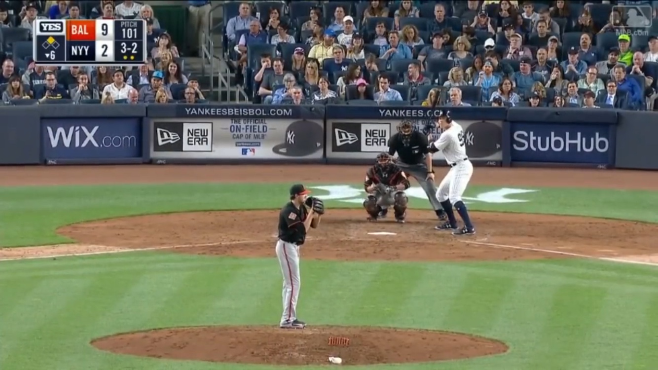
Travis focused on the bat path changes, but Judge hinted at another adjustment when he mentioned “getting into my lower half.” Let’s look at two screenshots of Judge’s stance (from videos here and here), one of his first career home run in 2016, and the other of his 2nd jack on April 28 of this year:

It’s impossible to know, but Judge’s great start could be attributed solely to his switching to the pants-up look. Comfort and breathability can go a long way towards improved performance; just ask George Costanza.

Uniform changes notwithstanding, look closely at the differences in Judge’s setups. The first picture shows Judge more upright. Not only are his legs fairly straight, but his torso is more erect, as well. The stance from the bottom picture is noticeably lower, with increased bend in the knees and a slight upper-body lean over the plate, maintaining a similar balance. As he said in spring training, Judge is more in his lower half.

One effect this change may bring is a smaller strike zone. One of the concerns with Judge as a prospect was, ironically, that his enormous 6′ 7″ frame would create a strike zone too large for him to consistently control. Judge seems to have addressed this issue slightly by getting lower in his stance, thus decreasing the area above the plate he is responsible for. Kris Bryant is another big guy (6′ 5″) who noticeably crouches in his stance, albeit for different reasons.

Judge has gotten lower in his setup, sure, but what really matters is how he looks as he is about to enter the hitting zone. Let’s look at he top of his leg kick and plant:

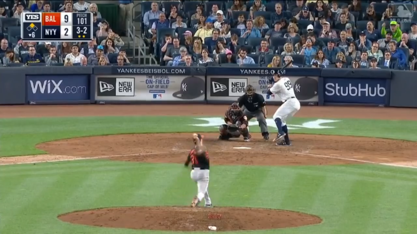
Look at the height of the leg kick. Judge has made his kick much smaller this year, and while that would usually result in a slight loss of power, something tells me he has enough in reserve to make that trade-off.

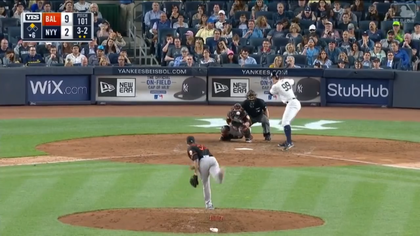
When the foot lands, he gets to similar positions both years. To my eye, he has a little more knee bend this year, and his lean over the plate is slightly increased, creating a smaller strike zone as he is about to launch.

The results of all these changes have been staggering. Judge has increased his Contact% from 59.7% to 71.5%, with nearly all of that improvement coming in the zone (Z-Contact% improved from 74.3% to 85.0%, while O-Contact% improved from 40.7% to 41.0%). He is swinging in the zone more, chasing less, and has decreased his whiff rate. All together, this means more contact, and more balls put in play really, really hard.

Aaron Judge Plate Discipline
2016 2017 Change
O-Swing% 34.9% 22.5% -12.4%
Z-Swing% 59.7% 65.4% 5.7%
O-Contact% 40.7% 41.2% 0.5%
Z-Contact% 74.3% 85.0% 10.7%
Contact% 59.7% 71.5% 11.8%
SwStr% 18.1% 11.8% -6.3%
K% 44.2% 28.3% -15.9%

To be clear, I am not suggesting that getting lower in the setup triggered some breakthrough for Judge that allowed him to miss less. When players tinker with their swings, it is seldom one big change that unlocks massive potential, but rather a series of smaller adjustments that work in tandem and add up to improvements. Think about Eric Thames, who not only worked on meditation, visualization, and tracking when struck with boredom in his apartment, but also greatly improved his flexibility. For Judge, getting lower in the stance did make the strike zone smaller when he was about to swing. It also decreased the amount of head movement he had as the ball was in flight. Judge’s head noticeably lowers from stance to plant in the screenshots from 2016, but there is virtually no movement in 2017. A stable head makes it easier to track a moving baseball. The smaller leg kick contributes to the improved head stability, and the increased simplicity makes it easier for Judge to be on time. All of that, in addition to an improved swing path that stays on plane with the ball longer, led to more contact.

It will be interesting to see where the league goes from here regarding Judge. He has made his adjustment, and now it is up to pitchers to start attacking him differently. My guess is that pitchers will start throwing him fastballs up and in off the plate to prevent him from extending his gargantuan biceps, and A LOT of soft stuff away. Hard in, soft away; innovative, right? The problem, as Jeff Sullivan has noted, is that Judge is so otherworldly strong that he can get beat in off the plate and still inside-out a home run the other way. Someone will figure Judge out and adjust. Judge will struggle, then adjust, as he has shown he will do at every level of pro ball he’s been at.


Let’s Get the Twins to the World Series

Imagine for a second that MLB Commissioner Rob Manfred has gone senile. I know that’s a ridiculous premise, and this is sure to be a ridiculous post, but bear with me. Commissioner Manfred, perhaps after a long night of choice MLB-sponsored adult beverages, has placed the Minnesota Twins in the playoffs. Yes, the same Twins of the .364 win percentage and facial hair promotional days. What is the probability that they make or win the World Series? For simplicity, let’s say they take the place of both AL Wild Card teams and are just inserted into the divisional playoffs.

We are going to look at a bunch of ways of estimating the probability the Twins win a five-game series or a seven-game series, then multiply our results accordingly to find an estimate for the team reaching each round. We’ll start simply, and gradually progress to more complicated methods of estimation. Let’s start as simply as possible, then, and use the Twins’ .364 win percentage.  The probability of the Twins winning a five-game series (at least three out of five games) is 25.7%. The same process gives them a 22.4% chance of winning a seven-game series. Multiplying these out gives the Twins a 5.8% chance of reaching the World Series (roughly 1 in 17) and a 1.3% chance of winning it. For reference, those are nearly the same odds FanGraphs gave the Mets of reaching/winning the World Series on October 2nd. Of course, those Mets also had to get through the Wild Card round (and the greatest frat boy to ever pitch a playoff game), but failed to do so.

Okay, so maybe you didn’t like that method because we included the Twins’ entire regular season, instead of just including games against playoff teams. Noted, but just understand that the Twins had basically the same win percentage against playoff teams (.365) as their overall percentage. Just to note, I defined playoff teams as the six division winners plus the four wild card teams. Using the Twins’ percentage against playoff teams yields identical probabilities as above.

How else can we attack this problem? Well, the Twins played 162 games this year, which means they have 158 different five-game stretches and 156 seven-game stretches. Over all those five-game rolling “series”, the Twins won at least three games 24.1% of the time, and they won at least four games in 25% of their seven-game tilts. Multiplying those figures out gives them a 6% chance of reaching the World Series and a 1.5% chance of becoming world champs.

Again, those numbers are unsatisfying because they include all teams, not just the playoff teams. However, removing the non-playoff teams leaves us with a bit of a sample issue because they played 52 games against playoff teams. So, let’s change the problem slightly: what is the probability that a last-place team can reach, and win, the World Series? The teams I’ll be considering all finished in last in their respective divisions: Twins, Athletics, Rays, Braves, Reds, and Padres. Cumulatively, these teams had a win percentage of .412, won 37.4% of their games against playoff teams, won at least three games in 30.6% of their five-game stretches, and won at least four out of seven 29.9% of the time. You can multiply these percentages out and get some answers.

I’m still not satisfied, so there is one more tool I’m gonna break out: a bootstrap simulation. Bootstrapping basically means sampling with replacement, which means every time I randomly choose a game from the sample, that game is thrown back in and has the same exact chance of getting picked again. This resampling with replacement process gives the bootstrap some pretty useful properties that I won’t get into here, but you can check here for more info.

I’m going to put all the games the last-place teams played against playoff teams into a pile. I’m going to randomly sample five games from that pile, with replacement, and count how many games were wins. I’m going to do this 100,000 times. I will then divide the number of samples that included at least three wins by the total number of samples, giving me an estimated probability of these last-place teams winning a five-game series against a playoff team. I will repeat this process for a seven-game series.

The bootstrap probability of a last-place team winning a five-game series against a playoff team was 27%. The probability of them winning a seven-game series was 24%. They have a 6.5% chance of reaching the World Series and 1.6% chance of winning it.

Honestly, these probabilities are lower than I expected. I have believed in and learned to embrace the randomness of the MLB postseason. I went into this post expecting the outcome to highlight just how random the postseason really is, even absurdly so. However, the randomness of the postseason really depends on the extremely small differences between all the teams at the top, so inserting teams from the very bottom of the league introduces a level of certainty that would be new to the playoffs. However, imagine repeating a similar exercise for the NFL or NBA. The 27% or so chance I’d give the Twins of advancing seems much higher than the probability of, say, the Cleveland Browns winning a playoff game if inserted into the postseason.

My methodology was clearly very simple, but intentionally so. I gave no acknowledgement to a home-field advantage adjustment, and I looked only at the team’s W-L record. A more complex method could have taken into consideration Pythagorean Expectation or BaseRuns.

This was a ridiculous post and ultimately a meaningless exercise. The Twins probably couldn’t reach the World Series if they were placed in the playoffs, but I’ll point out that as of this writing (October 10th during Game 3 of Nationals-Dodgers) the Cubs also probably won’t reach the World Series. Baseball is a weird and wonderful sport, and the postseason is the weirdest and most wonderful time of the year. If the Twins could conceivably reach the World Series as currently constructed, don’t think too hard about what’s happening and just enjoy.


The Year-to-Year Consistency of Contact Quality: Pitchers

A few months ago, I read an article on FiveThirtyEight by Rob Arthur about a pitcher’s ability to suppress hard contact. One of his conclusions was that some pitchers are better at limiting hard contact than others. This makes good sense, and we can see that suppressed contact in guys like Johnny Cueto and Chris Young. He used the Statcast dataset to find, in MPH, how much faster or slower, on average, a ball would come off the bat from a given pitcher. While the Statcast dataset is still a work in progress, and the metrics may not be super reliable at the moment, the basic idea that pitchers can suppress contact quality, and therefore hits, remains.

That’s all fine, but these statistics would only be useful if they are predictive. I want to see if contact quality is consistent from year to year. I went back through the FanGraphs leaderboards and pulled pitcher seasons from 2010-2014 with at least 200 balls in play. I chose 2010 as the start year because it was the first season Baseball Info Solutions (BIS) used an algorithm to determine contact quality, instead of the video scouts’ judgments. I wanted to see how the Hard% compared from one year to the next, so I took the 20 best and 20 worst pitchers by the metric in each year and matched them with the next year’s data.

Now, since I used a 200 ball in play cutoff, some of the top 20 for a given year did not qualify for the next year, so I only used pitcher seasons that qualified in consecutive years. I did the same thing for Soft%, but not Med%, as nobody cares about who gave up the least medium contact. I had to do all this relative to the league average in that season because league average changed drastically each year (league average Soft% was .1716 in 2010 and .2417 in 2011 for pitchers in my sample). Starting with Soft%:

Year AVG Top 20 Diff Top 20 Next AVG Next Diff Next Change
2010 0.1716 0.2201 0.0485 0.2474 0.2417 0.0057 -0.0428
2011 0.2417 0.2905 0.0488 0.1677 0.1565 0.0112 -0.0376
2012 0.1565 0.1956 0.0391 0.1591 0.1499 0.0092 -0.0299
2013 0.1499 0.1877 0.0378 0.1926 0.1810 0.0116 -0.0262
Total 0.1799 0.2235 0.0436 0.1917 0.1823 0.0094 -0.0341
Year AVG Bot 20 Diff Bot 20 Next AVG Next Diff Next Change
2010 0.1716 0.1318 -0.0398 0.2344 0.2417 -0.0073 0.0325
2011 0.2417 0.2019 -0.0398 0.1549 0.1565 -0.0016 0.0382
2012 0.1565 0.1189 -0.0376 0.1364 0.1499 -0.0135 0.0241
2013 0.1499 0.1140 -0.0359 0.1818 0.1810 0.0008 0.0367
Total 0.1799 0.1417 -0.0383 0.1769 0.1823 -0.0054 0.0329

This table is not the easiest to read because, but the columns to focus on in each table are Diff, Diff Next, and Change. Diff is the difference between the Top/Bot 20 average and the league average for that year. Diff Next is the difference between how those same pitchers perform the next year and the league average for next year, and Change is the difference between Diff and Diff Next.

On average, the top 20 pitchers by Soft% had a Diff of .0436 in year one, and .0094 in year two. In other words, they generated 24.2% more soft contact than average in year 1, and only 5.1% more the next year. Similarly, the bottom 20 pitchers generated 21.3% less soft contact in the first year and 3.0% less the next year.

Here are the same results for Hard%:

Year AVG Bot 20 Diff Bot 20 Next AVG Next Diff Next Change
2010 0.3033 0.3462 0.0429 0.2523 0.2465 0.0058 -0.0371
2011 0.2465 0.2853 0.0388 0.2907 0.2858 0.0049 -0.0339
2012 0.2858 0.3282 0.0424 0.3136 0.3066 0.0070 -0.0354
2013 0.3066 0.3530 0.0464 0.3095 0.2917 0.0178 -0.0286
Total 0.2856 0.3282 0.0426 0.2915 0.2827 0.0089 -0.0338
Year AVG Top 20 Diff Top 20 Next AVG Next Diff Next Change
2010 0.3033 0.2606 -0.0427 0.2346 0.2465 -0.0119 0.0308
2011 0.2465 0.1996 -0.0469 0.2692 0.2858 -0.0166 0.0303
2012 0.2858 0.2419 -0.0439 0.3013 0.3066 -0.0053 0.0386
2013 0.3066 0.2570 -0.0496 0.2820 0.2917 -0.0097 0.0399
Total 0.2856 0.2398 -0.0458 0.2718 0.2827 -0.0109 0.0349

The 20 pitchers who allowed the most hard contact allowed 14.9% more than average in year one, but only 3.1% more in year two. The 20 best pitchers by Hard% allowed 16.0% less than average one year and 3.9% less the next.

It is obvious that some regression should be expected for these over- and under-performers. For both metrics, the top and bottom 20 pitchers in one season come much closer to average the next. These quality-of-contact metrics are similar to BABIP in that they are highly volatile from year to year.

The numbers, however, don’t come all the way back to league average in year two. The top 20 pitchers stay slightly above average the next year, while the bottom 20 guys similarly stay slightly below average. This suggests, which is often the case, that a year of these highly variable quality of contact metrics can still carry some predictive value. It is hard to say just how much predictive power they have without knowing how much to regress someone’s Hard%, for example, given some number of balls in play.

While there is some predictive value in a season’s worth of batted-ball data, there isn’t much, so it’s hard to attribute an extremely high Soft% to talent. More likely, these metrics behave similarly to BABIP, in that one fortunate season is not enough to determine the talent level of a player. Batted-ball profiles and BABIP are closely connected, as hard-hit balls tend to fall for hits more often than softly-hit balls.

Groundballs, line drives, and fly balls also have their own expected BABIPs, so we could combine this entire batted-ball profile and come up with an expected BABIP for a pitcher, both within a season and for a career. While we know how many groundballs and how much soft contact a pitcher gives up, we don’t know how many soft groundballs a pitcher gives up. Ideally, we could classify each batted ball into flight type and speed. This is what Statcast tries to do with its launch angle and launch speed data, but that system still has a ways to go. For now, don’t put too much stock into a pitcher’s ability to suppress hard contact in a single season, the same way we don’t put too much stock into a pitcher’s low BABIP for the year.


The Best Predictors of Second-Half ERA

I play a lot of fantasy baseball and am always looking for an edge. When scouting possible waiver and trade pitching targets, I normally compare players’ ERA with his FIP and xFIP in order to find pitchers underperforming their peripherals, and are thus undervalued. This is a very common process among fantasy owners. But, when are the peripherals not indicative of future performance? Take, for example, Clay Buchholz, who had a 3.26 ERA but a far better 2.62 FIP through 113.1 innings before the All-Star break. Classic buy low candidate (which I did, and he has a 2.02 ERA in 75.2 IP since I added him on May 15th). However, Steamer has him as a 3.76 ERA/3.54 FIP pitcher, with far different walk and strikeout numbers than those he is currently putting up.

What numbers do I trust? What is the best predictor of second half performance? To answer, I went back and pulled first and second half splits for pitchers from 2010-2014, and kept only those who had the qualifying innings pitched in both halves, leaving 349 pitcher seasons. This methodology was inspired in large part by Jeff Sullivan’s research on team records. I found ERA, FIP, and xFIP for each half, and a Steamer projection for the entire season. Using this data, I found what correlated most with second half ERA. The results are below:

  • 1st Half ERA, 2nd Half ERA: .212
  • 1st Half FIP, 2nd Half ERA: .254
  • 1st Half xFIP, 2nd Half ERA: .307
  • Projected ERA, 2nd Half ERA: .315

This is about what I expected. First and second half ERA had a correlation of .21. As we know, no matter how variable ERA can be, an entire half of ERA can still tell us something about future performance, but it is by no means the best.

FIP had a correlation of .25, while xFIP had one of .30. FIP was always thought of as a retrospective statistic, which is why it is used in the calculation of WAR for pitchers, while xFIP is better for predictions. Both of these statistics perform better than first half ERA, which is a good sanity check for advanced metrics in general: they better out perform basic statistics.

The preseason projection, denoted by ERAp, performs the best, with a correlation of .31. The fact that 3 years of prior data is still better than half a year of present data shouldn’t be surprising, but it sort of is. I went into this exercise thinking xFIP would be the best predictor of the second half, but the preseason projections perform better. This result suggests in season improvements on K% and BB% should be taken with a grain of salt and regressed.

We would expect that some combination of the preseason projection and the updated numbers would perform really well. Fortunately, Steamer is constantly updating their projections and release Rest-of-Season numbers daily. Unfortunately, accessing ROS projections from the All-Star break since 2010 is beyond my coding know-how, so those numbers are unavailable.

We can estimate what those updated ROS projections might look like with a linear regression model. Regressing xFIP1 and ERAp on ERA2 provides the best correlation of .35 (this is the square root of the adjusted R-squared number the model spits out).

It’s amazing just how little we can predict. Our best guess only can account for about 30% of the variation in second half ERA. That’s nothing. This stuff is still really hard to predict.  Half a season of data just isn’t enough to go off of. But these are just the public stats. I always wonder what kind of numbers front offices use, and how much better (if at all) they perform. From a fantasy perspective, if you use this methodology enough, you should end up better off than the alternative. When it comes down to it, the updated rest of season projections should be better than just a single season xFIP number.