Archive for Research

Joint Model of the WAR Aging Curve

An aging curve illustrates how a performance changes throughout a career. It plays a crucial role in various fields of baseball, particularly in player evaluation and forecasting. While any performance measure could theoretically be the subject of an aging curve, we will focus on WAR hereafter. This is because WAR captures a player’s actual playing time. No player can help his team win while sitting at bench (or hospital).

Before we get into the technical stuff, let’s talk about what we pursue, or expect from an aging curve. I expect an aging curve to be the average trajectory of players. In other words, I expect a player to follow the trajectory over his career.

Keep in mind that this is not the same as simply the average WAR of all player-seasons at each age. That approach would be valid only if players started and ended their careers at the same ages. But that is not the case.

Consider this example: Imagine a league established in 2015 with two distinct groups. As of 2015, half of the batters are ordinary players in their age-20 seasons, while the other half are 30 but very talented. If we track these players until 2024 and average their player-season WAR by age, we’d get a curve spanning ages 20-39. But this curve does NOT represent a single player’s trajectory, since two parts of the curve (20-29 and 30-39) are constructed from whole different populations.

Below is the crude aging curve of batters, constructed by simply averaging each batter-season WAR by age. I looked at the player-seasons of the Statcast era (2015-present, excluding 2020), and includes all primary position non-pitcher players with at least one plate appearance. To keep the sample size reasonable, I only looked at players 21-35 years old.

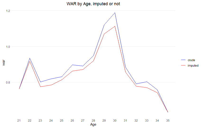
In this injury-epidemic era, not being hurt is getting increasingly important. To account for this, I imputed a WAR of zero for a player who missed an entire season if he has a record in the majors both before that missed season AND after that missed season.

Take Fernando Tatis Jr. as an example. He missed all of 2022 due to injuries and his PED suspension, and because he played both before and after 2022 (2019-21, 2023-24), I counted his 2022 WAR as zero. (This is a small bonus of using WAR. We can easily impute zero to these seasons. With other stats like wRC+, picking a value to fill in would be much trickier.)

In this crude model, players peak at age 30 with a WAR of 1.2. This might look different from aging curves you’ve seen before.

The point of this is to account for the fact that players debut and retire at different ages. Previous research tackled this by looking at WAR differences between consecutive seasons for individual players. Here’s how it works: Take Shin-Soo Choo, who posted 0.5 WAR at age 33 and 0.3 WAR at age 34. That -0.2 WAR difference becomes one data point for the age 33-to-34 change. In contrast, Félix Hernández’s final season came at age 33, so we do not use his data to calculate 33-to-34 difference. This way, we’re comparing players to themselves, using the same group of players for each year-to-year change. (Note that the mean of differences is the same as the difference of means, if the population is fixed.)

This “difference method” helps with the population mix problem, but it’s not perfect. We run into trouble when comparing changes across multiple years because we’re dealing with different groups of players. Let’s say we use 100 players to find the average WAR change from age 33 to 34. When we look at the change from 34 to 35, we’re working with a different group – not even necessarily a subset of those original 100 players.

This all comes back to players starting and ending their careers at different times. If everyone played from the same age to the same age, we’d have consistent groups to compare. Even with varied career lengths, it would work if retirement and debut ages were totally random – like if they were decided by flipping a coin rather than being tied to how well a player performs. But that’s not how baseball works – performance definitely affects how long players stay in the league.

Let’s try a different approach to building an aging curve. Instead of just averaging WAR (or difference of WAR) by age, we’ll use what is called a mixed effects model. This is great for our purposes because it can handle a correlation problem: A player’s performance in one season tends to relate to his performance in other seasons. For example, Choo’s WAR at age 33 is definitely related to his WAR at age 34, but not related to the 3.1 WAR Nolan Arenado put up last season at age 33. Assuming the quadratic curve of WAR by age, I fitted a model like this:

WAR_i = β0 + β1age + β2age^2 + b0i + b1iage

The subscript ‘i’ represents a player. The model has two parts for each player:

Part 1: b0i is called “random intercept” and represents how much a player i is departed from the average player.

Part 2: b1i is called “random slope” and represents how much a player i’s rate of change by age is different from the average player.

But usually, those “random effects” are not of primary interest and considered to have a mean of 0. What we really want is the average trend. That comes from the β values, which turned out to be: β0 = -15.46, β1 = 1.20, and β2 = -0.02. I plotted these values to create the aging curve below. Note that I used a different color for ages above 35 since those are not based on the data, but extrapolated by the model.

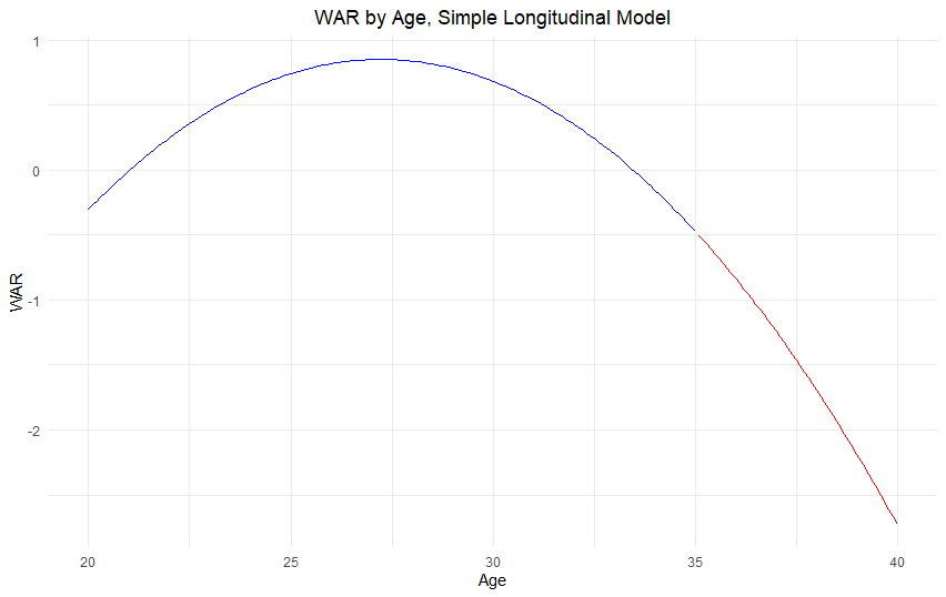
Using this model, we find players peak at age 27.2 – three years earlier than what our crude model suggests. But we’re still running into the same issue we had with the difference method: survivor bias.

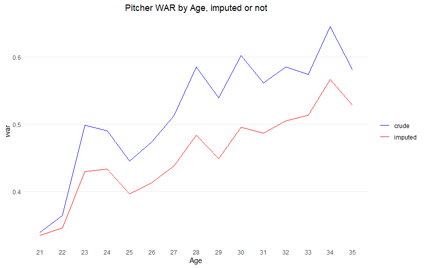
The players who stick around into their mid-30s aren’t your average players – they’re usually the most talented ones who can still perform at a high level. So when we look at the numbers for older ages, we’re really just looking at the success stories, which makes our estimates too optimistic. This is well illustrated by the pitchers. If we draw a crude WAR average graph, it has a peak at age 34! (For pitchers, any player of primary position pitcher, with at least one total batter faced was included in the study.)

Previous studies tried to handle this bias by making educated guesses about what players would have done if they hadn’t retired early. For example, if a player retired at 34, researchers would estimate what his WAR might have been at 35 and include that in the analysis.

But there’s another approach: using what’s called a joint model. As the name suggests, this combines two different models: 1) A longitudinal model that tracks how WAR changes with age, and 2) A survival model that looks at how WAR affects when players retire.

Instead of just looking at how players age OR just looking at who stays in the league, we’re considering both at the same time. This gives us a much more complete picture of player aging.

I’ll omit the technical details. I used an R package called JMBayes. Below you can see how this joint model compares to our simpler naïve model.

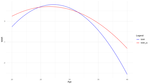
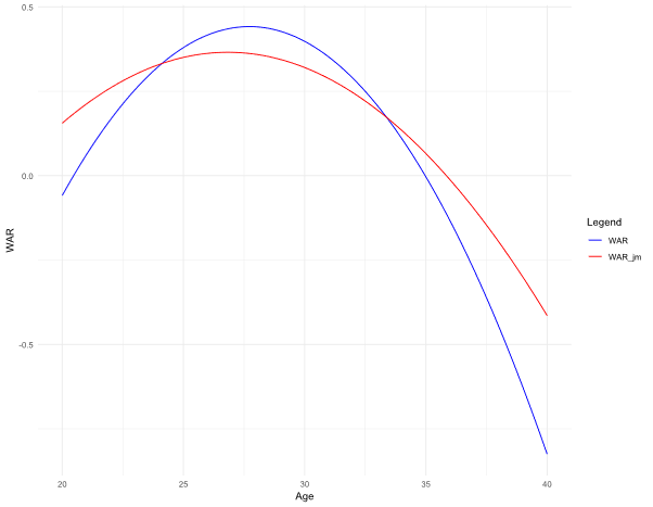
The blue curve is the naïve model, and the red curve is the joint model. The peak of batter is at age 26.5 in the joint model, approximately 0.7 years earlier than the one by the naïve model. Below are the curves for pitchers. The peak was at 26.8 in the joint model, 0.9 years earlier than the peak at the naïve model (27.7). (Just remember that any values shown beyond age 35 are projections based on our model, not actual data.)

This is all I want to introduce.

But one more thing. Should we adjust for the survivor bias at all?

The answer depends on what you’re trying to figure out. Let’s look at two common scenarios:

Scenario #1: If you’re trying to predict how a 34-year-old free agent pitcher will perform this year, the unadjusted difference method works just fine. After all, this pitcher is still in the league, so we know he has “survived” to this point.

Scenario #2: But if you’re projecting a 20-year-old prospect’s career path, you definitely want to use the adjusted model. Here’s why: The unadjusted aging curve is actually showing you two different things. The data for players in their 30s only includes the most talented players who stuck around, while the data for players in their 20s includes pretty much everybody who made it to the majors. So you end up with a curve that doesn’t truly represent either group – it’s not showing you the path of an average player OR the path of a star player.

One final note about the difference method that’s easy to misinterpret: When it shows something like “WAR decreases by 0.3 between ages 34 and 35,” that’s what statisticians call a conditional difference. This means “IF a player is good enough to still be playing at both age 34 AND age 35, he typically declines by 0.3 WAR.” It’s not telling you about all players who reached age 34 — just the ones who kept playing through 35.


Does Consistent Messaging Impact Pitcher Performance?

Wendell Cruz-Imagn Images

Editor’s Note: A version of this post was first published on Liam Delehanty’s personal blog on Medium.com.

As someone whose playing career fizzled out after high school, the realm of scouting and player development is one that has always drawn my interest. With the tools that MLB organizations and third-party facilities like Driveline and Tread Athletics utilize, it is easier than ever for players look at their unique biomechanical profiles, identify areas of improvement, and optimize everything from their spin rates and movement profiles to their throwing workloads. Despite the ability to objectively evaluate such a wide range of player traits, drafting and development remains an inexact science, with 26% of signed draftees between 2012–2019 reaching the majors, and only 3% of drafted players contributing more than 5 WAR with team that drafted them. (For reference, Dillon Gee generated 5.0 WAR over the course of his MLB career.) What gives players the ability to reach or exceed their potential? What makes certain organizations (Astros, Dodgers, Rays) more likely to develop major league contributors, while others consistently struggle to do so?

In recent years, organizations have made more concerted efforts to bridge the gap between analytics and traditional coaching, with former players like Brian Bannister serving as conduits between the front office and on-field staff. Bannister described much of his role as VP of Pitching Development with the Red Sox as “…during a bullpen session, holding my phone and showing it to a pitcher, showing him what the data says and then telling him why I think he should make an adjustment and backing it up on the spot.” Despite the industry shift toward a more player-friendly deployment of data, Driveline’s Kyle Boddy believes “player development departments are still highly fractured — there is strong resistance in most organizations to unify under a data-driven message.”

Motivated by my interest in the field and a Saberseminar presentation in 2023 by Katie Krall, which emphasized organizational efforts to fight “stereo coaching” and deliver a consistent message around a player’s development plan to all levels of the organization, I am examining if it is possible to find a link between organizational consistency and performance relative to projections. This study formed the basis of my 2024 Saberseminar presentation, titled “Consistency is Key? Examining Pitcher Arsenals Across Organizations.”

Org Level

Given publicly available data, I decided to use pitch arsenals as a proxy, as Statcast added Triple-A pitch-level data in 2023. Pulling team-level statistics and differentiating by pitch type percentage, we can get an overview of which organizations had the closest alignment in pitch arsenals across Triple-A and MLB.

From the data above, we can see that the Giants, Nationals, and Marlins saw the greatest overall difference in arsenals across Triple-A and MLB, while the Braves, Mets, and Orioles had the most consistency across levels. Did this impact how the staff performed relative to projections? To examine this, I pulled year-end individual statistics for the 2023 season, and compared them to preseason PECOTA projections, grouped by team. I then calculated correlations between the delta in pitch category and average difference in actual ERA, FIP, WHIP, and DRA vs. projections by team, then further broke out the data into plots for WHIP and DRA, the two metrics with the (relatively) strongest correlations:

While all of these correlations range from weak to nonexistent, the inverse nature of the correlations suggests there may be a small relationship between greater variance in arsenals across levels, and better performance compared to preseason projections. While a variety of other factors can play into this, it aligns with the idea that the most successful organizations are not those that necessarily preach one message across levels, but can identify and implement tweaks throughout the season.

If we are able to get more granular with these data, can we identify a more solid relationship between arsenal variance and performance?

Player Level

As a next step, we will be looking at a subset of players who spent significant time in Triple-A and MLB to see if there is a stronger relationship between individual arsenal variance and performance. Using Python, I gathered a list of pitchers who had thrown at least 100 pitches in both Triple-A and MLB during the 2023 season. (Apologies to the Alex Wood lovers, he fell one Triple-A pitch short of making the dataset.) With a group of 395 pitchers, I calculated the pitch percentage difference for each pitch category (fastball, offspeed, breaking, other) in a player’s arsenal by taking the absolute difference of pitch percentages of each pitch category in Triple-A and in MLB and calculating a total and average difference. For example, Logan Allen’s 2023 season broke down to a 14.35% total arsenal difference and a 3.59% mean arsenal difference.

Across the entire dataset, the median of all Total % Difference is 13.44% and the Average % Difference is 3.36%.

Performance vs. Projections

To measure if a smaller variance in arsenal aligned with stronger performance relative to projections, I pulled statistics from 2023, and compared them to Baseball Prospectus’ 50th Percentile PECOTA projections for each player, focusing on ERA, FIP, WHIP, and DRA. For both the total and average pitch percentage differences, our correlations ranged from incredibly weak to nonexistent. Total and Average % Difference were perfectly correlated, as evidenced below. The results show that these correlations were even weaker than those found at the organization level.

A Sample: Organizational Philosophy in Player Acquisition

Finally, let’s look at three organizations with notable philosophies or histories of pitching development, to see what we could glean from the types of players they acquire and subsequent tweaks to pitcher arsenals. First, we’ll start with the Red Sox, for their anti-fastball approach. Then, we’ll go to the Yankees, due to their history of developing pitchers both internally, Luis Gil for example, and those acquired externally, like Clay Holmes. Lastly, we will look at the Dodgers, as their decade-long run of success has been sustained by their ability to, in the words of Noah Syndergaard, “turn everything they touch into gold.”

For this portion, I looked at players acquired by these three organizations between May 1 and August 1 of 2024. This range was selected to exclude any offseason arsenal tweaks that the pitchers may have made, and to isolate changes to those that can be attributed directly to the shift in organizations. While this is a relatively small sample size, certain trends do begin to emerge:

The Red Sox tend to acquire pitchers with four-seam fastball usage roughly at league average, and, true to form, reduce that number drastically to 19%. This difference is made up through more than doubling usage of the cutter, while also increasing the frequency of the sinker.

Unlike their AL East rivals, the Yankees employ a different tact — acquiring pitchers with lower four-seam usage relative to league average, and increasing that along with slider percentage — encouraging their acquisitions to lean on higher-velocity offerings, while decreasing the overall usage of breaking and offspeed pitches.

Over on the West Coast, the Dodgers have acquired pitchers who are heavily four-seam dependent (driven by Michael Kopech’s MLB-leading 79.1% four-seam usage) and encouraged a more diverse pitch mix, boosting sinker usage by almost 5 times, and adding one of the league’s two screwballers in Brent Honeywell.

What Can We Take From This?

In short, this analysis shows us that there is no meaningful relationship between arsenal consistency across levels and performance relative to projections at either the organization or individual player level within the same season. What we can deduce from this is that organizational philosophies can be discerned from a player acquisition level, and this can be used to identify pitchers who may be able to unlock another level of performance if they are put in the right situation. For example, the Red Sox maximize usage of a pitcher’s secondary offerings, which can cover up a poor fastball, while the Yankees seek out pitchers who could stand to benefit from leaning on their pure velocity and stuff to boost the fastball/slider combo.

Additionally, there are many more avenues that can be explored in this area. Is there an even smaller subset of players that should be considered? Can we focus on performance across specific pitch types? Would performance across seasons be more telling? Are there other proxies that would work better than pitch arsenals?

Fundamentally, what makes this such an inexact science is the fact that it’s difficult to measure! Even if there is not publicly available player performance data to back up the notion, entire industries in the business world have been built around ‘breaking down silos’ within organizations, and there is no reason why baseball should be an outlier in that regard.


Starting Pitchers Aren’t Leaning On Their Best Pitches

Nathan Ray Seebeck / USA TODAY Sports

The title of this post does not exactly mince words. Should that be all the context you need (TL;DR), it would be fair to move on. However, for those looking for a greater explanation, qualifications and nuance abound in what follows as justification for such a statement.

The impetus for doing some digging and eventually choosing this topic (and title) is pretty simple; I wondered whether starting pitchers, over the course of a long season, throw their best pitches more often than their less effective pitches.

Starters were the focus for a reason. Relievers, who most often face mere subsets of an opposing lineup (and face that subset crucially just once) in any given outing, are likely more inclined to defer to their strongest offerings at higher rates. Starting pitchers, meanwhile, often have to grapple with the phenomenon of diminishing returns on pitch usage. Should an opposing hitter see that “best” pitch over and over, what made it effective in the first place loses some of its value to a hitter’s heightened recognition. Starting pitchers, it turns out, probably should practice some moderation.

Read the rest of this entry »


The Last Solo Umpire

Kyle Terada / USA TODAY Sports

July 11, 1923, was a sunny, seasonal day in Philadelphia. As National League umpires, Ernie Quiqley and Cy Pfirman were accustomed to living out of a suitcase and spending nights and game days in Philadelphia, Brooklyn, Manhattan, Boston, Pittsburgh, Cincinnati, Chicago, and St. Louis. Quigley had been at this for more than a decade, starting his NL career in 1913; the first of the day’s games was the 146th that he’d umpired in Philadelphia. And while it was only Pfirman’s second season, he’d already worked 24 Phillies home games. On this day they were going to work a doubleheader, which was unusual but not extraordinary for a Wednesday, as the Cincinnati Reds were in town to play their regularly scheduled game followed by a makeup of the May 15th tilt that had been rained out.

The two umpires had been paired up since the season started on April 17th, having worked 70 games together over the first 85 days. As the more veteran member, Quigley was clearly the “chief.” Of those 70 games, he had been the home plate umpire in 68, even presiding over the plate in both ends of five doubleheaders. That’s how it had worked with Major League umpires since professional baseball started. In the early days, a single umpire worked most games. 1909 was the first NL season that had more games worked with two umpires than one, 442 games to 179. By 1910, the single-ump game had nearly been eliminated altogether, with less than 10 such games every year. Most of those rare solo games were necessitated by travel constraints — it was hard to get a person from far-flung St. Louis after a game to the east coast for another game the next day. Prior to 1923, there hadn’t been a game worked by only one umpire since 1917. In fact, the NL had begun incorporating three umpires into games occasionally in 1917.

Read the rest of this entry »

What Makes a Good Four-Seamer Good?

There used to be a lot of debate about the four-seam fastball and the relationship of velocity, vertical movement, and spin rate. But now there is a new concept called Vertical Approach Angle (VAA) that includes the height of the release and the height of the pitch’s path. With that in mind, let’s think again about what is needed for a good four-seam fastball.

Cross-Tabulating To Determine the Impact of Each Element

A cross-tabulation was performed for four-seamers thrown in MLB from 2017-2021, with velocity ticked to 4 km/h, vertical movement ticked to 7.5 cm, release height ticked to 10 cm, and plate height ticked to 15 cm. Each element was tabulated and color-scaled with the MLB average as the middle value in white, good values for pitchers in red, and bad values in blue. The indicators are Whiff%, xwOBAcon, and xPV/100 (expected Pitch Value per 100 pitches, which I wrote about here). Read the rest of this entry »


Are Hitters Hitting It Where It’s Being Pitched?

If you watch basebll games, which you probably do if you find yourself reading this, then you’re likely familiar with announcers employing phrases like “he just went with it,” or “hit it where it was pitched.” These phrases suggest hitters have made contact with the baseball such that outside pitches are hit to the opposite field and pitches on the inner half are put in play to the hitter’s pull side.

These comments beg the question: are hitters “going with” the pitches they are thrown with any discernible frequency? In today’s game, wherein the value of tapping into pull power and raising average launch angles has been well established, are hitters still hitting it where it’s pitched? To what extent do team’s defensive alignments correspond to how their pitchers will approach any given hitter should that hitter go with pitches? Given that pitchers who throw higher in the zone more often allow fly ball contact and those who throw lower induce more groundballs, does something similar apply for hitters given how they are pitched on a horizontal plane, i.e. inside and outside? Read the rest of this entry »


A Peta Perspective on the Hot Stove So Far

Cold snowy days here in our nation’s capital, combined with the owners’ and players’ seeming determination to kill the golden goose, provides an opportunity for me to look at the hot stove (pre-lockout) through the lens of the Peta methodology. For those unfamiliar with the Peta methodology, I refer you to this deeper dive here on the Community Blog published last January. Based on Joe Peta’s groundbreaking 2013 book Trading Bases, the methodology derives each team’s upcoming season win-loss record based on the utilization of its previous season performance (runs scored/runs allowed), adjusted for cluster luck (my proxy is FG BaseRuns), and the team’s upcoming-season projected WAR.

Just before Opening Day, the product of this calculation is compared to the money line. Peta suggests that in a 162-game season, win totals produced by the model that deviate from the money line by more than four games (1.5 games in a 60- game season) represented “unrepeatable results” and therefore were worth a possible wager. Read the rest of this entry »


Modeling One-Run and Extra-Inning Games

When the 2021 regular season concluded, there was the following exchange in the “Hey Bill” section of the Bill James Online baseball community, with Bill’s response starting at “Answered:”

Hey Bill! 

 Is it possible to calculate an expected number of 1-run games for a team in a season? The reason I ask is that the Mets played in 66 1-run games this year, 40.7% of their games. That seems like a whopping big number . . . but is it? 

Thanks 

Kevin

Asked by: kgh

Answered: 10/4/2021

It’s a very large number, but I wouldn’t know how to calculate an expected number. I don’t even know what the variables would be. I suppose one-run games are slightly more common among teams which are near .500, and obviously they would be significantly more common in a low-run environment than in a high-run environment.

Inspired by this interaction, I built a dataset to answer those questions and a few more that popped up along the way. Let’s start with the easiest one:

The 2021 Mets played 66 one-run games, or 40.7% of their contests. Is that a whopping big number?

Yes, that is a big number, but not “whopping” big.

The Mets did play 66 one-run games, with 13 of those in extra-innings and 53 in “regulation.” They played 18 total extra-inning games. This gave them a total of 71 games that were decided by one run or in extra-innings. Several teams listed below played more one-run games than the Mets did in 2021. Read the rest of this entry »


No Pitch Is an Island: Pitch Prediction With Sequence-to-Sequence Deep Learning

One of the signature dishes of baseball-related machine learning is pitch prediction, whereby the analysis aims to predict what type of pitch will be thrown next in a game. The strategic advantages of knowing what a pitcher will throw beforehand are obvious due to the lengths teams go (both legal and illegal) to gain such information. Analysts that solve the issue through data have taken various approaches in the past, but here are some commonalities among them:

  • Supervised learning is incorporated with numerous variables (batter-handedness, count, inning, etc.) to fit models on training data, which are then used to make predictions on test data.
  • The models are fit on a pitcher-by-pitcher basis. That is, algorithms are applied to each pitcher individually to account for their unique tendencies and repertoire. Results are reported as an aggregate of all these individual models.
  • There is a minimum cut-off for the number of pitches thrown. In order for a pitcher’s work to be considered they must have crossed that threshold.

An example can be found here. The goal of this study is not to reproduce or match those strong results, but to introduce a new, natural-fitting ingredient that can improve on their limitations. The most constraining restriction in other works is the sample size requirement; by only including pitchers with substantial histories, the scope of the pitch prediction task is drastically reduced. We hope to produce a model capable of making predictions for all pitchers regardless of their individual sample size. Read the rest of this entry »


The Effect of Fastball Velocity on the Slider

I’ve heard it said in the past that a batter should take care of the pitcher’s fastball first and then deal with the breaking ball. If this is true, then the faster the pitcher’s fastball is, the more the batter needs to be aware of the fastball when at the plate. I want to look at how this affects the most popular pitch in baseball: the slider.

First I calculated the average velocity of each pitcher’s fastball for pitchers who threw at least 100 fastballs (FF, FT, SI) in each major league season from 2017-2021. Based on the calculated average fastball velocity, I divided the pitchers into three groups: 143-148 km/h, 148-153 km/h, and 153-158 km/h. I then further divided the groups according to the velocity and movement of the slider thrown in each.

Then I calculated the Run Value/100 for each group. Let’s start with the velocity group between 143 and 148 km/h (click to enlarge). Read the rest of this entry »