Joint Model of the WAR Aging Curve

An aging curve illustrates how a performance changes throughout a career. It plays a crucial role in various fields of baseball, particularly in player evaluation and forecasting. While any performance measure could theoretically be the subject of an aging curve, we will focus on WAR hereafter. This is because WAR captures a player’s actual playing time. No player can help his team win while sitting at bench (or hospital).
Before we get into the technical stuff, let’s talk about what we pursue, or expect from an aging curve. I expect an aging curve to be the average trajectory of players. In other words, I expect a player to follow the trajectory over his career.
Keep in mind that this is not the same as simply the average WAR of all player-seasons at each age. That approach would be valid only if players started and ended their careers at the same ages. But that is not the case.
Consider this example: Imagine a league established in 2015 with two distinct groups. As of 2015, half of the batters are ordinary players in their age-20 seasons, while the other half are 30 but very talented. If we track these players until 2024 and average their player-season WAR by age, we’d get a curve spanning ages 20-39. But this curve does NOT represent a single player’s trajectory, since two parts of the curve (20-29 and 30-39) are constructed from whole different populations.
Below is the crude aging curve of batters, constructed by simply averaging each batter-season WAR by age. I looked at the player-seasons of the Statcast era (2015-present, excluding 2020), and includes all primary position non-pitcher players with at least one plate appearance. To keep the sample size reasonable, I only looked at players 21-35 years old.
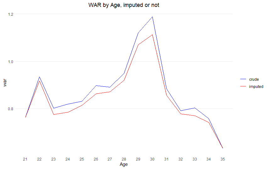
In this injury-epidemic era, not being hurt is getting increasingly important. To account for this, I imputed a WAR of zero for a player who missed an entire season if he has a record in the majors both before that missed season AND after that missed season.
Take Fernando Tatis Jr. as an example. He missed all of 2022 due to injuries and his PED suspension, and because he played both before and after 2022 (2019-21, 2023-24), I counted his 2022 WAR as zero. (This is a small bonus of using WAR. We can easily impute zero to these seasons. With other stats like wRC+, picking a value to fill in would be much trickier.)
In this crude model, players peak at age 30 with a WAR of 1.2. This might look different from aging curves you’ve seen before.
The point of this is to account for the fact that players debut and retire at different ages. Previous research tackled this by looking at WAR differences between consecutive seasons for individual players. Here’s how it works: Take Shin-Soo Choo, who posted 0.5 WAR at age 33 and 0.3 WAR at age 34. That -0.2 WAR difference becomes one data point for the age 33-to-34 change. In contrast, Félix Hernández’s final season came at age 33, so we do not use his data to calculate 33-to-34 difference. This way, we’re comparing players to themselves, using the same group of players for each year-to-year change. (Note that the mean of differences is the same as the difference of means, if the population is fixed.)
This “difference method” helps with the population mix problem, but it’s not perfect. We run into trouble when comparing changes across multiple years because we’re dealing with different groups of players. Let’s say we use 100 players to find the average WAR change from age 33 to 34. When we look at the change from 34 to 35, we’re working with a different group – not even necessarily a subset of those original 100 players.
This all comes back to players starting and ending their careers at different times. If everyone played from the same age to the same age, we’d have consistent groups to compare. Even with varied career lengths, it would work if retirement and debut ages were totally random – like if they were decided by flipping a coin rather than being tied to how well a player performs. But that’s not how baseball works – performance definitely affects how long players stay in the league.
Let’s try a different approach to building an aging curve. Instead of just averaging WAR (or difference of WAR) by age, we’ll use what is called a mixed effects model. This is great for our purposes because it can handle a correlation problem: A player’s performance in one season tends to relate to his performance in other seasons. For example, Choo’s WAR at age 33 is definitely related to his WAR at age 34, but not related to the 3.1 WAR Nolan Arenado put up last season at age 33. Assuming the quadratic curve of WAR by age, I fitted a model like this:
WAR_i = β0 + β1age + β2age^2 + b0i + b1iage
The subscript ‘i’ represents a player. The model has two parts for each player:
Part 1: b0i is called “random intercept” and represents how much a player i is departed from the average player.
Part 2: b1i is called “random slope” and represents how much a player i’s rate of change by age is different from the average player.
But usually, those “random effects” are not of primary interest and considered to have a mean of 0. What we really want is the average trend. That comes from the β values, which turned out to be: β0 = -15.46, β1 = 1.20, and β2 = -0.02. I plotted these values to create the aging curve below. Note that I used a different color for ages above 35 since those are not based on the data, but extrapolated by the model.
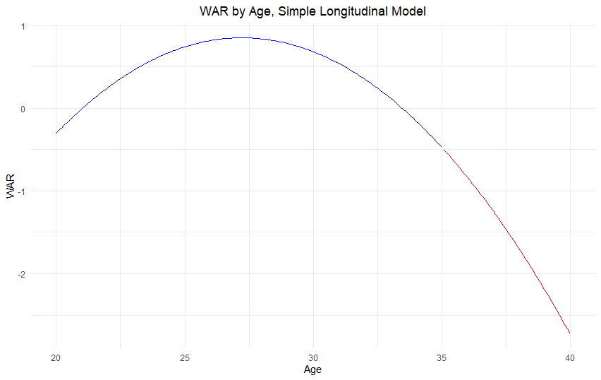
Using this model, we find players peak at age 27.2 – three years earlier than what our crude model suggests. But we’re still running into the same issue we had with the difference method: survivor bias.
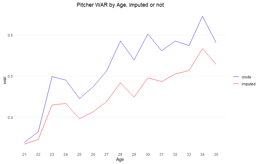
The players who stick around into their mid-30s aren’t your average players – they’re usually the most talented ones who can still perform at a high level. So when we look at the numbers for older ages, we’re really just looking at the success stories, which makes our estimates too optimistic. This is well illustrated by the pitchers. If we draw a crude WAR average graph, it has a peak at age 34! (For pitchers, any player of primary position pitcher, with at least one total batter faced was included in the study.)
Previous studies tried to handle this bias by making educated guesses about what players would have done if they hadn’t retired early. For example, if a player retired at 34, researchers would estimate what his WAR might have been at 35 and include that in the analysis.
But there’s another approach: using what’s called a joint model. As the name suggests, this combines two different models: 1) A longitudinal model that tracks how WAR changes with age, and 2) A survival model that looks at how WAR affects when players retire.
Instead of just looking at how players age OR just looking at who stays in the league, we’re considering both at the same time. This gives us a much more complete picture of player aging.
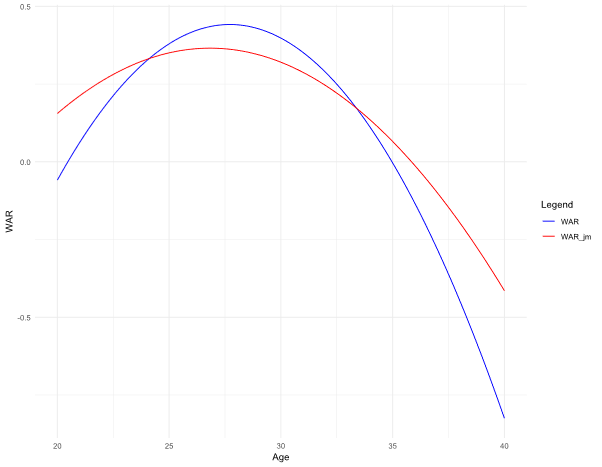
I’ll omit the technical details. I used an R package called JMBayes. Below you can see how this joint model compares to our simpler naïve model.
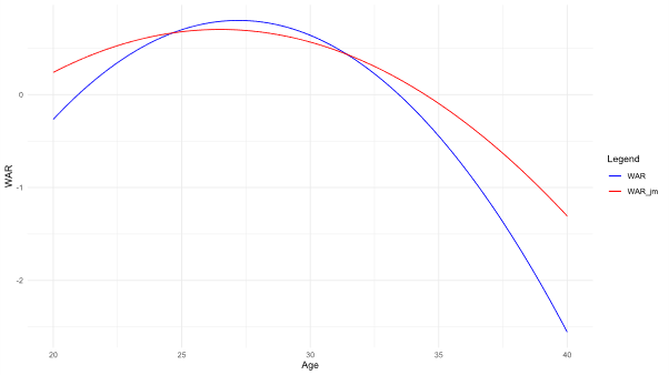
The blue curve is the naïve model, and the red curve is the joint model. The peak of batter is at age 26.5 in the joint model, approximately 0.7 years earlier than the one by the naïve model. Below are the curves for pitchers. The peak was at 26.8 in the joint model, 0.9 years earlier than the peak at the naïve model (27.7). (Just remember that any values shown beyond age 35 are projections based on our model, not actual data.)
This is all I want to introduce.
But one more thing. Should we adjust for the survivor bias at all?
The answer depends on what you’re trying to figure out. Let’s look at two common scenarios:
Scenario #1: If you’re trying to predict how a 34-year-old free agent pitcher will perform this year, the unadjusted difference method works just fine. After all, this pitcher is still in the league, so we know he has “survived” to this point.
Scenario #2: But if you’re projecting a 20-year-old prospect’s career path, you definitely want to use the adjusted model. Here’s why: The unadjusted aging curve is actually showing you two different things. The data for players in their 30s only includes the most talented players who stuck around, while the data for players in their 20s includes pretty much everybody who made it to the majors. So you end up with a curve that doesn’t truly represent either group – it’s not showing you the path of an average player OR the path of a star player.
One final note about the difference method that’s easy to misinterpret: When it shows something like “WAR decreases by 0.3 between ages 34 and 35,” that’s what statisticians call a conditional difference. This means “IF a player is good enough to still be playing at both age 34 AND age 35, he typically declines by 0.3 WAR.” It’s not telling you about all players who reached age 34 — just the ones who kept playing through 35.
Interesting post! Cool modeling methods I had not seen before.
Curious how the joint model connects final season WAR values and retirement, as especially over 30 I imagine there is a lot of overlap between players with middling WAR totals who do and do not retire for any number of reasons.
Thank you for your comment and question!
For the sake of the study, I considered every player who retired at ≥35 as retired at 35.
Those who have no record since age <35 as of 2024, are considered 'censored'. You may consider it as 'follow up loss'. Their record until 35 were failed to follow up, due to their inability to play in the big league.
Let me know if I misunderstood your question!
I like the idea behind this analysis! Teams/agents/players/fans can then choose the curve they think fits the player best.