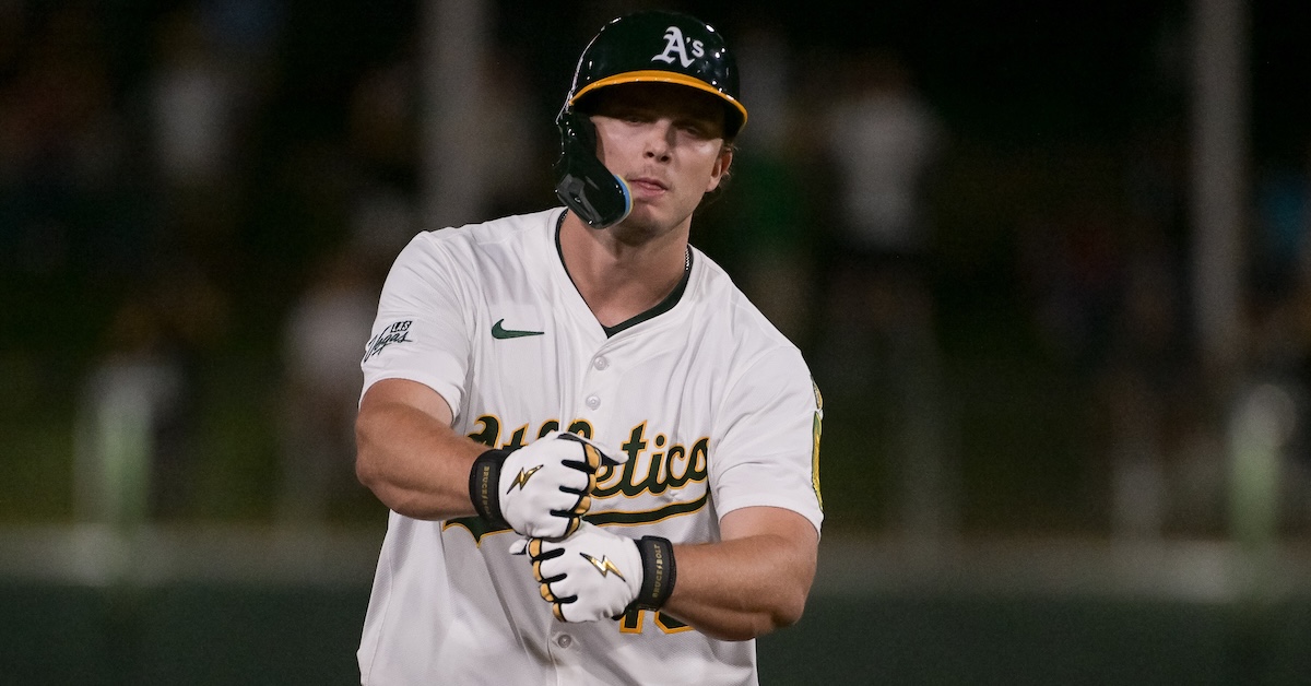
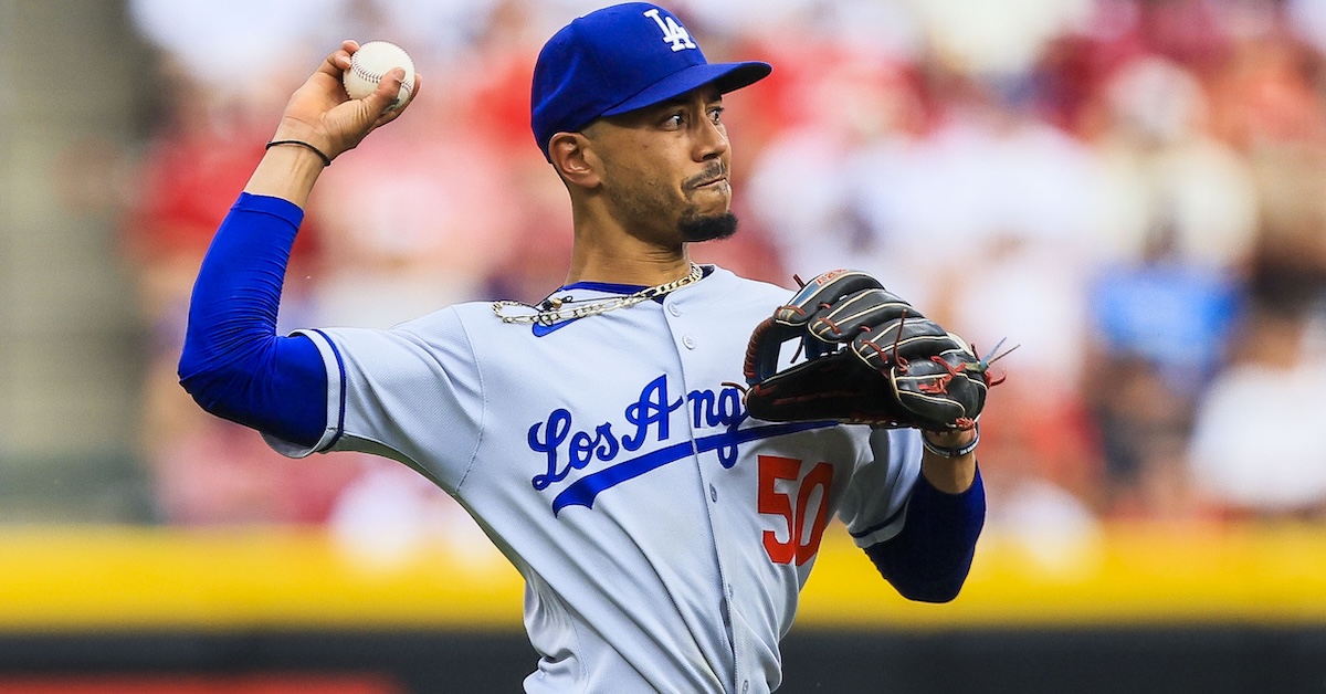
In 1889, Hall of Famer John Clarkson had one of the best pitching seasons ever by WAR. He won the Triple Crown with a 2.73 ERA, 284 strikeouts, and a win-loss record of 49-19. He also threw 620 innings, the most in the league and a total that represented more than half the combined workload of his team’s entire pitching staff. Although no one knew it at the time, his retroactively calculated ERA- was 64 and his FIP- was 82; both of those rates led the league among qualified pitchers. If the Cy Young award had existed in the National League at that time, he almost certainly would have been the recipient.
In 2025, Tarik Skubal had a dominant season. He didn’t repeat his Triple Crown achievement from 2024, but his ERA and strikeout numbers both improved from the prior year. His 195 1/3 innings were tied for fourth in the majors, and his 54 ERA- and 58 FIP- not only led among all qualified AL pitchers, but also significantly exceeded Clarkson’s 1889 performance. Skubal’s performance was more than good enough for him to win his second consecutive Cy Young award.
Clarkson’s pitching WAR was 10.9; Skubal’s was 6.6. Whose season did more to bolster his Hall of Fame case? Read the rest of this entry »
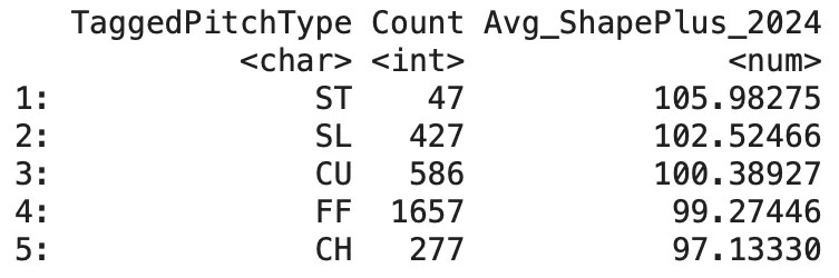
Last year, I finished Shape+ v1.0, my attempt at a novel approach to pitch modeling, and submitted it to the FanGraphs Community Blog. However, I have since identified several issues with the original framework. In short, v1.0 included a random effect for “PitcherID” — it allowed the model to implicitly learn pitcher identity and use it as a crutch when generating predictions.
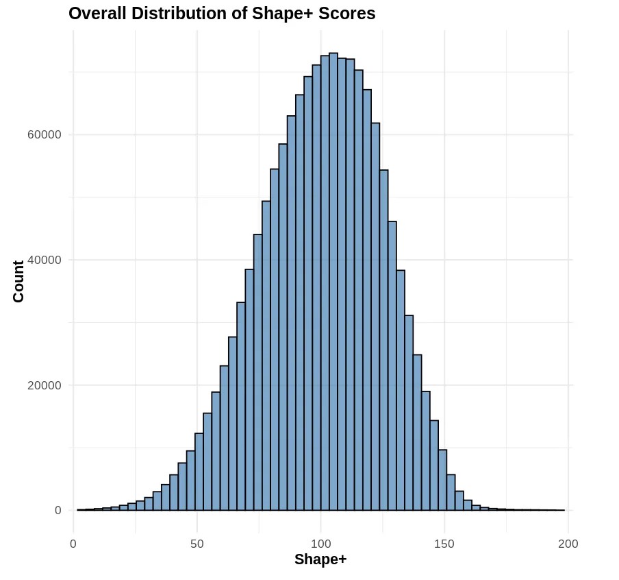
Instead of evaluating a pitch in a vacuum as I intended, the model would defer to the random effect, which has soaked up all information not explicitly coded into the models mixed effects. What’s more, the random effect also prevented the model from generalizing. If a pitcher was not included in the training data, it would not be assigned an intercept by the random effect, and therefore would not be scored. In an attempt to rectify this, I decided to try a different approach. Shape+ v2.0 is normally distributed, with 100 representing league-average pitch shape, and each 10-point increase representing one standard deviation. The new Shape+ remains a stable and sticky metric, exhibiting an R2 of 0.881 between 2024 and 2025 scores, and stabilizing after 50–80 pitches depending on the pitch type. Read the rest of this entry »
Would you rather have a guaranteed $140 million today or a chance at $1 billion six years from now? That very well may have been the decision facing Konnor Griffin earlier this month, and we know which path he chose.
The vast majority of us probably would have made the same decision as Griffin, who signed a nine-year, $140 million deal with the Pirates less than a week into his major league career. Lots of things can go wrong in six years that could eliminate that potential billion-dollar payout, let alone the many millions of dollars currently on the table. Griffin is far from the only young star in recent years to take the money. Bobby Witt Jr., Corbin Carroll, Julio Rodríguez, and fellow 2026 rookie Kevin McGonigle, among others, have made the same choice.
Still, Griffin’s combination of youth and ability set him up to be an even more attractive free agent target than any of the players who’ve signed early extensions in recent years. And had he not been so risk averse, he might have been worthy of baseball’s first 10-figure contract. How? It’s pretty simple, but far from easy. Just become the next Juan Soto.
Sure, comparing these two ballplayers makes little sense in some ways. Despite leading the National League in stolen bases in 2025, Soto is relatively slow. He also walks more than he strikes out, and is a defensively limited outfielder who is likely to shift to first base or designated hitter not too many years from now.
Griffin, on the other hand, is a top-tier speedster built like a football safety. He strikes out roughly twice as often as he walks, and is a reasonable bet to play shortstop for at least the first half of his career before perhaps sliding over to third base at some point in his 30s, not unlike Cal Ripken Jr. or Alex Rodriguez. (Hey, if we’re going to cite Soto, why not also invite comparisons to a first-ballot Hall of Famer and a guy with 696 home runs?)
Soto broke into the big leagues in 2018 at age 19, playing over two-thirds of the Washington Nationals’ game that season, reaching 494 plate appearances with a stellar .292/.406/.517 triple-slash line that overcame already weak defense to lead to 3.7 WAR.
He continued to pile up fantastic batting lines (and display poor glovework) during the next six seasons, spending three and a half more with the Nationals, then bouncing to the Padres for a year and a half and the Yankees in his walk year before becoming a free agent ahead of his age-26 season. If you consider his 116-game rookie campaign and the COVID-shortened 2020 as the equivalent of one season, Soto posted 36.6 WAR during what were essentially six full seasons prior to his pre-free agency tenure.
Betting on himself year after year (famously turning down a 15-year, $440 million offer from the Nats) allowed Soto to reach new benchmarks in arbitration, as he eventually hauled in over $80 million total before hitting the open market. And then Soto obliterated every prior free agent sports contract, signing with the New York Mets for the same 15-year term offered by Washington, but this time for $765 million. That was a $315 million winning bet, an incredibly savvy move by the precocious superstar.
That’s the rather straightforward benchmark for which Griffin needed to shoot. Stay healthy, compile a half-dozen 6-WAR seasons, and then sit back and wait for the gargantuan offers to come his way. So, how could he accumulate all of those 6-WAR seasons? Clearly, it’s a lofty expectation, but Griffin has a couple of immediate advantages that Soto lacked.
First, he’s a shortstop, while Soto is a corner outfielder, so the positional adjustment alone gains Griffin 15 runs, or roughly 1.5 WAR. On top of that inherent advantage, the fact is, Soto has never been a good fielder, averaging roughly -10 runs per year. Conversely, Griffin is viewed as an above-average defender, so +5 runs per season seems reasonable, doubling the defensive separation between the two players to 3.0 WAR.
Second, Soto has been a below-average baserunner in his career, averaging about -1.0 run per season. Meanwhile, Griffin has 70-grade speed and has achieved 98th-percentile sprint speed in early 2026 action. An average of 4.0 runs per year seems reasonable — conservative, even — and gives Griffin another 0.5 WAR edge on Soto. Given the significant variability of defensive and baserunning values, let’s tame our wild expectations somewhat by blending and smoothing those two advantages and yielding a 2.5-WAR edge for Griffin from those factors.
Building on that sizable head start achieved before stepping into the batter’s box, all Griffin would have to do is produce another 3.5 WAR per season with his bat. Shouldn’t be a problem, right? There are myriad of ways for hitters to be successful, but based on the type of player Griffin was in the minors, we can patch together an estimated batting line. We won’t use the projection systems stored at FanGraphs, which are designed to be conservative, and instead go with an approximation of what his ceiling could reasonably be over his first six seasons.
Griffin’s approach is unlikely to lead to the .400-plus on-base percentages that Soto posts, but his speed should allow him to get to first base often when he puts the ball in play. And at 6-foot-3 and 222 pounds, Griffin should also display significant power as he gains more big league experience. Indeed, the FanGraphs prospect analyst team of Eric Longenhagen, Brendan Gawlowski, and James Fegan gave Griffin future values of 70 for both his raw power and his game power when ranking him no. 1 on their preseason Top 100 Prospects list. (For what it’s worth, Eric Longenhagen and Kiley McDaniel assigned Soto a 60 FV for raw power and a 55 for game power when they evaluated him ahead of the 2018 season.) Again, we’re making a case for a massive payout, so let’s skew toward generosity and give Griffin a .280/.360/.490 triple-slash line on average for the six seasons, something akin to a Soto-Carroll mash-up, just on the infield dirt instead of the outfield grass. Offensive environment certainly matters, and in the reduced hitting environment of the last several seasons, those standout numbers should easily be worth at least 3.5 WAR per season.
Voila, we’ve done it! Somebody give Griffin one of those giant checks that lottery winners receive, because we’ve morphed him into the modern-day equivalent of turn-of-the-millennium A-Rod, another young superstar shortstop who obliterated the prior record for largest contract. But wait, $765 million is a far cry from $1 billion, right? It certainly is, but inflation is an inevitability for all of us, and a few years of compounding adds up quickly.
Soto signed his megadeal prior to the 2025 season, while Griffin would have been a free agent heading into 2032, assuming he receives a full year of service credit this season by finishing in the top two in the NL Rookie of the Year voting. If baseball salaries experience just a 4% average annual increase during that seven-year time period, the result is a 31.6% gain. Multiply $765 million by 1.316, and you get a bit more than $1.006 billion.
If you’re Griffin, and you’ve just achieved an equivalent performance to one of the best young players the game has ever seen, stayed healthy over the last six years, and are in line to continue playing a more premium defensive position than Soto, a contract of that magnitude would be justifiable, though maybe you’d be magnanimous and round it down to an even $1 billion.
Of course, now that he’s locked up through his age-28 season, Griffin’s situation mirrors that of so many of his contemporaries. Having just turned 20 years old, he’s set for life — and well beyond — while Pittsburgh fans have assurance that he’ll be playing in a Pirates uniform at least into the mid-2030s. In return, Griffin’s free agency has been postponed three seasons — three prime performance (and earning) seasons. Unless he significantly outperforms what we’ve estimated above and baseball inflation sours, we’ll have to continue waiting for MLB’s first billion-dollar superstar. And who knows how long that wait will be?
Before Opening Day, the FanGraphs podcast, Effectively Wild, held its annual Preseason Predictions Game. Hosts Ben Lindbergh and Meg Rowley were joined by FanGraphs writers Michael Baumann and Ben Clemens, and each made 10 predictions about the upcoming baseball season. EW listeners voted on the likelihood of each prediction to determine its value, which will be kept secret until the final scores are revealed in November.
At times throughout the season, we’ll be tracking the various predictions here on the Community Blog to see how each competitor is faring. Having already covered Baumann and Clemens, we’ll now review the full ballot of Meg Rowley.
1. Isaac Paredes will earn more fWAR than Kyle Tucker.
Originally a close race in the early months, Kyle Tucker was beginning to pull away as May turned to June. July only brought more clarity to this prediction due to Isaac Paredes being placed on the IL for what was described as a “severe” hamstring injury. He’s attempting to avoid season-ending surgery in the hopes that he can return to action, but given that he’s since been moved to the 60-day IL, it will likely be too little too late for the purposes of this exercise. Should he find his way back onto the field, he’ll be at 2.7 fWAR — well behind whatever Tucker can add to his 4.0 fWAR in the interim. (The only thing keeping this from being an even more foregone conclusion? Tucker’s massive struggles in August mean he’s actually below his season high of 4.2 fWAR, having hit only .069 in his last eight games.)
Verdict: Very unlikely
2. At least three primary catchers (as defined by FanGraphs) will hit 30+ HR this season.
Regardless of how big Cal Raleigh’s dumper is, he still only counts as one player, and that’s going to be Meg’s biggest obstacle toward earning points. For Raleigh, we don’t even need to invoke a projection system — he’s already at 47 home runs and threatening to completely lap the field.
But that still leaves us waiting for two more names, and for ages it’s been difficult to feel confident about any candidates stepping forward. Logan O’Hoppe was the best of the rest through the first half, but was still well behind Raleigh, and he hasn’t been able shake a rough stretch of play that started in late May. He’s fallen down the leaderboards with only a single home run added since midseason, so he isn’t likely to factor in the result. Hunter Goodman was the only other name on the list that jumped out as a genuine threat during the first three months. He had 14 as June turned to July, and unlike O’Hoppe, Goodman has steadily added to his total, with 11 homers since then. He is projected to clip the target goal; Depth Charts and Steamer both expect him to smash six more, while ZiPS tabs him for five more, which would put him at exactly 30. Still, that would only make for two 30-homer catchers.
The good news for Meg is that reinforcements have arrived in the form of Shea Langeliers and Salvador Perez! The A’s backstop is now leading the league in second-half home runs (16), bringing him all the way up to 28 on the year and making him a virtual lock to reach 30 over the final six weeks. He is the third catcher — along with Raleigh and Goodman — projected to eclipse the threshold. Meanwhile, Perez has cooled off slightly from his post-All-Star Game barrage, but he enters this weekend with 22 homers and is projected for six more. He’s close enough that he provides Meg some insurance in the event that Goodman goes cold.
Verdict: Not so down in the dumps after all!
3. We will have no repeat division winners other than the Los Angeles Dodgers.
Thanks to FanGraphs’ Playoff Odds, we can actually quantify this precisely, by combining the odds that the Dodgers repeat along with the odds that nobody else does:
Division Champs Repeat Odds (Aug 19)
2024 Division Winner
2025 Odds
Prediction Odds
Dodgers
83.7%
83.7%
Brewers
95.9%
4.1%
Phillies
84.6%
15.4%
Astros
51.5%
48.5%
Yankees
18.1%
81.9%
Guardians
1.2%
98.8%
Calculated Odds
0.21%
Besides the Dodgers repeating (which on its own looks not as certain as before), only one domino needs to fall for this prediction to go awry. For much of the season, the Yankees were in a commanding position to play spoiler, having peaked at 91.8%, but their slump (combined with the newfound momentum of the Blue Jays) has left them on the wrong side of the ledger. However, they have been supplanted by the Phillies, who now have a firmer grasp on the NL East, and the full goose bozo stampede that is the Brewers. The math doesn’t lie — the odds for this prediction are less than half of a percent.
Verdict: Very Unlikely
4. The New York Mets will miss the postseason.
Despite being 5.5 games behind the Phillies in the NL East, the Mets are projected to have a 77.4% chance of playing October baseball, even though they are only a half game ahead of the Reds for the final Wild Card spot. The reason? A softer remaining schedule coupled with a stronger lineup shake out to FanGraphs’ predicting 86.3 wins for the Mets, firmly ahead of 82.5 for the Reds. Yes, it’s the Mets we’re talking about here, so anything can happen, but at the moment they appear to be in the clear.
Verdict: LOLMets?
5. Nick Kurtz will earn more fWAR than Travis Bazzana.
Travis Bazzana isn’t even in the majors yet, but this prediction has still seen multiple twists and turns. The first was Nick Kurtz getting an early call-up, making his debut on April 23. But from there, he struggled to produce, and fell as low as -0.4 fWAR on May 19. So, technically, Bazzana was in the lead! Could he earn his own call-up to make this a true contest?
The answer to that question, however, has proven to be elusive. What initially felt like an expected 2025 debut suffered a setback when Bazzana was placed on the IL after straining his oblique during a doubleheader in Double-A action, only returning to the active roster on July 15. Yes, he’s been solid since, and was promoted to Triple-A on August 10, but any buzz regarding a trip to Cleveland has been completely absent. Eric Longenhagen concurred in his breakdown of the Top 48 Guardians prospects, believing that Bazzana’s timeline is “probably more in the late-2026 or early-2027 range”.
But, of course, you likely know what happened next: Kurtz hopped onto the express train to Rookie of the Year buzz, grabbing the attention of sportswriters everywhere. His four-homer, six-hit night against the Astros on July 25 firmly cemented that this was easily one of Meg’s best predictions since the exercise began, and he now is the proud owner of 3.9 fWAR at time of this writing. “Big Amish” can stop churning if he wants, because Meg’s got points coming her way.
I think @megrowler.fangraphs.com has earned the right to gloat a bit about her Kurtz > Bazzana prediction. WOW.
6. Chandler Simpson will lead the league in stolen bases.
If I had written this update earlier, the vibes would have been immaculate. In only 35 games of action, Chandler Simpson had compiled 19 stolen bases, was among the league leaders, and was projected to finish the season ahead of all comers. And then, at the end of May, the Rays demoted him to Triple-A, a move which Rays manager Kevin Cash called a “tough decision,” and what I call a “crime against baseball” (though only one of us has to worry about being diplomatic about roster construction).
In their defense, the Rays genuinely were in a difficult spot: Jake Magnum was coming off the IL, and an already crowded outfield meant that their best move was to demote Simpson or lose Christopher Morel altogether, since he was out of options. The Rays chose the path that kept everyone available while giving Simpson regular playing time, instead of playing a bench role at Steinbrenner Field. He was back in less than a month’s time, added back to the roster on June 24 and swiping his first bag only three days later, and staying in form ever since.
So where does that leave us? Thankfully, with a competitive race! Simpson finds himself only four stolen bases behind current leader José Caballero, and ZiPS can’t foresee much daylight between the two over the remainder of the season. If Simpson stays healthy and the Rays continue to provide him with playing time he deserves, good things could be in store.
Verdict: If this doesn’t happen I will personally blame Jeff Sullivan
7. The Athletics will finish second in the AL West.
Unlike the White Sox, who had their pick of days to lead the AL Central for Ben Clemens, the Athletics need to end the season as runners-up. Also unlike the White Sox, the A’s actually managed to briefly grab hold of that rung on the ladder, sitting in second place for most of early May. Sadly, that stretch looks to be all they’re capable of mustering, and they have since returned to being cellar dwellers. Now 14 1/2 games back of the Astros and 11 behind the Mariners, who currently occupy the spot they need, I don’t know if there’s much in the way of silver linings to find here.
Verdict: Sell the team
8. At least two major league teams will announce new controlling ownership.
Before I begin my update, I just wish to quote the very end of this prediction’s discussion, during which the panel interrogated multiple qualifications:
Ben L: Alright. I think hopefully that’s specific and precise enough for us to be able to call this. Meg: I think it is. Ben L: Yeah, I think we’ll probably know it. Meg: You’ll know! You’ll know. (defiantly) We’ll know!
*sigh*
The buzz around this prediction spiked when the Chicago White Sox revealed a deal between owner Jerry Reinsdorf and billionaire investor Justin Ishbia to transfer shares over the next several years, with Ishbia being able to hold a controlling stake as early as 2029. Based on the wording of the announcement and how the language of the prediction can be parsed, as well as Meg’s spelling out that the sale does not have to be completed by the deadline, it simply must be announced, I felt that it met the requirements. The evening that the news broke, I shared on social media that it counted toward this prediction being fulfilled.
However, some EW fans have disagreed, and I’m more than willing to say they have a valid argument: Technically, the announcement wasn’t about “new controlling ownership,” it was “a deal in place between two parties that builds a framework for said parties to have the option to transfer controlling ownership.” There is definitely a sequence of events where neither party exercises their part in the deal, and Reinsdorf remains owner of the White Sox past the spry young age of 98.
My counter to this is that a contract of this scope isn’t signed lightly, and doesn’t happen unless both sides go into the deal fully intending to see the deal through. Additionally, the tone of the press release, the quotes from both sides of the deal, and the analysis of media members close to the the relevant parties all communicated this is for all intents and purposes a succession plan. Given the long time frame that the deal required, it was more a pragmatic move for the transactions to be phrased as “options,” rather than an indication of indecision.
Meanwhile, the news cycle had barely cooled on this state of affairs when it was let slip that the Tampa Bay Rays are in “advanced negotiations” to be sold to a group of investors, who have reportedly signed a letter of intent. That letter has an expiration date, and should a deal not be struck, word is that another interested party is ready to step in and make a competing offer if given the opportunity. It’s been about a month since that report surfaced, and there’s no new info, but all in all, it’s looking promising for someone to put pen to paper and wrap this prediction up.
The background noise to all of this has been the ongoing saga that is my beloved Minnesota Twins. The Pohlad family making good on their professed desire to sell the Twins would, from my perspective, solve multiple problems: My favorite team would have someone less likely to cut payroll immediately following their greatest success in decades, and any controversy surrounding the White Sox factoring into this prediction would be moot — assuming the Rays rumors bear fruit. But those hopes were dashed the morning of August 13 by a press release reversing course, and instead simply adding two new groups of minority investment groups with no path toward a transfer of control.
With all of that laid before us, we await news from Florida, and any discourse that may follow.
Verdict: For the love of God, let’s make a deal!
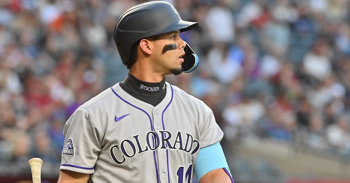
9. Ethan Holliday will be the first pick in this year’s MLB amateur draft.
As All-Star weekend approached, Ethan Holliday topped multiple mock drafts, including Jim Callis’ projections for MLB.com. Holliday was spoken of as one of the two best high school picks, alongside fellow shortstop Eli Willits. That, along with multiple players on the collegiate side earning plenty of attention, made for a situation where there was no clear-cut prospect separating himself from the pack. The best evidence for this was FanGraphs having Holliday and Willits ranked ninth and 32nd on its draft board, respectively. In the end, the poetic result won out, with Holliday being selected fourth to play for his father’s Colorado Rockies. A fitting outcome, but not the one needed here.
Verdict: False
10. Ketel Marte will win the NL MVP.
Only days after inking a big extension with the Diamondbacks, Ketel Marte’s MVP campaign took a major hit when he suffered a left hamstring injury on April 4 and missed a full month of playing time. On the bright side, Marte has been playing well since then (4.3 fWAR as of August 21), and was selected as the starting second basement for the NL All-Star team.
However, his path toward an MVP award is hampered by obstacles on multiple fronts. Statistically, Marte would need to challenge Shohei Ohtani (which was predictable), Kyle Schwarber (which was less so), and Pete Crow-Armstrong (which was not). But with all three of these players comes the other major obstacle: media narrative. Ohtani’s star shines incredibly bright as it always has, and PCA’s ascendancy has made him a darling of sportswriters nationwide. Schwarber is in the middle of his best season yet, and he’s a fun and media-friendly player. It’s fair to say that Marte doesn’t have the same support behind him. In recent days, much ink has been spilled on accusations of his leaving the team to go on vacation and being “a diva in the clubhouse,” as well as on his full-blown apology tour trying to mend fences. It’s not a stretch to imagine that this could cloud his MVP case in the eyes of BBWAA voters.
If it were up to me, and it was my responsibility to coax Marte back into contention, my first question would be “any chance you’ve got a good knuckleball?” (This is one of the many reasons why I’m not employed in a front office.)
Mookie Betts or Ronald Acuña Jr.? This was the question 2023 MVP voters were tasked with answering. There were cases for both: Acuña had just completed an incredible, record-breaking 40/70 season, while Betts had something others argued could not be quantified — positional versatility. The 2023 season marked his professional return to significant time in the infield, complementing his esteemed right field defense that had already earned him multiple Gold Glove awards.
Yet, as this debate unfolded, I found myself wondering: How, in the most quantified sport in the world, was there such a gap in our numerical understanding of player value? Surprisingly little research has been done on the value of positional versatility beyond its defensive benefits, which, for the most part, are at least somewhat accounted for in existing metrics. Considering this, with my research, I focused on quantifying versatility in a different way: by assessing its impact on a team’s ability to use pinch-hitters. Positional versatility allows a manager to make more substitutions in favor of stronger hitters off the bench, potentially increasing wins in a way not currently reflected in WAR. Conversely, versatility may have no such effect or may provide only a marginal benefit that does not meaningfully impact wins. Is versatility truly undervalued in today’s analytical climate? Let’s take a look. Read the rest of this entry »
Before Opening Day, the FanGraphs podcast, Effectively Wild, held its annual Preseason Predictions Game. Hosts Ben Lindbergh and Meg Rowley were joined by FanGraphs writers Michael Baumann and Ben Clemens, and each made 10 predictions about the upcoming baseball season. EW listeners voted on the likelihood of each prediction to determine its value, which will be kept secret until the final scores are revealed in November.
At times throughout the season, we’ll be tracking the various predictions here on the Community Blog to see how each competitor is faring. Having already covered Michael Baumann, who recently is feeling more optimistic about one of his picks, we’ll now review some highlights from fellow guest Ben Clemens. Read the rest of this entry »
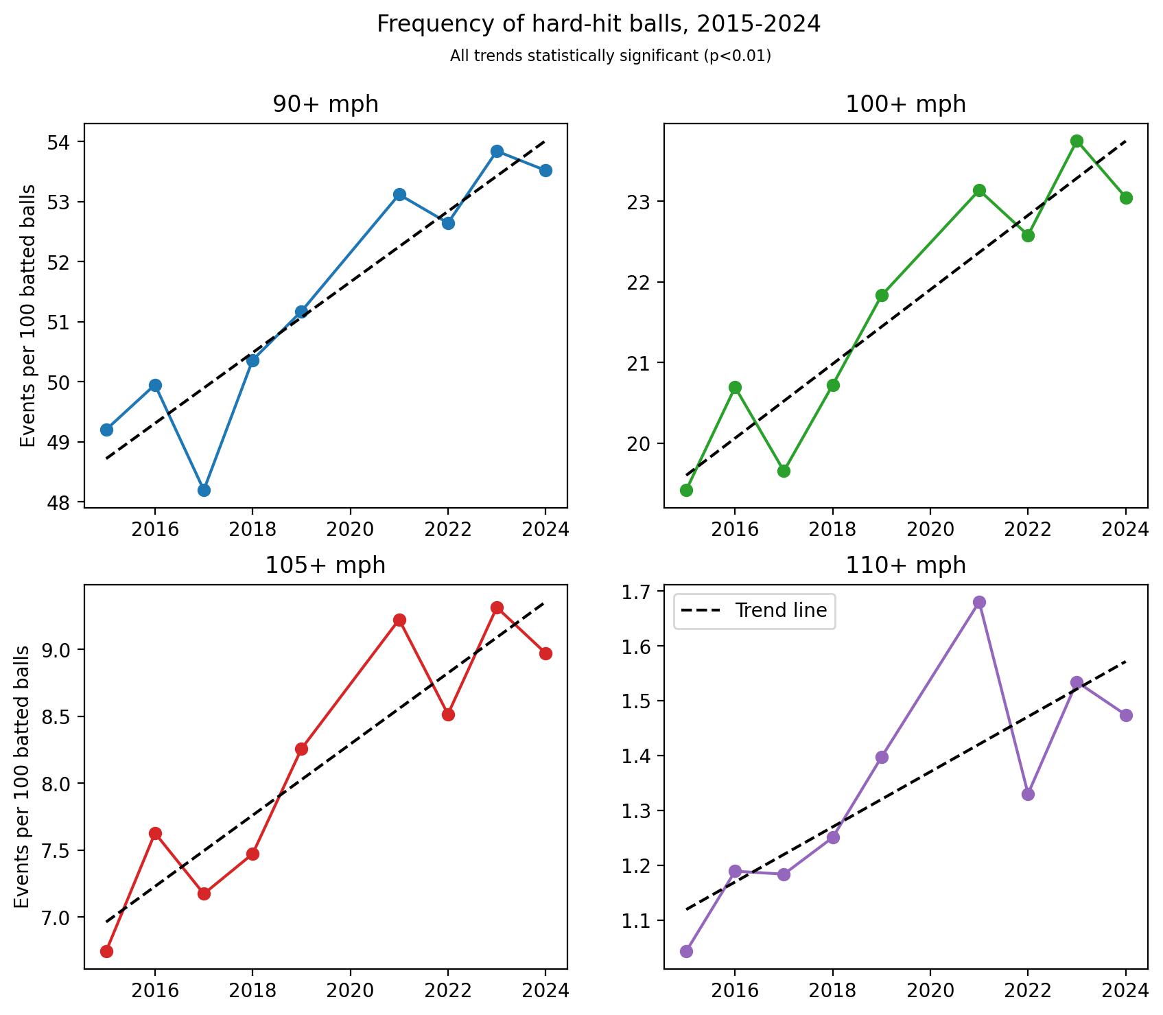
It’s not news to anyone that being on the receiving end of a 100-mph fastball is an unpleasant experience, but it’s easy for players and fans alike to forget that this little projectile is in fact a deadly weapon. While the tragic death of Ray Chapman along with decades of bruises and broken bones have spurred hitters to don an array of protective items in the box, our baseball culture does not afford pitchers the same protections. This is despite the fact that batted balls regularly exceed the speeds of the fastest fastballs, and occasionally top 120 mph, which may approach the limits of human reaction times at that distance. Additionally, while hitters are selected for their superhuman eyesight and reaction skills, those attributes are generally less important for pitchers. The issue may be further exacerbated by the increasing emphasis on exit velocities in modern hitting analytics:
That’s a concerning chart. In particular, notice the difference in scales across the panels; while the frequency of batted balls with exit velocities of at least 90 mph has increased by 8.7% in this span, batted balls hit 110+ mph occur a full 41% more often now than they did in 2015! Let’s find out if this trend is putting our already-fragile pitchers at even more risk. Read the rest of this entry »
Before Opening Day, the FanGraphs podcast Effectively Wildheld its annual Preseason Predictions Game. Hosts Ben Lindbergh and Meg Rowley were joined by FanGraphs writers Michael Baumann and Ben Clemens, and each made 10 predictions about the upcoming baseball season. EW listeners voted on the likelihood of each prediction to determine its value, which will be kept secret until the final scores are revealed in November.
At times throughout the season, we’ll be tracking the various predictions here on the Community Blog to see how each competitor is faring. We’ll begin today with a curated selection from the crystal ball of Michael Baumann! Read the rest of this entry »
In late February, I decided to try my hand at building out my own pitch model similar to Stuff+. I had no coding or modeling experience, and outside of my overall baseball knowledge I was starting from scratch. However, with the help of Bradley Woodrum, a former Miami Marlins analyst and FanGraphs contributor, and AI, I was able to learn what I needed and develop Shape+ in R over the course of about six weeks.
Shape+ is a location independent, layered mixed effects model that aims to quantify the relationship between pitch shape and run prevention. It uses its layered model approach to isolate physical pitch characteristics and predict their expected impact on run value (xRV), producing standardized scores that are both descriptive and predictive of a pitcher’s performance.
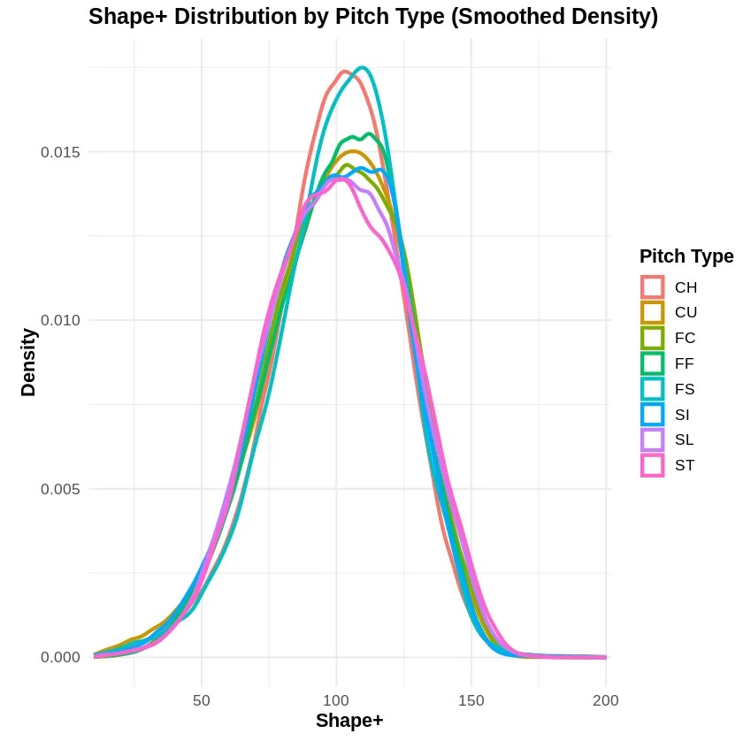
No real outcomes were used in the training of the model. Validation was done using 2023 Shape+ scores and 2024 wOBA, xERA, and ERA. Shape+ is normally distributed, with a standard deviation of 35. This scale can be easily adjusted without affecting the performance of the model.
Note: The high median score for forkballs in 2023 is due to limited sample size — primarily Kodai Senga.
Data Processing
I used 2023 and 2024 MLB Statcast data for training my model — downloaded using the baseballr package. To prepare the data for modeling, the following preprocessing steps were executed:
• Filtering out all fastballs below 80 mph.
• Assigning a “game_year” column to each pitch (2023 or 2024).
• Standardizing pitch type labels.
• Assigning a platoon advantage binary indicator for batter handedness.
• Calculating IVB, VAA, and HAA, none of which are not explicitly included in standard Statcast data.
• Bucketing all batted balls by Hard Hit (≥ 95 mph), Soft GB, Soft LD, Soft FB, Soft Pop, and Not in Play.
After processing, I used the bucketed batted balls and fixed values for non-BIP to generate a run expectancy chart based on the average runs scored by bucket. Each pitch is now assigned a run value based on the chart, and the data are ready for modeling.
Model Structure
Shape+ is built using a layered mixed effects modeling framework. The modeling process consists of four sequential stages.
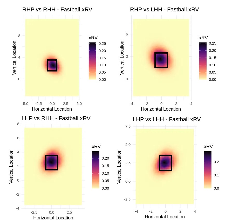
Model 1: xRV by Location
Model 1 is a large mixed effects model that is designed to predict expected run value (xRV) based on pitch type, location, platoon advantage, and count alone. The plate is sliced into a 150×150 grid to capture location effects at a granular level. Pitch types are bucketed into fastballs, changeups, and breaking balls to allow group-specific location interactions. Model 1’s goal is to quantify the value of pitch location, independent of actual outcomes or physical pitch shape.
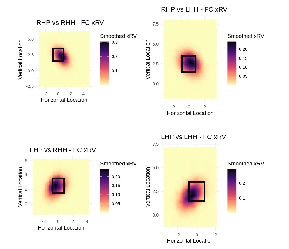
Below are heatmaps I generated based on Model 1’s output:
Model 2: GAM Smoothing
Model 2 utilizes a Generalized Additive Model (GAM) to the Model 1 outputs, smoothing the xRV surface to reduce noise and stabilize estimates across the strike zone. In doing so, I am able to retain meaningful and important patterns while eliminating spikes caused by outliers.
The smoothed Model 2 output is used as the training target for Model 3 (xRV by Physical Characteristics), isolating pitch location from the physical characteristics. As depicted in the smoothed heatmaps below, the model is flexible enough to capture nuance by individual pitch type, such as cutters.
Model 3: xRV by Physical Characteristics
Model 3 is a linear mixed effects model that utilizes polynomial, quadratic, and interaction terms to capture non-linear relationships between pitch characteristics and xRV. It uses both fixed effects and random effects.
Fixed effects capture the impact of measurable pitch characteristics (velocity, spin, IVB, etc) across all pitchers. Random effects — implemented as ((1 | PitcherID)) — account for the unobserved, pitcher-specific variations (deception, mechanics consistency).
Model 3 is trained exclusively on the smoothed xRV output from Model 2. It includes no location or outcome based variables, effectively isolating the value of the physical characteristics of a pitch. Variables included in Model 3 are as follows:
Categorical Variables
• Pitch Group (Fastball, Breaking Ball, Changeup)
• Pitcher Throws (R/L)
• Batter Side (R/L)
• PitcherID
Model 4: Final Shape+ Output
The final step of the modeling pipeline is Model 4, converting the outputs of Model 2 and Model 3 into a standardized and interpretable Shape+ score. It subtracts Model 3’s predicted xRV (based on physical characteristics) from Model 2’s smoothed xRV (based on location). The result, arbitrarily called stuffimpact, reflects how much pitch shape alone contributes to run prevention.
Stuffimpact is then scaled and standardized, producing typical Shape+ values between 50 and 150 to improve interpretability.
Performance and Validation
Shape+ performs exceptionally well both descriptively and predictively. After conducting both in-sample and out-of-sample validation, I found that Shape+ scores correlate strongly with both current-season and next-season wOBA and xERA. I obtained validation data by downloading xERA, ERA, and wOBA numbers for 2024 from Baseball Savant.
Descriptive Correlations
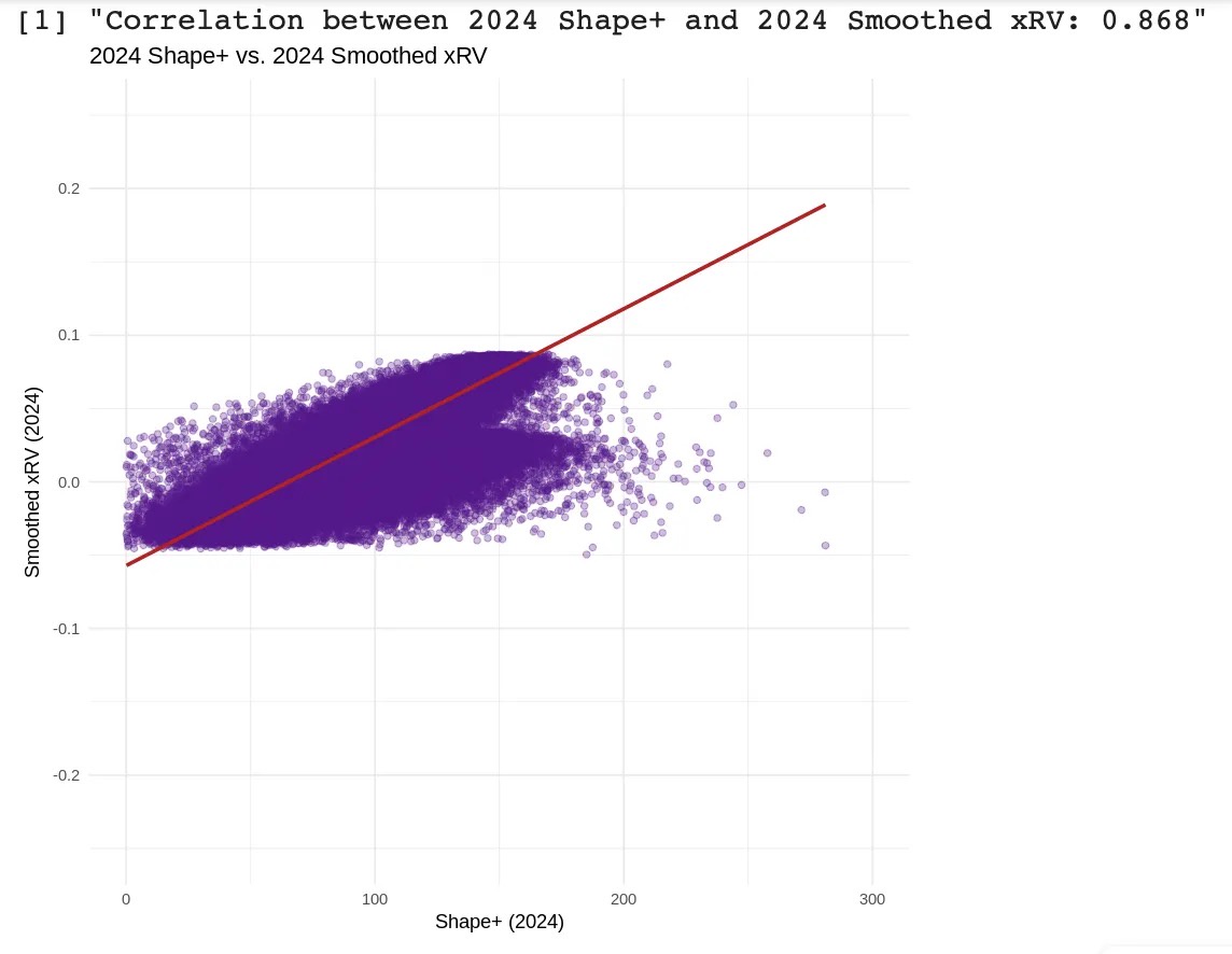
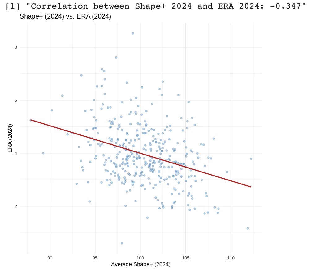
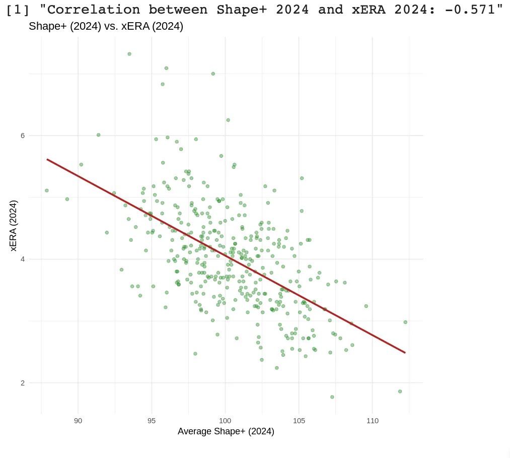
In-sample validation testing was conducted using 2024 data, evaluating how well Shape+ scores aligned with real-world metrics such as xRV, wOBA, ERA, and xERA over the same season. These correlations can been seen below:
• 0.868 (2024 xRV and 2024 Shape+)
• -0.347 (2024 ERA and 2024 Shape+)
• -0.571 (2024 xERA and 2024 Shape+)
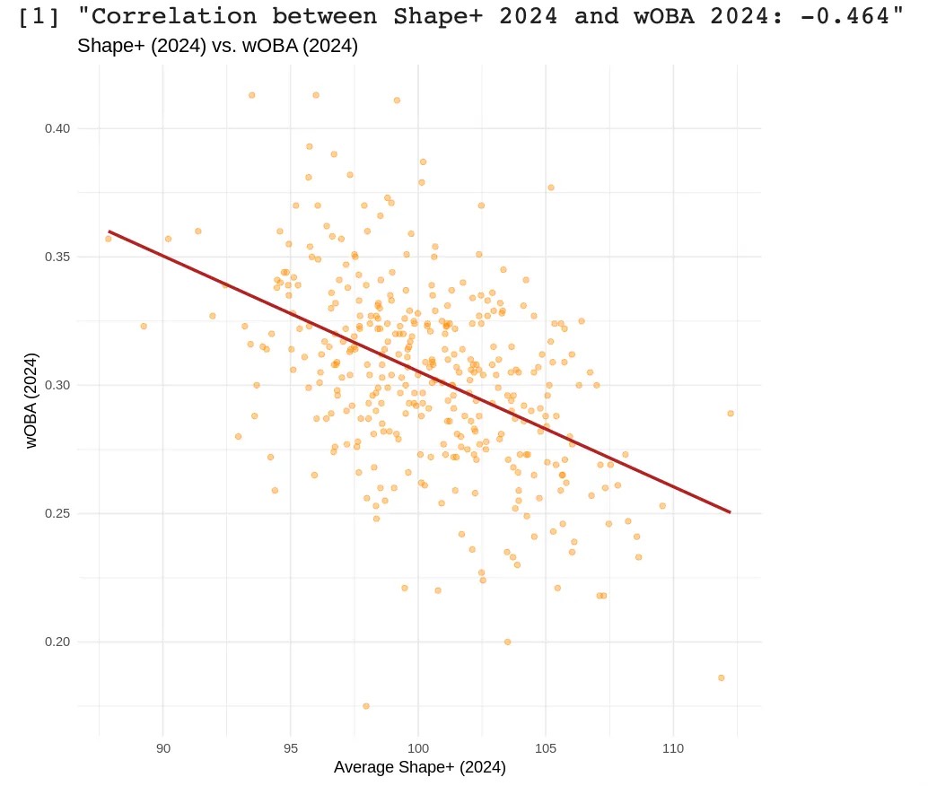
• -0.464 (2024 wOBA and 2024 Shape+)
The particularly strong correlation with xRV — the model’s training target — demonstrates excellent internal validity. In addition to this, these strong to moderate-strong correlations demonstrate that Shape+ accurately captures the quality of contact that pitchers are inducing in real time, confirming its descriptive power. The four scatterplots below depict the four descriptive correlations.
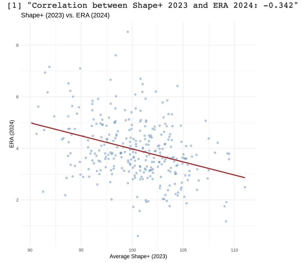
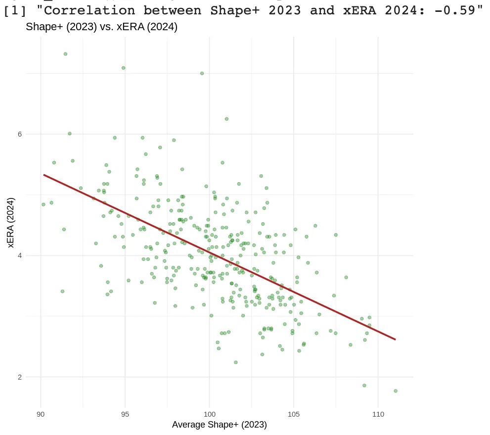
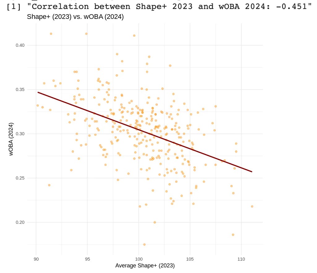
Predictive Correlations
Shape+ shows strong year-to-year consistency, reinforcing its reliability as a forecasting metric. The correlation between 2023 and 2024 Shape+ scores is 0.801, indicating a high degree of stickiness and model stability.
When used predictively, Shape+ correlates strongly with next-season performance metrics like xERA and wOBA. This suggests that Shape+ not only describes current pitch effectiveness, but that it also effectively anticipates future run prevention ability, making it a potential tool for forward-looking evaluation.
• -0.342 (2023 Shape+ and 2024 ERA)
• -0.590 (2023 Shape+ and 2024 xERA)
• -0.451 (2023 Shape+ and 2024 wOBA)
Below, I’ve included the three predictive correlation scatterplots:
I should note here that ERA is a noisy and context-dependent metric, heavily influenced by factors outside a pitcher’s control, such as defense, park effects, and weather. As a result, it is not a reliable target for evaluating pure pitch quality. Shape+, by contrast, is specifically designed to isolate and quantify the components that a pitcher can control. Metrics like xERA serve as better validation tools for this purpose, as they focus solely on outcomes driven by the pitcher’s own skillset.
Residuals and Error
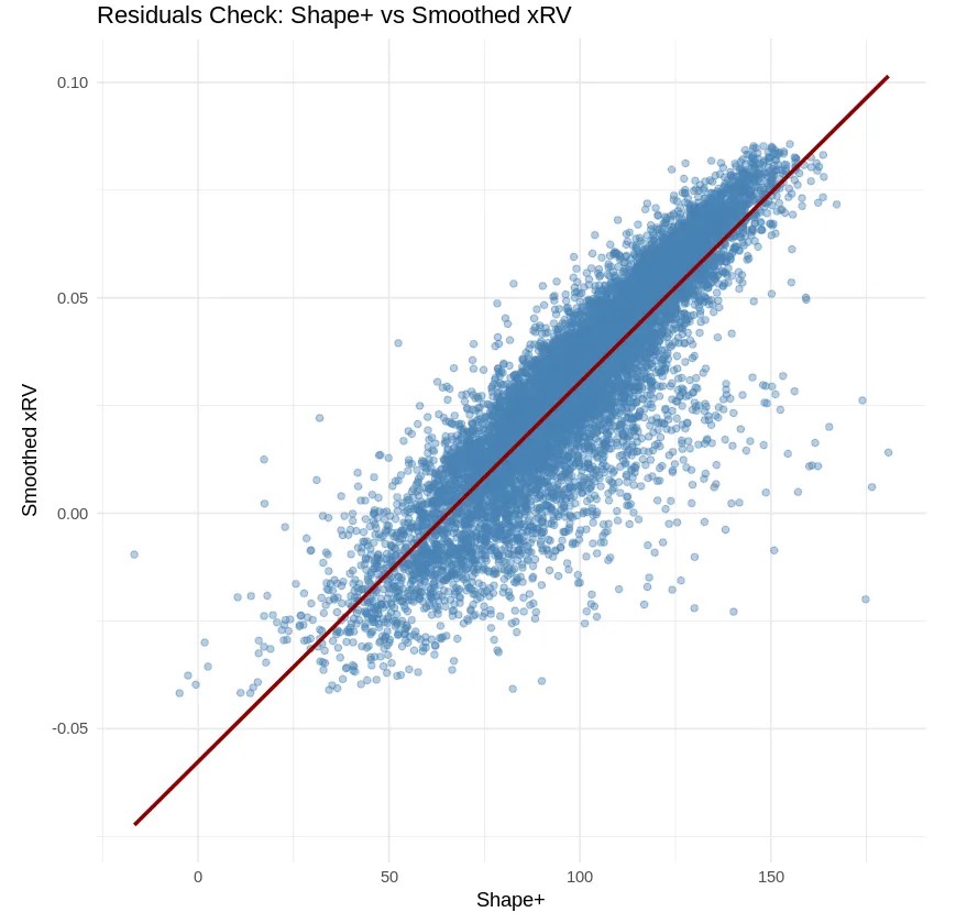
Shape+ demonstrates excellent alignment with the values it is targeting, confirmed by strong error metrics and stable residuals.
• RMSE: 0.022
• MAE: 0.018
These low values indicate that predictions from the model are consistently close to the actual smoothed xRV values, verifying the model’s precision.
Residuals show a tight linear relationship with minimal spread and few outliers. They are evenly distributed across the Shape+ scale, indicating low bias and overall consistency. Taking both the RMSE/MAE and residuals plot into account, we can confirm that Shape+ reliably quantifies pitch-level run prevention.
Pitcher Cases
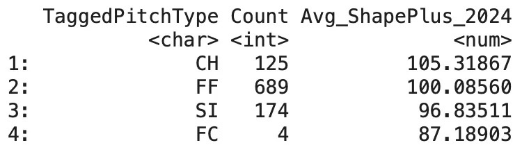
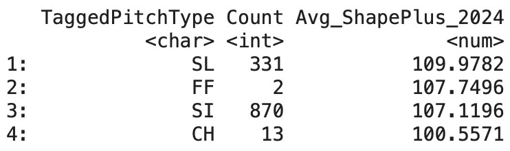
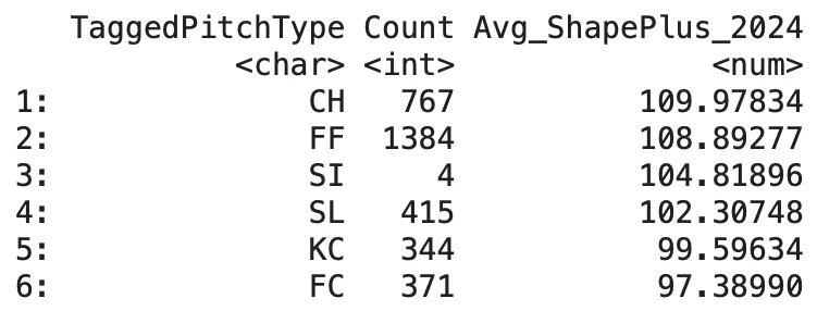
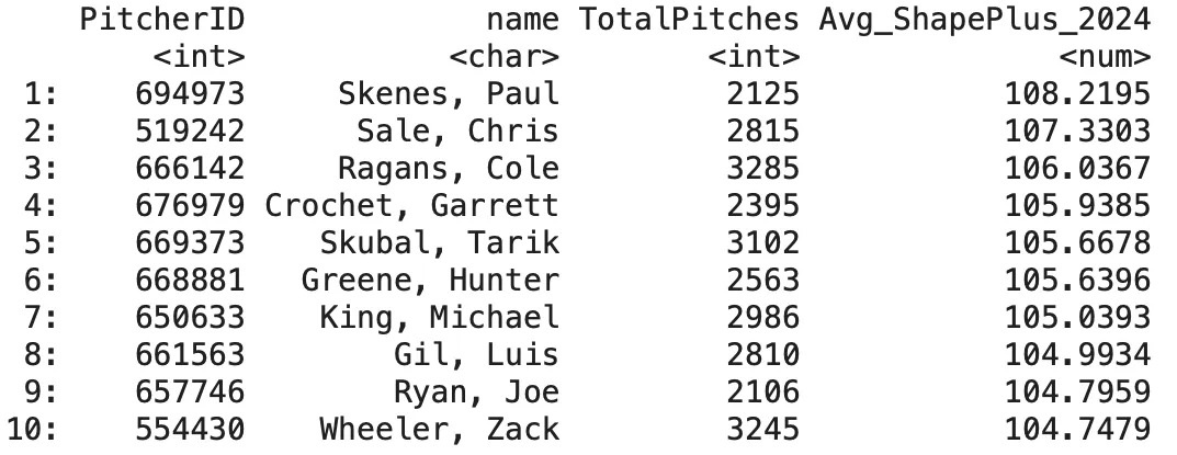
Shape+ can be easily applied to individual pitchers to evaluate the shape-based effectiveness of their arsenals. Using a few lines of code I can pull the 2024 Shape+ score for a given pitcher’s arsenal.
We can also pull the top 10 pitchers by Shape+ in 2024 (min. 1,800 pitches):
Conclusion
Shape+ is a location-independent model that quantifies the relationship between pitch shape and run prevention. By combining a layered modeling framework — including location modeling, GAM smoothing, and physical attribute regression — Shape+ aims to provide a robust and interpretable evaluation of pitch effectiveness.
Shape+ demonstrates both strong descriptive and predictive performance, and compares favorably to existing public models — particularly in its ability to forecast next-season xERA and wOBA.
Cade Cavin is the Assistant Director of Analytics for Point Loma Nazarene University in San Diego.
Last week, Ben Clemens wrote a fantastic piece comparing how well he, the FanGraphs crowd, and a set of other baseball websites and analysts did at predicting the fates of 2025 MLB free agents. His conclusion is that we, the crowd, did an overall great job. I concur. Yay, us!
Unaware that Ben had a piece in the works, I also spent time over the past few weeks testing the wisdom of the FanGraphs crowd against what free agents actually received this offseason, and hoped to publish my work in the newly revived Community Blog. After Ben’s article was published, the editorial staff at FanGraphs noted that I took slightly different slices of the data and conducted different analyses. They encouraged me to refine and update some of my analysis so they could then run it as a companion piece.
“Wisdom of the crowd” is the idea that the collective opinion of a diverse, independent group of individuals will come to a better decision than that of even the most well-informed individual expert. While it doesn’t always bear out, where would we be without the wisdom of crowdsources like Reddit, Quora, Wikipedia… or FanGraphs?
Beyond just being a fun way to engage with readers, the FanGraphs free agent crowdsource predictions exercise represents a good test of the “wisdom of the crowd” theory. Let’s see how wise this crowd turned out to be.
To test our wisdom, on February 17 and then again on March 8, I downloaded the excel file of the 2025 Free Agent Tracker. I then selected for every free agent who signed for a total contract value of at least $2 million, resulting in 105 cases. (Jon Berti and Amed Rosario just made the cut with one-year, $2 million deals; Mike Tauchman and Michael A. Taylor just missed it at one year and $1.95 million.) I then sorted out the players who didn’t receive a crowdsource estimate, reducing the pool to 67 players.
These 67 players were predicted by us to receive a collective 153 years of contracts (an average of 2.28 years per player) for a collective total of $2,886,520,000 and an average contract of $43,082,388.
However, this was an overall good year for free agents — just ask Juan Soto (15 years, $765 million) or Max Fried (8 years, $218 million) — and they ended up collectively out-earning our expectations by 10.4%. These 67 free agents signed a collective 150 years of contracts (we were 98.7% accurate in cumulative contract length!) for a collective $3,186,325,000, with an average contract of $47,557,090 (an AAV of just over $19 million).
Our collective wisdom was pretty good, but we underestimated the market by 10.4%. Let’s take a more detailed look at what happened.
Analyzing the Widest Prediction Gaps
In my research, I looked at the differences between what the FanGraphs crowd predicted and the actual signings. Again, I compared total contract value to the median crowdsourced prediction. (I know this is an oversimplification. I couldn’t think of an elegant way to include things like the “value” of opt-outs, etc.)
The FanGraphs crowd was within $2 million of the actual contract value for 22 of the free agents and got two exactly right, the one-year deals that Justin Verlander ($15 million) and Caleb Ferguson ($3 million) signed.
Some free agents signed for considerably more than we expected. In terms of total amounts, Soto, Fried, Blake Snell (5 years, $182 million), Tanner Scott (4 years, $72 million), Willy Adames (7 years, $182 million), and Corbin Burnes (6 years, $210 million) all exceeded their contract predictions by at least $30 million, with Soto, Fried, and Snell earning over $60 million more than we predicted. No other player signed a deal worth more than $20 million above what we predicted for him. Five relief pitchers — A.J. Minter (2 years, $22 million), Andrew Kittredge (1 year, $10 million), Yimi García (2 years, $15 million), Blake Treinen (2 years, $22 million), and Scott — netted contracts worth more than double what we expected they’d get. Minter especially scored a bonanza, getting a total value that was more than four times higher than what we predicted. It was a very good year to be a high-upside relief arm.
Notable Underestimated Contracts
Player
2025 Team
Crowdsource Prediction
Actual Contract
Total Value Diff.
Juan Soto
NYM
13 years, $585 million
15 years, $765 million
$180 million
Max Fried
NYY
5 years, $125 million
8 years, $218 million
$93 million
Blake Snell
LAD
4 years, $120 million
5 years, $182 million
$62 million
Tanner Scott
LAD
3 years, $36 million
4 years, $72 million
$36 million
Willy Adames
SFG
6 years, $150 million
7 years, $182 million
$32 million
Corbin Burnes
ARI
6 years, $180 million
6 years, $210 million
$30 million
A.J. Minter
NYM
1 year, $5 million
2 years, $22 million
$17 million
Blake Treinen
LAD
1 year, $8 million
2 years, $22 million
$14 million
Yimi García
TOR
1 year, $5 million
2 years, $15 million
$10 million
Andrew Kittredge
BAL
1 year, $3 million
1 year, $10 million
$7 million
On the flip side, there were other free agents who signed contracts below our predictions, with many of these players settling for short-term deals that curbed their total values. Pete Alonso (2 years, $54 million), Jack Flaherty (2 years, $35 million), Ha-Seong Kim (2 years, $29 million), Alex Bregman (3 years, $120 million), and Gleyber Torres (1 year, $15 million) all received contracts that were worth at least $30 million less than we expected, with only one other player, Andrew Heaney (1 year, $5.25 million), underperforming his predicted deal by more than $14 million. In terms of percentage, Alonso, Flaherty, Kim, Torres, Heaney, and Max Kepler (1 year, $10 million) received less than 50% of what the crowd predicted. It’s worth pointing out that Alonso and Bregman received higher average annual values than expected, owing to their shorter contract lengths. Bregman is set to make $4.7 million more per year than the $27 million AAV the crowd predicted for him, while Alonso’s $27 million AAV is $2 million per year more than expected.
Notable Overestimated Contracts
Player
2025 Team
Crowdsource Prediction
Actual Contract
Total Value Diff.
Pete Alonso
NYM
5 years, $125 million
2 years, $54 million
$71 million
Jack Flaherty
DET
4 years, $88 million
2 years, $35 million
$53 million
Ha-Seong Kim
TBR
4 years, $73.5 million
2 years, $29 million
$44.5 million
Alex Bregman
BOS
6 years, $162 million
3 years, $120 million
$42 million
Gleyber Torres
DET
3 years, $54 million
1 year, $15 million
$39 million
Max Kepler
PHI
2 years, $22 million
1 year, $10 million
$12 million
Andrew Heaney
PIT
2 years, $25 million
1 year, $5.25 million
$19.75 million
Eyeballing the data, a pattern seemed to emerge in which the top of the market did as well or better than expected, while the middle-to-bottom of the market fared worse. (This would be consistent with many author and reader hypotheses of how the market would shake out.) So I ran a quick correlation between the rank of the size of the signed contract and the difference between prediction and actual total contract value. The correlation coefficient was -.52, indicating that indeed those who signed the smaller contracts signed for less than predicted more so than those who signed larger total contracts.
The Implications of Signing Late
Once again, Ben pre-empted some of my analyses with his own deeper dives. Specifically, back in January, he examined whether those who signed late in the offseason (a) signed for less, and (b) performed worse than those who signed earlier. In short, yes and yes.
When one of my favorite players, Alonso, signed late and for far less than we expected, I also hypothesized that those who sign late in free agency get less than expected relative to those who sign early. After all, late signees usually do so after their options have dwindled. However, the 2025 free agent tracker does not include date of signing, so I could not directly test this proposition. (I suppose if I’d really wanted to spend time researching this, I could have gone back and logged every signing date, but, you know, this is the Community Blog and not my full-time job.) That said, I did find the list of players who’ve signed since the start of February as opposed to earlier in the offseason and ran some quick comparisons.
Of the players in the main sample, nine signed between February 1 and March 8. Nick Pivetta, Enrique Hernández, and Tommy Pham all signed for more than expected, although Hernández and Pham signed one-year deals worth $1.5 million and $1 million above their modest one-year expectations. Pivetta signed for an additional year and $10 million over his predicted deal (5 years and $55 million, compared to the crowd’s prediction of 4 years and $45 million). Kanley Jansen (1 year, $12 million) and Justin Turner (1 year $6 million) signed one-year contracts worth $2 million less than we expected — not very far off expectations.
The remaining four deals since the start of February demonstrate the downside of signing near the end of the offseason. In fact, those four players (Bregman, Alonso, Flaherty, and Heaney) represent four of the six deals listed in the overestimated contracts sample included in the previous section.
Comparison to Six Years Ago
Back in 2019, I performed a similar analysis that was published here in the community notes. That year’s free agent class, led by Bryce Harper and Manny Machado, came in under our expectations. Recall 2019 was a very cold “hot stove,” with major signings not occurring until late in the offseason. (Harper wasn’t signed until February 28!)
We predicted that year’s sample of 47 free agents would receive a collective 123 years of contracts (an average of 2.61 years per player) for a collective total of $1,801,000,000 and an average contract of $38,320,000. However, they ultimately received 91.4% of what was expected – a collective 109 years of contracts (an average of 2.32 years per player) for a collective total of $1,619,500,000 and an average contract of $34,460,000.
Our collective wisdom back then was also pretty solid, except we overestimated the market for free agents by just about the same margin as we underestimated it this year.
Conclusions?
I don’t think we can take any major lessons from this analysis — perhaps just two small ones: 1) relief pitchers with upside did well, and 2) prominent free agents shouldn’t wait too long to sign. That said, running the numbers was fun, and I hope you enjoyed the article. I’ll be back next year at this time with another update. Until then, let the wisdom of crowds protect you from the madness of crowds.