Archive for Research

The Disappearing Downside of Strikeout Pitchers

In 1977, Nolan Ryan was in the midst of his dominant tenure pitching for the California Angels. Four years before, he had broken Sandy Koufax’s modern strikeout record, and his stuff wasn’t going away. The 30 year-old finished the ’77 season three outs shy of 300 innings, and struck out 10.3 batters per nine innings. Those 341 strikeouts came with a home run rate 60% lower than league average.

Yet, somehow, Ryan was not the best pitcher in baseball that season. He finished 3rd in AL Cy Young voting. In the majors, he was 4th in pitcher WAR, 10th in Wins, 7th in ERA, and 9th in FIP. So how could such an unhittable season be so clearly something other than the best in baseball?

In 1977, Nolan Ryan walked 204 batters. That is 5.5 walks per start. With Tom Tango’s Linear Weights, we can say that Ryan’s walks cost the Angels over 60 runs, which is ~30 runs worse than if he had a league-average walk rate. Batters were fairly helpless against Nolan Ryan, but what help they did get, they got from him.

In the 1970’s, this phenomenon was not unheard of. Pitchers who struck the most hitters out tended to walk the most as well. (Note: for this article, I’m including pitchers who threw 140+ innings)

K BB 1970s

For every additional 5-6 strikeouts, you could expect an additional walk from a pitcher. This is not surprising for a few reasons. The main two that come to my mind are:

1) If a pitcher strikes out a lot of hitters, then GM’s and managers will be more willing to tolerate a lack of control, and
2) Harder throws, nasty movement, and a focus on offspeed pitches can lead to strikeouts and make balls harder to locate.

It seems natural that there would be a positive relationship here, and it goes along well with the idea that flamethrowers are wild.

But could that relationship be going away? Here’s the same chart, but instead of being the 1970’s, this is for the year 2010 and on:

K BB 2010s

In this span, it takes 20 strikeouts to expect an additional walk. There’s still a relationship, but it’s much looser.

And while it’s possibly irresponsible to look at sample sizes this small, the relationship was almost completely gone last year. If we only look at 2014 pitchers, we see the following:

K BB 2014

Given that the model here suggests that 300 strikeouts lead to one walk, I think it’s safe to say there wasn’t a meaningful relationship between strikeouts and walks last year.

It’s important to note that this is a continued trend. There has not been a specific time when strikeout pitchers decided to stop walking people. Broken up by decade, this is something that has constantly been occurring over the last 40 years.

K BB Correlation Decades

I’m not exactly sure what the big takeaway from this is, but I’m more curious about what is causing this shift. As far as the results from such a change, I do not believe this explains the drop in offense, since the trend continued through the booming offense of the late ’90s and early 2000s.

Maybe player development is better than it used to be. If coaches can better address player weaknesses, it would be possible for pitchers to be more well rounded.

Perhaps teams are less willing to tolerate players with large weaknesses, even if they are strong in another area. I find this theory unlikely in an age when almost any strength can be valued and measured.

It’s possible that pitchers try to strike batters out differently than they used to. Maybe they used to be more likely to try to get hitters to chase balls out of the zone to get a third strike, leading to more walks.

Most likely, it’s something that I am missing. But regardless, we are no longer in an era where a pitcher like Nolan Ryan leads the league in strikeouts, and you simply have to deal with his astronomical walk numbers. The modern ace is tough to hit and can command the zone, and there are plenty of them.


A Look at SGP-Based Rankings Using Different Projection Sets (Part 1)

The bulk of the work I do pre-draft and in-season is essentially based on an SGP (standings gain points) projections and ranking system. I use SGP data from leagues that match the format and settings of the league I’m ranking for (ideally from 10+ years of data from the actual league, where possible). While I usually do my own projections for 30-40 players of specific interest, in general I’m happy to utilize the projections published by experts that actually know what they’re doing and do it for a living. Specifically (and in no particular order) I use Steamer, Pecota, and Baseball HQ.

These lists may not be useful in ‘absolute’ terms – again, the data I’m using here reflect the SGP settings I use that reflect the league I play in. However, I still believe the lists offer an interesting way to notice a) how each projection system differs on its view of individual players, and b) general overall differences in each projection system. Blindly following a projection set is probably going to be better than randomly picking players by throwing darts at the wall. But you can squeeze a lot more value out of these rankings and the projections you use by gaining a deeper understanding of how each set of projections work, and what ‘biases’ and tendencies might be part of the numbers.

What I like to do each year is generate ‘top X’ lists of players at each position for each projection set I use, then play around in the results to spot any glaring differences.  Is one projection overly conservative on expected ABs? Is one projection set basically expecting a repeat of last year’s career year? I can use that as a starting point to drill down into some of the numbers to see what might be behind the differences. Personally, I find it all too easy to get overwhelmed at all the different numbers available to be looked at – far too often I find myself deep down the rabbit’s hole, spending three hours looking at average fly ball distance on balls hit on the second Wednesday of the month on even-numbered days or something. I find this approach helps me narrow in on specific players or numbers of interest. And the benefit of doing this by SGP, broken down by category, is that it is easier to see specifically how each player is projected to impact each category. Player stats will not win your fantasy league, roto points will win you your fantasy league: I get a better understanding of the player’s ‘value components’ and how it impacts the particular league I play in.

First, a quick overview of SGP. Standings Gain Points is a way to measure the contribution of each player to your overall roto league standings. Larry Schecter’s excellent book, ‘Winning Fantasy Baseball’ is a great primer on the subject. Other places to read about SGP online are here and here. In a nutshell the system looks at the average stats needed to gain one point in the standings for a particular rotisserie category. For example, suppose in your league over the past 10 years, you needed 10 HRs to gain one point in the HR category standings. A player projected to hit 30 home runs would be credited with 3 SGPs for the HR category. Tally up all the SGPs the player is expected to add (or subtract) for all categories, and you get a total SGP score.

There’s a ton more to it, but that’s the basics – ever tried to figure out if the guy hitting a lot of HRs but no average was more valuable (and if so, by how much) than the guy hitting for a decent average and some SBs but no power? Now you have an idea.

In this first article, I look at at Catchers. I’ll add reports on all the hitter positions over the next couple of weeks. A reminder that these rankings are based on SGP values which are basically unique to my specific league, so your numbers will differ if you play in a different league format, but again, we’re looking a relative differences, not absolute numbers (For the record, the league format for the SGP rankings here: Standard 12-team 5×5 roto, 1 catcher, three OF and two util, 1250 innings cap).

Here is the list of top 12 catchers ranked by my league’s SGP, based on Baseball HQ projections:

Figure 1. Top 15 catchers by SGP & BHQ projections

Rank MLBAMID Full Name RSPG HRSPG RBISPG SBSPG AVGSPG Total
1 457763 Buster Posey 4.22 2.66 4.60 0.15 1.24 12.87
2 543228 Yan Gomes 4.22 3.08 4.28 0.15 0.12 11.84
3 519023 Devin Mesoraco 3.73 3.78 4.33 0.15 -0.31 11.67
4 594828 Evan Gattis 3.48 4.33 4.12 0.00 -0.48 11.45
5 518960 Jonathan Lucroy 3.98 2.24 3.84 0.73 0.62 11.40
6 431145 Russell Martin 3.54 2.52 3.84 1.02 -0.12 10.80
7 521692 Salvador Perez 3.54 2.38 4.01 0.00 0.46 10.39
8 435263 Brian McCann 3.42 3.50 4.01 0.15 -0.68 10.38
9 425877 Yadier Molina 3.66 1.54 3.74 0.58 0.71 10.23
10 467092 Wilson Ramos 2.86 2.52 3.84 0.00 -0.16 9.06
11 446308 Matt Wieters 3.11 2.38 3.41 0.15 -0.14 8.90
12 444379 John Jaso 3.85 1.54 3.19 0.44 -0.32 8.70
13 572287 Mike Zunino 3.66 2.80 3.68 0.00 -1.52 8.63
14 519083 Derek Norris 3.29 1.96 3.14 0.73 -0.72 8.40
15 425900 Dioner Navarro 2.61 1.96 3.25 0.29 0.05 8.16

Nobody should be surprised to see Buster Posey at the top of any catchers list; he’s there because he has such a huge advantage over everyone else at the position in Batting Average. And he has a full point advantage over the next tier of players. Gomes and Mesoraco at 2nd and 3rd? Probably more of a surprise. Gomes has legit power, and the batting average isn’t a fluke (career BABIP: .323). Mesoraco had a career year last year – his 25 HRs in 440 PA is only 6 fewer than he hit in 1,100 PAs in 2013, 2012, 2011 combined. Yes, he plays in a tiny crackerjack box of a park. But his FB% jumped 10ppt (33.8% to 43%) from 2013 and 2014, while his HR/FB rate more than doubled, from a constant 10% or so in 2011-2013 to 20.5% in 2014. Color me less than convinced. And with only .44 points separating them, the next four players (Gomes, Mesoraco, Gattis and Lucroy) are basically interchangeable.

Russell Martin’s ranking gets a big boost from expected SB contribution; if those SBs dip he falls quite a bit. Would anyone be surprised if a catcher that turns 32 in February and was only 4-of-8 in stolen base attempts last year doesn’t run that much in 2015?

Conversely, if Zunino can boost his average a bit, he could be excellent late-round value. He gets a massive -1.52 hit to his SGP total after hitting less than his weight last year. On the one hand, one could possibly expect a bit of an uptick in the batting average; his BABIP last year of .248 was the lowest mark he’s recorded at any point for a full season going back to 2012 and his days in the Arizona Fall League. On the other hand, he struck out 33% of the time last year, so…yeah.

Finally – what’s surprising about this list is who’s not on it – no d’Arnaud, no Rosario.

Figure 2. Top 15 catchers by SGP & Steamer projections

Rank MLBAMID Full Name RSPG HRSPG RBISPG SBSPG AVGSPG Total
1 457763 Buster Posey 4.29 2.66 4.06 0.15 0.87 12.02
2 594828 Evan Gattis 4.22 3.92 4.28 0.15 -0.88 11.68
3 435263 Brian McCann 3.85 3.36 3.79 0.15 -0.54 10.61
4 518960 Jonathan Lucroy 4.04 1.96 3.47 0.73 0.36 10.55
5 431145 Russell Martin 3.79 2.24 3.19 0.87 -0.81 9.28
6 518595 Travis d’Arnaud 3.29 2.38 3.25 0.29 -0.54 8.67
7 521692 Salvador Perez 3.23 1.96 3.14 0.15 0.10 8.58
8 446308 Matt Wieters 3.35 2.38 3.03 0.44 -0.68 8.52
9 543228 Yan Gomes 3.17 2.24 3.09 0.29 -0.36 8.42
10 519023 Devin Mesoraco 2.98 2.52 2.98 0.44 -0.60 8.31
11 467092 Wilson Ramos 2.86 2.24 2.98 0.15 -0.03 8.19
12 425877 Yadier Molina 2.92 1.40 2.76 0.44 0.35 7.86
13 501647 Wilin Rosario 2.30 1.96 2.44 0.29 0.16 7.14
14 518735 Yasmani Grandal 2.98 1.82 2.71 0.29 -0.69 7.11
15 455139 Robinson Chirinos 2.73 1.68 2.49 0.29 -0.80 6.39

The first thing to notice about this list – in general the total ‘SGP’s provided are considerably lower than for the BHQ group above. At 8.90 total SGPs, Wieters wasn’t even in the top 10 in the BHQ list; 8.90 SGPs almost makes him a top-5 pick on this list. The numbers suggest that Steamer is a bit more conservative (or BHQ overly optimistic) in its forecasts, particularly for HR and RBIs. My understanding is that BHQ’s projections are largely based on playing time projections, so perhaps the numbers will change as we get closer to spring training and the start of the season and jobs are won/lost etc. It will be interesting to see how (if) these numbers change.

Looking at the list itself, Posey and Gattis again in the top five, no surprise there. McCann in the top five looks somewhat surprising (despite a rather big gap between Gattis and McCann). Maybe Steamer remembers that McCann still hit 23 HRs last year and still plays in a favorable park? His LD% was stable last year, GB% down a tick, FB% up a tick. His HR/FB rate was down quite a bit from 2013, which is surprising given that the conventional wisdom suggested he was moving to a more favorable ballpark…but his 2014 HR/FB rate was almost exactly in line with his average since 2008. Steamer might also be expecting an uptick on that awful .231 BABIP from 2014, although not sure if it’s factoring in the increased defensive shifts he saw last year. Less than .50 points separate d’Arnaud at #6 and Ramos at #11. Of the group, Wieters is now the grizzled veteran of the bunch and looked like he was on his way to a career year before getting hurt last year. If he’s healthy, he ironically could be the ‘safe’ pick of the bunch.

Grandal makes an appearance. Interestingly, Steamer is forecasting almost exactly the same number of Runs, RBIs and HRs this year – in the same number of at-bats – as last year, despite Grandal moving from a horrible Padres team (last year at least) to a much better Dodgers team (last year at least). I’d normally expect a bit of an uptick in those numbers.

Spoiler alert, but this is the only projection where Chirinos comes in the top 15; Steamer appears to be a bit more optimistic in projected at-bats, giving him a bump in Runs and RBIs that he doesn’t enjoy in the other projections.

Figure 3. Top 15 catchers by SGP & Pecota projections

Rank MLBAMID Full Name RSPG HRSPG RBISPG SBSPG AVGSPG Total
1 594828 Evan Gattis 4.41 4.19 4.82 0.0 -0.6 12.82
2 457763 Buster Posey 4.47 2.66 4.33 0.15 0.90 12.51
3 435263 Brian McCann 4.10 3.36 4.12 0.15 -0.78 10.93
4 431145 Russell Martin 4.85 2.38 3.30 1.16 -1.13 10.56
5 518960 Jonathan Lucroy 3.98 1.96 3.68 0.87 0.06 10.54
6 518595 Travis d’Arnaud 3.91 2.66 3.68 0.15 -0.57 9.83
7 521692 Salvador Perez 3.54 1.96 3.68 0.0 0.33 9.51
8 446308 Matt Wieters 3.66 2.38 3.57 0.29 -0.77 9.14
9 425877 Yadier Molina 3.42 1.54 3.19 0.58 0.39 9.12
10 572287 Mike Zunino 3.79 3.08 3.74 0.29 -1.79 9.1
11 543228 Yan Gomes 3.23 2.24 3.09 0.15 -0.03 8.67
12 518735 Yasmani Grandal 3.66 2.10 3.09 0.29 -0.56 8.58
13 519023 Devin Mesoraco 3.23 2.38 3.25 0.29 -0.68 8.47
14 455104 Chris Iannetta 4.04 1.96 3.19 0.44 -1.46 8.16
15 467092 Wilson Ramos 3.11 1.96 2.92 0.0 -0.26 7.73

Pecota loooooves it some Gattis, putting him in the top spot over Posey. The Pecota rankings for catchers have fairly clear tiers: Gattis and Posey at the top, a substantial gap to McCann, Martin, and Lucroy, then another gap, followed by only a point or so between d’Arnaud at #6 and Iannetta at #14. Iannetta actually only shows up here because Pecota is significantly more bullish on Iannetta across the board vs the other projection sets; this almost certainly is due to differing views on ABs; Pecota’s AB projection for Iannetta is about 80 ABs higher than the BHQ projection, and over 150 more than the Steamer projection.

The difference between the Pecota numbers for Yan Gomes and the BHQ numbers are interesting – BHQ projects Gomes as one of the top 3-4 HR hitters at the catcher spot; here he’s projected to be 8th.

Martin again gets a big SB bump, which just manages to offset a rather large Avg hit (particularly compared to, say the BHQ projection, where the Avg hit was minor). Pecota is probably looking at his .290 average last year and figuring it’s a .336 BABIP-fueled fluke; Martin hadn’t had a BABIP over .290 since 2008.

Zunino again projects to have great all-around numbers except for the black hole at Batting Average. If he somehow is able to hit even .250, Zunino would likely be a top-five fantasy play behind the plate.

Looking at all three rankings, the projections differ – sometimes significantly – on some players. The BHQ-based SGP rankings loved Yan Gomes and Mesoraco; Steamer and Pecota, not so much. At the other end of the spectrum: Salvador Perez was ranked 7th in all three projection systems, largely because he’s one of the few catchers expected to make a reasonably-sized positive contribution to batting average. Although we saw last time that maybe targeting batting average wasn’t all that important…


John Mayberry Jr.: King of the Pinch Hitters in 2014

Pinch-hitting is difficult. You’re sitting on the bench all game, you may not have taken batting practice that day, you might be facing a relief pitcher throwing hot cheese, it’s just really difficult to come off the bench and do something productive.

There were 574 different players used as pinch-hitters in 2014, with this group of players accumulating 5483 plate appearances and hitting just .213/.291/.322. As a group, pinch-hitters accounted for negative 0.9 WAR. At the bottom of the pinch-hitting group was Greg Dobbs, who hit .107/.138/.107 in 29 plate appearances, good for negative 0.5 WAR.

There were other players who struggled nearly as much as Dobbs. Chris Denorfia was 3 for 32 as a pinch-hitter. Tony Gwynn, Jr. was 2 for 30. Little Nicky Punto was 0 for 14.

Along with the individual strugglers, there were whole teams who cost themselves at least one win because of lousy pinch-hitting. The Washington Nationals finished dead last in pinch-hitting WAR, with a mark of -1.2. Their combined triple-slash line was .118/.244/.234, for a wRC+ of 38. There were a couple teams who hit even worse than the Nationals (the Braves and Astros), but the Nationals had more pinch-hitting appearances, so finished with less WAR.

The Nationals had five players who were particularly bad at pinch-hitting in 2014: Tyler Moore (1 for 14), Greg Dobbs (2 for 15), Nate McLouth (2 for 23), Nate Schierholtz (1 for 14), and Scott Hairston (5 for 38). Combined, these five players hit .106/.199/.163 with 36 strikeouts in 121 plate appearances and accounted for -1.0 WAR. Of course, there was some bad luck involved. The Nationals’ pinch-hitting BABIP was .171. They were the only team in baseball with a pinch-hitting BABIP below .200. All teams in major league baseball had a BABIP of .282 while pinch-hitting, with a high BABIP of .440 for the Chicago White Sox. The Nationals were not only bad at pinch-hitting; they were also unlucky.

On the other side of the coin, there were three teams who received 0.7 WAR from their pinch-hitters: the Orioles, Diamondbacks, and Rockies. The Orioles were kind of amazing in this regard. The Diamondbacks had 249 pinch-hitting plate appearances and the Rockies had 266, but the Orioles earned 0.7 WAR from their pinch-hitters in just 77 at-bats, thanks to a .313/.395/.522 batting line (156 wRC+). Delmon Young (0.6 WAR as a pinch-hitter) was the driving force behind the Orioles’ league-leading pinch-hitter WAR total. Young only had 23 pinch-hitting plate appearances, but hit .500/.565/.800.

As good as Delmon Young was, he wasn’t the top pinch-hitter of 2014. That title belongs to John Mayberry Jr., King of the Pinch Hitters. Mayberry had 32 pinch-hit plate appearances and hit .400/.438/.933. As a pinch-hitter, Mayberry accounted for 0.8 WAR, tops in baseball. For the season, Mayberry had just 0.2 WAR, so he was worth negative WAR in his non pinch-hitting appearances. Let’s look at a table (smalls sample size warning, yada, yada yada):

John Mayberry’s Hitting Prowess, by position

Position PA AB R H HR RBI AVG OBP SLG
1B 40 35 3 6 2 5 .171 .250 .429
LF 42 36 0 5 0 0 .139 .262 .139
CF 37 31 2 5 0 5 .161 .297 .226
RF 17 14 3 3 1 1 .214 .353 .500
PH 32 30 7 12 4 12 .400 .438 .933
TOTAL 168 146 15 31 7 23 .212 .310 .425
Not Pinch-Hitting 136 116 8 19 3 11 .164 .280 .294
Pinch-Hitting 32 30 7 12 4 12 .400 .438 .933

As a first baseman, John Mayberry did not hit well. As a left fielder, John Mayberry was truly awful. As a center fielder, John Mayberry was really bad. As a right fielder, John Mayberry was actually good. As a pinch-hitter, John Mayberry rocked the house. He brought the noise and the funk.

This hasn’t always been the case for John Mayberry the Younger. Before his mighty 2014 season as a pinch-hitter, Mayberry had three straight years with sub-par pinch-hitting production (wOBAs of .280, .285, and .258). Then again, in his first two seasons (very small sample size), Mayberry had wOBAs of .407 and .611. Overall, John Mayberry the Second is a career .304/.355/.545 hitter as a pinch-hitter. This is considerably better than his overall career batting line of .241/.305/.429. See the table below for this information in numerical form:

John Mayberry’s Pinch-Hitting Record by Year

YEAR PA AB AVG OBP SLG BABIP wOBA wRC+
2009 12 11 .273 .333 .636 .333 .407 149
2010 6 5 .400 .500 1.000 .500 .611 289
2011 35 31 .226 .314 .323 .261 .280 72
2012 23 23 .304 .304 .348 .438 .285 76
2013 13 12 .250 .308 .250 .300 .258 59
2014 32 30 .400 .438 .933 .421 .582 283
As a PH 121 112 .304 .355 .545 .355 .388 145
Career 1400 1276 .241 .305 .429 .280 .320 100

The problem with pinch-hitting it that it’s just so unreliable. Last year, the aforementioned Greg Dobbs hurt his team more than any other player when he came off the bench to pinch-hit. Early in his career, though, Mr. Dobbs had three very good years coming off the bench from 2006 to 2008, increasing his production each year, with wOBAs of .342, .384, and .387. He was so good at pinch-hitting, he was given around 60 pinch-hit plate appearances per year in 2007 and 2008. He was reliable, consistent, someone you could count on when the chips were down. If you needed a guy to come off the bench and get a hit, dial up Dobbs! He was Mr. Dependable!

Only then he wasn’t. In 2009, Dobbs hit .167/.250/.241, for a wOBA of .230, but still got 60 plate appearances off the bench. The next year, he hit .122/.204/.286 (.213 wOBA), but old reputations die hard and Dobbs was sent up as a pinch-hitter 54 times.

Then, just when you thought it was time to give up on old Greg Dobbs as a pinch-hitter, he hit .370/.400/.519 (.396 wOBA) in 2011. D-TO-THE-O-TO-THE-DOUBLE-B-S! Greg Dobbs, pinch-hitter extraordinaire was back, baby!

Only he wasn’t. He was less-than-stellar in 2012: .268/.289/.366 (.272 wOBA). He was pretty bad in 2013: .208/.298/.250 (.222 wOBA). And he was truly unpleasant in 2014: .107/.138/.107 (.116 wOBA). This table says it all:

THE DOBSTER AS A PINCH HITTER

YEAR PA AB AVG OBP SLG BABIP wOBA wRC+
2004 5 5 .400 .400 1.200 1.000 .645 310
2005 26 24 .250 .269 .375 .375 .274 67
2006 17 17 .294 .294 .529 .333 .342 108
2007 57 48 .292 .386 .521 .316 .384 127
2008 68 63 .349 .382 .524 .408 .387 133
2009 60 54 .167 .250 .241 .190 .230 30
2010 54 49 .122 .204 .286 .118 .213 24
2011 30 27 .370 .400 .519 .360 .396 150
2012 45 41 .268 .289 .366 .286 .272 66
2013 57 48 .208 .298 .250 .250 .222 33
2014 29 28 .107 .138 .107 .143 .116 -37
As a PH 448 404 .243 .299 .379 .278 .290 73
Career 2272 2097 .261 .306 .386 .300 .299 81


Greg Dobbs had some very good years as a pinch-hitter. He also had some very bad years as a pinch-hitter. Just when you thought he had proven to be a good pinch-hitter, he disproved it. You just never know with pinch-hitters.

John Mayberry Jr. was the King of the Pinch Hitters in 2014. Given the history of pinch-hitters, it is unlikely that he will retain that crown.


The Importance of the 30-Minute Population Radius on MLB Attendance

In 1992, the San Francisco Giants almost moved to St. Petersburg, Florida. Before the i’s could be dotted and the t’s crossed, new ownership bought the team and the Giants stayed in their Bay Area. Less than 10 years later, the Tampa Bay area received the Devil Rays.

While their results on the field have been somewhat similar since 2008 (Rays winning %: .552, Giants winning % .526), the two teams couldn’t be more different in regards to stadium experience. Since Oct 1, 2010, the Giants have sold out every game at AT&T Park, while the Rays have had 14 regular season sell-outs total since 2010. The Giants play in a beautiful new ballpark on the water, while the Rays play in a dilapidated 30-year old dome.

There is one other major difference when we look at the Giants and the Rays (besides the fact the Giants did draft Buster Posey):

Last year, of the US-based teams, the Giants had the smallest difference in weekend/weekend attendance; the Rays had the largest. By selling out every game, the Giants maintained an average Monday through Thursday attendance of 41,588 and a Friday through Sunday average of 41,589. An average of one person squeezed in to AT&T Park on the weekends.

Meanwhile, at Tropicana Field, the Rays averaged only 14,297 fans per game Monday through Thursday. This was the lowest average weekday attendance in Major League Baseball. On the weekends, however, the Rays averaged 21,692 fans per game. While still the lowest weekend average in Major League Baseball, the Rays saw a 51.7% average increase in attendance on the weekends.

There are many reasons why the Rays struggle with attendance. Many fans and residents point to the condition of the stadium, the demographics, and lack of mass transit as reason for not going. But one of the biggest and least-discussed reasons is that few people actually live near Tropicana Field. According to Maury Brown’s 2011 research on population, the Rays are dead last in population with a 30-mile radius of their ballpark.

A definite correlation exists between the population living within 30 minutes of a ballpark and the difference between weekend and weekday attendance. With only a few exceptions, teams with a 30-minute radius larger than 2 million have smaller weekend/weekday attendance differences. Teams that play in a population radius of less than 2 million, on the other hand, tend to have higher weekend/weekday differences.

Here is a breakdown of the 2014 MLB attendance:

Only the Chicago White Sox and Washington Nationals have more than 2 million people within 30 minutes of their ballpark and had an average weekend difference greater than 20%. Teams with less than 2 million people within 30 minutes of their ballpark who saw a smaller than 20% difference in average weekday to weekend attendance included the Cardinals, Twins, Rangers, and Marlins. The circumstances behind these fanbases should be studied further.

Looking at the data graphically, it is best to omit the New York teams, as the each can draw from a 30-minute population of over 8 million people, more than double any other team on the list. Removing the Mets and Yankees, we see the following:

On the left side of the chart, we see teams with smaller average weekend-to-weekday attendance difference. Notice they are all above 1.5 million and a majority are over 2 million. As we move right on the chart, the percentage gets higher and the dots trend lower, with the exception of the White Sox, who are the top-right dot. The Rays are also evident, as they are the dot in the lower-right.

Local population is important as they are the pool of fans who can most easily get to the ballpark after a day at the office. These are the fans who can also get home from a 3-hour game at a reasonable time. Having a larger local pool to draw from makes it easier for teams to pack their ballpark during fans’ valuable weekday time. It is easier to fill the average major league ballpark on weekdays when 8 million potential fans live within 30 minutes than when a majority of the area’s 3 million people have to travel over an hour each way.

Weekends, on the other hand, usually allow for more time to travel to the ballpark. Fans also don’t have to rush home to get to sleep before the next work day. Fridays and the rare Sunday night game are the odd exceptions as they have a time crunch on one side of the trip, but not the other.

While they don’t have the largest local population, the San Francisco Giants are doing a great job getting local residents to the ballpark. Fans show up, and they show up every day. (Yes, there are articles disputing exactly how many tickets are actually sold.)

The Tampa Bay Rays, on the other hand, will continue to struggle with attendance as long as they have less than 1 million fans living within 30 minutes of Tropicana Field. This is one of clearest reasons for a move to downtown Tampa, where the Tampa Bay Lightning see weekday/weekend attendance differences of approximately 5%. A move to the center of their market could vastly increase the pool of fans within 30 minutes of a Rays game. Or barring a new stadium in a new location, the Rays could build homes, apartments, and condos in an attempt to surround Tropicana Field with at least one million new neighbors.


Hardball Retrospective – The “Original” 2003 Florida Marlins

In “Hardball Retrospective: Evaluating Scouting and Development Outcomes for the Modern-Era Franchises”, I placed every ballplayer in the modern era (from 1901-present) on their original team. Consequently, Reggie Jackson is listed on the Athletics roster for the duration of his career while the Mets claim Tom Seaver and the Cardinals declare Steve Carlton. I calculated revised standings for every season based entirely on the performance of each team’s “original” players. I discuss every team’s “original” players and seasons at length along with organizational performance with respect to the Amateur Draft (or First-Year Player Draft), amateur free agent signings and other methods of player acquisition.  Season standings, WAR and Win Shares totals for the “original” teams are compared against the real-time or “actual” team results to assess each franchise’s scouting, development and general management skills.

Expanding on my research for the book, the following series of articles will reveal the finest single-season rosters for every Major League organization based on overall rankings in OWAR and OWS along with the general managers and scouting directors that constructed the teams. “Hardball Retrospective” is available in Kindle format on Amazon.com and ePub format on KoboBooks.com – other eBook formats coming soon. Additional information and a discussion forum are available at TuataraSoftware.com.

Terminology

OWAR – Wins Above Replacement for players on “original” teams

OWS – Win Shares for players on “original” teams

OPW% – Pythagorean Won-Loss record for the “original” teams

Assessment

The 2003 Florida Marlins           OWAR: 43.8     OWS: 260     OPW%: .522

GM Dave Dombrowski acquired all of the talent on the finest “Original” Marlins roster in team history – the 2003 squad. Fourteen of the 27 players were signed as amateur free agents and twelve entered the organization via the Amateur Draft. Kevin Millar was the lone exception as he was purchased from the St. Paul Saints (Northern League) in 1993. Based on the revised standings the “Original” 2003 Marlins notched 85 victories and tied the Expos for second place in the National League East, two games behind the Braves.

Cuban right-hander Livan Hernandez (15-10, 3.20) fashioned a career-best WHIP of 1.209 while leading the National League in complete games (8) and innings pitched (233.1). Josh Beckett paced the staff with a 3.04 ERA in 23 starts. Claudio Vargas, Gary Knotts and Nate Robertson rounded out the rotation. Felix Heredia (5-3, 2.69) delivered the best ERA and WHIP (1.230) of his career as the featured left-hander in the bullpen.

ROTATION POS WAR WS
Livan Hernandez SP 6.33 21.08
Josh Beckett SP 3.04 10.93
Claudio Vargas SP 1.41 6.65
Gary Knotts SP -1.05 0.73
Nate Robertson SP 0.05 1.32
BULLPEN POS WAR WS
Felix Heredia RP 1.48 8.18
Will Cunnane RP 0.46 3.16
Michael Tejera SW 0.01 3.19
Vic Darensbourg RP -0.36 0.26
Jason Pearson RP -0.54 0
Hector Almonte RP -0.75 0
Brian Meadows SP -0.27 3.12
Blaine Neal RP -0.95 0
Kevin Olsen RP -1.13 0

The Marlins’ farm system yielded two first-rate shortstops, Edgar Renteria and Alex “Sea Bass” Gonzalez. Renteria (.330/13/100) topped the club in BA, hits, doubles (47), RBI and stolen bases (34) while earning his second Gold Glove Award and appearing in his third All-Star game. Gonzalez tallied 33 two-baggers and swatted 18 big-flies. Second-sacker Luis Castillo managed a .314 BA and collected the first of three consecutive Gold Glove Awards. Miguel Cabrera was recalled in mid-June to handle assignments at third base and left field. The 20 year-old sensation from Maracay, Venezuela drove in 62 runs and placed fifth in the 2003 NL Rookie of the Year balloting. Kevin Millar slugged a team-high 25 round-trippers and plated 96 baserunners. Randy Winn (.295/11/75) led the Fish with 103 runs scored, drilled 37 two-base hits and swiped 23 bags. Charles Johnson handled the primary workload behind the dish and swatted 20 long balls.

LINEUP POS WAR WS
Luis Castillo 2B 3.12 23.37
Edgar Renteria SS 4.62 25.78
Randy Winn RF/LF 2.56 19.31
Kevin Millar 1B 1.83 14.94
Mark Kotsay CF 2.15 14.21
Miguel Cabrera 3B/LF 0.08 8.66
Charles Johnson C 1.25 11.6
Billy McMillon LF 0.62 5.12
BENCH POS total_WAR total_WS
Alex Gonzalez SS 1.79 20.48
Mike Redmond C 0.14 1.88
Luis Ugueto 2B 0.01 0.21
Julio Ramirez CF -0.05 0
Dave Berg 2B -0.41 2.37

The “Original” 2003 Florida Marlins roster

Player POS WAR WS General Manager Scouting Director
Livan Hernandez SP 6.33 21.08 Dave Dombrowski Orrin Freeman
Edgar Renteria SS 4.62 25.78 Dave Dombrowski Gary Hughes
Luis Castillo 2B 3.12 23.37 Dave Dombrowski Gary Hughes
Josh Beckett SP 3.04 10.93 Dave Dombrowski Al Avila
Randy Winn LF 2.56 19.31 Dave Dombrowski Gary Hughes
Mark Kotsay CF 2.15 14.21 Dave Dombrowski Orrin Freeman
Kevin Millar 1B 1.83 14.94 Dave Dombrowski Gary Hughes
Alex Gonzalez SS 1.79 20.48 Dave Dombrowski Gary Hughes
Felix Heredia RP 1.48 8.18 Dave Dombrowski Gary Hughes
Claudio Vargas SP 1.41 6.65 Dave Dombrowski Gary Hughes
Charles Johnson C 1.25 11.6 Dave Dombrowski Gary Hughes
Billy McMillon LF 0.62 5.12 Dave Dombrowski Gary Hughes
Will Cunnane RP 0.46 3.16 Dave Dombrowski Gary Hughes
Mike Redmond C 0.14 1.88 Dave Dombrowski Gary Hughes
Miguel Cabrera LF 0.08 8.66 Dave Dombrowski Al Avila
Nate Robertson SP 0.05 1.32 Dave Dombrowski Al Avila
Michael Tejera SW 0.01 3.19 Dave Dombrowski Gary Hughes
Luis Ugueto 2B 0.01 0.21 Dave Dombrowski Orrin Freeman
Julio Ramirez CF -0.05 0 Dave Dombrowski Gary Hughes
Brian Meadows SP -0.27 3.12 Dave Dombrowski Gary Hughes
Vic Darensbourg RP -0.36 0.26 Dave Dombrowski Gary Hughes
Dave Berg 2B -0.41 2.37 Dave Dombrowski Gary Hughes
Jason Pearson RP -0.54 0 Dave Dombrowski Orrin Freeman
Hector Almonte RP -0.75 0 Dave Dombrowski Gary Hughes
Blaine Neal RP -0.95 0 Dave Dombrowski Orrin Freeman
Gary Knotts SP -1.05 0.73 Dave Dombrowski Gary Hughes
Kevin Olsen RP -1.13 0 Dave Dombrowski Orrin Freeman


Honorable Mention

The “Original” 2011 Marlins              OWAR: 39.8     OWS: 254     OPW%: .510

Adrian Gonzalez (.338/27/117) and Giancarlo Stanton (.262/34/87) along with batting champion Miguel Cabrera (.344/30/105) form a potent lineup as the Marlins seize the National League Wild Card entry.

On Deck

The “Original” 2013 Diamondbacks

References and Resources

Baseball America – Executive Database

Baseball-Reference

James, Bill, with Jim Henzler. Win Shares. Morton Grove, Ill.: STATS, 2002. Print.

Retrosheet – Transactions Database

Seamheads – Baseball Gauge

Sean Lahman Baseball Archive


A Discrete Pitchers Study – Pitchers’ Duels

(This is Part 3 of a four-part series answering common questions regarding starting pitchers by use of discrete probability models. In Part 1 we explored perfect game and no-hitter probabilities and in Part 2 we further investigated other hit probabilities in a complete game. Here we project the probability of winning a pitchers’ duel for who will allow the first hit.)

IV. Pitchers’ Duels

Bronze statues and folk songs are created to honor legendary feats of strength and stoicism… And Madison Bumgarner is deserving given his performance in the 2014 World Series. On baseball’s biggest stage, Bumgarner not only steamrolled an undefeated Royals team that was firing on all cylinders but he also posted timeless statistics (21 IP, 0.43 ERA, 0.127 BAA) that were beyond Ruthian or Koufaxian. Even as a rookie hidden among the 2010 Giants World Series rotation, Bumgarner’s potential radiated. So what do you do with an athlete who transcends time? You throw him into hypothetical matchups versus other champions. It would be thrilling, unless you like runs, to pit him against a pack of no-hitter-throwing pitchers (his 2010 rotation-mates) and even his 2010 self. We would be treated to great pitchers’ duels comparable to the matchups we would expect from a World Series.

When you oppose an excellent starting pitcher against another (and their hitters), the results will likely not reflect each players’ season averages. Hits and walks will be hard to come by and runs will be even harder. For our duels, we use each pitcher’s World Series probability of a hit, P(H), Bumgarner from 2014 and 2010 and the rest from 2010; P(H), hits divided by the same base as on-base percentage (AB+SF+HBP+BB), represents the quality of pitching we want from our duels. Even though 2014 Bumgarner faced a different lineup (the Royals) than the lineup his 2010 rotation-mates faced (the Rangers) to produce their respective averages, we are encapsulating the performances witnessed and assuming they can be recreated for our matchups. If okay with this assumption, then we can construct a probability model that predicts which pitcher will allow the first hit in our hypothetical pitchers’ duels. If interested further, we could also switch the variables to predict which pitcher will allow the first base runner by using on-base percentage (OBP).

The first formula we construct determines the probability that 2010 Pitcher A will allow m hits before 2014 Bumgarner allows his 1st hit; it is possible for the mth hit from A and the 1st hit from Bumgarner to occur after the same number of batters, but in a duel we want a clear winner. Let a be P(H) for 2010 Pitcher A and TAm 
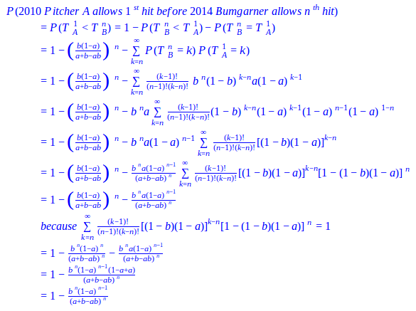
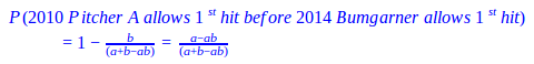
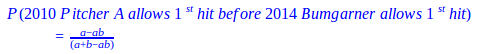
be a random variable for the total batters faced when he allows his mth hit; similarly, let b be P(H) for 2014 Bumgarner and TB1 be a random variable for the total batters faced when he allows his 1st hit. If 2010 Pitcher A allows his mth hit on the jth batter, he will have a combination of m hits and (j-m) non-hits (outs, walks, sacrifice flies, hit-by-pitches) with the respective probabilities of a and (1-a); meanwhile 2014 Bumgarner will eventually allow his 1st hit on the (j+1)th batter or later and he will have 1 hit and the rest non-hits with the respective probabilities of b and (1-b). We can then sum each jth scenario together for any number of potential batters faced (all j≥m) to create the formula below:

Formula 4.1

If we assume an even pitchers’ duel of who will allow the 1st hit, for m=1, then we have the following intuitive formula for 2010 Pitcher A versus 2014 Bumgarner:

Formula 4.2

This formula takes the probability that 2010 Pitcher A allows a hit minus the probability that both pitchers allow a hit and divides it by the probability that 2010 Pitcher A or 2014 Bumgarner allow a hit. Furthermore, if we let this happen for m hits, we arrive at our deduced formula. We should also note that according to the deduced formula, we should see the probability decrease as m increases. This logic makes sense because the expected span of batters until 2014 Bumgarner allows his 1st hit, TB1, stays the same, but we are trying to squeeze in more hits allowed by 2010 Pitcher A, which makes the probability become less likely.

Table 4.1:  Probability of 2010 Pitcher A Allowing mth Hit Before 2014 Bumgarner Allows 1st

Tim Lincecum

Matt Cain

Jonathan Sanchez

Madison Bumgarner

World Series P(H) 0.196 0.143 0.273 0.111
Allows 1st Hit before Bumgarner’s 1st 0.583 0.504 0.660 0.441
Allows 2nd Hit before Bumgarner’s 1st 0.340 0.254 0.435 0.195
Allows 3rd Hit before Bumgarner’s 1st 0.198 0.128 0.287 0.086

In Table 4.1, we compare 2014 Bumgarner and his 0.123 World Series P(H) versus each starter from the 2010 World Series Giants rotation and their respective P(H). We expect 2014 Bumgarner to have the advantage over 2010 Lincecum, Cain, and Sanchez, given how he dominated the 2014 World Series; clearly he does. In an even pitchers’ duel, he would win with a probability greater than 50% even after the chance of a tie is removed; we could even see 2 hits from the other pitchers before 2014 Bumgarner allows his 1st with a probability greater than 25%. However, against a comparably excellent pitcher, himself in 2010, he would likely lose the duel because 2010 Bumgarner actually has a better P(H). Notice that from Sanchez to Lincecum and from Lincecum to Cain, the P(H) descends steadily each time; consequently, the same pattern of linear decline also follows duel probabilities when transitioning from pitcher to pitcher for each of the different hits allowed. Hence, the distinction between exceptional and below-average pitchers stays relatively constant as we allow more hits by them versus 2014 Bumgarner.

We can also construct the converse formula to calculate the probability that 2010 Pitcher A allows 1 hit before 2014 Bumgarner allows his nth hit. We let TBn 
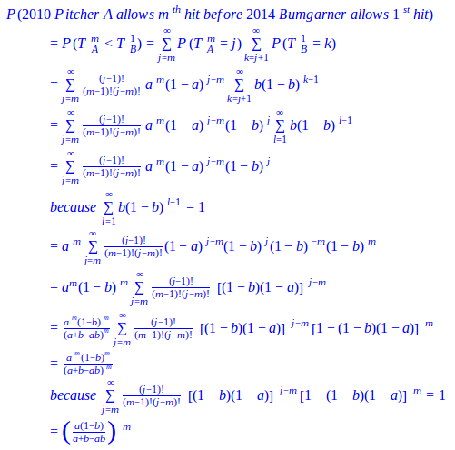
be a random variable for the total batters faced when 2014 Bumgarner allows his nth hit and TA1 for when 2010 Pitcher A allows his 1st hit. However, instead of directly deducing the probability that 2010 Pitcher A allows 1 hit before 2014 Bumgarner allows his nth hit, we’ll do so indirectly by taking the complement of both the probability that 2014 Bumgarner allows his nth hit before 2010 Pitcher A allows his 1st hit (a variation of our first formula) and the probability that 2014 Bumgarner allows his nth hit and 2010 Pitcher A allows his 1st hit after the same number of batters.

Formula 4.3

The resulting formula takes the complement of the probability that 2014 Bumgarner allows n hits and 2010 Pitcher A does not allow a hit in (n-1) chances and divides it by the probability that 2010 Pitcher A or 2014 Bumgarner allow n hits. In this formula we can contrarily see the probability increase as n increases. By extending the expected span of batters, TBn, to accommodate 2014 Bumgarner’s n hits instead of just 1, we’re granting 2010 Pitcher A more time to allow his 1st hit, resulting in an increased likelihood.

Once again, if we set n=1 for an even matchup, we get the same formula as before:

Formula 4.4

Table 4.2:  Probability of 2010 Pitcher A Allowing 1st Hit Before 2014 Bumgarner Allows nth

Tim Lincecum

Matt Cain

Jonathan Sanchez

Madison Bumgarner

World Series P(H) 0.196 0.143 0.273 0.111
Allows 1st Hit before Bumgarner’s 1st 0.583 0.504 0.660 0.441
Allows 1st Hit before Bumgarner’s 2nd 0.860 0.789 0.916 0.723
Allows 1st Hit before Bumgarner’s 3rd 0.953 0.910 0.979 0.862

In Table 4.2, we again use 2014 Bumgarner’s 0.123 P(H) versus those displayed in the table above. As expected, the probabilities from the even duels are the same as Table 4.1 because the formulas are the same. Although this time from Sanchez to Lincecum and from Lincecum to Cain, the difference between each pitcher noticeably decreases as we adjust the scenario to allow 2014 Bumgarner more hits. Thereby, there is less distinction between exceptional and below-average pitchers if we widen the range of batters, TBn, enough for them to allow their 1st hit versus 2014 Bumgarner.

Madison Bumgarner may have dominated the 2014 World Series as a starter, but he also forcefully shut the door on the Royals to carry his team to the title (by ominously throwing 5 IP, 2 H, 0 BB). Given the momentum he had, he proved himself to be Bruce Bochy’s best option. However, not every game is Game 7 of the World Series, where a manager must decisively bring in the one reliever he trusts the most. A manager needs to assess who is the appropriate reliever for the job and weigh which relievers will available later. Fortunately, an indirect benefit of the pitchers’ duel model is that it can calculate the relative probability between two relievers for who will allow a hit or baserunner first; this application could be very useful in long relief or in extra innings.

Table 4.3:  Probability of 2010 Pitcher A Allowing mth Baserunners Before 2014 Bumgarner Allows 1st

Tim Lincecum

Matt Cain

Jonathan Sanchez

Madison Bumgarner

World Series OBP 0.268 0.214 0.409 0.185
Allows 1st BR before Bumgarner’s 1st 0.602 0.547 0.698 0.511
Allows 1st BR before Bumgarner’s 2nd 0.362 0.299 0.487 0.261
Allows 1st BR before Bumgarner’s 3rd 0.218 0.164 0.339 0.133

Suppose we’re entering extra innings and the only pitchers available are 2014 Bumgarner and 2010 Bumgarner, Lincecum, Cain, and Sanchez with their respective statistics from Table 4.3 (where we substituted P(H) in Table 4.1 for OBP). We wouldn’t automatically throw in our best pitcher, 2014 Bumgarner, with his 0.151 OBP; we need to compare how he would perform relative to the other 2010 pitchers and see what the drop off is. Nor is it a priority to know how many innings to expect out of our reliever because we don’t know how long he’ll be needed. What is crucial in this situation is the prevention of baserunners as potential runs. 2010 Bumgarner, Cain, and Lincecum would each be worthy candidates to keep 2014 Bumgarner in the bullpen, because each has a reasonable chance (greater than 40%) of allowing a baserunner by the same batter or later than 2014 Bumgarner. Hence, the risk of using a pitcher with a slightly greater chance of allowing a baserunner sooner may be worth the reward of having 2014 Bumgarner available in a more dire situation. Yet, we would want to avoid bringing in 2010 Sanchez because the risk would be too great; the probability is approximately 49% that he could allow two baserunners before 2014 Bumgarner allows one. Preventing baserunners and using your bullpen appropriately are both high priorities in close game situations where mistakes are magnified.


Complete Outfield Dimensions

I’ve been consistently dismayed at how metrics such as park factors could be calculated when it seems as if the fundamental data for calculating such metrics, the actual size and dimensions of MLB parks, is unknown.

Any diagram or database of park dimensions I’ve found usually has LF, CF, and RF distances measured along with distances from home plate to the power alleys. A typical diagram is the following one of Fenway Park where five “important” distances have been marked.

The locations of these markings, particularly the power alleys, is extremely inconsistent across the different ballparks. In some parks the power alleys are measured at LCF and RCF (22.5° from each foul line), in other parks it’s where there is a corner in the outfield fence, and in other parks it’s just somewhere. In the Fenway image it’s impossible to tell where exactly any of those markings are and what any of the distances are between them. In any case, these five data points, plus any other distance markings, are not enough to define the shape and size of a ballpark.

We should be able to point in any direction in a ballpark and know the exact distance to the fence. Guessing by examining the proximity to the closest marked spot is insufficient for any real analysis. In order to understand the properties of a ballpark, to, for example, determine the ideal defensive positioning of the outfielders, we need to be able to mathematically define the boundaries, i.e. the location of the outfield fence.

These mathematical formulas defining the outfield fences are exactly what this article presents. If you look to the bottom of this article you’ll see the 30 equations that define the major league outfield fence distances from home plate. The equations are given in polar coordinates in terms of the angle θ from the right field foul line (RF=0°, LF=90°). The resulting distance, r, is given in feet.

The equations are all piecewise functions, with breaks between the sub-functions whenever the outfield wall changes direction. The sub-functions are given by linear functions or ellipses (all mapped to polar coordinates) where appropriate. Some ballparks are more complicated than others and that’s generally reflected in the number of required sub-functions. Some of the functions may seem intimidating, however, I would intend that any analysis with these functions would be done by computer, which makes the number of sub-functions in each piecewise definition generally irrelevant once the equations have been coded.

These equations were determined by examining the diagrams at ESPN Home Run Tracker, as well as park dimension data from Wikipedia, Clem’s Baseball, MLB team pages, and any other park diagrams I could find. These sources were not always in agreement and I used my best judgment when these situations arose, however I would guess that the standard error of the fence distance for any angle for any park is only a couple feet. There are also often many more precision digits that appear in the equations than necessary. This is for two reasons. The first reason is that it helps avoid discontinuities when transitioning between the functions and the second reason is that sometimes I just wrote down a lot of digits.

As a simple exercise of what can be done with this type of data, I’ve calculated the areas of the outfields of all the different MLB parks, as well as the respective sizes of left, center, and right field. The results are shown in Table 1 (sortable by clicking any of the header items). As an arbitrary start point, I assumed the outfield started 150 feet away from home plate and that each field spans 30°. Many of these results match our intuition (Yankee Stadium RF is tiny, Comerica Park CF is huge), but we now have numbers assigned to that intuition that can be analyzed.

Table 1: Outfield Areas (x1000 ft2)
City Team Stadium OF LF CF RF
Arizona Diamondbacks Chase Field 94.1 28.7 36.2 29.2
Atlanta Braves Turner Field 94.1 29.2 35.3 29.6
Baltimore Orioles Oriole Park at Camden Yards 87.8 27.1 34.4 26.3
Boston Red Sox Fenway Park 83.5 21.1 32.8 29.6
Chicago Cubs Wrigley Field 89.7 26.8 34.1 28.8
Chicago White Sox U.S. Cellular Field 87.8 26.5 34.2 27.2
Cincinnati Reds Great American Ball Park 87.1 26.7 34.5 26.0
Cleveland Indians Progressive Field 85.6 25.8 33.2 26.6
Colorado Rockies Coors Field 97.3 30.2 38.3 28.8
Detroit Tigers Comerica Park 95.8 28.5 39.9 27.4
Houston Astros Minute Maid Park 88.6 23.2 38.8 26.6
Kansas City Royals Kauffman Stadium 97.9 30.4 36.9 30.5
Los Angeles Angels Angel Stadium 89.2 29.0 32.7 27.5
Los Angeles Dodgers Dodger Stadium 91.1 28.8 33.8 28.5
Miami Marlins Marlins Park 93.4 28.3 36.9 28.3
Milwaukee Brewers Miller Park 91.1 28.9 34.6 27.6
Minnesota Twins Target Field 90.4 28.0 35.8 26.6
New York Mets Citi Field 91.5 27.1 36.0 28.4
New York Yankees Yankee Stadium 87.6 27.7 35.6 24.2
Oakland Athletics O.co Coliseum 88.4 27.5 33.4 27.5
Philadelphia Phillies Citizens Bank Park 86.2 25.7 34.9 25.5
Pittsburgh Pirates PNC Park 90.2 29.8 33.9 26.5
San Diego Padres PETCO Park 90.8 27.9 35.0 27.8
San Francisco Giants AT&T Park 92.2 27.3 36.2 28.7
Seattle Mariners Safeco Field 87.8 27.2 34.2 26.4
St. Louis Cardinals Busch Stadium 91.1 28.6 34.1 28.4
Tampa Bay Rays Tropicana Field 89.6 27.4 36.5 25.7
Texas Rangers Globe Life Park in Arlington 92.7 28.9 36.1 27.7
Toronto Blue Jays Rogers Centre 91.8 27.9 35.9 27.9
Washington Nationals Nationals Park 88.8 28.2 32.8 27.8

The previous definition of the different fields could be modified or determined based on the intended purpose. For example, for determining the outfield positioning, the relative speed of each fielder would determine the area for which each fielder is responsible. With these equations, those values can be exactly calculated. Also, just because two fields have the same area, does not mean they are of equal difficulty to defend. The shape of the fence determines how accessible the different parts of the area are. Again though, with these equations these shapes and values can be determined.

These equations are limited though in that they only define the outfield in fair play. For further research and to more completely account for different stadiums, the distances from the plate to the fence for all 360° of rotation should be known. Foul territory is a much greater consideration in some parks than others.

And now, the equations.

Arizona Diamondbacks – Chase Field

Atlanta Braves – Turner Field

Baltimore Orioles – Oriole Park at Camden Yards

Boston Red Sox – Fenway Park

Chicago Cubs – Wrigley Field

Chicago White Sox – U.S. Cellular Field

Cincinnati Reds – Great American Ball Park

Cleveland Indians – Progressive Field

Colorado Rockies – Coors Field

Detroit Tigers – Comerica Park

Houston Astros – Minute Maid Park

Kansas City Royals – Kauffman Stadium

Los Angeles Angels – Angel Stadium

Los Angeles Dodgers – Dodger Stadium

Miami Marlins – Marlins Park

Milwaukee Brewers – Miller Park

Minnesota Twins – Target Field

New York Mets – Citi Field

New York Yankees – Yankee Stadium

Oakland Athletics – O.co Coliseum

Philadelphia Phillies – Citizens Bank Park

Pittsburgh Pirates – PNC Park

San Diego Padres – PETCO Park

San Francisco Giants – AT&T Park

Seattle Mariners – Safeco Field

St. Louis Cardinals – Busch Stadium

Tampa Bay Rays – Tropicana Field

Texas Rangers – Globe Life Park in Arlington

Toronto Blue Jays – Rogers Centre

Washington Nationals – Nationals Park


Fantasy Baseball: Are Some Categories More Important Than Others?

While doing some work on my pre-season projections sheet, I came across a link to complete data from Razzball – complete full-season data for 48 12-team 5×5 fantasy baseball leagues[1]. I’ve been using this as a handy cross-reference in doing some SPG (Standings Points Gained) calculations, but I decided to try and use the data to do an exercise on something I’d been thinking about: are some categories more important than others?

First, I looked at the by-category scores for all 48 first place teams, then all the second place teams, etc:

R

HR RBI SB Avg W Sv K ERA WHIP Avg score
1st pl teams

10.8

10.4 10.2 9.8 8.3 10.7 10.3 11.1 9.8 9.9

10.11

2nd pl teams

9.8

9.0 9.9 8.3 8.2 9.5 9.8 9.9 9.6 9.1

9.31

3rd pl teams

9.0

8.4 9.1 8.5 7.6 8.9 8.9 9.1 8.1 7.8

8.56

4th pl teams

8.5

8.0 8.2 7.8 7.7 7.7 7.7 7.8 7.6 7.6

7.86

5th pl teams

7.9 7.5 6.9 7.4 6.8 7.3 7.2 7.5 7.1 6.8

7.24

The 48 first place teams, on average, scored 10.11 in the 5×5 categories. So basically a top-3 finish in all categories. Not that surprising.

Digging a bit deeper, I looked at the average score in each category for 1st place teams, then for 2nd place teams, and so on. I included the standard deviation (a measure of variability) and how often a team was in the top 3 for that category:

1st Place teams R HR RBI SB Avg W Sv K ERA WHIP
Average score 10.8 10.4 10.2 9.8 8.3 10.7 10.3 11.1 9.8 9.9
Std Dev 1.6 2.1 2.3 2.3 2.9 1.7 1.8 1.2 2.2 2.0
% in top 3 77.1% 72.9% 70.8% 62.5% 41.7% 79.2% 75.0% 87.5% 64.6% 66.7%
2nd place teams R HR RBI SB Avg W Sv K ERA WHIP
Average score 9.8 9.0 9.9 8.3 8.2 9.5 9.8 9.9 9.6 9.1
Std Dev 2.0 2.6 2.0 3.0 3.2 1.9 2.3 1.9 2.4 2.6
% in top 3 58.3% 52.1% 68.8% 41.7% 43.8% 60.4% 68.8% 66.7% 62.5% 56.3%
3rd place teams R HR RBI SB Avg W Sv K ERA WHIP
Average score 9.0 8.4 9.1 8.5 7.6 8.9 8.9 9.1 8.1 7.8
Std Dev 2.5 3.1 2.3 2.8 3.2 2.5 2.6 2.1 2.8 2.7
% in top 3 54.2% 47.9% 54.2% 47.9% 33.3% 52.1% 50.0% 50.0% 39.6% 37.5%

A quick glance seems to suggest that the most important categories were Runs on the batting side, and Ks on the pitching side: the average score for the team that won their league was highest – by quite a margin, and also varied less – for those two categories. Winning teams were also more likely to be at least in the top 3 in Runs and Ks compared to any of the other batting and pitching categories, respectively.

Conversely, Batting Average did not appear to be that important – less than half of the teams that won their league were in the top 3 in Batting Average, and it had the lowest average score for champion teams of all the 5×5 categories. It was also the most volatile – with a standard deviation of 2.9, around 67% of teams that won their league would have had a Batting Average score ranging from 11.2 down to as low as 5.3!

What about second-place teams? Ks and Runs were important here as well, but without the gaps seen for winning teams. The highest-scoring category on the pitching side was again Ks, but at 9.9, this was only 0.1 higher than the second category (Saves). On the hitting side, RBIs had the highest average score at 9.9, with Runs at 9.8

There’s another way to look at the data – if you were the leader in, say, Home Runs, how likely is it that you won your league? Here’s another breakdown:

1st in category
R HR RBI SB Avg W Sv K ERA WHIP
Avg Finish 2.1 3.0 3.0 3.4 5.2 2.5 3.1 2.2 3.2 3.6
% in top 3 75.0% 58.3% 56.3% 50.0% 31.3% 60.4% 58.3% 75.0% 60.4% 54.2%
2nd in category
R HR RBI SB Avg  W Sv K ERA WHIP
Avg Finish 3.4 4.3 3.3 4.3 4.9 3.5 3.0 3.3 4.5 4.2
% in top 3 39.6% 35.4% 56.3% 31.3% 31.3% 43.8% 41.7% 43.8% 27.1% 35.4%
3rd in category
R HR RBI SB Avg  W Sv K ERA WHIP
Avg Finish 4.3 4.3 4.1 4.7 5.5 4.1 3.8 3.5 4.6 4.9
% in top 3 20.8% 31.3% 25.0% 22.9% 22.9% 31.3% 43.8% 35.4% 39.6% 29.2%

This table tells us, for example, that once again, teams that finished tops in Runs or K’s, had an average overall finish of 2.1 and 2.2, respectively: basically, they finished 1st or 2nd overall in their league, and fully 75% of teams that were first in Runs or K’s had a top-3 overall finish. (15 teams were first in both Runs and Ks – of those, 14 won the league; the lone exception came in third).

Conversely, teams that had the best Batting Average only finished 5th on average, and only 30% of teams with the best batting average were in the top 3.

I’m not showing the data here, but the reverse was also true: of the teams that were in the bottom half in the league in Runs, or in K’s, exactly none of them won the league. None. Only four teams (for both Runs and K’s) even managed a 2nd place overall finish!

On the flip side, there were 26 teams that were in the bottom half in Batting Average but 1st or 2nd overall, including 14 overall winners.

So the data appear to be telling us that we need to focus on Runs and Ks, and not worry quite as much about Batting Average. There may be some logic behind this: players scoring lots of runs are, perhaps, coming to bat more often, which means more opportunities for HRs, SBs and RBIs. Pitchers generating lots of Ks are perhaps more likely to be in position to pick up Wins and Saves and have better ratios.

While I don’t think anyone would recommend ignoring a category altogether – even Batting Average – I think the key takeaway is that in looking at roster construction, you might benefit by paying closer attention to Runs and K’s – for example, by letting those two categories be the tie-breaker if two players appear to be close in value.

Obviously, none of this is particularly new or revolutionary. And of course the usual caveats apply: 48 leagues from one particular year may or may not be a sufficient sample size to draw conclusions from. Results will almost certainly differ in some way or another for leagues with different settings (1 catcher leagues vs 2 catcher leagues, 5 outfielders & 1 util vs 3 OF and 2 util, etc). My knowledge (or lack thereof) of statistics and such could make the entire exercise completely worthless, etc.

But I, at least, found it interesting – that’s all that matters, really – and I am looking to incorporate this as I do my projections this year.

[1] 12-team, standard 5×5, 5 outfielders and one utility spot; max 180 games started for pitchers, and – at least according to Razzball – the Razzball leagues are supposed to be generally more competitive that more casual leagues.


A zDefense Primer

This is installment 2 of the Player Evaluator and Calculated Expectancy (PEACE) system, which will culminate in a completely independent calculation of wins relative to replacement-level players.  Part 1 can be found here: http://www.fangraphs.com/community/an-introduction-to-calculated-runs-expectancy/

I reference Calculated Runs Expectancy a lot, so I highly recommend reading that article to gain some understanding of what I’m talking about.  Today I’m going to introduce my own defensive metric, zDefense, which operates under the same aggregate sum logic as UZR, but utilizes completely different arrangements of its components.

zDefense has 3 different methods of calculation: one for pitchers and catchers, one for infield positions, and one for outfielders.  I’ll explain how all three forms work to calculate each player’s defensive contribution in terms of runs relative to average (which for fielding is also considered “replacement-level”).  For this report, the seasons 2012-2014 have been calculated and will be compared throughout.

For pitchers and catchers, where Ball in Zone (BIZ) data isn’t available, the only calculation is zFielding, which measures how many relative runs player’s allowed according to Calculated Runs Expectancy (CRE).  For the pitchers, their defense is measured in terms of stolen bases, caught stealing, pickoffs, errors, and balks.  The catchers are judged based on stolen bases, caught stealing, wild pitches and passed balls, pickoffs, and errors.  In order to isolate each player’s individual contribution, each team’s “Base CRE” is calculated by taking their opponents’ offensive numbers and zeroing all baserunning/fielding statistics.  Then each player’s defensive numbers are included as the offensive counterpart and the difference between the new CRE calculation and the Base CRE indicates runs credited to that player defensively.  For example, in 2014 the St. Louis Cardinals had a Base CRE of 491 runs.  When analyzing Yadier Molina, his statistics (21 Stolen Bases, 23 Caught Stealing, 6 Pickoffs, 27 Bases Taken) are included in the equation and produce a new CRE value of 500, which means that he was responsible for about 9 runs allowed defensively.  This is done for all players and then compared to the positional average, which is where pitchers and catchers deviate from the other positions.

Without BIZ data, pitchers and catchers are evaluated based on the positional average number of innings played per defensive run allowed.  All other positions, however, are evaluated relative to the average number of runs allowed per ball in zone.  These numbers are almost constant year-to-year, with only miniscule variations (for example, the number of runs per BIZ for outfielders from 2012-2014 were 0.079, 0.079, and 0.078).

So in order to calculate Yadier Molina’s 2014 zDefense, his numbers would be plugged into the equation:

  • zDefense (Pitchers/Catchers) = (Innings Played / Positional Innings per Run) – Player Defensive Runs Allowed
  • zDefense (Molina, 2014) = (931.7 / 38.9) – 9.1 = +14.820


In 2014, catchers averaged one defensive run allowed every 38.9 innings; which means that an average catcher would be expected to allow about 24 runs in the number of innings that Molina caught.  Instead, he only allowed 9, saving the Cardinals nearly 15 runs in 2014.  This is all it takes to calculate the defensive contribution of pitchers and catchers.

For infielders and outfielders, zFielding is just one component; one that essentially tells how well fielders handled balls hit to them in terms of errors and preventing baserunner advancement.  It’s calculated slightly differently than for pitchers and catchers, but the first few steps are the same: find the team Base CRE, include player defensive stats, find the difference between the two CRE calculations, compare to positional rate.  Let’s use the Royals’ Alex Gordon in 2014 as an example.  The Royals as a team had a Base CRE of 519, and Gordon’s defensive contribution resulted in a new CRE of 528 (a difference of 9.1).  From here, just plug in the variables:

  •  zFielding (Infielder/Outfielders) = (Positional Runs per BIZ * Player BIZ) – Player Defensive Runs Allowed
  • zFielding (Gordon, 2014) = (0.064 * 261) – 9.1 = +7.724


Considering the number of balls in Gordon’s zone in 2014, he saved the Royals nearly 8 runs just by preventing errors and baserunner advancement.  But there are still a few other considerations for position players: zRange, zOuts, and zDoublePlays.

zRange attempts to quantify the number of runs saved by simply reaching balls in play using BIZ data and the runs per BIZ table from above.  It has 2 forms, one each for infielders and outfielders, but both begin the same way.  The first step is to find each position’s Real Zone Rating (RZR), which measures the percentage of BIZ fielded.  These numbers are more dynamic than the previous table, and the general trend has been towards higher RZR at all positions as offensive production has dwindled in the past decade.

The next step is basically the exact same as zFielding, except instead of finding relative runs allowed, we are looking for relative plays made.  For example, Alex Gordon in 2014 fielded 235 out of 261 BIZ (0.900 RZR), which was better than his positional average of 0.884.  By multiplying 261 and 0.884, it can be seen that Gordon reached about 4 more balls than the average left fielder would have.  From there, the relative number of plays is multiplied by the appropriate constant.  This is where one of the alterations to zDefense occurred.

For infielders, the idea is that by reaching a ball in play, the fielder has prevented the ball from reaching the outfield.  So in theory, this reduces the average number of runs that hit ball would be worth.  This is known as the IF (infield) Constant, and is the difference between the average runs per BIZ between outfield and infield balls in play.  In 2014 this constant was 0.068 (0.078 – 0.010), and has been nearly identical for each of the past three seasons.

For outfielders, the ball in play will almost always be classified as an outfield ball regardless of whether the fielder reaches it or not, so the OF (outfield) constant is just the average number of runs per BIZ for the outfield as a whole.  In 2014 this was 0.078, which would be multiplied by Gordon’s 4 relative plays above average.

Additionally, each player fields a number of balls outside of their zone (OOZ).  The number of OOZ plays is halved because they aren’t necessarily run-saving plays: when a shortstop catches a popup on the pitcher’s mound or when the first baseman extends to his right rather than let the second baseman handle the play, they may count as OOZ plays without being marginally beneficial.  The half of OOZ plays is also multiplied by the appropriate constant, added onto the previous product, and produces zRange.

  • zRange = {[Player Plays Made – (Player BIZ * Positional RZR)] + (Player OOZ Plays Made / 2)} * IF/OF Constant
  • zRange (Gordon, 2014) = {[235 – (261 * 884)] + (106 / 2)} * 0.078 = +4.436


On top of saving the Royals 8 runs with his arm and glove, Gordon also saved them over 4 runs with his legs and eyes.  This is where the biggest change to the formula happened; before, zRange was being calculated nearly identically to zOuts, which resulted in players essentially being credited twice with their relative RZR.  Instead, zRange just multiplies relative plays by the appropriate constant and recognizes that zOuts is a reflection of range and ability to convert balls into outs.

zOuts uses a very different approach than the previous 2 components; rather than find relative run values by conventional means, a rate statistic z-score is found and then multiplied by “playing time.”  It will be shown in the next section that this works remarkably well, but for now we are just looking at the derivation.  For zOuts, 2 different numbers are required for each player: their Real Zone Rating, and their Field-to-Out Percentage (F2O%).  These 2 numbers combine to form outs per BIZ, which is the comparative average each player is evaluated against.  Like the previous numbers, these also remain fairly consistent with a general trend negatively related to scoring.

Also required for z-scores is the standard deviation.  For these calculations, I have been using the standard deviation for just players with at least 100 innings played at that position to eliminate outliers.

Taking the z-score of outs per BIZ is simple enough, but what defines “playing time?”  Well, there are 2 factors that work well in eliminating outliers: the first is the percentage of total innings played at that position by that player.  If a team plays 1400 innings in the field over the course of the year, it means there are 1400 defensive innings available at each position, so a player who played in 1000 of them would have played about 71% of the defensive innings at that position.  The second factor considers that while players may have played an equal number of innings, they may not have had an equal number of balls to field.  This factor is one-half the square root of the number of BIZ for each player.

  • zOuts = [(Player O/BIZ – Positional O/BIZ) / Positional O/BIZ Standard Deviation] * (Player Innings / Team Innings) * (√ Player BIZ / 2)
  • zOuts (Gordon, 2014) = [(0.450 – 0.417) / 0.068] * (1372.7 / 1450.7) * (√ 261 / 2) = +3.741


zOuts is a blended statistic; it measures how well players convert balls into outs by considering their range and out-producing ability.  Alex Gordon saved the Royals another 4 runs this way, which brings his total zDefense to:

  • zDefense (Outfielders) = zFielding + zRange + zOuts
  • zDefense (Gordon, 2014) = +7.724 + 4.436 + 3.741 = +15.900


This is all it takes to calculate the defensive contribution of outfielders, but infielders still have one more factor to consider: double play ability.  zDoublePlays is nearly identical to zOuts, except double plays per BIZ is the positional average required.

From there, the calculation is almost the same as zOuts:

  • zDoublePlays = [(Player DP/BIZ – Positional DP/BIZ) / Positional DP/BIZ Standard Deviation] * (Player Innings / Team Innings) * (√ Player BIZ / 2) * Positional DP/BIZ


The last part at the end affects the weight of zDP in the overall zDefense equation.  The ability to turn double plays isn’t really a selling point for corner infielders because of the relative rarity of those plays.  Double play ability is much more relevant to middle infielders, and multiplying by the positional averages helps to bring this disparity into the equation.  JJ Hardy consistently ranks as elite in terms of double play ability, so we’ll use him as the example player here:

  • zDoublePlays (Hardy, 2014) = [(0.313 – 0.236) / 0.091] * (1257.0 / 1461.3) * (√ 316 / 2) * 0.236 = +1.540


And if we want the entire infielder formula written out:

  • zDefense (Infielders) = zFielding + zRange + zOuts +zDoublePlays


Like the previous post, there is a lot of new information to take in here, so feel free to ask any questions or leave any comments with feedback, thoughts, or concerns with work I’ve presented.  The next installment will be an exploration of z-scores in sports and how they correspond to actual points/runs, which I’ll use to provide credibility for zDefense.


Why the Chicago Cubs Should Keep Starlin Castro

Ever since the Cubs acquired top shortstop prospect Addison Russell from the Oakland Athletics in the Jeff Samardzija and Jason Hammel deal people began to speculate that Starlin Castro’s time in Chicago may be coming to a close sooner rather than later. Castro’s name began to pop up in trade rumors all the time, Castro to the Mets, Castro to Seattle etc… but Cubs President Theo Epstein and General Manager Jed Hoyer told teams that Castro wasn’t going anywhere. With all the middle infield talent the Cubs have people see Castro as the odd man out. The front office repeated their message about Castro being their guy early in the offseason by saying “ Starlin is our shortstop in 2015.” I know a lot of people expect Castro to be traded at some point, but I’ll go over why I think they should keep the three-time All-Star, and how he’s becoming a better player.

Contract

First off Castro is still young currently 24 years old (he’ll turn 25 in spring training). Castro also has a team friendly deal at 7yr/$61M with an option for the 2020 season. This contract averages out to $8.7M each year, although the contract is back loaded, but still an average of $8.7M is a bargain for a premium position in today’s MLB market.

 Year  Age  Salary
2015 25 $6,857,143
2016 26 $7,857,143
2017 27 $9,857,143
2018 28 $10,857,143
2019 29 $11,857,143
2020 30 $16,000,000 (Team Option) $1M Buyout

Lets compare Starlin’s contract to another young shortstop, Elvis Andrus of the Texas Rangers. Andrus signed an 8yr/$120M contract with the Rangers.

Year Age Salary
2015 26 $15,000,000
2016 27 $15,000,000
2017 28 $15,00,000
2018 29 $15,000,000
2019 30 $15,000,000
2020 31 $15,000,000
2021 32 $14,000,000
2022 33 $14,000,000
2023 34 $15,000,000 (Vesting Option)


As you can see Andrus is due significantly more money than Castro. Compared to Andrus’ contract Castro’s seems like a bargain. But the real question is who is the better player, and is Andrus worth $60M more than Castro? Lets look at each player’s career numbers.

Andrus has posted of career line of (.272/.335/.345) with an OPS of .680, 20 points lower than league average. He has totaled 20 home runs in 6 seasons. Castro has a career line of (.284/.325/.410) with an OPS of .735, 35 points higher than league average. Starlin has clubbed 51 career home runs in one fewer year than Andrus. By comparing these two players numbers and contracts you can clearly see that the Cubs are getting a great deal on Castro. Castro not only makes far less than Andrus he is a superior offensive player, and is also younger with more upside. I believe that Castro’s contract could become more of a steal if Castro becomes a better player, which he is starting to show signs of. Lets go over how Castro is starting to become better in all facets of the game.

Improving Power

Castro totaled 14 home runs in 2014 tying his career high set back in the 2012 season. Starlin would have easily set a new career high if not for an ankle injury that cost him most of September. Despite missing almost 30 games Castro still put up a career high SLG% of .438 besting his 2011 season SLG% of .432. Keep in mind that is the season where Castro hit .307 and had over 200 hits so therefore his slugging percentage was based more on singles and triples and fewer long balls.

One reason for Castro’s improving power is that he is starting to hit more fly balls, and those fly balls are starting to leave the ballpark. In 2010 when Starlin got called up as a 20 year old he looked like a 16 year old due to his lean frame. Castro hit only 3 home runs that year and was mainly a singles hitter when he first started his career. In 2010 Castro’s groundball percentage (GB%) was 51.3% and his fly ball percentage (FB%) was 29.2%, this equaled a groundball to fly ball ratio (GB/FB) of 1.76. Castro’s home run to fly ball ratio (HR/FB) in 2010 was only 2.6%, which ranked 19th out of 22 qualified shortstops. As you can see when Starlin first came up he was a singles hitter who mainly hit the ball on the ground, which isn’t a bad thing, and when he did elevate the ball it rarely left the yard.

Let’s look at these same numbers in 2014. His GB% dropped to 45.3% and his FB% rose to 32.3%, which equaled a GB/FB ratio of 1.40. Now where the biggest change happened is in his HR/FB ratio — it skyrocketed to 10.1%. This means 1 out of every 10 fly balls that Starlin hit traveled over the wall for a homer. His increased HR/FB ratio brought him to 4th among qualified shortstops in HR/FB ratio, which is a huge improvement over his rookie season.

With more fly balls from Castro you’ll see more of this

and this

and this

Not only is Castro hitting more home runs; he is hitting more impressive home runs like these above. Watching Castro’s 2014 season I found myself saying, “wow that was far” on more of his home runs than ever before in previous seasons.

For these reasons above I believe that Castro is poised to show even more power in the coming seasons due to his increased FB% as well as his vastly improved HR/FB ratio.

Improving Defense

Lets take a look at Castro’s fielding numbers from the beginning of his career until now.

Year Errors Fielding Percentage (FP%) FP% Change
2010 27 .950 N/A
2011 29 .961 +11
2012 27 .964 +3
2013 22 .967 +3
2014 15 .973 +6

When Starlin came up in 2010, defense was the biggest weakness of his game by far. In 2010 he committed 27 errors in 123 games, which ranked as the 2nd most in the MLB that year. His FP% of .950, was 2nd to last among qualified shortstops in 2010. In 2011 Castro committed 29 errors, which was the most in the majors that year, although he still ranked last in FP% among shortstops, his FP% rose by 11 points. In 2012 Castro tied for the major league lead in errors at 27. 2013 was more of the same tying for the second most errors in the majors, but in 2014 we saw a great improvement by his committing only 15 errors. This improvement is Starlin’s fielding brought him towards the middle of the pack in FP% among shortstops. Castro even had a 38-game errorless streak in 2014 as well, showing that he has gotten over his problem of making the routine throw to first.

Although the metrics are down on Castro as a defender, I see Castro get to balls that he has no business getting to. For example Castro is one of the best shortstops at making plays on bloopers and shallow fly balls, like this for example.

Castro has great range on balls hit over his head. Not only can he make the plays in shallow left and center field, he covers a lot of ground moving laterally and is quickly able to get to his feet and unleash a strong throw, like this for example.

As you can see Castro is improving his defensive game year by year and there is no evidence to suggest that he can’t get any better in 2015 as well. This is just one of the many ways that Castro is steadily improving his overall game.

Comparing Castro to Other Shortstops

As offensive numbers are down in recent years, finding a premium offensive shortstop is a hard thing to do. Lets see how Castro stacks up compared to other shortstops around the league in 2014.

Among qualified shortstops Castro led all of them in batting average at .292, He was 2nd in OBP at .339, and 3rd in SLG at .438. I’ll take a guy any day of the week that ranks in the top three of those categories among his position. Castro also ranked sixth in line drive percentage at 22.3% (which beat his previous career high by 2%), trailing the leader by only 2%. Castro also ranked first in batting average on balls in play (BABIP); these two categories combined shows that he is putting the ball in play and hitting the ball hard all over the field, which will generate a good average as well as power. Another stat where Castro is ranked in the top three among shortstops is wRC+; his wRC+ was 115, 15 points over league average, good enough for third among shortstops.

One knock on Castro in his career is that he doesn’t walk enough, but looking at the shortstop position as a whole no one is posting a staggering OBP (Except for Troy Tulowitzki, who is in another league compared to every other shortstop, but he can’t stay healthy). Therefore Castro’s .339 OBP is extremely good for a shortstop in the game today. I think people need to compare players to others playing that same position, because if you look at Castro’s numbers compared to other shortstops Starlin is clearly a top three shortstop in the game offensively.

What Do You Do With All These Shortstops?

Some people see the Cubs’ surplus of shortstops as a problem, but I see it as a good problem to have. Normally your shortstop is your most athletic player and covers the most ground, so why not have three of them in the infield? I think if the Cubs fielded and infield of Castro, Javier Baez, and Addison Russell, that infield would gobble up every groundball. Whether Castro sticks at short or if Russell comes up and becomes the shortstop that everyone thinks he will be, the Cubs could have a huge defensive advantage by playing three shortstops in the IF.

Playing three shortstops in the IF would shift Kris Bryant, who will be an average defensive 3B at best, to the outfield where his defense wouldn’t be as much of a concern. Bryant in LF would fill the one spot where the Cubs don’t have a top prospect. This would mean you would have a top prospect at every position in the future. For example C: Kyle Schwarber (if he can stick at C), 1B: All-Star Anthony Rizzo, a combination of Baez, Castro, and Russell all fitting at 2B, 3B, and SS (future positions TBD), LF: Bryant, CF: Albert Almora or Arismendy Alcantara (Alcantara could become super utility as well, a Ben Zobrist role), RF: Jorge Soler. I don’t know about you but a lineup filled with all those top prospects and all that power excites the heck out of me.

Overall I think Starlin Castro is severely under-appreciated not only by the MLB, but also by Cubs fans. Castro has improved in many areas, and I believe that he is among the top three shortstops in the game. Castro is starting to show that he has more power in that bat with an increased FB% and in his FB/HR ratio. Keeping Starlin Castro as well as all of the other shortstops could be very beneficial for the Cubs.