Author Archive

Complete Outfield Dimensions

I’ve been consistently dismayed at how metrics such as park factors could be calculated when it seems as if the fundamental data for calculating such metrics, the actual size and dimensions of MLB parks, is unknown.

Any diagram or database of park dimensions I’ve found usually has LF, CF, and RF distances measured along with distances from home plate to the power alleys. A typical diagram is the following one of Fenway Park where five “important” distances have been marked.

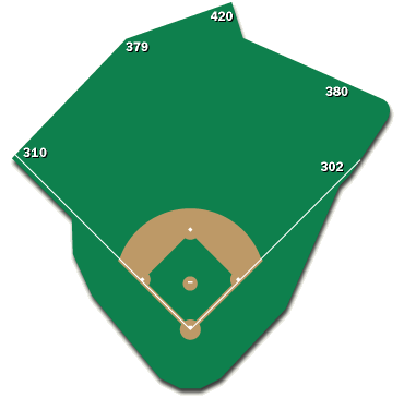
The locations of these markings, particularly the power alleys, is extremely inconsistent across the different ballparks. In some parks the power alleys are measured at LCF and RCF (22.5° from each foul line), in other parks it’s where there is a corner in the outfield fence, and in other parks it’s just somewhere. In the Fenway image it’s impossible to tell where exactly any of those markings are and what any of the distances are between them. In any case, these five data points, plus any other distance markings, are not enough to define the shape and size of a ballpark.

We should be able to point in any direction in a ballpark and know the exact distance to the fence. Guessing by examining the proximity to the closest marked spot is insufficient for any real analysis. In order to understand the properties of a ballpark, to, for example, determine the ideal defensive positioning of the outfielders, we need to be able to mathematically define the boundaries, i.e. the location of the outfield fence.

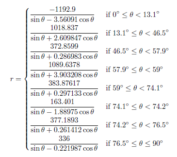
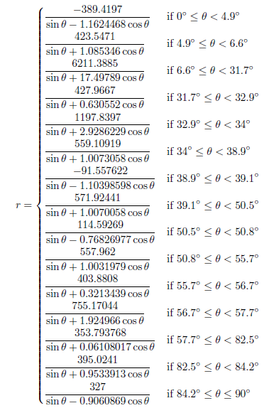
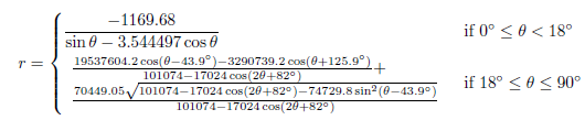
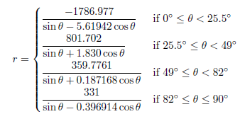
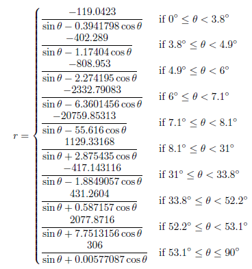
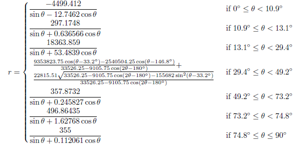
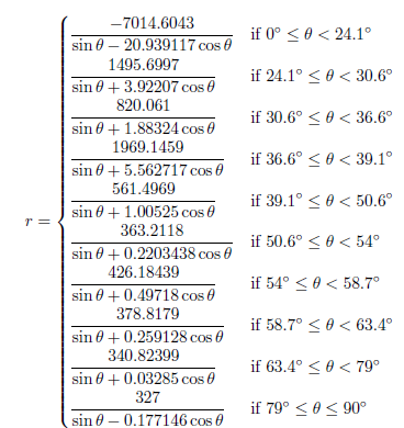
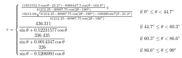
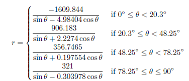
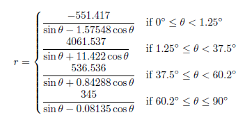
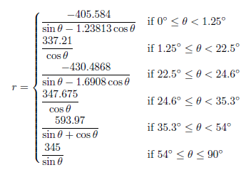
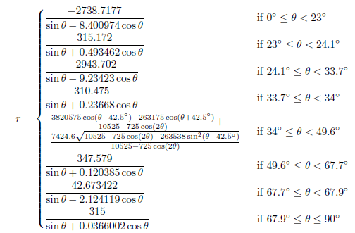
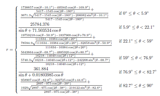
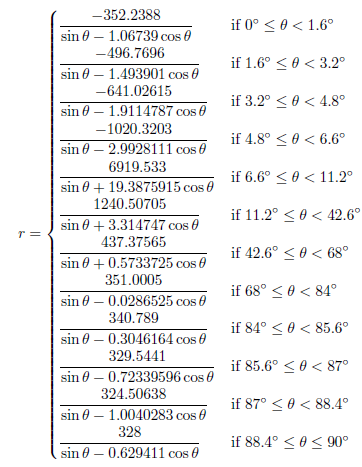
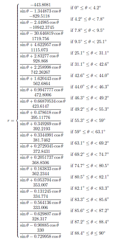
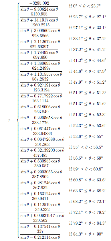
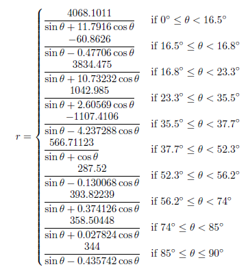
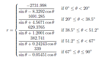
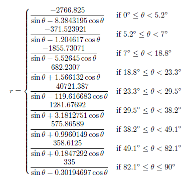
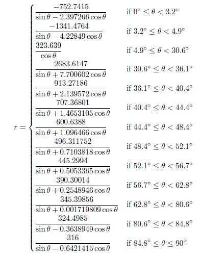
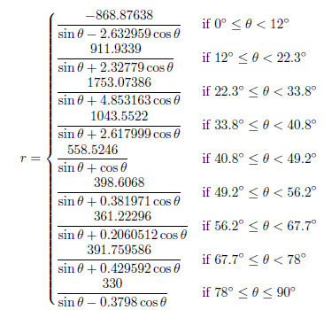
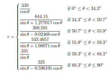
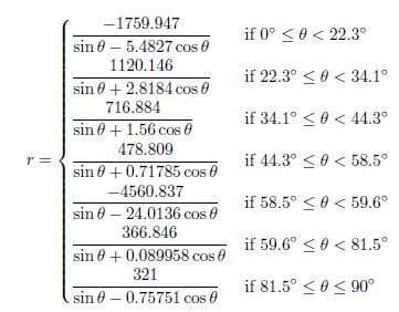
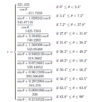
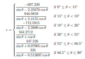
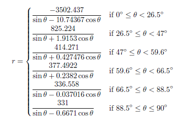
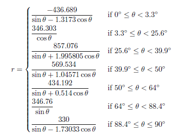
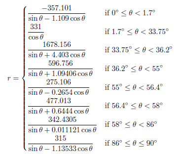
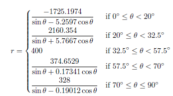
These mathematical formulas defining the outfield fences are exactly what this article presents. If you look to the bottom of this article you’ll see the 30 equations that define the major league outfield fence distances from home plate. The equations are given in polar coordinates in terms of the angle θ from the right field foul line (RF=0°, LF=90°). The resulting distance, r, is given in feet.

The equations are all piecewise functions, with breaks between the sub-functions whenever the outfield wall changes direction. The sub-functions are given by linear functions or ellipses (all mapped to polar coordinates) where appropriate. Some ballparks are more complicated than others and that’s generally reflected in the number of required sub-functions. Some of the functions may seem intimidating, however, I would intend that any analysis with these functions would be done by computer, which makes the number of sub-functions in each piecewise definition generally irrelevant once the equations have been coded.

These equations were determined by examining the diagrams at ESPN Home Run Tracker, as well as park dimension data from Wikipedia, Clem’s Baseball, MLB team pages, and any other park diagrams I could find. These sources were not always in agreement and I used my best judgment when these situations arose, however I would guess that the standard error of the fence distance for any angle for any park is only a couple feet. There are also often many more precision digits that appear in the equations than necessary. This is for two reasons. The first reason is that it helps avoid discontinuities when transitioning between the functions and the second reason is that sometimes I just wrote down a lot of digits.

As a simple exercise of what can be done with this type of data, I’ve calculated the areas of the outfields of all the different MLB parks, as well as the respective sizes of left, center, and right field. The results are shown in Table 1 (sortable by clicking any of the header items). As an arbitrary start point, I assumed the outfield started 150 feet away from home plate and that each field spans 30°. Many of these results match our intuition (Yankee Stadium RF is tiny, Comerica Park CF is huge), but we now have numbers assigned to that intuition that can be analyzed.

Table 1: Outfield Areas (x1000 ft2)
City Team Stadium OF LF CF RF
Arizona Diamondbacks Chase Field 94.1 28.7 36.2 29.2
Atlanta Braves Turner Field 94.1 29.2 35.3 29.6
Baltimore Orioles Oriole Park at Camden Yards 87.8 27.1 34.4 26.3
Boston Red Sox Fenway Park 83.5 21.1 32.8 29.6
Chicago Cubs Wrigley Field 89.7 26.8 34.1 28.8
Chicago White Sox U.S. Cellular Field 87.8 26.5 34.2 27.2
Cincinnati Reds Great American Ball Park 87.1 26.7 34.5 26.0
Cleveland Indians Progressive Field 85.6 25.8 33.2 26.6
Colorado Rockies Coors Field 97.3 30.2 38.3 28.8
Detroit Tigers Comerica Park 95.8 28.5 39.9 27.4
Houston Astros Minute Maid Park 88.6 23.2 38.8 26.6
Kansas City Royals Kauffman Stadium 97.9 30.4 36.9 30.5
Los Angeles Angels Angel Stadium 89.2 29.0 32.7 27.5
Los Angeles Dodgers Dodger Stadium 91.1 28.8 33.8 28.5
Miami Marlins Marlins Park 93.4 28.3 36.9 28.3
Milwaukee Brewers Miller Park 91.1 28.9 34.6 27.6
Minnesota Twins Target Field 90.4 28.0 35.8 26.6
New York Mets Citi Field 91.5 27.1 36.0 28.4
New York Yankees Yankee Stadium 87.6 27.7 35.6 24.2
Oakland Athletics O.co Coliseum 88.4 27.5 33.4 27.5
Philadelphia Phillies Citizens Bank Park 86.2 25.7 34.9 25.5
Pittsburgh Pirates PNC Park 90.2 29.8 33.9 26.5
San Diego Padres PETCO Park 90.8 27.9 35.0 27.8
San Francisco Giants AT&T Park 92.2 27.3 36.2 28.7
Seattle Mariners Safeco Field 87.8 27.2 34.2 26.4
St. Louis Cardinals Busch Stadium 91.1 28.6 34.1 28.4
Tampa Bay Rays Tropicana Field 89.6 27.4 36.5 25.7
Texas Rangers Globe Life Park in Arlington 92.7 28.9 36.1 27.7
Toronto Blue Jays Rogers Centre 91.8 27.9 35.9 27.9
Washington Nationals Nationals Park 88.8 28.2 32.8 27.8

The previous definition of the different fields could be modified or determined based on the intended purpose. For example, for determining the outfield positioning, the relative speed of each fielder would determine the area for which each fielder is responsible. With these equations, those values can be exactly calculated. Also, just because two fields have the same area, does not mean they are of equal difficulty to defend. The shape of the fence determines how accessible the different parts of the area are. Again though, with these equations these shapes and values can be determined.

These equations are limited though in that they only define the outfield in fair play. For further research and to more completely account for different stadiums, the distances from the plate to the fence for all 360° of rotation should be known. Foul territory is a much greater consideration in some parks than others.

And now, the equations.

Arizona Diamondbacks – Chase Field

Atlanta Braves – Turner Field

Baltimore Orioles – Oriole Park at Camden Yards

Boston Red Sox – Fenway Park

Chicago Cubs – Wrigley Field

Chicago White Sox – U.S. Cellular Field

Cincinnati Reds – Great American Ball Park

Cleveland Indians – Progressive Field

Colorado Rockies – Coors Field

Detroit Tigers – Comerica Park

Houston Astros – Minute Maid Park

Kansas City Royals – Kauffman Stadium

Los Angeles Angels – Angel Stadium

Los Angeles Dodgers – Dodger Stadium

Miami Marlins – Marlins Park

Milwaukee Brewers – Miller Park

Minnesota Twins – Target Field

New York Mets – Citi Field

New York Yankees – Yankee Stadium

Oakland Athletics – O.co Coliseum

Philadelphia Phillies – Citizens Bank Park

Pittsburgh Pirates – PNC Park

San Diego Padres – PETCO Park

San Francisco Giants – AT&T Park

Seattle Mariners – Safeco Field

St. Louis Cardinals – Busch Stadium

Tampa Bay Rays – Tropicana Field

Texas Rangers – Globe Life Park in Arlington

Toronto Blue Jays – Rogers Centre

Washington Nationals – Nationals Park


Why I Don’t Use FIP

Over the last decade, Fielding Independent Pitching (FIP) has become one of the main tools to evaluate pitchers. The theory behind FIP and similar Defensive Independent Pitching metrics is that ERA is subject to luck and fielder performance on balls in play and is therefore a poor tool to evaluate pitching performance. Since pitchers have little to no control over where batted balls are hit, we should instead look only to the batting outcomes that a pitcher can directly control and which no other fielder affects. In the case of FIP, those outcomes are home runs, strikeouts, walks, and hit batters.

However there are many serious issues with FIP that collectively make me question its usage and value. These issues include the theory behind the need for such a statistic, the actual parameters of the formula’s construction, and the mathematical derivation of the coefficients. Let’s address these issues individually.

Control over Balls in Play

A common statement when discussing FIP or BABIP is that pitchers have little to no control over the result of a ball once it is hit into play. A pitcher’s main skill is found in directly controllable outcomes where no fielder can affect the play, such as home runs, strikeouts, and walks (and HBP). In trying to estimate a pitcher’s baseline ERA, which is the objective of FIP, the approximately 70% of balls that are put into play can be ignored and we can focus only on the previously mentioned outcomes where no fielder touches the ball.

The concept of control is a little fuzzy though and something I believe has been misappropriated. It is definitely true that the pitcher does not have 100% absolute control over where a batted ball is hit. There is no pitch that anyone can throw that can guarantee a ball is hit exactly to a particular spot. However in the same vein, the batter doesn’t have 100% absolute control either. If you were to place a dot somewhere on the field, no batter is good enough to hit that spot every time, even if hitting off a tee.

However this lack of complete control should not in any way imply that the batter or pitcher doesn’t have any control at all over where the ball is hit. Batters hit the ball to places on the field with a certain probability distribution depending on what they are aiming for. Better batters have a tighter distribution with a more narrow range of possibilities and can more accurately hit their target. For example consider a right-handed batter attempting to hit a line drive into left field on an 80 mph fastball down the heart of the plate. A good hitter might hit that line drive hard enough for a double 30% of the time, for a single 30% of the time, directly at the left fielder 10% of the time, and accidentally hit a ground ball 20% of the time. Conversely, a worse batter who has less control over his swing may hit a double 10% of the time, a single 10% of the time, directly at the left fielder 15% of the time, an accidental ground ball 25% of the time, and in this case not even get his swing around the ball fast enough and instead hits the ball weakly towards the second baseman 40% of the time.

Where the pitcher fits into the entire scheme is in his ability to command the ball to specific locations, with appropriate velocity and spin, as to try to sway the batter’s hit distribution to outcomes where an out is most likely. Consider the good hitter previously mentioned. He accomplished his goal fairly successfully on the meatball-type pitch. What if the same good batter was still trying to hit that line drive to left field, but the pitch instead was a 90 mph slider on the lower outside corner? On such a pitch the good batter’s hit distribution may start to resemble the bad hitter’s hit distribution more closely. This is a slightly contrived and extreme example, but it also encompasses the entire theory of pitching. Pitchers are not trying to just strike out every batter, but instead pitch into situations and to locations where the most likely outcome for a batter is an out.

By this reasoning the pitcher has a lot of control over where and how a batted ball is hit. This does not mean that even on the tougher pitch that the batter can’t still pull a hard double, or even that the weak ground ball to the second baseman won’t find a hole into right field, these are all still possibilities. However by throwing good pitches the pitcher is able to control a shift in the batter’s hit probability distribution. Similarly, better batters are able to make adjustments so that their objective changes according to the pitch. On the slider, the batter may adjust to try to go opposite field. However a good pitch would still make the opposite field attempt difficult.

This is all to say that better pitchers have more control over how balls are hit into play. They are able to command more pitches to locations where the batter is more likely to hit into outs than if the pitch was thrown to a different location. Worse pitchers don’t have such command or control to hit those locations and balls put into play are decided more by the whims of the batter. FIP takes this control argument too far too the extreme. There is a spectrum of possibilities between absolute control over where a ball is hit and no control over where a ball is hit that involves inducing changes in the probability distribution of where a ball is hit, which is how the game of baseball is actually played. As a simple example, we see that some pitchers are consistently able to induce ground balls more frequently than others. Since about 70% of all plate appearances result in balls being put into play, it is important to actually consider this spectrum of control instead of just assuming that the game is played only at one extreme.

Formula Construction

Let’s pause though and ignore my previous argument that a pitcher can control how balls are hit and we’ll instead assume that all the fielding independence theories are true and we can predict a pitcher’s performance using only the statistics in the FIP formula. This introduces an immediate contradiction since none of the statistics used in the FIP formula (except HBP, which has the smallest contribution and is a prime example of lack of control) are in fact fielder independent. The FIP formula is not actually accounting for its intended purpose.

The issue of innings pitched in the denominator has been addressed before. Fielders are responsible for collecting outs on balls in play which therefore determines how many innings a pitcher has pitched. However all three of the statistics in the numerator are also affected by the fielding abilities of position players, especially in relation to ballpark dimensions. Catchers’ pitch framing abilities have been shown recently to heavily affect strike and ball calls and could be worth multiple wins per season. Albeit rare events, better outfielders are able to scale the outfield fences and turn potential home runs into highlight reel catches.

More commonly though, better catchers and corner infielders and outfielders can turn potential foul balls into outs. When foul balls are turned into caught pop-ups or flyballs, the at bat ends, thus ending any opportunity for a walk or a strikeout which may have been available to a pitcher with worse fielders behind him. This is particularly harmful to a pitcher’s strikeout total. Whereas a ball landing foul only gives an additional opportunity for a batter to draw a walk, it also moves the batter one strike closer (when there are less than two strikes) to striking out.

Similarly, instead of analyzing the effects of the fielders, we can look at the size of foul territory. Larger foul territory gives more chances for fielders to make an out since the ball remains over the field of play longer instead of going into the stands. Statistics like xFIP normalize for the size of the park by regressing the amount of flyballs given up to the league average HR/FB rate, however there is no park factor normalization for the strikeout and walk components of FIP.

We can see the impact immediately by examining the Athletics and Padres, two teams whose home parks have an extremely large foul territory. By considering only the home statistics for pitchers who threw over 50 IP in each of the last five seasons, the Athletics pitchers collectively had a 3.25 ERA, 3.74 FIP, and 4.05 xFIP, while the Padres pitchers collectively had a 3.38 ERA, 3.84 FIP, and 3.86 xFIP. In both cases FIP and xFIP both drastically exceeded ERA. Also, of the 46 pitchers who met these conditions, only 9 pitchers had an ERA greater than their FIP and only 7 had an ERA greater than their xFIP, with 6 of those pitchers overlapping. This isn’t a coincidence. Although caught foul balls steal opportunities away from every type of batting outcome, it is more heavily biased to strikeouts since foul balls increase the strike count.

Mathematics

The mathematics of the FIP formula may be my biggest problem with FIP, mostly because it’s the easiest to fix and hasn’t been. I’ve seen various reasons for using the (13, 3, -2) coefficients in derivations of the FIP formula. Ratios of linear weights, baserun values, or linear regression coefficients are the most common explanations. However none of these address why the final coefficient values are integers, or why they should remain constant from year to year.

There is absolutely no reason why the coefficients should be integers. Simplicity is a convenient excuse, but it’s highly unnecessary. No one is sitting around calculating FIP values by hand, it’s all done by computers which don’t require such simplicity. By changing the coefficients from their actual values to these integers, error and bias is unnecessarily introduced into the final results. Adjusting the additive coefficient to make league ERA equal league FIP does not solve this problem.

The baseball climate also changes yearly. New parks are built and the talent pool changes. This changes the value of baseball outcomes with respect to one another. It’s why wOBA coefficients are recalculated annually. However for some reason FIP coefficients remain constant. The additive constant helps in equating the means of ERA and FIP but there is still error since the ratios of HR, BB, and K should also change each year (or at least over multi-year periods).

I’ve calculated a similar version of FIP, denoted wFIP, for the 2003-2013 seasons using weighted regression on HR, (HBP+BB), K, all divided by IP as they relate to ERA. If we treat each inning pitched as an additional sample, then the variance of the FIP calculation for a pitcher is proportional to the reciprocal of the amount of innings pitched. Weighted regression typically uses the reciprocal of the variance as weights. Therefore in determining FIP coefficients we can use each pitcher’s IP as his respective weight in the regression analysis. The coefficients for the weighted regression compared to their FIP counterparts are shown in the following graph.

Ignoring the additive constant, since 2003 each of the three stat coefficients have varied by at least 22% from the FIP coefficient values and are all biased above the FIP integer value almost every year. In 2013 this leads to a weighted absolute average difference of 0.09 per pitcher between the wFIP and FIP values, which is about a 2.3% difference on average. However there are more extreme cases.

Consider Aroldis Chapman, who had a 2.54 ERA and 2.47 FIP in 2013. On first glance this seems to indicate a pitcher whose ERA was in line with his peripheral statistics and if anything was very slightly unlucky. However his wFIP came to 2.96. If we saw this as his FIP value we might be more inclined to believe that he was lucky and his ERA is bound to increase. This difference in opinion would come purely from use of a better regression model, without at all changing the theory behind its formulation. That is a poor reason to swing the future outlook on a player.

However even with current FIP values, no one would draw the conclusions I did in the previous paragraph that quickly. Upon seeing the difference in FIP (or wFIP) and ERA values, one would look to additional stats such as BABIP, HR/FB rate, or strand rate to determine the cause of the difference and what may transpire in the future. This in fact may be the ultimate problem with FIP. On its own it doesn’t give us any information. Even with the most extreme differentials we always have to look to other statistics to draw any conclusions. So why don’t we make things easier and just look at those other statistics to begin with instead of trying to draw conclusions from a flawed stat with incorrect parameters?