Author Archive

Hot Starts and Cool Finishes

When a Major League hitter gets off to a particularly good start it’s tempting to think he’s figured something out and has reached a new level of offensive performance. We want to believe. We had heard all of the “best shape of his life” stories in the spring or how a hitter is committed to using the whole field this year or how he may be working on his plate discipline. If it’s not a new level of performance we can believe in, perhaps this hitter is destined for a career year. We have hope that the good times will continue.

On the flip side, when a hitter gets off to a terrible start we worry that he’ll never figure it out. If he’s older, we may think age has finally caught up to him and this is the beginning of the end. Perhaps he can no longer hit the good fastball. Or he has to cheat to hit the fastball, so he’s susceptible to an offspeed pitch. If he’s a young player, we worry that the league has adjusted to him and he needs to adjust back. We’re pessimistic and wonder if he’ll ever come around.

The reality in most cases is that a particular player is just off to a hot or cold start and will revert back to the player he was expected to be. It’s usually best to trust the projections. FanGraphs has projections from Steamer and ZiPS that are updated on a daily basis based on new information. During the 2015 season, I used the Steamer projections to find out what we can learn about a hitter getting off to a particularly hot or cold start.

Let’s use Bryce Harper as an example. Before the 2015 season began, Harper was projected by Steamer to hit .279/.361/.487, for an OPS of .848. Through one-fourth of the season (I used May 25th, roughly the one-quarter point), Harper was hitting out of his mind: .333/.471/.727/1.198 OPS (in 191 plate appearances). The updated Steamer projection called for Harper to hit .283/.378/.515 (.893 OPS). Harper’s projected *OPS increased by .045 based on an incredible 191 plate appearances.

*I intended to use wOBA for this exercise, but I didn’t save all of the necessary stats to calculate wOBA for each time period I used last season, so OPS it is.

So what did Harper do from that point forward? He was even better than his updated projection. He hit .329/.455/.617 (1.073 OPS) after May 25th. Bryce Harper absolutely torched his updated projection. In his case, it all came together and he appears to have reached a new level of performance (he was projected for a .974 OPS heading into this season, an increase of .126 points of OPS from last season’s pre-season projection).

Of course, what is true for Bryce Harper is not necessarily true for other humans. Joc Pederson came into the 2015 season as a highly-regarded young prospect and got off to a very good start. Unlike Harper, Joc Pederson did not continue to rake. Whatever the opposite of rake is, that’s what Joc Pederson did. In fact, Pederson’s impressive first 179 plate appearances (he was hitting .250/.388/.556, with a .944 OPS through May 25th) increased his Steamer projection from a .702 OPS in the pre-season to a projected .729 OPS for the rest of the season. He actually had a .685 OPS after May 25th (hitting .193/.327/.357). In the case of Joc Pederson, you would have been better off looking at his pre-season projection than his rest-of season projection despite the additional very good early-season plate appearances.

Bryce Harper and Joc Pederson are just two of many MLB hitters. I wondered if there were any trends we could learn from this exercise, so I accumulated the necessary data during the 2015 season. I started with hitter projections from Steamer during the pre-season, then saved actual hitter statistics through May 25th, which was roughly the one-quarter point of the season for MLB teams. At the same time, I also saved the Steamer rest-of-season projections for May 26th and beyond. These projections would be compared to the actual rest-of-season statistics for each player from May 26th on.

I knew sample size would be an issue. This is just one season, after all. Also, I wanted a player to have a good number of plate appearances in the first one-fourth of the season for the Steamer projections to incorporate into the new projection. I also wanted a good number of plate appearances after the one-fourth point. I decided to use 100 plate appearances through May 25th and 100 plate appearances after May 25th as my admittedly arbitrary cutoff points in determining the sample of hitters. This left 238 hitters.

I divided these 238 hitters into three groups based on how well they hit through May 25th. There were 79 hitters who got off to very good starts, meaning their OPS through May 25th was at least .066 higher than their pre-season Steamer projection. These guys are the “Hot Starters.” The middle group of hitters consisted of 80 hitters who had an OPS through May 25th that was between -.047 and +.065 of their pre-season projection. These guys are the “Predictables.” The final group of 79 hitters had an OPS through May 25th that was -.048 or worse than their pre-season projection. These are the “Cold Starters.”

The chart below shows the pre-season OPS projection from Steamer, along with each group’s actual OPS through May 25th, and the difference between the two.

One thing to note is that all 238 players in this sample combined were projected for a .736 OPS, but had a .748 OPS through May 25th. For reference, all hitters in MLB had a .700 OPS in 2014 and .721 OPS in 2015, so the level of offense increased in baseball from 2014 to 2015 (and these hitters were selected based on playing time so are likely to be better hitters than the league as a whole). It appears that Steamer projected hitters for a lower level of offense than what actually occurred.

The Hot Starters group was very hot, with a combined OPS that was +.137 better than their pre-season projection. This group included the aforementioned Bryce Harper, along with other hot starters from last year such as Nelson Cruz, Stephen Vogt, Adrian Gonzalez, and Brandon Crawford.

As a group, the Predictables came in close to where they were projected, with a group OPS of .736 versus a predicted OPS of .730. Players who were almost spot on with their pre-season projection included Jean Segura, Kevin Kiermaier, Will Middlebrooks, and Steven Souza, Jr.

The Cold Starters group combined for an OPS that was nearly .113 worse than projected. Guys like Victor Martinez, Jayson Werth, Carlos Gonzalez, and Christian Yelich were among the biggest offenders in this group.

So how much did the rest-of-season projections change for each group? The chart below shows the same information as above in the first two columns, then adds the updated projection for each group, along with the difference between the pre-season projection and updated projection.

Notice that the Hot Starters were initially projected for the lowest OPS of the three groups and the Cold Starters were projected for the highest. After one-fourth of the season had been played, the Hot Starters group saw their projected OPS increase by .014, while the Cold Starters saw their projected OPS decrease by .011. Even after this update, the Cold Starters (with a combined .638 OPS at this point) were still projected to be nearly as good as the Hot Starters (with a combined .864 OPS through May 25th). The Cold Starters had started with a higher projection. Their lack of production through one-fourth of the season brought them down a notch, but the difference in rest-of-season projections for the hottest and coldest hitters was negligible.

As it turned out, the entire group of hitters in this sample outperformed their updated projections by .020 from May 25th on. This is not surprising when we realize that in 2015 MLB hitters did improve as the season went on, so it makes sense that the entire group of hitters would do better than Steamer projected because Steamer was likely projecting based on a lower offensive environment. MLB hitters hit even better in the second half than the first half of 2015. Here are the monthly OPS totals for MLB hitters in 2015:


April: .705 OPS

May: .712 OPS

June: .713 OPS

July: .719 OPS

August: .736 OPS

September: .737 OPS


As for the three groups of hitters in this study, the Hot Starters averaged an OPS of .767 as a group after May 25th, compared to their .741 rest-of-season projected OPS, an increase of .026, which was the largest increase of the three groups. The Predictables outperformed expectations by .017, and the Cold Starters were better by the least amount, at .014.

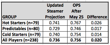
At this point, it looks like early-season hot hitters are more likely to beat their updated rest-of-season projection going forward. In this case, the Hot Starters and Cold Starters were given rest-of-season projections that were very similar (.741 and .740), but the Hot Starters out-produced the Cold Starters by .012 points of OPS. We might be on to something here. Before we dive further into this, let’s check up on our old friend “regression to the mean.”

The following table shows what percentage of players from each group improved after May 25th and what percentage performed worse after May 25th.

As you would expect, the majority of the Hot Starters (82%) couldn’t keep up their hot hitting. Notable exceptions included Joe Panik, A.J. Pollock, and Lorenzo Cain. Panik was projected to have a .641 OPS in the pre-season. Through May 25th, his OPS was .773, which made his updated projection .657. Instead of coming back down to earth, Panik took his offense to another level, producing an OPS of .875 after May 25th. A.J. Pollock was similar, but at an even higher level of production.

While the majority of Hot Starters couldn’t keep up their torrid pace, most of the Cold Starters (78%) turned things around after May 25th. Three who did not improve were some of the biggest hitting disappointments in 2015—Mike Zunino, Pablo Sandoval, and Wilson Ramos. All three started poorly and didn’t get any better over the last three-fourths of the season.

In the Predictables group, the king of consistency was Buster Posey. Posey was projected for an OPS of .840. Through May 25th, his OPS was .850. This increased his rest-of-season projection to .845. He produced an OPS of .849 after May 25th. Buster Posey was a human metronome in 2015.

Okay, let’s go back. I had arbitrarily divided these hitters into three groups and came up with these initial results that appear to show that hot hitters stay hotter than their updated projection would expect. What happens if I divide them into four groups?

Oh.

The column on the far right of the top chart is key here. Based on my results when the hitters were divided into three groups, I expected the Scorching hot hitters in this sample to stay hotter than the other three groups, meaning I expected them to outperform their updated rest-of-season projection by the largest amount. They did not. The Hot and Chilly hitters both improved on their updated rest-of-season projections by a greater amount than the Scorching hitters. The Chilly group of hitters were the worst of the four groups through the one-fourth point of the season (a combined .629 OPS), but actually had the highest OPS over the final three-fourths of the season.

On the bright side, the second chart came out as expected. The hitters who started out the year the hottest were the least-likely to improve after the one-quarter mark. The second-hottest hitters were the second-least likely to improve. The pattern follows for the Cool and Chilly hitters.

I did one final check with just two groups—those who had a higher OPS through May 25th than they were projected for in the pre-season and those who had a lower OPS through May 25th than they were projected for in the pre-season. That chart is below:

The Above Projection group started the year with a projected OPS of .731. Through May 25th, these hitters combined for an .823 OPS. Their updated projection was .739. After May 25th, they had a .761 OPS, which was .022 higher than their updated rest-of-season projection. The Below Projection Hitters ended up .015 higher than their updated rest-of-season projection.

This shows a slight trend towards the early season hot hitters outperforming their projection, but the difference is just .007 points of OPS and if Bryce Harper is removed from the Above Projection group, the difference drops to .005. If there is a trend, the difference is small. The important takeaway, as the second chart shows, is to trust that most of those who start out hot will cool down and most of those who start out cold will heat up.


Easy-Peasy Ranking System for Starting Pitchers: Follow-Up

Last March, I had an article posted here that looked at a very simple ranking system for starting pitchers in fantasy baseball. This system is so simple, it involves just two statistics: strikeouts and walks. You take a pitcher’s projected strikeouts and subtract his projected walks, then sort all pitchers by this result. Boom! There’s your ranking. Forget the pitcher’s projected wins or ERA or the team he plays on, the defense behind him, the hitters supporting him. Just strikeouts and walks, that’s all you need.

Of course, these are the two things a pitcher has the most control over, so there’s some rationale behind it. To create rankings for starting pitchers for fantasy purposes, I used a combination of sources found at Fantasy411 to create a projection for each pitcher. This is the “wisdom of the crowds” approach. Throw a bunch of projections together to create one ultimate super-projection. I then ranked the starting pitchers by strikeouts minus walks (K-BB) and compared this K-BB rankings list to the consensus rankings of the RotoGraphs pre-season Top 300 (composed of rankings from Jeff, Dan, Mike, Paul, and Zach). If you’re interested in the pre-season article, click on the link above.

Rather than throw it out there and forget about it forever, I decided it would be a good time to look back and see how the K-BB ranking system fared against the RotoGraphs writers. There were 87 starting pitchers in the consensus RotoGraphs Top 300 before the 2015 season, so I found the top 87 starting pitchers ranked by K-BB according to their preseason projection. I then compared these lists with the End of Season Fantasy Values for Starting Pitchers created by Zach Sanders. Now we get to find out how the simple K-BB system fared against the RotoGraphs writers.

For starters, here is a long chart of the top 87 pitchers sorted by their end-of-season dollar value. I’ve included their end of season dollar value, their end-of-season rank (EoS), their pre-season consensus RotoGraphs ranking (Roto), and their pre-season K-BB ranking. The blank spots are pitchers who did not appear among the top 87 pitchers on either list. An example from the list: Jake Arrieta was the top-valued starting pitcher in 2015. The pre-season consensus of the RotoGraphs writers had Arrieta as the 20th most-valuable pitcher and his K-BB ranking was 28. Another example is Marco Estrada, who was the 19th most-valuable pitcher in 2015. Estrada did not appear on either list, so there are two blank spots next to his name. Hopefully, you get the idea.

Yes, that’s a long list. Let’s break it down a bit. There were 53 pitchers in the consensus RotoGraphs top 87 who finished in the top 87 at the end of the season (61%). The K-BB rankings had slightly more pitchers who finished in the top 87, with 56 (64%). Fifty-two of the eighty-seven starting pitchers appeared on both lists.

The pitchers who made one list but not the other are an interesting group. Jose Fernandez was ranked 79th by the RotoGraphs writers in the pre-season and finished 70th in end-of-season value. He was not in the K-BB top 87, most likely because his projected innings (and therefore strikeouts and walks) were low because he was coming back from an injury. There were four pitchers who finished in the K-BB top 87 who did not appear on the RotoGraphs list: Bartolo Colon (ranked 74th by K-BB, finished 58th in end-of-season value), Colby Lewis (ranked 87th by K-BB, finished 62nd in value), Yovani Gallardo (ranked 79th, finished 71st), and Trevor Bauer (ranked 86th, finished 82nd). Overall, the K-BB list correctly identified more pitchers who would finish in the top 87 in value and these four pitchers were the reason why. Colon, Lewis, Gallardo, and Bauer are not exactly the most-exciting pitchers in the world. Check that, Bartolo Colon is awesome and incredibly exciting, but more for his hitting than his pitching.

Is this good? Is this what you would expect? I don’t know, since I’ve never really thought about it before. The combined knowledge of five fantasy baseball writers correctly predicted 60% of the starting pitchers who would finish in the top 87 in value. A simple ranking using strikeouts minus walks was about the same. With no other years to compare this to, I can’t say if it’s good, bad, or average.

What if we narrow it down to the top 50 starting pitchers of 2015? The consensus RotoGraphs rankings correctly predicted 29 of the 50 starting pitchers to finish in the top 50 in value. The K-BB rankings had 30. Again, roughly 60%.

Narrowing it down one final time to the best 20 pitchers of 2015, we find that the consensus RotoGraphs rankings correctly predicted 11 of these pitchers to be in the top 20 (55%), while the K-BB rankings had just 9 of 20 (45%).

More than anything, I believe this shows how difficult it is to predict what major league pitchers will do. Dallas Keuchel was ranked 53rd by the RotoGraphs group and 77th by projected K-BB. He finished 5th in value. Chris Archer was ranked 51st by the RotoGraphs group and 55th by K-BB and finished 13th in value. Marco Estrada was not on either pre-season Top 87, but finished 19th in value. At least with Kuechel and Archer you could see significant improvements in their peripherals that explain why the outperformed expectations. They had improved strikeout rates. They also both improved their walk rates and their FIP, xFIP, and SIERA suggested they actually were more effective pitchers in 2015 than they had been previously. Marco Estrada, on the other hand, seemed to do it with smoke and mirrors (and a .216 BABIP). He struck out fewer batters than he had previously, walked more, and his FIP (4.40), xFIP (4.93), and SIERA (4.64) did not at all match his actual ERA (3.13). His 2015 season didn’t make any sense at all. He was the epitome of unpredictable.

Another way to look at these lists is to compare how far off each rankings list was, on average, for each pitcher. The result slightly favored the RotoGraphs consensus list. The 53 pitchers on the RotoGraphs list were off by an absolute average of 19.5 spots, while the 56 pitchers on the K-BB list showed an absolute average difference of 20.9 spots. Again, they were close.

To wrap this up, here are the top 40 pitchers according to both pre-season lists, with their end-of-season dollar values included. They are separated into tiers of 10 pitchers each and the average dollar value per pitcher within each tier is included. The pitchers highlighted in orange did not finish among the top 87 starting pitchers in 2015 value. I assigned them a value of $0 in determining the average value per pitcher for each tier.

You can see that many of the same pitchers appear on both lists. The RotoGraphs writers had a pre-season top five of Kershaw, King Felix, Chris Sale, Stephen Strasburg, and Max Scherzer. The K-BB list had Kershaw, Scherzer, King Felix, Chris Sale, and David Price. The actual top five was Arrieta, Kershaw, Greinke, Scherzer, and Keuchel.

The consensus RotoGraphs list has the edge in the first three tiers of pitchers, but the K-BB list makes up some ground in the 31-40 range. Looking at the top-40 pitchers for each list reveals that 29 of the top 40 on the RotoGraphs list finished with positive value, with an average value of $16 per pitcher. The K-BB list had 30 of the top 40 pitchers finish with positive value and also had an average value of $16 per pitcher.

Overall, I believe the simple ranking system using strikeouts minus walks held it’s own pretty well.


Andruw Jones and Ken Griffey Jr.

Andruw Jones is likely to announce his retirement from Major League Baseball sometime in the very near future. Jones hasn’t been on the MLB radar since his last season in the big leagues back in 2012, when he played 94 games with the New York Yankees but hit just .197/.294/.408. He played 2013 and 2014 with the Tohoku Rakuten Golden Eagles in the Japan Pacific League and hit 26 and 24 home runs, while combining to hit .232/.393/.441. He’ll turn 39 years old in April, so he is likely to hang up his spikes after a 17-year Major League career.

In this column at FanGraphs, David Laurila made an apt comparison between Jones and Jim Edmonds with these numbers showing the similarity:


.254/.337/.486, 1933 hits, 434 HR, 10 Gold Gloves, 67.1 WAR—Andruw Jones

.284/.376/.527, 1949 hits, 393 HR, 8 Gold Gloves, 64.5 WAR—Jim Edmonds


It’s a good comparison. They were nearly equal in value in their careers and both hit many home runs and won numerous Gold Gloves.

Another interesting player to compare Jones to is more similar when you look at the arc of their careers. Both came up to the big leagues at the age of 19 and were very good players until the age of 30, then experienced a significant drop-off in value from that point on. That other player is Ken Griffey Jr. More on him later.

Andruw Jones came up with the Atlanta Braves in 1996, making his Major League debut on August 15th. He only hit .217/.265/.443 in 31 games in his rookie year but helped the Braves make it to the World Series. He hit two home runs in Game 1 against the Yankees, becoming the youngest player to ever hit a home run in the World Series. The Braves lost the series four games to two, but Jones hit .400/.500/.750 and made his presence known on a national stage.

Jones established himself in center field for the Braves in 1997 at the age of 20. He hit .231/.329/.416, which was below average for a hitter in an era of high offense (96 wRC+), but he was so good defensively that he was worth 3.7 Wins Above Replacement. The following year was the first in an impressive stretch of nine seasons from 1998 to 2006 during which Jones averaged 6.4 WAR per year. Not only did he excel on defense during this nine-year stretch, he averaged 35 home runs per season, 99 runs scored, 104 RBI, 12 steals, and a .270/.347/.513 batting line (119 wRC+). He was a five-time All-Star and won nine straight Gold Glove Awards (he would win a 10th in a row the next year). If Jones had played in the first part of the 20th century, his nickname might have been “Death to Flying Things.” Instead, he was just Andruw Jones. Jones’ best season was a 7.9 WAR year in 2005 when he hit .263/.347/.575 with 95 R, 51 HR, 128 RBI and finished second in the voting for National League MVP. This stretch was the essence of Andruw Jones—a power-hitting center fielder with 35 home runs a year and terrific defense. There were only four players in baseball worth more WAR during this nine-year stretch: Barry Bonds, Alex Rodriguez, Randy Johnson, and Pedro Martinez.

Jones was an above-average player again in 2007. He was worth 3.3 WAR thanks primarily to still excellent defense. His hitting dropped off considerably, though. After hitting .262/.355/.553 with a combined 92 home runs over the two previous seasons, Jones hit just .222/.311/.413 in 2007. His 26 home runs were his lowest total since 1999. This would be his last season in Atlanta and his last season with a WAR above 2.0. It was also his last excellent season on defense. Jones would play with four different teams over the final five years of his Major League career and hit .210/.316/.424. His once-great defense dropped off precipitously and he averaged just 0.6 WAR per season.

Those last five journeyman years for Jones could make it hard for people to remember how great he was in the first part of his career. Through the first seven years of his career, Andruw Jones was nearly the equal of Ken Griffey Jr. Both Jones and Junior reached the Major Leagues as 19-year-olds and were power-hitting center fielders. Griffey started winning Gold Glove Awards in his second year in the bigs and won nine Gold Gloves over the next 10 years. Jones won his first of 10 consecutive Gold Glove Awards in his third year in the Major Leagues. While both were considered good fielders, the truth was that Jones was significantly better than Junior for an extended period of time and held more of his defensive value in the latter years of his career. Jones was an elite fielder through his age-30 season, then became more of a slightly-below-league-average fielder in his last five years. Griffey, on the other hand, was rarely at the elite level as a fielder that Jones reached and when he declined, it was a significant decline to well-below-average defense in his late 30s.

Griffey was the better hitter, of course, but in terms of overall value, they were very close into their mid-20s. The chart below shows each player’s cumulative WAR by age. Griffey’s WAR advantage after each player’s first seven years was slim, just 38.2 to 36.5.

In a similar number of plate appearances, Jones and Griffey had a similar number of home runs, runs scored, and RBI. Griffey had a significant edge in batting average, on-base percentage, and slugging percentage. Jones was much better on defense. As mentioned above, they were very close in overall value.

Griffey took his game to another level in his age 26 and age 27 seasons, when he averaged 9.4 WAR per year while hitting 105 home runs and slugging .637. Jones averaged 5.2 WAR in his age 26 and 27 seasons, which is great — just not at the same level as Griffey.

The five-year stretch of seasons when Jones and Griffey were 26 through 30 years old makes up the bulk of the difference in career WAR between the two players. During this stretch of ages, Jones accumulated 27.7 WAR and Griffey had 35.6. Again, Griffey was a much better hitter, with a significant edge in average, on-base percentage, and slugging percentage, along with a large edge in runs, home runs, and RBI. Jones made up some of that difference with his still excellent defense.

This is not to say that Jones wasn’t an elite player. He was. Over the five-year stretch from age 26 to 30 (2003 to 2007), Andruw Jones was seventh in baseball in WAR.

If you expand the range to the first 12 years of his career, from 1996 to 2007, Andrus Jones was also seventh in baseball in WAR, behind Barry Bonds, Alex Rodriguez, Chipper Jones, Pedro Martinez, Randy Johnson, and Curt Schilling. In his first 12 seasons, Andruw Jones averaged 87 runs scored, 31 home runs, 93 RBI, and a .263/.342/.497 batting line with excellent defense.

And that was it. Those first 12 seasons make up nearly 96% of Jones’ career WAR even though he continued to play for another five years. He signed with the Dodgers as a free agent prior to the 2008 season and had the worst year of his career. He hit .158/.254/.249 and his defense went from excellent to average. His WAR for that season was -1.1. He rebounded on the hitting side over the next three seasons but was no longer the defensive stud he’d once been and became a part-time player. Over his last five seasons, he was worth just 2.9 WAR total.

Of course, Ken Griffey Jr. did not age well either. He was injured in 2001 at the age of 31 and finished with the lowest WAR of his career to that point (1.8). From 2002 to 2004, he played an average of just under 70 games per year and had 0.5 WAR per season. He continued to hit well (117 wRC+), but on defense he struggled. From 2004 to 2009, no outfielder in baseball with more than 2000 innings in the field had a worse Ultimate Zone Rating (UZR) than Griffey. He was even worse than Manny Ramirez and Adam Dunn.

The graph shown earlier reveals the similar arcs of the careers of Andruw Jones and Ken Griffey, Jr. They both were great players through the age of 30 and below average players from age 31 on. Griffey did have more truly elite seasons. He had three seasons with eight or more WAR, which were better than any season Jones had, but they were very close in the number of seasons with four or more WAR (Griffey had 10, Jones had 9).

It will be interesting to see what Hall of Fame voters think of Andruw Jones in five years. Admittedly, there was a 10-WAR difference between Jones and Griffey over the course of their careers, but they don’t seem all that different when you look at their similar career trajectories and their distribution of WAR, particularly in the number of great seasons they each had. Jones played 17 years, while Griffey played 22. But in Griffey’s final five years, his value was below replacement level. It didn’t seem like it because he hit a respectable-looking .247/.340/.444 and had nearly 500 hits and almost 100 home runs, but his defense was a killer that greatly affected his value.

Ken Griffey, Jr. was just voted into the Hall of Fame with 99.3% of the vote, the highest percentage ever. Jim Edmonds was on the same ballot and is now one-and-done with just 2.5% of the vote. How will Andruw Jones fare?


The BBWAA’s Hall of Fame, Graphically Speaking

The idea for the graphs in this article started with a post I read at Tom Tango’s website, which linked to this article. That article gave further credit to Sky Kalkman. Jeff Zimmerman also had a post in 2009 with this graphical representation, so be aware that I’m building off of the work of others, with some changes.

The methodology:

  • I used only BBWAA-elected Hall of Fame players. Since I’m looking at players currently up for election by the BBWAA, I thought it would be best to look at players previously voted in by the BBWAA. The BBWAA has a higher standard for entry than the various Veterans Committees. Many of the Hall of Fame players with the lowest WAR totals were put in by Veterans or Old Timers Committees.
  • I separated catchers from the rest of the hitters. I also created two graphs for relief pitchers. One compares relievers to all pitchers. The other compares relievers to just BBWAA-elected relievers.
  • I used FanGraphs WAR. The articles I linked to above used Sean Smith’s WAR database, which uses Baseball-Reference WAR.
  • BBWAA-elected Hall of Fame players are ranked by their highest WAR season to lowest WAR season.
  • All of the highest season values for the Hall of Famers were grouped together, then the second highest seasons, then the third highest seasons, etc.
  • When the WAR values went negative, they were zeroed out from that point forward.
  • I found the 75th, 50th, and 25th percentile for each season. This band is shaded in gray, with the black line representing the 50th

The “No-Doubters” Tier

Barry Bonds (164.4 WAR, seasons above the median: all)—Setting aside the PED issue and focusing on just what he did on the field, Barry Bonds could be in a two-man Hall of Fame with Babe Ruth (168.4 hitting WAR). They are both nearly 15 WAR ahead of the next player, Willie Mays (149.9 WAR). Then again, if you add in the 12.4 WAR Babe Ruth earned for his pitching, the gap between Ruth and Bonds is greater than the gap between Bonds and Mays. Babe Ruth could be in his own personal Hall of Fame, where the hot dogs are always cooked to perfection and the beer flows freely.

Pre-1999 Barry Bonds (99.2 WAR)—The purple line on the graph represents the best 13 years of Barry Bonds career before the 1999 season, which is when it is commonly thought Bonds started using PEDs. Even if Bonds had retired before his incredible stretch of seasons from 2001 to 2004, he looks like an easy Hall of Famer.

Jeff Bagwell (80.2 WAR, seasons above the median: 13)—Bagwell compares favorably to Ken Griffey, Jr. His best three years are surpassed by Griffey’s best three years, but Bagwell had a longer stretch of seasons well above the Hall of Fame median. On the MLB Network recently, I heard Ken Rosenthal discussing Bagwell and Piazza’s Hall of Fame case with regard to the voters. Rosenthal suggested that some voters have hesitated to vote for Bagwell and Piazza because of the possibility they used PEDs and the fear that if they are elected and we find out down the road that they used PEDs, this would have implications for Bonds and Clemens. Essentially, if they find out there is a player in the Hall of Fame who has used PEDs, then how do they then justify not voting for Bonds or Clemens? To be clear, Rosenthal doesn’t feel this way himself; he was just explaining how other voters may feel.

Ken Griffey, Jr. (77.7 WAR, seasons above the median: 10)—He’ll go in easily. Like Frank Thomas before him, the writers feel Griffey was clean. Whether that’s true or not, we don’t really know. His best 10 seasons were at or above the median Hall of Fame level and he has five other seasons in the gray zone.

The “In the Conversation” Tier

Larry Walker (68.7 WAR, seasons above the median: 6)—Remember, these are BBWAA-elected Hall of Fame players and the gray zone represents the 25th to 75th percentile seasons for those players. Larry Walker has an interesting line. His two best seasons were at or above the two best seasons of the Hall of Fame median but his third through sixth best seasons drop below that level. His remaining seasons in descending order are generally close to the median. Other factors that likely hurt him with the BBWAA voters are his games played in Coors Field and that he always seemed to miss 20 or more games each year. In his 17-year career, Walker only played 150 or more games one time.

Mark McGwire (66.3 WAR, seasons above the median: 5)—McGwire’s line is similar to Walker’s, but with fewer seasons below the 25th percentile level early in his career. McGwire’s sixth-best through tenth-best seasons are above the median, but he drops off quickly after his best 11 seasons.

Alan Trammell (63.7 WAR, seasons above the median: 1)—Trammell is consistently in the range between the 25th and 50th percentiles, but it isn’t until his 14th best season where he is above the median for the Hall of Fame groups’ 14th best season. More than half of the shortstops in the Hall of Fame were non-BBWAA selections. Trammell has more career WAR than many of those players, but beats out only one BBWAA-elected shortstop, Luis Aparicio. Trammell has been on the ballot for 14 years. His high total in voting was 36.8% in 2012, but he dropped to 25.1% last year. This is his final chance with the BBWAA.

Edgar Martinez (65.5 WAR, seasons above the median: 5)—Edgar has some things going against him. First off, playing primarily as a DH hurts him in the eyes of many voters. Second, based on the chart above, Edgar didn’t have the peak that many BBWAA-elected Hall of Famers had, as his five best seasons are in the gray zone between the 25th and 50th percentile. His sixth through tenth best seasons are above the zone and he does have 10 seasons with 4.7 or more WAR. That hasn’t been enough for the voters so far. His vote totals have dropped in each of the last three years.

The “Another Tier, Much Like the Previous Tier” Tier

Tim Raines (66.4 WAR, seasons above the median: 3)—Raines is a favorite candidate of many who is thought to be underrated and under-appreciated by Hall of Fame voters. He has gained support over the years, though, moving from 24.3% in his first year on the ballot to a peak of 55.0% last year. His place on the chart above shows that he’s similar to Alan Trammell. They both had long careers consistently in the gray zone below the median. Compared to the other BBWAA-elected hitters, Raines is a borderline candidate. He wouldn’t raise the level of BBWAA-elected hitters, but he’s better than some recent inductees. That being said, I added Tony Gwynn to this graph and it’s easy to see how similar Gwynn and Raines were in WAR. Gwynn made the Hall of Fame in his first year on the ballot. The key difference for voters may have been their distribution of hits and walks. Gwynn had 3,141 hits and 790 walks, for a total of hits plus walks of 3,931. Raines had 2,605 hits and 1,330 walks, for a total of hits plus walks of 3,935. Those 3,000 hits go a long way. Despite that, there isn’t enough of a separation between them that one should sail right in on his first ballot (97.6%) and the other gets 24.3% on his first ballot.

Jim Edmonds (64.5 WAR, seasons above the median: 5)—Half of Edmonds’ ten best 10 seasons were above the median Hall of Fame level and the other five were in the gray zone. His 11th best and beyond seasons fall short.

Gary Sheffield (62.1 WAR, seasons above the median: 2)—Despite being such different players, Sheffield’s line is very similar to Tony Gwynn’s line, with a similar pattern of highs and lows. It’s uncanny.

The “It’s Not the Hall of Good” Tier

Fred McGriff (56.9 WAR), Jeff Kent (56.1 WAR)—Jeff Kent and The Crime Dog were good players with long careers, but they don’t compare favorably with other BBWAA-elected Hall of Fame hitters.

Nomar Garciaparra (41.4 WAR)—Six of Nomar’s first seven seasons were worth 4.8 WAR or more, but it was a steep drop-off from there. He played 14 seasons and those six seasons accounted for 92% of his career WAR.

The “New Guys Who Don’t Have a Chance” Tier

The eight players on the above two charts are unlikely to get the 5% needed to stay on the ballot, but they may get some scattered votes here and there. In case you were wondering, that 8-win season for Troy Glaus came in 2000 when he hit .284/.404/.604, with 120 runs, 47 home runs, 102 RBI, and 14 steals. He was fourth in the AL in WAR but didn’t receive a single MVP vote. The winner that year was Jason Giambi (with 7.7 WAR).

The Catchers

Mike Piazza (62.5 WAR, seasons above the median: 10)—Piazza is on the cusp of entry into the Hall of Fame. His voting totals have gone from 57.8% to 62.2% to 69.9%. Based on his numbers, he should have been voted in three years ago. Hopefully, he’ll get the 75% needed for induction this time around.

Jason Kendall (39.8 WAR)—Kendall has more career WAR than a couple of Veterans Committee inductees (Rick Ferrell and Ray Schalk) and more WAR than Roy Campanella, who had his career start late and end early. Kendall had six seasons with 3.9 WAR or more, which is impressive, but he doesn’t compare to the BBWAA-elected Hall of Fame catchers.

Brad Ausmus (17.2 WAR)—Ausmus hit .251/.325/.344 in one of the best eras for hitting in the history of the game. Imagine how poorly he would have hit had he played in the 1960s.

Starting Pitchers

Roger Clemens (133.7 WAR, season above the median: all)—Roger Clemens is the Barry Bonds of pitchers. They were both well above the median of BBWAA-elected Hall of Fame players and they are trapped in Hall of Fame voter purgatory for the time being, both with roughly 37% of the vote on last year’s ballot. They have seven more years on the ballot.

Mike Mussina (82.2 WAR, season above the median: 12)—Mussina and Schilling are an interesting comparison. Schilling’s six best seasons are better than Mussina’s six best seasons. From their sixth-best seasons and beyond, Mussina was better. Mussina has been on the ballot two years and saw his vote total go from 20.3% to 24.6%. Compared to other BBWAA-elected Hall of Fame starting pitchers, both seem worthy of induction.

Curt Schilling (79.7 WAR, season above the median: 12)—Schilling and Mussina both had 12 seasons above the median and similar WAR totals, but Schilling has the edge in voting so far. Schilling has been on the ballot three years, going from 38.8% to 29.2% to 39.2% in the voting.

Mike Hampton (28.0 WAR, season above the median: 0)—He doesn’t compare to the other pitchers on this ballot, but Hampton did hit .315/.329/.552 in 152 plate appearances with the Rockies in 2001-2002, which is pretty cool.

Relief Pitchers

Lee Smith (26.6 WAR, season above the median: 12)—The top graph shows how these three relievers compare to all pitchers elected by the BBWAA. In short, they don’t compare favorably. The difference in innings pitched is just so great between starters and relievers that it’s hard for a reliever to be as valuable. The bottom graph includes just relief pitchers elected by the BBWAA, but without John Smoltz or Dennis Eckersley, who each had more than 350 starts and around 200 wins. The four “true” relievers are Hoyt Wilhelm, Goose Gossage, Rollie Fingers, and Bruce Sutter. Lee Smith didn’t reach the heights of those four, but did have 12 seasons above the median, starting with his third-best season. He’s been on the ballot for 13 years and peaked with 50.6% of the vote in 2012. Last year, he was down to 30.2%.

Trevor Hoffman (26.1, season above the median: 9)—For what it’s worth, Harold Reynolds thinks Trevor Hoffman is a “slam-dunk” Hall of Famer. Of course, that’s worth exactly nothing because it’s coming from Harold Reynolds and he doesn’t have a vote. Hoffman does have those 601 saves, but he doesn’t stand out here as being much better than Smith or Wagner.

Billy Wagner (24.2 WAR, season above the median: 6)—It wouldn’t surprise me to see Hoffman get considerable support and Wagner be a “one and done” candidate, despite how comparable they actually were.

If I Had a Ballot:


Barry Bonds

Roger Clemens

Mike Piazza


Jeff Bagwell

Ken Griffey, Jr.

Mike Mussina

Curt Schilling


Edgar Martinez

Larry Walker

Alan Trammell


Silly Money and What Our Society Values

The Boston Red Sox recently signed starting pitcher David Price to a seven-year, $217 million contract. That works out to $31 million per year. Not to be outdone, the Arizona Diamondbacks then signed pitcher Zack Greinke to a six-year, $206.5 million contract. Using straight division, Greinke’s contract calls for an average of $34.4 million per year, but the deal includes $60 million in deferred money that will be paid out in the five years following the end of the contract, so Greinke won’t be making $34.4 million next year. No matter how you look at it, though, these are big money deals.

There are many comparisons you can make with this. For starters, each time David Price heads out to pitch next season he will be making around one million dollars. David Price has averaged 217 innings pitched over the last six seasons. If he pitches 220 innings next year, he’ll make around $140,000 per inning. At 15 pitches per inning, that’s more than $9,000 per pitch. David Price will make as much money for throwing six pitches next season as the average public school teacher makes in a year.

In the world of Major League Baseball there are good arguments to be made that Price and Greinke will be worth the cost of their contracts. The most likely scenario for a long-term, big-money contract is that the player provides surplus value in the first few years of the deal but ends up overpaid in the last part of the deal. Baseball is flush with money right now for a number of reasons, including strong attendance numbers, but the big drivers behind the current economic strength of the game are cable television contracts and Major League Baseball Advanced Media (MLBAM). Baseball has done a very good job of establishing an online presence through MLBAM, which allows fans to follow their teams on assorted electronic devices beyond TV and radio.

Also, the way people consume entertainment these days is a big factor. More and more people have an on-demand mentality when it comes to their entertainment choices. No longer do we have to be in front of the TV at nine o’clock on Wednesday night to watch Modern Family. We can just record it and watch it later. If we miss the first few seasons of a popular show, we can binge-watch past seasons and catch up. We can record a week of Jeopardy! shows, then watch five in a row on a Saturday afternoon.

Sports are different. Most people want to watch sports live and this gives baseball (and other sports) a huge advantage. Sports fans have to be in front of the TV—or watching on a smartphone, a tablet, or a computer—while the sport is happening. We want to talk about it with friends, tweet about it on Twitter, and complain about the refs on Facebook. This strong desire to watch sports live makes sport programming a highly desirable commodity for networks and results in the big money TV contracts that baseball teams are signing.

So when you read about David Price or Zack Greinke signing a contract that will pay them $30 million or more per year, you have to understand that teams have enough money to pay them. They wouldn’t dish it out if they couldn’t afford it. These contracts aren’t unreasonable in the context of the game. As much as Price and Greinke are making, the owners of their teams are making more. Getting paid $30 million per year is not so ridiculous in the context of Major League Baseball in 2015. This is the going rate for a top pitcher these days.

As a matter of fact, Major League Baseball players are earning a much lower percentage of league revenues than they did a dozen years ago. Back in 2002, MLB player salaries were 56% of league revenues, but it’s been dropping steadily ever since. Their share dropped below 40% in 2014. That’s a significant decrease. Imagine how much pitchers like Price and Greinke would be making if the players’ share of league revenue hadn’t declined so much in that time period. Where is that money going now? In the pockets of the owners, of course. Baseball is flush with money these days and player contracts reflect that, but they could actually be making much more than they are now. Instead, the owners are making it.

In the world where most of us reside financially, it seems ridiculous to have a professional athlete make that much money, especially when compared to a teacher, a construction worker, a police officer, or any other job where people put in a good day’s work to make enough money to pay their rent and feed their family. This is where it can be frustrating for fans. Most of the people sitting in the stands or watching the games on the electronic device of their choice will never come close to making the annual salary of a major league rookie (around $500,000).

And it’s not just sports. There are plenty of other high-income fields with ridiculous salaries. According to Forbes.com, movie star Robert Downey Jr. will make $80 million in 2015. Jackie Chan will make $50 million. Vin Diesel will make $47 million. On the small screen, Jim Parsons, who plays Sheldon Cooper on The Big Bang Theory, makes $29 million per year. His TV roommate, Leonard, played by Johnny Galecki, makes $27 million. Even smarmy Howard Wolowitz (Simon Helberg) and his awkward buddy Raj (Kunal Nayyar) will each make $20 million.

Howard Stern earned $95 million between June 2014 and June 2015, with $80 million of that coming from Sirius XM satellite radio. Ellen DeGeneres made $75 million in that time span. Thanks to his long-running talk show and the release of his 13th book, Dr. Phil McGraw made $70 million. Kim Kardashian nearly doubled the amount she made from the previous year thanks to her role-playing app Kim Kardashian: Hollywood. She made $52.5 million from June 2014 to June 2015.

The simple fact is, athletes and entertainers are making million and millions of dollars because we spend our money to watch them. It’s very easy to say that a famous athlete or actor shouldn’t make 500 times as much as a schoolteacher, but we all make choices in how we spend our money and those choices dictate how much the athletes we love to watch will earn. We go to the games, we watch the movies, we subscribe to cable or Netflix so we can watch our favorite shows. Every time we choose to spend our money on entertainment, we’re contributing to the high salaries these people are making.

I have friends who are continually shocked by the big contracts that baseball players sign. They think it’s ridiculous. When I get into a conversation with these people about this topic, I always think about this quote by Bill James from the book, The Mind of Bill James: How a Complete Outsider Changed Baseball (2006):

“One of the unwritten laws of economics is that it is impossible, truly impossible, to prevent the values of society from manifesting themselves in dollars and cents. This is, ultimately, the reason why we pay athletes so much money: that it is very important to us to be represented by winning teams. The standard example is cancer research; letters pop up all the time saying that it is absurd for baseball players to make twenty times as much money as cancer researchers. But the hard, unavoidable fact is that we are, as a nation, far more interested in having good baseball teams than we are in finding a cure for cancer.

That pool of money which we pour into athletics makes it inevitable that athletes are going to be better paid than cancer researchers. Dollars and cents are an incarnation of our values. Economic realities represent not what we should believe, not what we like to say we believe, not what we might choose to believe in a more perfect world, but what our beliefs really are. However much we complain about it, nobody can stop that truth from manifesting itself.”

I live in Washington state, one of only seven states that does not have a state income tax. During the Great Depression in the early 1930s, Washington came very close to instituting a state income tax. Times were very hard back then and people were struggling just to put food on the table. Voters first voted to change the constitution to allow an income tax, then voted to approve the tax, with 70% in favor. An income tax was more popular among the voters than bringing back the sale of beer.

Local business owners could see where this was headed, so they challenged the tax in court. In 1933, this challenge reached the Supreme Court in Olympia and was voted down 5-4. Since then, a state income tax has come up for a vote seven times and voters have rejected it every time.

A measure was on the 2010 ballot that would have created an income tax on earnings over $200,000. This tax would affect fewer than 70,000 people out of the state’s 6.7 million residents and would provide money for education and health care. It was rejected by 65 percent of the voters. A dozen years before, voters had approved funding for the construction of CenturyLink Field, home of the Seahawks, even though the Seahawks’ Paul Allen is the NFL’s richest owner, worth $17.5 billion. I’m sure if you ask residents of Washington which is more important, education and health care or professional sports, they would say education and health care. But how they chose to spend their money says otherwise.

Income inequality has been and will be a big topic in the news over the next year. Not to get into the politics of the issue, but the statistics are clear. There is a growing disparity between what the majority of people in this country earn and what the richest people in this country earn.

In the most simple terms possible, the rich are getting richer. We often hear about the growing disparity between what the top 1% earns compared to the other 99%. It’s true; the gap has grown significantly over the last 30 years. Looking at the difference between the top 1% and the other 99% doesn’t tell the full story, though.

This IRS report showed the top 1% had an adjusted gross income (AGI) of $434,600 or more in 2012. The MLB minimum salary in 2015 was $507,500, which means every player in the major leagues is in the top 1%. It’s the level above the top 1% where the disparity is even greater and the gap is growing more quickly. The top .01% of tax returns in 2012 had an AGI of $12 million or more. Of the roughly 750 players in Major League Baseball in 2015, 121 made at least $10 million, which is about 16%. We could estimate that 10-15% of MLB players are in the top .01% of income earners.

The top .001% of tax returns had an AGI of $62 million. No player is in that range yet, but Bryce Harper will be a free agent heading into his age-26 season in 2019. With Zack Greinke having just signed a contract worth $34.4 million per year, will Bryce Harper be baseball’s first $50 million per year player in three years? If he stays healthy, we all know he will sign a record-setting contract. When he does, it’s very likely that our friends who don’t grasp the economics of Major League Baseball will lament the fact that a baseball player is making so much money. Then they’ll go to the theater and spend $15 to watch a movie starring an actor making $60 million and think nothing of it.


Hard-Hit Percentage Outliers

In the middle of June, I wrote an article looking at batted-ball data. Specifically, I grouped players into tiers based on their hard-hit percentage and looked at the statistics accumulated by the players in each group, then identified the outliers. This is a look back at that article to see if we can learn anything.

To start with, the following charts show a comparison of the correlation of other metrics to the different strengths of batted balls hit. I did this in the middle of June and will compare that chart to one I created using statistics for the entire season. In June, I used a cut-off of 150 plate appearances through June 14. This was right around the 60 game mark of the season. There were 236 players. At the end of the season, I used 350 plate appearances as the cut-off, which consisted of 249 players.

Noticeable here is the strengthening of the correlation for the power statistics with hard-hit percentage as more data came in. The three stats dealing the most with power—ISO, HR/FB, and slugging percentage—all saw an increase in their correlation with hard-hit percentage. This is true down the column until you get to batting average and BABIP, which showed a weaker correlation over a full season than over the first two and a half months. While ISO, HR/FB, and SLG all correlate with hard-hit percentage at .70 or above, batting average and BABIP are down around 0.10, and LD% is at .06.

In the June article, I separated the players into groups based on their hard-hit percentage. As you would expect, the players who hit the ball hard a higher percentage of the time were more productive hitters. Here is the breakdown again, first the chart through June 14, then the full-season chart.

Remember, these aren’t necessarily the same players within tiers in both tables. Some players could have moved from one tier to another as the season went on and more players qualified overall for the full season. The way to look at this is to go down the columns to see how the average statistics for each group change as hard-hit percentage goes down. It’s easy to see that the groups of players in the higher ranges of hard-hit percentage are more productive than the groups of players in lower ranges of hard-hit percentage. The players in the upper tier, with a hard-hit percentage of 35% and above, hit more fly balls, had more of those fly balls go over the fence, had a higher batting average, slugging percentage, and isolated slugging. Roughly 85% of these hitters had a wRC+ at 100 or better. The least productive tier was the group of players with a hard-hit percentage at 24% or below. A small number of these players were able to be league average or better hitters.

The numbers from June are similar to the numbers for the full-season. As hard-hit percentage goes up, offensive production goes up and the percentage of players who are above-average hitters (by wRC+) goes up. A similar trend emerges for ISO, fly-ball percentage, HR/FB%, and slugging percentage.

The interesting players to me are the ones in the minority among their group of hitters. Through June 14, there were seven players in the top tier who had a hard-hit percentage greater than 35%, but with a sub 100 wRC+. These players consistently hit the ball hard but were still below-average hitters. Considering how often they hit the ball hard, I expected these players to improve and more closely match the rest of the group from this point forward. Theoretically, these are the guys with upside based on their hard-hit percentage. At least, this was my hypothesis. How did these players do over the rest of the season?

The seven players who hit the ball hard a high percentage of the time but who had a wRC+ below 100 through June 14 are shown below. The following chart shows the performance of these seven hitters before and after June 14.

*note—to determine the wRC+ of the group, I just did a weighted average based on each player’s plate appearances. The other numbers are precise totals for the group.

These players did improve as a group, with their composite batting line going from .237/.292/.387 to .252/.305/.455. They improved even though their BABIP dropped from .289 to .286. The big increase was in their power. They hit more fly balls and had more fly balls go for home runs. Their ISO increased from .151 to .203 and their wRC+ went from 86 to 106.

Two of these players had fewer than 60 plate appearances after June 14, so they aren’t very helpful to us. Of the remaining five players, two stayed close to the level they had established by June 14 and the other three showed strong improvement. Here is a closer look at these players:

Jorge Soler was essentially the same hitter before and after June 14, right down to an identical 96 wRC+. His BABIP dropped from a sky-high .383 to a still very good .339, but he also struck out less often and his hard-hit percentage dropped from 39.5% to 32.3%. His hard-hit percentages in both portions of the season suggest he should have hit better than he did, but his low fly-ball percentage limited his power. Over the course of the whole season, Soler had a hard-hit percentage of 35.9%. That puts him in the top tier. The players in this tier of hitters had an average fly-ball percentage of 38%. Soler’s fly-ball percentage was 29.8%, which corresponds with the players on the lowest tier of hard-hit percentage, those players below 24%. Basically, Soler hit the ball hard as often as guys like Adrian Gonzalez, Bryan Braun, and Yoenis Cespedes, but hit the ball in the air as often as Gregor Blanco and Alcides Escobar. While he hits the ball hard with regularity, he doesn’t hit enough fly balls to take advantage of his hard-hit percentage.

Like Soler, Jay Bruce’s overall production did not improve. His wRC+ dropped slightly, from 96 to 90 even though he maintained a high hard-hit percentage. The shape of his production changed, though. He hit for much more power, with an ISO that was .040 higher after June 14 than before, but a corresponding drop in walk rate torpedoed his on-base percentage. The overall effect was going from hitting .212/.324/.394 through June 14 to .234/.277/.457 after June 14. Jay Bruce is a mystery. He had a top-tier hard-hit percentage and hit the ball in the air frequently enough, but his production didn’t compare to the other players with similar profiles.

Mark Trumbo was one of three players in this group who did improve a significant amount. Trumbo hit .242/.276/.445 through June 14 and .276/.333/.451 after. His wRC+ increased from 93 to 119 even though his hard-hit percentage dropped from 35.2% to 31.7%. The biggest change for Trumbo was an increase in BABIP from .280 to .337 and an increase in walk rate from 4.5% to 8.0%.

Both Will Middlebrooks and Matt Adams did not have enough plate appearances after June 14 to tell us much of anything.

Steve Pearce improved his wRC+ from 79 through June 14 to 106 from June 15 on even though his hard-hit percentage cratered from 35.6% to 25.4%. His BABIP was nearly the same. His walk rate and strikeout rate changed very little. He didn’t improve his on-base percentage by much. The big difference was an increase in slugging percentage from .365 to .471 with a corresponding increase in ISO from .153 to .248. He did this by greatly increasing the number of balls he hit in the air. His fly-ball rate through June 14 was 39%. After, it was 53%. That seems like a drastic change to me, so I wonder if Pearce made the decision to go all out for power by hitting fly balls as often as he could.

The final guy on this list was the greatest success story of this group, Matt Kemp. Kemp was terrible in the first part of the season. When I initially wrote about batted-ball data on June 14, Kemp was hitting .249/.289/.340 even though his hard-hit percentage of 35.8% was in the upper tier of hitters. From June 15 on, Kemp hit .270/.328/.519 with a hard-hit percentage of 45.5%. He hit fly balls at a higher rate (31% to 39%) and more of those fly balls left the yard (3.4% HR/FB% to 20.6% HR/FB%). Kemp’s ISO improved from .091 to .242 and his wRC+ went from 78 to 133.

This is a small group of players, so it is not an in-depth study. Also, two of this group of seven players didn’t have enough plate appearances to be meaningful. Of the remaining five players, three did significantly improve, while the other two continued their subpar ways.

The other group of hitters that interested me was the group of nine that had a wRC+ greater than 100 despite a hard-hit percentage below 24% through June 14. These players were somehow able to be above-average hitters despite carrying such a low hard-hit percentage.

The following chart shows these nine players (out of a group of 44) who had hard-hit percentages below 24% but with a greater than 100 wRC+. The top chart shows what they did through June 14 and the bottom chart shows what they did from June 15 on. My hypothesis was that these players would hit worse because their low hard-hit percentage would not let them sustain their above 100 wRC+.

As a group, these nine hitters went from hitting .313/.366/.404 through June 14 to .271/.315/.386 after June 14. They saw their combined wRC+ drop from 117 to 91. Only three of these nine hitters continued to have a wRC+ over 100 from June 15 on. The glaring change in BABIP from .353 to .303 for the group is likely a main culprit in their diminished production. They also walked less often and struck out more often.

Nori Aoki was the leader in wRC+ among this group of hitters on June 14th. Had he been able to sustain that for a full season, it would have been a career year. Unfortunately, he suffered a broken leg when he was hit by a pitch from Carlos Frias about a week later and wasn’t the same hitter when he came back. He also dealt with concussion issues and didn’t play after September 3. He was much worse after June 14 but injuries were obviously a big factor.

Jacoby Ellsbury was already on the DL with a knee injury at the time I wrote the original article. He missed close to seven weeks in May, June, and July and really struggled upon his return. His hard-hit percentage was just slightly lower than it had been before but his BABIP plummeted from .379 to .261 and his walk rate dropped significantly also (11.2% to 4.8%). Like Aoki, injuries were probably a big factor in Ellsbury’s diminished production.

Jose Iglesias also dealt with an injury, like Aoki and Ellsbury, but his was in September and cause him to miss the last month of the season. He had already declined from a 125 wRC+ through June 14 to an 80 wRC+ from that point forward. His BABIP dropped from .367 to .302 despite an increase in hard-hit percentage from 13.7% to 17.9%. Even with that increase, a 17.9% hard hit percentage is ridiculously low. With a hard-hit percentage that low, I wouldn’t expect Iglesias to be anywhere close to a league-average hitter going forward.

Billy Burns had the lowest hard-hit percentage (13.6%) of any qualified hitter over the entire season and the highest soft-hit percentage (30.5%). He rode a .366 BABIP to a well above average 120 wRC+ through June 14. From that point forward, his wRC+ was 97, with a BABIP of .328. Over the whole season, Burns had a 102 wRC+ despite such a low hard-hit percentage. Like Iglesias, I wouldn’t expect Burns to be league average as a hitter next year either.

Salvador Perez and Jace Peterson both increased their hard-hit percentage but still saw a drop in their wRC+ by a significant amount. Perez had fewer fly balls leave the yard (15.2% HR/FB% to 10.6% HR/FB%) and his already mediocre .292 BABIP dropped to a less-than mediocre .257. Peterson had a 106 wRC+ and .339 BABIP on June 14, with a hard-hit percentage of 23.8%. From that point forward, his hard-hit percentage was an improved 27.6%, but his BABIP was .266 and he had a 63 wRC+.

Yunel Escobar and Ian Kinsler were the only two players among this group of nine who saw an increase in wRC+ after June 14. They also greatly increased their hard-hit percentage. Yunel’s hard-hit percentage went from 23.9% to 30.4%. Kinsler’s increased from 22.1% to 28.6%. Both of these hitters were below their career rate of hard-hit balls as of June 14 and hit closer to their career marks from that point forward, which was likely a factor in their improved production.

Dee Gordon joined Escobar and Kinsler in maintaining a wRC+ over 100, but he did see a drop from 118 to 109. His BABIP through June 14 was a ridiculous .418. From that point forward, it was a silly .357. His hard-hit percentage barely changed at all (17.7% to 17.5%). Gordon has had a very low hard-hit percentage every year of his career. His production is very dependent on a high BABIP. In the three seasons when he’s had a BABIP of .345 or higher, his wRC+ was 94, 101, and 113. In the two seasons when he had a BABIP below .300, his wRC+ was 58 and 73.

Overall, just two of these hitters had an improved wRC+ after June 14 and both of those hitters also increased their hard-hit percentage. A third hitter, Dee Gordon, had a worse wRC+ after June 14 but was still an above-average hitter (109 wRC+). The other six hitters in this group were significantly worse after June 14.

This is a look at individual outliers and there are factors beyond hard-hit percentage that come into play, but I do think hard-hit percentage can help us when analyzing a player’s production during the season.


Revisiting Vegas

Before the season began, I wrote an article comparing the Vegas odds of each team winning the World Series to the projected standings according to Steamer. This is a look back at that comparison.

Using the Vegas odds of winning the World Series and the Steamer-projected standings, there were some strong plays on the board before the season began. Let’s look at each division, in chart form, starting with the NL West. The first table shows the Steamer pre-season projections. The second table shows the actual standings.

RDif=Run differential
RS/G=Runs scored per game
RA/G=Runs allowed per game
EXT W=Wins greater or fewer than Steamer projected

What I wrote then: It’s interesting that Vegas is really excited about the Padres, at least compared to the Rockies and Diamondbacks, who don’t project to be that much worse but who face significantly longer odds. With the Giants’ recent success, they are probably the best play here. Even if you don’t think they can beat out the Dodgers for the division, they’ve proven that they can make a run if they get into the playoffs as a wild card team. Of course, this is an odd-numbered year, so you might want to save your money and look elsewhere.

What actually happened: Steamer nailed the top of the division, picking both the Dodgers and Giants to win just one fewer game than they each did. The Diamondbacks and Padres were flipped, with the Diamondbacks winning five more games than projected and the Padres falling five games short. The Rockies came in way under. Vegas was right about the Dodgers being the favorites, with the Giants having the next-best odds, but the hype around the Padres at the beginning of the year proved to be unfounded and the Diamondbacks finished better than 120 to 1 odds would have predicted.

What I wrote then: The play here is the Pittsburgh Pirates. They are projected to be just a game off the division lead, but with odds at 30 to 1. In a world full of parity, every team in baseball would have a .500 record and 30 to 1 odds and there would be no supermodels. That would be a sad, sad, world. In this world, the Pirates are projected to be better than .500 and should have better odds than 30 to 1. Meanwhile, Vegas is excited about the Cubs, giving them 14 to 1 odds (they opened at 45 to 1). Some of you may remember that in Back to the Future, the Cubs won the 2015 World Series (in a 5-game sweep over Miami) after starting the year with 100 to 1 odds. This could be the Cubs’ year, McFly!

What actually happened: Steamer nailed the order of this division, right down to the gap between the top three teams and the bottom two. In the upper half of the NL Central, the Cardinals and Cubs shared the third-best odds in the National League and finished 1st and 3rd in overall win-loss record. The Pirates, on the other hand, finished with the second-best record in the NL but Vegas had them tied for eighth with the Marlins at 30 to 1 odds before the season. The Brewers and Reds both disappointed, but the Reds were particularly bad. They entered the season with 70 to 1 odds but finished the season with just 64 wins, one more than the Philadelphia Phillies, who were giving 300 to 1 odds back in April.

What I wrote then: There aren’t any real good plays here. As good as the Nationals look now, especially after acquiring Max Scherzer, it would be foolish to put any money on a major league team at 5 to 1 odds to win the World Series. There’s just too much unpredictability come playoff time. None of the teams in this division have appealing odds, unless your name is Lloyd Christmas, in which case you have to jump all over the Phillies at 300 to 1 (“So you’re telling me there’s a chance?”).

What actually happened: So much for those 5 to 1 odds in Vegas for the Washington Nationals. I hope you didn’t put too much money on them. Vegas was optimistic about the Nationals, as you would expect, but also gave the Marlins nearly the same odds as the Mets. The Mets made it all the way to the World Series, while the Marlins were 20 games under .500. The Phillies were the longest of longshots to win the World Series and finished with the worst record in the National League.

What I wrote then: There’s no love for the Tampa Bay Rays in Vegas, with odds of 75 to 1 in what still looks like a tight division. The Rays opened at 35 to 1. Apparently, Las Vegas does not like their recent moves. Based on Steamer projections, the Rays look like your best longshot option of any team in baseball.

What actually happened: At 14 to 1, the Red Sox were tied with the Seattle Mariners for the second-best odds of any American League team, with only the Los Angeles Angels topping them. The Red Sox (and Mariners) finished well below Steamer’s expectations. In the case of the Red Sox, the pitching didn’t hold up their end of the bargain. On the other hand, the Toronto Blue Jays had worse odds than nine other teams in the AL but finished with the second-best record in the league. They had nine more wins than Steamer projected.

What I wrote then: No team jumps out here, but if I had to pick one, I’d take the Indians at 25 to 1. They look to be right there with the Tigers to win the division, but with slightly worse odds, so you’d get a bigger payout if they went all the way.

What actually happened: I picked the Indians as the team to take a chance on, but everyone now knows the Royals were the best play. The 2015 World Champion Kansas City Royals were given 25 to 1 odds before the season started. Those odds placed the Royals behind six AL teams and tied with two others. They ended up with 14 more wins than projected by Steamer. The Tigers were the anti-Royals, finishing with 11 fewer wins than projected. The Tigers’ 20 to 1 odds were in the top six in the league and they finished with the second-worst record. The team with the longest odds in the AL, the Twins, actually made a run at a wild-card spot and had seven more wins than projected by Steamer.

What I wrote then: I guess when you lose Josh Donaldson, Brandon Moss, Jeff Samardzija, Jon Lester, and Derek Norris, your odds to win the World Series should get worse, but 60 to 1, really? Steamer still has Oakland in the mix for the AL Wild Card and just 5 games back of the Mariners for the division.

What actually happened: Based on their 68-94 record, the Athletics deserved their pre-season 60-to-1 odds, but they weren’t as bad as their record. They had a run differential that was better than the Mariners, who won eight more games than the A’s. The Angels (10 to 1), Red Sox (14 to 1), and Mariners (14 to 1) were the top three favorites in the AL in Vegas before the season started and they finished, 6th, 11th, and tied for 12th, respectively, in wins. The Angels were within range of a wild card spot and actually had one more win than Steamer projected, but the Mariners were big disappointments in Vegas and compared to their Steamer projection. They had 13 fewer wins than Steamer projected. The 50 to 1 Rangers had the worst Vegas pre-season odds of any team that went on to win their division.

The following chart shows the teams in each league with their pre-season Vegas odds, their Steamer projected win-loss record, and their actual win-loss record.

What I wrote then: The Pirates have worse odds than the Padres and Mets, neither of whom are projected to contend for the Wild Card or even finish .500. Aye, this be the National League team you should wager your doubloons on and win some booty!

What actually happened: The Pirates weren’t a bad play, really. They did win 98 games. They just ran into the Jake Arrieta Experience in the one-game wild card matchup with the Cubs.

Based on pre-season Vegas odds, the top five teams in the National League were the Nationals, Dodgers, Cardinals, Cubs, and Giants. Three of those five made the post-season. Steamer, on the other hand, had a top five of the Nationals, Dodgers, Cardinals, Pirates, and Cubs, giving them four of the five post-season teams. Both Vegas and Steamer missed out on the Mets.

The Vegas pre-season odds did a good job of identifying the league’s worst teams. Five teams finished with fewer than 70 wins and they all had odds of 60 to 1 or worse before the season started. The 120 to 1 Diamondbacks were the exception among the teams expected to struggle in 2015, as they surprisingly won 79 games.

What I wrote then: In the American League, your best options are the Athletics and Rays, and possibly the Blue Jays. The A’s are right in the mix for the wild card, yet have the same odds as the Houston Astros and Atlanta Braves. The Rays are projected to be nearly as good as the A’s and have even worse odds, better than only four teams in all of baseball—the Phillies, Diamondbacks, Rockies, and Twins. The Blue Jays don’t look to be as good a play as the A’s and Rays but, like the Pirates, they have longer odds than other similarly competitive teams.

What actually happened: It turned out the A’s and Rays were not good plays, but how about those Blue Jays?

The Vegas pre-season odds suggested a top six of the Angels, Mariners, Red Sox, Tigers, Orioles, and White Sox, with all given odds of 20 to 1 or better. None of the six made the playoffs. You have to get down to the 25 to 1 Yankees and Royals to find a playoff team and they were joined by the 30 to 1 Blue Jays, 50 to 1 Rangers, and 60 to 1 Astros. Steamer projected a top seven that included the Mariners, Red Sox, Tigers, Angels, Indians, Blue Jays, and Athletics, all with 84 wins or more. Only the Blue Jays were a playoff team among this group.

The bottom line is that baseball is difficult to predict. Eleven teams had better odds than the World Series Champion Kansas City Royals and four teams had the same odds as the Royals. Yet, it was the Royals hoisting the World Series trophy when all was said and done.


Final Month Fantasy Fun With Excel

The Major League Baseball season is just past the three-quarter mark, which means just under one-fourth of the season is left to be played. If you play fantasy baseball, you should know by now whether you have a chance to win this year. If you’re still in contention, now is the time to really take a good look at the important categories for your team. If you’re not in contention, don’t be a chump and just give up. At the very least, play an active lineup each day as a courtesy to the other owners in your league.

By this point, trades may no longer be an option. Most leagues have trade deadlines set before late August, so you are more likely looking at waiver-wire additions and setting your lineup in a way to optimize the points you can gain and minimize the points you can lose.

The vast majority of fantasy baseball leagues have both counting stat categories (runs, home runs, RBI, stolen bases, wins) and rate-stat categories (batting average, ERA, WHIP). In general, it’s easier to see how many points you can gain or lose in the counting categories. With so much of the season done, some of the counting-stat categories have taken on greater importance. Perhaps steals is a very tight category in which you have room to move up or down and could gain or lose a few points. It’s clear that you have to make add/drop moves and set your lineup to address steals, while also keeping an eye on any other hitting categories that would suffer with the addition of a low-power basestealer.

With rate-state categories, it’s a bit trickier than just looking at the standings and making an estimate of how much you can move up or down. I’ll use pitching as an example. In my standard 12-team Yahoo league, there is an innings limit of 1250 innings. In this league, the top team in innings pitched has used up 1037 innings (83% of the limit), while the bottom team has just 932 innings (75% of the limit). Moving forward, this will make a difference in the counting-stat categories of wins and strikeouts. It will also make a difference in ERA and WHIP.

I like to have an idea of how much my team can move in ERA, WHIP, and Strikeouts, so I created a spreadsheet to track this. Even though this leagues uses raw strikeouts, I want to figure out my K/9 so I can more easily compare my strikeouts to teams with different innings pitched totals (you could also use K/IP).

Below is my spreadsheet. In this spreadsheet, ER stands for “Earned Runs,” BR stands for “Base Runners,” and K stands for “Strikeouts.” I plug in my current innings total (955), with my current team ERA, WHIP and Strikeouts, then calculate ER [(ERA x IP)/9], BR [WHIP x IP], and K/9 [(K/IP)*9].

In the row labeled “Remaining IP,” I use the same formulas as above for ER and BR, then use this formula in the K column: ((K/9)*IP)/9.

For the “Projected Stats” row, I add up the INN, ER, BR, and K columns, then use formulas to figure projected ERA, WHIP, and K/9 (the yellow squares).

This gives you the framework of the spreadsheet. Now it’s time to get an expectation of how your team’s pitching numbers will play out.

In the grayed-out cells, I put in various projected ERA, WHIP, and K/9 numbers. I start with an optimistic view of my team’s future pitching abilities and work down to a pessimistic view. My team currently has a 3.44 ERA, 1.18 WHIP, and 8.94 K/9. In the top of the chart, I put in 3.00, 1.00, and 9.20 in the grayed out cells for ERA, WHIP, and K/9. This tells me that if my team puts up a 3.00 ERA, a 1.00 WHIP, and a 9.2 K/9 from this point forward, my final ERA will drop to 3.34, my final WHIP will drop to 1.14, and my final K/9 will rise to 9.0. This could be considered a best-case scenario.

On the other hand, if my pitchers post a 4.00 ERA, a 1.30 WHIP, and an 8.6 K/9 from this point forward, my final ERA will be 3.57, my final WHIP will be 1.21, and my final K/9 will be 8.86.

Here is the spreadsheet with various levels of projected performance:

The main idea is to get an estimate of how much your ERA, WHIP, and K/9 can change over the final five weeks of the season. If I use the numbers from this example, I can expect my final ERA to be between 3.34 and 3.57, while realizing a more realistic estimate would be between 3.40 and 3.50 unless I’ve made some big changes to my pitching staff. It’s a similar story for WHIP, with a likely estimate being a final WHIP of 1.16 to 1.20. The range for K/9 would be from 9.0 to 8.85. As you can see, there isn’t much movement available in these pitching categories. The particulars of your league’s standings will tell you how many points you can gain or lose based on rest-of-season expectations.

Once you’ve created the spreadsheet, you can take a closer look at ERA, WHIP, and K/9 and make the moves that will help you the most.


Ode to Willie Bloomquist

After 14 years in the Major Leagues, longtime utility player Willie Bloomquist was designated for assignment by the Mariners on Thursday. If this is truly the end, you have to agree that Willie Bloomquist had an amazing career when you stop to think about it. He lasted 14 years in the big leagues, played in over 1000 games, had more than 3000 plate appearances, and finished his career with a grand total of 1.0 WAR. As Tom Tango has pointed out many times, Willie Bloomquist has been “Mr. Replacement Level” for many years.

The highest WAR Willie B ever had in one season was 0.7 and that came in a 12-game stint as a September call-up in his rookie year of 2002. He hit .455/.526/.576 that year, thanks in large part to a sky-high .484 BABIP. In his last seven games that season, Bloomquist had a four-hit game, two three-hit games, and two two-hit games. He was the Fred Lynn of the 2002 Mariners (with apologies to Fred Lynn). Lynn had a sizzling 15-game stint in September of 1974 when he hit .419/.490/.698. Lynn, of course, followed up that torrid September with a terrific .331/.401/.566 year in 1975, winning the Rookie of the Year award and the AL MVP. Bloomquist followed up his scalding cup of coffee by hitting .250/.317/.321 over 89 games in 2003.

Imagine if Bloomquist never had that incredible BABIP-fueled 12-games stretch at the start of his career. How much did those 12 games affect the Mariners’ opinion of him, perhaps leading to more opportunities than a career-long replacement level player would normally get? Would he have had the career he had if not for that 12-games stretch of hot hitting?

It seemed destined for Willie Bloomquist to play for the Seattle Mariners. He was originally drafted out of nearby South Kitsap High School in Port Orchard, Washington in the eighth round of the 1996 amateur draft, but he eschewed the Mariners’ offer to go to Arizona State University. With the Sun Devils, he was named ASU On Deck Circle Most Valuable Player, just like Dustin Pedroia, Ike Davis, Paul Lo Duca, and Barry Bonds. That’s like a Mount Rushmore of Arizona State MVPs, plus Willie Bloomquist. At ASU, Bloomquist hit .394, the third-highest batting average in school history, and was the first Sun Devil to have back-to-back seasons with 100 or more hits. College Willie Bloomquist was pretty damn good.

After his junior season, Bloomquist was again drafted by the Mariners, this time in the third round. He signed and began his career with the Everett Aquasox in the Northwest League. He hit .287/.366/.410 that year while primarily playing second base. One of his teammates on the 1999 Aquasox was a 17-year-old Australian named Chris Snelling. Snelling was the youngest player on the team but hit .306/.388/.498 and looked to have a bright future. Unfortunately, he turned out to be the anti-Willie Bloomquist. Snelling was like a meteor that flashed quickly across the sky and disappeared after just 93 games in the big leagues across five injury-marred seasons. Willie Bloomquist was a slow and permanent planet who played 1055 games over 14 years at slightly above replacement level.

In 2000, Bloomquist was moved up to the High-A Lancaster JetHawks in the California League. This was a hitter’s league, with teams averaging 5.3 runs per game. Bloomquist had his best season, hitting .379/.456/.523 with 22 steals in 64 games, then was bumped all the way up from High-A to AAA. He was clearly overmatched and struggled mightily as a 22-year-old in AAA, hitting .225/.249/.277.

In 2001, while the Mariners were winning an amazing 116 games, Bloomquist was sent down to AA and hit .255/.294/.310, although with a career-best 34 steals. Despite his struggles hitting AA pitching, the Mariners aggressively moved Bloomquist up to AAA in 2002. He hit .270/.331/.383, then had that amazing 12-game stretch in September and the legend of Willie B was born.

Being able to play multiple positions was a big part of the baseball longevity of Willie Bloomquist. The only position other than pitcher that he never played was catcher. He never once donned the “Tools of Ignorance” but played at least 47 games at every other position, finishing his career with a negative UZR at every position he ever played. That’s consistency, my friends.

Bloomquist played the first seven years of his career with the Seattle Mariners, hitting .263/.322/.324 over that stretch, good for a .291 wOBA and 76 wRC+. He usually filled in at multiple positions, playing 80 to 90 games per year. He was like that bachelor uncle that always shows up at the family reunion but doesn’t do anything particularly memorable. Crazy aunt Alice will get into a heated argument with cousin Ashley over her too-revealing tank top, while ancient grandpa Ray loudly complains about whomever is currently occupying the White House, but uncle Willie just sits off to the side, casually eating some chips and drinking his beer. Everyone agrees he’s a good guy and nice to have around. If they need someone to man the grill for an hour, Willie’s the guy. If you’ve got a game of horseshoes going, or Bocce Ball or Cornhole or badminton or Frolf, Willie’s game. He never seems to win but isn’t the worst one out there either. He’s just a reliable guy, like mashed potatoes but without the gravy. Sure, you’d much rather have the gravy with the mashed potatoes but you’ll settle for just the spuds if there’s not a better option.

Bloomquist joined the Mariners at the tail end of their last real good stretch of baseball. From 1995 to 2001, the Mariners made the playoffs four times in seven years. Those remain their only four playoff appearances ever. Then Willie Bloomquist showed up in 2002 and they haven’t made the playoffs since (not that it’s his fault). From 2002 to 2008, Willie Bloomquist was reliably Willie Bloomquistian. He never had fewer than 1 WAR or more than 1 WAR in a season. This would hold true for his entire career:

There’s that consistency again. Willie Bloomquist—reliably replacement level. Of course, minor league baseball promotions directors don’t care about WAR, so in 2004 the Everett Aquasox had Willie Bloomquist Bobblehead Doll Night. The resemblance is uncanny:

After the 2008 season, Willie B took his talents to Kansas City, signing a two-year, $3.1 million contract with the Royals as a free agent. Through six-plus years in the Major Leagues, Bloomquist had accumulated 1.4 WAR plus an unknown amount of intangibleness that likely added to his value. As Dayton Moore said at the time, “He’s an on-base guy, a speed-type player and a hustler. He’s a Craig Counsell-type player who really plays hard, hustles, and knows how to play.” If you were to bullet-point Moore’s statement, it would look like this:

  • On-base guy
  • Speed-type player
  • Hustler
  • Craig Counsell-type player
  • Plays hard
  • Hustles
  • Knows how to play

That reads like the five paragraph essays I used to write in high school. I always wanted three examples but sometimes couldn’t think of three, so I would bust out the thesaurus and find synonyms (hustler, plays hard, hustles) so I could make the required word count. Bravo, Dayton Moore, bravo. Also, there’s this:

In his first year in Kansas City, Bloomquist played in a career-high 125 games, getting 468 plate appearances and hitting .265/.308/.355. He lived up to his “speed-guy” label by stealing a team-leading 25 bases. He was worth -0.1 WAR, almost exactly replacement-level, but WAR doesn’t measure intangibles, so we really don’t know his true value that year. He may have led the league in Hustle WAR and Knows How To Play WAR while likely finishing second to Craig Counsell in Craig Counsell WAR.

Other than the ample playing time, this 2009 season is the epitome of Willie Bloomquist. His triple-slash line, his walk rate, his strikeout rate, they were all very close to his career numbers. He also played every position except pitcher and catcher that year. Yep, in 2009 Willie Bloomquist was about as Willie Bloomquist as Willie Bloomquist could be.

His second year with the Royals did not go as well and he was sold to the Reds in September of 2010. I don’t know how much a 2010 Willie Bloomquist went for, but hopefully the Reds got a good deal.

In January of 2011, Willie Bloomquist got another free agent deal, this time signing with the Arizona Diamondbacks for one year. This was another quintessential Bloomquistian season. He played 97 games, had 381 plate appearances, and hit .266/.317/.340 (nearly a match for his .269/.316/.342 career batting line). He was worth 0.0 WAR.

This 2011 season was also the only season Willie got a taste of postseason play. In a five-game Division-Series loss to the Brewers, Bloomquist hit .318/.348/.318 with three steals. Yep, Willie Bloomquist has a career .318 average in the postseason, 10 points higher than Derek Jeter (yeah, I know there’s a difference of 153 games played. It’s not Willie’s fault he didn’t get the opportunities Jeter had. Don’t be a hater).

After Bloomquist’s 0.0 WAR season with the Diamondbacks, he re-signed with the team on a two-year, $3.8 million contract and had seasons worth 0.4 and 0.5 WAR. When Bloomquist’s contract expired after the 2013 season, the Diamondbacks didn’t look like they had room on the roster for Willie B, which led to this headline from the AZ Central: “Arizona Diamondbacks brace for departure of Willie Bloomquist.” I wonder how one braces for the departure of Willie Bloomquist? Does it involve eating chips and drinking beer?

According to the article, the Diamondbacks wanted Willie back for 2014, but the market for his services was moving quickly. “We like him a lot and would love to have him back,” Towers said. “But my sense is there are going to be some clubs after him aggressively early.” Hmm. A free-agent battle for a 36-year-old Willie Bloomquist. Well, I’ll be.

Apparently, the booming market for Willie Bloomquist resulted in the Seattle Mariners outfoxing their competition by signing Bloomquist to a two-year, $5.8 million deal. That’s not a bad chunk of change for “Mr. Replacement Level” (when the Moneyball-like film comes out about “Mr. Replacement Level”, Bloomquist will be played by Ben Foster, the Willie Bloomquist of Hollywood. If you don’t know who Ben Foster is, well, that’s why he’s the Willie Bloomquist of Hollywood).

Bloomquist was close to his typical self in his first season back with the Mariners, accounting for 0.1 WAR despite an ugly .297 OBP (and that was with a .356 BABIP). Once again, he was tabbed to fill in at every position on the diamond except for catcher and center field. He only stole one base, though, and had the lowest walk rate and highest strikeout rate of his career. It almost looked like age was catching up to Willie Bloomquist, but that could not possibly be true because Willie Bloomquist had seemingly not aged in more than a dozen years.

Sadly, it may be the end of The Willie Bloomquist Experience. His intangibles couldn’t make up for a .159/.194/.174 batting line and the Mariners have designated him for assignment. Maybe he will be picked up by another Major League team (or the Phillies) and he’ll bang out a .265/.315/.340 stretch one last time.

Despite his 14 years of ever-so-slightly-above replacement level play, I have to give credit to Willie Bloomquist. He played hard and he was willing to man most any position on the diamond. If you needed a bunt, Willie would bunt. In his early days, he could pinch-run and steal you a bag in a high-leverage situation. He must have been a great guy in the clubhouse to last as long as he did and he may not be done just yet. Jeff Francoeur hasn’t been above replacement level since 2011 and he’s still playing. As long as Francoeur continues to get work, there’s hope for Willie Bloomquist. If he isn’t signed by a Major League team (or the Phillies), he can be proud of what he accomplished in the big leagues.


Mike Moustakas Is Reverting Back to Mike Moustakasness

Coming into this season, the major league career of Mike Moustakas had been underwhelming. Underwhelming is probably kind, really. After being the second overall pick in the 2007 draft (behind David Price), Moustakas progressed through the minor leagues with consistently above average seasons. Before reaching the major leagues in the middle of the 2011 season, Moustakas had a minor league batting line of .282/.327/.503. From 2008 to 2011, Moustakas was ranked 18th, 13th, 80th, and 9th on the Baseball America Top 100 Prospects list.

Then he reached the Major Leagues. In his first three-and-a-half seasons with the Royals, Moustakas proved to be a below-average major league hitter, starting with an 84 wRC+ in 89 games during his rookie year, followed by 90, 77, and 76 wRC+ seasons from 2012 to 2014. Over this stretch, Moustakas hit .236/.290/.379, good for a .293 wOBA and 82 wRC+. His wRC+ placed him 177th out of 186 hitters with 1500 or more plate appearances. From 2011 to 2014, Moustakas had been a worse hitter than Ruben Tejada, Jeff Francouer, and Kurt Suzuki, among others.

This season has been a whole new world for Moustakas. He is currently hitting .328/.379/.478 and has a 141 wRC+. After being below average for the first four years of his career, he is now hitting at a well above average rate.

So what has changed?

The first glaring thing to notice is Moustakas’ .350 BABIP. In his first four seasons, Moustakas had a BABIP of .260. This sky-high BABIP for Moustakas explains much of his success this season. He isn’t hitting for any more power than he did before. His rate of doubles, triples, and home runs in 2015 are right in line with his rate of extra base hits previously. He’s also walking less often than he had in the past (and striking out less often). The difference in Mike Moustakas from 2011-2014 and Mike Moustakas in 2015 is a big increase in the number of singles and a decrease in strikeouts. The chart below shows Moustakas’ 2011-2014 numbers pro-rated to his current 284 plate appearances (as of June 25). As you can see by the columns highlighted in yellow, the “new” Mike Moustakas has 21 more singles and 15 fewer strikeouts than the “old” Mike Moustakas would have.

I took his current stats and adjusted his .350 BABIP down to his pre-2015 career mark of .260, with all of his “eliminated” hits being singles, and his batting line drops to .251/.306/.401. This shows just how much BABIP is influencing Mike Moustakas’ breakout season. That .251/.306/.401 line is better than his pre-2015 career mark of .236/.290/.379, but it’s not that much better. It would only be a slight improvement and nothing like what he is actually doing this year.

So, Moustakas’ BABIP is the main reason for his success this season. Looking at his walk and strikeout rates, we find that he’s walking slightly less often than he had previously (5.4% this year compared to 6.4% from 2011-14). His strikeout rate is also down, from 16.7% coming into this season to 11.1% so far this year. Perhaps he is focusing more on making contact than he had in the past. This would fit in with what looks to be a philosophy of the franchise. The Royals have struck out less often this year than any team in baseball. Since 2010, the Royals have been the hardest team to strike out in four seasons (including 2015) and near the top of the list in strikeout avoidance in the other two seasons. For his part, Moustakas has steadily dropped his strikeout rate from 20.2% in 2012 down to this year’s 11.1%.

Early in the year, Jeff Sullivan wrote about Moustakas’ first opposite field home run . . . ever. He pointed out that Moustakas was hitting the ball to the opposite field during spring training much more often than he ever had. The Kansas City Star had an article in February about Moustakas working on hitting to the opposite field to combat the infield shift, which he had seen more of in 2014 than in previous seasons. In May, an article at Grantland continued with this theme, pointing out that Moustakas was leading the league in opposite field hits at the time and had dropped down a couple bunts against the shift in April. With this in mind, perhaps Moustakas’ .350 BABIP in 2015 is due to his newfound ability to hit to the opposite field?

With almost three months of the season in the books, we can look at some batted ball data. When it comes to hitting the ball to the opposite field, Moustakas is going the other way much more often than he had in the past.

Moustakas has hit the ball the other way 31.4% of the time in 2015, compared to 21.7% of the time in the four previous seasons. He’s hit the ball to center just about as often as ever, so all of that opposite field contact has meant fewer balls hit to his pull field. As for soft, medium, and hard hit percentage, his profile hasn’t changed much; just a slight increase in hard hit percentage.

Along with more balls being hit the other way, Moustakas has hit more balls on the ground. You’d expect a big guy like Moustakas to hit the ball in the air with power, which he did better than he ever had during the post-season last year when he hit five home runs in 55 plate appearances. Instead, this season Moustakas is hitting the ball on the ground more often. So far, it’s working.

Considering that Moustakas is hitting better than he ever has, perhaps he’s figured something out and this is the new Mike Moustakas, a guy who hits the ball on the ground and to the opposite field more often than he ever did and the result is a shiny .350 BABIP.

Except it doesn’t look like this is the case when you take a closer look. Moustakas may have been a new man during spring training and in the first part of the year but he’s looking more like his old self recently.

Using monthly splits means slicing up data into arbitrary points, I know, but it’s not hard to see a reverting to old form when looking at Moustakas’ monthly opposite field percentage numbers. He hit the ball the other way 39% of the time in April, around 31% of the time in May and 23% of the time in June so far. His directional hitting numbers in June are all fairly close to his pre-2015 numbers. It looks like Moustakas was doing something different early in the year but that is no longer the case.

The interesting thing is that he’s continued to be productive and continued to post a high BABIP (.377 in April, .301 in May, .373 in June). He’s also hit the ball hard more frequently in June (36.2%) than he had in April (26.8%) and May (24.0%) and he’s continued to hit more ground balls than he had in previous seasons.

I don’t know how to find data on how often teams are shifting against Moustakas and if that information is broken down by month. The Grantland article referenced above pointed out that he had been shifted against 70.7% of the time in 2014 and just under 60% of the time in 2015 (the article was posted on May 5) and suggested that his ability to hit to the opposite field in April may have resulted in teams shifting less often. If this is true, then his reversion back to pulling the ball in June could be Moustakas adjusting to the adjustments of the opposing defense. It could be that Moustakas began the year facing a shifted defense a high percentage of the time and responded by hitting to the opposite field (39% of the time in April). Then teams may have gone away from the shift against Moustakas sometime in May and Moustakas has responded by pulling the ball more often (going opposite field just 23% of the time in June). This is speculation, of course, since I don’t know the shifting patterns of defenses facing Moustakas.

On the other hand, it could be that the BABIP-Gods are smiling down upon him so far this year and all of this batted ball talk is meaningless. Personally, I’m tempted to lean this direction. Moustakas is currently 18th out of 161 qualified hitters in BABIP. Of this group of hitters, Moustakas is 81st in line drive percentage, 88th in infield hit percentage, and 100th in hard-hit percentage. He’s also hit infield flies at a very high rate (16.5% IFFB%), with just 10 hitters popping out more often than Moustakas. There are just too many indicators suggesting he won’t continue to have a .350 BABIP, especially if he’s no longer taking advantage of shifted defenses by hitting the ball to the opposite field like he did early in the season.

For their part, ZiPS and Steamer see improvement but not earth-shattering improvement. For the rest of the season, they project a .289 and .280 BABIP, respectively, with wOBAs of .322 and .324, making him a slightly above-average hitter going forward (104 wRC+ and 106 wRC+). That’s not as bad as the old Mike Moustakas but it’s not all that new-and-improved either.