Archive for Uncategorized

The Endless Possibilities of Franchy Cordero

At the end of April, Mike Petriello wrote on the most interesting rookie you need to know more about, Padres outfielder Franchy Cordero. The way Cordero hits the ball, paired with how he runs and can defend, make him more than intriguing. However, Petriello detailed that the margin of error within Cordero’s game could turn him into just about anything — be it Keon Broxton or Aaron Judge.

The two potential comps couldn’t possibly represent further opposite ends of the spectrum. Broxton was demoted to the minors last season and Judge was a Rookie of the Year winner and MVP candidate. So where will Cordero end up shading himself within that vast spectrum? Consider those three players in their first extended stint in the Majors.

Franchy1

Can you tell who’s who?

Players A and C are Judge and Broxton in 2016. The two had largely similar plate discipline. The biggest differences came in Broxton’s reluctance to chase out of the zone, which fueled a lower strikeout total and a high amount of walks. But in between them, as player B, is Cordero. He swung more, chased nearly as much as Judge, made the least contact in the zone by a big margin, and whiffed way more than any of the three. While these are just descriptive numbers — things we can look at after the fact — it’s easy to see how Cordero approaches the batter’s box similar as these two other guys whose difference in success could fill the Grand Canyon.

The real interesting part comes in looking at their plate discipline after their first extended stint in the Majors. It gives us a sense of how each player bought into their skill set, possibly based on the success they did or didn’t have in their debuts.

Franchy2

Notice anything? Broxton went one way in the season after his debut, while Judge and Cordero have gone the other, more productive way. Broxton simply did the things you don’t want a player to do. He reached out of the zone more, made less contact doing it, and created fewer free passes for himself. Judge reached out of the zone less, made more contact, and shrunk his K-BB rate to Rick Moranis levels. It’s funny how one decision can impact so many results.

Baseball GIF-downsized_large (3)

So far, Cordero’s second extended stint in the Majors has mimicked Judge’s. He’s trending in all the same ways and generating monster power while he’s at it. Petriello noted how he’s part of the roughly one percent of hitters in the entire league to have hit a ball 115+ mph in 2018. That single data point alone is enough to project a pretty positive profile. What he’s really doing to generate that kind of exit velocity, though, is optimizing his mechanics with his contact point. It’s even more impressive when you combine it with how he hits homers. Since Statcast went live in 2015, the greatest average home run distance from any single player is Carlos Gonzalez, at 421 feet. Giancarlo Stanton is second at 420 feet. Cordero has averaged 438 feet per bomb after six home runs so far in 2018.

The Padres seem to believe that Cordero isn’t a finished product just yet, but that he’s good enough to learn on the job. The biggest truth to that is probably most easily visible in his free swinging ways. When he came up last year, he struck out in more than 44% of his plate appearances while drawing a walk in only six percent. But this year, his improved discipline at the dish has resulted in a jump in walks of four percent and an 11% decrease in whiffs. He’s not quite stepping up to Aaron Judge levels, but he’s demonstrating that he’s learned two things. One is that he can let tempting pitches out of the zone go because the contact he does make is strong enough to wait for. The other is that just because a pitch is in the zone doesn’t mean he has to swing. In this sense, it’s like a pitcher sequencing his stuff. By letting pitches go that don’t necessarily play into his strengths, Cordero is giving himself more opportunities to meet the ones that do.

If you’ve been wondering about sample sizes for all the examples above, that’s fair. Most of them are relatively small, potentially opening them to scrutiny because they don’t provide us the stability we crave when evaluating players. But that doesn’t mean they’re useless. In this context, they act in two ways: as indicators of aggression in each of Judge, Broxton, and Cordero; and what they’ve each learned once they had a chance to stay up in the Majors.

Franchy Cordero has proven to be more than intriguing, and he’s found himself in a unique situation that many clubs wouldn’t likely provide a young player. But the Padres are in a unique spot, too, and Cordero, unheralded as he may be so far, may be critical in helping to elevate them in the standings as time moves on.

Plate discipline data from FanGraphs. Heat maps from Baseball Savant; gif made with Giphy. 


Umpires Disproportionately Eject Non-White Players

Anthony Rendon was ejected from a game earlier this month for … not contesting the strike zone. He flipped his bat down, faced away from the umpire, and did not visibly open his mouth. He was tossed by Marty Foster, for, what crew chief Joe West described incorrectly as ‘throwing equipment.’ (The pathologization of a non-white player’s actions after the fact to justify an ejection by a white ump is the subject of an entirely different set of analyses.)

After the game, Rendon actually went on record to say that umpires, like players, should be held to specific standards and demoted if they fail to meet those standards. This statement is remarkable for a couple of reasons. One, as most Nats fans know, getting Rendon to say anything, particularly anything of substance, to the media is pretty tough. He is, to forgive the pun, a pretty close-mouthed guy. For another, he points out that umpires, like players, are now doing their jobs in the Statcast era – we know, to a pretty refined degree, how well or not well they’re performing.

Players can be subject to replays that will tell them if their hand left the bag for the fraction of a fraction of a second, such as what happened to Jose Lobaton for the last out in the 8th in 2017 NLDS Game 5 (stay salty, my friends). But a home plate umpire’s word, particularly about the strike zone, is law. I understand ball vs. strike calls not being subject to replay. Even as someone who thinks most of the league’s pace-of-play ‘innovations’ are utter nonsense, I can’t see a good system in which every pitch could be subject to review. (Though, if the manager could make it one of their challenges, that’d be a start.) Umpires, therefore, should be held to the same standards, including performance reviews, as the players whose games they call.

The other thing that makes Rendon’s statement noticeable is that he’ll be facing the same umpiring crew in the final game against the Mets of this series and is likely to face them again this season. Saying that an umpire isn’t, in effect, doing their job commensurate with how Rendon is doing his is putting a pretty wide target on his own, and his team’s, back.

But beyond this instance, Rendon’s relatively mild approach to being struck out looking was disproportionately punished. He was ejected for not doing a whole heck of a lot, a punishment that seems incredibly disproportionate to a ‘crime’ that didn’t seem to go against MLB rules, written or unwritten.

I quickly tweeted out asking for an analysis of non-white versus white players in similar circumstances, because I had a hard time picturing a white player (like, say, Kris Bryant) being tossed for the same thing. Since no analysis existed, I did my own.

My analysis of available player ejection data from 2015-2017 led to the unmistakable conclusion: Non-white players, and Latino players in particular, are tossed at rates completely disproportionate to their representation in the league.

Methodology

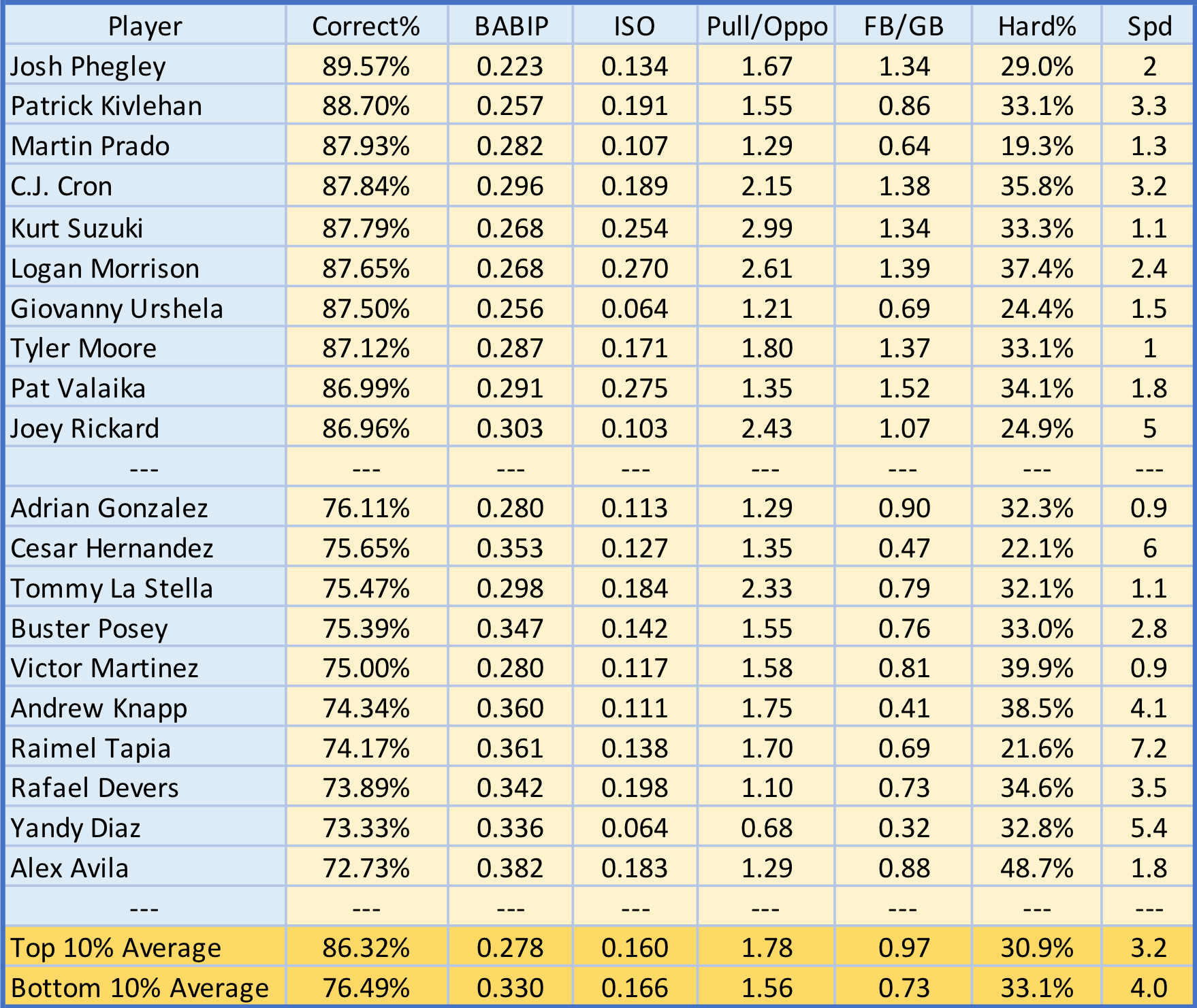
Here’s a spreadsheet of data I compiled, mostly using Umpire Ejection Fantasy League data. I decided to limit it to 2015-7, in part because of use of Statcast and relatively consistent replay rules.

I also came at this analysis assuming any particular non-white and Latino player was as likely as any white, non-Latino player to be ejected, and so compared player ejections with league representation percentages for particular ethnicities. However, in doing analysis on position players only – that is, excluding pitchers – I didn’t have the league representation percentages adjusted for position players.

A major limitation in my data is having to hand-assign players as being white or non-white, and Latino or non-Latino. This was done using country of origin and knowledge of US-born players, and therefore is limited by my personal knowledge, particularly for US-born players. For instance, Marcus Stroman’s mother is from Puerto Rico and he was offered the chance to pitch for Team PR in the WBC. For the purposes of this analysis, he was classified as ‘nonwhite’ and ‘Latino.’

I also don’t know how players self-identify; I’m assuming Anthony Rendon, whose family is from Mexico and who was offered the opportunity to play for Team Mexico, self-identifies as Latino, but I don’t know if he’s stated that specifically. For non-US-born players, I also classified all players born in Latin American countries as Latino, but again, that’s not the same as asking for someone’s self-identification and that’s not the same as how any particular umpire perceives any particular player. For example, Francisco Cervelli, who is Italian and Venezuelan, was classified as non-white and Latino for this analysis.

I also classified Latino players as ‘non-white’ for the purposes of this analysis. While many Latinos self-identify as white, the Racial and Gender Report Card for Major League Baseball, where I got the league demographic data, identifies them as non-white and calculates them in the total of ‘players of color.’ So I maintained this classification for the purposes of this analysis. Any mistakes are unintentional; I welcome comments with suggestions for re-categorization.

Lastly, the umpiring corps has, as far as I know, not changed dramatically year to year. It’s a notoriously narrow pipeline and one almost entirely composed of white men. Analysis showed that some umpires toss players more than others, but this hasn’t been controlled for brawls. Additionally, the numbers of players tossed is a reflection of the number of games worked, which I haven’t controlled for.

This analysis isn’t meant to ascribe ejecting non-white and Latino players to any particular bad actor within the umpiring corps but to show a pattern of behavior.


The data:

2015 2016 2017 Grand Total
Non-white 50 52 29 131
Latino 39 42 22 103
Non-Latino 11 10 7 28
White 50 38 44 132
Non-Latino 50 38 44 132
Grand Total 100 90 73 263


Non-white players being ejected accounts for almost 50 percent of total ejections, despite players of color never being more than 42.5 percent of the league. Latino player ejections account for 38 percent of ejections, despite Latinos never being more than 31.9 percent of the league. Non-white, non-Latino players (of whom most are African-American), accounted for about 11 percent of ejections, fitting with representation in the league, except that no Asian players were ejected in this time period, and Asian players made up between 1.2 and 1.9 percent of the league. So, non-white, non-Latino, non-Asian players make up about 9-10 percent of the league and 11 percent of the ejections.

2017 is, therefore, a bit of a fluke. Of total players, nonwhite and Latino players were actually not tossed any more often (relative to their representation in the league) than their white peers.


Percentage of Total Ejections 2017        Percentage of the League
Non-white players ejections 39.7% 42.5%
Latino players ejections 30.1% 31.9%
Non-white, non-Latino players

ejections

9.6% 10.7%
White players ejections 60.3% 57.5%


I then controlled for two things:  pitcher ejections and ejections by non-home plate umpires, figuring that most pitcher ejections were as a result of beaning batters (which, yep, keep tossing them), and non-HP ejections might result from ejections during brawls, arguing slide calls, or in circumstances dissimilar to Rendon’s.


2015 2016 2017 Grand Total
Nonwhite 31 36 26 93
Latino 23 26 19 68
Non-Latino 8 10 7 25
White 26 26 32 84
Non-Latino 26 26 32 84
Grand Total 57 62 58 177

A few things became noticeable. One, overall ejections seem to be dropping, but non-pitcher, HP umpire ejections are holding pretty steady. Two, in 2015 and 2016, non-white position players comprised the majority of ejected players. Not only were non-white position players being ejected at a rate disproportionate to their representation in the league, they were being ejected more often than their white peers.

Latino position players were also being ejected by home plate umpires at rates disproportionate to league representation in 2015 and 2016 – 40 percent of ejections in 2015, despite Latino players being 29 percent of the league, and 42 percent of ejections in 2016, despite being 28.5 percent of the league.

For 2017, non-white and Latino players were ejected slightly more frequently than representation would account for.

Percentage of Total Ejections 2017 Percentage of the League
Non-white players ejections 44.8       42.5
Latino players ejections 32.8 31.9
Non-white, non-Latino players

ejections

12.1 10.7
White players ejections 55.2 57.5

So, is 2017  a step in the right direction or a flukey year or something else? No idea, and with the 2018 season being nascent, it’s hard to say. If there have been interventions on the part of the MLB or the umpire’s union, fantastic, but those interventions have not, as far as I’m aware, been made public.

I also know we won’t know for a while about 2018 ejections because ejections aren’t all timed equally. One of the weird things about this data is that white players tend to be ejected in early months, and non-white and Latino players make up the majority (or at least a disproportionate percentage) of ejections after May.

April    May   June   July   August Sept. October Grand Total
Nonwhite 14 17 27 24 22 25 2 131
White 18 37 16 15 19 24 3 132
Grand Total 32 54 43 39 41 49 5 263
April May June July August Sept. October Grand Total
Latino 10 14 18 20 18 21 2 103
Non – Latino 22 40 25 19 23 28 3 160
Grand Total 32 54 43 39 41 49 5 263

What this means is that the early ‘eye test’ for white and non-white players being ejected at similar rates won’t bear out in later months.

What if they deserve it?

None of this has addressed a fundamental question in considering ejections: Some guys have it coming. I tried to control for this in considering repeat offenders – that is, if there are certain players who, by virtue of reputation and absent any racial dynamics, just get tossed a lot.

Of the guys who’ve been tossed more than three times, the results are … very unsurprising:

Ian Kinsler    4    
Josh Donaldson    4
Mike Napoli    4
Matt Kemp    5
Yunel Escobar    5
Bryce Harper    7

Of these repeat offenders, Escobar and Kemp are non-white, and the former is Latino. The rest are the kind of love-’em-or-love-to-hate-’em white guys you might expect to make up such a list. So again, the eye test of ‘Bryce gets tossed too,’ doesn’t bear out when you look at the number of different players tossed total.

For ‘three-peaters’ – guys tossed 3 times in the past three seasons – of the 13 tossed three times, only two, Joey Votto and Justin Turner, aren’t Latino. And for players tossed once or twice – so not for having a rep as a showboat or arguer or ‘disrespectful’, 57 Latino and 115 non-Latino players have been tossed in 3 years. So, 33 percent of ejections have been for Latino players, despite the fact that Latinos averaged at 30 percent of the league’s players during this time. For non-white players, 76 non-white and 96 white players were ejected once or twice, meaning 44 percent of players ejected once or twice weren’t white, with the league averaging 41.5 percent non-white players during this time.

In totality, 36 percent of the players being tossed are Latino, and 46.5 percent of the players being tossed are non-white, both higher than their representation in the league.

If ejections are the league’s way of dealing with argumentation at the plate, we should consider that Latino players and non-white players are already disproportionately disciplined by their fellow players – and brawls are more likely to break out between players of different ethnicities.

We should also consider why players are perceived to ‘have it coming’ to them for arguing, ‘showboating,’ or other displays of either enthusiasm or disrespect, depending on your perspective, and why Latino and non-white players are dinged for it so more than their white peers for what are likely similar behaviors.

Umpiring by largely white umpires on increasingly non-white players is a cross-cultural conversation, one that’s monitored by 40,000 fans, TV viewers, and the ever-watchful eye of Statcast. The league has a vested interest in solidifying its presence in Latin American countries and in trying to encourage African-American players – who are a decreasing percentage of players overall – to continue with the game.

I don’t pretend to know what’s in an umpire’s heart (I assume pine tar and certificates for failed eye exams). I didn’t do this analysis to say that any particular umpire is actively thinking that they should eject a non-white or Latino player because they are non-white or Latino. What I discovered in doing all of this is that there is a very clear pattern of behavior among umpires when it comes to player ejections when the Statcast era is taken in its totality. An action may cause harm – in this case, an ump being more likely to throw out a non-white player – without any specific racist intent.

Additionally, the idea that umpires are enforcing ‘respect’ (and Joe West said that was Foster’s intent in tossing Rendon – “You have to do something or he loses all respect from the players.”) on non-white and Latino players is particularly galling. If non-white and Latino players are disproportionately perceived as ‘disrespectful’ of the game for similar actions as their white peers, such as tossing a bat after a strikeout, then the issue is perceptions and not players.

This, of course, is a societal issue beyond baseball. Analyses of behavioral perception by white teachers show that they tend to ascribe disrespectful, aggressive behaviors to non-white students at higher rates than they do to white students or than black teachers do with black students. Analysis of school punishments shows that black and Latino students are suspended and expelled at much higher rate than their white peers without any evidence they’re misbehaving more. So this is not a problem unique to player-umpire dynamics, but instead is one indicative of broader structural societal dynamics.

To work on addressing this as a structural issue, the league can change how it handles ejections. A few proposals:

  • All plays over which a player is ejected are automatically reviewable, including balls vs. strikes. If an umpire ejects a player on a strike call that, on review, is revealed to be a ball, the player isn’t ejected. If a player makes contact with an umpire, they should be ejected but if players see that there is a clear and objective appeals process to an ejection, my guess is that they’re more likely to calmly walk off than explode.
  • All ejections should be reviewed as part of a rigorous rating process for umpires. Umpires who repeatedly eject players for calls that, on review, they should not have made (such as a bad ball vs. strike call) should experience some form of penalty – by being demoted, retrained, or fined.
  • Umpires’ ability to call balls vs. strikes compared with what Statcast determines is in or out of the zone should be made publicly available. If an umpire is consistently below a certain percentage of accuracy, they should be demoted or retrained.
  • Player strikeout rates should be adjusted for umpire accuracy the way player defense is adjusted for particular ballparks.
  • Diversify the umpire corps. Currently, umpires are generally older white men who feel tasked with enforcing ‘respect’ from young, increasingly non-white players. I’m not saying that simply hiring more people of color (including women of color) is a cure-all for these kinds of issues, but diverse perspectives may mean a decrease in unintended slights between players and umpires, and a general change in player-umpire dynamics.
  • Radically, I would also like strike calls to be reviewable. They would cost a manager a challenge if incorrect like any other play. If a manager challenges – and is correct in challenging – strike calls repeatedly, then the umpire, and not the player or manager, should be held at fault.

If this sounds like we can replace a home plate umpire with Statcast for calling balls vs. strikes, then I’m for it. As the cliche goes, I didn’t watch the game for the umpiring, and if a computer can do what the umpires are doing in a fashion that doesn’t disproportionately penalize players of color, then I don’t see a downside.

I co-host Resting Pitch Face, a bi-weekly baseball podcast with a Nationals bias. I can be reached on Twitter at @sydrpfp.


Finding Keys to Elevate the Ball More

Everyone is looking for keys to get players to elevate the ball. One important point is certainly the so called attack angle. The attack angle is the angle of which the bat attacks the ball (uppercut, level or down). Baseball used to teach swinging down but now you actually want a small uppercut. Players use different cues to achieve that. Common cues are for example leaning slightly back to the catcher and work up with the front elbow.

Up in the zone elevating is pretty easy. The league average launch angle (LA) in the upper third of the zone is 20 degrees. Even Christian Yelich averages 15 degrees in the upper part oft the zone. In a prior analysis I also found out that LA in the upper part of the zone has little influence on wOBA, the 20 lowest average LA guys in the upper third actually had a slightly better wOBA than the 20 highest LA guys (.402 vs .393). 170 out of 182 hitters last year averaged 10-plus degrees.

That is very different low in the zone. The league average LA in the lower third was just 5 degrees and over 30 guys actually had a negative LA. Here the wOBA for the high LA guys is 80 points higher than the low LA guys. The difference is made low in the zone.

View post on imgur.com

So the key for the low LA guys is definitely still to lift the low pitch. So how can this be achieved? You definitely need to swing up and you also need to avoid rolling over and hitting a grounder to pull field which is what the sinker-ballers try to achieve.

One theory is that on low pitches you tilt the shoulders more down and hit with the bat pointing more to the ground. The cue is that for high pitches the bat turns more like a merry go round and on low pitches more like a ferris wheel.

This Ferris Wheel like path makes sure that the bat comes through more straight through from below rather than going across the ball which leads to rolling over.

Mike Trout is so good at this that he is able to sometimes even hit down and in pitches  to dead center for a bomb while most have to pull that ball. Jeff wrote a nice article about this: https://www.fangraphs.com/blogs/jabo-mike-trout-has-a-new-trick/

Of course this Ferris Wheel path also has his disadvantages, for example Trout used to be very bad on high pitches the first 4 years of his career. Still he got away with that because most pitchers would only pitch up like once per at bat and not live up in the zone so Trout would just take but ideally a batter would flatten out the bat up in the zone and swing steeper down which Trout actually did last year causing him to improve up.

But the traditional level bat, level shoulders cue is definitely hurting on low pitches and made the sinker so popular. Now that more guys learn the new swing path the sinker doesn’t work as well anymore but there are still hitters who struggle down (like Hosmer and Yelich).

The pitch up is getting more popular but it can not suppress launch angle. The high pitch lifts itself, when a pitcher pitches up he needs to compensate for the higher LA by more pop ups, lower EV and more Ks.

It is a good sign that Hosmer now thinks about swinging up more but if he wants to increase his LA he either needs to stop swinging at pitches in the lower third and target pitches up or change the rotation axis of his bat to more vertical on top of his attack angle because if you swing up but across the ball on low pitches all you do is hitting your grounders with more topspin.

I measured the vertical angle of some good and bad low ball hitters. On the left of the picture you have Yelich and Hosmer and the other pics are Ortiz, Trout and Votto who are all excellent low ball hitters. All pitches I chose were about knee high and on the inside of the plate because that affects the bat angle.

What you can see is that Hosmer and Yelich have an angle in the mid 20s while the other three are in the low to mid 40s.

View post on imgur.com

That is important because on low pitches the flat barrel will naturally rotate to the left causing top spin similar to a tennis top spin while the steep barrel will rotate up and on the line to CF. https://www.youtube.com/watch?v=MJHTQncT-AA

So to learn to elevate getting a positive attack angle by leaning slightly back and keeping the head over the rear hip during the turn and working the front elbow slightly up definitely is important, but you also need to match the rotation axis of the bat around its long axis with the height of the pitch. The old cue of not dropping the back shoulder and hit with a level bat has its merits on pitches above the waist where a too steep bat angle is indeed bad (see young Trout) but on pitches mid-thigh to knee height this cue is very destructive. In the upper third of the zone the bat angle will be relatively flat ,but in the lower third you need to drop the back shoulder and tilt the rotation axis oft he bat down to around 40-45 degrees.

That means changing the swing isn’t that easy, you have to account for several things. It can be done but it is some work, will we see Hosmer and Yelich making all those adjustments? If they don’t make it they could also adjust less and try to just avoid hitting the low pitch but of course, that would eventually give the pitchers an opening to exploit.

So far there is no improvement for Hosmer. It is early but his GB rate is 58%. He either needs to stay away from the low pitches and target pitches up (and away in his case) or make more changes to his swing.


Using a Monte Carlo Simulation to Propose a Radical Four-Man Rotation

Introduction

Much has been made of the ‘bullpen revolution’ over the past couple of years. Andrew Miller and Chris Devinski represent relievers on the forefront of the revolution, on teams at the forefront of innovation. The Astros routinely use Devinski in the middle innings, and for multiple innings. Devinski, a skilled pitcher who could close on many teams, provides a bridge to the ‘high leverage relievers’ , and affords the Astros bullpen flexibility that is usually unseen with conventional bullpen management. Conventional bullpen management calls the starter to pitch at least 6 innings, with high leverage relievers then entering to close the game. However, as pointed out in recent articles by Russel Carleton at Baseball Prospectus, starting pitchers often fail to reach the sixth inning. Starters are pitching less every year, and real evidence has been found of starters performing considerably worse towards the end of outings.

Carleteon, and others around the baseball community, have examined different possible rotations constructs that would make starters more efficient. Rotation ideas include tandem starters, four-man rotations, six-man rotations, and others. What I propose is something slightly different and more radical.

My method proposes a group of seven pitchers capable of handling a starters workload. The goal of these 7 pitchers is to maximize the amount of games the team enters the 7th inning with a lead. The traditional model would have the 5 best pitchers pitch every fifth day, and if they are unable to complete six, they are relived, usually by a mediocre reliever. Instead, my system proposes a tandem-type method where decisions are made based on the leverage of the game in different innings. If your goal is to reach the 7th inning with the lead, having a good pitcher available to bridge the gap and conserve the lead makes sense. Specifically, my method calls for a four-man rotation, with each starter going anywhere from three to give innings, rarely six. Here’s the kicker; the ace is not one of the 4 starters. Instead, the ace will often relieve a starter in the fourth, fifth or sixth innings in high leverage situations.

I believe this simulation hones in on one important question. How valuable is a pitcher throwing 6 innings of two run baseball, but doing so once every five days? Is he more valuable pitching three times a week, two important innings at a time, with his runs allowed more likely spread over three games? Many will say that a starter who can go deep into games and keep the your team in games is indispensable. It keeps the bullpen fresh and gives your team a great chance to win. I don’t disagree. But I think the notion that this is the most efficient way to manage a whole rotation is short sighted. By having the best starter available to come in in the third, fourth, fifth, or sixth of almost any game, you’re creating the opportunity to win games you might otherwise lose had you let the inferior pitcher remain in the game. I propose that it’s likely that six innings pitched over three games provide no disadvantage when compared to 6 innings pitched in one game.

And finally, the question of if pitchers can pitch on four days rest if they are only going three-five innings at a time is important to consider. Russel Carleton showed here that pitchers going on three days of rest are largely unaffected in their performance. Previous game pitch count has a much greater effect on current game performance than days of rest. However, the effects of pitching a couple innings every other day or every three days could catch up to a pitcher over the course of a season. Then again, it could be beneficial to the pitcher by allowing them more opportunity to work on their craft. The truth is, a a strategy that calls for pitching 3 innings at a time multiple times a week hasn’t been seen in decades, and the exact effect it would have on todays pitchers is unknown.

Simulation Specifics

I created a Monte Carlo simulation in Python with the ultimate goal of seeing if two teams, comprised of the same exact pitchers, may achieve different results using different pitching management strategies.

I started by gathering pitcher data from FanGraphs. I got ERA data for starters and relievers who qualified over the past three years. Then, using random sampling in Python, I randomly sampled 150 times from the starter data. These 150 samples represent the 150 starters in my simulation, and each starter was placed on one of 30 arbitrary teams. I did the same for relievers, generating seven per team.

Now, with 30 teams, each of differing skill levels, I could simulate a season. While each team had high leverage relievers, for the sake of this model, I only looked at the five starters and the 2 worst relievers ( the mop-up men) for each team. I also insured that the two mop-up men always had worse ERA’s than any starter on their team.

I first simulated the season using traditional rotation management. Each pitcher went as far as he could, and was removed based on simplistic criteria that relied on the amount of runs he had given up and the amount of innings he had pitched. Of course, more goes into deciding weather to pull a starting pitcher, but for the sake of this simulation, I kept the criteria simple. Innings were simulated all at once, with the amount of runs determined by a random number generator which incorporated the pitchers ERA. No offense was used in the run generation, only the pitching talent level was considered. After each game is simulated through six innings, the winner and loser is recorded; in the event of a tie, the away team gets credited with a win.

For the second simulation, the starting rotation is made up of the number two, three, four and five starters. The ace never starts!!

In the second simulation, the starter always pitches at least three innings, regardless of his performance. He goes out for the fourth inning only if he’s given up less than 3 runs and he pitched less than 5 innings in his previous start. He goes out for the fifth inning only if he’s given up less than 2 runs and he pitched less than 4 innings in his previous start. He goes out for the sixth inning only if the ace and the two mop-up men are not available. If the starter is pulled, either the ace or one of the mop-up men is brought into the game, depending on the leverage of the situation.

The criteria above is one instance in which the starter is removed due to rest or runs given up. There is another instance in which the starter can be removed. If the Leverage Index is greater than 1.1 heading into the fifth or sixth innings, and the ace is sufficiently rested (determined by other criteria), the ace will be brought in.

Results

For each of the thirty teams in my fictional league, I simulated 100 seasons where that team used the new pitching strategy, and every other team used the old pitching strategy. On average, teams added .6 wins a season. The max wins added was 1.32, the min wins added was -.666. There does seem to be a very slight advantage to be had from saving your ace for the big moments.

Conclusion

The future of the five-man rotation is in question. As teams and analysts explore alternate strategies, the question posed by this project will certainly be raised. Through this analysis, it seems the value of a start by an ace once a week can be matched, and beaten, by 2 or 3 separate two inning high leverage outings by that same ace. Furthermore, it is known that pitchers moving to the bullpen perform better because they are able to exert more energy per outing, since they pitch less than starters. A question remains, however, on whether pitching less per outing but pitching in more games allows pitchers to exert more energy per outing, despite pitching the same amount over a given time, say a week.

The practicality of this simulation is lost a bit in simplicity and in the unknown. Runs are modeled using a random number generator, and pitching changes are ruled by a small series of if-and-elif statments. Not to mention the simulation only allows pitchers to be subbed before an inning starts. Certainly, real baseball is more complex. Regardless, I believe the simulation provides a framework to understand different pitching strategies. Future work could involve an examination of other pitcher management strategies as well as added complexity.

All in all, a strategy such as the one proposed here calls for very short rest and short outings throughout the year, something that hasn’t been seen in decades. Furthermore, a team moving their ace to the bullpen to add marginal wins would face an uproar from the fans, the media, and the ace himself. It’s fun to imagine aces pitching this way in a simulation, but the reality of a strategy like this is a little far fetched. Nonetheless, as starters start to pitch less, good pitchers are going to be needed to bridge the gap to the late innings. There is value to be had in shortening outings and insuring good pitchers pitch in important situations.


Optimizing Launch Angles Using Simulation and K-Nearest Neighbors

Although posted by Jack Marino this was a truly collaborative effort by Grant Carr, Justin Clark, Jake Fisher, Jack Marino, and Noah Nash.

The introduction of Statcast technology in 2015 has allowed analytics departments around the MLB to quantify aspects of the game that until the last few years were impossible to measure. One of the previously unanswerable questions that Statcast has allowed us to examine is the optimal launch angle for each hitter in the MLB. If the free agent market this winter has told us anything, it is that teams are now becoming more sabermetrically savvy with their checkbooks and are understanding the value a player adds to their roster in a far more analytical sense. For example, Mike Moustakas may have hit 38 bombs last year, but the fact of the matter is that he is a two WAR player with a below average glove and minimal range. Moustakas’s late signing for just $5.5 million plus incentives after declining a $17.4 million qualifying offer indicates that the market seems to have a much better understanding of his value than it has in years past. Since optimizing launch angle is defined as adding the greatest possible value per at bat, finding the right launch angle is undoubtedly a smart decision for a player trying to put himself in the best possible position to break the bank during free agency.

What makes this optimization problem so difficult is that simply knowing a launch angle on a certain ball in play very rarely tells us anything definitive about the outcome of that ball. The reason for this is that batted ball outcomes are extremely dependent on other variables such as exit velocity and the positioning of the opposing team’s defense. For example, a 25° launch angle hit above 100 mph is in most cases a home run; however, a ball hit at that same angle at 80 mph is almost surely a flyout. To gain a complete understanding of this relationship, we think the following visuals can be extremely helpful, but this relationship can also often make a lot of intuitive sense.

statcast 1 jpegpasted image 0 (1)

Never shying away from a challenge, we decided to dive into this problem and see what sort of algorithm we could develop to take a hitter’s batted ball data in 2017 and calculate an optimal launch angle for that hitter in 2018. The data we used for this project are from baseballsavant.com.

Since calculating an optimal launch angle will most likely result in an adjustment of a player’s swing, it is important to understand the possible repercussions of that change. For example, to increase launch angle, one definitely will need to adjust swing path to a more uppercut swing, which could in theory lead to a higher strikeout rate. For this reason, before recommending any changes, we wanted to make sure we understood the relationship between launch angle and strikeout rate. Using players with over 100 at bats during the 2017 season, we constructed the following plot and built a linear regression model trying to predict strikeout rate from launch angle. What we found was an R-squared value of approximately .05, meaning that only 5% of the variability in strikeout rate was accounted for by launch angle.

pasted image 0 (2)

Following this conclusion, it seemed fair to move on and continue our analysis under the assumption that any tweaks we make to a player’s swing will not cause a drastic change in strikeout rate or quantity of balls put in play.

We think at this point, major strides have already been made in understanding launch angle, especially the possibly unexpected result of our linear model above. However, the problem still has not been solved and our methodology for solving it has not yet been revealed!

The method we came up with was to use simulation to increase the sample size of exit velocities based off the distribution of our hitter’s and calculated comparable players’ batted ball data, take these simulated exit velocities and fix a launch angle to them, use k-nearest neighbors on our hitter and comparable players’ to get a likely outcome for that batted ball type, then see what launch angle maximizes a hitter’s expected weighted On Base Average (wOBA) given the simulated distribution of exit velocities and k-nearest neighbor outcomes.

That may be a lot to throw at a reader all at once, so let’s examine a case analysis of this study using San Francisco Giants outfielder Andrew McCutchen. McCutchen’s 2017 season saw him have an average exit velocity of 88.4 mph and an average launch angle of 14.2°. Optimal launch angle is extremely player specific, so the first thing we have to do is gain a complete understanding of McCutchen’s batted ball profile. The chart below does an excellent job of helping us to do exactly this. For example, it appears McCutchen never surpassed a launch speed of 110 mph off the bat in 2017, had a pocket of homeruns between 23-30° and 95-110 mph, had a band of doubles at similar exit velocities but lower launch angles, and a group of singles at low launch angles and an even larger distribution of exit velocities than before. Now this is a great plot for understanding comparable players, but the fact of the matter is that there are entirely too many players to compare on a plot by plot basis.

pasted image 0 (3).png

To combat this problem, we first narrowed down the field to players who took over 100 at-bats during the 2017 season and then used the technique of Principal Component Analysis to narrow down the field of comparable players even further. For the variables in our PCA, we chose many different metrics using the Baseball Reference play index including home runs, triples, doubles, and singles per at bat, fly ball rate, ground ball rate, WPA, RC, and oWAR amongst others. After completing the analysis, we chose our first four principal components, which accounted for 76% of the variability in the original variables. We squared and summed the differences of each player’s first four principal component scores and created a list of the top 20 players whose four squared distances were the smallest. From here, we removed players who did not bat righty to try to account for the lefty/righty splits a righty batter like McCutchen may have. Then we went plot by plot trying to match the pattern of hits and exit velocities to McCutchen’s plot above. After this qualitative piece of our analysis was complete, we came up with Adrian Beltre, Alex Bregman, Brian Dozier, and Eugenio Suarez as our four comparable players. Their distribution of hits graphed with McCutchen’s can be found below and are remarkably similar.

pasted image 0 (4).png

When we considered how to create this optimal launch angle, we knew we wanted to somehow incorporate different areas of the strike zone, as the optimal launch angle on a ball up and in is likely not the same as on a ball down and away. To combat this potential problem, we divided the strike zone into 9 sections and created the following heat maps for both McCutchen and McCutchen and his comparable players. To understand these heat maps, it is important to note that the first number in each zone is the average launch angle on balls in play for that player or groups of players during the 2017 season in that zone, while the second number is the average exit velocity on balls in that zone.

pasted image 0 (5).png

Looking at McCutchen’s heat map, we saw clear variation in exit velocity, launch angle, and offensive outcome (in this case wOBA) by zone, which confirmed our belief that we would have to take zone-specific differences into account. We decided to find the optimal angle for each of our nine zones, planning eventually to combine those angles into a single, optimal number unique to McCutchen. Looking at zone-specific data for McCutchen and his comparable players, we ran into the same challenge that motivated finding those comps in the first place: lack of data. There was simply not enough data on launch angle, exit velocity, and wOBA between McCutchen and his comps to perform the kind of verifiable analysis that comes with a larger sample size.

To overcome this challenge, we turned to simulation. Specifically, we searched for a distribution that would allow us to generate reasonable launch velocities for a given zone. With this distribution, we could test possible combinations of launch angle and exit velocity to explore which zone-specific angles might be optimal. Looking at a histogram of launch velocities for McCutchen and his comps, we observed a pronounced left skew across all nine zones. With this trend in mind, the Weibull distribution made sense for its flexibility in modeling real-life processes that feature multiple varieties of skew. Implementing maximum likelihood estimation on the zone-by-zone data used to generate the heat maps gave us the parameters for nine Weibull distributions that closely characterized the trends in exit velocity we observed for each zone. For example, the fit of our Weibull distribution in zone 1 shows the clear left skew, but also the excellent job of the flexible Weibull to fit the data.

Screen Shot 2018-03-12 at 7.26.11 PM.pngScreen Shot 2018-03-12 at 7.26.22 PM.png

In all, this process allowed us to generate any number of exit velocities for each zone that might reasonably approximate the kind of speeds we see on actual batted balls, leaving us with finding a range of launch angles that could be optimal for a given zone. While looking at the distribution of launch angles for McCutchen and his comparable players, we decided to consider only the launch angles between the 25th and 75th percentile for each zone. This gave us a number of discrete angles to test in conjunction with each zone’s launch velocity distribution for optimal offensive performance.

For each possible angle within a given zone, we generated 1000 exit velocities from that zone’s respective Weibull launch velocity distribution. Next, we used k-nearest neighbors to assign a wOBA value to every launch angle, exit velocity pair by examining similar pairs of launch angles and exit velocity and their associated wOBA within the McCutchen and comps dataset. This procedure gave us 1000 wOBA values for every launch angle that might be observed in a particular zone. By taking the mean of those wOBA values for each possible launch angle, we gained a more complete sense of what kind of offensive performance might be associatedon averagewith the various launch angles for each zone. To identify which angle in each zone was optimal, we simply chose the launch angle with the highest associated wOBA.

Now that we had our nine optimal launch angles in each of the nine zones, we wanted to come up with a way to get to one optimal launch angle. When coming up with this angle, we knew it would be important to incorporate how often a player faces pitches in each zone as well as some measure of his talent level in each zone. To incorporate these two factors into our analysis, we started in zone one and took the product of the proportion of pitches McCutchen saw in zone one and his contact percentage in zone one, then repeated this process for the other eight zones and took the proportion of each of these products to create linear weights. Once we had our linear weights, we simply multiplied each zone’s weight with our previously calculated optimal launch angle in that zone and took the sum of these products. A visualization of this process can be seen below:

pasted image 0 (6).png

To finalize our findings, while Andrew McCutchen finished his 2017 regular season with an average launch angle of 14.2°, our advice based off our model is that he lower his average launch angle to 13.0°.

Well, there’s our methodology, not saying it’s perfect, but we’re certainly happy with our results.


About the Authors:

Grant Carr is a mathematics and economics double major at Kenyon College.

Justin Clark is a mathematics major at Kenyon College.

Jake Fisher is a history major at Kenyon College.

Jack Marino is a mathematics and economics  double major at Kenyon College.

Noah Nash is an english major and art history minor at Kenyon College.

The group can be contacted at marinojc@kenyon.edu with any further questions.


Predicting Batter Batted-ball Outcomes

The same model as before, basically.

No two batters are the same. Identical, perhaps, but not exactly the same. Two identical stat lines can be produced in a myriad of ways. However, batted ball contact can be telling – it’s difficult to confuse a barreled ball to a soft-hit ball. I wanted to apply my Statcast hit prediction model to 2017 batters, to see which batters were easily predictable and which had outside factors beyond batted ball statistics impacting their hits and outs.

First, I would like to mention I made a major change to my model. Initially, I trained the model on a portion of 2017 data and applied the model on the rest of the season’s data. Between then and now, I added 2016 data to my SQL database and chose to train my model on all of 2016 for use on all of 2017. Here are the updated results:

correct2

Identical. My model got slightly worse at dealing with outs (a percentage point increase I misclassifying outs as hits, corresponding with the same decrease in predicting outs as outs) and slightly better at predicting hits (a .6 percentage point increase in predicting hits as hits and the same decrease at predicting hits as outs). The purpose behind retraining the model was that now I can apply it to the entirety of 2017 instead of merely 80% of 2017 – which, when dealing with small sample sizes (such as batter-specific analysis), helps.

My model did surprisingly well at predicting the correct batted ball outcome for hitters. I limited the sample of hitters to those with 100 or more balls in play, removing pitchers and many part-time players (though, in complete honesty, I don’t think sample size matters much here, as my model predicts each batted ball in isolation – please convince me either way in the comments).

players1.png

My model did pretty well! The model’s predictions ranged from 72-89%. Above are the top and bottom five players in terms of prediction accuracy (Correct%) as well as the top and bottom 10% averages. I included some statistics I thought would correlate with prediction accuracy – batting average on balls in play (BABIP), isolated slugging (ISO), pull to opposite batted ball ratio (Pull/Oppo), fly ball to grounder ratio (FB/GB), hard hit percentage (Hard%) and speed score (Spd).

My hypothesis was that higher speed and a more even spray distribution (a Pull/Oppo ratio closer to one) would decrease the performance of my model. Through comparing the top and bottom 10% averages, we see some correlations with some variables and model accuracy. BABIP, Pull/Oppo, FB/GB, Hard% and Spd all appear to impact my model’s accuracy. One thing these all have in common is that they impact BABIP – better spray charts increase BABIP, fewer ground balls decrease BABIP, harder hit balls can be harder to field (lower reaction times) and increase BABIP, and faster players can beat out infield hits at a higher rate. Clearly, some of these stats work independently of the others- for example, Buster Posey and Victor Martinez have low speed scores yet higher sprays (lower Pull/Oppo).

This has been a fun model to explore. Essentially, the ability to predict hit outcomes from batted ball statistics depends on BABIP – or, if you rather, factors that influence BABIP. Until deeper fielding data is publicly available, such as initial start position, catch probabilities, etc., I don’t think I can improve this model. Ideally, I hope to develop it into a tool to evaluate batters’ contact abilities sans luck. Let me know if there are any batters specifically that you’d like to see, or other ways I can explore the model!


– tb


Luis Castillo is Going to Be Just Fine

Following what was a great debut season in 2017, Luis Castillo has been disappointing. The young righty sported the third-hardest average Fastball (97.5 mph) of all major league starters last season, trailing only Noah Syndergaard and Luis Severino. This year, his average velocity on the heater is 95.8 mph — Almost two ticks below what it was in 2017, which is surprising when considering that he is only 25 years old. This is a young pitcher that recently broke into the league, whose fastball velocity has dropped for no real apparent reason, as far as public information has indicated.

Diving into the data, the first aspect of Castillo’s game that stands out as changed is his Four-Seam Fastball usage, which has gone down from 50.6% last year, to 34.9% in 2018. Instead he’s opted to throw his Sinker 22.2% of the time, in contrast with his 11.6% rate throwing the pitch in last year’s campaign. Castillo is also using his Changeup slightly more often this year, while backing off from utilizing his Slider somewhat, in comparison with his reliance on each pitch last season.

When a pitcher has a blistering Fastball like Castillo does, it usually makes a lot of sense for them to use it to challenge hitters with frequency. In throwing his Four-Seam Fastball about half the time last year, Castillo was quite successful. Fellow high-velocity righty Luis Severino was a Cy Young candidate whilst throwing his own Four-Seam Fastball in 51.7% of his pitches.

The question of why the velocity has decreased is effectively up in the air for now, though perhaps Castillo has been throwing it with less frequency because he knows it’s not the same as it was last year. Regardless, it’s hard to say whether his drop in velocity would be able to facilitate the same usage and success of his Four-Seamer this season, as during the last one — Due to its loss in velocity.

What can be examined to better understand his recent changes, are Castillo’s mechanics — And more specifically his release point, as it relates to his arm action. First off, is a Four-Seamer he threw in a July 2017 start basically middle-up in the zone at 96 mph:

Animated GIF

The next is a middle-up located Four-Seamer thrown at 94 mph, in his April 11th Start against the Phillies:

Animated GIF

These are nearly identical pitch locations, just thrown in different starts, with two strikes. Notice anything different between the two? Looking at the gifs is not sufficient for understanding what’s changed in Castillo’s mechanics since last season.

Take a look at the freeze frame of the release points on each pitch:

His arm slot is higher on the right than on the left, which could be the culprit of his struggles. He threw the Four-Seamer with an average vertical release point of 5.90 feet in his April 11th start against the Phillies, despite his average being 5.71 feet on the pitch last season. What’s puzzling is that his arm slot has actually been lower on average this season in comparison with where it was during the last.

What’s changed between his starts in 2017, and first three outings in 2018 — Is that his arm slot has been very inconsistent between games this year. For example his vertical release of the Four-Seamer was on average 5.58 feet above the ground, during his opening three starts in 2018. Could his variation in arm slots be to blame for his loss in velocity?

Perhaps, though what’s important is that Castillo bumped his velocity up in his last start. His Four-Seamer averaged 96.1 mph on April 16th versus the Brewers, in comparison with the Four-Seamer’s average velocity of 95.5 mph in earlier outings. His velocity is trending in the right direction! He’s certainly on the right track towards getting back to his 2017 form. There are further signs of his improvement, as well…

Here’s the comparison between Castillo’s start last year, and his most recent April 16th start against the Brewers:

His arm slots here are definitely closer, and the data on his start indicated that his vertical release point on Fastballs was 5.68 feet in his April 16th start — Nearly identical to the 5.73 foot vertical release point on it in 2017. The recent signs in his last start provide evidence that he’s going to be fine.

In the box score, his last start doesn’t look great. He gave up four earned runs, but when watching the final inning in which he was charged with the runs, it’s clear he really just ran into some bad luck. Quickly getting the first two outs, Castillo gave up a slowly hit single up the middle, and the Brewers’ pitcher got a two-RBI hit on a pitch that jammed him. It was an unfortunate ending to an outing that should have resulted in him throwing 7 shutout innings. Context is always important, and in the case of his last start, this holds especially true.

There should be little worry about Castillo moving forward, despite his rough beginning to the season. Finding his release point has been difficult to be consistent with, though with the kind of velocity he has, it isn’t surprising. This is a rare power pitcher even in the context of many pitchers’ newfound increases in velocity. Some bumps in the road shouldn’t slow Castillo, who is ultimately a front of the rotation starter.

All Data taken from Brooks Baseball, Fangraphs, and Statcast – Video from MLB.com


The Coors Field Hangover?

Recently, a brief exchange I had sparked some renewed interest in Coors Field. It’s the most offensively generous park in baseball by a good margin and because of that, people tend to cite context-neutral stats to assign less significance to phenomenal performances by Rockies’ players if they don’t outright Nerf their stat lines without a second thought.  But those context-neutral stats like wRC+ aren’t perfect. The most relevant imperfection to consider here is that the park adjustments are somewhat unrefined in their application.

For this thought experiment, I’ll consider Nolan Arenado as an example, and I’ll mainly be using wRC+ and fWAR to measure his value, so we need to first determine how FanGraphs applies their park factors (PF).

  1. They use a 5-year regressed value in their calculations, so if a stadium happens to play drastically different one year, that value won’t have as extreme an effect on stat calculations. Coors Field’s 5-year PF (116) is close to its 1-year PF (115), and Arenado plays relatively few games in other stadiums outside his division so we won’t consider this to be a real issue in evaluating him.
  2. When applied, park factors are divided in half to account for players only playing half of their games in their home park. In my calculations, I am splitting Arenado’s stats by the stadium he played in so I will not need to adjust park factors initially.
  3. Third, players are assumed to play their away games in a league average setting, meaning when calculating wRC+, etc. for Arenado in San Diego, for instance, Petco Park is considered a neutral park.

Surely, Petco and other parks don’t magically become neutral environments for visiting teams, so why not account for that? Let’s consider the case where Arenado does get more credit for playing outside of Coors Field.

I started by splitting Arenado’s offensive stats by stadium and finding wRC+ and fWAR, as they are typically calculated to make sure that if my numbers are ultimately off, it’s not because they started wrong.

Statistic FanGraphs My Calculation
fWAR 5.6 5.67
wRC+ 129 129.14
wRAA 42.6 42.82

There is some rounding error here, and given that I entered a good amount of data by hand, there is a chance I made some manual mistakes, but the results are close enough for me to feel like I can move forward.

Now, the fun part. Let’s change every PF to its “correct” mark, including an adjustment for Arenado only playing 78/81 possible games at home.

The Coors Field PF becomes 1.3081, and the weighted average of away PFs for Arenado is .9773. After applying these, we find somewhat of a lackluster result:

Statistic New Calculation
fWAR 5.81
wRC+ 130.33

There’s some improvement, but it’s about as “some” as “some” can get. Regardless, this is an adjustment that could (and arguably, should) be made for every player in the league, so it’s not really the difference maker I’m trying to uncover.

But wait. There’s more!

Isn’t there some kind of Coors hangover? I mean, Coors Field hangover? As in, don’t Rockies hitters tend to perform worse than expected on the road due having to adjust to pitches moving differently at a lower altitude? Maybe. Or probably depending on how you want to look at it.

Consider this slightly dated article by Jeff Sullivan. In this piece, Sullivan admits to reading some compelling reasoning in favor of the Coors Field hangover being real, but in compiling his own data, he found that the Rockies do not tend to improve their batting line as a team as their road trips continue. So if the hangover is real, it looks like it doesn’t ebb and flow. If anything, it is a persistent detriment — a “disease” as Sullivan says rather than a “hangover.”

Assuming the effect is real, we still can’t really project how much more productive batters would be if they were left unaffected by atmospheric changes, especially because the magnitude of this effect likely varies greatly from player to player. What we can do though is adjust the park factors of the stadiums Arenado visits so that whatever results he actually produced there are worth more when we calculate his advanced stats.

Because I can’t definitively say how much we should adjust each park factor, I’ll simply change the weighted average we calculated earlier in small increments. For Arenado (and Rockies in general), let’s make our away PFs 1 to roughly 8 percentage points lower (more favorable when adjusting values) so that the most generous case is equivalent to assuming Arenado plays all of his away games in Citi Field or Petco Park with no hangover effect (both have 95 PF/10% worse than league average).

Change in PF (in percentage points) New Away PF New wRC+ New fWAR
-1 .9673 130.81 5.85
-2 .9573 131.28 5.90
-3 .9473 131.75 5.94
-4 .9373 132.23 5.98
-5 .9273 132.70 6.02
-6 .9173 133.18 6.07
-7 .9073 133.65 6.11
~ -7.73 .9000 134.00 6.14

Here, we’re seeing what may be an upper limit to what essentially is a Coors Field hangover adjustment.

It is possible that the proposed hangover effect is even more detrimental to Rockies hitters on the road than this though. Over the last three years, in NL West parks, the Rockies here is how the Rockies have performed compared to the rest of the league according to xwOBA:

Venue Rockies xwOBA League xwOBA % Difference Rockies xwOBA Ranking
AT&T Park  .294  .310  -5.16%  20/25
Chase Field  .324  .323  0.31%  13/25
Dodger Stadium .267 .299 -10.70% 17/25
Petco Park .277 .296  -6.42% 13/25
Coors Field .320 .318  0.63% 11/25

Among the parks they’ve played in the most, the Rockies have had the most trouble in Dodger Stadium. Of course, these xwOBA measures do not account for the quality of competition so your Kershaws and Jansens might be putting a damper on things here, but given that Dodger Stadium is about 267 ft. above sea level, visiting LA gives us a good mix of changing atmosphere, typically competitive pitching, and about the largest sample size possible. So if we’re of the mind to translate that roughly 11% decrease in expected production to an 11% more favorable run environment (by PF), that seems like it would function well as an upper bound on a season-long, league-wide statistical “advantage” of the Coors Field hangover adjustment.

If we adjust our previously adjusted away PFs for Arenado one last time to a value 11% more favorable (roughly 87 PF), we land on 6.27 fWAR with a 135.42 wRC+. Arenado isn’t suddenly giving Mike Trout a run for his money, but he looks up to a half-win better when we give him credit for the fields he actually plays on and when we attempt to make a correction for the alleged Coors Field hangover.

Based on this data it would appear that the hangover only works one way — that is, Rockies players do not seem to suffer upon moving back to Coors Field — but given their substandard lineups since 2015, some of the Rockies’ roughly average xwOBAs, particularly at home, surely warrant some consideration. Still, we could be robbing select Rockies players of up to a half-win per season (per FanGraphs) and a handful of points on their wRC+ simply by assuming that changing altitudes doesn’t create additional difficulties while batting. I don’t advocate a total shift in perspective, particularly because I didn’t seek to change my opinion on the existence of the hangover while writing this, but at the very least, we should approach the evaluation of Rockies hitters with a little more thoughtfulness.


Momentum-Controlled and Season-Adjusted Controlled Runs Averages

                There are no current baseball statistics that truly measure a pitcher’s value. There is nothing inherently wrong with the statistics that have stood the test of time. They tell us part of the story. They are comfortable. They are easily understood. The newer sabermetrics that rely on advanced statistics or a derivative understanding of the game’s events are also good indicators of success and failure of particular aspects of baseball. This is exciting for some; unnecessary window dressing for others. They tell us our understanding of the game is evolving—even today. Perhaps most importantly, these new statistical interpretations have come from contemporaries within our lifetime. We are living in a time where we are changing the understanding of baseball for future generations. While the sport may simply be—to paraphrase Leo Durocher—running and throwing and catching and hitting, how we understand baseball is constantly changing.

I ended up developing two related metrics that have changed how I look at pitchers. What I contend is that they will make the game more accessible for you. They will help you evaluate pitchers using new metrics that focus only on what really matters, instead of being distracted by fancy peripheral numbers that do not translate into game control and seasonal dominance.

Background

Last summer, while flipping between channels to watch a couple of different ballgames, I was both frustrated and intrigued by how the broadcast crews focused on different peripheral stats—such as strikeouts-per-nine-innings, or first-pitch strike percentage—that this pitcher or that one dominated against the league. Needless to say, this was clearly an effort by each broadcast crew to show why the incoming pitcher was the obvious and correct choice for his team.

The more I thought about what I was seeing, the more I realized that everything we talk about and measure to determine a pitcher’s mettle or worth dances around the issue without addressing their primary job—controlling runs. Pitchers get paid varying degrees of fortune to control the momentum of an inning, of a game, and of a season. Controlling momentum means limiting the damage from the opposing offense. Periphery numbers are a good barometer or benchmark of being on the road to success; and having good numbers tend to accompany good game-control. However, this is nothing more than the dashboard gauges in your car telling you that it’s running properly. And anyone who has owned more than one car can tell you, each runs a bit differently, despite them all performing the same basic functions.

It quickly became apparent that most traditional methods of evaluating pitchers simply could not be correlated to measuring their ability to control the momentum of a game.

Methodology

The process of selecting which variables—raw statistics—should be included started with defining what the two hypothesized metrics were intended to measure. The first—Momentum-controlled runs—is concerned with identifying the extent to which a pitcher limits the amount of runs the opposition scores. Because this metric is focused solely on shutting down the opposition once the pitcher-in-question enters the game, we would hypothesize that relief pitchers will be overrepresented in this data set. For example, among qualified pitchers (minimum of 45 innings), Craig Kimbrel and Kenley Jansen led the league in 2017 with an MRA of 1.43 and 1.45, respectively. At the bottom of this category is Tyler Glasnow, who had a league worst MRA of 8.85, among qualified pitchers.

The second—Season-adjusted controlled runs—is concerned with quantifying how much a pitcher’s MRA helped his team over the course of a season. Because this metric is focused on a season-long effort—which suggests that a pitcher’s ability to control momentum needs to be balanced against how many innings he actually pitched for his team in a given season—we would hypothesize that starting pitchers will be overrepresented in this data set. For example, among qualified pitchers (minimum of 45 innings), Corey Kluber and Max Scherzer led the league in 2017 with an SRA of 1.97 and 2.24, respectively. At the bottom of this category is Tyson Ross, with an SRA of 27.93, among qualified pitchers.

The population sample of pitchers included everyone with at least 45 innings pitched. This was chosen to eliminate statistical outliers who did not have enough sample size to validate their inclusion in either data set. For the 2017 season, this sample included 382 pitchers. It should be noted that the size of the population sample of pitchers with at least 45 innings pitched has grown since 1995, which is the first year I included in this study. For the record, the sample in 1995 included 292 pitchers.

The next step was to determine which raw statistics would correlate to controlling the momentum of a game through limiting runs allowed. Comparing the correlation of typical or popular raw statistics—strikeouts, walks, hits, homeruns, runs allowed, etc.—to the possible formulas used to define MRA, it was determined that any raw statistics that did not show a strong correlation would not, and should not, be recognized as a major contributing factor towards controlling the momentum of a baseball game. The minimum threshold for an acceptable correlation coefficient was +/- 0.8. This was selected as the threshold because it is above the widely-accepted +/- 0.7 threshold needed to establish a strong linear relationship.

The raw statistics that met the minimum threshold of +/- 0.8, when correlated to the final formula used to calculate Momentum-controlled Runs Average (MRA), were baserunners-per-run, WHIP, and runs-allowed-per-inning. The correlation coefficient of these were -0.81, 0.83, and 1.0, respectively over a 23-year average of the seasonal correlation coefficients for the 1995 – 2017 MLB seasons. It should be noted that no other raw statistic established anything close to a strong linear relationship with the final formula.

To calculate the formula for Momentum-controlled Runs Average, a pitcher’s WHIP (walks-plus-hits divided by innings-pitched) was divided by his baserunners-per-run, with the corresponding value multiplied by 9. This yields a final MRA value that demonstrates how many momentum-controlled runs each pitcher allowed for a 9-inning game. This follows the same basic conception used to determine a pitcher’s Earned-Runs-Average (ERA), his Deserved-Runs-Average (DRA, a metric compiled by Baseball Prospectus), and his Fielding-Independent-Pitching (FIP). It was decided that calculating MRA to mirror metrics already in existence (ERA, DRA, FIP) would offer the easiest understanding for the average baseball fan.


(WHIP/(BR/R)) * 9 = MRA


It is important to establish that pitchers were held accountable for all runs allowed because their primary responsibility is to keep the opposition from scoring, whether those runs are deserved, earned, or not.

The next step was to determine how to translate MRA into a season-adjusted metric that took into consideration how many innings a pitcher controlled the momentum of each game. The obvious reason for expanding on MRA was that pitchers who control the momentum of 45 individual innings should be compared to pitchers who control the momentum of 200+ individual innings. This metric was intended to enumerate the value of a top-end closer as he compares to a starting pitcher.

To calculate the formula for Season-adjusted controlled Runs Average, a pitcher’s MRA was divided by the value of his innings-pitched divided by 162. This yields a final SRA value that demonstrates how effective that pitcher was at controlling momentum over an entire season of baseball. This also follows the same conception of ERA, DRA, and FIP; and SRA likewise mirrors those metrics in how it is scored.


(MRA/(Inn/162)) = SRA


After creating these metrics, it was determined that an adjusted version of each would provide the benefit of comparing a pitcher’s MRA or SRA from one season to that of a different season. This allows us to compare pitchers relative to their own seasonal performance from different seasons, but also to compare pitcher A from one season to pitcher B from another season. These metrics are reported as MRA+ and SRA+, respectively.


100 * ((2-(MRA/Lg. Avg. MRA))*(1/(PPF*.01))) = MRA+


100 * ((2-(SRA/Lg. Avg. SRA))*(1/(PPF*.01))) = SRA+


Results

                For the 2017 MLB season, the pitchers who led the league in MRA and SRA were household names that could be expected to demonstrate this type of dominance. What stood out were the number of pitchers who had not been properly evaluated using other traditional metrics—be they ERA or WAR. For example, Josh Hader posted the 11th best MRA in 2017 at 2.08, despite posting a WAR of 0.73 wins—which tied him for 197th best among qualified pitchers. Furthermore, Lance Lynn posted the 18th best SRA in 2017 at 3.36, despite posting a WAR of 2.15 wins—which tied him for 67th best among qualified pitchers. These are not just anecdotal examples. Instead, they are exemplary of how traditional metrics have incorrectly valued pitchers’ worth. In fact, what is most telling is not the names above these examples, but the names below them.

As mentioned previously, the raw statistics that were most closely correlated with MRA were baserunners-per-run (BR/R), WHIP, and runs-allowed-per-inning (R/Inn), using the 23-year averages of these correlations. The correlation between BR/R and MRA was -0.81. This is evidence of a strong negative relationship between the two. Basically, as the number of baserunners-per-run-scored increased for a pitcher, his MRA demonstrated a corresponding decline. A correlation coefficient of this magnitude indicates that nearly 66% of the variance in MRA is explained or predicted by BR/R.

The correlation between WHIP and MRA was 0.83. This is evidence of a strong positive relationship between the two. As a pitcher allowed fewer hits or walks per inning, his MRA demonstrated a similar decline. A correlation coefficient of this magnitude indicates that nearly 69% of the variance in MRA is explained or predicted by WHIP.

The correlation between R/Inn and MRA was 1.0. This is evidence of the strongest possible positive relationship between the two. As the number of runs-allowed-per-inning decreases, a pitcher will see an equivalent decline in his MRA. A correlation coefficient of this magnitude indicates that 100% of the variance in MRA is explained or predicted by R/Inn.

By comparison, home runs-allowed, strikeouts, and total-bases-per-run all had weak correlations with MRA. They were 0.22, -0.25, and -0.53, respectively. The strongest of these unfounded variables—TB/R—could only explain or predict 28% of the variance in MRA.

It should be noted that the correlation between MRA and SRA was 0.58. This was not unexpected as a pitcher’s SRA could not be accurately described by only his MRA, since we know that SRA is a function of controlling momentum over an entire season, whereas MRA is designed to focus on a smaller sample size.

Perhaps the most important results were found in the correlations between the adjusted MRA+ and WAR, and the adjusted SRA+ and WAR. The correlations were 0.47 and 0.56, respectively. These correlation coefficients indicate that WAR is not explained or predicted by MRA+ or SRA+. More to the point, this indicates that adjusted MRA+ and SRA+ are able to find and explain value in pitchers that is not being explained by a myriad of other metrics.

Reference for correlations of unfounded variables

Baserunners/Run and HR allowed: -.27

Baserunners/Run and Strikeouts: .09

MRA and DRA: .70

MRA and FIP: .66

MRA and HR allowed: .22

MRA and Strikeouts: -.25

MRA and TB/Run: -.53

Runs/Inn and HR allowed: -.27

Runs/Inn and SRA: .60

Runs/Strikeouts: -.25

Conclusions

The data sets that produced the metrics MRA and SRA were, quite simply, game-changing. I expected to find that I would need to incorporate complex calculations to measure a pitcher’s ability to control the momentum of a game and of season. I was wrong. The formulas used to calculate these metrics were not complex. Instead, I discovered that I needed to approach the raw statistics from a complex point-of-view that forced me to challenge my own misconceptions about what counted towards a pitcher’s success. I wanted to believe that strikeouts mattered. I wanted to chastise my team for allowing opponents to hit too many homeruns (I’m looking at you Ian Kennedy). Mostly, I wanted to criticize the Royals for signings—such as the Kennedy deal—that I wrongly believed were not working out.

For the record, Ian Kennedy posted the 31st highest adjusted SRA+ in 2016, at 162.22 (which means he was 62% above average); and he posted the 125th highest adjusted SRA+ in 2017, at 137.16 (37% above average). Maybe this doesn’t live up to what the Royals spent on him, but it changed how I internalized his value.

Moreover, I realized that when were told that Pedro Martinez posted a banner year in 2000—one that we were told redefined pitching dominance—we were previously unable to accurately measure where this season belonged in the pantheon of baseball lore. While it was an amazing season, it ranks as the 3rd best season of the Wild Card Era—just behind Greg Maddux’ 1995 season and Roger Clemens’ 1997 season. In fact, Maddux adjusted SRA+ in 1995 was 185.66 (85% above average), while Clemens posted a 184.37 in 1997, and Martinez posted a 183.78 in 2000.

We could be forgiven for recency bias when we rank the best pitchers of the Wild Card Era, as we tend to forget those performances that came in the years just following MLB’s fractious strike in 1994. However, the data simply doesn’t support that modern pitchers currently stack up to the best of the era. Randy Johnson has recorded five of the top twenty best individual seasons in adjusted SRA+ and six of the top fifty seasons of the Wild Card Era. Adding the total scores of his top-50 seasons places him nearly two seasons better than his closest competitor. Scoring the top-3 most dominant pitchers in adjusted SRA+ of the Wild Card Era, we find Randy Johnson ranked first (total score of 1078.02), Greg Maddux ranked second (total score of 723.36), and Kevin Brown ranked third (total score of 712.99). This might force you to reconsider your opinion of the Kevin Brown deal when the Dodgers signed him to the first $100-million-dollar-plus contract.

The findings were equally demonstrative in adjusted MRA+ as the top-50 individual seasons of the Wild Card Era yielded appearances by forty-four different pitchers. The most dominant adjusted MRA+ individual season was in 2016, from Zach Britton, when he posted a 179.92 (79% above average). The top-3 individual seasons in adjusted MRA+ were Britton in 2016, Jonathan Papelbon in 2006, when he posted a 179.14, and Craig Kimbrel in 2012, when he posted a 176.14.

Again, the recency bias may be misleading when we rank the most dominant adjusted MRA+ pitchers of the Wild Card Era. Remember that forty-four different pitchers graced the top-50 individual seasons list; only four pitchers posted multiple seasons on this list. Scoring the top-3 most dominant pitchers in adjusted MRA+ of the Wild Card Era, we find Craig Kimbrel ranked first (total score of 512.23), Joe Nathan ranked second (total score of 496.17), and Wade Davis ranked third (total score of 349.10). With great respect for Kimbrel, were it not for his 2017 season, Joe Nathan would be the clear favorite here.

What I hope you find when you use these metrics and you review the data I’ve compiled is that we should be looking at pitchers based ultimately on their ability to control the momentum of any given game AND their ability to exact this control over an entire season. While other raw statistics are nice and make for good drama, they simply don’t measure up to MRA and SRA. We all want to see strikeouts. They are sexy. They are the equivalent of homeruns for pitchers. We value them as the pinnacle of individual pitcher stats. We include them in the pitching Triple Crown. This shouldn’t elevate them to a level beyond that of a triple for a batter—something exciting for us to watch and recall later with our friends. To quote John Adams, facts are stubborn things. The facts, when properly correlated using appropriate data sets, show us that controlling the momentum of a game—limiting the opposition’s scoring—is the ultimate measure that adds up to wins and losses.

Enjoy these metrics. Use them to enhance your appreciation of the game we love. As always, constructive feedback is welcome.

Afterthought

I would be happy to share my data with interested parties for review. Message me and I will share a read-only version.


Gregory Polanco Is Annihilating Baseballs

The tools have always been there for Pirates outfielder Gregory Polanco, it has just been a question of whether he could put it all together with consistency in the big leagues. Well goodness, he has put it together this April! His average exit velocity is 92.8 mph in 2018, and his hits have had an average exit velocity of 100.9 mph! This is in stark contrast with his average of 86.5 mph on hits last season, which ranked 280th among Major Leaguers. Hitting Baseballs with this kind of force is nothing short of annihilation, based on the early results. His two solo home runs against the Cubs on the 12th, were a great example of how well he has played so far.

His average launch angle is 13.2 degrees, differing from a mark of 16.2 degrees last season. His launch angle on hits in 2017 was 10.1 degrees, and this year it has increased to 18.6 degrees. Even though his average launch angle is slightly down, lifting the ball has become more common for him when punishing mistakes. He has been able to get to more of his power already, as a result of hitting more balls in the air. Already having bashed five home runs so far, he looks set to easily surpass his career high of 22 taters back in 2016.

Seeing him hit the ball on average so much harder than he used to, is impressive in and of itself. When one looks at the individual batted ball outcomes, they see things like his eight batted balls hit at least 105 mph or harder. For comparison’s sake, Aaron Judge has nine, who hit the ball harder than anyone in Baseball last year. Additionally, Polanco’s twelve hits with exit velocities over 100 mph are equal to Judge’s twelve base knocks above the said velocity.

Here are his 2017 results against different pitches:

Pitch Type Pitches Hits AB AVG SLG
FF 588 44 146 0.301 0.404
SL 247 10 55 0.182 0.436
CH 176 9 45 0.200 0.356
FT 163 10 48 0.208 0.313
SI 102 9 25 0.36 0.640
CU 100 3 18 0.167 0.167
FC 83 3 17 0.176 0.294
KC 39 3 10 0.300 0.500

Given that all of his hits have been either on four-seam Fastballs, two-seam fastballs, or changeups this season, it seems likely that hitting breaking balls are a weakness in the outfielder’s game. His 0.182 average against such pitches last season, seems to confirm such a suspicion. However, his .436 slugging percentage against sliders, provides reason for optimism surrounding his ability to hit the pitch. This illustrates that Polanco can still crush pitches he usually struggles with. He hit four of his eleven home runs in 2017, off Sliders.

As for the question of whether Polanco is simply getting lucky on batted balls, the answer is that his BABIP is .231 — Which is actually the lowest of his career, across four previous seasons. Being as productive as he’s been, without much luck on balls in play, speaks to the talent he possesses. When he hits the ball hard, Polanco really can do some serious damage, as illustrated by his nine extra base hits in eleven games so far.

Polanco has hit more balls thrown middle-away this season, showing his ability to punish mistakes more often than he did previously. The heatmap on the left shows the locations of his 2017 hits, with his 2018 hit locations on the right:

He has gotten better at pulling his hands in and driving pitches he previously didn’t have as much success against. Last season he didn’t have many hits in the location where he’s now mashing pitches — A sign that he has probably matured as a hitter recently. The fact that there isn’t a darker zone towards the middle of the plate is due to it being the beginning of the season, so there is not concern at this point over his ability to hit pitches thrown basically right down the middle. Considering how hard he’s hit the ball on pitches towards the outside part of the plate, it would seem safe to assume that he’d crush pitches thrown more middle-in if given the chance.

Another encouraging development in his game, has been an increased number of walks this season in comparison with how often he’s done so previously. Polanco only walked 27 times last year in 411 plate appearances, yet in his 53 trips to the dish this season, he has nine walks already. Perhaps he’s just taken awhile to mature as a hitter, and only now is he beginning to flourish in the big leagues. The data suggests that he may have finally taken the big step many in Pittsburgh have long been waiting for.

Staying healthy this year will be key for him, as he missed time last season during three separate DL stints due to hamstring strains. If he can do so, the Pirates will have a dynamic outfielder who has become more patient at the dish, more selective in terms of the pitches he offers at, and most importantly annihilates mistakes for extra base hits.

What is looking great for the Pirates, is the extension they recently signed him to:

Losing Andrew McCutchen hurt, even if it mostly meant saying goodbye to a well-known star in Pittsburgh. With the emergence of Polanco, the Pirates may already have found their new face of the franchise. Given the abilities Polanco has shown this season, it is looking like his contract will be a major bargain for the Pirates. With the new star set to stick around in the Steel City for the long haul, it’s time for Pittsburgh to say hello to Gregory Polanco, only now in recognition of his immense talent and importance to the future of their team.

All Data in this article was taken from Fangraphs, Statcast,  Brooks Baseball, and Spotrac.