Author Archive

The Logic Behind Opt-Outs

Opt-outs are complicated to understand. On a basic level, an opt-out allows a player the choice, during a specified offseason, to nullify his current contract and become a free agent again. How an opt-out affects the value of a contract has been written about plenty — despite the differences in methods or dollar-per-WAR values, it is generally accepted that the inclusion of an opt-out lowers the total salary of the contract.

Given the issues with trying to calculate an exact value of an opt-out — the two biggest challenges being having sparse contract data and the necessity of a reliable future projection system — I tried to explore opt-outs from a theoretical perspective: why would a player ask for an opt-out, and why would a team write one into a contract. Note: the equations were originally in latex, but they lost formatting through submission. They have been replaced with plain text.

From the Player’s Perspective:

A player would sign a contract with an opt-out if he believed the expected present value of the contract was greater than a contract offer without an opt-out.

EPV_opt < EPV_no-opt

The expected present value of the contract without an opt-out (EPV_no-opt) is just the expected present value of the contract itself. The expected present value of the contract with an opt-out (EPV_opt) is more complex.

The expected present value of a contract with an opt-out can be broken down into two components: the expected present value of the pre-opt-out portion of the contract ($latex EPV_{pre\:opt}$) and the expected present value of the post-opt-out portion. Regardless of whether the player opts out or not, the pre-opt-out value of the contract is the same. The post-opt-out value differs, depending on three values: the value of the new contract should the player opt-out ($latex EPV_{opt}$), the value of staying in the current contract and not opting out ($latex EPV_{no\:opt}$), and the probability the player opts out (P opt-out). Read the rest of this entry »


Where Did Madison Bumgarner’s Four-Seamer Go?

Something appears to have happened to Madison Bumgarner. Specifically, his four-seam fastball has gone missing. Depending on which data source you use, it figuratively and literally disappeared. Regardless of data source used, Bumgarner’s fastball isn’t performing.

Two leading data sources disagree on what has happened to Bumgarner’s fastball. Because of this, I chose to look at both sources independently: Pitch Info (through Brooks Baseball) and Statcast (through Baseball Savant). This analysis spans four seasons, 2015 through 2018, encompassing Bumgarner’s two best and two worst complete seasons.

According to Pitch Info, Bumgarner threw four-seamers in 2018 at a career-low frequency — 34.5% of the time in 2018, down from 48.2% in 2016 and 49.6% in 2015. It has been losing effectiveness since its peak in 2014. Using Pitch Info’s runs above average metric, we see Bumgarner’s four-seamer peaked in quality at 1.25 runs above average per 100 pitches in 2014 and has dropped each year since then: 0.97 in 2015, 0.39 in 2016, -0.35 in 2017, and -1.14 in 2018, a career low.

bum brooks.png

As seen in the Pitch Info Whiff Percentage charts above, Bumgarner’s four-seam fastball had its lowest whiff rate of our period of study in 2018 (seen on the left), likely leading to it’s ineffectiveness. Similarly, Bumgarner’s four-seam is measured to have had more vertical sink, independent of gravity, than it had throughout this period (seen on the right). Depending on the pitch, more movement generally increases whiff rates. A four-seam fastball moving more like a two-seamer, however, would lose swing-throughs: sinkers (two-seamers) generate more contact in the form of ground balls.

Screen Shot 2018-10-10 at 3.45.35 PM.png

Bumgarner produced his highest ground-ball rate with his fastball since 2013 while also generating the fewest whiffs with his fastball of his career. Couple the results with the change (increased vertical movement), and it appears his fastball began to behave like a two-seam fastball.

This seems to be clear already. According to Statcast, Bumgarner threw his four-seam fastball only once in 2018, as compared to 38.6% of the time in 2016 and 41.1% of the time in 2015. He replaced them mainly with two-seam fastballs, but also with some curveballs and changeups.

bum_pitches_16-18

When comparing Statcast to Pitch Info, I wondered if Statcast could have been misclassifying four-seam fastballs as two-seamers. Through looking at the above plots, however, it’s clear a cluster of pitches was missing in 2018. The above graphs are of every pitch Bumgarner threw, by horizontal (x-axis) and vertical (y-axis) movement, colored by Statcast pitch classifications. Even when ignoring pitch type labels, a pitch type is seen to be missing. Specifically, Bumgarner’s high-rising, fairly straight pitch was no longer thrown. On a side note, notice how inconsistent 2017’s movements were: likely because Bumgarner had to recover form a major shoulder injury and struggled.

With Statcast data, we can evaluate what happened with greater depth than through other methods. Below is a table of statistical changes in both Bumgarner’s two-seam and four-seam fastballs.

fastball stats

Velocity is measured in miles per hour, spin in revolutions per minute, extension is feet from the rubber, and horizontal and vertical movements are in inches from release point. Ignore 2017, as it was a very inconsistent year (as seen with the movement chart above). Both two-seam and four-seam fastballs in 2015 and 2016 had significant vertical rise due to spin. In 2018, however, Bumgarner couldn’t or wasn’t spinning his fastballs as much, resulting in less rise and more downward movement. This could be why Statcast is misclassifying his fastballs.

Why has Bumgarner lost spin on his fastballs? The data suggests two reasons why, both of which could be correlated. He’s lost velocity, and release speed correlates with spin rate. Similarly, Bumgarner has less extension on his fastballs than in 2016. His 2018 extension is similar to his 2015 extension, but because he’s lost velocity, the loss of extension could be penalizing. This loss of extension could explain the loss of spin if it’s related to grip or release.

Extension loss to home plate reduces the perceived velocity the batter anticipates, making it easier for the batter to time the pitch. Both loss of velocity and extension would, when combined, greatly benefit the batter at the expense of Bumgarner’s fastball.

What could have caused the loss of velocity and extension? Bumgarner is 29 years old, so there is a chance he’s entered his decline. The likely culprit, however, is injury: Bumgarner fell of a dirt bike in April 2017, injuring his left shoulder, and he broke his left hand on a line-drive comebacker in spring training in 2018, requiring surgery. Being left-handed, both injuries could have significantly affected his 2018.

One year away from free agency, Bumgarner likely hopes he can recover lost velocity and spin on his fastball. Whether it was an organizational change, a declining skill set, or driven by injury, his 2018 fastball difference was one to forget. His shoulder should be better healed, one year further removed from his accident, and hopefully his throwing hand does the same.

This and other postings like it can be found on my personal blog, First Pitch Swinging.

How Sabathia Reformed his Career

I love rooting for late career resurgences. Seeing a player with diminished skills, who likely considered retirement, turn their career around for a few more years instills a feeling of hope. From an analytics perspective, how the player resurrects his career is fascinating.

A few years ago, a season after undergoing arthroscopic debridement surgery, CC Sabathia changed his style of pitching. He found a cutter. In 2016, CC began to ditch his four-seam fastball and replace it with a cutter. He learned his cutter from former teammates that may have had decent careers: Mariani Rivera and Andy Pettitte, one of whom is very likely a first ballot Hall of Famerlargely because of this pitch. Sabathia’s cutter drove the resurrection of his career.

Note: The pitch type data is from Pitch Info, hosted on Fangraphs. Performance data is also from Fangraphs. Tunneling information is from Baseball Prospectus, through May 12th, 2018.

sabathia_pitches

CC Sabathia has been changing his pitch distribution quite a bit over the last five-plus seasons. The change that revitalized his career, though, came during the 2015 offseason. His four-seam fastball usage dropped from 28.3% to almost nothing at 2%, while his cutter usage increased from 0.6% to 31.6%. Since 2016, CC has increased his slider and cutter usage while decreased his sinker and change up usage.

stats.png

Statistical Summaries: ERA- and FIP- measure ERA and FIP, compare them to the league average, and normalize them to 100. An ERA- of 51, for example, is extremely good – it means CC Sabathia has an ERA 49% below league average. wOBA, or weighted On Base Average, is a batting average-like measure that combines a batter’s overall offensive contribution. R wOBA is wOBA from right handed batters against CC Sabathia, and (R-L) wOBA is the difference between righty and lefty wOBA against.

As CC’s cutter usage has increased, his performance has as well. Relative to league-average, his ERA and FIP have dropped annually since implementing a cutter. Each season he has used a cutter, CC has been above-average. I included innings pitched to indicate his surgical leave in 2014.

Most of this improvement has been driven by CC’s performance against right-handed batters. Righties had a .347 wOBA in 2013 and .370 wOBA in 2015 against Sabathia, both at least 54 points above lefty wOBA against him. Since adding a cutter, CC has lowered right handed batter wOBA against from .316 to .310 and now .278, with the largest gap between lefty and righty wOBA being 26 points.

Replacing a four seam fastball with a cutter has its benefits. A cutter runs in on the hands of a righty, inducing weak contact. It deceives batters, appearing as a fastball yet cuts glove side instead of running arm side. And for CC Sabathia, it tunnels well with his secondary pitches.

Pitch tunneling, in a basic sense, occurs when two pitches appear similar at the ‘point of no return,’ where the batter decides whether or not to swing. By the time a batter realizes he should or shouldn’t have swung, the second pitch would ideally be far from what he expected.

Below are two examples of pitch tunneling. These pitches were from at bats between Sabathia and Randal Grichuk early in 2018. CC tried to use his slider to set up the cutter. The dashed black lines are the pitch trajectories. The flags are the pitch destinations, while the smaller flags on the trajectories are pitch locations at Grichuk’s swing decision point.

Tunnels.png

The pitch sequence on the left was tunneled well. The two pitches are almost indistinguishable at the batter’s decision point. The sequence on the right, however, were poorly tunneled. It’s clear that the pitches thrown were different types and in different locations.

Statistical summaries: PreMax measures the average distance, in inches, apart the two tunneled pitches are at the batters’ decision point. The average PreMax is said to be about 1.54 inches. PlatePreRatio measures the ratio between the average perceived distance and average actual distance between the tunneled pitches at the plate. The perceived distance is the distance the batter expects will be between the pitches when they reach the plate. The median PlatePreRatio in 2018 is 11.8. This ratio represents how many times further the pitches are apart than expected. For example, the average pitch tunnel sequence results in pitches being 11.8 times further apart than expected.

tunneling_speed

CC Sabathia has improved his PlatePreRatios through replacing his four seam fastball with a cutter. He also has improved his tunneling skills with his cutter over time, as he has gotten more comfortable using it and as he has gotten further from his surgery. CC’s tunneled pitches are much further apart at the plate than expected when he leads with a cutter instead of a four seamer. The current assumed average PreMax is 1.54 inches, of which Sabathia is above with his cutter, though over time he is improving. Quite a bit of research is needed to better understand pitch tunnels, but it is generally assumed that tunnels with higher PlatePreRatios, all else being equal (pitch types, movement, location, PreMax), are harder to hit and are more successful.

One thing to note, though, is that not everything improved for Sabathia in regards to pitch tunnels. PreMax, in my opinion, is very important for pitch tunnels – perhaps mores than PlatePreRatio. Regardless of how far apart two pitches end up compared to their expected destinations, if the pitches can be clearly identified prior to the swing decision time, the batter can make a much more educated decision. Ideally, a batter decides whether or not to swing purely based on the perceived location and his opinion of whether or not he can make quality contact. Pitches with smaller PreMax measures appear more similarly and can deceive the batter. Pitches with higher PreMax measures provide the batters with more information – whether it be pitch type (which could influence a batter to not swing if he knows he struggles against it) or a variable like pitch location, which lowers the PlatePreRatio through providing a more accurate perceived distance.

All three of Sabathia’s commonly-used pitch tunnels, listed above, became more differentiable when the cutter replaced CC’s four seam. More research is needed to understand if this is actually bad, like I theorize, or if the PlatePreRatio increase is enough to offset any of the hypothesized issues with higher PreMax tunnels.

If Sabathia asked me for help (which is shiny 51 ERA- in 2018 suggests he doesn’t need), I would recommend that he begin to pitch backwards more often. See the table below:

Tunnels_both

Pitching backwards is when a pitcher uses his secondary pitches initially instead of their speedier offerings. The above table compares CC Sabathia’s tunneling sequences when his cutter is the first pitch to when his cutter is the second pitch. Each of his cutter-second tunnel sequences has better PreMax distances and better PlatePreRatios than his cutter-first sequences. As mentioned above, the average PreMax distance is 1.54 inches, of which Sabathia is below on two of his three secondary-cutter sequences. When leading with the cutter, all three of his sequences are further apart than average. Similarly, Sabathia’s sequences have a higher PlatePreRatio when leading with the secondary than when leading with the cutter.

CC Sabathia had to transform his game to adapt to his diminishing velocity. He’s excelled at this, utilizing the cutter instead of the four seam fastball. Despite his changed approach and success, there are ways he could improve, such as pitching backwards with tunnels. He plans to retire if the Yankees win the World Series, though. He’s had a storied career, and may be HOF bound.


Brandon Crawford’s changed approach – raised hands and raised stats

Brandon Crawford has always been known as a defensive shortstop. His three-straight Gold Glove awards can attest to that, as do advanced metrics (he isn’t pulling a Derek Jeter). It wasn’t until Crawford’s third full season (2014) that he became an above-average bat. Though, with a 101 wRC+, he was more average than above. Thanks to a power surge in the following season (that may or may not have been aided by the juiced ball), Brandon had his offensive career-year, running a 113 wRC+ along with 21 home runs, 11 more than his previous career high.

Essentially, this is a long-winded way of saying Brandon Crawford hasn’t been  a middle-of-the-order, annual Silver Slugger-contending batter. The majority of his value is produced on the field. Because of this, Brandon Crawford’s 44 wRC+ from the start of the season through April 25th was concerning but not devastating. All the analysis in this piece was done using data from March 29th, 2018 through June 26th, 2018.

April 27th, 2018 may be remembered as the day the Giants’ shortstop energized their offense. According to Alex Pavlovic, Crawford made a mechanical adjustment in his swing. In his own words, Brandon is “getting [his] hands up and into the right slot by the time [he] start [his] swing.” Below are two set positions, immediately prior to the pitcher lifting his leading leg in his motion. Notice his hand positions.

crawford bats.png

On the left is an at bat against Alex Wood from March 30th, 2018, where he struck out and went 1-3. On the right is an at bat versus Brooks Pounders of the Rockies, on May 19th, 2018. He went 3-5 with 4 RBI’s that day. Both images were from videos found on MLB’s Youtube page.

Like Brandon said in Pavlovic’s piece, the change was only a few inches of hand relocation. Below I highlighted the hand & bat angle to help. Note: the camera angle is slightly tilted, contributing partially to the angle of his hands in the second image. Through viewing multiple swings, I can confirm the angle seen is close to or equals what he is currently doing.

crawford bats highlight.png

It may still be tough to see, but it’s there. This subtle change, contrary to the current ‘air ball‘ revolution’s lowering of ones hands for added loft, has fueled Brandon Crawford’s May. He had one of the hottest May’s of 2018, running a .448 wOBA and a 190 wRC+.

How has this mechanical change led to such a hot streak? Well, one could say he’s gotten lucky. Pitchers began to throw more pitches in the strike zone, of which Crawford is taking advantage. On the left is a heat map of pitches thrown to Brandon Crawford prior to the mechanical chance, and on the right is after the change. All the heat maps are from Fangraphs.

crawford pitches

Pitchers aren’t the only ones locating the outside corner more. Crawford has increased his plate coverage since raising his hands. Before the change, he was struggling to make contact anywhere besides on the inside corner. Now, however, he is covering both corners, and up in the zone. Like above, the left heat map is from the period prior to the change, and the right heat map is from after the change was made.

crawford contact.png

What does this look like statistically? Through Statcast, we are able to measure the changes in Crawford’s batted ball distribution and quality of contact. The data in this table and the below distribution are from Statcast, through Baseball Savant.

crawford statcast.png

Brandon Crawford has hit the ball much harder since the hand position change, increasing his exit velocity by 6 mph! xwOBA, a stat that encompasses all offensive contributions and can be read like batting average, validates this improved batted ball profile. xwOBA uses a batter’s launch angle and exit velocity for each batted ball to calculate the expected wOBA value for each event, as an attempt to strip away defense and luck from the batter’s offensive performance. Brandon’s launch angle has lowered, however, furthering itself from the ideal fly ball range of the low to mid-20 degree range (though, some research may suggest that, at a 90 mph average exit velocity, a 13 degree launch angle may be optimal).

Average launch angle is deceiving, however, as extreme batted balls aren’t captured as well in the mean of all batted balls. A ground ball with a -10 degree launch angle and a pop up with a 45 degree launch angle would imply that the batter has an ideal launch angle of 17.5 degrees, though a ground ball and a pop up aren’t ideal outcomes. Below is Brandon Crawford’s launch angle distributions, before and after his hand position change.

launch_angle

If anything, Crawford has trimmed worse-balled balls in favor of ideal batted balls. Despite lowering his average launch angle, Brandon Crawford increased the frequency of high-performance batted balls, namely line drives. As seen in the post-change pink distribution, Brandon reduced the number of pop ups and extreme ground balls. This can be seen in his batted ball rate statistics. This data is from Fangraphs.

crawford rates.png

The changes in his offensive profile are reflected in the above table. Brandon’s increased line drive rate is seen in both the distribution and the rate statistics. His average launch angle decrease comes from replacing many fly balls with line drives. This high line drive rate helps explain the high BABIP (batting average on balls in play). Similarly, pulled balls are hit harder and, shift-dependent, can do more damage to the opposing team. Brandon’s K-rate decreased from dangerously high in one period to far below average in the post-change period, while his walk rate fell further below average between periods. Both of these drops were caused by the increased zone rate mentioned above (in the heat maps).

Brandon Crawford had a far-too high K-rate while being far too unproductive for his team. After receiving a bit of swing advice, raising his hands a few inches, he has become one of the hottest hitters in baseball. As the season has gone on, Crawford has slightly cooled off – his high post-change BABIP and line drive rates likely aren’t sustainable – though with the stronger plate coverage and better approach at the plate, Crawford shouldn’t return to his April self.


– tb


Can we Fix Lewis Brinson?

Lewis Brinson has underwhelmed during his time in the majors. Despite dominating AAA competition (wRC+’s of 163 and 146 across two stints), he has struggled to find his stroke against MLB pitching. As a highly-rated prospect, Brinson provided power, speed and defense in a unique combination in the minors – a desirable trilogy of skills. He has played closer to his floor than his ceiling, though, since debuting in the majors. Using both FanGraphs and Statcast data, obtained the morning of June 8th, as well as video, I sought out to try to find a fix for Lewis Brinson.

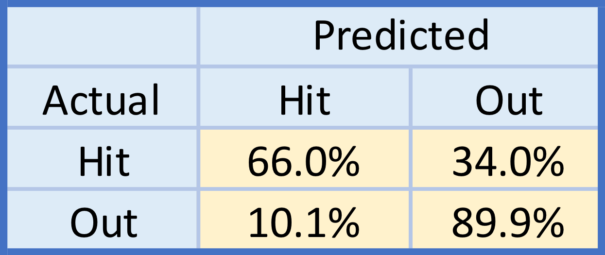
In Brinson’s initial cup of coffee, in 2017, he ran a rough 30 wRC+ and .225 wOBA in 55 PA with the Brewers, according to Fangraphs. After being traded to the Marlins, Brinson rode a solid spring training performance (.328/.365/.586) into a starting center field role, having appeared to turn a corner after 2017. Since the season began, though, Lewis Brinson began to perform like it was 2017 again. Through June 7th, he’s batting .168/.214/.313 with a 32.1% K-rate and a measly 4.1% BB-rate, good for a 41 wRC+, second-worst among qualified batters. His Fangraphs prospect tools, seen below, suggest he is much better than his current performance indicates.

brinson grades.png

Lewis Brinson was a top prospect in the minor leagues, peaking at 13th on MLB.com and FanGraph’s prospect rankings lists as some point within the last year. Brinson’s tools are promising. Essentially, he was seen as a power hitting speedster with a strong arm, average to above hands and fielding instincts, and a below to average contact ability. In the majors, Brinson has displayed above-average fielding and great to excellent speed – 29.5 ft/sec sprint speed, 8th at his position and 44th in the majors – but has yet to flash his game power and has mightily struggled with contact, to the point where it may be masking his power. When he makes contact, like in AAA, he displays uncanny offensive abilities: .343/.392/.575 with 17 home runs and 15 stolen bases in 433 PA, with a 19.2% K-rate and 7.9% BB-rate.

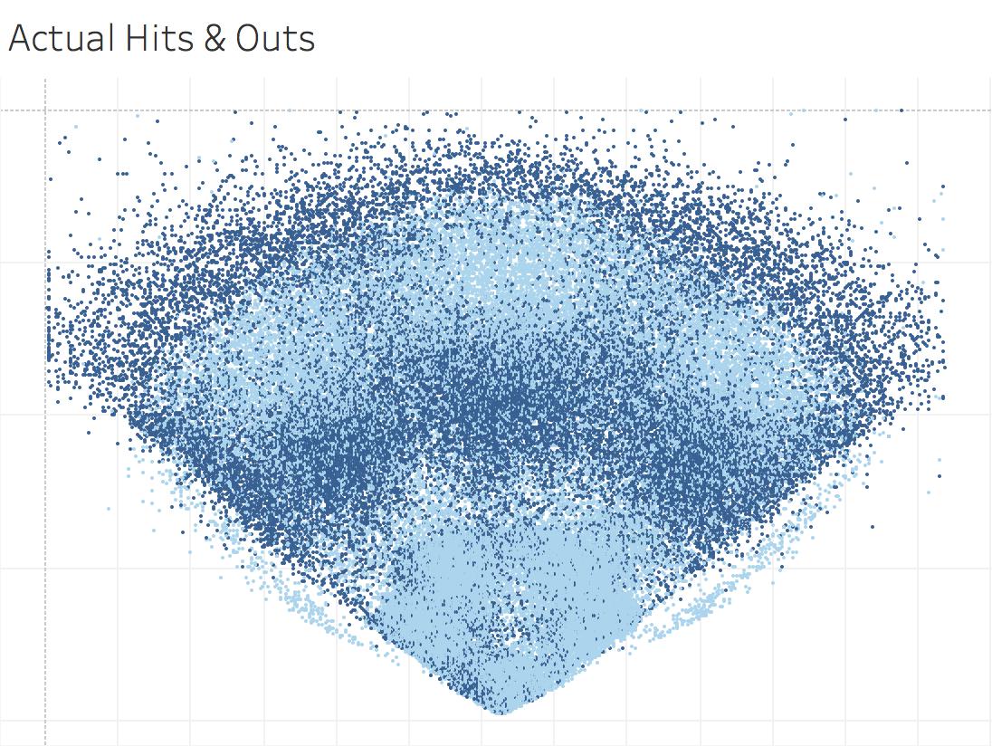
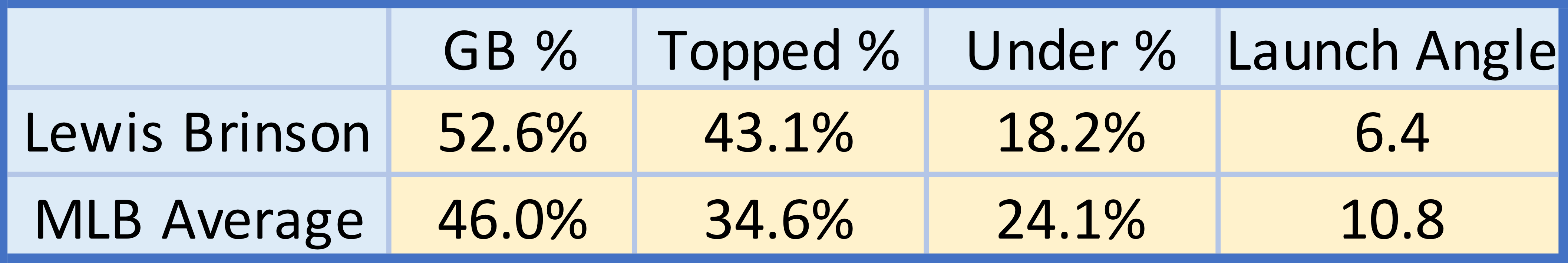
One of the major areas of concern for Lewis Brinson is his ability to make consistent contact. Specifically, he has had a hard time getting under the ball, too frequently hitting the top instead. As seen below, his Statcast data suggests he has a flat swing, as opposed to the slight uppercut many pros pursue. Brinson hits too many ground balls and topped balls, resulting in a low launch angle. Higher launch angles could help him utilize his natural power.

brinson batted balls.png

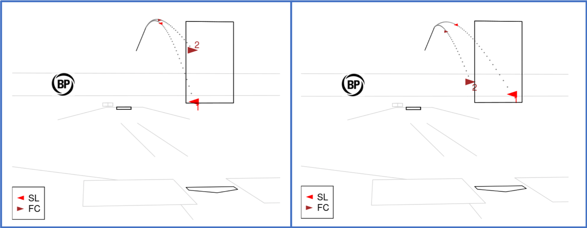
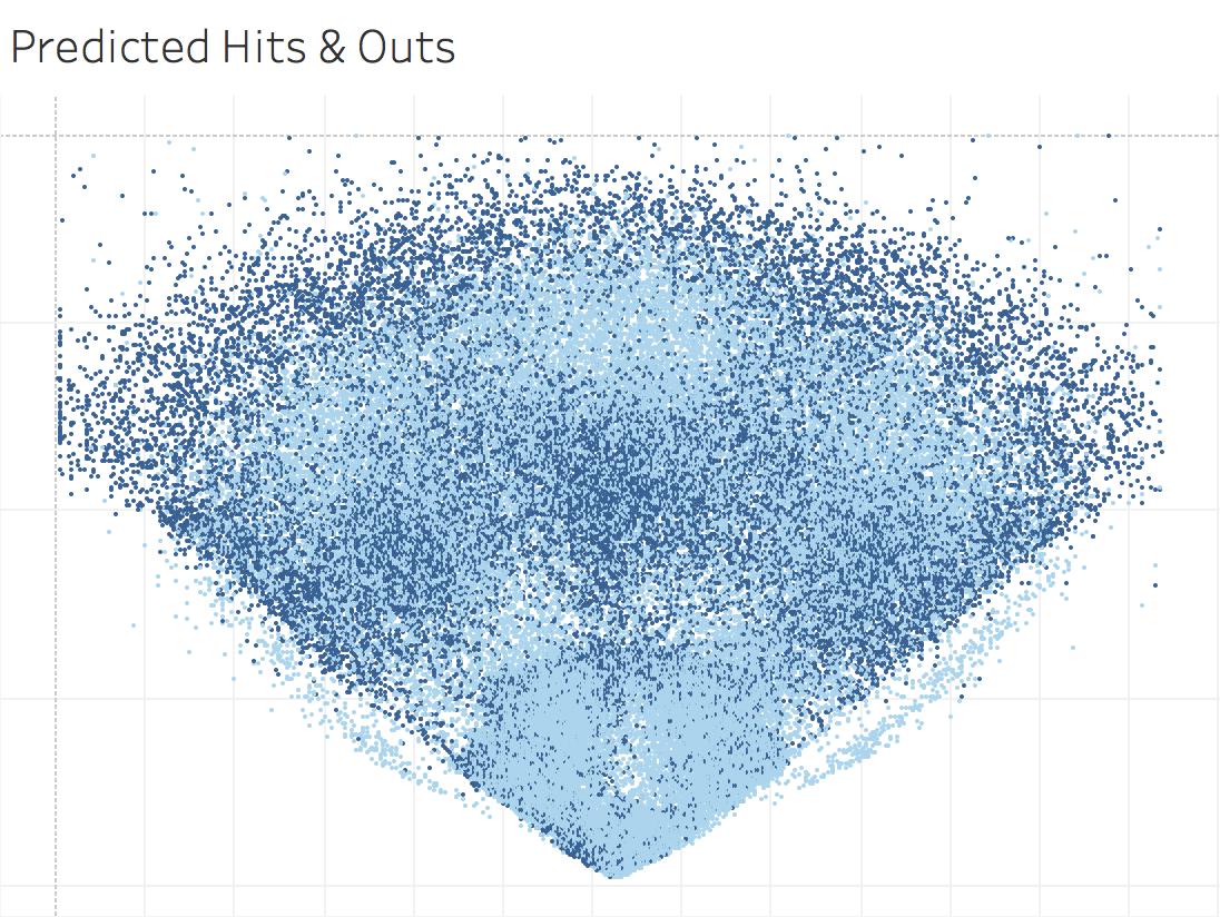
I felt Dexter Fowler was a decent comp to use for Lewis Brinson because of his similar body type and skill set. Brinson is 6’3″, 195lbs. and Fowler is 6’5″, 195 lbs. During the 2016-2017 seasons, Fowler displayed similar power and speed numbers to Brinson’s AAA performance. Given that similar power and speed profile, I chose to compare Fowler’s 2017 season’s launch angle distribution to Brinson’s. Below are both of those distributions – on the left, Lewis Brinson’s 2018 season and on the right, Fowler’s 2017.

brinson launch

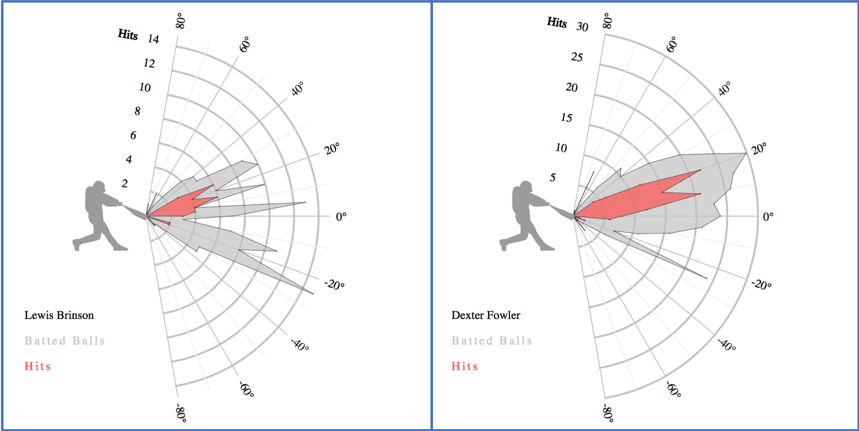
Clearly, Dexter Fowler capitalized on productive launch angle zones. Ideal launch angles are between 10 and 20 for line drives and 20-30 for fly balls (wide estimates, but they paint the right picture). Lewis Brinson, however, struggles to find those optimal launch angles. His launch angle distribution reflects that – the majority of his batted balls are hit into the ground, at launch angles at which balls rarely becomes hits.

Given his 6’3″ 195 lb. frame, Brinson struggles to make contact with pitches low in the zone. Below is a Fangraphs heat map of contact rate per area of the strike zone. On the left is Lewis Brinson’s 2018 contact rate. On the right is Dexter Fowler’s right handed contact rate from 2016 and 2017.

brinson swings.png

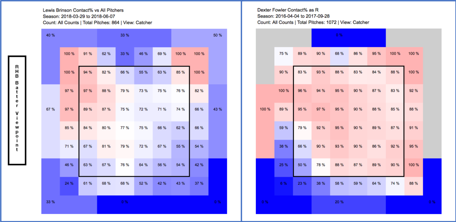
Lewis Brinson clearly struggles with low pitches, especially on the corners. Compare that to a 2016-2017 right-handed -batting Dexter Fowler (who ran a 120 wRC+ with a .355 wOBA), and you see the difficulties Brinson has had with making contact. Part of this surely is because Brinson is a rookie and needs to acclimate to MLB pitching. The likely cause, though, is his swing, which we can break down over time.

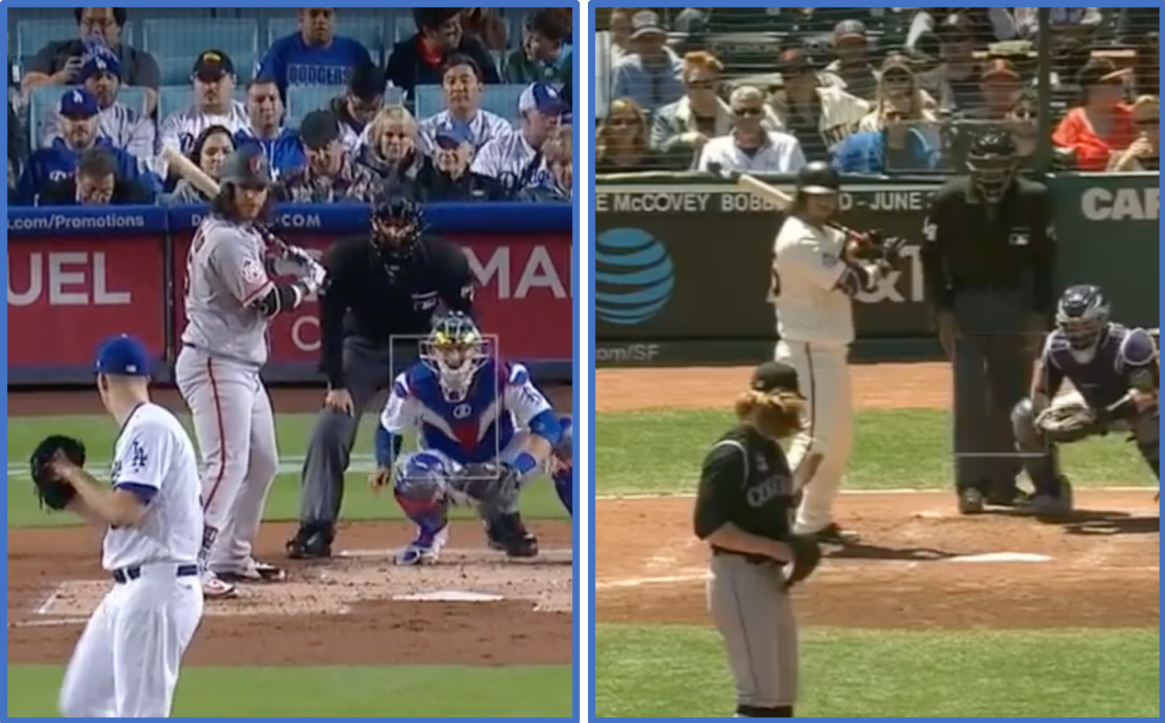
Through browsing the video archives (translation: Google Search Engine), I came across three separate swings Lewis Brinson has deployed in recent years, with varying success. The first swing was from his 2016 AA stint with the Frisco Roughriders, while the other two are both from 2018 – April 21st and May 4th. The three clips I chose are of home runs, with two of them (AA and May 4th) having the pitch in the same location. For convenience, here are gifs of each swing.

2016 AA:

giphy

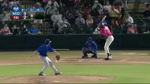
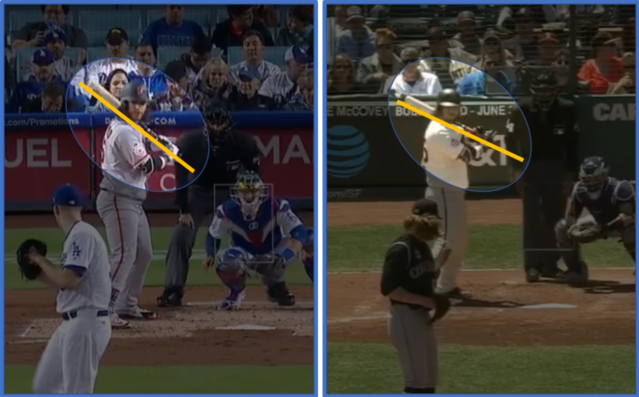
A few key details to notice. Brinson starts his leg kick before the pitch is released, . He also has a slight drop in his hands, a timing or loading mechanism for his swing. Also, from this perspective, we can’t see Brinson’s back knee until the moment he makes contact. We can see quite a bit of his jersey number, implying a strong turn and load.

2018 April 21st:

giphy2

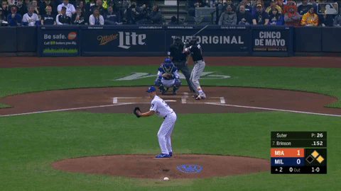
Here, Brinson is using a different leg kick. He lifts it prior to release, but earlier than in AA, and holds his leg in the air a bit. He’s removed the depth of his hand movement in loading, as well. Even though it is a different camera angle, it’s clear that Brinson’s back leg is exposing itself prior to contact. Not as much of his jersey number is exposed on his turn, though some of that could be camera angle differences.

2018 May 4th:

giphy1

In his most recent swing, only a few weeks after the April 21st swing, Brinson has reduced the magnitude of his leg kick. He starts his kick as the ball is being released, but uses a few leg movements prior to the release as a timing mechanism. Similarly to the previous swing, Brinson has reduced the magnitude of his hand drop and exposes his back leg prior to impact. Despite an aiding camera angle, not much of his jersey number can be seen.

Upon first view, I felt like the 2018 swings lacked athleticism which, for such an athlete as Brinson, is suboptimal. It appears that his upper and lower bodies aren’t working as one – exposing his back leg prior to contact implies he is opening up too early, even if his hips don’t appear to do so. These swings can be viewed as a one-two swing, where his lower body fires and then upper body, in a one-two sequence. By removing his hand drop, Brinson may have thrown off his load timing. Whether this is affecting the timing of his leg kick, or if the timing of his kick is conscious, is unknown, but his leg kicks in 2018 also appear suboptimal. Neither the larger, hanging leg kick nor the on-release leg kick appear to help his timing. Brinson appears to lack a deep load – even with an off-center camera angle, not much of his back can be seen, implying his shoulders aren’t in a powerful location during his load.

Compare his 2018 swings to a 2017 Dexter Fowler home run swing. Despite it being a left-handed swing, differences are immediately apparent.

giphy3

While Lewis Brinson is starting his current leg kick upon pitch release, Dexter Fowler is almost finishing his leg kick then. This allows Fowler to load into an athletic position, with his shoulders and hips turned, exposing most of his jersey number despite us having a camera angle that would hide his back. Fowler drops his hands upon loading, moving them back which supports his athletic load and turn. Despite starting in a slightly open position, Fowler doesn’t expose his back leg until impact or even slightly after. His upper and lower body work together, in sync as opposed to sequentially. Fowler’s swing here is explosive.

We can identify a few swing fixes we can suggest to Brinson, based on our swing breakdowns. The first would be his load mechanism – previously, he used his hand movements to load his swing into a turned, athletic position, while timing his swing with a small but effective leg kick. By trying to remove his hand motion, Brinson lost his deep load. Changing his leg kick led to a loss of timing, breaking the athletic chain and resistance his swing needs for coverage and power. These two changes broke the synchronization between his upper and lower body, which makes both contact and power more difficult to find. Brinson is very athletic – he likely has been relying on his athleticism more than his swing as of late.

How could these changes help Brinson? They could help put his swing in better positions to cover the lower part of the plate, and to cover the entire plate with greater efficiency. The quality of his contact could increase, as he gets his entire body working as a single, power-transferring unit. With better quality contact, he could get under the ball and square it up more, driving it along ideal launch angles and utilizing his natural power. Or, these changes could hurt him. As with many sports, fixes that may help some may not help others.Whatever Brinson is trying, though, doesn’t seem to be working.

– tb


This and posts like it can be found at my personal blog,
First Pitch Swinging

Predicting Batter Batted-ball Outcomes

The same model as before, basically.

No two batters are the same. Identical, perhaps, but not exactly the same. Two identical stat lines can be produced in a myriad of ways. However, batted ball contact can be telling – it’s difficult to confuse a barreled ball to a soft-hit ball. I wanted to apply my Statcast hit prediction model to 2017 batters, to see which batters were easily predictable and which had outside factors beyond batted ball statistics impacting their hits and outs.

First, I would like to mention I made a major change to my model. Initially, I trained the model on a portion of 2017 data and applied the model on the rest of the season’s data. Between then and now, I added 2016 data to my SQL database and chose to train my model on all of 2016 for use on all of 2017. Here are the updated results:

correct2

Identical. My model got slightly worse at dealing with outs (a percentage point increase I misclassifying outs as hits, corresponding with the same decrease in predicting outs as outs) and slightly better at predicting hits (a .6 percentage point increase in predicting hits as hits and the same decrease at predicting hits as outs). The purpose behind retraining the model was that now I can apply it to the entirety of 2017 instead of merely 80% of 2017 – which, when dealing with small sample sizes (such as batter-specific analysis), helps.

My model did surprisingly well at predicting the correct batted ball outcome for hitters. I limited the sample of hitters to those with 100 or more balls in play, removing pitchers and many part-time players (though, in complete honesty, I don’t think sample size matters much here, as my model predicts each batted ball in isolation – please convince me either way in the comments).

players1.png

My model did pretty well! The model’s predictions ranged from 72-89%. Above are the top and bottom five players in terms of prediction accuracy (Correct%) as well as the top and bottom 10% averages. I included some statistics I thought would correlate with prediction accuracy – batting average on balls in play (BABIP), isolated slugging (ISO), pull to opposite batted ball ratio (Pull/Oppo), fly ball to grounder ratio (FB/GB), hard hit percentage (Hard%) and speed score (Spd).

My hypothesis was that higher speed and a more even spray distribution (a Pull/Oppo ratio closer to one) would decrease the performance of my model. Through comparing the top and bottom 10% averages, we see some correlations with some variables and model accuracy. BABIP, Pull/Oppo, FB/GB, Hard% and Spd all appear to impact my model’s accuracy. One thing these all have in common is that they impact BABIP – better spray charts increase BABIP, fewer ground balls decrease BABIP, harder hit balls can be harder to field (lower reaction times) and increase BABIP, and faster players can beat out infield hits at a higher rate. Clearly, some of these stats work independently of the others- for example, Buster Posey and Victor Martinez have low speed scores yet higher sprays (lower Pull/Oppo).

This has been a fun model to explore. Essentially, the ability to predict hit outcomes from batted ball statistics depends on BABIP – or, if you rather, factors that influence BABIP. Until deeper fielding data is publicly available, such as initial start position, catch probabilities, etc., I don’t think I can improve this model. Ideally, I hope to develop it into a tool to evaluate batters’ contact abilities sans luck. Let me know if there are any batters specifically that you’d like to see, or other ways I can explore the model!


– tb


Temporarily Replacement-Level Pitchers and Future Performance

As I’d like to think I’m an aspiring sabermetrician, or saberist (as Mr. Tango uses), I decided to test my skills and explore this research question. How did starters, who had 25 or more starts in one season and an ERA of 6.00 or higher in their final 10 starts, perform in the following season? This explores whether past performance, regardless of intermediary performance, adequately predicts future performance. Mr. Tango proposed this question as a way to explore the concept of replacement level. From his blog: “These are players who are good enough to ride the bench, but lose some talent, or run into enough bad luck that you drop below ‘the [replacement level] line’.” Do these players bounce back to their previous levels of performance, or are they “replacement level” in perpetuity?

To explore this, I gathered game-level performance data for all starters from 2008 through 2017 from FanGraphs, grouped by season. I then filtered out pitchers who had fewer than 25 starts and had an ERA less than 6.00 in their final 10 starts. This left me with a sample of 78 starters from 2008 through 2016 (excluding 2017 as there is no next year data yet). I assumed that a starter with an ERA above 6.00 was at or below replacement level. Lastly, as some starters were converted to relievers in the following year, I adjusted the following year ERA according (assuming relievers average .7 runs over nine innings less than starters: see this thread).

final10.png

Seems like the 10-game stretch to end each season is a bit of an aberration. The following year’s adjusted ERA is much closer to the first 15+ games than the final 10 games for pitchers in our sample. In fact, the largest difference between any first 15+ game ERA and its following year adjusted ERA is .58 runs, in 2011. The smallest difference between any last 10 games ERA and its following year adjusted ERA counterpart, for comparison, is 1.7 runs, in 2009.

Using adjusted ERA corrects for the potential slight downward bias in our following year totals. Following year games started fell by ~9%, while reliever innings increased from zero to each season’s value. Relievers, on average, have a lower ERA than starters. As mentioned above, I adjusted each season’s following year ERA by .3 runs per reliever inning pitched (my assumed difference in runs allowed between starters and relievers per inning pitched). Another source for potential downward bias is sample size – of the 78 pitchers who fit our sample qualifications, only 69 pitched in the majors the following season. A survivor bias could exist in that the better pitchers in the sample stayed pitching, while the worse pitchers weren’t signed by a team, took a season off or retired.

What is driving these final 10 game ERA spikes? It has been shown that pitchers don’t have much control over batted ball outcomes. Generally, it is assumed pitchers control home runs, strikeouts and walks – the basis of many defense-independent pitching stats. Changes in these three stats could explain what happens during our samples’ final 10 games. Looking at each stats’ rate per nine innings, however, would be misleading, as each season exhibits uniform change (such as the recent home run revolution, or the ever-growing increasing in strikeouts). I calculated three metrics for each subset (first 15+, last 10 and following year) to use in evaluation: HR/9–, K/9– and BB/9–. All three are similar to ERA– in interpretation – a value of 100 is league average, and lower values are better.

Further, not necessary math details: for example, a value of 90 would be read as the following. For HR/9– or BB/9–, a value of 90 means that subset’s HR/9 or BB/9 is 10% lower, or better, than league average.  For K/9–, a value of 90 means that the league average is 10% lower, or worse, than the subset’s K/9. To create these measures, I calculated HR/9, K/9 and BB/9 for each subset and normalized them to the league value for each season – including the next year’s value for the following year’s rates. Then, I normalized these ratios to 100. To do that, I divided HR/9 and BB/9 by the league averages and multiplied by 100. Because a higher K/9 is better (unlike HR/9 and BB/9), I had to divide the league average by K/9 and then multiply by 100, slightly changing its interpretation (as noted above).

final10-2.png

As mentioned above, the issue of starters-turned-relievers within our sample likely influences our following year statistics. I was able to adjust the ERA, but I did not adjust the rate stats – HR/9, K/9 or BB/9 – as I have not seen research suggesting specific conversion rates between starters and relievers for these.

Interestingly, our sample of pitchers improved their K/9– across the three subsets, despite having fluctuating ERAs. They were below average, regardless, but improved relative to league average over time. Part of this could be calculation issues, as league K/9 fluctuates monthly, and I used season-level averages in calculations.

Both HR/9– and BB/9– drastically get worse during the 10 start end-of-season stretch. These clearly drive the ERA increase. In fact, despite seven of the nine seasons’ samples having better-than-average HR/9 in their first 15+ starts, every season’s sample has a much-worse-than-average HR/9 in their last 10 starts, where eight of the nine seasons’ samples HR/9 are 40%+ worse than league average. Likewise, though less drastically, our samples’ BB/9 are much worse than league average in the last 10 starts subset. Unlike HR/9–, though, our samples’ BB/9– is worse than league average in the first 15+ starts subset. The first 15+ games’ HR/9– and BB/9– are identical to the following year’s values, unlike K/9–.

It appears that starters with an ERA greater than or equal to 6.00 in their final 10 starts, assuming 25 or more starts in the season, generally return to close to their pre-collapse levels in the following year. This end of season collapse seems to be driven primarily by a drastic increase in home run rates allowed, coupled with an increase in walk rate. These pitchers performed at a replacement level (or worse) for a short period and bounced back soon after. Mr. Tango & Bobby Mueller, in their email chain (posted on Mr. Tango’s blog), acknowledge this conclusion: “they are paid 0.5 to 1.0 million$ above the baseline… At 4 to 8 MM$ per win, that’s probably an expectation of 0.1 wins to 0.2 wins.” We can debate the dollars per WAR, and therefore the expected wins, but one thing’s for sure – past performance is a better predictor of the future than most recent performance.


– tb


Special thanks to Mr. Tango for his motivation and adjusted ERA suggestion.

Do Teams That Shift More Have Lesser Defenders?

Defensive shifts are designed to prevent hits. By placing fielders in spots of higher hit frequency, the logic follows, fewer batted balls will drop in as hits. Notably, though, as the number of shifts has drastically increased, the league-wide BABIP hasn’t changed. Since 2011, shift deployment has increased tenfold (though BABIP has actually increased 1.7% – .295 in 2011 to .300 in 2017). Better positioning could lead to teams utilizing fielders who have less range, as they’d be located closer to batted balls. Do teams who shift frequently employ worse-ranged fielders?

First, the recent MLB environment. Through a combination of enhanced analysis and deeper data, teams across MLB are increasing shift usage. Positioning fielders in locations of high hit density, for specific batters, allows them to field more batted balls. Every team is increasing their shift usage, driving the total shifts deployed up.

shifts_league

The intuitive result of this would be batters are recording fewer hits. As fielders field more balls, they should convert more of those previously-hits into outs. However, league-wide BABIP has actually increased as shift usage increased. Perhaps the quality of the batted balls has decreased, though – trading doubles and triples for singles. According to the league-wide wOBA, though, the overall quality of offense has increased.

woba_league

Clearly, shifts aren’t having the effect one would expect them to have. Rather than explore what effect they do have (as if they had no effect, why would teams continue to shift?), I want to see if perhaps the defenders being used are worse. Perhaps shifts have allowed teams to mask poor defenders with better positioning.

After browsing the data, I thought it was best to compare year-to-year changes in range runs saved above average to changes in shift deployment, in attempts to analyze the effects of a large change in shift use on range runs above average (RngR). This variable doesn’t measure data for shifts — any shift-influenced batted balls are excluded. This exclusion is what makes RngR perfect for analysis — we can isolate plays which are standard and similar fielder-to-fielder and control for frequency of shifts.

To do this, I first prorated range runs above average to a 150 defensive game rate (RngR.150), as each team had slightly different innings totals. I then took the year over year difference in RngR.150 as RangeDiff, to analyze changes in range runs above average. Similarly, I took the year over year percentage changes in shift deployments. Due to the drastic increase in shift usage across the majors, comparing these absolute numbers would be meaningless here, so I scaled these percentage changes to each season’s average change in shift usage. This variable, ShiftScaleYOY, represents a team’s shift usage change as standard deviations above or below the season average change. All this data is from Fangraphs, 2011-2017 team defense statistics and shift deployment.

My hypothesis is that teams that have a drastic increase in shift usage between seasons, compared to league-average, would have worse defenders, as measured by range. The results:

positions.jpg

First, notice the axes. Third basemen have a larger variance. Teams with larger increases in shift usage year-to-year, relative to the rest of the league during this same time periods, appear to have defenders at third with range values closer to zero. This is difficult to see through inspection, however. There doesn’t appear to be much of a relationship with 2nd basemen or shortstops.

When I regressed the between-year standard deviation measurement of shift changes on between-year range change, with dummies for position and season, the shift change variable was insignificant. In fact, there were no significant variables, and the R-Squared was merely .13%. Notice the symmetry in the above graphs, though. A team’s range values seem to converge as the team’s standard deviation of shift changes increases.

To explore this, I ran two regressions, with subsets where the dependent variable, Range.150, was positive and negative. The positive regression had an R-Squared of 9.2%, implying it poorly describes the variance in positive Range changes year-over-year. 2017, 3B and SS were all statistically significant, at the 99% confidence level. This implies that there is a 2.15 range per 150 defensive games decrease in 2017 versus the other seasons, that there is a 1.5 run increase for being a third baseman and a 1.4 run increase for being a shortstop over a second baseman. The negative regression had an R-Squared of 8.6%, again implying this model poorly describes the variance in the data. Here, however, 2017 and 3B both were statistically significant, at the 99.9% or greater confidence level. The values were greater, but the direction of implication was the same – 2017 implies a 2.7 run increase, and a third baseman has a 2.4 run decrease over second basemen. These analyses suggest that 2017 resulted in fewer outlier defenders and that third basemen were higher variance than second basemen.

There are a few issues or improvements with this analysis that could be made. First, publicly available data is limited – comparing shifted plays and non-shifted plays would be best for this analysis. What I did could be seen as cursory, at best an introduction. Secondly, the sample size of defensive shift data is small. Defense data for individual, full-time players is generally utilized in three-year samples, and I was using single-year measurements (albeit at the team level, slightly larger samples per position than individual players). Lastly, a deep analysis on shift impacts on player abilities would use individual players – comparing his or her defensive prowess on shifted and non-shifted plays. This would allow us to try to measure the impact of shifts on defensive performance, to better understand if teams would employ different-skilled players as they increase shift usage or if their players perform differently with shift usage.

There are suggestions in the data that certain years or positions differ with respect to defensive range. Nothing suggested relative increases in shift usage impacts range or quality of defenders on the field. All in all, I think this study can be summarized by the wisdom of Albert Einstein: “the more I know, the more I realize how much I don’t know.”


– tb


An Attempt to Predict Hits With Statcast

Most of what happens in a baseball game are influenced by chance. A ball hit on the screws can end up in the outstretched glove of a diving fielder. The outfield wall could be just six inches too tall, keeping a home run in the park. Strike three could be called ball four by the home plate umpire. Traditional statistics can’t account for all of this, hence why sabermetricians have developed context-specific statistics like DIPS (defense independent pitching statistics) or wRC (weighted runs created). These stats try to explain the outcomes of batted balls while controlling for defense and ballparks.

I sought out to try and create a model that controls for defense, but from the hitter’s perspective. A model that could predict batted ball outcomes could be used to better evaluate hitters and their quality of contact. Using 2017 MLB pitch-by-pitch Statcast data’s batted ball statistics (launch angle, exit velocity, outcome and spray angle), I used a random forest to model whether a batted ball would be a hit or an out. I trained my model on 20% of the data, and felt confident the training set and test set were identical, with similar means and standard deviations for launch angle, speed and spray angle.

I chose to use a random forest because it runs multiple decision trees on subsets of the training set and averages the results across the sets. A Random Forest model uses k-decision trees, or binary ‘decision’ or outcome model, to model the data. Random forest algorithms minimize variance and bias through averaging; a random forest helps prevent overfitting, something I was afraid of doing. Using the Random Forest provided much better accuracy than running a Logistic Regression, my alternative hypothesized model, due to the number of trees (10) and the nature of a decision tree versus a regression.


Without further ado, the results (in visual form):

Actual Hits & Outs.jpg  Predicted Hits &amp; Outs

There’s quite a bit going on in these plots. Let me break it down.

These plots are of every fair ball hit (with a few misclassifications) in 2017 and their landing (or caught) locations. The dark blue balls in play are hits, while the light blue balls are outs. On the left are the actual hits and outs, while on the right are the predicted hits and outs. There are almost a hundred thousand points on these plots, making it difficult to sift through. Here is an explanation of these plots in tabular form:

correct

My model does a much better job at predicting outs than hits. It was correct almost 90% of the time at predicting outs, compared to merely 66% of the time predicting hits. From From the perspective of hits being good (the batter’s perspective), 10% of outs were false positives, and 34% of hits were false negatives. I believe my model did better with outs because there are many more outs than hits – league-average BABIP is .300, or 30% of the time a ball in play is a hit, 70% of the time it’s an out. The model was accurate 81.4% of the time. Despite the high accuracy, the model only ran a .1769 R-Squared. That is, the model was able to describe 17.7% of the variance in batted ball results.

Overall, I feel this model can help predict batted ball results. Two main drawbacks of the model are that it only predicts hits instead of the type of hit and that it requires more data to increase accuracy. I believe having fielder data, such as shifts and defensive capabilities, would greatly increase the accuracy of the model, though at the risk of overfitting (given the small samples of fielded balls in certain areas).

I plan to explore this model further and look at individual batters to compare their actual hits to the predicted ones.