Archive for October, 2014

Job Posting: Software Development Intern, TrackMan Baseball

Software Development Intern, TrackMan Baseball
 
Join our team as a Software Development Intern at TrackMan Baseball, a US based sports technology firm.  You will take on a critical role in a small, fast moving entrepreneurial company that is breaking new ground in sports.
 
In this position, you will be a contributor on the application development team and work on projects that are actively used within and outside of the organization.
 
REQUIREMENTS:
  • Proficiency in an object-oriented programming language such as Python, C#, Java, etc.
  • Ability to work independently and collaboratively
  • Strong attention to detail and ability to work well with others
DESIRED SKILLS AND EXPERIENCE
  • Bachelors or Masters degree in Computer Science or a related field.
  • Strong knowledge of relational and non-relational databases such as SQL and MongoDB
  • Experience working with large baseball related data-sets.
  • R or another scripting language experience is a plus.
This is a great opportunity for someone who wants to break into the baseball community and get experience with data available exclusively to professional baseball teams.  Full training is provided and you’ll have the opportunity to work closely with all members of the TrackMan staff and interface with our partner teams.  Weekend availability is important.
 
To apply, send a resume to np@trackman.dk.  No phone calls please.
 
Compensation:
This is a paid internship.
 
About TrackMan Inc.
TrackMan Inc. is a US based subsidiary of TrackMan A/S.
 
TrackMan A/S has developed a range of products for the golf market and is considered the gold standard in measurement of ball flight and swing path. TrackMan’s golf products are used by top touring professionals, teaching pros, broadcasters and governing bodies.
 
TrackMan Inc. is based in Stamford, CT, about 30 miles north of New York City.  TrackMan, Inc. introduced 3D Doppler radar technology to the baseball industry and the technology is now used by more than half of Major League Baseball teams.  TrackMan, Inc. is revolutionizing baseball data by measuring the full trajectory of both the pitch and hit and has been featured in publications such as the New York TimesSports Illustrated and ESPN.
 
http://www.hardballtimes.com/tht-live/trackman-baseball/
http://www.si.com/more-sports/2011/04/12/fastballs-trackman
http://www.businessweek.com/articles/2014-03-04/major-league-baseball-unveils-an-even-newer-player-tracking-system

The Mariners’ Short Window

The Mariners are in a tough spot.

In 2014, the AL West was baseball’s best division. Yes, Oakland mortgaged their future at the deadline. Yes, the Angels minor league system looks weak. Yes, the Rangers aren’t guaranteed to snap back next year and have a healthy, competitive roster. Yes, the Astros aren’t there yet. There will be prominent sports writers picking the M’s to win their division next year and they will likely get bandied about as a dark horse. But…the Mariners have been baseball’s ninth-best club by BaseRuns and only the third-best in their own division. Next year’s A’s and Angels shouldn’t be drastically different, either.

What makes the Mariners situation so tough, though, is their own muddled roster construction. The M’s had a historically good year at preventing runs but still found themselves right on the edge of contending. In large part that’s because they can’t hit, and the biggest reason they can’t hit is that they have only one average or better right-handed bat, Austin Jackson. Aside from Jackson, the M’s outfield has given big chunks of playing time to four different lefties: Dustin Ackley, Endy Chavez, Michael Saunders, and James Jones.

Their biggest hole, however, has been at 1B/DH, and this isn’t a new thing for the M’s. Last year they received solid production from Kendrys Morales and an average campaign from Justin Smoak, but neither has been anywhere near effective this year. The only bright spot this year has been Logan Morrison with his wRC+ of 110. In sum, the Mariners actually had a historically terrible year from their DHs, and that was nothing new.

Looking to the minors, there is hope. 2013 1st rounder DJ Peterson has already made his way to AA, but may start 2015 back in Jackson after posting a .261/.335/.473 in 248 PAs. Jackson is a fringe candidate to contribute for a stretch run, but probably won’t be a significant contributor for quite some time. In fact, former Rutgers defensive back Patrick Kivlehan may be contribute to the big league club sooner after crushing AA pitching with a .300/.374/.485 line in 430 PAs.

But things get trickier as we look toward the offseason.

When the Mariners signed Robinson Cano, they rapidly accelerated the timeline for fielding a competitive team. While Cano and Felix will still be around when Peterson and 2014 1st rounder Alex Jackson are, theoretically, contributing to the big league club, neither is likely to be better than they are now. Both have had incredible seasons, but realistically both players can only get worse.

The window gets even shorter when you consider that Hisashi Iwakuma, Austin Jackson, and Fernando Rodney will be eligible for free agency after the 2015 season. Couple them with Felix, Cano, and a cost-controlled Kyle Seager, and the M’s, who should have about $20 million in budget flexibility next year after arbitration raises, might be best poised to try and seriously compete next season.

Any big trade or free-agent splash, however, is going to block playing time, and if that sounds like a familiar situation for this club, that’s because it is. When they signed Cano, it gutted Nick Franklin’s value, and it took the Jack Z almost eight months to make a trade.

The best place for the M’s to look would be for a bat-first, right-handed outfielder who can platoon with Michael Saunders and play DH against righties. Torii Hunter would be a great fit, although he alone probably wouldn’t be enough. Manager Lloyd McClendon has repeatedly referred to the need for two bats.

The M’s also could try and use their prospect surplus and to try and land a more impactful player. In Brad Miller and Chris Taylor the M’s have two capable (if not quite good) shortstops at the big-league level, and there had reportedly been lots of interest in Dustin Ackley at the trade deadline even before his strong second half. It wouldn’t be surprising to see the M’s try and lock up with Dodgers for Matt Kemp (with a lot of swallowed salary) or the Red Sox for a piece of their crowded outfield. Shane Victorino would be a great fit on the M’s and could be out of a job. In DJ Peterson, Taijuan Walker, and James Paxton, the M’s also have chips to land a guy like Yoenis Cespedes, but Jack Z has (wisely) shied away from moving a piece of that caliber.

But if the M’s stand pat, they probably won’t be good enough next year. Chris Young may not be a good a pitcher, and regardless he will be looking for a raise and will likely be elsewhere next season. The M’s don’t have much depth behind what still looks to be a strong group in Felix, Iwakuma, Roenis Elias, James Paxton and Taijuan Walker. As stands right now, their 2015 DH is Logan Morrison and their first baseman is Justin Smoak, but the M’s will have to choose between a $3.6M team option and a $200k buy-out, and his Mariners days are probably over.

The M’s could write off Kendrys Morales’ 2014 struggles as a result of missing spring training, but his batted ball distance in August and September is down 12 feet from last year, and generally follows what is known of the aging curve for first basemen. Kendrys’ power, at this stage, is probably in the 15-20 home run range, and along with his 49% GB rate, terrible base running, and mediocre defense, that’s not a strong package. What all this means is that, just like last winter, Kendrys will probably look for a lot more than he’s worth, and it wouldn’t be a good gamble for the M’s to be the ones to pay him, even if it’s only a couple million.

In 2018, when the Mariners will theoretically feature DJ Peterson, Alex Jackson, Taijuan Walker and James Paxton in their primes, Oliver thinks Cano will be worth 2.8 WAR. On the plus side, Felix will still only be 32 years old and, theoretically, just beginning his decline phase). Kyle Seager will be eligible for free agency after the 2017 season, so he will either be gone, expensive, or not very good. And even without Seager, the M’s have $50 million committed to Cano and Felix.

As a Mariners fan, it’s been a blessing to watch Cano this year after so many years of offensive mediocrity, but this is the predicament the Mariners have put themselves into with his signing. The M’s were supposed to be about .500 club this year, and even if you look optimistically at their improvement, put faith in Brad Miller breaking out next year, and call Ackley and Morrison’s strong second halves improvement rather than streaks, this club still needs some work.

And, from the looks of things, the Mariners are going to hurt themselves no matter what road they take. Spend now, and they inhibit playing time and take away from extensions for guys like Seager and Paxton. Trade now and they potentially strike out big. The most likely course is that pursue players like Delmon Young and Michael Cuddyer hoping for a big year. Jack Z has repeated played the high-risk, low cost card for his clean-up hitters, from Russell Branyan to Milton Bradley to, more recently, Corey Hart and Kendrys Morales. Jack Z has said the M’s will be reasonably aggressive pursuing free agents this winter, but even money may not be enough lure talent to the northwest.

While a 2015 Mariners club with Melky Cabrera and Victor Martinez would be a legitimate contender, and the M’s are flush in TV cash right now, Seattle was a hard sell even after their 116 win season in 2001. Team president Kevin Mather places the blame on the M’s tough travel schedule, but the (at least historically) tough hitting environment, cold and wet weather, and reported organizational dysfunction likely don’t help matters either.

In 2014 the M’s both have led the league with increase in attendance and have failed to sell out important September games. This is club that needs just a little bit more oomph. A 2018 Mariners club with Cano, Melky Cabrera, and Victor Martinez, however, probably isn’t very good though. The 2014 trade deadline had been labeled as make-or-break for Jack Z, and this coming winter won’t be any different.


A Discrete Pitchers Study – Predicting Hits in Complete Games

(This is Part 2 of a four-part series answering common questions regarding starting pitchers by use of discrete probability models.  In Part 1, we dealt with the probability of a perfect game or a no-hitter. Here we deal with the other hit probabilities in a complete game.)

III. Yes! Yes! Yes, Hitters!

Rare game achievements, like a no-hitter, will get a starting pitcher into the record books, but the respect and lucrative contracts are only awarded to starting pitchers who can pitch successfully and consistently. Matt Cain and Madison Bumgarner have had this consistent success and both received contracts that carry the weight of how we expect each pitcher to be hit. Yet, some pitchers are hit more often than others and some are hit harder. Jonathan Sanchez had shown moments of brilliance but pitch control and success were not sustainable for him. Tim Lincecum had proven himself an elite pitcher early in his career, with two Cy Young awards, but he never cashed in on a long term contract before his stuff started to tail off. Yet, regardless of success or failure, we can confidently assume that any pitcher in this rotation or any other will allow a hit when he takes the mound. Hence, we should construct our expectations for a starting pitcher based on how we expect each to get hit.

An inning is a good point to begin dissecting our expectations for each starting pitcher because the game is partitioned by innings and each inning resets. During these independent innings a pitcher’s job is generally to keep the runners off the base paths. We consider him successful if he can consistently produces 1-2-3 innings and we should be concerned if he alternately produces innings with an inordinate number of base runners; whether or not the base runners score is a different issue.

Let BR be the base runners we expect in an inning and let OBP be the on-base percentage for a specific starting pitcher, then we can construct the following negative binomial distribution to determine the probabilities of various inning scenarios:

Formula 3.1

If we let br be a random variable for base runners in an inning, we can apply the formula above to deduce how many base runners per inning we should expect from our starting pitcher:

Formula 3.2

The resulting expectation creates a baseline for our pitcher’s performance by inning and allows us to determine if our starting pitcher generally meets or fails our expectations as the game progresses.

Table 3.1: Inning Base Runner Probabilities by Pitcher

Tim Lincecum

Matt Cain

Jonathan Sanchez

Madison Bumgarner

P(O Base Runners)

0.333

0.352

0.280

0.356

P(1 Base Runner)

0.307

0.310

0.290

0.311

P(≥2 Base Runner)

0.360

0.338

0.430

0.333

E(Base Runners)

1.326

1.250

1.586

1.233

Based upon career OBPs through the 2013 season, Bumgarner would have the greatest chance (0.356) of retiring the side in order and he would be expected to allow the fewest base runners, 1.233, in an inning; Cain should also have comparable results. The implications are that Bumgarner and Cain represent a top tier of starting pitchers who are more likely to allow 0 base runners than either 1 base runner or +2 base runners in an inning. A pitcher like Lincecum, expected to allow 1.326 base runners in an inning, represents another tier who would be expected to pitch in the windup (for an entire inning) in approximately ⅓ of innings and pitch from the stretch in ⅔ of innings. Sanchez, on the other hand, represents a respectively lower tier of starting pitchers who are more likely to allow 1 or +2 base runners than 0 base runners in an inning. He has the least chance (0.280) of having a 1-2-3 inning and would be expected to allow more base runners, 1.586, in an inning.

As important as base runners are for turning into runs, the hits and walks that make up the majority of base runners are two disparate skills.  Hits generally result from pitches in the strike zone and demonstrate an ability to locate pitches, contrarily, walks result from pitches outside the strike zone and show a lack of command.  Hence, we’ll create an expectation for hits and another for walks for our starting pitchers to determine if they are generally good at preventing hits and walks or prone to allowing them in an inning.

Let h, bb, and hbp be random variables for hits, walks, and hit-by-pitches and let P(H), P(BB), P(HBP) be their respective probabilities for a specific starting pitcher, such that OBP = P(H) + P(BB) + P(HBP). The probability of Y hits occurring in an inning for a specific pitcher can be constructed from the following negative multinomial distribution:

Formula 3.3

We can further apply the probability distribution above to create an expectation of hits per inning for our starting pitcher:

Formula 3.4

For walks, we do not have to repeat these machinations.  If we simply substitute hits for walks, the probability of Z walks occurring in an inning and the expectation for walks per inning for a specific pitcher become similar to the ones we deduced earlier for hits:

Formula 3.5

We could repeat the same substitution for hit-by-pitches, but the corresponding probability distribution and expectation are not significant.

Table 3.2: Inning Hit Probabilities by Pitcher

Tim Lincecum

Matt Cain

Jonathan Sanchez

Madison Bumgarner

P(O Hits in 1 Inning)

0.457

0.466

0.439

0.443

P(1 Hits in 1 Inning)

0.315

0.314

0.316

0.316

P(2 Hits in 1 Inning)

0.145

0.141

0.152

0.150

P(3 Hits in 1 Inning)

0.056

0.053

0.061

0.060

E(Hits in 1 Inning)

0.896

0.870

0.947

0.936

The results of Table 3.2 and Table 3.3 are generated through our formulas using career player statistics through 2013. Cain has the highest probability (0.466) of not allowing a hit in an inning while Sanchez has the lowest probability (0.439) among our starters. However, the actual variation between our pitchers is fairly minimal for each of these hit probabilities. This lack of variation is further reaffirmed by the comparable expectations of hits per inning; each pitcher would be expected to allow approximately 0.9 hits per inning. Yet, we shouldn’t expect the overall population of MLB pitchers to allow hits this consistently; our the results only indicate that this particular Giants rotation had a similar consistency in preventing the ball from being hit squarely.

Table 3.3: Inning Walk Probabilities by Pitcher

Tim Lincecum

Matt Cain

Jonathan Sanchez

Madison Bumgarner

P(O Walks in 1 Inning)

0.685

0.718

0.589

0.776

P(1 Walk in 1 Inning)

0.244

0.225

0.286

0.189

P(2 Walks in 1 Inning)

0.058

0.047

0.093

0.031

P(3 Walks in 1 Inning)

0.011

0.008

0.025

0.004

E(Walks in 1 Inning)

0.404

0.351

0.580

0.264

The disparity between our starting pitchers becomes noticeable when we look at the variation among their walk probabilities. Bumgarner has the highest probability (0.776) of getting through an inning without walking a batter and he has the lowest expected walks (0.264) in an inning. Sanchez contrarily has the lowest probability (0.589) of having a 0 walk inning and has more than double the walk expectation (0.580) of Bumgarner. Hence, this Giants rotation had differing abilities targeting balls outside the strike zone or getting hitters to swing at balls outside the strike zone.

Now that we understand how a pitcher’s performance can vary from inning to inning, we can piece these innings together to form a 9 inning complete game. The 9 innings provides complete depiction of our starting pitcher’s performance because they afford him an inning or two to underperform and the batters he faces each inning vary as he goes through the lineup. At the end of a game our eyes still to gravitate to the hits in the box score when evaluating a starting pitcher’s performance.

Let D, E, and F be the respective hits, walks, and hit-by-pitches we expect to occur in a game, then the following negative multinomial distribution represents the probability of this specific 9 inning game occurring:

Formula 3.6

Utilizing the formula above we previously answered, “What is the probability of a no-hitter?”, but we can also use it to answer a more generalized question, “What is the probability of a complete game Y hitter?”, where Y is a random variable for hits. This new formula will not only tell us the probability of a no-hitter (inclusive of a perfect game), but it will also reveal the probability of a one-hitter, three-hitter, etc. Furthermore, we can calculate the probability of allowing Y hits or less or determine the expected hits in a complete game.

Let h, bb, hbp again be random variables for hits, walks, and hit-by-pitches.

Formula 3.7

Formula 3.8

Formula 3.9

The derivations of the complete game formulas above are very similar to their inning counterparts we deduced earlier. We only changed the number of outs from 3 (an inning) to 27 (a complete game), so we did not need to reiterate the entire proofs from earlier; these formulas could also be constructed for an 8 inning (24 outs), a 10 2/3 inning (32 outs), or any other performance with the same logic.

Table 3.4: Complete Game Hit Probabilities by Pitcher using BA

Tim Lincecum

Matt Cain

Jonathan Sanchez

Madison Bumgarner

P(O Hits in 9 Innings)

0.001

0.001

0.001

0.001

P(1 Hit in 9 Innings)

0.006

0.007

0.004

0.005

P(2 Hits in 9 Innings)

0.023

0.026

0.017

0.018

P(≤3 Hits in 9 Innings)

0.060

0.067

0.046

0.049

P(≤4 Hits in 9 Innings)

0.124

0.137

0.099

0.105

E(Hits in 9 Innings)

8.062

7.833

8.526

8.420

The results of Table 3.4 were generated from the complete game approximation probabilities that use batting average (against) as an input. Any of the four pitchers from the Giants rotation would be expected to allow 8 or 9 hits in a complete game (or potentially 40 total batters such that 40 = 27 outs + 9 hits + 4 walks), but in reality, if any of them are going to be given a chance to throw a complete game they’ll need to pitch better than that and average less than 3 pitches per batter for their manager to consider the possibility. If we instead establish a limit of 3 hits or less to be eligible for a complete game, regardless of pitch total, walks, or game situation (not realistic), we could witness a complete game in at most 1 or 2 starts per season for a healthy and consistent starting pitcher (approximately 30 starts with a 5% probability). Of course, we would leave open the possibility for our starting pitcher to exceed our expectations by throwing a two-hitter, one-hitter, or even a no-hitter despite the likelihood. There is still a chance! Managers definitely need to know what to expect from their pitchers and should keep these expectations grounded, but it is not impossible for a rare optimal outcome to come within reach.


Progressive Pitch Projections

When examining a batter’s strike zone judgment, the analysis is typically done based on where the pitches passed the plane of the front of the strike zone. However, this analysis usually does not include a discussion of the pitches’ trajectories as they approached the plate, which influences whether or not a batter may choose to swing at a pitch. The aim of this research is to apply a simple model to project a pitch to the plane of the front of the strike zone, from progressively closer distances to home plate, and track how the projected location changes as the pitch nears the plate. In order to quantify the quality of a pitch’s projection as it approaches home plate, we will use a model for the probability of a pitch being called a strike to assess its attractiveness to a batter. While the focus of this will be the projections and results derived from them, a discussion of the strike zone probability model will be given after the main article.

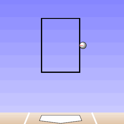
To begin, we can start with a single pitch to explain the methodology. The pitch we will use was one thrown by Yu Darvish to Brett Wallace on April 2nd of 2013 (seen in the GIF below screen-captured from the MLB.tv archives) [Note: I started working on this quite awhile ago, so the data is from 2013, but the methodology could be run for any pitcher or any year].

 photo Darvish_Wallace_P.gif

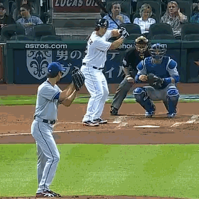
The pitch is classified by PITCHf/x as a slider and results in a swinging strikeout for Wallace. The pitch ends up inside on Wallace and, based purely on its final location, does not look like a good pitch to swing at, two strikes or not. In order to analyze this pitch in the proposed manner of projecting it to the front of the plate at progressively closer distances, we will start at 50 feet from the back of home plate (from which all distances will be measured) and remove the remaining PITCHf/x definition of movement (as is calculated, for example, for the pfx_x and pfx_z variables at 40 feet) from the pitches to create a projection that has constant velocity in the x-value of the data and only the effects of gravity deviating the z-value from constant velocity. This methodology is adopted from an article by Alan Nathan in 2013 about Mariano Rivera’s cut fastball. At a given distance from the back of home plate, the pitch trajectory between 50 feet and this point is as determined by PITCHf/x, and the remaining trajectory to the front of home plate is extrapolated using the previously discussed method.

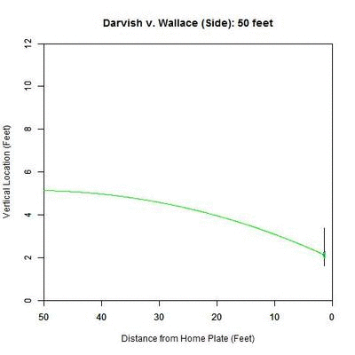
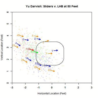
If we examine the above Darvish-Wallace pitch in this manner, the projection looks like this from the catcher’s perspective:

 photo Darvish_Wallace_XZ_250ms.gif

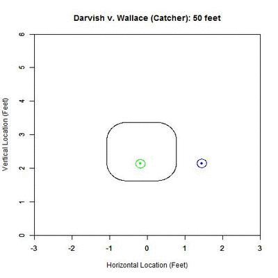
In the GIF, the counter at the top, in feet, represents the distance that we are projecting from. The black rectangular shape is the 50% called-strike contour, where 50% of the pitches passing through that point were called strikes, the inside of which we will call our “strike zone” (for a complete explanation of this strike zone, see the end of the article). Within the GIF, the blue circle is the outline of the pitch and the blue dot inside is the PITCHf/x location of the pitch at the front of the plate. The projection appears in red/green where red represents a lower-than-50% chance of a called strike for the projection and green 50% or higher. As one can see, early on, the pitch projects as a strike and as it comes closer to the plate, it projects further and further inside to the left-handed hitter. If we track the probability of the projection being called a strike, with our x-axis being the distance for the projection, we obtain:

 photo Darvish_Wallace_Probability.jpeg

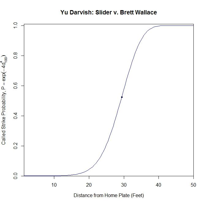
Based on this graph, the pitch crosses the 50% called-strike threshold at approximately 29.389 feet (seen as a node on the graph). With this consideration, and the fact that the batter is not able to judge the location of the pitch with PITCHf/x precision, it seems reasonable that Brett Wallace might swing at this pitch.

We can also examine this from two other angles, but first we will present the actual pitch from behind as another point of reference:

 photo DarvishWallace_C.gif

Now, we will look at an angle which is close to this new perspective: an overhead view.

 photo Darvish_Wallace_XY_250ms.gif

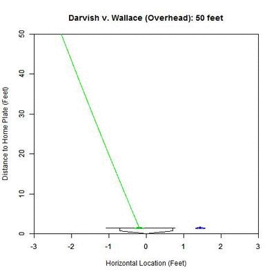
The color palette here is the same as the previous GIF (blue is the actual trajectory in this case and red/green is as defined above) with the added line at the front of home plate indicating the 50% called-strike zone for the lefty batter. Note that since the scales of the two axes are not the same, the left-to-right behavior of the pitch appears exaggerated. The pitch projects as having a high probability of being called a strike early on and around 30 feet, starts to project more as a ball.

From the side, the pitch has nominal movement in the vertical direction, and so the projection appears not to move. However, the color-coding of the projected pitch trajectory shows the transition from 50%+ called-strike region to the below-50% region.

 photo Darvish_Wallace_YZ_250ms.gif

With this idea in mind, we can apply this to all pitches of a single type for a pitcher and see what information can be gleaned from it. We will break it down both by pitch type, as identified by PITCHf/x, and the handedness of the batter. We will perform this analysis on Yu Darvish’s 2013 PITCHf/x data and compare with all other right-handed pitchers from the same year.

To begin, we will examine Yu Darvish’s slider, which, according to the data, was Darvish’s most populous pitch in 2013. Since we are dealing with a data set of over 1000 sliders, we will first condense the information into a single graph and then look at the data more in-depth. We will separate the pitches into four categories based on their final location at the front of the strike zone: strike (50%+ chance of being called a strike) or ball (less than 50%), and swing or taken pitch. We will take the average called-strike probability of the projections in each of these four categories and plot it versus distance to the plate for the projection.

For left-handed batters versus Darvish in 2013:

 photo Darvish_ST_BS_SL_LHB.jpeg

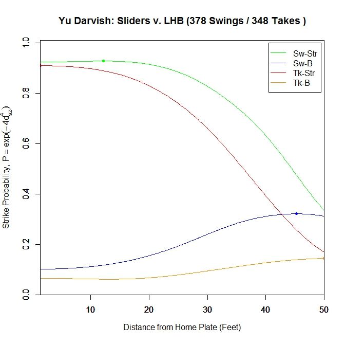
The color-coding is: green = swing/strike, red = take/strike, blue = swing/ball, orange = take/ball. Looking at just pitches that are likely to be called strikes, the pitches swung at have a higher probability of being called strikes throughout their projections, peaking at the node located at 12.167 feet (0.928 average called-strike probability for the projections) for swings and at 1.417 (0.91), the front of home plate, for pitches taken. The swings at pitches in the strike zone end at a 0.924 average called-strike probability. Both curves for pitches outside the strike zone peak very early and remain relatively low in terms of probability throughout the projection.

We can also group all swings together and all pitches taken together to get a two-curve representation.

 photo Darvish_ST_SL_LHB.jpeg

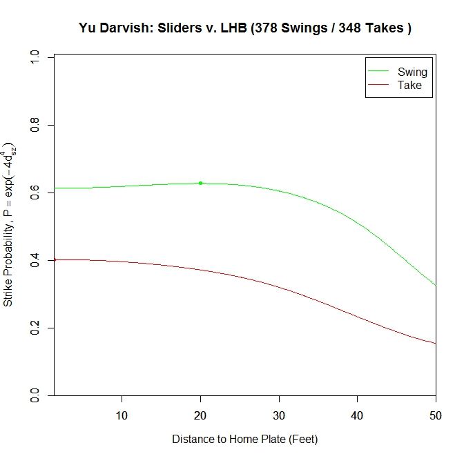
For sliders to lefties, the probability of a called strike is higher throughout the projection for swings compared to sliders taken. Similar to the previous graph, the swing curve peaks before the plate, at 20 feet with a 0.627 average called-strike probability and ends at 0.613, whereas the pitches taken peak at the front of the plate with a called-strike probability of 0.402.

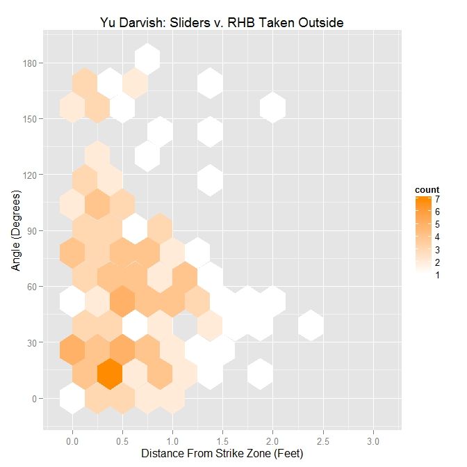
To examine this in more detail, we can look at the location of the projections as the pitches moves toward the plate, similar to the GIFs for the single pitch to Wallace. Using the same color scheme as the four-curve graph, we will plot each pitch’s projection.

 photo Darvish_Pitch_Proj_SL_LHB_250ms.gif

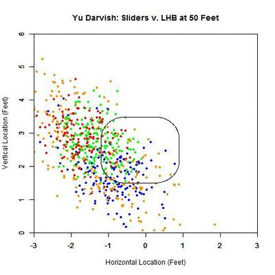
Of interest in this GIF is the observation that most swings outside the zone (blue) are down and to the right from the catcher’s perspective. In particular, based on the projections, there appears to be a subset of the pitches with a strong downward component of movement that are swung at below the strike zone, while most other pitches have more left-to-right movement. In addition, the pitches taken are largely on the outer half of the strike zone to lefties. To better illustrate the progressive contribution of movement to the pitches, we will divide the area around the strike zone into 9 regions: the strike zone and 8 regions around it: up-and-left of the zone, directly above the zone, up-and-right of the zone, directly left of the zone, etc. In each of these 9 regions, we will display the number of swings and number of pitches taken as well as the average direction that the projections are moving as more of the actual trajectory is added in, or in other words, the direction that the movement is carrying the pitch from a straight line trajectory, plus gravity, in the x- and z-coordinates.

 photo Darvish_Pitch_Proj_Gp_SL_LHB_250ms.gif

Note that the movement of the pitches is predominately to the right, from the catcher’s perspective, with some contribution in the downward direction. In the strike zone, the pitches taken have an average location to the left of those swung at. This may be due to the movement bringing the pitches into the strike zone too late for the hitter to react. Computing the percentage of swings in each region produces the following table:


Darvish – Sliders vs. LHB
10 25 0
12.9 62.8 12.5
33.3 65.4 49.2


From the table, where the middle square is the strike zone, we can see that the slider is most effective at inducing swings outside of the strike zone, which has a better percentage of swings than the strike zone itself (Note that some of these regions may contain small samples, but these can be distinguished by the above GIFs). Next is the strike zone, followed by the region directly down-and-right of the strike zone. Going back to the projections, pitches in the two aforementioned non-strike zone regions start by projecting near the bottom of the strike zone and, as they move closer to the plate, project into these two regions.

Putting these observations in context, the movement on the sliders from Yu Darvish to lefties may allow him to get pitches taken on the outer half of the plate, which is generally in the opposite direction of the movement, and swings on pitches down and inside, in the general direction of the pitch movement. This would signify that movement has a noticeable effect on the perception of sliders to lefties. Also of note is that the pitches up and left of the strike zone have very few swings among them, and those that were swung at are close to the zone. Again using movement as the explanation, the pitches project far outside initially and, as they near the plate, project closer to the strike zone, but not enough to incite a swing from a batter.

We can further illustrate these effects on the pitches outside the zone by treating the direction of the movement at 40 feet, taken from the PITCHf/x pfx_x and pfx_z variables, as a characteristic movement vector and finding the angle of it with the vector formed by the final location of the pitch and its minimum distance to the strike zone. So if the movement sends the pitch perpendicularly away from the strike zone, the angle will be 0 degrees; if the movement is parallel to the strike zone, the angle will be 90 degrees; and if the pitch is carried by the movement perpendicularly toward the strike zone, the angle will be 180 degrees. As an illustrative example, consider the aforementioned pitch from Darvish to Wallace:

 photo SZ_MVMT_Angle.jpeg

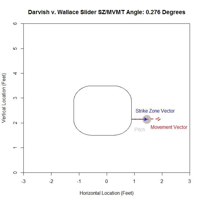
In this case, the movement vector of the pitch (red dashed vector) is nearly in the same the direction as the vector pointing out perpendicular from the strike zone (blue vector). This means that the angle between the two is going to be small (here, it is 0.276 degrees). If the movement vector in this case were nearly vertical, lying along the right edge of the zone, the angle would be close to 90 degrees.

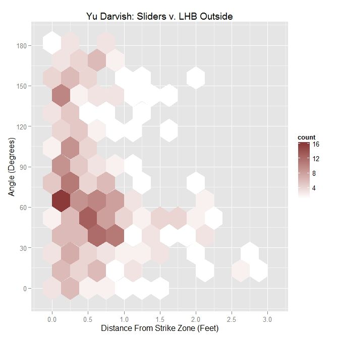
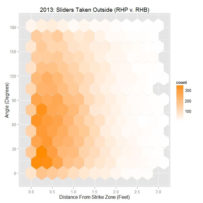
Taking the movement for all sliders thrown to lefties in 2013 by Darvish and finding the angle it makes relative to the vector perpendicular to the zone, we get the following hexplot:

 photo Darvish_Out_SL_LHB.jpeg

Summing up the hexplot in terms of a table:


Darvish – Sliders Outside the Zone v. LHB
Angle Percentage Average Distance
Less Than 45 Degrees 31.8 0.779
Less Than 90 Degrees 67.9 0.691
All X 0.608


So 31.8% of the sliders thrown outside the strike zone to lefties had an angle of less than 45 degrees between the movement and the vector perpendicular to the strike zone. The average distance of these pitches from the strike zone was 0.779 feet. Increasing the restriction to less than 90 degrees, meaning that some part of the movement is perpendicular to the strike zone, we get 67.9% of pitches outside met this criterion with an average distance from the zone of 0.691 feet. Finally, for all pitches outside, the average distance was 0.608 feet.

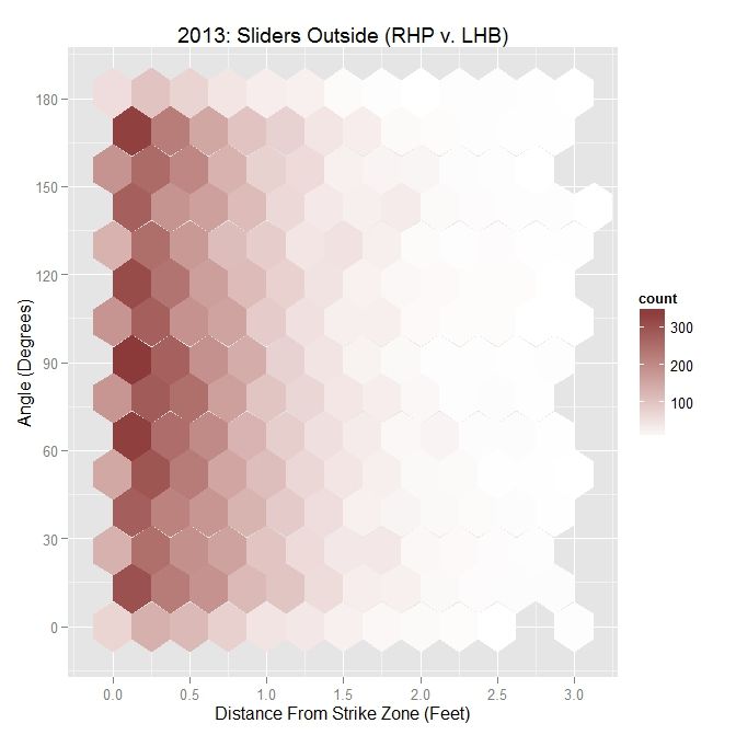
As a point of comparison, for all MLB RHP in 2013, the same analogous plot and table are:


 photo MLB_Out_SL_RHP_LHB.jpeg


MLB RHP 2013 – Sliders Outside the Zone v. LHB
Angle Percentage Average Distance
Less Than 45 Degrees 25.3 0.652
Less Than 90 Degrees 52.6 0.624
All X 0.606


Note that the range of possible angles is 0 to 180 degrees, with 25.3% lying in the 0-45 degree range and 52.6% in the 0-90 degree range. So based on this and examining the hexplot visually, the pitches are fairly uniformly distributed across the range of angles.

Comparing Darvish to other RHP in 2013, he threw his slider more in the direction of movement outside the zone. In particular, for angles less than 45 degrees, he threw his slider an average of 1.5 inches further outside compared to other MLB RHP. That disparity shrinks when restricting to less than 90 degrees and is virtually the same for all pitches outside.

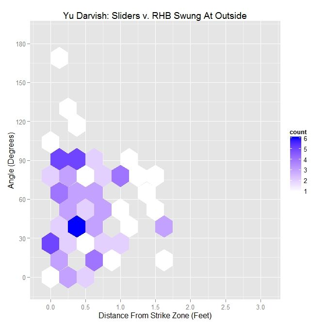
While this observation on its own does not have much significance, we can look to see if this was an effective strategy by looking only at swings and seeing the effects.


 photo Darvish_Swing_Out_LHB.jpeg


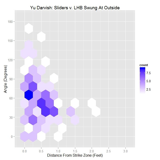
Darvish – Sliders Swung At Outside the Zone v. LHB
Angle Percentage Average Distance
Less Than 45 Degrees 39.9 0.59
Less Than 90 Degrees 83.2 0.526
All X 0.478


Examining both the hexplot and the table, Darvish induced most of his swings outside of the strike zone with pitches having its movement at an angle of less than 90 degrees relative to the strike zone. Note that when the pitch is thrown outside the zone in the general direction of movement (an angle of less than 90 degrees), the pitch can still induce the batter to swing while pitches not thrown in this general direction are only swung at when very close to the zone. In particular, the majority of pitches that reach the farthest outside the zone and still lead to swings are in the range of 30 to 60 degrees. This is due to many of the swings outside the zone being below the strike zone, where the angle with the down-and-to-the-right movement will be in the neighborhood of 45 degrees.

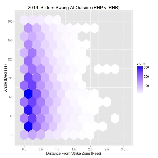
For all MLB RHP in 2013, the hexplot for swings produces a similar result:

 photo MLB_Swing_Out_SL_RHP_LHB.jpeg


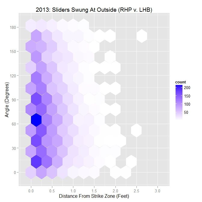
MLB RHP 2013 – Sliders Swung At Outside the Zone v. LHB
Angle Percentage Average Distance
Less Than 45 Degrees 31.8 0.436
Less Than 90 Degrees 64.3 0.421
All X 0.405


From the hexplot, we can see that the majority of pitches swung at are at an angle of 90 degrees or less; 64.3% to be precise. For less than a 45-degree angle, the percentage is 31.8%. These are both up from the percentages from all pitches. As seen with the Darvish data, as the angle decreases, the average distance tends to increase.

Finally, for pitches not swung at outside the zone, we get a complementary result to the swing data:

 photo Darvish_Take_Out_SL_LHB.jpeg


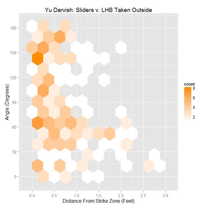
Darvish – Sliders Taken Outside the Zone v. LHB
Angle Percentage Average Distance
Less Than 45 Degrees 26.3 0.976
Less Than 90 Degrees 57.4 0.854
All X 0.696


Here, the percentages are lower than for swings and, while the largest distance is for small angles, there is a grouping of pitches present in pitches taken at angles greater than 90 degrees that is virtually nonexistent for swings. So for Darvish, throwing sliders outside the strike zone with an angle greater than 90 degrees does not appear to be a fruitful strategy, unless it plays a larger role in the context of pitch sequencing. To sum up this observation, it would appear that pitching in the general direction of movement outside the strike zone is a necessary but not sufficient condition for inducing swings from left-handed batters.

For MLB right-handed pitchers, this observations appears to still hold:

 photo MLB_Take_Out_SL_RHP_LHB.jpeg


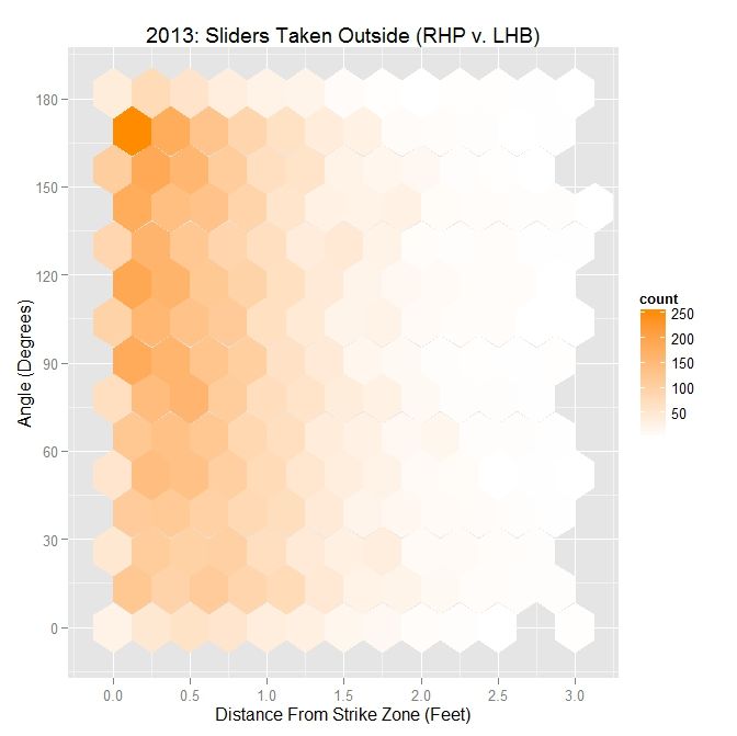
MLB RHP 2013 – Sliders Taken Outside the Zone v. LHB
Angle Percentage Average Distance
Less Than 45 Degrees 22.1 0.809
Less Than 90 Degrees 46.7 0.765
All X 0.708


As with Darvish, the percentages drop when comparing pitches taken to pitches swung at. The hexplot also bears this out, with the largest concentration of pitches taken outside the strike zone having an angle between movement and the strike zone vector of greater than 90 degrees. These results match in general with what we have seen with Darvish, and based on the numbers, Yu Darvish is able to play this effect to his advantage, with a larger-than-MLB-average percentage of sliders outside the zone to lefties with an acute angle.

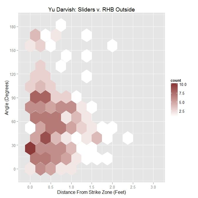
Next, we will perform a similar analysis on sliders to righties. This will allow for comparison between the effects of the slider on batters from both sides of the plate.

 photo Darvish_ST_BS_SL_RHB.jpeg

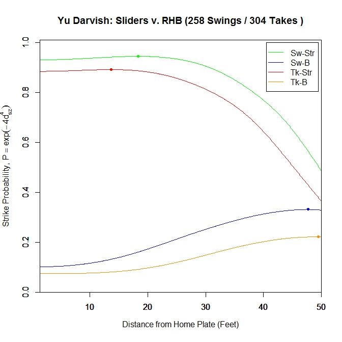
Once again, for pitches in the strike zone, the sliders swung at by righties have a higher probability of being called strikes than those taken. The peak for swings at strikes occurs at 18.333 feet (v. 12.167 feet for LHB) with a 0.945 called-strike probability and ending at 0.931, and taken strikes at 13.667 feet (v. 1.417 feet for LHB) with a 0.892 probability and ending at 0.885.

 photo Darvish_ST_SL_RHB.jpeg

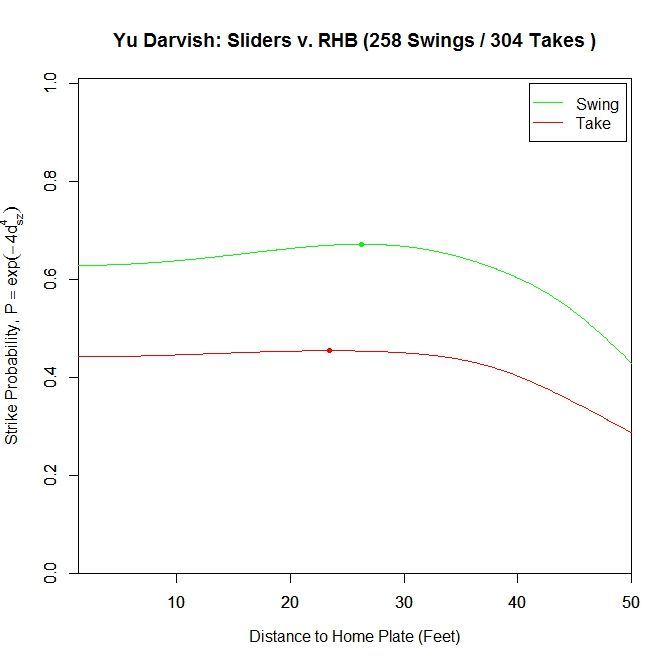
Just examining swings and pitches taken, the peak projected probability is earlier than for lefties at 26.25 feet with 0.672 probability and finishing at 0.629. It also peaks earlier for pitches taken, at 23.147 feet with peak and ending probabilities of 0.454 and 0.442, respectively. Comparing with the results for lefties, the RHB both swing at and take sliders with a higher probability of being called strikes, but have an earlier peak probability.

Breaking it down again in terms of the individual pitches:

 photo Darvish_Pitch_Proj_SL_RHB_250ms.gif

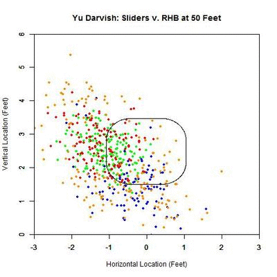
The plot here looks similar to that of the lefties. However, the pitches taken in the strike zone (red) appear more evenly distributed. In addition, the swings outside the zone (blue) appear to be more down and to the right and less directly below the strike zone. To confirm these observations, we can again simplify the plot to arrows indicating the direction of movement in each region and the number of each type of pitch in each region.

 photo Darvish_Pitch_Proj_Gp_SL_RHB_250ms.gif

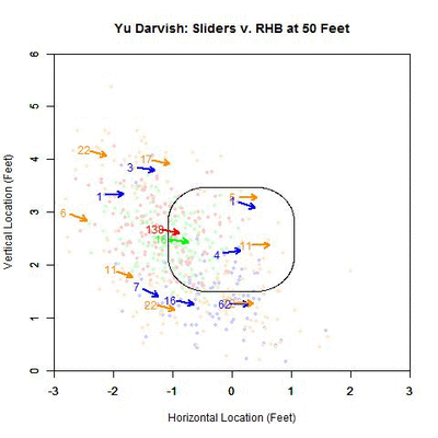
The table below gives the percentage of swings on pitches in each of the nine regions for Yu Darvish’s sliders to RHB:

Darvish – Sliders vs. RHB
4.3 15 16.7
0 54.3 26.7
38.9 42.1 46.3

To confirm the first observation, note that the red arrow (pitches taken) virtually overlaps with the green arrow (pitches swung at) in the strike zone. Examining the table, the value that differs the most, among the reasonably populated regions, is directly below the strike zone (42.1% to RHB v. 65.4% to LHB). One possible explanation for this is that some of the sliders ending up in this region to LHB have a stronger downward component of the movement than for RHB. This can be seen by comparing the two GIFs.

Moving on to the results for the angle between the movement and the strike zone vector, the hexplot is heavily populated by pitches thrown in the direction of movement:

 photo Darvish_Out_SL_RHB.jpeg

Considering the same metrics for interpreting this plot as before:

Darvish – Sliders Outside the Zone v. RHB
Angle Percentage Average Distance
Less Than 45 Degrees 42.3 0.587
Less Than 90 Degrees 78.9 0.618
All X 0.572

From the table, we see that Yu Darvish threw 42.3% of his sliders to RHB with an angle of less than 45 degrees between the strike zone vector and the movement vector, up from 31.8% to LHB. Nearly 79% of his sliders outside the zone were thrown with an angle less than 90% degrees, again up from 67.9% to lefties. However, the average distance is down across the board as compared to lefties.

As a point of comparison, for MLB righties to right-handed batters, the distribution looks similar to that of Darvish:

 photo MLB_Out_SL_RHP_RHB.jpeg

MLB RHP 2013 – Sliders Outside the Zone v. RHB
Angle Percentage Average Distance
Less Than 45 Degrees 31.6 0.671
Less Than 90 Degrees 62.4 0.664
All X 0.673

Compared to Darvish, MLB RHP tend to throw a lower percentage of sliders with an angle less than 45 and 90 degrees. However, the MLB average distance from the strike zone is greater across the board.

Now, isolating only swings:

 photo Darvish_Swing_Out_RHB.jpeg

Darvish – Sliders Swung At Outside the Zone v. RHB
Angle Percentage Average Distance
Less Than 45 Degrees 46.8 0.513
Less Than 90 Degrees 86.2 0.558
All X 0.512

For RHB versus LHB, Darvish’s percentages are up, if only by a few percent. The average distance for less than 45 degrees is down from 0.59 feet to LHB but up in the other two cases. This can be seen in the hexplot since the protrusion in the distribution is around 60 degrees rather than being closer to 45 degrees as before.

The 2013 MLB data shows a similar result, with a roughly triangular pattern in the hexplot, where the distance from the strike zone for swings increases as the angle between the strike zone vector and movement vector decreases.

 photo MLB_Swing_Out_SL_RHP_RHB.jpeg

MLB RHP 2013 – Sliders Swung At Outside the Zone v. RHB
Angle Percentage Average Distance
Less Than 45 Degrees 32.3 0.437
Less Than 90 Degrees 64.8 0.427
All X 0.417

As in the case of lefties, all metrics for Darvish are above MLB-average.

For the sliders taken by right-handed batters:

 photo Darvish_Take_Out_SL_RHB.jpeg

Darvish – Sliders Taken Outside the Zone v. RHB
Angle Percentage Average Distance
Less Than 45 Degrees 39.8 0.634
Less Than 90 Degrees 74.9 0.656
All X 0.605

For angles less than 45 degrees, the percentage of sliders taken outside is noticeably up, as compared with LHB (39.8% v. 26.3%) as well as for less than 90 degrees (74.9% v. 57.4%). This is not surprising since the distribution for all pitches was markedly different between batters on either side of the plate and, in this case, skewed toward the less-than-90-degrees region. The average distances are, however, down from the case for lefties.

Comparing Darvish to other RHP in 2013, the results are similar:

 photo MLB_Take_Out_SL_RHP_RHB.jpeg

MLB RHP 2013 – Sliders Taken Outside the Zone v. RHB
Angle Percentage Average Distance
Less Than 45 Degrees 31.3 0.781
Less Than 90 Degrees 61.3 0.777
All X 0.788

In contrast to MLB RHP, Darvish’s sliders that are taken outside the strike zone are closer to it across the three measures. As before, Darvish’s sliders taken are thrown more in the direction of movement as compared to MLB righties in 2013.

Discussion

When constructing this algorithm, we need to choose a metric by which to group the pitches at each increment. In this case, we are using distance from the back of home plate. While this may be suitable for analyzing a single pitcher, when dealing with multiple pitchers or flipping the algorithm around and using it for evaluating a hitter, the variance in velocity of pitches in between pitchers may have an effect on the results. Therefore, it may be better, for working with multiple pitchers or a hitter, to use time as a metric instead. So rather than tracking the projections as y feet from home plate, we would use t seconds from home plate.

Using this method, with further refinement, we could potentially try to measure quantities such as “late break”. Granted, the PITCHf/x data is restricted to its parameterization by quadratic functions so even if aberrant behavior occurred near the plate, PITCHf/x would not be able to represent it. However if we define late break as x inches of movement over distance y from home plate (or t seconds from home plate), we could hope to quantify it. Based on how we construct the projection, such as including factors other than the PITCHf/x definition of movement, late break could be considered as a difference in perceived position at a distance versus the location at the front of the plate. As seen in the swing/take curves, after a certain distance, the probability of a called strike starts to drop off for Darvish’s sliders, and we could possibly choose, from that point on, to calculate late break for each pitcher. But to do this, we would first have to figure out all elements we wish to use, including movement, to make up pitch perception. As we have seen, for both Darvish and MLB RHP in general, throwing sliders outside of the strike zone in the general direction of movement (with less than a 90-degree angle between the movement vector and the vector perpendicular to the strike zone) elicits swings at a higher rate farther outside the strike zone. In the hexplot for swings, this takes the form of, roughly, a triangular shape of the data which widens in the distance direction as the angle decreases. This can also be seen in the GIFs for the blue pitches (swings outside of the strike zone).

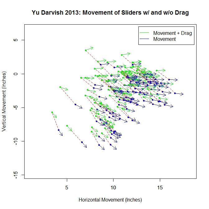
In addition, other elements could be added into this medley for attempting to model a hitter’s perception of a pitch as it approaches the plate. First, one could remove the drag from the movement, leaving it in the projection. Without running the projections, we can see how this would affect the results by looking at how the “movement” differs at 40 feet with and without drag. Pictured below is a subsample of the movement vectors at 40 feet for Darvish’s sliders based on the PITCHf/x definition, in green, and the movement without drag, in blue. The blue vectors are found based on Alan Nathan’s paper on the subject. The dashed red lines connect the same pitch for the different versions of movement. We can see that the movement without drag is larger in magnitude, and in the downward direction and to the right, meaning the projections would start higher and to the left. Comparing the movement vectors with and without drag, the average change in movement for the entire sample is 1.571 inches and the average change in angle between the pairs of vectors is 5.527 degrees. With drag left in the projection and out of the movement, the swing hexplots would likely take a more triangular shape with the angle between the vectors decreasing and shifting the data downward for the pitches outside the zone that were previously moving more laterally.

 photo Darvish_Slider_Movement.jpeg

One could also affect the time to the plate for the pitches as well. As it stands, this approach assumes that the hitters have perfect timing and track pitches using a simple extrapolation approach. If one were to assume that the remaining velocity in the y-direction (toward the plate) was perceived as constant for the pitches, the hitters would be expecting the pitches to arrive faster than they actually are. This would lead to the projections appearing higher, since gravity would have less time to have an effect.

A rather large assumption that we are making is that batters can decouple vertical movement from gravity. Even in cases where the vertical movement is small, this will have an effect on the projected pitch location. This may also serve as an explanation as to why the sliders swung at below the strike zone do not always have a strong vertical component of movement.

Next time, we will look at Darvish’s four-seam fastballs, followed by his cut fastballs, in a similar manner. As we will see, certain pitches excel at inducing swings outside the strike zone when thrown in the general direction of movement while others show little to no benefit at all. We can also break down the pitches swung at by the result (in play, foul, swing-and-miss) to gain further insight.

Strike Zone Analysis

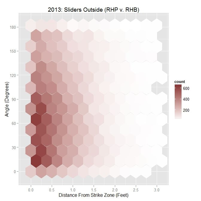
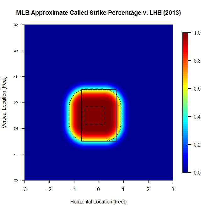
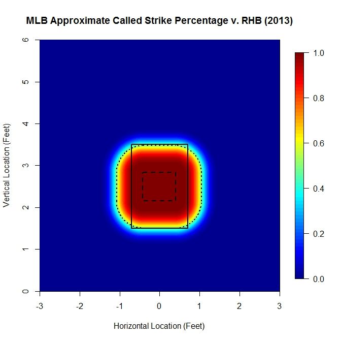
This section explains the calculation and choice of model for the probability of a called strike used in the above analysis. There have been a lot of excellent articles analyzing the strike zone, such as by Matthew Carruth, Bill Petti, and Jon Roegele, among others, and this method is derivative of those previous works. Our goal is the create an explicit piecewise function that reasonably models the probability that a pitch will be called a strike, based on empirical data. However, rather than treat the data as zero-dimensional (no height, width, or length for each datum), we represent each pitch as a two-dimensional circle with a three-inch diameter. Then, over a sufficiently refined grid, we calculate the number of 2D pitches that intersected each point that were called strikes divided by the number of 2D pitches that were taken (ball or strike). This gives the percentage of pitches that intersected each point that were called strikes. This number provides an empirical estimate of a pitch passing through that point being called a strike. The advantage of taking this approach is that we do not impose any a priori structure on the data, which can happen when using methods such as binning or model fitting to the zero-D data. It also conforms with using a 2D strike zone to perform the analysis by representing the data fully in 2D. Note that since using all MLB data from 2013 to generate these plots, we have a large enough data set that we do not get jumps or discontinuities for the strike zone that may occur for smaller data sets, such as for a single pitcher. As an example, the called-strike probability for LHB in 2013 looks like:

 photo SZ_Heat_LHB-1.jpeg

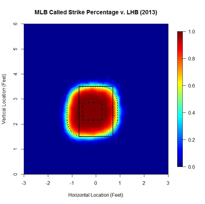
The colormap on the right gives the probability of a pitch at each location being called a strike, based on the data. The solid rectangle represents the textbook strike zone (with 1.5 and 3.5 vertical bounds), and the two dashed lines will be explained concurrently with the model.

For the model, we assume a small region where the probability of a called strike is essentially 1, which, in the graph, is the long-dashed line. Far outside the strike zone, will assume that the probability that a pitch is called a strike is essentially zero. In between, we need a way to model the transition between these two regions. To do this, we will adopt a general exponential decay model of the form exp(-a x^b), where a and b are parameters. In this case, we take x to be the minimum distance to the probability-1 region of the strike zone (long-dashed line). Since there is some flexibility in how we choose the probability-1 region and the subsequent parameters, we will do this less rigorously than could be done in order to keep things simple.

First we examined slices of the empirical data in profile and found that experimenting with the probability-1 region bounds and a, b values, a value around 4 for b worked well at matching the curvature. Then a choice of a equal 4 was found similarly via guess-and-check. Finally the probability-1 region was adjusted to make the model match the data based on a contour plot for each (see below). For lefties, the probability-1 region is [-0.55,0.25] x [2.15,2.85] feet.

 photo SZ_Contour_LHB.jpeg

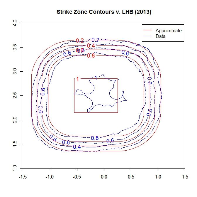
Note that we do a decent job of matching the contours outside of the lower-right and upper-left regions, where there is some deviation. This can be adjusted for by changing the shape of the probability-1 area, but this increases the complexity of calculating the minimum distance. When plotting the model for the probability:

 photo SZ_Heat_LHB_Approx.jpeg

Here, the solid and long-dashed lines are as before, and the dotted line is the 50% called-strike contour from the model, which is used as the boundary of the strike zone in the above analysis. While the shape of the strike zone may seem unconventional, it is a natural approach for handling the zero-dimensional PITCHf/x data. For example, if we place a pitch on the edge of the rectangular textbook zone, a so-called borderline pitch, and track the path that the center would make as it moved around the rectangle, it would trace out a similar shape.

 photo SZAnimation.gif

For RHB, the heat map is much more balanced, left to right, making the fit much closer than could be achieved for LHB.

 photo SZ_Heat_RHB.jpeg

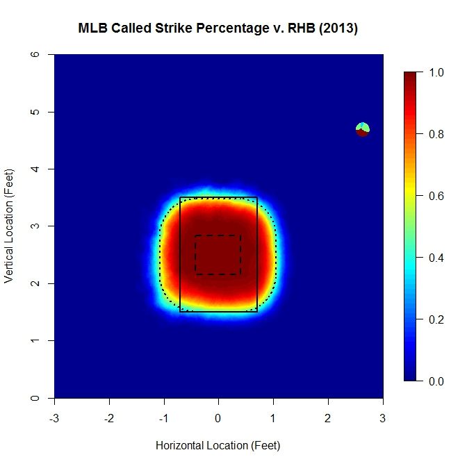
Again, the top and bottom of the 50% called-strike contour lies near 3.5 and 1.5 feet, respectively. Examining the contour map:

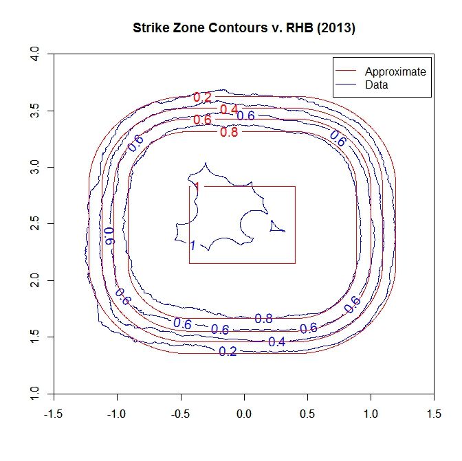
Here, the identified contours fit well all around. The called-strike probability, with the model applied, is:

 photo SZ_Heat_RHB_Approx.jpeg

In this case the probability-1 region is [-0.43,0.40] x [2.15,2.83] feet.

So, overall, the RHB called-strike probability model fits much better, especially in the corners, than for LHB. In order to properly fit the called-strike probability to such a model, one would first need to have a component of the algorithm that adjusts the probability-1 area, both by location and size, and possibly by shape. Then the parameters for the decay of the strike probability could be fit against the data. The probability-1 area could then be adjusted and fit again, to see if the overall fit is better. This might work similar to a simulated annealing process. However, for our purposes, sacrificing the corners for LHB seems reasonable to maintain simplicity of method and calculations.

In closing, if you made it this far, thank you for reading to the end.


The Baseball Fan’s Guide to Baby Naming

I’ve often wondered if some sort of bizarre connection exists between names and athletic ability, specifically when it comes to the sport of baseball. Considering I grew up in the 90’s, I will always associate certain names with possessing a supreme baseball talent. Names like Ken (Griffey Jr.), Mike (Piazza), Randy (Johnson), Greg (Maddux) and Frank (Thomas) are just a few examples. With a wealth of statistical information available, I thought I’d investigate into the possibility of an abnormal association between names and baseball skill.

I began digging up the most popular given names, by decade, using the 1970’s, 80’s & 90’s as focal points. This information was easily accessible on the official website of the U.S. Social Security Administration, as they provide the 200 most popular given names for male and female babies born during each decade. After scouring through all of the names listed, the records revealed there were 278 unique names appearing during that timespan.

Having narrowed down the most popular names for the timeframe, I wandered over to FanGraphs.com, to begin compiling the “skill” data. I will be using the statistic known as WAR (Wins Above Replacement) as my objective guide for evaluating talent. Sorting through all qualified players from 1970-1999, the data revealed 2,554 players eligible for inclusion. After combining all full names with their corresponding nicknames (i.e.: Michael & Mike), the list was condensed down to 507 unique names.

By comparing the 278 unique names identified via the Social Security Administration’s most popular names data, with the 507 qualified ballplayer names collected through FanGraphs, it was discovered that 193 of the names were present on both lists. The following tables point out some of the more intriguing findings the research was able to provide.

The first table[Table 1], below, is comprised of the 25 most frequent birth names from 1970-1999. The second table[Table 2] consists of the 25 WAR leaders by name, meaning the highest aggregate WAR totals collected by all players with that name. Naturally, many of the names that appear in the 25 most common names list, reappear here as well. Ken, Gary, Ron, Greg, Frank, Don, Chuck, George and Pete are the exceptions. It’s interesting to see that these names seem to have a higher AVG WAR per 1,000 births(as seen on the final table), perhaps indicative of those names’ supremacy as better baseball names? The last table[Table 3] contains the top 25 names by AVG WAR per 1,000 births; here we see some less common names finally begin to appear. These names provide the most proverbial bang (WAR) for your buck (name). Yes, some names, like Barry and Reggie, are inflated in the rankings — probably due to the dominant play of Barry Bonds and Reggie Jackson, but could it not also mean these players were just byproducts of their birth names?!? Probably not, but it’s interesting, nonetheless.

So if you’re looking to increase the chances your child will make it professionally as a baseball player, then you might want to take a look at the names toward the top of the AVG WAR per 1,000 births table, choose your favorite, and hope for the best…OR, you could always just have a daughter.

Please post comments with your thoughts or questions. Charts can be found below.

25 Most Common Birth Names 1970-1999

Rank

Name

Total Births

Total WAR

WAR per 1,000 Births

1

Michael/Mike

2,203,167

1,138

0.516529

2

Christopher/Chris

1,555,705

184

0.11821

3

John

1,374,102

799

0.581252

4

James/Jim

1,319,849

678

0.513316

5

David/Dave

1,275,295

859

0.673491

6

Robert/Rob/Bob

1,244,602

873

0.70175

7

Jason

1,217,737

77

0.062904

8

Joseph/Joe

1,074,683

616

0.573006

9

Matthew/Matt

1,033,326

95

0.091646

10

William/Will/Bill

967,204

838

0.866415

11

Steve(Steven/Stephen)

916,304

535

0.583649

12

Daniel/Dane

912,098

233

0.255674

13

Brian

879,592

154

0.174967

14

Anthony/Tony

765,460

314

0.409819

15

Jeffrey/Jeff

693,934

298

0.430012

16

Richard/Rich/Rick/Dick

683,124

888

1.29991

17

Joshua

677,224

0

0

18

Eric

627,323

122

0.194637

19

Kevin

613,357

305

0.497426

20

Thomas/Tom

583,811

505

0.86552

21

Andrew/Andy

566,653

184

0.325243

22

Ryan

558,252

17

0.030094

23

Jon/Jonathan

540,500

61

0.112118

24

Timothy/Tim

535,434

253

0.473074

25

Mark

518,108

397

0.765477


25 Highest Cumulative WAR, by Name, 1970-1999

Rank

Name

Total Births

Total WAR

WAR per 1,000 Births

1

Michael/Mike

2,203,167

1,138

0.516529

2

Richard/Rich/Rick/Dick

683,124

888

1.29991

3

Robert/Rob/Bob

1,244,602

873

0.70175

4

David/Dave

1,275,295

859

0.673491

5

William/Will/Bill

967,204

838

0.866415

6

John

1,374,102

799

0.581252

7

James/Jim

1,319,849

678

0.513316

8

Joseph/Joe

1,074,683

616

0.573006

9

Steve(Steven/Stephen)

916,304

535

0.583649

10

Thomas/Tom

583,811

505

0.86552

11

Kenneth/Ken

312,170

439

1.405644

12

Mark

518,108

397

0.765477

13

Gary

176,811

353

1.998179

14

Ronald/Ron

246,721

342

1.38456

15

Anthony/Tony

765,460

314

0.409819

16

Kevin

613,357

305

0.497426

17

Gregory/Greg

324,880

303

0.931729

18

Jeffrey/Jeff

693,934

298

0.430012

19

Donald

215,772

298

1.380161

20

Frank

176,720

298

1.687415

21

Charles/Chuck

458,032

262

0.571357

22

Timothy/Tim

535,434

253

0.473074

23

Lawrence

220,557

248

1.126239

24

George

226,108

246

1.090187

25

Peter

181,358

246

1.357536


25 Highest WAR per 1,000 Births, by Name, 1970-1999

Rank

Name

Total Births

Total WAR

WAR per 1,000 Births

1

Barry

34,534

175

5.079053

2

Leonard

31,626

123

3.895529

3

Omar

13,656

53

3.873755

4

Fernando

13,180

47

3.543247

5

Theodore/Ted

27,144

93

3.444592

6

Jack

53,079

176

3.323348

7

Reginald/Reggie

47,883

157

3.283002

8

Frederick/Fred

54,529

146

2.681142

9

Bruce

56,609

141

2.487237

10

Calvin

43,412

107

2.453239

11

Gary

176,811

353

1.998179

12

Roger

77,458

151

1.948153

13

Glenn

33,794

65

1.929337

14

Darrell

53,317

102

1.920588

15

Frank

176,720

298

1.687415

16

Dennis

131,577

218

1.653024

17

Jerry

122,465

201

1.638019

18

Dale

36,162

54

1.48775

19

Lee

62,922

89

1.406503

20

Kenneth/Ken

312,170

439

1.405644

21

Louis/Lou

142,969

200

1.400304

22

Ronald/Ron

246,721

342

1.38456

23

Roy

59,004

82

1.382957

24

Donald

215,772

298

1.380161

25

Jay

63,795

87

1.368446


Free Scott Van Slyke!

Some team really should take a chance to give Scott Van Slyke a starting OF job next season.  Frankly, I’d find it almost sinful if some team does not go for it.

(Granted, the Dodgers may still use the off-season to relieve their outfield logjam, so maybe Van Slyke works his way into the Dodgers’ own starting lineup.  But I’ll suppose for now that that does not happen.)

First, a summary of his career performance:
.261/.348/.476
.361 wOBA
134 wRC+
(455 PA)

The 134 wRC+ certainly is impressive.  And while he obviously did it only over a limited sample, if he were a full-time player, that would have ranked 24th in 2014; just behind Hanley Ramirez, David Ortiz, and Jose Altuve.  Alternatively, among all players with 450+ PA from 2012-2014, Van Slyke’s wRC+ also ranks 24th.

So he certainly has been good in-sample.  But what should you expect going forward?

There seem to be three key questions:
(1) Can he hit righties well enough?
(2) What is his true talent BABIP?
(3) What is his true talent ISO?

On the first point, Van Slyke’s career-to-date statline has certainly benefited from heavy use against left-handers.  In his career, he’s had slightly over half of his plate appearances against lefties — with a punishing 151 wRC+ — and a more pedestrian 116 wRC+ versus righties.  Taking those numbers at face value, for now, even if you re-weighted his plate appearances to be 70% against righties and 30% against lefties, that still comes out to 126.5, aka plenty good.  At least in-sample, that’s not that different from Josh Donaldson, who mashes lefties and is comparatively average against righties.  And I’m sure most teams would be elated to have Josh Donaldson.

The next question, then, is whether his career-to-date .323 BABIP is his true-talent BABIP.  There are some plausible reasons to think “no.”  Steamer projects him for .295 BABIP next season, and at least this 2012 version of an xBABIP calculator puts him more in the .270 territory.

I’m somewhat more optimistic on his BABIP, though.  His minor league BABIPs were good, after all: .404 over a full season in AA, and .354 and .437 across two half-seasons in AAA.  And ZiPS had him projected for .310 BABIP for 2014, and after a .394 actual showing, it will most likely be higher next season.

For simplicity’s sake, suppose you take everything else about Van Slyke’s career-to-date batting as given (BB and K rates, ISO, etc.), and just do the BABIP adjustment.  (This is not entirely realistic, but again, simplicity.)  What do his stats look like for different BABIP values?  You get:

BABIP OPS
0.280 0.772
0.290 0.784
0.300 0.796
0.310 0.808
0.320 0.820

Even on the low end, that’s still a useful player.  And even lowering everything by .050 for the platoon adjustment,* even the worst-case scenario is about a league-average LF, which this season posted a .720 OPS.  And the more optimistic scenarios put him above average.

* – Remember that 126.5 wRC+ computed earlier?  This would be about a .341 wOBA, which is .020 lower than his unadjusted wOBA.  .020 wOBA is approximately equal to .050 OPS.

Then the last question is: has he also overachieved on ISO in-sample?  Here, I’m a little more convinced that he may have.  His minor league ISOs were not much higher than his Major League career-to-date mark (.215), and you see that Steamer has him projected for just .165 ISO next year.  It’s also possible Steamer is stingy, as ZiPS had him projected for .170 ISO in 2014, and this will only increase after his actual 2014 performance.  But even supposing that increases to something like .182, it still suggests Van Slyke’s true-talent ISO is lower than what he’s shown so far.

Suppose we somewhat conservatively assume Van Slyke’s true talent BABIP is .300, and again take BB and K rates as given, but this time do an ISO adjustment.  What would his career-to-date stats look like?  You get:

(assuming .300 true-talent BABIP; no platoon adjustment)

ISO OPS
0.170 0.751
0.180 0.761
0.190 0.771
0.200 0.781
0.210 0.791

Or, if you want a full table that allows BABIP and ISO to vary simultaneously, you get:

(OPS value in cells; no platoon adjustment)

BABIP .170 ISO .180 ISO .190 ISO .200 ISO .210 ISO
.280 BABIP 0.727 0.737 0.747 0.757 0.767
.290 BABIP 0.739 0.749 0.759 0.769 0.779
.300 BABIP 0.751 0.761 0.771 0.781 0.791
.310 BABIP 0.763 0.773 0.783 0.793 0.803
.320 BABIP 0.775 0.785 0.795 0.805 0.815

Especially after factoring in some platoon adjustment, you see that there definitely are scenarios where Van Slyke could be below a league-average corner OF, despite his promising performance to date.  But these require that he has overachieved in either BABIP or ISO, or both; neither of which is given.  Even using the seemingly conservative Steamer projection for Van Slyke’s 2015 performance, he projects for something like 2 WAR over a full season, which is good enough to start.  And meanwhile there are many scenarios where he could be better than that.  (In-sample he’s been 4.5 WAR per 600 plate appearances!)

Of course the Dodgers know this as well.  Even so, I can’t imagine the price to acquire Van Slyke would be that high, and with the upside, it sounds totally reasonable for teams like Cincinnati, Seattle, or the White Sox, who didn’t get nearly enough production from their outfield last year.

Reader thoughts?


Analyzing Baseball’s Final Four

Now that the 2014 major league season is down to the final four, we can reflect on how these four teams made it to the League Championship Series and how they stack up for a World Series run.  To do so, I’ll look at the hitting, pitching, and defense of the remaining teams.

One of the best ways to measure a player’s offensive contributions is with Weighted Runs Created Plus (wRC+). Weighted Runs Created Plus attempts to quantify a player’s total offensive value and measure it in runs relative to the league average, controlling for park effects. League average for position players is 100. Every point above 100 is a percentage point above league average, so a 110 wRC+ means a player created 10 percent more runs than a league average hitter would have in the same number of plate appearances. I’ll use that 110 wRC+ threshold, based on the numbers on FanGraphs, to identify above average offensive players.

Last year’s World Series matchup featured two of the teams that make a strong case for the importance of offensive excellence. The World Champion Boston Red Sox had seven players with a wRC+ of 110 or better, tied for the most in baseball, and two more with a 109 wRC+. Their World Series opponent, the St. Louis Cardinals, had six players that were at least 10 percent better than average, tied for third best in baseball.

Players with 110 wRC+ or Better
2013 Playoff Teams
Minimum 250 Plate Appearances

Team

Players

Boston Red Sox

7

Pittsburgh Pirates

7

St. Louis Cardinals

6

Detroit Tigers

6

Tampa Bay Rays

6

Oakland Athletics

5

Los Angeles Dodgers

5

Atlanta Braves

5

Cleveland Indians

5


This season, the American League Championship Series features the Baltimore Orioles and the Kansas City Royals. Manny Machado’s knee injury in August and Chris Davis’ 25-game suspension left the Orioles with only four above average offensive regulars heading into the postseason. While Davis’ suspension garnered plenty of media coverage, his offensive production had been below average, 94 wRC+, this season.

Making up for the loss of Machado and Davis’ poor season was center fielder Adam Jones, who hit 29 home runs and slugged .469. Jones was among the best hitting center fielders, ranking second and seventh at the position in home runs and slugging percentage, respectively, among qualifiers. In addition, Nelson Cruz was one of the most underrated offseason free agent signings. Dan Duquette signed Cruz to a one-year deal for $8 million in February, securing a middle-of-the-order power bat to protect Adam Jones. Cruz handily outperformed his one-year deal by hitting an MLB-best 40 home runs in 2014.

While the Orioles have four above-average offensive players, they have an abundance of above-average defensive players. The Orioles lead the American League by a wide margin with 56 Defensive Runs Saved (DRS). The Athletics finished second with 42 DRS. Baltimore has four players that rank in the top 10 at their respective positions, including the important up-the-middle positions with catcher Caleb Joseph, shortstop J.J. Hardy, and second baseman Jonathan Schoop.

Perhaps the most remarkable story of the season has been that of Steve Pearce. The 31-year old journeyman has taken advantage of the his opportunity this season by slugging .556 and hitting 21 home runs on his way to a 161 wRC+. Pearce also shined defensively where he ranked in the top 10 in Runs Saved at two different positions: first base and left field. This season, Pearce should be one of the most dangerous and versatile players in the postseason.

Beyond their individual players, the Orioles also have a nice advantage in the form of defense shifts. Baltimore led all teams in baseball with 599 shifts on balls in play a year ago and increased that total this season to 705 shifts, fourth most in baseball. That dedication to the shift resulted in seven Shift Runs Saved.

One the major reasons the Orioles advanced past the Detroit Tigers in the ALDS was the effectiveness of their bullpen. Where the Tigers bullpen failed to hold leads in the series sweep, the Orioles bullpen was superb. Manager Buck Showalter used his bullpen for 12 innings over the three games, and his relievers surrendered just three runs in that span. Showalter has a plethora of options to deploy against righties, including hard-throwing Tommy Hunter and sidewinder Darren O’Day. But his star reliever is their left-handed trade deadline acquisition Andrew Miller.

Miller pitched 3.1 innings of no-hit baseball against the Tigers, striking out three batters against only one walk. Showalter utilized Miller’s versatility to pitch multiple innings in Games 1 and 3. Miller came on in the sixth inning in Game 1 to hold a one-run lead before the Orioles offense torched the Tigers bullpen for eight runs in the eighth inning. In Game 3, Miller inherited a runner on first, but he still held the Tigers scoreless, bridging the game to Orioles closer Zach Britton. Britton saved the final two games of the series, sending the Orioles to the ALCS for the first time since 1997.

The Kansas City Royals’ return to the playoffs was built upon power arms in the bullpen, speed, and defense. The Royals collective athleticism and speed buoyed an often lifeless offense. They led MLB in stolen bases this season, with Jarrod Dyson and Alcides Escobar each stealing 30-plus bases this year. Speed has continued to play a major role in the Royals’ postseason success thus far as the Royals stole seven bases against the Athletics in the Wild Card play-in game. They stole another five bases in their sweep of the Angels in the ALDS.

The Royals bullpen features three of the best power arms in baseball. Setup men Kelvin Herrera and Wade Davis and closer Greg Holland each have an average fastball velocity over 95 mph, with Herrera and Davis touching 100 mph at various times this season. Davis was nearly untouchable this season, striking out almost 40 percent of the batters he faced while averaging only one earned run per nine innings. Holland and Herrera kept pace with Davis, with Holland fanning 38 percent of hitters and Herrera punching out 21 percent. Both maintained sub-2.00 ERAs, as well. In their four playoff games so far, the three flamethrowers and TCU rookie sensation Brandon Finnegan have been outstanding. They have combined to throw 15 innings, allowing just three earned runs and striking out 18 batters.

While their offense had its ebbs and flows this season, the Royals’ defense remained a constant strength all year. Kansas City saved 40 runs defensively this season, third most in the AL. Their outfielders were particularly outstanding. Left fielder Alex Gordon led all AL players with 27 DRS this season. Nearly as impressive were Lorenzo Cain and Jarrod Dyson who saved 24 and 14 runs, respectively. That defensive success has continued into the postseason where Cain and Dyson have made spectacular catches and outfield assists to stymie any potential rally put forth by the A’s and Angels.

During the regular season, the Royals had only three above-average regulars on offense. So far this postseason, their offense has improved dramatically. First baseman Eric Hosmer and third baseman Mike Moustakas were well-below average offensive players in the regular season. Hosmer hit a paltry 9 home runs and Moustakas hit 15. But both players have played like stars in their playoff games, hitting a pair of home runs, each, including two game-winning home runs, one by Moustakas in Game 1 and the other by Hosmer in Game 2 of the ALDS.

The National League Championship Series pits the San Francisco Giants against the St. Louis Cardinals, two of the most successful NL franchises over the last decade. The Giants are quite familiar with the spotlight and hope to continue their odd trend of winning a World Series in even years just as they did in 2010 and 2012.

Five Giants were at least 10 percent better than league average offensively this season. Team leader and perennial MVP candidate Buster Posey has the rare ability to both get on base at a high rate and hit for power. He ranked near the top in both on-base percentage and slugging percentage among catchers in 2014. Posey is surrounded by outfielder Hunter Pence, a stealth MVP candidate, and Pablo Sandoval, an above average offensive third baseman. In his career, Sandoval has really shined in the postseason. He has a solid .294/.346/.465 in the regular season, but in the playoffs, Sandoval has been a superstar, hitting .311/.351/.547 with six home runs in 27 career playoff games.

The Giants’ staff ace, Madison Bumgarner, is perhaps the most underrated pitcher in baseball. Still just 25-years old, Bumgarner has already won two World Series and finished in the top 12 in Cy Young voting twice. This season, with Matt Cain lost to injury for much of the season, Bumgarner established himself as the clear ace of the staff. It was his fourth consecutive season with more than 200 innings, and Bumgarner was also among the NL leaders in strikeout rate, walk rate, and ERA. He even excels in the batter’s box. In Bumgarner’s limited 78 plate appearances this season, he hit four home runs and posted a 115 wRC+, the best among pitchers with at least 50 plate appearances.

Even with Bumgarner at the top of the rotation, the strength of the Giants pitching staff is its bullpen. Manager Bruce Bochy can use his bullpen to counter any matchups that Cardinals manager Mike Matheny might present during the NLCS. Bochy has a lefty specialist in Javy Lopez who neutralizes left-handed hitters. Lefties are hitting just .190/.248/.290 against Lopez this season. Right-handed reliever Sergio Romo has regained the feel for his devastating slider, which he featured with tremendous success as the Giants closer in 2012. Bochy now has a flame-throwing righty in Hunter Strickland to counter difficult right-handed hitters with his 98 mph fastball. Santiago Casilla closes down games. He has a mid-90s fastball and two breaking pitches, a curve and a slider, which successfully held hitters to a .175 batting average against this season.

Last year’s NL Champion, the St. Louis Cardinals, aim for a return trip to the World Series. The Central Division champs had five above average offensive players this season, but they had to do it without catcher Yadier Molina for a good portion of the season. Between 2011 and 2013, Molina posted three consecutive seasons with a wRC+ above 125, but this season, he was barely above league average. Molina’s torn thumb ligament on his right hand, which put him on the disabled list from July 9th through August 29th, may explain his subpar offensive season.

With Molina sidelined, the Cardinals had several players who stepped up both offensively and defensively. Shortstop Jhonny Peralta lived up to the four-year $53 million free agent contract he signed in the winter. He has provided both power and defense, with 21 home runs and 17 Runs Saved, which had him near the top in each category among shortstops.

The Cardinals would not have advanced past the Dodgers in the NLCS without the efforts of third baseman Matt Carpenter. The TCU product was taken by the Cardinals in the 13th round of the 2009 draft and has steadily risen to become one of the best players in baseball. In fact, since the beginning of the 2013 season, Carpenter is 4th in the NL in FanGraphs’ Wins Above Replacement with 10.7 WAR, trailing only center fielders Andrew McCutchen and Carlos Gomez and first baseman Paul Goldschmidt. During that span, Carpenter has been over 30 percent better than league average offensively, ranking in the top 10 among all NL position players in batting average and on-base percentage. Against the Dodgers in the NLDS, Carpenter hit .375/.412/1.125 with three home runs and a decisive three-run double against Clayton Kershaw in Game 1, cementing the Cardinals rally in the opening game of the series.

The Cardinals’ playoff rotation is built around staff ace Adam Wainwright, who finished second in the Cy Young voting last year and has once again built a strong case for the award in 2014. Among NL starters, Wainwright was second in innings and third in ERA and Fielding  Independent Pitching (FIP). Lance Lynn, the Cardinals Game 2 starter, has pitched over 200 innings in back-to-back seasons and is unusual in his approach. Lynn throws 79 percent fastballs, which is the second highest fastball percentage in MLB.

The Cardinals acquired veteran pitcher John Lackey at the trade deadline from the Boston Red Sox. Lackey has raised his game in the postseason in his career. His playoff ERA is under 3.00 in 17 starts, compared to an ERA over 4.00 in the regular season. He also has 86 strikeouts against just 36 walks in his postseason career. Lackey immediately paid dividends for the Cardinals in his Game 3 start against the Dodgers in the NLDS. In that start, he pitched seven innings and gave up just one-run on five hits while striking out eight batters and walking just one.

The two League Championship Series possess plenty of interesting matchups. The AL pits the Orioles’ power versus the Royals’ speed and the Royals’ lefty-laden lineup against Buck Showalter’s ability to counter with his relief corps. Both teams excel on defense, but Caleb Joseph should be able to slow the Royals’ running game down, and Nelson Cruz, Steve Pearce and the Orioles offense should continue to mash home runs, perhaps even a few against the hard-throwing Royals bullpen.

The NLCS is a complete toss-up, seemingly destined to go the distance and be decided in seven games. Although the Giants have the better bullpen, which manager Bruce Bochy deploys as well as any manager in the game, the Cardinals’ lineup is deeper with power from both sides of the plate, and they also have the stronger rotation.


Anomalous Baserunning

One of the beautiful things about WAR is the way it assigns value to separate, unique elements of player performance. Perhaps one of the lesser-appreciated elements of WAR is BsR, which measures the value of a player’s baserunning.

BsR contains two separate components: wSB and UBR. wSB describes a player’s value added through base stealing, and UBR measures the cumulative value of a player’s base path advancements outside of stealing.

One might imagine that these two components demand similar skill sets. To excel in either, a player must have a: reasonable speed and b: good instincts on the base paths. Indeed, it would be fairly surprising to see a great disparity between the two components for any given player’s baserunning.

In a quest to discover the most puzzling baserunners, I searched for the largest absolute difference between wSB and UBR over a player’s career. There were several noteworthy constraints, a: our UBR data begins in 2002, limiting the search to the past 13 seasons and b: a general difference in magnitude between wSB and UBR. Because UBR governs all base running events outside of stolen bases, players typically see far more opportunities to accrue UBR than wSB value.

To adjust for this factor, I assigned each of the 685 qualified players a percentile rank for wSB and UBR. After sorting by the largest absolute difference in percentile, the truly anomalous base runners became apparent. Consider:


Table 1: From 2002-2014, Largest Absolute Differences in wSB and UBR Percentile

Rank Name wSB wSB Percentile UBR UBR Percentile % Difference BsR
1 David DeJesus -16.5 0.00% 19 95.00% 95.00% 2.5
2 Cristian Guzman -7.2 2.30% 16.7 92.60% 90.30% 9.4
3 Casey Blake -11.6 0.10% 12.9 88.10% 88.00% 1.4
4 Clint Barmes -5.9 4.60% 15.2 91.00% 86.40% 9.3
5 Dan Uggla -7.2 2.30% 12.5 87.50% 85.20% 5.3
6 Juan Uribe -10.7 0.20% 10.1 85.00% 84.80% -0.6
7 Brad Wilkerson -8.8 1.30% 10.5 85.50% 84.20% 1.7
8 Austin Kearns -4.6 10.30% 15.3 91.50% 81.20% 10.8
9 Reed Johnson -6.2 4.20% 10.4 85.30% 81.10% 4.3
10 Carlos Guillen -7 2.90% 9.4 83.30% 80.40% 2.5
11 Barry Bonds 3.7 85.90% -15.8 6.70% 79.20% -12.1
12 Jack Wilson -5.9 4.60% 9.4 83.30% 78.70% 3.5
13 Yunel Escobar -7.3 2.10% 8.3 80.70% 78.60% 1
14 Hunter Pence -3.5 17.50% 20.5 96.00% 78.50% 17
15 Marlon Byrd -5.1 8.60% 11.2 86.80% 78.20% 6.2
16 Jamey Carroll -3.7 15.90% 17.5 93.50% 77.60% 13.9
17 Jason Kendall -5.9 4.60% 8 79.00% 74.40% 2.1
18 Neil Walker -5.3 7.40% 8.8 81.50% 74.10% 3.5
19 J.D. Drew -4.3 12.10% 10.6 86.10% 74.00% 6.3
20 Moises Alou 2.3 82.40% -12.3 9.00% 73.40% -10


Well, there he is — among the anomalous, David Dejesus reigns supreme. While the average player carries a 22% difference between wSB and UBR percentile, Dejesus clocks in at more than 3.5 standard deviations above the mean. In 123 career stolen base attempts, Dejesus has succeeded in swiping the extra bag only 63 times. That’s certainly a less-than-stellar success rate. Nonetheless, Dejesus’ uncanny knack for taking extra bases on balls in play salvages his value as a baserunner; while Dejesus’ failures as a thief cost his team more than 15 runs, his ability to advance on the basepaths during the course of play has credited his team roughly 20 runs, or 2 wins.

Similarly, Cristian Guzman, Casey Blake, Clint Barmes and Dan Uggla all cost their teams with the stolen base, but ultimately produced positive baserunning value due to their ability to advance extra bases on balls in play. With two exceptions, the top 20 is filled with players who struggled to steal bases but excelled in running them.

Of the top 20 differences, only Barry Bonds and Moises Alou possess a baserunning disparity driven by a positive wSB and negative UBR. Strangely enough, by 2002 both players had already seen a decline in their stolen base totals. Nonetheless, each managed to accrue positive value via thievery, only to give it back (and then some) throughout the course of their time on the base paths.

Ultimately, there exists a relatively easy solution for players who hurt their teams via the stolen base: stop attempting steals. By minimizing their exposure to negative outcomes in base stealing, players can maximize their baserunning value. Unfortunately for players who possess a negative UBR, there is no simple solution. While players can minimize their stolen bases attempted, they cannot avoid the daily labor of running the bases. For most of the “anomalous” players in the table above, a small tweak of strategy could have improved their value over time. In the case of David DeJesus, a league average wSB could have saved his teams close to 20 runs — roughly 2 wins. Although hitting and defense deserve the attention they receive, WAR’s baserunning components play a fascinating role in player valuation.

Statistics courtesy of FanGraphs and Baseball-Reference.


Is Velocity More Important Than We Think?

There is a reason that one of the first things scouts look for in pitching prospects is velocity. Higher velocity leads to a higher whiff rate, which leads to more strikeouts; it goes without saying that striking out batters is a good starting point to becoming a successful pitcher. While there are many other essential components to pitching, high velocity is always a plus. But does high velocity have other benefits besides improved whiff rate?

In my research I compared batted ball distance to velocity, using only hits classified as fly balls or popups. I used intervals of 1 mph between endpoints of 82 and 100 mph. Only pitches classified as four seam fastballs, two seam fastballs, cutters, and sinkers were used. Baseball Savant was my source, using the complete sample of their applicable PITCHf/x data, from 2008-2014.

Velocity (mph) Batted Ball Distance (ft.)
100+ 229.78
99-100 229.53
98-99 234.92
97-98 235.97
96-97 236.23
95-96 239.78
94-95 240.14
93-94 240.47
92-93 240.60
91-92 242.90
90-91 244.02
89-90 244.80
88-89 245.65
87-88 243.76
86-87 244.21
85-86 244.36
84-85 242.59
83-84 245.45
82-83 244.28
0-82 239.06

Velocity vs. Batted Ball Distance

On an individual level, there will always be large discrepancies due to sample size, but when we apply all the data we have, there appears to be an obvious trend. Higher velocity generally leads to lower batted ball distances on fly balls/popups. Once below the 88 mph threshold, it is unclear whether less velocity makes a difference in terms of batted ball distance, as the distances start to plateau and even take a significant drop in the sub-82 mph sample. But the trend is very clear above 88 mph that higher velocity leads to less batted ball distance.

Now that we see this trend, I have two theories as to why this might happen. The higher velocity could lead to a horizontal exit angle directed more towards the opposite field, where hitters have less power. Or the higher velocity could be harder to square up, leading to more weak contact and popups. Perhaps it is a combination of both.


Jonathan Lucroy: A No-Brainer for NL MVP

Jonathan Lucroy deserves the NL MVP.  I’ll try to make this short, but first I’ll need to discuss the factors I consider important for MVP candidacy.

Beyond WAR

WAR is a good starting point, but does not give the full picture of a player’s performance in a given year.  It does a great job at combining a hitter’s contributions (hitting, baserunning, defense) across the same units (runs and wins) to allow us to compare players who impact the game and add value in different ways, as well as adjusting for park and league factors, etc.  I also like talking about players in terms of how many wins they add, and the notion of comparing players to replacement level (readily available talent, in theory) as opposed to average has a lot of merit.  That said, there are still things that go uncaptured in WAR (in some cases, as with context/sequencing, this is by design) that make it incomplete when evaluating a player’s MVP candidacy.

For starters, WAR is context-neutral.  In my opinion, context matters.  Others may disagree, and do every time I bring this up, even though I’m saying precisely what others have acknowledged, which is that context is relevant for a backward-looking evaluation of value added to a team.  Take two guys of equal “true talent” levels; if the first guy happens to get more opportunities in high-leverage situations, and/or happens to cluster more of his offensive production in said situations, he’s adding more value than the second guy, if the second guy comes up in the proportionally expected number of high-leverage situations and performs no differently in those situations than low-leverage situations.  Do I project them to repeat their same trends the next year?  No.  But I’m pretty firm in my take that the first guy added more value over the season in question.

Furthermore, WAR does not capture all elements of a player’s contribution.  The most glaring omission at the current time is pitch framing.  Whether or not you believe pitch framing should be a part of the game (which I don’t — use a computer to call a consistent zone already!), it is part of the game, it does have value, and teams do appear to factor it into their evaluation of players.

Let’s look at the top NL position players, starting out with WAR:

Name Batting Base Running Offense Defense RAR WAR WPA Clutch
Andrew McCutchen 49.6 1.5 51.1 -8.6 61.7 6.8 5.22 -0.3
Anthony Rendon 23.2 7.4 30.7 9.2 60.1 6.6 1.42 -1.55
Jonathan Lucroy 24.3 -1 23.4 14.6 57.4 6.3 3.84 1.65
Giancarlo Stanton 42.1 -0.6 41.5 -5.1 55.3 6.1 5.56 -0.66
Carlos Gomez 23.5 3.3 26.8 7.8 53.7 5.9 1.22 -2.04
Buster Posey 29.8 -3 26.8 7 51.8 5.7 4.87 1.75

Lucroy’s got some ground to make up in the WAR department.

Context

Taking some context into account though, he was significantly more clutch than the other candidates — in fact, the only other player with a positive Clutch score is Posey. The two catchers were the only ones who turned in better performances in higher-leverage situations.  It should be noted that other hitters (Stanton and McCutchen) put up a higher WPA, but this is expected for players whose value comes almost entirely from hitting (WPA measures hitting almost exclusively).  Posey and Lucroy added more value (created more runs) than their WAR represents due to sequencing; all the other candidates added less value.

Pitch Framing

Using Baseball Prospectus’s numbers, Lucroy added 23.3 runs through framing and blocking (almost entirely from framing; in fact his blocking was just slightly negative).  Posey added 13.7.  If we make a back-of-the-envelope calculation of 9.1 Runs Per Win in the NL this year, those come out to 2.6 Wins for Lucroy and 1.5 Wins for Posey.

Add it all up

Taking both context and pitch framing into account easily vaults Lucroy past the other contenders.  I don’t claim to have a perfect method of converting “Clutch” to the same units as WAR (Runs or Wins); one could use something like, the difference between “expected” WPA given a player’s Batting (based on league-wide correlation between Batting and WPA), and then look at their actual WPA, and add the difference to their WAR.  Such a system would give both Lucroy and Posey a bump of 1-1.5 Wins, while penalizing Rendon and Gomez pretty heavily.

Likewise for pitch framing, I’m not comfortable giving the catcher 100% credit for runs saved via framing (which by extension means removing the associated WAR from the pitcher), but based on my subjective opinion from watching good framers and bad framers and the skills they possess, I’m certainly comfortable giving at least half the value to the catcher, probably more.  So again, we’re talking another 1-2 Wins for Lucroy.  By my count, that puts him at upwards of 8-9 Wins, with the rest of the field not coming close.  Posey also sets himself apart from the non-catchers by virtue of both framing and clutching, but not enough to catch Lucroy.

It’s important to call out that using framing isn’t always going to mean a catcher will inevitably win the MVP.  There are plenty of years that the best catcher is not particularly close to the best position players in terms of WAR.  In 2013, Yadier Molina was 2.7 WAR behind MVP McCutchen, a gap too large for pitch framing to cover.  In 2012, Posey had the highest WAR even without framing.  In 2011, Molina had the highest WAR among catchers at 4.4, a full 4.0 behind Matt Kemp (who didn’t win the MVP…).  The same is true in the AL.  Using pitch framing doesn’t mean the MVP is suddenly going to start vaulting catchers over 10+ WAR guys like 2012-13 Mike Trout (we’ll leave that to other position players…).  It just happens that this year, we have two NL catchers who both happen to have exhibited clutch hitting (and who are good hitters in their own right), and who add significant value with their ability to receive the ball in such a way as to convince the umpire to call a strike more often than average.

That other guy

I’m not the type to say pitchers can’t win the MVP, and won’t resort to the “they only play every 5 days!” argument.  Clayton Kershaw has been dominant.  And, if you’re the type, it can be argued he led his team to win their division, while Lucroy’s headed home in September.  Bottom line for me though: Lucroy added more value to his team, using the units of Wins.  He’s a no-brainer for MVP.

All that said, Lucroy has absolutely no chance of winning the MVP.  The rationale in this post is in no way the mindset of the voters and he doesn’t stand a chance.