Progressive Pitch Projections
When examining a batter’s strike zone judgment, the analysis is typically done based on where the pitches passed the plane of the front of the strike zone. However, this analysis usually does not include a discussion of the pitches’ trajectories as they approached the plate, which influences whether or not a batter may choose to swing at a pitch. The aim of this research is to apply a simple model to project a pitch to the plane of the front of the strike zone, from progressively closer distances to home plate, and track how the projected location changes as the pitch nears the plate. In order to quantify the quality of a pitch’s projection as it approaches home plate, we will use a model for the probability of a pitch being called a strike to assess its attractiveness to a batter. While the focus of this will be the projections and results derived from them, a discussion of the strike zone probability model will be given after the main article.
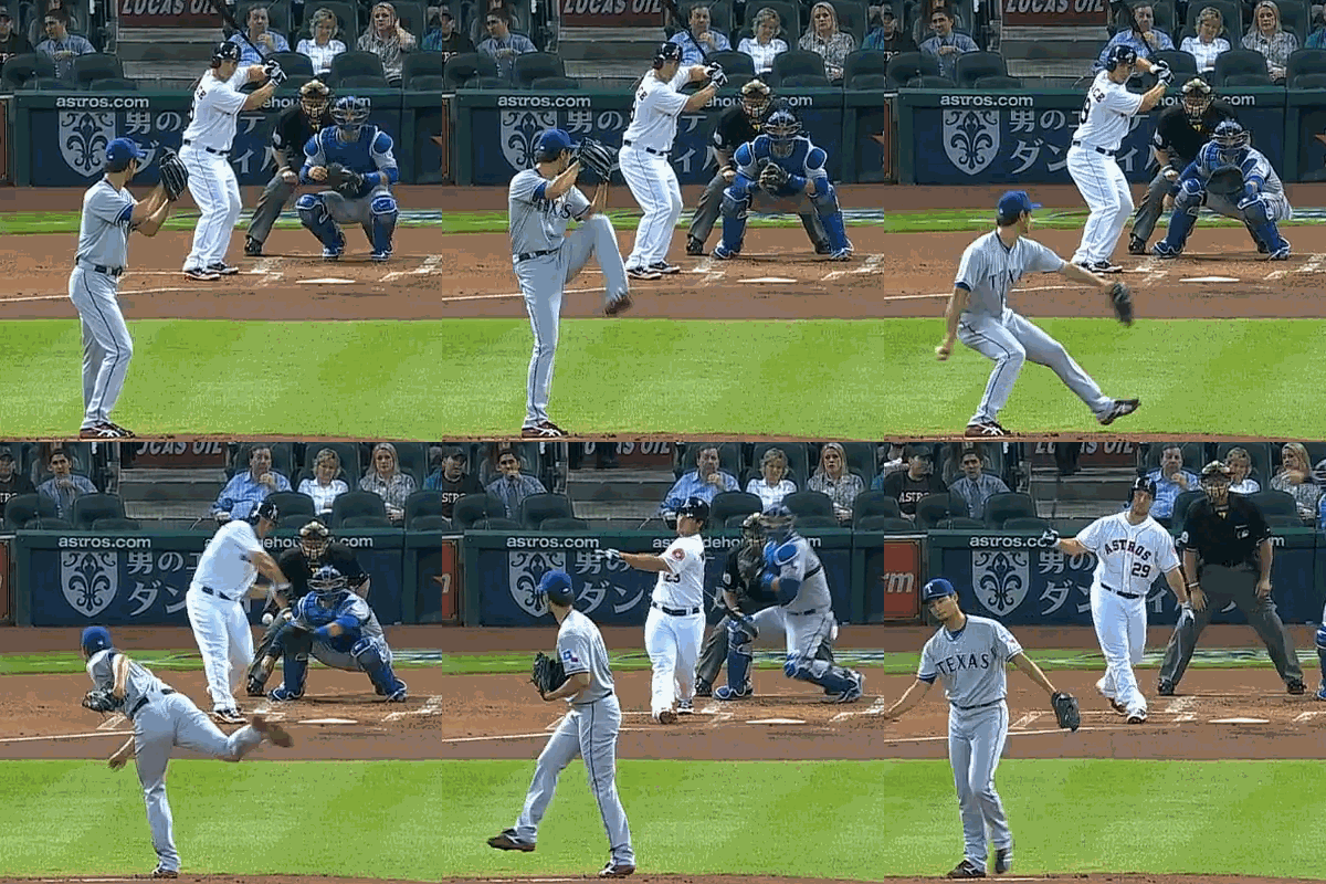
To begin, we can start with a single pitch to explain the methodology. The pitch we will use was one thrown by Yu Darvish to Brett Wallace on April 2nd of 2013 (seen in the GIF below screen-captured from the MLB.tv archives) [Note: I started working on this quite awhile ago, so the data is from 2013, but the methodology could be run for any pitcher or any year].
The pitch is classified by PITCHf/x as a slider and results in a swinging strikeout for Wallace. The pitch ends up inside on Wallace and, based purely on its final location, does not look like a good pitch to swing at, two strikes or not. In order to analyze this pitch in the proposed manner of projecting it to the front of the plate at progressively closer distances, we will start at 50 feet from the back of home plate (from which all distances will be measured) and remove the remaining PITCHf/x definition of movement (as is calculated, for example, for the pfx_x and pfx_z variables at 40 feet) from the pitches to create a projection that has constant velocity in the x-value of the data and only the effects of gravity deviating the z-value from constant velocity. This methodology is adopted from an article by Alan Nathan in 2013 about Mariano Rivera’s cut fastball. At a given distance from the back of home plate, the pitch trajectory between 50 feet and this point is as determined by PITCHf/x, and the remaining trajectory to the front of home plate is extrapolated using the previously discussed method.
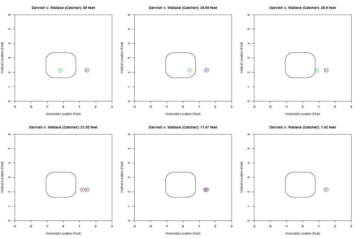
If we examine the above Darvish-Wallace pitch in this manner, the projection looks like this from the catcher’s perspective:
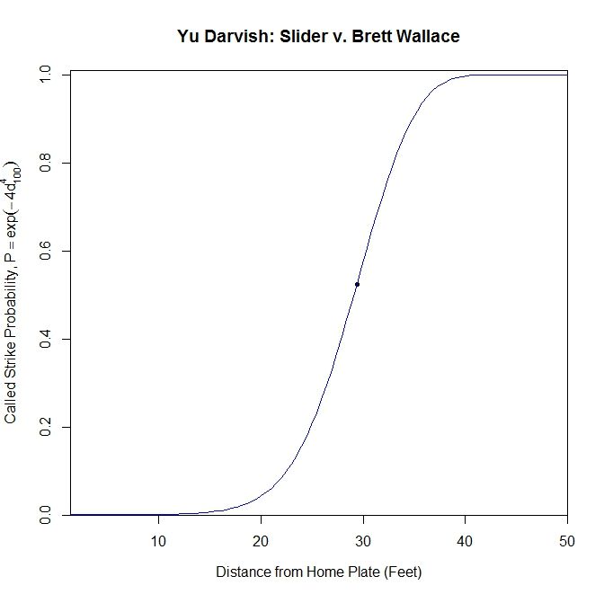
In the GIF, the counter at the top, in feet, represents the distance that we are projecting from. The black rectangular shape is the 50% called-strike contour, where 50% of the pitches passing through that point were called strikes, the inside of which we will call our “strike zone” (for a complete explanation of this strike zone, see the end of the article). Within the GIF, the blue circle is the outline of the pitch and the blue dot inside is the PITCHf/x location of the pitch at the front of the plate. The projection appears in red/green where red represents a lower-than-50% chance of a called strike for the projection and green 50% or higher. As one can see, early on, the pitch projects as a strike and as it comes closer to the plate, it projects further and further inside to the left-handed hitter. If we track the probability of the projection being called a strike, with our x-axis being the distance for the projection, we obtain:
Based on this graph, the pitch crosses the 50% called-strike threshold at approximately 29.389 feet (seen as a node on the graph). With this consideration, and the fact that the batter is not able to judge the location of the pitch with PITCHf/x precision, it seems reasonable that Brett Wallace might swing at this pitch.
We can also examine this from two other angles, but first we will present the actual pitch from behind as another point of reference:
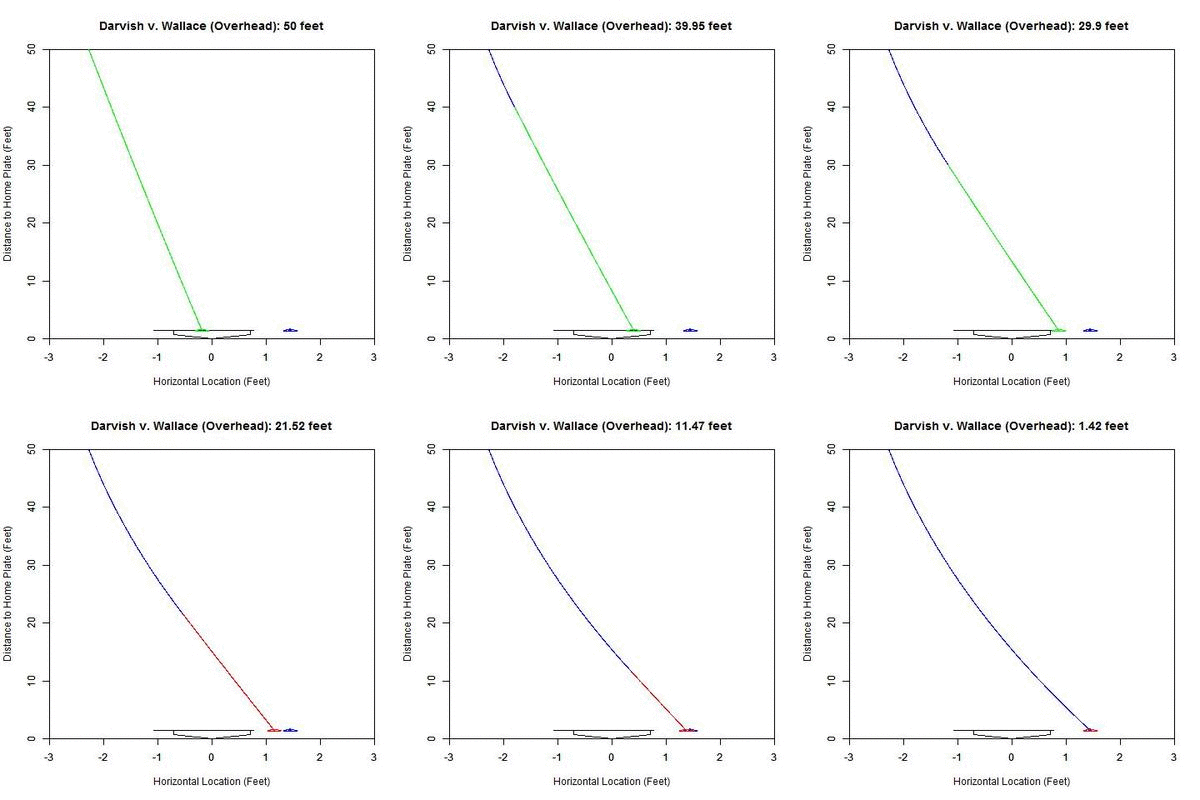
Now, we will look at an angle which is close to this new perspective: an overhead view.
The color palette here is the same as the previous GIF (blue is the actual trajectory in this case and red/green is as defined above) with the added line at the front of home plate indicating the 50% called-strike zone for the lefty batter. Note that since the scales of the two axes are not the same, the left-to-right behavior of the pitch appears exaggerated. The pitch projects as having a high probability of being called a strike early on and around 30 feet, starts to project more as a ball.
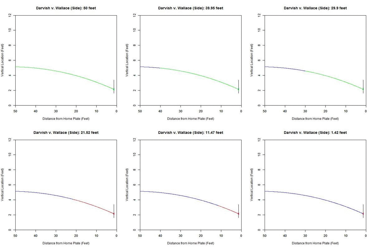
From the side, the pitch has nominal movement in the vertical direction, and so the projection appears not to move. However, the color-coding of the projected pitch trajectory shows the transition from 50%+ called-strike region to the below-50% region.
With this idea in mind, we can apply this to all pitches of a single type for a pitcher and see what information can be gleaned from it. We will break it down both by pitch type, as identified by PITCHf/x, and the handedness of the batter. We will perform this analysis on Yu Darvish’s 2013 PITCHf/x data and compare with all other right-handed pitchers from the same year.
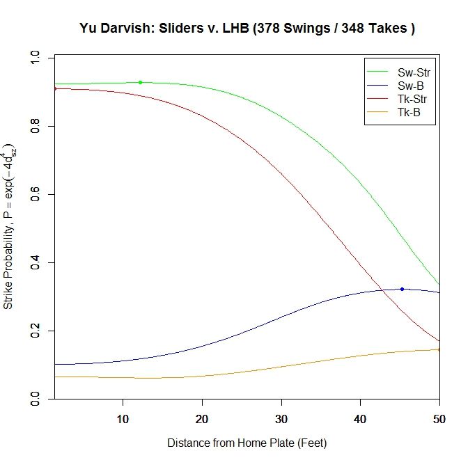
To begin, we will examine Yu Darvish’s slider, which, according to the data, was Darvish’s most populous pitch in 2013. Since we are dealing with a data set of over 1000 sliders, we will first condense the information into a single graph and then look at the data more in-depth. We will separate the pitches into four categories based on their final location at the front of the strike zone: strike (50%+ chance of being called a strike) or ball (less than 50%), and swing or taken pitch. We will take the average called-strike probability of the projections in each of these four categories and plot it versus distance to the plate for the projection.
For left-handed batters versus Darvish in 2013:
The color-coding is: green = swing/strike, red = take/strike, blue = swing/ball, orange = take/ball. Looking at just pitches that are likely to be called strikes, the pitches swung at have a higher probability of being called strikes throughout their projections, peaking at the node located at 12.167 feet (0.928 average called-strike probability for the projections) for swings and at 1.417 (0.91), the front of home plate, for pitches taken. The swings at pitches in the strike zone end at a 0.924 average called-strike probability. Both curves for pitches outside the strike zone peak very early and remain relatively low in terms of probability throughout the projection.
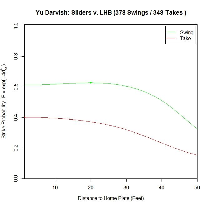
We can also group all swings together and all pitches taken together to get a two-curve representation.
For sliders to lefties, the probability of a called strike is higher throughout the projection for swings compared to sliders taken. Similar to the previous graph, the swing curve peaks before the plate, at 20 feet with a 0.627 average called-strike probability and ends at 0.613, whereas the pitches taken peak at the front of the plate with a called-strike probability of 0.402.
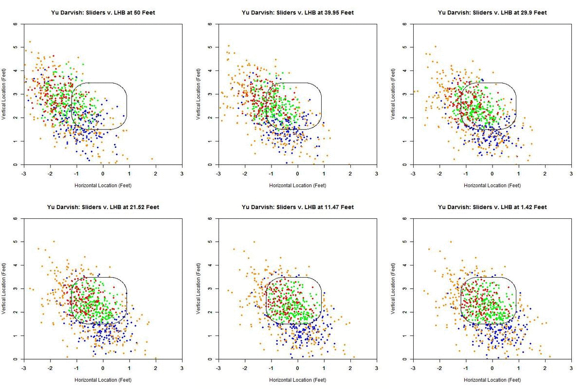
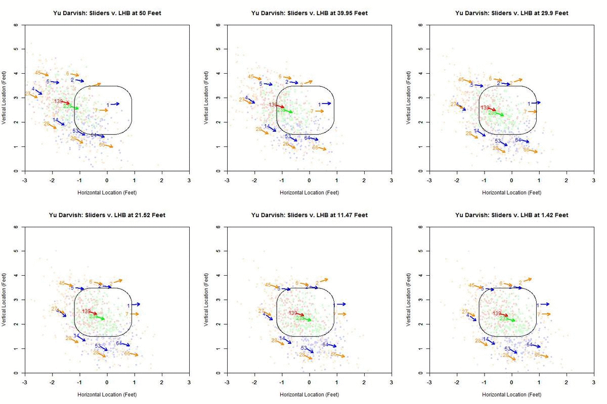
To examine this in more detail, we can look at the location of the projections as the pitches moves toward the plate, similar to the GIFs for the single pitch to Wallace. Using the same color scheme as the four-curve graph, we will plot each pitch’s projection.
Of interest in this GIF is the observation that most swings outside the zone (blue) are down and to the right from the catcher’s perspective. In particular, based on the projections, there appears to be a subset of the pitches with a strong downward component of movement that are swung at below the strike zone, while most other pitches have more left-to-right movement. In addition, the pitches taken are largely on the outer half of the strike zone to lefties. To better illustrate the progressive contribution of movement to the pitches, we will divide the area around the strike zone into 9 regions: the strike zone and 8 regions around it: up-and-left of the zone, directly above the zone, up-and-right of the zone, directly left of the zone, etc. In each of these 9 regions, we will display the number of swings and number of pitches taken as well as the average direction that the projections are moving as more of the actual trajectory is added in, or in other words, the direction that the movement is carrying the pitch from a straight line trajectory, plus gravity, in the x- and z-coordinates.
Note that the movement of the pitches is predominately to the right, from the catcher’s perspective, with some contribution in the downward direction. In the strike zone, the pitches taken have an average location to the left of those swung at. This may be due to the movement bringing the pitches into the strike zone too late for the hitter to react. Computing the percentage of swings in each region produces the following table:
| Darvish – Sliders vs. LHB | ||
| 10 | 25 | 0 |
| 12.9 | 62.8 | 12.5 |
| 33.3 | 65.4 | 49.2 |
From the table, where the middle square is the strike zone, we can see that the slider is most effective at inducing swings outside of the strike zone, which has a better percentage of swings than the strike zone itself (Note that some of these regions may contain small samples, but these can be distinguished by the above GIFs). Next is the strike zone, followed by the region directly down-and-right of the strike zone. Going back to the projections, pitches in the two aforementioned non-strike zone regions start by projecting near the bottom of the strike zone and, as they move closer to the plate, project into these two regions.
Putting these observations in context, the movement on the sliders from Yu Darvish to lefties may allow him to get pitches taken on the outer half of the plate, which is generally in the opposite direction of the movement, and swings on pitches down and inside, in the general direction of the pitch movement. This would signify that movement has a noticeable effect on the perception of sliders to lefties. Also of note is that the pitches up and left of the strike zone have very few swings among them, and those that were swung at are close to the zone. Again using movement as the explanation, the pitches project far outside initially and, as they near the plate, project closer to the strike zone, but not enough to incite a swing from a batter.
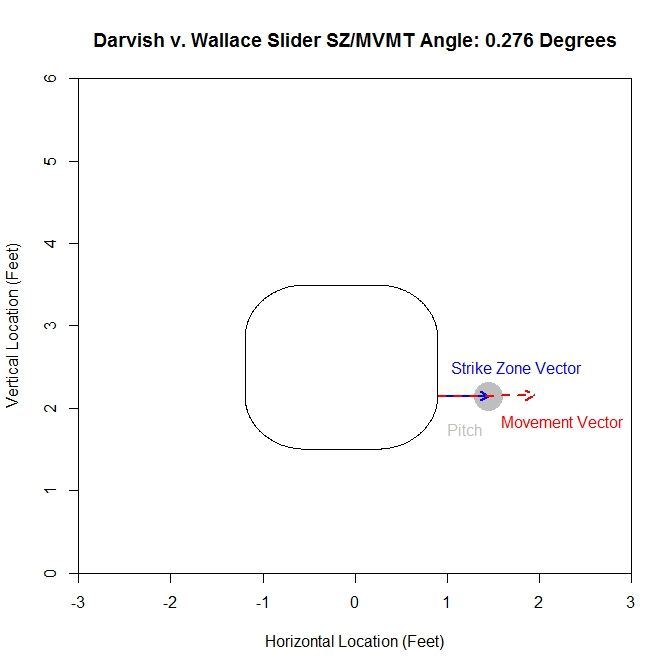
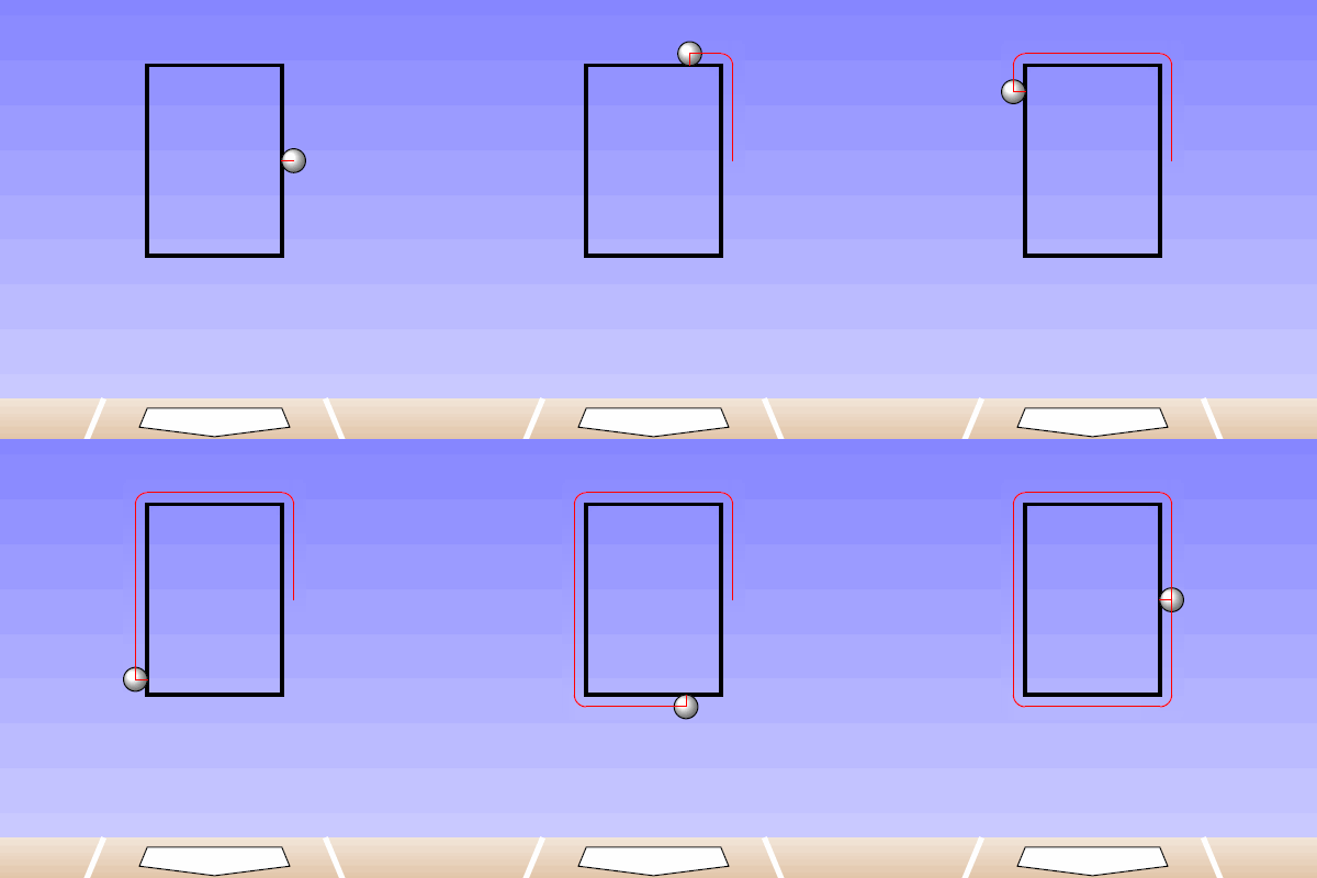
We can further illustrate these effects on the pitches outside the zone by treating the direction of the movement at 40 feet, taken from the PITCHf/x pfx_x and pfx_z variables, as a characteristic movement vector and finding the angle of it with the vector formed by the final location of the pitch and its minimum distance to the strike zone. So if the movement sends the pitch perpendicularly away from the strike zone, the angle will be 0 degrees; if the movement is parallel to the strike zone, the angle will be 90 degrees; and if the pitch is carried by the movement perpendicularly toward the strike zone, the angle will be 180 degrees. As an illustrative example, consider the aforementioned pitch from Darvish to Wallace:
In this case, the movement vector of the pitch (red dashed vector) is nearly in the same the direction as the vector pointing out perpendicular from the strike zone (blue vector). This means that the angle between the two is going to be small (here, it is 0.276 degrees). If the movement vector in this case were nearly vertical, lying along the right edge of the zone, the angle would be close to 90 degrees.
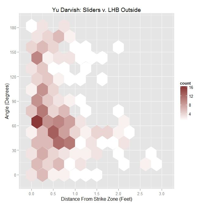
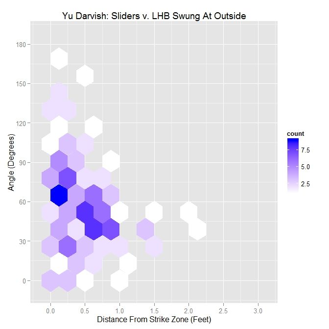
Taking the movement for all sliders thrown to lefties in 2013 by Darvish and finding the angle it makes relative to the vector perpendicular to the zone, we get the following hexplot:
Summing up the hexplot in terms of a table:
| Darvish – Sliders Outside the Zone v. LHB | |||||
| Angle | Percentage | Average Distance | |||
| Less Than 45 Degrees | 31.8 | 0.779 | |||
| Less Than 90 Degrees | 67.9 | 0.691 | |||
| All | X | 0.608 | |||
So 31.8% of the sliders thrown outside the strike zone to lefties had an angle of less than 45 degrees between the movement and the vector perpendicular to the strike zone. The average distance of these pitches from the strike zone was 0.779 feet. Increasing the restriction to less than 90 degrees, meaning that some part of the movement is perpendicular to the strike zone, we get 67.9% of pitches outside met this criterion with an average distance from the zone of 0.691 feet. Finally, for all pitches outside, the average distance was 0.608 feet.
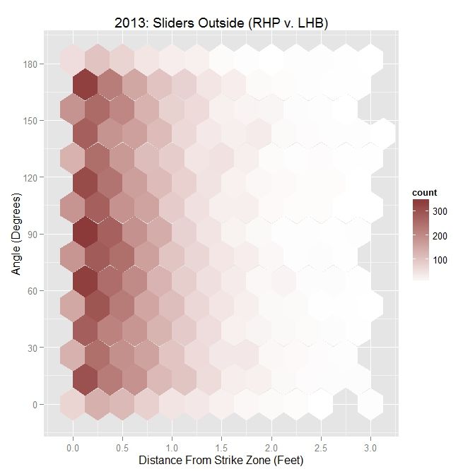
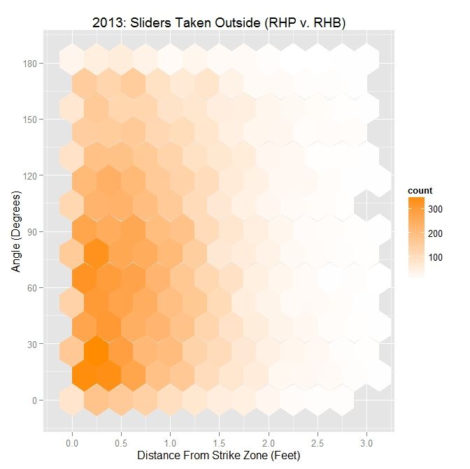
As a point of comparison, for all MLB RHP in 2013, the same analogous plot and table are:
| MLB RHP 2013 – Sliders Outside the Zone v. LHB | |||||
| Angle | Percentage | Average Distance | |||
| Less Than 45 Degrees | 25.3 | 0.652 | |||
| Less Than 90 Degrees | 52.6 | 0.624 | |||
| All | X | 0.606 | |||
Note that the range of possible angles is 0 to 180 degrees, with 25.3% lying in the 0-45 degree range and 52.6% in the 0-90 degree range. So based on this and examining the hexplot visually, the pitches are fairly uniformly distributed across the range of angles.
Comparing Darvish to other RHP in 2013, he threw his slider more in the direction of movement outside the zone. In particular, for angles less than 45 degrees, he threw his slider an average of 1.5 inches further outside compared to other MLB RHP. That disparity shrinks when restricting to less than 90 degrees and is virtually the same for all pitches outside.
While this observation on its own does not have much significance, we can look to see if this was an effective strategy by looking only at swings and seeing the effects.
| Darvish – Sliders Swung At Outside the Zone v. LHB | |||||
| Angle | Percentage | Average Distance | |||
| Less Than 45 Degrees | 39.9 | 0.59 | |||
| Less Than 90 Degrees | 83.2 | 0.526 | |||
| All | X | 0.478 | |||
Examining both the hexplot and the table, Darvish induced most of his swings outside of the strike zone with pitches having its movement at an angle of less than 90 degrees relative to the strike zone. Note that when the pitch is thrown outside the zone in the general direction of movement (an angle of less than 90 degrees), the pitch can still induce the batter to swing while pitches not thrown in this general direction are only swung at when very close to the zone. In particular, the majority of pitches that reach the farthest outside the zone and still lead to swings are in the range of 30 to 60 degrees. This is due to many of the swings outside the zone being below the strike zone, where the angle with the down-and-to-the-right movement will be in the neighborhood of 45 degrees.
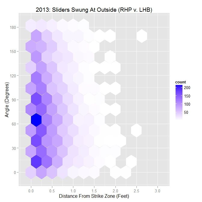
For all MLB RHP in 2013, the hexplot for swings produces a similar result:
| MLB RHP 2013 – Sliders Swung At Outside the Zone v. LHB | |||||
| Angle | Percentage | Average Distance | |||
| Less Than 45 Degrees | 31.8 | 0.436 | |||
| Less Than 90 Degrees | 64.3 | 0.421 | |||
| All | X | 0.405 | |||
From the hexplot, we can see that the majority of pitches swung at are at an angle of 90 degrees or less; 64.3% to be precise. For less than a 45-degree angle, the percentage is 31.8%. These are both up from the percentages from all pitches. As seen with the Darvish data, as the angle decreases, the average distance tends to increase.
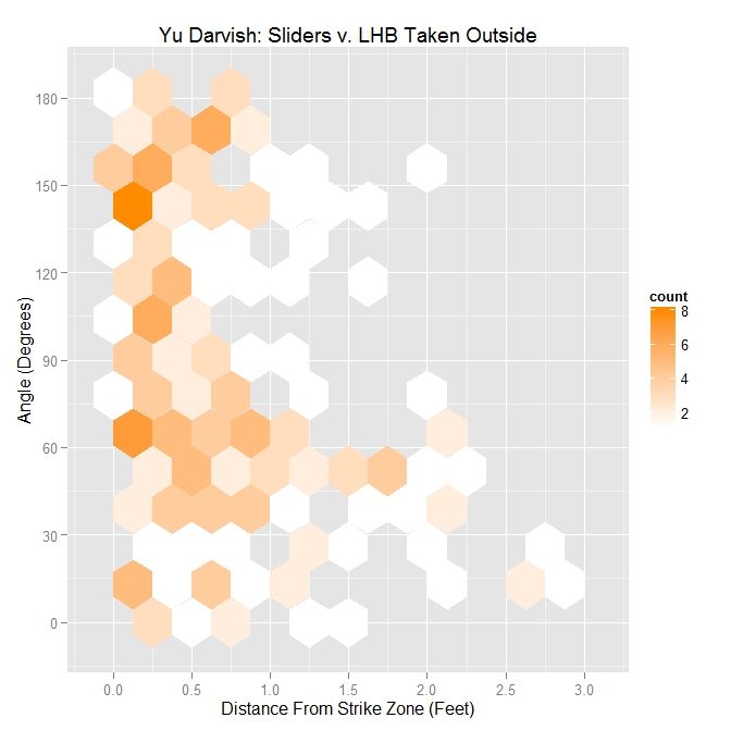
Finally, for pitches not swung at outside the zone, we get a complementary result to the swing data:
| Darvish – Sliders Taken Outside the Zone v. LHB | |||||
| Angle | Percentage | Average Distance | |||
| Less Than 45 Degrees | 26.3 | 0.976 | |||
| Less Than 90 Degrees | 57.4 | 0.854 | |||
| All | X | 0.696 | |||
Here, the percentages are lower than for swings and, while the largest distance is for small angles, there is a grouping of pitches present in pitches taken at angles greater than 90 degrees that is virtually nonexistent for swings. So for Darvish, throwing sliders outside the strike zone with an angle greater than 90 degrees does not appear to be a fruitful strategy, unless it plays a larger role in the context of pitch sequencing. To sum up this observation, it would appear that pitching in the general direction of movement outside the strike zone is a necessary but not sufficient condition for inducing swings from left-handed batters.
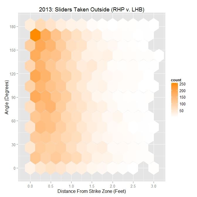
For MLB right-handed pitchers, this observations appears to still hold:
| MLB RHP 2013 – Sliders Taken Outside the Zone v. LHB | |||||
| Angle | Percentage | Average Distance | |||
| Less Than 45 Degrees | 22.1 | 0.809 | |||
| Less Than 90 Degrees | 46.7 | 0.765 | |||
| All | X | 0.708 | |||
As with Darvish, the percentages drop when comparing pitches taken to pitches swung at. The hexplot also bears this out, with the largest concentration of pitches taken outside the strike zone having an angle between movement and the strike zone vector of greater than 90 degrees. These results match in general with what we have seen with Darvish, and based on the numbers, Yu Darvish is able to play this effect to his advantage, with a larger-than-MLB-average percentage of sliders outside the zone to lefties with an acute angle.
Next, we will perform a similar analysis on sliders to righties. This will allow for comparison between the effects of the slider on batters from both sides of the plate.
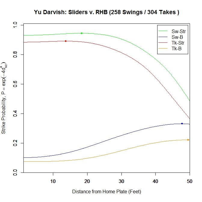
Once again, for pitches in the strike zone, the sliders swung at by righties have a higher probability of being called strikes than those taken. The peak for swings at strikes occurs at 18.333 feet (v. 12.167 feet for LHB) with a 0.945 called-strike probability and ending at 0.931, and taken strikes at 13.667 feet (v. 1.417 feet for LHB) with a 0.892 probability and ending at 0.885.
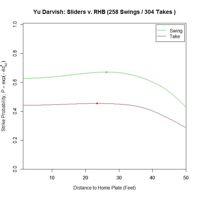
Just examining swings and pitches taken, the peak projected probability is earlier than for lefties at 26.25 feet with 0.672 probability and finishing at 0.629. It also peaks earlier for pitches taken, at 23.147 feet with peak and ending probabilities of 0.454 and 0.442, respectively. Comparing with the results for lefties, the RHB both swing at and take sliders with a higher probability of being called strikes, but have an earlier peak probability.
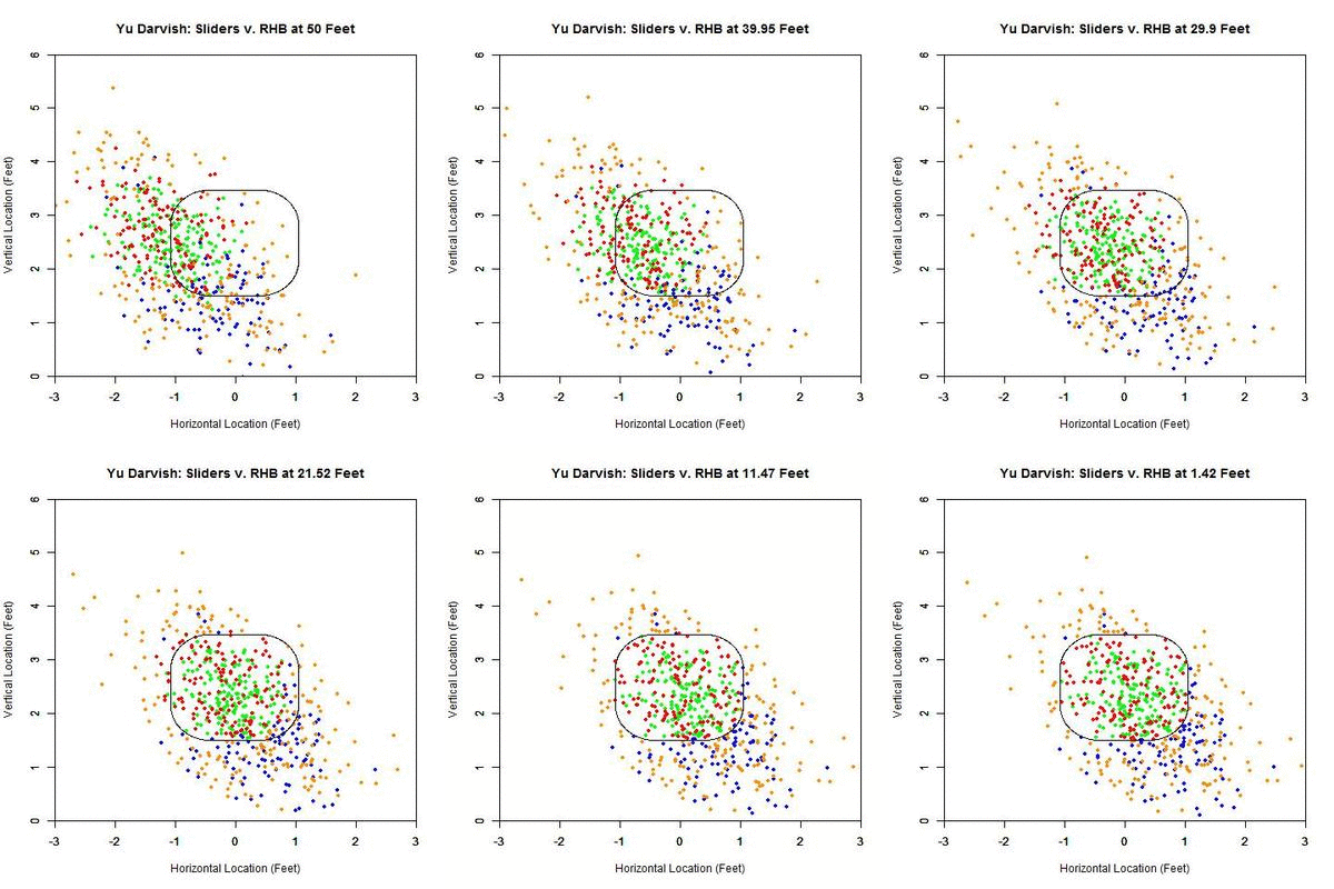
Breaking it down again in terms of the individual pitches:
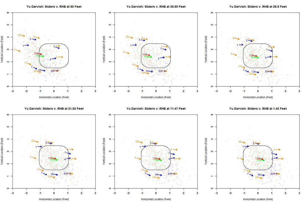
The plot here looks similar to that of the lefties. However, the pitches taken in the strike zone (red) appear more evenly distributed. In addition, the swings outside the zone (blue) appear to be more down and to the right and less directly below the strike zone. To confirm these observations, we can again simplify the plot to arrows indicating the direction of movement in each region and the number of each type of pitch in each region.
The table below gives the percentage of swings on pitches in each of the nine regions for Yu Darvish’s sliders to RHB:
| Darvish – Sliders vs. RHB | ||
| 4.3 | 15 | 16.7 |
| 0 | 54.3 | 26.7 |
| 38.9 | 42.1 | 46.3 |
To confirm the first observation, note that the red arrow (pitches taken) virtually overlaps with the green arrow (pitches swung at) in the strike zone. Examining the table, the value that differs the most, among the reasonably populated regions, is directly below the strike zone (42.1% to RHB v. 65.4% to LHB). One possible explanation for this is that some of the sliders ending up in this region to LHB have a stronger downward component of the movement than for RHB. This can be seen by comparing the two GIFs.
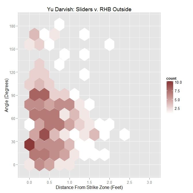
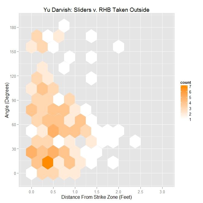
Moving on to the results for the angle between the movement and the strike zone vector, the hexplot is heavily populated by pitches thrown in the direction of movement:
Considering the same metrics for interpreting this plot as before:
| Darvish – Sliders Outside the Zone v. RHB | |||||
| Angle | Percentage | Average Distance | |||
| Less Than 45 Degrees | 42.3 | 0.587 | |||
| Less Than 90 Degrees | 78.9 | 0.618 | |||
| All | X | 0.572 | |||
From the table, we see that Yu Darvish threw 42.3% of his sliders to RHB with an angle of less than 45 degrees between the strike zone vector and the movement vector, up from 31.8% to LHB. Nearly 79% of his sliders outside the zone were thrown with an angle less than 90% degrees, again up from 67.9% to lefties. However, the average distance is down across the board as compared to lefties.
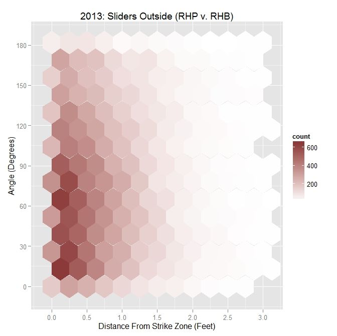
As a point of comparison, for MLB righties to right-handed batters, the distribution looks similar to that of Darvish:
| MLB RHP 2013 – Sliders Outside the Zone v. RHB | |||||
| Angle | Percentage | Average Distance | |||
| Less Than 45 Degrees | 31.6 | 0.671 | |||
| Less Than 90 Degrees | 62.4 | 0.664 | |||
| All | X | 0.673 | |||
Compared to Darvish, MLB RHP tend to throw a lower percentage of sliders with an angle less than 45 and 90 degrees. However, the MLB average distance from the strike zone is greater across the board.
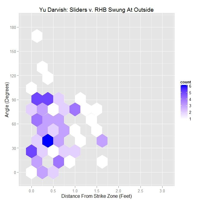
Now, isolating only swings:
| Darvish – Sliders Swung At Outside the Zone v. RHB | |||||
| Angle | Percentage | Average Distance | |||
| Less Than 45 Degrees | 46.8 | 0.513 | |||
| Less Than 90 Degrees | 86.2 | 0.558 | |||
| All | X | 0.512 | |||
For RHB versus LHB, Darvish’s percentages are up, if only by a few percent. The average distance for less than 45 degrees is down from 0.59 feet to LHB but up in the other two cases. This can be seen in the hexplot since the protrusion in the distribution is around 60 degrees rather than being closer to 45 degrees as before.
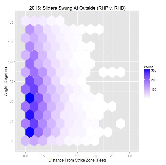
The 2013 MLB data shows a similar result, with a roughly triangular pattern in the hexplot, where the distance from the strike zone for swings increases as the angle between the strike zone vector and movement vector decreases.
| MLB RHP 2013 – Sliders Swung At Outside the Zone v. RHB | |||||
| Angle | Percentage | Average Distance | |||
| Less Than 45 Degrees | 32.3 | 0.437 | |||
| Less Than 90 Degrees | 64.8 | 0.427 | |||
| All | X | 0.417 | |||
As in the case of lefties, all metrics for Darvish are above MLB-average.
For the sliders taken by right-handed batters:
| Darvish – Sliders Taken Outside the Zone v. RHB | |||||
| Angle | Percentage | Average Distance | |||
| Less Than 45 Degrees | 39.8 | 0.634 | |||
| Less Than 90 Degrees | 74.9 | 0.656 | |||
| All | X | 0.605 | |||
For angles less than 45 degrees, the percentage of sliders taken outside is noticeably up, as compared with LHB (39.8% v. 26.3%) as well as for less than 90 degrees (74.9% v. 57.4%). This is not surprising since the distribution for all pitches was markedly different between batters on either side of the plate and, in this case, skewed toward the less-than-90-degrees region. The average distances are, however, down from the case for lefties.
Comparing Darvish to other RHP in 2013, the results are similar:
| MLB RHP 2013 – Sliders Taken Outside the Zone v. RHB | |||||
| Angle | Percentage | Average Distance | |||
| Less Than 45 Degrees | 31.3 | 0.781 | |||
| Less Than 90 Degrees | 61.3 | 0.777 | |||
| All | X | 0.788 | |||
In contrast to MLB RHP, Darvish’s sliders that are taken outside the strike zone are closer to it across the three measures. As before, Darvish’s sliders taken are thrown more in the direction of movement as compared to MLB righties in 2013.
Discussion
When constructing this algorithm, we need to choose a metric by which to group the pitches at each increment. In this case, we are using distance from the back of home plate. While this may be suitable for analyzing a single pitcher, when dealing with multiple pitchers or flipping the algorithm around and using it for evaluating a hitter, the variance in velocity of pitches in between pitchers may have an effect on the results. Therefore, it may be better, for working with multiple pitchers or a hitter, to use time as a metric instead. So rather than tracking the projections as y feet from home plate, we would use t seconds from home plate.
Using this method, with further refinement, we could potentially try to measure quantities such as “late break”. Granted, the PITCHf/x data is restricted to its parameterization by quadratic functions so even if aberrant behavior occurred near the plate, PITCHf/x would not be able to represent it. However if we define late break as x inches of movement over distance y from home plate (or t seconds from home plate), we could hope to quantify it. Based on how we construct the projection, such as including factors other than the PITCHf/x definition of movement, late break could be considered as a difference in perceived position at a distance versus the location at the front of the plate. As seen in the swing/take curves, after a certain distance, the probability of a called strike starts to drop off for Darvish’s sliders, and we could possibly choose, from that point on, to calculate late break for each pitcher. But to do this, we would first have to figure out all elements we wish to use, including movement, to make up pitch perception. As we have seen, for both Darvish and MLB RHP in general, throwing sliders outside of the strike zone in the general direction of movement (with less than a 90-degree angle between the movement vector and the vector perpendicular to the strike zone) elicits swings at a higher rate farther outside the strike zone. In the hexplot for swings, this takes the form of, roughly, a triangular shape of the data which widens in the distance direction as the angle decreases. This can also be seen in the GIFs for the blue pitches (swings outside of the strike zone).
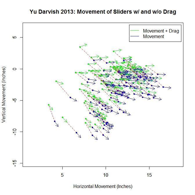
In addition, other elements could be added into this medley for attempting to model a hitter’s perception of a pitch as it approaches the plate. First, one could remove the drag from the movement, leaving it in the projection. Without running the projections, we can see how this would affect the results by looking at how the “movement” differs at 40 feet with and without drag. Pictured below is a subsample of the movement vectors at 40 feet for Darvish’s sliders based on the PITCHf/x definition, in green, and the movement without drag, in blue. The blue vectors are found based on Alan Nathan’s paper on the subject. The dashed red lines connect the same pitch for the different versions of movement. We can see that the movement without drag is larger in magnitude, and in the downward direction and to the right, meaning the projections would start higher and to the left. Comparing the movement vectors with and without drag, the average change in movement for the entire sample is 1.571 inches and the average change in angle between the pairs of vectors is 5.527 degrees. With drag left in the projection and out of the movement, the swing hexplots would likely take a more triangular shape with the angle between the vectors decreasing and shifting the data downward for the pitches outside the zone that were previously moving more laterally.
One could also affect the time to the plate for the pitches as well. As it stands, this approach assumes that the hitters have perfect timing and track pitches using a simple extrapolation approach. If one were to assume that the remaining velocity in the y-direction (toward the plate) was perceived as constant for the pitches, the hitters would be expecting the pitches to arrive faster than they actually are. This would lead to the projections appearing higher, since gravity would have less time to have an effect.
A rather large assumption that we are making is that batters can decouple vertical movement from gravity. Even in cases where the vertical movement is small, this will have an effect on the projected pitch location. This may also serve as an explanation as to why the sliders swung at below the strike zone do not always have a strong vertical component of movement.
Next time, we will look at Darvish’s four-seam fastballs, followed by his cut fastballs, in a similar manner. As we will see, certain pitches excel at inducing swings outside the strike zone when thrown in the general direction of movement while others show little to no benefit at all. We can also break down the pitches swung at by the result (in play, foul, swing-and-miss) to gain further insight.
Strike Zone Analysis
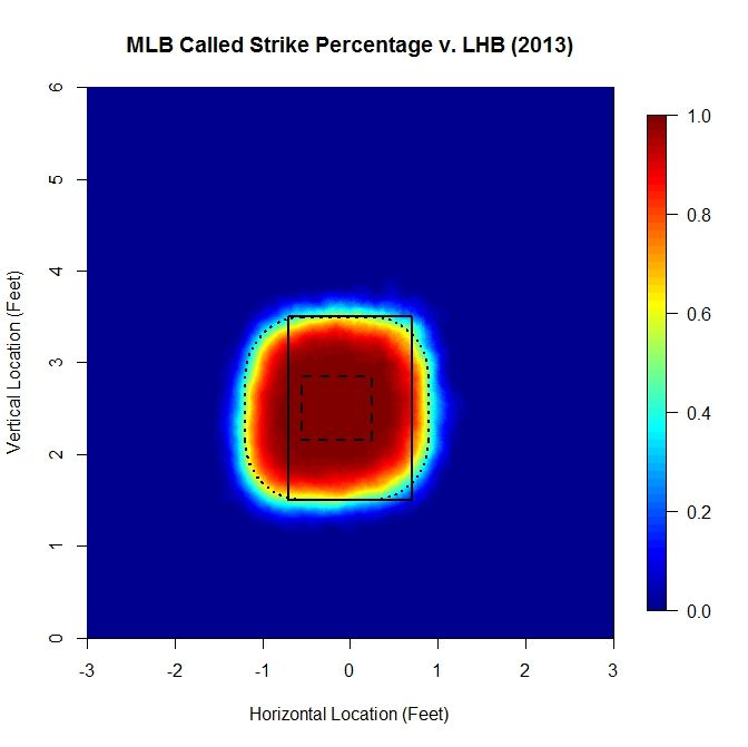
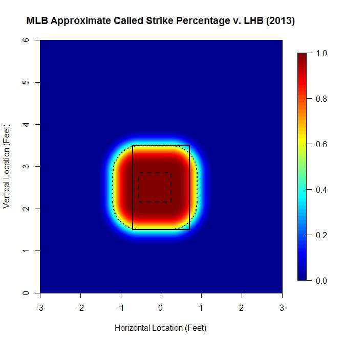
This section explains the calculation and choice of model for the probability of a called strike used in the above analysis. There have been a lot of excellent articles analyzing the strike zone, such as by Matthew Carruth, Bill Petti, and Jon Roegele, among others, and this method is derivative of those previous works. Our goal is the create an explicit piecewise function that reasonably models the probability that a pitch will be called a strike, based on empirical data. However, rather than treat the data as zero-dimensional (no height, width, or length for each datum), we represent each pitch as a two-dimensional circle with a three-inch diameter. Then, over a sufficiently refined grid, we calculate the number of 2D pitches that intersected each point that were called strikes divided by the number of 2D pitches that were taken (ball or strike). This gives the percentage of pitches that intersected each point that were called strikes. This number provides an empirical estimate of a pitch passing through that point being called a strike. The advantage of taking this approach is that we do not impose any a priori structure on the data, which can happen when using methods such as binning or model fitting to the zero-D data. It also conforms with using a 2D strike zone to perform the analysis by representing the data fully in 2D. Note that since using all MLB data from 2013 to generate these plots, we have a large enough data set that we do not get jumps or discontinuities for the strike zone that may occur for smaller data sets, such as for a single pitcher. As an example, the called-strike probability for LHB in 2013 looks like:
The colormap on the right gives the probability of a pitch at each location being called a strike, based on the data. The solid rectangle represents the textbook strike zone (with 1.5 and 3.5 vertical bounds), and the two dashed lines will be explained concurrently with the model.
For the model, we assume a small region where the probability of a called strike is essentially 1, which, in the graph, is the long-dashed line. Far outside the strike zone, will assume that the probability that a pitch is called a strike is essentially zero. In between, we need a way to model the transition between these two regions. To do this, we will adopt a general exponential decay model of the form exp(-a x^b), where a and b are parameters. In this case, we take x to be the minimum distance to the probability-1 region of the strike zone (long-dashed line). Since there is some flexibility in how we choose the probability-1 region and the subsequent parameters, we will do this less rigorously than could be done in order to keep things simple.
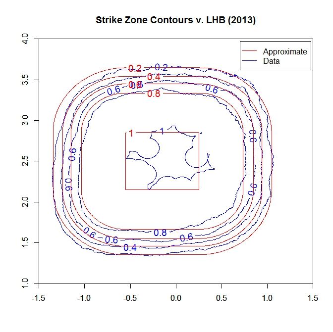
First we examined slices of the empirical data in profile and found that experimenting with the probability-1 region bounds and a, b values, a value around 4 for b worked well at matching the curvature. Then a choice of a equal 4 was found similarly via guess-and-check. Finally the probability-1 region was adjusted to make the model match the data based on a contour plot for each (see below). For lefties, the probability-1 region is [-0.55,0.25] x [2.15,2.85] feet.
Note that we do a decent job of matching the contours outside of the lower-right and upper-left regions, where there is some deviation. This can be adjusted for by changing the shape of the probability-1 area, but this increases the complexity of calculating the minimum distance. When plotting the model for the probability:
Here, the solid and long-dashed lines are as before, and the dotted line is the 50% called-strike contour from the model, which is used as the boundary of the strike zone in the above analysis. While the shape of the strike zone may seem unconventional, it is a natural approach for handling the zero-dimensional PITCHf/x data. For example, if we place a pitch on the edge of the rectangular textbook zone, a so-called borderline pitch, and track the path that the center would make as it moved around the rectangle, it would trace out a similar shape.
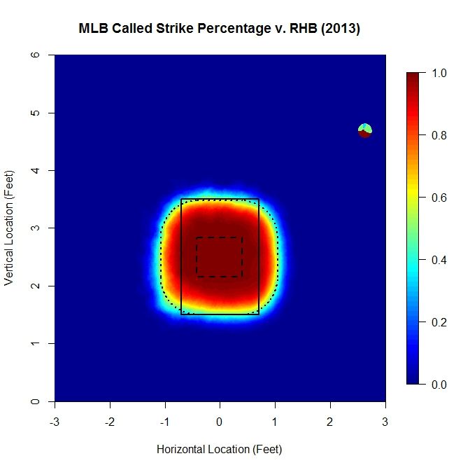
For RHB, the heat map is much more balanced, left to right, making the fit much closer than could be achieved for LHB.
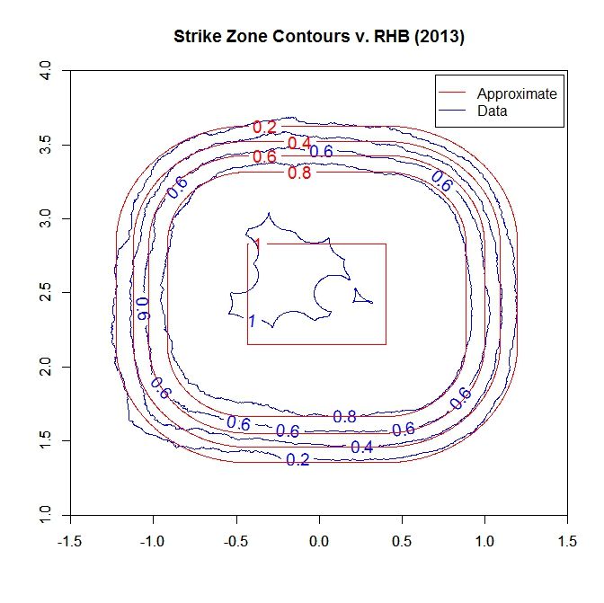
Again, the top and bottom of the 50% called-strike contour lies near 3.5 and 1.5 feet, respectively. Examining the contour map:
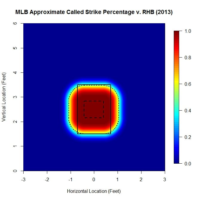
Here, the identified contours fit well all around. The called-strike probability, with the model applied, is:
In this case the probability-1 region is [-0.43,0.40] x [2.15,2.83] feet.
So, overall, the RHB called-strike probability model fits much better, especially in the corners, than for LHB. In order to properly fit the called-strike probability to such a model, one would first need to have a component of the algorithm that adjusts the probability-1 area, both by location and size, and possibly by shape. Then the parameters for the decay of the strike probability could be fit against the data. The probability-1 area could then be adjusted and fit again, to see if the overall fit is better. This might work similar to a simulated annealing process. However, for our purposes, sacrificing the corners for LHB seems reasonable to maintain simplicity of method and calculations.
In closing, if you made it this far, thank you for reading to the end.
Matthew Mata is a mathematician, specializing in applied mathematics and scientific computing. He can be reached via email here. Follow his sporadic tweets on Twitter @arcarsenal8.

Whoa. I haven’t read this all yet (I plan to later when I have time) but it already looks very impressive.
I want dat source code.
Amazing work!