Author Archive

Progressive Pitch Projections: Four-Seam Fastballs (+ PITCHf/x Simulation)

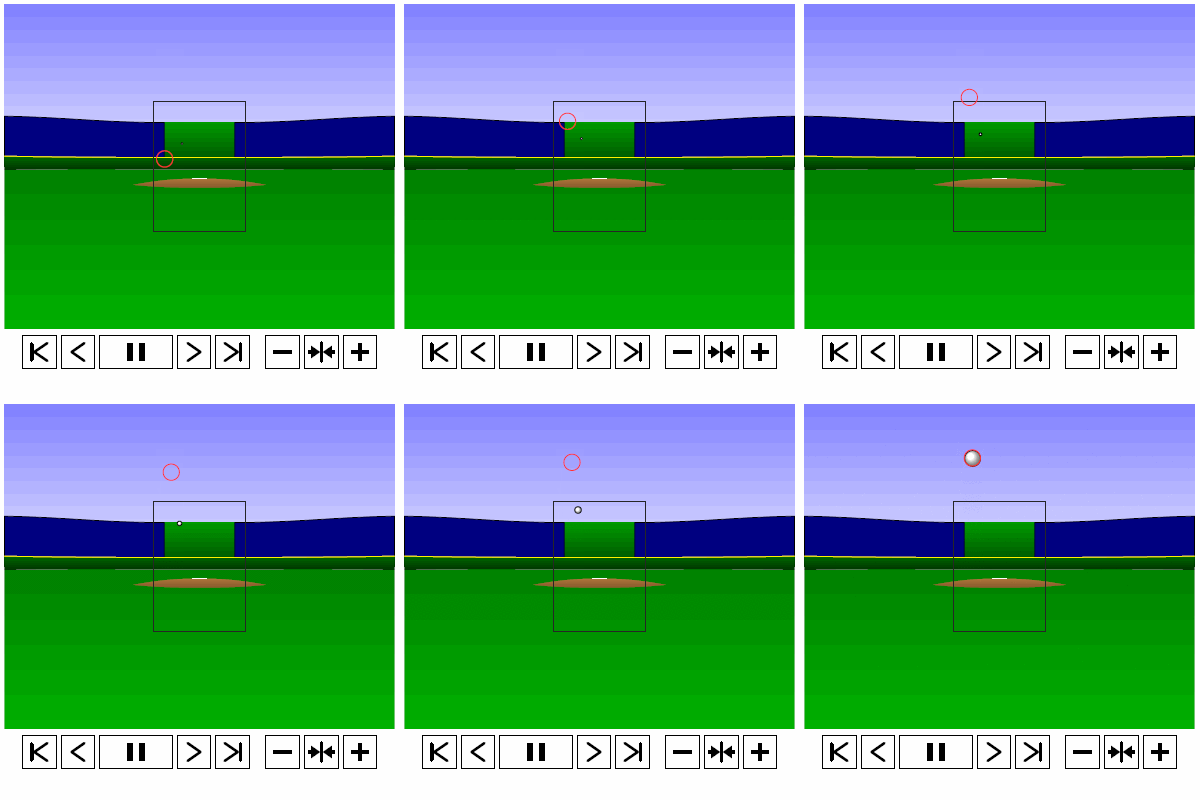
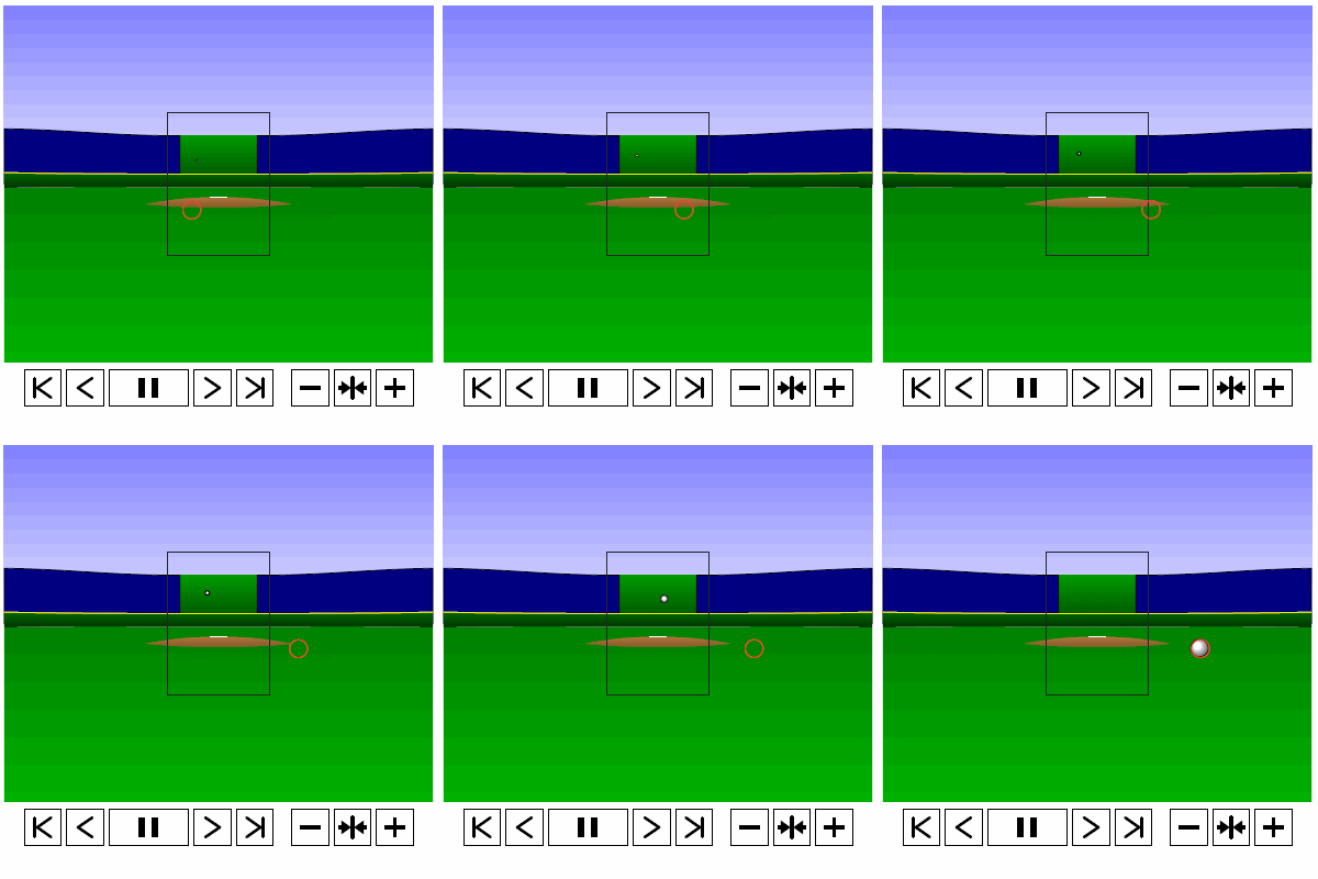
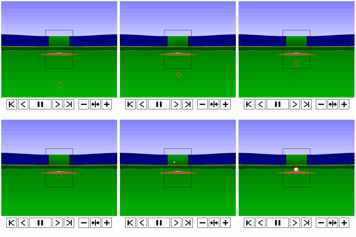
Last time, we analyzed Yu Darvish’s sliders in terms of when they projected as strikes and how pitch movement affected perception, leading batters to swing at pitches outside of the strike zone in the direction of the pitch movement. This time, we will turn our focus to four-seam fastballs. As before, we are using the 2013 data set since the algorithms for this were run before the completion of the 2014 season. To start, we can examine a four-seam fastball from Yu Darvish, his second-most thrown type of pitch in 2013, via simulation using the nine-parameter PITCHf/x data for its trajectory. The chosen fastball from Darvish was thrown roughly down the middle of the strike zone and we also track the projection of the pitch as it approaches the plate.

 photo Darvish_FF_Middle.gif

Note that the pitch, in this case, is simulated at one-quarter actual speed. The strike zone shown is the standard width of the plate and 1.5 to 3.5 feet vertically. The red circle represents the projection of the pitch after removing the remaining PITCHf/x definition of movement from its current location (Note that while the simulation shown above is a GIF, the actual simulation is an interactive PDF where the controls at the bottom of the image can play, rewind,  slow down, etc. the simulation. This is discussed at the end of the article for the interested reader, including a link to several interactive PDFs as well as a tutorial for the controls and the source code written in TeX). Here, the movement causes the pitch to rise, giving the pitch in the simulation a “floating” quality as it never seems to drop.

As in the previous work on sliders, we will start by splitting the four-seamers into four groups based on the pitch location and the batter’s response: strikes (pitches with a 50% chance or better of being called a strike) and balls (lower than 50% chance of being called a strike), and swings and pitches taken. Working with the projections to the front of the plate after removing the remaining movement on the pitch, we can examine how attractive (in terms of probability that the projection will be called a strike) pitches in each of these four categories, on average, are to batters incrementally as they approach the plate.

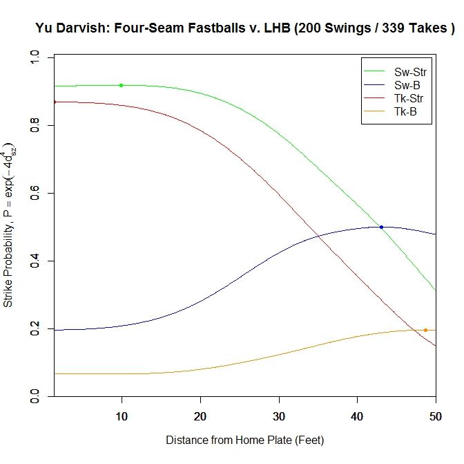
To begin, for left-handed batters versus Darvish in 2013:

 photo Darvish_ST_BS_FF_LHB.jpeg

For both types of pitches in the strike zone (red=taken, green=swung at), the average probability of the pitch being called a strike levels off around 20 feet, with strikes swung at peaking at probability 0.919 at 9.917 feet from home plate, then dropping to 0.917 at the plate. Strikes taken reach their maximum at the front of the plate with probability 0.869. The four-seamers swung at outside of the strike zone (blue) average around 0.5 probability of being called a strike up until around 30 feet, before dropping off. The fastballs taken outside the zone (orange) tend to project as low-probability strikes initially and remain so to the front of the plate.

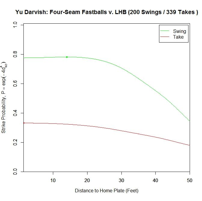
We can simplify this graph to include only swings and pitches taken.

 photo Darvish_ST_FF_LHB.jpeg

Once again, pitches swung at project as better pitches throughout than those taken. The peak for swings is at 14.083 feet with probability 0.782, and finishes at 0.777. The pitches taken keep increasing in attractiveness all the way to the front of the plate, reaching a called-strike probability of 0.332.

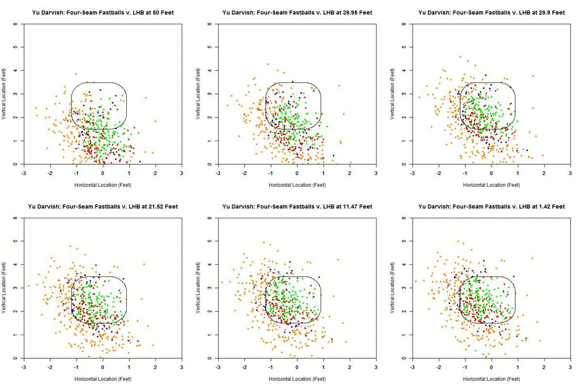
To further examine what is happening in these graphs, we can view the location of these projections from 50 feet to the front of home plate. The color scheme is the same as the four-curve plot above.

 photo Darvish_Pitch_Proj_FF_LHB_250ms.gif

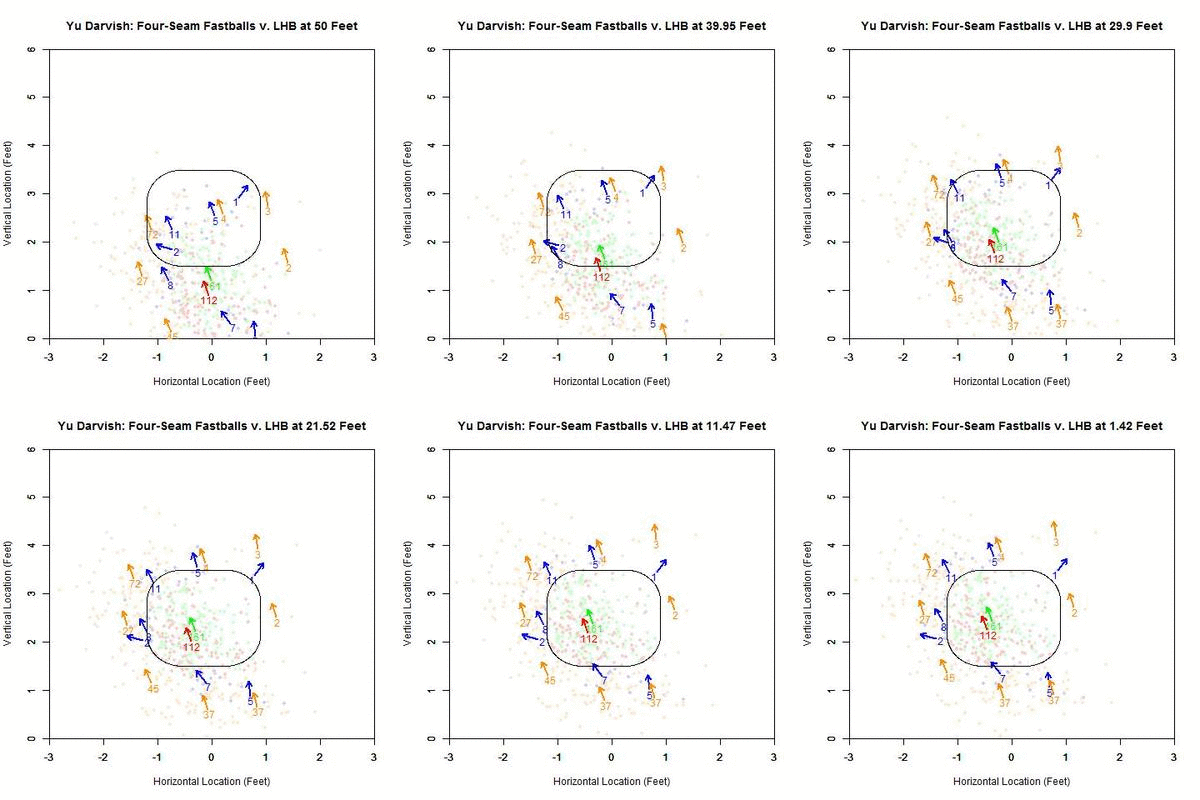
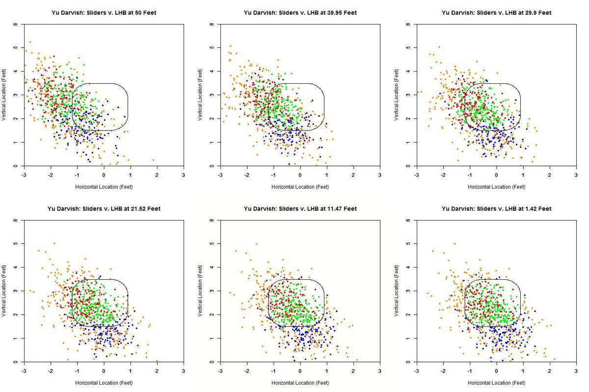
Focusing on the blue projections for the moment (swings outside the strike zone), the projections down and to the right of the zone are carried by movement toward the strike zone and most end up as borderline strikes. Those up and to the left project further and further outside the strike zone as they approach the plate, since their direction of movement is roughly perpendicular to the strike zone contour. To get a better idea of the number of each of the four cases in nine regions in and around the strike zone, we can fade the data into the background and replace it in each region by an arrow indicating the direction that the average projection for that area is moving and the number of pitches of that case located there.

 photo Darvish_Pitch_Proj_Gp_FF_LHB_250ms.gif

Focusing first on the pitches in the strike zone, there is a dearth of projections in the upper-right area, which would be on the inside half of the plate to LHB. The pitches taken in the strike zone tend to skew slightly down and to the left, relative to those swung at. Note that in many of the regions around the strike zone, the samples are quite small so it may be difficult to draw any strong conclusions. With this in mind, these results can be summarized in the following table where the center cell represents the swing percentage in the strike zone and all other cells contain the percentage of swings in that region.

Darvish – Four Seamers vs. LHB
13.3 55.6 25
22.9 59 0
4.3 15.9 11.9

The region with the highest swing percentage is the strike zone, at 59%. The region with the next highest percentage is above the strike zone, which is in the general direction of movement, but here there are only nine data points to rely on for this percentage. It would seem that the regions that induce swings are those where the pitches project in the strike zone and are carried out by movement (above and above-and-left of the zone) and where the pitches project as balls but movement is carrying them toward the zone (below and below-and-right of the zone). Notice that the area below and left of the strike zone has 47 pitches thrown there and only 2 swings, which is where the movement parallels the strike zone.

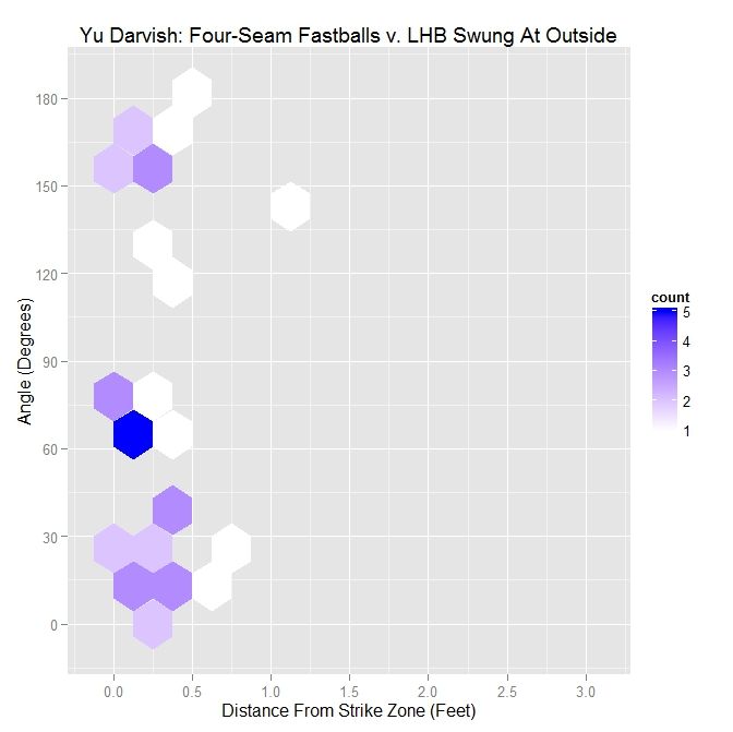
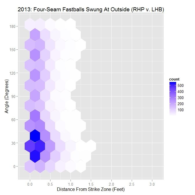
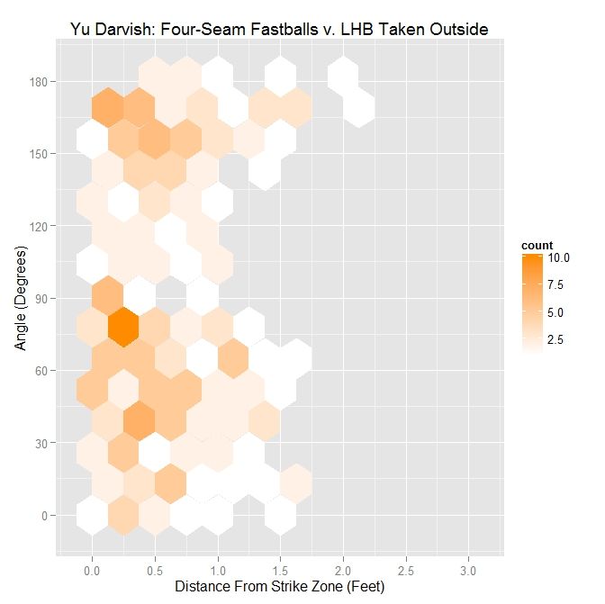
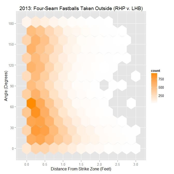
It would appear, based on these observations, that the location of the pitch, relative to the direction of the movement, has an influence on generating swings outside the strike zone. As with the sliders in the previous article, we will use, as a measure of if the pitch is thrown outside in the direction of movement, the angle between the movement of the four-seam fastballs at 40 feet (the pfx_x and pfx_z variables in the PITCHf/x data set) outside the zone and a vector perpendicular to the strike zone extending to the final location of the pitch at the front of home plate. An angle of zero indicates that the movement of the pitch carried it perpendicularly away from the strike zone. Ninety degrees means that the pitch projection parallels the strike zone due to movement. A one-eighty degree angle means that the pitch is being carried by movement perpendicularly toward the strike zone. Further explanation, including a visual depiction, can be found in the link to the previous article at the top of this page.

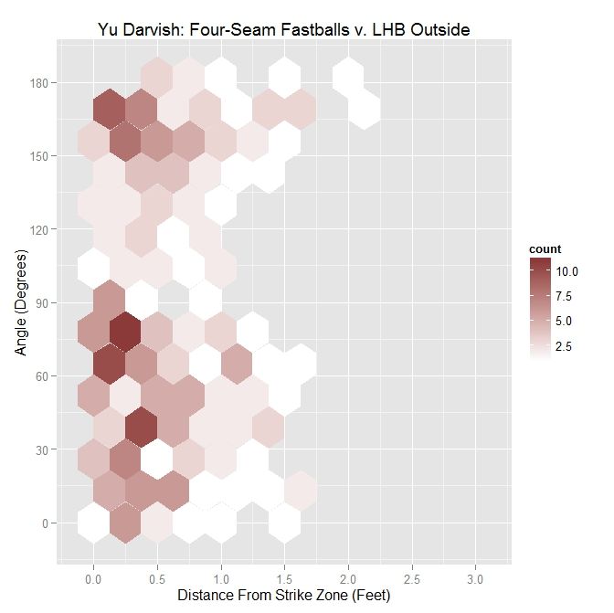
To begin, we will look at the distribution of angle versus distance from the strike zone for all of Darvish’s four-seamers outside the zone to lefties.

 photo Darvish_Out_FF_LHB.jpeg

Darvish – Four Seamers Outside the Zone v. LHB
Angle Percentage Average Distance
Less Than 45 Degrees 28.9 0.546
Less Than 90 Degrees 58.6 0.517
All X 0.553

The distribution, in this case, seems slightly skewed toward having pitches thrown in the general direction of movement. This visual assessment is supported by the percentages in the table (sorted by angle and average distance from the strike zone contour in feet. e.g., 0.5 = 6 inches, 0.33 = 4 inches), with nearly 29% of pitches having an angle of less than 45 degrees and over 58% with an angle less than 90 degrees. The distribution does not seem to have definitive shape.

 photo MLB_Out_FF_RHP_LHB.jpeg

MLB RHP 2013 – Four Seamers Outside the Zone v. LHB
Angle Percentage Average Distance
Less Than 45 Degrees 37.5 0.557
Less Than 90 Degrees 61.9 0.501
All X 0.477

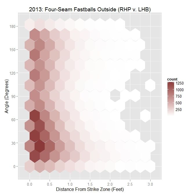
For all MLB right-handed pitchers in 2013, including Darvish, the distribution is much more clear. There is a swell of pitches thrown with angle between 0 and 90 degrees and within six inches of the strike zone, with 37.5% thrown with an angle of less than 45 degrees, and 61.9% with an acute angle. In conjunction, as the angle increases, the average distance from the strike zone decreases. To get a better handle on the ramifications of this choice of pitch locations, we can further sort the data into swings and pitches taken.

 photo Darvish_Out_Swing_FF_LHB.jpeg

Darvish – Four Seamers Swung At Outside the Zone v. LHB
Angle Percentage Average Distance
Less Than 45 Degrees 43.6 0.315
Less Than 90 Degrees 69.2 0.232
All X 0.248

For Darvish, nearly 44% of the pitches swung at had an angle between the vector perpendicular to the strike zone and the movement vector of less than 45 degrees. For those less than 90 degrees, this percentage jumps to nearly 70%. In addition, the average distance outside with angle less than 45% is an average of 4 inches outside whereas, overall, the average is about 3 inches in all directions. We can compare this to Darvish’s right-handed colleagues in 2013:

 photo MLB_Swing_Out_FF_RHP_LHB.jpeg

MLB RHP 2013 – Four Seamers Swung At Outside the Zone v. LHB
Angle Percentage Average Distance
Less Than 45 Degrees 46.9 0.267
Less Than 90 Degrees 66.8 0.248
All X 0.238

For MLB righties, the largest area of swings is right around a 30-degree angle. Close to half of the swings, 46.9% to be exact, occur when the angle is less than 45 degree and over two-thirds are for pitches in the general direction of movement. The average distance on four-seamers swung at outside is close to Darvish’s overall, but is almost an inch further out for Darvish for 45-degree or less angles. So for RHP to LHB, pitches thrown in the neighborhood of 30 degrees and within a half-foot of the strike zone tend to induce swings, which is also seen for Darvish. We can now look at the complement of this, pitches taken outside, to see how this distribution compares to swings.

 photo Darvish_Out_Take_FF_LHB.jpeg

Darvish – Four Seamers Taken Outside the Zone v. LHB
Angle Percentage Average Distance
Less Than 45 Degrees 26.4 0.611
Less Than 90 Degrees 56.8 0.577
All X 0.605

The distribution for Darvish on pitches taken has some semblance to that for all pitches, but the percentages have dropped in all cases. In addition, the average distances across the board are over six inches outside.

 photo MLB_Take_Out_FF_RHP_LHB.jpeg

MLB RHP 2013 – Four Seamers Taken Outside the Zone v. LHB
Angle Percentage Average Distance
Less Than 45 Degrees 35.1 0.654
Less Than 90 Degrees 60.7 0.571
All X 0.537

For all MLB RHP in 2013, the pitches taken by LHB outside the strike zone are largely located below 90 degrees, with a large number near 60 degrees. Compared to the case of all pitches outside the strike zone, the percentages are not all that dissimilar, but the distances are slightly larger. Putting the two hexplots together to see how they form the plot for all outside pitches, we see that what appears to be one large grouping of data below 90 degrees for all pitches separates into two smaller groupings: one around 30 degrees for swings and one around 60 degrees for pitches taken.

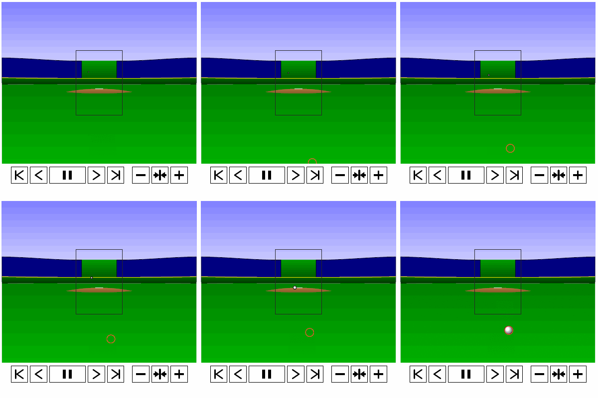
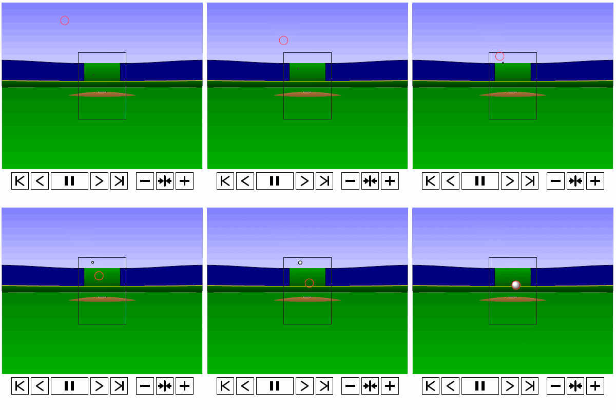
To examine why it might be the case that pitches thrown in the direction of movement, meaning a small angle between the movement vector and the vector perpendicular to the strike zone, are swung at more frequently and are more effective at inducing swings further from the strike zone than those that are not, we can take a four-seamer thrown by Darvish above the strike zone and examine both the trajectory of the pitch and its projection. We can again simulate such a pitch (at quarter speed) via the PITCHf/x data for Darvish. Note that since the below simulation does not possess the same computational capabilities as the rest of the code, which is done in R, we use the standard strike zone as a reference rather than the 50% contour.

 photo Darvish_FF_Top.gif

Based on the simulation and associated projection, we can see that the pitch projects as a strike early on and, late in its trajectory, appears to be a ball. The important observation for this is that, for some part of its flight, the pitch does appear that it may be a strike. Similarly, for a pitch below the strike zone, we see the opposite result.

 photo Darvish_FF_Bottom.gif

One can see the problem with getting a batter to swing at a pitch such as this. It starts out as looking like a pitch in the dirt and, through its path to the plate, only slightly improves its chances of being called a strike, and at no point really gives the batter much incentive to swing at it. Thus it makes sense that a batter might swing at a four-seam fastball high above the strike zone but not one a similar distance beneath.

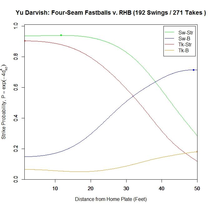
Performing the same analysis for right-handed batters, we again start with Darvish’s results for the four-seam fastball in terms of ball/strike and swing/take.

 photo Darvish_ST_BS_FF_RHB.jpeg

Here, the swing/strike curve peaks at probability 0.94 at 11.667 feet and finishes at 0.937. These probabilities are slightly higher than those for lefties at the maximum and at the front of the plate. The pitches taken in the strike zone peak at the plate with probability 0.904, compared to 0.869 for LHB. For both cases of pitches outside the strike zone, they reach their maximum very early in the trajectory and drop off afterward.

 photo Darvish_ST_FF_RHB.jpeg

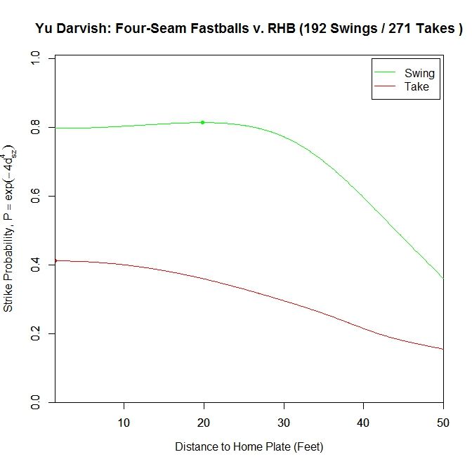
Changing to the two-curve representation for four-seam fastballs to right-handers, the swing curve reaches its apex of probability 0.814 at 19.833 feet and ends with probability 0.797 at the plate. For pitches taken, the average strike probability increases throughout the trajectory, ending at 0.411. Once again, these probabilities are higher than for left-handed batters.

 photo Darvish_Pitch_Proj_FF_RHB_250ms.gif

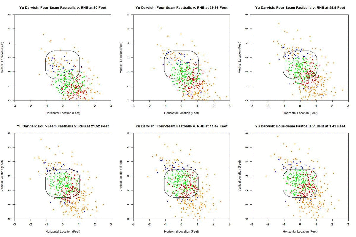
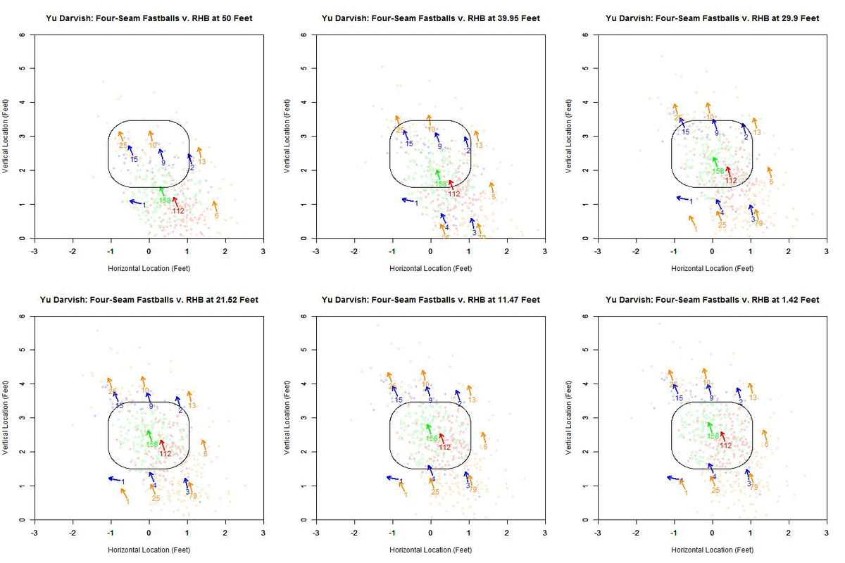
As before, we can switch to the discrete data and their projections as the pitches near the front of home plate. Of note is that the pitches taken (red data points) are, by and large, down and to the right of the strike zone from the catcher’s perspective, which is in the opposite direction that the movement influences the pitches as they approach the plate. In addition, the majority of swings outside the strike zone, the blue data points, leave the strike zone in the direction of movement. Also of interest is that the pitches fill up the strike zone more against RHB, while four-seamers to LHB were lacking for the inner half of the strike zone. For the pitches swung at outside the strike zone in the opposite the direction of movement, down and to the right, they end up very close the strike zone contour, making them boarderline strikes, and thus nominally classified outside the zone. To observe these phenomena more succinctly, we can switch to a vector representation indicating the number of pitches and the direction that the projections are headed for each of the nine regions in and around the strike zone.

 photo Darvish_Pitch_Proj_Gp_FF_RHB_250ms.gif

Of the 270 pitches in the defined strike zone, the average location of the 112 taken were down and to the right of those swung at, as represented by the red and green arrows. To quantify the percentage of swings in each of the nine regions, we can refer to the below table, aligned spatially with the data from the GIF (center square being in the strike zone).

Darvish – Four Seamers vs. RHB
37.5 47.4 13.3
X 58.5 0
50 13.8 3.7

Based on these results and for regions with more than a handful of pitches, the highest percentages of swings outside the strike zone are in the upper and upper-left regions, in the direction of movement. The lower-left corner is large as well but can be disregarded as it only contains two pitches, one of which was swung at. Also, it is hard to draw any conclusions to the left of the plate since there is no data.

We can now turn our attention to pitches outside the zone for both Darvish and other MLB righties in 2013:

 photo Darvish_Out_FF_RHB.jpeg

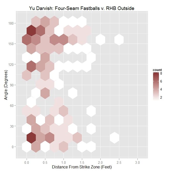
First, for Darvish, the distribution of pitches, when viewed by plotting distance from the strike zone versus angle between the perpendicular vector to the strike zone and the movement vector, appears bimodal with a large grouping both above and below the 90-degree mark.

Darvish – Four Seamers Outside the Zone v. RHB
Angle Percentage Average Distance
Less Than 45 Degrees 31.2 0.633
Less Than 90 Degrees 41.1 0.619
All X 0.619

The four-seamers outside to righties are, on average, over 6 inches outside, with most thrown, 59.9% to be precise, in the opposite direction of movement. However, most of the pitches thrown in the direction of movement, 31.2%, are thrown with an angle of less than 45 degrees. Compared to LHB, the distances are greater and the percentage of pitches with an angle of less than 90 degrees is noticeably lower.

 photo MLB_Out_FF_RHP_RHB.jpeg

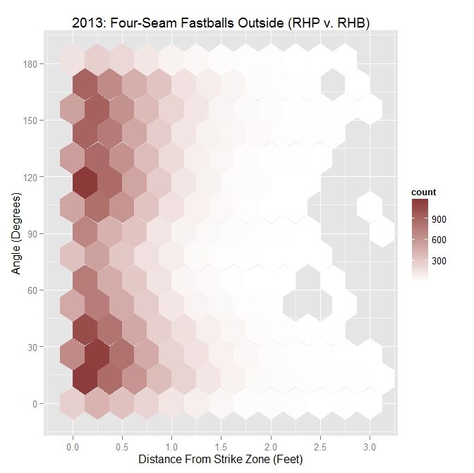
For MLB RHP, the distribution also appears bimodal, with two groupings of data near 30 degrees and 120 degrees. This roughly mirrors Darvish’s distribution, relative to angle versus distance.

MLB RHP 2013 – Four Seamers Outside the Zone v. RHB
Angle Percentage Average Distance
Less Than 45 Degrees 31.6 0.514
Less Than 90 Degrees 48.6 0.478
All X 0.476

As compared to Darvish, RHP threw about the same percentage of pitches with an angle of less than 45%, but more with an angle of less than 90 degrees. In all cases, the MLB RHP four-seamers outside were, on average, closer to the strike zone. Compared to pitches outside to lefties, the percentages for less than 45 and less than 90 degrees are down.

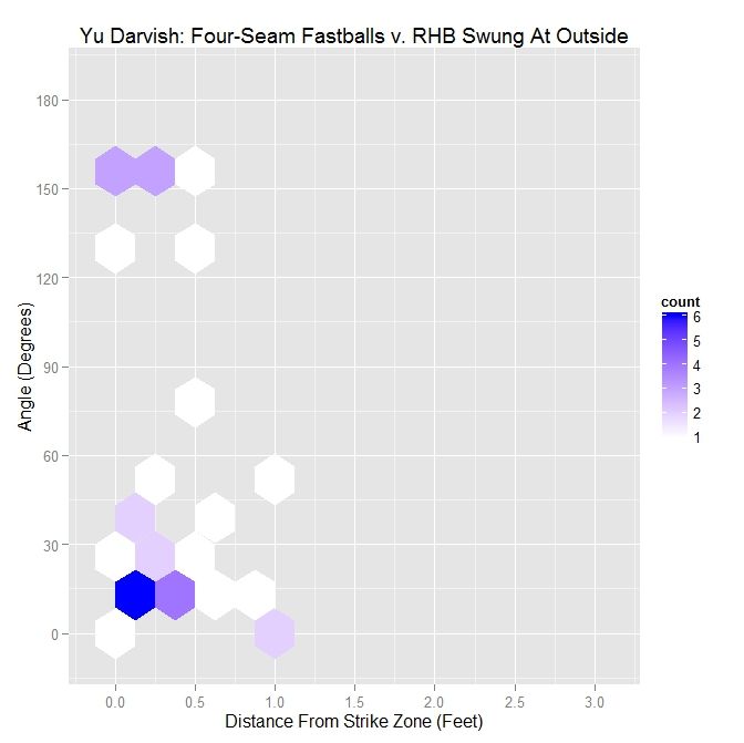
 photo Darvish_Out_Swing_FF_RHB.jpeg

Taking the subset of pitches swung at outside for Darvish, the distribution has become closer to having a single mode near 30 degrees. Despite reaching into small sample sizes for this subset, the below table reinforces these conclusions.

Darvish – Four Seamers Swung At Outside the Zone v. RHB
Angle Percentage Average Distance
Less Than 45 Degrees 67.6 0.351
Less Than 90 Degrees 73.5 0.347
All X 0.313

While only around 30% of Darvish’s pitches were thrown with an angle of 45 degrees or less, over two-thirds of his swings outside the strike zone were in this range of angles. This increases to nearly 75% when considering four-seam fastballs thrown in the general direction of movement, meaning 90 degrees or less. Of note here is that the distance that entices a swing decreases as the movement aligns less and less with the vector perpendicular to the strike zone. Here, the distances are greater compared to left-handed batters faced by Darvish in 2013, but the percentages are up.

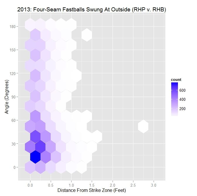
 photo MLB_Swing_Out_FF_RHP_RHB.jpeg

Switching the larger sample of all 2013 MLB RHP, we retain only one of the modes observed for all pitches. The pitches that are swung at outside are clustered down near 15 degrees and within half a foot of the strike zone.

MLB RHP 2013 – Four Seamers Swung At Outside the Zone v. RHB
Angle Percentage Average Distance
Less Than 45 Degrees 53.9 0.286
Less Than 90 Degrees 74.2 0.268
All X 0.255

The percentage of swings with an angle of 45 degrees or less is over 50% and, like Darvish, those less than 90 degrees are up near 75%. The distance again decreases as the angle increases and, compared to Darvish, is much closer to the zone. Versus right-handed batters, the percentages for angles 45 and 90 degrees or less are greater but the distances do not differ greatly as compared to LHB.

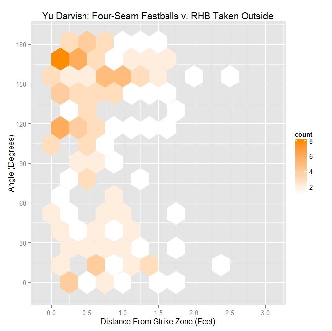
 photo Darvish_Out_Take_FF_RHB.jpeg

The other half of the data, pitches taken outside, gives us the second mode seen originally in Darvish’s data. This mode is a cluster of data above the 90 degree level.

Darvish – Four Seamers Taken Outside the Zone v. RHB
Angle Percentage Average Distance
Less Than 45 Degrees 23.8 0.794
Less Than 90 Degrees 34.5 0.736
All X 0.681

While a quarter of the pitches taken are thrown with an angle of 45 degrees, only a little over one-third were thrown in the general direction of movement. Note that the pitches that are thrown in the direction of movement and are taken tend to average three-quarters of a foot outside, so it makes sense that they would not be swung at. The percentage of pitches taken with an angle of less than 90 degrees is down from 56.8% for LHB and, overall, the pitches are almost an inch further outside.

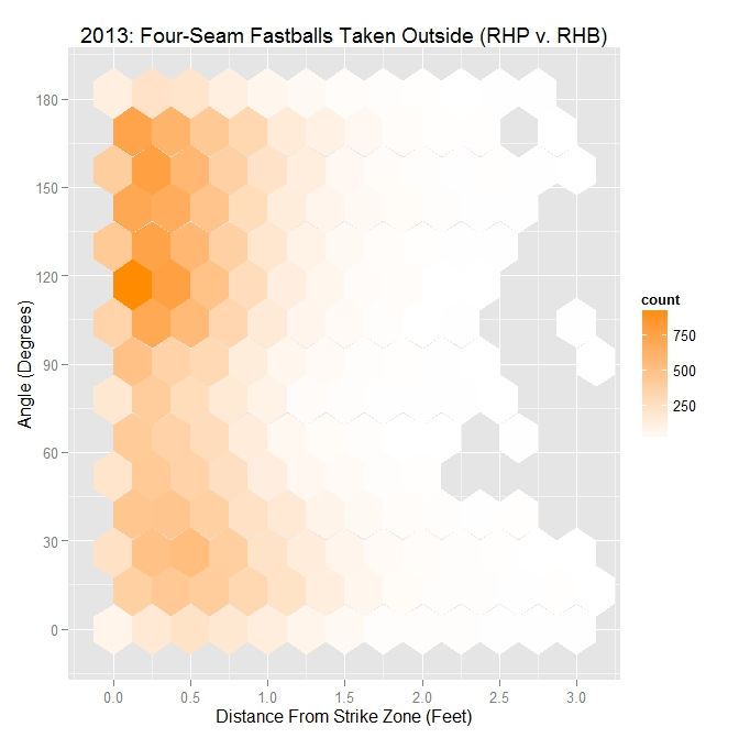
 photo MLB_Take_Out_FF_RHP_RHB.jpeg

For the MLB data set, the second mode is located around 120 degrees.

MLB RHP 2013 – Four Seamers Taken Outside the Zone v. RHB
Angle Percentage Average Distance
Less Than 45 Degrees 24.9 0.662
Less Than 90 Degrees 41 0.592
All X 0.542

As with Darvish, about one quarter of the pitches taken outside are at an angle of 45 degrees or less and 59% are thrown in the opposite direction of movement. When put up against the pitches taken by LHB, the percentages are down for both 45 and 90 degree or less pitches from 35.1% and 60.7%, respectively.

As with RHP versus LHB, the full distribution, in terms of the hexplots, separates into two clusters: one related to swings and one related to pitches taken. The cluster related to swings sits in the range of 15 degrees while pitches taken are closer to 120 degrees. This is similar to the case for lefties, except the cluster of pitches taken moves from the 60-degree area to the 120-degree area and the cluster related to swings moves down from 30 degrees to 15 degrees. However, in both cases, the swings appear to be separate clusters from the pitches taken.

Discussion

For four-seam fastballs thrown by Yu Darvish in 2013, the maximum attractiveness on swings is in the range of 10-20 feet in front of home plate for left- and right-handed batters, possibly tying into how long a batter can reasonably project a pitch when deciding to swing. The four-seamers also tend to be swung at outside the strike zone in the general direction of movement, which we have seen previously with sliders. This is especially pronounced for RHB vs RHP, with pitches exiting the strike zone in the direction of movement causing swings, and pitches entering the zone opposite the direct of movement being taken. By simulating the PITCHf/x data, we can get an idea of why this might be true: pitches outside thrown in the general direction of movement project in the strike zone for some period of time before projecting outside of it and pitches thrown opposite this direction project outside and, while their probability increases, these pitches never appear as strikes and thus do not usually induce swings from the batter.

Next time, we will finish up with cut fastballs from Yu Darvish and see how movement affects perception in this case. After that, we can switch to the 2014 data set and also turn the algorithm around and apply it to a batter.

PITCHf/x Simulation

For those familiar with the previous installment, we covered a slider thrown by Yu Darvish to Brett Wallace and simulated the projected pitch location in R. To better represent how the pitch projection may tie into perception, we have switched to a more visually appealing representation of simulating the PITCHf/x data in the context of the catcher’s viewpoint (we could presumably display this from the batter’s point of view as well). For the aforementioned slider to Wallace, the simulated PITCHf/x data, based on the 9-parameter model, is:

 photo Darvish_Slider.gif

This would seem to be a better way to represent the data, including a backdrop and accurate scaling of the pitch size and location. As another example, we can simulate a random Darvish curve:

 photo Darvish_Curve.gif

In order to make the GIFs for simulating the PITCHf/x data, we are first using TeX to write the code and then compiling it using MiKTeX with the “animate” package handling the controls. To begin, we place a reference point 6 feet, 1 inch behind the tip of home plate, roughly approximating the location of the catcher (the one inch past six feet is not important but makes the distance to the front of home plate an even 7.5 feet).  The height of the reference point is taken to be 2.5 feet in the z-direction. This is the point by which we will determine perspective. Everything will be projected into the plane at the front of home plate, spanning three feet to the left and right of center and from the ground to five feet high. For a given position of the pitch, we find the associated spherical coordinates, relative to the reference point. To figure out where to display the pitch in the frame, we track the pitch along the line formed between the pitch location and the reference point until it reaches the frame. Since the two angle measures of the spherical coordinates will not change when tracking along this line, we need only find the distance along it that places it in the frame we are displaying.

Once we have the location of the pitch in the frame, we still need to find the size of the pitch as seen from that distance. To do this, we again use the reference point and find the distance to the center and to the top of the baseball. With a third side that goes from the top to the center of the baseball, this creates a triangle. Forming a similar triangle by adding an additional third side where the frame cuts the triangle at the front of the plate, we obtain a smaller triangle contained in the larger one. Using this geometry, we can find the size that the pitch will appear at this distance using trigonometric properties of similar triangles (namely that their sides have the same ratio).

To begin the simulaton, we find the times associated with 55 feet and the front of the plate. We then find the location of the pitch in three dimensions, incrementing in time from release to strike zone and adjusting the location and the size of the pitch to appear positioned and scaled correctly in frame. The simulation in the actual PDF is at 60 frames per second, with most animations lasting around a half a second. For the purposes of creating GIFs, we slow the pitches down to one quarter this speed and capture using a program called LICEcap. The code is written so as to work for any pitch by merely swapping in the chosen 9-parameter PITCHf/x data and recompiling. The projection is shown as a red circle, and is calculated as previously discussed. All background features are scaled appropriately, in a similar manner as the pitch.

Note that while this is, in many ways, an approximation of perception from the catcher’s point of view, it functions well for our purposes of providing a decent replacement for live video since we can overlay the projection and view it from the reverse of the traditional television angle from center field. Included is a link to a Google Drive containing a collection of interactive PDFs for pitchers and pitches from 2013 and 2014. There is also an interactive guide to the controls with the given example being a Clayton Kershaw slider. Finally, the source code is included so the interested reader/programmer can input any chosen PITCHf/x parameters and compile to get a representation of the pitch, that includes distance to home plate, the velocity of the pitch, and the time since release.
Progressive Pitch Projections

When examining a batter’s strike zone judgment, the analysis is typically done based on where the pitches passed the plane of the front of the strike zone. However, this analysis usually does not include a discussion of the pitches’ trajectories as they approached the plate, which influences whether or not a batter may choose to swing at a pitch. The aim of this research is to apply a simple model to project a pitch to the plane of the front of the strike zone, from progressively closer distances to home plate, and track how the projected location changes as the pitch nears the plate. In order to quantify the quality of a pitch’s projection as it approaches home plate, we will use a model for the probability of a pitch being called a strike to assess its attractiveness to a batter. While the focus of this will be the projections and results derived from them, a discussion of the strike zone probability model will be given after the main article.

To begin, we can start with a single pitch to explain the methodology. The pitch we will use was one thrown by Yu Darvish to Brett Wallace on April 2nd of 2013 (seen in the GIF below screen-captured from the MLB.tv archives) [Note: I started working on this quite awhile ago, so the data is from 2013, but the methodology could be run for any pitcher or any year].

 photo Darvish_Wallace_P.gif

The pitch is classified by PITCHf/x as a slider and results in a swinging strikeout for Wallace. The pitch ends up inside on Wallace and, based purely on its final location, does not look like a good pitch to swing at, two strikes or not. In order to analyze this pitch in the proposed manner of projecting it to the front of the plate at progressively closer distances, we will start at 50 feet from the back of home plate (from which all distances will be measured) and remove the remaining PITCHf/x definition of movement (as is calculated, for example, for the pfx_x and pfx_z variables at 40 feet) from the pitches to create a projection that has constant velocity in the x-value of the data and only the effects of gravity deviating the z-value from constant velocity. This methodology is adopted from an article by Alan Nathan in 2013 about Mariano Rivera’s cut fastball. At a given distance from the back of home plate, the pitch trajectory between 50 feet and this point is as determined by PITCHf/x, and the remaining trajectory to the front of home plate is extrapolated using the previously discussed method.

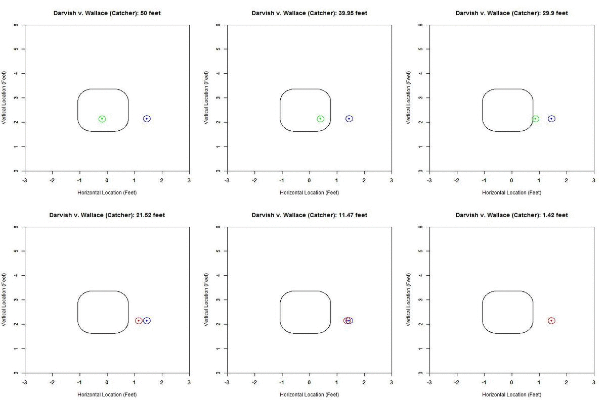
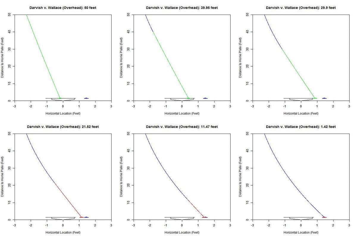
If we examine the above Darvish-Wallace pitch in this manner, the projection looks like this from the catcher’s perspective:

 photo Darvish_Wallace_XZ_250ms.gif

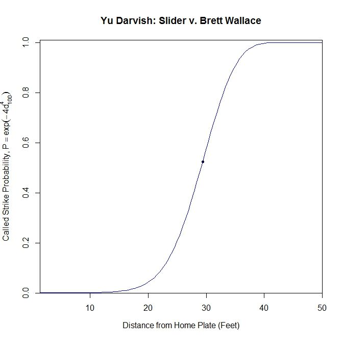
In the GIF, the counter at the top, in feet, represents the distance that we are projecting from. The black rectangular shape is the 50% called-strike contour, where 50% of the pitches passing through that point were called strikes, the inside of which we will call our “strike zone” (for a complete explanation of this strike zone, see the end of the article). Within the GIF, the blue circle is the outline of the pitch and the blue dot inside is the PITCHf/x location of the pitch at the front of the plate. The projection appears in red/green where red represents a lower-than-50% chance of a called strike for the projection and green 50% or higher. As one can see, early on, the pitch projects as a strike and as it comes closer to the plate, it projects further and further inside to the left-handed hitter. If we track the probability of the projection being called a strike, with our x-axis being the distance for the projection, we obtain:

 photo Darvish_Wallace_Probability.jpeg

Based on this graph, the pitch crosses the 50% called-strike threshold at approximately 29.389 feet (seen as a node on the graph). With this consideration, and the fact that the batter is not able to judge the location of the pitch with PITCHf/x precision, it seems reasonable that Brett Wallace might swing at this pitch.

We can also examine this from two other angles, but first we will present the actual pitch from behind as another point of reference:

 photo DarvishWallace_C.gif

Now, we will look at an angle which is close to this new perspective: an overhead view.

 photo Darvish_Wallace_XY_250ms.gif

The color palette here is the same as the previous GIF (blue is the actual trajectory in this case and red/green is as defined above) with the added line at the front of home plate indicating the 50% called-strike zone for the lefty batter. Note that since the scales of the two axes are not the same, the left-to-right behavior of the pitch appears exaggerated. The pitch projects as having a high probability of being called a strike early on and around 30 feet, starts to project more as a ball.

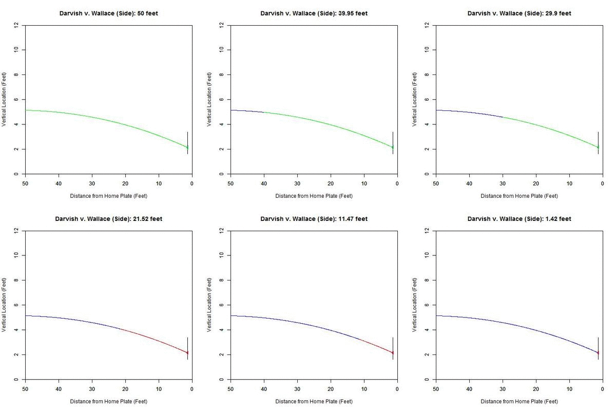
From the side, the pitch has nominal movement in the vertical direction, and so the projection appears not to move. However, the color-coding of the projected pitch trajectory shows the transition from 50%+ called-strike region to the below-50% region.

 photo Darvish_Wallace_YZ_250ms.gif

With this idea in mind, we can apply this to all pitches of a single type for a pitcher and see what information can be gleaned from it. We will break it down both by pitch type, as identified by PITCHf/x, and the handedness of the batter. We will perform this analysis on Yu Darvish’s 2013 PITCHf/x data and compare with all other right-handed pitchers from the same year.

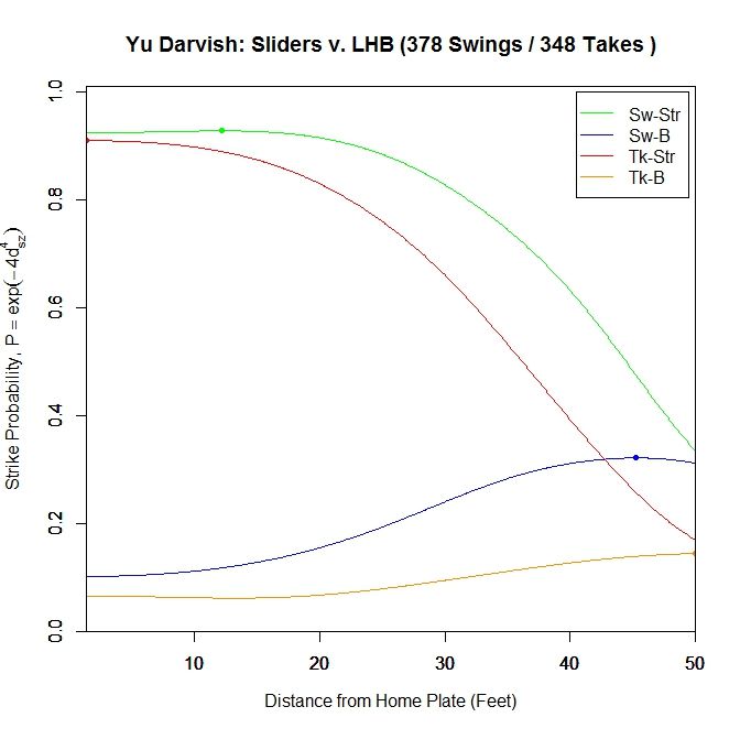
To begin, we will examine Yu Darvish’s slider, which, according to the data, was Darvish’s most populous pitch in 2013. Since we are dealing with a data set of over 1000 sliders, we will first condense the information into a single graph and then look at the data more in-depth. We will separate the pitches into four categories based on their final location at the front of the strike zone: strike (50%+ chance of being called a strike) or ball (less than 50%), and swing or taken pitch. We will take the average called-strike probability of the projections in each of these four categories and plot it versus distance to the plate for the projection.

For left-handed batters versus Darvish in 2013:

 photo Darvish_ST_BS_SL_LHB.jpeg

The color-coding is: green = swing/strike, red = take/strike, blue = swing/ball, orange = take/ball. Looking at just pitches that are likely to be called strikes, the pitches swung at have a higher probability of being called strikes throughout their projections, peaking at the node located at 12.167 feet (0.928 average called-strike probability for the projections) for swings and at 1.417 (0.91), the front of home plate, for pitches taken. The swings at pitches in the strike zone end at a 0.924 average called-strike probability. Both curves for pitches outside the strike zone peak very early and remain relatively low in terms of probability throughout the projection.

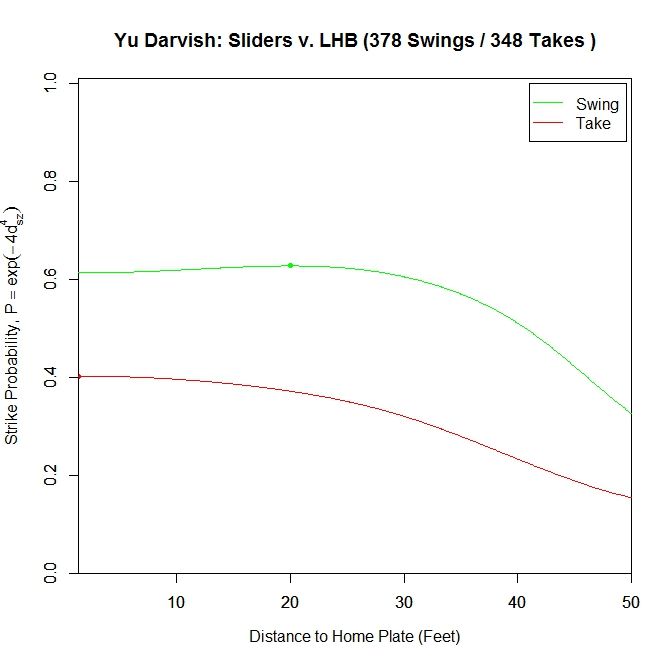
We can also group all swings together and all pitches taken together to get a two-curve representation.

 photo Darvish_ST_SL_LHB.jpeg

For sliders to lefties, the probability of a called strike is higher throughout the projection for swings compared to sliders taken. Similar to the previous graph, the swing curve peaks before the plate, at 20 feet with a 0.627 average called-strike probability and ends at 0.613, whereas the pitches taken peak at the front of the plate with a called-strike probability of 0.402.

To examine this in more detail, we can look at the location of the projections as the pitches moves toward the plate, similar to the GIFs for the single pitch to Wallace. Using the same color scheme as the four-curve graph, we will plot each pitch’s projection.

 photo Darvish_Pitch_Proj_SL_LHB_250ms.gif

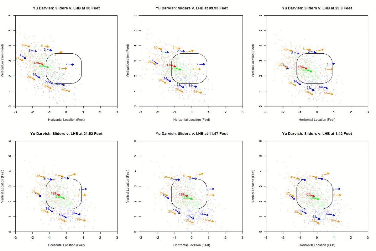
Of interest in this GIF is the observation that most swings outside the zone (blue) are down and to the right from the catcher’s perspective. In particular, based on the projections, there appears to be a subset of the pitches with a strong downward component of movement that are swung at below the strike zone, while most other pitches have more left-to-right movement. In addition, the pitches taken are largely on the outer half of the strike zone to lefties. To better illustrate the progressive contribution of movement to the pitches, we will divide the area around the strike zone into 9 regions: the strike zone and 8 regions around it: up-and-left of the zone, directly above the zone, up-and-right of the zone, directly left of the zone, etc. In each of these 9 regions, we will display the number of swings and number of pitches taken as well as the average direction that the projections are moving as more of the actual trajectory is added in, or in other words, the direction that the movement is carrying the pitch from a straight line trajectory, plus gravity, in the x- and z-coordinates.

 photo Darvish_Pitch_Proj_Gp_SL_LHB_250ms.gif

Note that the movement of the pitches is predominately to the right, from the catcher’s perspective, with some contribution in the downward direction. In the strike zone, the pitches taken have an average location to the left of those swung at. This may be due to the movement bringing the pitches into the strike zone too late for the hitter to react. Computing the percentage of swings in each region produces the following table:


Darvish – Sliders vs. LHB
10 25 0
12.9 62.8 12.5
33.3 65.4 49.2


From the table, where the middle square is the strike zone, we can see that the slider is most effective at inducing swings outside of the strike zone, which has a better percentage of swings than the strike zone itself (Note that some of these regions may contain small samples, but these can be distinguished by the above GIFs). Next is the strike zone, followed by the region directly down-and-right of the strike zone. Going back to the projections, pitches in the two aforementioned non-strike zone regions start by projecting near the bottom of the strike zone and, as they move closer to the plate, project into these two regions.

Putting these observations in context, the movement on the sliders from Yu Darvish to lefties may allow him to get pitches taken on the outer half of the plate, which is generally in the opposite direction of the movement, and swings on pitches down and inside, in the general direction of the pitch movement. This would signify that movement has a noticeable effect on the perception of sliders to lefties. Also of note is that the pitches up and left of the strike zone have very few swings among them, and those that were swung at are close to the zone. Again using movement as the explanation, the pitches project far outside initially and, as they near the plate, project closer to the strike zone, but not enough to incite a swing from a batter.

We can further illustrate these effects on the pitches outside the zone by treating the direction of the movement at 40 feet, taken from the PITCHf/x pfx_x and pfx_z variables, as a characteristic movement vector and finding the angle of it with the vector formed by the final location of the pitch and its minimum distance to the strike zone. So if the movement sends the pitch perpendicularly away from the strike zone, the angle will be 0 degrees; if the movement is parallel to the strike zone, the angle will be 90 degrees; and if the pitch is carried by the movement perpendicularly toward the strike zone, the angle will be 180 degrees. As an illustrative example, consider the aforementioned pitch from Darvish to Wallace:

 photo SZ_MVMT_Angle.jpeg

In this case, the movement vector of the pitch (red dashed vector) is nearly in the same the direction as the vector pointing out perpendicular from the strike zone (blue vector). This means that the angle between the two is going to be small (here, it is 0.276 degrees). If the movement vector in this case were nearly vertical, lying along the right edge of the zone, the angle would be close to 90 degrees.

Taking the movement for all sliders thrown to lefties in 2013 by Darvish and finding the angle it makes relative to the vector perpendicular to the zone, we get the following hexplot:

 photo Darvish_Out_SL_LHB.jpeg

Summing up the hexplot in terms of a table:


Darvish – Sliders Outside the Zone v. LHB
Angle Percentage Average Distance
Less Than 45 Degrees 31.8 0.779
Less Than 90 Degrees 67.9 0.691
All X 0.608


So 31.8% of the sliders thrown outside the strike zone to lefties had an angle of less than 45 degrees between the movement and the vector perpendicular to the strike zone. The average distance of these pitches from the strike zone was 0.779 feet. Increasing the restriction to less than 90 degrees, meaning that some part of the movement is perpendicular to the strike zone, we get 67.9% of pitches outside met this criterion with an average distance from the zone of 0.691 feet. Finally, for all pitches outside, the average distance was 0.608 feet.

As a point of comparison, for all MLB RHP in 2013, the same analogous plot and table are:


 photo MLB_Out_SL_RHP_LHB.jpeg


MLB RHP 2013 – Sliders Outside the Zone v. LHB
Angle Percentage Average Distance
Less Than 45 Degrees 25.3 0.652
Less Than 90 Degrees 52.6 0.624
All X 0.606


Note that the range of possible angles is 0 to 180 degrees, with 25.3% lying in the 0-45 degree range and 52.6% in the 0-90 degree range. So based on this and examining the hexplot visually, the pitches are fairly uniformly distributed across the range of angles.

Comparing Darvish to other RHP in 2013, he threw his slider more in the direction of movement outside the zone. In particular, for angles less than 45 degrees, he threw his slider an average of 1.5 inches further outside compared to other MLB RHP. That disparity shrinks when restricting to less than 90 degrees and is virtually the same for all pitches outside.

While this observation on its own does not have much significance, we can look to see if this was an effective strategy by looking only at swings and seeing the effects.


 photo Darvish_Swing_Out_LHB.jpeg


Darvish – Sliders Swung At Outside the Zone v. LHB
Angle Percentage Average Distance
Less Than 45 Degrees 39.9 0.59
Less Than 90 Degrees 83.2 0.526
All X 0.478


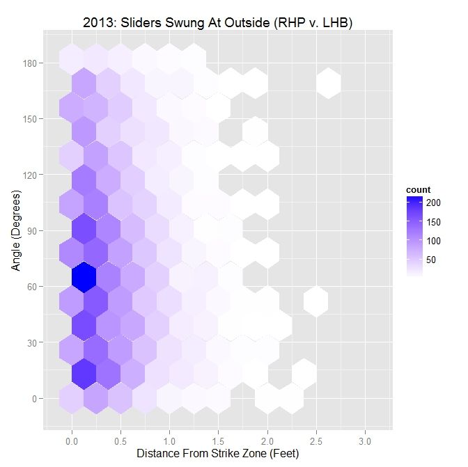
Examining both the hexplot and the table, Darvish induced most of his swings outside of the strike zone with pitches having its movement at an angle of less than 90 degrees relative to the strike zone. Note that when the pitch is thrown outside the zone in the general direction of movement (an angle of less than 90 degrees), the pitch can still induce the batter to swing while pitches not thrown in this general direction are only swung at when very close to the zone. In particular, the majority of pitches that reach the farthest outside the zone and still lead to swings are in the range of 30 to 60 degrees. This is due to many of the swings outside the zone being below the strike zone, where the angle with the down-and-to-the-right movement will be in the neighborhood of 45 degrees.

For all MLB RHP in 2013, the hexplot for swings produces a similar result:

 photo MLB_Swing_Out_SL_RHP_LHB.jpeg


MLB RHP 2013 – Sliders Swung At Outside the Zone v. LHB
Angle Percentage Average Distance
Less Than 45 Degrees 31.8 0.436
Less Than 90 Degrees 64.3 0.421
All X 0.405


From the hexplot, we can see that the majority of pitches swung at are at an angle of 90 degrees or less; 64.3% to be precise. For less than a 45-degree angle, the percentage is 31.8%. These are both up from the percentages from all pitches. As seen with the Darvish data, as the angle decreases, the average distance tends to increase.
Finally, for pitches not swung at outside the zone, we get a complementary result to the swing data:

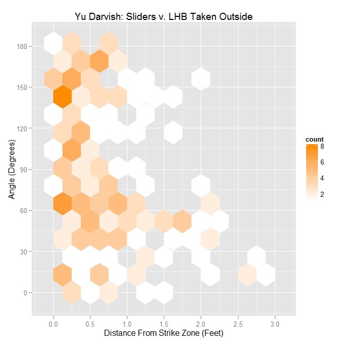
 photo Darvish_Take_Out_SL_LHB.jpeg


Darvish – Sliders Taken Outside the Zone v. LHB
Angle Percentage Average Distance
Less Than 45 Degrees 26.3 0.976
Less Than 90 Degrees 57.4 0.854
All X 0.696


Here, the percentages are lower than for swings and, while the largest distance is for small angles, there is a grouping of pitches present in pitches taken at angles greater than 90 degrees that is virtually nonexistent for swings. So for Darvish, throwing sliders outside the strike zone with an angle greater than 90 degrees does not appear to be a fruitful strategy, unless it plays a larger role in the context of pitch sequencing. To sum up this observation, it would appear that pitching in the general direction of movement outside the strike zone is a necessary but not sufficient condition for inducing swings from left-handed batters.

For MLB right-handed pitchers, this observations appears to still hold:

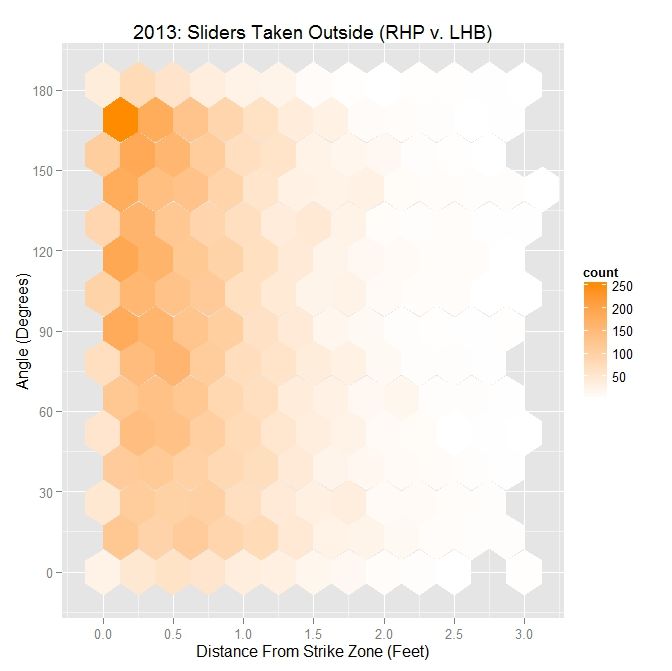
 photo MLB_Take_Out_SL_RHP_LHB.jpeg


MLB RHP 2013 – Sliders Taken Outside the Zone v. LHB
Angle Percentage Average Distance
Less Than 45 Degrees 22.1 0.809
Less Than 90 Degrees 46.7 0.765
All X 0.708


As with Darvish, the percentages drop when comparing pitches taken to pitches swung at. The hexplot also bears this out, with the largest concentration of pitches taken outside the strike zone having an angle between movement and the strike zone vector of greater than 90 degrees. These results match in general with what we have seen with Darvish, and based on the numbers, Yu Darvish is able to play this effect to his advantage, with a larger-than-MLB-average percentage of sliders outside the zone to lefties with an acute angle.

Next, we will perform a similar analysis on sliders to righties. This will allow for comparison between the effects of the slider on batters from both sides of the plate.

 photo Darvish_ST_BS_SL_RHB.jpeg

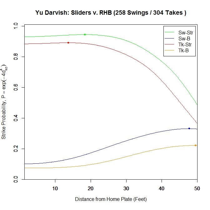
Once again, for pitches in the strike zone, the sliders swung at by righties have a higher probability of being called strikes than those taken. The peak for swings at strikes occurs at 18.333 feet (v. 12.167 feet for LHB) with a 0.945 called-strike probability and ending at 0.931, and taken strikes at 13.667 feet (v. 1.417 feet for LHB) with a 0.892 probability and ending at 0.885.

 photo Darvish_ST_SL_RHB.jpeg

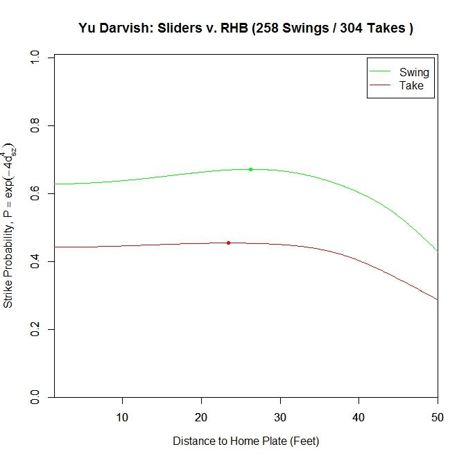
Just examining swings and pitches taken, the peak projected probability is earlier than for lefties at 26.25 feet with 0.672 probability and finishing at 0.629. It also peaks earlier for pitches taken, at 23.147 feet with peak and ending probabilities of 0.454 and 0.442, respectively. Comparing with the results for lefties, the RHB both swing at and take sliders with a higher probability of being called strikes, but have an earlier peak probability.

Breaking it down again in terms of the individual pitches:

 photo Darvish_Pitch_Proj_SL_RHB_250ms.gif

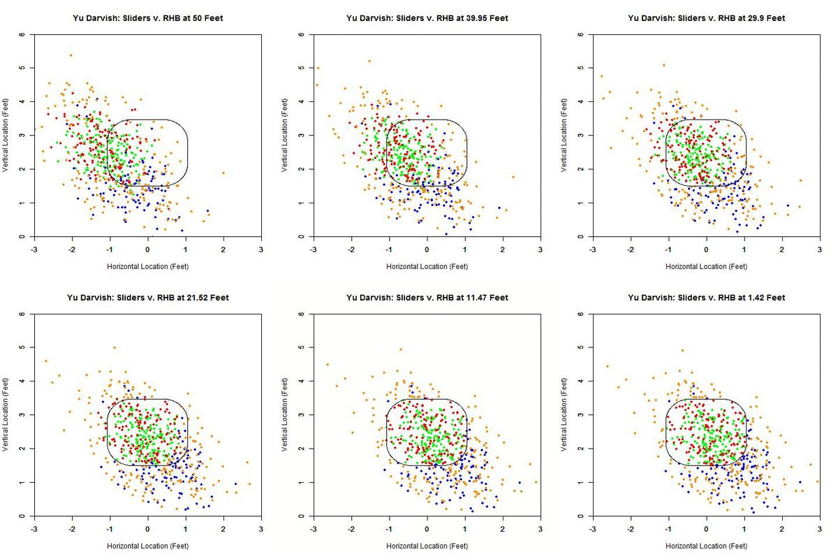
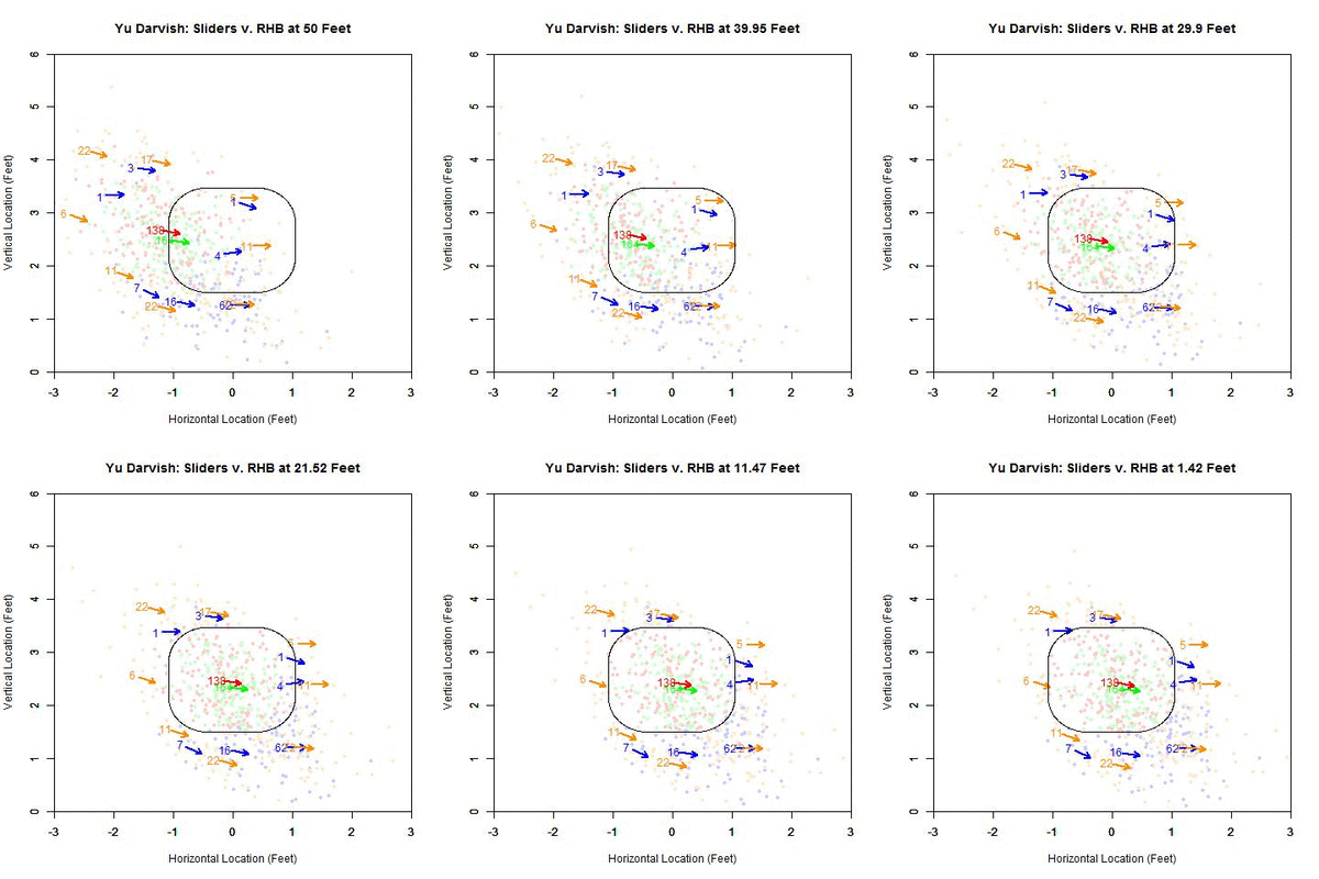
The plot here looks similar to that of the lefties. However, the pitches taken in the strike zone (red) appear more evenly distributed. In addition, the swings outside the zone (blue) appear to be more down and to the right and less directly below the strike zone. To confirm these observations, we can again simplify the plot to arrows indicating the direction of movement in each region and the number of each type of pitch in each region.

 photo Darvish_Pitch_Proj_Gp_SL_RHB_250ms.gif

The table below gives the percentage of swings on pitches in each of the nine regions for Yu Darvish’s sliders to RHB:

Darvish – Sliders vs. RHB
4.3 15 16.7
0 54.3 26.7
38.9 42.1 46.3

To confirm the first observation, note that the red arrow (pitches taken) virtually overlaps with the green arrow (pitches swung at) in the strike zone. Examining the table, the value that differs the most, among the reasonably populated regions, is directly below the strike zone (42.1% to RHB v. 65.4% to LHB). One possible explanation for this is that some of the sliders ending up in this region to LHB have a stronger downward component of the movement than for RHB. This can be seen by comparing the two GIFs.

Moving on to the results for the angle between the movement and the strike zone vector, the hexplot is heavily populated by pitches thrown in the direction of movement:

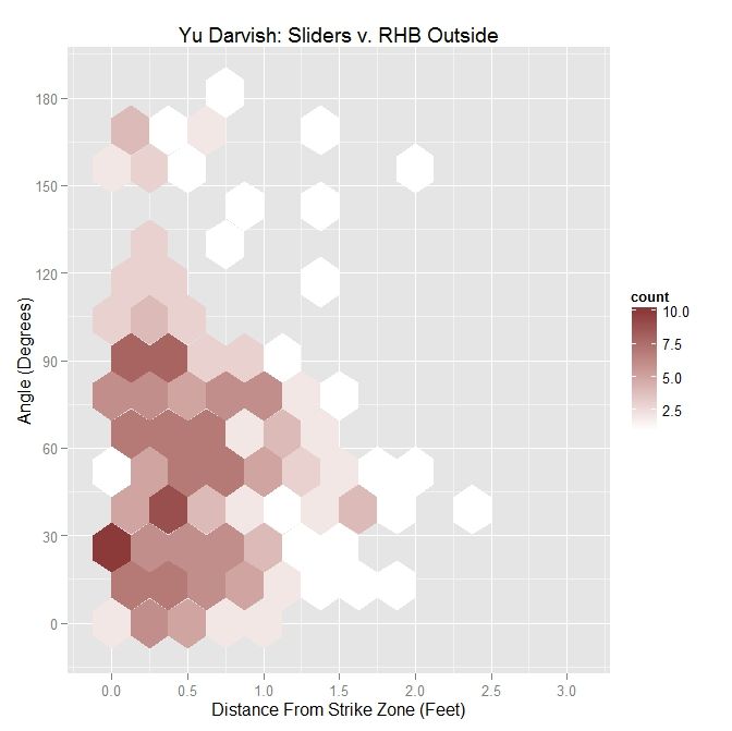
 photo Darvish_Out_SL_RHB.jpeg

Considering the same metrics for interpreting this plot as before:

Darvish – Sliders Outside the Zone v. RHB
Angle Percentage Average Distance
Less Than 45 Degrees 42.3 0.587
Less Than 90 Degrees 78.9 0.618
All X 0.572

From the table, we see that Yu Darvish threw 42.3% of his sliders to RHB with an angle of less than 45 degrees between the strike zone vector and the movement vector, up from 31.8% to LHB. Nearly 79% of his sliders outside the zone were thrown with an angle less than 90% degrees, again up from 67.9% to lefties. However, the average distance is down across the board as compared to lefties.

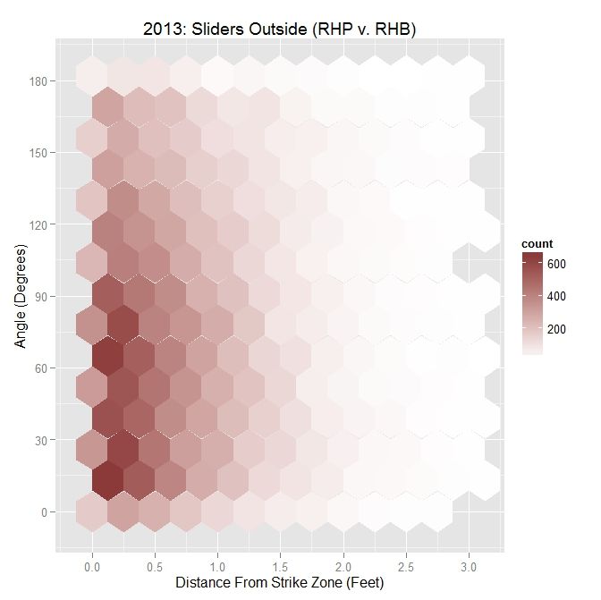
As a point of comparison, for MLB righties to right-handed batters, the distribution looks similar to that of Darvish:

 photo MLB_Out_SL_RHP_RHB.jpeg

MLB RHP 2013 – Sliders Outside the Zone v. RHB
Angle Percentage Average Distance
Less Than 45 Degrees 31.6 0.671
Less Than 90 Degrees 62.4 0.664
All X 0.673

Compared to Darvish, MLB RHP tend to throw a lower percentage of sliders with an angle less than 45 and 90 degrees. However, the MLB average distance from the strike zone is greater across the board.

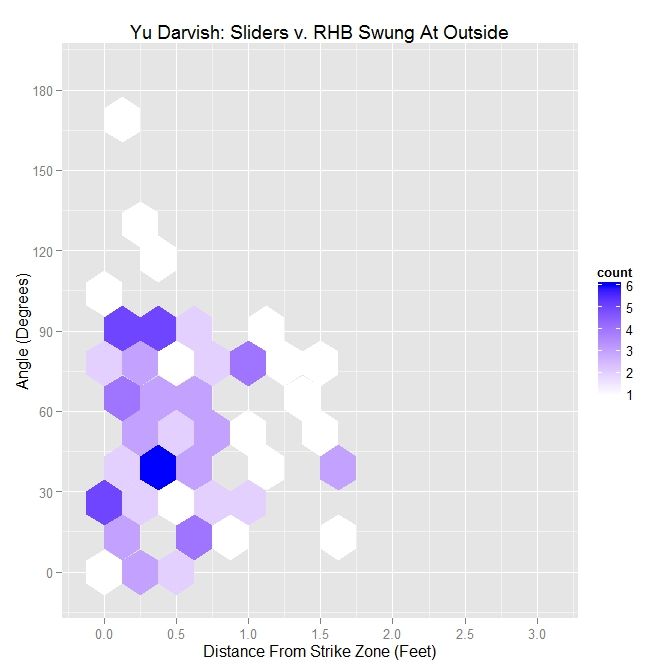
Now, isolating only swings:

 photo Darvish_Swing_Out_RHB.jpeg

Darvish – Sliders Swung At Outside the Zone v. RHB
Angle Percentage Average Distance
Less Than 45 Degrees 46.8 0.513
Less Than 90 Degrees 86.2 0.558
All X 0.512

For RHB versus LHB, Darvish’s percentages are up, if only by a few percent. The average distance for less than 45 degrees is down from 0.59 feet to LHB but up in the other two cases. This can be seen in the hexplot since the protrusion in the distribution is around 60 degrees rather than being closer to 45 degrees as before.

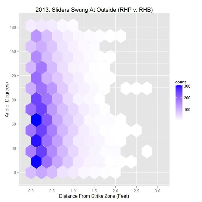
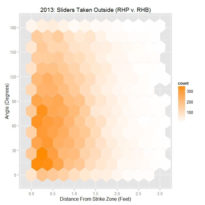
The 2013 MLB data shows a similar result, with a roughly triangular pattern in the hexplot, where the distance from the strike zone for swings increases as the angle between the strike zone vector and movement vector decreases.

 photo MLB_Swing_Out_SL_RHP_RHB.jpeg

MLB RHP 2013 – Sliders Swung At Outside the Zone v. RHB
Angle Percentage Average Distance
Less Than 45 Degrees 32.3 0.437
Less Than 90 Degrees 64.8 0.427
All X 0.417

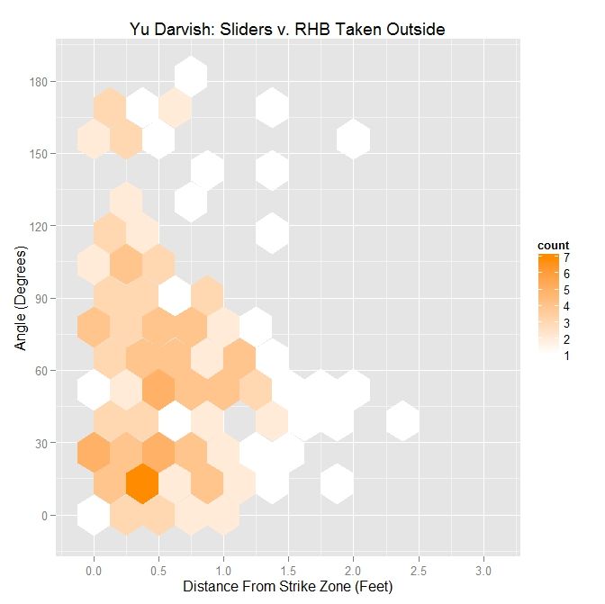
As in the case of lefties, all metrics for Darvish are above MLB-average.

For the sliders taken by right-handed batters:

 photo Darvish_Take_Out_SL_RHB.jpeg

Darvish – Sliders Taken Outside the Zone v. RHB
Angle Percentage Average Distance
Less Than 45 Degrees 39.8 0.634
Less Than 90 Degrees 74.9 0.656
All X 0.605

For angles less than 45 degrees, the percentage of sliders taken outside is noticeably up, as compared with LHB (39.8% v. 26.3%) as well as for less than 90 degrees (74.9% v. 57.4%). This is not surprising since the distribution for all pitches was markedly different between batters on either side of the plate and, in this case, skewed toward the less-than-90-degrees region. The average distances are, however, down from the case for lefties.

Comparing Darvish to other RHP in 2013, the results are similar:

 photo MLB_Take_Out_SL_RHP_RHB.jpeg

MLB RHP 2013 – Sliders Taken Outside the Zone v. RHB
Angle Percentage Average Distance
Less Than 45 Degrees 31.3 0.781
Less Than 90 Degrees 61.3 0.777
All X 0.788

In contrast to MLB RHP, Darvish’s sliders that are taken outside the strike zone are closer to it across the three measures. As before, Darvish’s sliders taken are thrown more in the direction of movement as compared to MLB righties in 2013.

Discussion

When constructing this algorithm, we need to choose a metric by which to group the pitches at each increment. In this case, we are using distance from the back of home plate. While this may be suitable for analyzing a single pitcher, when dealing with multiple pitchers or flipping the algorithm around and using it for evaluating a hitter, the variance in velocity of pitches in between pitchers may have an effect on the results. Therefore, it may be better, for working with multiple pitchers or a hitter, to use time as a metric instead. So rather than tracking the projections as y feet from home plate, we would use t seconds from home plate.

Using this method, with further refinement, we could potentially try to measure quantities such as “late break”. Granted, the PITCHf/x data is restricted to its parameterization by quadratic functions so even if aberrant behavior occurred near the plate, PITCHf/x would not be able to represent it. However if we define late break as x inches of movement over distance y from home plate (or t seconds from home plate), we could hope to quantify it. Based on how we construct the projection, such as including factors other than the PITCHf/x definition of movement, late break could be considered as a difference in perceived position at a distance versus the location at the front of the plate. As seen in the swing/take curves, after a certain distance, the probability of a called strike starts to drop off for Darvish’s sliders, and we could possibly choose, from that point on, to calculate late break for each pitcher. But to do this, we would first have to figure out all elements we wish to use, including movement, to make up pitch perception. As we have seen, for both Darvish and MLB RHP in general, throwing sliders outside of the strike zone in the general direction of movement (with less than a 90-degree angle between the movement vector and the vector perpendicular to the strike zone) elicits swings at a higher rate farther outside the strike zone. In the hexplot for swings, this takes the form of, roughly, a triangular shape of the data which widens in the distance direction as the angle decreases. This can also be seen in the GIFs for the blue pitches (swings outside of the strike zone).

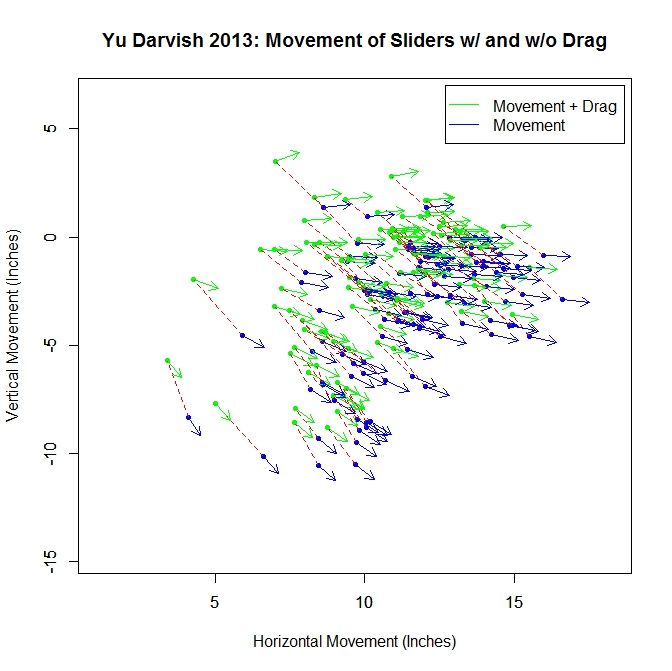
In addition, other elements could be added into this medley for attempting to model a hitter’s perception of a pitch as it approaches the plate. First, one could remove the drag from the movement, leaving it in the projection. Without running the projections, we can see how this would affect the results by looking at how the “movement” differs at 40 feet with and without drag. Pictured below is a subsample of the movement vectors at 40 feet for Darvish’s sliders based on the PITCHf/x definition, in green, and the movement without drag, in blue. The blue vectors are found based on Alan Nathan’s paper on the subject. The dashed red lines connect the same pitch for the different versions of movement. We can see that the movement without drag is larger in magnitude, and in the downward direction and to the right, meaning the projections would start higher and to the left. Comparing the movement vectors with and without drag, the average change in movement for the entire sample is 1.571 inches and the average change in angle between the pairs of vectors is 5.527 degrees. With drag left in the projection and out of the movement, the swing hexplots would likely take a more triangular shape with the angle between the vectors decreasing and shifting the data downward for the pitches outside the zone that were previously moving more laterally.

 photo Darvish_Slider_Movement.jpeg

One could also affect the time to the plate for the pitches as well. As it stands, this approach assumes that the hitters have perfect timing and track pitches using a simple extrapolation approach. If one were to assume that the remaining velocity in the y-direction (toward the plate) was perceived as constant for the pitches, the hitters would be expecting the pitches to arrive faster than they actually are. This would lead to the projections appearing higher, since gravity would have less time to have an effect.

A rather large assumption that we are making is that batters can decouple vertical movement from gravity. Even in cases where the vertical movement is small, this will have an effect on the projected pitch location. This may also serve as an explanation as to why the sliders swung at below the strike zone do not always have a strong vertical component of movement.

Next time, we will look at Darvish’s four-seam fastballs, followed by his cut fastballs, in a similar manner. As we will see, certain pitches excel at inducing swings outside the strike zone when thrown in the general direction of movement while others show little to no benefit at all. We can also break down the pitches swung at by the result (in play, foul, swing-and-miss) to gain further insight.

Strike Zone Analysis

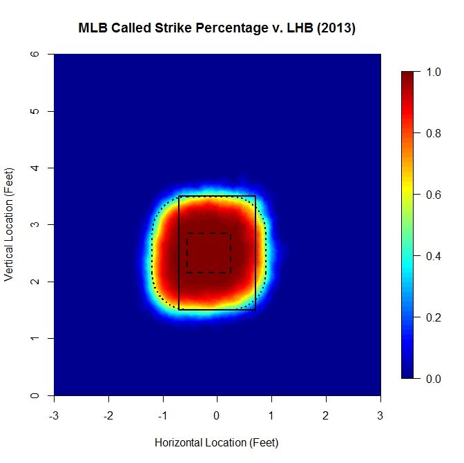
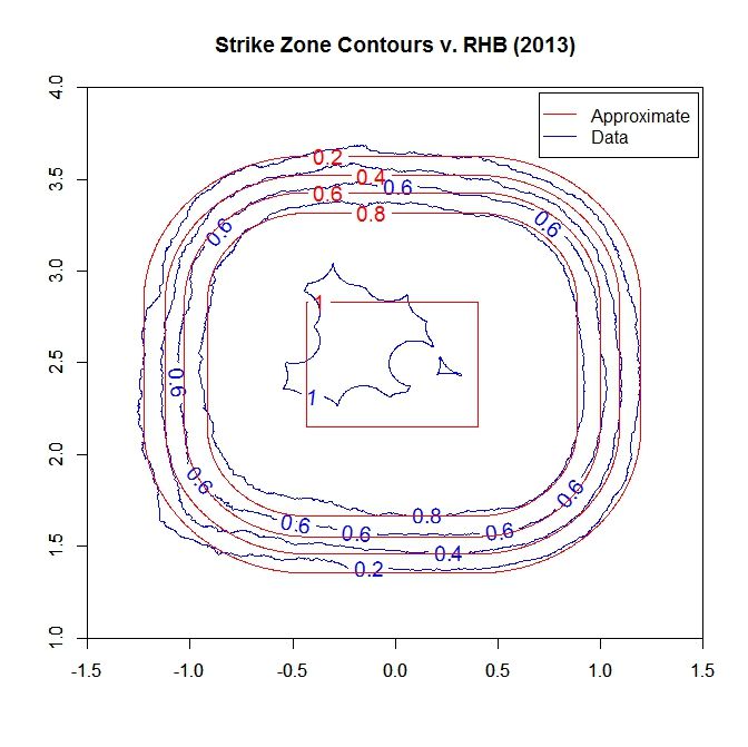
This section explains the calculation and choice of model for the probability of a called strike used in the above analysis. There have been a lot of excellent articles analyzing the strike zone, such as by Matthew Carruth, Bill Petti, and Jon Roegele, among others, and this method is derivative of those previous works. Our goal is the create an explicit piecewise function that reasonably models the probability that a pitch will be called a strike, based on empirical data. However, rather than treat the data as zero-dimensional (no height, width, or length for each datum), we represent each pitch as a two-dimensional circle with a three-inch diameter. Then, over a sufficiently refined grid, we calculate the number of 2D pitches that intersected each point that were called strikes divided by the number of 2D pitches that were taken (ball or strike). This gives the percentage of pitches that intersected each point that were called strikes. This number provides an empirical estimate of a pitch passing through that point being called a strike. The advantage of taking this approach is that we do not impose any a priori structure on the data, which can happen when using methods such as binning or model fitting to the zero-D data. It also conforms with using a 2D strike zone to perform the analysis by representing the data fully in 2D. Note that since using all MLB data from 2013 to generate these plots, we have a large enough data set that we do not get jumps or discontinuities for the strike zone that may occur for smaller data sets, such as for a single pitcher. As an example, the called-strike probability for LHB in 2013 looks like:

 photo SZ_Heat_LHB-1.jpeg

The colormap on the right gives the probability of a pitch at each location being called a strike, based on the data. The solid rectangle represents the textbook strike zone (with 1.5 and 3.5 vertical bounds), and the two dashed lines will be explained concurrently with the model.

For the model, we assume a small region where the probability of a called strike is essentially 1, which, in the graph, is the long-dashed line. Far outside the strike zone, will assume that the probability that a pitch is called a strike is essentially zero. In between, we need a way to model the transition between these two regions. To do this, we will adopt a general exponential decay model of the form exp(-a x^b), where a and b are parameters. In this case, we take x to be the minimum distance to the probability-1 region of the strike zone (long-dashed line). Since there is some flexibility in how we choose the probability-1 region and the subsequent parameters, we will do this less rigorously than could be done in order to keep things simple.

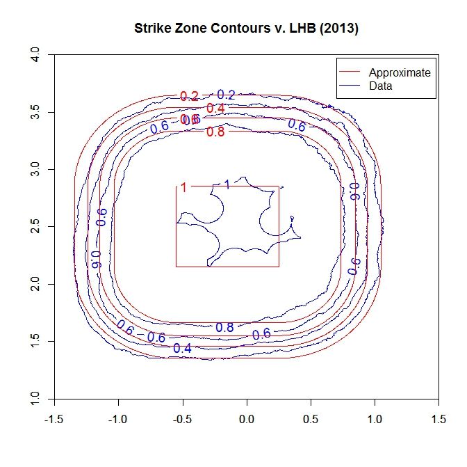
First we examined slices of the empirical data in profile and found that experimenting with the probability-1 region bounds and a, b values, a value around 4 for b worked well at matching the curvature. Then a choice of a equal 4 was found similarly via guess-and-check. Finally the probability-1 region was adjusted to make the model match the data based on a contour plot for each (see below). For lefties, the probability-1 region is [-0.55,0.25] x [2.15,2.85] feet.

 photo SZ_Contour_LHB.jpeg

Note that we do a decent job of matching the contours outside of the lower-right and upper-left regions, where there is some deviation. This can be adjusted for by changing the shape of the probability-1 area, but this increases the complexity of calculating the minimum distance. When plotting the model for the probability:

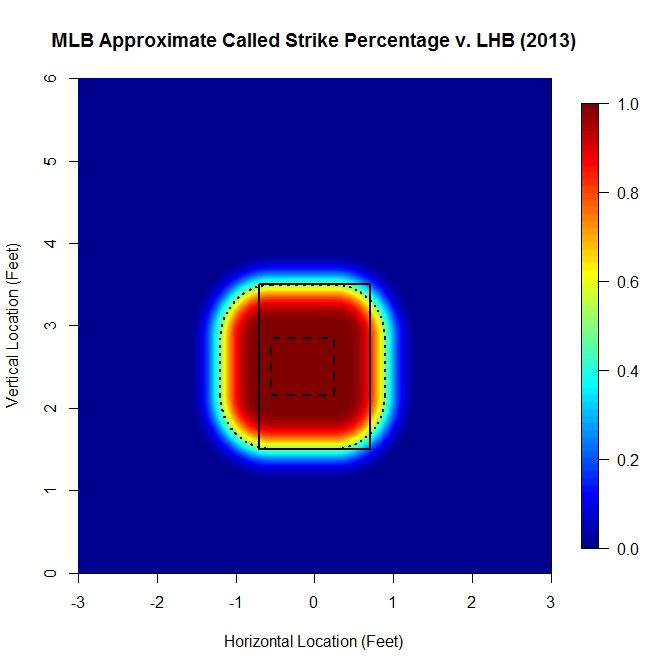
 photo SZ_Heat_LHB_Approx.jpeg

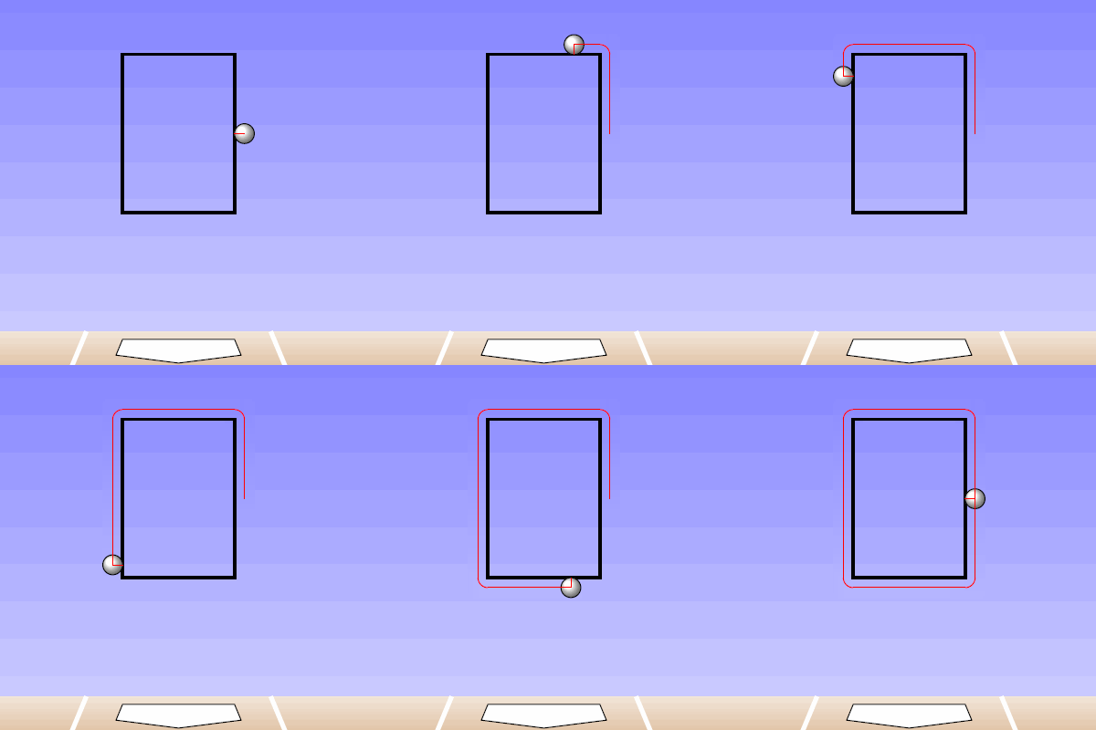
Here, the solid and long-dashed lines are as before, and the dotted line is the 50% called-strike contour from the model, which is used as the boundary of the strike zone in the above analysis. While the shape of the strike zone may seem unconventional, it is a natural approach for handling the zero-dimensional PITCHf/x data. For example, if we place a pitch on the edge of the rectangular textbook zone, a so-called borderline pitch, and track the path that the center would make as it moved around the rectangle, it would trace out a similar shape.

 photo SZAnimation.gif

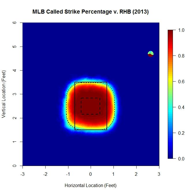
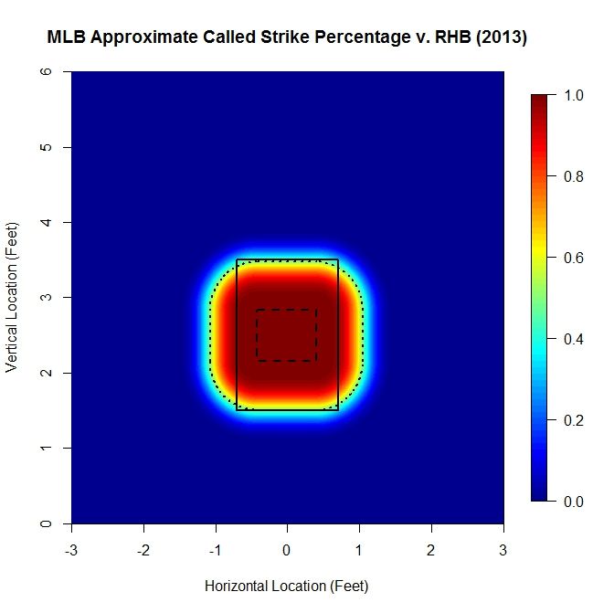
For RHB, the heat map is much more balanced, left to right, making the fit much closer than could be achieved for LHB.

 photo SZ_Heat_RHB.jpeg

Again, the top and bottom of the 50% called-strike contour lies near 3.5 and 1.5 feet, respectively. Examining the contour map:

Here, the identified contours fit well all around. The called-strike probability, with the model applied, is:

 photo SZ_Heat_RHB_Approx.jpeg

In this case the probability-1 region is [-0.43,0.40] x [2.15,2.83] feet.

So, overall, the RHB called-strike probability model fits much better, especially in the corners, than for LHB. In order to properly fit the called-strike probability to such a model, one would first need to have a component of the algorithm that adjusts the probability-1 area, both by location and size, and possibly by shape. Then the parameters for the decay of the strike probability could be fit against the data. The probability-1 area could then be adjusted and fit again, to see if the overall fit is better. This might work similar to a simulated annealing process. However, for our purposes, sacrificing the corners for LHB seems reasonable to maintain simplicity of method and calculations.

In closing, if you made it this far, thank you for reading to the end.


Pitching Sinks

Pitch sequencing is a complicated topic of study. Given the previous pitch(es) to a batter, the next pitch may depend on factors such as the game-based information (e.g., count, number of outs, runners on base); the previous pitch(es), including their location, type, and batter’s response to them; and the scouting report against the batter as well as the repertoire of the pitcher. In order to approach pitch sequencing from an analytical prospective, we need to first simplify the problem. This may involve making several assumptions or just choosing a single dimension of the problem to work from. We will do the latter and focus only on the location of pitches at the front of the strike zone. Since we are interested in pitch sequencing, we will consider at-bats where at least two pitches were thrown to a given batter. The idea is to use this information to generate a simple model to indicate, given the previous pitch, where the next pitch might be located.

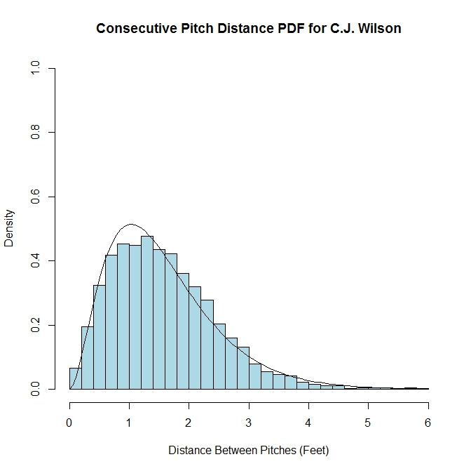
We can start with examining the distance between pitches, regardless of the location of the initial pitch. If this data, for a given pitcher, is plotted in a histogram, the spread of the data appears similar to a gamma distribution. Such a distribution can be characterized many ways, but for our purposes, we will use the version which utilizes parameters k and theta, where k is the shape parameter and theta is the scale parameter. With a collection of distances between pitches in hand, we can fit the data to a gamma distribution and estimate the values of k and theta. As an example, we have the histogram of C.J. Wilson’s distances between pitches within an at-bat from 2012 overlaid with the gamma distribution where the values of k and theta are chosen via maximum likelihood estimation.

Author’s note: I started working on this quite a few weeks ago and so, at the time, the last complete set of data available was 2012. So rather than redo all of the calculations and adjust the text, I decided to keep it as-is since the specific data set is not of great importance in explaining the method. I will include the 2013 data in certain areas, denoted by italics.

Wilson Gamma photo WilsonGamma.jpeg

While this works for the data set as a whole, this distribution will not be too useful for estimating the location of a subsequent pitch, given an initial pitch. One might expect that for pitches in the middle of the strike zone, the distribution would be different than for pitches outside the strike zone. To take this into account, we can move from a one-dimensional model to a two-dimensional one. Also, instead of using pitch distance, we are going to use average pitch location, since this will include directional information as well. To start, we will divide the area at the front of the strike zone into a grid of three-inch by three-inch squares. We choose this discretization because the diameter of a baseball is approximately three inches and therefore seems to be a reasonable reference length. The domain we consider will be from the ground (zero feet) to six feet high, and three feet to the left and right of the center of home plate (from the catcher’s perspective).

We will refer to pairs of sequential pitches as the “first pitch” and the “second pitch”. The first pitch is one which has a pitch following it in a single at-bat. This serves as a reference point for the subsequent pitch, labeled as the “second pitch”. Adopting this terminology, we find all first pitches and assign them to the three-inch by three-inch square which they fall in on the grid. Then for each square, we take its first pitches and find the vector between them and their associated second pitches (each vector points from the first pitch to the second pitch). We then average the components of the vectors in each square to provide a general idea of where the next pitch in headed for the first pitches in that square.

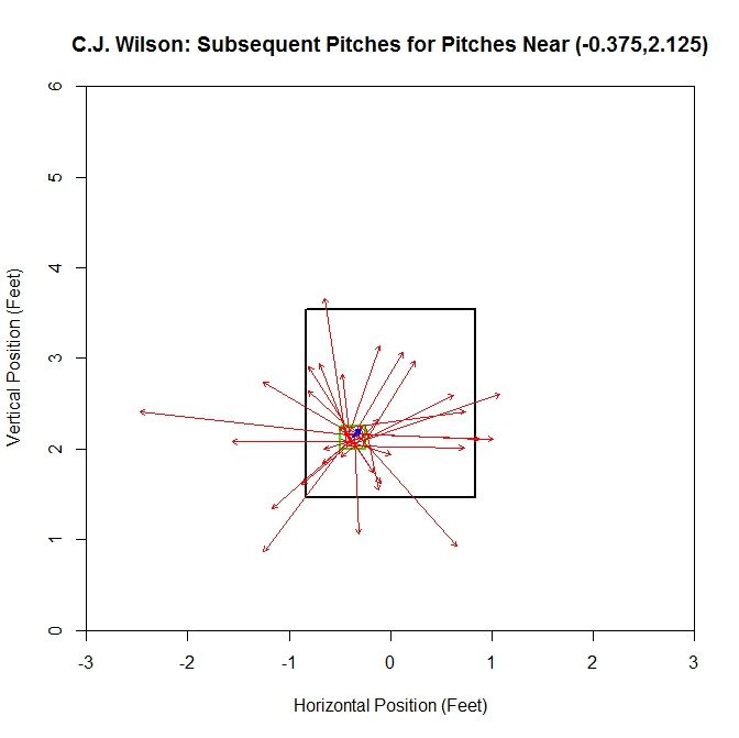
In areas where the magnitude of the average vector is small, the location of the next pitch can be called isotropic, meaning there is no preferred direction. This is because average vectors of small magnitude are likely going to be the result of the cancellation of vectors of similar magnitude in all directions (from the histogram, the average distance between pitches was approximately 1.5 feet with most lying between 0.5 and 2.5 feet apart). One can create contrived examples where, say, all pitches are oriented either left or right and so there would be two preferred directions rather than isotropy, but these cases are unlikely to show up at locations with a reasonable amount of data, such as in the strike zone. In areas where the average vector has a large magnitude, the location of the next pitch can be called anisotropic, indicating there is some preferred direction(s). Here, the large magnitude of the average vector is due to the lack of cancellation in some direction. For illustrative purposes, we can look at one example of an isotropic location and one of an anisotropic location. First, for the isotropic case:

Wilson Isotropic photo WilsonIsotropic.jpeg

In this plot, the green outline indicates the square containing the first pitches and the red arrows are the vectors between the first and second pitches. The blue arrow in the center of the green square is the average vector. For the grid square centered at (-0.375,2.125), we have a fairly balanced, in terms of direction and distance, distribution of pitches. Therefore the average vector is small in magnitude. In other cases, we will have the pitches more heavily distributed in one direction, leading to an anisotropic location:

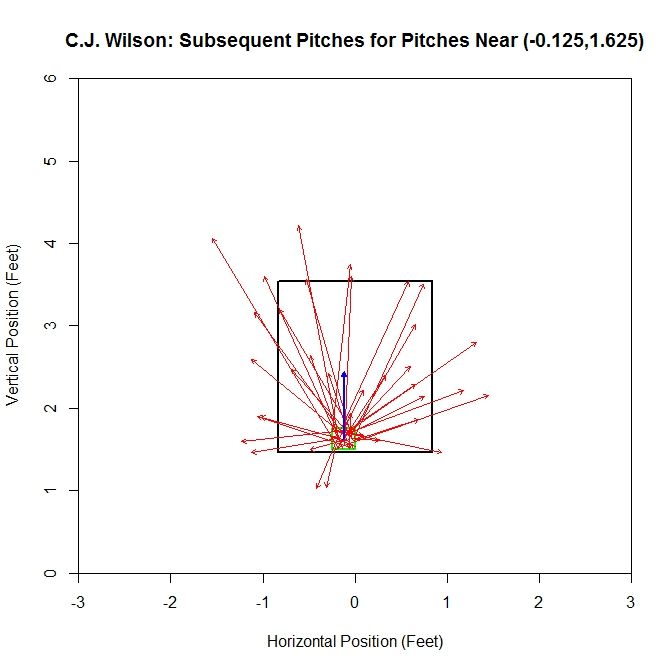
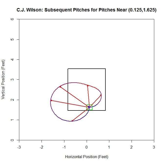
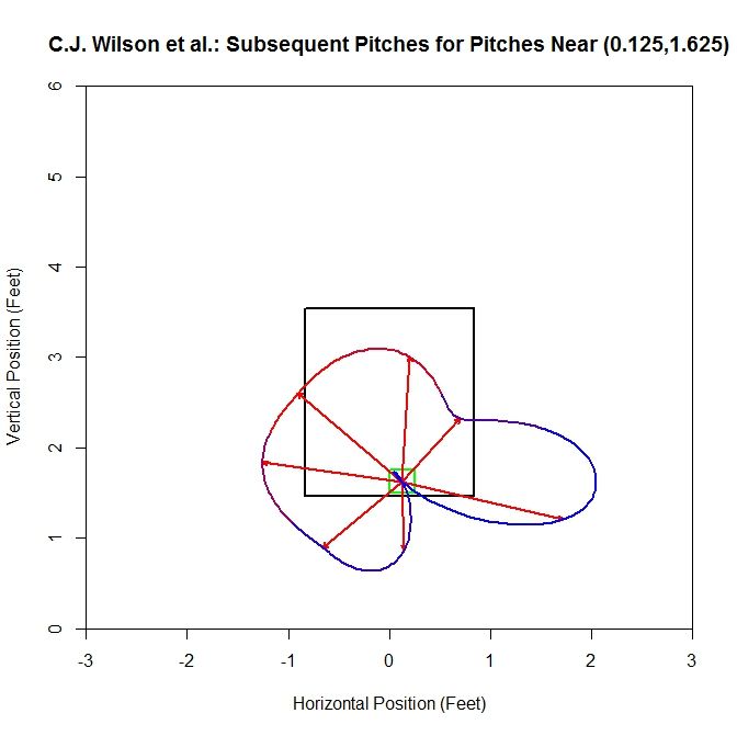
 photo WilsonNematic.jpeg

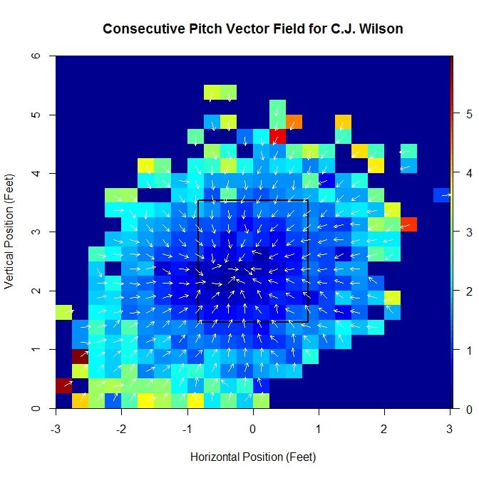
As opposed to the previous case, there is a distinct pattern of pitches up from the position (-0.125,1.625), which is shown by the average vector having a substantially larger magnitude. This is due to most of the vectors having a large positive vertical component. Running over the entire grid where at least one pitch had a pitch following it, we can generate a series of these average vectors, which make up a vector field. In order to make the vector field plot more legible, we remove the component of magnitude from the vector, normalizing them all to a standard length, and instead assign the length of the vector to a heat map which covers each grid square.

 photo WilsonCPVectorField.jpeg

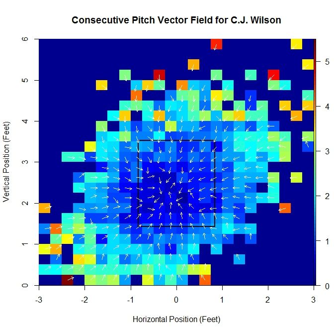
For the 2013 data set:

Wilson Vector Field 2013 photo WilsonVectorField2013.jpeg

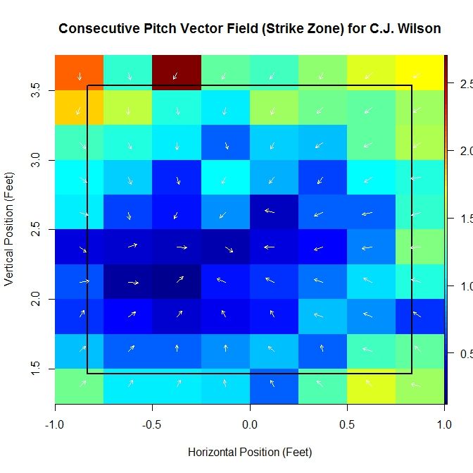
By computing these vectors over the domain, we are able to produce a vector field, albeit incomplete. Computing this vector field based on empirical data also lends itself to outliers influencing the average vectors as well as problems with small sample size. We can attempt to handle these issues and gain further insight by finding a continuous vector field to approximate it. To do this, we will begin with a function of two variables, to which we can apply the gradient operator to produce a gradient field. We can zoom in near the strike zone to get a better idea of what the data looks like in this area:

 photo WilsonSZVector.jpeg

Note that as we move inward, toward the middle of the strike zone, the magnitude of the average vector shrinks. In addition, the direction of all vectors seems to be toward a central point in the strike zone. Based on these observations, we choose a function of the form

P(x,z) = (1/2)c_x(x – x_0)^2 + (1/2)c_z(z – z_0)^2.

The x-variable is the horizontal location, in feet, and z the vertical location. This choice of function has the property that there is a critical point for P and when the gradient field is calculated, all vectors will radially point toward or away from this critical point. The constants in the equation of this paraboloid are (x_0,z_0), the critical point (in our case, it will be a maximum), and (c_x,c_z) are, for our purposes, scaling constants (this will be clear once we take the gradient). The gradient of function P is

grad(P) = [c_x(x – x_0), c_z(z – z_0)].

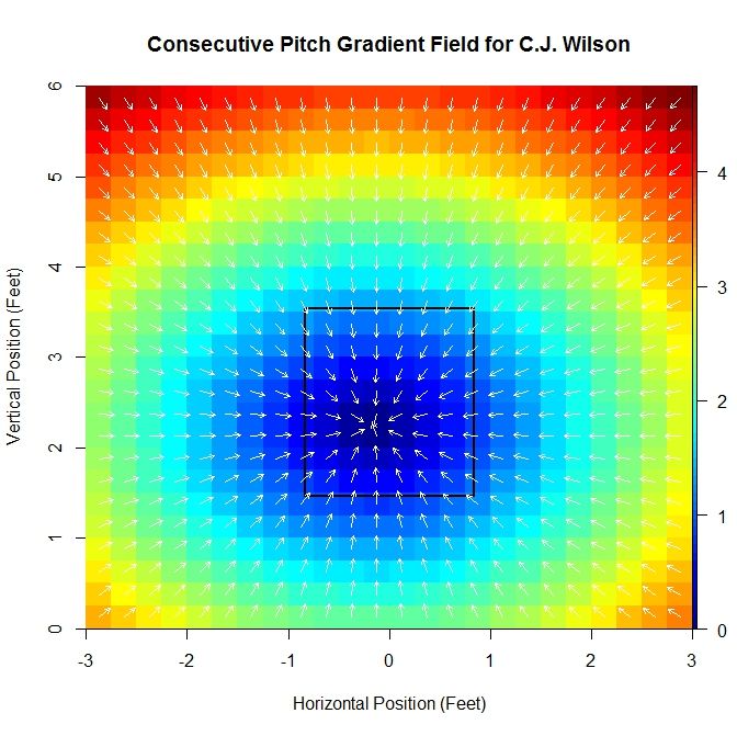
Then c_x and c_z are constants that scale the distances from the x- and z-locations to the critical point to determine the vector associated with point (x,z). Note that grad(P)(x_0,z_0) = [0,0]. In fact, we will give this point a special name for future reference: the pitching sink. For vector fields, a non-mathematical description of a sink is a point where, locally, all vectors point toward (if one imagines these vectors to be velocities, then the sink would be the point where everything would flow into, hence the name). This point is, presumably, the location where we have the least information about the direction of the next pitch, since there is no preferred direction. Again using Wilson’s data as an example:

Wilson Gradient Field photo WilsonCPGradient.jpeg

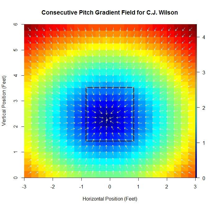
For the 2013 data set:

Wilson Grad Field 2013 photo WilsonGradField2013.jpeg

The gradient field is fit to the average vectors using linear least squares minimization for the x- and z-components. This produces estimates for c_x, c_z, x_0, and z_0. For the original vector field, if we are interested in the location where the average vector is smallest in magnitude (or the location where there is the least bias in terms of direction of the next pitch), we are limited by the fact that we are using a discretized domain and therefore can only have a minimum location at a small, finite number of points.

One advantage to this method is that it produces a minimum that comes from a continuous domain and so we will be able to get unique minimums for different pitchers. Another piece of information that can be gleaned from this approximation is the constants, c_x and c_z. If c_x is large in magnitude, there may be a large east-west dynamic to the pitcher’s subsequent pitch locations. For example, if a first pitch is in the left half of the strike zone, the next pitch may have a proclivity to be in the right half and vice versa. A similar statement can be made about c_z and north-south dynamics. Alternatively, if c_x is small in magnitude, then less information is available about the direction the next pitch will be headed. For Wilson, the constants obtained from the best fit approximation are a pitching sink of (-0.163,2.243) and scaling constants (-0.925,-1.055).

For C.J. Wilson’s 2013 season, we have the sink at (-0.109,2.307) and scaling constants (-0.902,-0.961), so the values are relatively close between these two seasons.

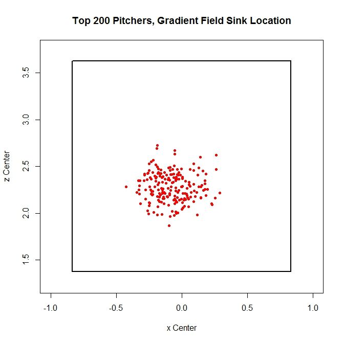
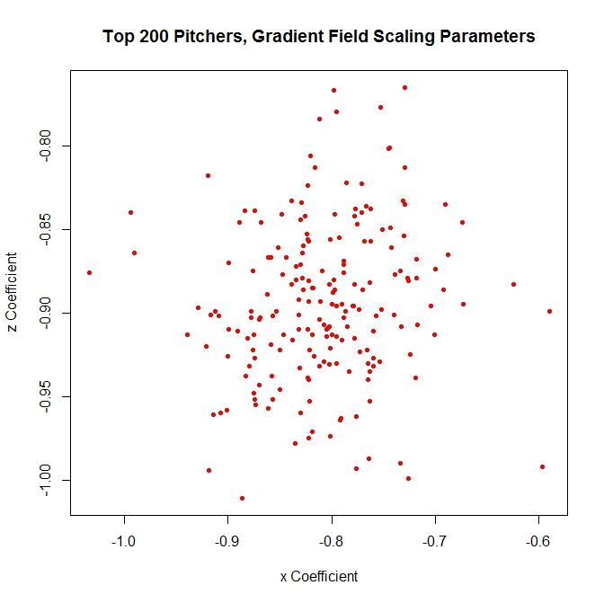
We can now obtain this set of parameters for a large collection of pitchers. For each pitcher, we can find the vector field based on the data and then find the associated gradient field approximation. We can then extract the scaling constants and the pitching sink. We can run this on the most recent complete season (2012, at the start of this research) for the 200 pitchers who threw the most pitches that year and look at the distribution of these parameters.

 photo TwoKSinks.jpeg

The sinks cluster in a region roughly between 1.75 and 2.75 feet vertically and -0.5 and 0.5 feet horizontally. This seems reasonable, since we would not expect this location to be near the edge or outside of the strike zone. Similarly, we can plot the scaling constants:

 photo TwoKScales.jpeg

The scaling constants are distributed around a region of -1 to -0.8 vertically and -0.7 and -0.9 horizontally.

One problem that arises from this method is that since we are averaging the data, we are simplifying the analysis at the cost of losing information about the distribution of second pitches. Therefore, we can take a different approach to try to preserve that information. To do so, at a grid location, we can calculate several average vectors in different directions, instead of one, which will keep more of the original information from the data. This can be accomplished by dividing the area around a given square radially into eight slices and calculating the average in each octant.

However, since each nonempty square may contain anywhere from one to upwards of thirty plus pitches, using octants spreads the data too thin. To better populate the octants, we can find pitchers with similar data and add that to the sample. To do this, we will go back to the aforementioned average vectors and use them as a means of comparison. At a given square, with a pitcher in mind whose data we wish to add to, we can compute the average vector for a large collection of other pitchers, compare average vectors, and add the data from those pitchers whose vector is most similar to the pitcher of reference. In order to do this, we first need a metric. Luckily, we can borrow and adapt one available for comparing vector fields:

M(u,v) = w exp(-| ||u||-||v|| |) + (1-w) exp(-(1 – <u,v>/||u|| ||v||))

Here, u and v are vectors, and w is a weight for setting the importance of matching the vector magnitudes (left) and the vector directions (right). For the calculations to follow, we take w = 0.5. The term multiplied to w on the left is an exponential function where the argument is the negative of the absolute value of the difference in the vector magnitudes. Note that when ||u|| = ||v||, the term on the left reduces to w. As the magnitudes diverge, the term tends toward zero. The term multiplied to (1-w) is an exponential function with argument negative quantity 1 minus the dot product between u and v, divided by their magnitudes. When u and v have the same direction, <u,v>/||u|| ||v|| = 1, and the exponent as a whole is zero. When u and v are anti-parallel, <u,v>/||u|| ||v|| = -1 and the exponent is -2 so the term on (1-w) is exp(-2) which is approximately 0.135, which is close to zero. So when u = v, M(u,v) = 1 and when u and v are dissimilar in magnitude and/or direction, M(u,v) is closer to zero.

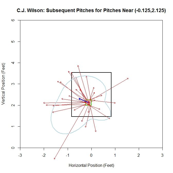
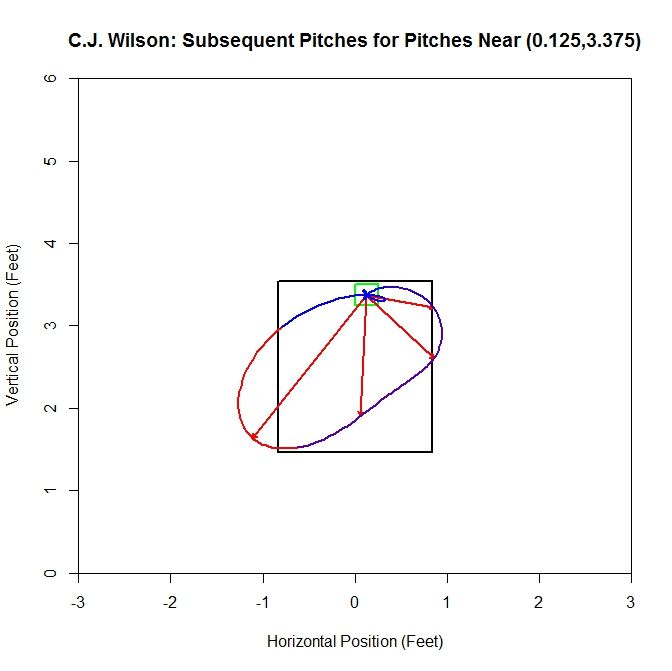
We now have a means of comparing the data from different pitchers to better populate our sample. To demonstrate this, we will again use C.J. Wilson’s data. First, we will run this method at a point near his sink: (-0.125,2.125). Since we will have up to eight vectors, we can fit an interpolating polynomial in between their heads to get an idea of what is happening for the full 360 degrees around the square. The choice of interpolating polynomial in this case will be a cubic spline function. This will give a smooth curve through the data without large oscillations. Working with only Wilson’s data, which is made up of 30 pitches, this looks like:

 photo WilsonVector.jpeg

The vectors are spread out in terms of direction, but one vector which extends outside the lower-left quadrant of the plot leads to the cubic spline (light blue curve) bulging to the lower left of the strike zone. Otherwise, the cubic spline has some ebb and flow, but is of similar average distance all around.

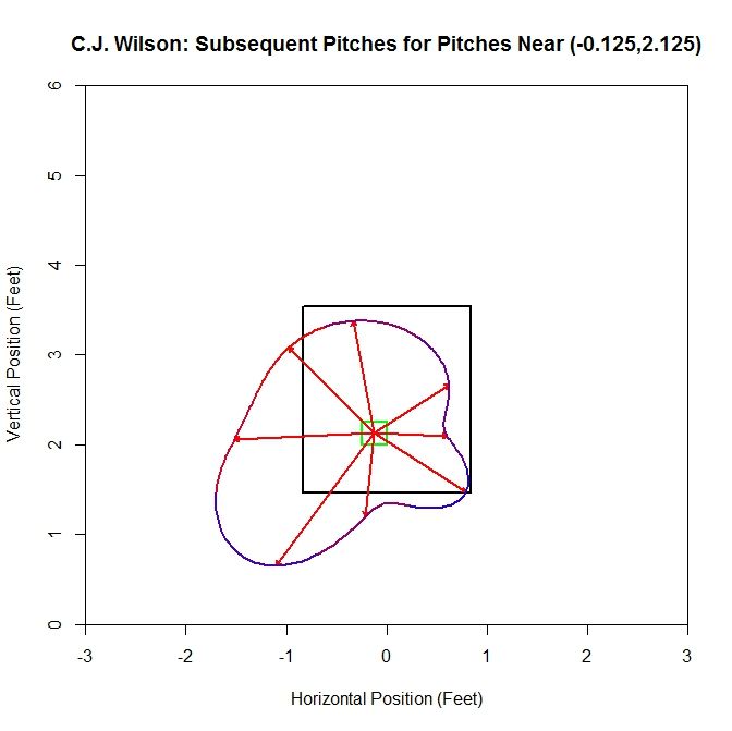
 photo WilsonOctant.jpeg

When we remove the vectors and replace them with the average vector of each octant (red vectors), we have a better idea of where the next pitch might be headed. We also color-code the spline to keep the data about the frequency of the pitches in each octant. Red indicates areas where the most pitches were subsequently thrown and blue the least. We see that the vectors are longer to the left and, based on the heat map on the spline, more frequent. However, a few short or long vectors in areas that are otherwise data-deficient will greatly impact the results. Therefore, we will add to our sample by finding pitchers with similar data in the square. We will compute the value of M between Wilson at that square and the top 200 pitchers in terms of most pitches thrown for the same season.

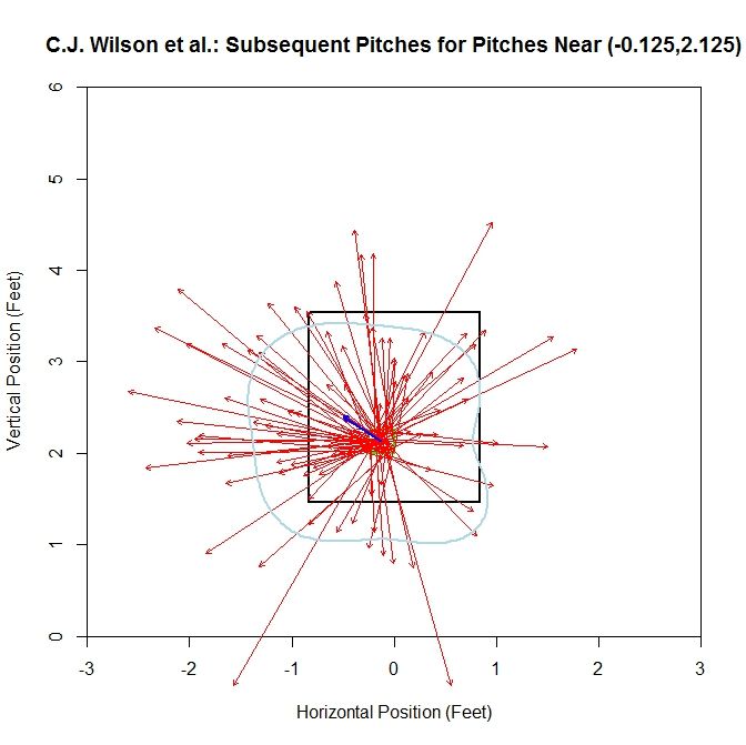
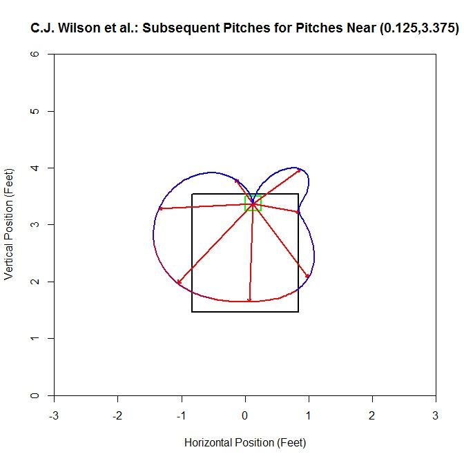
For Wilson, the top five comparable pitchers in the square (-0.125,2.125), with the value of M in parentheses, are Liam Hendriks (0.995), Chris Young (0.986), A.J. Griffin (0.947), Kyle Kendrick (0.943), and Jonathan Sanchez (0.923). Recall that this considers both average vector length and direction. Adding this data to the sample increases its size to 94 pitches.

 photo WilsonetalVector.jpeg

For this plot, the average vector (the blue vector in the center of the cell) is similar to that of Wilson’s solo data. However, since the number of pitches has essentially tripled, the plot has become hard to read. To get a better idea of what is going on, we can switch to the average vector per octant plot:

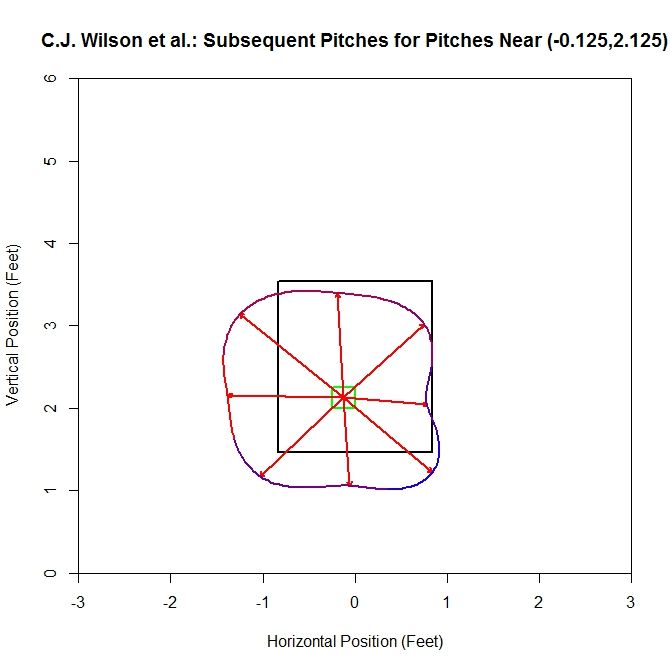
 photo WilsonetalOctant.jpeg

Examining this plot, most of the average vectors are in the range of 1-1.5 feet. The shape of the interpolation is square-like and seems to align near the edge of the strike zone, extending outside the zone, down and to the left.

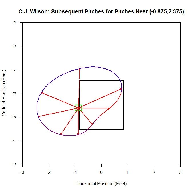
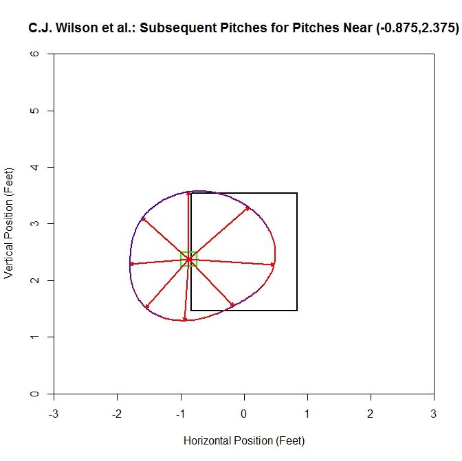
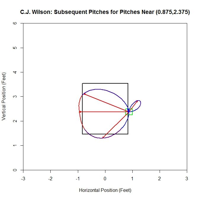
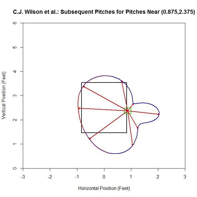
We can also run this at points nearer to the edge of the strike zone. On the left side of the strike zone, we can work off of the square centered at (-0.875,2.375) (note that we drop the plots of the original data in lieu of the plots for the octants).

 photo WilsonLeftSideOriginal.jpeg

For the original sample, the dominant direction (where most of the vectors are pointed, indicated by the red part of the spline) is to the right, with an average distance of one to two feet in all directions. Now we will add in data based on the average vectors, increasing our sample from 15 to 97 pitches.

 photo WilsonLeftSide.jpeg

For the larger sample, the spline, which is almost circular, has average vectors approximately 1 to 1.5 feet in length. The preferred directions are to the right (into the strike zone) and downward (below the left edge of the strike zone). Also note that comparing the two plots, the vectors in the areas where there are the most pitches in the original sample (between three and six o’clock) have average vectors that retain a similar length and direction.

 photo WilsonRightSideOriginal.jpeg

Switching sides of the strike zone, we can examine the data related the square centered at (0.875,2.375). For the original sample, the dominant direction is to the left with little to no data oriented to the right. Since there are octants that contain no data, we get a pinched area of the cubic spline. This is due to the choice of how to handle the empty octants. We choose to set the average distance to zero and the direction to the mean direction of the octant. This choice leads to pinching of the curve or cusps in these areas. Another choice would be to remove this octant from the sample and do the interpolation with the remaining nonempty octants.

 photo WilsonRightSide.jpeg

Adding data to this sample increases it from 9 pitches to 67, and the average vector and spline jut out on the right side due to a handful of pitches oriented further in this direction (this is evident from the blue color of the spline). In the areas where most of the subsequent pitches are located, the spline sits near the left edge of the strike zone. Again, the average vectors in the red area of the spline maintain a similar length and direction.

 photo WilsonTopSideOriginal.jpeg

Moving to the top of the strike zone, we choose the square centered at (0.125,3.375). The original plot for a square along the top contains 11 pitches and no second pitches are oriented upward. There are only have four non-zero vectors for the spline and the dominant direction is down and to the left.

 photo WilsonTopSide.jpeg

In this square, the sample changes from 11 to 72 pitches by adding similar data. Note the cusp that occurs at the top since we are missing an average vector there. Unsurprisingly, at the top of the strike zone, the preferred direction for the subsequent pitch is downward, and as we rotate away from this direction, the number of pitches in each octant drops.

 photo WilsonBottomSideOriginal.jpeg

Finally, along the bottom of the strike zone, we choose (0.125,1.625). Starting with 27 pitches produces five average vectors, with the dominant direction being up and to the left.

 photo WilsonBottomSide.jpeg

With the additional data from other pitchers, the number of pitches moves up to 87. The direction with the most subsequent pitches is up and to the left. In areas where we have the most data in the original sample (the red spline areas), the average vectors and splines are most alike.

There are several obvious drawbacks to this method. For the model fitting, we have some points in the strike zone with 30+ pitches and as we move away from the strike zone, we have less and less data for computing the averages. However, as we move away, the general behavior becomes more predictable: the next pitch will likely be closer to the strike zone. So the small sample should have less of a negative effect for points far away. This is also a potential problem since we use these, in some cases, small samples to calculate the average vector in each square, which is used as a reference point for adding data to the sample. It may be better to use the vector from the gradient field for comparison since it relies on all of the available data to compute the average vector (provided the gradient field approach is a decent model).

Another problem is that in computing the average vector, we are not taking into account the distribution of the vectors. The same average vector can be formed from many different combination of vectors. However, based on the limited data presented above, adding to the sample, using M and the average vectors, does not seem to have a large effect on octants where there is the most data in the original sample. These regions, even with more data, tend to retain their shape. These are also the areas that are going to contribute most to the average vector that is used for comparison, so this seems like a reasonable result.

A smaller problem that shows up near the edge of the zone is that we still occasionally, even after adding more data, get directions with only one or two pieces of data and this causes some of the aberrant behavior seen in some of the plots, characterized by bulges in blue areas of the spline. One solution to this would be to only compute the average vector in that octant if there were more than some fixed number of pitches in that direction. Otherwise, we could set the average vector to zero and the direction to the mean direction in that octant.

Obviously, an analysis of one pitcher over a small collection of squares in the grid does not a theory make. It is possible to examine more pitchers, but because the analysis must be done visually, it will be slow and imprecise. Based on these limited results, there may be potential if the process can be condensed. The pitching sink approach gives an idea of where the next pitch may be headed. As we move toward the sink, we have less information on where the next pitch is headed since near this point, the directions will be somewhat evenly distributed. As we move toward the edge of the strike zone, we get a clearer picture of where the next pitch is headed if only for the reason that it seems unlikely that the next pitch will be even further away.

While this model seems reasonable in this case, there may be cases where a more general model is needed to fit with the behavior of the data. To recover more accurate information on the location of the next pitch, we can switch to the octant method. Since some areas with this method will have very small samples, we can pad out the data via comparison of the average vectors. This seems to do well at filling out the depleted octants and retains many of the features of the average vectors in the most populated octants of the original samples. At this point, both these models exist as novelties, but hopefully with a little more work and analysis, they can be improved and simplified.


Estimating Pitcher Release Point Distance from PITCHf/x Data

For PITCHf/x data, the starting point for pitches, in terms of the location, velocity, and acceleration, is set at 50 feet from the back of home plate. This is effectively the time-zero location of each pitch. However, 55 feet seems to be the consensus for setting an actual release point distance from home plate, and is used for all pitchers. While this is a reasonable estimate to handle the PITCHf/x data en masse, it would be interesting to see if we can calculate this on the level of individual pitchers, since their release point distances will probably vary based on a number of parameters (height, stride, throwing motion, etc.). The goal here is to try to use PITCHf/x data to estimate the average distance from home plate the each pitcher releases his pitches, conceding that each pitch is going to be released from a slightly different distance. Since we are operating in the blind, we have to first define what it means to find a pitcher’s release point distance based solely on PITCHf/x data. This definition will set the course by which we will go about calculating the release point distance mathematically.

We will define the release point distance as the y-location (the direction from home plate to the pitching mound) at which the pitches from a specific pitcher are “closest together”. This definition makes sense as we would expect the point of origin to be the location where the pitches are closer together than any future point in their trajectory. It also gives us a way to look for this point: treat the pitch locations at a specified distance as a cluster and find the distance at which they are closest. In order to do this, we will make a few assumptions. First, we will assume that the pitches near the release point are from a single bivariate normal (or two-dimensional Gaussian) distribution, from which we can compute a sample mean and covariance. This assumption seems reasonable for most pitchers, but for others we will have to do a little more work.

Next we need to define a metric for measuring this idea of closeness. The previous assumption gives us a possible way to do this: compute the ellipse, based on the data at a fixed distance from home plate, that accounts for two standard deviations in each direction along the principal axes for the cluster. This is a way to provide a two-dimensional figure which encloses most of the data, of which we can calculate an associated area. The one-dimensional analogue to this is finding the distance between two standard deviations of a univariate normal distribution. Such a calculation in two dimensions amounts to finding the sample covariance, which, for this problem, will be a 2×2 matrix, finding its eigenvalues and eigenvectors, and using this to find the area of the ellipse. Here, each eigenvector defines a principal axis and its corresponding eigenvalue the variance along that axis (taking the square root of each eigenvalue gives the standard deviation along that axis). The formula for the area of an ellipse is Area = pi*a*b, where a is half of the length of the major axis and b half of the length of the minor axis. The area of the ellipse we are interested in is four times pi times the square root of each eigenvalue. Note that since we want to find the distance corresponding to the minimum area, the choice of two standard deviations, in lieu of one or three, is irrelevant since this plays the role of a scale factor and will not affect the location of the minimum, only the value of the functional.

With this definition of closeness in order, we can now set up the algorithm. To be safe, we will take a large berth around y=55 to calculate the ellipses. Based on trial and error, y=45 to y=65 seems more than sufficient. Starting at one end, say y=45, we use the PITCHf/x location, velocity, and acceleration data to calculate the x (horizontal) and z (vertical) position of each pitch at 45 feet. We can then compute the sample covariance and then the area of the ellipse. Working in increments, say one inch, we can work toward y=65. This will produce a discrete function with a minimum value. We can then find where the minimum occurs (choosing the smallest value in a finite set) and thus the estimate of the release point distance for the pitcher.

Earlier we assumed that the data at a fixed y-location was from a bivariate normal distribution. While this is a reasonable assumption, one can still run into difficulties with noisy/inaccurate data or multiple clusters. This can be for myriad reasons: in-season change in pitching mechanics, change in location on the pitching rubber, etc. Since data sets with these factors present will still produce results via the outlined algorithm despite violating our assumptions, the results may be spurious. To handle this, we will fit the data to a Gaussian mixture model via an incremental k-means algorithm at 55 feet. This will approximate the distribution of the data with a probability density function (pdf) that is the sum of k bivariate normal distributions, referred to as components, weighted by their contribution to the pdf, where the weights sum to unity. The number of components, k, is determined by the algorithm based on the distribution of the data.

With the mixture model in hand, we then are faced with how to assign each data point to a cluster. This is not so much a problem as a choice and there are a few reasonable ways to do it. In the process of determining the pdf, each data point is assigned a conditional probability that it belongs to each component. Based on these probabilities, we can assign each data point to a component, thus forming clusters (from here on, we will use the term “cluster” generically to refer to the number of components in the pdf as well as the groupings of data to simplify the terminology). The easiest way to assign the data would be to associate each point with the cluster that it has the highest probability of belonging to. We could then take the largest cluster and perform the analysis on it. However, this becomes troublesome for cases like overlapping clusters.

A better assumption would be that there is one dominant cluster and to treat the rest as “noise”. Then we would keep only the points that have at least a fixed probability or better of belonging to the dominant cluster, say five percent. This will throw away less data and fits better with the previous assumption of a single bivariate normal cluster. Both of these methods will also handle the problem of having disjoint clusters by choosing only the one with the most data. In demonstrating the algorithm, we will try these two methods for sorting the data as well as including all data, bivariate normal or not. We will also explore a temporal sorting of the data, as this may do a better job than spatial clustering and is much cheaper to perform.

To demonstrate this algorithm, we will choose three pitchers with unique data sets from the 2012 season and see how it performs on them: Clayton Kershaw, Lance Lynn, and Cole Hamels.

Case 1: Clayton Kershaw

Kershaw Clusters photo Kershaw_Clusters.jpeg

At 55 feet, the Gaussian mixture model identifies five clusters for Kershaw’s data. The green stars represent the center of each cluster and the red ellipses indicate two standard deviations from center along the principal axes. The largest cluster in this group has a weight of .64, meaning it accounts for 64% of the mixture model’s distribution. This is the cluster around the point (1.56,6.44). We will work off of this cluster and remove the data that has a low probability of coming from it. This is will include dispensing with the sparse cluster to the upper-right and some data on the periphery of the main cluster. We can see how Kershaw’s clusters are generated by taking a rolling average of his pitch locations at 55 feet (the standard distance used for release points) over the course of 300 pitches (about three starts).

Kershaw Rolling Average photo Kershaw_Average.jpeg

The green square indicates the average of the first 300 pitches and the red the last 300. From the plot, we can see that Kershaw’s data at 55 feet has very little variation in the vertical direction but, over the course of the season, drifts about 0.4 feet with a large part of the rolling average living between 1.5 and 1.6 feet (measured from the center of home plate). For future reference, we will define a “move” of release point as a 9-inch change in consecutive, disjoint 300-pitch averages (this is the “0 Moves” that shows up in the title of the plot and would have been denoted by a blue square in the plot). The choices of 300 pitches and 9 inches for a move was chosen to provide a large enough sample and enough distance for the clusters to be noticeably disjoint, but one could choose, for example, 100 pitches and 6 inches or any other reasonable values. So, we can conclude that Kershaw never made a significant change in his release point during 2012 and therefore treating the data a single cluster is justifiable.

From the spatial clustering results, the first way we will clean up the data set is to take only the data which is most likely from the dominant cluster (based on the conditional probabilities from the clustering algorithm). We can then take this data and approximate the release point distance via the previously discussed algorithm. The release point for this set is estimated at 54 feet, 5 inches. We can also estimate the arm release angle, the angle a pitcher’s arm would make with a horizontal line when viewed from the catcher’s perspective (0 degrees would be a sidearm delivery and would increase as the arm was raised, up to 90 degrees). This can be accomplished by taking the angle of the eigenvector, from horizontal, which corresponds to the smaller variance. This is working under the assumption that a pitcher’s release point will vary more perpendicular to the arm than parallel to the arm. In this case, the arm angle is estimated at 90 degrees. This is likely because we have blunted the edges of the cluster too much, making it closer to circular than the original data. This is because we have the clusters to the left and right of the dominant cluster which are not contributing data. It is obvious that this way of sorting the data has the problem of creating sharp transitions at the edge of cluster.

Kershaw Most Likely photo Kershaw_Likely_Final.jpeg

As discussed above, we run the algorithm from 45 to 65 feet, in one-inch increments, and find the location corresponding to the smallest ellipse. We can look at the functional that tracks the area of the ellipses at different distances in the aforementioned case.
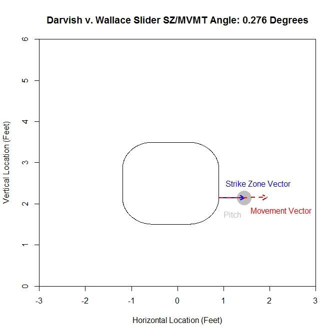
Kershaw Most Likely Functional photo Kershaw_Likely_Fcn.jpeg

This area method produces a functional (in our case, it has been discretized to each inch) that can be minimized easily. It is clear from the plot that the minimum occurs at slightly less than 55 feet. Since all of the plots for the functional essentially look parabolic, we will forgo any future plots of this nature.

The next method is to assume that the data is all from one cluster and remove any data points that have a lower than five-percent probability of coming from the dominant cluster. This produces slightly better visual results.

Kershaw Five Percent photo Kershaw_Five_Pct_Final.jpeg

For this choice, we get trimming away at the edges, but it is not as extreme as in the previous case. The release point is at 54 feet, 3 inches, which is very close to our previous estimate. The arm angle is more realistic, since we maintain the elliptical shape of the data, at 82 degrees.
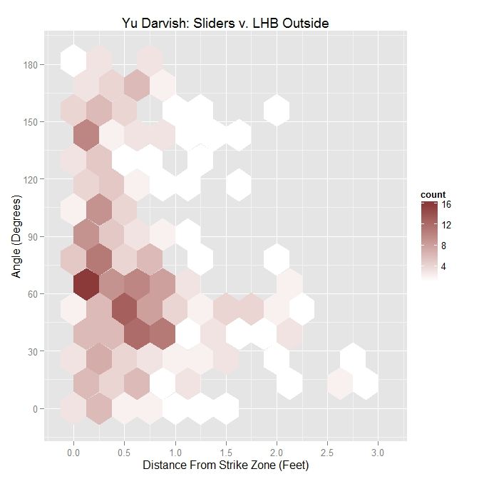
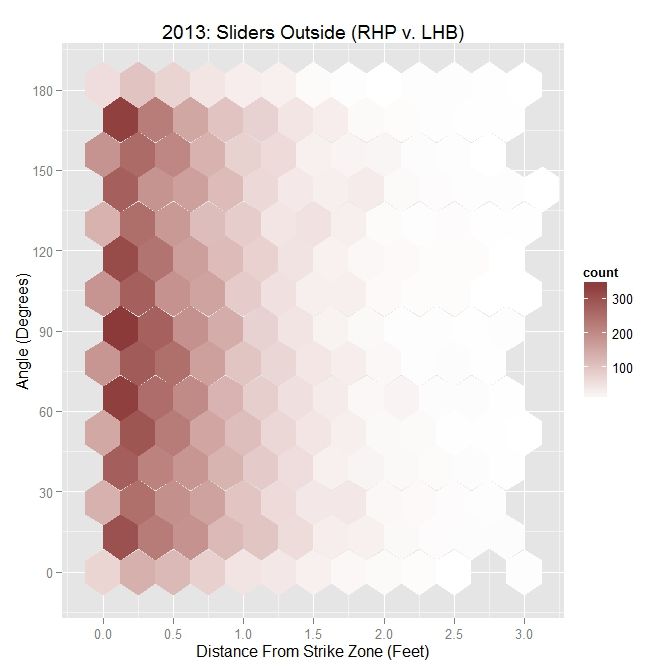
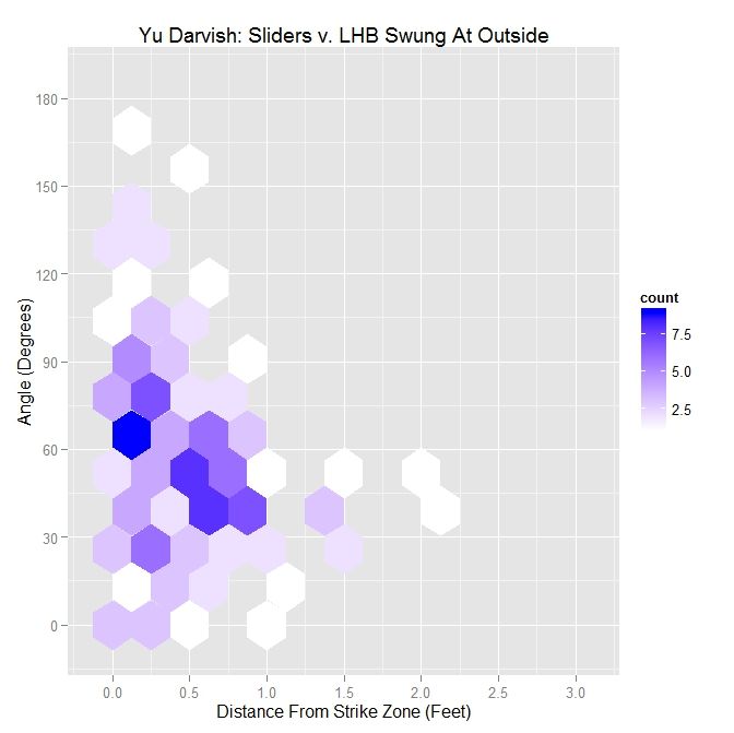
Kershaw Original photo Kershaw_Orig_Final.jpeg

Finally, we will run the algorithm with the data as-is. We get an ellipse that fits the original data well and indicates a release point of 54 feet, 9 inches. The arm angle, for the original data set, is 79 degrees.

Examining the results, the original data set may be the one of choice for running the algorithm. The shape of the data is already elliptic and, for all intents and purposes, one cluster. However, one may still want to remove manually the handful of outliers before preforming the estimation.

Case 2: Lance Lynn

Clayton Kershaw’s data set is much cleaner than most, consisting of a single cluster and a few outliers. Lance Lynn’s data has a different structure.

Lynn Clusters photo Lynn_Clusters.jpeg

The algorithm produces three clusters, two of which share some overlap and the third disjoint from the others. Immediately, it is obvious that running the algorithm on the original data will not produce good results because we do not have a single cluster like with Kershaw. One of our other choices will likely do better. Looking at the rolling average of release points, we can get an idea of what is going on with the data set.

Lynn Rolling Average photo Lynn_Average.jpeg

From the rolling average, we see that Lynn’s release point started around -2.3 feet, jumped to -3.4 feet and moved back to -2.3 feet. The moves discussed in the Kershaw section of 9 inches over consecutive, disjoint 300-pitch sequences are indicated by the two blue squares. So around Pitch #1518, Lynn moved about a foot to the left (from the catcher’s perspective) and later moved back, around Pitch #2239. So it makes sense that Lynn might have three clusters since there were two moves. However his first and third clusters could be considered the same since they are very similar in spatial location.

Lynn’s dominant cluster is the middle one, accounting for about 48% of the distribution. Running any sort of analysis on this will likely draw data from the right cluster as well. First up is the most-likely method:

Lynn Most Likely photo Lynn_Likely_Final.jpeg

Since we have two clusters that overlap, this method sharply cuts the data on the right hand side. The release point is at 54 feet, 4 inches and the release angle is 33 degrees. For the five-percent method, the cluster will be better shaped since the transition between clusters will not be so sharp.

Lynn Five Percent photo Lynn_Five_Pct_Final.jpeg

This produces a well-shaped single cluster which is free of all of the data on the left and some of the data from the far right cluster. The release point is at 53 feet, 11 inches and at an angle of 49 degrees.

As opposed to Kershaw, who had a single cluster, Lynn has at least two clusters. Therefore, running this method on the original data set probably will not fare well.

Lynn Original photo Lynn_Orig_Final.jpeg

Having more than one cluster and analyzing it as only one causes both a problem with the release point and release angle. Since the data has disjoint clusters, it violates our bivariate normal assumption. Also, the angle will likely be incorrect since the ellipse will not properly fit the data (in this instance, it is 82 degrees). Note that the release point distance is not in line with the estimates from the other two methods, being 51 feet, 5 inches instead of around 54 feet.

In this case, as opposed to Kershaw, who only had one pitch cluster, we can temporally sort the data based on the rolling average at the blue square (where the largest difference between the consecutive rolling averages is located).

Lynn Time Clusters photo Lynn_Time_Clusters.jpeg

Since there are two moves in release point, this generates three clusters, two of which overlap, as expected from the analysis of the rolling averages. As before, we can work with the dominant cluster, which is the red data. We will refer to this as the largest method, since it is the largest in terms of number of data points.  Note that with spatial clustering, we would pick up the some of the green and red data in the dominant cluster. Running the same algorithm for finding the release point distance and angle, we get:

Lynn Largest photo Lynn_Large_Final.jpeg

The distance from home plate of 53 feet, 9 inches matches our other estimates of about 54 feet. The angle in this case is 55 degrees, which is also in agreement. To finish our case study, we will look at another data set that has more than one cluster.

Case 3: Cole Hamels

Hamels Clusters photo Hamels_Clusters.jpeg

For Cole Hamels, we get two dense clusters and two sparse clusters. The two dense clusters appear to have a similar shape and one is shifted a little over a foot away from the other. The middle of the three consecutive clusters only accounts for 14% of the distribution and the long cluster running diagonally through the graph is mostly picking up the handful of outliers, and consists of less than 1% of the distribution. We will work with the the cluster with the largest weight, about 0.48, which is the cluster on the far right. If we look at the rolling average for Hamels’ release point, we can see that he switched his release point somewhere around Pitch #1359 last season.

Hamels Rolling Average photo Hamels_Average.jpeg

As in the clustered data, Hamel’s release point moves horizontally by just over a foot to the right during the season. As before, we will start by taking only the data which most likely belongs to the cluster on the right.

Hamels Most Likely photo Hamels_Likely_Final.jpeg

The release point distance is estimated at 52 feet, 11 inches using this method. In this case, the release angle is approximately 71 degrees. Note that on the top and the left the data has been noticeably trimmed away due to assigning data to the most likely cluster. The five-percent method produces:

Hamels Five Percent photo Hamels_Five_Pct_Final.jpeg

For this method of sorting through the data, we get 52 feet, 10 inches for the release point distance. The cluster has a better shape than the most-likely method and gives a release angle of 74 degrees. So far, both estimates are very close. Using just the original data set, we expect that the method will not perform well because there are two disjoint clusters.

Hamels Original photo Hamels_Orig_Final.jpeg

We run into the problem of treating two clusters as one and the angle of release goes to 89 degrees since both clusters are at about the same vertical level and therefore there is a large variation in the data horizontally.

Just like with Lance Lynn, we can do a temporal splitting of the data. In this case, we get two clusters since he changed his release point once.

Hamels Time Clusters photo Hamels_Time_Clusters.jpeg

Working with the dominant cluster, the blue data, we obtain a release point at 53 feet, 2 inches and a release angle of 75 degrees.

Hamels Largest photo Hamels_Large_Final.jpeg

All three methods that sort the data before performing the algorithm lead to similar results.

Conclusions:

Examining the results of these three cases, we can draw a few conclusions. First, regardless of the accuracy of the method, it does produce results within the realm of possibility. We do not get release point distances that are at the boundary of our search space of 45 to 65 feet, or something that would definitely be incorrect, such as 60 feet.  So while these release point distances have some error in them, this algorithm can likely be refined to be more accurate. Another interesting result is that, provided that the data is predominantly one cluster, the results do not change dramatically due to how we remove outliers or smaller additional clusters. In most cases, the change is typically only a few inches. For the release angles, the five-percent method or largest method probably produces the best results because it does not misshape the clusters like the mostly-likely method does and does not run into the problem of multiple clusters that may plague the original data. Overall, the five-percent method is probably the best bet for running the algorithm and getting decent results for cases of repeated clusters (Lance Lynn) and the largest method will work best for disjoint clusters (Cole Hamels). If just one cluster exists, then working with the original data would seem preferable (Clayton Kershaw).

Moving forward, the goal is settle on a single method for sorting the data before running the algorithm. The largest method seems the best choice for a robust algorithm since it is inexpensive and, based on limited results, performs on par with the best spatial clustering methods. One problem that comes up in running the simulations that does not show up in the data is the cost of the clustering algorithm. Since the method for finding the clusters is incremental, it can be slow, depending on the number of clusters. One must also iterate to find the covariance matrices and weights for each cluster, which can also be expensive. In addition, the spatial clustering only has the advantages of removing outliers and maintaining repeated clusters, as in Lance Lynn’s case. Given the difference in run time, a few seconds for temporal splitting versus a few hours for spatial clustering, it seems a small price to pay. There are also other approaches that can be taken. The data could be broken down by start and sorted that way as well, with some criteria assigned to determine when data from two starts belong to the same cluster.
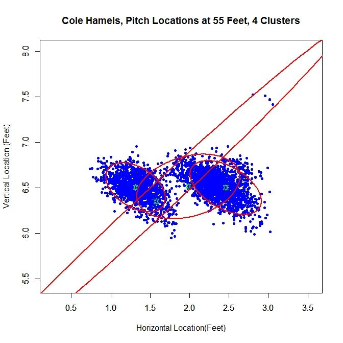
Another problem exists that we may not be able to account for. Since the data for the path of a pitch starts at 50 feet and is for tracking the pitch toward home plate, we are essentially extrapolating to get the position of the pitch before (for larger values than) 50 feet. While this may hold for a small distance, we do not know exactly how far this trajectory is correct. The location of the pitch prior to its individual release point, which we may not know, is essentially hypothetical data since the pitch never existed at that distance from home plate. This is why is might be important to get a good estimate of a pitcher’s release point distance.

There are certainly many other ways to go about estimating release point distance, such as other ways to judge “closeness” of the pitches or sort the data. By mathematizing the problem, and depending on the implementation choices, we have a means to find a distinct release point distance. This is a first attempt at solving this problem which shows some potential. The goal now is to refine it and make it more robust.

Once the algorithm is finalized, it would be interesting to go through video and see how well the results match reality, in terms of release point distance and angle. As it is, we are essentially operating blind since we are using nothing but the PITCHf/x data and some reasonable assumptions. While this worked to produce decent results, it would be best to create a single, robust algorithm that does not require visual inspection of the data for each case. When that is completed, we could then run the algorithm on a large sample of pitchers and compare the results.