Estimating Pitcher Release Point Distance from PITCHf/x Data
For PITCHf/x data, the starting point for pitches, in terms of the location, velocity, and acceleration, is set at 50 feet from the back of home plate. This is effectively the time-zero location of each pitch. However, 55 feet seems to be the consensus for setting an actual release point distance from home plate, and is used for all pitchers. While this is a reasonable estimate to handle the PITCHf/x data en masse, it would be interesting to see if we can calculate this on the level of individual pitchers, since their release point distances will probably vary based on a number of parameters (height, stride, throwing motion, etc.). The goal here is to try to use PITCHf/x data to estimate the average distance from home plate the each pitcher releases his pitches, conceding that each pitch is going to be released from a slightly different distance. Since we are operating in the blind, we have to first define what it means to find a pitcher’s release point distance based solely on PITCHf/x data. This definition will set the course by which we will go about calculating the release point distance mathematically.
We will define the release point distance as the y-location (the direction from home plate to the pitching mound) at which the pitches from a specific pitcher are “closest together”. This definition makes sense as we would expect the point of origin to be the location where the pitches are closer together than any future point in their trajectory. It also gives us a way to look for this point: treat the pitch locations at a specified distance as a cluster and find the distance at which they are closest. In order to do this, we will make a few assumptions. First, we will assume that the pitches near the release point are from a single bivariate normal (or two-dimensional Gaussian) distribution, from which we can compute a sample mean and covariance. This assumption seems reasonable for most pitchers, but for others we will have to do a little more work.
Next we need to define a metric for measuring this idea of closeness. The previous assumption gives us a possible way to do this: compute the ellipse, based on the data at a fixed distance from home plate, that accounts for two standard deviations in each direction along the principal axes for the cluster. This is a way to provide a two-dimensional figure which encloses most of the data, of which we can calculate an associated area. The one-dimensional analogue to this is finding the distance between two standard deviations of a univariate normal distribution. Such a calculation in two dimensions amounts to finding the sample covariance, which, for this problem, will be a 2×2 matrix, finding its eigenvalues and eigenvectors, and using this to find the area of the ellipse. Here, each eigenvector defines a principal axis and its corresponding eigenvalue the variance along that axis (taking the square root of each eigenvalue gives the standard deviation along that axis). The formula for the area of an ellipse is Area = pi*a*b, where a is half of the length of the major axis and b half of the length of the minor axis. The area of the ellipse we are interested in is four times pi times the square root of each eigenvalue. Note that since we want to find the distance corresponding to the minimum area, the choice of two standard deviations, in lieu of one or three, is irrelevant since this plays the role of a scale factor and will not affect the location of the minimum, only the value of the functional.
With this definition of closeness in order, we can now set up the algorithm. To be safe, we will take a large berth around y=55 to calculate the ellipses. Based on trial and error, y=45 to y=65 seems more than sufficient. Starting at one end, say y=45, we use the PITCHf/x location, velocity, and acceleration data to calculate the x (horizontal) and z (vertical) position of each pitch at 45 feet. We can then compute the sample covariance and then the area of the ellipse. Working in increments, say one inch, we can work toward y=65. This will produce a discrete function with a minimum value. We can then find where the minimum occurs (choosing the smallest value in a finite set) and thus the estimate of the release point distance for the pitcher.
Earlier we assumed that the data at a fixed y-location was from a bivariate normal distribution. While this is a reasonable assumption, one can still run into difficulties with noisy/inaccurate data or multiple clusters. This can be for myriad reasons: in-season change in pitching mechanics, change in location on the pitching rubber, etc. Since data sets with these factors present will still produce results via the outlined algorithm despite violating our assumptions, the results may be spurious. To handle this, we will fit the data to a Gaussian mixture model via an incremental k-means algorithm at 55 feet. This will approximate the distribution of the data with a probability density function (pdf) that is the sum of k bivariate normal distributions, referred to as components, weighted by their contribution to the pdf, where the weights sum to unity. The number of components, k, is determined by the algorithm based on the distribution of the data.
With the mixture model in hand, we then are faced with how to assign each data point to a cluster. This is not so much a problem as a choice and there are a few reasonable ways to do it. In the process of determining the pdf, each data point is assigned a conditional probability that it belongs to each component. Based on these probabilities, we can assign each data point to a component, thus forming clusters (from here on, we will use the term “cluster” generically to refer to the number of components in the pdf as well as the groupings of data to simplify the terminology). The easiest way to assign the data would be to associate each point with the cluster that it has the highest probability of belonging to. We could then take the largest cluster and perform the analysis on it. However, this becomes troublesome for cases like overlapping clusters.
A better assumption would be that there is one dominant cluster and to treat the rest as “noise”. Then we would keep only the points that have at least a fixed probability or better of belonging to the dominant cluster, say five percent. This will throw away less data and fits better with the previous assumption of a single bivariate normal cluster. Both of these methods will also handle the problem of having disjoint clusters by choosing only the one with the most data. In demonstrating the algorithm, we will try these two methods for sorting the data as well as including all data, bivariate normal or not. We will also explore a temporal sorting of the data, as this may do a better job than spatial clustering and is much cheaper to perform.
To demonstrate this algorithm, we will choose three pitchers with unique data sets from the 2012 season and see how it performs on them: Clayton Kershaw, Lance Lynn, and Cole Hamels.
Case 1: Clayton Kershaw
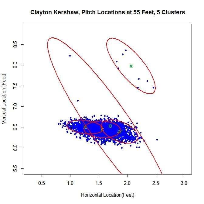
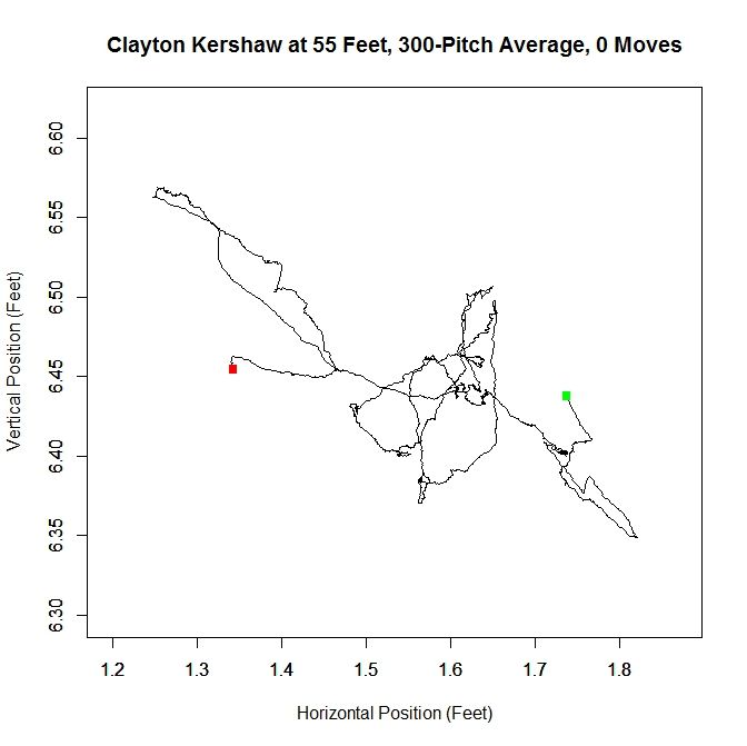
At 55 feet, the Gaussian mixture model identifies five clusters for Kershaw’s data. The green stars represent the center of each cluster and the red ellipses indicate two standard deviations from center along the principal axes. The largest cluster in this group has a weight of .64, meaning it accounts for 64% of the mixture model’s distribution. This is the cluster around the point (1.56,6.44). We will work off of this cluster and remove the data that has a low probability of coming from it. This is will include dispensing with the sparse cluster to the upper-right and some data on the periphery of the main cluster. We can see how Kershaw’s clusters are generated by taking a rolling average of his pitch locations at 55 feet (the standard distance used for release points) over the course of 300 pitches (about three starts).
The green square indicates the average of the first 300 pitches and the red the last 300. From the plot, we can see that Kershaw’s data at 55 feet has very little variation in the vertical direction but, over the course of the season, drifts about 0.4 feet with a large part of the rolling average living between 1.5 and 1.6 feet (measured from the center of home plate). For future reference, we will define a “move” of release point as a 9-inch change in consecutive, disjoint 300-pitch averages (this is the “0 Moves” that shows up in the title of the plot and would have been denoted by a blue square in the plot). The choices of 300 pitches and 9 inches for a move was chosen to provide a large enough sample and enough distance for the clusters to be noticeably disjoint, but one could choose, for example, 100 pitches and 6 inches or any other reasonable values. So, we can conclude that Kershaw never made a significant change in his release point during 2012 and therefore treating the data a single cluster is justifiable.
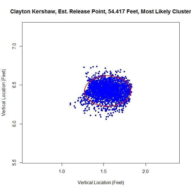
From the spatial clustering results, the first way we will clean up the data set is to take only the data which is most likely from the dominant cluster (based on the conditional probabilities from the clustering algorithm). We can then take this data and approximate the release point distance via the previously discussed algorithm. The release point for this set is estimated at 54 feet, 5 inches. We can also estimate the arm release angle, the angle a pitcher’s arm would make with a horizontal line when viewed from the catcher’s perspective (0 degrees would be a sidearm delivery and would increase as the arm was raised, up to 90 degrees). This can be accomplished by taking the angle of the eigenvector, from horizontal, which corresponds to the smaller variance. This is working under the assumption that a pitcher’s release point will vary more perpendicular to the arm than parallel to the arm. In this case, the arm angle is estimated at 90 degrees. This is likely because we have blunted the edges of the cluster too much, making it closer to circular than the original data. This is because we have the clusters to the left and right of the dominant cluster which are not contributing data. It is obvious that this way of sorting the data has the problem of creating sharp transitions at the edge of cluster.
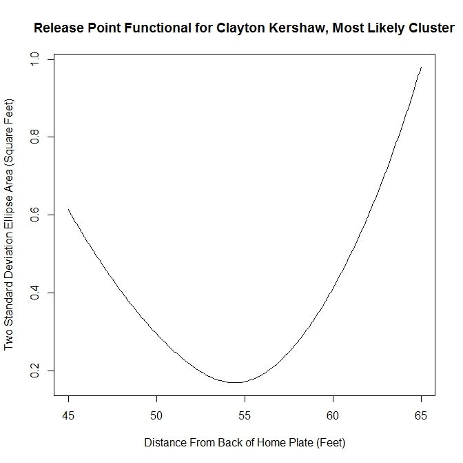
As discussed above, we run the algorithm from 45 to 65 feet, in one-inch increments, and find the location corresponding to the smallest ellipse. We can look at the functional that tracks the area of the ellipses at different distances in the aforementioned case.
This area method produces a functional (in our case, it has been discretized to each inch) that can be minimized easily. It is clear from the plot that the minimum occurs at slightly less than 55 feet. Since all of the plots for the functional essentially look parabolic, we will forgo any future plots of this nature.
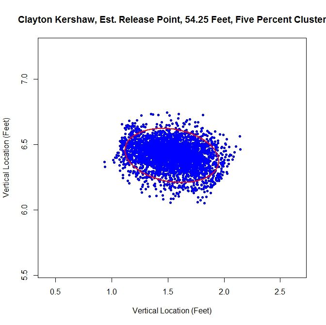
The next method is to assume that the data is all from one cluster and remove any data points that have a lower than five-percent probability of coming from the dominant cluster. This produces slightly better visual results.
For this choice, we get trimming away at the edges, but it is not as extreme as in the previous case. The release point is at 54 feet, 3 inches, which is very close to our previous estimate. The arm angle is more realistic, since we maintain the elliptical shape of the data, at 82 degrees.
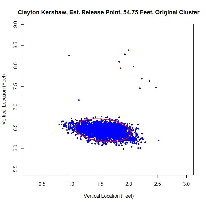
Finally, we will run the algorithm with the data as-is. We get an ellipse that fits the original data well and indicates a release point of 54 feet, 9 inches. The arm angle, for the original data set, is 79 degrees.
Examining the results, the original data set may be the one of choice for running the algorithm. The shape of the data is already elliptic and, for all intents and purposes, one cluster. However, one may still want to remove manually the handful of outliers before preforming the estimation.
Case 2: Lance Lynn
Clayton Kershaw’s data set is much cleaner than most, consisting of a single cluster and a few outliers. Lance Lynn’s data has a different structure.
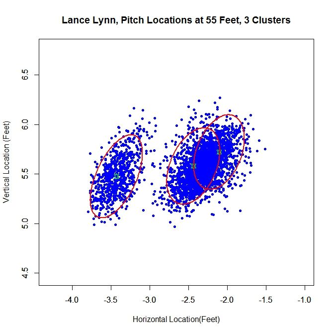
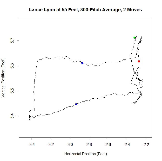
The algorithm produces three clusters, two of which share some overlap and the third disjoint from the others. Immediately, it is obvious that running the algorithm on the original data will not produce good results because we do not have a single cluster like with Kershaw. One of our other choices will likely do better. Looking at the rolling average of release points, we can get an idea of what is going on with the data set.
From the rolling average, we see that Lynn’s release point started around -2.3 feet, jumped to -3.4 feet and moved back to -2.3 feet. The moves discussed in the Kershaw section of 9 inches over consecutive, disjoint 300-pitch sequences are indicated by the two blue squares. So around Pitch #1518, Lynn moved about a foot to the left (from the catcher’s perspective) and later moved back, around Pitch #2239. So it makes sense that Lynn might have three clusters since there were two moves. However his first and third clusters could be considered the same since they are very similar in spatial location.
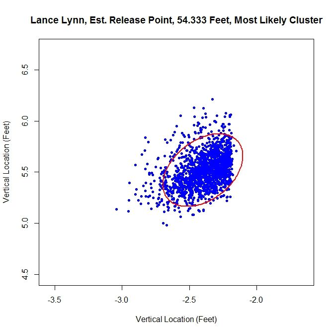
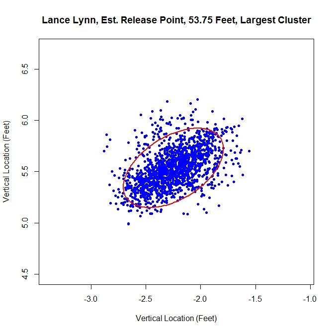
Lynn’s dominant cluster is the middle one, accounting for about 48% of the distribution. Running any sort of analysis on this will likely draw data from the right cluster as well. First up is the most-likely method:
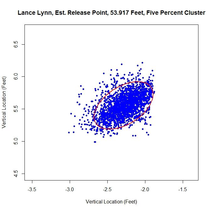
Since we have two clusters that overlap, this method sharply cuts the data on the right hand side. The release point is at 54 feet, 4 inches and the release angle is 33 degrees. For the five-percent method, the cluster will be better shaped since the transition between clusters will not be so sharp.
This produces a well-shaped single cluster which is free of all of the data on the left and some of the data from the far right cluster. The release point is at 53 feet, 11 inches and at an angle of 49 degrees.
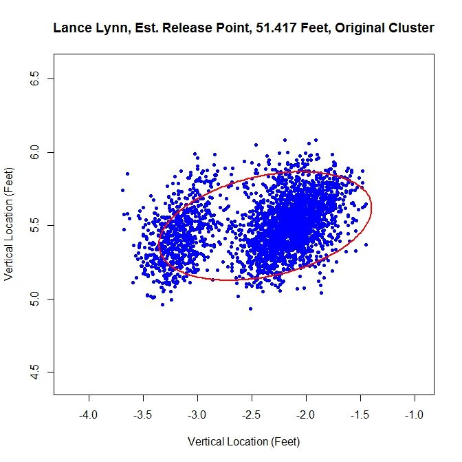
As opposed to Kershaw, who had a single cluster, Lynn has at least two clusters. Therefore, running this method on the original data set probably will not fare well.
Having more than one cluster and analyzing it as only one causes both a problem with the release point and release angle. Since the data has disjoint clusters, it violates our bivariate normal assumption. Also, the angle will likely be incorrect since the ellipse will not properly fit the data (in this instance, it is 82 degrees). Note that the release point distance is not in line with the estimates from the other two methods, being 51 feet, 5 inches instead of around 54 feet.
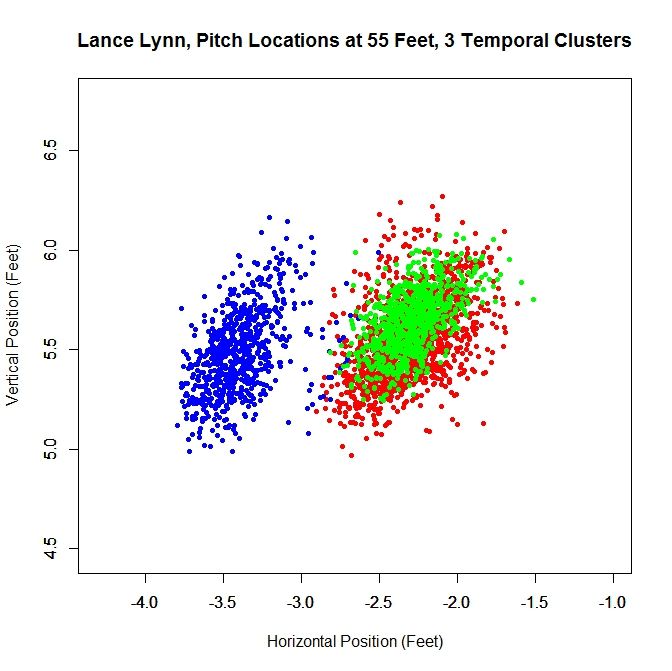
In this case, as opposed to Kershaw, who only had one pitch cluster, we can temporally sort the data based on the rolling average at the blue square (where the largest difference between the consecutive rolling averages is located).
Since there are two moves in release point, this generates three clusters, two of which overlap, as expected from the analysis of the rolling averages. As before, we can work with the dominant cluster, which is the red data. We will refer to this as the largest method, since it is the largest in terms of number of data points. Note that with spatial clustering, we would pick up the some of the green and red data in the dominant cluster. Running the same algorithm for finding the release point distance and angle, we get:
The distance from home plate of 53 feet, 9 inches matches our other estimates of about 54 feet. The angle in this case is 55 degrees, which is also in agreement. To finish our case study, we will look at another data set that has more than one cluster.
Case 3: Cole Hamels
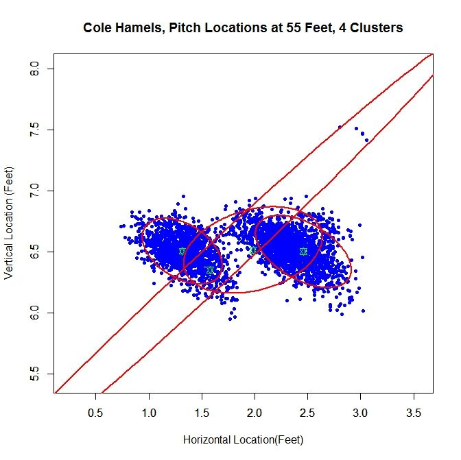
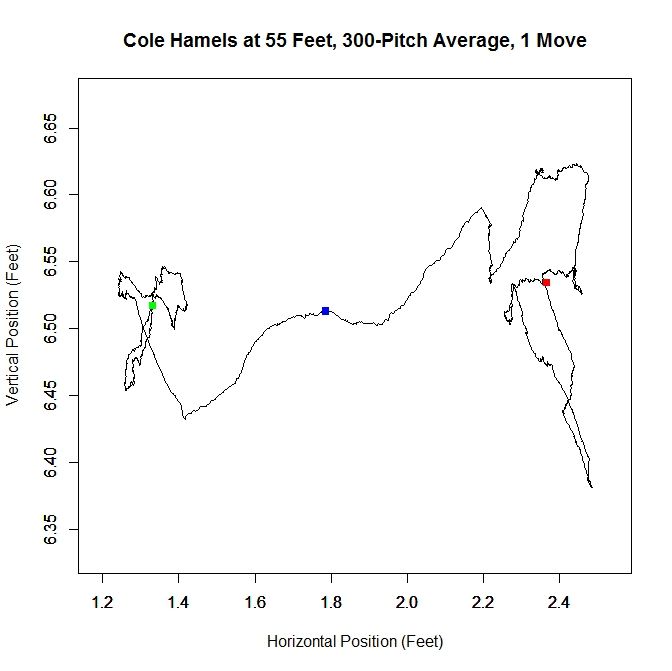
For Cole Hamels, we get two dense clusters and two sparse clusters. The two dense clusters appear to have a similar shape and one is shifted a little over a foot away from the other. The middle of the three consecutive clusters only accounts for 14% of the distribution and the long cluster running diagonally through the graph is mostly picking up the handful of outliers, and consists of less than 1% of the distribution. We will work with the the cluster with the largest weight, about 0.48, which is the cluster on the far right. If we look at the rolling average for Hamels’ release point, we can see that he switched his release point somewhere around Pitch #1359 last season.
As in the clustered data, Hamel’s release point moves horizontally by just over a foot to the right during the season. As before, we will start by taking only the data which most likely belongs to the cluster on the right.
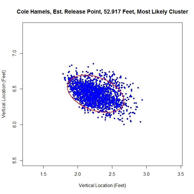
The release point distance is estimated at 52 feet, 11 inches using this method. In this case, the release angle is approximately 71 degrees. Note that on the top and the left the data has been noticeably trimmed away due to assigning data to the most likely cluster. The five-percent method produces:
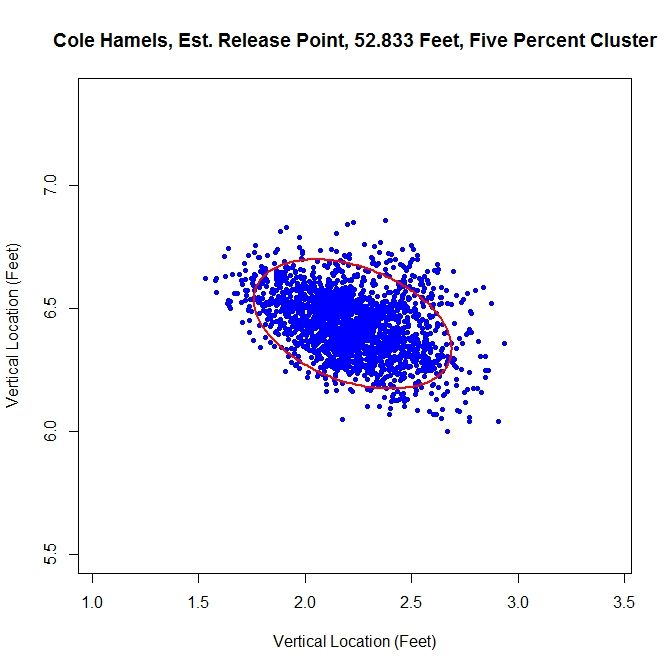
For this method of sorting through the data, we get 52 feet, 10 inches for the release point distance. The cluster has a better shape than the most-likely method and gives a release angle of 74 degrees. So far, both estimates are very close. Using just the original data set, we expect that the method will not perform well because there are two disjoint clusters.
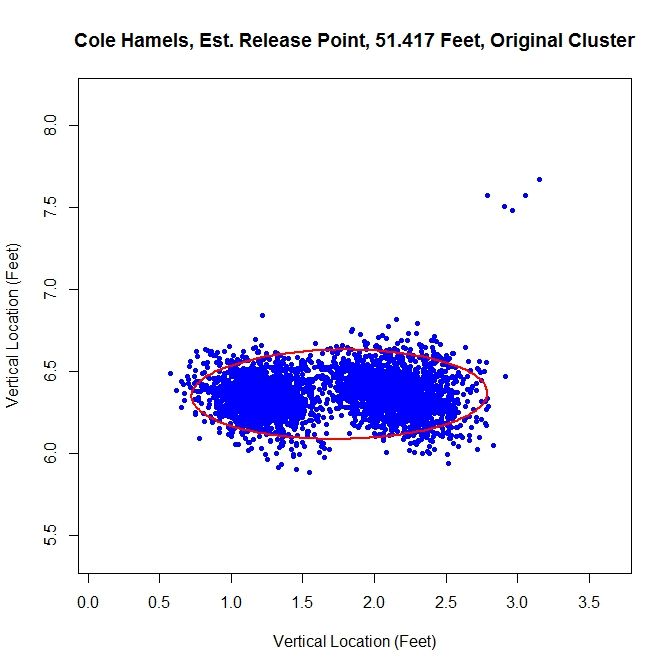
We run into the problem of treating two clusters as one and the angle of release goes to 89 degrees since both clusters are at about the same vertical level and therefore there is a large variation in the data horizontally.
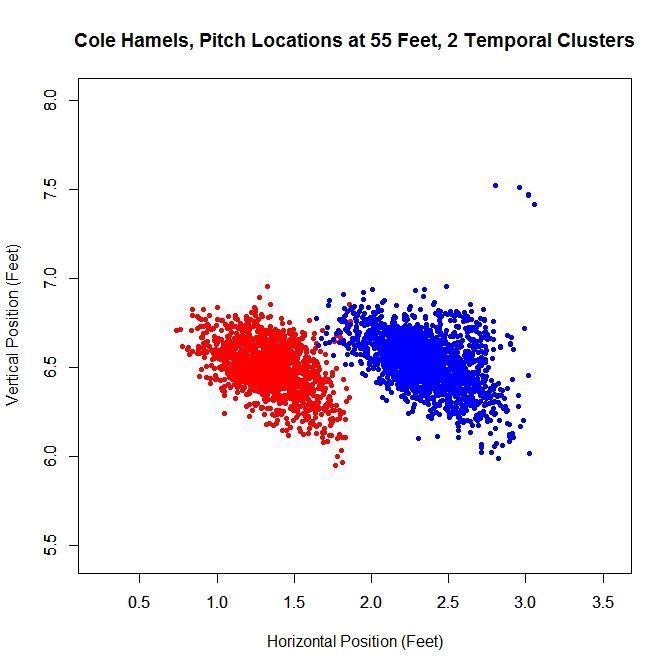
Just like with Lance Lynn, we can do a temporal splitting of the data. In this case, we get two clusters since he changed his release point once.
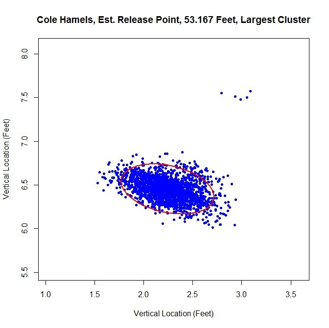
Working with the dominant cluster, the blue data, we obtain a release point at 53 feet, 2 inches and a release angle of 75 degrees.
All three methods that sort the data before performing the algorithm lead to similar results.
Conclusions:
Examining the results of these three cases, we can draw a few conclusions. First, regardless of the accuracy of the method, it does produce results within the realm of possibility. We do not get release point distances that are at the boundary of our search space of 45 to 65 feet, or something that would definitely be incorrect, such as 60 feet. So while these release point distances have some error in them, this algorithm can likely be refined to be more accurate. Another interesting result is that, provided that the data is predominantly one cluster, the results do not change dramatically due to how we remove outliers or smaller additional clusters. In most cases, the change is typically only a few inches. For the release angles, the five-percent method or largest method probably produces the best results because it does not misshape the clusters like the mostly-likely method does and does not run into the problem of multiple clusters that may plague the original data. Overall, the five-percent method is probably the best bet for running the algorithm and getting decent results for cases of repeated clusters (Lance Lynn) and the largest method will work best for disjoint clusters (Cole Hamels). If just one cluster exists, then working with the original data would seem preferable (Clayton Kershaw).
Moving forward, the goal is settle on a single method for sorting the data before running the algorithm. The largest method seems the best choice for a robust algorithm since it is inexpensive and, based on limited results, performs on par with the best spatial clustering methods. One problem that comes up in running the simulations that does not show up in the data is the cost of the clustering algorithm. Since the method for finding the clusters is incremental, it can be slow, depending on the number of clusters. One must also iterate to find the covariance matrices and weights for each cluster, which can also be expensive. In addition, the spatial clustering only has the advantages of removing outliers and maintaining repeated clusters, as in Lance Lynn’s case. Given the difference in run time, a few seconds for temporal splitting versus a few hours for spatial clustering, it seems a small price to pay. There are also other approaches that can be taken. The data could be broken down by start and sorted that way as well, with some criteria assigned to determine when data from two starts belong to the same cluster.
Another problem exists that we may not be able to account for. Since the data for the path of a pitch starts at 50 feet and is for tracking the pitch toward home plate, we are essentially extrapolating to get the position of the pitch before (for larger values than) 50 feet. While this may hold for a small distance, we do not know exactly how far this trajectory is correct. The location of the pitch prior to its individual release point, which we may not know, is essentially hypothetical data since the pitch never existed at that distance from home plate. This is why is might be important to get a good estimate of a pitcher’s release point distance.
There are certainly many other ways to go about estimating release point distance, such as other ways to judge “closeness” of the pitches or sort the data. By mathematizing the problem, and depending on the implementation choices, we have a means to find a distinct release point distance. This is a first attempt at solving this problem which shows some potential. The goal now is to refine it and make it more robust.
Once the algorithm is finalized, it would be interesting to go through video and see how well the results match reality, in terms of release point distance and angle. As it is, we are essentially operating blind since we are using nothing but the PITCHf/x data and some reasonable assumptions. While this worked to produce decent results, it would be best to create a single, robust algorithm that does not require visual inspection of the data for each case. When that is completed, we could then run the algorithm on a large sample of pitchers and compare the results.
Matthew Mata is a mathematician, specializing in applied mathematics and scientific computing. He can be reached via email here. Follow his sporadic tweets on Twitter @arcarsenal8.
What a beautiful example of statistical research with a touch of data mining and a bunch of baseball passion. Great job, guys. I was just wondering, what medium did you use to carry out your analyses (MATLAB, R, etc)? Looking forward to seeing more
Hi,
Thanks! I should note that even though I use “we” in the piece, it’s just me. For this, about 6 months ago, I downloaded Mike Fast’s PITCHf/x code, went through it line-by-line, edited it, and added a few hundred lines of my own. Then I relearned R since I hadn’t used in it about 6 years and I used that for the above analysis. It’s pretty convenient for calling the MySQL database using the RODBC package. If people are interested and I take this further, I might switch to C++ since then I can parallelize it. Parallel C++ using OpenMP would be a lot faster and would take away some of the hurdles related to time for running the spatial clustering. I actually have a bunch of R codes for doing weird things with PITCHf/x data like this that I haven’t written up yet, but if there’s interest, I’ll try submitting another piece to community research soon.
The idea for this came from some work I’ve done with image processing, where you try to remove noise from an image. To do so, you set up an energy functional which has two terms: one which keeps the denoised image close to the original noisy image and another which penalizes for large gradients between pixels. Minimizing the sum of those energies makes it so the image is smoother without deviating too far from the image itself. In this case, we just have the term that represents the spread of the data which we are minimizing. However, additional terms could be added in to penalize for various things. The rolling average is a very simple form of signal processing that I made up on the spot.
Really neat work! Enjoyable read! I liked your creative applications of signal processing.
Would you comment on if the multiple clustering (Fig.1) that the algorithm was identifying were different pitch types?
My apologies if you already cover this in the article…I couldn’t find it.
Cheers!
Thanks. I’m glad you enjoyed it. The multiple clusters are probably more a result of the data not being exactly bivariate normal and the way the clustering algorithm works rather than the pitch type. I haven’t looked into pitch type for this, mostly because this article was a little bit long to begin with (15 pages in Word). I’ll look into this tomorrow and let you know in the comments. If you have other questions about the clustering algorithm, I can recommend the paper I got it from.
In response to the comment about pitch types and clusters for Kershaw, the only pitch that doesn’t overlap well with the large cluster at the bottom is the curve, which tends to appear more to the left side of the cluster. All of the other pitches roughly cover the same area. Also, the handful of pitches in the upper-right are intentional balls, so in that case that cluster does match a pitch type, and I’ll probably remove those in future iterations of the code.
Excellent analysis and very well written article.
Fantastic work, Arcarsenal8.
Out of curiosity, what type of image processing do you do? Some of the concepts used in this analysis are very similar to what we use in neuroimaging, in particular processing diffusion tensor imaging scans. Anyways, it’s always fun to see my work life collide and interact with my baseball hobbies.
Question: What was your algorithm for determining the number of components k? For example, how did your initial plot of Kershaw determine that there were 5 clusters? More specifically, how did your algorithm determine that the big blob is really 3 clusters (even though you eventually treated it as one larger cluster)?
Hi,
In my masters program, we did some work with image deblurring/denoising as a group final project since there were only four of us in the program. I don’t remember the specifics of what we did, but it was pretty standard stuff like removing Gaussian blur or random uniform noise in a greyscale image. In my PhD program, I took several classes where we did image processing, so I also learned it that way. There were also a lot of talks I attended on pan-sharpening, filling in missing pixels, etc. I also had a friend that worked on problems of identifying terrain and specific objects in images. I believe most of the denoising methods were total variation-based, but since I wasn’t working on it directly, I don’t remember all of the details. My formal background, in terms of publications and research, is in handling missing data in data sets and computational fluid dynamics (which is what I do now).
Hi,
For whatever reason, there isn’t a reply button to click so this post is out of order. To address the clustering algorithm, the one I’m using is for speaker identification based on data about their speech waves. The first cluster loops over all data points, treating each as a possible center and computing the sum over j of exp(-||x_j -x_c||) where x_c is the proposed center. This gives N sums (if we have N data points), which we can think of as energies, and choosing the maximum gives the first cluster center. This essentially chooses the point which locally has the most points close to it. Since the sum involves exponential decay, points far away don’t contribute as much.
The subsequent centers are based on the 2-norm. The paper I’m drawing from doesn’t explain it well and has some typos, so I had to fix the problems in it and figure out what they were saying. The idea is that now that we have the first center, we can run through the data points again and choose another center. If we have center x_c1 (from before) and proposed center x_c2, we again compute a sum over all data points. This time we find ||x_j – x_c1|| and ||x_j – x_c2|| and choose the smaller of the two and add it to the sum. Then since there are N-1 possible new centers, we find the minimum, since that will give us the new center that minimizes the distance between each data point and one of the centers. This process continues for forming the clusters. For a stopping criterion, the process terminates when the clusters are found to be statistically dependent after the EM process of determining the covariances and weights.
In regard to the number of clusters for Kershaw, if you look at the rolling average, you get results that look random walk-esque (its not exactly a random walk since its an average but the results behave similiarly), meaning that the release point in these areas is probably consistent with some noise. When a change occurs, the rolling average straightens out since there will be a large contribution from the horizontal component. This can be seen for Lynn and Hamels.
For Kershaw, if I reduce the move distance from 9 inches to 3 inches, it produces 2 clusters. If I shrink it to 2 inches, it makes 6 clusters. So getting 3 clusters from the rolling average sets the distance between clusters somewhere in the middle. Visually, the areas that exhibit random walk behavior are about 0.2 feet apart, which is in the range of 2-3 inches.
There is a lot a room for change in the algorithm and that’s why I presented it in this manner rather than picking one method and making it definitive. I’d be happy to hear if you had any input or suggestions since the algorithm is limited to my knowledge base and I could be missing things that could improve it that I’m just not aware of.
Thanks for the detailed reply. On another topic, I’d like to learn more about your CFD work. When you get a chance, please send me an e-mail.
Another question: In the Lance Lynn analysis, you have three clusters, two of which are overlapping. What would you find if you analyzed the one that does not overlap the others? Similar question applies to the two dominant clusters from Hamels (the red and blue clusters, which look to the eye to be pretty similar in shape, only shifted).
Sure. I’d be happy to talk to you. I’ve read most of your work and I really enjoy it.
I’ve thought about analyzing multiple clusters as a way to check consistency for the estimates (do both clusters produce similar distances). It’s not hard to do numerically, especially when you don’t have to use spatial clustering. I can probably look into this tonight and get back to you with some results.
Here are the results for all temporal clusters for Hamels and Lynn:
Cole Hamels: Cluster #1 = Red, Cluster #2 = Blue
Cluster #1 Distance: 52.833
Cluster #1 Angle: 74.029
Cluster #2 Distance: 53.167
Cluster #2 Angle: 74.865
Lance Lynn: Cluster #1 = Red, Cluster #2 = Blue, Cluster #3 = Green
Cluster #1 Distance: 53.75
Cluster #1 Angle: 54.671
Cluster #2 Distance: 53.083
Cluster #2 Angle: 47.376
Cluster #3 Distance: 54
Cluster #3 Angle: 53.978
The results for the angle look very similar as do the distances, except maybe Lynn’s cluster #2.
Really interesting work! Some information about how Pitch Fx works tat migh be helpful to you. Pitch Fx only tracks ball position. From the ball positions all the other pitch data is inferred. However, the pitch is not tracked all the way from the release point to bat contact. It is tracked only in the Region of Interest (ROI) which begins somewhere between 45 and 35 feet from home plate and ends about 8 to 12 feet from home plate. The reason for this is to eliminate areas where extraneous movement might confuse the ball tracking algorithm. Because the camera positions are not the same in each stadium te ROIs are different for each stadium. This means that he amount of extrapolation for the ball release point differs for each stadium. Because of this it might be wise to calculate first on only home game data for a pitcher and then see if the release point agrees with calculations from other ball parks.
Thanks! At some point, I’m going to write a version 2.0 of this algorithm and I’ll make sure to check home vs away. It’s always good to get as much information as possible so I can do a better job in my calculations. If the release point is approximately 55 feet, that means we’re dealing with 10 to 20 feet of extrapolation and in general polynomial extrapolation isn’t a great idea (especially for higher order but we might be okay at order 2). Thanks again and any other advice/suggestions are welcome.
Peter makes an excellent point and his suggestion of looking initially just at home games in a good one. The constant acceleration model for the trajectory that is used by Pitchf/x is an approximation to the exact trajectory. Therefore, the parameters will be dependent on the ROI that is used. The closer the start of the ROI is to the actual release point, the better the extrapolation will work. Comparing release points by a given pitcher at different stadiums might be quite interesting. The ROI will generally extend closer to both the pitcher and batter for stadiums that utilize a “high third” camera rather than a “high home” camera. So, comparing those two classes of stadiums would be especially interesting. I’ll send you an e-mail with the info about which stadiums are which.
What a fascinating study. I wonder what Tim Lincecum would look like if similarly analyzed?
I also really like At the Drive In and Baseball.
This is really great work. The Community Researchers have really been killing it lately. Keep up the incredible work!
This is amazing! Congratulations!
Thanks for all of the supportive comments. I’m going to try to put together a new piece on this with all of the input I’ve received. I don’t know exactly how it will be structured, but I’ll try to include a larger sample of pitchers, so if there are other suggestions, like Lincecum, please let me know.
While I admit it’s probably impossible, I wonder if there is any way to filter out the amount of change in the “release point” this is measuring with where the pitcher positions on the rubber? Some pitchers move from left to right on the rubber depending on the handedness of the opposing batter, others move a little based on count or pitch they are throwing.
At lunch and just skimmed. Isn’t the exact release point in the PFX data itself? I’m not sure it displays anywhere but if you look at the raw data presented by MLB. COM, it’s in there. It has to be in order to calculate the BRK and PFX numbers.
Again I only skimmed and need to read in detail to see what you’re getting after.
Finally got there in the last paragraphs. Kind if an interesting exercise. If I get this, PFX takes it back to 50 feet and you are trying to extend the arc back beyond and see where they mostly intersect and the actual physical release point is HERE (or so).
It might be fun to ultimately create some sort if release point consistency rating and see how well that correlates to things like walks and percent of pitches on the edges of the strike zone. Maybe it doesn’t matter but you don’t know unless you ask, right?
Yes, that’s the basic idea. As for your questions, Mike Fast did an excellent job discussing this topic, including consistency, in a 2010 article at BP, if you’re interested:
http://www.baseballprospectus.com/article.php?articleid=12432
My only concern would be the ROI thing. That’s a big extrapolation to a small point. Hopefully the noise doesn’t sink you. You can always run your results thru a smell test like running that Japanese pitcher with the freakishly consistent release point.
I have trying some thing similar for trying to estimate release points. I was wondering how many pitchers you ran it on, and if you had looked at the year to year correlation of the release distance for a pitcher. Or if there was a correlation with release distance and height.
In particular I was wondering if you ran Ubaldo Jimenez through your different processes. I found anecdotal evidence that he has a very short stride but when I looked a what distance his release points where the most tightly I got him releasing the the ball between 78 and 81 inches from the rubber in 2009 (which would be above the major league average of 70 inches given by Trackman) but more surprisingly I got him releasing the ball and in human 108 to 112 inches from the rubber in 2012 so I was just curious to see what release distance you would get for Jimenez’s 2012 campaign.
Great work by the way.
Hi,
I’ve run the original algorithm with no clustering on all pitchers and occasionally you get bad results, like 50 feet, for a release point. That’s why I started looking into clustering methods for sorting the data. This piece was meant to be an exploratory look at possible methods, so I didn’t include any more than that. I’m working on a followup piece, which will address a lot of the things mentioned in the comments thread. In that I’ll do an analysis of a larger pitcher sample. I’ve thought of checking season-to-season correlation, so I might include that. Correlation to height might be an interesting thing to check as well.
As for Jimenez, using the temporal splitting of the data, I get one cluster with an average release distance of 54.417 feet for 2012.