Archive for Strategy

Introducing Shape+: A Mixed Effects Take on Pitch Modeling

In late February, I decided to try my hand at building out my own pitch model similar to Stuff+. I had no coding or modeling experience, and outside of my overall baseball knowledge I was starting from scratch. However, with the help of Bradley Woodrum, a former Miami Marlins analyst and FanGraphs contributor, and AI, I was able to learn what I needed and develop Shape+ in R over the course of about six weeks.

Shape+ is a location independent, layered mixed effects model that aims to quantify the relationship between pitch shape and run prevention. It uses its layered model approach to isolate physical pitch characteristics and predict their expected impact on run value (xRV), producing standardized scores that are both descriptive and predictive of a pitcher’s performance.

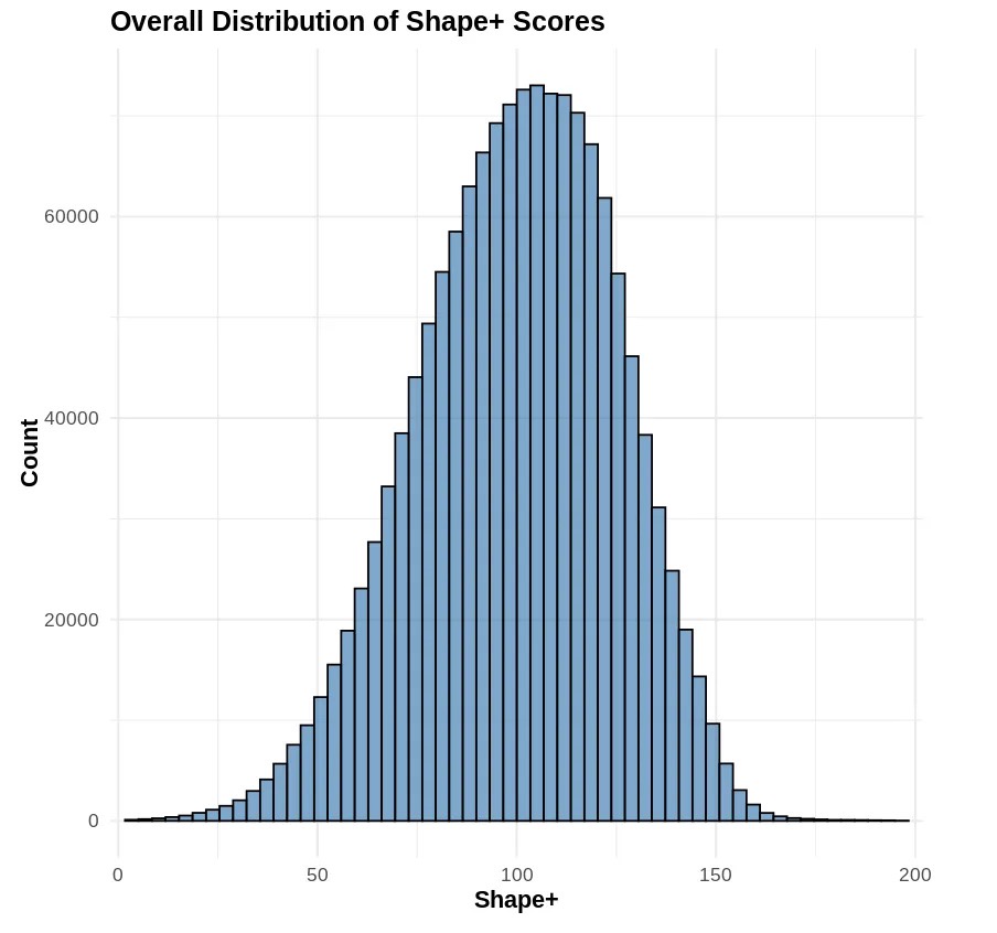
No real outcomes were used in the training of the model. Validation was done using 2023 Shape+ scores and 2024 wOBA, xERA, and ERA. Shape+ is normally distributed, with a standard deviation of 35. This scale can be easily adjusted without affecting the performance of the model.

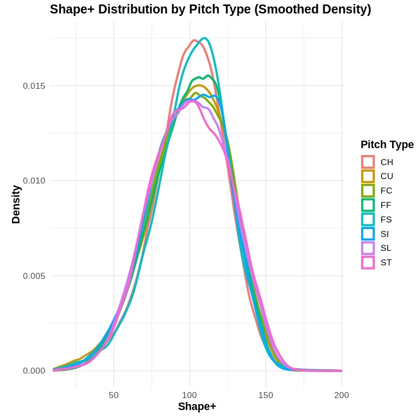
Note: The high median score for forkballs in 2023 is due to limited sample size — primarily Kodai Senga.

Data Processing

I used 2023 and 2024 MLB Statcast data for training my model — downloaded using the baseballr package. To prepare the data for modeling, the following preprocessing steps were executed:

• Filtering out all fastballs below 80 mph.
• Assigning a “game_year” column to each pitch (2023 or 2024).
• Standardizing pitch type labels.
• Assigning a platoon advantage binary indicator for batter handedness.
• Calculating IVB, VAA, and HAA, none of which are not explicitly included in standard Statcast data.
• Bucketing all batted balls by Hard Hit (≥ 95 mph), Soft GB, Soft LD, Soft FB, Soft Pop, and Not in Play.

After processing, I used the bucketed batted balls and fixed values for non-BIP to generate a run expectancy chart based on the average runs scored by bucket. Each pitch is now assigned a run value based on the chart, and the data are ready for modeling.

Model Structure

Shape+ is built using a layered mixed effects modeling framework. The modeling process consists of four sequential stages.

Model 1: xRV by Location
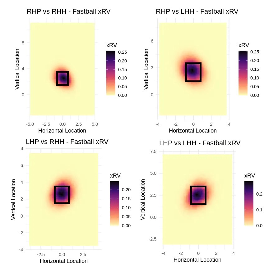
Model 1 is a large mixed effects model that is designed to predict expected run value (xRV) based on pitch type, location, platoon advantage, and count alone. The plate is sliced into a 150×150 grid to capture location effects at a granular level. Pitch types are bucketed into fastballs, changeups, and breaking balls to allow group-specific location interactions. Model 1’s goal is to quantify the value of pitch location, independent of actual outcomes or physical pitch shape.

Below are heatmaps I generated based on Model 1’s output:

Model 2: GAM Smoothing
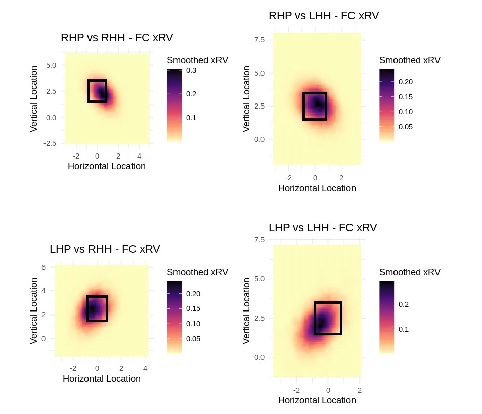
Model 2 utilizes a Generalized Additive Model (GAM) to the Model 1 outputs, smoothing the xRV surface to reduce noise and stabilize estimates across the strike zone. In doing so, I am able to retain meaningful and important patterns while eliminating spikes caused by outliers.

The smoothed Model 2 output is used as the training target for Model 3 (xRV by Physical Characteristics), isolating pitch location from the physical characteristics. As depicted in the smoothed heatmaps below, the model is flexible enough to capture nuance by individual pitch type, such as cutters.

Model 3: xRV by Physical Characteristics
Model 3 is a linear mixed effects model that utilizes polynomial, quadratic, and interaction terms to capture non-linear relationships between pitch characteristics and xRV. It uses both fixed effects and random effects.

Fixed effects capture the impact of measurable pitch characteristics (velocity, spin, IVB, etc) across all pitchers. Random effects — implemented as ((1 | PitcherID)) — account for the unobserved, pitcher-specific variations (deception, mechanics consistency).

Model 3 is trained exclusively on the smoothed xRV output from Model 2. It includes no location or outcome based variables, effectively isolating the value of the physical characteristics of a pitch. Variables included in Model 3 are as follows:

Physical Characteristics
• Velocity, standardized to create z-scores
• Induced Vertical Break
• Vertical Approach Angle
• Horizontal Approach Angle
• Horizontal Break
• Spin Rate
• Extension
• Release Height

Categorical Variables
• Pitch Group (Fastball, Breaking Ball, Changeup)
• Pitcher Throws (R/L)
• Batter Side (R/L)
• PitcherID

Model 4: Final Shape+ Output
The final step of the modeling pipeline is Model 4, converting the outputs of Model 2 and Model 3 into a standardized and interpretable Shape+ score. It subtracts Model 3’s predicted xRV (based on physical characteristics) from Model 2’s smoothed xRV (based on location). The result, arbitrarily called stuffimpact, reflects how much pitch shape alone contributes to run prevention.

Stuffimpact is then scaled and standardized, producing typical Shape+ values between 50 and 150 to improve interpretability.

Performance and Validation

Shape+ performs exceptionally well both descriptively and predictively. After conducting both in-sample and out-of-sample validation, I found that Shape+ scores correlate strongly with both current-season and next-season wOBA and xERA. I obtained validation data by downloading xERA, ERA, and wOBA numbers for 2024 from Baseball Savant.

Descriptive Correlations
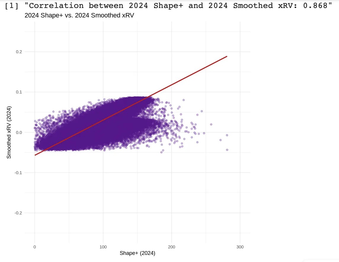
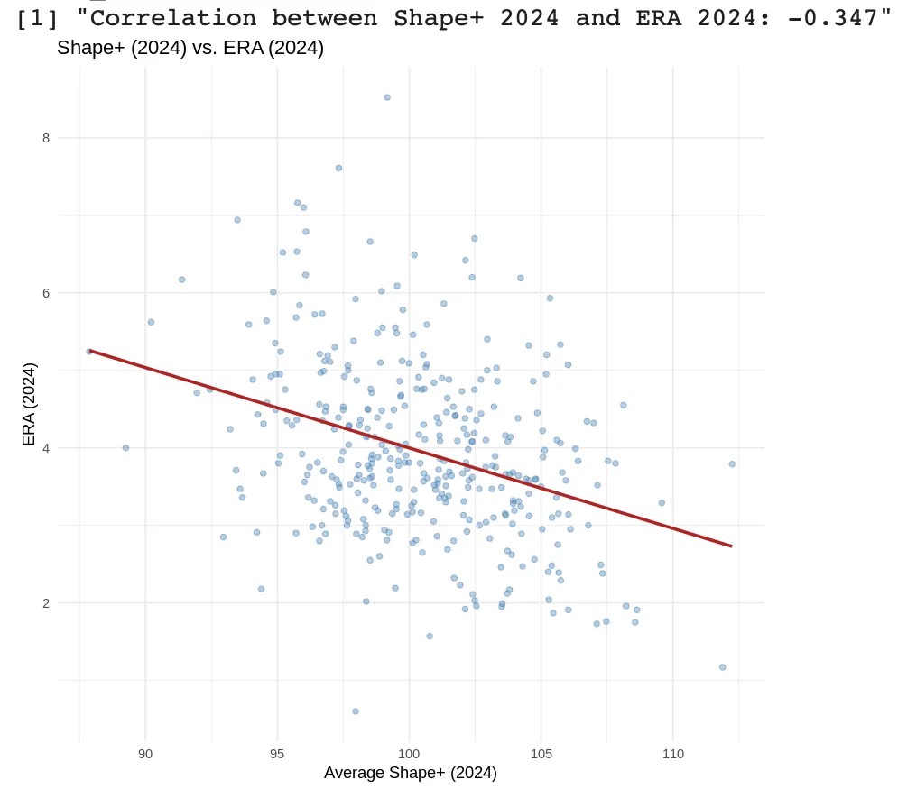
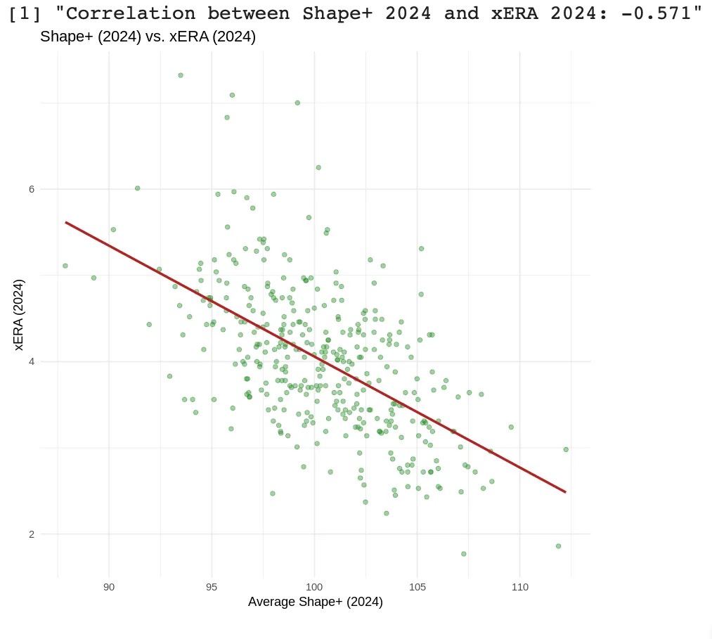
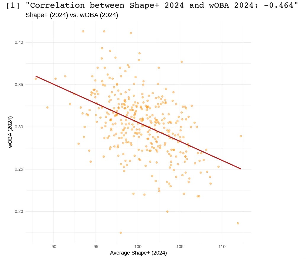
In-sample validation testing was conducted using 2024 data, evaluating how well Shape+ scores aligned with real-world metrics such as xRV, wOBA, ERA, and xERA over the same season. These correlations can been seen below:

• 0.868 (2024 xRV and 2024 Shape+)
• -0.347 (2024 ERA and 2024 Shape+)
• -0.571 (2024 xERA and 2024 Shape+)
• -0.464 (2024 wOBA and 2024 Shape+)

The particularly strong correlation with xRV — the model’s training target — demonstrates excellent internal validity. In addition to this, these strong to moderate-strong correlations demonstrate that Shape+ accurately captures the quality of contact that pitchers are inducing in real time, confirming its descriptive power. The four scatterplots below depict the four descriptive correlations.

Predictive Correlations
Shape+ shows strong year-to-year consistency, reinforcing its reliability as a forecasting metric. The correlation between 2023 and 2024 Shape+ scores is 0.801, indicating a high degree of stickiness and model stability.

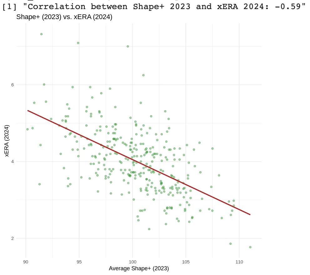
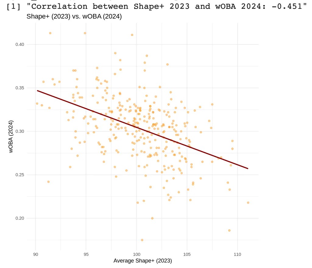
When used predictively, Shape+ correlates strongly with next-season performance metrics like xERA and wOBA. This suggests that Shape+ not only describes current pitch effectiveness, but that it also effectively anticipates future run prevention ability, making it a potential tool for forward-looking evaluation.

• -0.342 (2023 Shape+ and 2024 ERA)
• -0.590 (2023 Shape+ and 2024 xERA)
• -0.451 (2023 Shape+ and 2024 wOBA)

Below, I’ve included the three predictive correlation scatterplots:

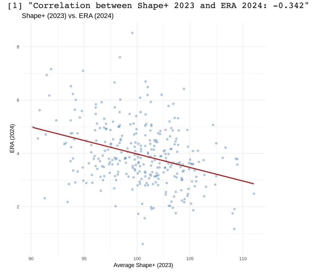
I should note here that ERA is a noisy and context-dependent metric, heavily influenced by factors outside a pitcher’s control, such as defense, park effects, and weather. As a result, it is not a reliable target for evaluating pure pitch quality. Shape+, by contrast, is specifically designed to isolate and quantify the components that a pitcher can control. Metrics like xERA serve as better validation tools for this purpose, as they focus solely on outcomes driven by the pitcher’s own skillset.

Residuals and Error
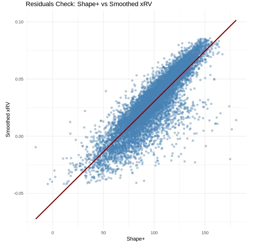
Shape+ demonstrates excellent alignment with the values it is targeting, confirmed by strong error metrics and stable residuals.

• RMSE: 0.022
• MAE: 0.018

These low values indicate that predictions from the model are consistently close to the actual smoothed xRV values, verifying the model’s precision.

Residuals show a tight linear relationship with minimal spread and few outliers. They are evenly distributed across the Shape+ scale, indicating low bias and overall consistency. Taking both the RMSE/MAE and residuals plot into account, we can confirm that Shape+ reliably quantifies pitch-level run prevention.

Pitcher Cases

Shape+ can be easily applied to individual pitchers to evaluate the shape-based effectiveness of their arsenals. Using a few lines of code I can pull the 2024 Shape+ score for a given pitcher’s arsenal.

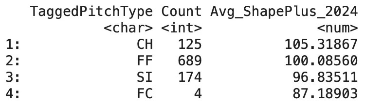
Robert Suarez, RHP, San Diego Padres

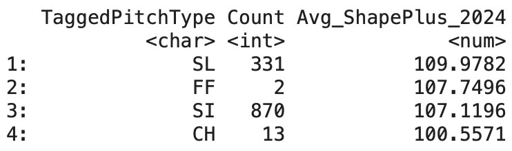
Josh Hader, LHP, Houston Astros:

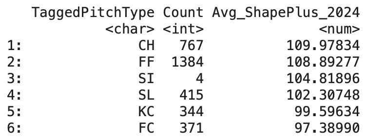
Cole Ragans, LHP, Kansas City Royals:

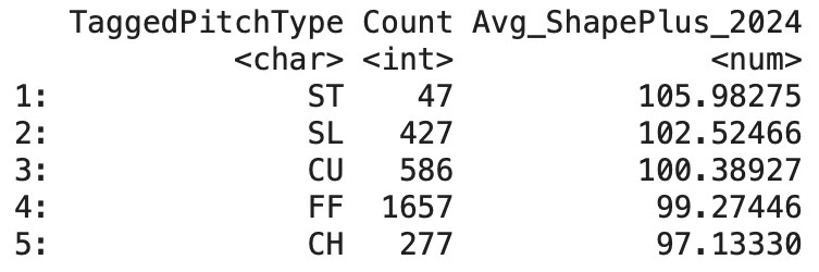
MacKenzie Gore, LHP, Washington Nationals:

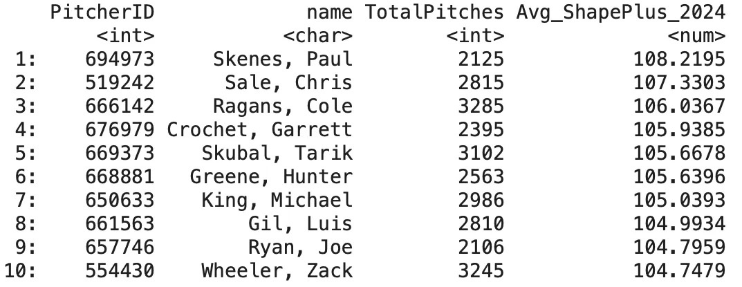
We can also pull the top 10 pitchers by Shape+ in 2024 (min. 1,800 pitches):

Conclusion

Shape+ is a location-independent model that quantifies the relationship between pitch shape and run prevention. By combining a layered modeling framework — including location modeling, GAM smoothing, and physical attribute regression — Shape+ aims to provide a robust and interpretable evaluation of pitch effectiveness.

Shape+ demonstrates both strong descriptive and predictive performance, and compares favorably to existing public models — particularly in its ability to forecast next-season xERA and wOBA.

Cade Cavin is the Assistant Director of Analytics for Point Loma Nazarene University in San Diego.


No Pitch Is an Island: Pitch Prediction With Sequence-to-Sequence Deep Learning

One of the signature dishes of baseball-related machine learning is pitch prediction, whereby the analysis aims to predict what type of pitch will be thrown next in a game. The strategic advantages of knowing what a pitcher will throw beforehand are obvious due to the lengths teams go (both legal and illegal) to gain such information. Analysts that solve the issue through data have taken various approaches in the past, but here are some commonalities among them:

  • Supervised learning is incorporated with numerous variables (batter-handedness, count, inning, etc.) to fit models on training data, which are then used to make predictions on test data.
  • The models are fit on a pitcher-by-pitcher basis. That is, algorithms are applied to each pitcher individually to account for their unique tendencies and repertoire. Results are reported as an aggregate of all these individual models.
  • There is a minimum cut-off for the number of pitches thrown. In order for a pitcher’s work to be considered they must have crossed that threshold.

An example can be found here. The goal of this study is not to reproduce or match those strong results, but to introduce a new, natural-fitting ingredient that can improve on their limitations. The most constraining restriction in other works is the sample size requirement; by only including pitchers with substantial histories, the scope of the pitch prediction task is drastically reduced. We hope to produce a model capable of making predictions for all pitchers regardless of their individual sample size. Read the rest of this entry »


Frankenstein and the Rays’ Sister City Concept

In 2018, the Tampa Bay Rays introduced the Opener, a novel concept in which a relief pitcher started a game with the purpose of shutting down an offense in the first few innings. The Opener would then hand the ball to a bulk pitcher, who went three-to-four innings before giving way to the usual bullpen corps.

When the Rays introduced the Opener strategy, many in baseball thought it was blasphemy. Starting pitchers have roles and this is the way the pitcher order has been for generations. How dare the Rays upset the natural order of roles, titles, and statistics?

When analysts looked at the Rays roster, however, they quickly understood what the team was doing. By not recognizing a “pitching rotation,” the Rays were looking a level deeper. They were stacking pitchers on a per-game basis, with the intent to win each game and hence build enough wins to make the playoffs. Once it was understood, the Opener was applauded and eventually copied throughout the league.

Besides being a sly way to neutralize lineups, the Opener represented the “Rays Way” amidst financial necessity. The team could not afford a typical major league rotation of four or five quality starters. Relief pitchers are cheaper and easier to find. They couldn’t find five aces, so they built ace performances using multiple relievers, with the additional bonus of paying them less. If you can’t find a hundred-million-dollar starter, build one. Read the rest of this entry »


Are Third Base Coaches Too Hesitant in Sacrifice Fly Situations?

Imagine you are coaching third base. Your team is at bat with a runner on third and one out. There is a flyball caught in marginally shallow left field. You think your runner has about a 50/50 chance of scoring if you send him. Do you send him?

Many of you would probably say no. This is a risky call. There is a 50% chance the runner would be out, which would be a huge momentum killer. Furthermore, if he gets caught and your team loses by a run, you are going to be the person blamed by the media.

My hypothesis is that third base coaches are leaving runs on the table. Over the past four seasons, third base runners scored 98% of the time when sent in sac fly situations, suggesting that coaches are sending them only when they have a very high degree of confidence of success. I hypothesize they won’t send runners unless they feel they have at least an 80% chance of scoring, but my analysis says they should be sent even with much lower chances. Read the rest of this entry »


Pitch Mix Effectiveness

In a previous project, I attempted to determine what types of pitches are most effective in 1-2 and 0-2 counts based on suspicions that wasting pitches was not inherently strategic. I did this by analyzing league average wOBA values of different types of pitches in and out of the strike zone. The findings showed that on average, breaking and off-speed pitches outside of the zone were the most effective pitch to throw in order to minimize wOBA in both 0-2 and 1-2 counts.

While using league-average data produced some interesting results, I was still unsatisfied, since trying to project pitching strategy to a single pitcher doesn’t work when the data is league-wide. My goal was then to write an algorithm that could use a specific pitcher’s career pitching history to analyze the results of each of their pitches and determine every pitcher’s most effective pitch mix.

After a long time writing and editing code, I believe I have written a script that can do just that: evaluate each pitcher who has thrown more than 1,250 pitches since the start of 2019 and determine the wOBA value of each of their pitches at every count. Read the rest of this entry »


Using Clustering To Generate Bullpen Matchups

In today’s game, reliever usage may be more important than ever. As starters go less deep into games, more emphasis is placed on bullpen strategy to survive the mid-to-late innings. Teams can use data to streamline this process, strategizing relief pitcher usage based on their pitch repertoires and batter ability. My goal is to produce a matchup tool that can potentially give us some insight as to how the big league teams “play the matchups.”

The basis of a bullpen matchup recommender will be at the pitch level: what types of pitches does a particular hitter struggle against, and how do they align with what a particular pitcher throws? To do this, I will first use clustering methods in order to redefine pitcher arsenals based on pitch flight characteristics. Matchups will then be selected according to which pitcher is expected to perform the best against a given batter, optimizing pitcher strengths against batter weaknesses.

Data

To conduct this research I used available Statcast data from 2016-2021 (through this year’s trade deadline). My variables of interest are as follows: pitch location (plate_x & plate_z), perceived pitch speed derived from release extension (effective_speed), pitch movement (pfx_x & pfx_z), spin rate (release_spin_rate), and the newly introduced spin axis (spin_axis). I elected to include spin axis in order to account for how the batter may see the pitch as it’s released. All in all, the variables selected measure the stuff and location of each pitch so that we may classify them more accurately beyond the basic pitch type labels. After cleaning this dataset and removing outliers, I was ready to move on to the modeling process. Read the rest of this entry »


Which Pitch Should Be Thrown Next?

There are few things I enjoy in baseball more than the pitcher vs. hitter dynamic. Everyone likes to see highlight plays like a great catch or a mammoth home run, but those plays are few and far between. I believe that the tension created in a drawn-out plate appearance is where baseball is most enjoyable. Every pitch is meaningful, and the strategy of the game is on full display. The pitcher is trying to decide the best way to get the hitter to produce an out and the hitter is doing everything he can to thwart the pitcher.

This dynamic of baseball has always fascinated me. I was curious how pitchers and catchers decided which pitch was correct to throw in a situation. There are plenty of tools available to them that were not readily available when I was a child, like heat maps made from pitch-tracking data, but they show results without the context of what previous pitches were thrown in the plate appearance. Heat maps provide useful data, but the real art of pitching is being able to set up a hitter to take advantage of their weaknesses. If a pitcher throws the same pitch in the same location every time, eventually the hitter is going to catch on and change his strategy accordingly. So which sequence of pitches is the most effective at retiring hitters? This is the question I attempted to answer with this article. Read the rest of this entry »


Jake McGee: The One-Pitch Pitcher

One of the newest members of the San Francisco Giants, lefty reliever Jake McGee, is coming off one of his best years in the major leagues throwing one pitch: a fastball. Seemingly by magic, McGee twirled a fastball 97% of the time he threw in 2020 on the way to a 2.66 ERA, 0.836 WHIP, and 11 strikeouts for every walk. I will be taking an in-depth look into McGee’s success and failure over his career, which might give better insight as to how he can continue to perform and how a major league reliever can succeed with only one pitch.

McGee was drafted in 2004 by the Tampa Bay Rays and made his major league debut with them in 2010. After his first full season in 2011, McGee posted extremely strong numbers in 2012, 2014, and 2015 with an ERA+ (it will become clear why I use ERA+) of 148 and a K/BB of 5.02 within those four seasons. After the 2015 campaign, McGee was traded along with Germán Márquez to the Colorado Rockies in exchange for Corey Dickerson and Kevin Padlo.

McGee immediately regressed in Colorado, as his ERA+ went from 163 to 103 (ERA+ adjusts for ballparks, which is particularly useful at Coors Field) and his K/BB sunk from 6 to 2.38 in the transition from the Rays to the Rockies (2015-2016). Of course, some of this decline is attributed to the difficult conditions of Colorado, but there is also additional evidence to show that McGee’s style of pitching contributed to his declined performance. Following 2016, McGee remained a strong-yet-aging reliever and was ultimately released by the Rockies in July of 2020.

Four days later, McGee signed with the Los Angeles Dodgers and proceeded to outperform even his 27-year-old self with an incredible season. McGee finished in the 99th percentile in K%, 96th in BB%, 95th in xERA, and 95th in xwOBA. So what exactly was the cause of this change and what did McGee do to get there? Read the rest of this entry »


A Lineup Construction Experiment

Who should bat second? This question has been debated quite a bit in recent years, as the modern approach has become to slot the best hitter in the 2-hole to increase their total plate appearances in a season. Others argue that the second hitter, like the leadoff man, should be a table-setter and the goal should be to get the best hitters to the plate with runners on base. So which is more valuable: getting your best hitter to the plate with men on or getting them to the plate more often? A simple experiment suggests that we are wasting a lot of energy arguing either side, and it would be time better spent thinking about other elements of lineup construction.

Overview

I created nine fictional players that will be referred to by position. I arbitrarily provided probabilities for the players based on seven possible plate appearance outcomes: single, double, triple, homer, walk, hit by pitch, and out. To simulate the lineup playing a game, I used a simple base-to-base style (the runners on base move up the same number of bases as the batter). An oversimplification of play to be sure, but the goal is to get an approximation of potential lineups relative to each other. Each lineup “plays” 100,000 nine-inning games so that the run distribution is virtually identical on multiple simulations. Read the rest of this entry »


Pitch Count Efficiency is Undervalued

During Game 6 of the World Series, Kevin Cash infamously replaced his cruising starting pitcher, Blake Snell, with reliever Nick Anderson. Anderson would give up the lead before registering an out, and the Los Angeles Dodgers won the Series for the first time in 32 years.

A heavily criticized decision by many, both in the moment and in hindsight, the move is representative of the new direction many clubs have been heading towards. This is calculated and analytics-heavy decision-making on reliever usage that has caused both a major shift in the value of relievers and a steady increase in pitchers used in games.

The consistent incline of pitchers used per game notably paired with the decline of average pitches and innings thrown by starters begs the question: how should pitch count factor into removing pitchers from games? If starters are removed for the fact that they are facing the top of the order for the third time rather than because they are fatigued or have seen a decline in their outing performance, is it important to pass on hittable pitches in order to drive pitch count up? Alternatively, is there value in being a pitcher who can record outs quickly if by the time Mookie Betts comes to the plate in the 6th inning, the threat of impending doom will chase an ace at 73 pitches out of the game? Read the rest of this entry »