Author Archive

Being Drafted and Making the Show the Same Year

At this point we’re less than a month away from the June 8th, 2015 Major League Draft. Which essentially means we’re in draft season. A lot of mock drafts are coming out, and most fans are excited to see which young talent their team will add to their minor-league system. While the draft can be an exciting event to some, it’s very different than the NBA or NFL draft. Unlike in the NBA and NFL draft where a player will have an immediate impact on the team upon being drafted, the players drafted in the Major League draft will have to spend some time in the minors before making an impact. Most fans therefore won’t be able to see the fruition of the draft for several years. This can be frustrating.

But every now and then a rare event in baseball occurs. A player sometimes reaches the Majors the same year he’s drafted. This event actually happened last year. Brandon Finnegan, you see, was drafted 17th overall, in the first round of last year’s draft by the Kansas City Royals. He eventually went on to make his Major League debut that same season on September 6th and helped the Royals reach the playoffs for the first time since 1985. Finnegan, however, is not the first player to accomplish this feat. Since the draft was first implemented in 1965, a total of 55 players who have been drafted made the majors the same season. This of course does not include international free agents.

But is this feat becoming more or less prevalent? Are certain organizations more likely to promote a player quickly? Is there a certain position that get’s promoted more frequently? And is this even a smart strategy? Will this affect a player’s long-term success? Are the players capable of actually helping the Major League squad? These are all questions I will attempt to answer.

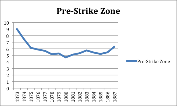
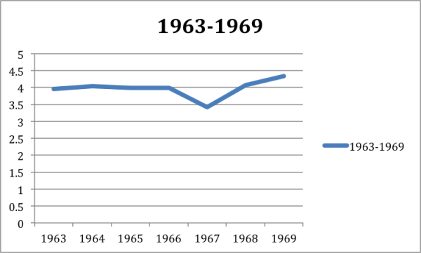
First will look at the prevalence of this feat.

Maikng majors trend

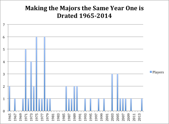
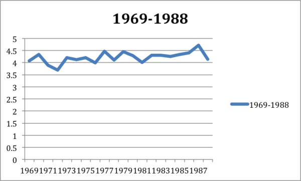
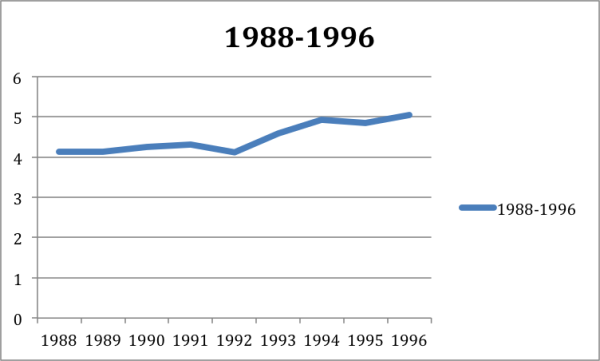
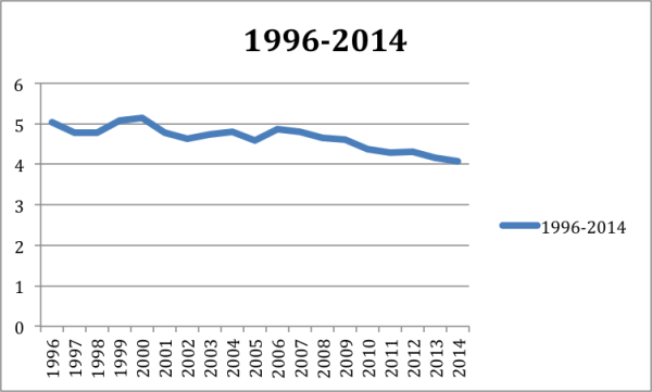
As you can see this was actually not an uncommon occurrence in the 70s. It was actually pretty popular, in 1975 and 1978 as a total of 6 players made the majors upon being drafted. In fact this event actually happened at least once a year for ten straight seasons (1970-1980). Now, however, the trend is far less frequent. Brandon Finnegan was the first player to accomplish the feat since 2010, when Chris Sale was promoted by the White Sox to the Major Leagues.

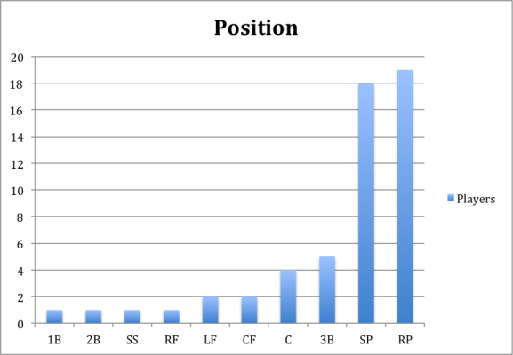
What you may have noticed at this point, is that both players are pitchers. In fact both players were promoted to the majors as relief pitchers. I think at this point most of us would assume that the vast majority of players promoted to the majors upon being drafted would be pitchers. It simply makes sense. Some pitchers coming out of college who have devastating stuff can theoretically come up and get batters out. A position player, however, probably needs more time in the minors to develop an acceptable hitting approach before he can help a team. Developing a hitting approach takes time. So below is the list of all 55 players separated by their different positions.

making majors by position


If you happened to read my latest Tommy John article you probably noticed that a relief pitcher was defined as GS/G < 0.5. I again used this barometer to define a relief pitcher. The position of the player was also defined as, the position that was most often played, the year of the promotion. So for example normally Chris Sale would be defined as a starter, but since he was primarily used as a reliever when promoted, I put him in the reliever group.

At this point you’ve probably noticed that the majority of players promoted are in fact pitchers. As for the reasons stated above this shouldn’t be very surprising.

So now let’s look at whether this is an effective strategy. Most teams are probably hoping that these players make an impact, or else why would they be promoting them, which would speed up their free agent clock, and theoretically affect their development.

Basically what I did was rather simple. I looked at the average stats of all the players when they were promoted. I also, obviously, split the pitchers and position players into two different groups. There were a total of 38 different pitchers and 17 position players.

Pitchers
Age Innings ERA+ PWARP
20.8 27.52 107.5 0.05


Position Players
Age PA wRC+ WAR
20.76 77 101.11 0.14

The results seem to look good, while ERA+ isn’t a perfect statistic by any measure it gives us a sense of the situation and here it looks like the pitchers who are promoted to the majors upon being drafted give above-average production. The hitters fare less well but again give an above-average production. For rookies who have just been called up, I’d say that’s pretty good. This is of course an average look at the players and one needs to consider that not all of them were productive. Also, this strategy for teams is only productive if they’re filling in a need. If a player for example, is performing below league average then this would be an effective strategy, if he were performing above league average then you’re probably better off keeping your everyday player in the lineup.

If we also take a look at the PA and innings, it seems that these players are being used as role players. So basically part-time fielders, or mostly relief pitchers. The position chart above, however, doesn’t support this claim, as the second-most frequent position was starting pitcher.

Another explanation therefore could be that these players are called up later in the season; for example, I would guess that most of them are called up in September. Fortunately though I don’t have to guess I have the results, so here they are.

Months Players
April 1
May 0
June 11
July 7
August 10
September 24

As one might have expected most players are called up by September. This is not surprising. What might be surprising was that a player was called up in April. This might be surprising to some especially considering that the draft begins in June. Some of you might think this is an error. It, however, is not. You see, initially baseball’s draft was divided into three separate drafts. The first and largest was in June. The second was in January, to adhere to the players who graduated in the winter semesters. The third and final round then took place in August. The August draft only lasted two years, while the January draft lasted until 1986. For those interested the one player who was called up in April was drafted in the January draft, his name was Dick Ruthven, and the Philadelphia Phillies called him up April 17th 1973.

What might be even more interesting is that not only was Dick Ruthven the only player who was called up in April; he was the only players who was ever called up by the Phillies (The same year he was drafted). The Phillies though are not the only team who are squeamish about this strategy. In fact, there are 10 teams who have never called up a player the same year he was drafted. Below are the results.


making majors teams


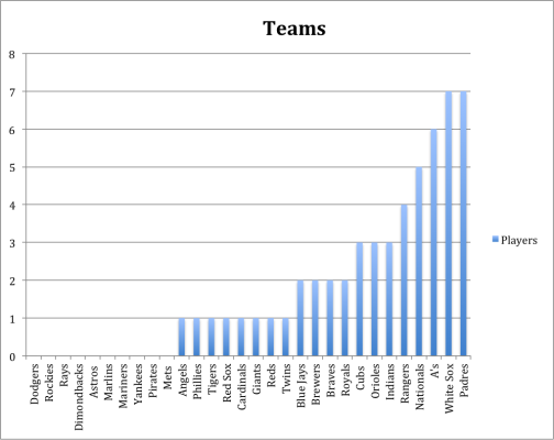
As you can see the Padres and White Sox seem to be the ones who feel most comfortable promoting a player so early in his development process. That being said, while I have described this as a “strategy” earlier on, this is probably just statistical noise. It’s not like there’s a team or a few teams that are doing this a lot more than other teams. If I had to venture a hypothesis, I would guess that teams probably make the decision to promote someone so quickly, based on need and how advanced the player already is in his development. Personally, however, I would be hesitant to do so in fear that it might affect the player in the long run. For example, he might come up to the majors earlier than he should and therefore will not be able to develop into the player he could have been in the minors.

So now I’ll look to answer my final question and that’s how being promoted the first year a player is drafted affect his career production?

For this I looked at the average of all the player’s career stats. Again splitting the position players and pitchers. I wanted to see if these players ended up having successful careers.

Pitchers (Career)
MLB Games Innings ERA+ WARP
223.52 872.53 94.73 5.93


Position Players (Career)
MLB Games PA wRC+ WAR
961.58 3575.17 89.58 15.43


This time it looks like the position players were more successful than the starters, which was surprising to me. Maybe, it has something do to with the sample size, but I would have either way expected the pitchers to be better.

These career statistics also don’t leap off the screen. These are not superstars, for the most part, but seem to be serviceable Major League players. To me that’s a definite success. It’s a successful draft pick and it shows that the promotion doesn’t overly affect the players. (Of course I’m speaking generally here, I have no way of knowing if it affected a particular player.) This might be a controversial or surprising statement to some but the fact remains that most players who get drafted simply don’t make it to the Major Leagues, let alone have any semblance of a career. The fact that the position players, on average participate in 961.58 games shows that on average they’ve had a respectable career. The same thing goes for the pitchers. While being in 223.52 games might not seem like a lot, that’s more than an entire season’s worth of baseball, which most minor leaguers would kill to have.


Statistics were found at Baseball Prospectus, FanGraphs, and Baseball Reference.


The database for players making it to the majors the same year they were drafted was found at The Baseball Cube, which is a great website where a lot of good research can be done.


Velocity and the Likelihood of Tommy John Surgery

Around a month ago I wrote an article entitled “Tommy John Surgery and Throwing 95+ MPH”. Basically what I was trying to find out was, are pitchers who throw harder more likely to have Tommy John. The article fell short of this discovery, mainly because I only looked at pitchers who threw 95 or more. I wanted to get more in-depth but as my semester was coming to an end, I simply didn’t have the time to do an expanded study. Since then my semester has ended and I do have the time to get more in-depth.

First, however, we’re going to tread back and look at old work. In November 2012, Jon Roegele came out with an article introducing his and Jeff Zimmerman’s Tommy John surgery list. At this point, I think it’s pretty safe to say it’s the most complete list of Tommy John surgeries. The list can be found on Jeff’s site baseballheatmaps.com. Below is an updated chart of the list.


TMJ


Then in July of 2013 Will Carroll came out with an article stating that 33% of opening day Major League pitchers had undergone the surgery. I, however, found the study problematic, which I discussed in my previous article.

In March of 2014, Jeff looked at players who threw a pitch 100MPH or harder and found that 25% of them had the surgery. And finally at this year’s Sloan Sports Analytics Conference, Dr. Glenn Fleisig found that 16% of all pitchers had Tommy John, 15% of Minor Leaguers had Tommy John, and 25% of Major Leaguers fell under the knife.

So how does this relate to velocity? Well in my previous article I found that 32% of pitchers who threw 95+ MPH on average had the surgery. If we are to believe Will Carroll’s findings then really there isn’t any significant risk of throwing harder. If we, however, choose to look Dr. Fleisig’s results then throwing harder does increase your chances of having Tommy John.

There are essentially two sources where velocity data can be found, PITCHfx, which dates back to 2007 and Baseball Info Solution (BIS), which dates back to 2002. Below is the yearly velocity data.


Year PITCHfx BIS
2002 89.56
2003 89.6
2004 89.77
2005 90.01
2006 90.17
2007 91.67 90.05
2008 91.39 90.43
2009 91.6 90.71
2010 91.82 91.01
2011 92.21 91.19
2012 92.34 91.32
2013 92.5 91.44
2014 93.05 91.43

As you can see velocity is on the rise. There are also discrepancies in the data. This is why when I did my study I looked at PITCHfx and BIS data separately to see if I would get different results.

Before we get into my results, however, I’ll explain my methodology. I gathered the PITCHfx data in Baseball Prospectus’ leaderboard. I looked at all the years available and did not set an innings limit, in order to get as large of a sample size as possible. This gave me 1484 pitchers to work with. I then looked up, which pitchers had Tommy John surgery. I basically did the same thing for the BIS data, which was gathered at FanGraphs. Again did not set an innings limit and this gave me a sample size of 2097 pitchers. I did not include position players as I felt they would skew the data.

I also set buckets for the velocity. The goal was to get as close to the exact velocity, while at the same time maintaining a respectable sample size. I did my best with this; you’ll find that in some cases there are some sample size issues.

So let’s begin. Below you will find the percent of pitchers who have had Tommy John surgery based on their velocity group.


PITCHfx

Velo Sample Size TMJ Count TMJ %
96+ 99 36 36.36%
95+ 196 61 31.12%
92 to 95 584 158 27.05%
89 to 92 530 106 20%
86 to 89 151 34 22.51%
86- 23 4 17.39%


BIS

Velo Sample Size TMJ Count TMJ %
96+ 36 8 22.22%
95+ 113 40 35%
92 to 95 547 147 26.87%
89 to 92 890 190 21.34%
86 to 89 429 83 19.34%
85- 118 16 13.55%


From this data it’s pretty clear that velocity does increase one’s likelihood of getting Tommy John surgery. The biggest increase happens from the 89-92 bucket to the 92-95 bucket. There is also a pretty big increase when looking at the 95+ bucket, in both tables, although I would argue that the sample size there is somewhat small. This doesn’t mean, however, that we can’t come to any conclusions. A 113 or 196 sample is definitely not as accurate as a 500 sample, but I don’t think that it’s unreasonable to suggest, based on this data, that throwing 95+ increases one’s likelihood of getting the surgery.

Also you might have noticed that in the PITCHfx table the 86 to 89 buckets are actually more likely to have Tommy John than the 89 to 92 group. This can be due to a couple of factors: A) We can definitely attribute some of this to a small sample size, especially since in the BIS table (where the sample is bigger) it shows a drop in percentage. B) The pitchers who are throwing in that group are probably older and therefore are more prone to the injury.

You’re at this point probably curious to see the results, so here they are. I was debating (with myself) whether I should show this or not. The sample is really small and I’m not sure we can really conclude anything from it. But I figured that showing some data is better than no data.


PITCHfx Age

Velo Sample Size Avg. Age
96+ 36 23.44
95+ 61 23.48
92 to 95 158 24.85
89 to 92 106 25.56
86 to 89 34 27.05
86- 4 33.5


BIS Age

Velo Sample Size Avg. Age
96+ 8 25.87
95+ 40 23.87
92 to 95 147 24.51
89 to 92 190 25.65
86 to 89 83 27.02
85- 16 28.68


So pitchers in the lower groups are older, this would seem to make sense, although again each sample is small. More data needs to be gathered here to come to an accurate conclusion. (The age chosen, for each individual pitcher, was the age of the year the Tommy John surgery occurred).

I also wanted to look at the difference between starting pitchers and relievers, or at least see if there was a difference. The logic being that on average relief pitchers will throw harder than starters so maybe they would have a higher likelihood of getting Tommy John surgery based on their velocity.

A relief pitcher was defined as this: GS/G < 0.5. Jeff Zimmerman deserves the credit here. For a while now I’ve been struggling to define what qualifies as a relief pitcher. Then I read Jeff’s latest article at The Hardball Times and stupidly asked how he defined a relief pitcher. Obviously he had defined it in the article (GS/G <0.5) and I missed it. I personally like this barometer for a relief pitcher. While I could have simply sorted the pitchers by there type on FanGraphs and BP, I don’t know where they draw the line on a relief pitcher. This at least gives us a concrete definition of what a reliever is. I also like this better than an arbitrary innings limit.

Important to also note is that the overall relief and starting pitcher data has nothing to do with velocity. It is rather the overall percentage of relief and starting pitchers who have undergone Tommy John. For BIS it dates back to 2002 and PITCHfx it’s 2007. Ok enough chitter-chatter, here are the results.


Overall PITCHfx RP

Sample Size TMJ Count TMJ %
1016 241 23.72%


Overall BIS RP

Sample Size TMJ Count TMJ %
1475 321 21.76%


PITCHfx RP

Velo Sample Size TMJ Count TMJ %
96+ 89 30 33.70%
95 + 175 51 29.14%
92 to 95 412 110 26.69%
89 to 92 340 61 17.94%
86 to 89 77 16 20.77%
86- 12 3 25%


BIS RP

Velo Sample Size TMJ Count TMJ %
96+ 35 8 22.85%
95+ 101 32 31.68%
92 to 95 437 121 27.68%
89 to 92 604 118 19.53%
86 to 89 262 42 16.03%
86- 71 8 11.26%


And now the starters.


Overall PITCHfx SP

Sample Size TMJ Count TMJ %
464 121 26.07%


Overall BIS SP

Sample Size TMJ Count TMJ %
623 155 24.87%


PITCHfx SP

Velo Sample Size TMJ Count TMJ %
95 to 98 20 9 45%
92 to 95 169 48 28.40%
89 to 92 190 45 23.68%
89- 85 19 22.35%


BIS SP

Velo Sample Size TMJ Count TMJ %
94 to 97 23 10 43.47%
91 to 94 191 47 24.60%
88 to 91 272 69 25.36%
88- 137 29 21.16%


Ok, let’s start with the relief pitchers, they’re less complicated. Basically the results aren’t very surprising, the harder one throws the higher chance one will fall under the knife. There again seems to be this vast increase between the 89 to 92 bucket and 92 to 95. Also, and this was surprising to me, the overall results for relievers show that they are actually less likely to have Tommy John, than the starters. Even more interesting was while BIS and PITCHfx data show different numbers, they seem to be telling the same story here. That starting pitchers are about 3% more likely to have Tommy John than relief pitchers.

Now let’s focus on the starters, and this is where there is a serious discrepancy in the data. With PITCHfx it shows that velocity does impact a starter’s likelihood of getting the surgery. While with the BIS data, the evidence is more ambiguous and the sample size is larger in the BIS data. I’m not sure what to personally make of this. Some might point out that the sample is not ideal. I would agree with that, a sample of 400 or 500 would be more accurate but a sample of 272 or even 169 are nothing to sneeze at. This is when the evidence is starting to take shape. What was even more surprising was that it was the BIS data that was more ambiguous because the sample is bigger.

There could also be a larger number of factors at play here. Starting pitchers throw more innings than relief pitchers, which puts added stress on the arm. They also throw more pitches, which based on which pitch they throw could also increase their chances of getting the surgery. Finally, and this is more of a hypothesis than anything, starting pitchers tend to have longer careers than relief pitchers. Therefore the older a pitcher gets the more likely he is to having a drop in velocity, while still maintaining the risk of Tommy John. This is of course a hypothesis. I think more data needs to be acquired to make a more accurate statement, but now at least I wouldn’t be surprised if the starting pitchers data was more ambiguous.

Finally let’s look at the overall results. This has nothing to do with velocity, just general Tommy John percentage.


Overall PITCHfx

Sample Size TMJ Count TMJ %
1484 363 24.46%


Overall BIS

Sample Size TMJ Count TMJ %
2097 476 23%


As you can see these results are more in line with Dr. Fleisig’s results (25% Major League pitchers). I don’t think it’s unreasonable there are some differences, however. This would depend on our methods of gathering the data and how we defined what a Major League pitcher is. My definition was very loose. Basically if a pitcher came up and threw one inning, then I put him in the results. The reason why I didn’t have a stricter definition of what a Major League pitcher was was because my goal wasn’t to find the percentage of Majors League pitchers who had Tommy John. Rather it was to examine the relationship between velocity and Tommy John surgeries. This is really just an added bonus. Also, Dr. Fleisig’s goal was to see how many current pitchers had Tommy John. My results are the percentage of pitchers who have had Tommy John since 2002 and 2007. We, however, now can accurately conclude, in my estimation, that Carroll’s results were way too high and that velocity does increase a player’s chance of having Tommy John.

This can make pitcher selection now very interesting. For example, if you are trying to decipher whether to get a pitcher who throws 96 MPH who is just as good as a pitcher who throws 90 MPH, you might be better off taking the guy who throws 90. By doing that you would be reducing the odds that that pitcher has Tommy John by about 7 to 10 percent, which is pretty good if you ask me. Also if you’re a GM or in fantasy and are terrified of relievers because you think they all tear their ulnar collateral ligaments, well you shouldn’t be. Your starters are actually slightly more likely to tear their UCL. There are of course other factors to consider here but these can serve as basic general guidelines. Finally velocity does increase your likelihood of tearing your UCL, although with starters the data is a little murkier.


Bonus: Pitchers who have had multiple Tommy John surgeries.

PITCHfx

Sample Size Velo Age
25 93.53 24.68


BIS

Sample Size Velo Age
31 92.17 25.12


Introducing a Concussions Database

Today, all everybody seems to care about is the Tommy John surgery. The surgery is on the rise and people want to find a solution. This is not unreasonable, according to Jeff Zimmerman and Jon Roegele’s Tommy John database; there are now 100 players who suffered the surgery, alone in 2014. It’s therefore understandable that many people are not only talking about it but also studying it, and trying to find solutions.

But, what about other baseball injuries? Sure, the Tommy John surgery is a devastating injury, but it’s certainly not the only devastating injury in baseball. What about torn labrums, torn Achilles, fractures, concussions? Most other types of baseball injuries haven’t had a lot of studies on them. (As you can probably guess from the title, I’m going to be focusing on concussions). 

So I decided to zig to everyone’s zag. Over the past month I’ve constructed a concussions database. My database for the time being includes the start and end date of the concussion, days missed, DL type, Position, Team, Age, and cause. So far I’ve recorded 189 concussions.. This may not seem like a lot, especially when you compare it to Zimmerman and Roegele’s Tommy John database, which contains 962 cases of Tommy John. But concussions as I’ve found are not that common in baseball.

My database ranges from the years, 1985 to 2015. This, however, is very misleading. Since the year 2000 I found 187 recorded concussions, before the year 2000 I only found two. One was in 1985, suffered by Roy Smith, by a batted ball, which landed him on the 15-day DL. The other was by Ivan Rodriguez in 1999, which happened due to a collision at home plate; he was not put on the DL and didn’t even miss a game. I will obviously keep doing research and will try to find more players, but for the time being it appears that concussions were infrequently diagnosed or reported before 2000.

The database was constructed through many ways. My primary tool was the Pro Sports Transactions. I scoured through their injury database. I also used MLB Transactions, although that proved to be a very ineffective tool. A lot of the concussions I found on the Pro Sports Transactions were not included, and all of the concussions I found with MLB Transactions I already had compiled thanks to Pro Sports Transactions. Pro Sports Transactions, however, also had injury types described as “head”. While not all head injuries are concussions, I decided to do a player search of every player who suffered a “head” injury (according to Pro Sports Transactions).

I looked at many players through the Baseball Prospectus (BP) profile page because each players BP profile page includes their injury history. This also proved to be an indispensable tool in doing my research. It allowed me to find not only the injury type but also the injury cause. I therefore double-checked every player I found on the Pro Sports Transactions with their BP player profile page. The results and dates almost always matched up. If they didn’t I looked at other sources, such as online articles, or Rotoworld, which had a great transaction events in the players profile page. I also used bleacher reports and other news reports, which allowed me to find some but not lots info. (If you know of another site or way I could check to expand my list PLEASE let me know in the comment section or by email).

Finally before I get started I want to point out that I am not the first that will undergo or do studies on concussions. There was an article written by the NY Times recently, which identified a study published by the American Journal of Sports Medicine, which suggested that players performed worse when returning from concussions. The study, however, “…identified 66 position players who had concussions between 2007 and 2013, including some who never went on the disabled list.” There was also a study published by the SciMedCentral called “Epidemiology and Outcomes of Concussions in Major League Baseball”. The study looked at players from 2001 to 2010 who had concussions. The problem is that they only found 33 players who had concussions during that time. In both cases the sample size is really too small to come to any conclusion.

The way I see it the only database that can actually compete with mine is the BP, database, which according to this Ben Lindbergh article, “The Year of Living Less Dangerously,” contains 175 players from 2001 to 2013. I unfortunately, however, don’t know how big the database is today; the article was written in 2014 for Grantland.

What I hope to do with this database is construct similar and more complicated studies. The difference I believe, in the similar studies I will be conducting, is that my database simply has a larger sample size, which will allow us to get more accurate results.

For today, however, we’re just going to start off slowly. First we’re simply going take an overall look at the concussions I recorded. The chart below will show you the total amount of concussions I’ve been able to find from 2000 to 2014. The chart is also interactive — I used Tableau to create it. If you do some clicking around you’ll see that I’ve also included all the players who’ve landed on the DL, the players who’ve landed on the 7-day DL, the 15-day DL, 60-day DL, and those that didn’t end up on the DL (due to a concussion).

If for any reason you cannot interact with this graph here is a link to Tableau Public, which will allow you to interact with it. 

https://public.tableau.com/profile/publish/Concussion1_0/Story1#!/publish-confirm


Overall and DL Concussions data (2000-2014)

So hey look Tommy John surgeries are not the only thing that’s on the rise, concussions are too. While there’s a ton of variance in the 15-day, 60-day, and even the non-DL graphs, the amount of players landing on the DL due to a concussion is on the rise, and there might be an explanation for that.

You see, in the winter of 2011 Major League Baseball and the Players Association adopted new protocols regarding to concussions. The biggest change according to this Cash Karuth article “MLB, union adopt universal concussion policy” was the implementation of a seven-day disabled list for concussions. The protocol also forces teams to clear a, “club-submitted “Return to Play” form to Major League Baseball’s medical director. The submission of the form is required regardless of whether the player was placed on the disabled list.”

“New procedures will be implemented for evaluating players and umpires for possible concussions after such incidents as being hit in the head by a pitched, batted or thrown ball or bat; a collision with a player, umpire or fixed object; or any time the head or neck of a player or umpire is forcibly rotated.” (For more information I recommend reading the article.)

While there is a rise of concussions after the protocol was implemented, it’s hard to decipher based on these graphs whether it actually had a huge impact. Concussions were on the rise before the protocol was implemented and while there is a drastic increase in the 7-day DL department that was presumably inevitable due to the new rule. When looking at the overall concussions the drastic increase happened in years 2013 and 2014. For the overall DL stints it happened in 2013. In both cases it didn’t happen directly after the protocol was implemented. Maybe the protocol didn’t necessarily have a huge impact. Perhaps it only started to get enforced in 2013?

I also don’t know how many concussions were either not diagnosed or not reported. Before 2005 players rarely went on the DL due to a concussion. The concussions info before 2000 is almost non-existent. It’s hard to believe that players are suddenly getting concussed. This information was either not made public or poorly handled by Major League Baseball. Also maybe it’s simply that doctors are getting better at detecting concussions? Or they might just be paying more attention to it? These are questions unfortunately I simply don’t have an answer to at this point.

Let’s now take a look at which teams have been most impacted by this injury. The graph below again is interactive. The important element to note is that the bigger the circle the more concussions the team has suffered. If you’re not familiar with these types of interactive graphs, they’re relatively simple. Just bring your mouse over the circles and all the data will be there.

If for any reason you cannot interact with this graph here is a link to Tableau Public, which will allow you to interact with it. https://public.tableau.com/profile/julien1554#!/vizhome/Concussions2/Sheet1

Team Concussions 2000-2014

If we were living in an alternate universe and I had a gun to your head and made you guess the team which had suffered the most concussions, you’d probably guess the Twins. And you would be correct; since 2000 no team had suffered more concussions than the Twins, that is of course if you don’t count the Mets. Both teams have had a lot of players who underwent this injury. The Twins have most notably had Joe Mauer and Justin Morneau; both players’ careers have been seriously hampered by injuries. The Mets most notably had Jason Bay and David Wright.

Perhaps another interesting element to note is that the White Sox have the least amount of concussions suffered, at only two. That is of course if you don’t count the Padres who also have two. But for the sake of interesting trends let’s ignore the Padres.

The White Sox you see seem to have a knack or secret sauce for keeping their players healthy. According to this article by Jeff Zimmerman “2014 Disabled List Information and So Much More,” the White Sox have suffered the least amount of injuries since 2002. Also if we look this article by Jon Roegele, “Tommy John Surgeries: A More Complete List” the White Sox have suffered the least amount of Tommy John surgeries. I don’t and will not pretend to know what’s going on up there but it seems as though the White Sox are better than just about any other team at keeping their players healthy.

While I could have displayed a bigger sample of my database, I think all leave it here for today. I’ve given you a lot of information to absorb, and don’t want to overwhelm anyone.


Tommy John Surgery and Throwing 95+ MPH

Nowadays all the rage seems to be about Tommy John surgeries, as it should be. The number of players who’ve had the surgery is rising at an alarming rate. Therefore many studies have been done on the issue. Most notably by Jeff Zimmerman and John Roegele, who have combined forces to create the biggest and most complete list of Tommy John surgeries. This led them to delve into many studies, such as the effects of Tommy John on performance, the success rate of the surgery, the effects of velocity, the effects of certain pitches, etc… Therefore I decided to do my part.

While a lot has already been done on Tommy John surgeries, not a lot of studies have examined the percentage of hard-throwing pitchers who have had the surgery. Jeff Zimmerman did look at pitchers who hit 100 MPH or more and the percentage of them who have had Tommy John (25% had the surgery). What I will be doing, however, is somewhat different. I will look at the pitchers whose fastball averaged 95 or more and the percentage of them who have had Tommy John surgery, as requested by Jeff, “Help Out: While I looked at pitchers who threw over 100 mph, 100 may not me the key number. Maybe it’s 97 mph, or 95 mph. The increase in velocity and increase in TJS can’t be ignored. It is time to perform a more thorough assessment.”

Before I dive into this, some of you reading might not be familiar with Tommy John surgeries, so I’ll give a brief explanation. If you are, however, then you can probably skip this paragraph. Tommy John surgeries or the ulnar collateral ligament (UCL) reconstruction is a surgical procedure where a ligament in the medial elbow is replaced with a tendon from elsewhere in the body. The procedure was first performed in 1974 on a pitcher called Tommy John, by Dr. Frank Jobe; the surgery was named after Tommy John. The procedure is rather devastating and it will usually take around a year for a pitcher to get back onto the field. Now, some pitchers of course never make it back, and some pitchers come back but are never the same. The success rate of the recovery varies and is debatable; some have estimated it at around 80%. For a more elaborate explanation of the success rate I recommend reading Jon Roegele’s article here. The final element you should know is that the Tommy John surgery is on the rise; it’s being performed at an alarming rate, which has spurred many studies. Below is a graph of all the Tommy John surgeries performed since 1974 (not including the ones that occurred in 2015).

TMJ

So Tommy Johns are on the rise, and reached an all-time high in 2014. You know what’s also on the rise? Pitcher velocity. Since PITCH f/x was made available in 2007, there has been a steady and consistent increase in pitcher velocity. Both the rise in Tommy John surgeries and the rise in velocity seem to be linked. (The velocity below is on an average per year basis).

TMJ and Velocity

This, however, doesn’t mean that one causes the other. A big question, at the end of almost every Tommy John article, is the attempt to figure out or contemplate what is causing the increase in the surgery. Especially since it seems practically every pitcher that throws hard is getting the surgery, Zack Wheeler being the latest example. Hopefully what follows will show or will give some inclination into whether pitchers who throw hard are more likely to have the surgery.

So first I’ll explain my process. I went on Baseball Prospectus and I looked at every pitcher’s average velocity from 2007 to 2014. I looked at both starters and relievers and I didn’t set an innings limit, in order to get as big of a sample size as possible. Then I took every pitcher who threw 95 or over as the arbitrary definition of hard throwers, which left me with 191 pitchers. After I got every pitcher who 95 MPH or more and I looked up their injury history, to see whether or not they had received the surgery. Here is what I found; I also included the pitchers who threw 96+ MPH because while I was compiling the data, I thought I noticed a slight increase in Tommy John surgeries. A final element to note is that I didn’t look at Minor League pitchers, only the Major Leaguers because unfortunately there is no PITCH f/x data available for minor leaguers (at least that I know of).

Sample Size MPH Percentage of TMJ
191 95+ MPH 32.46%
95 96+ MPH 36.45 %

Of those pitchers who threw 95+ here’s a list of those who have had more than one Tommy John surgery:

Brian Wilson
Pedro Figueroa
Tyler Yates
Christian Garcia

Okay, so now what to make of this? 32.46% seems like an awful lot, but one needs to put it into perspective. Jeff Zimmerman in his “100MPH = Tommy John Surgery?” article pointed out that, “The number of major league pitchers with the surgery now stands at 33% according to Will Carroll.” I personally felt that that number was awfully high.

So I read Will Carroll’s article and found it somewhat problematic. “One-third of current MLB pitchers have had Tommy John surgery. Of the about 360 who started the season, 124 share the all-too-familiar triangular scar.” While I do respect Will Carroll’s work, why did he limit himself to the pitchers who started the season? And what does that even mean? Is it the pitchers who threw on opening day? Was it the pitchers on opening day rosters? Did he use an innings limit? At this point, I’m simply befuddled at how he came to the number of “360 pitchers”. Due to baseball’s Minor League system one first needs to define what qualifies as a Major League pitcher. I’m not sure that Carroll did that or rather cannot tell from his article how he did that. I think a more thorough study needs to be done. For example, not simply looking at the pitchers who start the season. I think a good barometer could be, to set an innings limit, for a certain amount of years and looking at the percentage of those pitchers who had Tommy John. I think that will give us a better sense of the total percentage of pitchers who have had the surgery. Or hell one could do it on a year-by-year basis.

As for this study, what we can conclude is that around one in three pitchers who throw 95+ MPH have to suffer the surgery. If we simply go by Will Carroll’s study, this doesn’t seem like it increases a pitchers chance of getting the surgery at all. I, however, think that with a more thorough study we will find that throwing harder does actually lead to more Tommy Johns. This is of course just a hypothesis, and by no means should be taken as fact. Also saying that 95 MPH is the benchmark for hard throwers is relatively arbitrary, maybe 94+ or 93+ MPH will give us different results.


Making the Case Against Baseball in Montreal

Through a lot of backroom deals and schemes, which are beautifully illustrated in Jonah Keri’s Up, Up, and Away, mayor Jean Drapeau was finally able to get Montreal, and Canada, a professional baseball team. The Expos were the first baseball franchise to be situated outside of the US. They were part of Major League Baseball from 1969 to 2004; in 2004 they relocated to Washington and became the Washington Nationals.

Throughout most of its history, baseball in Montreal has been a struggle, not just on the field but also off it. In fact, just getting a suitable stadium for the team was a headache. The Expos had to play their first seven years in a Triple-A ballpark called Jarry Park, which could only seat 28, 500 people. The stadium was less than ideal, it wasn’t a dome, and due to Montreal’s cold weather, many games in April and September had to be played on the road.

In 1977, however, the Expos finally got a new Stadium, Olympic Stadium. The unfortunate part, however, for the Expos, was that the primary designs of the stadium were for the Olympics and not baseball. In fact the Stadium, while a dome, was a disaster, in not just its facility but it’s location. It was located completely out of the way, and far from downtown. Charles Bronfman, owner and majority shareholder, often tried to get a new stadium in downtown Montreal, but was never successful. This was probably one of the most significant impediments in the Expos success as a franchise.

The Expos were often poor on the field, but more importantly, they were poor as a business, creating very little revenue (as compared to other major league franchises). They were also, as it seemed, always rebuilding, never being able to sign valuable free agents, and never having a high payroll. There attendance also wasn’t exactly great.

What now follows is an evaluation, of the Expos historical value as a franchise. The problems? Well there are several, one and perhaps the most important to remember, is that teams are privately owned, and therefore are not obliged to disclose any of their financial information. This makes evaluating a team’s overall value very difficult, but not impossible.

Most of you are probably familiar with Forbes. The problem, however, is that I was only able to find Forbes data from 1990 to 2014. I also was only able to find data on payroll, from 1985, on-word, leaving me essentially only with attendance to look at from 1969 to 2004. Attendance, and let me make this clear, is not the best way of measuring a franchise’s value, but since it’s the only data source I could find before 1985, I thought I’d use it. So, below is a chart comparing the Expos attendance history to league average.

MTL A

For most of its history, the Expos attendance was below average. A couple of other important elements to note are that in 1981, it was a labor-shortened season. That’s why you see the league wide drop in attendance. In 1998 also, while the league attendance was starting to rise, the Expos dropped dramatically. Perhaps this had something to do with the trade of Pedro Martinez to the Red Sox, in the 1997 offseason. Perhaps it had something to do with the franchise rebuilding, yet again, or perhaps there was still some lingering frustration from the 1994 season. None of this is certain, what is however is after 1996, Expos fans stopped showing up.

The goal though is not to gain a sense of attendance, but rather to get a sense of the franchise’s value. Attendance, in that matter has a number of shortcomings. It doesn’t tell us anything about the overall expenses, revenues, ticket sales, TV deals, income, ect… Rather, what it does is give us a sense of the fan’s interest in the team (though not entirely as it doesn’t consider TV ratings). While there seems to have been a significant interest in the team in the mid to low 80’s, the overall interest in the team tends to have been very minimal.

As I’ve mentioned because teams are privately owned enterprises, I had to rely on Forbes value system, which is only available from 1990 on-wards. This will skew the data. For example, from 1979 to 1990 was the Expos most successful era. During that time they only had two losing seasons, which coincided with their first and only playoff berth in 1981.

That being said, a team’s success on the field does not always translate to value. We should therefore not assume that since the Expos had good teams from 1979 to 1990 that the team’s value had risen significantly, if at all. Just take a look at the Rays and the A’s, both teams have won a lot of games, the last few years, and yet Forbes still ranks them among the lowest teams in value.

Also many of you might be wondering what goes into Forbes’ valuation process? How accurate is it? These are valuable questions and concerns. While there isn’t a ton of information out there on these issues, John Beamer did write an article in 2007, for The Hardball Times, which takes a look at how accurate Forbes’ valuation is and what goes into it. If you’re too lazy to read it, than just understand this, “The variance between the purchase price and the Forbes’ valuation averaged 20%…” also “The primary axis of valuation is team revenue, which includes things such as ticket sales, TV money, sponsorship, revenue sharing, concessions, parking and a myriad of other schemes that franchises use to wheedle money from their fans”.

In determining the value, Beamer looked at “recent deals” which ranged from years 1992 to 2006 where only two team values were past 2004 (Brewers and Nationals). Considering most of the data we will be looking at will be from years 1990 to 2004, Beamer’s valuations should not be considered outdated.

So considering that Forbes’ main valuation process is through revenue, that’s where we’ll go next. Below is a chart that compares Montreal’s revenue from 1990 to 2004, compared to league average. An element to note, the 2002 data for revenue was not available, that’s why you will notice a break in the graph.

MTL R

As you can probably tell, Montreal was always, below average when it came to revenue, and the gap seemed to be getting wider and wider as the years went on. It is also very disappointing that the 2002 data point was not available. There seems to be some kind of break or shift that happened that year, which would have been interesting to look at.

Even though revenue is the major contributor to value, it also states in Beamer’s article that “Major League Baseball franchises are typically valued at somewhere between 2-3x revenues”. To see the evidence of this, again read John Beamer’s article.

So now lets get to the moment you’ve all been waiting for, the Expos franchise value, compared to league average. I also included the median in the chart below. Why? Well in order to avoid teams that are skewing the data too heavily one way or another, such as the Yankees, the median seemed like a useful tool to add, although as you will be able to tell, there wasn’t a significant difference between the median and average.

MTL V

A lot of you might notice the sudden increase in value for the Expos, in 2004. Well, the Forbes’ valuations for 2004 came after the 2004 season. Thus the franchise was going to officially be the Washington Nationals, which immediately increased the team’s overall value.

Some of you at this point might be wondering how can value increase so significantly? Well, in order to understand what this means, I recommend you read John Beamer’s The Value of Ball Clubs (Part 1) and go to the valuation 101 section. If you don’t want to do that, then I’ll just summarize the concept. Basically what one is trying to do, in valuing any type of business, is trying to work out the value of today, in conjunction with the amount of cash flow a business or team will provide it’s owners in the future.

Ok, now that you got that, let’s look at one final chart, I promise! Here we’ll look at the Expos overall franchise value beginning with 1990, but will also include the Nationals value until 2011, in order to see how the move to Washington has paid off.

Expos to Nats

Now look at that huge increase in team value. Basically what Major League Baseball did, was turn one of it’s least profitable teams into an above average team. In fact, from 2003 to 2004 the team’s value changed 114 %. This was by far the biggest change in one-year value of any franchise. The next highest one-year percentage change, for 2004, was the Phillies at 39%. In fact, since Forbes has made their data available I have never found a one-year value % change as high as this one.

This looks like pretty damming evidence of the Expos franchise, and it is. Montreal’s first crack at a Major League Franchise was not a successful one. This, however, does not mean that it wasn’t important. Montreal was the first Canadian franchise to ever get a baseball team and it opened the doors for a team to come to Toronto.

That being said,, the prospects of Montreal getting a new team does look bleak, even after Rob Manfred’s comments, “Montreal’s a great city. I think with the right set of circumstances and the right facility, it’s possible.” Manfred’s comments were positive, when addressing Montreal, however, they were relatively vague. The notion of the right set of circumstances, for example, could mean anything. Also, for Montreal to get a team another team needs to re-locate and when addressing a team’s relocation, a popular team has been the Tampa Bay Rays.

The problem is that the Rays aren’t moving anytime soon. As Eric Macramalla points out in his article, Dream Killer: Sorry Expos Fans, The Tampa Bay Rays Aren’t Moving To Montreal. Basically the Rays aren’t going anywhere because they signed a Use Agreement, which “prevents the team from moving out of Tropicana Field and calls for potentially catastrophic monetary damages should the Rays abandon the stadium before its deal is up in 2027”. As for baseball expanding, well I haven’t exactly herd or read that baseball expects to expand anytime soon, so it doesn’t look like that is going to happen.

Then there’s the right facility, well just about every owner of the Expos has tried unsuccessfully to get a new stadium, and one downtown. At this point (and this is my opinion and should be taken that way), Montreal would need to construct a stadium downtown in order for them to receive a team. Which, given its history of incompetence in that matter seems unlikely.

Finally, could Montreal someday get a baseball team? Yes, when that will be, I don’t know, probably not anytime soon. Therefore Expos fans should not be holding their breaths. At this point, as it concerns a Major League Baseball Franchise there really is no evidence that Montreal can sustain a successful team. That being said, if I were Major League Baseball, I’d start by installing a Minor League Team and see how it goes. If it’s successful and fans are showing up, then perhaps re-consider.

References:


  1. John Beamer Articles for The Hardball Times: Part 1 http://www.hardballtimes.com/measuring-managing-the-value-of-ballclubs-part-1/
  2. Part 2: http://www.hardballtimes.com/measuring-managing-the-value-of-ballclubs-part-2/
  1. SABR Business of Baseball Committee, which provided most of the Forbes data. Also a great source of economic data, for baseball research.
  2. Eric Macramalla’s article “Dream Killer: Sorry Expos Fans, The Tampa Bay Rays Aren’t Moving To Montreal”.
  3. The Biz of Baseball for providing additional Forbes data.
  4. Ben Nicholson-Smith article Manfred: Return to Montreal ‘Possible’ for MLB, for the Manfred quote.
  5. Jonah Keri’s Up, Up, and Away.
  6. Attendance data was found at Baseball Reference.

Is It Time to Re-Evaluate the Value of the Walk?

One of the founding notions of sabermetrics has been the emphasis of the walk. Before sabermetrics, in the dark ages, people hardly paid attention to the walk. Teams would pay players based on there batting average, HR, and RBIs and no one really put a lot of stock on the “scrappy” player who would draw walks and get on base. Sabermetrics essentially started around the mid 1900s and one of their founding principals was that the walk was way undervalued. Now the walk is deemed as an extremely valuable tool, and organizations will often pay a heavy hand for someone with a good walk rate. But what if the value of the walk was dropping, what if a walk in today’s game was not nearly as valuable as it use to be? Baseball you see is a living organism and is prone to change, just because something was valuable in the past, doesn’t mean it’s valuable in the present. We constantly need to be adjusting to the value of certain strategies and skills in order to stay ahead of the game.

This essentially all started when I looked at the correlation between pitches per plate appearance (Pit/PA) and runs scored per game (R/G), for 2014, and found that there was no real correlation (You can find the article here). I therefore decided to expand the data pool, look through a twenty year span to examine if 2014, was an anomaly, part of a consistent trend, or if Pit/PA never really had any correlation with (R/G).

So what I did was, I calculated the correlation coefficient of Pit/PA and R/G dating all the way back to 1994, for each individual year. If you don’t know what correlation coefficient is, or what is a strong or week correlation coefficient, I explain it, in my previous article. Anyways, the data that I found had a high level of variance. I did, however display two labels, the largest correlation coefficient in the last twenty years and the smallest. Why? Because although there is a large variation in the data from year to year, and it wouldn’t be unreasonable to believe that Pit/PA has a much higher correlation to R/G in 2015, it still is displaying a downward trend.

baseball

1994 had the highest correlation, while 2014 had the lowest correlation. So at this point you’ve probably noticed the variation and downward trend. Essentially what this tells us is that Pit/PA’s correlation with R/G is basically unpredictable. If your team, for example, sees a lot of pitches, it doesn’t mean that they will have a good offense. In fact if someone says that this team sees a lot of pitches and it’s a good thing, well he’s probably just blurting crap out. This is not to suggest that that individual is wrong, it is rather to suggest that seeing pitches doesn’t have a consistent correlation with runs scored. It is rather difficult then or impractical to come to any conclusion from this data set.

Now, what follows is an examination of similar trends and stronger trends of data. Oh, and I almost forgot, you’re also probably wondering well what about the base on balls, what was the point of that introduction? Well after I looked at the correlation between Pit/PA and R/G, I took a look at the correlation between BB% and R/G for 2014.

baseball2

This basically shows no distinct correlation between BB% and R/G in 2014. Then I calculated the correlation coefficient to get an exact number, and got R=0.0908. Essentially this displays that there was no correlation between BB% and R/G in 2014.

I therefore ran the numbers again, for 20 years, to see if this was just an abnormality in the data. I also wanted to get a sense of whether there was a specific trend.


baseball 3

For this chart I decided to display all the data sets, to give you an idea of what the correlations looked like. The two, however, that I really want you to focus on are the 2012 correlation (R=0.083) and 2014 (R=0.0908) correlation. Both of these years show a significant drop-off in the correlation between BB% and R/G. Before there was always a positive correlation between the two data points, even at times strong correlations. In 2014 and 2012, however, there was essentially no correlation between BB% and R/G.

So what does this mean? Why the sudden drop in data correlation and will it continue? I also found it odd that in 2013, the correlation went all the way back up to R=0.4749, which is not the strongest correlation, but still a good one.

First, however, before we try to answer the two questions I’ve asked, let’s look at another set of correlation data, and that’s the correlation between BB% and OBP. Why? Well my hypothesis was if the correlation between BB% and OBP is getting smaller than naturally the correlation between BB% and R/G would get smaller as well.

baseball 4

As you might be able to tell although less drastic the correlation between BB% and OBP has similar results to the correlation between BB% and R/G. Again the part of the graph, which you should focus on is the two outlier data points. Again they are 2012 (R=0.2317) and 2014 (R=0.3570). This at this point gives us some explanation for the two outlier data points in the previous graph.

Essentially what one needs to understand from this is, since BB% is becoming less correlated with OBP, it’s evidently going to have a lesser correlation with R/G. Since the primary value of a BB is the effect it has on the OBP (obviously though not the only). Also generally and through the 20 years of data there has been a strong correlation between BB% and OBP. Apart from 2012 and 2014 where their correlation is weaker, although still a positive correlation.

So now we need to understand this, if the walk has a small correlation with OBP, then its value will be significantly affected. The problem here is trying to figure out why in 2012 and 2014 there was a sudden drop in its correlation with OBP. My first hypothesis was that it had something to do with the overall BB% of the league.

league BB

In hindsight this was probably a simplistic hypothesis. At this point you’ve probably figured out that this was not the answer. Yes, the overall BB% is trending down, just like the previous charts, but the difference is that it doesn’t have the outliers of 2012 and 2014. (I included this to dispel a possible easy assumption to the answer.)

There are in fact several possibilities for the drop in correlation between BB% and OBP. Perhaps it’s the shift, perhaps it’s the low run environment, perhaps it’s high rise in strikeouts. I think another interesting element to look at it is how are hitters doing later in the count. Considering the rise in strikeouts, it’s probably not unreasonable to assume that hitters are performing worse than ever when hitting with two strikes, although this of course is just a hypothesis. The answer to that question is for another study, for another day. What is certain, however, is that this upcoming season will be a fascinating data point. Will the correlations keep getting smaller or are these two data points just truly abnormalities? In any case I think it’s important to consider this, baseball is an ever changing game, and just because something has value one year, doesn’t mean it has value another. Teams need to keep changing and mixing their strategies in order to stay ahead in this wacky game.

Finally, something to note: these data sets are not meant to arrive to any conclusion. I have not arrived at any conclusions about baseball through this data. What it does is, it raises more questions for further and more detailed and elaborate studies. For, example it would be interesting, for Pit/PA to look at it from a pitchers point of view, although I’m not sure that would give us different results. These data sets are also general; they give us a general idea of the situation. Perhaps there are specific teams or players that thrive on seeing a lot of pitches or that do translate a high number of BBs into runs. Also and this might be the most important element to note, correlations aren’t always linked with causation. For example, pop fly’s may have a positive correlation with Pit/PA, that doesn’t mean that pop fly’s caused Pit/PA. What correlations, however, can do is direct us into the right direction to finding the causation. It is a measure or a way of advancing and creating more elaborate and specific research.

So I conclude, now that one has digested all this data, is it time to re-evaluate the value of a walk?


All data courtesy of baseball reference.


Does Seeing More Pitches Lead to More Runs?

There are many notions or perceived notions in baseball that are commonly false. For example, pundits throughout time have often suggested that a good hitter provides protection for another good hitter. Studies have been done on this and it is false. Another commonly stated notion, is that seeing a lot of pitches is a good thing. This notion is not only stated by former players, making constant sets of statements based on no evidence or facts, or by TV broadcasters who use a never-ending array of cliché lines, but also by smart sabermetricians.

But is this notion true? Does seeing more pitches really lead to more runs? First and foremost, I want to thank Owen Watson, who on September 30th 2014, came out with an article for The Hardball Times displaying that there is a correlation between seeing pitches and drawing walks (you can find his article here). This is basically where I got the idea for this study. The study was well done, however, I don’t think it was asking the right question. While yes, there is a correlation between seeing pitches and walks, and walks are good, this doesn’t necessarily mean that seeing more pitches leads to more runs or that seeing more pitches is necessarily a good thing. There are other factors that one must consider in order to be able to come to this conclusion (Watson’s article was on pitching efficiency, and I want to make it clear that I’m only focusing on this specific aspect of the article).

For example, the Red Sox in 2014 saw a lot of pitches yet they weren’t one of the top teams when it came to run scoring. Also, the Royals went all the way to the finals last year, and they don’t exactly see a lot of pitches. In fact they’re famous for having a bunch of free swingers on the team. Finally, while getting into deep counts leads to more walks, it’s also very possible that it will lead to more strikeouts. This is what made me question whether seeing more pitches is a good thing. While Watson’s study looked at the correlation between walks and pitches per plate appearance,  it ignored several other factors that could contribute to seeing a lot of pitches being counterproductive.

Ok, now let’s get to the fun stuff. The way I constructed this study was rather simple and I basically used the same model Watson did for his study, I just changed the BB% to R/G (runs per game). Below is a chart that examines the correlation between Pit/PA (pitches per plate appearance) and R/G (runs per game) for every team, for the 2014 season. The X-axis represents the teams. Then you will notice two data points on the Y-axis — the blue represents R/G, and the red represents Pit/PA. Oh and if you don’t know what LgA is on the X-axis, that’s the league average.

123

So there it is. As you might be able to tell there is no real correlation between pitches seen and runs scored. The correlation coefficient, by the way, is R = -0.0486. If you are unfamiliar with correlation coefficients, all you really need to understand is a correlation coefficient of 0 displays no real correlation between the data. The correlation here is slightly negative but it’s too small or too close to zero to really be interpreted as a negative correlation.

You might, at this point, find this data hard to believe. Well, I would ask you to consider this; strikeouts as I’ve already mentioned, and can’t keep mentioning enough, are at an all-time high. Going deeper into counts therefore puts one at a higher risk of getting struck out. This may be one of the explanations for the data above. Also, seeing more pitches means you are wearing the starting pitcher out, meaning you are far more likely to face the bullpen. This is not necessarily a good thing! Bullpen pitchers are better than ever. Facing the bullpen, in today’s game, may actually be counterproductive.

Now let’s consider one final element. This study is not perfect and has a few flaws. Most notably, it only takes into account 2014. This after all may have just been a blip on the radar. I will therefore be looking at more of this data to truly examine whether this data is 100% accurate. I will also take a look at the correlation between pitches seen and K% to get a better and further understanding of whether it is beneficial to see a lot of pitches. I just thought that this data point was simply too interesting not to be shared especially as we head into a new season of baseball. Hopefully this will allow people to be more critical when they are watching the game and listening to pundits speak on TV. Remember, just because someone says something doesn’t mean it is true.

Thanks to Owen Watson for doing his study in The Hardball Times; he now writes for FanGraphs. The data was also all found at Baseball Reference.


The Horrors of Jackie Bradley Jr.’s 2014 Season

Jackie Bradley Jr. is not a terrible baseball player, and honestly he probably didn’t have a terrible 2014 season. Well at least, it wasn’t as bad as what people perceived. That, however, is due to his impeccable fielding and good baserunning. What follows will include none of that. It is rather a complete and utter breakdown of Bradley’s hitting performance, for 2014, and the trends he displayed. They, as you might have guessed, are not pretty.

First, it seems important to mention that Bradley’s numbers were great in the minors. Not just fielding but hitting as well. After A ball (Greenville), Bradley never had a wRC+ below 120 and he never had a BB% lower than 10%. Now BB% is not always predictive, as Chris Mitchell has displayed through his KATOH metric. KATOH, however, does show that BB% is predictive in AA and AAA, and Bradley’s BB% was good in AA and AAA.

Now on to 2014. This was suppose to be Bradley’s big break, it was supposed to be his year, he was going to replace Jacoby Ellsbury in center, and become the next great Red Sox center fielder. None of that happened; Bradley did play good defense but his offense was atrocious, finishing with a 47 wRC+.

So what happened? How did a player lauded for not just his defense but also his hitting ability, finish the year with a 47 wRC+? First, let’s acknowledge that hitting is extremely difficult, especially at the major-league level. There are also many components that go into hitting and all of them have an impact on a why a hitter hits a certain way. It’s also important to look at how pitchers work a hitter, and I think that’s where will start. Below is a graph, of the hard, breaking, and off-speed pitches Bradley faced in 2014.

lql

From this, it’s pretty evident that pitchers predominantly attacked Bradley with fastballs. This was after all his first major league season, and pitchers will often test young hitters or rookies with fastballs. If the hitter starts to hit the fastball well, then typically a pitcher will make an adjustment. As you can see, no adjustments were made because no adjustments were needed.

Now that we know what pitchers were throwing at Bradley, lets look at what Bradley did with those pitches. The graph below will display the outcome of Bradley’s at-bats in 2014.

poppp

This is where my eyes started to hurt. Bradley, as you can see, got off to a good start, but everything fell off quickly after that. In fact, things fell apart so badly that Bradley didn’t get a single extra base hit in the last two months of the season. While I like this graph, in explaining Bradley’s struggles, I think the pie chart below will give you an even better example of just how bad Bradley was in 2014. The graph was provided by Baseball Savant.

iiiiii

There are many outcomes that can come from a pitch: a foul, a whiff, a called strike, a ball, a ball in play, and finally a hit. Bradley, got a hit considerably less often than any other outcome. This is not a recipe for success. Hold on, let me clarify that. The fact that Bradley’s hits were his most infrequent outcome was not the problem. Mike Trout’s most infrequent outcome after all was his hits. The problem was Bradley’s 4.6 hit%.

Another problem here is that Bradley was simply not putting the ball in play enough, and the balls in play, unfortunately, were not resulting in enough hits (.284 BABIP). This, however, is only one of the problems. To get a better understanding of why Bradley didn’t get enough hits, it seems imperative that we examine where Bradley was hitting the ball. For this, we’ll look at a spray chart provided by Brooks Baseball, to examine exactly where Bradley was hitting the ball, and if there are any consistent trends.

rrrrr
Here are the outcomes when Bradley put the ball in play. What is distinctively clear is that Bradley pulled the ball a lot, especially in the infield. He also doesn’t seem to have been hitting a lot of hard ground balls, which would explain his lack of hits in the infield. As you can see Bradley over a full season of baseball only mustered four hits in the infield and none the other way. The Red Sox have talked about working on Bradley’s swing, they’ve suggested that his swing is too uppercut-y and he needs to start swinging down on the baseball. From this chart it seems pretty evident why they want to do that. They probably want Bradley to be able to hit the ball the other way, not just in the air but also on the ground, as to maximize his ability to get hits.

While fixing a swing is important, it’s only one of the problems. There are more elements that go into hitting and someone doesn’t end up with a 47 wRC+ without some kind of approach problem. This is where we’ll take our final investigation, into Bradley’s plate approach and the tendencies he’s been displaying.

There are a few factors and components that can be attributed to a hitter’s approach. One of them is the hitter’s tendency to swing. The more one swings the less he is likely to be a patient hitter, and the less likely he is to have a good approach at the plate. Below is a graph of Bradley’s month-by-month swing percentage on hard, breaking, and off-speed pitches for 2014.

eeeeee

This as you might be able to tell is not good. Bradley’s tendency to swing got gradually worse as the year went on. This meaning that as the year went on Bradley either got further away from his approach or he simply got frustrated. Let’s not panic, however, just because a hitter has a high swing% doesn’t mean that he can’t be a successful hitter, especially if he makes contact on a lot of his swings. Vlad Guerrero was a great hitter and he swung at everything; he also hit everything. So let’s look at Bradley’s whiffs per swing (whiff/swing). Why? Well because if you’re swinging a lot, you don’t want to have a low whiff per swing rate because it means that most of the pitches you’re swinging at aren’t going to become hits. It also probably means you’re striking out a lot and that you’re chasing a lot of pitches.

ssssss

As you might be able to tell, Bradley in 2014 swung and missed a lot. I think it’s also important to note that in the last two months of the year, Bradley’s plate appearances were significantly reduced. He only got 35 plate appearances in August and only 36 in September. So while it might seem that in the last month, Bradley started swinging and missing less, that was in a very small sample size.

Finally, lets look at Bradley’s overall plate approach tendencies. What follows is a chart provided by Brooks Baseball that examines a players overall plate approach. It examines, through the use of PITCH f/x data his passiveness and his aggressiveness at the plate. It does this through the use of detection theory, which analyses the decisions one makes in face of uncertainty. There are essentially two parameters to detection theory, C and d’. C, which is the one used for this graph, reflects the strategy of the response. Ok, that’s enough on the subject.

tototot

Just like Bradley’s swing tendencies, his overall plate approach was going in the wrong direction. Throughout the year, Bradley had consistently gotten more and more aggressive. He’s essentially lost what made him a successful hitter in the minors. These are the signs that probably made the Red Sox sign Rusney Castillo from Cuba to a seven-year deal. It also might be a reason why the Red Sox are in serious talks with the Braves about a potential trade involving Bradley.

That being said, while it is certain that Bradley’s tendencies and approach were all heading in the wrong direction, this doesn’t mean that he can’t turn things around. Players make adjustments all the time, and I’m not sure that these stats are necessarily predictive of future performance. Baseball after all is a game of adjustments, pitchers make adjustments on hitters, and then the hitters counter with their own adjustments. It doesn’t seem that Bradley will ever be a great hitter or even a good hitter, but what he can be is a league-average hitter. I’ve spent a lot of time discussing Bradley’s offense and not nearly enough on his defense. Bradley is a great defensive center fielder, maybe the best, and that has real value. If Bradley can simply become an average hitter, he should have a spot in the majors for many years to come.

All graphs can be found on Brooks Baseball and the circle graph on Baseball Savant. A lot of the stats can also be found on FanGraphs.  


A Historical Study of the Strike Zone and the Offensive Environment

As offense is continuously decreasing, a popular suggestion to increase the offense has been the shrinking of the strike zone. Primarily discouraging the low strike — since the implementation of QuesTec and later Zone Evaluation, the low strike is being called more and more often. All it really is is the enforcement of the strike zone or the rule of the strike zone. The solution that many have proposed is to reduce the low strike, which would require a changing in the wording of the strike zone. This in theory would increase the offense, which would increase the popularity of the game.

This may be a surprise to some but the re-wording of the strike zone is a common occurrence throughout the history of the game. Ok, maybe not common but it does happen on occasion. The first implementation of a strike zone was in 1887. Before 1887 batters would ask where they wanted the ball delivered and pitchers had to throw it there. There was no official definition of the strike zone.

The main question I tried to answer was how did the re-wording of the strike zone affect the run environment, if at all? There is no guarantee that it has, or that there is a correlation between the change in strike zone rules and the run environment. I think it’s a good theory and I would tend to believe that it would affect the run environment; that being said there are many factors that go into the run environment, and the strike zone is merely one of them.

The first chart is a representation of the run environment leading up to 1887, when the strike zone was officially defined. The definitions of the strike zone were found on Baseball Almanac. The data for all the charts was provided by baseball-reference. The X-axis for all the upcoming charts is the year and the Y-axis is the average runs per game.

m1

Take this data for what you will. I personally don’t think it truly reveals a ton about the strike zone’s effect but it is a data point.

“A (strike) is defined as a pitch that ‘passes over home plate not lower than the batsman’s knee, nor higher than his shoulders.”

m2

After 1887 there was a relatively steep drop in the run environment before it went back up. I’m not entirely sure the data reveals anything; the chart is rather noisy. In this chart, probably other factors were conducive to the fluctuation in run environment.

“A fairly delivered ball is a ball pitched or thrown to the bat by the pitcher while standing in his position and facing the batsman that passes over any portion of the home base, before touching the ground, not lower than the batsman’s knee, nor higher than his shoulder. For every such fairly delivered ball, the umpire shall call one strike.”

m3

This chart again isn’t precisely indicative that the change in strike zone had an impact on the run environment. The modern game was still in its infancy and there was a lot of fluctuation before things stabilized in the mid 1900s.

“The Strike Zone is that space over home plate which is between the batter’s armpits and the top of his knees when he assumes his natural stance”.

m4

This data point gives us more information. There was a pretty drastic drop from 1950-1952 in offense. In fact it was almost an entire run of offense that dropped and it makes sense. This was the first time there was a concrete definition of the strike zone. The umpires now had something to go on. Before there was a general idea of what strike and ball was. This was the first acknowledgment that there was a concrete zone pitchers had to throw into. The run environment did stabilize though until1963, where there was a slight drop in offense, obviously unrelated to the strike zone.

“The Strike Zone is that space over home plate which is between the top of the batter’s shoulders and his knees when he assumes his natural stance. The umpire shall determine the Strike Zone according to the batter’s usual stance when he swings at a pitch.” This rule was implemented in 1963.

22222

As you can see there is no real change or effect from the rule change or the re-working of the rule. What you will also be able to conclude from the upcoming charts is that the re-wording of the strike zone doesn’t exactly have any effect on the offensive environment.

The strike zone was then again altered in 1969; “The Strike Zone is that space over home plate which is between the batter’s armpits and the top of his knees when he assumes a natural stance. The umpire shall determine the Strike Zone according to the batter’s usual stance when he swings at a pitch.”

iiiiiii

“The Strike Zone is that area over home plate the upper limit of which is a horizontal line at the midpoint between the top of the shoulders and the top of the uniform pants, and the lower level is a line at the top of the knees. The Strike Zone shall be determined from the batter’s stance as the batter is prepared to swing at a pitched ball”

312

“The Strike Zone is expanded on the lower end, moving from the top of the knees to the bottom of the knees (bottom has been identified as the hollow beneath the kneecap).”

ppppp

The offense as you can see does take a rather significant and consistent dip after 1996. This, however, is probably not due to the re-working of the strike zone or rather one cannot tell that it is due to the re-working of the strike zone from this chart.

There is, as we all know, another element to this strike zone saga and it’s the implementation of QuesTec. QuesTec was implemented in 2002 and was not well received by umpires. They actually filed a grievance in 2003, about the use of QuesTec, which was resolved in 2004.

55555

The evidence displayed by the data above doesn’t suggest that QuesTec had a direct link to offensive production. What it rather indicates is there was a drastic shift in offensive production after 2006. 2006 was the year where Zone Evaluation was implemented in baseball. Zone Evaluation was deemed to be a more accurate way of judging the strike zone. Its implementation also has a direct correlation with a constant decrease in offense, which has not ended. The goal was to force umpires to be more accurate and to adhere to the definition of the strike zone, which was last altered in 1996. In 1996 the definition explicitly dictated that the strike zone should expand downward from the top of the knees to the bottom of the knees. This seems to perhaps be the biggest impact against offense.

There are obviously other extreme factors to consider. For example, the aggressive testing of steroids and other performance-enhancing drugs. It seems most of us including myself like to believe that we are playing in a much cleaner game, which has affected the offense as a whole. Pitchers are throwing harder than ever and if that wasn’t enough most advanced metrics seem to favor pitching and defense. These are all elements to consider that have affected the offense.

That being said there is an undeniable connection between the enforcement of the strike zone and the drastic drop in offense. In previous years, when the strike zone was re-worked, there were no real correlations with regards to offense, apart from 1950, where the strike zone was initially defined. The correlation is rather with technology and the strike zone. It’s highly probable that the umpires in years past ignored or disregarded the changes with the rule. They just kept calling the strike zone, like they always did. The implementation of Zone Evaluation forced them to change, which had a direct effect on the offense. Changing the strike zone should have a rather drastic affect on offense, especially now that we have Zone Evaluation to keep umpires accountable.


Why Did Xander Bogaerts Stop Walking?

For most of his baseball career Xander Bogaerts has been an extremely successful player, whether it’s been in the low or high minors. He’s also always been a highly touted prospect, primarily praised for his ability to hit the baseball all the while playing reasonably good defense as a shortstop. It’s not simply Bogaerts’ ability to impact the baseball that made him such a touted prospect, but also his approach. In his brief stint in the majors, in 2013, Bogaerts was lauded for his impeccable plate discipline, especially in the playoffs. As he should have been; in 2013, Bogaerts had a 10% walk rate, and in the postseason it skyrocketed to 17.6%.

This, however, was in a small sample size; Bogaerts only had 50 plate appearances in the majors in 2013, and only 34 in the playoffs. In 2014, Bogaerts, got off to a very strong start. He didn’t hit for much power at the beginning of the year but he walked an awful lot and the power was slowly starting to creep up. Around the end of May, Bogaerts had close to a 400 OBP.

The wheels though fell off after that. Bogaerts simply stopped walking and hitting well. He basically struggled the rest of the year apart from September where he did show signs of improvement. Bogaerts’ failures though went almost side by side with his walk rate apart from the last month of the season where he did have a spike in BABIP. Below is a chart of Bogaerts’ walks per month displayed by Baseball Savant.

Untitled.popopo

As you can see Bogaerts’ walks just took a huge dip after May. So what happened — why did Bogaerts just stop walking? Well there are a number of factors to consider here. First I think it’s important to look at how Bogaerts was pitched — did pitchers make a sudden adjustment? Below is a chart of hard, breaking, and off-speed pitches used against Bogaerts in 2014. Provided by Brooks Baseball.

loolololo

What is primarily noticeable is that pitchers, as the year went on started throwing fewer hard pitches and more breaking pitches. This, however, only shows us that pitchers made an adjustment to Bogaerts it doesn’t show us the full story; it doesn’t show us how Bogaerts reacted to the adjustments the pitchers were making.

There are many factors that can indicate how a player reacts to pitching adjustments. We can look at his swing rate or his whiff rate but the question, which we are really trying to answer, is: did something change in the player’s approach? Below I think is the most accurate example of how Bogaerts changed his approach at the plate and why he started walking a lot less. It’s a chart provided by Brooks Baseball that examines a player’s aggressiveness and passiveness, essentially his plate approach on hard, breaking, and off-speed pitches.

Untitled

As you can see Bogaerts early on in the year was a very patient hitter but as the season went on he became increasingly aggressive at the plate. In fact he didn’t just start getting more aggressive on one type of pitch, but rather in general. He went away from what made him successful on the outset and began his prolonged slump throughout the year. What can be rather alarming is that it wasn’t just a one or two-month spike in aggressiveness, but rather trend in increased aggressiveness throughout the year.

Xander Bogaerts is still a very young player — he’s going into his age 22 seasons and this breakdown by no means should be taken as a prediction for future failures. This is really just part of maturing as a young athlete, getting better and making adjustments. Bogaerts went through the highs and lows of a baseball season in 2014. While I don’t expect him to be a superstar next year, I do expect that we will see significant improvement in not just his stats but his approach at the plate. My advice to Bogaerts on this behalf would be to look back at what made him successful in the first two months of the 2014 season and try and replicate that. Don’t be so aggressive at the plate, just wait for your pitch and when you get it, put a good swing on it. This is of course an annoying cliché but I do think it applies in Bogaerts’ case.