Is It Time to Re-Evaluate the Value of the Walk?
One of the founding notions of sabermetrics has been the emphasis of the walk. Before sabermetrics, in the dark ages, people hardly paid attention to the walk. Teams would pay players based on there batting average, HR, and RBIs and no one really put a lot of stock on the “scrappy” player who would draw walks and get on base. Sabermetrics essentially started around the mid 1900s and one of their founding principals was that the walk was way undervalued. Now the walk is deemed as an extremely valuable tool, and organizations will often pay a heavy hand for someone with a good walk rate. But what if the value of the walk was dropping, what if a walk in today’s game was not nearly as valuable as it use to be? Baseball you see is a living organism and is prone to change, just because something was valuable in the past, doesn’t mean it’s valuable in the present. We constantly need to be adjusting to the value of certain strategies and skills in order to stay ahead of the game.
This essentially all started when I looked at the correlation between pitches per plate appearance (Pit/PA) and runs scored per game (R/G), for 2014, and found that there was no real correlation (You can find the article here). I therefore decided to expand the data pool, look through a twenty year span to examine if 2014, was an anomaly, part of a consistent trend, or if Pit/PA never really had any correlation with (R/G).
So what I did was, I calculated the correlation coefficient of Pit/PA and R/G dating all the way back to 1994, for each individual year. If you don’t know what correlation coefficient is, or what is a strong or week correlation coefficient, I explain it, in my previous article. Anyways, the data that I found had a high level of variance. I did, however display two labels, the largest correlation coefficient in the last twenty years and the smallest. Why? Because although there is a large variation in the data from year to year, and it wouldn’t be unreasonable to believe that Pit/PA has a much higher correlation to R/G in 2015, it still is displaying a downward trend.
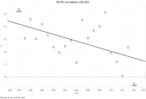
1994 had the highest correlation, while 2014 had the lowest correlation. So at this point you’ve probably noticed the variation and downward trend. Essentially what this tells us is that Pit/PA’s correlation with R/G is basically unpredictable. If your team, for example, sees a lot of pitches, it doesn’t mean that they will have a good offense. In fact if someone says that this team sees a lot of pitches and it’s a good thing, well he’s probably just blurting crap out. This is not to suggest that that individual is wrong, it is rather to suggest that seeing pitches doesn’t have a consistent correlation with runs scored. It is rather difficult then or impractical to come to any conclusion from this data set.
Now, what follows is an examination of similar trends and stronger trends of data. Oh, and I almost forgot, you’re also probably wondering well what about the base on balls, what was the point of that introduction? Well after I looked at the correlation between Pit/PA and R/G, I took a look at the correlation between BB% and R/G for 2014.
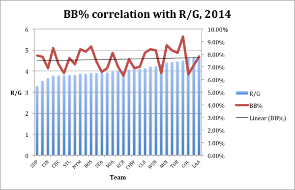
This basically shows no distinct correlation between BB% and R/G in 2014. Then I calculated the correlation coefficient to get an exact number, and got R=0.0908. Essentially this displays that there was no correlation between BB% and R/G in 2014.
I therefore ran the numbers again, for 20 years, to see if this was just an abnormality in the data. I also wanted to get a sense of whether there was a specific trend.
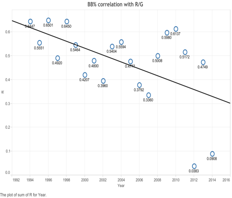
For this chart I decided to display all the data sets, to give you an idea of what the correlations looked like. The two, however, that I really want you to focus on are the 2012 correlation (R=0.083) and 2014 (R=0.0908) correlation. Both of these years show a significant drop-off in the correlation between BB% and R/G. Before there was always a positive correlation between the two data points, even at times strong correlations. In 2014 and 2012, however, there was essentially no correlation between BB% and R/G.
So what does this mean? Why the sudden drop in data correlation and will it continue? I also found it odd that in 2013, the correlation went all the way back up to R=0.4749, which is not the strongest correlation, but still a good one.
First, however, before we try to answer the two questions I’ve asked, let’s look at another set of correlation data, and that’s the correlation between BB% and OBP. Why? Well my hypothesis was if the correlation between BB% and OBP is getting smaller than naturally the correlation between BB% and R/G would get smaller as well.

As you might be able to tell although less drastic the correlation between BB% and OBP has similar results to the correlation between BB% and R/G. Again the part of the graph, which you should focus on is the two outlier data points. Again they are 2012 (R=0.2317) and 2014 (R=0.3570). This at this point gives us some explanation for the two outlier data points in the previous graph.
Essentially what one needs to understand from this is, since BB% is becoming less correlated with OBP, it’s evidently going to have a lesser correlation with R/G. Since the primary value of a BB is the effect it has on the OBP (obviously though not the only). Also generally and through the 20 years of data there has been a strong correlation between BB% and OBP. Apart from 2012 and 2014 where their correlation is weaker, although still a positive correlation.
So now we need to understand this, if the walk has a small correlation with OBP, then its value will be significantly affected. The problem here is trying to figure out why in 2012 and 2014 there was a sudden drop in its correlation with OBP. My first hypothesis was that it had something to do with the overall BB% of the league.
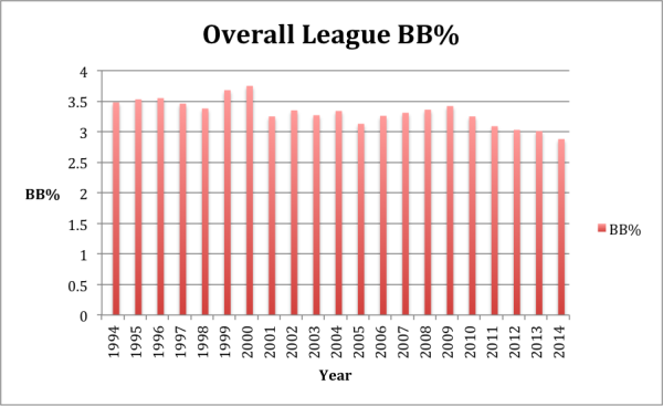
In hindsight this was probably a simplistic hypothesis. At this point you’ve probably figured out that this was not the answer. Yes, the overall BB% is trending down, just like the previous charts, but the difference is that it doesn’t have the outliers of 2012 and 2014. (I included this to dispel a possible easy assumption to the answer.)
There are in fact several possibilities for the drop in correlation between BB% and OBP. Perhaps it’s the shift, perhaps it’s the low run environment, perhaps it’s high rise in strikeouts. I think another interesting element to look at it is how are hitters doing later in the count. Considering the rise in strikeouts, it’s probably not unreasonable to assume that hitters are performing worse than ever when hitting with two strikes, although this of course is just a hypothesis. The answer to that question is for another study, for another day. What is certain, however, is that this upcoming season will be a fascinating data point. Will the correlations keep getting smaller or are these two data points just truly abnormalities? In any case I think it’s important to consider this, baseball is an ever changing game, and just because something has value one year, doesn’t mean it has value another. Teams need to keep changing and mixing their strategies in order to stay ahead in this wacky game.
Finally, something to note: these data sets are not meant to arrive to any conclusion. I have not arrived at any conclusions about baseball through this data. What it does is, it raises more questions for further and more detailed and elaborate studies. For, example it would be interesting, for Pit/PA to look at it from a pitchers point of view, although I’m not sure that would give us different results. These data sets are also general; they give us a general idea of the situation. Perhaps there are specific teams or players that thrive on seeing a lot of pitches or that do translate a high number of BBs into runs. Also and this might be the most important element to note, correlations aren’t always linked with causation. For example, pop fly’s may have a positive correlation with Pit/PA, that doesn’t mean that pop fly’s caused Pit/PA. What correlations, however, can do is direct us into the right direction to finding the causation. It is a measure or a way of advancing and creating more elaborate and specific research.
So I conclude, now that one has digested all this data, is it time to re-evaluate the value of a walk?
All data courtesy of baseball reference.
Julien Assouline is a journalism student at Ryerson University, and writes for Baseball Prospectus Milwaukee. Follow him on Twitter @JulienAssouline.
Interesting that the Red Sox, a team reliant on OBP had down offensive years in 2012 and 2014. Do the signings of Ramirez and Sandavol indicate something about where the Sox think things are going?
It’s very possible although I’m not sure. I wouldn’t exactly classify Ramirez as a free swinger though. I think when it comes to the Red Sox, it was more about adding talent than anything else.
First, I really do have to say that trying to evaluate the value of a walk, looking at team-aggregated data does very little except muddy the waters. At the team level, when it was an under-valued skill, you could gain advantages by stockpiling a bunch of guys who could walk: hence leading to concentrations where R/G would be driven highly by a team’s BB%, because whole lineups were based on it, while others were conspicuously not. If anything, I would expect the variance in walk rate across teams has diminished significantly.
Second, if you want to look at the value of walks, shouldn’t you first try to control for the values of other things? Otherwise, I feel like we’re just accepting lots of noise in the data when we have good ways to explain that variation.
All told, little in this article indicates any real rationale why we would re-evaluate the value of a walk. Such rationales do exist, but they don’t seem to be considered:
1. OBP correlates with runs non-linearly (has a quadratic term). As overall OBP gets lower, the value of an individual with higher OBP is also lower. In real-life baseball terms, this means a walk only worth something when the next three guys don’t strike out (and strikeouts are up).
2. Pitchers pounding the zone. The league BB/9 rate was almost a full walk lower in 2014 than 2000. More generally, it’s around 3 right now, while the last 20 years have been around 3.30 – 3.40 (e.g., 10%-15% decrease in walks). Less walks-> less overall impact on scoring. Doesn’t mean that each individual walk is worth less, however.
3. Drawing walks became a more difficult skill. While you don’t quite show it, you may be able to find that Pitches/PA and BB% might be less correlated than before. This would imply that patience (i.e., just laying off pitches) used to be a useful skill on its own to draw walks, but isn’t as much these days. By comparison, having a great eye (fairly rare skill) and HR-threat power may now be more important skills for walks.
However, I doubt that any of these factors would make sense to study at the team level, because of the flood of other factors involved.
Also, if you were wondering how a “good eye” might be measured, I would say that a good guidepost is if the player tends to be right on their close swing/lay off judgments than the umpires are in calling them. During some of David Ortiz’s or Barry Bonds’ prime years, you’d find that the pitch replays would often show him making the right “no swing” calls better than the umps were for calling them.
That skill is almost useless without at least some minimal power though, because Juan Pierre had a pretty good eye, which was counteracted by pitchers being willing to groove one down the middle with two strikes.
As for your second comment, that wasn’t exactly something I was looking for or at, to measure. All though it could definitely make for an interesting element to consider/study.
“First, I really do have to say that trying to evaluate the value of a walk, looking at team-aggregated data does very little except muddy the waters.” I respectfully disagree the fact that there was a very low level of variance and the strong correlation displays that we can take some conclusions out of this data. Are there a lot of factors to consider? Yes, but what is the alternative, looking at it from a players point of view? There are a lot of factors to consider there too. As I’ve mentioned it gives us a general sense of the situation. The elements I’m most concerned about are the 2 outliers. If it was just noise, as you’ve mentioned, I would expect there to be a much larger level of variance.
“Very little rationale”, I’m assuming you didn’t read my closing paragraphs? I did give rationale’s or possible reasons for the data. For the OBP comment, there is still an extremely strong level of correlation between OBP and R/G. Pitchers pounding the strike zone is a good point and that may be an answer, and something to take not in a study. As for Pit/PA and BB% This would give no answers to why the correlation between BB% and OBP is down.
Finally you don’t explain well why it isn’t good to look at it from a team level, your just making a set of statements based on what exactly? And what would be the alternative looking at it from a players point of view?
I’m not a math person, but doesn’t the regular linear-weights wOBA thing we do account for the changing value of events anyway? I don’t really understand what your approach is bringing to the table. (Again, I don’t really understand the math stuff well, so this is not a criticism, just an honest question.)
Hi Simon, thanks for the question, this will definitely allow me to clear up something, which I should have made more clear. Especially after re-reading my post. The main goal is to find the causation of the outlier data points both in the BB% correlation with R/G and with BB% correlation with OBA. Below is a link where you can find wBB and really all the measures that go into wOBA. What you will notice is that it doesn’t have the outlier data points that my correlation chart has (even though wBB is trending down). wOBA and more specifically linear weights deals with run expectancy. To read more on it go here.
wOBA: http://www.fangraphs.com/guts.aspx?type=cn
Linear Weights: http://www.fangraphs.com/library/principles/linear-weights/
The 2012 and 2014 outliers are potentially interesting. Unfortunately, your methodology fails to take into consideration all of the other factors that impact R/G. For instance 2014 was a banner base running year. 2012 was a high home run year. I think a better approach would be to use a regression approach on the usual suspects contributing to R/G, and then look for auto correlation of each variable. This should coax out any changing significance of walks or any other factors over time.
Thanks for the comment Gary and yes this methodology doesn’t take into account many affects that go into R/G. I think what this does is it will point us in the right direction for better research, so for example, using a regression approach as you suggest. That being said I think, personally I would start by looking at why the correlation between BB% and OBP has dropped so significantly. There are also a lot less variables to consider when looking at that correlation as appose to the correlation between BB% and R/G.
Has it occurred to you there might not be a reason “why the correlation between BB% and OBP has dropped so significantly”? That you found two outlier sets of games because you looked through a lot of data to see if any contained outliers?
A very simple possible explanation is that teams were constructed in both 2012 and 2014 such that baserunning and/or slugging was negatively correlated to OBP skill on a team level for the those two seasons. Hence, the previously commenters criticism of using team-level correlations, which are directly subject to team construction strategies and just plain luck.
I wasn’t looking at individual games, I looked at it by individual season basis. Also I’m not sure I follow your reasoning.
20 years is a very long time to run these numbers. Didn’t you miss your family or experience any of life’s joys during that time?
I admire your dedication though!
Lol ya I wanted to get a large sample size to make sure it was accurate and get a sense of the trend. Also doing baseball research is a form of life’s joys :). But seriously i did it after my midterms, when things are more quiet in terms of school work.
Very interesting article and thank you for addressing OBP. I think that is the main concern.
Walks were loved by sabermetrics because they were an undervalued skill that could be had for cheap. Walks were just the mean to the ends that is OBP.
A .360 OBP is a .360 OBP whether the hitter has a .220 BA or a .300 BA. Almost everyone in this generation of players was developed at a time when OBP was becoming more mainstream so there have become more of the former given a shot making BB% more uniform.
50 years ago a player that hit .220/.360/.410 likely may have been passed over in favor of a player that hit .300/.330/.410. Savvy GM’s who recognized the value of the former would have received more value from walks than others who did not in the form of better OBP relative to the rest of the league. Assuming the slashes listed above are true talent levels and defense between the two players is a wash, most will now pick the higher OBP, otherwise equal production guys (insert Ruben Amaro joke here)
Thanks jmarsh123, and ya the main point to take away from these data points is the BB% correlation with OBP. Obviously though this doesn’t suggest that the value of OBP is dropping but rather that BB is becoming a smaller part of what constitutes OBP. Although no definitive conclusions should be taken from this data. More research needs to be done.
“A .360 OBP is a .360 OBP whether the hitter has a .220 BA or a .300 BA.”
That’s simply not true. A single is more valuable than a walk, as it advances runners on base farther than a walk does.
In fact, perhaps teams giving so many lineup spots to guys who can walk but can’t make contact has actually dragged down their run scoring.
50 years ago a player that hit .220/.360/.410 likely may have been passed over in favor of a player that hit .300/.330/.410. Savvy GM’s who recognized the value of the former would have received more value from walks than others who did not in the form of better OBP relative to the rest of the league
Assuming the players had identical PAs the player hitting .220/.360/.410 would indeed have more overall value than the player with the higher BA. About 8.6 runs of extra value depending on the linear weights values for the year, how the actual hits were distributed for both players, and where they were hitting in the batting order. But it would be wrong to assume that that extra value was created by his extra 30 points of OBA. That only contributed about .8 runs of extra value. The other 7.8 runs comes from the 80 extra points of ISO that the player has to create identical SLG.
Those numbers were for 500 PAs for each batter and using linear weight values from The Book and assuming all walks for each batter to be non intentional.
There are two features of walks that make them valuable:
(1) They add a runner to the bases and advance eligible runners.
(2) They are not outs.
There are lots of ways to estimate home many runs a walk is worth on average. You’ll probably find this really intersting: http://www.tangotiger.net/runscreated.html