An Inquiry Into The Efficacy of Differing Pitching Philosophies

A philosophical question many people have likely pondered is the decision of whether it is more beneficial to be daring and to take risks, or to simply remain content with the status quo and use a more risk-averse approach. Being audacious requires a willingness to leave the comfort of society’s praise and expectations, and this ambition is too often discouraged. As a Baseball fan, one can relate these themes to styles of pitching and philosophies for being successful as a pitcher.

In the age of the juiced ball and home run spike, it would seem safe to say that the most prevalent style of pitching involves throwing lots of pitches towards the low-outside corner of the plate. If one thinks about the last time they watched a Baseball game, they would very likely remember the number of times they saw the catcher set up his target on the edge of the lower part of home plate. The idea is to basically throw the baseball as far away from the hitter as possible, while barely catching the plate. One would imagine that the idea is to generate ground balls and induce strikeouts, when pitchers throw to this location. Throwing pitches up in the zone is typically associated with allowing hitters to elevate the ball and get to more of their power.

Can one reasonably fight fire with fire, or should they simply use water? In Baseball terms: Is the art of ground-ball induction a worthwhile endeavor for pitchers, or should they challenge hitters more aggressively with their pitch locations?

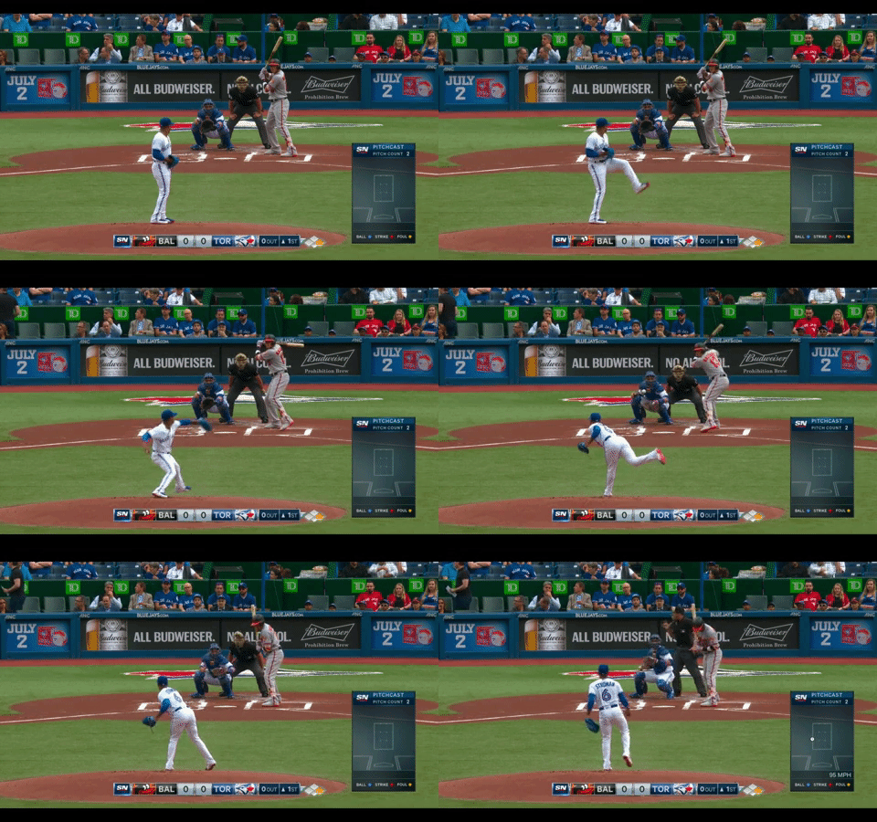
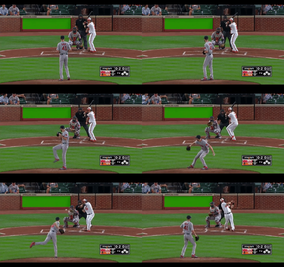
Visually, these are the two examples that help one understand the essence of what the differing pitching philosophies entail:

Marcus Stroman painting the low-outside corner:

Chris Sale blowing hitters away with high heat:

Chris Sale was arguably the best pitcher on the planet last season; he was honestly chosen as an example for this piece because his statistics are a part of the data being analyzed here. Marcus Stroman’s numbers are also a part of the data being interpreted; his ground-ball rate of 62.1% ranked highest among all qualified starting pitchers in 2017. Sale, on the other hand, recorded the ninth-lowest ground ball rate among qualified starters, at 38.7%.

This investigation is going to look at the twenty starting pitchers across Major League Baseball who were best able to induce ground balls this past season, as well as the other twenty who generated the fewest number of them. To start, it is apt to examine the durability and effectiveness of the two different kinds of pitchers being evaluated. Below are two tables showing the ground-ball rates, games started, and innings pitched by two very different kinds of pitchers:

Ground Ball Artists’ Durability Statistics:

Rank  Name GB% GS IP
1 Marcus Stroman 62.1 % 33 201
2 Luis Perdomo 61.8 % 29 163.2
3 Clayton Richard 59.2 % 32 197.1
4 Mike Leake 53.7 % 31 186
5 Sonny Gray 52.8 % 27 162.1
6 Carlos Martinez 51.3 % 32 205
7 Luis Severino 50.6 % 31 193.1
8 Patrick Corbin 50.4 % 32 189.2
9 Jimmy Nelson 50.3 % 29 175.1
10 Zach Davies 50.2 % 33 191.1
11 Aaron Nola 49.8 % 27 168
12 Michael Fulmer 49.2 % 25 164.2
13 Masahiro Tanaka 49.2 % 30 178.1
14 Jhoulys Chacin 49.1 % 32 180.1
15 Andrew Cashner 48.6 % 28 166.2
16 Tanner Roark 48.2 % 30 181.1
17 Michael Wacha 48.0 % 30 165.2
18 Clayton Kershaw 47.9 % 27 175
19 Alex Cobb 47.8 % 29 179.1
20 Martin Perez 47.3 % 32 185
   Average 51.4 % 29.9 180.2

Leading the ground ball pitchers above is Marcus Stroman, who is the model for all pitchers striving to generate weak contact. Also included is Carlos Martinez and his impressive 9.53 K/9 last season, as well as Yankees ace Luis Severino. One can never forget Clayton Kershaw, of course. Martin Perez and Luis Perdomo do not appear to be much more than league average starters, and Andrew Cashner’s drop in strikeouts does not inspire confidence moving forward. Aside from those three players though, the rest are some very accomplished and talented pitchers.

Low Ground-Ball Rate Pitchers’ Durability Statistics:

Rank Name GB% GS IP
1 Marco Estrada 30.3 % 33 186
2 Dylan Bundy 32.8 % 28 169.2
3 Justin Verlander 33.5 % 33 206
4 Dan Straily 34.2 % 33 181.2
5 Jeremy Hellickson 34.9 % 30 164
6 Max Scherzer 36.5 % 31 200.2
7 Matt Moore 37.7 % 31 174.1
8 Jason Hammel 38.0 % 32 180.1
9 Chris Sale 38.7 % 32 214.1
10 Rick Porcello 39.2 % 33 203.1
11 Julio Teheran 40.0 % 32 188.1
12 Ricky Nolasco 40.1 % 33 181
13 Jason Vargas 40.3 % 32 179.2
14 Robbie Ray 40.3 % 28 162
15 Yu Darvish 40.7 % 31 186.2
16 Ervin Santana 41.2 % 33 211.1
17 John Lackey 41.2 % 30 170.2
18 Jeff Samardzija 41.5 % 32 207.2
19 Chris Archer 42.0 % 34 201
20 Kevin Gausman 42.7 % 34 186.2
  Average 38.3 % 31.7 187.5

Taking a look at the individual pitchers who generated the lowest percentage of ground balls, it is notable to see the back-to-back National League Cy Young Winner, Max Scherzer. Also included is Chris Sale, whom the writer of this article thinks was the best pitcher in Baseball last season. However, it is imperative not to forget about the man at the top of the table, Marco Estrada. He has actually been a very good player throughout the past couple seasons for the Blue Jays. It is simply hard to feel good about the future outlook of the man nicknamed “Estradabien” with his 89.8 mph average fastball velocity, who generates the least number of ground balls among qualified Major League starting pitchers. The point is really that there are varying levels of talent and performance in the group of pitchers in the table, which is a part of what makes this investigation so captivating.

If a pitcher is getting hitters to pound the ball on the ground, he is seemingly more likely to be efficient with his pitch count, and should theoretically be able to stay in the game longer. Though this theory does not hold true in the case of the pitchers being evaluated here. The qualified starting pitchers with the lowest ground ball rates averaged almost two more starts comparatively with those who had the highest ground ball rates in 2017. The same low ground-ball rate pitchers also pitched approximately seven more innings than the ground-ball artists threw this past season.

This finding begs the question: Are pitchers who are less interested or talented at generating ground balls more durable than the pitchers who are more successful in doing so? Half of the twenty ground ball inducing pitchers (10) went on the 10-day Disabled List last season at least once, while only twenty percent of the pitchers with the lowest ground-ball rates (4) required time on the Disabled List. It would appear based on this data, that ground-ball pitchers are more injury prone comparatively with pitchers who seem less interested and able to induce ground balls.

Staying healthy is obviously a significant part of being a successful player, especially in the case of pitchers. The table below, however, shows the important stats one is usually looking for when comparing these two different kinds of pitchers:

2017 Performances of High and Low Ground-Ball Pitchers

Pitching Philosophy K/9 BB/9 HR/9 FIP WAR
High Groundball 7.88 2.72 1.04 3.92 3.1
Low Groundball 8.73 2.80 1.40 4.28 2.7

This data slightly favors the high ground-ball pitching philosophy, which is quite an interesting development. Yet at this point it is still not necessarily clear whether one approach is favorable to the other. The data representing the results of both pitching philosophies is simply too similar to come to a sound conclusion thus far.

Thus it would be prudent to view the 2018 projections for both kinds of pitchers, to have an idea of what pitching philosophy is potentially going to make the players more successful moving forward. Steamer projects the High ground-ball pitchers to produce an average WAR of 2.65 in 2018, with the Low ground ball pitchers expected to produce 2.35 WAR on average. Again, there is a slight inclination to lean towards the ground-ball approach, yet the difference in projected performance from both types of pitchers is marginal. At this point it would seem like a good idea to simply accept that there are different ways of pitching, and depending on the pitcher’s skillset, he should pitch to his strengths.

Taking a look at how the two different styles of pitching fared in 2016 is also important. The high ground ball rate pitchers produced an average WAR of 2.72, in comparison with the 2.65 WAR put up by the pitchers with the lowest percentages of ground balls. Given that there has not been a significant difference in production between the two different styles of pitching over the last two seasons, could this be related to the home-run spike and juiced baseballs?

Despite suspicion that these themes could have been related to how pitchers have performed and approached their location of pitches to hitters, the fact that there was not a significant difference in performance between the two different ground ball rates does not provide evidence for them being a real factor in this investigation. While it would be more satisfying to say that throwing the ball up in the zone is preferable to painting the low-outside corner of the plate, or vice versa, there simply is not sufficient evidence for either being truly better than the other.

In this case the answer seems to lie in the middle – aces like Chris Sale and Max Scherzer are clearly having success with high heat up in the zone to hitters. Marcus Stroman is keeping hitters from making quality contact by keeping the ball down and throwing a great sinker. Luis Severino is using some of the best velocity of any starter in the Major Leagues to generate ground balls. Perhaps this was always too binary of an exploration of what is an inherently open-ended question. Hopefully, this article has at least helped advocate for pitchers who challenge hitters up in the zone, without criticizing the admirable approach of keeping the ball down in the zone and inducing ground balls.

All data used in this piece was taken from Fangraphs.


The Pirates Are Probably Better (This Year) After These Trades

Are the Pirates actually worse after trading Andrew McCutchen and Gerrit Cole? Probably not. The trades addressed their weakest spot on the field, even though they caused sore spots off the field.

It’s usually doom and gloom when big names leave, and small names come back in return. But, the value of the smaller players can add up. In this situation they do.

The most important thing is to understand the context of who the Pirates are. The Pirates were not a World Series contender before the trades, or even strong playoff contenders. They were, and still are, a team that needed things to break the right way in order to compete for a playoff spot in a division with the Cubs, Cardinals, and Brewers. 

However, a small market team can compete on the fringes, and the Pirates are doing that.

The Pirates weakest spot in 2017 was the 7th inning. Their starters had a 7.08 ERA in 47 innings pitched after the 6th. The team, as a whole had a 5.00 ERA in the 7th inning. The Pirates were nearly a whole run worse than the league in the 7th inning, which posted a 4.19 ERA. Over 162 innings that’s 14.58  (let’s call it 15) runs. Overall, the Pirates were an above average pitching team, but the 7th inning was their downfall.

 Inning Pirates ERA League ERA Difference
1st 5.17 4.8 0.37
2nd 3.67 3.97 -0.30
3rd 4.67 4.51 0.16
4th 3.72 4.62 -0.9
5th 4.28 4.53 -0.25
6th 4.11 4.45 -0.34
7th 5.00 4.19 0.81
8th 3.28 4.1 -0.82
9th 4.05 3.87 0.18

The mid-game struggles are further highlighted by the Pirates inability to keep up with the league average when entering the 6th and 7th. Teams that entered the 6th with the lead won 82.8% of the time; those who entered the 7th with the lead won 87.1% of their games. The Pirates only won 77.3% and 86.4% of those games, respectively.

League       Pirates
Inning W L W% W L W%
Wins Below League Average
6 1762 365 0.828 51 15 0.773 3.6
7 1872 278 0.871 57 9 0.864 0.5

On average, teams that entered the 6th inning tied won 50% of their games. The same applies to teams entering the 7th inning tied. The Pirates won 52% of the time when tied going into the 6th inning. They only won 45.8% of the games in which they were tied going into the 7th inning.

League       Pirates
Inning W L W% W L W%
Wins Below League Average
6 303 303 0.5 13 12 0.52 -0.5
7 279 279 0.5 11 13 0.458 1.0

Moreover, the Pirates were less adept at making comebacks than other teams. The league average winning percentage for teams trailing entering the 6th inning was 17.2%, and 12.9% when trailing entering the 7th inning. The Pirates ended the season with a 15.5% and 9.7% winning percentage in each respective situation.

League       Pirates
Inning W L W% W L W%
Wins Below League Average
6 365 1762 0.172 11 60 0.155 1.2
7 278 1872 0.129 7 65 0.097 2.3

Juan Nicasio left the team in free agency this off-season. His stellar 2017 is the reason for the Pirates’ great 8th inning performance last year, but the Gerrit Cole trade addressed this loss through the acquisition of Michael Feliz, who will likely, at least in part, take over Nicasio’s 8th inning role. The Cole trade also alleviated the loss of Cole himself, as the Pirates acquired Joe Musgrove, who Steamer projects to have a nearly identical season, if not better season than Cole himself. (Editor’s note: Steamer has not yet accounted for Musgrove’s projected switch from the bullpen to the rotation in regard to his rate stats).

What about the 7th inning? This is what the McCutchen trade addresses. Kyle Crick may seem underwhelming, but he may be exactly what the Pirates need in order to extend and bolster their bullpen.  Crick will be relied upon to team up with A.J. Schugel, George Kontos and Daniel Hudson to address the 7th. The four of them are unlikely to be dominant, but the Pirates will be well-served if the four players can mimic, or slightly exceed the league average. More important, the group will need to provide Clint Hurdle with enough confidence to remove his starters by the 6th inning. The group is ill-equipped for the final third of games, but they are seemingly capable of providing average to above-average performance in the first 6 innings of a game.

Kyle Crick and Michael Feliz may not inspire passion in a fan base that lost a face of the franchise, and head of their rotation, but those are the types of players the Pirates need to stay competitive, with or without Cole and McCutchen.

This doesn’t address the loss of McCutchen on offense, but there’s a reasonable expectation that players on the team will be able to patch together those losses in the form of a healthy Starling Marte (Steamer 2018 Projection: 3 WAR, 2017 1.2 WAR), a healthy Gregory Polanco (Steamer 2018 Projection: 1.8 WAR, 2017 0.5 WAR), a more developed Josh Bell (Steamer 2018 Projection: 1.2 WAR, 2017 .8 WAR), etc.  The team will also need to add a veteran outfielder to hedge against a likely Adam Frazier regression and to provide time to figure out where Austin Meadows fits into the 2018 Pirates.  However, the picture as a whole suggests that this team is no worse off in the field than it was with the 2017 version of Andrew McCutchen (3.7 WAR).

The Pirates rightly buried the memories of the past to focus on the present and the future. They addressed their weakest spots by picking up players that will contribute now, and provide them a cost-controlled future. McCutchen and Cole were not the right places to invest for the future, therefore the Pirates rightly divested now, and they are, at worst, not worse off for it.

It’s going to be really hard for the Pirates to win 90+ games again. This was the case with Cole and McCutchen. It’s also the case without them. But, they may actually have a better shot now than they did before the trades. Bullpen depth isn’t sexy, but it’s necessary.  Particularly for this team.

***All stats in the tables above were taken from Baseball-Reference.com. All Steamer projections and 2017 WAR citations are from Fangraphs


This Year’s Free Agency, or Lack Thereof, Visualized

As basically anyone who follows baseball has noticed this years free agency has dragged on through today January 24th with really nothing of note happening. It’s frustrating for the fans, the media and most of all the players. I decided to look back at the last six years to the 2012-2013 offseason and compare the money spent on all free agent contracts of three years or more as most of the best players get some sort of lengthy deal. To this point this offseason less than half of the top 50 free agents according to mlbtraderumors.com have signed and only one of their top 10, Wade Davis. Only 8 free agents among FanGraphs’ top 20 have signed.

Let’s start with the obvious, the number of deals this offseason is extremely low to this point in the winter. I looked back at all the deals each year and verified the date the deals were announced and sorted by month. Here though is the total number of deals three or more years in length as of January 20th in each of those years.

As you can see this year teams just aren’t wanting to commit to longer-term deals hardly at all. Currently this offseason there have been just nine deals of any real length. Three of those were signed by the Colorado Rockies alone with the signings of Wade Davis, Bryan Shaw and Jake McGee. Every deal of three or more years this offseason has been for just three years, no longer deals have been signed as of yet. At this point in the year the number of deals is for all intents and purposes half, or less than halfof what has been normal in recent years so everyone is right to think this year’s Hot Stove is quite cold.

So what kind of money are teams committing?

Again as seen here, for this point in the year the $ spent are incredibly low as well. These figures will surely rise when/if the top free agents start to sign but as they sit currently the low level of spending is almost mind-blowing. Four of the five previous years by January 24th teams in MLB had committed either very close to well over a billion, yes with a b, dollars to free agents on long term deals. This year’s total currently sits at $415 million. To put that in perspective in the 2015 offseason David Price and Zack Greinke combined for more money than that at $423.5 million between them. So what’s different this year? Has the free agent spending bubble burst? It’s most certainly not the qualifying offer and the loss of a draft pick holding teams back anymore.

Here you will see the total spent as the months passed in previous offseasons. What is obviously missing this year is all the big names signing in December like most years. Now the biggest question is when will those names sign? Will it be before the end of January… February… Spring Training? We are only 20 days away from pitchers and catchers reporting to spring training and the picture of this offseason is not pretty.


J.D. Martinez Will Be Productive in Six Years (And Maybe Seven)

While baseball fans wait for the free agent market to finally unthaw, J.D. Martinez waits for a contract offer enticing enough for him to sign. Early reports suggested that Martinez and his agent, Scott Boras, set an early asking price at seven years, $210 million. Clearly, nobody has taken the bait. Among Martinez’ likely suitors, many have moved onto other options; the Cardinals traded for Marcell Ozuna, and the Giants traded for Andrew McCutchen, seemingly leaving the Red Sox as Martinez’ lone serious suitor.

The latest report, from Buster Olney, is that Martinez has an offer on the table from the Red Sox worth five years, $100 million. Taking the reports at face value (although Boras himself has simply declared the report “inaccurate”), the offer obviously comes up short of Martinez’ demands, which is why this article is being written in late January to begin with. To that end, here’s an excerpt from Jeff Passan’s recent column at Yahoo Sports on baseball’s economic system:

Recently, one of the best free agents available this offseason met with a friend, and he admitted something shocking: He was preparing to sit out until the middle of the season. The market for his services this winter was so thin, the offers so incompatible with his production, that he worried he was going to need an external force to compel teams to pay him what his numbers say he’s worth. Maybe it would take a playoff race.”

Can we assume that the hitter in question is Martinez? Of course not, but considering the discrepancy between his asking price and the reported Red Sox offer, it wouldn’t be an outlandish guess. While I understand that the Red Sox have leverage in that they presumably don’t have anyone to bid against, I will argue that Martinez will be well worth a contract in excess of 5/$100M.

From 2014-2017, his Age 26 through  Age 29 seasons, Martinez posted an astounding 149 OPS+ (my apologies for not using wRC+ in this column!), with a low of 139 and a high of 166. To that end, I researched players from the DH era (circa 1973) that posted an OPS+ between 140 and 160 in their Age 26 through Age 29 seasons. Presumably, these players would make for suitable Martinez comps as we attempt to project his offensive production over the next five to seven years. Of course, some of these players are still active and haven’t played enough to give me complete data, such as Ryan Braun, so they have been eliminated from the dataset. I was left with 38 comparable players, which is a large enough sample for our purposes today.

In this chart, I condensed the sample into averages because 40 rows and 9 columns doesn’t embed so cleanly. These are Martinez’s comps for their age-26 through age-29 seasons, their offensive production for the next five years (through age-34, which is Martinez’ floor value at this point) and then their production in the sixth and seventh following years (ages 35 and 36, which represent Martinez’ ceiling value at this point).

J.D. Martinez Age 26-29 Comps Through Age 30-34, 35, and 36
Age Average OPS+ Average PA/Season Sample Size
26-30 147 637 38
30-34 134 559 38
35 124 512 36
36 117 447 33

The average player from my sample posted a 147 OPS+ in their age-26 through 29 seasons, which matches up neatly with Martinez’ 149 mark. You’ll first notice the drop off in production for these players in their age-30 through 34 seasons. There are several reasons for this. Yes, natural decline was at work, but the original search for Martinez comps included a 2000 plate appearance minimum; this means I was guaranteed to be given players both as good and as healthy as Martinez in their Age 26-29 seasons without the same guarantee they would be healthy in the years that followed. This also means players like Mark McGwire (146 OPS+ in 1913 PA) were excluded from the sample because he was injured, despite the 189 OPS+ he would put up in 3462 plate appearances through Age 36.

Nevertheless, it’s a reasonable regression one can expect for players entering their 30s, and the good news is that they were, on average, very productive (134 OPS+) and very healthy (559 PA). This is what the Red Sox believe to be worth 5/$100M, but I would argue that this data shows they should be willing to tack on a sixth year without blinking. Of the original 38 player sample, 36 players played their age-35 seasons; they were still very productive (Khris Davis has been producing along these lines the past two years) and healthy enough to play a full season.

The real question surrounding Martinez is – or at least should be, if the market weren’t so cold – whether he should be given a seventh year or not. From his comps, the sample size drops significantly for the first time down to 33, the average playing time falls below the league qualifying minimum for the first time, and the production drops below what you’d want from your DH (the reference point here would be Miguel Sano from the last couple of seasons).

At face value, I would absolutely give Martinez the sixth year, and absolutely not give him the seventh. At the same time, we should dive into our sample a little deeper and discover why some players did well and why others tanked in their 30s; perhaps there is something we can correlate with Martinez so we can get an even better projection. From the original sample, here are the twenty best performers in their age-36 seasons (based on a combination of plate appearances and OPS+).

Twenty Age-36 Producers
Rank Player OPS+ PA Rank Player OPS+ PA
1 Rafael Palmeiro 141 714 11 George Brett 123 528
2 Mike Schmidt 153 657 12 Robin Yount 102 629
3 Dave Winfield 159 631 13 Wade Boggs 142 434
4 Chipper Jones 176 534 14 George Foster 121 504
5 Carlos Delgado 128 686 15 Brian Giles 110 552
6 Jim Thome 150 536 16 Dave Parker 92 647
7 Bobby Abreu 118 667 17 Alex Rodriguez 111 529
8 Fred McGriff 110 664 18 Vladimir Guerrero 98 590
9 Eddie Murray 115 625 19 Ken Griffey 99 472
10 David Ortiz 173 383 20 Bernie Williams 85 546
Average 140 610   Average 107 543

The reason I picked the twenty best rather than the top and bottom ten is that the bottom ten would be littered with folks such as Cliff Floyd or Dale Murphy, who only came to the plate 17 and 63 times respectively during their age-36 seasons. Using the ten best players captures those who were magnificent offensive performers with full playing time. Using the next ten players captures those who were mediocre in full playing time. This looks good to me.

This would be the time for me to explain why I haven’t mentioned WAR in this piece: J.D. Martinez has been horrible on defense!

He was best suited as a DH years ago, but being on a roster with Victor Martinez and then being traded to the National League forced him to play right field, which depressed his value. If Boston signs him, he’ll see absolutely no time in an outfield that will be covered by Jackie Bradley, Mookie Betts, and Andrew Benintendi for the foreseeable future. As a DH for the rest of his career, Martinez will be solely judged by his offensive production and ability to stay on the field.

Again, our question is whether Martinez receiving a seventh year is justified. More specifically, this boils down to “In seven years, will Martinez be in the left column or the right column?” Both sides of the list contain incredible players, but there’s a way to make a reasonable projection. Here’s the same list, but instead of rank, you’ll see the positions these players spent significant time. Those who had significant time at 1B/DH are highlighted in gold.

Twenty Age-36 Producers (By Age)
Position Player OPS+ PA Position Player OPS+ PA
1B/DH Rafael Palmeiro 141 714 1B George Brett 123 528
3B/1B Mike Schmidt 153 657 CF Robin Yount 102 629
RF Dave Winfield 159 631 3B Wade Boggs 142 434
3B Chipper Jones 176 534 LF George Foster 121 504
1B Carlos Delgado 128 686 RF Brian Giles 110 552
DH Jim Thome 150 536 RF Dave Parker 92 647
RF/LF/DH Bobby Abreu 118 667 3B/DH Alex Rodriguez 111 529
1B Fred McGriff 110 664 DH Vladimir Guerrero 98 590
1B Eddie Murray 115 625 CF Ken Griffey 99 472
DH David Ortiz 173 383 CF/DH Bernie Williams 85 546
Average 140 610   Average 107 543

In this exercise, let’s consider 1B/DH to be significantly less stressful positions than the others. After all, there is a significant correlation between time spent in the field and sustaining an injury that leads to decline. While players like Brian Giles, Dave Parker, and Ken Griffey Jr. saw injuries and offensive decline catch up to them after years chasing down balls in the outfield, players like Rafael Palmeiro, Carlos Delgado, and Jim Thome aged extremely well by not exerting the same stress in the field.

Martinez is almost certain to spend no time in the field at Age 36. Hell, he might not spend much time in the field ever again. So I consider him a slam dunk to be placed in the group on the left. Referring to the averages from the first chart in this article, I’ll the over on Martinez when the time comes. To be clear, I donJD’t necessarily think he should be given the seventh year outright – an option would probably be most appropriate – but I think this data solidifies my comfort in giving him a sixth guaranteed year.

In a winter in which the market is changing in ways we have never seen before, it’s difficult to predict what  Martinez will earn. It’s important to remember that dollars are a construct; we can’t assume Martinez will get $150 million from the Red Sox because Adrian Gonzalez did after amassing similar numbers. Teams like the Red Sox are wary of contracts like the one given to Gonzalez, who will earn $21.5M from that deal this year. In this market (or lack thereof), it’s impossible for me to put dollars or years on Martinez, but I do know this: Martinez is a special hitter, and he’ll age especially well.

He will be a productive hitter for the next six or seven years, and there’s no dollar amount that can change that.


Yet Another Eric Hosmer Red Flag

I don’t need to sell this all that hard. You come to FanGraphs. You’ve seen the articles about Eric Hosmer, his wildly fluctuating value, and how that stacks up next to his big free agency ask. The horse is dead already — rest in peace, horse. And yet, here it is. Another caution label to throw on Eric Hosmer, who is beginning to look more caution label than man now.

Statcast has been wonderful in both expanding the breadth and the depth of baseball analysis among both professionals (unlike myself) and hobbyists (hey, like myself!). Where PITCHf/x allowed us deep inside the world of pitching, many aspects of hitting were largely a black box until recently. With the aid of launch angles, exit velocity, and xBA we can judge not only the hitter’s results, but the process by which he arrived at them — is the hitter making quality contact? For Hosmer, his 25 home runs in 2017 might lead you to believe that he is. Statcast, as we’ll see, respectfully disagrees.

When it comes to types of contact, barrels are the crème de la crème. MLB’s glossary has the in-depth details, but in short — hit ball good, ball do good things. Statcast captures every batted ball event and allows us to take a closer look at who’s clobbering the ball on a regular basis. The leaders in barrel rate (Barrels per batted ball event, min. 200 batted balls) — Aaron Judge (25.74%), Joey Gallo (22.13%), and J.D. Kong (19.48%). Nothing out of place here. The laggards will surprise you just as much as the leaders did (in that they will not surprise you at all) — Dee Gordon (0.18%), Darwin Barney (0.36%), and Ben Revere (0.37%).  Hosmer’s 6.99% barrel rate ranks 121st out of 282 players, just above the average of 6.83%.

This not-terrible barrel rate is being masked by a well-above-average home run rate. Hosmer’s 22.5% HR/FB% ranks 30th in that same sample of 282 players. How do barrel rate and HR/FB% correlate?

Very well, actually. It seems my “hit ball good” theory has legs. Highlighted in red is Hosmer, and from a glance, it’s clear he’s pretty outlier-y. Using the equation from the best fit line and plugging in Hosmer’s barrel rate yields a pedestrian 14.34% xHR/FB%. The difference between his HR/FB% and xHR/FB% ranks 3rd out of 282. Yikes.

You might be wondering if HR/FB%-xHR/FB% even means anything. What good is knowing the difference if we don’t know the standard deviation or the distribution of the sample? Let the following bell curve assuage your concerns. Highlighted in red, again, is Hosmer.

I don’t have a very good conclusion for this. I’ve seen people mention his worm-killing tendencies. I’ve seen concerns about his defense. I’ve seen mentions of his BABIP-inflated career year. What I hadn’t seen yet was just how out of line his power numbers looked to be with his contact quality, and for a player seeking as much money as he is, that’s one more thing to be concerned about.


The Pirates and the Value of Being Around .500

I was at first very critical of the Pirates trades. I didn’t think the surplus value is bad, but I didn’t like getting older prospects with lower ceilings who are MLB-ready instead of higher-upside guys who are farther away. My thinking was that the Pirates can’t buy upside, and while those good depth pieces help them to stay around .500, they don’t make them a great team. However, what if that is what the Pirates want? I thought it might make sense to tank completely and rebuild for a couple years, but maybe there is value to being an average team in the two-WC era.

So first I looked at what is needed to win a WC.

Year NL AL
2017 87 85
2016 87 89
2015 97 86
2014 88 88
2013 90 92
AVG 89.8 88

So roughly 88 wins are needed, and you have a chance with 85+.

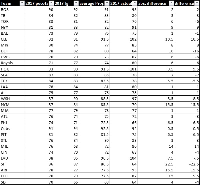
I compared last year’s projections (average of PECOTA and FG) with the actual results and calculated the absolute distance (eliminating negative numbers to make the math easier) and the difference (found the projections here).

The average difference to the projection was 7.1 wins. Those differences don’t mean projections are bad; there is always under and overperformance, unlikely breakouts as well as injuries. Also just Pythagoran luck or bad luck can easily make up 3-4 wins or more. Of course this goes both ways — an 81-win team can easily have a 71-win season, but there definitely is a chance.

As you can see in the upper graphic, usually around 88-89 wins get you a WC, although you sometimes can get one with 85 or sometimes 90+ is required. So a .500 team needs to make up like seven games to get into the postseason. With a little bit of overperformance, one or two Pythagoran luck wins and one or two wins picked up in deadline trades, that is quite possible. Actually 30% of the MLB teams last year were plus-7 or better. That means a .500 team might have around a 30% chance to get (actually half) a playoff spot. That isn’t great, but if you are a .500 team for six years, that would mean two WC game appearances.

Now of course that is not ideal. Ideally you want a talent-oozing rebuild like the Cubs, White Sox, or Braves. But other teams now also have recognized the value of cheap controllable talent, and are much stingier with their top prospects. Also, currently many .500 teams have given up and prefer to start a rebuild or at least do nothing. That means, if anything, it might become a little easier to make a WC, because the emergence of the super teams might cause the in-between teams to push the reset button to become the next Cubs or Astros.

Maybe that is really what the Pirates were thinking. The Dave Stewarts are gone, and usually those plus 50M surplus-value trades that made rebuilding so attractive don’t happen anymore. Now you have to fight for every million of surplus value, as any intern or even hobby sabermetrist can easily get a pretty good guess of the surplus value of a trade. So maybe the Pirates are trying to use a little game theory here and go against the trend to try finding a market inefficiency. It is a little like with poker. If you play beginner levels, you don’t need to worry about game theory and out-thinking the opponent — you just play the plus-EV hands, occasionally make a bluff to keep them off balance, and then you win. But at higher levels, everyone plays the correct hands, and game theory and out-thinking the opponent like a chess player becomes more important. The early sabermetric age was a bit like beginner-level poker, and you just needed to make mathematically correct calls because enough Dave Stewarts were feeding you. But now there isn’t that much difference between analytical departments, so that for smaller-market teams, even less than optimal plays can become profitable if they catch the market off balance. A team like the Dodgers doesn’t need to do that; they just need to play the mathematically correct hand and avoid mistakes to let their resources do the work, as they just start with pocket aces more often.

But a cash-constrained team like the Pirates might need to do more to out-think opponents and go against the trend, because they can’t do what anyone else does with half the resources and expect to beat them. Sure, they would have preferred a GM giving them a Shelby Miller trade, but it just wasn’t available, so maybe they re-evaluated and chose a path of sustained mediocrity to chase the second WC.

The Pirates version isn’t sexy, just like the 2000s A’s way wasn’t sexy. People love to dream. They don’t want the bird in the hand — they want the two in the bush. Fans don’t want an outlook of “we can be an 83-win team for a couple years and maybe make a WC or two,” they want to dream about becoming the next juggernaut. Fans are extremely emotional about their prospects. They want to believe anyone is the next Babe Ruth and getting a couple of 25-year-old prospects doesn’t really elicit that dream. The Pirates fans don’t want that — they want to be the White Sox and have all those studs coming up. But then again, that is no guarantee, as just one or two years ago they had those studs themselves in Glasnow and Meadows and it didn’t work out that well (for now, of course — they could still break out).

At first I hated the trades, but maybe it is good that a team chose to actually value mid-80s wins rather than tanking like anyone else. Sure, it isn’t nice that their owner has tight pockets, and you would have wished for more, but a future where we just have super teams and tankers is really boring. Maybe that tanking hype is already self-correcting currently. Anyone might’ve wanted to be the next Cubs, but as more try it and at the same time the buyers get stingier with their prospects, that becomes increasingly harder to do, and maybe as a consequence teams start to value those half-playoff spots more. Baseball really needs a middle field or the regular season will become a long and boring spring training for the postseason (which admittedly has become really great with all those super teams).


Adding to the K-vs.-Clutch Dilemma

A few recent researchers have been doing some fascinating work on the relationship between strikeouts and clutch and leverage performance. Some good work has been done and there has even been good content added to the comment sections of the respective articles. To start a talk on anything that has to do with clutch performance, there are a few things that need to be settled first.

What is clutch?

The stat called ‘clutch’ has aptly been called into question recently. Does it measure what it is intended to measure, is the main issue. Clutch is namely one’s ability to perform in high leverage situations vs. their performance in not-high leverage situations. If someone is notably poor in important PAs compared to their relative performance in lower leverage situations, clutch will let us know. However, if someone is a .310 hitter in all situations, that hitter is very good, but clutch is not really going to tell us much.

I think the topic has been popularized partly because of Aaron Judge, who had a notoriously low ‘clutch’ number last season. Many have blamed his process to striking out, which indeed could very well be a factor in the relative situational performance gap. However, Judge helped his team win last year despite his record-setting strikeout process. Still, Judge wasn’t even top 40 in WPA last year, but then again neither were a lot of good players. But are high strikeout guys really worse off in high leverage spots? The rationale with putting a strong contact hitter up to the plate in high leverage game-changing spots is intuitively obvious, but all else equal, is someone like Ichiro really better in game-changing situations than someone like Judge?

Many have been using clutch to compare relationships with other stats. To be quite honest, I can’t seem to get much of a statistical relationship between anything and ‘clutch’ so I am opting for a different route. We know that a player’s high leverage PAs are worth many times more to the importance of their team as low leverage situations, by about a factor of 10. If we assume WPA is the best way of measuring a player’s impact to their team winning in terms of coming through in leverage spots, then we can tackle the clutch problem, in the traditional sense of the word.

WPA is not perfect, like every other statistic that exists or will exist. There are a lot of factors that play into a player’s potential WPA. Things like place in the batting order, strength of teammates among other factors all play a part. But in terms of measuring performance in high leverage, it works quite well.

Examining the correlation matrix between WPA and several other variables tells is some interesting things.

**K=K% and BB=BB%

We assume already that a more skilled hitter is going to better be able to perform in high leverage situations than a not as skilled hitter. What we see is that K% appears to have a negative relationship with WPA, but not a strong one, and not as strong as BB%, which has a positive relationship. Looking at statistics like wOBA, K% and BB% along with WPA can be tricky because players with good wRC numbers can also strike out a lot. See Mike Trout a few years back. Those same players can also walk a lot. I like this correlation matrix because it also shows the relationship between stats like wOBA and K%, which you can see are negatively correlated but also very thinly. The relationship between stats like these will not be perfect. Again, productive hitters can still strikeout a lot. Those same players again can also walk a lot. This helps to lend evidence to confirm that a walk is much more valuable than a strikeout is detrimental.

I’ll add a few more variables to the correlation matrix without trying to make it too messy.

We see again that WPA and wOBA show the strongest relationship. The matrix also suggests that we debunk the myth that ground ball competent hitters lead to better performance in high leverage situations.

So why do we judge players like Judge (no pun intended) so much for their proneness to striking out, when overall, they are very productive hitters who still produce runs for their teams? The answer is that we probably shouldn’t. But it wouldn’t be right just to stop there.

So how exactly should we value strikeouts? One comment in a recent article mentioned that when measuring clutch against K% and BB%, he or she finds a statistically significant negative relationship between K% and clutch. However, that statistical significance goes away when also controlling for batting averages. Interestingly, I found the same is true when using WPA as the dependent variable but instead of using batting average, I used wOBA.

To further test this, I use an Ordinary Least Squares Linear regression to test WPA against several variables to try to find relationships. I run several models based mainly on some prior studies that suggests relationships with high leverage performance and other variables. Before I go into the models, I feel I need to talk a little more about the data.

More about the data:

I wanted to have a large sample size of recent data so I use a reference period of 10 years, encompassing the 2007-2017 seasons. I use position players with at least 200 PAs for each year that they appear in the data, which seems to allow me to capture other players with significant playing time besides just starters. This also gives me a fairly normal distribution of the data. The summary statistics are shown below.

There aren’t really abnormalities in the data to discuss. I find the standard deviations of the variables to be especially interesting, which will help me with my analysis. All in all, I get a fairly normal distribution of data, which is what I am going for. The only problems I found with observations swaying far from the mean were with ISO and wOBA. To account for this, I square both the variables, which I found produces the most normal adjustment of any transformation. The squared wOBA and ISO variables is what I will be using in the models.

I use multiple regression and probability techniques to try to shed light on the relationship between strikeouts and high leverage performance. First I use an OLS linear regression model with a few different specifications. These specifications can be found below.

For the first equation, I find that wOBA, BB% and K% all have statistically significant relationships with WPA at the one percent level. I know that is not exactly ground breaking, but we can get a better idea of the magnitudes of the relationship. The results of the first regression are below.

I find that these three variables alone account for about 60% of the variance in WPA. Per the model, we find that a one percentage point increase in K% corresponds to about a 1.14 percentage point decrease in WPA. Upping your walk rate one percent has a greater effect in the other direction, corresponding to about a 5-percentage point increase in WPA. Also per the model, we find that a one percentage point increase in the square root of wOBA corresponds to about a 35.50 percentage point increase in WPA. These interpretations, however, are tricky, and do not really mean much. Since WPA usually runs from about a -3 to +6 scale, looking at percentage point increases does not really tell us anything tangible, but it does give a sense of magnitude.

To account for this, I convert the measurement weights into changes by standard deviation to help us compare apples-to-apples on a level field. The betas of the variables shown below.

We see that wOBA not surprisingly has the greatest effect on WPA while K% has the smallest. All else equal, a one standard deviation increase in K% corresponds with just a -0.04 standard deviation decrease in WPA. A one standard deviation increase in BB% has more an upward effect on WPA than K% does a downward one, albeit by not much. Though the standard deviations for these variables are not very big, so the movement increments will be small. Nevertheless, we still see level comparisons across the variables in terms of magnitude.

We go back to the fact that good hitters still sometimes strike out a good portion of the time. We like to think that strikeout hitters are also just power hitters, but Mike Trout was not that when he won his MVP while striking out more than anyone in the league. Not completely gone are the days where the only ones who were allowed to strike out were the ones who hit 40+ round trippers a year. I’m not necessary trying to argue one way or another, but getting comfortable with high strikeout yet productive players could take some getting used to. We value pitchers who can rack up high numbers of strikeouts because it eliminates the variance in batted balls, but comparing high K pitchers and high K batters is not exactly the same. Simply putting the ball in play is not quite enough in the MLB when you’re a hitter, but eliminating the batted ball variance through strikeouts is important for pitchers.

Speaking of batted ball variance, we can account for that in the models. I add ISO, hard hit ball%, GB% and FB%. I would have liked to add launch angle to the sample but I do not have the time to match the data right now, but that would likely improve the sample. I do my best and account for exit velocity with Hard%. I do not account for Soft% or Med% because some preliminary tests showed no statistical significance. Same goes for LD%, which was a bit surprising. I am mainly looking for how K% changes while controlling for these new variables, and if I can get any better account for the variance in the model.

When controlling for the new variables, the magnitude of the K% shows a stronger negative relationship. We find that despite some other popular belief, ground balls seem to be negatively correlated with WPA, but not as much as fly balls. wOBA and BB% show the strongest positive relationship with WPA. Hard% shows a positive relationship with WPA but is only significant at the 10% level. This model accounts for about 65% of the variation in WPA.

Batted ball profiling for WPA is still a little tricky. Running F-tests for significance on GB and FB, I find that indeed both of them together are significant in the model. However, when controlling for season to season variance, GB and FB percentages are not significant and don’t help the model. I think it’s likely the case that extreme fly ball hitters, all else equal, will not be as strong in high leverage situations.  Kris Bryant seems to fit the profile of a guy who constantly puts the ball in the air yet struggled in high leverage spots last year. On the opposite end of the spectrum, extreme ground ball hitters were not WPA magicians either. It is likely that when looking at the entire sample, FB and GB rates play a part, but when looking at an individual season level, the variance in these rates doesn’t really tell us much.

The explanation may be as simple as that MLB fielders are good. Yes, batted ball variance is very real, but simply making contact, all else equal, does not much change your ability at adding to your team’s chances at winning as striking out. Do not get me wrong, putting a ball in play is always better, but the simple fact of putting the ball in play in itself is not much more helpful. In addition, striking out a lot could suggest mechanical issues with a player’s swing, timing issues etc, though I do not believe it should be a blanket generalization. Mike Trout (I like mentioning Trout, but there are many more who fit this profile) may strike out a lot (not so much anymore) but he also has a great controlled swing where he hits the ball at optimal launch/speed angles, making him good at performing in high leverage situations.

Perhaps the shift has hurt the ability of extreme pull hitters to produce enough to the point where it hurts their WPA. A better idea would probably be to look at platoon splits to see if extreme pull lefties are hurt more than extreme pull righties, since lefties get shifted on much more often. The next explanation is more of an opinion gathered from my playing days and could easily be debated, but the ability to use the whole field is a sign of a better well-rounded hitter. Being an extreme pull hitter often means you lock yourself in to one approach, one swing, and one pitch. But again, I have no statistical evidence to back that up, but that is what I have gathered while being on the field. I think it is good to sometimes throw the eye test into statistical analysis to keep the study grounded.

It seems that performance in high leverage situations is more a mentality and ability to adjust approaches given the situation. The overall conclusion I gather is that K% is detrimental to one’s ability to perform in high leverage situations, but not by much. There are good hitters who strike out a bit, but those good hitters are still good hitters, as demonstrated but the strong relationship between stats like wOBA and WPA. Yes, Aaron Judge struck out a lot last season and had a big dip in relative performance in high leverage situations as seen by his Clutch metric, but all 29 other teams wish they had him. However, even when looking at BB/K rate, the leaders at the very top also show the highest WPAs, but the other leaders beyond that do not follow suit.

To see a more visual relationship between K% and WPA, below is a scatter plot comparing the two metrics with a line of best fit.

Looking a scatter plot of WPA vs. K%, we can see a slight downward relationship with WPA, but the data is mostly scattered around the means, helping confirm my aforementioned conclusion. We can see that there are not as many high K guys with high WPAs as there are high K guys with lower WPAs, but that doesn’t really tell us much because there are obviously going to be more average and below average players than above average. I’ll let you guess the player who had an over 30% K rate yet had a WPA of well over 5.

I know the matrix graph is a little overwhelming, but we can see that K% does not show much of a strong visual relationship with anything. We see a slight upward tick in the slope of measuring K and ISO together, but still predominantly scattered around the means. We also see a slight downward tick in the slope of GB% and K%. Besides the obvious strong relationship with wOBA and WPA, BB% does indeed show positive visual relationship with WPA. The fact that ISO shows a relationship with both K and WPA is interesting. Perhaps ISO helps explain the quality of batted ball variance that I have been trying to capture. The 2s after wOBA and ISO indicate their squared variables.

It seems that no one trait makes a hitter good in high leverage situations or not. Exceptionally well-rounded hitters, such as Joey Votto and Mike Trout, seem to constantly be ahead of everyone else in high leverage situations. Even still, they are not the same types of hitters exactly, though both walk a lot and make quality contact with the baseball. I believe that performance in high leverage situations is a mentality and the ability to keep a solid approach in the face of pressure. Using the Clutch metric itself is probably better when looking at how batters deal with pressure, but players know what is high leverage and what is not and respond accordingly.

Interestingly enough, though I won’t go into much detail here, I took O-Swing and Z-Swing rates and measured them both independently against WPA as well as with the full model. What I found was that O-Swing’s effect on WPA is statistically significant from zero while Z-Swing’s is not. O-Swing% of course showed a negative relationship with WPA. Disciplined batters who have the ability not to chase pitches, thereby recognizing good ones, indeed are poised to do better in big spots (if that is not stating the obvious). I don’t think anyone will pinpoint the exact qualities of a good situational hitter. The best pure hitters will have the edge on WPA, even if they are prone to striking out.


Using Statcast Data to Predict Future Results

Introduction

Using Statcast data, we are able to quantify and analyze baseball in ways that were recently immeasurable and uncertain. In particular, with data points such as Exit Velocity (EV) and Launch Angle (LA) we can determine an offensive player’s true level of production and use this information to predict future performance. By “true level of production,” I am referring to understanding the outcomes a batter should have experienced, based on how he hit the ball throughout the season, rather than the actual outcomes he experienced. As we are now better equipped to understand the roles EV and LA play in the outcome of batted balls, we can use tools like Statcast to better comprehend performance and now have the ability to better predict future results.

Batted Ball Outcomes

Having read several related posts and projection models, particularly Andrew Perpetua’s xStats and Baseball Info Solutions Defense-Independent Batting Statistic (DIBS), I sought to visualize the effect that EV and LA had on batted balls. For those unfamiliar with the Statcast measurements, EV is represented in MPH off the bat, while LA represents the trajectory of the batted ball in Vertical Degrees (°) with 0° being parallel to the ground.

The following graph visualizes how EV and LA together can visually explain batted ball outcomes and allows us to identify pockets and trends among different ball in play (BIP) types.


The following two density graphs were created to show the density of batted ball outcomes by EV and LA, without the influence of one another.

As expected, our peaks in density are located where we notice pockets in Graph 1. Whereas home runs tend to peak at 105 MPH and roughly 25°, we see that outs and singles are more evenly distributed throughout and doubles and triples fall somewhere in between, with peaks around 100 MPH and 19°. These graphs served as a substantiation to the understanding that hitting the ball hard and in the air correlates to a higher likelihood of extra-base hits. I found it particularly interesting to see triples resembled doubles more than any other batted-ball outcome in regards to EV and LA densities. Triples are often the byproduct of a variable such as larger outfields, defensive misplays, and batter sprint speed, which are three factors not taken into account during this project.

Expected Results

My original objective in this project was to create a table of expected production for the 2017 season using data from 2017 BIP. Through trial and error, I shifted my focus towards the idea that I could use this methodology to better understand the influence expected stats using EV/LA can have in predicting future results. With the implementation of Statcast in all 30 Major League ballparks beginning in 2015, I gathered data on all BIP from 2015 and 2016 from Baseball Savant’s Statcast search database. In addition, I created customized batting tables on FanGraphs for individual seasons in 2015, 2016, and 2017 for all players with a plate appearance (PA).

After cleaning the abundance of Statcast data that I had downloaded, I assigned values of 0 and 1 to all BIP, representing No Hit or Hit respectively, and values of 1, 2, 3, and 4 for Single/ Double/Triple/Home Run respectively. Comparing hits and total bases to their FanGraphs statistics for all individuals, I made sure all BIP were accounted for and their real-life counting statistics matched. Following this, I created a table of EV and LA buckets of 3 MPH and 3°, along with bat side (L/R), and landing location of the batted ball (Pull, Middle, Opposite), using Bill Petti’s horizontal spray angle equation. While projection tools often take into account age, park factors, and other variables, my intention was to find the impact of my four data points and to tell how much information this newly quantifiable batted-ball data can give us.

By calculating Batting Average (BA) and Slugging Percentage (SLG) for every bucket, we can more accurately represent a player’s true production by substituting in these averages for the actual outcomes of similar batted balls. For instance, a ball hit the opposite way by a RHB in 2015 and 2016 between 102 and 105 MPH and 21° and 24° was worth .878 BA and a 2.624 SLG, representing the values I will substitute for any batted ball hit in this bucket.

While a player’s skills may be unchanged, opportunity in one season can be tremendously different from the following, affecting individual counting statistics. With a wide range of factors that can lead to changes in playing time, from injuries to trades to position battles, rate statistics are steadier when looking at year-to-year correlation than counting statistics. Typically rate statistics, such as BA and SLG, will correlate better because they remove themselves from the variability and uncertainty of playing time, which counting statistics are predicated heavily on. Totaling the BA and SLG for each individual batter’s BIP from the 2015 and 2016 season, I was able to then divide by their respective at-bats for that year to determine their expected BA (xBA) and SLG (xSLG).

Year-to-Year Correlation Rates For BA/SLG/xBA/xSLG to Next Season BA/SLG, 2015 to 2016 / 2016 to 2017

Season (Min. 200 AB Per Season)

Statistic

2015 to 2016

2016 to 2017

BA

0.140

0.173

xBA

0.163

0.179

SLG

0.244

0.167

xSLG

0.301

0.204

While our correlation rates for xBA and xSLG are not terribly strong from season to season over their BA and SLG counterparts, we are seeing some positive steps towards predicting future performance. The thing that stands out here is the decline in SLG and xSLG from 2015/2016 to 2016/2017 and my suspicions are that batters are beginning to use Statcast data. It is widely known that a “fly-ball revolution” has been taking place and many players are embracing this by changing their swings and trying to elevate and drive the ball more than ever. With a new record in MLB home runs in 2017, I would not be surprised to see our correlation rates jump back up next season as the trend has now been identified and our batted-ball data should reflect that.

By turning singles, doubles, triples, and home runs into rate statistics per BIP, we are able to put aside the playing time variables and apply these rates to actual opportunities. Similar to calculating xBA and xSLG, I created a matrix of expected BIP rates (xBIP%) for each possible BIP outcome (x1B%, x2B%, x3B%, xHR%, xOut%). In other words, for each bucket of EV/LA/Stand/Location, I calculated the percentage of all batted-ball outcomes that occurred in that bucket (i.e. 99-102 MPH/18-21°/RHB/Middle: x1B% = 0.012, x2B% = 0.373, x3B% = 0.069, xHR% = .007, xOut% = .536), and summed the outcomes for each batter, giving their expected batting line for that season.

Using this information, I wanted to find the actual and expected rates per BIP for each possible outcome (actual = 1B/BIP, expected = x1B/BIP, etc.) and apply these to the next seasons BIP totals. For example, by taking the 2B/BIP and x2B/BIP for 2015 and multiplying by 2016BIP, I can find the correlation rates for actual and expected results, with disregard to opportunity and playing time in either season. Below are the correlations from 2015 to 2016 and 2016 to 2017, with both their actual and expected rates applied to the BIP from the following season.

Correlation Rates For Actual and Expected Batted Ball Outcomes, 2015 to 2016 /

2016 to 2017

Season (200 BIP Per Season)

Statistic

2015 to 2016

2016 to 2017

1B

0.851

0.843

x1B

0.871

0.865

2B

0.559

0.594

x2B

0.624

0.644

3B

0.173

0.262

x3B

0.107

0.098

HR

0.628

0.608

xHR

0.662

0.617

Looking at the above table, the expected statistics have a higher correlation to the following seasons production than a player’s actual stats. The lone area where actual stats prevail in our year-to-year correlations is projecting triples, which should come as no surprise. Two noticeable areas that this study neglects to take into account are park factors and batter sprint speed. Triples, more than any other batted-ball outcome, rely on these two factors, as expansive power alleys and elite speed can influence doubles becoming triples very easily.

One interesting area where this projection tool flourishes is x2B/BIP to home runs in the following season. By taking the x2B/BIP and multiplying by the following seasons’ BIP and then running a correlation to the home runs in that second season, we see a tremendous jump from the actual rate in season one to the expected rate in season one.

Correlation Rates of 2B/x2B To HR In Following Season, 2015 to 2016 / 2016 to 2017

Season (200 BIP Per Season)

Statistic

2015 to 2016

2016 to 2017

2B -> HR

0.381

0.322

x2B -> HR

0.535

0.420

Conclusion

With this information, we can continue to understand the underlying skills and more accurately determine expected future offensive production. By continuing to add variables to tools like this, including age, speed, park factors, as many projection models have done, we can incrementally gain a better understanding to the question at hand. This research attempted to show the effect EV/LA/Stand/Location have on batted balls and how that data can help us find tendencies, underlying skills, and namely, competitive advantages.

Having strong correlation rates on xBIP% to the next season’s actual results, it is exciting to find another area of baseball that gives the information and ability to better understand players and their abilities. With the use of Statcast, we are looking to create a better comprehension of what has happened and how can we use that to know what will happen, and it appears that we have.


Remembering April 2016 Odubel Herrera

Ah, Odubel Herrera. When you read his name, what’s the first thing that pops into your mind? Is it the lapses on the basepaths? Is it the absolute joy he displays on the baseball field? Is it his stellar defense in center field? Is it his free-swinging approach at the plate? Is it the BAT FLIPS? No matter what Odubel Herrera brings to your mind, I doubt your first thought is of a disciplined hitter with an advanced approach at the plate. But, what if it was?

Let’s take a look back to April of 2016. Odubel Herrera was starting his second big-league season, coming off a very productive rookie season, where he played excellent defense in center field, sprayed hits all around the field, and, quite frankly, was one of the few reasons to watch the 2015 Phillies. However, Odubel walked at a well below-average rate of 5.2%, and struck out more than average, at 24%. He didn’t hit for much power, and his statline was greatly aided by an unsustainable BABIP of .387. I believed, and probably rightfully so, that if Odubel failed to make changes at the plate, his offensive value would suffer. With that being said, watching Herrera at the plate in April 2016 was one of the most unexpected transformations I’ve ever seen from a major-league player.

So, what changed for Odubel in April of 2016? To get an idea of how different he was at the plate, take a look at this chart, comparing his career plate-discipline numbers to his April 2016 plate-discipline numbers.


Odubel Herrera’s Plate Discipline Metrics

Metric Odubel Herrera, April 2016 Odubel Herrera, Career
O-Swing% 21.1 36.3
Z-Swing% 65.4 68.9
O-Contact% 66.0 64.3
Z-Contact% 84.1 85.5
SwStrk% 8.6 11.7


Wow. While these rates were accumulated over a fairly small sample size of 104 plate appearances, the differences between his April 2016 numbers and his career numbers are absolutely stunning. His O-Contact and Z-Contact rates were within 2 percentages of his career numbers, and his Z-Swing percentage was only three and a half percent less.

Meanwhile, Herrera’s O-Swing% in April 2016 was over 15 points lower than his career rate. For reference, in 2017, the players with the most similar O-Swing rates to April 2016 Odubel Herrera were Anthony Rendon, Brett Gardner, and Chase Utley. As you would expect, three extremely disciplined hitters with good control of the strike zone. They rated 12th, 13th, and 14th in O-Swing% among hitters with 300 or more plate appearances. Very impressive.

When we look at players who, in 2017, had similar O-Swing rates to Odubel’s career numbers, we see a much different trio of hitters. Tommy Joseph, Darwin Barney, and Jose Iglesias. Not exactly a group of fearsome hitters at the plate. They rated as 251st, 252nd, and 253rd among hitters with at least 300 plate appearances, out of 287 hitters. Not so impressive.

Could Herrera’s improved discipline stats have been aided by simply being pitched outside of the zone more often? No, not the case. Throughout his career, Odubel has been pitched inside the zone on 41.9% of pitches. In April 2016, he was pitched inside the zone even more often, with 48.9% of pitches coming inside the strike zone.

Did Herrera make a conscious decision to be more selective at the plate? It looks like that may be the case. I found a few articles about Herrera’s improved plate discipline in April 2016, including this one from the Morning Call. The article speaks of Odubel Herrera and his father having an issue with his relatively high strikeout rate during his rookie season. Unhappy with his high strikeout rate, Herrera came into 2016 planning to display a more patient approach at the plate. That, he certainly did.

So, what changed after April of 2016? Odubel Herrera quickly regressed towards his career average O-Swing%. Herrera finished 2017 with a hideous 40% O-Swing rate, one of the worst marks in baseball. He walked only 5.5% of the time, and struck out 22.4% of the time. Both rates are similar to the ones he produced in his rookie season. He put up an even 100 wRC+, which is actually pretty impressive for someone who swings at so many bad pitches. However, if Herrera ever wants to be something more than a league-average to slightly above-average hitter, he’ll need his plate-discipline metrics to look more like they did in April of 2016 than they have throughout his career.

Odubel Herrera walked an incredible 22.1% of the time in April 2016, while striking out only 17.3% of the time. For one month, Odubel Herrera borrowed Joey Votto’s eyes at the plate. Since then, he’s looked a lot more like Odubel Herrera. Will he ever look like Joey Votto again? For a player as unique and ever-changing as Odubel Herrera, I don’t want to rule it out. This is what’s fun about baseball. In a few months, we’ll get to see.


The 2017 BABIP All-Star Team

Oh BABIP, the stat of luck. For those wondering what the baseball BABIP is – it stands for Batting Average on Balls in Play. So basically a player’s batting average excluding home runs and strikeouts. It’s often viewed as a stat of luck.

So who was lucky in 2017? Who are the 2017 BABIP All-Stars? Here are the qualified (unless noted otherwise) BABIP leaders at each position.

Catcher: Alex Avila, .382 BABIP *Min 300 PA

Whoa, .382! Yeah, that’s not going to happen again, at least not in 300 plate appearances. Alex Avila had a nice bounce back in 2017, his best season since his career year in 2011. But what do we make of it considering he had such a high BABIP? Well for starters, Avila had the second-highest hard-hit rate of all players with at least 300 plate appearances behind only J.D. Martinez. Yes, Alex Avila’s ridiculous 48.7% hard-hit rate was better than Aaron Judge, Giancarlo Stanton, Joey Gallo, Miguel Sano – everyone but Martinez (which was 49% if you’re wondering). A high hard-hit rate does generally relate to a higher BABIP, but we have no reason to believe he’ll even sniff a 40% hard-hit rate again, and with limited speed it’s hard to imagine his BABIP being anywhere near .382.

2018 Expectations: .320

First Base: Trey Mancini, .352 BABIP

2017 was Trey Mancini’s first big-league season so we have to look back to his minor-league numbers for comparisons. A .352 BABIP seems pretty high for a lumbering first baseman, but Trey Mancini actually posted a high BABIP regularly in the minors. He held a BABIP above .344 in five different 52+ game stints at different minor-league levels, including a .400 BABIP over 84 games at AA in 2015. Even in his largest sample, 125 games at AAA in 2016, he posted a .351 BABIP!

He holds a decent hard-hit rate at 34.1% and was able to avoid a lot of infield fly balls. So, while .352 may seem high, I’d expect Mancini to consistently achieve an above-average BABIP. I do anticipate his norm being a little lower – around .335, but overall I don’t think this an out of the ordinary BABIP.

2018 Expectations: .335

Second Base: Jose Altuve, .370 BABIP

Look, Jose Altuve is one of the best in the game, and a perennial first-round pick in fantasy baseball. There’s no questioning his talent, but a .370 BABIP should be viewed as really high for any player. And for Altuve, this was the highest mark of his career, although not by much. Altuve achieved a BABIP of .360 back in 2014 and hit the .347 mark in 2016.

Altuve is a high-contact player with a lot of speed. His BABIP will generally always be higher than most, but .370 is pushing it. I’d peg his expectations at .340-.350 for 2018.

2018 Expectations: .345

Third Base: Chase Headley, .341 BABIP

A .341 BABIP is quite a bit higher than Chase Headley’s career BABIP of .328, but not that extreme. His career high, albeit in only 113 games, was .368 back in 2011. But what really stands out to me here is his .303 BABIP in 2016. Headley’s 2016 and 2017 seasons were nearly identical when you dig into the numbers. Similar hard-hit rates, strikeout and walk rates, and an identical ISO. Even down to the infield fly-ball percentage, the stats show a very similar season, but the results were very different for BABIP. So what the baseball gives?

Well, BABIP is generally viewed as luck, and I think this is a case where Headley had some bad in 2016 and some good in 2017. I’d put his BABIP expectations below that of even his career, somewhere around .320.

2018 Expectations: .320

Short Stop: Tim Beckham, .365 BABIP

I feel like Tim Beckham has been in the game for years, but 2017 was really his first full season in the bigs. A former first overall draft pick, Beckham finally started to break out last year. His strikeout rate continues to be an issue, but he showed promise in several areas. We don’t have great data to compare his BABIP to, but Beckham has good speed and hits it hard when he makes contact. One of the best numbers to support a high BABIP is his extremely low infield fly-ball percentage, 3.7%. Regardless, a .365 BABIP isn’t going to happen again. I think FanGraphs’ projections of .330 nails it right on the head.

2018 Expectations: .330

Left Field: Tommy Pham, .368 BABIP

Tommy Pham, what a season! Where did this come from, what the baseball Tommy? Well, Pham had shown strong signs in recent years at AAA, but struggled mightily with strikeouts in 2016. Wow, what a difference some vision correction can do! For those unaware, in 2008 Pham was diagnosed with a degenerative eye condition, which has recently been treated. There are numerous articles on this, but here is one from the St. Louis Post-Dispatch to check out. So what do we do here? Well, while Pham did strike out a ghastly 38.8% of the time in 2016, he still maintained a strong BABIP of .342. His hard-hit rate remains strong and he has a nice line-drive rate. And let’s not forget, Pham does have some wheels, too.

There’s not a great answer for this one, but we have to expect a dip in 2018. Numbers are supportive of a higher BABIP, but not at .368.

2018 Expectations: .340

Center Field: Charlie Blackmon, .371 BABIP

This guy just keeps getting better. Sure, Charlie Blackmon enjoys the Coors Field effect, but his numbers are still very impressive. I’m going to make this one simple. Blackmon is a great player with speed and has increased his hard-hit rate by almost 5%, but even Coors Field won’t help him to a BABIP of .371 again. I do, however, believe he can repeat his mark from 2016, .350.

2018 Expectations: .351

Right Field: Avisail Garcia, .392 BABIP

I’ve actually written about Avisail Garcia in more detail elsewhere, but to summarize – this isn’t going to happen again. This was the highest BABIP by a qualified hitter since 2013, and Garcia has never been anywhere close to this in his big-league career. Yes, he has shown improvements in numerous ways, but expect this BABIP to come crashing down to earth and landing at around .320.

2018 Expectations: .320

Designated Hitter: Domingo Santana, .363 BABIP

Did you know Domingo Santana had a .359 BABIP in 2016? Right off hand, it would seem .363 isn’t too far off expectations for the young slugger who is finally showing his potential. A .363 BABIP shouldn’t be expected for anyone, but I have a hard time arguing against it for Santana. Take a look at some of his AAA BABIP totals – 2014: .408 in 120 games, 2015: .429 in 75 games with the Astros and .467 in 20 games with the Brewers. Crazy! He has good speed and hits the ball hard. Did you know he had the second highest line-drive rate of all qualified hitters in 2017 at 27.4%?

2018 Expectations: .345

And just for fun – Pitcher: Robbie Ray, .433 BABIP *Min 50 PA

Who doesn’t like to talk about pitcher hitting stats! With a qualifier of 50 minimum plate appearances, Robbie Ray takes the cake for pitchers with a whopping .433 BABIP. What else do we even need to say here?

2018 Expectations: It doesn’t matter