Breaking Down the Aging Curve: Late 20s

This will cover the last set of cohorts, click the links for parts 1, 2, and 3 if you want more info on what I am doing or read on if you are already up to speed.

Age 27 Cohort:

This group started at 173 players with 54 only playing one season leaving 119 for my purposes, and they averaged 5 full seasons each.  Out of the 119, 49 (41%) maxed out their wRC+ in their first full season and 44 (37%) maxed WAR.  Both of the groups that maxed out in year one averaged 3.2 full seasons in the big leagues.

 photo 27percentofmaxchart_zps5e6fb276.jpg


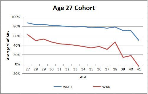
The same thing we have seen since the age 25 cohort continues, a clearly declining performance trend in aggregate from the time they show up until they leave.  In year 1, these players are hitting on average at nearly 90% of their max, so there is almost no chance of a large increase in subsequent seasons.

Age 28 Cohort:

Sample sizes are going to start becoming a big issue again as only 110 started and 38 only played one 300+ PA season.  The remaining 72 averaged only 3.7 full seasons.  For those that were maxing wRC+ or WAR in year one, both groups included 32 of the 72 (44%) and averaged 2.7 seasons and 3 full seasons respectively.

 photo 28percentofmaxchart_zpsa53fa5a4.jpg


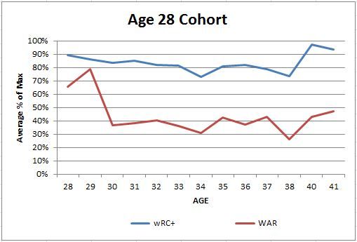
The chart does show an increase in WAR from year 1 to 2 do to an anomaly, but the hitting shows the 90% of peak on average and decreasing from there.  You can ignore the spikes in age 40 and 41 seasons as there was only one player accounted for there, Davey Lopes, who happened to hit pretty well those two seasons.  Without him it drops off like all of the others and ends at age 38.  You can see that by WAR the entirety of their decline is pretty much done by 30 years old, only their third seasons and thus the short careers.

Age 29 Cohort:

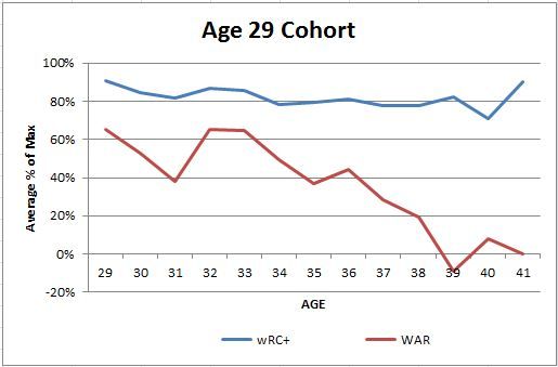
This group is nearing the point where it might be worth ignoring anything you see with a starting group of 62 that gets whittled down to 41 players with more than one full season.  Those 41 averaged 4.6 full seasons in their careers, longer than the 28-year-olds because of a few guys that hung around awhile and the small sample.  One was Hideki Matsui who was a professional long before 29, but not in the United States.  I will discuss two others in a moment.  Out of our 41 players here 23 (56%) had their max wRC+ in their first full season, and almost 50%, 20 out of the 41 had their best WAR.  At a coin flip for whether we have seen their best or not immediately we have definitely hit the point where any real growth as a player is unlikely or purely luck driven.  Those two groups of year one max wRC+ and WAR had average career lengths of 3.7 and 3.1 years respectively.

 photo 29percentofmaxchart_zpsb8acfefc.jpg


Like the last group we see a little uptick at the end, and these were two of the odd players from this group that hung around.  Actually, Raul Ibanez is still hanging around currently in Minnesota with the Royals, and the other is a former Royal too in Matt Stairs.  Again, in reality this group is pretty much all declining from year 1 on and almost all are finished by their late 30s.  There is a large spike in WAR for ages 32 and 33 and a smaller corresponding one in wRC+ because 4 players had their best season at 32 and 5 players at 33 which is a significant amount out of a pool of 41 players.  Those two years along with the first full season of the cohort comprise over 70% of the players and so it is probably just a sample size issue that we see the early 30s uptick here.

I am done with the cohorts, or at least running through them all the first time.  Players that play their first full season at 30 or older were mostly ignored.  There were 92 of them total and about 80% of them maxed in year one or only had one full season, so to chart a growth pattern would be ludicrous for the other 18 to 20 players who didn’t all come up at the same age.  Next I will summarize this all and try and point out several other things that I learned from breaking these cohorts apart so that you can get the full picture, or at least as much of the picture as I have managed to see.


How Telling are a Teenager’s A-ball Stats?

The Charleston RiverDogs, the Yankees’ low-A affiliate, has rostered several of the team’s more interesting prospects this year, with Luis Severino, Ian Clarkin, Aaron Judge, Abiatal Avelino, Miguel Andujar, Luis Torrens, Gosuke Katoh, and Tyler Wade all having spent time in Charleston thus far. A few of these players are still teenagers, and despite having promising potential, are very raw in terms of their overall development. Despite being just 19-years-old, infielders Avelino, Andujar, Katoh, and Wade spent the entire first half in Charleston with varrying degrees of success. Avelino (108 wRC+) hit fairly well before going down with injury, but Andujar (78 wRC+), Katoh (79 wRC+), and Wade (98 wRC+) have looked a bit over-matched at the plate so far.

These players have been facing pitchers two or three years older than them, so it’s hard be too critical of their poor batting lines; and the fact that they’re even playing in full season ball as teenagers is an accomplishment on its own. Still, performance obviously matters, and you’d prefer to see them hit well than not. But it’s hard to know how much weight should be put on their stat lines. Should we be worried that Gosuke Katoh’s striking out 35% of the time? Or should we still be more focused on the tools that got him drafted in the second round last year? It’s a little hard to say.

To get a better idea of what to make of these guys’ performances, I turned to the reams of minor league data compiled over the last couple of decades. Below, you’ll find some heat maps representing the likelihood that a player will play in the majors based on his low-A stats as a teenager. “Average Power” refers to players with an ISO within .025 of their league’s average, and within each panel, walk rate above league average and strikeout rate above league average occupy the X and Y axes respectively. I considered all 321 player seasons where a teenager logged at least 400 PA’s from 1995-2008.

A couple things to keep in mind before I delve into the results:

1) This methodology measures the likelihood that a player made it to the majors and doesn’t take into account how well he played upon arriving. So a player with one big league game is counted the same as a player who went on to have a Hall of Fame-caliber career. A stat that predicts a player’s making the majors may also predict his level of big league success, but that’s not something I attempt to quantify here.

2) This methodology does not account for a player’s defensive skill or position. Obviously, a weak-hitting catcher or shortstop is more likely to crack the majors than a weak-hitting first baseman, but defensive skill is a little hard to quantify for minor leaguers. Prospects change positions all the time and there’s a good chance any given A-baller won’t stick at his current position as he navigates through three more minor league levels.

All Players

Low Power

Average Power

High Power

Overall, there’s not a ton of predictability here: There are examples of players who made it — or didn’t make it — from nearly every corner of every heat map. Players like Rocco Baldelli, Austin Jackson, Jhonny Peralta, and Pablo Sandoval, turned into fine hitters despite scuffling as teenagers, yet plenty of others hit for good power and put up healthy plate discipline numbers, only to flop at the higher levels. Jeff Goldbach, Nick Weglarz, and Mike Whitlock all raked in A-ball, but never made it to the show. Stats alone can’t tell us everything, but there are definitely some obvious trends. Most notably, players who hit for power appear to be much more likely to play in the majors than those who don’t. Completely ignoring strikeouts and walks, 70% players from the high power group made it to the bigs compared to 65% of players with average power and just 44% from the low power demographic. Plate discipline stats seem to matter a little, but power is clearly king.

The heat maps give a nice visual of what’s happening, but don’t really give us a precise estimate of how likely these players are to make it. To better quantify each player’s chances, I ran a probit regression analysis on this group of players. In a nutshell, a probit tells us how a variety of inputs can predict the probability of an event that has two possible outcomes. In this case, it shows that hitter’s strikeout rate, isolated power, and BABIP are predictive of whether or not he’ll play in the majors.

It’s worth pointing out that there are some obvious flaws in this model. As previously mentioned, it doesn’t consider defense, so if an elite defensive shortstop and a lumbering first baseman had the same batting line, they would receive the same probability, which obviously doesn’t seem right. It also doesn’t take scouting reports into account. We all know that there’s more to a player’s potential than his stat line, especially for minor leaguers; and in some cases, a good scouting report is worth more than a dog’s age of statistical regressions. Still, I think it does a good job of slapping an unbiased probability on a player’s MLB chances. For those interested, here’s the R output from my model:

R Output

Without getting too technical, the “Estimate” column basically tells us (in Z-scores) how a change in each stat affects a player’s MLB likelihood. As you’d expect, players with higher strikeout rates are less likely to crack the majors, while players with higher power and higher BABIPs have a better shot. Interestingly, walk rate was not statistically significant in predicting whether or not he’ll reach the big leagues. This might be partly due to the relatively small sample of players, but it’s probably safe to say that a player’s walk rate isn’t a make-or-break. Several players — including Erick Aybar, Michael Barrett, Engel Beltre, and A.J. Pierzynski — managed to reach baseball’s highest level despite walking around 3% of the time in their first tastes of full-season ball, while Mike Whitlock and Nick Weglarz fizzled after walking over 15% of the time.

That’s well and good, but what does it tell us about today’s prospects? Here’s what we get by applying my model to all low-A teenagers with at least 200 PA’s (I also included Abi Avelino, who’s logged 131). What stands out to me is how few players are true long-shots. Of the 36 players, two thirds are more likely than not to make it to the bigs and only one player gets less than a 27% chance. If a player’s talented enough to play in full season ball at 19, there’s a good chance he’ll make it to the majors one way or another.

Player Organization MLB Probability
Jake Bauers Padres 96%
Chance Sisco Orioles 87
Ryan McMahon Rockies 86
Andrew Velazquez Diamondbacks 84
Trey Michalczewski White Sox 80
Drew Ward Nationals 79
Manuel Margot Red Sox 78
J.P. Crawford Phillies 77
Abiatal Avelino Yankees 75
Kean Wong Rays 74
Willy Adames Tigers 74
Carson Kelly Cardinals 73
Harold Ramirez Pirates 71
Nomar Mazara Rangers 67
Travis Demeritte Rangers 65
Dustin Peterson Padres 62
Wendell Rijo Red Sox 61
Franmil Reyes Padres 61
Dawel Lugo Blue Jays 60
Reese McGuire Pirates 57
Dominic Smith Mets 54
Jamie Westbrook Diamondbacks 52
Javier Betancourt Tigers 52
Tyler Wade Yankees 52
Miguel Andujar Yankees 48
Elier Hernandez Royals 48
Victor Reyes Braves 47
Clint Frazier Indians 46
Alfredo Escalera-Maldonado Royals 42
Dorssys Paulino Indians 41
Ronald Guzman Rangers 41
Josh Van Meter Padres 39
Carlos Tocci Phillies 37
D.J. Davis Blue Jays 27
Gosuke Katoh Yankees 27
Jairo Beras Rangers 16


There are some highly-touted prospects on this list, but other than J.P. Crawford, they aren’t among the names listed near the top. Reese McGuire, Dominic Smith, and Clint Frazier all graced top 100 lists in the pre-season, but have had disappointing power outputs this year, which has lead to such mediocre probabilities. Instead, most of the top ranked players are relatively fringy prospects who have broken out in a big way this year.

As for the Yankees’ prospects, the model thinks Avelino has a pretty good shot at making it, but is relatively low on the others. Even so, Andujar and Wade both have around a 50-50 chance, which isn’t too bad — especially when you consider the model ignores their defensive skills. Things don’t look as promising for Katoh, who’s struck out a ton and hit for only modest power. The lone bright spot in Katoh’s line is his 12% walk rate, which unfortunately for him, proved un-predictive of a player’s big league future.
Baseball’s Most Under-Popular Hitters

Lists of baseball’s most underrated players are often interesting and thought-provoking exercises, because by definition they focus on players that tend to get less attention than they should. However, there isn’t an easy way to definitively say how players are “rated” by baseball followers. Writers often just list off players who have the attributes that they are looking for (grit, plate discipline, small market players, etc.), which isn’t a bad way of doing it.

However, there is a more scientific way of approaching a list like this. We could look at how many people are doing Google searches for specific players. It wouldn’t exactly tell us what players are most underrated, but it can tell us which players should be getting more attention; these two things are very tightly correlated. The key difference is that plenty of players get attention for things that don’t necessarily mean they are considered good players. Ryan Braun got a lot of attention during his steroid drama, Robinson Cano was heavily talked about during free agency, and people search for Carlos Santana because of this and this. But when good players draw very little interest from fans, they’re probably underrated. But the term I’ll use is under-popular.

Using Google’s Adwords Keyword Tool, I gathered the data on every player who has achieved a WAR of at least 3.0 since the beginning of the 2013 season. A regression model with those 132 players showed that an additional 1 WAR was worth 6,000 Google searches per month – not too shabby.

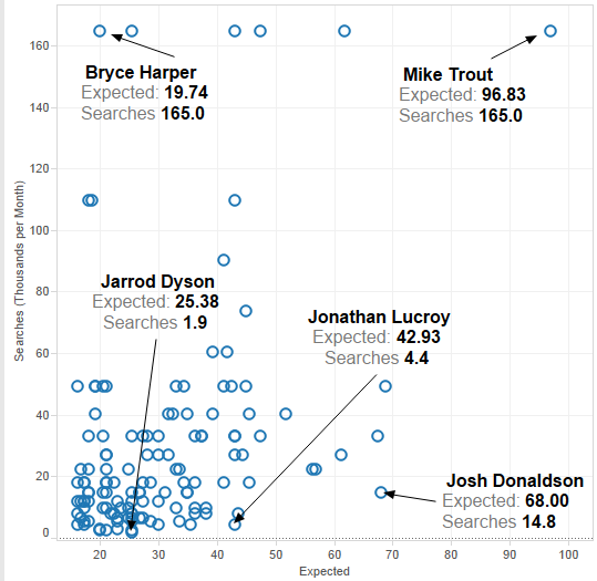
Here is a plot of these players, with the expected amount of Google searches on the horizontal axis, and the actual amount of searches on the vertical. While the keyword tool was incredibly useful, it rounds numbers when they get too high, and you can see a handful of players were rounded off to exactly 165,000 searches per month (FYI, these players were Mike Trout, Miguel Cabrera, David Ortiz, Robinson Cano, Bryce Harper, and Yasiel Puig). Derek Jeter has roughly double that amount, but his WAR did not qualify him for this list.

Searches vs. Expected

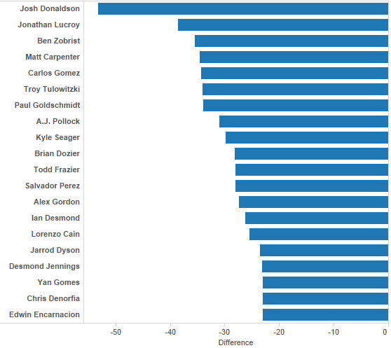
There are a lot of players who have played very well the last two years who are by no means household names. Welington Castillo has put up 3.8 WAR since the start of 2013, A.J. Pollock has been worth 6.1 wins, and Brian Dozier 5.8. In order to really measure who the most under-popular players are, I’ll use two methods. The first is just to simply subtract how many Google searches were expected and how many there really were.

difference

According to this measurement, Josh Donaldson is the most under-popular player in baseball, because he should have been looked up 53,000 times per month more often than he was (68k vs. 15k). That’s a big difference. There are some excellent players on this list, with many players who have an argument as the best or one of the few best players at their position. But for the most part, these are well known players who should just be more well known.

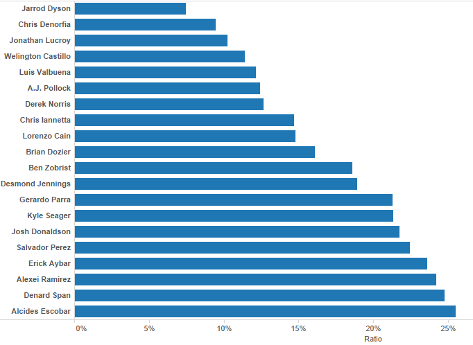
A different way to measure under-popularity, and the way I think is more telling, is to find the ratio between expected and actual searches, as opposed to just subtracting. For instance, is Edwin Encarnacion more under-popular than, say, Luis Valbuena? Encarnacion should have gotten 41,000 searches per month, but actually only got 18,000. Valbuena, however, played like someone who should have been searched 20,000 times, but was only Googled 2,400 per month. Since I believe Valbuena’s numbers are more out of whack, I prefer the second method.

Here are the top 20 players using that measurement, where we see how many times a player was searched as a percentage of how many times you would expect them to be:

Jarrod Dyson has quietly become a well above average baseball player. In about 800 career PA, Dyson has a WAR of 6.8. That is All-Star level production. His elite fielding and baserunning skills (which have combined to be worth more than 3 wins these last two years) make his wRC+ of 91 more than acceptable.

A.J. Pollock appears high on both lists, and for great reason. This year he is quietly hitting .316/.366/.554, after putting up 3.6 WAR last year.

This method of establishing players who deserve more credit for their play certainly has some flaws. WAR is not the only way to measure how good a player is, and Google searches are not a perfect representation of how popular or famous players are. However, it takes away the guess work and opinions from the standard underrated player lists, and in that there is some value.


Ottoneu Tools: Advanced Standings Part Two

In early May I introduced Ottoneu players to the Advanced Standings Dashboard, a tool that allows team owners to decipher the early season standings in an effort to better gauge where their team might be headed as the 2014 season comes together. You can download that tool here (http://goo.gl/pbXI5), but now that we’ve just entered July, the traditional halfway point of the baseball season, it’s time to take a deeper look at a few ways this tool can be used to effectively to manage your team into contention in the second half.

Since the tool can be updated easily with just a couple of copy/paste actions, I use this tool almost daily in my own FGPoints Ottoneu league.  But for fun, let’s walk through a few features as they apply to the FanGraphs Staff League, with a special focus on Eno Sarris’ team, “It’s A Perm“.

Eno enters July as a 3rd place team, nearly 400 points out of 1st place, and 150 out of 2nd.  In general, with at least seven teams over the 8,000 point mark, this league looks competitive at a glance.  But with the recent pickup of Ryan Braun, Eno clearly has his sights set on a title (https://twitter.com/enosarris/status/483016142831644672), so let’s break down the standings using the tool to see if Eno has the momentum to win it all in the 2nd half.

The first tab of the tool is simply the statistical breakdown of the Ottoneu standings into some common sabermetric calculations.  While we can easily see Eno leads the league offensively at 5.44 P/G, the underlying statistics also support it, showing he maintains an (slight) advantage in OPS, OPS+, wOBA, Runs Created, and Total Bases.  What may be more interesting is that Eno has more points scored from his offense than any other team in the league.  In fact, just over 58% of his points have come from his hitters (tab 3, ‘Projected Finish”). With roughly 55% of league scoring in Ottoneu coming from offense, Eno is clearly banking on this approach of shoring up the side of the ledger that carries the most weight.  The acquisition of Braun will only help.

So It’s A Perm is built on bats, but what about the pitching? Unfortunately, this is a weak spot, as Eno’s FIP, WHIP, and BB/9 are all higher than the two teams he’s chasing.  I’m sure he knows this instinctively as his 5.03 P/IP is below the league average of 5.13 P/IP (and further below the top 7 teams of 5.19 P/IP), but the dashboard makes it quicker and easier to point out these pitching deficiencies.  One possible area of improvement: the bullpen.  Without looking at his roster, I can tell you pretty quickly he’s probably pretty frustrated with his bullpen, which has been almost 42% less effective (“PEN” = Saves + Holds/IP) than the league leader, A Little Out of Context.  Shoring up a bullpen is often easier and cheaper than finding an ace SP mid season, so does Eno speculate on the eventual Sergio Romo replacement? Does he approach John Heyman’s Last Sirloin about shedding some of his bullpen pieces in a plea to “deal from strength”?

Once you’ve taken the time to digest some of the traditional sabermetric outputs in the Dashboard, your eyes will naturally gravitate toward the end of the first tab into the “League Projections” section, which is where the real power of the tool comes alive.  The key takeaways here are the “Otto” score and the “Pace” columns.  The Otto score can be better explained here by Chad Young (http://goo.gl/KK4Xy), while the “Pace” attempts to project the season-ending point totals for each team based up a range of factors, including current P/G and P/IP values, remaining IP and GP, and league averages in these areas.  In many leagues these are the columns that can better identify contenders from pretenders, but for the FanGraphs Staff league we see more evidence that the actual standings are, for the most part, very accurate, as Eno is also projected to end the season with the 3rd most points (18,042, or about 400 points out of 1st place).

There are a few interesting things to note here, however. First, John Heyman’s Last Sirloin actually has the third highest Otto score (13.66), but is still projected for 4th place, most likely due to his slower pace in IP (1,416 projected).  If this team can pick up the IP pace in the 2nd half with similar quality IP (5.54 P/IP), this team could make up ground quickly.  This team is clearly riding a league-best bullpen and trying to maximize its RP innings as much as possible.

Second, Ground Rule Double Helmet, despite sitting in 4th place with a strong 9,000 points, has had to overtax a very week pitching staff (4.74 P/IP) just to get there (1,577 IP projected).  The tool sees as much and projects this team to end the season in 5th place, but unless the pitching staff sees a significant improvement in the 2nd half, I’d expect this team to possibly fall even further as the season shakes out.

And that’s just the first tab…Once you get familiar with the tool, you’ll actually find the third tab, “Projected Finish” to be the most useful summary of some of these features described above, as it will give you a daily update of the projected champion for the league.  With Eno just 400 points out of both the actual and projected season-ending standings, this league is just too close to call on July 1st, but there are at least four clear contenders here, and It’s A Perm is one of them.  Will Ryan Braun help the cause? Just for fun, let’s say Braun increases Eno’s offense by just 2.00% (from 5.44 to 5.55).  Well, that could be all it takes, as that small increase moves the needle for It’s A Perm enough to overtake Johan Santa Claus by 100 points in the projected season-ending standings, and less than 200 points out from 1st place.  Of course, that’s if everything else stays the same, and, as in life, the only thing constant in baseball is change.  This will be a fun league to watch as the summer heats up, so enjoy the tool and use it where possible to get that 2% edge.


Breaking Down the Aging Curve: Mid 20s

In case you missed parts 1 and 2, you can follow the links especially back to one if you want to see what I am doing.  Otherwise it is time to look at the 24 year old cohort:

There were 362 players in this group, 64 of which only had one season of 300+ PAs, leaving us with 298 in the sample.  Those 298 averaged 7.2 years of full seasons.  Almost 21% of them (62 total) had their best season in year one according to wRC+, and for war it was just below 20% (59).  For those players the average career length was 4.3 and 4 years respectively.  I’m going to start speeding up the discussion only highlighting things of interest so that we can get to a more comprehensive picture.
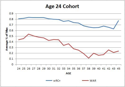
 photo 24percentofmaxchart_zps0b3bf593.jpg
The 24 cohort chart shows a couple of years of modest improvement before starting their decline though wRC+ stays pretty flat until age 30 or so.  We have seen some similar patters up to this point, but those are going to end with the next group.

Age 25 Cohort:

This group was comprised of 343 players in total.  After taking out the 59 that only had one season I had 284 left at an average number of 5.9 full seasons.  About 30% of those players had their best season in their first full big league chance (86 for wRC+ and 87 for WAR) with average length of career for the 1st year max group of 4 years for wRC+ and 3.7 for WAR.

 photo 25percentofmaxchart_zps0e1b58f0.jpg


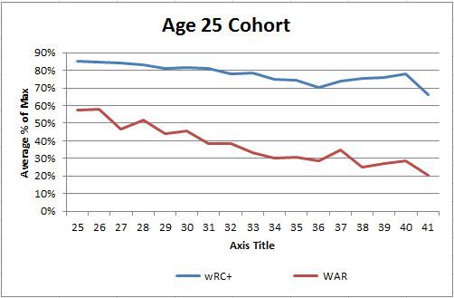
This is where this cohort is getting more interesting.  They seem to only decline as a group after their first full season.  There doesn’t seem to be any appreciable increase in hitting or overall performance throughout their careers.  You will also see that they are therefore nearer their max as a group out of the gate as well.  Once I am through all of the cohorts we can discuss overall threshold of performance relative to these which will help us understand everything that is going on hopefully.

Age 26 Cohort:

Here is where the sample sizes start to shrink again as we get to ages where a lot of players have either quit or will never make it.  There are still 238 players in this group so it is relatively large (4th largest cohort), and 64 had only one full season leaving a group of 174 players who on average had 5.2 full seasons.  65 (37%) maxed out their wRC+ in year 1 along with 54 (31%) maxing WAR right off the bat.  Those groups averaged 3.6 full seasons and 3.3 respectively.

 photo 26percentofmaxchart_zps7e58f79d.jpg


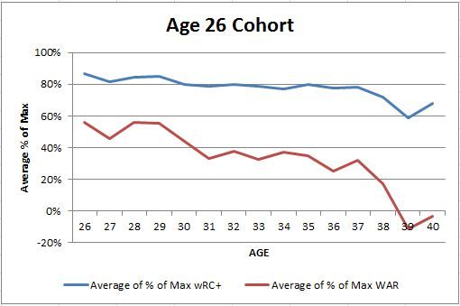
Like the last group, this group seems to max out on average in their first year and are declining by their late 20s.  They keep up 80 or near 80% of their max in hitting into their mid 30s, but that I think is going to prove out as being two things.  The first will be survivorship issues since on average most of this group retired or were forced out of the game around age 31, and the second being that their starting threshold won’t be as high and will be easier to stay near.

We are getting close.  I will try and blow through the late 20s before the end of the week so I can summarize and give some things that I think are of interest overall.


A Discrete Pitchers Study – Perfect Games & No-Hitters

I. Introduction

In the statistics driven sport of baseball, the fans who once enjoyed recording each game in their scorecard have become less accepting of what they observe and now seek to validate each observation with statistics.  If the current statistics cannot support these observations, then they will seek new and authenticated statistics.

The following sections contain formulas for statistics I have not encountered, yet piqued my curiosity, regarding the 2010 Giants’ World Series starting rotation.  Built around Tim Lincecum, Matt Cain, Jonathan Sanchez, and Madison Bumgarner, the 2010 Giants’ strength was indeed starting pitching.  Each player was picked from the Giants farm system, three of them would throw a no-hitter (or perfecto) as a Giant, and of course they were the 2010 World Series champions.  Throw in a pair of Cy Young awards (Lincecum), another championship two years later (Cain, Bumgarner, Lincecum), eight all-star appearances between them (Cain, Bumgarner, Lincecum), and this rotation is highly decorated.  But were they an elite rotation?

II. Perfectos & No-No’s

It certainly seems rare to have a trio of no-hit pitchers on the same team, let alone home-grown and on the same championship team.  No-hitters and perfect games factor in the tangible (a pitcher’s ability to get a batter out and the range of the defense behind him) and the intangible (the fortitude to not buckle with each accumulated out).  Tim Lincecum, Matt Cain, and Jonathan Sanchez each accomplished this feat before reaching 217th career starts, but how many starts would we have expected from each pitcher to throw a no-hitter or perfect game?  What is the probability of a no-hitter or perfect game for each pitcher?  We definitely need to savor these rare feats.  Based on the history of starting pitchers with career multiple no-hitters, it is unlikely that any of them will throw a no-hitter or perfect game again.  Nevermind, it happened again for Lincecum a few days ago.

First we deduce the probability of a perfect game from the probability of 27 consecutive outs:

Formula 2.1

Table 2.1: Perfect Game Probabilities by Pitcher

Tim Lincecum

Matt Cain

Jonathan Sanchez

Madison Bumgarner

On-Base Percentage

.307

.294

.346

.291

P(Perfect Game)

1 / 19622

1 / 12152

1 / 94488

1 / 10874

Starts until Perfect Game

N/A

216

N/A

N/A

The probability of a perfect game is calculated for each pitcher (above) using their exact career on-base percentage (OBP rounded to three digits) through the 2013 season.  Based on these calculations, we would expect 1 in 12,152 of Matt Cains starts to be perfect.  Although it didn’t take 12,152 starts to reach this plateau, he achieved his perfecto by his 216th start.  For Tim Lincecum, we would expect 1 in 19,622 starts to be perfect; but starting even 800 starts in a career is very farfetched.   Durable pitchers like Roger Clemens and Greg Maddux only started as many as 707 and 740 games respectively in their careers and neither threw a perfect game nor a no-hitter.  No matter how elite or if Hall of Fame bound, throwing a perfect game for any starting pitcher is very unlikely and never guaranteed.  However, that infinitesimal chance does exist.  The probability that Jonathan Sanchez would throw a perfect game is a barely existent chance of 1 in 94,488, but he was one error away from a throwing a perfect game during his no-hitter.

The structure of a no-hitter is very similar to a perfect game with the requirement of 27 outs, but we include the possibility of bb walks and hbp hit-by-pitches (where bb+hbp≥1) randomly interspersed between these outs (with the 27th out the last occurrence of the game).  We exclude the chance of an error because it is not directly attributed to any ability of the pitcher.  In total, a starting pitcher will face 27+bb+hbp batters in a no-hitter.  Using these guidelines, the probability of a no-hitter can be constructed into a calculable formula based on a starting pitcher’s on-base percentage, the probability of a walk, and the probability of a hit-by-pitch.  Later we will see that this probability can be reduced into a simpler and more intuitive formula.

Let h, bb, hbp be random variables for hits, walks, and hit-by-pitches and let P(H), P(BB), P(HBP) be their respective probabilities for a specific starting pitcher, such that OBP = P(H) + P(BB) + P(HBP).  The probability of a no-hitter or perfect game for a specific pitcher can be constructed from the following negative multinomial distribution (with proof included):

Formula 2.2

This formula easily reduces to the probability of a no-hitter by subtracting the probability of a perfect game:

Formula 2.3

The no-hitter probability may not be immediately intuitive, but we just need to make sense of the derived formula. Let’s first deconstruct what we do know… The no-hitter or perfect game probability is built from 27 consecutive “events” similar to how the perfect game probability is built from 27 consecutive outs.  These “event” and out probabilities can both broken down into a more rudimentary formulas. The out probability has the following basic derivation:

Formula 2.4

The “event” probability shares a comparable derivation that utilizes the derived out probability and the assumption that sacrifice flies are usually negligible per starting pitcher per season:

Formula 2.5

From this breakdown it becomes clear that the no-hitter (or perfect game) probability is logically constructed from 27 consecutive at bats that do not result in a hit, whose frequency we can calculate by using the batting average (BA). Recall that a walk, hit-by-pitch, or sacrifice fly does not count as an at bat, so we only need to account for hits in the no-hitter or perfect game probability. Hence, the batting average in conjunction with the on-base percentage, which does include walks and hit-by-pitches, will provide an accurate approximation of our original no-hitter probability:

Formula 2.6

Comparing the approximate no-hitter probabilities to their respective exact no-hitter probabilities in Table 2.2, we see that these approximations are indeed in the same ball park as their exact counterparts.

Table 2.2: No-Hitter Probabilities by Pitcher

Tim Lincecum

Matt Cain

Jonathan Sanchez

Madison Bumgarner

P(No-Hitter)

1 / 1231

1 / 1055

1 / 1681

1 / 1772

P(≈No-Hitter)

1 / 1295

1 / 1127

1 / 1805

1 / 1883

P(No-Hitter) / P(Perfect Game)

15.9

11.5

56.2

6.1

Starts until No-Hitter

207, 236

N/A

54

N/A

The probability of a no-hitter is calculated for each pitcher (above) using their exact career on-base percentage, walk probability, and hit-by-pitch probability through the 2013 season.  Notice that the likelihood of throwing a no-no is significantly greater than that of a perfecto for each pitcher.  For example, Lincecum and Cain’s chances of making no-no history are far easier than being perfect by the respective factors of 15.9 and 11.5.  Although Lincecum and Cain are still both unlikely to accumulate the 1,231 and 1,055 starts necessary to ascertain these no-hitter probabilities.  If it’s any consolation, Lincecum already achieved his no-hitter by his 207th start (and another by his 236th start) and Cain already has a perfecto instead.

Furthermore, it’s possible for two pitchers with disparate perfect game probabilities to have very similar no-hitter probabilities, as we see with Sanchez and Bumgarner.  Sanchez has a no-hitter probability of 1 in 1,681 that is 56.2 times greater than his perfect game probability, while Bumgarner’s 1 in 1,772 probability is a mere 6.1 times greater.  This discrepancy can be attributed to Sanchez’ improved ability to not induce hits versus his tendency to walk batters, while Bumgarner’s improvement is of a lesser degree.  Regardless, Sanchez’ early no-hitter, achieved by his 54th start, can instill hope in Bumgarner to also beat the odds and join his 2010 rotation mates in the perfect game or no-hitter’s club.  Adding Bumgarner to the brotherhood would greatly support the claim that the Giants 2010 starting rotation was extraordinary.  However, the odds still fall in my favor that I will not need to rewrite this section of this study due to another unexpected no-no or perfecto by Lincecum, Cain, Sanchez, or Bumgarner.


“The Managers’ Favourite Stat”

In the June 26 Nats-Cubs broadcast, Washington announcers Bob Carpenter and F.P. Santangelo had a conversation about how managers use statistics, and in particular how Matt Williams managed a 16-inning epic against Milwaukee.

“He was relying on batting average with runners in scoring position,” Santangelo said, “and to me that’s the best stat going.” They added that Cardinals manager Mike Matheny uses it, and Matheny told them that “it was a lot of managers’ favourite stat.”

Go ahead and freak out a little. But I’m curious. If you were judging hitters based on batting average with RISP, how different would your judgments be than if you judged them based on AVG, wOBA, or wRC+?

I can’t figure out how to insert a table, so here is a handy and also dandy chart for your surveyal, with helpful, pretty colors! You shall behold the 2013 leaders – minimum of 100 plate appearances, to include pinch-hitters who might pop up in a 16-inning game – for average, wOBA, wRC+, and BARISP. Hitters who appear in all 4 columns are colored peach, and hitters who appear in 3 of the 4 columns are colored blue. (Note: Hanley Ramirez should have been in the fourth column, too. Somehow the leaderboard I pulled left his name out.)

What do you notice? Well, yes, there is a lot more overlap between the first three columns than the last one. I might be counting wrong, but it looks like over half of the BARISP leaderboard does not appear in a single other column. (Many of them are Cardinals.) And yet, the truth is, almost all of the top 25 BARISP leaders were, in fact, good hitters in 2013. The three worst hitters on the list, by wRC+, are Michael Brantley (104), Manny Machado (101), and Brandon Phillips (91). That’s not a terrible bench. (On the other hand, Pete Kozma looms.)

The truth is, good hitters are good hitters. A manager relying on BARISP would not suddenly disregard Josh Donaldson, Miguel Cabrera, or Paul Goldschmidt.

Who would lose the most from a reliance on BARISP instead of advanced stats? Arguably, the guys who appear in the wOBA and wRC+ columns, but not the BARISP one. There are 15 of those players, favored by advanced numbers but not by “the managers’ favourite”. Of those 15, 8 still have BARISPs above .280. Here are the bottom five:

5. Khris Davis, .250 (43 PA)
4. Shin-Soo Choo, .240 (144 PA)
3. Joe Mauer, .239 (113 PA)
2. Yasiel Puig, .234 (99 PA)
1. Jeff Baker, .162 (44 PA)

On my custom BARISP Snub Leaderboard, there are only a handful of players a real manager might pass over. (Who would bet against 2013 Joe Mauer?)

In other words, even though a true stathead might yelp in terror at the thought of his team’s manager using BARISP to select a hitter, the process does not actually yield many bad results. Good hitters will be good hitters, even if your measure is slightly faulty. Your coach might bench Yasiel Puig for Brandon Phillips, which obviously would be bad. It’s also unlikely. More likely might be benching Khris Davis for Michael Brantley, and would you truly be that offended?

On the other hand, Pete Kozma looms.


The Effects of Tommy John Surgery on Batters

The new prevailing trend in major league baseball is a disturbing one. It is a trend of exponentially more frequent Tommy John surgeries. During the surgery, the ulnar collateral ligament is replaced by a different tendon from elsewhere in the body. As would be predicted, pitchers suffer from the injury much more than batters because they are constantly stretching their arm to full extension and pitching at high velocities. However, there are times when batters must have their UCL repaired. The unfortunate truth is that there is little data on what may happen to batters when they return. Most analysts report that the surgery has little to no effect on batters’ performance. This isn’t true.

My search for answers began when I heard the news that Matt Wieters, the Baltimore Orioles catcher, would need to undergo Tommy John surgery. Suddenly, I realized that nobody really knows how he will fare when he returns next season. Same thing applies to Minnesota Twins’ top prospect Miguel Sano. Sano, the Twins’ powerful third baseman of the future, had to have his UCL replaced before the season began to the disappointment of prospect and Twins fans alike. The same kind of disappointment felt when Jose Fernandez needed to have Tommy John surgery. The injury is affecting more players at an exponential rate and there is little data (particularly in regards to batters) that suggests how it will affect them when they return.

I scoured the internet for the complete list of players who have undergone the procedure and came across a massive list of 737 confirmed players (major and minor leagues) and crossed out everyone that was not a position player. I was left with a meager list of 29 names from the major leagues (minor league players were excluded because of the distinct differences from each minor league level). After removing even more names of players who may have appeared briefly in the major leagues or had the surgery and never returned to playing, I was left with just 15 confirmed names. Stars of the times like Paul Molitor, one of the very first recipients of the surgery, and lesser known players like Kyle Blanks both stood out on the list.

The next step in the process of unraveling the mystery behind the surgery was to figure out how the surgery affects the batters. In other words, I wanted to test if different tools were affected and in what ways. Did batters hit for the same amount of power as they did before? To begin, I collected data to test for three different measures of arm strength. Batting Average on Balls in Play (BABIP) determines the rate at which balls put into play are turned into hits. While this is not entirely based on arm strength, arm strength is a large factor in placement of the ball coming off the bat. A more powerful swing will lead to more balls in play being turned into hits. More on that here. Slugging percentage (SLG) was the next piece of data I tested for. If a batter could hit the ball further, then they could have more extra-base hits. Similarly, I tested for Home Run to Fly Ball percentage (HR/FB). This measures the rate at which fly balls go over the outfield walls and become home runs. Another barrier to success, as can be seen in the image below, was that there was no recorded advanced fielding data prior to 2002. So it is possible that the HR/FB data is less diluted by sample size than the other measures.

TJ Batter Data

Honestly, the results were surprising. Like most analysts, I believed that they would be right in saying that the surgery has little to no effect on batter strength. I found this to be wrong though because, on average, most batters did experience a non-negligible decrease in BABIP, SLG, and HR/FB.

TJ Batter

Of the 15 tested batters, 12 experienced a decrease in BABIP, culminating to an average decrease of 0.015. In the sabermetrics world, statistics dictate all research and this is no exception. A 0.015 decrease is another way to say, “1.5% less balls in play lead to hits”. Whether this can be attributed to luck, fielding, or less power is another question. But with over 65,000 at bats worth of data, there should be a sizable amount of batter-driven results rather than deferring the results to worse luck or better fielding. In perspective, a 1.5% decrease in batting average causes a drop from .300 to .285.

Slugging percentage was the most impactful finding though because, of the 15 batters, 11 experienced a decrease in slugging percentage. A reminder that each surgery occurred at different points in the batters’ careers, meaning that natural weakening with age should be filtered out. Overall, the data combined to form a 0.419 drop in slugging percentage or an average 0.028 decrease post-Tommy John surgery. 2.8% less hits were extra-base hits for the remainder of these batters’ careers. A significant amount when considering that some of these batters had careers lasting fifteen years or more. Home Run to Fly Ball rate had to be adjusted to take into account the emergence of fly ball data in 2002 (I removed the home runs hit before 2002 before calculating). Of the 9 batters tested, now 7 of them experienced a decrease in their HR/FB rates. This all comes out to be a 0.018 decrease, meaning 1.8% less fly balls zoomed out of the park and into the stands. The major league average usually stands at 10% but these batters saw their power drop from 10.1% to 8.3% after the surgery.

The only thing left to say is that analysts and fans alike need to recognize the fact that Tommy John surgery does have a negative effect on a batters’ power. Mostly though, I’m disappointed Miguel Sano’s power will never be what it could have been.

Thanks to FanGraphs for all batting and advanced fielding data and BaseballHeatMaps.com for the complete Tommy John surgery encyclopedia

NotGraphs: Only Congress Can Declare WAR, But What About FIP?

Let’s face it: we’re all nerds here at FanGraphs. But it takes a special kind of nerd to bring FanGraphs’ brand of sabermetric analysis to that other realm of the dull and dweeby: the United States Congress.

Every summer, a handful of the 535 senators and congressmen who represent you in Washington divide into teams to play the Congressional Baseball Game, a charity event at Nationals Park. Despite its informal nature and the, ah, senescent quality of play, the game is a serious affair (something its participants often have experience with). This is no friendly softball game; the teams practice for months before the big day, and the players take the results very seriously.

So seriously, in fact, that players keep track of (even send press releases about) their hits and RBI. A small group of baseball-obsessed politicos scores and generates a box score for the game every year. With their help, I was able to take their record-keeping to the next level. This is where this becomes the dorkiest FanGraphs article ever—for the first time, we now have advanced metrics on the performance and value of U.S. congressmen’s baseball skills.

Using recent Congressional Baseball Game scoresheets, I made a Google spreadsheet that should look familiar to any FanGraphs user—complete with the full Standard, Advanced, and Value sections you see on every player page. (Though this spreadsheet is more akin to the leaderboards—since the game is only played once a year, I treated the entire, decades-long series as one “season,” and each line is a player’s career stats in the CBG.) From Rand Paul’s wOBA to Joe Baca’s FIP-, all stats are defined as they are in the Library and calculated as FanGraphs does for real MLBers—making this the definitive source for the small but vocal SABR-cum-CBG community.

That said, unfortunately the metrics can never be complete—there’s just too much data we don’t have. Most notably, although the CBG has a long history (dating back to 1909), I capped myself at stats from the past four years only—so standard small-sample-size caveats apply. (This is mostly for fun, anyway.) Batted-ball data is also incomplete, so I opted to leave it out entirely—and we don’t have enough information about the context of each at-bat to calculate win probabilities. For obvious reasons, there’s also no PITCHf/x data, and fielding stats are a rabbit hole I’m not even going to try to go down.

It’s still a good deal of info, though, and there’s plenty to pick through that goes beyond what you might have noticed with the naked eye at the past four Congressional Baseball Games. But why should I care to pick through them, you might ask; what good are sabermetrics for a friendly game between middle-aged men? Well, apart from the always-fun Hall of Fame arguments, they serve the same purpose they do in the majors: they help us understand the game, and they can help us predict who will win when the Democrats next meet the Republicans (how else would the teams be divided?) on the battle diamond—this Wednesday, June 25.

You probably don’t need advanced metrics to guess that the Democrats are favored. They’ve won the past five games in a row, including the four in our spreadsheet by a combined score of 61 to 12. That’s going to skew our data, but by the same token, Democratic players have clearly been better in recent years. Going by WAR, a full five Democrats are better than the best Republican player, John Shimkus of Illinois.

But the reason we expect Democrats to win on Wednesday is the player who tops that list: Congressman Cedric Richmond of Louisiana. Richmond’s 1.1 WAR (in only three games!) is 0.9 higher than the next-best player (Colorado’s Jared Polis), putting him in a league of his own. In each of the past three CBGs, the former Morehouse College varsity ballplayer has pitched complete-game gems that have stifled the Republican offense. He carries a 40.0% K% and 28 ERA- into this year’s game. (Note: Congressional Baseball Games last only seven innings, so the appropriate pitching stats use 7 as their innings/game constant in place of MLB’s 9.)

The GOP has a few options to oppose Richmond on the mound—it’s just that none of them are good. The four Republicans on the roster with pitching experience have past ERAs ranging from 8.08 to 15.75. If there’s any silver lining, it’s that Republican pitchers have been somewhat unlucky. Marlin Stutzman has a .500 BABIP, and Shimkus has an improbably low 20.8% LOB percentage. Thanks to a solid 15.0% K-BB%, Stutzman has just a 5.98 FIP—high by major-league standards, but actually exactly average (a FIP- of 100) in the high-scoring environment of the CBG. (Another note: xFIP is useless in the congressional baseball world, as no one has hit an outside-the-park home run since 1997.) A piece of advice to GOP manager Joe Barton of Texas: Stutzman is your best option for limiting the damage on Wednesday.

On offense, it’s again the Cedric Richmond show. His 8 wRC and 4.6 wRAA dwarf all other players. In a league where power is almost nonexistent, he carries a .364 ISO (his full batting line is a fun .818/.833/1.182); only eight other active players even have an ISO higher than .000. Other offensive standouts for the Democrats include Florida’s Patrick Murphy, he of the 214 wRC+ and .708 wOBA (using 2012 coefficients), and Missouri’s Lacy Clay, who excels on the basepaths to the tune of a league-high 0.5 wSB. With a 1.4 RAR (fourth-best in the league) despite only two career plate appearances, Clay has proven to be the best of the CBG’s many designated pinch-runners who proliferate in the later innings. (Caveat: UBR is another of those statistics we just don’t have enough information to calculate.) Democrats might want to consider starting him over Connecticut Senator Chris Murphy, however; Murphy is a fixture at catcher for the blue team despite a career .080 wOBA and -2.5 wRAA.

As on the mound, Republicans don’t have a lot of talent at the plate. Their best hitter is probably new Majority Whip Steve Scalise, who has a 168 wRC+, albeit in just four plate appearances. (Scouting reports actually indicate that Florida Rep. Ron DeSantis is actually their best player, but injury problems have kept him from making an in-game impact so far in his career—and he’s missing this game entirely due to a shoulder injury.) Meanwhile, uninspired performers like Jeff Flake (.268 wOBA) and Kevin Brady (.263 wOBA) continue to anchor the GOP lineup, potentially (rightfully?) putting their manager on the hot seat. Some free advice for the Republicans: try to work the walk better. Low OBPs are an issue up and down the lineup, and they have a .279 OBP as a team. Their team walk rate of 8.2% is also too low for what is essentially a glorified beer league. If someone is telling them that the way to succeed against a pitcher of Richmond’s caliber is to be aggressive, they should look at the numbers and rethink.


Breaking Down the Aging Curve: Early 20s

If you missed the first part and want a little more explanation about what I am doing click here.  I am going to start getting into the meat today with larger sample sizes and more typical groups of players.

Age 21 cohort:

There were 102 players in this group, three played only 1 season and were removed.  This is not as necessary with this group, but it becomes pretty important in the later cohorts as you will see.  The main thing is that for the max % part it is automatically 100% for the first year for any player with only one full season.  The 99 players left have an average number of 10.3 full seasons in the majors, so less than the previous cohorts as expected but still long careers on average.  There were 10 players that posted their max wRC+ in that first full season, and 9 posted their max WAR.  Said another way, about 90% of the players went on to have their best season later in their careers making it unlikely that a 21 year-old reaching the 300 PA plateau minimum is showing you a career year.  Again, part of this is that they on average have 9+ seasons to go so they have a lot of opportunities to have better years which the older cohorts will not have.

We also start to see something else I was expecting.  The players who max out in their first year tend to have shorter careers because they are not as good of players on average and that first year max was not very high.  Those that maxed wRC+ averaged only slightly over 4 years of 300+ PAs, and the ones that maxed WAR were only 3.25 years on average (with one active player in the group.  There is some overlap, but the two groups are different and will be for every cohort.  It is likely the trend here continues as well.  If you max WAR your first season it means you are not showing overall improvement later and leave the league quickly.  Those that max wRC+ but not WAR are likely getting more playing time later due to defense or other peripheral skills that are making them better players overall.  On to the max % chart:
 photo 21percentofmaxchart_zps33a3ba20.jpg

It looks like there is some slight improvement in the first couple of years in hitting.  The increase is more drastic in WAR, partly because those that stick in the majors get more playing time and thus accumulate more WAR, but the increase might be more than that especially if the slight uptick in hitting is for real, though I will spend more time trying to tease that out after I have this base run through all the cohorts done.  You will notice that these players peak younger than our traditional understanding of peaks.  The group peak is around 24 and hitting stays around that level until their early 30s, but the WAR starts dropping the next season.

Age 22 cohort:

This group started with 200 players of which 41 only played 1 season and were removed.  The one season group in this case held a lot of current young players such as Wil Myers and Yasiel Puig, so this might be an interesting group to follow over the coming years.  The average tenure of the remaining 159 players was 8.6 full seasons.  Of those 159, 27 had their best wRC+ in their first season and 26 had their best WAR.  Now instead of 90% having better seasons later in their careers, we are down to 83 or 84%.  About one out of every six 22 year-olds never improve on their first full season.  The average number of full seasons for those that did max in year 1 was 4 years for both wRC+ max and the WAR max group with the second being only a few hundredths of years below the first.
 photo 22percentofmaxchart_zps34ed058b.jpg

The chart shows a less distinct increase in the first few seasons, but is upward sloping for both wRC+ and WAR until the age 26 season.  There is a similar decline pattern to the 21 year-old group.  The 21 cohort just had a steeper early incline and younger peak.

Age 23 cohort:

Now we start getting into the largest cohorts.  The most likely time for a player to get their first full season is from ages 23 through 25, and if you haven’t made it by then your odds as a player of ever getting a full season in the majors start to drop off.  This age group started with 320 players total and 43 were removed as one year players like before 7 of which are active players.  Of the 277 left they average number of full seasons played was 7.6 and now 56 had max wRC+ in year 1 and 52 a max WAR.  That is nearing the mark where a full quarter of the players are never better than their first full season.  Of those that maxed in year 1, the wRC+ group had an average of 4.3 full seasons and the WAR group was 3.9 years.  Frank Thomas was in the max WAR group, so despite playing 14 more seasons above the 300+ PA  level after 1991 (only 240 PAs in 1990) he never posted a higher WAR.  He had 2 seasons where is wRC+ were equal or greater than that first one, but didn’t amass enough PAs to accumulate more WAR, though in 1997 he tied the WAR and wRC+ of that first full season.  Anyway, chart time:

 photo 23percentofmaxchart_zps2715039d.jpg

It’s harder to see much of any improvement in hitting with this group. There might be a slight improvement peaking in the 26 season again.  WAR shows an increase that is fairly steady until age 27 and then another similar decline phase.  Another thing to note, the hitting % of peak average at its peak is consistently in the low 80%.  For WAR it is declining so far.  If you look at the WAR line on the three charts, the first hits a peak of 60.3%, the second at 56.4%, and the third at 55.8% and might be worth keeping an eye on as we go on to the next set of cohorts.  For now though I will wrap it up rather than going on for the 3 or 4 thousand words all of the cohorts and summaries might take.