Archive for Research

Adam Wainwright: Efficiency is the Name of the Game

Adam Wainwright has been absolutely phenomenal this season. If you prefer old school stats: 12-5, 2.30 ERA, with an 8.06 K/9 ratio. If you prefer advanced statistics, he looks even better: 2.12 FIP to go along with a 2.69 xFIP. My favorite stat about his season so far though is his K/BB ratio which in mid July now stands at a staggering 9. For every 9 strikeouts he walks 1 batter. You don’t need me to tell you how good that is. The pitcher nearest his efficiency is Cliff Lee and he isn’t even close.  I decided to compare Adam Wainwright’s impeccable ratio to some of the greatest pitchers in the past 20 years. I’ll take their best season (regarding K/BB) and see how it stacks up to the masterful performance Wainwright is putting up this season.

**disclaimer: WAR total is from their best K/BB season. Wainwright’s is still counting**

Adam Wainwright is having a phenomenal year. His 9.00 K/BB is surpassed only by Cliff Lee’s and Curt Schilling’s most efficient seasons, respectively. I’m not really counting Smoltz, due to his best K/BB ratio coming as a closer with only 60+ innings pitched. Here are the following seasons since 1900 where someone had a K/BB greater than or equal to 9.

  •  Bret Saberhagen (11 K/B 1994)
  • Curt Schilling (9.58 K/B 2002)
  • Cliff Lee (10.28 K/BB 2010)

That’s it. Adam Wainwright is on pace to have the 4th best season since 1900 in regards to strikeouts-to-walks. Three pitchers have accomplished this feat in last 113 years. It’s hard to fully recognize in the moment, but you truly are witnessing greatness when watching Adam Wainwright go to work this season.

What is making him this successful?

For one thing, control is the last aspect of a pitcher’s game to return after Tommy John. Wainwright had a mediocre season in 2012. (his words, not mine) This season the control is completely back to match the velocity. In a podcast visit with Matthew Berry and Nate Ravtiz, he credited his efficiency to first-pitch strikes. He said he made a concerted effort to get ahead, because batters gradually get statistically worse the further down in the count they get. Adam Wainwright does a great job of getting ahead; according to FanGraphs he throws a first pitch strike 65.6% of the time. That 65.6% is the best for starting pitchers in the MLB.  Wainwright’s recipe seems pretty simple once you look at the data: get ahead early then force hitters to chase out of the zone. He also leads the majors in O-Swing% (swings at pitches out of the zone) with a 38.2% rate.

 Adam Wainwright is also phenomenal at mixing his pitches. According to Brooks Baseball Wainwright’s first-pitch mix breaks down this way: 15% four-seam fastballs, 37% sinkers, 2% changeups, 18% curveballs, and 30% cutters. Wainwright uses the hard stuff to get ahead. Once he’s ahead 0-2 the mix stays relatively the same except for the fact that curveball becomes the go-to pitch. He throws his curveball 48% of the time when he is ahead 0-2. That might seem like it would make it easy to guess what’s coming, but good luck touching it. 20% of the swings taken on his curveball in that count ends in a big fat whiff. Wainwright’s curveball has a horizontal movement of 8.21 inches on top of moving 9.33 inches on a downward trajectory. In other words, if Wainwright gets ahead of you, you’re screwed


Visualizing Pitcher Consistency

Visualizing Pitcher Consistency

When evaluating starting pitcher performance, fantasy owners and fans alike lament the relative inconsistency of certain pitchers deemed especially volatile (Francisco Liriano will break your heart), while others like Mark Buehrle are workhorses often viewed as among the most steady arms available.  A.J. Mass of ESPN has written about the value of calculating “Mulligan ERAs,” in which a pitcher’s three worst outings are subtracted from his overall ERA. His colleague Tristan Cockroft routinely publishes Consistency Ratings to let readers know which pitchers have remained relatively high on ESPN’s player rater from week to week.

While these methods focus on pitcher performance from start to start, it may be useful to evaluate pitcher performance against individual batters. If Tommy Milone gets rocked pitching on the road in Texas, we may be less concerned than if he is routinely unable to get out low quality hitters. To this end, we can examine how pitchers perform against different levels of batters. How well does a given pitcher avoid putting low OBP batters on base? How does this compare to his rate of putting a high OBP batter on base? We would expect to see a linear relationship—the Emilio Bonifacios of the world should be easier to get out than the Joey Vottos.

Methods

We begin by examining the 31 pitchers with the most innings pitched for the 2012-2013 seasons. After obtaining batter vs. pitcher data for each of these pitchers during the last season and a half, we can calculate the OBP allowed by each pitcher to any batter with at least 5 plate appearances during this time period (arbitrary cutoff alert!). We can now see how Buster Posey fares against the likes of Clayton Kershaw, Ian Kennedy, and any other NL pitcher in which he has accrued at least 5 PA. It turns out Posey did pretty well for himself.

In order to obtain the OBP of batters in general, not in relation to particular pitchers, we can examine the leaderboards for players with at least 450 PA in 2012-2013. Based on the work of Russell Carleton, we have confidence that after ~450 PA, a batter’s OBP tends to stabilize and represents their long-term OBP skill level.

Batters were then placed in five buckets, lowest, low, medium, high, and highest OBP levels.

Batter On-Base Percentage Classification

OBP Category

OBP

Player Examples

Lowest

0.243-.311

Colby Rasmus, J.J. Hardy, Raul Ibanez

Low

.311-.330

Ruben Tejada, Eric Hosmer, Michael Young

Medium

.330-.338

Elvis Andrus, Jason Heyward, Yoenis Cespedes

High

.338-.349

Brandon Belt, Jason Kipnis, Coco Crisp

Highest

.349-.458

Allen Craig, Andrew McCutchen, Mike Trout

Each batter, assigned a score of lowest to highest, was then matched with the batter vs. pitcher dataset, allowing for us to calculate the mean OBP allowed by individual pitchers to hitters in each of the categories. So, although someone like Zack Cozart sports a .283 OBP in 2012-2013, earning a spot in the lowest category, he does own a .329 OBP against Yovani Gallardo. Maybe this is all the evidence Reds Coach Dusty Baker needs to keep batting Cozart second in the lineup.

Results

If we examine the performance of pitchers across five categories of OBP skill, we can calculate the correlation coefficient of these five points. R2 in this case is a measure of how well the data fits a straight line—if a pitcher allows a low OBP to low OBP hitters, and a correspondingly higher OBP to high OBP hitters, the data points should increase linearly and the value of R2 should approach 1. Conversely, pitchers that are inconsistent in their ability to get hitters of a certain skill level out would have a R2 much closer to 0.00.


Correlation Coefficient for OBP Allowed Among Differently Skilled Batters

Name

R2

Adam Wainwright

0.798

Jason Vargas

0.793

Max Scherzer

0.771

Ricky Nolasco

0.740

Matt Cain

0.734

Yu Darvish

0.717

Wade Miley

0.705

C.J. Wilson

0.700

Jordan Zimmermann

0.697

Kyle Lohse

0.660

Bronson Arroyo

0.657

Yovani Gallardo

0.638

Justin Verlander

0.619

Mat Latos

0.617

Cliff Lee

0.553

Hiroki Kuroda

0.536

James Shields

0.469

Justin Masterson

0.443

Homer Bailey

0.377

Ian Kennedy

0.353

Clayton Kershaw

0.329

Cole Hamels

0.159

Gio Gonzalez

0.140

Mark Buehrle

0.105

Trevor Cahill

0.083

Felix Hernandez

0.076

Chris Sale

0.031

R.A. Dickey

0.029

CC Sabathia

0.028

Jon Lester

0.028

Madison Bumgarner

0.025

There is a wide range of R2 values among this list of starting pitchers. Adam Wainwright takes the grand prize for consistency. He is far more prone to putting elite OBP hitters on base than lowly hitters. Madison Bumgarner, on the other hand, strangely performs worse against low OBP than high OBP hitters, and has the lowest R2.  And R.A. Dickey, as you might expect, is sort of all over the place.


Below is a visual representation of the OBP against pitchers with high and low R2 values. We can see that the pitchers with the highest correlation coefficient have a much more linear relationship overall with OBP allowed than pitchers with low values.


Additional analyses showed that there was no relationship between a starter’s FIP and their correlation coefficient. A quick glance at the names in the two graphs above confirms this. Jason Vargas, with a R2 of .793 is a worse pitcher, in pretty much all respects, than Felix Hernandez at .076. Interestingly, Jason Vargas has one of the league’s highest HR/9 at 1.28 during 2012-2013, while King Felix sports one of the lowest ratios at .62.

What, then, does pitcher consistency tell us? While it may not tell us much about the overall skill of a pitcher by itself, we can discern from the data which pitchers are doing a good job getting out poor hitters. Pitchers like Adam Wainwright and Max Scherzer are doing extremely well, and their R2 values indicate that they are pitching steady—they are less likely to blow up against poor hitters. Of course, pitcher performance can differ greatly from start to start, but one can have confidence that Ricky Nolasco will probably dominate his former Marlins teammates (30th in team OBP), because he consistently allows a low OBP to low OBP hitters. Conversely, perhaps it’s a good thing Jason Vargas does not have to pitch against his Angels teammates, who collectively have the 4th highest team OBP in the majors.

Oddly enough, Justin Masterson’s OBP allowed has a small range, from .299 in the middle OBP tier to .371 against the highest tier, indicating that when he’s brought his good stuff, he mostly dominates all batters regardless of their level of skill. We can have less confidence that Justin Masterson will dominate a middling OBP team like Kansas City (6.39 ERA this year), ranked 20th overall in the majors, while he has repeatedly humiliated the Blue Jays, who just beat out the Royals at 17th overall.

Despite the comically bad timing of his recent piece on batting Raul Ibanez against CC Sabathia, David Cameron was right to point out the relative worthlessness of individual batter vs. pitcher matchups and the danger of drawing conclusions from such small sample sizes. However, we can use aggregated batter vs. pitcher data to learn more about what kinds of players pitchers are more likely to strike out, or serve up the long ball, or a base on balls. While it’s easy to assume that pitcher X will be less likely to strike out Norichika Aoki than Ike Davis, by studying consistency we may be able to see who deviates from this linear pattern. Are some average strike out pitchers more likely to strike out low strikeout hitters? We can already see from the data above that R.A. Dickey is as likely to put a low OBP hitter on base as a high OBP hitter. While this fact seems to make little sense, these results indicate that the knuckleball can baffle expert hitters as much as less skilled batsmen. It may be worthwhile to use consistency ratings such as these to determine what kinds of pitchers deviate from the expected patterns.

All data courtesy of Fangraphs and Baseball Reference.

Because I’m a big believer in open data, here is a link to the R code used to find Batter vs. Pitcher OBP percentages by quintile.


Who is the Real RBI Leader for 2012?

We all know that Miguel Cabrera had a phenomenal year in 2012, winning the Triple Crown and later being named the American League MVP. His 44 home runs and .330 batting average are all his own but the 139 RBI he amassed are a shared number, as he couldn’t accumulate RBI without the R (runners). What if everybody had Cabrera’s opportunities? Would others have eclipsed his RBI total?

To analyze this I calculated a percentage measure called the Runner Movement Indicator, or RMI for short. It’s a simple calculation once you have the data. Each time a batter comes to the plate with a runner on base, the potential bases that the runners can move are added together. A runner on 1st can move three total bases, 2nd base can move two and 3rd base can move one. Then, at the end of the at-bat, the final positions of the runners are compared with their starting position to determine the total bases moved out of the potential bases. For example if Cabrera gets a single with a runner on 1st, moving the runner to 3rd base, he is awarded two of the possible three bases, for a 0.667 clip. By calculating RMI as a percentage of the opportunities, we’re factoring out the increased benefit Cabrera gets from his stellar teammates.

One of the beautiful things about RMI is not just that it is a simple calculation, but that it reads nearly like a batting average. This makes it is immediately easy to tell the good from the bad. Below is a histogram of the RMI for all qualifying players in 2012.

Now let’s overlay that with the batting averages from the same year in red. You’ll see the distribution is quite similar.

One might think that players with high batting averages also have high RMI, but that’s not quite the case. If we try to correlate RMI with Batting Average, OBP or SLG, we stay below a 0.5 R2 in each case although all with the expected positive slopes.

RMI vs BA

RMI vs OBP

RMI vs SLG

0.411 R2

0.429 R2

0.323 R2

* * *

Now that we know a little about RMI, let’s look at the leaders from 2012.

Player

RMI

Actual Bases Moved

Potential Bases Moved

RBI

Joey Votto

0.342

218

637

56

Joe Mauer

0.332

336

1011

85

Torii Hunter

0.328

300

915

92

Josh Hamilton

0.323

288

891

128

Adrian Gonzalez

0.317

329

1037

108

Yasmani Grandal

0.317

117

369

36

Miguel Cabrera

0.316

319

1008

139

Josh Rutledge

0.316

128

405

37

Garrett Jones

0.315

249

791

86

Elvis Andrus

0.311

271

871

62

We see that Cabrera is 7th on the list for 2012. Still great, but not the best. We also see that Joey Votto moved runners around the bases at the highest rate, 26 points higher than Cabrera. So let’s use the RMI data above to see if anybody would have taken over the RBI lead given the same opportunities as Cabrera.

To do this we first subtract home runs from RBI, as the batter’s own bases aren’t used in RMI. Of Cabrera’s 139 RBI in 2012, 44 came from himself scoring on his own home run. This means he had 95 RMI influenced RBI based on a 0.316 RMI. If we apply this same ratio to Votto’s RMI of 0.342 we get 103 RBI. Votto’s 14 home runs bring him up to 117 RBI, still well shy of Cabrera.

Of course we know that Josh Hamilton was the one chasing Cabrera’s home run total in 2012, so let’s do the same calculation with him. Hamilton’s 0.323 RMI would give him 98 equivalent RBI. Adding in his 43 home runs brings him to 141 RBI, 2 higher than Cabrera. Too close to call? Nah… Hamilton wins.

Takeaways

The ability to get on base is one of the best predictive factors of runs and therefore wins. It gets better if you add RMI but they should be considered a distinct contribution. RMI leaders may not have great batting averages and vice versa. Undervalued players can be found with high RMI that have average OBP and BA stats.

More Data

Complete player and team RMI stats can be found on with the links below


Data Collection & Mining Techniques

All of the data used in this post was loaded from MLB’s gameday servers into a MongoDB database using my atbat-mongodb project. This project is open source code that anybody can use, modify, contribute to, etc. Fork me please!
https://github.com/kruser/atbat-mongodb

All data aggregation code and charts are written in Python using MongoClient, matplotlib, scipy and numpy modules. You can find that code on github as well. https://github.com/kruser/mlb-research

Other Notes on RMI

  • After collecting my data I ran across Gary Hardegree’s Base-Advance Average paper from 2005, which does a nearly similar calculation, with the exception that it gives the batter credit for moving themselves. I prefer to keep this a clutch stat and remove the batter’s bases.

  • The RMI data does not correlate to team run production as high as Batting Average, Slugging Percentage or On-Base Percentage. Adding OBP to RMI correlates much higher, but then again, that’s what a run is–getting on base and moving around to home. So there isn’t anything noteworthy enough there to post numbers.

  • In order to qualify for my list a batter must have a minimum of two potential base movement opportunities per game. Opportunities fluctuate largely among regular players so it is important not to keep this requirement too low.


Estimating Pitcher Release Point Distance from PITCHf/x Data

For PITCHf/x data, the starting point for pitches, in terms of the location, velocity, and acceleration, is set at 50 feet from the back of home plate. This is effectively the time-zero location of each pitch. However, 55 feet seems to be the consensus for setting an actual release point distance from home plate, and is used for all pitchers. While this is a reasonable estimate to handle the PITCHf/x data en masse, it would be interesting to see if we can calculate this on the level of individual pitchers, since their release point distances will probably vary based on a number of parameters (height, stride, throwing motion, etc.). The goal here is to try to use PITCHf/x data to estimate the average distance from home plate the each pitcher releases his pitches, conceding that each pitch is going to be released from a slightly different distance. Since we are operating in the blind, we have to first define what it means to find a pitcher’s release point distance based solely on PITCHf/x data. This definition will set the course by which we will go about calculating the release point distance mathematically.

We will define the release point distance as the y-location (the direction from home plate to the pitching mound) at which the pitches from a specific pitcher are “closest together”. This definition makes sense as we would expect the point of origin to be the location where the pitches are closer together than any future point in their trajectory. It also gives us a way to look for this point: treat the pitch locations at a specified distance as a cluster and find the distance at which they are closest. In order to do this, we will make a few assumptions. First, we will assume that the pitches near the release point are from a single bivariate normal (or two-dimensional Gaussian) distribution, from which we can compute a sample mean and covariance. This assumption seems reasonable for most pitchers, but for others we will have to do a little more work.

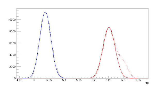
Next we need to define a metric for measuring this idea of closeness. The previous assumption gives us a possible way to do this: compute the ellipse, based on the data at a fixed distance from home plate, that accounts for two standard deviations in each direction along the principal axes for the cluster. This is a way to provide a two-dimensional figure which encloses most of the data, of which we can calculate an associated area. The one-dimensional analogue to this is finding the distance between two standard deviations of a univariate normal distribution. Such a calculation in two dimensions amounts to finding the sample covariance, which, for this problem, will be a 2×2 matrix, finding its eigenvalues and eigenvectors, and using this to find the area of the ellipse. Here, each eigenvector defines a principal axis and its corresponding eigenvalue the variance along that axis (taking the square root of each eigenvalue gives the standard deviation along that axis). The formula for the area of an ellipse is Area = pi*a*b, where a is half of the length of the major axis and b half of the length of the minor axis. The area of the ellipse we are interested in is four times pi times the square root of each eigenvalue. Note that since we want to find the distance corresponding to the minimum area, the choice of two standard deviations, in lieu of one or three, is irrelevant since this plays the role of a scale factor and will not affect the location of the minimum, only the value of the functional.

With this definition of closeness in order, we can now set up the algorithm. To be safe, we will take a large berth around y=55 to calculate the ellipses. Based on trial and error, y=45 to y=65 seems more than sufficient. Starting at one end, say y=45, we use the PITCHf/x location, velocity, and acceleration data to calculate the x (horizontal) and z (vertical) position of each pitch at 45 feet. We can then compute the sample covariance and then the area of the ellipse. Working in increments, say one inch, we can work toward y=65. This will produce a discrete function with a minimum value. We can then find where the minimum occurs (choosing the smallest value in a finite set) and thus the estimate of the release point distance for the pitcher.

Earlier we assumed that the data at a fixed y-location was from a bivariate normal distribution. While this is a reasonable assumption, one can still run into difficulties with noisy/inaccurate data or multiple clusters. This can be for myriad reasons: in-season change in pitching mechanics, change in location on the pitching rubber, etc. Since data sets with these factors present will still produce results via the outlined algorithm despite violating our assumptions, the results may be spurious. To handle this, we will fit the data to a Gaussian mixture model via an incremental k-means algorithm at 55 feet. This will approximate the distribution of the data with a probability density function (pdf) that is the sum of k bivariate normal distributions, referred to as components, weighted by their contribution to the pdf, where the weights sum to unity. The number of components, k, is determined by the algorithm based on the distribution of the data.

With the mixture model in hand, we then are faced with how to assign each data point to a cluster. This is not so much a problem as a choice and there are a few reasonable ways to do it. In the process of determining the pdf, each data point is assigned a conditional probability that it belongs to each component. Based on these probabilities, we can assign each data point to a component, thus forming clusters (from here on, we will use the term “cluster” generically to refer to the number of components in the pdf as well as the groupings of data to simplify the terminology). The easiest way to assign the data would be to associate each point with the cluster that it has the highest probability of belonging to. We could then take the largest cluster and perform the analysis on it. However, this becomes troublesome for cases like overlapping clusters.

A better assumption would be that there is one dominant cluster and to treat the rest as “noise”. Then we would keep only the points that have at least a fixed probability or better of belonging to the dominant cluster, say five percent. This will throw away less data and fits better with the previous assumption of a single bivariate normal cluster. Both of these methods will also handle the problem of having disjoint clusters by choosing only the one with the most data. In demonstrating the algorithm, we will try these two methods for sorting the data as well as including all data, bivariate normal or not. We will also explore a temporal sorting of the data, as this may do a better job than spatial clustering and is much cheaper to perform.

To demonstrate this algorithm, we will choose three pitchers with unique data sets from the 2012 season and see how it performs on them: Clayton Kershaw, Lance Lynn, and Cole Hamels.

Case 1: Clayton Kershaw

Kershaw Clusters photo Kershaw_Clusters.jpeg

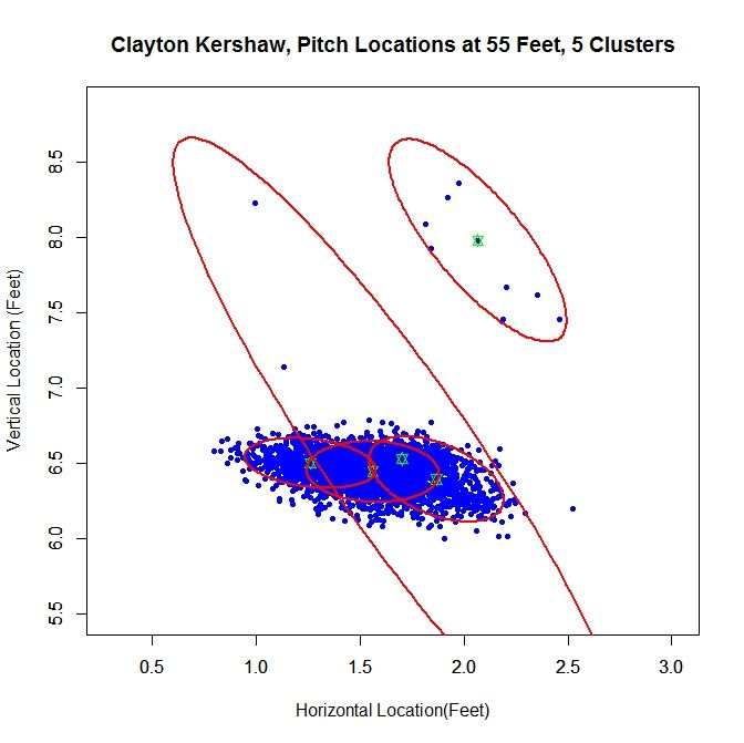
At 55 feet, the Gaussian mixture model identifies five clusters for Kershaw’s data. The green stars represent the center of each cluster and the red ellipses indicate two standard deviations from center along the principal axes. The largest cluster in this group has a weight of .64, meaning it accounts for 64% of the mixture model’s distribution. This is the cluster around the point (1.56,6.44). We will work off of this cluster and remove the data that has a low probability of coming from it. This is will include dispensing with the sparse cluster to the upper-right and some data on the periphery of the main cluster. We can see how Kershaw’s clusters are generated by taking a rolling average of his pitch locations at 55 feet (the standard distance used for release points) over the course of 300 pitches (about three starts).

Kershaw Rolling Average photo Kershaw_Average.jpeg

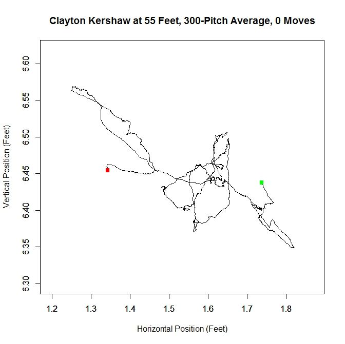
The green square indicates the average of the first 300 pitches and the red the last 300. From the plot, we can see that Kershaw’s data at 55 feet has very little variation in the vertical direction but, over the course of the season, drifts about 0.4 feet with a large part of the rolling average living between 1.5 and 1.6 feet (measured from the center of home plate). For future reference, we will define a “move” of release point as a 9-inch change in consecutive, disjoint 300-pitch averages (this is the “0 Moves” that shows up in the title of the plot and would have been denoted by a blue square in the plot). The choices of 300 pitches and 9 inches for a move was chosen to provide a large enough sample and enough distance for the clusters to be noticeably disjoint, but one could choose, for example, 100 pitches and 6 inches or any other reasonable values. So, we can conclude that Kershaw never made a significant change in his release point during 2012 and therefore treating the data a single cluster is justifiable.

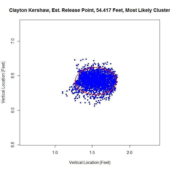
From the spatial clustering results, the first way we will clean up the data set is to take only the data which is most likely from the dominant cluster (based on the conditional probabilities from the clustering algorithm). We can then take this data and approximate the release point distance via the previously discussed algorithm. The release point for this set is estimated at 54 feet, 5 inches. We can also estimate the arm release angle, the angle a pitcher’s arm would make with a horizontal line when viewed from the catcher’s perspective (0 degrees would be a sidearm delivery and would increase as the arm was raised, up to 90 degrees). This can be accomplished by taking the angle of the eigenvector, from horizontal, which corresponds to the smaller variance. This is working under the assumption that a pitcher’s release point will vary more perpendicular to the arm than parallel to the arm. In this case, the arm angle is estimated at 90 degrees. This is likely because we have blunted the edges of the cluster too much, making it closer to circular than the original data. This is because we have the clusters to the left and right of the dominant cluster which are not contributing data. It is obvious that this way of sorting the data has the problem of creating sharp transitions at the edge of cluster.

Kershaw Most Likely photo Kershaw_Likely_Final.jpeg

As discussed above, we run the algorithm from 45 to 65 feet, in one-inch increments, and find the location corresponding to the smallest ellipse. We can look at the functional that tracks the area of the ellipses at different distances in the aforementioned case.

Kershaw Most Likely Functional photo Kershaw_Likely_Fcn.jpeg

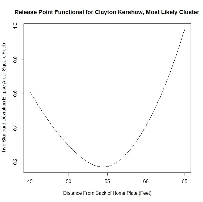
This area method produces a functional (in our case, it has been discretized to each inch) that can be minimized easily. It is clear from the plot that the minimum occurs at slightly less than 55 feet. Since all of the plots for the functional essentially look parabolic, we will forgo any future plots of this nature.

The next method is to assume that the data is all from one cluster and remove any data points that have a lower than five-percent probability of coming from the dominant cluster. This produces slightly better visual results.

Kershaw Five Percent photo Kershaw_Five_Pct_Final.jpeg

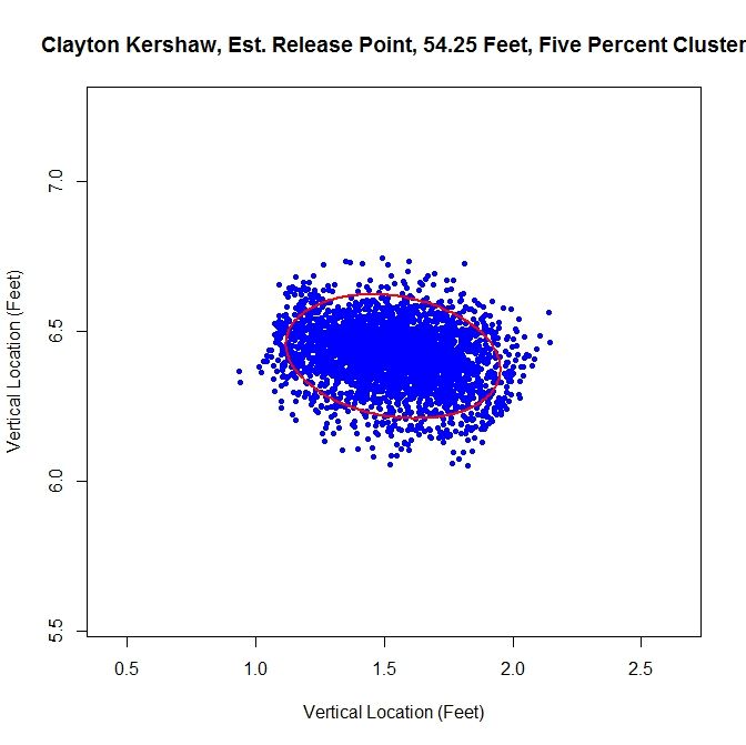
For this choice, we get trimming away at the edges, but it is not as extreme as in the previous case. The release point is at 54 feet, 3 inches, which is very close to our previous estimate. The arm angle is more realistic, since we maintain the elliptical shape of the data, at 82 degrees.

Kershaw Original photo Kershaw_Orig_Final.jpeg

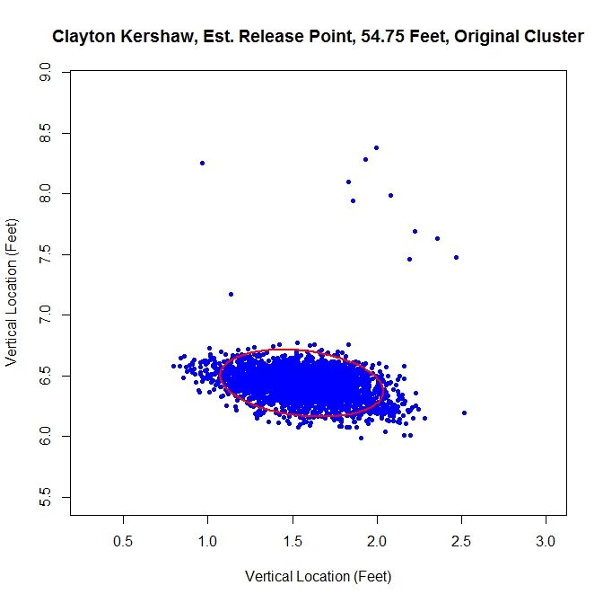
Finally, we will run the algorithm with the data as-is. We get an ellipse that fits the original data well and indicates a release point of 54 feet, 9 inches. The arm angle, for the original data set, is 79 degrees.

Examining the results, the original data set may be the one of choice for running the algorithm. The shape of the data is already elliptic and, for all intents and purposes, one cluster. However, one may still want to remove manually the handful of outliers before preforming the estimation.

Case 2: Lance Lynn

Clayton Kershaw’s data set is much cleaner than most, consisting of a single cluster and a few outliers. Lance Lynn’s data has a different structure.

Lynn Clusters photo Lynn_Clusters.jpeg

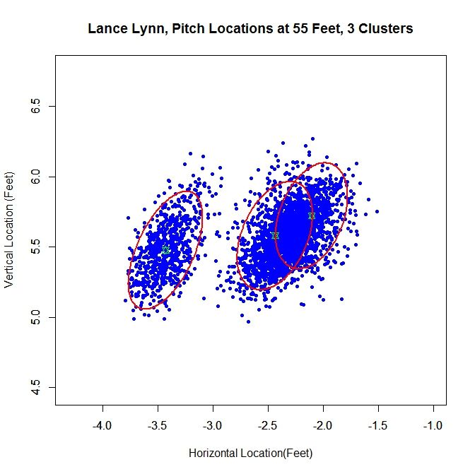
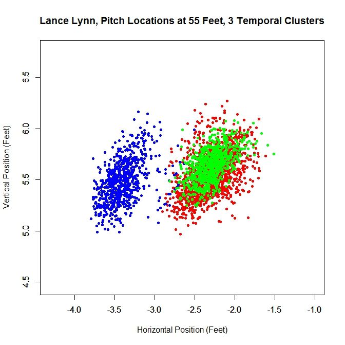
The algorithm produces three clusters, two of which share some overlap and the third disjoint from the others. Immediately, it is obvious that running the algorithm on the original data will not produce good results because we do not have a single cluster like with Kershaw. One of our other choices will likely do better. Looking at the rolling average of release points, we can get an idea of what is going on with the data set.

Lynn Rolling Average photo Lynn_Average.jpeg

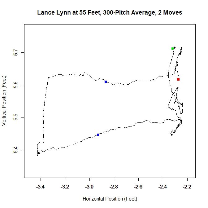
From the rolling average, we see that Lynn’s release point started around -2.3 feet, jumped to -3.4 feet and moved back to -2.3 feet. The moves discussed in the Kershaw section of 9 inches over consecutive, disjoint 300-pitch sequences are indicated by the two blue squares. So around Pitch #1518, Lynn moved about a foot to the left (from the catcher’s perspective) and later moved back, around Pitch #2239. So it makes sense that Lynn might have three clusters since there were two moves. However his first and third clusters could be considered the same since they are very similar in spatial location.

Lynn’s dominant cluster is the middle one, accounting for about 48% of the distribution. Running any sort of analysis on this will likely draw data from the right cluster as well. First up is the most-likely method:

Lynn Most Likely photo Lynn_Likely_Final.jpeg

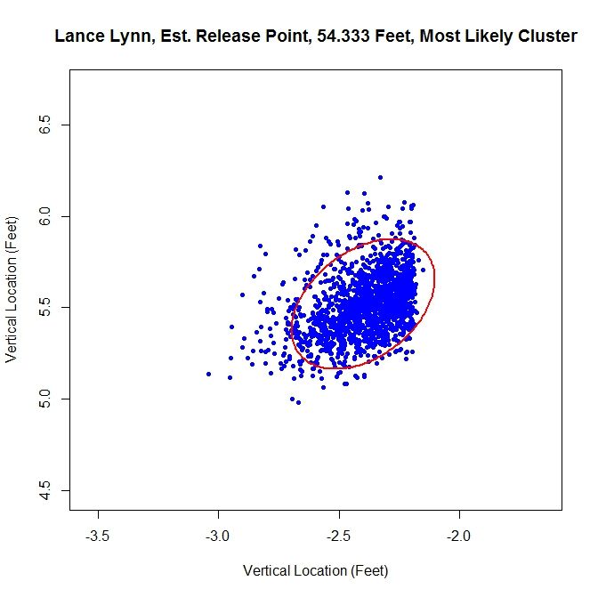
Since we have two clusters that overlap, this method sharply cuts the data on the right hand side. The release point is at 54 feet, 4 inches and the release angle is 33 degrees. For the five-percent method, the cluster will be better shaped since the transition between clusters will not be so sharp.

Lynn Five Percent photo Lynn_Five_Pct_Final.jpeg

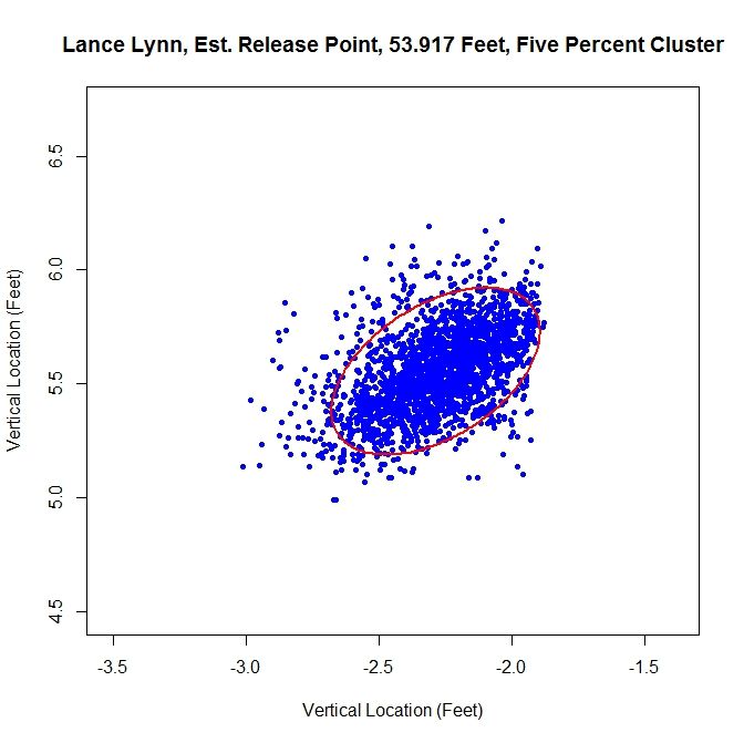
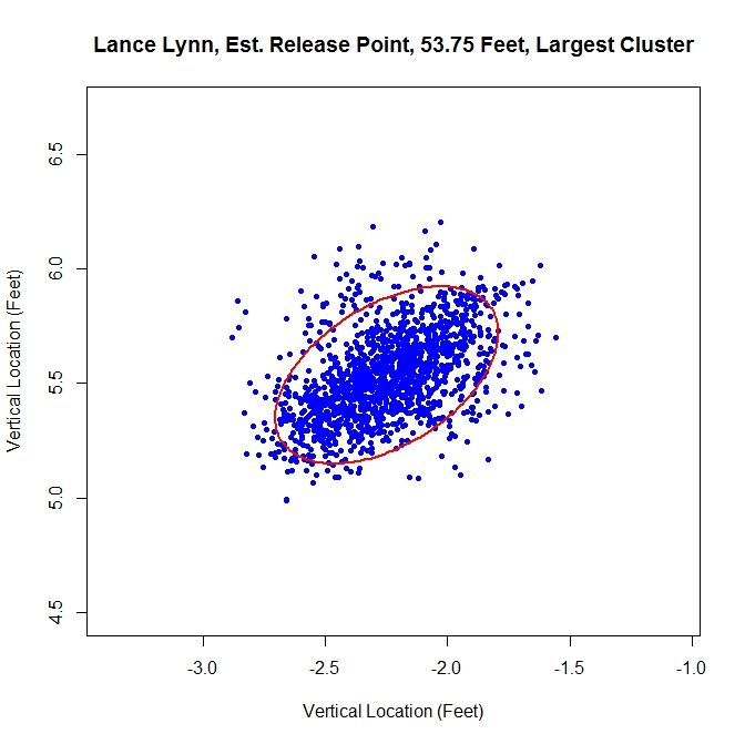
This produces a well-shaped single cluster which is free of all of the data on the left and some of the data from the far right cluster. The release point is at 53 feet, 11 inches and at an angle of 49 degrees.

As opposed to Kershaw, who had a single cluster, Lynn has at least two clusters. Therefore, running this method on the original data set probably will not fare well.

Lynn Original photo Lynn_Orig_Final.jpeg

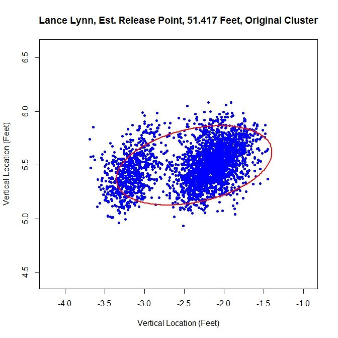
Having more than one cluster and analyzing it as only one causes both a problem with the release point and release angle. Since the data has disjoint clusters, it violates our bivariate normal assumption. Also, the angle will likely be incorrect since the ellipse will not properly fit the data (in this instance, it is 82 degrees). Note that the release point distance is not in line with the estimates from the other two methods, being 51 feet, 5 inches instead of around 54 feet.

In this case, as opposed to Kershaw, who only had one pitch cluster, we can temporally sort the data based on the rolling average at the blue square (where the largest difference between the consecutive rolling averages is located).

Lynn Time Clusters photo Lynn_Time_Clusters.jpeg

Since there are two moves in release point, this generates three clusters, two of which overlap, as expected from the analysis of the rolling averages. As before, we can work with the dominant cluster, which is the red data. We will refer to this as the largest method, since it is the largest in terms of number of data points.  Note that with spatial clustering, we would pick up the some of the green and red data in the dominant cluster. Running the same algorithm for finding the release point distance and angle, we get:

Lynn Largest photo Lynn_Large_Final.jpeg

The distance from home plate of 53 feet, 9 inches matches our other estimates of about 54 feet. The angle in this case is 55 degrees, which is also in agreement. To finish our case study, we will look at another data set that has more than one cluster.
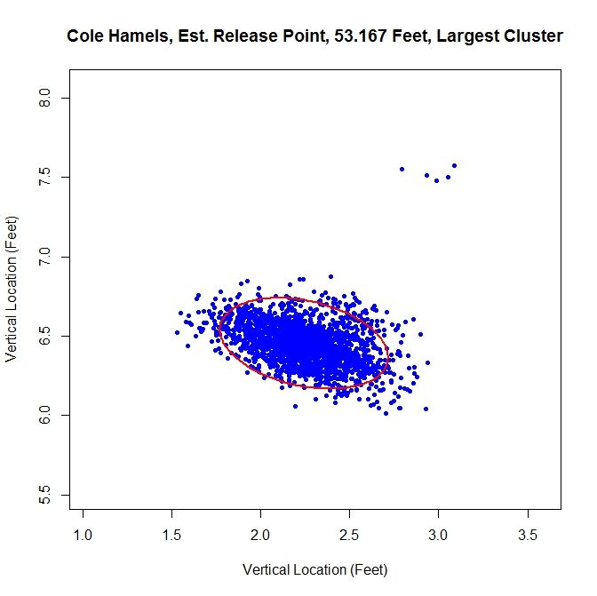
Case 3: Cole Hamels

Hamels Clusters photo Hamels_Clusters.jpeg

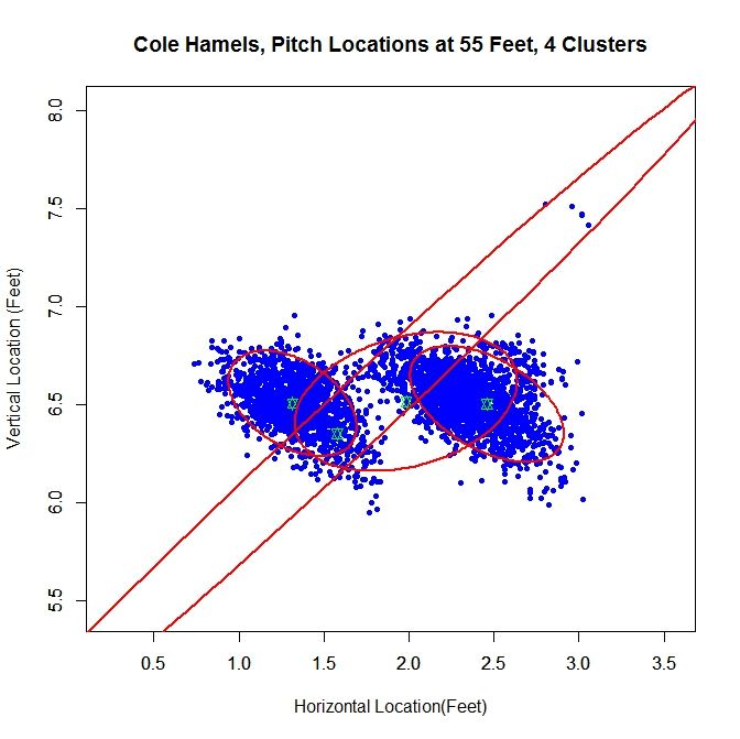
For Cole Hamels, we get two dense clusters and two sparse clusters. The two dense clusters appear to have a similar shape and one is shifted a little over a foot away from the other. The middle of the three consecutive clusters only accounts for 14% of the distribution and the long cluster running diagonally through the graph is mostly picking up the handful of outliers, and consists of less than 1% of the distribution. We will work with the the cluster with the largest weight, about 0.48, which is the cluster on the far right. If we look at the rolling average for Hamels’ release point, we can see that he switched his release point somewhere around Pitch #1359 last season.

Hamels Rolling Average photo Hamels_Average.jpeg

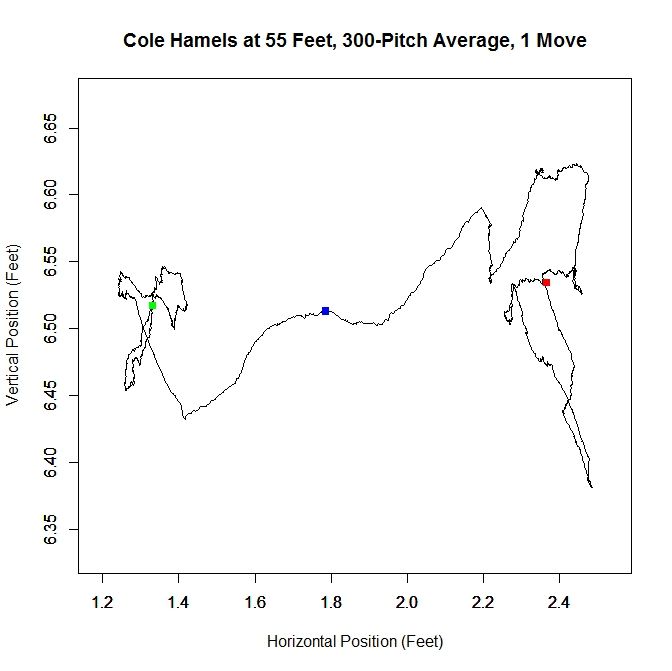
As in the clustered data, Hamel’s release point moves horizontally by just over a foot to the right during the season. As before, we will start by taking only the data which most likely belongs to the cluster on the right.

Hamels Most Likely photo Hamels_Likely_Final.jpeg

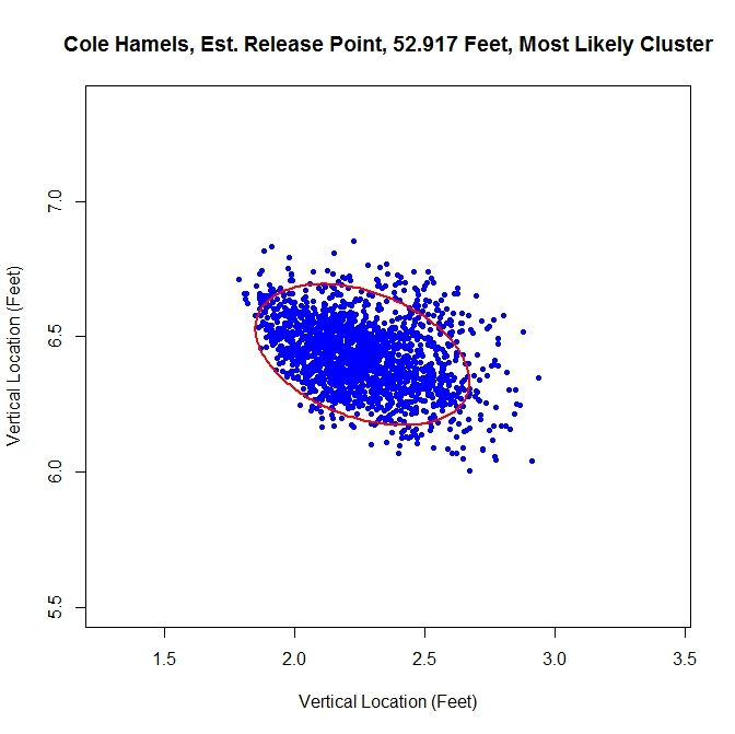
The release point distance is estimated at 52 feet, 11 inches using this method. In this case, the release angle is approximately 71 degrees. Note that on the top and the left the data has been noticeably trimmed away due to assigning data to the most likely cluster. The five-percent method produces:

Hamels Five Percent photo Hamels_Five_Pct_Final.jpeg

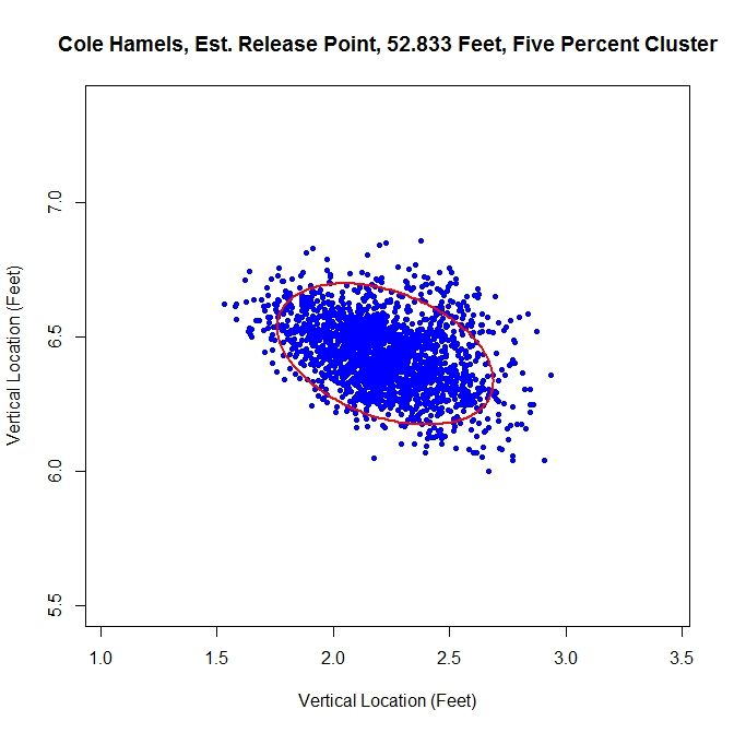
For this method of sorting through the data, we get 52 feet, 10 inches for the release point distance. The cluster has a better shape than the most-likely method and gives a release angle of 74 degrees. So far, both estimates are very close. Using just the original data set, we expect that the method will not perform well because there are two disjoint clusters.

Hamels Original photo Hamels_Orig_Final.jpeg

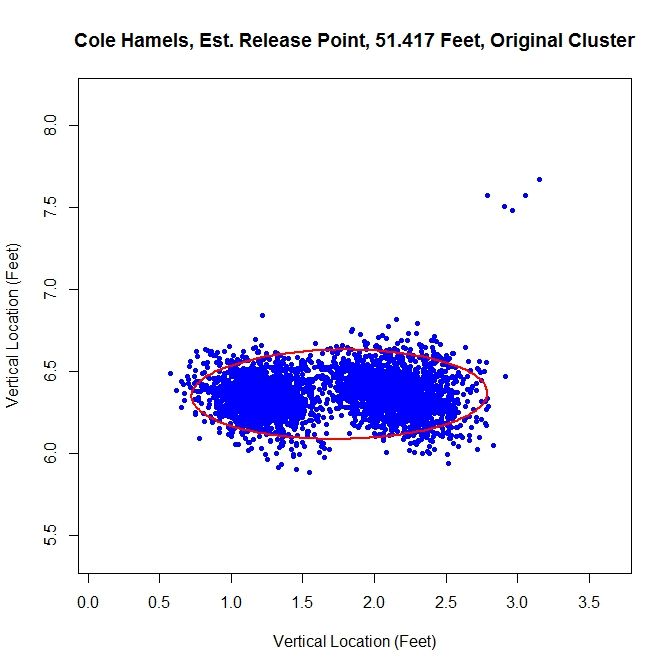
We run into the problem of treating two clusters as one and the angle of release goes to 89 degrees since both clusters are at about the same vertical level and therefore there is a large variation in the data horizontally.

Just like with Lance Lynn, we can do a temporal splitting of the data. In this case, we get two clusters since he changed his release point once.

Hamels Time Clusters photo Hamels_Time_Clusters.jpeg

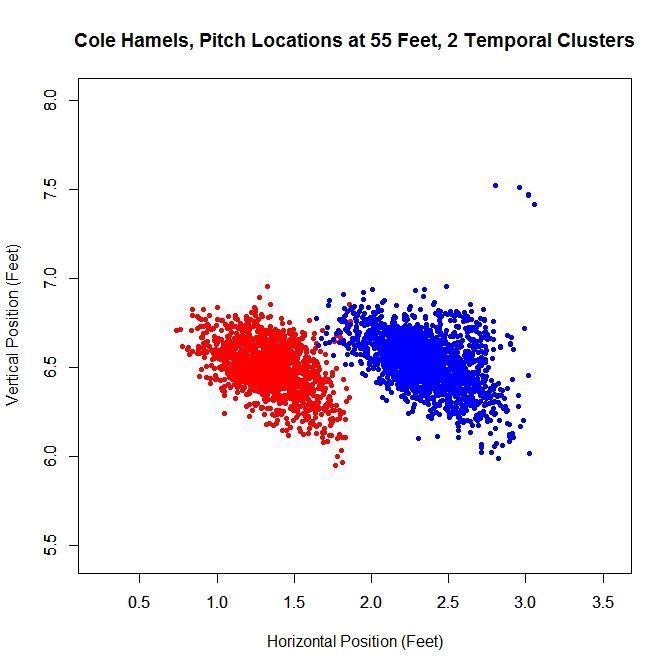
Working with the dominant cluster, the blue data, we obtain a release point at 53 feet, 2 inches and a release angle of 75 degrees.

Hamels Largest photo Hamels_Large_Final.jpeg

All three methods that sort the data before performing the algorithm lead to similar results.

Conclusions:

Examining the results of these three cases, we can draw a few conclusions. First, regardless of the accuracy of the method, it does produce results within the realm of possibility. We do not get release point distances that are at the boundary of our search space of 45 to 65 feet, or something that would definitely be incorrect, such as 60 feet.  So while these release point distances have some error in them, this algorithm can likely be refined to be more accurate. Another interesting result is that, provided that the data is predominantly one cluster, the results do not change dramatically due to how we remove outliers or smaller additional clusters. In most cases, the change is typically only a few inches. For the release angles, the five-percent method or largest method probably produces the best results because it does not misshape the clusters like the mostly-likely method does and does not run into the problem of multiple clusters that may plague the original data. Overall, the five-percent method is probably the best bet for running the algorithm and getting decent results for cases of repeated clusters (Lance Lynn) and the largest method will work best for disjoint clusters (Cole Hamels). If just one cluster exists, then working with the original data would seem preferable (Clayton Kershaw).

Moving forward, the goal is settle on a single method for sorting the data before running the algorithm. The largest method seems the best choice for a robust algorithm since it is inexpensive and, based on limited results, performs on par with the best spatial clustering methods. One problem that comes up in running the simulations that does not show up in the data is the cost of the clustering algorithm. Since the method for finding the clusters is incremental, it can be slow, depending on the number of clusters. One must also iterate to find the covariance matrices and weights for each cluster, which can also be expensive. In addition, the spatial clustering only has the advantages of removing outliers and maintaining repeated clusters, as in Lance Lynn’s case. Given the difference in run time, a few seconds for temporal splitting versus a few hours for spatial clustering, it seems a small price to pay. There are also other approaches that can be taken. The data could be broken down by start and sorted that way as well, with some criteria assigned to determine when data from two starts belong to the same cluster.

Another problem exists that we may not be able to account for. Since the data for the path of a pitch starts at 50 feet and is for tracking the pitch toward home plate, we are essentially extrapolating to get the position of the pitch before (for larger values than) 50 feet. While this may hold for a small distance, we do not know exactly how far this trajectory is correct. The location of the pitch prior to its individual release point, which we may not know, is essentially hypothetical data since the pitch never existed at that distance from home plate. This is why is might be important to get a good estimate of a pitcher’s release point distance.

There are certainly many other ways to go about estimating release point distance, such as other ways to judge “closeness” of the pitches or sort the data. By mathematizing the problem, and depending on the implementation choices, we have a means to find a distinct release point distance. This is a first attempt at solving this problem which shows some potential. The goal now is to refine it and make it more robust.

Once the algorithm is finalized, it would be interesting to go through video and see how well the results match reality, in terms of release point distance and angle. As it is, we are essentially operating blind since we are using nothing but the PITCHf/x data and some reasonable assumptions. While this worked to produce decent results, it would be best to create a single, robust algorithm that does not require visual inspection of the data for each case. When that is completed, we could then run the algorithm on a large sample of pitchers and compare the results.


Rebuilding on a Crash Diet: The Brewers and a Calamitous May

To describe May, 2013 as an awful month for the Milwaukee Brewers would not do it justice.

In fact, the Brewers were downright putrid, winning only six games the entire month.  Their record in May was so bad (6-22) that it tied the worst month in franchise history: the August turned out by the 1969 Seattle Pilots, who ended the following season in bankruptcy, followed by a permanent road trip to become the Milwaukee Brewers.

The Brewers ended the month of April only a half game out of first place.  The Brewers ended the month of May 15 games behind the St. Louis Cardinals, managing the impressive feat of losing 14.5 games in the standings in one month.  Now that is a tailspin.

CoolStandings.Com currently gives the Brewers a 1 in 250 chance of making even the wild-card play-in game.  GM Doug Melvin admitted there is no chance the Brewers will be buyers this year at the trade deadline.  Rather, they will either be in a sell mode, seeking high-ceiling prospects a few years away, or keeping the assets they have, presumably only if they cannot get anything in return.  In short, the Brewers are suddenly rebuilding, and are focusing on  stocking up their farm system and developing controllable rotation talent.

But, rebuilding is a complicated topic in small markets like Milwaukee.  As Wendy Thurm has noted, the Brewers, with their limited geographic reach, have one of the smallest television contracts in the league.  Thus, the Brewers rely upon strong attendance to deliver profits for Mark Attanasio and his ownership group.  In recent years, the Brewers’ attendance fortunately has been some of the most impressive in baseball, particularly in comparison to the size of the Milwaukee metropolitan area.  Over the last five years, the Brewers have consistently approached or exceeded three million fans, despite challenging economic times.  So, one thing the Brewers cannot afford is a collapse akin to the mere 1.7 million fans they drew in 2003 during a terrible season — not if they want to make the investments in future talent required to make the franchise a perennial contender.

So, the Brewers face an obvious challenge: the team needs to lose enough games to obtain a prime draft position, and thereby maximize its chances to draft a top-ceiling player with minimum bust potential.  At the same time, the Brewers need to avoid losing in any drawn-out fashion, because a corresponding and sustained decline in attendance could hemorrhage desperately-needed cash from their balance sheet.  As Ryan Topp and others have argued, this need to maintain attendance in the short term seems to be one reason why the Brewers have systematically traded away what previously was an excellent farm system, with the apparent goal of maintaining the aura of a competitive team.

How does one navigate this problem?  Well, the best solution could be to experience a May like the Brewers just suffered.  Doing so addresses two problems: (1) it abruptly puts the team on course to get a top 5 draft pick, and (2) it achieves this result so abruptly, and in this case so early in the season, that the fan base can still — at least in theory —enjoy much-improved baseball for the remainder of the season without jeopardizing that draft slot.  In short, when you can take your medicine over the course of one month, instead of over an entire season, you really ought to do it.

As to the draft:

Thanks to May, the Brewers currently have the fifth-worst record in baseball at 23–37.  As of the morning of June 8, 2013, FanGraphs predicted that the Brewers will end the season tied for baseball’s fourth-worst record with the New York Mets at 73–89.  Provided that 2013’s top five draft picks all reach agreement with their teams, the Brewers are on pace for a top-5 draft slot in 2014.

The Brewers have not had a top-5 pick in the Rule 4 draft since 2005, when they picked some guy named Ryan Braun.  Before 2013, the top five slots in the draft provided, among others, Buster Posey (#5, 2008), Stephen Strasburg (#1, 2009), Manny Machado (#3, 2010), Dylan Bundy (#4, 2011), and Byron Buxton (#2, 2012) — the types of superstar prospects the Brewers have been denied for years, and which they need to anchor their next generation of players.  At the end of April, and before May occurred, the Brewers were on track for yet another mid-round pick slot.

As to the rest of the season:

It is unlikely that the Brewers will continue to suffer the combination of injuries and dreadful rotation pitching that helped ruin their May.  FanGraphs seems to agree, predicting that the current Brewers roster (or something like it) will essentially play .500 baseball for the rest of the season, even while maintaining one of the five worst records in the game.

Average baseball is not contending baseball, but average baseball at least would offer Brewers fans — already pleased with Miller Park’s immunity from rain delays — a reasonable likelihood of seeing a win on any given day.  In 2009, the Brewers were able to bring in over three million fans, despite finishing under .500 overall.  In 2010, the Brewers ended up eight games under .500, but still brought in 2.7 million fans.  It remains to be seen whether playing .500 baseball for the rest of the 2013 season would be sufficient to keep fans coming through the Miller Park turnstiles, but if so, the increasing remoteness of May could be a significant factor, particularly if the team can convince fans that “one bad month” does not represent the current Miller Park experience or true caliber of the team.

Of course, it is also possible that the Brewers will be able to trade significant assets at the deadline in exchange for the prospects Doug Melvin wants.  If so, their projected record could, and probably would decline.  (This is necessarily not a bad thing, given that 68.5 wins is the average cut-off to secure a top 5 draft spot from 2003 through 2012).  If that happens, the Brewers will have a further challenge on their hands in trying to provide even average baseball for their fans, and maintain the attendance they need.

That said, the Brewers’ remarkable close to 2012 — an incredible .610 winning percentage from August through October — was accomplished after trading away Zack Greinke and calling up minor league talent to plug gaps in the rotation left by Greinke’s trade and Shaun Marcum’s injuries.  If the Brewers are once again able to make advantageous trades at the deadline, and also able to play even .500 ball for the rest of the year, they are still in a position to do so without hurting their chances to get the impact player they need in the 2014 Rule 4 draft.

If they can pull both of these things off, much of the thanks should be given to the horrible month of May.


The Ten Highest BABIPs Since 1945

Earlier this season I looked at the ten lowest BABIPs since 1945, investigating what, exactly, this statistic can teach us about hitters. The conclusions ranged from clear to not-so-much: your batting average on balls in play will be lower if you’re too slow to beat out infield grounders, if you hit an unusually low number of line drives, if you’re getting poor contact by swinging at bad pitches, and if you’re just plain unlucky. Sometimes players saw their power numbers drop along with their BABIPs, most likely because of an inferior approach at the plate which caused weak hits, but sometimes players saw their power numbers rise sharply: one of the ten lowest BABIPs ever belongs to Roger Maris, because he put 61 balls out of play and over the outfield fences.

Will our high scorers clear things up?

What is BABIP? (Copied from the First Post)

Batting average on balls in play is exactly that: when you hit the ball and it’s not a home run, what’s your batting average? Imagine you’d only ever batted twice; first you hit a single and then you struck out. Your BABIP would be 1.000. If a single and a groundout, .500. After seven games of the 2013 season, Rick Ankiel had two home runs but no singles, doubles, or triples, so his BABIP was .000.

Across any given season, the average BABIP tends to be about .300. All this means is that, when you hit the ball at professional defenders, there’s a 70% chance they’ll get you out.

The Ten Highest BABIPs Since 1945

Leaderboard

10. Willie McGee, 1985 (.395). McGee’s presence here isn’t surprising, since his hallmarks, aside from excellent hitting skills (and not much power), were speedy outfield defense and quality baserunning. It’s easy to imagine McGee beating infield grounders, hustling out hits, or being above average at driving the ball, even though some of those statistics weren’t tracked at the time.

9. Derek Jeter, 1999 (.396). Jeter’s 2006 ranks 17th on the list, too. Jeter’s 266 infield hits since 2002, when batted-ball data started being counted, ranks second among all hitters in that decade-plus. First place? You’ll find out who that is in a minute (if you don’t know already).

8. Wade Boggs, 1985 (.396). Hey look, two top-ten BABIP seasons in the exact same year! Boggs edges McGee and the whole league with 240 hits in 161 games, 187 (77.9%) of them singles. During all his batting-title years, his BABIP was high, bottoming out at .361. Lucky? No: more like extremely good contact skills.

7. Austin Jackson, 2010 (.396). Jackson’s breakout season in center field for Detroit (that .396 BABIP led him to a .293 average) was followed by a breakup 2011 when his BABIP dropped 56 points (still above average!) and his batting average and on-base percentage fell 54 and 28 points, respectively. So far in 2013 Jackson’s at a career low on balls in play, but he’s also dramatically reduced his previously ugly strikeout rate, which has bolstered his return to the ranks of the truly outstanding.

6. Andres Galarraga, 1993 (.399). Before Galarraga cranked out 47 home runs at the age of 35, he had an also highly improbable 1993. Triple slash, 1989-1992 (509 games): .246/.301/.399. Home runs in those 509 games: 62. Triple slash in 1993: .370/.403/.602.

Three observations. First, Galarraga’s batting average never came within fifty (!) points of that again. Second, this was his first season in Colorado, although it wasn’t a full one, as he only played 120 games. The Coors boost to his power was minimal, at first. Third, the guy could not take a walk.

5. Ichiro Suzuki, 2004 (.399). Will anyone be surprised to see Ichiro here? Speedy, with a near-mythical gift for hitting, Ichiro also has a gift for avoiding fly balls (23.8% flyballs, fourteenth-lowest in baseball since we started counting in 2002). And another thing we’ve been counting since 2002: Ichiro has 463 infield hits, 40% more than second-place Derek Jeter. In 2004, Ichiro had 57 infield hits in 161 games, or about one every series. Since 2002, Mark Sweeney has 12 infield hits in 690 games.

4. Roberto Clemente, 1967 (.403). Clemente was in the middle of a run of six consecutive 6.0+ WAR years. His high batting average on balls in play made this one his most valuable of all (7.7), 40 points above his career average (which was identical to his BABIP the year before). Clemente hit six fewer homers and five fewer doubles but 19 more singles, explaining the paradox that his slugging percentage rose while his power actually dropped.

3. Manny Ramirez, 2000 (.403). This is one of seven seasons in which Manny posted a BABIP above .350. I looked at batted ball data, available from 2002 onward, and found that Manny’s 22.6% line drives ranked 31st among the 481 hitters who’ve racked up more than 1,500 plate appearances since. Of course, Manny was inconsistent in that stretch. His .373 BABIP in 2002 coincided (or not!) with a line-drive rate of 25.3%. (Mark Loretta sits at first since ’02, 26.0%, while at second with 25.2% is Joey Votto, more on whom shortly.)

2. Jose Hernandez, 2002 (.404). I was alive and watching baseball in 2002 and I had never heard of Jose Hernandez. The Brewers shortstop had four pretty good seasons (1998-99, 2001, 2004), three terrible ones (1996, 2000, 2003), and a rather miraculous 2002 which found Hernandez riding a tidal wave of good luck on balls in play. His average rose 39 points, and dropped by 63 the next season; he struck out in literally one-third of his at-bats (188 Ks); his power numbers were unchanged. But, aside from luck, there was another big change. This was the first year batted-ball data is available, and the only year where Hernandez’ flyball rate was below 30%. Between Hernandez, Ichiro, and Jeter, flyball rate is a significant predictor of BABIP.

1. Rod Carew, 1977 (.408). What does it take to have the highest career BABIP of any finished career since 1945? (“Hang on,” you say, “what’s with this ‘finished career’ business?” “Ah,” I say, “Austin Jackson and Joey Votto are in the lead.”) Carew’s career BABIP is .359. Carew’s 1974 ranks 19th on this list (.391). So the guy was a great hitter: but his 1977 was extraordinary. An 8.5 WAR season, it saw a dramatic spike in singles, plus career highs in doubles, triples, and (tied with 1975) home runs. There was also an MVP award.

Conclusions

Again, some of the things we learned are unsurprising: speed is good; being an all-time great contact hitter is good. But there’s a twist: Jose Hernandez benefited from a whole lot of luck, and Rod Carew had the year of his life, but most of the guys here are obviously disposed to high BABIPs based on their skills. We were able to blame a lot of the bottom-ten seasons on hard times and bad breaks, but most of these guys are exceptional hitters with speed and contact ability.

And there’s a new factor begging for our attention.

When we looked at the ten lowest BABIPs, we were unwittingly at a disadvantage, because only one of those low seasons took place while batted-ball data was documented. Three of our ten highest have happened since 2002, though, as well as #13, 14, and 17, which means we have evidence of a new factor.

Hit more line drives, and your batting average on balls in play goes up.

Hit more fly balls, and it goes down–fast.

As a Community Research writer, I can’t insert a chart here; as a lazy person, I don’t have a chart to insert. But the next step in our inquiry is very, very clear. Does fly ball hitting suppress BABIP? Is it because of the increase in home runs, the ease with which defenders catch the ball, both, or neither?

Even More Pertinent Conclusion

We live in the golden age of BABIP. If I had done this “Ten Highest” post including 2013, the present season would have accounted for 40% of the list.

Among the top 20 BABIP guys with more than 700 games played in their careers, there are some retirees: Rod Carew (#2), Ron LeFlore (#7), Wade Boggs, Roberto Clemente, Kirby Puckett, Tony Gwynn, Willie McGee, and John Kruk. But 12 of the top 20 guys are currently active: Joey Votto (#1), Derek Jeter (#3), Shin-Soo Choo (#4), Matt Kemp (#5), Joe Mauer, Miguel Cabrera, Ichiro Suzuki, Matt Holliday, Michael Bourn, Ryan Braun, Wilson Betemit, David Wright.

As commenter Ferd pointed out last time, the league average BABIP was .260 in 1968; when I started the series, I relied on research which assured me that BABIP was consistent over time, but this is clearly not true. This means that there are two more lines of inquiry we should follow.

1. Why are so many BABIP leaders currently active? Is it a change in hitting style? Is it a change in pitching style? Is it a change in the data being used or the calculations being made? Or is it simply because most of them haven’t gotten older, slower, and less talented at the plate, and once they all age and retire order will be restored?

2. Wilson Betemit? How did that happen?


Chris Davis’s Oddly Historic Season So Far

A lot of ink (and pixels) have been spilled about Chris Davis’ great season.  It’s hard to overstate just how great a .337/.432/.721 start through roughly one-third of the season is, especially in this renewed era of depressed offense.  MLB’s .722 OPS this year so far ranks it as Baseball’s second-lowest since 1992’s .700.  (2011 = .720)  Quite straight, Davis is having the best offensive season in the American League of any player whose first name is not some variation of “Michael”.

Here’s yet another data point for you to chew on: Chris Davis is on track to have one of the highest extra-base hit (XBH) to plate appearance (PA) ratios in history.

As of the morning of Memorial Day 2013, Davis has hit an XBH in 16.5% of his PAs.  In conversational terms, he hits an XBH about every six times he steps to the plate.

If Davis were to end the season with this ratio and qualify for a batting championship, it would rank second in history behind this other guy’s pretty good season.

In fact, only nine qualified players in modern history have ever had an XBH-PA ratio of greater than 15% over the course of an entire season.  Here is the list, with Davis’s 2013 added for context:

Rk Player Year XBH PA XBH %
1 Babe Ruth 1921 119 693 17.2%
2 Chris Davis 2013 34 206 16.5%
3 Albert Belle 1995 103 631 16.3%
4 Lou Gehrig 1927 117 717 16.3%
5 Barry Bonds 2001 107 664 16.1%
6 Babe Ruth 1920 99 616 16.1%
7 Jeff Bagwell 1994 73 479 15.2%
8 Al Simmons 1930 93 611 15.2%
9 Albert Belle 1994 73 480 15.2%
10 Todd Helton 2001 105 697 15.1%

You may have noticed that 30% of the players on this list are named either Al or Albert, but none of them are named Pujols.  None of them are named Miguel, either.  In fact, the closest the reigning American League Triple Crown winner has come to cracking this list was in 2010 with a 13.0% XBH-PA ratio, and as of this morning he sits well out of range in 2013 at 12.5%, despite his own empirically otherworldly start.

This is, without a doubt, a most exclusive list of a most consistently slugging nature.  It’s enough to send pitchers into grand mal seizures at the very contemplation of this.  Or perhaps more exactly, it might if they were even aware of it.  This data point has probably not yet been illuminated in quite this way—this here article is the closest I myself have found so far, and Davis is not even the star of the piece.  But that does not mitigate the impressiveness of this feat of his so far.

This is not to say that Chris Davis is a better hitter than Miguel Cabrera, or Albert Pujols or Joey Votto or even Shin Soo Choo, for that matter.  But even if this does turn out to be a world class-level fluke season for him, Davis has a chance to crack an elite list inhabited only by the greatest of the great, even if he never knows it.


The Ten Lowest BABIPs Since 1945

For hitters, BABIP is often an explanation for unusually good or bad seasons. But what causes a great or poor BABIP? And are we right to simply blame BABIP whenever a bizarre season happens? It might help to look at some extreme cases. Even if we don’t learn something about how to interpret hitters’ BABIP, we can at least have fun. Nerdy, nerdy fun.

What is BABIP?

Batting average on balls in play is exactly that: when you hit the ball and it’s not a home run, what’s your batting average? Imagine you’d only ever batted twice; first you hit a single and then you struck out. Your BABIP would be 1.000. If a single and a groundout, .500. After seven games of the 2013 season, Rick Ankiel had two home runs but no singles, doubles, or triples, so his BABIP was .000.

Across any given season, the average BABIP tends to be about .300. All this means is that, when you hit the ball at professional defenders, there’s a 70% chance they’ll get you out.

What influences BABIP?

The enemy. Defense and to some extent pitching are factors, but over the course of a full year, as you face the entire league, this averages out.

Power. If you hit twenty balls to the warning track, and a lot of them fall for hits, your BABIP will increase. But if they all carry right over the fence for home runs, they will stop counting for this purpose, meaning your BABIP will probably decrease since more of your hits will be excluded from the stat.

Hitting style. There are six infielders, so more ground balls tend to be fielded; this is why pitchers, who are wimpy at hitting, tend to have low BABIPs. Fly balls are often caught, so the best scores go to line-drive hitters.

Speed. If you’re fast enough to beat throws and bunt for singles, your BABIP will be higher. If you run like I do, probably not so much.

Luck. Maybe the biggest single factor is: are you lucky? We all see hard-hit balls straight at defenders, or guys who go on “hot streaks” where the ball “finds all the holes.” That’s called “luck,” and BABIP can quantify it. Believe it or not, you really can have good or bad luck that lasts an entire year.

Let’s illustrate these principles by looking at some hitters with very low BABIPs.

The Ten Lowest BABIPs Since 1945

10. Roger Maris, 1961 (.209). 38.4% of Roger Maris’ hits that year were home runs. (Stop now to think about that.) If the ball stayed in the park, somebody probably caught it. On the other hand, if the ball had a chance of leaving the park, it did. 61 of them did.

9. Jim King, 1963 (.208). Although somewhat powerful (24 homers), Jim King was also something else: bad. His BABIP never came close to league average, and in partial seasons after ’63 it would be .207 and .209. He was known as a power-hitting bench bat, and only found regular playing time on the miserable Washington Senators (106 losses that year).

8. Dave Kingman, 1982 (.207). Dave Kingman hit homers (37) and struck out a whole lot, and based on his terrible, terrible fielding metrics, he was a mighty slow fellow. There’s also another factor here: he was old. “But he was only 33,” you say. “If there was something to this age thing, he’d get worse as he got even older.” “Aha,” I reply, “that’s why you’re supposed to keep reading!”

7. Dick McAuliffe, 1971 (.206). Here’s our first plausible “bad luck” guy. A career .264 BABIP, and indeed the following year he had a .264 BABIP. A career .247 hitter, and the following year he hit .240. A career .343 OBP, and the following year his OBP was .339. So Dick McAuliffe bounced back just fine, but it’s worth noting two things: first, a career .247 hitter is not that good, and second, for whatever reason his walk rate did decline sharply during his “unlucky” year. Was he swinging more aggressively? If so, he was still striking out less than usual.

6. Roy Cullenbine, 1947 (.206). I mentioned Roy Cullenbine in my first post on these venerable pages: a man who combined all-time bad luck with a truly incredible batting eye, walking 22.6% of the time despite being a distinctly non-intimidating hitter. The only guy in 1947 who walked more was Triple Crown winner Ted Williams, and Williams was frequently being walked on purpose. Cullenbine’s possibly all-time-great ability to take a walk was rewarded with–well, never playing in another major league game.

He did hit 24 homers, but this is another bad luck year. Heck, Cullenbine’s BABIP in 1946 was .347.

5. Dave Kingman, 1986 (.204). Toldja so! Here’s Kingman, age 37, hitting home runs (35) but nothing else. A full-time DH by now, he (like Cullenbine) never played in the big leagues again.

4. Brooks Robinson, 1975 (.204). Only six home runs to his name, still manning third base, Brooks Robinson is another example of what’s becoming a clear trend: he was 38 years old. He played partial seasons after this, but not full ones. This was a truly godawful year: .201/.267/.274, good for a wRC+ of 54.

3. Ted Simmons, 1981 (.200). A catcher and a fairly slow runner turning 32, Simmons saw a small drop in power, which he partially recovered the next year, and a 97-point drop in his BABIP, hard to explain just from the power outage. The traditional explanation for his poor 1981 is that he had just moved to Milwaukee and the American League. Luck might have hurt him, too.

2. Curt Blefary, 1968 (.198). Carson Cistulli previously highlighted Blefary on this site. After winning Rookie of the Year in 1965, the young outfielder posted two more above-average seasons before falling off a metaphorical cliff in 1968. He was being bounced around between positions, and he was never a speedster: his defense inspired the nicknames Clank and Buffalo.

Part of it must be bad luck. The BABIP .045 below his career average bounced back in 1969, when he moved to catcher and had a fairly good season for the Astros; a power decline turned out to be real, but his other numbers recovered. And yet Blefary would play his last major league game at age 29, moving on to a career as a “sheriff, bartender, truck driver, and night club owner.”

1. Aaron Hill, 2010 (.196). Aaron Hill’s notoriously lost season is the only one here from the last twenty-five years–and the most dramatic of all. Interestingly, a RotoGraphs article on Hill attributes his 2010 to pure awfulness but his recovery in 2011 to an “inflated” BABIP. But a .196 BABIP, a full hundred points below average, counts as deflated, right? Hill sucked in 2010 despite 26 homers and a slightly increased walk rate.

The advantage of recency is that we have more data. Here the culprit is obvious: he had previously been, and would soon be again, very good at hitting line drives, but in 2010 his line-drive percentage dropped by half (just 10.6%) and more than half of the balls he hit all year became fly balls. Some of those drifted out of the park, but most drifted over a waiting defender. And even though Hill was walking more, he was also swinging more frequently at pitches outside the strike zone. Hill’s new approach in 2010 didn’t hurt his ability to take a walk, but it hurt his ability to drive the ball. Still, to earn the lowest BABIP in modern history, he also suffered from an entire season of some of the worst luck any batter’s ever had.

Conclusion

The BABIP losers here didn’t do badly over their careers: combined, these “bottom 10” earned 42 All-Star appearances (18 by Brooks Robinson), 3 MVP awards, and a Rookie of the Year prize.

This unscientific survey confirms a lot of preconceived ideas:
– slower players don’t create their own luck on balls hit in fair territory
– aging players often lose their speed or power or both
– swinging at balls outside the strike zone means you make inferior contact
– sometimes, good luck isn’t enough to save a terrible hitter
– sometimes, terrible luck is enough to end a good hitter’s career

But there’s an interesting question to be raised here. Some of these guys–Maris, Kingman–hit homers like crazy, thus suppressing their BABIPs. On the other hand, Blefary and Simmons lost home run power in their hard-luck years. Simmons was playing in a new ballpark and Blefary at a new position. Maybe they were the Aaron Hills of their times, adjusting their approaches in deleterious ways (probably swinging at more pitches). Maybe they hit the ball poorly for unknown, reversible reasons. Maybe they had bad luck.

If I were counseling hitters on how to maximize their batting average on balls in play, I would say this: cultivate speed and athleticism, swing at better pitches, and try to hit line drives. I don’t know if BABIP can or should be learned, however. Ultimately, BABIP is the baseball version of a zen koan or hippie bumper sticker. BABIP: Stuff Happens. Or, more accurately, sometimes in baseball you make your own fate, but sometimes your fate makes you.


Does it matter which side of the pitching rubber a pitcher starts from throwing a sinker?

As we start a new baseball season, I start a new season of my own. This is my first – of many I hope – analysis and write-up on baseball that I am submitting. I am an avid fan, a numbers geek, an aspiring writer and lastly a bored software engineer. I am also very fortunate. I have a close connection with a former major league player and the ability to leverage his vast experience and knowledge of the game. Hopefully, I can parlay the knowledge I have learned from many years of observation along with the knowledge I have gleaned from my connection to realize my goal as a contributor to the sabermetric community and to the enjoyment of baseball fans everywhere. Here we go!

Question

Is the effectiveness of a sinker dependent on from which side of the rubber the pitcher throws?

I was in Florida in mid March for spring training, talking with a minor league coach when he mentioned that he and a former all star pitcher were in a disagreement about how to throw a sinker. Their debate centers on where a pitcher should stand on the rubber to throw a sinker most effectively. We all understand that a pitcher should not move all over the rubber to become more effective on a single pitch. This would obviously tip off the hitters as to what type of pitch might be coming. But for argument’s sake, a team might have some newly transformed position players learning to throw different pitches. Wouldn’t a team want to know if, for some pitches, it was more beneficial to stand on one side of the rubber than another?

I consider myself a pretty observant guy, but I will have to admit that I never really paid much attention to where a pitcher stood on the rubber. To me the juicy part is watching the ball just after it is released. The dance, dip, duck and dive a pitcher is able to command of the ball is where the action is as far as I am concerned. So watching what a pitcher does before he even starts his motion was asking a little much. Nonetheless, I was certain that with so many pitchers in the majors, that a breakdown of data would show that there was not a singular starting point on the rubber. Every pitcher is different, right?

Setup

I started my analysis by downloading the last 4 years (2009-2012) of PitchFx data. Most of us know this already but by using PitchFx data there are some limitations to analysis. Unlike Trackman, PitchFx initially records each pitch at 50’ from home plate, not the actual release point of the pitch. For PitchFx this data point is called “x0”, and for all intents and purposes this is pretty good data, as for most pitchers their strides are approximately 5 to 6’ from the rubber, and with arms length added in we are talking about a difference of a couple of percentage points from being the same as the release point metric from Trackman. But full disclosure, it is not exactly the release point. Another factor that I didn’t measure is a pitcher’s motion to the plate. Some pitchers throw “across” their bodies and not down a straight line, and even fewer open up their body to the batter (stepping to stride leg’s baseline). Also, there is probably a bit to glean from going between the stretch and wind-up, but again without doing a very in-depth study I assume no factor in the analysis. Lastly, arm length is an unmeasured factor. For example, I didn’t check to see if there were any right-handed pitchers with extra long arms standing on the first-base side of the rubber distorting the data.

I started by combining the PitchFx Sinker (SI) and Two-seam fastball (FT) data into a single database. The reason to combine the data is due to the fact that the grips for each pitch are the same, combine this with a two-seam fastball can and a sinker break the same way (down and in to a RH batter from a RH pitcher), and lastly they are also somewhat synonymous in major league vernacular. Maybe somewhere along the line the pitch was invented twice (north or south), the name given is based on region like when asking for a Coke… it’s a “soda”, a “pop”, or a “tonic” depending on where you are in the states. Maybe in the South it was labeled a sinker and the North it was taught as a “two-seamer”? Either way it’s the same pitch as far as I am concerned, and the etymology of pitch naming is a different topic for a different time.

Back to the question above about every pitcher being different, I was wrong. Using the 2012 data I created a frequency distribution for right-handed pitchers (figure 1), and as you can see there is definite focal area at around -2’ point from the centerline of the pitching rubber (and home plate).

Image

Figure 1 – Right-handed pitchers in 2012

This shows that most pitchers start from about the same side; which I determined to be the right side of the rubber (3rd base side). I determined this by adding 9” to one-half the length of the pitching rubber (24”) which comes to 21” (9”+12”). Add in arm length and you can see that using an x0 that is less than or equal to 2’ (remember we are using negatives here) should prove that the pitcher is throwing from the right side.  I would like to add that the 9” used above is based on the shoulder width of an average man, which is around 18”. This metric is based on studies on the “biacromial diameter” of male shoulders in 1970 (pg. 28 Vital and Health Statistics – Data from the National Health Survey). I think we can all agree that the 18” is probably conservative by today’s growth standards. I mentioned in the limitations of the analysis written above, I don’t account for arm length or pitcher motion. Therefore I needed to make sure that there are right-handed pitchers who are throwing from the left hand side of the rubber; just not a bunch of super long-armed, cross bodied throwers.  With the data in hand I was able to identify which pitchers had thrown the ball closer to centerline of the rubber and therefore would be good candidates for standing on the left side of the rubber. The first pitcher who had a higher (>-2) x0 value was Yovani Gallardo of the Milwaukee Brewers. Without knowing Gallardo’s motion I needed to go to the video. From the video, you can clearly see that Gallardo starts on the left side of the rubber and throws fairly conventionally, straight down the line to the batter.

I wanted to keep this as simple as possible, breaking up the pitchers in two categories – Left side or Right side. Without looking at video for each pitcher I had to come up with a tipping point for classifying the side based on the x0 data I had available. If we simply take what we determined above and correlate it to the left hand side we will come up with 1 (starting on left side of rubber) and an x0 of 0. But it isn’t quite that simple. The frequency chart shows that there are less than 1000 balls thrown in 2012 with an x0 greater than or equal to 0. Gallardo threw 504 pitches himself in 2012. So we have to increase the scope a bit. By arranging the x0 data into quartiles we see that upper or lower quartile – depending on handedness – is around -1 or 1 (remember we are using negatives) so for a right handed pitcher the x0 splits are:

Min

25%

Med

Avg

75%

Max

-5.264

-2.315

-1.868

-1.849

-1.372

2.747


For left handers:

Min

25%

Med

Avg

75%

Max

-3.787

1.455

1.953

1.924

2.401

5.378


As I am trying to stay conservative, and the fact that these are not release point numbers I use 1 and -1 as the cut off for classification based on the handedness of the pitcher. Using these numbers provided a pretty clean break in the distributions (90-10%).

Findings

So who was right, the all star pitcher or the minor league pitching coach? Is there an advantage depending on where the pitcher stands on the rubber? Neither – both of them. It’s a tie.

What can I say; my initial analysis is a bit anticlimactic, but not because of lack of effort.  To denote the labels below:

  • LH or RH (Handedness)
  • RR or LR (Right or Left Rubber)
  • B – Balls
  • K – Strikes
  • P – In play (No Outs)
  • O – In play (Outs)
  • BackK – Called Strikes
  • FT – Two seam fastballs
  • SI – Sinkers
  • Efficiency – O/(P+O)
  • XSide – Cross Side (i.e. RH-LR or LH-RR)
  • Same side – LH-LR or RH-RR


LHData

194487

pitches
LH_LR

173145

89.03%

LH_RR

21342

10.97%

LH_LR_B

62957

36.36%

LH_RR_B

7932

37.17%

LH_LR_K

75241

43.46%

LH_RR_K

9067

42.48%

LH_LR_O

22610

13.06%

LH_RR_O

2843

13.32%

LH_LR_P

12335

7.12%

LH_RR_P

1500

7.03%

LH_LR_FT

108600

62.72%

LH_RR_FT

15846

74.25%

LH_LR_SI

64545

37.28%

LH_RR_SI

5496

25.75%

LH_LR_BackK

34932

46.43%

LH_RR_BackK

4406

48.59%

RHData

473032

pitches
RH_LR

48791

10.31%

RH_RR

424241

89.69%

RH_LR_B

18266

37.44%

RH_RR_B

153014

36.07%

RH_LR_K

20486

41.99%

RH_RR_K

180611

42.57%

RH_LR_O

6453

13.23%

RH_RR_O

58895

13.88%

RH_LR_P

3583

7.34%

RH_RR_P

32459

7.65%

RH_LR_FT

21781

44.64%

RH_RR_FT

194582

45.87%

RH_LR_SI

27010

55.36%

RH_RR_SI

229659

54.13%

RH_LR_BackK

10520

51.35%

RH_RR_BackK

82482

45.67%

Xside  667519

pitches

Same Side
LH_RR&RH_LR

70133

10.51%

LH_LR&RH_RR

597386

89.49%

LH_RR&RH_LR_B

26198

37.35%

LH_LR&RH_RR_B

215971

36.15%

LH_RR&RH_LR_K

29553

42.14%

LH_LR&RH_RR_K

255852

42.83%

LH_RR&RH_LR_O

9296

13.25%

LH_LR&RH_RR_O

81505

13.64%

LH_RR&RH_LR_P

5083

7.25%

LH_LR&RH_RR_P

44794

7.50%

LH_RR&RH_LR_FT

37627

53.65%

LH_LR&RH_RR_FT

303182

50.75%

LH_RR&RH_LR_SI

32506

46.35%

LH_LR&RH_RR_SI

294204

49.25%

BackK

14926

50.51%

BackK

117414

45.89%

Efficiency

64.65%

Efficiency

64.53%


The efficiency is so very close. Twelve-hundredths (.12) of a percent is not a lot – 169 outs out of 140678 – but give any Chicago Cub fan five of those outs in 2003 and Mr. Bartman would be an afterthought. Which, I am sure is the way he and all Cub fans around the world would like it. The efficiency is the same, no other way to put it which is the beauty of statistics and sabermetrics. Numbers can say so much, even when they are the equal.

But the analysis wasn’t all for naught, there are some nuggets to glean from the numbers above. As a segue, I am currently watching Derek Lowe of the Texas Rangers pitch on opening night and from the left side of the rubber he throws a sinker and it dips back over the rear part of the plate for a called strike. With all of the similarities within my analysis the most striking observation is the difference in called strikes depending on the side of the rubber. If a pitcher, coach or manager could get a strike or a strike out without the fear of having a batter get a hit or moving a runner forward they would do it every time. With a five percent difference in getting a strike and not having the worry of the ball being put into play would be an interesting thing to know in some tight situations with runners on base. My thought on the difference revolves around the back door being open a little wider when it comes to getting called strikes. With a pitcher throwing X-side you can definitely see a pattern of called strikes on the same side of the plate from which the pitcher throws from. Positive numbers in figures below indicate right side of plate (1st base side)

Image

With today’s specialization where pitchers are matched up to batters based on handedness, the ability for a pitcher to throw a strike as it tails back over the plate or close to the plate (or maybe not even close for some of the pitches above ) is essential. It appears that umpires are a little more flexible with their perception of the strike zone for these pitchers as well.

Closing

I didn’t get the results that I anticipated when I started this analysis, and that is great! As a society we are determined to have a winner! Just as there is “no crying in baseball”, there are no ties in baseball. Even when there is a tie; like on a close play at first – it proverbially goes to the runner. We can’t settle for a tie…. hockey reduced ties by adding a shootout after overtime.  College football removed the tie by introducing sudden death (hopefully the bowl playoff with help eliminate the subjective BCS tie). With no clear cut advantage (read – TIE) identified in my analysis means that a more in depth analysis could/should be performed to validate. Maybe expanding the percentage of X-side pitchers to 15-20, or identifying when pitchers are throwing from the stretch and removing those instances would alter the results and provide a much needed winner? If after all analytical statistical avenues have been exhausted there’s still not a proven advantage, we can always resort to having the coach and player settle it with a coin flip?


A Case Study in Lineup Construction

Controversy and speculation have surrounded the Texas Rangers’ lineup for the better part of a year.  First, Michael Young was a consistent presence in the middle of the Rangers’ order despite lackluster performance.  More recently, the departure of Josh Hamilton and Mike Napoli have led many to speculate the Rangers’ offense would take a step back in 2013.  But how did Ron Washington’s lineups compare to an optimized lineup? How will the loss of Hamilton and Napoli affect the Rangers’ run production?

To find out, I wrote a Monte Carlo program which simulated 50 seasons of games for all 362,880 (9!) lineup combinations. It takes as input the percentage of singles, doubles, triples, home runs, walks, and strikeouts with respect to their number of plate appearances for each batter in the lineup. The outcomes of each at bat is determined by a random number generator as if each batter faces a league average pitcher, and base runners advance according to the league averages for taking extra bases. While not including all the variations of pitcher quality, player speed and defensive quality, it allows for an adequate picture of the effectiveness of various lineups.

Let’s first look at the effect of moving Young from the 5th spot to the 9th spot. We’ll start with the most frequently occurring lineup from 2012:

Ian Kinsler
Elvis Andrus
Josh Hamilton
Adrian Beltre
Micheal Young
Nelson Cruz
David Murphy
Mike Napoli
Mitch Moreland

We’ll plot a histogram of the runs per game (labeled rpg in the plots, always full 9 innings games) scored by all 362,880 possible lineup combinations, all 40,320 lineup combinations with Young batting 5th, and all 40,320 lineup combinations with Young batting 9th (y-axis is frequency of occurrence, note the logarithmic scale).

2012 Lineup distribution, Young in 5 slot vs 9 slot

Most possible lineup combinations produce the same number of runs to within a 0.1 runs per game. No matter the lineup combination, the variation of runs scored is around 16 runs a year. For the Rangers’ lineup, lineup optimization is a relatively small effect. Lineups with different hitters may show a greater or lesser dependence of lineup construction on run scoring.

The difference between moving Michael Young from 5th in the order to 9th in the order is smaller; 0.02 runs per game, or 3 runs over the course of a year. Given the hitters in the Rangers lineup, batting Young 5th in the order did not make a significant difference. But there was another option, Ron Washington could have substituted Craig Gentry for Michael Young. We again plot a histogram of the runs per game scored for all possible lineup combinations with Gentry batting (red) or Michael Young batting (blue).

Rangers Lineup Distribution, Young vs. Gentry

Again, we find the difference to be minimal; this time roughly 0.01 runs per game, or a mere 1.6 runs per season. While it was painful to watch Young batting 5th in 2012, the increased production at the bottom of the lineup largely offset the loss of production in the middle of the lineup. So what happens now that the Rangers’ lineup has lost Hamilton, Napoli and Young in exchange for AJ Pierzynski, Lance Berkman, and Leonys Martin/Craig Gentry? Based on Ron Washington’s lineups in spring training, a likely common lineup for the Rangers in 2013 is as follows:

Ian Kinsler
Elvis Andrus
Lance Berkman
Adrian Beltre
Nelson Cruz
AJ Pierzynski
David Murphy
Mitch Moreland
Leonys Martin

I ran all possible lineup combinations in which Adrian Beltre batted 2nd, 3rd or 4th for both the 2012 and likely 2013 Rangers’ lineup. For the 2013 Rangers’ lineup, I used projections (ZiPS, Steamer, Oliver, Bill James) for the upcoming season to seed the simulation with the hitters’ likely production. Again, a histogram of runs scored per game for all these lineup combinations, with 2012 in blue and 2013 in red.

2013 Rangers Lineup Distribution vs 2012 Lineup Distribution

The peaks as fit predict a 0.22 runs per game increase for the Rangers in 2013, or roughly 36 runs over the course of the year. The non-Gaussian (or normal distribution) tail of the 2013 distribution indicates it might be possible to improve even more.

We will finish with comparisons of the optimized lineups for 2012 and 2013 to the most usual/expected lineups for those years.

2012 Lineup 2012 Optimized 2013 Lineup 2013 Optimized
5.03 rpg 5.11 rpg 5.29 rpg 5.34 rpg
Ian Kinsler David Murphy Ian Kinsler Ian Kinsler
Elvis Andrus Adrian Beltre Elvis Andrus Lance Berkman
Josh Hamilton Josh Hamilton Lance Berkman Leonys Martin
Adrian Beltre Mitch Moreland Adrian Beltre Adrian Beltre
Micheal Young Nelson Cruz Nelson Cruz Nelson Cruz
Nelson Cruz Mike Napoli AJ Pierzynski Mitch Moreland
David Murphy Ian Kinsler David Murphy AJ Pierzynski
Mike Napoli Micheal Young Mitch Moreland David Murphy
Mitch Moreland Elvis Andrus Leonys Martin Elvis Andrus

We’ll start with the big picture. While moving/substituting for Michael Young in 2012 would have made little difference in run production, an optimized lineup would have increased the Rangers’ run total by 13 runs over the course of the year. Not much, but it would likely have been enough to have won the division instead of losing to the A’s. Of course, it is much easier to optimize a lineup when you already know how everyone is going to perform; using an optimized lineup based on 2012 projections wouldn’t have netted the 13 run increase. Most notably, leading off with Murphy (in his breakout year) instead of Kinsler (in his down year) to increase production is not a move one could expect an organization to predict before any games had been played in 2012.

Second, the probable lineup for the Rangers in 2013 is projected to score 8 runs a year less than an optimized lineup. Given the large variance in the production of a hitter as compared to his projections, these lineups seem virtually equivalent.

The optimized lineups show different characteristics than the lineups generated by Ron Washington. The optimized lineups forego Elvis Andrus batting second in preference for a power hitter with good average. Elvis Andrus is instead relegated to the 9th spot. The 2013 optimized lineup puts a lot of faith in rookie Leonys Martin, due entirely to some very respectable projections for the coming year (and not knowing he’s a rookie). Given the uncertainty of how much offense Martin will produce in 2013, have Martin bat in the bottom of the order, as in Ron Washington’s lineup, seems prudent. Finally, Mitch Moreland is preferred in the middle of the lineup in the optimized lineups instead of the bottom of the order as in Washington’s lineups.

If the Rangers are looking to optimize their lineup for 2013, this simulation indicates the two main points to consider: moving Moreland to the middle of the order, and considering batting Andrus 9th.