Archive for Research

Does it matter which side of the pitching rubber a pitcher starts from throwing a sinker?

As we start a new baseball season, I start a new season of my own. This is my first – of many I hope – analysis and write-up on baseball that I am submitting. I am an avid fan, a numbers geek, an aspiring writer and lastly a bored software engineer. I am also very fortunate. I have a close connection with a former major league player and the ability to leverage his vast experience and knowledge of the game. Hopefully, I can parlay the knowledge I have learned from many years of observation along with the knowledge I have gleaned from my connection to realize my goal as a contributor to the sabermetric community and to the enjoyment of baseball fans everywhere. Here we go!

Question

Is the effectiveness of a sinker dependent on from which side of the rubber the pitcher throws?

I was in Florida in mid March for spring training, talking with a minor league coach when he mentioned that he and a former all star pitcher were in a disagreement about how to throw a sinker. Their debate centers on where a pitcher should stand on the rubber to throw a sinker most effectively. We all understand that a pitcher should not move all over the rubber to become more effective on a single pitch. This would obviously tip off the hitters as to what type of pitch might be coming. But for argument’s sake, a team might have some newly transformed position players learning to throw different pitches. Wouldn’t a team want to know if, for some pitches, it was more beneficial to stand on one side of the rubber than another?

I consider myself a pretty observant guy, but I will have to admit that I never really paid much attention to where a pitcher stood on the rubber. To me the juicy part is watching the ball just after it is released. The dance, dip, duck and dive a pitcher is able to command of the ball is where the action is as far as I am concerned. So watching what a pitcher does before he even starts his motion was asking a little much. Nonetheless, I was certain that with so many pitchers in the majors, that a breakdown of data would show that there was not a singular starting point on the rubber. Every pitcher is different, right?

Setup

I started my analysis by downloading the last 4 years (2009-2012) of PitchFx data. Most of us know this already but by using PitchFx data there are some limitations to analysis. Unlike Trackman, PitchFx initially records each pitch at 50’ from home plate, not the actual release point of the pitch. For PitchFx this data point is called “x0”, and for all intents and purposes this is pretty good data, as for most pitchers their strides are approximately 5 to 6’ from the rubber, and with arms length added in we are talking about a difference of a couple of percentage points from being the same as the release point metric from Trackman. But full disclosure, it is not exactly the release point. Another factor that I didn’t measure is a pitcher’s motion to the plate. Some pitchers throw “across” their bodies and not down a straight line, and even fewer open up their body to the batter (stepping to stride leg’s baseline). Also, there is probably a bit to glean from going between the stretch and wind-up, but again without doing a very in-depth study I assume no factor in the analysis. Lastly, arm length is an unmeasured factor. For example, I didn’t check to see if there were any right-handed pitchers with extra long arms standing on the first-base side of the rubber distorting the data.

I started by combining the PitchFx Sinker (SI) and Two-seam fastball (FT) data into a single database. The reason to combine the data is due to the fact that the grips for each pitch are the same, combine this with a two-seam fastball can and a sinker break the same way (down and in to a RH batter from a RH pitcher), and lastly they are also somewhat synonymous in major league vernacular. Maybe somewhere along the line the pitch was invented twice (north or south), the name given is based on region like when asking for a Coke… it’s a “soda”, a “pop”, or a “tonic” depending on where you are in the states. Maybe in the South it was labeled a sinker and the North it was taught as a “two-seamer”? Either way it’s the same pitch as far as I am concerned, and the etymology of pitch naming is a different topic for a different time.

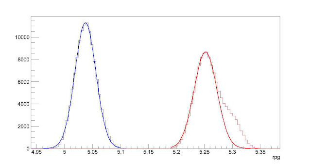
Back to the question above about every pitcher being different, I was wrong. Using the 2012 data I created a frequency distribution for right-handed pitchers (figure 1), and as you can see there is definite focal area at around -2’ point from the centerline of the pitching rubber (and home plate).

Image

Figure 1 – Right-handed pitchers in 2012

This shows that most pitchers start from about the same side; which I determined to be the right side of the rubber (3rd base side). I determined this by adding 9” to one-half the length of the pitching rubber (24”) which comes to 21” (9”+12”). Add in arm length and you can see that using an x0 that is less than or equal to 2’ (remember we are using negatives here) should prove that the pitcher is throwing from the right side.  I would like to add that the 9” used above is based on the shoulder width of an average man, which is around 18”. This metric is based on studies on the “biacromial diameter” of male shoulders in 1970 (pg. 28 Vital and Health Statistics – Data from the National Health Survey). I think we can all agree that the 18” is probably conservative by today’s growth standards. I mentioned in the limitations of the analysis written above, I don’t account for arm length or pitcher motion. Therefore I needed to make sure that there are right-handed pitchers who are throwing from the left hand side of the rubber; just not a bunch of super long-armed, cross bodied throwers.  With the data in hand I was able to identify which pitchers had thrown the ball closer to centerline of the rubber and therefore would be good candidates for standing on the left side of the rubber. The first pitcher who had a higher (>-2) x0 value was Yovani Gallardo of the Milwaukee Brewers. Without knowing Gallardo’s motion I needed to go to the video. From the video, you can clearly see that Gallardo starts on the left side of the rubber and throws fairly conventionally, straight down the line to the batter.

I wanted to keep this as simple as possible, breaking up the pitchers in two categories – Left side or Right side. Without looking at video for each pitcher I had to come up with a tipping point for classifying the side based on the x0 data I had available. If we simply take what we determined above and correlate it to the left hand side we will come up with 1 (starting on left side of rubber) and an x0 of 0. But it isn’t quite that simple. The frequency chart shows that there are less than 1000 balls thrown in 2012 with an x0 greater than or equal to 0. Gallardo threw 504 pitches himself in 2012. So we have to increase the scope a bit. By arranging the x0 data into quartiles we see that upper or lower quartile – depending on handedness – is around -1 or 1 (remember we are using negatives) so for a right handed pitcher the x0 splits are:

Min

25%

Med

Avg

75%

Max

-5.264

-2.315

-1.868

-1.849

-1.372

2.747


For left handers:

Min

25%

Med

Avg

75%

Max

-3.787

1.455

1.953

1.924

2.401

5.378


As I am trying to stay conservative, and the fact that these are not release point numbers I use 1 and -1 as the cut off for classification based on the handedness of the pitcher. Using these numbers provided a pretty clean break in the distributions (90-10%).

Findings

So who was right, the all star pitcher or the minor league pitching coach? Is there an advantage depending on where the pitcher stands on the rubber? Neither – both of them. It’s a tie.

What can I say; my initial analysis is a bit anticlimactic, but not because of lack of effort.  To denote the labels below:

  • LH or RH (Handedness)
  • RR or LR (Right or Left Rubber)
  • B – Balls
  • K – Strikes
  • P – In play (No Outs)
  • O – In play (Outs)
  • BackK – Called Strikes
  • FT – Two seam fastballs
  • SI – Sinkers
  • Efficiency – O/(P+O)
  • XSide – Cross Side (i.e. RH-LR or LH-RR)
  • Same side – LH-LR or RH-RR


LHData

194487

pitches
LH_LR

173145

89.03%

LH_RR

21342

10.97%

LH_LR_B

62957

36.36%

LH_RR_B

7932

37.17%

LH_LR_K

75241

43.46%

LH_RR_K

9067

42.48%

LH_LR_O

22610

13.06%

LH_RR_O

2843

13.32%

LH_LR_P

12335

7.12%

LH_RR_P

1500

7.03%

LH_LR_FT

108600

62.72%

LH_RR_FT

15846

74.25%

LH_LR_SI

64545

37.28%

LH_RR_SI

5496

25.75%

LH_LR_BackK

34932

46.43%

LH_RR_BackK

4406

48.59%

RHData

473032

pitches
RH_LR

48791

10.31%

RH_RR

424241

89.69%

RH_LR_B

18266

37.44%

RH_RR_B

153014

36.07%

RH_LR_K

20486

41.99%

RH_RR_K

180611

42.57%

RH_LR_O

6453

13.23%

RH_RR_O

58895

13.88%

RH_LR_P

3583

7.34%

RH_RR_P

32459

7.65%

RH_LR_FT

21781

44.64%

RH_RR_FT

194582

45.87%

RH_LR_SI

27010

55.36%

RH_RR_SI

229659

54.13%

RH_LR_BackK

10520

51.35%

RH_RR_BackK

82482

45.67%

Xside  667519

pitches

Same Side
LH_RR&RH_LR

70133

10.51%

LH_LR&RH_RR

597386

89.49%

LH_RR&RH_LR_B

26198

37.35%

LH_LR&RH_RR_B

215971

36.15%

LH_RR&RH_LR_K

29553

42.14%

LH_LR&RH_RR_K

255852

42.83%

LH_RR&RH_LR_O

9296

13.25%

LH_LR&RH_RR_O

81505

13.64%

LH_RR&RH_LR_P

5083

7.25%

LH_LR&RH_RR_P

44794

7.50%

LH_RR&RH_LR_FT

37627

53.65%

LH_LR&RH_RR_FT

303182

50.75%

LH_RR&RH_LR_SI

32506

46.35%

LH_LR&RH_RR_SI

294204

49.25%

BackK

14926

50.51%

BackK

117414

45.89%

Efficiency

64.65%

Efficiency

64.53%


The efficiency is so very close. Twelve-hundredths (.12) of a percent is not a lot – 169 outs out of 140678 – but give any Chicago Cub fan five of those outs in 2003 and Mr. Bartman would be an afterthought. Which, I am sure is the way he and all Cub fans around the world would like it. The efficiency is the same, no other way to put it which is the beauty of statistics and sabermetrics. Numbers can say so much, even when they are the equal.

But the analysis wasn’t all for naught, there are some nuggets to glean from the numbers above. As a segue, I am currently watching Derek Lowe of the Texas Rangers pitch on opening night and from the left side of the rubber he throws a sinker and it dips back over the rear part of the plate for a called strike. With all of the similarities within my analysis the most striking observation is the difference in called strikes depending on the side of the rubber. If a pitcher, coach or manager could get a strike or a strike out without the fear of having a batter get a hit or moving a runner forward they would do it every time. With a five percent difference in getting a strike and not having the worry of the ball being put into play would be an interesting thing to know in some tight situations with runners on base. My thought on the difference revolves around the back door being open a little wider when it comes to getting called strikes. With a pitcher throwing X-side you can definitely see a pattern of called strikes on the same side of the plate from which the pitcher throws from. Positive numbers in figures below indicate right side of plate (1st base side)

Image

With today’s specialization where pitchers are matched up to batters based on handedness, the ability for a pitcher to throw a strike as it tails back over the plate or close to the plate (or maybe not even close for some of the pitches above ) is essential. It appears that umpires are a little more flexible with their perception of the strike zone for these pitchers as well.

Closing

I didn’t get the results that I anticipated when I started this analysis, and that is great! As a society we are determined to have a winner! Just as there is “no crying in baseball”, there are no ties in baseball. Even when there is a tie; like on a close play at first – it proverbially goes to the runner. We can’t settle for a tie…. hockey reduced ties by adding a shootout after overtime.  College football removed the tie by introducing sudden death (hopefully the bowl playoff with help eliminate the subjective BCS tie). With no clear cut advantage (read – TIE) identified in my analysis means that a more in depth analysis could/should be performed to validate. Maybe expanding the percentage of X-side pitchers to 15-20, or identifying when pitchers are throwing from the stretch and removing those instances would alter the results and provide a much needed winner? If after all analytical statistical avenues have been exhausted there’s still not a proven advantage, we can always resort to having the coach and player settle it with a coin flip?


A Case Study in Lineup Construction

Controversy and speculation have surrounded the Texas Rangers’ lineup for the better part of a year.  First, Michael Young was a consistent presence in the middle of the Rangers’ order despite lackluster performance.  More recently, the departure of Josh Hamilton and Mike Napoli have led many to speculate the Rangers’ offense would take a step back in 2013.  But how did Ron Washington’s lineups compare to an optimized lineup? How will the loss of Hamilton and Napoli affect the Rangers’ run production?

To find out, I wrote a Monte Carlo program which simulated 50 seasons of games for all 362,880 (9!) lineup combinations. It takes as input the percentage of singles, doubles, triples, home runs, walks, and strikeouts with respect to their number of plate appearances for each batter in the lineup. The outcomes of each at bat is determined by a random number generator as if each batter faces a league average pitcher, and base runners advance according to the league averages for taking extra bases. While not including all the variations of pitcher quality, player speed and defensive quality, it allows for an adequate picture of the effectiveness of various lineups.

Let’s first look at the effect of moving Young from the 5th spot to the 9th spot. We’ll start with the most frequently occurring lineup from 2012:

Ian Kinsler
Elvis Andrus
Josh Hamilton
Adrian Beltre
Micheal Young
Nelson Cruz
David Murphy
Mike Napoli
Mitch Moreland

We’ll plot a histogram of the runs per game (labeled rpg in the plots, always full 9 innings games) scored by all 362,880 possible lineup combinations, all 40,320 lineup combinations with Young batting 5th, and all 40,320 lineup combinations with Young batting 9th (y-axis is frequency of occurrence, note the logarithmic scale).

2012 Lineup distribution, Young in 5 slot vs 9 slot

Most possible lineup combinations produce the same number of runs to within a 0.1 runs per game. No matter the lineup combination, the variation of runs scored is around 16 runs a year. For the Rangers’ lineup, lineup optimization is a relatively small effect. Lineups with different hitters may show a greater or lesser dependence of lineup construction on run scoring.

The difference between moving Michael Young from 5th in the order to 9th in the order is smaller; 0.02 runs per game, or 3 runs over the course of a year. Given the hitters in the Rangers lineup, batting Young 5th in the order did not make a significant difference. But there was another option, Ron Washington could have substituted Craig Gentry for Michael Young. We again plot a histogram of the runs per game scored for all possible lineup combinations with Gentry batting (red) or Michael Young batting (blue).

Rangers Lineup Distribution, Young vs. Gentry

Again, we find the difference to be minimal; this time roughly 0.01 runs per game, or a mere 1.6 runs per season. While it was painful to watch Young batting 5th in 2012, the increased production at the bottom of the lineup largely offset the loss of production in the middle of the lineup. So what happens now that the Rangers’ lineup has lost Hamilton, Napoli and Young in exchange for AJ Pierzynski, Lance Berkman, and Leonys Martin/Craig Gentry? Based on Ron Washington’s lineups in spring training, a likely common lineup for the Rangers in 2013 is as follows:

Ian Kinsler
Elvis Andrus
Lance Berkman
Adrian Beltre
Nelson Cruz
AJ Pierzynski
David Murphy
Mitch Moreland
Leonys Martin

I ran all possible lineup combinations in which Adrian Beltre batted 2nd, 3rd or 4th for both the 2012 and likely 2013 Rangers’ lineup. For the 2013 Rangers’ lineup, I used projections (ZiPS, Steamer, Oliver, Bill James) for the upcoming season to seed the simulation with the hitters’ likely production. Again, a histogram of runs scored per game for all these lineup combinations, with 2012 in blue and 2013 in red.

2013 Rangers Lineup Distribution vs 2012 Lineup Distribution

The peaks as fit predict a 0.22 runs per game increase for the Rangers in 2013, or roughly 36 runs over the course of the year. The non-Gaussian (or normal distribution) tail of the 2013 distribution indicates it might be possible to improve even more.

We will finish with comparisons of the optimized lineups for 2012 and 2013 to the most usual/expected lineups for those years.

2012 Lineup 2012 Optimized 2013 Lineup 2013 Optimized
5.03 rpg 5.11 rpg 5.29 rpg 5.34 rpg
Ian Kinsler David Murphy Ian Kinsler Ian Kinsler
Elvis Andrus Adrian Beltre Elvis Andrus Lance Berkman
Josh Hamilton Josh Hamilton Lance Berkman Leonys Martin
Adrian Beltre Mitch Moreland Adrian Beltre Adrian Beltre
Micheal Young Nelson Cruz Nelson Cruz Nelson Cruz
Nelson Cruz Mike Napoli AJ Pierzynski Mitch Moreland
David Murphy Ian Kinsler David Murphy AJ Pierzynski
Mike Napoli Micheal Young Mitch Moreland David Murphy
Mitch Moreland Elvis Andrus Leonys Martin Elvis Andrus

We’ll start with the big picture. While moving/substituting for Michael Young in 2012 would have made little difference in run production, an optimized lineup would have increased the Rangers’ run total by 13 runs over the course of the year. Not much, but it would likely have been enough to have won the division instead of losing to the A’s. Of course, it is much easier to optimize a lineup when you already know how everyone is going to perform; using an optimized lineup based on 2012 projections wouldn’t have netted the 13 run increase. Most notably, leading off with Murphy (in his breakout year) instead of Kinsler (in his down year) to increase production is not a move one could expect an organization to predict before any games had been played in 2012.

Second, the probable lineup for the Rangers in 2013 is projected to score 8 runs a year less than an optimized lineup. Given the large variance in the production of a hitter as compared to his projections, these lineups seem virtually equivalent.

The optimized lineups show different characteristics than the lineups generated by Ron Washington. The optimized lineups forego Elvis Andrus batting second in preference for a power hitter with good average. Elvis Andrus is instead relegated to the 9th spot. The 2013 optimized lineup puts a lot of faith in rookie Leonys Martin, due entirely to some very respectable projections for the coming year (and not knowing he’s a rookie). Given the uncertainty of how much offense Martin will produce in 2013, have Martin bat in the bottom of the order, as in Ron Washington’s lineup, seems prudent. Finally, Mitch Moreland is preferred in the middle of the lineup in the optimized lineups instead of the bottom of the order as in Washington’s lineups.

If the Rangers are looking to optimize their lineup for 2013, this simulation indicates the two main points to consider: moving Moreland to the middle of the order, and considering batting Andrus 9th.


The True Dickey Effect

Most people that try to analyze this Dickey effect tend to group all the pitchers that follow in to one grouping with one ERA and compare to the total ERA of the bullpen or rotation. This is a simplistic and non-descriptive way of analyzing the effect and does not look at the how often the pitchers are pitching not after Dickey.

I decided to determine if there truly is an effect on pitchers’ statistics (ERA, WHIP, K%, BB%) who follow Dickey in relief and the starters of the next game against the same team. I went through every game that Dickey has pitched and recorded the stats (IP, TBF, H, ER, BB, K) of each reliever individually and the stats of the next starting pitcher if the next game was against the same team. I did this for each season. I then took the pitchers’ stats for the whole year and subtracted their stats from their following Dickey stats to have their stats when they did not follow Dickey. I summed the stats for following Dickey and weighted each pitcher based on the batters he faced over the total batters faced after Dickey. I then calculated the rate stats from the total. This weight was then applied to the not after Dickey stats. So for example if Francisco faced 19.11% of batters after Dickey, it was adjusted so that he also faced 19.11% of the batters not after Dickey. This gives an effective way of comparing the statistics and an accurate relationship can be determined. The not after Dickey stats were then summed and the rate stats were calculated as well. The two rate stats after Dickey and not after Dickey were compared using this formula (afterDickeySTAT-notafterDickeySTAT)/notafterDickeySTAT. This tells me how much better or worse relievers or starters did when following Dickey in the form of a percentage.

I then added the stats after Dickey for starters and relievers from all three years and the stats not after Dickey and I applied the same technique of weighting the sample so that if Niese’12 faced 10.9% of all starter batters faced following a Dickey start against the same team, it was adjusted so that he faced 10.9% of the batters faced by starters not after Dickey (only the starters that pitched after Dickey that season). The same technique was used from the year to year technique and a total % for each stat was calculated.

Here is the weighted year by year breakdown of the starters’ statistics following Dickey and a total (- indicates a decrease which is desired for all stats except K%):

2012:
ERA: -46.94%  with 5/5 starters seeing a decrease
WHIP: -16.16% with 4/5 seeing a decrease
K%: 47.04% with 4/5 seeing an increase
BB%: 6.50% with 3/5 seeing a decrease
HR%: -50.53% with 5/5 seeing a decrease
BABIP: -14.08% with 4/5 seeing a decrease
FIP: -25.17% with 5/5 seeing a decrease

2011:
ERA: 17.92%  with 0/3 seeing a decrease
WHIP: -9.63% with 2/3 seeing a decrease
K%: -2.64% with 2/3 seeing an increase
BB%: -15.94% with 2/3 seeing a decrease
HR%: -9.21% with 2/3 seeing a decrease
BABIP: -15.14% with 2/3 seeing a decrease
FIP: -5.58% with 2/3 seeing a decrease

2010:
ERA: -23.82%  with 5/7 seeing a decrease
WHIP: 1.68% with 5/7 seeing a decrease
K%: -22.91% with 1/7 seeing an increase
BB%: -2.34% with 5/7 seeing a decrease
HR%: -43.61% with 5/7 seeing a decrease
BABIP: -3.61% with 4/7 seeing a decrease
FIP: -10.61% with 5/7 seeing a decrease

Total:
ERA: -17.21%  with 10/15 seeing a decrease
WHIP: -8.10% with 11/15 seeing a decrease
K%: -3.38% with 7/15 seeing an increase
BB%: -5.17% with 10/15 seeing a decrease
HR%: -32.96% with 12/15 seeing a decrease
BABIP: -11.04% with 10/15 seeing a decrease
FIP: -13.34% with 12/15 seeing a decrease

So for starters that pitch in games following Dickey against the same team, it can be concluded that there is an effect on ERA, WHIP, BABIP, and FIP and a slight effect on BB% and on K%. There is also a large effect on HR rates which we can attribute the ERA effect to. This also tells us that batters are making worse contact the day after Dickey.

So a starter (like Morrow) who follows Dickey against the same team can expect to see around a 17.2% reduction in his ERA that game compared to if he was not following Dickey against the same opponent. For example if Morrow had a 3.00 ERA in games not after Dickey he can expect a 2.48 ERA in games after Dickey.

So if in a full season where Morrow follows Dickey against the same team 66% of the time (games 2 and 3 of a series) in which he normally would have a 3.00 ERA without Dickey ahead of him, he could expect a 2.66 ERA for the season. This seams to be a significant improvement and would equate to a 7.6 run difference (or 0.8 WAR) over 200 innings.

Here is a year by year breakdown of relievers after Dickey (these are smaller sample sizes so I will not include how many relievers saw an increase or decrease):

2012:
ERA: -25.51%
WHIP: -1.57%
K%: 27.04%
BB%: -49.25%
HR%: -34.66%
BABIP: 30.23%
FIP: -38.34%

2011:
ERA: -17.43%
WHIP: 8.45%
K%: 6.74%
BB%: -5.14%
HR%: 7.34%
BABIP: 9.75%
FIP: -2.05%

2010:
ERA: -2.55%
WHIP: 7.69%
K%: -9.28%
BB%: 10.84%
HR%: 2.11%
BABIP: 4.23%
FIP: 9.43%

Total:
ERA: -16.61%
WHIP: 5.38%
K%: 7.50%
BB%: -12.65%
HR%: -8.53%
BABIP: 13.38%
FIP: -10.40%

As expected there was a good effect on the relievers’ ERA, FIP, K%, and BB%, but the WHIP and BABIP were affected negatively. This tells me that the batters were more free swinging after just seeing Dickey (more hits, less walks, more strikeouts).

So in a season where there are 55 IP after Dickey in games (like in 2012) there would be a 16.6% reduction in runs given up in those 55 innings. If the bullpen’s ERA is 4.20 without Dickey it can be expected to be 3.50 after Dickey. Over 55 IP this difference would save 4.3 runs (or 0.4 WAR).

Combine this with the saved starter runs and you get 11.9 runs saved or (1.2 WAR). This is Dickey’s underlying value with the team that he creates by baffling hitters. This 1.2 WAR is if Morrow has a 3.00 ERA normally and the bullpen has a 4.00 ERA. If Morrow normally had a 4.00 ERA than his ERA would reduce to 3.54 over the season with 10.2 runs saved for 200 innings (1.0 WAR) and if the bullpen has a 4.00 ERA normally as well, 4.1 runs would be saved there, equating to 14.3 runs saved or a 1.4 WAR over a season.


Johnny B. Goode

Controlling the run game, pitcher fielding and ERA

Run & Glove

Johnny Cueto has been mocking his peripherals ever since his big league debut.  For the most part FIP serves as a terrific gauge for pitcher performance, but in 2011 Cueto made FIP look like a heart monitor trying to explain the weather.  On what most consider a separate note, base runners have a healthy and robust fear of Cueto’s pickoff move, which is one of the best in the show.

FIP measures outcomes a pitcher can control (home runs, walks and strikeouts) and chalks the rest up to random variation.  Studies have shown that stolen bases contribute relatively little to run creation and perhaps on that basis the ability to control the run game has generally been ignored or deemed overrated.

It is difficult, however, to ignore the six runs Cueto saved the Reds via his contributions to controlling the run game in 2012.  By contrast, A.J. Burnett’s inability to control runners cost the Pirates four runs. The typical scale is that 10 runs amount to one team win – and teams will pay about $5 million per win.

Acknowledging run game control cannot fully explain how Cueto has routinely outperformed his peripherals, just as it cannot wholly explain Pittsburgh’s inability to keep pace with Cincinnati in the NL Central last season.  It does, however, get us closer.

Incorporating a pitcher’s fielding ability proved of comparative importance in explaining and predicting performance.  Here we’ll turn to Mark Buehrle, whose glove has saved four runs per year since 2004, and among fellow hurlers the fast-working lefty has been one of the decade’s most steadily superb fielders.  FIP underestimated Buehrle in eight of the past nine seasons, slighting his ERA by an average of .30 per year over that span.

Numbers

 The numbers indicate that a pitcher’s defense and ability to control the run game should both be considered in assessing and forecasting the pitcher’s value.

Focusing on seasons in which pitchers hurled 100 same-league (AL or NL) innings from 2003-2012 (n=1400), I ran a multiple linear regression to create a formula (“MBRA”) incorporating run control (rSB) and pitcher fielding (rPM) on top of line drive and infield fly ball percentages (credit to BABIP guru Steve Staude) and a regressed take on FIP.

MBRA = (55.25*HR + 14.05*BB – 8.57*K)/TBF – .041*rPM – .056*rSB + (5.71*LD – 8.27*IFFB)/(LD+GB+FB) + 2.34 

Correlation

Mean Absolute Error

MBRA

.7750

.4570

FIP

.7647

.4697

BERA

.7477

.4922

tERA

.7472

.5616

MBRAT

.7216

.5394

xFIP

.6451

.5649

SIERA

.6290

.5768


MBRA is engineered to properly credit pitchers who can field and control the run game.  When I subtracted MBRA from FIP to locate the pitcher-seasons that benifitted most from my formula, I was encouraged seeing Buehrle show up twice in the top ten, and five times in the top 100 (again, that is out of 1400).

Next, I looked at seasons in which pitchers threw 100 same-league innings in consecutive seasons from 2003 to 2012 (n=791).  This time I ran a regression to create a model suited to predict a pitcher’s ERA based on his previous year’s statistics.

MBRAT = (20.12*HR + 7.13*BB – 6.7*K)/TBF -.025*rPM -.034*rSB + 2.37*ZC% + 2.22


Correlation

Mean Absolute Error

MBRAT

.4526

.6498

SBERA

.4398

.6582

BERA

.4347

.6634

xFIP

.4220

.6803

MBRA

.4198

.6987

FIP

.4162

.7024

ERA

.3630

.7920

MBRAT stands tall on the lofty pinnacle of public forward-looking ERA estimators, and if you factor in the percentage at which pitchers throw over the edge of the plate (EDGE%) its correlation jumps even higher (.4621).  Unfortunately, I only have Edge% data from 2008 to 2012 (n=362) and cannot yet justify its inclusion.

On Deck

I will create expectations for pitchers with fewer innings pitched and convert my findings to a WAR measure that may serve as a middle-ground between fWAR and rWAR.  I also stumbled on a potentially significant relationship between pick-off attempts and strand rates that may work its way into future formulas.


Evaluating 2012 Projections

Evaluating 2012 Projections

Hello loyal readers.  It’s time for the annual evaluation of last year’s player projections.  Last year saw Gore, Snapp, and Highly’s Aggpro forecasts win among hitter projections (http://www.fangraphs.com/community/comparing-2011-hitter-forecasts/) and Baseball Dope win among pitchers http://www.fangraphs.com/community/comparing-2011-pitcher-forecasts/ .  In general, projections computed using averages or weighted averages tended to perform best among hitters, while for pitchers, structural models computed using “deep” statistics (k/9, hr/fb%, etc.) did better.

2012 Summary

In 2012, there were 12 projections submitted for hitters and 12 for pitchers (11 submitted projections for both).  The evaluation only considers players where every projection system has a projection.

Read the rest of this entry »


Introducing BERA: Another ERA Estimator to Confuse You All

Coming up with BERA… like its [almost] namesake might say, it was 90% mental, and the other half was physical.  OK, maybe he’d say something more along the lines of “what the hell is this…” but that’s beside the point.    By BERA, I mean BABIP-estimating ERA (or something like that… maybe one of you can come up with something fancier).  It’s an ERA estimator that’s along the lines of SIERA, only it’s simpler, and—dare I say—better.

You know, I started out not knowing where I was going, so I was worried I might not get there.  As you may recall, I’ve been pondering pitcher BABIPs for a little while here (see article 1 and article 2), and whereas my focus thus far had been on explaining big-picture, long-term BABIP stuff in terms of batted ball data, one question that remained was how well this info could be used to predict future BABIPs.  After monkeying around with answering that question, though, I saw that SIERA’s BABIP component could be improved upon, so I set to work in coming up with BERA.  In doing so, I definitely piggybacked off of FIP and a little of what SIERA had already done.  You can observe a lot just by watching, you know.   I’m also a believer in “less is more” (except for when it comes to the size of my articles, obviously), so I tried to go for the best compromise of simplicity and accuracy that I could.

Read the rest of this entry »


Is Rebuilding Worth It?

Every year the least competitive MLB teams decide whether they will commit to “going for it” the next season, or take a step back and wait for some of their cost-controlled young players to develop into big league contributors, then invest money in the team at that time a year or two down the road.  If the situation is dire, the media and baseball executives alike will start kicking the tires on an organization needing an all-out rebuild.  In this case, teams trade away every expensive, though often productive, veteran for young prospects that can hopefully help form a more competitive and sustainable team in a few years in part due to a higher production to salary ratio.  A judgment is made that investing money into the major league portion of the organization will not yield worthwhile results in the upcoming seasons, leading to declining attendance and television ratings.  That money would be better spent on the draft and developing the players acquired through trades of the more expensive players on the team.  These often publicly announced plans usually have estimated times to completion ranging from 3-5 years, often coinciding with a new baseball executive’s contract length within a year or two.  I set out to measure the results of this strategy as it applies to total revenue, as well as how it works out in terms of return on investment.

Read the rest of this entry »


BABIP and Innings Pitched (Plus, Explaining Popups)

In my last post on explaining pitchers’ BABIPs by way of their batted ball rates, I was very careful to say that it was applicable in the long run, as it’s hard to be accurate over a short number of innings pitched, due to all the “noise” in BABIP (Batting Average on Balls In Play).  I only used pitchers with a qualifying number of innings pitched (IP) in the calculations, for that reason.  After writing the post, I did some messing around with the data, to find out just how much of an effect IP had on the predictability of BABIP.

Hold on to your propeller beanies, fellow stat geeks: the correlation between xBABIP and BABIP went from 0.805 when the minimum IP was set to 1500, to 0.632 at a 200 IP minimum, down to 0.518 at 50 IP.  OK, maybe it’s not that surprising.  Still, I thought I’d better show you how confident you can be in my xBABIP formula’s accuracy when you take the pitcher’s innings pitched into account.

The formula, again: xBABIP = 0.4*LD% – 0.6*FB%*IFFB% + 0.235

And remember, that formula is primarily meant to be a backwards-looking estimator of “true,” defense-neutral BABIP.  My next article will (probably) discuss another formula I’ve come up with that’s more forward-looking.

Read the rest of this entry »


Projecting BABIP Using Batted Ball Data

Hi everybody, this is my first post here. Today, I’ll be sharing some of my BABIP research with you. There will probably be several more in the near future.

Now, I don’t know about you, but Voros McCracken’s famous thesis stating that pitchers have practically no control over their batting average on balls in play (BABIP) always seemed counterintuitive to me, ever since I heard it about 10 years ago. Basically, my thought this whole time was that if an Average Joe were pitching to an MLB lineup, the hitters would rarely be fooled by the pitches, and would be crushing most of them, making it very tough on the fielders. Think Home Run Derby (only with a lot more walks). Now, the worst MLB pitcher is a lot closer in ability to the best pitcher than he is to an Average Joe, but there still must be a spectrum amongst MLB pitchers relating to their BABIP, I figured. After crunching some numbers, I have to say that intuition hasn’t completely failed me.

This is going to be a long article, so if you want the main point right here, right now, it’s this: in the long run, about 40% or more of the difference in pitchers’ BABIPs can be explained by two factors that are independent of their team’s defense: how often batters hit infield fly balls and line drives off of them. It is more difficult to predict on a yearly basis, where I can only say that those factors can predict over 22% of the difference. Line drive rates are fairly inconsistent, but pop fly rates are among the more predictable pitching stats (about as much as K/BB). I’ll explain the formula at the very end of the article.

Read the rest of this entry »


Part II: Curveball Velocity, Location, or Movement: What is more important?

Stated in as simplest terms as possible, the goal of pitching is to get batters out without allowing runs to score. There are three ways any given pitch can get a batter out. A pitch can either be swung on and missed, taken for a called strike, or batted in such a way that the batted ball does not result in the runner reaching base. Batted balls involve the defence and are therefore less directly related to the pitch’s effectiveness at getting outs. That leaves us with swinging strikes and called strikes as the two best ways to measure a pitch’s effectiveness.

In Part I of my research on curveballs, I looked at what makes a curveball effective from a swinging strike perspective. I used an outcome variable that I like to call: ratio of effectiveness. Ratio of effectiveness is simply a ratio between swinging strikes and home runs hit. In Part II of my research, I will look at the effectiveness of curveballs from a called strike perspective. This work will aim to answer two basic questions: 1) are curveballs taken for strikes more often than fastballs? And 2) what are the characteristics of curveballs most often taken for strikes?

Are curveballs taken for strikes more often than fastballs?

Read the rest of this entry »