BABIP and Innings Pitched (Plus, Explaining Popups)
In my last post on explaining pitchers’ BABIPs by way of their batted ball rates, I was very careful to say that it was applicable in the long run, as it’s hard to be accurate over a short number of innings pitched, due to all the “noise” in BABIP (Batting Average on Balls In Play). I only used pitchers with a qualifying number of innings pitched (IP) in the calculations, for that reason. After writing the post, I did some messing around with the data, to find out just how much of an effect IP had on the predictability of BABIP.
Hold on to your propeller beanies, fellow stat geeks: the correlation between xBABIP and BABIP went from 0.805 when the minimum IP was set to 1500, to 0.632 at a 200 IP minimum, down to 0.518 at 50 IP. OK, maybe it’s not that surprising. Still, I thought I’d better show you how confident you can be in my xBABIP formula’s accuracy when you take the pitcher’s innings pitched into account.
The formula, again: xBABIP = 0.4*LD% – 0.6*FB%*IFFB% + 0.235
And remember, that formula is primarily meant to be a backwards-looking estimator of “true,” defense-neutral BABIP. My next article will (probably) discuss another formula I’ve come up with that’s more forward-looking.
Here’s the raw scatter plot of BABIP against IP over my main 2002-2012 sample (using the overall numbers for each pitcher):
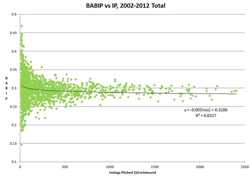
As you can see, towards the lower innings pitched, there is massive variation, but even with plenty of innings, there are still noteworthy differences between them that remain. Also notice the outliers in the lower IP area tend towards high BABIPs — they probably didn’t get much time in the MLB due to their horrible BABIPs (whether that was due to bad luck or incompetence, who knows).
Next, we have a comparison of the Mean Absolute Error (MAE) between xBABIP and actual BABIP, according to innings pitched. This was done by grouping pitchers into one of several IP categories, which you’ll see specified in the table below the graph. You can interpret the MAE as the average amount that xBABIP will be off the mark from actual BABIP, either plus or minus. It’s similar to RMSE (Root Mean Squared Error), except that RMSE basically gives an extra penalty for being further off the mark (which makes RMSE arguably more useful for comparing formulas, but more difficult to interpret and apply).
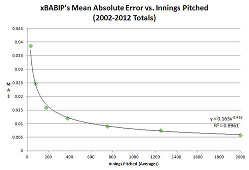
So, the formula xMAE = 0.163 * IP^-0.436 for xBABIP pretty much nails it with a 0.9961 r-squared (an r^2 of 1 is a perfect fit). That’s the overall trend, anyway — it’s a lot noisier when applied to individual pitchers instead of averages, of course. But I guess you could say the unpredictability is very predictable. Here are the average MAEs for each range of IPs, and their expected MAEs according to the formula:
| IP range | MAE | xMAE | Standard Deviation of BABIP | # of Pitchers |
| 1500 to 2500 | 0.00591 | 0.00593 | 0.01204 | 37 |
| 1000 to 1500 | 0.00764 | 0.00728 | 0.01073 | 70 |
| 500 to 1000 | 0.00918 | 0.00909 | 0.01541 | 182 |
| 250 to 500 | 0.01201 | 0.01230 | 0.01841 | 279 |
| 100 to 250 | 0.01595 | 0.01715 | 0.02357 | 365 |
| 50 to 100 | 0.02483 | 0.02481 | 0.03419 | 267 |
| 10 to 50 | 0.03869 | 0.03700 | 0.05219 | 459 |
And here are some confidence measures:
| IP range | Percent of the time MAE is less than: | |||||||
| 0.005 | 0.01 | 0.015 | 0.02 | 0.025 | 0.03 | 0.035 | 0.04 | |
| 1500 to 2500 | 55.3% | 76.3% | 97.4% | 100.0% | 100.0% | 100.0% | 100.0% | 100.0% |
| 1000 to 1500 | 40.0% | 70.0% | 87.1% | 95.7% | 100.0% | 100.0% | 100.0% | 100.0% |
| 500 to 1000 | 29.7% | 59.9% | 84.6% | 95.6% | 96.2% | 98.4% | 99.5% | 100.0% |
| 250 to 500 | 26.2% | 48.4% | 65.2% | 81.4% | 91.0% | 95.7% | 98.6% | 99.6% |
| 100 to 250 | 21.1% | 39.7% | 58.4% | 68.8% | 80.0% | 85.5% | 91.0% | 94.2% |
| 50 to 100 | 12.7% | 24.3% | 36.7% | 49.1% | 57.3% | 66.3% | 71.5% | 79.4% |
| 10 to 50 | 6.5% | 14.2% | 19.4% | 24.6% | 29.1% | 34.6% | 40.5% | 47.1% |
So, you could say the standard 95% confidence interval can be achieved to within 0.020 points BABIP when there are over 500 IP. However, when there are fewer than 100 IP of data to work with, there’s not much you can be very sure of.
Explaining Popups
If you read my last article, you know that I see popups (defined as FB%*IFFB%) as the main key to distinguishing pitchers’ BABIPs. I took a little time to see if some of the factors I uncovered as being correlated to infield fly balls could be used to come up with an estimation of the rate. Specifically, I went for factors that are no-doubt-about-it controlled by the pitcher. Here are the variables:
xPU% = expected popup percentage (also known as xFB%*IFFB%)
FA% = percentage of 4-seam fastballs thrown
FAZ = vertical movement on 4-seamers (positive values means it rises relative to a spinless ball)
SI% = percentage of sinkers thrown
FAvCH = the difference in speed between the pitcher’s 4-seamer and changeup (=vFA – vCH)
Zone% = Percentage of pitches thrown in the zone
I won’t worry about trying to simplify the formula down, because I figure hardly anybody is actually going to try to use this:
xPU% = 0.00289*FA%*FAZ + 0.00189*FAZ – 0.01815*FA% -0.00589*SI% + 0.00111*FAvCH + 0.05398*Zone% – 0.02040
The results: a 0.627 correlation to FB%*IFFB%, and a MAE of 0.789% (the mean and standard deviation of actual FB%*IFFB% are 3.616% and 1.308%, respectively). Considering this doesn’t even take into account pitch locations (other than the vague Zone%), and that 5 variables are a pretty small piece of the overall puzzle, this seems pretty good to me.
If you’re curious, xPU% according to this formula has a -0.172 correlation to BABIP, -0.199 to HR/FB, and 0.388 to K% (which means pitchers with high xPU% tend to look better in all these areas), but on the downside, a 0.219 correlation to LD%. It has almost no apparent connection to ERA (-0.045 correlation).
Updates to My Previous Article
I had included the stat Pace (which is the time a pitcher takes between pitches) as an interesting correlate to some factors (especially K%), but as J. Cross of Steamer Projections pointed out to me in a conversation on the Inside the Book site, Pace is mainly explained by % of innings as a starter. For whatever reason, relievers tend to wait longer between pitches, but they also tend to strike out more hitters and generally have lower BABIPs as well. I suspect the latter two points have a lot to do with my sample — the worse (or unluckier) relievers weren’t used enough to meet the IP requirements, so were excluded from consideration.
Matthew Cornwell, in that same discussion, brought up how extreme groundball pitchers tend to have lower than expected BABIPs. I made a scatter plot and found that there appears to be some truth to that:
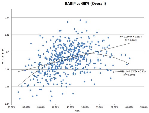
The quadratic equation that dips a bit towards the extreme GB% legitimately does work better than the linear one, as the r^2 numbers show. Apparently, the new version of SIERA employs something along those lines as part of its formula. It does make some sense — the extreme GB% pitchers are probably getting more of the ground ball equivalent of a popup: the chopper. A chopper is far from an automatic out when the runner is fast, but it’s still a desirable thing overall, I’m sure.
A similar trend exists for OFFB%, or outfield fly ball percentage, which is FB% – FB%*IFFB%. Actually, it’s an even stronger effect, although apparently IFFB%*FB% itself captures a lot of it.
I applied all this new knowledge to coming up with a new xBABIP formula, and the effects were pretty modest, I have to say. Here it is:
xBABIP = 0.59*LD% – 0.31*FB%*IFFB% + 0.39*LD% – 0.22*LD%^2 + 0.21*OFFB% – 0.08*OFFB%^2
Over the same sample I used in the last article (qualified IP = 300+), there was only a 0.005 improvement in correlation, and a 0.00014 improvement in MAE, compared to the simple version. Not a big upgrade for all that extra complexity, but there you have it.
Thanks again to J. Cross for providing me with the pitcher handedness data. Unfortunately, there’s not a lot I can say about it, other than that lefties had a BABIP a little under 0.002 higher than righties over my data set.
…
It’s now almost a couple weeks after I initially submitted this article (I’m waiting for it to be published), and Eno Sarris just posted an article today that compares my formula (the simple version) to SIERA’s BABIP component, which uses the formula: 0.295 + 0.045*GB% – 0.103*K%. I thought I’d put them head-to-head according to different criteria. A couple I’ll introduce now: wMAE and wRMSE, which are the weighted versions of MAE and RMSE (in this case, weighted by innings pitched). I’m also including results for J Cross’ formula, which is: 0.67*LD% + 0.24*GB% + 0.17*OFFB% (OFFB% means outfield fly ball percentage, which is the fly balls that aren’t infield fly balls, of course). This comparison, as usual, is for qualified pitchers (>300 IP) over the span of 2002-2012:
| xBABIP (simple) | xBABIP (complex) | SIERA BABIP | J Cross | |
| Correlation to BABIP | 0.62800 | 0.63434 | 0.40811 | 0.60725 |
| MAE | 0.00961 | 0.00947 | 0.01125 | 0.00980 |
| wMAE | 0.00854 | 0.00848 | 0.01041 | 0.00885 |
| RMSE | 0.01207 | 0.01201 | 0.01416 | 0.01244 |
| wRMSE | 0.01078 | 0.01076 | 0.01306 | 0.01127 |
As Eno correctly points out, putting a lot of weight on line drives does hurt the value for forecasting future BABIPs, since line drives are hard to predict. But an article with a new formula tailored to predicting future BABIPs is in the works. I’ll compare that formula to all of these.
I also have to say, as you can see from the effect of IP, don’t use only one season worth of batted ball data if you’re trying to project the next season — you’re much better off using several years’ worth.
…
I’ll leave you now with a couple of lists — the pitchers whose BABIPs from 2002-2012 are worst explained by the new, improved(?) formula, either due to good luck or misfortune, their defenses, or something else the formula just can’t explain. They were selected for having the highest combinations of innings pitched and deviations from actual BABIP (but then listed according to the deviation afterwards):
“Luckiest” Pitchers
| IP | BABIP | xBABIP (simple) | xBABIP (complex) | Expected – Actual | |
| Jeremy Hellickson | 402.1 | 0.244 | 0.2817 | 0.2831 | 0.0391 |
| Jason Isringhausen | 508.1 | 0.252 | 0.2844 | 0.2875 | 0.0355 |
| Billy Wagner | 559.2 | 0.252 | 0.2833 | 0.2851 | 0.0331 |
| Justin Duchscherer | 440 | 0.261 | 0.2927 | 0.2935 | 0.0325 |
| Kirk Rueter | 648.1 | 0.285 | 0.3048 | 0.3066 | 0.0216 |
| Greg Maddux | 1457.1 | 0.287 | 0.3063 | 0.3080 | 0.0210 |
| Tom Glavine | 1293.1 | 0.284 | 0.3027 | 0.3049 | 0.0209 |
| Roger Clemens | 1029.2 | 0.28 | 0.2965 | 0.2989 | 0.0189 |
| Russ Ortiz | 951 | 0.287 | 0.3005 | 0.3034 | 0.0164 |
| Tim Hudson | 2108.2 | 0.279 | 0.2961 | 0.2952 | 0.0162 |
| Chris Carpenter | 1422 | 0.285 | 0.2992 | 0.3009 | 0.0159 |
| Jon Garland | 1896.2 | 0.283 | 0.2958 | 0.2984 | 0.0154 |
| Carlos Zambrano | 1951.1 | 0.277 | 0.2886 | 0.2918 | 0.0148 |
| Cory Lidle | 951.1 | 0.295 | 0.3070 | 0.3096 | 0.0146 |
| Matt Cain | 1536.2 | 0.264 | 0.2779 | 0.2784 | 0.0144 |
| Barry Zito | 2129.1 | 0.269 | 0.2816 | 0.2830 | 0.0140 |
| Kenny Rogers | 1253.1 | 0.294 | 0.3048 | 0.3073 | 0.0133 |
| Ted Lilly | 1807.1 | 0.265 | 0.2765 | 0.2761 | 0.0111 |
| Johan Santana | 1896 | 0.272 | 0.2803 | 0.2814 | 0.0094 |
| Roy Halladay | 2351 | 0.29 | 0.2942 | 0.2961 | 0.0061 |
“Unluckiest” Pitchers
| IP | BABIP | xBABIP (simple) | xBABIP (complex) | Expected – Actual | |
| Felipe Paulino | 385.1 | 0.335 | 0.2917 | 0.2916 | -0.0434 |
| Manny Parra | 513 | 0.337 | 0.3012 | 0.3031 | -0.0339 |
| Kevin Slowey | 532.2 | 0.31 | 0.2845 | 0.2802 | -0.0298 |
| Shawn Camp | 566 | 0.323 | 0.2957 | 0.2963 | -0.0267 |
| Kyle Davies | 768 | 0.318 | 0.2933 | 0.2932 | -0.0248 |
| Scott Kazmir | 1022 | 0.302 | 0.2788 | 0.2790 | -0.0230 |
| Sidney Ponson | 1055 | 0.318 | 0.2977 | 0.2994 | -0.0186 |
| Jeff Francis | 1178.2 | 0.313 | 0.2923 | 0.2945 | -0.0185 |
| Scott Baker | 958 | 0.302 | 0.2851 | 0.2838 | -0.0182 |
| Max Scherzer | 804.2 | 0.312 | 0.2930 | 0.2939 | -0.0181 |
| Kelvim Escobar | 916.1 | 0.304 | 0.2852 | 0.2873 | -0.0167 |
| Zach Duke | 1054.2 | 0.323 | 0.3047 | 0.3063 | -0.0167 |
| Curt Schilling | 1102.1 | 0.307 | 0.2902 | 0.2917 | -0.0153 |
| Chris Capuano | 1162 | 0.297 | 0.2815 | 0.2839 | -0.0131 |
| Aaron Harang | 1802 | 0.305 | 0.2918 | 0.2924 | -0.0126 |
| Zack Greinke | 1492 | 0.308 | 0.2965 | 0.2977 | -0.0103 |
| Cliff Lee | 1852.2 | 0.296 | 0.2859 | 0.2873 | -0.0087 |
| John Lackey | 1876 | 0.309 | 0.2994 | 0.3010 | -0.0080 |
Lowest xBABIPs according to complex formula (new addition)
| BABIP | Simple | Complex | SIERA’s | |
| Tyler Clippard | 0.246 | 0.2438 | 0.2368 | 0.2743 |
| Chris Young | 0.254 | 0.2592 | 0.2530 | 0.2815 |
| Russ Springer | 0.261 | 0.2662 | 0.2603 | 0.2807 |
| Carlos Marmol | 0.257 | 0.2645 | 0.2625 | 0.2746 |
| Takashi Saito | 0.276 | 0.2606 | 0.2630 | 0.2779 |
| Armando Benitez | 0.25 | 0.2646 | 0.2634 | 0.2804 |
| Octavio Dotel | 0.269 | 0.2685 | 0.2657 | 0.2745 |
| Robinson Tejeda | 0.278 | 0.2674 | 0.2659 | 0.2856 |
| Jon Rauch | 0.273 | 0.2666 | 0.2661 | 0.2857 |
| Scott Proctor | 0.277 | 0.2711 | 0.2666 | 0.2848 |
| Tim Wakefield | 0.269 | 0.2642 | 0.2667 | 0.2919 |
| Julio Mateo | 0.261 | 0.2713 | 0.2678 | 0.2870 |
| Luis Vizcaino | 0.268 | 0.2659 | 0.2680 | 0.2847 |
| David Hernandez | 0.279 | 0.2724 | 0.2688 | 0.2798 |
| Ramon Ramirez | 0.272 | 0.2666 | 0.2690 | 0.2880 |
| Joe Nathan | 0.255 | 0.2680 | 0.2699 | 0.2763 |
| Chad Cordero | 0.257 | 0.2730 | 0.2701 | 0.2837 |
| Orlando Hernandez | 0.274 | 0.2687 | 0.2702 | 0.2855 |
| Jered Weaver | 0.271 | 0.2723 | 0.2702 | 0.2837 |
Steve is a robot created for the purpose of writing about baseball statistics. One day, he may become self-aware, and...attempt to make money or something?
Great work.
Thanks David, glad you liked it.
Thought I’d better add for everybody that, in my opinion, speed off of the bat is probably the biggest missing component of my formula — not all line drives are created equal (nor are grounders and fly balls). There are a lot of outstanding pitchers on the “luckiest” list, some of whose success could have been created by inducing weaker contact through better pitch location or smarter strategies.
There are also defense and park factors in the mix, of course. Schilling probably owed a lot of his “unluckiness” over 2002-2007 to The Green Monster. His career BABIP is actually very close to what my formula pegged him at based on his ’02-’07 batted ball rates: 0.293 (my formulas said 0.290-0.292).
Great work, love reading these. Agree with the bat speed comment. Would be useful to know for players like Glavine and Maddux (although I am fairly sure hitF/x information does not date back that far). They are classified as “luckiest” pitchers, even though for them to be that “lucky” for such a long period of time some other factor(s) is clearly playing a significant role.
Great work. I’ll 2nd boss. Love this stuff.
5 of the “unluckiest” pitchers spent a significant amount of those innings in Kansas City. Just saying.
Much appreciated, boss and J. Cross.
boss, I can definitely see Maddux and Glavine being exceptional pitchers in this regard, thanks to their craftiness and control. My guess is that they did get some weaker contact thanks to more opposing batters being off-balance and taking defensive swings.
Aaron — good catch. I did notice a bit of a Royals theme as well. Well, according to UZR, the Royals ranked 22nd in the majors over 2002-2012. That’s probably part of it. The rest?…
Well, here’s one interesting thing to look at: http://www.fangraphs.com/guts.aspx?type=pf&season=2011&teamid=0 Kansas City, if I’m interpreting it correctly, consistently sees the fewest infield popups of anywhere. I’m kind of dumbfounded as to why that is — the foul territory in Kauffman Stadium doesn’t look small around the infield. Maybe the lights are bad and make fielders miss foul popups? I don’t get it. Perhaps the scorers in KC are just less likely to call something an infield fly ball? Though, that would seem like it would be more likely to make a pitcher look “lucky” in my formula. Weird. Maybe it’s just a fluke.
I think you’re on to something with the 4 seam Fastball Percentage. I incorporated K% into my xBABIP pitcher work, but I suspect a lot of the reason that works is because high K% pitchers generally use 4 seam fastballs (in turn generating more IFFB’s)
Yeah, I agree. I talked about how strikeout pitchers and popup pitchers tend to share the traits of throwing a lot of 4-seamers and “rising” fastballs in the last article. I think the connection between K% and popup rate explains a significant chunk of the success of formulas like FIP.
nice job. one word of caution re: your BABIP vs. Groundball fits:
if you want to argue that BABIP is unimodally distributed , you can’t just compare the goodness-of-fit estimators because there’s a good chance you’re overfitting the model.
If you are going to argue against a linear response at high GB-rate, for what it’s worth, I’d think the data would be most likely to follow a sigmoidal response curve than anything else, simply from what the data “look” like. Either way, you need to actually compare the models to one another to verify that the complex model describes the relationship significantly better than the simple model.
I would be curious to know if there is any correlation between pop-up rate and strand rate. I’ve long had a conjecture that, other than hitting into a double play, the infield pop-up is the worst possible outcome for a hitter: not only is the hitter’s chance of reaching base pretty near zero, but the chance of a runner being able to move up is also pretty near zero. Even on a strikeout, the runner has a chance to advance via steal or passed ball/wild pitch. But on a pop-up, even if the fielder muffs it, if there are runners on (and less than two out) the odds are pretty good that an out will result.
On top of 5 people from KC you have Parra and Capuano who played on a bunch of really awful defensive Brewer teams. I would guess one big missing factor in this is pitch counts. BABIP varies pretty heavily when ahead or behind in the count and a lot of those ‘unlucky’ pitchers are the type that get behind in the count a lot.
Hey thanks for the comments jessef, it sounds like you really know your stuff (more than I do, probably). I actually did try a logistic function before the polynomial one on the GB%, and it was improvement over linear, but the polynomial was considerably ahead in terms of r^2.
Regarding overfitting, I’m not sure whether this will assuage your concerns, but I did remove the extreme GB% outliers and saw that the curve still stayed about the same. After reading your comment, I split the pitchers randomly into three groups, and ran linear, logistic, and polynomial regressions on them, and also found that the curves for the polynomial functions stayed roughly the same in all three groups, and beat out the other two types of function in terms of r^2 in all three (it beat linear by margins of 0.079, 0.066, and 0.040; it beat logistic by 0.059, 0.049, and 0.026). That being said, the idea that it would follow a logistic function, or at least have a shallower dip towards the high GB% does make more sense (I doubt a hypothetical 90% groundballer would have a BABIP that much lower than a 70%er, if at all).
I also compared my two formulas directly against each other, as I take it you were suggesting. I found that the complex version is closer to the actual BABIP 54% of the time when there’s no minimum IP, and it stays that way, plus or minus a percent until about a 300 IP minimum. Past about 500 IP minimum, they go back and forth. However, the overall difference is pretty small, and I think the simpler version is better, all things considered.
Oh, I noticed an embarrassing screw-up I made in copying my complex formula into this article: the formula here lists LD% three times, whereas I meant the latter two instances to be GB%, not LD%. Very sorry, everybody.
Dave, I think the evidence backs your idea up. LOB% (Left On Base Percentage, for everybody) has a 0.315 correlation to popup rate. It also has a -0.289 to LD% and a -0.596 to BABIP. If you’re curious, some other correlations to LOB%:
ERA: -0.858
Avg: -0.768
K%: 0.627
HR/FB: -0.421
HR/9: -0.351
OFFB%: 0.228
GB%: -0.180
Ender — well, maybe you’re right about getting behind in the count leading to a higher BABIP, but it’s not obvious in the big-picture data I’m looking at. I mean, BABIP has a -0.072 correlation to BB%, whereas I’d expect to see a positive correlation if what you’re saying is right. There’s also a -0.030 correlation between BABIP and F-Strike% (First-pitch Strike Percentage); that’s at least in the right direction for what you’re saying, but 0.03 is an extremely weak connection.
So whereas your idea does make sense to me, it looks to me that if it’s true, it’s being more than outweighed by other factors.
BABIP by count for all hitters last year.
.308 – 3-2
.307 – 3-0
.304 – 3-1
.303 – 2-1
.299 – 0-0
.299 – 1-1
.298 – 0-1
.294 – 2-2
.285 – 1-2
.276 – 0-2
.256 – 3-0
It is like that every year. It might not be a wild swing in BABIP but if you are consistently ahead vs consistently behind you are going to see a swing in BABIP. It is definitely part of the final equation though part of it might be noise caused by pitch selection.
Interesting, Ender, thanks. The low BABIP with an 0-2 count does make sense, but there are at least three things that go into that: 1) The batter taking weaker, defensive swings; 2) A good strikeout pitcher will get to more 0-2 counts than a bad one, and also will tend to have a lower overall BABIP, which skews the overall numbers towards their BABIP tendencies; and 3) A bad batter (e.g. one who swings at everything) will get into more 0-2 counts than a good one, and may also tend to have a lower BABIP. There’s probably a lot of interaction going on there, and it’d be hard to say what causes what, to what degree there.
Now, the .256 at 3-0 at the bottom of your list is probably the most interesting thing there… just want to make sure that’s right, though (I see another 3-0 second from the top, and one of them is supposed to be 2-0, I’m guessing). Anyway, where did you find that?