Archive for strike zone

Judge and Altuve: A Tale of Two Strike Zone Oddities

Aaron Judge and Jose Altuve seem like they shouldn’t coexist in Major League Baseball, but their mutual success reveals an amazing fact about different paths to pitcher dominance.

Here’s a line of reasoning using the transitive property about short hitters and small strike zones:

  • If a player is shorter, then his shoulders are closer to his knees.
  • If his shoulders are closer to his knees, his strike zone should be smaller.
  • If his strike zone is smaller, then it should be harder for the pitcher to throw strikes.
  • If it is harder to throw strikes, he should get on base more.
  • Shorter players should have higher on-base percentages.

But this isn’t how it actually works. Why not?

Aaron Judge is tall and Jose Altuve is short. That’s analysis. They both are very productive at the plate. That’s deeper analysis. However, Judge gives pitchers a 25% larger strike zone to target due to his 6-foot-7 height, so he must be doing something different and better than Altuve to offset the larger area he gifts to pitchers with every pitch.

Read the rest of this entry »

How Aaron Judge Can Turn the Corner

Yankees right fielder Aaron Judge is, to say the least, an imposing figure in the batter’s box. Judge is one of only three position players in baseball history with a height and weight of at least 6’7” and 255 pounds, respectively – the other two, for those curious, being 1960s power hitter Frank Howard and current Tigers minor league Steven Moya – and with his enormous size comes enormous strength. According to Statcast, 59.5% of Judge’s batted balls last season left the bat with an exit velocity of at least 95 miles per hour, a mark that trailed only those of the Brewers’ Domingo Santana and the Mariners’ Nelson Cruz. Further, Judge’s average exit velocity ranked second among the entire league, with only Cruz ahead of him. However, the player comparison that most swiftly comes to mind is the Marlins’ Giancarlo Stanton, who, incidentally, finished third in average exit velocity last season. When Judge truly barrels up the ball, as exemplified here, his raw power tends to elicit the type of awe usually reserved for Stanton.

Unfortunately for the Yankees, Judge was largely unable to capitalize on this strength in 2016. Although he only saw 95 plate appearances, he batted an uninspiring .179 with an astronomical 44.2% strikeout rate. Even his ISO, above average at .167, was still disappointing for a player claiming raw power as his most prominent attribute.

The Yankees, of course, were fully aware that their right fielder’s approach at the plate needed an adjustment. Said Yankees assistant hitting coach Marcus Thames during spring training:

“I thought [Judge] started expanding a little too much… At the big-league level, the game’s a little bit more physical, it’s a little bit faster and I thought it sped up on him a little bit and he started expanding.”

A cursory look at Judge’s 2016 batting statistics plate surprisingly suggests that plate discipline may not be as big a problem as one would expect based on Thames’ comments. Among 451 position players with at least ninety plate appearances in 2016, Judge’s O-Swing percentage was tied for 119th at 33.6% (27th percentile), and his Z-Swing percentage of 63.5% ranked nearly identically, at 112th (68th percentile).  Judge, surprisingly, rated fairly well in both measures: he chased far fewer balls than the average hitter, and he swung at a healthy percentage of strikes.

His contact rates, on the other hand, did not inspire quite the same sanguinity. Last season, Judge ranked dead last in overall contact percentage, as well as on pitches outside the strike zone. On pitches inside the strike zone, his contact percentage saw a slight improvement relative to his peers, but still ranked 42nd from the bottom. BaseballSavant’s pitch heatmaps suggest that Judge seemed to have the most difficulty with low and away pitches, both in and out of the strike zone. The following graph displays the locations of Judge’s swinging strikes from 2016 (not including foul balls):
2-Judge[A-SwingingStrikes]

As the preceding heatmap illustrates, the crux of Judge’s contact problems occurs in the low-and-away portions in and around the strike zone. However, a heatmap of Judge’s hardest-hit balls (exit velocity >= 100) shows that Judge’s best contact occurs on pitches that aren’t located anywhere near the low and away sections of the zone. In fact, the pitches Judge hits best are on the inside half of the plate:

2-Judge[B-100MPH]

Now, let’s see where Judge’s weaker contact (exit velocity <= 99) falls in the strike zone.

2-Judge[B-99MPH]

So, low and away pitches not only induce a league-leading whiff rate for Judge, but even when he does manage to connect, he connects with his weakest exit velocity. Marcus Thames’ comments, therefore, may require a slight adjustment: Judge didn’t necessarily expand the zone in 2016, but he certainly didn’t make the most efficient use of it. Courtesy of Brooks Baseball, the following graph illustrates Judge’s 2016 whiff rate by zone:

2-Judge[C-WhiffRateX]

From these charts, we can observe Judge’s whiff rate slowly rising from left to right (inside to outside) across the strike zone. To cut down on his high swinging-strike rate, which was the third-highest in the league among those 451 batters, Judge should reduce his swing rate on low and outside pitches – at least, until the count or game situation demands a more aggressive approach. Ahead in the count, however, Judge should look primarily for the middle-in pitches that have produced better and more frequent contact. He shouldn’t even consider swinging at anything on the outer sections of the plate, as he did last season while ahead in the count (heatmap from FanGraphs):

2-Judge[E-AheadInCount]-FanGraphs


As of Tax Day afternoon, the Yankees are only 11 games into the season, so it’s admittedly a bit early to draw any major conclusions. Even so, we should note that Judge has shown signs of legitimate improvement over last year’s campaign. In 33 at-bats, Judge is slashing .276/.364/.621, and although a 175 wRC+, .345 ISO, and 50% HR/FB rate are all but guaranteed to decline, there’s still reason to believe that Judge has made significant strides in his approach at the plate. Last year, Judge saw the 18th lowest percentage of fastballs in the league at 49.8%, a percentage that this season has dipped even further, to 45.5%. Pitchers, expecting Judge to flail as in 2016, have fed him a steady diet of low and away breaking balls. The following chart reflects all off-speed pitches Judge has faced to date in 2017:

2-Judge[D-17Offspeed]

Even with this steady diet of low and away breaking balls, Judge has managed to cut his O-Swing% from 34.9% to 23.9%, and his swinging-strike percentage has fallen from 18.1% to 12.0%. This is especially impressive considering that, like last year, pitchers have thrown him a fairly low percentage of strikes (about 41%).

The Yankees have lots of reason for optimism regarding their young slugger. As the starting right fielder in Yankee Stadium’s less-than-spacious right field, Judge’s value to his team will derive mostly from his batting output. If Judge can consistently lay off of the low and away pitches that gave him problems last year, he’ll have more opportunity to mash the balls that find the inner half of the plate – like this beauty from last Wednesday. If his early 2017 performance is any indication, Judge’s offseason adjustments have the potential to transform him into a Giancarlo Stanton-caliber power hitter.


Visualizing and Quantifying Strikes Zone Changes Over Time

This week the strike zone has been getting a lot of attention. If you’ve been paying any attention to baseball (and I’m sure you have since fantasy baseball leagues are starting to open up) there have been a few articles/releases suggesting that MLB may be considering raising the strike zone from the hollow beneath the kneecap to the top of the kneecap. It seems like a good idea since strikeout rates are on the rise, but was this a result of (1) pitchers getting better or (2) hitters getting worse or (3) have strikes been getting called differently? I’ll give you a hint; it’s neither of the first two suggestions, at least not directly. No, instead let’s focus on the strike zone and more specifically two things: (1) visualizing the strike zone from 2008 to 2015 and (2) using a standardized set of pitches look at how those pitches have been called over time.

Let’s go through the methods I used before we get to the plots. I used the pitchRx package in R to gather and store the data and used many of the functions included in the package. Next I went through the data and subset the PITCHf/x data by year since I was interested in looking at annual changes. Now due to a combination of time restraints and lack of computing power I didn’t run all of the pitches thrown in each year so I did some subsetting instead. I downloaded a CSV from the FanGraphs leaderboards of all qualified pitchers from 2008 to 2015. In each year I randomly selected 20 pitchers from the list of qualified starters to represent how the strike zone was called for that given year. Finally I ran the data through a general additive model (seen here) which was used to create the “heat maps” for the probability of called strikes in the plots below. I also tested the probability of five standard pitches being called strikes, but that is addressed a bit more later one so I won’t bore you with the details twice. Added note: if anyone actually wants a copy of the R code leave a comment below and I’ll get in contact with you.

Below I’ve included a GIF of the strike zone from 2008 to 2015 . If you watch it a few times you’ll begin to notice the gradual changes to the bottom of the strike zone, plus when it flips from 2015 to 2008 you can really notice the difference. It’s not surprising that there are inter-annual differences between the zones since I’m sure MLB makes a few minor tweaks every off-season and maybe there is a changing of the guard over time for the umps. I also need to apologize about the 2010 plot, the left (L) and right (R) are reversed and I can’t seem to switch them. We will just have to deal with that one plot being different. In all plots the label “L” refers to left-handed batters and “R” to right handed batters.

Now I wanted to find a way to quantify changes to how pitches were being called and I decided on using a set of standardized pitches. Below is a plot showing the locations I chose for my test pitches. I went with five different locations. The pitch right down the middle was my control of sorts, just to make sure things were getting called consistently over time. The remaining locations were the ones I was really interested about; three of those pitches were all located on the lower edge of the strike zone and the final pitch was located 0.2 feet or 2.4″ (the metric system would be more useful here, just sayin’) below the bottom edge of the strike zone. When I initially began this simulation I expected that the lowest pitch would be a second control pitch that would consistently be called a ball, but the results were pretty surprising. Also, I’d like to include that the strike zone to lefties is slightly shifted so that more outside pitches are called strikes.

OK so we are almost at the exciting conclusion. Using those standardized pitches from the plot above I used the general additive model to predict the probability of that pitch being called a strike in a given year. The results are summarized in the plot below. We can see that the pitch being thrown at coordinates 0, 2.5 (the one down the middle) the probability of being called a strike is basically 100% every year. Well that’s a good thing at least that call is consistent. The low pitch thrown down the middle on the bottom edge of the strike zone, coordinates 0, 1.7 (green line), has increasingly been called strike since 2008 to both right- and left-handed batters. Pitches down and in to righties increased pretty significantly this past season where the probability crept above 50%; to lefties that pitch is down and away and it’s been called pretty consistently since 2011 (red lines). Pitches thrown down and away to righties or down and in to lefties (coordinates 1, 1.7 — purple lines) haven’t changed all that much over the time period.

Now we get to what I think is the most interesting pitch. The low fastball down the middle (coordinates 0, 1.5) the one that should be out of the strike zone. This pitch is represented by the gold/yellow lines on the plots. In 2008 these pitches had a chance of being called a strike ~10% of the time to both righties and lefties. Over the last eight seasons that number has trended upwards and in the 2015 season settles in somewhere around 36-40%, which is not an insignificant proportion.

Based on this data it certainly appears as though MLB is justified into looking at raising the strike zone. Pitchers that live down in the zone have been given an increasing advantage in a relatively short amount of time. Hopefully this sheds some light onto the debate on whether or not to raise the strike zone in the coming seasons or maybe the umps will be able to make some adjustments for the upcoming season.


Automate the Strike Zone, Unleash the Offense

Hello World! As a software developer, automation is my way of life. It kills me to see the tedious yet important job of calling balls and strikes performed at less than 90% accuracy. Worse, catcher framing is now a thing, which is essentially baseball’s equivalent of selling the flop.

Today, I want to talk about how automating the strike zone would affect the MLB run-scoring environment. Don’t we all want to save the environment?

Let’s pretend that before the 2014 season, home plate umpires were fitted with earpieces giving them a simplified Pitch f(x) feed of balls and strikes. They heard a high beep for a strike, a low beep for a ball. They then called balls/strikes exactly as they were told, resulting in a perfect zone.

Experiment 1: Walks/Strikeouts overturned

The most damaging ball/strike errors happen when ball 4 or strike 3 was thrown but not called. Sometimes the umpire is redeemed by luck, and a walk/strikeout happens eventually anyway, but not nearly every time. Think of how many times you’ve seen a 3–0 count where a ball was called a strike, only to have the hitter swing and ground out harmlessly on the 3–1 pitch.

For these experiments, let’s look at short description of the situation, the number of instances of that situation in 2014, and net runs that would have been added if a perfect zone had been called.

Data courtesy of Baseball Savant; click on a situation to see the query I used.

Situation Instances Net Runs (Rough)
Strike 3 thrown, batter safe 146 -88
Ball 4 thrown, eventual out 691 415
Difference 545 327 (.07 team runs per game)

Are you surprised? The umpires made 545 more extra outs than extra ‘safes’. Using a rough walk minus out run differential of 0.6 runs, we see that a perfect zone would have added 0.07 runs per game. Interesting, but not huge.

But think again—this effect isn’t limited to plate appearances that should have ended with a bad call. We all know that the count affects the expected run value all on its own. So let’s expand this to all ‘bad calls’ in 2014.

Experiment 2: All balls/strikes called correctly

Balls and strikes don’t obviously translate to runs. So I’ll use someone else’s much more careful research and use a ball minus strike run value of approximately 0.14 runs. Here’s what happens when we apply a perfect zone to all balls and strikes. Brace yourself!

Situation Instances Net Runs (Rough)
Strike thrown, ball called 8724 -1212
Ball thrown, strike called 40557 5633
Difference 31833 4422 (.91 runs per game per team)

Whoa. Are you kidding me? If we’d run last season with a perfect strike zone, the run environment would go from 4.07 runs/game to nearly 5! That’s the highest level since 2000. I know what you’re thinking: this is crazy, and probably wrong.

Sanity checking

I also found this result to be larger than expected, to say the least. So let’s back up, check the mirrors, and look at the frequency of called strikes vs. balls.

Called Ball 233421
Called Strike 123922
Difference 109499

There are a ton more called balls than called strikes. This makes sense because batters are more likely to swing at strikes. But the ratio of balls to strikes is only about 2:1, that doesn’t account for the 5:1 ratio among ‘mistaken’ balls/strikes! How do we account for this?

A possible explanation

Here we dive into speculation, but stay with me for a minute. Maybe there’s a logical explanation.

What sequence of events must occur in order for a Pitch f(x) strike to become a ball?

  1. Pitcher throws in strike zone: ~45% (Zone %)
  2. Hitter takes said pitch in the strike zone: ~35% (100% – Z-Swing %)
  3. Umpire makes bad ‘ball’ call: ~10%

By this ridiculously rough method, we would expect bad ‘ball’ calls about 1.5% of the time (0.10 * 0.35 * 0.45). Compare that with the observed value of 1.2%

Conversely, the sequence for a Pitch f(x) ball becoming a called strike is as follows:

  1. Pitcher throws out of zone: ~55% (100% – Zone %)
  2. Hitter takes said pitch outside the strike zone: 70% (100% – O-Swing %)
  3. Umpire makes bad ‘strike’ call ~15%

We therefore expect bad ‘strike’ calls about 5.7% of the time (0.15 * 0.7 * 0.55). Again, compare that to the observed value of, wait for it, 5.7%. Boom!

More reasons to automate

  1. Automatic things happen faster. As a professional automator, I guarantee this will speed up play, by more than you think. I bet the umpire thinks for about 1 second on every pitch. That’s just the obvious part.
  2. Set the umpires free. Focusing on something as difficult as calling balls/strikes squeezes out the umpire’s attention on other important matters, such as enforcing pace of play.
  3. Crazy cool things will happen. For example, we will finally see what happens to an insane control pitcher’s K-BB%. V-Mart might never strike out!

I welcome your comments, criticisms, or even praise 🙂


Hit Batters as Collateral Damage of Rising Strikeout Rates

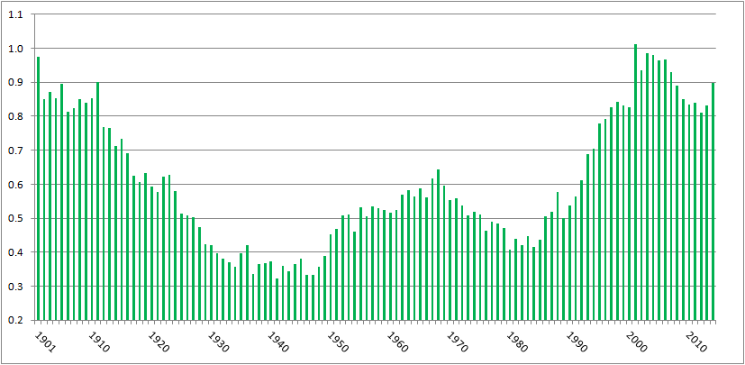
In the past, I’ve written about batters being hit by pitches–specifically, how the rate of hit batters is near all-time highs yet it hasn’t generated much, if any, outcry. Here’s a chart of hit batters per game, from 1901 (the start of the two-league era) to 2014:

HBP per game, 2001-2014

There were 0.68 hit batters per game in 2014, the eleventh-highest total over 115 years of two-league play. The top ten years, in order, have a 21st century slant: 2001, 2004, 2003, 2006, 1901, 2005, 2007, 2002, 2008, 1911.

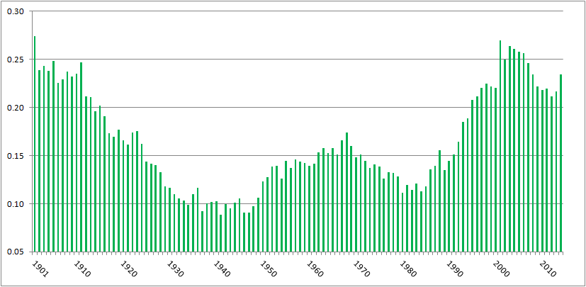
Or, pretty much the same chart, here’s hit batters per 100 plate appearances:

HBP per 100 PA

There were 0.898 batters hit per 100 plate appearances in 2014, the tenth highest amount in the two-league era. The ten top years are, in order, 2001, 2003, 2004, 1901, 2006, 2005, 2002, 2007, 1911, and 2014.

Commenter jaysfan suggested that the modern emphasis on going deep into counts has changed the number of pitches thrown per game, so perhaps hit batters per pitch haven’t changed much. It turns out the pattern still holds. Here’s a graph of hit by pitch per 100 pitches, using actual pitch counts from FanGraphs for 2002 to present, and Tom Tango’s formula of Pitches = 3.3 x plate appearances + 1.5 x strikeouts + 2.2 x walks for the preceding years:

HBP per 100 pitches

With 0.234 hit batters per 100 pitches, 2014 ranks 16th all time, behind 1901-1905, 1908, 1910, 1911, and every year from 2001 to 2007. Again, a pronounced millennial bias. (Source for all the above graphs: Baseball Reference and FanGraphs)

It’s clear, then, that we’re seeing batters getting hit at the highest rate in a century. I tried to figure out why, and came up dry. Left-handed batters, who face a wider strike zone than righties, aren’t leaning across the plate and thereby getting hit at a proportionately higher rate. HBPs are not inversely correlated to power, with pitchers more willing to pitch inside now to hitters who less frequently pull inside pitches down the line and over the fence. College graduates are slightly more likely to get hit by pitches than other hitters, but not enough to explain the change. Batters setting up deeper in the batter’s box, as measured by catcher’s interference calls, isn’t correlated to HBPs.

However, commenter Peter Jensen noted, “I don’t think there is any question that pitchers throw more to the edges of the strike zone when they are ahead in the count. This could be confirmed with a pretty simple Pitch Fx study. And if they pitch to the edge more they are also going to miss inside more (and outside more) so this could partially or even wholly account for why there are more HBPs in pitcher counts.”

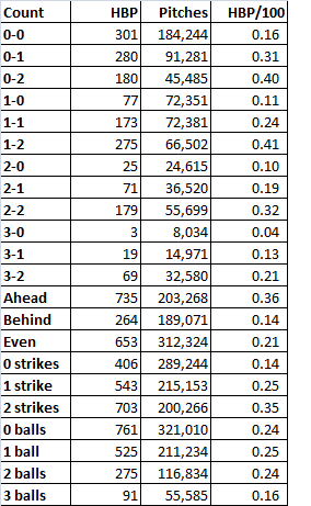
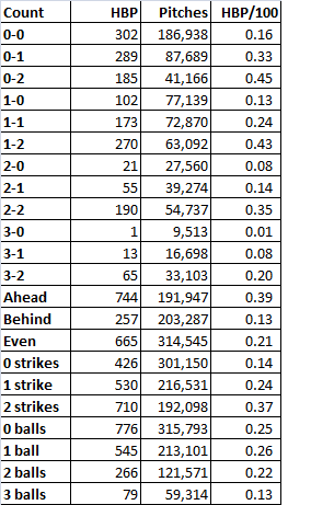
I did the PITCHf/x study Peter suggested. Using Baseball Savant data, I looked at hit by pitch by count, and as Peter found when he studied the data from 1997 and 2013, HBPs occur more when pitchers are ahead on the count. Here are the data from 2014:

2014 HBP

When the pitcher was ahead on the count, the batter was nearly three times as likely to get hit as when the batter was ahead. The most common counts for hit batters: 1-2, 0-2, and 2-2, and 0-1, all counts that encouraged pitchers to try to get batters to chase pitches on the border of the strike zone. Is this trend consistent? Baseball Savant’s data go back only to 2008, but using that season’s data, yes, the trend’s unchanged:
2008 HBP

Same thing. Batters are three times more likely to get hit when the pitcher’s ahead on the count, and the three most common HBP counts are two strikes with zero, one, or two balls, followed by 0-1.

So why the increase in hit batters? It appears that, as Peter implied, it’s because of the increase in strikeouts. Every three strike count requires a two strike count, obviously. In 2008, 22% of at bats went to 0-2 counts, 34% went to 1-2, and 29% went to 2-2. In 2014, those percentages had risen to 25%, 36%, and 30%, respectively, in line with the increase in strikeouts from 17.5% of plate appearances to 20.4%. The route to three strikes, which is being traveled more frequently, includes the four counts most likely to result in a hit batter. That’s why we’re seeing batters hit by pitches at rates not seen since before the first World War.

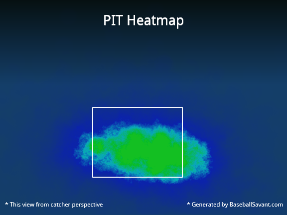
Here’s a graphical representation. In 2014, the Pirates led the majors in hit batters, handily, with 88. Here’s where Pirates pitchers threw on the hitters’ counts of 1-0. 2-0, 3-0, and 3-1:

Those greenish-yellow areas in the middle of the zone indicate that when the pitchers fell behind, they tended to locate their pitches in the strike zone. By contrast, check out the location for pitches thrown on 0-1, 0-2, 1-2, and 2-2 counts, when the pitcher could waste a pitch trying to get the batter to chase it:

That’s a much less concentrated blob, with a higher percentage of pitches outside the strike zone, where the batter can get hit.

As a final check, I ran a correlation between strikeouts per plate appearance and hit batters per plate appearance post-World War II. The correlation coefficient’s 0.82. That’s pretty high, suggesting a link between strikeouts and batters getting hit. Granted, correlation is not causation. But given that there’s an empirical link–to get to three strikes, you have to get to two, and batters with two strikes are at the highest risk of getting hit by a pitch–it’s enough to make me believe that while there are a lot of reasons more batters are getting hit by pitches, a major explanation is that hit batters are a consequence of rising strikeout rates.

CODA: If there were a day last season that I thought might’ve turned to tide on batters getting hit by pitch, it was Thursday, September 11. That day, there were 15 HBPs in 11 games. That doesn’t include the horrific fastball to the face that ended Giancarlo Stanton’s season; that pitch was a strike. A lot of stars got hit: Stanton, Mike Trout (twice), Yoenis Cespedes, Carlos Gomez, Jayson Werth. Tampa Bay’s Brad Boxberger hit Derek Jeter in the elbow. Had that pitch ended Jeter’s farewell tour, I really think it would’ve created an issue of rising HBP rates. Fortunately for Jeter and purveyors of Jeter memorabilia, it didn’t. But taking the 15 hit batters together, plus Stanton, and excluding two obvious retaliation jobs (Anthony DeSclafani hitting Gomez after Stanton got hit, Joe Smith hitting Tomas Telis after Trout got hit a second time), the fourteen hit batsmen occurred on six 0-1 counts (including Stanton and Jeter), three 1-2 counts, two 1-1 counts, and one count each of 0-0, 2-1, and 2-2. There was only one HBP with the batter ahead on the count, and ten occurred on the four counts identified here as the most dangerous for batters.


Another Look at Tom Glavine’s Generous Strike Zone

Jeff Sullivan recently suggested that despite his reputation Tom Glavine did not pitch to a significantly more generous strike zone. Sullivan points out Glavine did not get significantly more called strikes than other pitchers, even during the peak of his career. Sullivan’s analysis piqued my interest and made me wonder if Glavine’s reputation for getting a wider strike zone helped him succeed in ways beyond called strikes.

Glavine’s reputation alone likely influenced a batter’s behavior at the plate, encouraging batters who were behind the count to swing at questionable pitches. Batters believed if they did not swing these pitches would be called strikes for Glavine (when a batter swings at a pitch out of the zone when the batter is ahead of the count that has more to do with a pitchers stuff than the batter giving the pitcher an expanded zone). So, what would we expect from a pitcher who is getting batters to expand the strike zone? You would expect batters to make poor contact, yielding a lower BABIP. The batter would most likely swing at pitches outside the zone when the batter is behind the count.

Based on this reasoning, I hypothesize that Tom Glavine will see a greater reduction in quality of contact when he gets ahead of the count than a league-average pitcher. I’m going to look at the time span from 1991 to 2002 because that was the time span Jeff looked at and because I like palindromes.

To measure quality of contact I will be looking at BACON (batting average on contact). BACON is slightly different than BABIP because BACON includes home runs. If batters are expanding the strike zone when Glavine is ahead in the count we should see the quality of contact decrease. To measure the decrease in quality of contact, I will look at the ratio of BACON when Glavine is ahead to BACON to when Glavine is behind (the lower the number the greater improvement the pitcher experiences by getting ahead in the count). I will refer to this measure as EXP (a lower EXP shows a greater decrease in quality of contact, an EXP above 100 shows an increase in quality of contact).  The graph below compares Glavine’s EXP to the league average EXP for each season during the 11-year span.

 The league-average EXP is consistent year to year, hovering around 91, which suggests batters expand the strike zone for most pitchers when batters are behind in the count. Glavine’s EXP is not always better than the league-average EXP. In ‘94 and ‘96 Glavine was actually worse when ahead in the count than when he was behind.  This is to be expected because BACON takes a while to stabilize. Looking at Glavine’s data for a single season is subject to a fair amount of random noise because you have a relatively small sample of data. One season for Glavine gives us about 170 fair balls with Glavine ahead and 280 fair balls with Glavine behind. However, over a larger sample BACON stabilizes. At around 2,000 fair balls (more than in a single season for Glavine) BACON stabilizes. For example, when looking at the league-average EXP for a full year BACON is stable — with 3,500 fair balls with the pitcher ahead of the count and 4,600 fair balls with pitcher behind the count.

To make sure we are not just attributing skill to some random variation we need to look at a larger sample for Glavine. Over the 11 year span form 1991-2002 Glavine induced weaker contact (lower BACON) than the league average both when he was ahead of the count and behind the count. This is not surprising as we would expect a good pitcher to be better than average ahead and behind the count.  What’s interesting is Glavine has better than league-average EXP  (87 vs. 92) which suggests Glavine is better at expanding the strike zone than league-average pitchers. This comes with the caveat that while we have 3,056 fair balls when Glavine is behind the count, we only have 1,853 fair balls when Glavine is ahead — just shy of the 2000 at which the measure should stabilize.  Even so, the difference between Glavine’s EXP and the league-average EXP is very convincing.

Glavine (1991-2002)

MLB ave (1991-2002)

Ahead Behind EXP Ahead Behind EXP
BACON

0.266055

0.304319

87.42626

0.303134

0.330999

91.58153

To stabilize BACON, I increased the sample by looking at all the balls put in play. I compared balls put in play when the pitcher had two strikes to balls put in play when the pitcher had fewer than two strikes, which led to EXP2: the ratio of BACON when a pitcher has two strikes, to when he has fewer than two strikes. The table bellow shows a comparison of the quality of contact in two strike counts to non-two strike counts.

Glavine (1991-2002)

MLB ave (1991-2002)

2 Strikes Not 2 Strikes EXP2 2 Strikes Not 2 Strikes EXP2
BACON

0.275

0.302

91.22

0.3118

0.331

94.19

Even with this larger sample size Glavine’s BACON is still lower than the league average in respective counts. More importantly, his EXP2 is still better than league average (although higher than his EXP).  Pitchers in general try to induce weaker contact when they are ahead of the count, but the data shows Glavine is doing something special to induce even weaker contact.

Is Glavine getting batters to give him a wider strike zone? We cannot definitively say what is causing this pattern in the data, but we are seeing the type of numbers we would expect to see if the batter was giving him a wider strike zone.


All splits number are from Baseball-Reference.