The Season’s Least Likely Non-Homer

A little while back, I took a look at what might be considered the least likely home run of the 2016 season. I ended up creating a simple model which told us that a Darwin Barney pop-up which somehow squeaked over the wall was the least likely to end up being a homer. But what about the converse? What if we looked at the ball that was most likely to be a homer, but didn’t end up being one? That sounds like fun, let’s do it. (Warning: GIF-heavy content follows.)

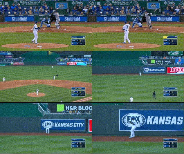
The easy, obvious thing to do is just take our model from last time and use it to get a probability that each non-homer “should” be a home run. So let’s be easy and obvious! But first — what do you think this will look like? Maybe it was robbed of being a home run by a spectacular play from the center fielder? Or maybe this fly ball turned into a triple in the deepest part of Minute Maid Park? Perhaps it was scalded high off the Green Monster? Uh, well, it actually looks like this.

That’s Byung-ho Park, making the first out of the second inning against Yordano Ventura on April 8. Just based off exit velocity and launch angle, it seems like a worthy candidate for the title, clocking in at an essentially ideal 110 MPH with a launch angle of 28 degrees. For reference, here’s a scatter plot of similarly-struck balls and their result (click through for an interactive version):

(That triple was, of course, a triple on Tal’s hill)

But, if you’re anything like me, you’re just a tad underwhelmed at this result. Yes, it was a very well-struck ball, but it went to the deepest part of the park. What’s more, Kauffman Stadium is a notoriously hard place to hit a home run. It really feels like our model should take into consideration both the ballpark in which the fly ball was hit, and the horizontal angle of the batted ball, no? Let’s do that and re-run the model.

One tiny problem with this plan is that Statcast doesn’t actually provide us with the horizontal angle we’re after. Thankfully Bill Petti has a workaround based on where the fielder ended up fielding the ball, which should work well enough for our purposes. Putting it all together, our code now looks like this:

# Read the data
my_csv <- 'data.csv'
data_raw <- read.csv(my_csv)
# Convert some to numeric
data_raw$hit_speed <- as.numeric(as.character(data_raw$hit_speed))
data_raw$hit_angle <- as.numeric(as.character(data_raw$hit_angle))
# Add in horizontal angle (thanks to Bill Petti)
horiz_angle <- function(df) {
angle <- with(df, round(tan((hc_x-128)/(208-hc_y))*180/pi*.75,1))
angle
}
data_raw$hor_angle <- horiz_angle(data_raw)
# Remove NULLs
data_raw <- na.omit(data_raw)
# Re-index
rownames(data_raw) <- NULL

# Make training and test sets
cols <- c(‘HR’,’hit_speed’,’hit_angle’,’hor_angle’,’home_team’)
library(caret)
inTrain <- createDataPartition(data_raw$HR,p=0.7,list=FALSE)
training <- data_raw[inTrain,cols]
testing <- data_raw[-inTrain,cols]
# gbm == boosting
method <- ‘gbm’
# train the model
ctrl <- trainControl(method = “repeatedcv”,number = 5, repeats = 5)
modelFit <- train(HR ~ ., method=method, data=training, trControl=ctrl)
# How did this work on the test set?
predicted <- predict(modelFit,newdata=testing)
# Accuracy, precision, recall, F1 score
accuracy <- sum(predicted == testing$HR)/length(predicted)
precision <- posPredValue(predicted,testing$HR)
recall <- sensitivity(predicted,testing$HR)
F1 <- (2 * precision * recall)/(precision + recall)

print(accuracy) # 0.973
print(precision) # 0.811
print(recall) # 0.726
print(F1) # 0.766

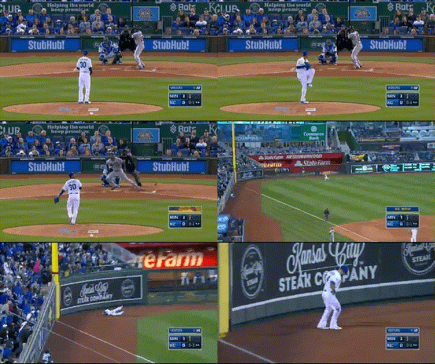
Great! Our performance on the test set is better than it was last time. With this new model, the Park fly ball “only” clocks in at a 90% chance of becoming a home run. The new leader, with a greater than 99% chance of leaving the yard with this model is ARE YOU FREAKING KIDDING ME

I bet you recognize the venue. And the away team. And the pitcher. This is, in fact, the third out of the very same inning in which Byung-ho Park made his 400-foot out. Byron Buxton put all he had into this pitch, which also had a 28-degree launch angle, and a still-impressive 105 MPH exit velocity. Despite the lower exit velocity, you can see why the model thought this might be a more likely home run than the Park fly ball — it’s only 330 feet down the left-field line, so it takes a little less for the ball to get out that way.

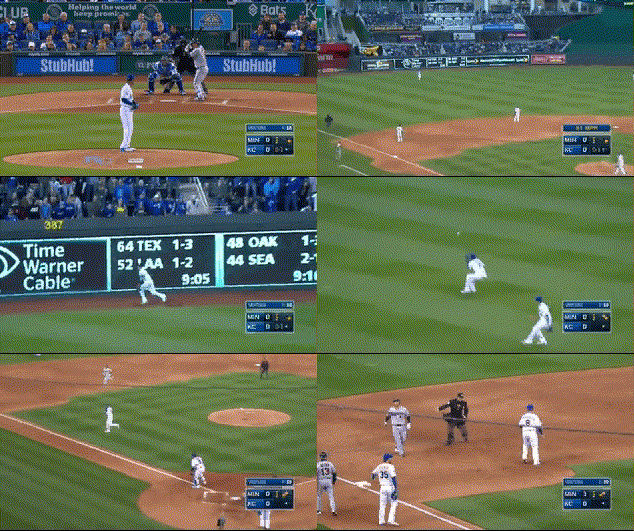
Finally, because I know you’re wondering, here was the second out of that inning.

This ball was also hit at a 28-degree launch angle, but at a measly 102.3 MPH, so our model gives it a pitiful 81% chance of becoming a home run. Come on, Kurt Suzuki, step up your game.


What to Make of Blake Snell’s Arsenal

I’ll give y’all a warning: This is a very random article. It’s not like Blake Snell isn’t an interesting player; he’s a young arm who is going to be a pivotal piece of the Tampa Bay Rays rotation for a while. Even though he struggles to keep the ball in the zone, he has electric stuff and does a good job of keeping the hits he gives up in the ballpark. He was a highly-touted prospect and certainly delivered on that last year, striking out 24.4% of batters while delivering a 3.39 FIP in 89 innings.

However, there were some reasons to be concerned. Snell was very mediocre, according to Baseball Prospectus’ DRA (Deserved Run Average), which is widely considered to be one of the best measures of a pitcher’s ability. In 2016, he had a DRA of 4.58 with a DRA- of 108, with 100 being considered the average performance by a pitcher. He also struggled to keep batters off base, issuing 5.2 walks per nine and sporting a 1.62 WHIP. These are some legitimate reasons for concern, but I want to try to look at the positives, and that starts by looking at the pitches he throws. The reason scouts have been optimistic about Snell this whole time is because of his stuff. He was known for having a fastball with good velocity and movement, along with a plus slider and change-up that essentially made up for his control issues.

Looking at his 2016 numbers, Snell had a pretty bad fastball, giving up 1.02 runs per 100 pitches thrown, and it got smacked around to the tune of an .893 OPS. He only threw it in the zone 51.4% of the time, and when it was thrown in the zone, it got hit over 86% of the time, which can explain the OPS. That being said, there were positives here that shouldn’t be overlooked. Snell has ridiculous vertical movement on his fastball; 10.7 inches of rise according to the Baseball Prospectus leaderboard. In fact, he ranked fourth overall in fastballs thrown with a spin rate over 2500 RPM. The higher the spin rate, the more the ball tends to “rise” in the eyes of a hitter. Overall, 32.4% of his fastballs registered over 2500 RPM, and if you watch him pitch, you can see that his fastball, when located up in the zone, has a ridiculous amount of life, and makes even the most professional hitters look silly. Also, his fastball ranked in the 70th percentile (minimum 100 fastballs thrown) for whiffs with 19.7%. Snell’s change-up was actually his best pitch in terms of runs saved, saving 2.4 runs per 100 thrown, with good arm-side fade and a 9-mph velocity gap from his fastball. Now, this is where this article takes a strange turn, and leads into why I’m writing it in the first place.

Snell’s slider had the best whiff rate in the MLB last year. Batters missed it a whopping 56.2% of the time, six points better than the NL Cy Young winner Max Scherzer’s slider. Wow! That’s amazing! Let’s check how many runs it saved!

Well, actually, it cost Snell 2.04 runs per 100 thrown…which registered it as one of the worst sliders in baseball. That doesn’t really make a whole lot of sense. Looking deeper, I found his slider got absolutely clobbered when it got hit; it had a 100% HR/FB ratio and got smashed with an .898 OPS when batters hit it. But hitters also missed it 56% percent of the time. Yet it got hit, a lot. We could continue that back and forth forever.

Well, it turns out this isn’t the only breaking ball Snell has. He has a slow, looping curve that clocks in at the low to mid 70s with a ton of vertical drop created by 12-6 movement. He threw both his slider and curve at nearly identical rates, 12% for the slider and 12.8% for the curve. If you look at scouting reports from Baseball Prospectus and FanGraphs, you don’t see any mentions of his curve, just some blurbs about his slider and change-up being quality offspeed offerings. But, his curve was pretty damn good last year, ranking in the top five in runs saved per 100 thrown, with 2.2. It had sharp downward movement and comes out of the same arm slot as his slider, but is much slower, so it keeps batters off balance. It also held batters to a remarkable .162 OPS. It was truly one of the better curves in the game. Looking at this data, I’m left with a question: What do we make of this?

Before I attempt to answer that, I want to show a graph of Snell’s release points in 2016 — it will come up in the next paragraph.


Snell’s fastball has a ton of life, and is an absolutely nasty pitch when left up in the zone. If he’s throwing a “rising” fastball that comes out of the same arm slot as everything else (except the change), to me, it makes sense for him to throw his curve. His fastball becomes much harder to catch up to due to its movement if batters sit curve, and the velocity gap along with the drop he gets on his curve will get batters out if they sit fastball. The combination of the change of eye level, consistent arm slot, and the velocity difference will keep hitters off the entire game.

Not only is Snell improving both his fastball and curve this way, but he’s taking off the reliance on the slider by not having to throw a “bad pitch.” That being said, the slider still gets a ton of whiffs, but I would rather throw a pitch that batters can’t hit/do hit poorly in his curve than essentially taking a 50-50 shot of getting clobbered when throwing a slider. There’s no reason to stop throwing his change-up; it was his best pitch in 2016. It fills the velocity gap between the fastball and the curve and features movement away from righties, which is something he would otherwise lack. This brings me to my last point, and one more snippet of stats for you.

Snell’s slider vs. RHB: .650 SLG

Snell’s slider vs. LHB: .357 SLG

He threw his slider 9.7% of the time to righties. I’m not saying he should stop throwing it completely; there are obviously some redeeming qualities to it if he can get over 50% whiffs on on it. But if Snell can cut down on that slider usage and throw it more or less “exclusively” to lefties, he can eliminate the problem that he was having with it getting blasted. Since both breaking balls leave his hand at the same place, the deception will still be there, especially since batters will have to guess if it’s the harder, faster slider or the slower curve. If he can keep the walks down as well, we’re looking at a brand-new ace in the Rays rotation for 2017, assuming that throwing the better pitch can actually lead to success.


Ranking the Importance of the Five Tools

A good friend of mine with whom I argue about baseball often once posed a very interesting question to me.  He asked me, if I were to build a team completely devoid of one tool, which tool would I want to be missing?  In the ensuing argument, I was asked to rank the tools from least to most important for team success.  I put the order as arm, speed, fielding, contact, and power.  It was not until later that day that it struck me just how great a question he had asked.  Now, several months later, I will attempt to quantify the tools.

The rules for this study will be simple.  Two teams will be assembled for each of the five tools.  Each team will be considered league-average in every tool but the one for which they are being evaluated.  One of the teams for each tool will be the best possible in that one area, and the other will be the worst possible.  The runs lost from league-average by the worst possible team will be subtracted from the runs gained by the best possible teams.  The larger the difference, the more important the tool.  The teams will have one player for each position (minimum 250 PA, 450 Inn).

Note:  Pitchers are not included.  Losing arm does not mean losing value from pitchers.

Power

The players on the teams for power will be determined using isolated power.

Best Possible Team:  C) Evan Gattis (.257); 1B) Chris Carter (.277); 2B) Ryan Schimpf (.315); 3B) Nolan Arenad0 (.275); SS) Trevor Story (.296); LF) Khris Davis (.277); CF) Yoenis Cespedes (.251); RF) Mark Trumbo (.277)

This group has a combined ISO of .276, which would put their team OPS+ at about 115.4.  An average team has 6152.6 PA in a season.  Using these figures, they would score 836 runs as a team, compared to the 725 of an average team.

Worst Possible Team:  C) Francisco Cervelli (.058); 1B) Chris Johnson (.107); 2B) Jed Lowrie (.059); 3B) Yunel Escobar (.087); SS) Ketel Marte (.064); LF) Ben Revere (.083); CF) Ramon Flores (.056); RF) Flores

The combined ISO for this team was only .072, making the OPS+ about 87.8.  Runs scored for this team would then be 636.

Difference between BPT and WPT:  200 runs

Contact

The players on the teams for contact will be determined using K%.

BPT:  C) Yadier Molina (10.8); 1B) James Loney (10.1); 2B) Joe Panik (8.9); 3B) Jose Ramirez (10.0); SS) Andrelton Simmons (7.9); LF) Revere (9.1); CF) Revere; RF) Mookie Betts (11.0)

Collectively, this team would strike out in 9.7% of their plate appearances.  League average in 2016 was 21.1%, meaning the BPT is 11.4% better than league average.  The team would score 807 runs.

WPT:  C) Jarrod Saltalamacchia (35.6); 1B) Chris Davis (32.9); 2B) Schmipf (31.8); 3B) Miguel Sano (36.0); SS) Story (31.3); LF) Ryan Raburn (31.3); CF) Byron Buxton (35.6); RF) Sano

This high swing-and-miss team would strike out in 33.9% of plate appearances.  This is 12.8% higher than average.  The team would score 632 runs.

Difference between BPT and WPT:  175 runs

Fielding/Arm

As it turns out, there are really not stats for exclusively measuring a fielder’s arm.  Baseball-Reference has Arm Runs Saved, but that is not for infielders.  Additionally, the stat I originally wanted to use for Fielding, UZR/150, is not available for catchers.  To remedy both of these problems, I elected to use DRS.  DRS is available for all positions, and it takes a fielder’s arm into account.  Because I will not be taking values for fielding and arm on their own, fielding will receive about 60% of the total difference in the category.  The remaining 40% will be attributed to arm.

BPT:  C) Buster Posey (23); 1B) Anthony Rizzo (11); 2B) Ian Kinsler/Dustin Pedroia (12); 3B) Arenado (20); SS) Brandon Crawford (20); LF) Starling Marte (19); CF) Kevin Kiermaier (25); RF) Betts (32)

Kinsler and Pedroia tied for the lead at second base, so I just listed both of them.  The brilliant defensive team would be 162 runs better than the average in the field.  Of these, 97 will be attributed to fielding and 65 to arm.

WPT:  C) Nick Hundley (-16); 1B) Joey Votto (-14); 2B) Schimpf/Daniel Murphy/Rougned Odor (-9); 3B) Danny Valencia (-18); SS) Alexei Ramirez (-20); LF) Robbie Grossman (-21); CF) Andrew McCutchen (-28); RF) J.D. Martinez (-22)

The team of these players, who look like pretty good players, would have a -148 defensive value.  The value to fielding is -89 runs, and -59 for arm.

Difference between BTP and WPT (Fielding):  186 runs

Difference between BTP and WPT (Arm):  124 runs

Speed

Speed presents a problem.  It is valuable on the basepaths, obviously, but it is also valuable in the field.  More speed means more range.  Speed Score is a stat that represents the importance of both, but it does not translate well into value.  I decided to go with FanGraphs BsR, even though it does not measure speed in the field.  That value can be circumvented by routes and reactions anyway.

BPT:  C) Derek Norris (1.8); 1B) Wil Myers (7.8); 2B) Dee Gordon (6.2); 3B) Ramirez (8.8); SS) Xander Bogaerts (6.1); LF) Rajai Davis (10.0); CF) Billy Hamilton (12.8); RF) Betts (9.8)

This speed roster is a team that anyone would like to run out every day.  It is a young and athletic team.  Even so, based on speed alone, the team is just 63 runs above average.  That is the lowest value above average for any BPT.

WPT:  C) Molina (-8.7); 1B) Miguel Cabrera (-10.0); 2B) Pedroia (-4.5); 3B) Escobar (-5.6); SS) Erick Aybar (-3.9); LF) Yasmany Tomas (-5.5); CF) Jake Smolinski (-3.4); RF) Tomas

The lead-foot team is 47 runs below average.  That is the closest to average of any WPT.  Speed clearly has the least impact of the five tools.  I regret not putting it last.

Difference between BPT and WPT:  110 runs

Conclusion

I will admit that I was wrong.  Arm actually has some real value.  My excuse, I guess, is to say that it slipped my mind that arm is important for infielders as well as outfielders.  That should not have happened, and I am a little upset I made that mistake.  Fielding also beat out contact, which I did not expect.  I do not even have a defense for this one, as I do not know what I was thinking.

In all honesty, this post was written to win an argument.  However, it does have a deeper purpose.  This answers the question posed so many years ago in Moneyball.  If a general manager can afford to buy players with only one tool, which tool should it be?  This information is probably not new to any front office in baseball, but it is something to remember when considering small-market strategy.

Anyway, here is the official list of the five tools by importance, at least for 2017.

1.  Power

2.  Fielding

3.  Contact

4.  Arm

5.  Speed


We Good, Pham

Playing with the wonderful new splits leaderboard that was just rolled out on these very pages has led me down a Tommy Pham-shaped rabbit hole.

Tommy Pham has a stat line that is currently boggling my mind.

.214 ISO, 10.9% BB%, .342 BABIP, and 9 HR in 183 PA…good to excellent offensive numbers, in my opinion. Yet despite all of these good to excellent offensive numbers, he sported a major-league-high 38.8% strikeout rate (min 100 PA) that dragged his wRC+ to a barely-above-average 105. This deserves some digging into.

Looking at this 15-game rolling K%, there were times this past season that his rolling K-rate was down to 20.8% (on August 12). The AMAZING thing happens the further right you look on that graph — he begins striking out at a rate that makes Bartolo Colon look patient, hitting a high of 66.7% in the middle of September. From the beginning of the season to August 12, Pham had a wRC+ of 126 — higher than the full-season numbers of Carlos Beltran, Nolan Arenado, and Jose Bautista. After August 12, his wRC+ was 40. 40! FOUR ZERO. That’s behind nine pitchers (min. 40 PA).

AND SOMEHOW

SOMEHOW

He managed to have a higher BABIP when he was walking through life in a strikeout-induced haze. After August 12, he ran a BABIP of .417 with a K% of 59.1%, meaning he didn’t put the ball in play much, but when he did, it was finding the holes. BABIP and wRC+ have an R^2 correlation of 0.23, so you’d sort of expect them to move up and down together. However, before he started striking out like he was afraid someone was going to outlaw strikeouts so he was getting them all in while he could, his BABIP was 89 points lower — .328.

That’s not just lower. That’s much lower. That’s the difference between Dexter Fowler and Albert Pujols. And somehow an 89-point difference in BABIP resulted in an 86-point difference in wRC+ in the wrong direction.

You’d think running a much higher BABIP would be the result of hitting more line drives. After all — that is the variety of batted ball that lands for a hit more often than any type.

BUT. IT. GETS. WEIRDER. He hit line drives 28.0% of the time up to and including August 12. After August 12, he hit line drives ONLY 7.7% OF THE TIME. So with a 28.0% line drive rate, he ran a .328 BABIP, but his 7.7% line-drive rate resulted in a .417 BABIP. WHAT KIND OF MAGIC IS THIS?

Well, you know. The magic of small samples. 183 plate appearances falls nearly 70 short of being half of a qualified season’s plate appearances. Weird things are going to happen when you are looking at smaller samples. Weird things are always happening in baseball; that’s part of its charm. We just don’t always notice because over the course of a season, some weird things will balance out other weird things and we’ll forget how weird things were at some point. That’s why it’s worth it to dive into the numbers — to remind yourself that fun things are always happening in baseball. You may even find yourself surprised with how interesting you find Tommy Pham at the end of it all.


Cardinals’ Sin: Defensive Indifference

Last season the St. Louis Cardinals scored the fourth-most runs in the majors, but were a mere 13th in runs allowed. Yes, the rotation had its issues, including but not limited to Lance Lynn’s season-long absence, but the pitching staff managed to finish seventh in FIP. The large disconnect between the Cardinals’ runs allowed and FIP has the aroma of a defensive rat.

The Cards ranked 17th in the FanGraphs Def rating, and five of their top eight players by plate appearances had negative ratings. The team’s roster had a severe internal contradiction last year, putting weak defenders behind a merely average strikeout staff; the Cards were 15th in K% last year. Cardinals’ GM John Mozeliak recognizes the problem, and recently took one step to address it by signing Dexter Fowler to play center. Craig Edwards recently covered the signing in detail, calling attention to the continuing controversy regarding Fowler’s defense. The Cards will play him in center, but he might not really be a center fielder.

Randal Grichuk patrolled center last year in a manner that will make no one forget Jim Edmonds. His advanced defensive metrics, though, were not terrible; his UZR in center was a hair below average. The Fowler signing pushes Grichuk to left, but it isn’t at all clear Fowler is actually an improvement.

It is clear, however, that even Fredbird would be a defensive improvement over Matt Holliday in left. UZR liked Holliday as a defender early in his career, but hasn’t thought much of him since 2012. Holliday’s offense made up for his increasingly offensive glove, until last year. Mozeliak’s first move to right the wrongs of the Cardinals’ 2016 roster was his eminently wise decision to let Holliday walk. Fowler may or may not be better than Grichuk in center, but Grichuk will almost certainly be far better than Holliday in left. (And, heck, maybe Fowler’s defensive improvement will stick.)

This will still, in all likelihood, be a below-average defensive outfield, but 2017’s edition should be slightly more agile than the 2016 product. The good news is that St. Louis has a heavy groundball staff; they led the league in GB/FB ratio last year. The bad news is that infield defense is even worse than the outfield.

Mozeliak is moving to fix this, too. Matt Carpenter has played five different positions in his career, none especially well. Next year he will man the cold corner, his bat having developed to the point that it can carry him at that position. Giving most of the second-base starts to Kolten Wong will improve defense at the keystone. He’s not a stellar defender, but is far better than any of the other available options.

The left side of the infield, as currently constructed, will remain scary bad. Defense is the province of the young, something that Jhonny Peralta isn’t. Heading into his age-35 season, Peralta will surrender runs in quantity whether he plays short or third. The current odd man out in the infield, Jedd Gyorko, could be a solution at the hot corner. He’s not a great defender either, but he’s better than Peralta, six years younger, and probably at least equivalent offensively.

Aledmys Diaz is young, but not as young as you think, and played old at short last year, finishing 22nd out of 28 shortstops with at least 450 plate appearances in Def. It’s hard to know whether the offense he displayed last year is real; Steamer sees some regression but is still optimistic. As long he hits he’ll play, and St. Louis will have to hope the glove develops, at least a little. The farm lacks much of a shortstop crop, and the free-agent cupboard is also bare.

The pitching staff can help hide the defense’s weaknesses by striking batters out more often. The return of Lance Lynn and his career strikeout rate of 22% in April or May should help in that regard, although Tommy John survivors sometimes struggle initially upon their return. The flame-throwing Alex Reyes, with a combined career K/9 of 11.7 at all levels, could help even more if he wins a rotation spot.

But that’s a big if. Assuming Lynn and Reyes both win spots, that leaves one of last year’s starters spitting seeds in the bullpen. Lynn in effect replaces the now-departed Jaime Garcia. But who would Reyes replace? “Mike Leake” roars (or chirps) the Cardinal faithful, and on pure performance they’re not wrong. Leake projects to have the worst ERA, FIP, and K/9 of any Cardinals starter next year. He will also be entering the second year of his questionable five-year, $80-million contract, making Leake simultaneously a Cardinal and an albatross. He is a less-extreme version of Jason Heyward, a player whose contract significantly impedes benching.

Lynn may not be back on opening day, and teams frequently can avoid using a fifth starter for the first couple of weeks of the season thanks to frequent off days. It’s likely that manager Mike Matheny won’t make a decision until he has to, and he may not have to until well into May. Leake may get off to an awful start, perhaps making it easier to banish him to the pen. Michael Wacha may suffer a similar fate, or get injured again. Both the Mikes were disappointing last season, but Reyes doesn’t offer sure improvement, given his eye-watering walk rates.

So this may be a roster bug, but it’s also a feature. The Cardinals have no sure-fire No. 1-caliber starter, but they have considerable depth, including the guys mentioned above as well as Carlos Martinez, Adam Wainwright, Luke Weaver, and perhaps Trevor Rosenthal. The last two are nearly and entirely untested (respectively) in the major-league rotation, but both cook with gas and could help alleviate the team’s defensive problems if they can command their stuff.

Another way to get more Ks would be for manager Mike Matheny to get a bit more out of his bullpen at the expense of his lower-stuff starters. The Cardinals were 20th in reliever innings last year, despite having a bullpen that finished 12th in FIP and 13th in ERA — not Rivera-esque, but usable. The addition of Brett Cecil will help if he performs as his contract suggests the Cardinals are projecting. Some of the losers in the rotation sweepstakes could also be effective relievers. Rosenthal used to be one, and Reyes showed a flash of brilliance in 17 innings at season’s end last year. Few Cardinals fans will put a big stack on Matheny’s decision-making capacity, but there is at least the possibility that he might make better use of the resources at his disposal.

The Cardinals had a poorly-configured team by the end of last season, but Mozeliak is taking steps to correct it. Cardinals fans are surely hoping that whatever roster sins remain will not be mortal ones.


Derek Norris, 2016 — A Season to Forget

While it may not be the most exciting Nationals story of the offseason, Wilson Ramos signing with the Rays and the subsequent trade for Derek Norris to replace him is a very big change for the Nats. Prior to tearing his ACL in September, Ramos was having an incredible 2016, and he really carried the Nationals offense through the first part of the year (with the help of Daniel Murphy, of course) when Harper was scuffling and Anthony Rendon was still working back from last season’s injury. Given Ramos’ injury history it makes sense to let him walk, but Nationals fans have reasons to be concerned about Norris.

After a few seasons of modest success, including an All-Star appearance in 2014, Norris batted well under the Mendoza line (.186) in 2016 with a significant increase in strikeout rate. What was the cause for this precipitous decline? Others have dug into this lost season as well, and this article will focus on using PitchFx pitch-by-pitch data through the pitchRx package in R as well as Statcast batted-ball data manually downloaded into CSV files from baseballsavant.com, and then loaded into R. Note that the Statcast data has some missing values so it is not comprehensive, but it still tells enough to paint a meaningful story.

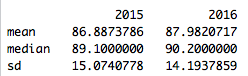
To start, Norris’ strikeout rate increased from 24% in 2015 to 30% in 2016, but that’s not the entire story. Norris’ BABIP dropped from .310 in 2015 to .238 in 2016 as well, but his ISO stayed relatively flat (.153 in 2015 vs. .142 in 2016). Given the randomness that can be associated with BABIP, this could be good new for Nats fans, but upon further investigation there’s reason to believe this drop was not an aberration.

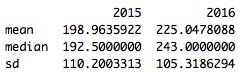
Using the batted-ball Statcast data, it doesn’t appear that Norris is making weaker contact, at least from a velocity standpoint (chart shows values in MPH):

Screen Shot 2016-12-11 at 9.50.27 PM.png

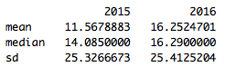
Distance, on the other hand, does show a noticeable difference (chart shows values in feet):

Screen Shot 2016-12-11 at 9.53.45 PM.png

So Norris is hitting the ball further in 2016, but to less success, which translates to lazy fly balls. This is borne out by the angle of balls he put in play in 2015 vs. 2016 (values represent the vertical angle of the ball at contact).

Screen Shot 2016-12-11 at 9.56.55 PM.png

The shifts in distance & angle year over year are both statistically significant (velocity is not), indicating these are meaningful changes, and they appear to be caused at least in part by the way pitchers are attacking Norris.

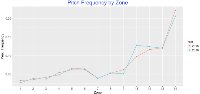
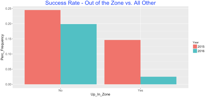
Switching to the PitchFx data, it appears pitchers have begun attacking Norris up and out of the zone more in 2016. The below chart shows the percentage frequency of all pitches thrown to Derek Norris in 2015 & 2016 based on pitch location. Norris has seen a noticeable increase in pitches in Zones 11 & 12, which are up and out of the strike zone.

Screen Shot 2016-12-11 at 10.11.19 PM.png

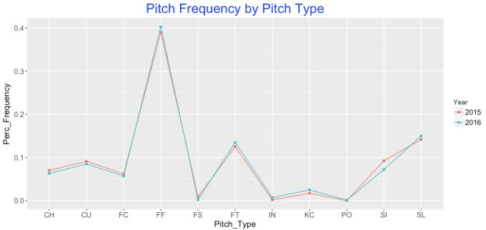
Norris has also seen a corresponding jump in fastballs, which makes sense given this changing location. This shift isn’t as noticeable as location, but Norris has seen fewer change-ups (CH) and sinkers (SI) and an increase in two-seam (FT) & four-seam fastballs (FF).

Screen Shot 2016-12-11 at 10.15.10 PM.png

The net results from this are striking. The below chart shows Norris’ “success” rate for pitches in Zones 11 & 12 (Represented by “Yes” values, bars on the right below) compared to all other zones for only outcome pitches, or the last pitch of a given at-bat. In this case success is defined by getting a hit of any kind, and a failure is any non-productive out (so, excluding sacrifices). All other plate appearances were excluded.

Screen Shot 2016-12-11 at 10.21.20 PM.png

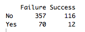
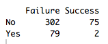
While Norris was less effective overall in 2016, the drop in effectiveness on zone 11 and 12 pitches is extremely noticeable. Looking at the raw numbers makes this even more dramatic:

2015                                                     2016

Screen Shot 2016-12-11 at 10.23.19 PM.png                       Screen Shot 2016-12-11 at 10.23.38 PM.png

So not only did more at-bats end with pitches in zones 11 and 12; Norris ended up a shocking 2-for-81 in these situations in 2016.

In short, Norris should expect a steady stream of fastballs up in the zone in 2016, and if he can’t figure out how to handle them, the Nationals may seriously regret handing him the keys to the catcher position in 2016.

All code can be found at the following location : https://github.com/WesleyPasfield/Baseball/blob/master/DerekNorris.R


Kinda Juiced Ball: Nonlinear COR, Homers, and Exit Velocity

At this point, there’s very little chance you are both (a) reading the FanGraphs Community blog and (b) unaware that home runs were up in MLB this year. In fact, they were way up. There are plenty of references out there, so I won’t belabor the point.

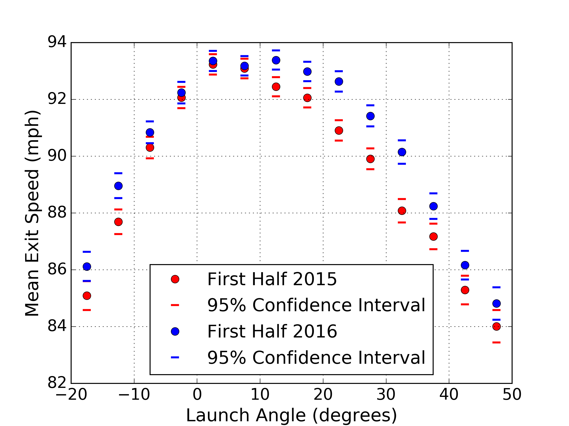
I was first made aware of this phenomenon through a piece written by Rob Arthur and Ben Lindbergh on FiveThirtyEight, which noted the spike in homers in late 2015 [1]. One theory suggested by Lindbergh and Arthur is that the ball has been “juiced” — that is, altered to have a higher coefficient of restitution. Since then, one of the more interesting pieces I have read on the subject was written by Alan Nathan at The Hardball Times [2]. In his addendum, Nathan buckets the batted balls into discrete ranges of launch angle, and shows that the mean exit speed for the most direct contact at line-drive launch angles did not increase much between first-half 2015 and first-half 2016. He did observe, however, that negative and high positive launch angles showed a larger increase in mean exit speed. Nathan suggests that this is evidence against the theory that the baseball is juiced, as one would expect higher mean exit speed across all launch angles. I have gathered the data from the excellent Baseball Savant and reproduced Nathan’s plot for completeness, also adding confidence intervals of the mean for each launch angle bucket.

Figure 1. Mean exit speed vs. launch angle.

At the time of this writing, I am not aware of any concrete evidence to support the conclusion that the baseball has been intentionally altered to increase exit speed. This fact, combined with Nathan’s somewhat paradoxical findings, led me to consider a subtler hypothesis: some aspect of manufacturing has changed and slightly altered the nonlinear elastic characteristics of the ball. Now, I’ve been intentionally vague in the preceding sentence; let me explain what I really mean.

Coefficient of restitution (COR) is a quantity that describes the ratio of relative speed of the bat and ball after collision to that before collision. The COR is a function of both the bat and the ball, where a value of 1 indicates a perfectly elastic collision, during which the total kinetic energy of the bat and ball in conserved. The simplest, linear, approximation of COR is a constant value, independent of the relative speed of the impacting bodies. It has long been known that, for baseballs, COR takes on a non-linear form, where the value is a function of relative speed [3]. Specifically, the COR decreases with increasing relative speed, and can vary on the order of 10% across a typical impact speed range. My aim is to show that, for some reasonable change in the non-linear COR characteristics of the baseball, I can reproduce findings like Alan Nathan’s, and offer yet another theory for MLB’s home-run spike.

In order to explore this, I first need a collision model to incorporate a non-linear COR. I want this model to be relatively simple, and also to be able to account for different impact angles between bat and ball. This is what will allow me to explore the effect of non-linear COR on exit speed vs. launch angle. I will mostly follow the work of Alan Nathan [4] and David Kagan [5]. I won’t show my derivation; rather, I will include final equations and a hastily drawn figure to explain the terms.

Figure 2. Hastily drawn batted-ball collision.

The ball with mass is traveling toward the bat with speed , assumed exactly parallel to the ground for simplicity. The bat with effective mass is traveling toward the ball with speed , at an angle  from horizontal. We know that in this two-dimensional model, the collision occurs along contact vector, the line between the centers of mass, which is at an angle from horizontal. This will also be the launch angle. Intuition, and indeed physics, tells us that the most energy will be transferred to the ball when the bat velocity vector is collinear with the contact vector. When the bat is traveling horizontally and the ball impacts more obliquely, above the center of mass of the bat, the ball will exit at a lower speed. These heuristics are captured with the following equations, where COR as a function of relative speed will be denoted , and the exit speed .

                                                             (1)

                                                   (2)

                                                               (3)

                                                                              (4)

                                           (5)

Now all we must do is choose a functional dependence of the COR on relative speed. Following generally the data from Hendee, Greenwald, and Crisco [3], and making small modifications, I produced the following models of COR velocity dependence:

Figure 3. Hypothetical non-linear COR.

Note that, for the highest relative bat/ball collisions, the “old” and “new” ball/bat collisions will result in similar amounts of energy transferred, while in the “new” ball model, slightly more energy will be transferred to the ball in lower-speed collisions. This difference seems to me quite plausible given manufacturing and material variation of the baseball. It is also worth emphasizing that this difference need only be on average for the whole league; some variation ball-to-ball would be expected.

Taking the new and old ball COR models from Figure 3 and plugging into equations (1)-(5) allows us to simulate the exit speed across a range of launch angles. I have assumed a bat swing angle of 9 degrees. Calculations and plots are accomplished with Python.

Figure 4. Exit speed as a function of launch angle for non-linear COR.

The first thing to note about Figure 4 is that the highest exit speed is indeed at 9 degrees, which was the assumed bat path. The second is the remarkable likeness between Figure 4, the model, and Figure 3, the data. Clearly, I have cheated by tweaking my COR models to qualitatively match the data, but the point is that I did not have to make wildly unrealistic assumptions to do so. I have not looked deeply into the matter, but this hypothesis would also suggest that from ’15 to ’16, a larger home-run increase would be expected for moderate power hitters than from those who hit the ball the very hardest. In fact, Jeff Sullivan suggests almost exactly this [6], although he also produces evidence somewhat to the contrary [7].

There is certainly much complexity that I am ignoring in this simple model, but it is based on solid fundamentals. If one accepts that baseball manufacturing could be subject to small variations, and perhaps a small systematic shift that alters the non-linear coefficient of restitution of the ball, it follows that the exit speed of the baseball is also expected to change. Further, the exit speed is expected to change differently as a function of launch angle. That a simple model of this phenomenon can easily be constructed to match the actual data from suspected “before” and “after” timeframes is at least interesting circumstantial evidence for the baseball being juiced. Perhaps not exactly the way we all expected, but still kinda juiced.


References:

[1] Arthur, Rob and Lindbergh, Ben. “A Baseball Mystery: The Home Run Is Back, And No One Knows Why.” FiveThirtyEight. 31 Mar. 2016. Web. 30 Aug. 2016.

[2] Nathan, Alan, “Exit Speed and Home Runs.” The Hardball Times. 18 Jul. 2016. Web. 23 Aug. 2016.

[3] Hendee, Shonn P., Greenwald, Richard M., and Crisco, Joseph J. “Static and dynamic properties of various baseballs.” Journal of Applied Biomechanics 14 (1998): 390-400.

[4] Nathan, Alan M. “Characterizing the performance of baseball bats.” American Journal of Physics 71.2 (2003): 134-143.

[5] Kagan, David. “The Physics of Hard-Hit Balls.” The Hardball Times. 18 Aug. 2016. Web. 23 Aug 2016.

[6] Sullivan, Jeff. “The Other Weird Thing About the Home Run Surge.” FanGraphs. 28 Sept. 2016. Web. 4 Dec. 2016.

[7] Sullivan, Jeff. “Home Runs and the Middle Class.” FanGraphs. 28 Sept. 2016. Web. 4 Dec. 2016.


Examining Net Present Value and Its Effects

Going back to January 2016, Dave Cameron wrote an article detailing the breakdown of money owed to Chris Davis over the life of the deal he signed last year. For myself, this provided insight into how teams value long-term contracts, but more importantly it led me to more questions about how money depreciates over time. Fast-forward to the present and we start to see some articles and comments with people speculating about how much money teams are going to throw at Bryce Harper when he reaches free agency in a few years. The numbers have been pretty incredible; $400 million? $500 million? Even $600 million? Then someone threw out an even larger number: $750 million.

The best thing to do is ignore these numbers because we are still a couple of years away from free agency and he just had a down year where he was “only” worth 3.5 WAR, which gave the team a value of $27.8 million. At some point the numbers don’t even make sense because the contract values are getting so inflated. But at the same time, good for him, maybe he’ll buy a baseball team once he retires, or a mega-yacht. But unfortunately we will need to wait until after the 2018 season before we find out the value of this contract. In the meantime, speculation will run rampant and the media will throw out inflated numbers for the amusement of the masses.

Now, the purpose of this article is not to predict the value of Bryce Harper’s future contract, but to examine a few scenarios as to the actual value in present-day dollars. To do this I will use the concept of Net Present Value (NPV) from Dave Cameron’s Chris Davis article and then use some of the numbers from his article predicting a contract for Bryce Harper. Let’s set a couple rules; (1) Match the length of contract given to Stanton — 13 years, (2) use nice round numbers and get as close to the total values as possible, (3) use a discount rate of 4%, (4) this is an exercise in futility and not to be taken too seriously and finally (5) to estimate NPV for a massive contract.

Here are the scenarios for a 13-year contract totaling in excess of $400M, $500M and $600M.

13 Year Contract Structure
Year Age
2019 26 $31,000,000 $38,500,000 $46,500,000
2020 27 $31,000,000 $38,500,000 $46,500,000
2021 28 $31,000,000 $38,500,000 $46,500,000
2022 29 $31,000,000 $38,500,000 $46,500,000
2023 30 $31,000,000 $38,500,000 $46,500,000
2024 31 $31,000,000 $38,500,000 $46,500,000
2025 32 $31,000,000 $38,500,000 $46,500,000
2026 33 $31,000,000 $38,500,000 $46,500,000
2027 34 $31,000,000 $38,500,000 $46,500,000
2028 35 $31,000,000 $38,500,000 $46,500,000
2029 36 $31,000,000 $38,500,000 $46,500,000
2030 37 $31,000,000 $38,500,000 $46,500,000
2031 38 $31,000,000 $38,500,000 $46,500,000
Total $403,000,000.00 $500,500,000.00 $604,500,000.00
NPV $309,555,083.25 $384,447,442.10 $464,332,624.87

Over the life of this contract, the value of each in NPV is significantly less than the actual amount signed. That’s because $5 today won’t buy you as much five years down the road. To get a little more numerical, 13 years from now currency will lose ~40% of its value. Quoting the Chris Davis article again, the league and the MLBPA have agreed to use a 4% discount rate to calculate present-day values of long-term contracts. Since important people within the industry take this into account, that’s likely why we don’t see too many contracts with a significant amount of deferred money.

Since players are taking — and I use this term very lightly — a “hit” when they sign a long-term deal, I wondered what kind of contract structure would benefit a player the most. Again, I wanted to use nice round numbers, so I settled on a 10-year, $100M contract, looking at an equal payment structure, a front-loaded contract, and a back-loaded contract. Here’s what I came up with:

Hypothetical 10 Year $100M Contract
Year Equal Front-loaded Back-loaded
1 $10,000,000 $14,500,000 $5,500,000
2 $10,000,000 $13,500,000 $6,500,000
3 $10,000,000 $12,500,000 $7,500,000
4 $10,000,000 $11,500,000 $8,500,000
5 $10,000,000 $10,500,000 $9,500,000
6 $10,000,000 $9,500,000 $10,500,000
7 $10,000,000 $8,500,000 $11,500,000
8 $10,000,000 $7,500,000 $12,500,000
9 $10,000,000 $6,500,000 $13,500,000
10 $10,000,000 $5,500,000 $14,500,000
Total $100,000,000 $100,000,000 $100,000,000
NPV $81,108,957.79 $83,726,636.52 $78,491,279.06

There’s not a huge difference, but a player would gain just over $5M by signing a front-loaded contract as compared to a back-loaded contract. It seems as though the agents and the MLBPA are more concerned about total dollars rather than NPV since they probably want to drive up total contracts.

And in case you’re wondering what those annual salaries would look like in NPV from the table above, I’ve created another table to show what those salaries actually look like in NPV over the life of our hypothetical 10-year contract.

NPV Of Hypothetical 10 Year $100M Contract
Year Expected Equal Front-loaded Back-loaded
1 $10 $9.62 $13.94 $5.29
2 $10 $9.25 $12.48 $6.01
3 $10 $8.89 $11.11 $6.67
4 $10 $8.55 $9.83 $7.27
5 $10 $8.22 $8.63 $7.81
6 $10 $7.90 $7.51 $8.30
7 $10 $7.60 $6.46 $8.74
8 $10 $7.31 $5.48 $9.13
9 $10 $7.03 $4.57 $9.48
10 $10 $6.76 $3.72 $9.80

What I was hoping to show you next was a cool interactive plot similar to the table above, but instead of showing you the annual salaries it will show cumulative earnings as the life of our 10-year/$100M contract as time progresses. Well unfortunately I am unable to get this plot to show up on this webpage; it has something to do with WordPress being unable to use Javascript. If you’ll bear with me, you can click the link below (it just opens a new window and shows the plot).

https://docs.google.com/spreadsheets/d/19qGcrwGmdZemmYG_LaP_Ay6_5g6hL3VKT8z-Q3-PWXI/pubchart?oid=422413074&format=interactive
Front-loaded contracts seem to have the most benefit to the players themselves since they actually get more value out of any long-term contracts they might sign. For a player to maximize their career earnings it looks like it would be way more beneficial to sign shorter-length contracts with higher AAV than those long-term contracts. Maybe that is why we are beginning to see more deals with opt-out clauses in them.


Batted Balls and Adam Eaton’s Throwing Arm

Adam Eaton, he of 6 WAR, is now on the Nationals and there is a lot of discussion happening regarding that.  It would seem that maybe 2 – 3 of those WAR wins are attributable to his robust defensive play in 2016. 20 DRS!

In Dave Cameron’s article “Maybe Adam Eaton Should Stay in Right Field,” Dave points out that Eaton led MLB with 18 assists and added significant value by “convincing them not to run in the first place.”

What Dave and most of the other defensive metrics that I’ve seen on the public pages tend to ignore is the characteristics of the ball in play, i.e. fielding angle and exit velocity, and these impacts on the outfielders performance.  So with only a bit of really good Statcast data I understand this is still hard to do, but it’s time to start.  You can easily envision that balls hit to outfielders in different ways (i.e. launch angle and velocity) can result in different outfield outcomes.  Whether it is the likelihood of an out being made on that ball in play, or whether it is how that ball interacts with runners on base.  Ignoring this data has nagged me for a while now, as I love to play with the idea of outfield defense (just look at my other community posts).

So can some of these stats explain Adam Eaton’s defensive prowess this season?  Maybe it’s possible.  I had downloaded all the outfield ball-in-play data from the 2016 Statcast search engine so I fired it up.  I have cleaned the data up to include the outfielder name and position for each play.  Using this I can filter the data for the situation Dave describes, which is:

A single happens to right field with a runner on first base.

Before we go into the individual outfielders, let’s look in general:


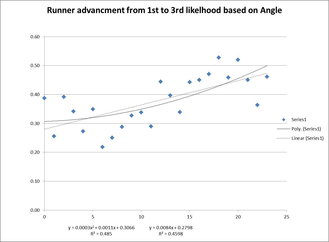
By looking in general at the plays, you can see that a player is significantly less likely to advance from 1st to 3rd on a single to right field if the ball is hit at 5 degrees vs 15 degrees.  It’s nearly double from ~20% at 5 degrees to ~40% at 15 degrees.  Wow. That’s huge, and with an R-squared of nearly 50%, we’re talking half of the decision to go from 1st to 3rd can be tied to the launch angle.  (The chart is basically parabolic if you go to the negative launch angles which do appear in the data set, but with much less frequency, which is why I removed those data points.  But it makes sense that it would be way.)

I did this same analysis using exit velocity and it wasn’t nearly as conclusive, though there was a trend downward, i.e guys were less likely to advance on singles hit at 100mph then they were for singles hit at 60 mph. The r-squared was ~13%.

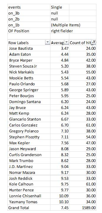
So now that we see that the angle the BIP comes to the outfield can make a big difference, who were the lucky recipients in the outfield of runner-movement-prevention balls in play?  When filtered to remove anybody who made fewer than 20 of this type of play, you end up with Eaton at No. 2 with an average angle of 4.44 (Bryce Harper, his now-teammate and also mentioned in Dave’s article in conjunction with his similarly excellent runner-movement-prevention, comes in at No. 3.  Possibly not a coincidence.)


You may notice my total number of plays for Eaton doesn’t match the total referenced by Dave per Baseball-Reference. I filtered out the plays where Eaton was in center field (which were several).  I believe that my analysis from the Statcast data had Eaton with 48 plays of this type (I think Dave’s article mentioned 52 per BR? Not sure what the difference is).

So in conclusion, I do think it’s very possible that Adam Eaton’s defensive numbers this past season, in particular with regards to his “ARM” scoring, could have been dramatically influenced in a positive direction simply by the balls that were hit to him and the angle they came.  Clearly this is something he has absolutely no control over whatsoever and it could fluctuate to another direction entirely next year.  I do think this area of analysis, in particular for outfield plays, whether it’s catches, assists, or even preventing advancement for runners, is a very ripe field for new approaches which in time should give us a much better idea of players’ defensive value.

That said, in this simple analysis the angle only accounted for ~50% of that runner-movement-prevention and that still leaves arm strength and accuracy as likely significant contributors, both of which I believe Eaton excels at.  And of course he did throw all those guys out.  So Eaton should be fine, likely well above average, but just don’t expect those easy singles to keep coming to him.


Where Bryce Harper Was Still Elite

Bryce Harper just had a down season. That seems like a weird thing to write about someone who played to a 112 wRC+, but when you’re coming off a Bondsian .330/.460/.649 season, a line of .243/.373/.441 seems pedestrian. Would most major-league baseball players like to put up a batting line that’s 12% better than average? Yes (by definition). But based on his 2015 season, we didn’t expect “slightly above average” from Bryce Harper. We expected “world-beating.” We didn’t quite get it, but there’s one thing he is still amazing at — no one in the National League can work the count quite like him.
Read the rest of this entry »