Author Archive

Batted Balls and Adam Eaton’s Throwing Arm

Adam Eaton, he of 6 WAR, is now on the Nationals and there is a lot of discussion happening regarding that.  It would seem that maybe 2 – 3 of those WAR wins are attributable to his robust defensive play in 2016. 20 DRS!

In Dave Cameron’s article “Maybe Adam Eaton Should Stay in Right Field,” Dave points out that Eaton led MLB with 18 assists and added significant value by “convincing them not to run in the first place.”

What Dave and most of the other defensive metrics that I’ve seen on the public pages tend to ignore is the characteristics of the ball in play, i.e. fielding angle and exit velocity, and these impacts on the outfielders performance.  So with only a bit of really good Statcast data I understand this is still hard to do, but it’s time to start.  You can easily envision that balls hit to outfielders in different ways (i.e. launch angle and velocity) can result in different outfield outcomes.  Whether it is the likelihood of an out being made on that ball in play, or whether it is how that ball interacts with runners on base.  Ignoring this data has nagged me for a while now, as I love to play with the idea of outfield defense (just look at my other community posts).

So can some of these stats explain Adam Eaton’s defensive prowess this season?  Maybe it’s possible.  I had downloaded all the outfield ball-in-play data from the 2016 Statcast search engine so I fired it up.  I have cleaned the data up to include the outfielder name and position for each play.  Using this I can filter the data for the situation Dave describes, which is:

A single happens to right field with a runner on first base.

Before we go into the individual outfielders, let’s look in general:


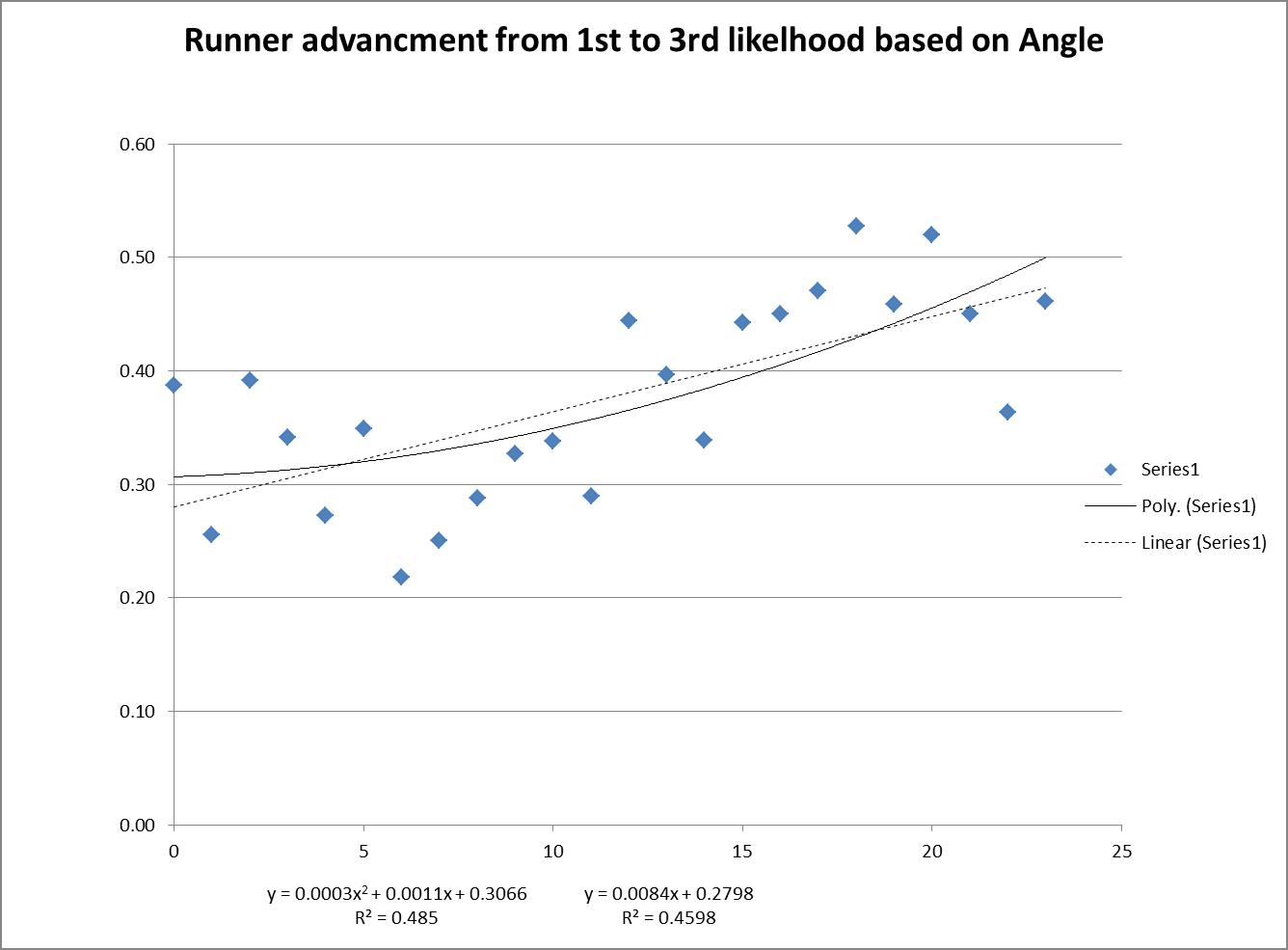
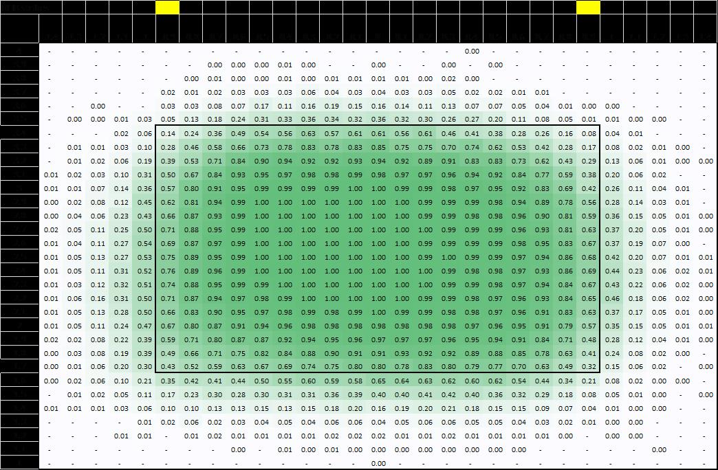
By looking in general at the plays, you can see that a player is significantly less likely to advance from 1st to 3rd on a single to right field if the ball is hit at 5 degrees vs 15 degrees.  It’s nearly double from ~20% at 5 degrees to ~40% at 15 degrees.  Wow. That’s huge, and with an R-squared of nearly 50%, we’re talking half of the decision to go from 1st to 3rd can be tied to the launch angle.  (The chart is basically parabolic if you go to the negative launch angles which do appear in the data set, but with much less frequency, which is why I removed those data points.  But it makes sense that it would be way.)

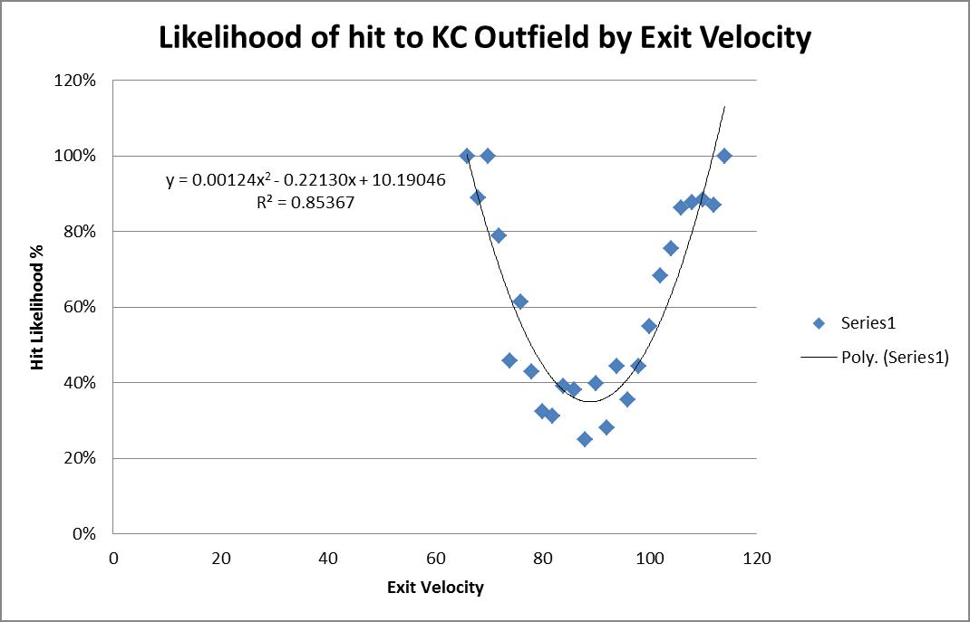
I did this same analysis using exit velocity and it wasn’t nearly as conclusive, though there was a trend downward, i.e guys were less likely to advance on singles hit at 100mph then they were for singles hit at 60 mph. The r-squared was ~13%.

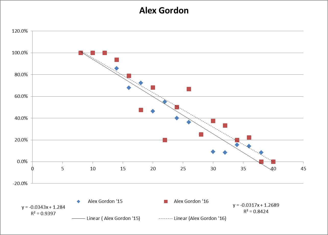
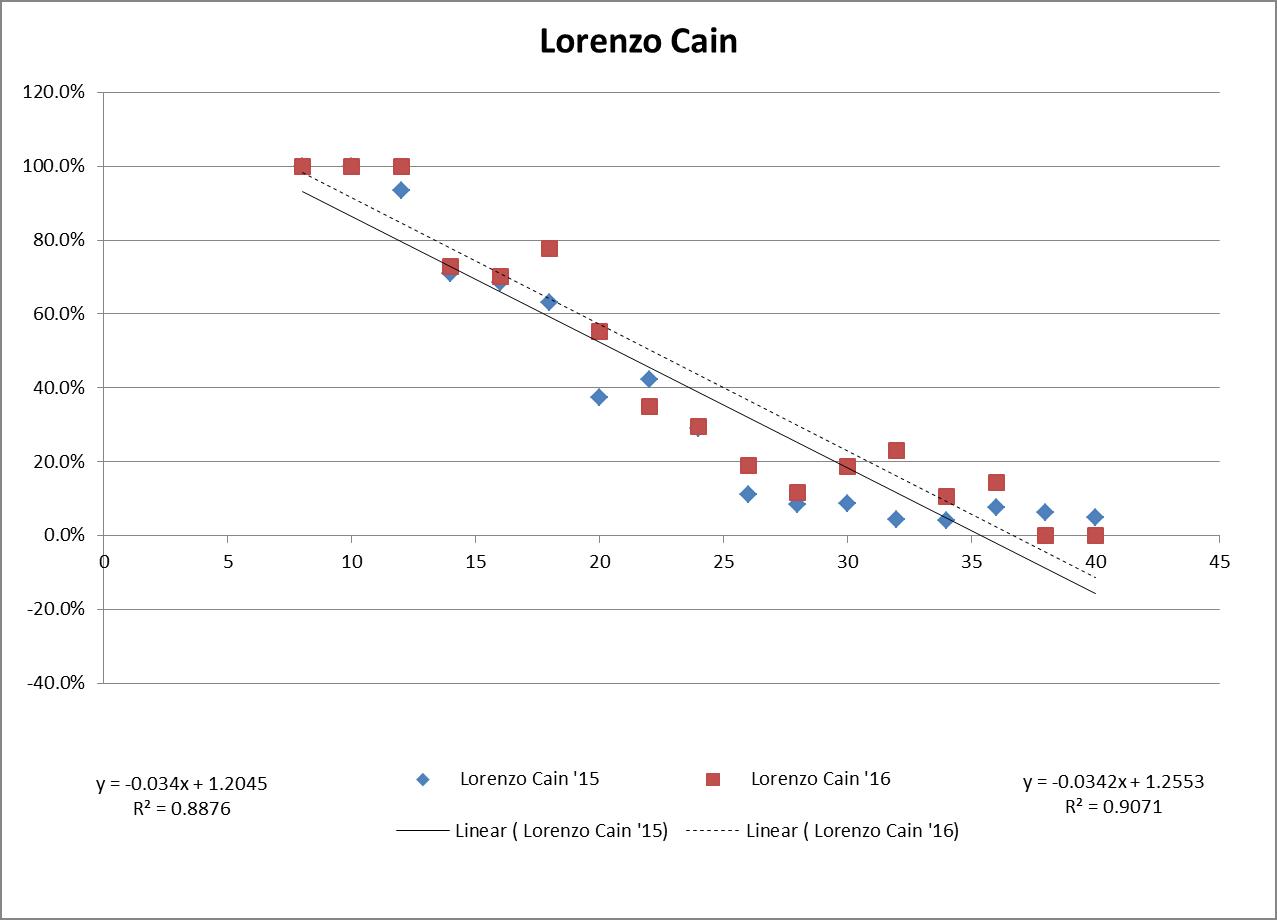
So now that we see that the angle the BIP comes to the outfield can make a big difference, who were the lucky recipients in the outfield of runner-movement-prevention balls in play?  When filtered to remove anybody who made fewer than 20 of this type of play, you end up with Eaton at No. 2 with an average angle of 4.44 (Bryce Harper, his now-teammate and also mentioned in Dave’s article in conjunction with his similarly excellent runner-movement-prevention, comes in at No. 3.  Possibly not a coincidence.)


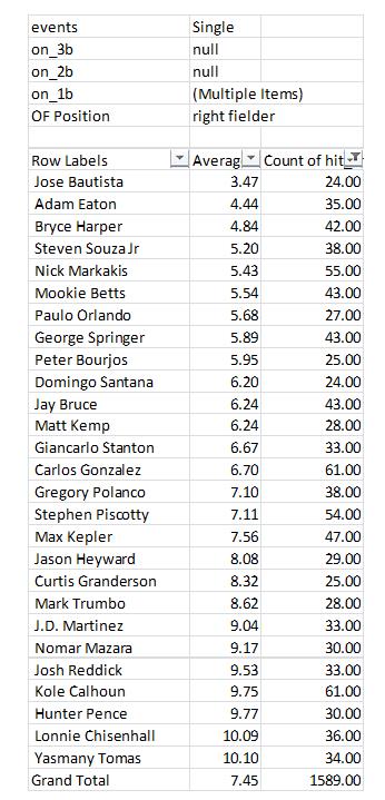
You may notice my total number of plays for Eaton doesn’t match the total referenced by Dave per Baseball-Reference. I filtered out the plays where Eaton was in center field (which were several).  I believe that my analysis from the Statcast data had Eaton with 48 plays of this type (I think Dave’s article mentioned 52 per BR? Not sure what the difference is).

So in conclusion, I do think it’s very possible that Adam Eaton’s defensive numbers this past season, in particular with regards to his “ARM” scoring, could have been dramatically influenced in a positive direction simply by the balls that were hit to him and the angle they came.  Clearly this is something he has absolutely no control over whatsoever and it could fluctuate to another direction entirely next year.  I do think this area of analysis, in particular for outfield plays, whether it’s catches, assists, or even preventing advancement for runners, is a very ripe field for new approaches which in time should give us a much better idea of players’ defensive value.

That said, in this simple analysis the angle only accounted for ~50% of that runner-movement-prevention and that still leaves arm strength and accuracy as likely significant contributors, both of which I believe Eaton excels at.  And of course he did throw all those guys out.  So Eaton should be fine, likely well above average, but just don’t expect those easy singles to keep coming to him.


Using Statcast to Analyze the 2015/16 Royals Outfielders

I’m working under the hypothesis that you can use launch angle on balls hit to the outfield to determine an outfielder’s relative strength.

The more I look at the data, the more convinced I’m becoming.

So I downloaded the 2015 and 2016 KC Royals Statcast data to see if I could compare their major outfielders’ performance year to year and see a couple things. What I’ve done is bucket hits to the OF by launch angle (in two-degree increments) and calculate a percentage of that contact resulting in a HIT or an OUT. Simple as that. So what I’m comparing between years is:

1) Are the hit likelihood percentages for each angle by OF reasonably projectable year to year
2) Does improvement in my angle metric result in improvement in other defense metrics

First let’s look at Jarrod Dyson. He’s one of the best outfielders in MLB. He recorded, per FanGraphs, 11 DRS in 2015 and to date has 18 DRS in 2016. His 2015 UZR/150 was 18.4 and in 2016 to date it’s 28.7. So both of the “new-traditional” type defense stats are saying, he’s not only good but he’s getting better in 2016 versus 2015. What does my angular stat suggest?

The red points are for ’16 Dyson while the blue is ’15. The left linear regression equation (with the .837 R2) is 2015 while the right (R2 .7796) is 2016. This shows Dyson as a similar player year to year, but likely a bit better. On the higher-angle fly balls, it does appear that Dyson has done a better job this year tracking them down; however, it also appears that in 2015 he did a bit better catching some of the lower-angled fly balls. So it’s not entirely clear, from this graph, why Dyson is per DRS and UZR having such a better defensive year. To have something like this happen, it could indicate that maybe Dyson is starting to play deeper than before. This would limit the likelihood of him catching the low-angled line drives to the OF, but help track down more true fly balls. I’d certainly be interested to see if Dyson is actually doing that very thing this year.

When it comes to projecting year to year, the R2 for Dyson’s ’15 to ’16 hit likelihood % was: 0.532. In real life this is a pretty strong correlation, so I’d say it’s a reasonable estimator.

How about we look at KC OF defensive darling Alex Gordon:

Again the red points are for ’16 Gordon while the blue is ’15. The left linear regression equation (with the .939R2) is 2015 while the right (R2 .8424) is 2016. It jumps right out to you how much smoother Gordon’s regressions are than Dyson’s. Maybe experience leads to that, who knows. So the 2016 regression line (the dashed one) shows that contact to him in the OF is a bit more likely to land for a hit now in 2016 than it was in 2015. This would suggest that Alex Gordon is having a worse year defensively in ’16 than ’15.

How do DRS and UZR/150 compare? Well, Alex has a DRS of 3 in 2016 and had a DRS of 7 in 2015. So he does seem to be trending a bit lower, though not too much. And he has a UZR/150 in 2016 of 9.9 whereas that was 10.5 in 2015. So in this case it all sort of agrees. Gordon seems to be a step or two slower (age and injuries easily could account for that) and as a result his defense has stepped backward a bit. Interestingly he’s still doing about the same job on balls that are high-likelihood hits — the more difficult plays. It’s really at the end of the spectrum where the balls are unlikely to be hits anyway that Alex seems to be struggling. So maybe the “skills” are still there, but the athleticism has just faded a bit and he can’t run down those long fly balls anymore. This is sort of the opposite of Dyson. Maybe Gordon is in fact playing too shallow, cheating to ensure his reputation for robbing sure hits stays intact while losing a bit of overall range, creating a situation where some balls land that probably should have been outs.

When it comes to projecting year to year, the R2 for Gordon’15 to ’16 hit likelihood % was: 0.778. This is excellent and I think it is clearly visible from the chart just how projectable year to year this would be.

What about All-Star and defensive stalwart Lorenzo Cain?

Again the red points are for ’16 Cain while the blue is ’15. The left linear regression equation (with the .8876 R2) is 2015 while the right (R2 .9073) is 2016. Well this is interesting — it’s just as though you shifted the line up ever so slightly. A 2016 higher trendline would indicate that contact to the outfield around Lorenzo would be more likely than last year to result in a base hit. This would indicate he too has backslid some from his 2015 self. So what do UZR and DRS say? DRS in 2016 is 11 whereas it was 18 in 2015. But UZR/150 is currently 15.4 in 2016 and it was only 14.1 in 2015. So there is a bit of confusion as to Cain’s 2016 performance, relative to ’15. Clearly he is still an excellent outfielder by all measures, but I would lean toward him trending in the negative direction in ’16 and moving forward.

Given the two linear regressions and data sets, you’d have to believe you could use this data to project very accurately the future year. And you’d be right. Cain’s year-to-year R2 checks in at 0.955.

Well what about newcomer Paulo Orlando? he already seems to be living up to the newfound tradition of excellent KC outfield defense:

Paulo Orlando is sort of the exact reverse of Cain. His trend has basically just taken an entire step down. This means balls are less likely to be hits now than before. So do UZR and DRS agree with Orlando taking what appears to be a reasonable step forward? Surprisingly no. DRS from ’15 to ’16 has jumped from 8 to 12, but Orlando has played a lot more innings which more or less would explain that growth. And his UZR/150 went from 14.0 in 2015 to 8.7 now in 2016. So these metrics both seem to think Orlando is the same if not a little worse than in ’15.

Projecting using Orlando’s earlier year is, like with Cain, excellent. There is an R2 of .90 between the two data sets.

So for my questions:

1) Are the hit-likelihood percentages projectable year to year? This seems to be a resounding yes, at least in the case of KC Royals. The R2 was always greater than 0.5 with two instances of the four being over 0.9! I’m starting to believe this really could mean something in regards to defense evaluation.
2) How does my angle measure compare to UZR/DRS? There do seem to be some differences; however, this is basically the norm in the “new” defense evaluations. No universal system has been developed and there are plenty of cases where UZR and DRS themselves have disagreements.

I do think in the end this has some merit and I will be looking further into it. I also think similar work can be done with regards to hit speed, as I already alluded to in my earlier article:

Using Statcast to Substitute the KC Outfield for Detroit’s

I think it’s important to view both the angle and hit speed as two pieces and going forward that’s something I’m hoping to include for these players.


Using Statcast to Substitute the KC Outfield for Detroit’s

As I write this post the KC outfield defense is ranked No. 1 in Defensive Runs Saved (DRS) with 43, and is No. 2 in UZR at 28.6 (first is the Cubs with 29.0).  KC sports one of the best, if not the best defensive outfield in the majors this season.

Detroit on the other hand has a fairly poor one.  They rank last in DRS, with -44, and last in UZR at -31.8.  Though Baltimore gives them a good run for their money, Detroit is probably the worst defensive outfield in the majors so far this season.

So I wondered if we could do an analysis to show what would happen if we substituted them entirely for one another?  How would that work?  Well, one simple approach would be to just use the DRS metrics for each team and basically say that DET would go from -44 to +43, so that’s a swing of +77 runs. Using the 10 runs per win thumb-rule, that’d be a pretty big swing, nearly eight games. Detroit is a whole lot better.  But I’m not sure this method is really the best we can do.  After all, we have all this Statcast data now.  Could we use that?

I set out to try to do just that.  So my first step was to hypothesize that the likelihood of a ball hit to the outfield actually dropping for a base hit could be correlated to the launch angle provided by Statcast and then that this likelihood would change depending on the team.  So to test this theory out I went to Baseball Savant and grabbed all the Statcast data for balls hit to the outfield for KC and for Detroit.

The KC data consisted of 1722 balls hit to the OF (when removing the few points that had NULL data for launch angle).  I took these 1722 points and bucketed them by launch angle in buckets that were 2 degrees each.  I then calculated the percentage of hits to total (hits + outs) for each bucket.  This percentage was the likelihood that a ball hit to the outfield at a certain launch angle would end up being a base hit.  This led me to my first realization, which was that anything that was basically < 8 degrees on launch angle (so including all negative angles), and made it to the OF, was a guaranteed hit.

The results of this analysis for the 1722 KC points made a lot of sense intuitively.  As the launch angle increased, so did the likelihood that it was an out, so my hit percentage trend went down.  Using a simple linear regression projecting the likelihood of a hit by angle had a 92.5% R^2.  This equation was going to work nicely.

I then considered running the same drill but this time using exit velocity of the hit to see how that impacted the likelihood of a ball being a hit.  There have been at least a couple article written on this topic, and the results I got matched up with the projections I had seen in other articles on the topic.  That’s to say the trend isn’t linear, but more parabolic. Using a simple second-order polynomial trend, a very reasonable projection could again be made of a hit likelihood based on the exit velocity of a ball hit to the OF.
Using these two points of data for any ball put in play to the outfield (exit velocity and launch angle) it seems as though OF defense could be projected fairly reasonably.
I proceeded to re-run those same drills using Baseball Savant’s Detroit outfield data. Launch angle provided another great fit, 95% R^2 and a slightly higher overall trendline than KCs (notice the higher y-intercept or “b” value).  KC’s OF was almost 4% more likely to catch a ball just from the “b” value.
Using a simple second-order poly trend for Detroit’s exit velocity also resulted again in an 85% R^2, very similar to that of KC.  It also showed the expected parabolic action.
What I now had was a way to project the likelihood of the KC outfield or the DET outfield making a play on any ball hit to the outfield.  All I needed to know was what the angle and exit velocity was.  Lucky for us, Statcast gives us all that information.
My next step was to take all the OF plays made by Detroit and, using my newfound Detroit projection system, project the number of real hits based on the hit events to the OF.  My Detroit projection system projected 1089 hits, in reality there were 986 hits. Not perfect, and something that could undergo some more tweaking, but reasonable.  My projection system was overly simplistic — I took the likelihood from the angle * the likelihood from the exit velocity.  If the multiplication was > 25% (i.e. 50% for each as the minimum threshold) then I projected a hit; else, an out.
So my Detroit projecting Detroit resulted in 1089 hits.  When I substituted the KC projection equations in, the Detroit projected hit to the OF dropped to 903.  This was a reduction of 186 expected hits!  Wow.  That’s some serious work the KC outfielders would’ve done.
The last step here was then to attempt to convert this reduction in hits to a reduction in runs.  I grabbed FanGraphs’ year-to-date pitching stats by team and used that to do a simple regression on hits allowed to runs allowed.
This showed strong correlation with a ~77% R^2.  Using the slope of this equation it shows that each hit allowed correlates to 0.7298 runs.  This means that a reduction of 186 hits would correlate to a reduction of 136 runs! Again, using the 10-run thumb-rule, that’s a nearly 14-win move.  That’s amazing improvement.   Now of course we are expecting drastic improvement; we’re talking about replacing the worst OF defense in the league with the best!
Conclusions
Are there some bold assumptions made here? Yes.  However, I do think it’s a fairly reasonable approach.  It’s fun to see all the different ways this new Statcast data can be used.  This same drill could be run on all sorts of “swap” evaluations and could be a whole lot of fun for a variety of what-if scenarios.  I enjoyed attempting to answer this question using the new data and hopefully you found this entertaining as well!

Using WAR to Project Wins by Team and by Team Position

When I think of WAR, I tend to think of it truly in terms of wins.  So when I see that a player is rated an 8 WAR player, to me I’m literally thinking this guy will get my team approximately eight additional wins.  Otherwise we should really just rename this “best player metric.”  Not that anything is wrong with a best player metric, but let’s not try to “connect” it to wins, if it’s not really connecting to wins, right?  So I wanted to see how accurate this really is.  So I downloaded the team WAR data from FanGraphs from 1985 – 2013, both hitting and pitching. I summed up the hitting & pitching WAR and plotted them versus the teams’ wins that year, hoping for a strong correlation.

You can see from the chart above, a correlation of 0.7525 was recorded. Great! This also shows a replacement-level team is about a 46.5-win team.  Not unreasonable. Things make sense.
So then I figured, maybe we could try to do this same drill, but instead of using complete team calculations, what if we used individual position components?  Would that result in a more accurate result?  It’s possible, since the sum of a team’s individual player WAR values is not necessarily representative of the team WAR calculation alone.  So what would this look like?  So I went to FanGraphs again and downloaded the same dataset, except by position this time, instead of by team.  For example, I’ve linked the catcher data below.
I went through and built a comprehensive list, tagging each player’s position.  For pitchers the FanGraphs link was comprehensive, so I determined the RP and SP tag by assigning anybody who had >75% of their games also be games-started, as a SP, and all others as RPs.  In some cases players showed up in multiple categories (i.e. Mike Napoli was listed as a C and 1b in 2011).  In those events, I simply equally split their total seasonal WAR evenly across however many positions.  So if a 6 WAR player showed up as a C & 1b & DH in a single season, each position was credited with 2 WAR. This prevented double or triple-counting of players.  So how did this work out?
This actually projected slightly better. I do mean slightly — 0.7559 R2 versus the 0.7525 R2 when viewed as just team hitting and pitching.  It also predicted basically the same replacement-level team, a 46-win one.  So you could probably make the argument that it’s slightly more accurate to try to actually use the sum of the individual player WARs on the team instead of just a team calculation.  But it is so close it’s probably not worth the extra effort for most exercises.
This then led me to think, why not try to tie wins in as a multi-variable regression using all the positions individually instead of just a linear one where we connect wins to some singular WAR total?
Since I already had the data i gave it a shot.
You can see here that we actually arrive at an R2 of a bit above 76%.  So this is ever so slightly more predictive again.  Again you also see that the intercept ends up very close to other methods, at 45.4 Wins for a replacement-level team.  But bottom line, it’s basically as accurate as the other approaches.  However, what I do find interesting in this approach is that it actually appears to value RP highest and the SS position the lowest.  And those values are substantial. Very substantial.
You could probably make the argument then that shortstops are being overvalued by the present system. This could possibly mean the defensive position adjustment value for SS defense is too high.  Reasons aside, this seems like a very legit finding, as the “WAR” metric appears to overstate SS value by 26.7% (1/0.789).  So for example, a typical FanGraphs contract analysis approach can use a standard $/WAR value for projections into the future. Yet from this perspective, spending that $/WAR on a SS will have you significantly overweighting the benefit you’ll get from that SS.  To a lesser extent that would also apply to 2b, CF and RFs.
Conversely, RP, SP and catcher figures are actually quite undervalued.  This would certainly lend some credence to the approaches of “smaller” and “rebuilding” teams to date (think Royals and Astros, even last year’s Yankees) who have focused, among other things, on RP groups.
Based on this data, it would seem that focusing on pitching, specifically RP, and getting an excellent catcher, would be the best ways to focus on turning around a team.  At least in the context of a singular $/WAR metric.
While this wasn’t what I went into this analysis looking for, it was a fairly surprising result. Yet one that seems to be in line with the approach many teams are currently taking.
NOTE: I do understand this could be refined even further to re-weight the players WAR values exactly correctly based upon their actual number of games at each position instead of the approach I took which was just to equally distribute those values.  Given the size of that specific sample and what type of change we’d be talking about, I would find it unlikely that would move the needle substantially here though. But I think it’s an interesting finding.

Rookie Pitchers and the Strike Zone

So my question is, do rookie pitchers get a similar treatment from umpires with regard to called strikes as do veteran pitchers?

In order to evaluate this question, I first had to develop a strike zone to evaluate.  So using the PITCHf/x data from 2013, 2014, and 2015, I created a model of the strike zone which was broken down into tenth-of-a-foot increments and plotted the probability of a strike or ball being called when a pitch was thrown inside that range for all the balls and strikes looking over those three years.  I did separate strike zones for lefty hitters and righty hitters since umpires should have a slightly different perspective depending on the batter’s location.

The strike zones I arrived at are shown here:

Once the strike zones were determined, I was able to go through the PITCHf/x data and tag every pitch thrown which resulted in either a ball or called strike with the associated probability of a pitch in that location being called either a ball or strike.

This then allowed me to take any individual pitcher and calculate an average “strike” probability for his called strikes.  As an example, here were my 2015 top 10 pitchers in terms of average strike likelihood (minimum pitches of 750 that were either balls or called strikes).

pitcher # Called Strikes Strike Likelihood % (SL%)
Dallas Keuchel 650 73.0%
A.J. Burnett 483 74.1%
Francisco Liriano 495 75.1%
Jon Lester 568 75.7%
Jesse Chavez 475 76.0%
Lance Lynn 445 76.0%
Jeff Locke 495 76.0%
Gio Gonzalez 541 76.3%
John Danks 498 76.4%
Charlie Morton 361 76.4%

The lower the percent, the better. This means that on average when Dallas Keuchel got a called strike over the course of the entire season, that pitch was only likely to be called a strike 73% of the time. To show the impact this could have, Stephen Strasburg in 2015 had 402 called strikes; however, his Strike Likelihood% was 86.5%.

So if Strasburg threw a pitch into a zone where there was an 80% chance of that pitch being called a strike, he was unlikely to get that call, while if Keuchel or Jon Lester or Gio Gonzalez threw that same pitch they were very likely to get that call.

Strasburg is particularly interesting due to the fact that both him and Gio are on opposite sides of the spectrum, since the first thing that would jump out to you is catcher framing as part of the delta. Looking at the top 10 list from 2015 for example you notice a lot of Pirates and of course Francisco Cervelli was loved by the catcher-framing metrics this year.

But catcher framing shouldn’t really be a major issue in the evaluation of rookie versus veteran pitchers. It’s unlikely rookies wouldn’t be caught by the primary catcher.

My next step was to calculate the Rookie Strike Likelihood% for 2013, 2014 & 2015 and compare it to the Non-Rookie Strike Likelihood% for those same seasons to see if there was any “bias”. I set my minimum total balls + called strike total to the 1st quartile value for that season. Remember the lower the SL% the better — this means a pitch can be “worse” and still called a strike.

2015 (135 minimum)

Non-Rookie SL% – 81.1%

Rookie SL% – 82.1%


2014 (114 minimum)

Non-Rookie SL% – 82.1%

Rookie SL% – 82.4%


2013 (166 minimum)

Non-Rookie SL% – 82.0%

Rookie SL% – 83.1%


So while the gap is not always huge, there is in each year a delta in the SL% which favors the veteran pitchers.

What does this mean? This could mean nothing. It could be entirely due to rookies just not working the zone in the same way veterans do, or it could be related to the specific pitch selection (fastball vs. curve vs. slider) and how those different pitches are typically located in the zone. It could be related to how often rookies are ahead vs. behind in the count against batters and what that means for their next pitch location.

Then again, it could just mean that there is some bias against rookies where they don’t get a sort of “Jordan” impact where your reputation gets you a call that maybe you wouldn’t have gotten without it. In all likelihood it is a combination of both. But given that this seems to be a real thing, it could also be used in the evaluation, again, of catcher-framing metrics. Catchers who catch an abnormally high amount of rookies in a season could see their framing “skills” negatively impacted due to their counterparts alone and not a diminishing skill on their part.