Author Archive

Kinda Juiced Ball: Nonlinear COR, Homers, and Exit Velocity

At this point, there’s very little chance you are both (a) reading the FanGraphs Community blog and (b) unaware that home runs were up in MLB this year. In fact, they were way up. There are plenty of references out there, so I won’t belabor the point.

I was first made aware of this phenomenon through a piece written by Rob Arthur and Ben Lindbergh on FiveThirtyEight, which noted the spike in homers in late 2015 [1]. One theory suggested by Lindbergh and Arthur is that the ball has been “juiced” — that is, altered to have a higher coefficient of restitution. Since then, one of the more interesting pieces I have read on the subject was written by Alan Nathan at The Hardball Times [2]. In his addendum, Nathan buckets the batted balls into discrete ranges of launch angle, and shows that the mean exit speed for the most direct contact at line-drive launch angles did not increase much between first-half 2015 and first-half 2016. He did observe, however, that negative and high positive launch angles showed a larger increase in mean exit speed. Nathan suggests that this is evidence against the theory that the baseball is juiced, as one would expect higher mean exit speed across all launch angles. I have gathered the data from the excellent Baseball Savant and reproduced Nathan’s plot for completeness, also adding confidence intervals of the mean for each launch angle bucket.

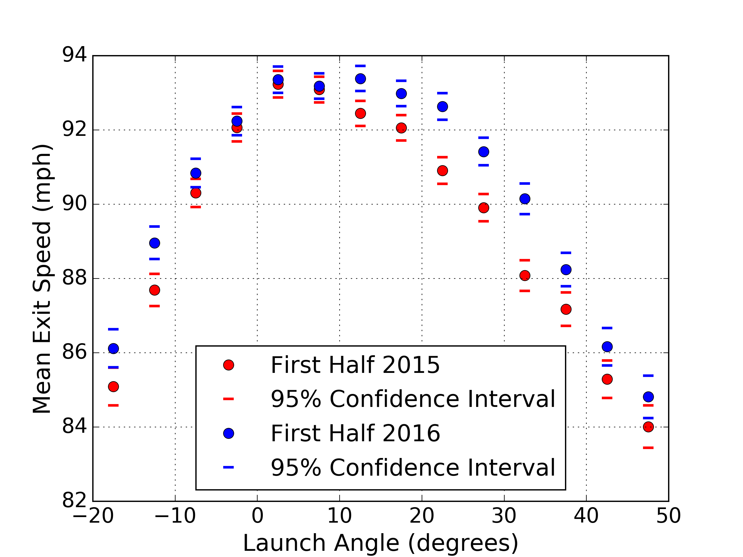
Figure 1. Mean exit speed vs. launch angle.

At the time of this writing, I am not aware of any concrete evidence to support the conclusion that the baseball has been intentionally altered to increase exit speed. This fact, combined with Nathan’s somewhat paradoxical findings, led me to consider a subtler hypothesis: some aspect of manufacturing has changed and slightly altered the nonlinear elastic characteristics of the ball. Now, I’ve been intentionally vague in the preceding sentence; let me explain what I really mean.

Coefficient of restitution (COR) is a quantity that describes the ratio of relative speed of the bat and ball after collision to that before collision. The COR is a function of both the bat and the ball, where a value of 1 indicates a perfectly elastic collision, during which the total kinetic energy of the bat and ball in conserved. The simplest, linear, approximation of COR is a constant value, independent of the relative speed of the impacting bodies. It has long been known that, for baseballs, COR takes on a non-linear form, where the value is a function of relative speed [3]. Specifically, the COR decreases with increasing relative speed, and can vary on the order of 10% across a typical impact speed range. My aim is to show that, for some reasonable change in the non-linear COR characteristics of the baseball, I can reproduce findings like Alan Nathan’s, and offer yet another theory for MLB’s home-run spike.

In order to explore this, I first need a collision model to incorporate a non-linear COR. I want this model to be relatively simple, and also to be able to account for different impact angles between bat and ball. This is what will allow me to explore the effect of non-linear COR on exit speed vs. launch angle. I will mostly follow the work of Alan Nathan [4] and David Kagan [5]. I won’t show my derivation; rather, I will include final equations and a hastily drawn figure to explain the terms.

Figure 2. Hastily drawn batted-ball collision.

The ball with mass is traveling toward the bat with speed , assumed exactly parallel to the ground for simplicity. The bat with effective mass is traveling toward the ball with speed , at an angle  from horizontal. We know that in this two-dimensional model, the collision occurs along contact vector, the line between the centers of mass, which is at an angle from horizontal. This will also be the launch angle. Intuition, and indeed physics, tells us that the most energy will be transferred to the ball when the bat velocity vector is collinear with the contact vector. When the bat is traveling horizontally and the ball impacts more obliquely, above the center of mass of the bat, the ball will exit at a lower speed. These heuristics are captured with the following equations, where COR as a function of relative speed will be denoted , and the exit speed .

                                                             (1)

                                                   (2)

                                                               (3)

                                                                              (4)

                                           (5)

Now all we must do is choose a functional dependence of the COR on relative speed. Following generally the data from Hendee, Greenwald, and Crisco [3], and making small modifications, I produced the following models of COR velocity dependence:

Figure 3. Hypothetical non-linear COR.

Note that, for the highest relative bat/ball collisions, the “old” and “new” ball/bat collisions will result in similar amounts of energy transferred, while in the “new” ball model, slightly more energy will be transferred to the ball in lower-speed collisions. This difference seems to me quite plausible given manufacturing and material variation of the baseball. It is also worth emphasizing that this difference need only be on average for the whole league; some variation ball-to-ball would be expected.

Taking the new and old ball COR models from Figure 3 and plugging into equations (1)-(5) allows us to simulate the exit speed across a range of launch angles. I have assumed a bat swing angle of 9 degrees. Calculations and plots are accomplished with Python.

Figure 4. Exit speed as a function of launch angle for non-linear COR.

The first thing to note about Figure 4 is that the highest exit speed is indeed at 9 degrees, which was the assumed bat path. The second is the remarkable likeness between Figure 4, the model, and Figure 3, the data. Clearly, I have cheated by tweaking my COR models to qualitatively match the data, but the point is that I did not have to make wildly unrealistic assumptions to do so. I have not looked deeply into the matter, but this hypothesis would also suggest that from ’15 to ’16, a larger home-run increase would be expected for moderate power hitters than from those who hit the ball the very hardest. In fact, Jeff Sullivan suggests almost exactly this [6], although he also produces evidence somewhat to the contrary [7].

There is certainly much complexity that I am ignoring in this simple model, but it is based on solid fundamentals. If one accepts that baseball manufacturing could be subject to small variations, and perhaps a small systematic shift that alters the non-linear coefficient of restitution of the ball, it follows that the exit speed of the baseball is also expected to change. Further, the exit speed is expected to change differently as a function of launch angle. That a simple model of this phenomenon can easily be constructed to match the actual data from suspected “before” and “after” timeframes is at least interesting circumstantial evidence for the baseball being juiced. Perhaps not exactly the way we all expected, but still kinda juiced.


References:

[1] Arthur, Rob and Lindbergh, Ben. “A Baseball Mystery: The Home Run Is Back, And No One Knows Why.” FiveThirtyEight. 31 Mar. 2016. Web. 30 Aug. 2016.

[2] Nathan, Alan, “Exit Speed and Home Runs.” The Hardball Times. 18 Jul. 2016. Web. 23 Aug. 2016.

[3] Hendee, Shonn P., Greenwald, Richard M., and Crisco, Joseph J. “Static and dynamic properties of various baseballs.” Journal of Applied Biomechanics 14 (1998): 390-400.

[4] Nathan, Alan M. “Characterizing the performance of baseball bats.” American Journal of Physics 71.2 (2003): 134-143.

[5] Kagan, David. “The Physics of Hard-Hit Balls.” The Hardball Times. 18 Aug. 2016. Web. 23 Aug 2016.

[6] Sullivan, Jeff. “The Other Weird Thing About the Home Run Surge.” FanGraphs. 28 Sept. 2016. Web. 4 Dec. 2016.

[7] Sullivan, Jeff. “Home Runs and the Middle Class.” FanGraphs. 28 Sept. 2016. Web. 4 Dec. 2016.


A Year In xISO

For the type of baseball fan I’ve become — one who follows the sport as a whole rather than focuses on a particular team — 2016 was the season of Statcast. Even for those who watch the hometown team’s broadcast on a nightly basis, exit velocity and launch angle have probably become familiar terms. While Statcast was around last season, it seems fans and commentators alike have really embraced it in 2016.

Personally, I commend MLB for democratizing Statcast data, at least partially, especially when they are under no apparent obligation to do so. I’ve enjoyed the Statcast Podcast this season, but most of all, I’ve benefited from the tools available at Baseball Savant. For it is that tool which has allowed me to explore xISO. I first introduced an attempt to incorporate exit velocity into a player’s expected isolated slugging (xISO). I subsequently updated the model and discussed some notable first half players. Alex Chamberlain was kind enough to include my version of xISO in the RotoGraphs x-stats Omnibus, and I’ve been maintaining a daily updated xISO resource ever since.

Happily for science, all of my 2016 first half “Overperformers” saw ISO declines in the second half, while most of my first half “Underperformers” saw large drops in second half playing time. Rather than focus on individuals, though, let’s try to estimate the predictive value of xISO in 2016.

Yuck. This plot shows how well first-half ISO predicted second-half ISO, compared to how well first-half xISO predicted the same, for 2016 first AND second-half qualified hitters. Both of these are calculated using the model as it was at the All-Star break. There are two takeaways: First-half ISO was a pretty bad predictor of second-half ISO, and first-half xISO was also a pretty bad predictor of second-half ISO. Mercifully though, first-half xISO was a bit better than ISO at predicting future ISO. This is consistent with the findings in my first article, and a basic requirement I set out to satisfy.

Now, an interesting thing happened recently. After weeks of hinting, Mike Petriello unveiled “Barrels”. Put simply, Barrels are meant to be a classification of the best kind of batted balls. Shortly thereafter, Baseball Savant began tabulating total Barrels, Barrels per batted ball (Brls/BBE), and Barrels per plate appearance (Brls/PA). In a way, this is similar to Andrew Perpetua’s approach to using granular batted-ball data to track expected outcomes for each batted ball, except that the Statcast folks have taken only a slice of launch angles and exit velocities to report as Barrels.

By definition, these angles and velocities are those for which the expected slugging percentage is over 1.500, so it would appear that this stat could be a direct replacement for my xISO. Not so fast! First of all, because ISO is on a per at-bat (AB) basis, we definitely need to calculate Brls/AB from Brls/PA. This is not so hard if we export a quick FanGraphs leaderboard. Let’s check how well Brls/AB works in a single-predictor linear model for ISO:

Not too bad. The plot reports both R-squared and adjusted R-squared, for comparison with multiple regression models. I won’t show it, but this is almost exactly the coefficient of determination that my original xISO achieves with the same training data. I still notice a hint of nonlinearity, and I bet we can do better.

Hey now, that’s nice. In terms of adjusted R-squared, we’ve picked up about 0.06, which is not insignificant. The correlation plot also looks better to my eye. So what did I do? As is my way, I added a second-order term, and sprinkled in FB% and GB% as predictors. The latter two are perhaps controversial inclusions. FB% and/or GB% might be suspected to be strongly correlated with Brls/AB, introducing some undesired multicollinearity. While I won’t show the plots, it doesn’t actually turn out to be a big problem in this case. Both FB% and GB% have Pearson correlation coefficients close to 0.5 with Brls/AB (negative correlation in the case of GB%). Here’s the functional form of the multiple regression model plotted above, which was trained on all 2016 qualified hitters:

To be honest, there is something about my first model that I liked better. This version, using Barrels, feels like a bit of a half-measure between Andrew Perpetua’s bucketed approach and my previous philosophy of using only average exit-velocity values and batted-ball mix. My original intent was to create a metric that could be easily calculated from readily available resources, so in that sense, I’m still succeeding. Going forward, I will be calculating both versions on my spreadsheet. I’m excited to see which version serves the community better heading into 2017!

As always, I’m happy to entertain comments, questions, or criticisms.


Updating Hitter xISO and Second-Half Predictions

In late May, I posted a version of expected ISO (xISO), inspired by Alex Chamberlain’s work, which incorporated the publicly available Statcast data, easily accessible from the Baseball Savant leaderboard. I’ve been tinkering with it since, and figured I would post an updated version, as well as some second-half predictions based on the current “leaders and laggards”.

MODEL UPDATE

The original version of xISO was a simple linear regression model using GB% and average LD/FV exit velocity (LDFBEV). The only feature of any real note was the inclusion of the square of LDFBEV as an additional term. I knew then that I could get better correlation to data if I used LD% and FB% and removed GB% from the model, but I thought the simpler model would be better. I also thought it would be weird to have LD% and FB% as separate terms, and then one combined term for average exit velocity. I guess I just changed my mind. Whatever, it’s all empirical, and the only rule is it has to…predict better. Let’s examine the model, again trained on 2015 qualified hitters, and using LD% and FB% instead of GB%.

New xISO Model, Trained on 2015 Data

As you can see, the coefficient of determination went up a little bit from the previous version. It’s not a big deal, but it’s basically free, so we’ll take it. The updated model equation is as follows:

Now, we also have a fair bit of data for this year. I don’t yet want to update the model parameters using 2015 and 2016 data to train, but I will at least check how the model correlates to this year’s outcomes so far. I arbitrarily selected a minimum of 175 batted ball events (BBE), which limits the pool to 141 players, as of July 8th.

2016 xISO

Look at that! Not too bad overall. Armed with some confidence in the method, let’s now take a look at some of the hitters who most over- and under-performed xISO in the first half (numbers current as of July 9). I will also attempt to avoid talking about any of the players I mentioned previously, or that Alex mentioned in his June xISO report.


OVERPERFORMERS

Jay Bruce: ISO = .274,  xISO = .187

Bruce is actually hitting his line drives and fly balls with less authority than last year (92.8 mph down from 93.2). His overall batted-ball profile looks similar as well. After a couple down years, it’s nice to see Bruce succeeding, but I’m not betting on it to continue.

Anthony Rizzo: ISO = .282,  xISO = .201

At the risk of enraging my pal, league-mate, and curator of Harper Wallbanger, we might need to calm down a little bit on Rizzo. Don’t get me wrong, I think he’s a very good player, but odds are he won’t continue to hit for quite this much power.

Jake Lamb: ISO = .330,  xISO = .256

Right now, Jake Lamb is second in the majors in ISO behind David Ortiz. He does hit the ball hard (97.9 mph LDFBEV), but he hits 46% of his balls on the ground. Even a .256 ISO would be quite good, given his decent walk rate. This will likely go down as a true breakout season for Lamb.

Wil Myers: ISO = .242,  xISO = .188

While some of the guys on this list play in hitters’ parks, Myers is an example of a first half overperformer in a pitcher’s park. Between expected power regression and his spotty injury history, I’m nervous about the second half.


UNDERPERFORMERS

Andrew McCutchen: ISO = .165,  xISO = .233

Now, ‘Cutch is hitting more popups this year than last year, which could be fooling xISO a bit. Still, I like his ISO to get back to around .200. Of more concern might be his spike in strikeouts.

Ryan Zimmerman: ISO = .181,  xISO = .236

Zimmerman’s exit velocity is up from last year (96.8 mph from 95.0). He probably won’t hit for average, but if he continue making hard contact, he should accumulate plenty of RBIs in the second half.

Yasiel Puig: ISO = .133,  xISO = .188

xISO basically expects Puig to get back to his career average of .183. My main worry with the burly Cuban is his struggle to maintain a healthy pair of hamstrings.

Colby Rasmus: ISO = .157,  xISO = .211

At this point, we basically know who Rasmus is. He is a player who consistently sports an ISO over .200. After a bump in fly balls last year, he’s sitting below his career average this season. That’s not ideal for power output, but he’s also hitting the ball a bit harder. I’ll still bet on him doubling his homer total over the remainder of the season, and surpassing 20 for the second season in Houston.


That’s it! Please feel free to to leave comments, questions, or suggestions for improvement. I’m working on a public document with the xISO calculation available for every player, updated daily-ish. Feel free to follow me on Twitter for updates, or badger me in the comments.


A New Hitter xISO, Now with Exit Velocity

Over the last few years, Alex Chamberlain has published a series of posts exploring the concept of xISO. Like the most commonly known xFIP, this metric is supposed to be an “expected” ISO, based on batted ball metrics. Nobly, Alex kept his model quite simple, using only statistics available on the FanGraphs player pages: Hard%, FB%, and Pull%.

I have very little formal training in statistics, most of it is self-taught to help me in my day job, so I’m also going to keep things simple. Inspired by Alex’s work, I began to experiment with improving the xISO model. I started building linear models including more predictors, and even introduced higher order and interaction terms. While these all improved the model slightly, I didn’t feel that the added complexity was worth the slight improvement. Along the way, I noticed that, although Chamberlain makes mention of the correlation between first half xISO and end of season ISO, if I calculated first half xISO and compared to second half ISO, I would find the initial xISO model to be a worse predictor of second half ISO than the actual first half ISO.

As I was running these calculations, I also became acquainted with the publicly available Statcast data through Daren Willman’s Baseball Savant site. Although the gathering of input data becomes a bit more tedious, surely some combination of exit velocity and launch angle information would improve an xISO model, and perhaps produce something which produces a better correlation between first and second halves. Let us see!

First things first, since Statcast is so new, we only have one full season of data. Ideally, we could use multiple years of data to build the model, but for now, we’ll stick with 2015 full season to train the model. As it turns out, the Statcast parameter that correlates best with ISO is the average exit velocity for line drives and fly balls (LDFBEV). This makes sense, right? It also makes sense that we can exclude ground ball exit velocity in an ISO predictor. Launch angle seems to have some relationship with ISO, but it’s relatively weak.

So, we’ll hang our predictive hats on LDFBEV and see what else can help. After constructing various models, we can pretty quickly see that Pull%, Center%, and Oppo% don’t add much additional explained variance between model and data, nor do Soft%, Med%, and Hard%. This isn’t surprising, since we already have an objective hard contact measure. Ultimately, the one traditional batted ball statistic that helps is GB%. In fact, in the final regression, adding GB% nets us about 18% more explained variance between model and data. This also makes sense. It’s pretty hard to hit a ground ball double or triple, and really hard to hit a home run.

So we’re down to two predictors, GB% and LDFBEV. If we ran a regression with only these two predictors, we would undersell the players who hit the ball really hard. To solve this, we’ll simply include another term in the regression, simply the square of the exit velocity. Throw in a constant term, and we’re ready to run the regression using all 2015 qualified hitters (141 of them). Here’s what comes out:

xISO Model Regression

First things first, we see an R-squared value of 0.75. This is pretty decent; it means our really simple model explains 75% of the variance of of the ISO data. The regression coefficients are as follows.

xISO = -0.358973*(GB) – 0.108255*(EV) + .00066305*(EV)^2 + 4.66285

With this equation, one can look up the relevant data on FanGraphs and Baseball Savant, and calculate the current xISO for any given player. We’ll get to that, but first, I think it’s important to check whether the new xISO model can do a better job predicting future performance than a player’s current ISO. One could also check how quickly xISO stabilizes, compared to ISO, but I won’t attempt that here. What I will do is produce the necessary splits for GB%, LDFBEV, and ISO from FanGraphs and Baseball Savant, calculate 2015 first half xISO for all qualified, and compare to second half ISO. Unfortunately, the number of qualifying players common to the first and second half in 2015 was only 109, but this is what we have:

First Half Second Half

It’s hard to see from the plot, but the R-squared values tell the story: first half xISO does a better job than actual first half ISO at predicting second half ISO. Interestingly, it seems that several players significantly increased second half ISO compared to first half xISO or ISO, and relatively fewer saw a large decrease. I don’t know why this is, but perhaps it is related to the phenomenon detailed by Rob Arthur and Ben Lindbergh on the sudden power spike in 2015.

Having roughly demonstrated the predictive power of our new xISO, let’s show its utility by looking at a few interesting 2016 performers, as of May 22nd:

Trevor Story: ISO = .327,  xISO = .272

Domingo Santana: ISO = .142,  xISO = .238

Troy Tulowitzki: ISO = .190,  xISO = .182

Chris Carter: ISO = .349,  xISO = .355

Christian Yelich: ISO = .205,  xISO = .201

One of the first half’s great surprises, Trevor Story has a slightly inflated ISO, but he does hit the ball pretty hard, and does not hit many ground balls. While he probably won’t sustain an ISO north of .300, he’s a good bet to beat his Steamer ROS projected ISO of .191. Santana and Yelich are two guys who hit the ball hard, but are are held back by their ground ball tendencies. Chris Carter currently leads the pack in LDFBEV, and is a deserved second in ISO. Troy Tulowitzki fans: sorry, but it appears his days of .250 ISOs are a thing of the past.

So that’s it! We’ve got a cool new tool to use. Perhaps not surprisingly, I’ll be mostly using it for fantasy. Dedicated FanGraphs readers will also note that Andrew Perpetua has been doing work with Statcast data on “these electronic pages” recently as well. His use of launch angles introduces more sophistication into the models, but also more complication. My intent here is to present something which can be evaluated by anyone with a few clicks and a calculator. Please reach out with any qualms, criticisms, or suggestions for improvement!