Balancing the Realities of Michael Conforto’s Service Time

There’s no shortage of people who think Michael Conforto should never have been demoted last season. The thinking among members of this group is that the Mets messed around with Conforto’s development by twice transporting the 23-year-old outfielder to Las Vegas rather than allowing him to work through his struggles in the majors.

Whether you agree with this sentiment or not, there is no arguing that Conforto did struggle, especially against LHP. There is also no arguing that the acquisition of a left-handed RF at last year’s trade deadline was directly related to said struggles.

The presence of that left-handed RF, Jay Bruce — and maybe more importantly the $13-million 2017 salary associated with Bruce that has scared off potential trade suitors to date — leaves the current state of the 2017 Mets outfield quite complicated.

As it stands now, hundred-millionaire Yoenis Cespedes has permanent claim in left, and Curtis Granderson seemingly has permanent claim in center, leaving Bruce or Conforto to man right. The defensively-superior Juan Lagares could spell Granderson against lefties (if he makes the roster, that is), which would leave one of Granderson/Bruce/Conforto in right. Further, there is some talk of Jose Reyes getting time in the outfield. So yeah, pretty complicated.

A 2015 summer addition, Conforto never had a chance of being Super Two-eligible post-2017. But last season’s two Vegas vacations have left his current service time at 1.043. Stated another way, if Conforto starts 2017 in Vegas and spends the first 48 games there, the Mets gain another year of team control. Given the superfluous state of the Mets current OF, this scenario, which would have sounded outlandish in March of 2016, is now worth considering.

Michael Conforto Salary Chart

≥129 days, ≥114 games <129 days, <114 games
Year Age Salary Year Age Salary
2017 24 Team Control 2017 24 Team Control
2018 25 Team Control 2018 25 Team Control
2019 26 Arb 1 2019 26 Arb 1
2020 27 Arb 2 2020 27 Arb 2
2021 28 Arb 3 2021 28 Arb 3
2022 29 FA 2022 29 $10.7mil (Arb 4)
2023 30 2013 30 FA

While it’s impossible to predict Conforto’s future arbitration salaries, I arrived at this estimate using the general rule of a 50% increase in salary each year of arbitration. A low-ish estimate of $2 million for Conforto’s Year 1 arbitration salary would yield a $6.75 million Year 4 arbitration salary, while a high-end estimate of $4.5 million for Conforto’s Year 1 arbitration salary would yield a $15.2 million Year 4 arbitration salary. $10.7 million is not only pretty close to the exact middle of these two numbers, but also conveniently lines up with the value of 1 win in 2022 when using 5% inflation.

Year $/WAR (5% inflation)
2016 $8mil
2017 $8.4mil
2018 $8.8mil
2019 $9.3mil
2020 $9.7mil
2021 $10.2mil
2022 $10.7mil

If Conforto turns out to be just an average regular, the Mets would still gain $10.7 million in 2022 surplus value. If he’s a lot better than average while in the heart of his prime, then the Mets’ 2022 surplus value would be much greater. If you think Conforto will be below average in 2022, then what the Mets do with him in 2017 is mostly irrelevant. Any way you slice it, the potential long-term financial advantage is discernible.

It’s no surprise that Conforto’s playing time projections are all over the place — Depth Charts projects 245 PAs, Steamer projects 319 and ZiPS projects 558. 48 games equal 29.6% of the season, which equates to 73 PA using Depth Charts projections, 94 PA using Steamer projections, and 165 using ZiPS projections. Take the average of those three and you get 111 PA for Michael Conforto over the first 48 games.

Which brings me back to my original title of this piece — is the value of 111Michael Conforto PA in 2017 worth more than a one-year deal for ~$10.7mil in 2022, Conforto’s age-29 season?

There are plenty of variables to consider when answering this, but the most important is probably comparing the 2017 versions of Conforto and Bruce. While Conforto projects as a better hitter, fielder and runner than Bruce, Bruce did run a 124 wRC+ against RHP 2016 and holds a 115 career mark. No one is confusing Bruce for Bryce Harper, but he’s a perfectly suitable platoon option in RF.

Also relevant is the Mets’ schedule over the first 48 games.  Using FanGraphs projections, the weighted projected win percentage of the Mets’ first 48 opponents is .477 — roughly the equivalent of a 77-win team. Now of course these 48 games won’t count any less than the 114 that will follow, but if you truly think Conforto is a better option than Bruce AND you had to choose 48 games to play Bruce over Conforto, the first 48 would be pretty ideal.

While Conforto looked miserable at times last year, it’s impossible to ignore that he posted a 152 wRC+ from July 2015 – April 2016 at the ages of 22-23. While his 2016 Barreled Balls May Not Have Been Ideal, he continued to hit the ball hard amidst his struggles.

I hope Michael Conforto is in RF when Noah Syndergaard throws his first 100mph fastball against Julio Teheran and the Braves on Monday, April 3. But if he’s not, then he must be 2000 miles away, getting at-bats in Las Vegas, rather than a matter of feet away, wasting away in the dugout in Queens. The latter simply doesn’t pay.


Turning Nick Castellanos Into Nolan Arenado

Inspiration struck me after reading Jeff Sullivan’s piece yesterday on how Christian Yelich could morph into Joey Votto with continued changes, or shall we say improvements, to his batted-ball profile. Namely, hitting the ball in the air more. As Jeff rightly pointed out, Yelich hammers the ball as well as anyone in baseball; it’s just that, to date, he’s done so much more often on the ground. You know who doesn’t have Christian Yelich’s problem?  Nick Castellanos.

Castellanos has driven changes in his batted-ball profile, which were covered last May by Eno Sarris when he documented the change in Castellanos’ launch angles. Why should you care? Because he’s slowly morphing into Nolan Arenado, and now is the time to buy.

There have been only 10 players with at least 250PA each season since 2013 to grow their FB% year over year.

FB% 2013-2016
Player 2013 2014 2015 2016
Brian Dozier 41.3% 42.9% 44.1% 47.7%
Nolan Arenado 33.7% 41.8% 43.9% 46.7%
Yan Gomes 38.7% 39.4% 40.0% 45.1%
Matt Carpenter 34.0% 35.2% 41.7% 43.3%
Mark Trumbo 37.0% 40.2% 40.3% 43.1%
Bryce Harper 33.4% 34.6% 39.3% 42.4%
Adam Jones 32.0% 35.5% 36.3% 40.6%
Victor Martinez 35.4% 38.1% 38.7% 39.3%
Kendrys Morales 32.7% 33.3% 34.7% 35.7%
James Loney 27.9% 31.0% 33.0% 34.5%
Minimum 250 PA in each season 2013-2016.

Then there’s Nick Castellanos:

FB% 2013-2016
Player 2013 2014 2015 2016
Nick Castellanos N/A 36.5% 40.4% 43.0%

To be fair to Arenado, hitting more fly balls isn’t the only thing that’s made him the home-run king of the NL (now that Chris Carter has departed to the AL). It’s been his meteoric rise in HR/FB rate as well. There are 10 other players that would fit nicely on this table with Castellanos, but I’ll leave that as an exercise for the reader. Chances are, you’re already well aware of the other players that would join him on the list — I’m looking at you, Justin Turner.

HR/FB 2013-2016
Player 2013 2014 2015 2016
Nolan Arenado 7.1% 11.4% 18.5% 16.8%
Nick Castellanos N/a 7.5% 9.2% 13.7%

For fun, if we were to project out a full season of at-bats with some growth for Nick Castellanos, we get an interesting range of outcomes for his HR totals:

Castellanos HR Outcomes Given FB% and HR/FB
HR/FB 40% FB 41% FB 42% FB 43% FB 44% FB 45% FB
10% HR/FB 17 18 18 18 19 19
11% HR/FB 19 19 20 20 21 21
12% HR/FB 21 21 22 22 23 23
13% HR/FB 22 23 23 24 25 25
14% HR/FB 24 25 25 26 26 27
15% HR/FB 26 26 27 28 28 29
16% HR/FB 28 28 29 30 30 31
* Assumes 430 balls put in play

Much like the Yelich-to-Votto comparison, there are some things that keep Castellanos from becoming Nolan Arenado — namely his strikeout rate, which is 24.6% to Arenado’s 14.6%. This limits the number of balls he puts in play and thus the number of fly balls and homers he can hammer. However, with a little bit of health, growth and maturation in approach, we could see a 30HR season out of Castellanos this year.


Why Doesn’t Mauricio Cabrera Strike Out More Batters?

For many years, the undisputed king of velocity in Major League Baseball has been Aroldis Chapman, with his fastball that averages around 100 mph and regularly reaches higher. Few pitchers have even been able to approach the level of Chapman’s fastball since he came into the league, and none have surpassed him. However, in 2016, one pitcher finally did it. Mauricio Cabrera of the Atlanta Braves averaged nearly 101 mph on his fastball in 2016 and he regularly touched 103; but yet there was still a major difference between Cabrera and the incredible Chapman. Chapman struck out over 40% of the batters he faced last year, while Cabrera struck out less than 20%. Strikeouts are intuitively related to fastball velocity. The faster that a pitcher can throw the ball, the less time a batter has to react, making it harder to make contact. So how does a pitcher such as Cabrera, who throws as hard as anyone in the game, strike batters out at a well below-average rate?

I first thought that maybe his perceived velocity is not as great as his actual velocity, and sure enough Cabrera does gets very little extension toward the plate when he delivers the ball. He only extends about six feet toward the plate before he releases the ball, which is a full foot shorter than fellow reliever, Zach McAllister, and several inches shorter than average for fastball-heavy relievers. This lack of extension means that the velocity that the batter perceives is slower than the actual velocity coming out of Cabrera’s hand, because it has farther to travel before it gets to the plate. However, this is only a minor difference, as Cabrera’s perceived velocity is still above 100 mph. This is not a huge drop, but it does bring him closer to the pack, as many relievers get good extension that increases their perceived velocities above their actual velocities. Chapman, for instance, gets great extension toward the plate on his already incredible fastball, which results in his excellent perceived velocity of over 101 mph. Cabrera’s lack of extension is likely a contributing factor to his low strikeout numbers, but it does not seem to be the main culprit.

Next, I wanted to see if there was something about the spin rate on his fastball that doesn’t lend itself to strikeouts. Spin rates correlate quite strongly with strikeout rates. Pitchers with high spin rates on their fastballs typically generate more swings and misses, and thus more strikeouts. It turns out that Mauricio Cabrera does have a low spin rate on his fastball. His fastball spin rate of 2300 rpm is well below average for fastball-heavy relievers, which is probably a major reason why he doesn’t miss many bats.

While it makes intuitive sense that something like the amount of spin on his fastball could be the reason for his low strikeout totals, it is still puzzling to see that his spin rate is so low, because spin rate is typically correlated with velocity. For most pitchers, the harder you throw, the more spin you will put on the ball. Aroldis Chapman, for example, has one of the highest spin rates in the sample. In order to single out the spin rate from the velocity, I divided the spin rate by the velocity to find the Bauer Unit, named after Indians pitcher Trevor Bauer. Cabrera’s average Bauer Unit of 22.85 is one of the lowest in the entire sample of fastball-heavy relievers. This means that he has some of the lowest spin per MPH in the game. There must be something inherent in how Cabrera throws a baseball that just doesn’t allow him to generate the amount of spin that is typically commensurate of how fast he throws.

Cabrera’s low spin is not all bad, though. Just as high spin rates lead to strikeouts, low spin rates lead to ground balls. An average spin rate is really where you don’t want to be, as those are the pitches that get squared up more often. While Cabrera actually has an above-average spin rate for the entire population of major-league pitchers, his spin rate is one of the lowest in the league compared to his velocity. This effectively makes him a low-spin pitcher, and last year’s batted-ball numbers bear that out. Nearly 50% of the batted balls Cabrera gave up last season were on the ground, and he didn’t surrender a single home run all season despite giving up the hardest average exit velocity in the game last year on his fastball. Cabrera got away with that extreme exit velocity by only allowing an average launch angle of 5.9 degrees, which was one of the lowest among the fastball-heavy relievers. It is hard to do much damage on balls hit on the ground, even if they are hit 95 mph. While the myth that the harder the ball is thrown the harder the ball can be hit has largely been disproved, it is interesting to see that the pitcher who throws the hardest also gave up the highest average exit velocity.

Of course, strikeouts aren’t just about swinging strikes; you have to get called strikes as well. Throughout Cabrera’s minor-league career, he struggled to throw strikes consistently. So much so that many thought his strike-throwing ineptitude might prevent him from ever even reaching the big leagues. However, once he started pitching in the majors, he suddenly discovered how to find the strike zone. Of course, walking four and a half batters per nine innings is still poor, but that mark represented his lowest walk rate since rookie ball in 2012. Even with the high walk rate last year, he actually threw strikes at an above-average rate. His Called Strike Probability, according to Baseball Prospectus, was 47%, which is slightly above league average. For a guy like Cabrera who has always struggled with control, it is probably a good thing to see him filling up the strike zone at an above-average clip. However, the tendency to pitch within the zone could result in more contact and thus bring his strikeout numbers down. Since he doesn’t command his pitches well, he cannot nibble at the corners or trust himself to throw his pitches just off the plate to generate swings and misses. This allows hitters to either lay off pitches that are safely outside, or lock in to the pitches that are squarely in the zone. This could be another significant cause for his lack of strikeouts.

Another reason Cabrera doesn’t strike out many batters is because he doesn’t possess a bat-missing secondary offering. His secondary pitches are all used primarily to get hitters off of his fastball. He throws the hardest change-up in baseball at 91 mph, and a mid-80s slider with good depth. The change-up got squared up pretty often in 2016, which makes sense, seeing that he throws the pitch with the velocity of a league-average fastball. The slider also does not get many whiffs, but hitters were not able to do much damage off of it in 2016. Batters only slugged .136 off of his slider last season, and the pitch generated the highest rate of fly balls of any slider in the game. Perhaps what is even more significant is that hitters had an average exit velocity against his slider of 85 mph and an average launch angle of 30 degrees. For reference, hitters that hit the ball with an exit velocity of 85 mph at a 30-degree launch angle went 4 for 72. His slider may not be a swing-and-miss offering, but it sure seems to be a good out pitch for him.

It looks like Cabrera’s low spin rate on his fastball relative to its velocity is the main reason for his lack of strikeouts. However, it is also likely that that same low spin rate allows him to induce an extreme amount of ground balls, which helps him limit the damage from the opposing batter. His lack of extension toward the plate and his tendency to live in the strike zone are also contributing factors. He also doesn’t have a secondary offering that gets many swings and misses. His slider, however, does produce a great deal of pop-ups, which is another way he limits damage on his batted balls. A major reason for his success last season despite his low strikeout totals and high walk numbers was that he didn’t give up any home runs. While a complete lack of dingers is very unlikely to persist, the types of batted balls he allows on his fastball and slider make it difficult for batters to hit it deep off of him.

Cabrera walks too many batters, and while I wouldn’t be surprised to see some progression in his strikeout rate, I don’t expect him to ever strike out batters at the same rate as someone like Chapman. He should be able to persist for several years as a good late-inning reliever, but he probably will never reach the elite levels that his fastball might suggest.


Rick Porcello and Wins

Before spring training started, Scott Lauber at ESPN explored whether Rick Porcello could match his 22-win season from 2016. The short answer? No. Probably, almost definitely, not.

Conventional wisdom would swiftly say that, too, though. Three pitchers netted 20 wins last year, two in 2015, and three in 2014. And over those three years, none of the pitchers repeated the feat.

With wins speaking to much more than simply the pitcher on the mound, there are two things to consider when digging into the question: What could Porcello repeat, and what could the Red Sox offense?

Let’s start with the offense. Lauber’s article acknowledges that the Sox scored a league-leading 5.42 runs per game last year, and 6.83 per Porcello start. The biggest difference between this year’s and last year’s team is Mitch Moreland replacing David Ortiz. You could close your eyes and dip your hand into a bowl of cold spaghetti like it’s a Halloween Horror House and pull out the contrast between their production. As is, Moreland is projected to be worth about half a win next season. Alone, that suggests how the Sox could have struggles producing the same way in 2017.

But there are other questions to answer, too. How will top prospect Andrew Benintendi fare? Will Pablo Sandoval make any difference or continue to be negligible? I’m not suggesting the Sox won’t be good. It would be hard for them not to be. But they have enough variables going into the year that Porcello getting another 20+ wins is largely on him, which could be difficult for reasons beyond conventional wisdom.

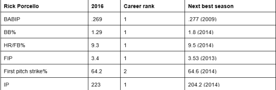
image

These numbers tend to feed into each other, which is why they’re useful in seeing just how good Porcello was, and how well things broke for him last year. His pitching profile was relatively similar to past seasons, though. It’s not like Drew Pomeranz discovering a new pitch or Brandon Finnegan changing a grip. Porcello’s sinker (or two-seamer, depending which stat site you reference) gets a lot of the credit for his exceptional performance, but differences in his curveball may reveal reasons for it, too.

image

None of these changes are insignificant. The h-movement tells us Porcello’s curve ran away more from right-handed hitters and in on lefties. The v-movement tells us it dropped more. Add in how it was three mph slower and it rounds out how the pitch fell off the table more. He worked the zone more up and down over the plate than he did side to side in the two years prior, so it could have messed with batters more when the rest of his pitches moved as they have.

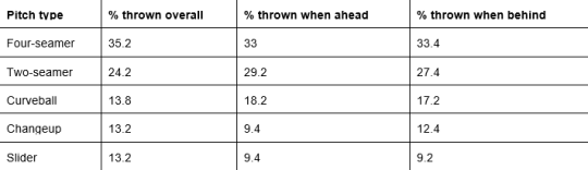
According to Lauber, Porcello mimicking anything close to 2016 will come down to “keeping hitters honest with his off-speed pitches.” Opponents hit .190 against his slider and .174 against his changeup. That could concern pitch-sequencing. Take a look at how he distributed his offerings in general, and then when ahead or behind in the count.

image

While the numbers don’t detail specifically when each pitch was thrown, they indicate that Porcello was eerily similar no matter what the count was. Sequencing isn’t about finding a magic combination of pitches; it’s about making sure a hitter can’t tell what’s coming. It certainly seems he was successful at it.

This data shines light on the tiny changes that might make a big difference in the game, which is one of the most fascinating aspects of baseball. But even more interesting is a quote from Dave Dombrowski in the ESPN piece, where he said, “I don’t think [Porcello] will try to do too much anymore.”

By itself, that reads like a generic sports-interview statement. But think about what the concept of “trying to do too much” really means in baseball: trying to do too much of one thing. A guy tries to hit a five-run homer or hit 100 on the gun every time; really tries to impose his will over the game by doing something impossible. Porcello wasn’t relying on any one pitch in 2016. And what Dombrowski is hinting at here, intentional or not, is there’s a certain amount of surrender that’s necessary for faring well in baseball.

Lauber tells how Porcello best explains his 2016 success by saying he “better understands what makes him effective.” Maybe that has to do with knowing how much the game controls versus how much he can, which let him harness his own abilities more.

I fear a lesser 2017 from Porcello could be called a disappointment by some, but an advanced understanding doesn’t always mean advanced success. The reality is it was a great year aided by good luck, probably buoyed by the cognizance that has allowed Porcello to be a contributing major-leaguer since he was 21. Maybe he isn’t as good this coming season, but it doesn’t take away from the player he is.

career and pitch movement data from FanGraphs; pitch usage from Baseball Savant


A New Option for the Nationals’ Closer

The Nationals have had what seems to be a perpetual issue at closer. They have churned through Drew Storen, Tyler Clippard, Rafael Soriano, Jonathan Papelbon, and now Mark Melancon. Some people have touted Koda Glover as the solution for the next half century, but he remains mostly untested. For a team with a great record of developing starting pitchers such as Jordan Zimmermann, Tanner Roark, and Stephen Strasburg, and a general manager in Mike Rizzo whose list of faults is one name long — Jonathan Papelbon (I’m still hopeful about Adam Eaton) — it is somewhat surprising that they have not been able to address the omnipresent glaring issue at the end of games. The potential solution might be in the starting rotation: Joe Ross.

It may not seem obvious, but Ross is a perfect candidate to be moved to the bullpen. Ross has never pitched a full season as a starter. He pitched 105 innings this most recent season, and missed the middle of the season sidelined with a shoulder ailment. The slider that he threw 39% of the time this season is known to wear down a pitcher’s arm, and it did wear down his brother Tyson’s. A move to the ‘pen might save Joe Ross’s arm.

Ross’ numbers are far superior his first time through the order. As Eno Sarris detailed in his article “Who Needs a New Pitch the Most,” Ross’s velocity decreased a full mile per hour during his average start, his strikeout rate dropped by over 10 percent, and his wOBA against shot up from .248 his first time through the order to .371 his second time through.

Most importantly, Ross really only throws two pitches, a slider and a sinker. Two pitches are typical of a reliever, but a solid third option is often required to stick in the rotation. His sinker currently averages about 93 mph, so a move to the end of games could see that number rise to 95. He might also be able to get away with throwing his slider, which batters have hit just .173 against, more often. That combination is tantalizing.

It doesn’t make sense to give up on Joe Ross as a starter just yet, but if his arm fizzles out yet again this season, the Nats should give him a shot in the ‘pen.


MLB to Across the Pacific and Back

The player that all Milwaukee Brewers fans, and baseball fans for that matter, should be watching most closely this spring is Eric Thames. Thames, after three incredible seasons in the KBO, signed a three-year, $16-million deal to man first base for the Brewers. The front office likes what they see from the 2015 KBO MVP, but admittedly did not scout him in person while he was playing overseas; instead, they relied on video to make their assessment of his game. I’ll admit, I can’t wait to see Thames play this year; the mystery, concerns, and potential all make for great theater, but there is one question that keeps haunting me at night: How do former MLB payers fare when they play overseas and then return? As much as this post is about Thames, it is also about those few players who have done what he is doing.

I approached this by looking at all the major-league players who have played in both Korea and Japan over the past 10 years. I could have gone further back to the days when Cecil Fielder was playing in Japan, but the game, both in North America and across the Pacific, has changed significantly since then. The argument could be made that the game has changed significantly over the past 10 years — it changes every season — but that is the beauty of baseball.

I wanted to isolate Korea only, but, perhaps not surprisingly, there were too few players to make anything of that. Out of the several hundred total players in both these leagues over the past 10 years, only a total of 11 players who began their career in MLB returned to MLB after an overseas hiatus. That’s 11 between the KBO AND NPB. 11! Four players from the KBO and seven from NPB. Here’s a graph that shows their names and WAR before and after their careers in Japan and Korea:

Pre WAR MLB Season(s) Pre Post WAR MLB Season(s) Post
Joey Butler 0 2013-2014 0.5 2015
Brooks Conrad -0.1 2008-2012 -0.5 2014
Lew Ford 8.4 2003-2007 0 2012
Andy Green -1.2 2004-2006 0 2009
Dan Johnson 4.0 2005-2008 -0.8 2010-2015
Casey McGehee 1.6 2008-2012 -0.4 2014-2016
Kevin Mench 5.8 2002-2008 -0.4 2010
Brad Snyder -0.1 2010-2011 0.1 2014
Chad Tracy 5.7 2004-2010 -0.3 2012-2013
Wilson Valdez 0.7 2004-2005, 2007 -1.1 2009-2012
Matt Watson -0.5 2003. 2005 0.1 2010
Total WAR: 24.3 -2.8
Eric Thames -0.6 2011-2012 ? 2017-?

(Numbers courtesy of baseball-reference.com)

The outcome for these players is, well, not good. A select few players like Lew Ford and Chad Tracy carry the “pre-Japan/Korea WAR” section thanks to longer, successful careers in MLB before they changed leagues. It also seems unfair to compare these players to each other due to their careers, or lack thereof, upon their return. For example, Ford’s 79 plate appearances are incomparable to Wilson Valdez’s 966. But, in every case, the story arch is the same: Begin their professional baseball career in North America, make it to the majors as a 20-something, decline at the major- and minor-league level, go to Japan/Korea, return to North America in a very limited capacity and fail to make an impact with a major-league-affiliated team.

If the careers of these 11 players is a trend, then Eric Thames is in for a lot of trouble.

But there is reason to believe that Thames is the exception to the rule. Will Franta wrote a convincing Community Research article about the reason to believe that Eric Thames will do well. Additionally, various projections believe that Thames could be anywhere from a 1.2 to 2.2 WAR player with mid- to high-20 home-run totals and an above-average wRC+. Dave Cameron wrote an article analyzing the projections for Thames and concluded that he has the potential to be “the steal of the winter,” and for three years and $16 million, that could very well be true.

But there are factors going against Thames. It isn’t all too often professional players find their footing at the major-league level in their 30s (Thames will be 30 on Opening Day). Plus, with several other corner infielders in the form of Hernan Perez, Travis Shaw, Jesus Aguilar and others who could fill in at first if need be such as Ryan Braun and Scooter Gennett, a team in the middle of a rebuild might not completely be opposed to disposing the incumbent starting first baseman if another star emerges. Even comparing career KBO and NPB players to their transitions to MLB, we can see that there are a lot more Tsuyoshi Nishiokas than Jung-ho Kangs, which is why players like Kang, Ichiro Suzuki, Hideo Nomo, and Yu Darvish are lauded when they succeed in the majors.

I believe that Eric Thames will not be like the 11 others who, by and large, failed in their returns. Thames is intriguing and there is a lot to like about him — and a lot to worry about with him. There are pros and cons to his game. I believe that he will be a great addition to a team that, honestly, could afford to wait for him to assimilate completely to the game.


Adjusting Appearance Data for Base-Out State

So far, we’ve developed some mathematical principles for visualizing appearance data for relief pitchers, and for measuring how apart they are. The goal has been to say something about how pitchers are being used, not only in a vacuum, but in the context of the way in which the team has chosen to divide up its relief innings for the season. We’ve only partially gotten there so far, but today let’s take a slight detour to ask: Is the underlying data conveying the most useful information?

Inning and score differential at the time of entering the game are the critical data elements in answering questions related to usage. The numbers and tables in my previous articles all focused on using these two elements. Here’s an example of the underlying data being used, in the form of three Daniel Hudson appearances which appear identical.

Three (Similar?) Daniel Hudson Appearances
Date Player Season Inning Score
6/28/2016 Daniel Hudson 2016 8 1
8/20/2016 Daniel Hudson 2016 8 1
9/21/2016 Daniel Hudson 2016 8 1

Inning and score differential are critical; however, as data elements are concerned, they are somewhat raw. Fortunately, those aren’t the only data elements we can look at. The next-most impactful data, I would argue, is the base-out state at the time that the pitcher enters the game.

Let’s establish a baseline: It’s the norm for relief pitchers to enter the game in a clean inning (no outs, no runners on base). Among pitchers with 20+ relief appearances in 2016, this was the situation in 68.1% of appearances. That’s a very high percentage, considering that there are 24 base-out states. It’s also very intuitive when we think about the game. Among other reasons, pitchers need time to warm up, and mostly, they do so while their own team is batting. It’s also the only base-out state which is guaranteed to happen every inning.

It would be atypical – and therefore, interesting – for a pitcher to be used frequently in other base-out states. Moreover, we should be giving credit to pitchers who are being used in that way. An appearance where a pitcher enters with a four-run lead but the bases loaded should not be viewed in the same way as an appearance where a pitcher enters with a four-run lead in a clean inning. More than likely, the manager has two different pitchers in mind for each of these scenarios.

Adjusting the inning is easy: Credit partial innings in the event that the pitcher enters with more than zero outs in the inning. This will bump the inning component of every pitcher’s “center of gravity” up a bit, giving credit to players for working slightly later in the game when called upon mid-inning. (Note: we could also define terms in a different way, and say that a pitcher who enters in a “clean” 9th inning is actually entering at inning 8.0, as 8 innings have been recorded prior to his entrance; however, this makes the resulting metric less intuitive.)

Adjusting the score differential doesn’t seem as straightforward at first, but fortunately, we can use the concept of RE24 to accomplish this. Given that entering in a clean inning is the default status, we will make no adjustment to the score differential for a given appearance if the pitcher entered in a clean inning. For any other base-out state, we will add or subtract the difference between expected runs in that base-out state and expected runs in a clean inning state (0 on, 0 out).

Let’s return to the three appearances shown above. As you might have guessed by now, they are not identical. Rather, they illustrate the importance of adjusting for base-out state.

Three Daniel Hudson Appearances (in greater detail)
Date Player Inning Score Outs Bases Adj. Inn. Adj. Score
6/28/2016 Daniel Hudson 8 1 0 ___ 8.00 1.00
8/20/2016 Daniel Hudson 8 1 0 123 8.00 -0.82
9/21/2016 Daniel Hudson 8 1 2 _2_ 8.67 1.16

If you were to ask Daniel Hudson to recall what he could about these three appearances, he’d probably feel very differently about each of them (if he remembers, anyway). In the first case, he’s coming into a clean 8th inning, protecting a one-run lead. It was a situation he found himself in with some regularity in 2016, prior to assuming the closer’s role.

The second situation is an absolute bear. Jake Barrett has allowed a leadoff single to lead off the inning, and poor Steve Hathaway, who shouldn’t be touching this game situation with a 10-foot pole at this point in his career, has subsequently allowed a double and a walk to load the bases. Hudson has been brought in to protect a one-run lead with the bases loaded and nobody out. The opposing team has an expected run value of 2.282. While technically Hudson has been given a lead, it’s one that he would be hard-pressed to keep, even if he does everything right. The reality is that this appearance is associated with an expectation that Arizona will trail by the end of it – as you can see on the play-by-play log, the Padres have a 70.6% win probability at this point. It would be silly to give this appearance the same treatment as the first two. (Hudson, by the way, does a masterful job of escaping this situation without surrendering the lead!)

The third case is the one I want to focus on. Rather than a clean inning, Hudson was asked to get the third out of the 8th inning, with the tying run standing on second base. While the Leverage Index at the time of entry for this appearance is higher (3.50) than in the first instance (2.17), Hudson actually has an easier job: He needs just one out instead of three, and the opposing team is expected to score fewer runs in this situation, all else being equal. In the “clean” 8th inning, he can be expected to give up 0.481 runs, while in the two-out, runner-on-second situation, he can be expected to give up just 0.319 runs. Moreover, the chance of scoring at least one run – presumably the more important question where one-run leads are concerned – is also lower in the “higher leverage” situation. (This doesn’t even account for the batter, Hector Sanchez, who is hardly Wil Myers at the plate, and is probably inferior to the 4-5-6 hitters in the Phillies lineup, as well.)

This brings up an important distinction between leverage and run prevention. Leverage Index, certainly, is an important tool. What it measures, however, is variance in win probability for a single at-bat. Managers rarely have the luxury of giving their pitchers one-batter appearances in the regular season. Even the notoriously fleeting Javier Lopez averaged nearly three batters per appearance in 2016. Managers must therefore determine how to maximize the value of relief appearances as a whole, not just at the time when the reliever is entering the game. Leverage Index shows how much variance can arise from the current plate appearance, but a manager may very well be better served having their best pitcher throw the entirety of the 8th inning, rather than having him get the third out in a situation that commands high leverage but still has relatively low run expectation.

Next time, we’ll look at how base-out state adjustments impacted the raw inning-score matrix data in 2016, to draw conclusions about which relievers were used most often in high-pressure, mid-inning situations, and whether that sort of usage aligns with what we’d expect from an optimal manager.


An Attempt to Quantify Quality At-Bats (Part 2)

In my first article, I created a definition for what I feel like constitutes a quality at-bat. I also examined a few test cases1 and hypothesized different ways in which this data could be used going forward. As a reminder, my definition of a quality at-bat (QAB) is an at-bat that results in at least one of the following:

  1. Hit
  2. Walk
  3. Hit by pitch
  4. Reach on error
  5. Sac bunt
  6. Sac fly
  7. Pitcher throws at least six pitches
  8. Batter “barrels” the ball.


To calculate a QAB percentage I divided the player’s total number of QABs by his total number of plate appearances. I then dove a little deeper into QABs to see what conclusions I could draw from this statistic.

The first thing I did was run every hitter in 2016 who had more than 400 at-bats and created a leaderboard. I displayed the players with the best QAB% and the worst QAB% below. The average QAB percentage in 2016 was 48.54%.  Not surprisingly, Mike Trout leads all hitters and is followed closely by Joey Votto — a player who always finds a way to get on base. The player that stuck out to me most on this list was Chris Carter. This is a player who had a lot of trouble getting a contract this offseason, despite leading the league in homers. In fact, he had so much trouble that he considered going to Japan before finally signing with the Yankees. However, he had the 10th highest QAB percentage. Mike Napoli’s QAB% also surprised me because I do not view him to be a particularly elite hitter; yet he ranked number four between two of baseball’s best hitters.

Players with best QAB% Players with worst QAB%
Name QAB % Name QAB %
Mike Trout 64.02% Josh Harrison 41.83%
Joey Votto 63.52% Rajai Davis 41.82%
Freddie Freeman 57.93% Andrelton Simmons 41.74%
Mike Napoli 57.89% Ryan Zimmerman 41.67%
Josh Donaldson 57.71% Alcides Escobar 41.40%
Paul Goldschmidt 57.65% Jason Heyward 41.34%
Dexter Fowler 57.61% Adeiny Hechavarria 41.32%
DJ LeMahieu 57.30% Jonathan Schoop 40.49%
David Ortiz 55.27% Salvador Perez 40.22%
Chris Carter 55.16% Alexei Ramirez 38.46%


One commenter on my last post pointed out that OBP could be highly correlated with QAB%. They were right. In fact, there is a strong correlation of r2=.82 between OBP and QAB%, which makes sense since they share many of the same parameters. After this finding, I decided to create an interactive scatter plot of OBP and QAB% to see what the data looked like and to see if I could find any interesting patterns. If you interact with the graph you can see that the five players who seem to be a little above the data between .3 and .35 OBP are Chris Carter, Mike Napoli, Michael Saunders, Miguel Sano, and Jason Werth.


Click here for an interactive version

Why does QAB% seem to favor this group of players more than others? By investigating the other parameters in my definition of QABs, I found that these five hitters were taking a lot of pitches. In fact, all five of these hitters were in the top 15 last year in pitches per plate appearance, with Jason Werth and Mike Napoli being numbers one and two, respectively. Additionally, Chris Carter’s score was likely higher since he barreled the 8th most balls last season. This leads me to believe that QAB% tends to favor or distinguish hard-hitting, patient sluggers.

Is QAB% another way in which we should be evaluating hitter performance? Probably not. As much as I love seeing Chris Carter on a list with the best players in baseball, this statistic uses an old-school mindset that does not show true value. That being said, it can still be helpful. It is a good way to show which hitters are taking a lot of pitches. It also helps quantify what coaches and broadcasters mean when they say a player had a  “good at-bat.” Finally, perhaps you watched a lot of Indians games last season and you couldn’t help but feel like Mike Napoli was the best hitter ever. His QAB% may identify why you feel that way. Mike Napoli is a good hitter, but not nearly as good as former MVP Josh Donaldson despite the fact that they both have a very similar number of at-bats that a coach would call “quality”.  Overall, I think this statistic does a good job of quantifying something that used to be a lot harder to quantify. At the very least, QAB% has given me a reason to be excited about Chris Carter joining the Yankees, my favorite team. Opening day cannot come soon enough.


  1. In my first article I made a mistake with my test cases. Barrels, a Statcast statistic, did not start being counted until 2015. I had provided QAB numbers starting in 2014. With the way I wrote my code this actually caused the barrels in 2015 and 2016 not to be counted. I should not have provided 2014 numbers at all, and the numbers for 2015 and 2016 were a little lower than they should have been. All of my calculations have been corrected for this article.


WAR and the Relief Pitcher, Part II

Background

Back on 2016-Nov-11 I posted WAR and Eating Innings.

Basically, I was looking at reliever WAR and concluded that giving a lower replacement to relievers isn’t quite correct. Inning for inning, a replacement reliever needs to be better than a replacement starter, because eating innings has real value. But reliever/starter doesn’t actually capture the ability to eat innings, and I gave several examples where it fails historically.

I don’t have roster-usage numbers and don’t want to penalize a pitcher for sitting on the bench, but outs per appearance makes a nice proxy for the ability to eat innings; and in a linear formula that attempts to duplicate the current distribution of wins between relievers and starters, this gives roughly 0.367 win% as pitcher replacement level (as opposed to the current 0.38 for starters and 0.47 for relievers), and then penalized the pitcher roughly 1/100th of a win per appearance.

The LOOGY needs to be pretty good against his one guy to make up for that penalty, but for a starter it will make almost no difference.

That’s pretty much the entire article summarized in three paragraphs. By design, this doesn’t change much about 2016 WAR — it will give long relievers a modest boost, and very short relievers (LOOGYs and the like) a very modest penalty, and have an even smaller effect on starters.

So why did I bother?

Well, first, there are historical cases where it does matter; but more to the point, I was thinking that relievers are being undervalued by current WAR, and to examine this I needed a method to evaluate a reliever’s value compared to a starter’s value, and different replacement levels complicate that.

Why Do I Think Relievers Are Undervalued?

You could just go to this and read it; it shows that MLB general managers thought relievers were undervalued as of a few years ago. But that’s not what convinced me. What convinces me is the 2016 Reds pitching staff. 32 men pitched at least once for the Cincinnati Reds in 2016. Their total net WAR was negative.

Given that the Reds did spend resources (money and draft picks) on pitching, if replacement level is freely available, then that net negative WAR is either spectacularly bad luck, or spectacularly bad talent evaluation.

32 Reds pitchers were used; sort by innings pitched, and the top seven are all positive WAR, accounting for 5.6 of the Reds’ total of 6.7 positive WAR. Of their other 25 pitchers, only three had positive WAR: Michael Lorenzen (reliever, 50 innings, part of the Reds’ closer plans for the coming year), Homer Bailey (starter, coming off Tommy John and then injured again, only six appearances), and Daniel Wright (traded away mid-season, after which he turned back into a pumpkin and accumulated negative WAR for the season).

It sure sounds like the Reds coaches knew who their best pitchers were and used them. Their talent evaluation was not spectacularly bad. But they had 17 relievers with fewer than 50 innings, and not one of them managed to accumulate positive WAR for the year.

Based on results, we can list the possible mistakes in who they gave innings to: Maybe they could have used Lorenzen a bit more. That’s it; otherwise it’s hard to improve on who they gave the innings to. They also usually gave the high-leverage innings to their best relievers.

So, if replacement level is freely available, why did the Reds coaches give a total of 574.2 innings to 22 pitchers who managed between them to accumulate no positive WAR and 7.1 negative WAR?

If that’s just bad luck, it is spectacularly bad luck; and spectacularly consistent, as the Reds seem to have known in advance exactly who was going to have all this bad luck.

I don’t really believe it is bad luck. Thus, I don’t really believe that the Reds pitchers were below replacement, and the alternative is that replacement (at least for relievers) is too high.

GMs Still Agree: Relievers Are Undervalued by WAR

The article I referenced above was from the 2011-2012 off season; maybe something has changed.

As I write this (2017-Feb-24), FanGraphs’ Free Agent Tracker shows 112 free agents signed over the 2016-2017 off-season. 10 got qualifying offers and thus aren’t truly representative of their free-market value. 22 have no 2017 projection listed, and most of those went for minor-league deals (Sean Rodriguez and Peter Bourjos are the exceptions, and they aren’t pitchers). I’m going to throw those 32 out.

That leaves a sample of 80 players, 28 of them relievers or SP/RP. A fairly simple minded chart is below:

(Hmm, no chart. There was supposed to be a chart. Don’t see an option that will change this. Relief pitcher Average $/Year=5.7105*projected 2017 WAR with an R2 of 0.585; everyone else Average $/Year=4.6028+1.401*projected 2017 WAR with an Rof .5917. Note that the “everyone else” line, if you could see it, is below the relief pitcher line at 0 WAR, and then slopes up faster from there.)

R2 values aren’t great, and overall values per WAR are low because most of the big paydays are on multiyear contracts where value can be assumed likely to collapse by the end of the contract (I’m not including any fall-off). But the trend continues — MLB general managers think relievers are worth more than FanGraphs thinks they are.

The formula I give above (replacement of 0.367 win% with a −0.01 wins/appearance) is based on trying to reproduce the FanGraphs results. But if the FanGraphs results are wrong, then so is my formula.

Why the Current Values Might Be Wrong

I’ve shown why I think the current values are wrong, but what could cause such an error?

Roster spots change in value over time. That’s all it takes; the reliever is held to a higher (per-inning) standard because historical analysis indicated that he should be. But if roster spots were free, then it would be absurd to evaluate starters and relievers at all differently. The difference in value depends on the value of a roster spot; or, if using my method, the “cost” imposed per appearance needs to be based on the value of a roster spot.

Prior to 1915, clubs had 21 players, and no DL at all. In 1941, the DL restrictions were substantially loosened, and a team could have two players on the DL at the same time (60-day DL only at that time). In 1984, they finally removed the limits to the number of players on a DL at a time; in 2011, a seven-day concussion DL was added, and a 26th roster spot for doubleheader days; in 2017, the normal DL will be shortened to 10 days.

21 players and no DL makes roster spots golden. You simply could not have modern pitcher usage in such a period.

Not to mention the fact that, in 1913, you’d never have been able to get a competent replacement on short notice. Jets and minor-league development contracts both also dropped the value of a roster spot.

25-26 roster spots, September call-ups to 40, and starting this year you can DL as many players you want for periods short enough that it’s worth thinking about DLing your fifth starter any time you have an off day near one of his scheduled starts. Roster spots are worth a lot less today; it’s not surprising that reliever WAR seems off, when it was based on historical data, and the very basis for having a different reliever replacement level is based on the value of a roster spot.

Conclusion

When I started this, I was hoping to produce a brilliant result about what relief-pitcher replacement should be. I have failed to do so; there’s simply too little data, as shown by the low R2 values on the chart I tried to include above, to make a serious try at figuring out what general managers are actually doing in terms of their concept of reliever replacement level.

But the formula I suggested back in November has an explicit term acting as a proxy for the value of a roster spot, and that term can be adjusted for era. If you drop the cost of an appearance from 0.01 WAR to some lower value, raising replacement a bit to compensate, you’ll represent the fact roster spots have changed in value over time.

Given any reasonable attempt to estimate the cost per appearance based on era, I don’t see how this could be worse than the current methods.


I Alone Can Make Felix Hernandez Great Again

It’s no secret that Felix Hernandez struggled in 2016, looking little like the ace Mariners fans had come to expect from 2009-2014. After a good-but-not great 2015, there was some hope that Hernandez would fix what ailed him and come back as the fire-breathing ace he’s been for more than a half-decade.

Instead, he had the worst season of his career, striking out 7.2 per nine, walking 3.8 per nine, and allowing 1.1 home runs per nine. His sudden decline from ace to barely-passable fourth starter has baffled fans and media members alike. Many point to his declining velocity — his fastball averaged just 90.5 miles per hour in 2016, the lowest of his career.

Of course, the real answer has nothing to do with velocity. The answer is far simpler. The Muddy Mound Game Conspiracy has been hidden from the public’s memory for long enough, and it’s time to wake up, sheeple! Those close to me have called me a “muddy-mound truther,” as if that’s a negative thing. But, folks, don’t believe what they’re telling you. I’ve got the facts, and once you’ve taken in this mind-blowing information, you’re not likely to ever trust a grounds crew again.

The muddy-mound game is the day everything changed for Hernandez. I’m talking, of course, about June 1, 2015, when the Mariners faced the Yankees at home.

Because of a malfunction with the Safeco Field roof, rain covered the mound, making it muddy and slippery. Hernandez visibly had trouble with his stride leg in his delivery, and was seen at times scraping the dirt out from between his cleats.

Through the first three innings, Hernandez was perfect, striking out three and inducing five ground-ball outs. And then, in the top of the fourth inning, as the rain came down harder and covered the mound, Hernandez appeared to land awkwardly on his first pitch to the inning’s second batter, Chase Headley.

At that point, it was clear something wasn’t right. Hernandez would walk five batters in the next inning-and-two-thirds (after having walked just 15 in 70.2 total innings up until that point in 2015) and give up seven runs before being removed.

This is the point, almost exactly, where Hernandez’s command abandoned him. From this game forward, Hernandez has had 46 starts, and has walked 3.4 per nine. In the 46 starts leading up to this game, he was averaging just 1.9 walks per nine. It seems unlikely that an ace pitcher would lose his command entirely in the span of two innings, but the numbers say that’s exactly what has happened.

Mariners fans may recall that in 2009, Hernandez began to add a Luis Tiant/Fernando Valenzuela-esque twist to his windup. Hernandez himself said that he had picked it up from watching teammate Erik Bedard. It should be noted that Hernandez made the jump from “promising young pitcher” to “perennial Cy Young contender” in 2009. The twist in his windup may not be directly responsible for Hernandez’s ascension to the throne, but it certainly played a large role.

In the chart below, you’ll see four sets of data. The first column is from when Hernandez debuted through the 2008 season. Row two spans 2009 until June 1, 2015 — from when he first started adding the twist, until the muddy-mound game. Row three is the 46 starts before June 1, 2015, and row four shows us the 46 games including, and since, the muddy-mound game.

So, not only has Hernandez declined dramatically since the fourth inning of that game, but it’s actually been the worst stretch he’s had in his entire career. Oddly enough, this stretch has come right after the best stretch of his career.

But there’s more! It’s not just boring data that shows dramatic decline. There’s been a visible change in Hernandez windup over the last year and a half since this game. I’m going to play right into my enemies’ hands here — as they would say, I’m putting on my tinfoil hat. But, the joke is on them, because now they can’t hear my thoughts.

Three things stand out — Hernandez has reduced the torque of his twist, he’s lowered his hands, and the position of his stride leg is inconsistent. I took a series of images of Hernandez at the top of his windup, detailing the changes. To the undeniable proof!

First, we have an image from Hernandez’s perfect game against Tampa Bay on August 19, 2012:

The twist is as prominent as ever in this game; the front of Hernandez’s shoulder is basically facing the viewer. His hands are close to his neck, and his arms are raised high enough for us to read the jersey script. Hernandez’s drive leg is bent at a slight angle. Considering he threw a perfect game with 12 strikeouts with these mechanics, it would seem that these represent a good version of his windup.

Let’s jump ahead. This one comes from April 18, 2015 — Hernandez’s second home start of the year.

For the most part, things look similar here. He’s turning slightly less, but we can still read the jersey script, and see most of the front of his left shoulder. Moving on!

Nothing appeared too different in his next few starts, though he didn’t look exactly the same as the previous image. This image is from the first inning of the infamous muddy mound game itself:

Some small tweaks, but for the most part, things appear the same. Considering Hernandez was dominating during this stretch, it’s hard to argue with the results.

Here’s an image from Hernandez’s first slip off the mound in the fourth inning:

Unfortunately, Hernandez spent most of the rest of his outing after slipping pitching from the stretch, so it’s hard to find an example of his windup immediately after the injury. It’s hard to tell from this image, but this came on the first pitch of the second at-bat of the fourth inning. Hernandez falls off the mound, looks a little ginger on his left foot, but shakes it off and returns to the mound. The story is the same for the very next pitch. Hernandez appears to be visibly uncomfortable, on his way to walking five batters and throwing a wild pitch.

Small changes to his motion became evident throughout the rest of 2015, and the best example of these changes came on September 10 against the Rangers:

It’s clear that his hands have lowered, though his front shoulder still seems pretty well twisted to face us, the viewer. It’s also notable that Hernandez’s stride leg is now wrapped more around him at an angle, whereas before it was closer to perpendicular with the ground. Hernandez didn’t give up a run in this game, but did walk four batters.

In Hernandez’s second home start of 2016, April 29 against the Royals, we see not much has changed:

His hands have raised slightly, but still cover the jersey script more than before. Where his shoulder once squarely faced the camera, it appears almost to be pointing straight at the batter in this picture. His stride leg still appears to be almost wrapped around his drive leg — consistent with the last image, but more dramatic than at any point before that. It’s worth noting that Hernandez walked 18 batters in just 32.2 April innings in 2016.

Skipping ahead to Hernandez’s return from the disabled list, things appear to be more problematic:

Hernandez’s hands are now at an all-time low, almost entirely covering the jersey script. The front shoulder still faces the batter more than it used to, and the angle of his stride leg seems as wrapped over the drive leg’s knee as ever.

The last exhibit from the 2016 season comes on September 5 against Texas:

Hernandez’s hands appear to have lowered even a little further. His stride leg is angled so much that it’s almost passing over his drive leg’s knee from our point of view. While his front shoulder once looked square and broad to the viewer, we now essentially just see the side of Hernandez’s arm, and little of the shoulder itself. At this point, he’s twisting less than ever, his hands are at their low point, and his stride leg is the most out-of-whack it’s ever been.

The final piece of evidence — and I apologize for the quality, but winter-league baseball isn’t streamed at the quality of MLB games — is from Winter Ball. Observe:

The camera angle here isn’t exactly the same as Safeco Field, but as the most recent piece of evidence of what Felix is doing, it should be included. First, some good news: Hernandez’s stride leg is more perpendicular with the ground than it has been since the first three innings of the muddy-mound game itself. His hands have been raised up above the jersey script partially, though not quite as high as before the injury occurred.

The bad news, though, is the worst news. Hernandez has less of a torso-twist in his windup than ever. In fact, we can’t even see his shoulder at the top of his windup — the only image where this is true.

Watching the video, the twist seems less dramatic than at any point. It should be mentioned that in the video this was lifted from, Hernandez’s line is: 1 IP, 2 H, 2R, 2BB, 1 K. He also threw a wild pitch with no one aboard, and threw the ball into center field for an error when the runner on first took off early.

So why did the King stop twisting so much? It’s hard to say. Hernandez has been known throughout his career as a guy that doesn’t watch much film of himself. He didn’t even start throwing bullpens in between starts until late in 2016. I exchanged messages with 710 ESPN Mariners Insider, Shannon Drayer, to confirm that both of those statements are true.

My hypothesis? He subtly changed his motion to not feel pain in his ankle after slipping on the muddy mound. Less twist means less torque, which means less force landing on the ankle, and that his legs will land just a bit sooner. This has caused his legs to be “ahead” of the motion of his upper body, and with that he’s lost his feel for his command.

As someone who doesn’t watch film, it seems entirely believable that once Hernandez got healthy, he didn’t realize he was doing anything wrong, and the bad habits he picked up to compensate for his injury became his new normal.

Velocity would be nice, but Hernandez, more than anything, needs to rediscover his command. He pitched at an ace level in 2013 with a 91.3 MPH average fastball. Velocity doesn’t usually return with age, but command can.

The path toward re-discovering his command appears clear. Hernandez needs to return to his older wind-up, when he twisted so much that the batters could read his name and number on his jersey. He became an ace when he began twisting, and began falling apart when he stopped twisting.

It appears that he made progress in winter ball with his hands and his stride leg. Though I remain skeptical that his performance is going to rebound in any significant way until he makes like Chubby Checker and starts doing the twist again.

Brett Miller does the agate page for the print edition of the Seattle Times. He is also a proud Washington State University alum, and good at drinking beer and taking criticism. Complain about this article directly to him at bmiller@seattletimes.com.