Boston Should Turn Joe Kelly Into the Next Zach Britton

It seems that every MLB season, we witness a failed starter turn into a great reliever. The 2014 season was no different, and one of the biggest transformations came from the arm of Orioles RHP Zach Britton. Britton, a former 3rd round pick by the O’s in 2006, was twice named to Baseball America’s top 100 prospects list during his time as an Orioles’ minor leaguer. Britton would go on to join the Orioles’ rotation in 2011, posting a 4.86 ERA and a 4.23 xFIP over 46 starts from ’11-’13, while splitting time at AAA Nofolk. Due to Britton’s inconsistencies, the Orioles decided to try his hand in the bullpen for the 2014 season, and the results speak for themselves:

76.1 IP, 1.65 ERA, 2.82 xFIP, 75.3% GB rate

The ridiculous 75.3% GB rate comes after Britton posted a 55.5% rate over the previous three years. The key difference was Britton relying heavily on his sinking fastball, going from using it 69.6% of the time as a starter, to 91.5% as a reliever. As with most converted starters, Britton also saw a jump in his fastball velocity, going from an average of 92 MPH from ’11-’13, to 95.1 as a reliever. Is there another pitcher out there that could go from being a very average starter to a top notch closer? There is, and he also resides in the AL East.

Joe Kelly and Allen Craig were shipped to Boston in a 2014 trade-deadline deal that sent veteran John Lackey to the St. Louis Cardinals. In his seven starts with the Cards in 2014, St. Louis witnessed a regression from Kelly that was expected by anyone that had kept up with his peripheral statistics in the previous two seasons. Over the 2012 and 2013 seasons, Kelly posted a 3.08 ERA, which tied Madison Bumgarner and Stephen Strasburg, as well as topped teammate Adam Wainwright’s 3.39 ERA during that time frame. But when you look deeper, you see more numbers that don’t belong next to names like Bumgarner, Strasburg and Wainwright: 6.0 K/9, 4.12 xFIP, and 4.22 SIERA. Despite a fastball velocity that tied Jeff Samardzija’s 94.7, and only finished behind Strasburg and Matt Harvey’s 95.5, Kelly’s results were very mixed. In fact, they showed a great resemblance to someone else’s numbers:

               Kelly         Britton (starter)

FIP        4.11            4.25

xFIP      4.14           4.23

K/9        6.05           5.94

BB/9     3.35           4.00

GB%      52.4%        54.9%

While the numbers are not exactly identical, the results are very similar: two pitchers that had very good stuff, but were very inconsistent. As noted earlier, Britton’s move to the ‘pen was also a move to a primarily two-seam/sinking fastball that induced tons of ground balls. While it is unlikely that Kelly’s move to the ‘pen would turn him into a ground ball machine like Britton, it should be noted that Kelly already possesses an average fastball of 94.7 MPH as a starter, while Britton saw his jump from 91.6 as a 2013 starter to an average of 95.1 as reliever in 2014. A few other notable velocity spikes we’ve seen from pitchers with a history of working as a starter, as compared to  fastball velocity as a reliever:

Tommy Hunter 91.6 to 96.0

Andrew Miller 92.5 to 94.9

Wade Davis 91.8 to 93.7

Joba Chamberlain 92.5 to 94.6

Maybe Kelly puts it together as a starter this season. After all, Boston thought very highly of him if they were willing to give up John Lackey last season. Maybe we see Kelly cut down on his walk rates, and finally put together some peripheral stats that match his strong ERA numbers in 2012 and 2013. But what if he doesn’t? What if he continues to be a bottom-of-the-rotation type pitcher? Boston could move him to the ‘pen, see that 95 MPH fastball bump up to the 97-98 range, and reap similar rewards that the O’s received from Britton in 2014.


Trying to Improve fWAR: Part 1

FanGraphs Wins Above Replacement is considered by many in the sabermetric community be the holy grail of WAR.  And, even though I’m writing a piece that is critical of fWAR, FanGraphs is still the first website I go to when I want to get a basic understanding of a specific player or team’s value.  Don’t view this article as an attack on fWAR or FanGraphs, both of which I use frequently; instead, consider this article as constructive criticism.

fWAR, specifically for pitchers, is riddled with minor problems that together make the metric less valuable.  In Part 1 of the series, we’re going to look at a hotly debated issue regarding fWAR that has been brought up by other readers before: the fWAR park factors.

According to the FanGraphs glossary, a basic runs park factor is used when calculating fWAR.  Because FIP models ERA, using runs park factors for FIP shouldn’t be a problem.

Unfortunately, this idea simply isn’t true.  The inputs of FIP, HR/9, BB/9, and K/9, only include about 30% of plate appearances.  Some ballparks (Citi Field for example), inflate HR/9 and FIP despite suppressing runs in general.  If Pitcher fWAR is based on FIP, FIP park factors, not runs park factors, must be used.  Below is a table comparing runs and FIP park factors for different teams/ballparks, with FIP park factor equaling ((13*HRPF)+(3*BBPF)-(2*SOPF))/(14), with all of the data coming from the FanGraphs park factors.

Season Team Basic FIP Difference
2014 Reds 101 112 -11
2014 Brewers 103 111 -8
2014 White Sox 104 111 -7
2014 Yankees 103 110 -7
2014 Mets 95 102 -7
2014 Phillies 100 106 -6
2014 Dodgers 96 101 -5
2014 Orioles 102 107 -5
2014 Blue Jays 103 108 -5
2014 Astros 100 104 -4
2014 Indians 97 100 -3
2014 Padres 94 96 -2
2014 Mariners 97 97 0
2014 Rays 95 95 0
2014 Rangers 106 106 0
2014 Braves 99 99 0
2014 Diamondbacks 104 103 1
2014 Cubs 102 101 1
2014 Rockies 117 116 1
2014 Tigers 102 101 2
2014 Nationals 100 97 3
2014 Angels 95 92 3
2014 Athletics 97 93 4
2014 Cardinals 98 94 4
2014 Giants 93 88 5
2014 Royals 101 96 5
2014 Twins 101 95 6
2014 Pirates 97 89 8
2014 Red Sox 104 96 8
2014 Marlins 101 90 11

In addition, the standard difference between the Basic and FIP park factors was a staggering 5.5.  Clearly, using runs park factors on FIP significantly benefits and hurts certain teams’ Pitcher fWAR.

While the Marlins, Red Sox, Pirates, Twins, and Royals benefit from park factors that overestimate their ballpark’s FIP-inflating ability, the Reds, Brewers, White Sox, Yankees and Mets experience the opposite effect, falsely increasing/decreasing these teams’  Pitcher fWAR.

Looking at the team pitching leaderboards, the effect of this mistake is pronounced on several teams’ fWAR.  For example, the Mets, despite ranking 9th in the National League in FIP while playing in a ballpark that inflates FIP by 2%, rank dead last in the National League in Pitcher fWAR.  Similarly, the Red Sox rank 5th in the AL in Pitcher fWAR despite ranking 10th in the AL in FIP and playing in a ballpark that suppresses FIP by 4%.

Using FIP park factors instead of runs park factors is a simple change that would vastly improve the accuracy of Pitcher fWAR.  In the next segment of “Trying to Improve fWAR”, I’ll examine the league adjustments (or lack thereof) in both Position Player and Pitcher fWAR.


Progressive Pitch Projections: Four-Seam Fastballs (+ PITCHf/x Simulation)

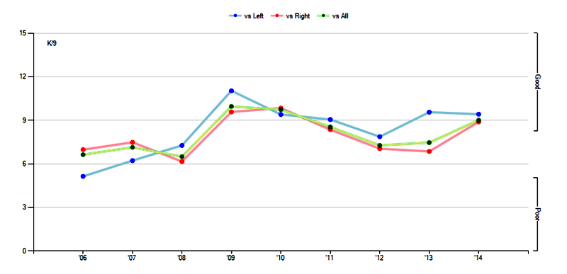
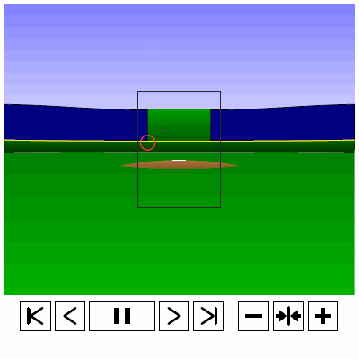
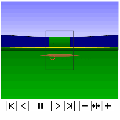
Last time, we analyzed Yu Darvish’s sliders in terms of when they projected as strikes and how pitch movement affected perception, leading batters to swing at pitches outside of the strike zone in the direction of the pitch movement. This time, we will turn our focus to four-seam fastballs. As before, we are using the 2013 data set since the algorithms for this were run before the completion of the 2014 season. To start, we can examine a four-seam fastball from Yu Darvish, his second-most thrown type of pitch in 2013, via simulation using the nine-parameter PITCHf/x data for its trajectory. The chosen fastball from Darvish was thrown roughly down the middle of the strike zone and we also track the projection of the pitch as it approaches the plate.

 photo Darvish_FF_Middle.gif

Note that the pitch, in this case, is simulated at one-quarter actual speed. The strike zone shown is the standard width of the plate and 1.5 to 3.5 feet vertically. The red circle represents the projection of the pitch after removing the remaining PITCHf/x definition of movement from its current location (Note that while the simulation shown above is a GIF, the actual simulation is an interactive PDF where the controls at the bottom of the image can play, rewind,  slow down, etc. the simulation. This is discussed at the end of the article for the interested reader, including a link to several interactive PDFs as well as a tutorial for the controls and the source code written in TeX). Here, the movement causes the pitch to rise, giving the pitch in the simulation a “floating” quality as it never seems to drop.

As in the previous work on sliders, we will start by splitting the four-seamers into four groups based on the pitch location and the batter’s response: strikes (pitches with a 50% chance or better of being called a strike) and balls (lower than 50% chance of being called a strike), and swings and pitches taken. Working with the projections to the front of the plate after removing the remaining movement on the pitch, we can examine how attractive (in terms of probability that the projection will be called a strike) pitches in each of these four categories, on average, are to batters incrementally as they approach the plate.

To begin, for left-handed batters versus Darvish in 2013:

 photo Darvish_ST_BS_FF_LHB.jpeg

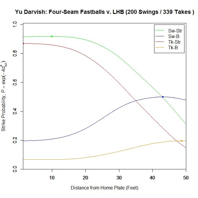
For both types of pitches in the strike zone (red=taken, green=swung at), the average probability of the pitch being called a strike levels off around 20 feet, with strikes swung at peaking at probability 0.919 at 9.917 feet from home plate, then dropping to 0.917 at the plate. Strikes taken reach their maximum at the front of the plate with probability 0.869. The four-seamers swung at outside of the strike zone (blue) average around 0.5 probability of being called a strike up until around 30 feet, before dropping off. The fastballs taken outside the zone (orange) tend to project as low-probability strikes initially and remain so to the front of the plate.

We can simplify this graph to include only swings and pitches taken.

 photo Darvish_ST_FF_LHB.jpeg

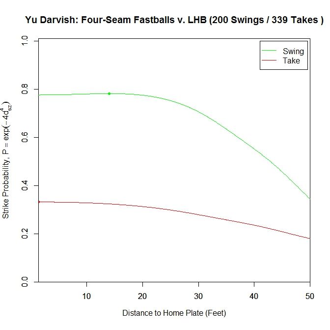
Once again, pitches swung at project as better pitches throughout than those taken. The peak for swings is at 14.083 feet with probability 0.782, and finishes at 0.777. The pitches taken keep increasing in attractiveness all the way to the front of the plate, reaching a called-strike probability of 0.332.

To further examine what is happening in these graphs, we can view the location of these projections from 50 feet to the front of home plate. The color scheme is the same as the four-curve plot above.

 photo Darvish_Pitch_Proj_FF_LHB_250ms.gif

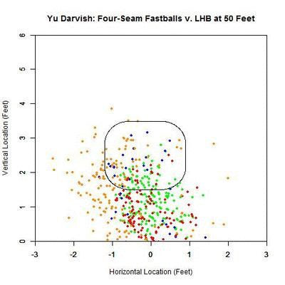
Focusing on the blue projections for the moment (swings outside the strike zone), the projections down and to the right of the zone are carried by movement toward the strike zone and most end up as borderline strikes. Those up and to the left project further and further outside the strike zone as they approach the plate, since their direction of movement is roughly perpendicular to the strike zone contour. To get a better idea of the number of each of the four cases in nine regions in and around the strike zone, we can fade the data into the background and replace it in each region by an arrow indicating the direction that the average projection for that area is moving and the number of pitches of that case located there.

 photo Darvish_Pitch_Proj_Gp_FF_LHB_250ms.gif

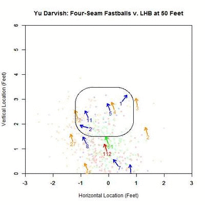
Focusing first on the pitches in the strike zone, there is a dearth of projections in the upper-right area, which would be on the inside half of the plate to LHB. The pitches taken in the strike zone tend to skew slightly down and to the left, relative to those swung at. Note that in many of the regions around the strike zone, the samples are quite small so it may be difficult to draw any strong conclusions. With this in mind, these results can be summarized in the following table where the center cell represents the swing percentage in the strike zone and all other cells contain the percentage of swings in that region.

Darvish – Four Seamers vs. LHB
13.3 55.6 25
22.9 59 0
4.3 15.9 11.9

The region with the highest swing percentage is the strike zone, at 59%. The region with the next highest percentage is above the strike zone, which is in the general direction of movement, but here there are only nine data points to rely on for this percentage. It would seem that the regions that induce swings are those where the pitches project in the strike zone and are carried out by movement (above and above-and-left of the zone) and where the pitches project as balls but movement is carrying them toward the zone (below and below-and-right of the zone). Notice that the area below and left of the strike zone has 47 pitches thrown there and only 2 swings, which is where the movement parallels the strike zone.

It would appear, based on these observations, that the location of the pitch, relative to the direction of the movement, has an influence on generating swings outside the strike zone. As with the sliders in the previous article, we will use, as a measure of if the pitch is thrown outside in the direction of movement, the angle between the movement of the four-seam fastballs at 40 feet (the pfx_x and pfx_z variables in the PITCHf/x data set) outside the zone and a vector perpendicular to the strike zone extending to the final location of the pitch at the front of home plate. An angle of zero indicates that the movement of the pitch carried it perpendicularly away from the strike zone. Ninety degrees means that the pitch projection parallels the strike zone due to movement. A one-eighty degree angle means that the pitch is being carried by movement perpendicularly toward the strike zone. Further explanation, including a visual depiction, can be found in the link to the previous article at the top of this page.

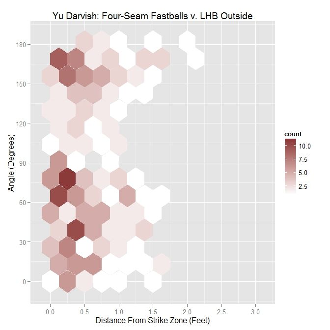
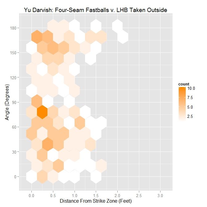
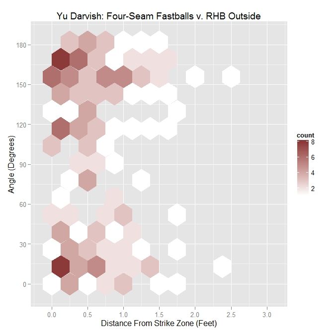
To begin, we will look at the distribution of angle versus distance from the strike zone for all of Darvish’s four-seamers outside the zone to lefties.

 photo Darvish_Out_FF_LHB.jpeg

Darvish – Four Seamers Outside the Zone v. LHB
Angle Percentage Average Distance
Less Than 45 Degrees 28.9 0.546
Less Than 90 Degrees 58.6 0.517
All X 0.553

The distribution, in this case, seems slightly skewed toward having pitches thrown in the general direction of movement. This visual assessment is supported by the percentages in the table (sorted by angle and average distance from the strike zone contour in feet. e.g., 0.5 = 6 inches, 0.33 = 4 inches), with nearly 29% of pitches having an angle of less than 45 degrees and over 58% with an angle less than 90 degrees. The distribution does not seem to have definitive shape.

 photo MLB_Out_FF_RHP_LHB.jpeg

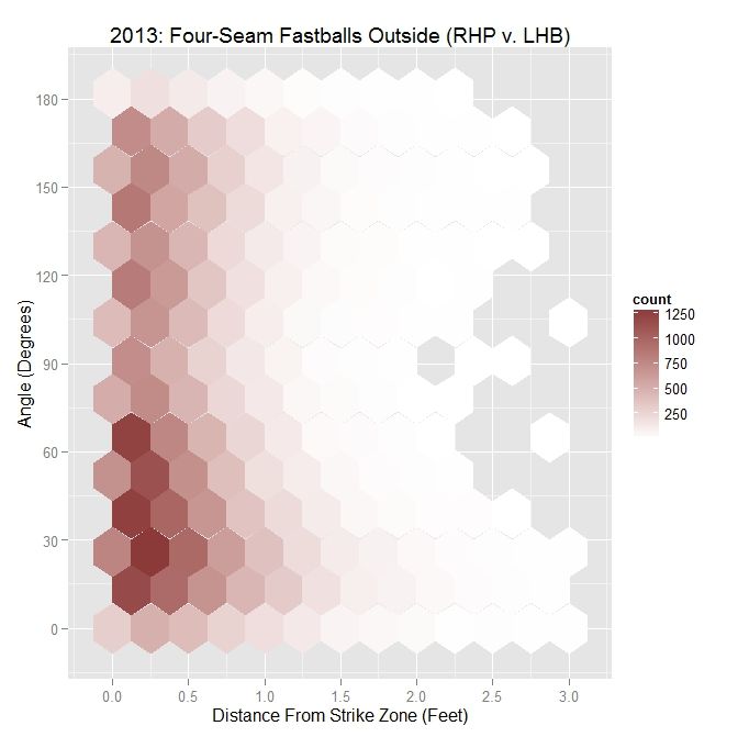
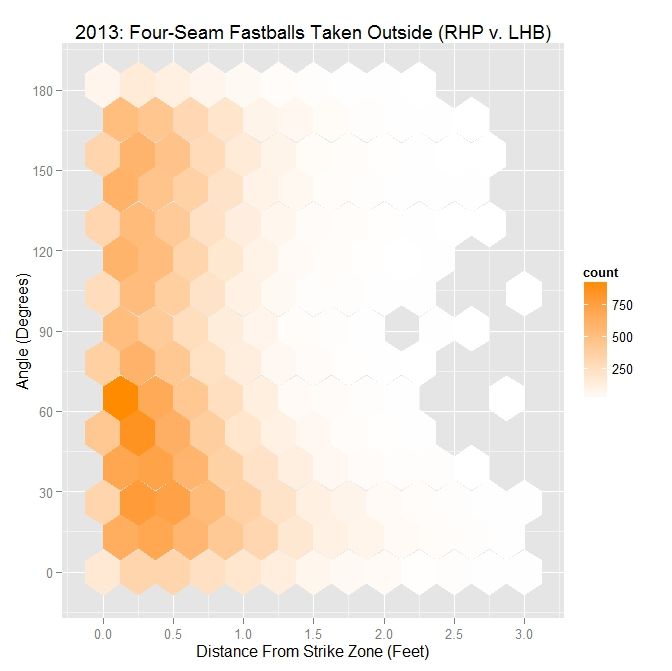
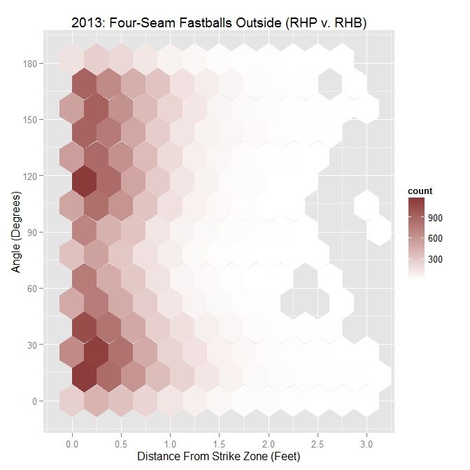
MLB RHP 2013 – Four Seamers Outside the Zone v. LHB
Angle Percentage Average Distance
Less Than 45 Degrees 37.5 0.557
Less Than 90 Degrees 61.9 0.501
All X 0.477

For all MLB right-handed pitchers in 2013, including Darvish, the distribution is much more clear. There is a swell of pitches thrown with angle between 0 and 90 degrees and within six inches of the strike zone, with 37.5% thrown with an angle of less than 45 degrees, and 61.9% with an acute angle. In conjunction, as the angle increases, the average distance from the strike zone decreases. To get a better handle on the ramifications of this choice of pitch locations, we can further sort the data into swings and pitches taken.

 photo Darvish_Out_Swing_FF_LHB.jpeg

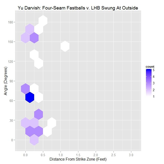
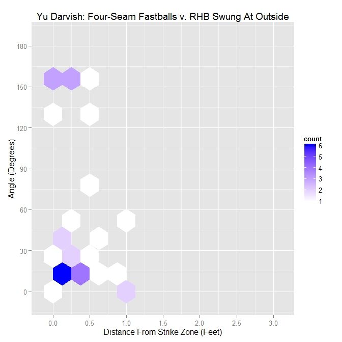
Darvish – Four Seamers Swung At Outside the Zone v. LHB
Angle Percentage Average Distance
Less Than 45 Degrees 43.6 0.315
Less Than 90 Degrees 69.2 0.232
All X 0.248

For Darvish, nearly 44% of the pitches swung at had an angle between the vector perpendicular to the strike zone and the movement vector of less than 45 degrees. For those less than 90 degrees, this percentage jumps to nearly 70%. In addition, the average distance outside with angle less than 45% is an average of 4 inches outside whereas, overall, the average is about 3 inches in all directions. We can compare this to Darvish’s right-handed colleagues in 2013:

 photo MLB_Swing_Out_FF_RHP_LHB.jpeg

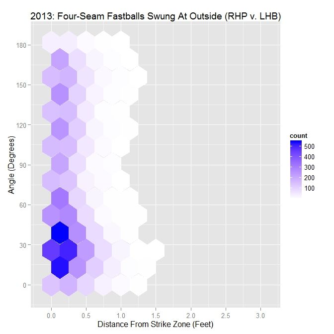
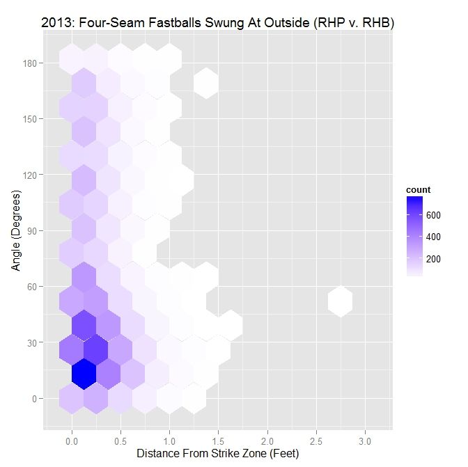
MLB RHP 2013 – Four Seamers Swung At Outside the Zone v. LHB
Angle Percentage Average Distance
Less Than 45 Degrees 46.9 0.267
Less Than 90 Degrees 66.8 0.248
All X 0.238

For MLB righties, the largest area of swings is right around a 30-degree angle. Close to half of the swings, 46.9% to be exact, occur when the angle is less than 45 degree and over two-thirds are for pitches in the general direction of movement. The average distance on four-seamers swung at outside is close to Darvish’s overall, but is almost an inch further out for Darvish for 45-degree or less angles. So for RHP to LHB, pitches thrown in the neighborhood of 30 degrees and within a half-foot of the strike zone tend to induce swings, which is also seen for Darvish. We can now look at the complement of this, pitches taken outside, to see how this distribution compares to swings.

 photo Darvish_Out_Take_FF_LHB.jpeg

Darvish – Four Seamers Taken Outside the Zone v. LHB
Angle Percentage Average Distance
Less Than 45 Degrees 26.4 0.611
Less Than 90 Degrees 56.8 0.577
All X 0.605

The distribution for Darvish on pitches taken has some semblance to that for all pitches, but the percentages have dropped in all cases. In addition, the average distances across the board are over six inches outside.

 photo MLB_Take_Out_FF_RHP_LHB.jpeg

MLB RHP 2013 – Four Seamers Taken Outside the Zone v. LHB
Angle Percentage Average Distance
Less Than 45 Degrees 35.1 0.654
Less Than 90 Degrees 60.7 0.571
All X 0.537

For all MLB RHP in 2013, the pitches taken by LHB outside the strike zone are largely located below 90 degrees, with a large number near 60 degrees. Compared to the case of all pitches outside the strike zone, the percentages are not all that dissimilar, but the distances are slightly larger. Putting the two hexplots together to see how they form the plot for all outside pitches, we see that what appears to be one large grouping of data below 90 degrees for all pitches separates into two smaller groupings: one around 30 degrees for swings and one around 60 degrees for pitches taken.

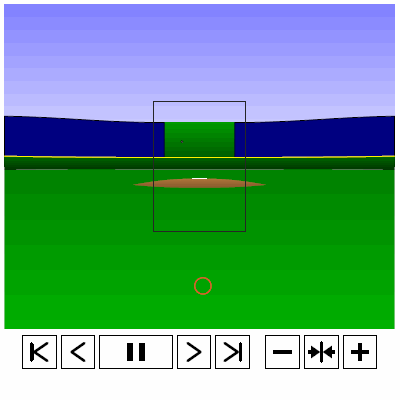
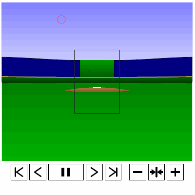
To examine why it might be the case that pitches thrown in the direction of movement, meaning a small angle between the movement vector and the vector perpendicular to the strike zone, are swung at more frequently and are more effective at inducing swings further from the strike zone than those that are not, we can take a four-seamer thrown by Darvish above the strike zone and examine both the trajectory of the pitch and its projection. We can again simulate such a pitch (at quarter speed) via the PITCHf/x data for Darvish. Note that since the below simulation does not possess the same computational capabilities as the rest of the code, which is done in R, we use the standard strike zone as a reference rather than the 50% contour.

 photo Darvish_FF_Top.gif

Based on the simulation and associated projection, we can see that the pitch projects as a strike early on and, late in its trajectory, appears to be a ball. The important observation for this is that, for some part of its flight, the pitch does appear that it may be a strike. Similarly, for a pitch below the strike zone, we see the opposite result.

 photo Darvish_FF_Bottom.gif

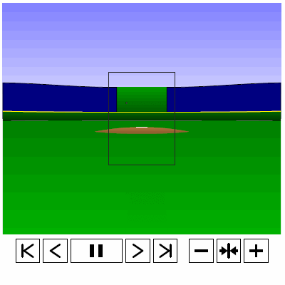
One can see the problem with getting a batter to swing at a pitch such as this. It starts out as looking like a pitch in the dirt and, through its path to the plate, only slightly improves its chances of being called a strike, and at no point really gives the batter much incentive to swing at it. Thus it makes sense that a batter might swing at a four-seam fastball high above the strike zone but not one a similar distance beneath.

Performing the same analysis for right-handed batters, we again start with Darvish’s results for the four-seam fastball in terms of ball/strike and swing/take.

 photo Darvish_ST_BS_FF_RHB.jpeg

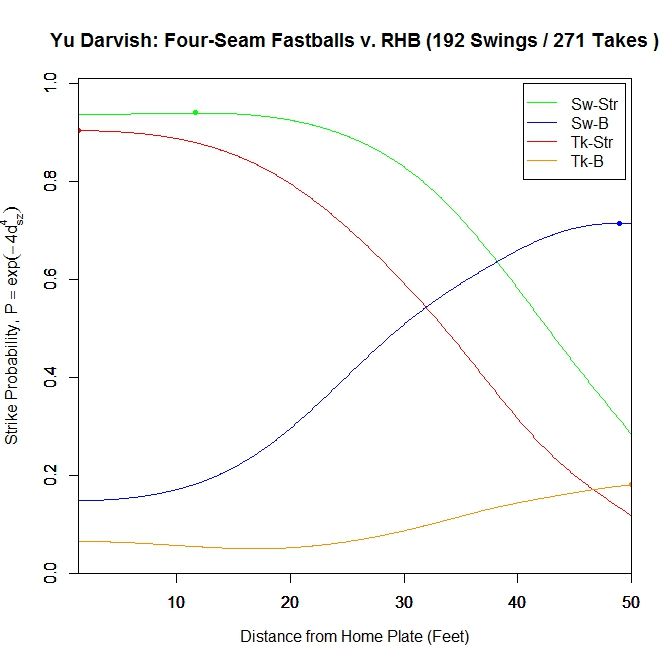
Here, the swing/strike curve peaks at probability 0.94 at 11.667 feet and finishes at 0.937. These probabilities are slightly higher than those for lefties at the maximum and at the front of the plate. The pitches taken in the strike zone peak at the plate with probability 0.904, compared to 0.869 for LHB. For both cases of pitches outside the strike zone, they reach their maximum very early in the trajectory and drop off afterward.

 photo Darvish_ST_FF_RHB.jpeg

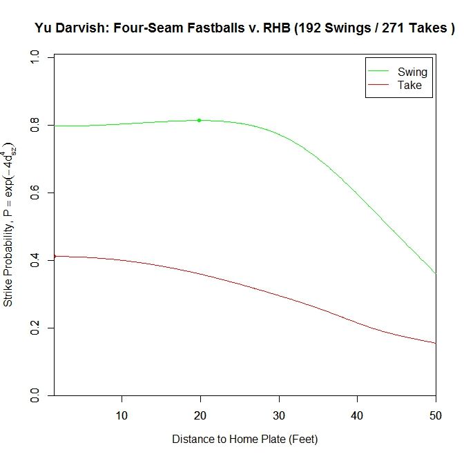
Changing to the two-curve representation for four-seam fastballs to right-handers, the swing curve reaches its apex of probability 0.814 at 19.833 feet and ends with probability 0.797 at the plate. For pitches taken, the average strike probability increases throughout the trajectory, ending at 0.411. Once again, these probabilities are higher than for left-handed batters.

 photo Darvish_Pitch_Proj_FF_RHB_250ms.gif

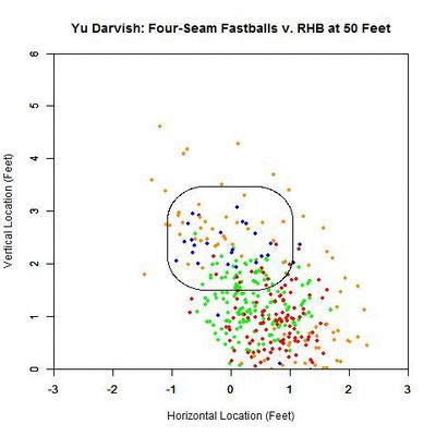
As before, we can switch to the discrete data and their projections as the pitches near the front of home plate. Of note is that the pitches taken (red data points) are, by and large, down and to the right of the strike zone from the catcher’s perspective, which is in the opposite direction that the movement influences the pitches as they approach the plate. In addition, the majority of swings outside the strike zone, the blue data points, leave the strike zone in the direction of movement. Also of interest is that the pitches fill up the strike zone more against RHB, while four-seamers to LHB were lacking for the inner half of the strike zone. For the pitches swung at outside the strike zone in the opposite the direction of movement, down and to the right, they end up very close the strike zone contour, making them boarderline strikes, and thus nominally classified outside the zone. To observe these phenomena more succinctly, we can switch to a vector representation indicating the number of pitches and the direction that the projections are headed for each of the nine regions in and around the strike zone.

 photo Darvish_Pitch_Proj_Gp_FF_RHB_250ms.gif

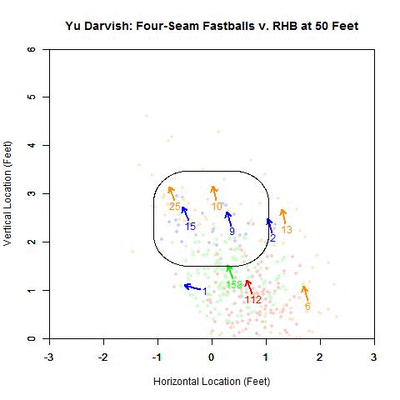
Of the 270 pitches in the defined strike zone, the average location of the 112 taken were down and to the right of those swung at, as represented by the red and green arrows. To quantify the percentage of swings in each of the nine regions, we can refer to the below table, aligned spatially with the data from the GIF (center square being in the strike zone).

Darvish – Four Seamers vs. RHB
37.5 47.4 13.3
X 58.5 0
50 13.8 3.7

Based on these results and for regions with more than a handful of pitches, the highest percentages of swings outside the strike zone are in the upper and upper-left regions, in the direction of movement. The lower-left corner is large as well but can be disregarded as it only contains two pitches, one of which was swung at. Also, it is hard to draw any conclusions to the left of the plate since there is no data.

We can now turn our attention to pitches outside the zone for both Darvish and other MLB righties in 2013:

 photo Darvish_Out_FF_RHB.jpeg

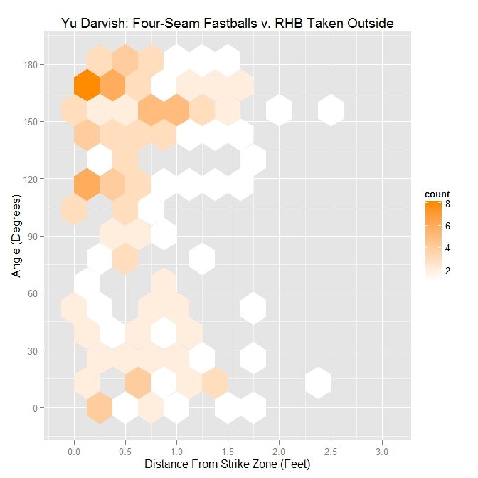
First, for Darvish, the distribution of pitches, when viewed by plotting distance from the strike zone versus angle between the perpendicular vector to the strike zone and the movement vector, appears bimodal with a large grouping both above and below the 90-degree mark.

Darvish – Four Seamers Outside the Zone v. RHB
Angle Percentage Average Distance
Less Than 45 Degrees 31.2 0.633
Less Than 90 Degrees 41.1 0.619
All X 0.619

The four-seamers outside to righties are, on average, over 6 inches outside, with most thrown, 59.9% to be precise, in the opposite direction of movement. However, most of the pitches thrown in the direction of movement, 31.2%, are thrown with an angle of less than 45 degrees. Compared to LHB, the distances are greater and the percentage of pitches with an angle of less than 90 degrees is noticeably lower.

 photo MLB_Out_FF_RHP_RHB.jpeg

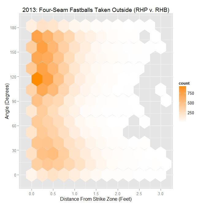
For MLB RHP, the distribution also appears bimodal, with two groupings of data near 30 degrees and 120 degrees. This roughly mirrors Darvish’s distribution, relative to angle versus distance.

MLB RHP 2013 – Four Seamers Outside the Zone v. RHB
Angle Percentage Average Distance
Less Than 45 Degrees 31.6 0.514
Less Than 90 Degrees 48.6 0.478
All X 0.476

As compared to Darvish, RHP threw about the same percentage of pitches with an angle of less than 45%, but more with an angle of less than 90 degrees. In all cases, the MLB RHP four-seamers outside were, on average, closer to the strike zone. Compared to pitches outside to lefties, the percentages for less than 45 and less than 90 degrees are down.

 photo Darvish_Out_Swing_FF_RHB.jpeg

Taking the subset of pitches swung at outside for Darvish, the distribution has become closer to having a single mode near 30 degrees. Despite reaching into small sample sizes for this subset, the below table reinforces these conclusions.

Darvish – Four Seamers Swung At Outside the Zone v. RHB
Angle Percentage Average Distance
Less Than 45 Degrees 67.6 0.351
Less Than 90 Degrees 73.5 0.347
All X 0.313

While only around 30% of Darvish’s pitches were thrown with an angle of 45 degrees or less, over two-thirds of his swings outside the strike zone were in this range of angles. This increases to nearly 75% when considering four-seam fastballs thrown in the general direction of movement, meaning 90 degrees or less. Of note here is that the distance that entices a swing decreases as the movement aligns less and less with the vector perpendicular to the strike zone. Here, the distances are greater compared to left-handed batters faced by Darvish in 2013, but the percentages are up.

 photo MLB_Swing_Out_FF_RHP_RHB.jpeg

Switching the larger sample of all 2013 MLB RHP, we retain only one of the modes observed for all pitches. The pitches that are swung at outside are clustered down near 15 degrees and within half a foot of the strike zone.

MLB RHP 2013 – Four Seamers Swung At Outside the Zone v. RHB
Angle Percentage Average Distance
Less Than 45 Degrees 53.9 0.286
Less Than 90 Degrees 74.2 0.268
All X 0.255

The percentage of swings with an angle of 45 degrees or less is over 50% and, like Darvish, those less than 90 degrees are up near 75%. The distance again decreases as the angle increases and, compared to Darvish, is much closer to the zone. Versus right-handed batters, the percentages for angles 45 and 90 degrees or less are greater but the distances do not differ greatly as compared to LHB.

 photo Darvish_Out_Take_FF_RHB.jpeg

The other half of the data, pitches taken outside, gives us the second mode seen originally in Darvish’s data. This mode is a cluster of data above the 90 degree level.

Darvish – Four Seamers Taken Outside the Zone v. RHB
Angle Percentage Average Distance
Less Than 45 Degrees 23.8 0.794
Less Than 90 Degrees 34.5 0.736
All X 0.681

While a quarter of the pitches taken are thrown with an angle of 45 degrees, only a little over one-third were thrown in the general direction of movement. Note that the pitches that are thrown in the direction of movement and are taken tend to average three-quarters of a foot outside, so it makes sense that they would not be swung at. The percentage of pitches taken with an angle of less than 90 degrees is down from 56.8% for LHB and, overall, the pitches are almost an inch further outside.

 photo MLB_Take_Out_FF_RHP_RHB.jpeg

For the MLB data set, the second mode is located around 120 degrees.

MLB RHP 2013 – Four Seamers Taken Outside the Zone v. RHB
Angle Percentage Average Distance
Less Than 45 Degrees 24.9 0.662
Less Than 90 Degrees 41 0.592
All X 0.542

As with Darvish, about one quarter of the pitches taken outside are at an angle of 45 degrees or less and 59% are thrown in the opposite direction of movement. When put up against the pitches taken by LHB, the percentages are down for both 45 and 90 degree or less pitches from 35.1% and 60.7%, respectively.

As with RHP versus LHB, the full distribution, in terms of the hexplots, separates into two clusters: one related to swings and one related to pitches taken. The cluster related to swings sits in the range of 15 degrees while pitches taken are closer to 120 degrees. This is similar to the case for lefties, except the cluster of pitches taken moves from the 60-degree area to the 120-degree area and the cluster related to swings moves down from 30 degrees to 15 degrees. However, in both cases, the swings appear to be separate clusters from the pitches taken.

Discussion

For four-seam fastballs thrown by Yu Darvish in 2013, the maximum attractiveness on swings is in the range of 10-20 feet in front of home plate for left- and right-handed batters, possibly tying into how long a batter can reasonably project a pitch when deciding to swing. The four-seamers also tend to be swung at outside the strike zone in the general direction of movement, which we have seen previously with sliders. This is especially pronounced for RHB vs RHP, with pitches exiting the strike zone in the direction of movement causing swings, and pitches entering the zone opposite the direct of movement being taken. By simulating the PITCHf/x data, we can get an idea of why this might be true: pitches outside thrown in the general direction of movement project in the strike zone for some period of time before projecting outside of it and pitches thrown opposite this direction project outside and, while their probability increases, these pitches never appear as strikes and thus do not usually induce swings from the batter.

Next time, we will finish up with cut fastballs from Yu Darvish and see how movement affects perception in this case. After that, we can switch to the 2014 data set and also turn the algorithm around and apply it to a batter.

PITCHf/x Simulation

For those familiar with the previous installment, we covered a slider thrown by Yu Darvish to Brett Wallace and simulated the projected pitch location in R. To better represent how the pitch projection may tie into perception, we have switched to a more visually appealing representation of simulating the PITCHf/x data in the context of the catcher’s viewpoint (we could presumably display this from the batter’s point of view as well). For the aforementioned slider to Wallace, the simulated PITCHf/x data, based on the 9-parameter model, is:

 photo Darvish_Slider.gif

This would seem to be a better way to represent the data, including a backdrop and accurate scaling of the pitch size and location. As another example, we can simulate a random Darvish curve:

 photo Darvish_Curve.gif

In order to make the GIFs for simulating the PITCHf/x data, we are first using TeX to write the code and then compiling it using MiKTeX with the “animate” package handling the controls. To begin, we place a reference point 6 feet, 1 inch behind the tip of home plate, roughly approximating the location of the catcher (the one inch past six feet is not important but makes the distance to the front of home plate an even 7.5 feet).  The height of the reference point is taken to be 2.5 feet in the z-direction. This is the point by which we will determine perspective. Everything will be projected into the plane at the front of home plate, spanning three feet to the left and right of center and from the ground to five feet high. For a given position of the pitch, we find the associated spherical coordinates, relative to the reference point. To figure out where to display the pitch in the frame, we track the pitch along the line formed between the pitch location and the reference point until it reaches the frame. Since the two angle measures of the spherical coordinates will not change when tracking along this line, we need only find the distance along it that places it in the frame we are displaying.

Once we have the location of the pitch in the frame, we still need to find the size of the pitch as seen from that distance. To do this, we again use the reference point and find the distance to the center and to the top of the baseball. With a third side that goes from the top to the center of the baseball, this creates a triangle. Forming a similar triangle by adding an additional third side where the frame cuts the triangle at the front of the plate, we obtain a smaller triangle contained in the larger one. Using this geometry, we can find the size that the pitch will appear at this distance using trigonometric properties of similar triangles (namely that their sides have the same ratio).

To begin the simulaton, we find the times associated with 55 feet and the front of the plate. We then find the location of the pitch in three dimensions, incrementing in time from release to strike zone and adjusting the location and the size of the pitch to appear positioned and scaled correctly in frame. The simulation in the actual PDF is at 60 frames per second, with most animations lasting around a half a second. For the purposes of creating GIFs, we slow the pitches down to one quarter this speed and capture using a program called LICEcap. The code is written so as to work for any pitch by merely swapping in the chosen 9-parameter PITCHf/x data and recompiling. The projection is shown as a red circle, and is calculated as previously discussed. All background features are scaled appropriately, in a similar manner as the pitch.

Note that while this is, in many ways, an approximation of perception from the catcher’s point of view, it functions well for our purposes of providing a decent replacement for live video since we can overlay the projection and view it from the reverse of the traditional television angle from center field. Included is a link to a Google Drive containing a collection of interactive PDFs for pitchers and pitches from 2013 and 2014. There is also an interactive guide to the controls with the given example being a Clayton Kershaw slider. Finally, the source code is included so the interested reader/programmer can input any chosen PITCHf/x parameters and compile to get a representation of the pitch, that includes distance to home plate, the velocity of the pitch, and the time since release.


Will Neftali Feliz Be Back to Form in 2015?

On August 3, 2009, Neftali Feliz made his major league debut against the Athletics, pitching two perfect innings with four punchouts. In those innings, he mowed down hitters with 23 fastballs that averaged 99.45 mph, 4 changeups that averaged 91.13 mph, and 3 sliders that averaged 82.43 mph. He would end his rookie season with a 1.74 ERA (2.48 FP), a 33.3 K%, and a 6.8 BB%. As a 21 year-old, he already looked like a bonafide bullpen ace for the Rangers.

Fast forward to the end of spring training in 2014. Feliz is 25 years old and in the prime ages of his baseball career. And he’s starting in AAA. With a fastball that is 91-93 mph. Rangers’ General Manager Jon Daniels said of him, “He’s healthy and his work ethic has been solid, but he needs some work and the best place to get him that is in Round Rock right now. I expect he’ll be back as soon as he’s ready to help us.” A team whose bullpen for opening day included Seth Rosin thought that Feliz wasn’t ready to contribute for them out of the gate. Clearly something was off.

On August 1, 2012, Neftali Feliz underwent Tommy John surgery. Tommy John surgery generally requires at least 12 months for recovery, and he was back in the majors by September 2013. He averaged 94.19 mph with his fastball during his 6 games in September 2013. While his velocity was a step down from his 97+ mph heat in 2009-2011, pitchers often have to slowly build their arm strength up again to pre-surgery levels and there was no reason to believe he wasn’t on track to doing so. When his velocity failed to reach that level through most of his 2014 campaign, though, it became unclear if he would ever regain his pre-surgery stuff.

By some measures, his time in AAA was a success. He struck out 9.73 batters and walked only 2.51 per 9 innings. He produced a 3.14 ERA compared to the Pacific Coast League’s league-wide 4.64 ERA. His biggest problem was home runs—he gave up 6 in only 28.2 innings. When was he called back up to the major league squad on July 4, there were reasons to be cautiously optimistic that he could find some success again as a reliever. The Rangers noted that he was throwing in the mid 90’s some games while in others he would sit in the low 90’s.

Feliz didn’t exactly dominate during his early outings. Through July 23, he had pitched 10.1 innings with only 4 strikeouts, 3 walks, and 2 home runs given up. Yet, out of the playoff race, Texas dealt their closer Joakim Soria to the Tigers and anointed Feliz their new closer. While it’s possible that the team merely liked his shiny ERA at the time over his FIP (2.61 to 5.75), perhaps they started to see some signs of life in him. Regardless, his 1.69 ERA and 13 saves out of 14 save opportunities the rest of the way probably made them feel validated in their decision. With his end of the season performance, it appears likely that he will be the Rangers’ opening day closer.

Projecting into 2015, Feliz’s 4.90 FIP and -.1 WAR from 2014 provide red flags. His home run rate also look to be an issue. His extreme flyball tendencies (51.1 FB% versus 27.3 GB%) resulted in 1.42 HR per 9 innings despite a fairly ordinary 11.1 HR/FB% rate. His 17.2 K% and 9 BB% doesn’t exactly inspire confidence, either. Steamer isn’t a fan and projects him for .1 WAR in 65 innings.

But there are reasons for optimism, too. He kept up his low BABIP streak at .176 (.215 career) thanks to his impressive 20 IFFB% (17.8 career). Among relievers with 200 innings since his debut, he has the lowest BABIP, the 6th lowest LD%, and the highest IFFB%. Steamer projects him for a .284 BABIP next year, but I’m willing to bet his will be much lower than that figure and will continue to let him beat his FIP by around a full run.

Next, we’ll look at his home run rate. His 2014 figure was the highest of his career, caused primarily by his 11.1 HR/FB% (6.9 career). What may have caused that? Well, it may have been caused at least in part by his changeup. A changeup is a pitch designed to fool hitters who are looking for a fastball: it is supposed to be thrown with identical arm speed as the fastball to make it harder to pick up, and then its velocity and/or movement difference makes it effective. For a pitcher throwing in the upper 90’s with hitters already struggling to catch up to their fastball, a changeup may be less effective because the velocity reduction may sometimes help the hitter instead of hurting him (of course, there are exceptions). When Feliz was throwing in the upper 90’s in 2009-2011, he threw his changeup just 4.4 percent of the time. When Feliz was throwing in the low to mid 90’s in 2014, he threw his changeup 12.4 percent of the time. For his career, opponents have a .212 ISO against his changeup compared to a .119 ISO against his fastball.  In 2014, hitters had a .429 ISO against the pitch, including 3 of his 5 home runs given up on the year.

His velocity provided another reason for optimism as well. While his early- to mid-season velocity wasn’t great, he improved as time went on: in July he averaged 92.88 mph; in August he averaged 93.7; and in September he averaged 95.81. The ISO against his fastball decreased each month as well (from .107 to .107 to .053), even as he increased his usage of his fastball (from 64.7% to 77.36 to 77.78).  His velocity increase had an added bonus as well: it allowed him to use his changeup less (from 14.72% to 11.32 to 3.17). The biggest question is whether he can maintain his September velocity, or even improve upon it.

Overall, I don’t think Neftali Feliz is a safe bet to be great in 2015. But I do think that he has a real chance to be much better than the projections project him to be. To end this post, I’ll post a few gifs of Feliz at his best in 2014:

* All pitch usage, velocity, and movement numbers are obtained from Brooks Baseball. All pitch results numbers are obtained from Baseball Savant.


The Resurgence of Jon Lester: How a Small Mechanical Change Brought Back a Pitch that Earned Millions

Jon Lester just got paid. Early Wednesday morning, it was announced that Jon Lester accepted a 6-year $155M contract with a vesting option for a 7th year to become a member of the Chicago Cubs. This is over $20M more than the FanGraphs readers predicted in the offseason free agent crowdsourcing. This is the same pitcher that the Red Sox offered a 4-year $70M extension to prior to the season and proceed to nearly double their offer to $135M in the off-season. Before 2014, it was reasonable to think Jon Lester might be looking at a deal similar to the 5 years $90-95M that has been predicted for James Shields. What did Lester do to convince teams he is closer to a $200M pitcher than a $100M pitcher? He looked like the elite Lester we saw in 2009-2010, and not the merely very good pitcher he was in the past few years. How did he improve in his contract year? Let’s take a look.

Jon Lester fWAR/Season fWAR rank FIP FIP rank K% K% rank Contact % Contact% Rank
2009-2010 5.8 9th 3.14 10th 26.4% 2nd 76.1% 7th
2011-2013 3.6 16th 3.84 60th 20.4% 48th 80.9% 68th
2014 6.1 6th 2.80 9th 24.9% 12th 78.6% 29th


Lester was one of the top pitchers in the game during the 2009 and 2010 seasons, and even placed 4th in AL Cy Young voting in 2010. His peers were Felix Hernandez and Adam Wainwright, along with Lincecum and Sabathia (before they became husks of their former selves on the mound). While WAR still treated Lester well in 2011-2013, partially due to the sheer number of IP and park and league statistical adjustments, his FIP placed him in the leagues of Kyle Lohse, Homer Bailey, Yovani Gallardo and Ian Kennedy. During that period, Lester’s opponent contact rate and swinging-strike rate were the same as those of Clay Buchholz. So comparing a theoretical Lester deal to the Bailey extension, which was looked at as an overpay by some, didn’t seem unfair. From 2011-2013, Lester trailed Shields by over 2 WAR, so a similar contract didn’t seem unfair prior to 2014.

What caused Lester to fall from the ranks of the elite and become more of a number-two starter? The strikeouts disappeared.

800x387xlester-l-r.png.pagespeed.ic.p9Ej

800x394xlester-k9.png.pagespeed.ic.-Zrox
The problem was especially apparent against righties, whom he struck out at only a 17.9% clip in 2013 (compared to 26.3% in 2010). What caused this decline? Let’s take a quick look at the Pitch F/X data. A lot of people are under impression that the decline was due to velocity loss that occurs with aging. This isn’t really the case for Lester. Lester’s fastball velocity has declined by less than one mile per hour, from 94 MPH in 2010 to 93.2 MPH in 2014. While the cutter and curveball have lost velocity, they aren’t as dependent on velocity as the fastball:

800x529xlester-pitch-type.png.pagespeed.
If we take a look at his pitch usage, we notice two things: He has for the most part ditched the sinker and changeup in favor of the fastball, cutter, curveball combination that our Matt Trueblood detailed in his recent piece.

Let’s take a look for the most telling data for any pitcher: the ability to get hitters to swing and miss.

800x541xlester-whiff.png.pagespeed.ic.Br

Lester’s fastball generated whiffs on 16.3 percent of all swings in 2014, his best mark since 17.8 percent in 2010. That is around the league average of 16.4 percent, according to Eno Sarris’s benchmarks. The cutter, which he is throwing at a career-high frequency of 31.0% of all his pitches, is generating a whiff-per-swing rate of 23.8 percent (5th in MLB, minimum 500 pitches thrown), above the league average of 21.4%. The pitch isn’t as good as it used to be, when it generated whiffs on over 28 percent of swings, for reasons Sarris detailed last year. However, it’s still a very good pitch that was even better in 2014 due to improvements in the horizontal movement.

The curveball, though, is what’s special. In 2014, Lester’s curveball generated whiffs-per-swing on 40.8 percent of opponents’ swings, the highest mark of his career—and 12 percentage points more than in 2013, when his curveball was league-average in that regard. In 2014, It was the best curveball in the league in terms of whiffs per swing, with pitchers like A.J. Burnett, Adam Wainwright and Sonny Gray behind him.

Now what happened to the curveball? It didn’t gain velocity. It didn’t gain movement. It gained a more consistent vertical release point. Look at 2014. Lester changed his release point on all pitches, but as you can see, the release points of the fastball, cutter, and curveball are tightly grouped together. Now look at 2009 and 2010, and compare it to 2011-2013. It appears that in his “peak years,” Lester maintained a better-disguised release point on the curve than he did in 2011-2013.

If the curveball was being tipped or was less deceptive, righties would have the best look at it.  Let’s check that out:

800x534xlester-release.png.pagespeed.ic.

nAa3HGr.png


NqtDfGc.png

There is something incredibly satisfying in finding the results we might expect. The curveball generated 41.4% Whiffs/Swing vs. righties compared to the 25.8% in 2013. Lester’s Curveball caused 25 Ks against righties, 6th in baseball compared to 2014 when it only caused 6. This is exceptional because he only generated 55 whiffs on the CB vs. RHH. When righties do make contact, they aren’t hitting it hard, only slugging .151 against the hook last year, compared to .338 in 2013. Righties aren’t picking up the curveball like they were before, and in 2014, that solved the platoon issues he had against them in previous years. Trueblood said, “Lester might have tapped into something that will allow him to dominate right-handed batters in the future.” That something is the curveball. It allowed him to ditch his changeup with little consequence.

The gist is that 2014 Jon Lester was more like 2009-2010 Jon Lester than 2011-2013 Jon Lester. A mechanical adjustment allowed the curveball to reemerge as an elite weapon in Lester’s arsenal, complementing a very good cutter and an above average fastball. It also allowed him to enjoy success versus righties again. The question is: How sustainable is this change? If Lester can lose his mechanics for years, is there serious risk of him losing them again? Can he continue to improve? If he can bring the curveball back to its former glory, can he regain a bit more movement on the cutter again? Can he bring back an effective sinker, giving him a deeper arsenal? These are the questions on which the Cubs will be betting $155 million on. If these changes can be sustained, it wouldn’t be surprising if Lester is worth the contract barring injury. Just one 5 WAR season can be worth $40M on this market. Lester made a slight change to his mechanics and it just might have earned him tens of millions of dollars.


Giants Shouldn’t Overspend on Headley

When the Red Sox locked up Pablo Sandoval a few weeks ago, Giants fans immediately began to wonder who San Francisco would turn to at third base. After all, Sandoval had just wrapped up his seventh season with the Giants, and the Panda had become a fan favorite for his postseason success. With a free agent market saturated with several bench pieces and only one legitimate option in Chase Headley, the Giants began to focus on Headley as a potential replacement. With Headley seeking a four-year deal, worth close to $50 million, the Giants have to ask themselves, is this the best option?

No.

While Sandoval will always be a beloved figure in the Bay Area, let’s not overestimate his value with the club. From 2009-2011, the Panda was worth 12 wins. His WAR over the next three years? 7.9.

Sandoval from 2009-2011:

.857 OPS, .198 ISO, 129 wRC+

Sandoval from 2012-2014:

.759 OPS, .144 ISO, 115 wRC+

Whether or not the Red Sox overpaid on Sandoval is a discussion for another day, so let’s focus on the Giants’ potential options here. If Opening Day was tomorrow, Bruce Bochy would have to decide between Marco Scutaro and Joaquin Arias as his starter at third base. Scutaro, entering his age 39 season, is coming off a major back injury that limited him to just 5 games in 2014. On top of that, Scutaro has made just 15 starts at third base since 2008, and all 15 of those came in 2012. Arias adds some intriguing value in more of a platoon role, but we’ll get to that later. Now let’s take a look at the Giants’ top option on the free agent market, Chase Headley.

Defensively, Headley is widely regarded as one of the top performers in all of baseball. For his career, Headley boasts a 10.8 UZR/150, along with a 2014 season that included 13 DRS, second only to Josh Donaldson’s 20 DRS among AL third basemen. Everyone knows of Headley’s breakout season in 2012: .874 OPS, 31 HR, 145 wRC+, 7.2 (!!!) WAR, and everyone is just as quick to point out the downfall in the next two seasons. But Headley hasn’t been that bad.

Headley in 2013 and 2014:

.725 OPS, 26 HR, 109 wRC+, 8.0 WAR

As we have always known with Headley, his defense increases his value. In 2012, it was merely an afterthought to a career season at the plate. Headley would add solid production the Giants’ lineup, but could they get similar production at a cheaper cost? One step towards that would involve a trade with a team that will break in a top prospect at third base at some point in 2015. Enter the Chicago Cubs and Luis Valbuena.

Valbuena, who will soon be replaced by top prospect Kris Bryant, is projected to make somewhere in the neighborhood of $3 million in 2015. He would make an excellent platoon partner with Arias, for a total of $5 million, or half the price of Chase Headley. But why go with these platoon players when you can add a proven everyday guy in Headley? Because the Giants could use the money to help pay for improvements elsewhere, such as left field, or the starting rotation. They could even save the Headley money for the 2016 season, when the Giants lose over $40 million in annual salaries to the likes of Tim Lincecum, Tim Hudson, Jeremy Affeldt and Scutaro. But a platoon of Valbuena and Arias is not just half the price, it’s equal the production. Let’s take a look:

vs RHP in 2014:

Headley .690 OPS, 99 wRC+

Valbuena .811 OPS, 124 wRC+

vs LHP in 2014:

Headley .721 OPS, 110 wRC+

Arias .720 OPS, 107 wRC+

Now it is worth noting that Headley’s ISO was very consistent from both sides, posting a .130 vs RHP and a .132 vs LHP. Valbuena posted a .208 ISO vs RHP, while Arias was just .076 vs LHP. If the Giants did choose this platoon, the power would be limited from Arias. But what about the defense from each player?

Career UZR/150

Headley 10.8 (6,366.2 innings)

Valbuena 10.2 (2438.2 innings)

Arias 15.6 (800.1 innings)

Even when you combine Valbuena and Arias, the total time at third base is roughly half the time Headley has seen at the MLB level. With that being said, both are very good defenders at third base.

Would a platoon of Valbuena and Arias produce better results than Chase Headley in 2015? Maybe, maybe not. But it is very possible that the Giants get equal the production, at half the price, and spend some of that extra money elsewhere. Maybe the extra $5-6 million lands them a pitcher they couldn’t quite afford if they had Headley under contract? Maybe it helps them make space for a Justin Upton in left field in 2015? Either way, the Giants would be wise to find a cheaper option at third base.


The Mariners’ Deficiency

This trade, at least in its basic terms, has been well covered. I personally don’t believe that one of these players is really any better than the other, not in any significant sense. The Mariners gave away a roughly league-average player and received a roughly league-average player in return, but as a result paid a penalty in salary and in team control — for essentially no reason. Jeff has gone over all of that on two different websites. It’s a nice deal for the Jays. It’s less than that for Seattle.

Where it gets ugly is at the far periphery, the tertiary implications of this deal that, on its face, really indict a disparity between the Mariners’ front office and the rest of baseball.

The Mariners now need a right fielder, having just traded theirs. A right fielder is an everyday player theoretically assigned for about 1500 defensive innings and 700 plate appearances; and therefore someone who will be competing, on average, against a very high threshold of performance. From 2012-2014, the average full-time right fielder produced 2.6 WAR/600 per FanGraphs. The market price for 2.6 WAR, at the established pre-season price of $7M/win, is approximately $18M. This is about in line with what’s been observed to date. The 2015 cost of these players on the open market:

Player Projected WAR 2015 Salary (M) $/Win Additional Costs
Hanley Ramirez 3.6 $22.00 $6.11 2nd Rd. Pick, length
Victor Martinez 2.7 $17.00 $6.30 1st Rd. pick, length
Nelson Cruz 1.5 $14.50 $9.67 1st Rd. Pick, length
Nick Markakis 1.5 $11.00 $7.33 length
Torii Hunter 1.7 $10.50 $6.18 None
Jason Heyward 5.0 $7.80 $1.56 Shelby Miller, tm. control
Justin Upton 3.0 $14.50 $4.83 ???

In order to obtain someone to meet this threshold, you have to pay. You have to pay a lot. Nick Markakis just signed for 4 years and $44M. Nelson Cruz signed for $57M to knock out just one half of the workload, also costing a draft selection. Victor Martinez signed for $68M to knock out just one half of the workload. He didn’t cost the Tigers a draft selection, but that’s unique to the Tigers. For someone who can do it all, you’re looking at Hanley Ramirez, and then you’re looking at nine figures. The $/win for the four free agents above is $7.12M. Their average salary for 2015 is $15.0M for 2.2 WAR. Four of the five signed for 4 years or more, the exception being Torii Hunter, who is likely to retire.

The Blue Jays now need a #5 starter, having just traded theirs. A #5 starter starts more-or-less every 5 days. About once every 4 or 5 weeks, his start might be skipped thanks to an off day. An average #5 starter makes roughly 30 starts for roughly 180 innings per year. On average, this type of pitcher meets a very low threshold of performance. From 2012-2014, there have been 257 qualifying seasons for starting pitchers. The average performance of this group is 2.7 WAR/200 IP. Population sections of 20% amount to 51 or 52 individuals per section, the lowest ranked section theoretically accounting for the #5 slot. The average performance of this section is 0.9 WAR/200 IP. At the established pre-season price of $7M/win, the market price for 0.9 WAR is approximately $6.5M. The cost of these players on the open market:

Player Projected WAR 2015 Salary (M) $/Win Additional Costs
Colby Lewis 0.6 $4.00 $6.67 None
JA Happ** 1.2 $6.70 $5.58 Michael Saunders, tm. cont
AJ Burnett 1.7 $10.00 $5.88 None
Jerome Williams 0.4 $2.50 $6.25 None
Brad Mills None Minor League NA None
Jeff Francis None Minor League NA None

**Option picked up

To obtain players who can meet this threshold, you can generally pay fringe talents for 1-year deals or look to candidates from minor-league affiliates for league-minimum salaries. This position is not often filled by a singular person, as teams rarely have that many reliable starters on a roster due either to scarcity or to budgetary constraints. The Mariners themselves filled their 5-slot in 2014 with a combination of Erasmo Ramirez, Blake Beavan and Brandon Maurer, winning 87 games. This is not uncommon. The Orioles, Angels and Athletics all employed variations of this theme.

The average $/win for the above free agents given guarantees is $6.3M. The average guaranteed salary for 2015 is $5.8M. None of these players is signed beyond 2015.

The Blue Jays took their high-cost need and exchanged it for a low-cost need, transferring the balance onto the Mariners.

This is not to say that the Blue Jays have to sign a #5 starter. If someone better presents themselves at a price they can incur, they absolutely have that option. But if they decide to follow the standard rotation model, that’s okay too, because most of baseball either does or has to. The penalty for playing down to the average #5 starter is relatively small.

The Mariners no longer have this luxury. There’s no such thing as a #5 right-fielder. If you were to place the terms of this concept on the right-field position, you’d have a replacement player, the penalty for which is a couple wins. The Mariners, at least in their position, can’t afford that.

This isn’t about obtaining talent for talent, salary for salary, years for years. This is about understanding your market, about being able to let your environment work for you. We don’t have to sugar-coat this. There are people who get it and people who don’t. Jack Zduriencik, for whatever reason, just doesn’t get it.

But the Mariners aren’t constrained to budget limitations in the way the A’s and Rays are. They don’t struggle in the draft the way the Yanks, Astros and White Sox do. The Mariners, for all of their issues, have a winning team with a young core to credit them, and Zduriencik has quite the hand in that. That his knack for strategy might be among the lower tier of his peers is a singular constraint among many working parts, and the hope is that the rest of the machine can overcome the deficiency — the same way a lot of teams do.

But I won’t blame you for cringing at what might be next. Their propensity for this kind of deal is matched only by their propensity to compound one mistake with another. And given their shiny new need, they may not have much of choice.


Could Pro Sports Lead Us to Wellness?

Comment From Bill
St. Louis is being hindered in the stretch drive by some kind of GI bug passing through (so to speak) the team. Reports have as many as 15 guys down with it at once. That seems a lot, but given the way a baseball clubhouse works, my question is why don’t we see more of that? Answering that baseball players are fanatically interested in sanitation and hygiene ain’t gonna cut it, I don’t think…

12:10
Dave Cameron: They have access to a lot of drugs.

–comment from a chat at FanGraphs, September 24, 2014

So this comment caught my eye. Ever since I began following sites like BaseballProspectus.com and FanGraphs.com, and reading things like Moneyball, I’ve found myself thinking about efficiency and unappreciated or unexplored resources in different situations.

I realize this was a throwaway line in a baseball chat. But it piqued my interest because it seems to point out something that’s maybe underappreciated and understudied about how sports teams go about their business–specifically, the kinds of things they do to keep their athletes healthy.

My question is, does this represent a potential source of “Found Research” data that could help the rest of us reach wellness? more


The Real Reason for Mark Teixeira’s Decline

When the Yankees signed Mark Teixeira to an 8-year, $180 million contract in the 2008-2009 offseason, they knew fully well that they were getting a hitter who liked to pull the ball. Like Jason Giambi, his predecessor at first base, it was believed that his superb power would make up for a batting average that was likely to decline throughout the deal, especially with the short porch in right field at Yankee Stadium. However, Teixeira’s 2014 line of .215/.305/.413 against righties was probably not what they had in mind for their switch-hitting first baseman.

Naturally, many have jumped to blame Teixeira’s woes on the drastic defensive shift that is employed when he hits left-handed. But the shift was there in 2009, when Teixeira finished 2nd in the AL MVP voting with a .292/.383/.565 line and 39 home runs. The fact is Mark Teixeira, spray chart included, was once good enough of a hitter to earn a $180 million contract. Defenses could basically know where he was going to hit the ball and still shook in their boots when he came up to bat.

However, one factor has not remained constant: Teixeira’s production against fastballs. In his prime, Teixeira wasn’t just good against heaters: from 2003-2012, his wFB/C of 1.70 ranks 16th among qualified hitters. But his numbers against fastballs has consistently diminished during his Yankee years. Brooks Baseball gives some additional information (note: wFB/C is from FanGraphs and is not against RHP only):

Mark Teixeira vs. RHP
Year Whiff/Swing GB/BIP% wFB/C
2009 9.74% 30.56% 2.22
2010 11.55% 25.00% 1.29
2011 11.64% 25.23% 1.43
2012 11.80% 29.41% 1.47
2014 14.52% 34.58% -0.14

2014 saw Teixeira whiffing on more fastballs then ever before and hitting more grounders when he did make contact. Even more alarming is the fact that his wFB/C is negative, suggesting that he was a liability against what was once his favorite pitch. Baseball Savant shows a similar downward trend against righties throwing four seam fastballs, two seam fastballs, cutters, or sinkers:

Mark Teixeira v. RHP
Year BA SLG
2009 0.314 0.661
2010 0.291 0.526
2011 0.258 0.512
2012 0.271 0.476
2014 0.195 0.381

Teixeira’s decreasing offensive value makes sense when one considers the fact that what was once his greatest strength as a hitter is now a weakness. And considering the fact that FanGraphs has had pitchers throwing 57.8% fastballs to Teixeira throughout his career, it is definitely not a problem that can be avoided by trying to do damage against other pitches. However, this trend also suggests that Teixeira, who put up wRC+’s of 142, 128, 124, and 116 in the first 4 years of his deal, can become a force on offense again if he can start hitting heaters like he used to.

Unfortunately, I have very little no expertise that can assuredly help Teixeira regain his prowess against fastballs. The only “shot in the dark” idea I have for Teixeira is for him to level out his notorious uppercut swing. The fact that Teixiera is whiffing on more fastballs and hitting more groundballs suggests that his ability to make solid contact has diminished with age and injury. Straightening the path of his swing would give him more of a margin for error.

He could maintain his power by guessing on more pitches, which is what I believe fellow Yankee Brett Gardner did in 2014, when he hit 17 of his 40 career home runs. According to Baseball Savant, 15 of his 17 home runs came from four seam fastballs, two seam fastballs, sinkers or cutters. The fact that all of them were pulled to right field, despite greater velocity, leads me to believe that Gardner was sitting on them more often than not.

Alternatively Teixeira’s lingering wrist injury (which is why I left his 15-game 2013 season off the tables above) might be making it harder for him to turn on pitches with high velocity. Conversely, Teixeira could be correct in suggesting that a full offseason workout program could allow him to return to form. In any case, Teixeira needs to regain his ability to destroy fastballs if he has any hope of being a force on offense again.


High-End Free Agents: Do They Exist?

A common refrain during this point in baseball’s calendar is that the free agent market isn’t what it used to be. The underlying premise is that more and more teams place more and more focus on locking up their young, talented players to long-term contract extensions.  In turn, fewer and fewer young and talented players are reaching free agency. With the free agent market drying up, teams must pay a significant premium for the few players that do reach free agency that are both relatively young and relatively talented. Ken Rosenthal highlighted this line of thinking in an article last year:

One of the game’s rising young stars recently told me he was concerned about the flurry of contract extensions in baseball. The player didn’t want to be identified, but his thoughts intrigued me, in no small part because he is a candidate for an extension himself. The player’s point was this: Free agency helped make the players union into a powerhouse. But now, with fewer top players reaching free agency, who is going to drive the top of the market? Shouldn’t players feel a sense of responsibility to those who came before them and those who will follow? Fair questions, particularly if you look at the next two free-agent classes, which are almost devoid of stars. But when I expressed the player’s concerns to the head of the union, Michael Weiner, and a prominent agent, Scott Boras, I didn’t get the answers I expected. Neither views the trend as necessarily a problem.

But is this really a trend at all? Let’s look at that question more closely. Let’s begin by looking at the 2014-2015 crop of free agents.  Baseball Reference has a list that is published here. As of this writing, that list contains 306 players. These 306 players have an average age of 31.6 and a median age of 31.0. The average WAR is at 5.54, which reflects outliers at the high end (like Ichiro and Jason Giambi); the median WAR for these 306 players is only 1.90. Of these 306, there are only six players that both (a) are 30 years old or younger (using Baseball Reference’s midpoint method to calculate ages, this is the age the player will be on July 1 of the next season), and (b) have achieved 12 wins above replacement in their career. These six players, in order of descending career WAR, are (i) Pablo Sandoval, (ii) Billy Butler, (iii) Asdrubal Cabrera, (iv) Melky Cabrera, (v) Colby Rasmus, and (vi) Max Scherzer.

If you are general manager looking to fill multiple holes in your roster, this is not the most inspiring group, especially when considering the cost of doing so. This group does reflect the current narrative — there does appear to be a dearth of high-end talent available on the free agent market. But how does this group compare to prior free agent cohorts? Has the free agent market really dried up, or has it always been dry?

Again, Baseball Reference is helpful. On its site, it lists the free agent signings for each year. For example, its list of 2013-2014 free agents is published here. Using the same criteria as before (30 or younger, and 12 career WAR or better), the 2013-2014 free agent crop had seven relatively young and relatively talented players: (i) Josh Johnson, (ii) Brian McCann, (iii) Jacoby Ellsbury, (iv) Ubaldo Jimenez, (v) Scott Kazmir, (vi) Chris Young (the hitter), and (vii) Matt Garza. Perhaps a bit better than 2014-2015, in general, but not markedly different. Looking back further, in summary fashion, here is a look at the free agent market during the ten seasons leading up to this one:

Total Number of Signings/Free Agents* Average Age Median Age Average WAR Median WAR Relatively Young and Relatively Talented (30 and younger; 12 bWAR or better)
2004 493 31.5 31 5.27 0.3 12
2005 420 31.5 31 5.03 0.5 6
2006 411 31.4 31 6.06 0.4 10
2007 391 31.3 31 5.41 0.4 1
2008 433 31.1 30 5.44 0.4 6
2009 443 31.2 31 5.14 0.6 6
2010 445 31.2 31 5.76 0.6 4
2011 417 31.3 31 5.46 0.6 7
2012 426 31.3 30 4.74 0.7 8
2013 413 31.1 31 4.96 0.9 7
2014 306 31.6 31 5.54 1.9 6

As for a list of the remaining names of the relatively young and relatively talented players appearing in the table above, they are:

2012-13:  Zack Greinke, Russell Martin, Michael Bourn, B.J. Upton, Melky Cabrera, Anibal Sanchez, Edwin Jackson, Stephen Drew

2011-12:  Jose Reyes, Grady Seizemore, Dontrelle Willis, Francisco Rodriguez, Aaron Hill, Prince Fielder, Kelly Johnson

2010-11:  Carl Crawford, Dontrelle Willis, Mark Prior, Jhonny Peralta

2009-10:Matt Holliday, Jon Garland, Rich Harden, Coco Crisp, Hank Blalock, Austin Kearns

2008-09:  CC Sabathia, Mark Teixeira, Jon Garland, Mark Prior, Francisco Rodriguez, Adam Dunn

2007-08:  Aaron Rowand

2006-07:  Barry Zito, Kerry Wood, Mark Mulder, Marcus Giles, Jeff Weaver, Wade Miller, Randy Wolf, Juan Pierre, Aramis Ramirez, Aubrey Huff

2005-06:  Rafael Furcal, Jeff Weaver, Wade Miller, Ramon Hernandez, Paul Konerko, A.J. Burnett

2004-05:  Carlos Beltran, J.D. Drew, Adrian Beltre, Troy Glaus, Edgar Renteria, Matt Morris, Richard Hidalgo, Eric Milton, Kevin Milwood, Placido Polanco, Wade Miller, Richie Sexson

What can we learn from looking at information from the ten free agent classes before this year’s free agent class?

  1. The free agent classes have looked very similar, on average, for the past ten years.
  2. Over the past ten years, free agency has not yielded the bumper crop of talent that has been suggested.  The locking up of young talent prior to free agency does not appear to be a recent trend.
  3. The appearance of high-end talent, particularly high-end talent in the fat part of an aging curve, is at best sporadic (occasionally yielding a young high-end bat, such as Carlos Beltran, Adrian Beltre, Matt Holliday, or Prince Fielder, but almost never a pitcher with his best years ahead).

Based on this look, it has always been difficult to find players in their prime on the free-agent market. They exist, but they are rare. This does not appear to be a new trend.* The number of free agents in 2014 does not include the players that have not been tendered a contract for arbitration. Once this group of non-tendered players become free agents this winter, it will both inflate the number of available free agents and depress the average and median WAR figures shown in the table.