Testing the Eye Test: Part 1

As long as I can remember, I’ve been a fan of good defense. Growing up my favorite player was Andy Van Slyke, and as a Braves fan I’ve had the privilege of rooting for defensive wizards such as Greg Maddux, Andruw Jones, and now Andrelton Simmons. Advanced defensive statistics are one of the things that drew me into sabermetrics and I spend entirely too much time obsessing over pitch framing.

Foremost among the new wave of statistics is UZR, Ultimate Zone Rating, which is the metric that is used to calculate the defensive portion of fWAR. In addition, Fangraphs also carries DRS and FSR, or Fans Scouting Report. While UZR is my preferred metric, I’ve always been intrigued by FSR. After all, I pride myself on my knowledge of the defensive ability of players on my favorite team and it makes sense to me that there is a wide population that has a pretty good idea of the quality of Chirs Johnson’s defense (namely, that it sucks but improved a lot in 2014).

I decided to take a look at the correlation between a player’s FSR and the components of his UZR (ARM, DPR, RngR, and ErrR, as well as total UZR). For this exercise, I pulled the defensive stats of every player who qualified (minimum of 900 innings) at a position from 2009-2014 (FSR data is only available for those 6 seasons on Fangraphs). I then disregarded catchers, as UZR does not cover the position. Likewise, pitchers are left out because they are not covered by UZR or FSR. That left me with 761 player seasons across the other seven positions. Here’s the correlations between FSR and UZR and its components for those seven positions:

Position |#    |ARM |DPR  |RngR  |ErrR   |UZR
1B           |118 |N/A   |0.213 |0.285 |0.320 |0.396
2B          |117  |N/A   |0.159 |0.470 |0.547  |0.637
3B          |107 |N/A   |0.154 |0.632 |0.261  |0.673
SS           |130|N/A   |0.363 |0.428 |0.344 |0.592
LF           | 71  |0.510 |N/A  |0.526  |0.186  |0.664
CF           |115 |0.237 |N/A  |0.493 |0.071  |0.548
RF           |103|0.214 |N/A  |0.541  |0.067  |0.613

There’s a lot to look at there, but first let me draw your attention to one fact: UZR has a higher correlation for every position than any one of its components at the same position. That’s a big plus for FSR, as it shows the fans don’t get so caught up in one area of a position to ignore how it fits into the whole. It also runs counter to my expectations, as I expected the fans to strongly favor players who avoided making errors (as it seems the voters of the Gold Gloves do). Instead, the component that averages the strongest correlation is range, with ARM (which is only calculated for outfielders) a distant second. Errors only beat out double play runs, which is an indication of how informed fans have moved from using errors as the primary way to evaluate defense. Indeed, errors had a strongest correlation of any component at only two positions: 1B and 2B. Further, errors had an extremely weak correlation with FSR in the outfield, with CF and RF featuring almost no relationship at all.

I was also struck by how strong the correlation between FSR and UZR was at every position. With the exception of 1B, every position’s correlation between the two metrics was above .5, with four of the seven positions above .6. The correlation between FSR and UZR was strongest at 3B, with LF a close runner up. 3B also features the strongest correlation between FSR and a component of UZR – in this case, RngR – and the smallest gap between UZR and one of its components. This finding surprised me, as I typically picture range as a CF tracking down a fly ball hit far over his head. Indeed, the average correlation between RngR and FSR is higher in the OF (0.520) than in the IF (0.454) despite the strength of the correlation at 3B.

I was also surprised to see the strongest correlation between ARM and FSR in LF, not RF which is typically known as the haven for strong arms. I have two theories to explain this incongruity: the first is that this simply is a small sample quirk. The other is that the selection bias for RF creates a situation where the distribution between the strongest and weakest arms is simply too small to make a significant difference in the data. Indeed, the range between the highest ARM in RF (Jeff Francoeur’s 9.7 in 2010) and lowest (Curtis Granderson’s -7.4 in 2014) was approximately 3 runs smaller than the difference in LF between Yoenis Cespedes’ 2014 (12.4) and Ryan Braun’s 2010 (-7.9).

Overall, this shows the strength of FSR. While its certainly not the same as UZR, the correlations are strongest between total UZR and FSR, and the components with the strongest correlations appear to generally be appropriate for the position. In Part 2, I will examine which components are over or under-emphasized by FSR.


Hardball Retrospective – The “Original” 1992 Milwaukee Brewers

In “Hardball Retrospective: Evaluating Scouting and Development Outcomes for the Modern-Era Franchises”, I placed every ballplayer in the modern era (from 1901-present) on their original team. Accordingly, Ken Griffey, Jr. is listed on the Mariners roster for the duration of his career while the Marlins claim Miguel Cabrera and the Nationals declare Vladimir Guerrero. I calculated revised standings for every season based entirely on the performance of each team’s “original” players. I discuss every team’s “original” players and seasons at length along with organizational performance with respect to the Amateur Draft (or First-Year Player Draft), amateur free agent signings and other methods of player acquisition.  Season standings, WAR and Win Shares totals for the “original” teams are compared against the “actual” team results to assess each franchise’s scouting, development and general management skills.

Expanding on my research for the book, the following series of articles will reveal the finest single-season rosters for every Major League organization based on overall rankings in OWAR and OWS along with the general managers and scouting directors that constructed the teams. “Hardball Retrospective” is available in digital format on Amazon, Barnes and Noble, GooglePlay, iTunes and KoboBooks. Additional information and a discussion forum are available at TuataraSoftware.com.

Terminology 

OWAR – Wins Above Replacement for players on “original” teams

OWS – Win Shares for players on “original” teams

OPW% – Pythagorean Won-Loss record for the “original” teams

Assessment

The 1992 Milwaukee Brewers    OWAR: 48.2     OWS: 290     OPW%: .587

GM Harry Dalton acquired 85% (29 of 34) of the ballplayers on the 1992 Brewers roster. All of the team members were selected during the Amateur Draft with the exception of Frank DiPino and Dave Nilsson (signed as amateur free agents). Based on the revised standings the “Original” 1992 Brewers finished eight games ahead of the Yankees and secured the American League pennant.

Gary Sheffield (.330/33/100) paced the Brew Crew with 32 Win Shares, collected the batting crown and placed third in the MVP race. Paul “The Ignitor” Molitor nabbed 31 bags, drilled 36 doubles and delivered a .320 BA. Fleet-footed shortstop Pat Listach earned Rookie of the Year honors, swiping 54 bases and scoring 93 runs while batting .290 from the leadoff spot. Center fielder Robin Yount slashed 40 two-base hits in his penultimate campaign. Darryl Hamilton contributed a personal-best 41 stolen bases and posted a .298 BA.

Yount placed fourth behind Honus Wagner, Arky Vaughan and Cal Ripken Jr. in “The New Bill James Historical Baseball Abstract” for the best shortstop of All-Time. Molitor (3B – 8th), Greg Vaughn (LF – 68th) and B.J. Surhoff (LF – 97th) finished in the top 100 at their respective positions. 

LINEUP POS WAR WS
Pat Listach SS 4.67 22.88
Darryl Hamilton RF 3.55 18.71
Paul Molitor DH 4.87 28.44
Gary Sheffield 3B 5.92 32.28
Robin Yount CF 2.29 19.45
Greg Vaughn LF 1.7 14.43
B. J. Surhoff C 1.58 13.54
John Jaha 1B 0.31 2.63
Jim Gantner 2B -0.24 4.96
BENCH POS WAR WS
Mike Felder CF 0.93 10.14
Dion James RF 0.45 4.29
Glenn Braggs LF 0.31 6.9
Dave Nilsson C 0.27 5.19
Kevin Bass LF 0.26 10.84
Dale Sveum SS 0.08 3.61
Bill Spiers SS 0.05 0.58
Ernie Riles SS 0.03 1.34
Russ McGinnis C -0.11 0.71
Bert Heffernan C -0.15 0.06
Randy Ready DH -0.21 2.92
Tim McIntosh C -0.66 0.62

Bill Wegman compiled a 1.169 WHIP while supporting a workload of 261.2 innings. Jaime Navarro topped the pitching staff with 17 victories and an ERA of 3.33. Chris Bosio (16-6, 3.62) fashioned a 1.154 WHIP. Rookie right-hander Cal Eldred notched an 11-2 record with a 1.79 ERA and a 0.987 WHIP subsequent to a promotion from the Minor Leagues in mid-July.

Doug Jones (11-8, 1.85) rebounded from an off-year in ’91, posting 36 saves and leading the AL with 70 games finished in 80 relief appearances. Jeff Parrett (9-1, 3.02) and Dan Plesac (5-4, 3.68) held opponents at bay.

ROTATION POS WAR WS
Bill Wegman SP 3.73 15.72
Jaime Navarro SP 3.47 15.6
Chris Bosio SP 2.41 13.26
Cal Eldred SP 3.76 11.58
Mike Birkbeck SP -0.3 0
BULLPEN POS WAR WS
Doug Jones RP 2.6 17.59
Dan Plesac RP 0.92 5.9
Jeff Parrett RP 0.91 8.43
Frank DiPino RP 0.31 1.29
Brian Drahman RP 0 0.58
Doug Henry RP -0.71 5.72
Tim Crews RP -1.11 0.05
Chuck Crim RP -1.52 2.41

 The “Original” 1992 Milwaukee Brewers roster

NAME POS WAR WS General Manager Scouting Director
Gary Sheffield 3B 5.92 32.28 Harry Dalton Dan Duquette
Paul Molitor DH 4.87 28.44 Jim Baumer Dee Fondy / Al Widmar
Pat Listach SS 4.67 22.88 Harry Dalton Dick Foster
Cal Eldred SP 3.76 11.58 Harry Dalton Dick Foster
Bill Wegman SP 3.73 15.72 Harry Dalton Ray Poitevint
Darryl Hamilton RF 3.55 18.71 Harry Dalton Dan Duquette
Jaime Navarro SP 3.47 15.6 Harry Dalton Dan Duquette
Doug Jones RP 2.6 17.59 Harry Dalton Ray Poitevint
Chris Bosio SP 2.41 13.26 Harry Dalton Ray Poitevint
Robin Yount CF 2.29 19.45 Jim Wilson Jim Baumer
Greg Vaughn LF 1.7 14.43 Harry Dalton Dan Duquette
B. J. Surhoff C 1.58 13.54 Harry Dalton Ray Poitevint
Mike Felder CF 0.93 10.14 Harry Dalton Ray Poitevint
Dan Plesac RP 0.92 5.9 Harry Dalton Ray Poitevint
Jeff Parrett RP 0.91 8.43 Harry Dalton Ray Poitevint
Dion James RF 0.45 4.29 Harry Dalton Ray Poitevint
Frank DiPino RP 0.31 1.29 Jim Baumer Dee Fondy / Al Widmar
Glenn Braggs LF 0.31 6.9 Harry Dalton Ray Poitevint
John Jaha 1B 0.31 2.63 Harry Dalton Ray Poitevint
Dave Nilsson C 0.27 5.19 Harry Dalton Dan Duquette
Kevin Bass LF 0.26 10.84 Jim Baumer Dee Fondy / Al Widmar
Dale Sveum SS 0.08 3.61 Harry Dalton Ray Poitevint
Bill Spiers SS 0.05 0.58 Harry Dalton Dan Duquette
Ernie Riles SS 0.03 1.34 Harry Dalton Ray Poitevint
Brian Drahman RP 0 0.58 Harry Dalton Dan Duquette
Russ McGinnis C -0.11 0.71 Harry Dalton Ray Poitevint
Bert Heffernan C -0.15 0.06 Harry Dalton Dick Foster
Randy Ready DH -0.21 2.92 Harry Dalton Ray Poitevint
Jim Gantner 2B -0.24 4.96 Jim Wilson Jim Baumer
Mike Birkbeck SP -0.3 0 Harry Dalton Ray Poitevint
Tim McIntosh C -0.66 0.62 Harry Dalton Dan Duquette
Doug Henry RP -0.71 5.72 Harry Dalton Ray Poitevint
Tim Crews RP -1.11 0.05 Harry Dalton Ray Poitevint
Chuck Crim RP -1.52 2.41 Harry Dalton Ray Poitevint

Honorable Mention

The “Original” 1987 Brewers        OWAR: 46.1     OWS: 258     OPW%: .555

Milwaukee rallied to a 90-72 record and finished seven games ahead of Detroit to achieve its first pennant. Paul Molitor (.353/16/75) sparked the Brewers’ offense with a League-leading 41 doubles and 114 runs scored. He pilfered 45 stolen bases and placed fifth in the A.L. MVP balloting. Teddy Higuera whiffed 240 batsmen and registered an 18-10 mark in the course of a four-year run in which he averaged 17 wins, a 3.25 ERA and 192 strikeouts per season. Robin Yount (.312/21/103) tallied 99 runs and 198 base knocks.

On Deck

The “Original” 1999 Rangers

References and Resources 

Baseball America – Executive Database

Baseball-Reference

James, Bill. The New Bill James Historical Baseball Abstract. New York, NY.: The Free Press, 2001. Print.

James, Bill, with Jim Henzler. Win Shares. Morton Grove, Ill.: STATS, 2002. Print.

Retrosheet – Transactions Database – Transaction a – Executive 

Seamheads – Baseball Gauge

Sean Lahman Baseball Archive


Can Past Calendar Year Stats be Trusted?

To me, the first few weeks of baseball each year are small sample size season. It seems that every article is either a) drawing wildly irresponsible conclusions based on a few dozen plate appearances or innings (either with or without the routine “This is a small sample, but…” disclaimer), or b) showing why those claims are wildly irresponsible and not very useful. This is how we get articles comparing Charlie Blackmon and Mike Trout. It gets a little repetitive, but writing this in March, when the closest thing to real baseball I can experience is play-by-play tweeting of a spring training game, it honestly sounds lovely.

Fairly often in those early articles, I see analyses that use past calendar year stats, that incorporate the first x games of the current season and the last 162-x games of the previous season. The idea is to rely on more than a few games of evidence, but still incorporate hot first months in some way. I’m always conflicted about how much trust to put in those stats and the resulting conclusions.

On the one hand, they have a reasonable sample size, and aren’t drawing any crazy conclusions off a few good games. Including a large portion of the prior season limits the effect a first month can have on the results, which is probably a good thing. On the other hand, it seems like a lot of changes could be made in the offseason, and those changes could have major effects on a player’s performance basically immediately. If that were the case, stat lines that treated game 1 of 2014 as following game 162 of year 2013 in the same way game 162 of 2013 followed game 161 of 2013 would not be presenting an accurate picture of skill.

Consider the case of Brandon McCarthy, who made a lot of changes to his offseason training regimen between the 2013 and 2014 seasons (detailed in this Eno Sarris article). He went on to record his healthiest season to date in 2014, hitting 200 innings exactly with the second-best WAR (3.0) and best xFIP (2.87) of his career. Combining his results from September/October 2013 (42.0 IP, 7.6% K-BB%, 3.74 xFIP) and March/April 2014 (37.1 IP, 15.2% K-BB%, 2.89 xFIP) would not give an accurate sense of McCarthy going into 2014. But is he the exception, or the rule?

To test this, I looked at the correlations between players’ stats in the first and second halves of 2014, and compared that to the correlation between their stats in the second half of 2013 and the first half of 2014. I expect the six-month discontinuity in the second case to make the correlations weaker, but by how much? If it’s a lot, that’s a sign that analysis relying on stats from the last calendar year probably shouldn’t be trusted; if it’s not, then incorporating the last few months of the previous season to boost sample size is more likely to be a good idea. I also looked at the correlations between stats in 2013 and 2014, to provide a sort of baseline for how predictable each statistic is from season-to-season.

I tried to choose stats that reflect primarily the skill of each player, but that they can control to some extent. Hopefully these are stats that won’t change due to a player switching teams, but might if he changes his approach. I settled on BB%, K%, ISO, and BsR for batters, and BB%, K%, GB%, and HR% for pitchers. Those look reasonable to me, but I’d welcome any suggestions.

I set a minimum of 400 PAs or 160 IP for the full-year samples, and 200 PAs or 80 IP for the half-year samples, and looked at all the players that showed up in both of the time frames being compared. I’m going to look at position players first, then starters. In the following table, the value in each cell is the linear R2 of the stats in the two time periods, except in the last row, which shows the number of players in the sample. I bolded the stronger of the two half vs. half correlations.

2nd Half ’13 v. 1st Half ’14 1st Half ’14 v. 1st Half ’14 Full 13 v. Full 14
BB% .552 .481 .608
K% .672 .661 .771
ISO .572 .519 .654
BsR .565 .849 .605
n 140 138 142

So these are some seriously unintuitive results, to the point that I went back and triple-checked the data, but it’s accurate. BB%, K%, and ISO all tracked better from player to player from the second half of 2013 to the first half of 2014 than they did from the first half of 2014 to the second half of 2014. Of the four selected stats, only BsR had a stronger correlation inside 2014, but it was odd in its own way, as it was also the only stat for which the full year correlation wasn’t the strongest.

What could explain this? First, it’s possible that this is just randomness, and if we looked at this over a larger sample, the in-year correlations would tend to be stronger. But even if that’s the case, the fact that randomness can make the cross-year correlations stronger (as opposed to just making the lead of the in-year correlations larger) suggests that the difference between the two is relatively small. One possible explanation is survivor bias – perhaps players that get a lot worse between the first and second halves are still likely to see playing time until the end of the season, while players who get substantially worse between seasons might be benched in the first month or two and not get to the 200 PA/80 IP minimum. There’s no doubt that there is survivor bias in this sample, but I’m not convinced by that explanation. Settling on randomness always feels half-hearted, but I really have no idea what else it could be. If anyone has any thoughts, post them in the comments!

The table for the pitchers is set up in the same way.

2nd Half ’13 v. 1st Half ’14 1st Half ’14 v. 1st Half ’14 Full 13 v. Full 14
BB% .533 .663 .738
K% .489 .844 .723
GB% .742 .799 .779
HR% .243 .213 .357
n 38 45 47

This looks a lot more like I expected. Three of the four stats are more strongly correlated in season than between seasons, and the exception (HR%) also has the smallest gap between the two correlations, making me inclined to chalk that up to random variation. Interestingly, the gap between the season-to-season correlations and the half-to-half correlations is relatively small (again with the exception of HR%), which fits with my perception of BB%, K%, and GB% as stats that stabilize relatively quickly.

It also doesn’t surprise me that pitchers are less predictable than hitters from the second half of one season to the first half of the other, relative to their in-season predictability. Intuitively, pitchers seem to have a lot more control over their approach, and a much greater ability to shift significantly in the offseason by adding a new pitch, changing a grip, or just getting healthy for the first time in a while. Hitters, on the other hand, seem like they have less ability to change their approach drastically. Even when they can make a change, it’s not necessarily the sort of thing that has to happen in the offseason; if a hitter wants to be more aggressive, he can just decide to be more aggressive, whereas a pitcher looking to throw more strikes is probably going to have to work at that. If true, hitter changes would happen throughout the season and offseason, while pitcher changes would be clustered in the offseason. These correlations don’t provide nearly enough evidence to conclude that’s true, but they do fit these perceptions, which is encouraging.

Overall, this suggests that while going back to last season to get a year’s worth of PAs for a hitter might be a good way to beef up your sample size, it’s probably not as good idea for a pitcher, and also less necessary. After the first few starts, most starters have thrown enough innings that the interesting metrics – BB%, K%, Zone%, etc. – are more signal than noise, and not a lot is added by going to the previous season. This analysis also suggests that adding old stats may even reduce accuracy, by ignoring the potentially significant shifts made by pitchers in the offseason. So the next time you read about a starter’s performance in his last 30 starts, stretching back to May 2014, beware! Or at least be skeptical.


The Fans Projections: Pitchers

Previously, I looked at the difference between the Fans projections and the Depth Charts projections for hitters. Now let’s look at the pitchers.

As with the hitters, the Fans projections are much more optimistic than the Depth Charts. Using the raw projections, the following table shows how much more optimistic the Fans are for pitchers. One note: because of the big difference in playing time and role for Tanner Roark, I eliminated him from consideration. The Depth Charts have Roark primarily pitching in relief (61 G, 6 GS, 95 IP), while the Fans have him as a starter (34 G, 29 GS, 184 IP).

For the average starting pitcher, the Fans are projecting eight more innings pitched, a much better ERA and WHIP, slightly more strikeouts, and 0.5 more WAR. Relievers have closer projections from the Fans and the Depth Charts, with the Fans projecting just 0.1 more WAR for the average reliever. For the entire set of pitchers, the Fans are projecting a 3.47 ERA and 1.21 WHIP, while the Depth Charts check in at 3.71 and 1.25.

The overall totals are useful to get a big-picture view, but the distribution of WAR can also be interesting. The graph below shows the difference between the Fans projected WAR and the Depth Charts projected WAR for starting pitchers in increments of WAR from -0.8 to 1.9. The players on the left are projected by the Fans for less WAR than the Depth Charts are projecting. The players on the right are projected for more WAR by the Fans. The black line is at a difference of 0.0 WAR.

The Fans projected more WAR for 80% of the hitters (previous article). It’s even more extreme for the pitchers: 83% of the pitchers are projected by the Fans for more WAR than the Depth Charts are projecting. The pie chart below shows this breakdown.

Again, that’s the big picture for starting pitchers. The individual pitchers at the extremes might be interesting to look at, so we’ll start with the nine pitchers with the biggest NEGATIVE difference between their Fans projection and their Depth Charts projection.

There are some good pitchers on this list. Given that the Fans project 83% of pitchers to have a higher WAR than the Depth Charts are projecting, it’s surprising to see Max Scherzer, Jose Fernandez, Hisashi Iwakuma, and Francisco Liriano on this list of starting pitchers the Fans like the least. In most cases, the Fans are projecting a better ERA than FIP and, because FanGraphs WAR is FIP-based, this explains some of the difference in WAR. Also, the Fans are projecting significantly fewer innings than the Depth Charts for some of these pitchers, which reduces their WAR.

Notes:

  • The Fans like Masahiro Tanaka to perform well when he’s on the mound (3.14 FIP versus 3.37 FIP projected by the Depth Charts) but project him for 46 fewer innings than the Depth Charts are projecting, which accounts for his lower projected WAR.
  • Max Scherzer is projected by the Fans for five more innings than the Depth Charts, but with a higher FIP, at 2.96 to 2.78, and a higher BABIP that results in a higher WHIP (1.12 to 1.07). He’s still the eighth-best starting pitcher per the Fans, while the Depth Charts have him at #5 among starters in WAR.
  • Francisco Liriano is similar to Scherzer in that the Fans are in agreement on the number of innings pitched but project Liriano for a higher FIP (3.54 to 3.29) than the Depth Charts.
  • Jose Fernandez and CC Sabathia are projected for fewer innings by the Fans than the Depth Charts. In the case of Sabathia, the deficit is 53 innings. As for production, the Fans and Depth Charts projections are quite similar for CC: 4.18 ERA, 3.93 FIP, 1.26 WHIP for the Fans, 4.12 ERA, 3.96 FIP, 1.26 WHP for the Depth Charts.
  • After dropping his BB/9 to a microscopic 0.7 in 2014, the Fans and the Depth Charts both see regression in this area for Phil Hughes. The Fans expect Hughes’ BB/9 to more than double, from 0.7 to 1.6, while the Depth Charts expect Hughes to hold on to some of those gains, projecting a 1.2 BB/9. Hughes is projected for a very similar number of innings, but his higher FIP projection by the Fans results in a -0.6 WAR difference between the two sources.
  • For John Lackey, the main difference in his Fans projection and his Depth Chart projection is a higher BB/9 (2.3 to 2.0). His career mark is 2.6, but he’s been better than that in each of the last two years (1.9 BB/9 in 2013, 2.1 BB/9 in 2014).
  • Finally, the Fans are most pessimistic about James Shields, despite his move to Petco Park, also known as Pitchers Paradise (by me, I just made that name up, you’re welcome.). The Depth Charts project Shields for a higher strikeout rate (8.1 K/9 to 7.6 K/9) and to have fewer fly balls leave the yard (0.7 HR/9 to 0.9 HR/9). The result is a difference in FIP in favor of the Depth Charts (3.23 FIP to 3.47) and a 0.8 difference in WAR. Among starting pitchers, Shields is ranked 16th in WAR by the Depth Charts but 56th by the Fans.


On the other end of the spectrum, there are 21 starting pitchers for whom the Fans project a WAR that is at least 1.0 greater than the Depth Charts are projecting, with Jesse Hahn leading the way with a difference of 1.9 WAR. Here are the top 10 starting pitchers based on the greatest difference in their Fans projection and their Depth Charts projection.

All ten of these pitchers are projected for more innings and a better FIP by the Fans than by the Depth Charts. Many of these pitchers are younger pitchers or pitchers with only a year or two of major league experience.

Notes:

  • The leader in the clubhouse is Jesse Hahn, projected for 1.9 more WAR by the Fans than the Depth Charts. Their innings projections are close, just a difference of 10, but the Fans expect Hahn to post a 3.27 FIP compared to the 4.25 mark projected by the Depth Charts. The Fans project a better strikeout rate, better walk rate, and lower home run rate. In 163 1/3 minor league innings, Jesse Hahn struck out 8.8 batters per nine innings. His K/9 was 8.6 in 73 1/3 major league innings last year. The fans are projecting more of the same, with a K/9 of 8.5. The Depth Charts see major regression, pegging Hahn for a 6.7 K/9.
  • Cliff Lee is projected for 180 innings by the Fans and 106 by the Depth Charts. It looks like there’s a good chance he won’t achieve either mark in 2015.
  • Drew Smyly is projected for significantly more innings by the Fans, along with a better FIP (3.41 to 3.63).
  • The Mookie Betts of starting pitchers? That would be Carlos Carrasco. Carrasco’s projection for 4.2 WAR by the Fans ranks him 9th among all SPs, while the Depth Charts have him 28th. The Fans project Carrasco for a much higher K/9 (9.3 to 8.5) and a lower walk rate (2.2 BB/9 versus 2.6 BB/9), along with 29 more innings pitched.
  • If you compare the strikeout and walk rate projections by the Fans for Nathan Eovaldi to his career strikeout and walk rates, it’s easy to see that they are quite optimistic for Eovaldi in 2015. The Fans project Eovaldi for a 7.0 K/9 versus a 6.3 career K/9 and a 2.3 BB/9 versus a career 2.9 mark. That gives him a forecasted 3.58 FIP. The Depth Charts have him with a 4.25 FIP and less than half as much WAR.
  • Jake Odorizzi had a strong 2014 season and the Fans are optimistic that he can do it again in 2015.
  • Jacob deGrom had a big jump in his strikeout rate after moving up to the big leagues last year. In 323 1/3 minor league innings, deGrom has a career 7.4 K/9, and his best single-season mark in the minor was 7.8 K/9 in 2012. Then he came up to the major leagues last year and struck out 9.2 batters per nine in 140 1/3 innings. The Fans are projecting deGrom for a K/9 of 8.8, while the Depth Charts have him down at 8.2. The difference in FIP is 3.03 for the Fans and 3.40 for the Depth Charts, which produces an overall WAR difference of 1.3. deGrom is ranked 58th among starting pitchers in WAR based on his Depth Chart projection but is 32nd based on the Fans projections.
  • Both the Fans and the Depth Charts like Jordan Zimmermann quite a bit. The Depth Charts projection has Zimmermann with 3.4 WAR, which ranks him 12th among starting pitchers. The Fans projected WAR of 4.7 moves Zimmerman up to 6th.

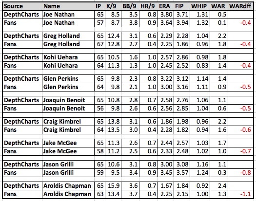
Well wrap this up with a look at the individual relief pitchers at the extremes. First are the relief pitchers who are projected for much less WAR by the Fans than the Depth Charts.

The three relievers who might be the top three closers in baseball are on this list, which is surprising (Aroldis Chapman, Craig Kimbrel, Greg Holland).

  • Aroldis Chapman is projected for a 2.15 FIP but even that can’t compare to the 1.84 FIP projected by the Depth Charts. The Fans also project Chapman to have a 13.4 K/9 versus a 15.9 K/9 projected by the Depth Charts. The end result is a difference of 1.1 WAR, with the Depth Charts placing Chapman 1st in WAR among relief pitchers and the Fans projecting him 9th.
  • When it comes to Greg Holland, Craig Kimbrel, and Koji Uehara, I’m not sure what is going on with their WAR projection from the Fans. Holland, Kimbrel, and Uehara are all projected for better FIPs by the Fans than the Depth Charts, and similar innings pitched, but less WAR.
  • Jake McGee’s lower WAR projection is in part due to eight fewer innings being projected by the Fans.

Finally, we’ll look at the relievers with the most favorable difference in WAR based on the Fans projections versus the Depth Charts projections.

  • Aaron Sanchez is very popular this spring. He was terrific in 33 innings out of the bullpen last year (1.09 ERA, 2.80 FIP). The Fans project him for a 3.36 FIP in 129 innings (43 games, 16 starts), while the Depth Charts are not so optimistic, with a 4.53 projected FIP in 111 innings (56 games, 11 starts). This combination of better pitching in more innings results in a difference of 1.9 WAR, tops among all relief pitchers.
  • Yusmeiro Petit is similar to Sanchez, projected to have a better FIP (3.07 to 3.30) and more innings pitched (131 to 92) by the Fans.
  • A couple of Seattle Mariners pitchers, Dominic Leone and Danny Farquhar, make this list based on their projection for many more innings by the Fans versus the Depth Charts. This is also true for Chase Whitley, Tony Watson, Jake Diekman, and Justin Wilson.
  • The Fans projection for Jeurys Familia is closer to the Depth Charts projection for innings pitched (61 to 55), but the Fans project Familia to have a 2.97 FIP versus a 3.50 FIP projected by the Depth Charts.


Robinson Cano’s Replacement-Level Floor

Robinson Cano’s power vanished in 2014 without a clear explanation.  Most believe that he will be valuable even if the power does not return.  I think Cano’s risk going forward is greater than meets the eye.

After sporting an ISO of at least .199 every year from 2009 to 2013, Cano posted a mark of .139 in 2014.  There is reason to believe that this power outage is permanent.  Robinson Cano was a different kind of hitter in 2014.  His ground ball percentage was 53% (up from 44% in 2013), and his average HR/FB distance plummeted from 292 to 278.  Cano was mostly incapable of hitting fly balls to his pull side, which is where his home-run power used to be, despite swinging at more pitches middle-in.  Cano’s aging bat may be unable to turn on major-league pitching the way it used to.  As noted elsewhere, Cano’s 2014 power numbers had little to do with the move from Yankee Stadium to Safeco.  His problem was that he hit the ball in the air less frequently, with less authority, and to the wrong side of the ballpark.

Aging may have played a role, but it is unusual for an elite slugger’s power to disappear at age 31 without something else going on.  Perhaps Cano was dealing with an injury.  Perhaps his amazing run from 2009-2013 was fueled by PEDs.  We don’t know.  But consider the similarities between Cano’s pre-elite 2008 line and his line from last year:

Year NI BB% K% ISO BABIP WAR
2008 3.6% 10.3% .139 .283 0.1
2014 6.1% 10.2% .139 .335 5.2

It’s easy to forget that Cano was a replacement level second baseman in 2008.  BABIP (along with the changing run environment) is mostly what separates his 2008 replacement level performance from the five-win version of Cano we saw in 2014.  The stability of last year’s BABIP may be the key to Cano’s value going forward—a terrifying thought for the Mariners, who presumably did not intend to invest $240 million in the vagaries of BABIP.

There is conflicting data on what to expect from Cano’s balls in play in 2015.  For example, ZIPS predicts .323—not so bad.  Jeff Zimmerman’s xBABIP formula predicts .299—much closer to the 2008 disaster scenario.  Neither of these predictions fully accounts for shifts, and Cano’s performance against them in 2014 is concerning.  His BABIP was .388 against the shift and .303 without it.  This is disconcerting because Cano displayed no such shift-beating prowess before last year, and his 2014 spray chart suggests no change in his approach that would justify any BABIP spike.  To the contrary, last year Cano hit an alarming number of grounders to the right side of the infield, which should have favored the shifted infield defenses.  It appears that Cano got lucky—perhaps very lucky—with his 2014 balls in play.  My money is on something closer to the xBABIP prediction for 2015.

Cano went from an elite slugger to a BABIP-fueled slap hitter in a short period of time.  His 2014 output was akin to an early-career Ichiro, except unlike Ichiro, we lack assurances that Cano will maintain the high BABIP.  If the power is truly gone and the BABIP craters, he’s toast—or at least something closer to league average.  The risk of collapse is higher than most want to believe, if for no other reason than this same risk was once realized by the same player.


Making the Case Against Baseball in Montreal

Through a lot of backroom deals and schemes, which are beautifully illustrated in Jonah Keri’s Up, Up, and Away, mayor Jean Drapeau was finally able to get Montreal, and Canada, a professional baseball team. The Expos were the first baseball franchise to be situated outside of the US. They were part of Major League Baseball from 1969 to 2004; in 2004 they relocated to Washington and became the Washington Nationals.

Throughout most of its history, baseball in Montreal has been a struggle, not just on the field but also off it. In fact, just getting a suitable stadium for the team was a headache. The Expos had to play their first seven years in a Triple-A ballpark called Jarry Park, which could only seat 28, 500 people. The stadium was less than ideal, it wasn’t a dome, and due to Montreal’s cold weather, many games in April and September had to be played on the road.

In 1977, however, the Expos finally got a new Stadium, Olympic Stadium. The unfortunate part, however, for the Expos, was that the primary designs of the stadium were for the Olympics and not baseball. In fact the Stadium, while a dome, was a disaster, in not just its facility but it’s location. It was located completely out of the way, and far from downtown. Charles Bronfman, owner and majority shareholder, often tried to get a new stadium in downtown Montreal, but was never successful. This was probably one of the most significant impediments in the Expos success as a franchise.

The Expos were often poor on the field, but more importantly, they were poor as a business, creating very little revenue (as compared to other major league franchises). They were also, as it seemed, always rebuilding, never being able to sign valuable free agents, and never having a high payroll. There attendance also wasn’t exactly great.

What now follows is an evaluation, of the Expos historical value as a franchise. The problems? Well there are several, one and perhaps the most important to remember, is that teams are privately owned, and therefore are not obliged to disclose any of their financial information. This makes evaluating a team’s overall value very difficult, but not impossible.

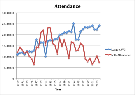
Most of you are probably familiar with Forbes. The problem, however, is that I was only able to find Forbes data from 1990 to 2014. I also was only able to find data on payroll, from 1985, on-word, leaving me essentially only with attendance to look at from 1969 to 2004. Attendance, and let me make this clear, is not the best way of measuring a franchise’s value, but since it’s the only data source I could find before 1985, I thought I’d use it. So, below is a chart comparing the Expos attendance history to league average.

MTL A

For most of its history, the Expos attendance was below average. A couple of other important elements to note are that in 1981, it was a labor-shortened season. That’s why you see the league wide drop in attendance. In 1998 also, while the league attendance was starting to rise, the Expos dropped dramatically. Perhaps this had something to do with the trade of Pedro Martinez to the Red Sox, in the 1997 offseason. Perhaps it had something to do with the franchise rebuilding, yet again, or perhaps there was still some lingering frustration from the 1994 season. None of this is certain, what is however is after 1996, Expos fans stopped showing up.

The goal though is not to gain a sense of attendance, but rather to get a sense of the franchise’s value. Attendance, in that matter has a number of shortcomings. It doesn’t tell us anything about the overall expenses, revenues, ticket sales, TV deals, income, ect… Rather, what it does is give us a sense of the fan’s interest in the team (though not entirely as it doesn’t consider TV ratings). While there seems to have been a significant interest in the team in the mid to low 80’s, the overall interest in the team tends to have been very minimal.

As I’ve mentioned because teams are privately owned enterprises, I had to rely on Forbes value system, which is only available from 1990 on-wards. This will skew the data. For example, from 1979 to 1990 was the Expos most successful era. During that time they only had two losing seasons, which coincided with their first and only playoff berth in 1981.

That being said, a team’s success on the field does not always translate to value. We should therefore not assume that since the Expos had good teams from 1979 to 1990 that the team’s value had risen significantly, if at all. Just take a look at the Rays and the A’s, both teams have won a lot of games, the last few years, and yet Forbes still ranks them among the lowest teams in value.

Also many of you might be wondering what goes into Forbes’ valuation process? How accurate is it? These are valuable questions and concerns. While there isn’t a ton of information out there on these issues, John Beamer did write an article in 2007, for The Hardball Times, which takes a look at how accurate Forbes’ valuation is and what goes into it. If you’re too lazy to read it, than just understand this, “The variance between the purchase price and the Forbes’ valuation averaged 20%…” also “The primary axis of valuation is team revenue, which includes things such as ticket sales, TV money, sponsorship, revenue sharing, concessions, parking and a myriad of other schemes that franchises use to wheedle money from their fans”.

In determining the value, Beamer looked at “recent deals” which ranged from years 1992 to 2006 where only two team values were past 2004 (Brewers and Nationals). Considering most of the data we will be looking at will be from years 1990 to 2004, Beamer’s valuations should not be considered outdated.

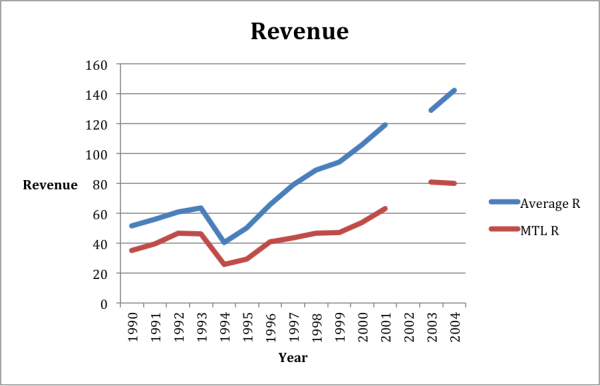
So considering that Forbes’ main valuation process is through revenue, that’s where we’ll go next. Below is a chart that compares Montreal’s revenue from 1990 to 2004, compared to league average. An element to note, the 2002 data for revenue was not available, that’s why you will notice a break in the graph.

MTL R

As you can probably tell, Montreal was always, below average when it came to revenue, and the gap seemed to be getting wider and wider as the years went on. It is also very disappointing that the 2002 data point was not available. There seems to be some kind of break or shift that happened that year, which would have been interesting to look at.

Even though revenue is the major contributor to value, it also states in Beamer’s article that “Major League Baseball franchises are typically valued at somewhere between 2-3x revenues”. To see the evidence of this, again read John Beamer’s article.

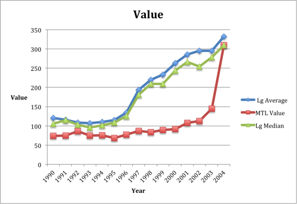
So now lets get to the moment you’ve all been waiting for, the Expos franchise value, compared to league average. I also included the median in the chart below. Why? Well in order to avoid teams that are skewing the data too heavily one way or another, such as the Yankees, the median seemed like a useful tool to add, although as you will be able to tell, there wasn’t a significant difference between the median and average.

MTL V

A lot of you might notice the sudden increase in value for the Expos, in 2004. Well, the Forbes’ valuations for 2004 came after the 2004 season. Thus the franchise was going to officially be the Washington Nationals, which immediately increased the team’s overall value.

Some of you at this point might be wondering how can value increase so significantly? Well, in order to understand what this means, I recommend you read John Beamer’s The Value of Ball Clubs (Part 1) and go to the valuation 101 section. If you don’t want to do that, then I’ll just summarize the concept. Basically what one is trying to do, in valuing any type of business, is trying to work out the value of today, in conjunction with the amount of cash flow a business or team will provide it’s owners in the future.

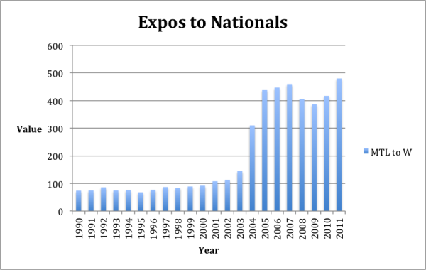
Ok, now that you got that, let’s look at one final chart, I promise! Here we’ll look at the Expos overall franchise value beginning with 1990, but will also include the Nationals value until 2011, in order to see how the move to Washington has paid off.

Expos to Nats

Now look at that huge increase in team value. Basically what Major League Baseball did, was turn one of it’s least profitable teams into an above average team. In fact, from 2003 to 2004 the team’s value changed 114 %. This was by far the biggest change in one-year value of any franchise. The next highest one-year percentage change, for 2004, was the Phillies at 39%. In fact, since Forbes has made their data available I have never found a one-year value % change as high as this one.

This looks like pretty damming evidence of the Expos franchise, and it is. Montreal’s first crack at a Major League Franchise was not a successful one. This, however, does not mean that it wasn’t important. Montreal was the first Canadian franchise to ever get a baseball team and it opened the doors for a team to come to Toronto.

That being said,, the prospects of Montreal getting a new team does look bleak, even after Rob Manfred’s comments, “Montreal’s a great city. I think with the right set of circumstances and the right facility, it’s possible.” Manfred’s comments were positive, when addressing Montreal, however, they were relatively vague. The notion of the right set of circumstances, for example, could mean anything. Also, for Montreal to get a team another team needs to re-locate and when addressing a team’s relocation, a popular team has been the Tampa Bay Rays.

The problem is that the Rays aren’t moving anytime soon. As Eric Macramalla points out in his article, Dream Killer: Sorry Expos Fans, The Tampa Bay Rays Aren’t Moving To Montreal. Basically the Rays aren’t going anywhere because they signed a Use Agreement, which “prevents the team from moving out of Tropicana Field and calls for potentially catastrophic monetary damages should the Rays abandon the stadium before its deal is up in 2027”. As for baseball expanding, well I haven’t exactly herd or read that baseball expects to expand anytime soon, so it doesn’t look like that is going to happen.

Then there’s the right facility, well just about every owner of the Expos has tried unsuccessfully to get a new stadium, and one downtown. At this point (and this is my opinion and should be taken that way), Montreal would need to construct a stadium downtown in order for them to receive a team. Which, given its history of incompetence in that matter seems unlikely.

Finally, could Montreal someday get a baseball team? Yes, when that will be, I don’t know, probably not anytime soon. Therefore Expos fans should not be holding their breaths. At this point, as it concerns a Major League Baseball Franchise there really is no evidence that Montreal can sustain a successful team. That being said, if I were Major League Baseball, I’d start by installing a Minor League Team and see how it goes. If it’s successful and fans are showing up, then perhaps re-consider.

References:


  1. John Beamer Articles for The Hardball Times: Part 1 http://www.hardballtimes.com/measuring-managing-the-value-of-ballclubs-part-1/
  2. Part 2: http://www.hardballtimes.com/measuring-managing-the-value-of-ballclubs-part-2/
  1. SABR Business of Baseball Committee, which provided most of the Forbes data. Also a great source of economic data, for baseball research.
  2. Eric Macramalla’s article “Dream Killer: Sorry Expos Fans, The Tampa Bay Rays Aren’t Moving To Montreal”.
  3. The Biz of Baseball for providing additional Forbes data.
  4. Ben Nicholson-Smith article Manfred: Return to Montreal ‘Possible’ for MLB, for the Manfred quote.
  5. Jonah Keri’s Up, Up, and Away.
  6. Attendance data was found at Baseball Reference.

2014 Projection Review (Updated)

Update: The previous version of this post, published last week, contained a data error that has now been fixed. Steamer/Razzball and Pod projections have been added and the hitter sample has been corrected from the prior version of this article.

Welcome to my 5th annual forecast review.  Each year, every projection submitted to me at http://www.bbprojectionproject.com is tested for error (RMSE), overall predictive power (R^2), and is then ranked.  I present both RMSE and R^2 because both have their uses. RMSE is a standard measure of forecast error, but this metric penalizes general optimism/pessimism about the run environment, even if a forecast has low error after controlling for the bias. For instance, Marcel is very good at predicting the run environment and the FanGraphs Fans are pretty terrible, so Marcel will usually have a better RMSE than the Fans. On the other hand, R^2 serves as a better test of the relative performance of players by ignoring any general biases in the forecasts that are pervasive in the forecasting system. Marcel tends to be lower in this metric versus other systems due to its rigid formula, whereas more sophisticated methods like ZIPS or Steamer tend to do better.

Comparisons are based on the set of players that every system projected. This amounts to 70 pitchers and 141 hitters for 2014. This is certainly limiting, but there is an inherent tradeoff in the number of projection systems that can be analyzed vs. the number of players that are projected by all systems. My policy is to consider as many projection systems as possible, as long as the number of players doesn’t get too low.

Now, on to the contest!

This year certainly saw some interesting results.  By the R^2 metric, the best forecaster for hitters (Dan Rosenheck) only published forecasts for hitter categories–evidently there’s some benefit in specialization when it comes to projecting baseball players. The best pitcher forecasts came from Mike Podhorzer’s Pod forecasts.  The best composite score came from my own personal forecast brew, which is computed based on an algorithm that estimates weights of other main-line forecasts. In a sense, this is not an original forecast, so I now note forecasts that I know use other forecasts as inputs with an “*” (I realize that to some degree, most everyone calibrates their forecasts to what they see other people doing). The next two forecasts are also of this same type, the AggPro and the Steamer/Razzball forecasts. The top “structural” forecast was Pod, followed by ZIPS, Rotovalue, and CBS.

In terms of RMSE, Dan Rosenheck ran away with the hitters, and my weighted average did the best among pitchers.  The top overall performers across categories were MORPS, Marcel, Rotovalue, and AggPro.

Overall, there are a few interesting comparisons to be made between projection systems across different years. Among the open-source stats community, Steamer vs ZIPS is always interesting to watch. In prior years, Steamer has been better. This year, however, ZIPS made huge gains and beat Steamer.  Marcel, had a typical year—with a very favorable ranking on RMSE but not R^2. The FanGraphs Fans had a down year, finishing near the bottom in most metrics.  CBS Sportsline is the top forecast by a major media company, which in general, tend to do poorly. Finally, most every projection submitted beat the naïve previous-season benchmark, where the 2014 forecast is simply the actual performance in 2013.  At least we’re all doing something right.

Thank you again to all who submitted projections. I invite anyone who is interested to submit their top-line hitter and pitcher projections to me at larsonwd@gmail.com.  You projection will be put up on http://www.bbprojectionproject.com as soon as I receive it, unless you want me to embargo it until the end of the season, which some people choose to do because of fantasy baseball or other proprietary reason.  All the code (STATA) and data for these evaluations are available upon request. If I’m using the wrong versions of anyone’s projections (which can happen!), please let me know.


R^2 Rankings:

Place Forecast System Hitters Pitchers Average
N/A Dan Rosenheck* 1.60 1.60
N/A Beans 5.00 5.00
1st Will Larson* 6.60 5.25 5.93
2nd AggPro* 8.40 6.25 7.33
3rd Steamer/Razzball* 6.20 9.00 7.60
4th Pod 11.20 4.75 7.98
5th ZIPS 10.00 7.25 8.63
6th Rotovalue 9.00 8.25 8.63
7th CBS Sportsline 10.20 8.00 9.10
8th ESPN 9.40 10.50 9.95
9th Steamer 9.60 11.50 10.55
10th Fangraphs Fans 13.60 9.00 11.30
11th Rotochamp 7.60 15.25 11.43
12th Razzball 11.60 12.25 11.93
13th MORPS 13.20 11.00 12.10
14th Clay Davenport 14.60 11.50 13.05
15th Cairo 8.20 18.00 13.10
16th Marcel 16.60 10.00 13.30
17th Bayesball 9.80 20.50 15.15
18th Guru 16.80 14.00 15.40
19th Oliver 16.40 15.00 15.70
20th Prior Season 20.40 18.75 19.58


RMSE Rankings:

Place System Hitters Pitchers Average
N/A Dan Rosenheck* 1.40 1.40
1st MORPS 4.20 8.50 6.35
N/A Beans 6.50 6.50
2nd Marcel 8.00 7.00 7.50
3rd Rotovalue 8.60 7.00 7.80
4th AggPro* 7.60 8.25 7.93
5th ZIPS 9.60 7.75 8.68
6th Clay Davenport 6.60 10.75 8.68
7th Steamer 7.80 11.00 9.40
8th Cairo 4.80 14.00 9.40
9th Steamer/Razzball* 9.80 10.00 9.90
10th Will Larson* 15.60 4.75 10.18
11th Guru 7.80 13.00 10.40
12th Rotochamp 10.20 11.50 10.85
13th Bayesball 7.20 15.25 11.23
14th Pod 15.80 8.75 12.28
15th Razzball 16.20 13.00 14.60
16th Oliver 14.40 15.25 14.83
17th ESPN 18.40 11.50 14.95
18th CBS Sportsline 17.40 13.50 15.45
19th Fangraphs Fans 19.40 13.25 16.33
20th Prior Season 20.00 20.50 20.25


RMSE, Hitters:

system r rank hr rank rbi rank avg rank sb rank AVG
Dan Rosenheck* 19.22 1 7.07 1 20.91 1 0.024 2 6.24 2 1.40
MORPS 20.56 2 7.70 3 22.35 2 0.027 13 6.13 1 4.20
Cairo 21.55 3 7.87 6 22.53 3 0.025 9 6.30 3 4.80
Clay Davenport 21.91 6 7.92 7 23.74 8 0.025 8 6.33 4 6.60
Bayesball 22.47 9 8.24 10 24.03 10 0.022 1 6.39 6 7.20
AggPro* 22.64 12 8.23 9 23.34 6 0.024 3 6.42 8 7.60
Steamer 22.58 10 8.22 8 23.37 7 0.025 7 6.41 7 7.80
Guru 22.62 11 7.74 4 23.76 9 0.025 6 6.88 9 7.80
Marcel 21.67 4 7.62 2 22.76 4 0.027 16 7.04 14 8.00
Rotovalue 22.03 7 7.77 5 23.02 5 0.026 10 7.07 16 8.60
ZIPS 22.11 8 8.46 11 25.30 14 0.024 4 6.94 11 9.60
Steamer/Razzball* 23.87 13 8.73 13 24.75 13 0.024 5 6.35 5 9.80
Rotochamp 21.73 5 8.49 12 24.60 12 0.026 12 6.93 10 10.20
Oliver 24.67 16 9.26 18 26.86 16 0.026 11 6.94 11 14.40
Will Larson* 24.88 17 8.75 14 24.37 11 0.029 19 7.08 17 15.60
Pod 24.23 14 9.10 16 26.54 15 0.035 21 7.04 13 15.80
Razzball 24.57 15 8.90 15 27.45 19 0.027 14 7.14 18 16.20
CBS Sportsline 26.28 19 9.94 21 26.90 17 0.027 15 7.06 15 17.40
ESPN 25.88 18 9.88 20 27.25 18 0.028 17 7.32 19 18.40
Fangraphs Fans 27.20 21 9.24 17 28.98 21 0.029 18 7.62 20 19.40
Prior Season 26.56 20 9.39 19 28.77 20 0.033 20 7.84 21 20.00


R^2, Hitters:

system r rank hr rank rbi rank avg rank sb rank AVG
Dan Rosenheck* 0.267 1 0.329 1 0.181 1 0.373 2 0.679 3 1.60
Steamer/Razzball* 0.143 12 0.270 5 0.150 8 0.325 5 0.689 1 6.20
Will Larson* 0.162 10 0.263 8 0.165 5 0.320 6 0.676 4 6.60
Rotochamp 0.227 2 0.268 7 0.127 15 0.293 9 0.675 5 7.60
Cairo 0.166 7 0.259 10 0.165 4 0.288 12 0.659 8 8.20
AggPro* 0.129 15 0.269 6 0.141 11 0.352 3 0.660 7 8.40
Rotovalue 0.164 8 0.272 3 0.167 2 0.278 14 0.574 18 9.00
ESPN 0.166 6 0.253 12 0.166 3 0.273 16 0.656 10 9.40
Steamer 0.130 14 0.260 9 0.135 12 0.317 7 0.661 6 9.60
Bayesball 0.144 11 0.235 17 0.148 9 0.424 1 0.655 11 9.80
ZIPS 0.180 4 0.244 14 0.124 16 0.347 4 0.652 12 10.00
CBS Sportsline 0.162 9 0.243 15 0.151 7 0.266 18 0.682 2 10.20
Pod 0.183 3 0.271 4 0.128 14 0.111 21 0.641 14 11.20
Razzball 0.128 16 0.281 2 0.159 6 0.256 19 0.639 15 11.60
MORPS 0.174 5 0.217 19 0.132 13 0.288 13 0.636 16 13.20
Fangraphs Fans 0.103 19 0.255 11 0.116 18 0.289 11 0.657 9 13.60
Clay Davenport 0.134 13 0.237 16 0.143 10 0.271 17 0.622 17 14.60
Oliver 0.065 21 0.223 18 0.101 20 0.289 10 0.648 13 16.40
Marcel 0.119 17 0.250 13 0.122 17 0.275 15 0.515 21 16.60
Guru 0.118 18 0.210 20 0.109 19 0.311 8 0.555 19 16.80
Prior Season 0.094 20 0.206 21 0.093 21 0.197 20 0.525 20 20.40


RMSE, Pitchers:

system W rank ERA rank WHIP rank SO rank AVG
Will Larson* 4.77 2 0.992 6 0.148 10 56.62 1 4.75
Beans 4.82 4 0.983 3 0.148 11 58.88 8 6.50
Marcel 4.90 8 1.003 11 0.143 4 57.93 5 7.00
Rotovalue 4.83 6 0.978 2 0.151 17 57.26 3 7.00
ZIPS 5.06 15 0.965 1 0.139 1 60.06 14 7.75
AggPro* 4.94 9 0.992 7 0.144 7 59.18 10 8.25
MORPS 4.71 1 1.026 18 0.149 13 56.69 2 8.50
Pod 4.82 5 0.995 10 0.144 8 59.75 12 8.75
Steamer/Razzball* 4.89 7 1.004 12 0.150 15 58.20 6 10.00
Clay Davenport 4.78 3 1.015 15 0.148 12 59.80 13 10.75
Steamer 4.94 10 1.006 14 0.150 16 57.89 4 11.00
ESPN 5.40 18 0.994 8 0.141 3 63.31 17 11.50
Rotochamp 5.04 14 0.989 4 0.145 9 64.18 19 11.50
Razzball 5.25 17 0.990 5 0.149 14 62.89 16 13.00
Guru 4.96 12 1.055 19 0.144 6 61.96 15 13.00
Fangraphs Fans 5.56 20 1.005 13 0.141 2 64.09 18 13.25
CBS Sportsline 5.47 19 0.995 9 0.143 5 67.18 21 13.50
Cairo 4.96 11 1.022 17 0.170 21 58.76 7 14.00
Oliver 5.12 16 1.019 16 0.151 18 59.73 11 15.25
Bayesball 5.04 13 1.082 20 0.163 19 59.11 9 15.25
Prior Season 5.64 21 1.157 21 0.169 20 64.99 20 20.50


R^2 Pitchers:

system W rank ERA rank WHIP rank SO rank AVG
Pod 0.229 1 0.174 9 0.302 5 0.134 4 4.75
Beans 0.184 5 0.196 3 0.269 10 0.136 2 5.00
Will Larson* 0.194 3 0.199 2 0.269 11 0.133 5 5.25
AggPro* 0.190 4 0.190 6 0.287 7 0.121 8 6.25
ZIPS 0.137 12 0.207 1 0.331 2 0.102 14 7.25
CBS Sportsline 0.222 2 0.176 8 0.330 3 0.079 19 8.00
Rotovalue 0.158 9 0.183 7 0.242 16 0.179 1 8.25
Fangraphs Fans 0.122 16 0.161 13 0.372 1 0.125 6 9.00
Steamer/Razzball* 0.167 8 0.192 4 0.254 14 0.111 10 9.00
Marcel 0.137 13 0.146 14 0.302 6 0.122 7 10.00
ESPN 0.146 11 0.171 11 0.309 4 0.101 16 10.50
MORPS 0.181 6 0.112 18 0.236 17 0.134 3 11.00
Steamer 0.128 15 0.192 5 0.254 13 0.104 13 11.50
Clay Davenport 0.177 7 0.120 15 0.252 15 0.117 9 11.50
Razzball 0.154 10 0.174 10 0.257 12 0.097 17 12.25
Guru 0.115 17 0.106 19 0.281 9 0.109 11 14.00
Oliver 0.133 14 0.119 16 0.225 18 0.107 12 15.00
Rotochamp 0.079 20 0.170 12 0.283 8 0.037 21 15.25
Cairo 0.115 18 0.118 17 0.178 19 0.097 18 18.00
Prior Season 0.088 19 0.028 21 0.164 20 0.102 15 18.75
Bayesball 0.077 21 0.103 20 0.159 21 0.060 20 20.50


The Fans Versus the Depth Charts

By now it’s common knowledge that the projections created by the Fans here at FanGraphs are much more optimistic than Steamer or ZiPS or the combination of Steamer and ZiPS used in the Depth Charts. Of course, this isn’t totally fair because of the difference in projected playing time. The Fans project more playing time for most players so those players will generally be projected for more WAR. The Depth Charts can be altered at any time by the people behind the curtain to reflect current injuries or changes in playing time estimates, while the Fans projections have been coming in for the last couple months and don’t accurately reflect recent changes in expected playing time. Still, I thought it would be interesting to look at the Fans versus the Depth Charts to highlight the players with the largest difference in WAR when comparing the two. This information is from Friday the 13th, so the Depth Charts may have had some changes since then. There are 326 players with projections from the Fans and the Depth Charts.

To get this party started, consider the graph below. This graph shows the difference between the Fans projected WAR and the Depth Charts projected WAR for each player in increment of WAR from -1.0 to 2.6. The players on the far left, at -1.0 WAR, are projected for 1.0 less WAR by the Fans than the Depth Charts. The thick line above 0.0 is the dividing point between negative WAR and positive WAR. There were 19 players projected for the same WAR by the Fans and the Depth Charts.

This shows very clearly that the majority of players are projected by the Fans to have more WAR than the Depth Charts are projecting for that player. Can you guess the identity of the player on the far right, the guy who is projected for 2.6 more WAR by the Fans? He’s a FanGraphs’ favorite. It’s *Mookie Betts! A little to his left, at 2.2 more WAR, is Steven Souza. On the other end, the two hitters projected for 1.0 less WAR by the Fans are Mark Trumbo and Drew Stubbs.

*Mookie Betts is projected by the Depth Charts to have 371 PA with a .275/.343/.416 batting line. The Fans project him for 633 PA with a .294/.368/.435 line. The Fans also project him to have better fielding and base running numbers.

The pie chart below shows the breakdown of players projected for less WAR, the same WAR, and more WAR by the Fans. As you can see, 80% of the players are projected for more WAR by the Fans than the Depth Charts.

As mentioned above, the Fans project more playing time for most players than the Depth Charts project. The graph below shows the breakdown by plate appearances when comparing the Fans to the Depth Charts.

Again, not surprising. The Fans consistently project more playing time. The breakdown for plate appearances shows that 79% of the players were projected for more plate appearances by the Fans. This matches up well with the WAR projections, as 80% of the players were projected for more WAR by the Fans. Individually, the three players projected for the greatest difference in plate appearances by the Fans are Danny Espinosa (+296), Jon Singleton (+279), and Robbie Grossman (+277). The four players to the extreme in the other direction are Jake Marisnick (-151), Marcus Semien (-151), Maikel Franco (-145), and Brendan Ryan (-130). The Fans don’t expect these four players to get the kind of playing time the Depth Charts are projecting. Just for fun, the players who have the most similar projections for plate appearances are Marcell Ozuna (-2), Nick Franklin (+1), Justin Turner (+1), and J.D. Martinez (+2).

It’s not all about playing time, though. To find out how much of the higher projection of WAR by the Fans is due to playing time and how much is based on actual production on the field, I adjusted the Fans’ WAR projections to the same number of plate appearances being predicted by the Depth Charts and created the following graph and accompanying pie chart.

Even after adjusting to an equivalent number of plate appearances, the Fans are projecting 75% of the players to have more WAR than the Depth Charts are projecting. This shows that the Fans are consistently projecting hitters to perform better. They are also projecting these hitters to be better fielders and base runners than the Depth Charts are projecting. Consider the table below that shows the average line for these hitters based on the Depth Charts and based on the Fans.

The Fans are projecting these players for an average of 49 more plate appearances and a better hitting line across the board, along with better Fld and BsR and about 0.6 more WAR per hitter.

Let’s look at some individual players, starting with the true oddballs: the players the Fans like much LESS than the Depth Charts. These are the adjusted numbers, meaning that the WAR projected by the Fans is adjusted to the number of plate appearances projected by the Depth Charts. These are the players for whom, playing time being equal, the Fans like much less than the Depth Charts.

All nine of these players are projected by the Fans to hit worse than their Depth Charts projection would suggest and six of the nine players are projected to be worse fielders. I’d say the most surprising player on this list would have to be Mike Trout. As good as the Fans believe Trout will be, the Depth Charts like him even more. Based on raw numbers, Trout is projected for 8.6 WAR by the Depth Charts and 8.2 WAR by the Fans, but the raw numbers show Trout projected by the Fans for 686 plate appearances. In the chart above, Trout’s plate appearances are adjusted down to the 644 projected by the Depth Charts, which drops his WAR to 7.7 and creates a difference of -0.9 WAR. The WAR difference can be attributed to a worse projected wOBA (.401 to .411) and worse fielding.

Other notes on these players:


  • The Depth Charts project a .339 wOBA for Mark Trumbo, while the Fans have him at .321. Last year, Trumbo finished with a .308 wOBA. The year before, he was at .322. His career mark is .326 and he’s had a wOBA of .339 or more just once in his four years as a regular (or semi-regular) player. The Fans might end up being more accurate on Trumbo than the Depth Charts.
  • Drew Stubbs has a projected wOBA of .313 by the Fans and .327 by the Depth Charts. He had his best-hitting season last year with a .358 wOBA, all of it Coors Field inflated (.431 wOBA at home, .276 on the road).
  • Torii Hunter will be 85 years old this year (not really) and it looks like the Fans are pegging him for age-related decline, with a projected wOBA of .319 compared to the Depth Charts’ .327. Hunter hasn’t had a wOBA below .330 since 2003. The Fans are also projecting Hunter to be even worse in the field than the Depth Charts expect.


So, what players do the Fans REALLY like? Which players are projected for significantly more WAR by the Fans than the Depth Charts? Again, the following numbers are adjusted, meaning the players’ plate appearance totals are adjusted to their Depth Chart projections. With this adjustment, FanGraphs’ favorite Mookie Betts is not the most-liked player. Instead, Mr. Steven Souza rises to the top, with his former teammate, Michael Taylor, right there with him, and Joc Pederson rounding out this trio of young Fan favorites.

The Fans project all of these players to hit better, field better, and have better (or equal, in the case of Michael Cuddyer) base running numbers than the Depth Charts are projecting. In the case of Michael Taylor, the Fans are VERY optimistic, projecting a .336 wOBA compared to a .290 wOBA expected of the Depth Charts. The numbers for Taylor are based on just five fans, though, so take this with a giant grain of salt.

Eight of these nine players are young, have little major league experience, or both. Michael Cuddyer is the lone veteran. Cuddyer is coming off back-to-back years with wOBAs of .396 and .414. Of course, those seasons were in Colorado, where Cuddyer took full advantage of the park’s friendliness to hitters. Last year, Cuddyer had a .533 wOBA at home and .324 on the road. In 2013, it was a slightly more reasonable .427/.369 split. He will call Citi Field home this year and the Depth Charts are forecasting a .329 wOBA, while the optimistic Fans see Cuddyer posting a .352 mark.

Souza, Taylor, Pederson, Pompey, and Castillo have almost no major league track record to speak of yet the Fans are projecting them all to be above-average players. It’s very likely that these players will be drafted higher than they should be in the fantasy world. Everyone likes the shiny new toy, but young and inexperienced players generally take time to develop into fantasy assets.

Here is the next group of players liked much more by the Fans projections than the Depth Charts (again, adjusted to equal playing time based on the Depth Charts projections):

This group of players has a few with limited major league experience, such as Kevin Kiermaier, Joe Panik, Jose Ramirez, and Jorge Soler, but also includes a few players who have four or more big league seasons under their belts (Kyle Seager, Lorenzo Cain, Francisco Cervelli). Almost all of these players are projected by the Fans to hit, field, and run better the Depth Charts would suggest. One very notable number on this chart is the relative optimism of the Fans for Wil Myers on defense.

Going back to Kyle Seager, the Fans are projecting a career-high wOBA for Seager, at .354. His career mark is .333. He’s increased his wOBA in each year of his major league career, from .306 to .321 to .337 to .346. The Fans see another increase, while the Depth Charts are projecting regression back to his 2013 mark.

Other notes of interest:

  • The Fans project Kiermaier to equal his wOBA from last year’s 108 games with the Rays (.333 last year, projected for .332). The Depth Charts have him at .304.
  • The Fans like Josh Rutledge to be close to his career .312 wOBA (projected for .314), but the Depth Charts have him way down at .284.
  • In less than a half-season of playing time, Joe Panik had a .317 wOBA last year. The Fans have him projected for a .312 wOBA, while the Depth Charts see much more regression, down to a .291 mark.
  • In his two seasons in the bigs, Wil Myers has posted a .357 wOBA and a .275 mark. Of course, he dealt with injuries last year, which likely contributed to that disappointing performance. The Depth Charts are projecting a .329 wOBA for Myers this year, while the Fans have him with a .345 wOBA. Both projections are worse than what Myers did in his rookie year but much better than what he did last year.
  • Soler was crazy-good in 24 games last year (.386 wOBA). The Depth Charts have him regressed down to a .339 wOBA, while the Fans have him projected for a .364 mark.
  • In 785 career plate appearances, Francisco Cervelli has a career .327 wOBA. The Fans are projecting him for more of the same (.325), while the Depth Charts don’t think he’ll come close to that (.300).


Okay, last group. After adjusting to equalize the playing time, the following players are projected for 1.2 more WAR by the Fans than the Depth Charts:

Here we’re starting to see a few bigger names, like Joe Mauer, George Springer and Adam Jones.

  • Joe Mauer has a career .372 wOBA but is coming off a season that saw him with the second-lowest mark of his career, at .322. In the two previous seasons, Mauer had wOBAs of .376 and .383. The Fans are projecting a .357 wOBA, while the Depth Charts are not that optimistic, projecting a .338 mark.
  • George Springer’s career wOBA (.352) is between his 2015 Depth Charts projection (.346) and Fans projection (.366).
  • Adam Jones has reached his 2015 Fans projected wOBA of .355 just once in his career, back in 2012.
  • Jedd Gyorko hit .249/.301/.444 with a .325 wOBA in 2013, then followed that up with a .210/.280/.333 (.275 wOBA) season last year. The Fans see a return to his 2013 glory days (.328 wOBA), while the Depth Charts see improvement (.308 wOBA) but not to the level of two years ago.

The Fans projections are optimistic on most players, but the players listed on the three charts above are the players that the Fans like most of all. Many of them are young with limited major league playing time. It will be interesting to see how accurate the Fans are on these players at the end of the season.


Analyzing David Wright With Just One Swing

2014 was a disappointment for David Wright, posting his lowest career numbers in almost every offensive category: OBP, SLG, OPS, ISO, wRC+, wOBA, and WAR. Cries of Wright being washed up began springing up immediately – he’s a 31-year-old who saw significant drops in almost every offensive category possible. However, everything might not be as it seems.

Wright injured his left shoulder early in the season and tried to play through it before finally getting shut down in September. Here’s Wright’s home run chart for 2014.

Now here’s his home run chart for 2012-13.

Do you notice a difference? Wright did not hit a single home run to right or center field the entire season last year, and that’s always been something of a trademark for him. The injury to his front shoulder had a clear effect on his opposite field power, and that effect (or lack thereof) was apparent in yesterday’s Mets-Nats spring training game, where Wright did this.

Now that right there is something that Mets fans haven’t seen since Wright’s 2013 season, where he did it rather regularly, such as this home run against Craig Kimbrel.

Look at those two swings: the exact same swing, both demolishing the ball to the same spot of the field. By all accounts, David Wright is healthy. His shoulder is 100% and he’s in The Best Shape of His Life. In baseball, you never want to use a sample size of one to draw a conclusion, but when Captain America comes into the season showing off the trademark power he didn’t show in the Mets’ previous 162 games, there’s plenty of reason to get excited.

Just look at this swing. That’s the swing of a man ready to put America (and the Mets) on his back.


Comparing Ben Revere to Nook Logan

Note: Post was written on March 12. Truths may be falsehoods by the time you read this.

So Nook Logan was trending on FanGraphs this morning. Still is, in fact, as of this writing—he is eighth on the “Major League Players” list, sandwiched between Clayton Kershaw and Yasiel Puig—and that piqued my interest. So I looked at his FanGraphs profile. Upon this inspection, I found that Logan seems to compare quite favorably to another center fielder who started with an AL Central team and moved to a NL East team: Ben Revere. Logan, from a quick glance at his stats, appears to have good speed, but no power and a good glove, but no arm: all traits possessed by Mr. Revere.

First, let’s establish each of these characteristics.

Logan stole exactly 23 bases in each of his two full seasons: 2005 with Detroit and 2007 with Washington. Revere has played three full seasons, with at least 34 steals in each of those seasons, plus another 22 in an injury-shortened 2013. So maybe Revere has more speed. According to their Speed Scores (Spd), where Logan is rated at a 7.4 and Revere at a 7.0, Logan is faster, or at least utilizes his speed better. Both are “Excellent” scores, though, and the FG glossary tells us to look at UBR, so we do. “Hmm,” we say. “Revere has a much higher UBR than Logan.” And yes, this is true. And yes, Revere also has higher values in everything related to base running. So we’ll say that Revere is a far superior baserunner despite Logan’s slightly better speed.

“No power” is not hard to determine. Logan has never had an ISO above .089. Revere has only had two ISOs above .100, and he hit a combined one home run in those seasons (his first two minor-league seasons). He was just hitting and running, and getting a lot of triples. Such is the life of a minor-league speedster. But I will take this time to mention something: Revere has a career K rate of 9.1%, only rising above ten percent three times—once in the minors, once in his “cup of coffee” 2010, and once in his injury-plagued 2013. His walk rate, though, is bad. Like really bad. Like it was barely above the amount of fat in my milk last season bad. Logan, on the other hand, had a better (and more consistent) walk rate, hovering around six percent his entire career (save for an 8.6% rate his rookie year). But he struck out a ton. Or, rather, he struck out a normal amount, then got sent down by the Tigers and started striking out a lot more, and continued to strike out at high rates after being dealt to the Nats. I don’t know what to make of this data, but it is a dissimilarity.

Now we turn our attention to a section I didn’t mention in what an English teacher might call my thesis sentence: batted-ball rates. Both men hit a high amount of ground balls, over 50 percent in all but one season (Logan’s short 2006 campaign, when he hit only 46.7% ground balls, is the lone exception). This doesn’t give us the full picture: while Logan certainly hit his fair share of grounders, he also hit a fair amount of fly balls, checking in at 29 percent for his career, with a 7.9% infield fly rate. Revere, on the other hand, hit so many ground balls that it might be considered unhealthy if he weren’t so doggone fast. Revere has managed to hit about one-seventh of his BIP in the air, and only 3.4 percent of that has been represented by popups. So, um, Logan hit more fly balls, but the same amount of home runs (two). Say what you want about the fact that he would have four in Revere’s sample size.

And now, defense: the hardest part to talk about, because there are so many ways to statisticize (that can’t be a word) it and none of them have become the “standard” method of measuring defensive contributions. First, we’ll only be discussing Logan’s and Revere’s performance in center field, because it is their primary position and also because they have played a not-dissimilar amount of games at that position. First of all, when normal people (I’m weird, you’m weird, everybody’m weird) talk about defense, they think of errors and assists, probably. Or just they think of how many times they saw that one guy make that one catch—you know, the one where he dives, makes the catch, makes another, leaping, catch at the wall, and then throws out all twelve baserunners, including the guy going from fifth base to shortstop, saving the game and making it onto the Top Ten playlist seven hundred million times. Okay, that was a lot of mumbo-jumbo that basically meant, “normal people don’t think in terms of UZR and TZL, they think in terms of highlight plays and errors”.

And now, the actual discussion of defense. Logan had eight assists, 11 errors, and a .985 FLD% in 306 games. Revere had 13 assists, 13 errors, and a .986 FLD% in 362 games. So it can be said that both are players who do their job mostly, but also have little to nothing in the way of arm strength. ARM thinks that they’re basically the same player, but UZR thinks that Logan is eighty times better at defense than Revere, so okay. They have very similar Fielding values, though. ¯\_()_/¯

So yeah, maybe this served no point, but I like writing semi-pointless things about semi-obscure players. Maybe you can expect more of the same in the future.