Effect of Stats So Far on Depth Charts RoS Projections

Major League Baseball teams have played more than one-fourth of their schedule so for and there is new data to incorporate into projections. Some players are off to amazing starts (Bryce Harper and Nelson Cruz), while others have really struggled (Troy Tulowitzki and Steve Pearce). With that in mind, I thought I’d look at which players have seen their rest-of-season projections change the most from their preseason projections. I used the preseason Depth Charts projections and compared each player’s preseason projection for AVG/OBP/SLG and wOBA to their rest-of-season Depth Charts projection. All statistics are from May 25th.

The Biggest Losers


SS Troy Tulowitzki (-.019)


.272/.288/.415, .301 wOBA—current

.307/.386/.539, .400 wOBA—preseason

.300/.370/.515, .381 wOBA—rest-of-season


The statistic that stands out most when looking at Tulowitzki is an extremely low walk rate of just 2.6%. Tulo’s career walk rate is 9.8% and the lowest single-season walk rate he’s had was an 8.4% mark in 2007, his second year in the major leagues. He also has a strikeout rate (21.7%) that is 5.7% higher than his career mark. According to Pitch f/x Plate Discipline, Tulowitzki is swinging at more pitches outside the strike zone (on pace for a career high of 32.9% O-Swing%) and more pitches inside the strike zone (65.6%, career mark is 57.8%) and making less contact than he ever has in a season (78.2% Contact%). When it comes to balls in play, Tulowitzki has seen just 4.3% of his fly balls leave the yard, far below his career rate of 15.1% HR/FB. Despite his struggles, his rest-of-season projection of a .381 wOBA is still elite for a shortstop even if it’s dropped .019 from his pre-season projection of .400.

2B/OF/1B Steve Pearce (-.018)


.188/.262/.323, .259 wOBA—current

.266/.346/.471, .358 wOBA—preseason

.254/.333/.446, .340 wOBA—rest-of-season


Pearce is striking out slightly more than he did last year (20.6% to 19.8%) and walking a bit less (7.5% to 10.4%), but nothing as glaringly different from the norm as Troy Tulowitzki has shown so far (see above). One of the biggest problems for Pearce has been a .197 BABIP, down from .322 last year and well below his .287 career mark. His BABIP is down despite a career-best 25.3% line drive rate. His HR/FB is also close enough to last year’s rate to not be anything to worry about (14.3% this year, 17.5% last year). According to Pitch f/x Pitch Types, Pearce has seen a much lower percentage of two-seam fastballs (4.5%) than he did last year (14.1%) even though his overall percentage of fastballs is up (45.1% to 43.7%), so pitchers are attacking him a bit differently. The heat maps below show the swing percentage for Steve Pearce in 2014 on the left and his swing percentage for 2015 on the right. It looks like pitchers are getting Pearce to swing at more pitches in the upper half and inside part of the strike zone with four seam fastballs. Can he adjust?

OF Carlos Gonzalez (-.017)


.206/.285/.326, .275 wOBA—current

.281/.346/.509, .370 wOBA—preseason

.270/.338/.481, .353 wOBA—rest-of-season


Unlike his equally disappointing teammate, Troy Tulowitzki, Carlos Gonzalez is walking more and striking out less than he has in the last couple seasons. His walk rate of 10.1% is higher than his career mark of 8.0% and his strikeout rate of 20.8% is below his career mark of 22.3%. Like Steve Pearce, CarGo has a BABIP problem. From 2008 to 2013, Gonzalez never had a BABIP below .318 and his career mark over 2826 plate appearances was .350. Last year, he had a .283 BABIP. This year, it’s down to .238. His batted ball profile shows a 22.9% line drive rate, which is higher than his career rate of 20.2%. He’s hitting more ground balls and fewer fly balls than he has historically, which should help his BABIP. When looking at Gonzalez’ hard hit percentage, we find his 27.3% mark this year is his lowest since his rookie year. In his two best season’s (2010 and 2013), CarGo had his two best Hard Hit percentages, at 43.8% and 38.8%. With Gonzalez and his history of injuries, you never know if he’s truly healthy. His plate discipline numbers suggest he’s fine in that regard but that low hard hit percentage is troublesome.

OF Melky Cabrera (-.014)


.241/.287/.271, .253 wOBA—current

.292/.342/.436, .342 wOBA—preseason

.286/.335/.414, .328 wOBA—rest-of-season


Melky is suffering from a low BABIP of .252 (career mark is .308) but his batted ball profile isn’t much different from last year as far as line drives, ground balls, and fly balls are concerned. His HR/FB is way down at 2.4% (last year it was 10.7%) and his Hard% of 19.6% is well below his 2014 rate of 30.5%. He’s walking about as much as he usually walks and is striking out less often than he ever has so he’s making contact, it just hasn’t been good contact.

2B Robinson Cano (-.013)


.253/.295/.337, .279 wOBA—current

.296/.361/.455, .353 wOBA—preseason

.289/.351/.438, .340 wOBA—rest-of-season


Through more than one-fourth of the season, Robinson Cano has just one home run. Other than a terrible 2.9% HR/FB, his batted ball profile looks much like last year and his Hard% of 32.6% is better than last season’s 28.5% mark. As for plate discipline, his walk rate is down to 5.4% after averaging over 9% in the three previous seasons. He also currently has the highest strikeout rate of any season of his career, at 16.7%, with a contact percentage down by approximately 5% on pitches both inside and outside of the strike zone.


The Biggest Winners


OF Bryce Harper (+.019)


.333/.471/.727, .494 wOBA—current

.279/.363/.491, .372 wOBA—preseason

.287/.383/.528 .391 wOBA—rest-of-season


Bryce Harper’s monster start to the season has raised his wOBA projection by .019, the largest increase for any player. This looks like the year Harper has made the jump to elite level. His walk rate of 20.9% is well above his career rate of 11.6%. He’s been hitting so well, and with such power, that pitchers just don’t want to throw him anything to hit. His percentage of strikes out of all pitches thrown was 61.7% in his first three years in the major leagues. This year, pitchers are throwing strikes to Harper just 55.8% of the time. He’s also swinging less often on pitches both inside and outside the strike zone and has a career-best 40.0 Hard% when he does make contact. His HR/FB of 35.6% is almost double his career rate and he’s increased the percentage of fly balls he’s hit and the percentage of balls he’s pulled. It looks like he’s matured into the player everyone thought he’d be.

C Stephen Vogt (+.019)


.307/.410/.598, .424 wOBA—current

.255/.303/.398, .308 wOBA—preseason

.263/.322/.429, .327 wOBA—rest-of-season


Stephen Vogt has some of the same indicators as Bryce Harper. Vogt is also seeing fewer strikes (58.2% after seeing 64.1% strikes in his first three seasons) and has a career-best walk rate of 15.1% (career rate is 8.1%). His HR/FB rate of 22.2% is more than double his career rate (10.6%) and he’s pulling more balls than he ever has.

OF Nelson Cruz (+.016)


.341/.398/.688, .458 wOBA—current

.250/.309/.457, .334 wOBA—preseason

.262/.322/.492, .350 wOBA—rest-of-season


Unlike Harper and Vogt, Cruz has a walk rate that is very close to his career mark. He’s also striking out just a little more than he has during his career, so he’s not walking or striking out at a much different rate than he normally does. He does have a very high .374 BABIP (career BABIP is .302) and the best HR/FB rate of his career, at 31.5% (career mark is 17.9%). With Cruz being on the positive side of the biggest changes in projected wOBA from the preseason to now and his teammate Robinson Cano being on the negative side, the only explanation is that Cruz stole Cano’s mojo.

The interesting thing is that the Cruz and Cano combined are not far off from preseason projections when pro-rated to their current 376 combined plate appearances:

376 PA, 44 R, 14 HR, 49 RBI, .274/.336/.456—Combined preseason projection for Cano & Cruz pro-rated to their current 376 plate appearances.

376 PA, 48 R, 18 HR, 48 RBI, .296/.346/.508—Current combined hitting statistics for Cano & Cruz.

DH Alex Rodriguez (+.015)


.262/.363/.545, .388 wOBA—current

.231/.311/.386, .310 wOBA—preseason

.236/.323/.417, .325 wOBA—rest-of-season


Heading into his age 39 season and having missed all of 2014, expectations were low for Alex Rodriguez this year. And yet, here he is with a very good .263/.363/.545 batting line and 10 home runs in 41 games. His current .388 wOBA would be his highest since 2009. Of course, the projections don’t see that happening but they have bumped up his wOBA from .310 before the season started to .325 for the rest of the season. A-Rod is walking and striking out at similar rates to his 2013 season and has a similar BABIP to that year as well, but he’s increased his HR/FB percentage from 15.6% in 2013 to 23.3% so far this year. That rate would be his best since 2007.

1B Mark Teixeira (+.015)


.236/.362/.563, .387 wOBA—current

.229/.319/.422, .327 wOBA—preseason

.234/.332/.454, .342 wOBA—rest-of-season


Mark Teixeira has seen a projected increase of .015 in his wOBA from the preseason to the rest-of-season thanks to a .387 wOBA through his first 43 games. Teixeira is doing this despite a .191 BABIP, which is well below his career mark of .285. Of course, Teixeira routinely had BABIPs above .300 in the first seven years of his career but has been below .250 in each of the last five years. He is walking more than he ever has (15.6% BB%) and striking out at a career-low rate (12.1%). He also has a 25.5% HR/FB, which would be a career high.


Being Drafted and Making the Show the Same Year

At this point we’re less than a month away from the June 8th, 2015 Major League Draft. Which essentially means we’re in draft season. A lot of mock drafts are coming out, and most fans are excited to see which young talent their team will add to their minor-league system. While the draft can be an exciting event to some, it’s very different than the NBA or NFL draft. Unlike in the NBA and NFL draft where a player will have an immediate impact on the team upon being drafted, the players drafted in the Major League draft will have to spend some time in the minors before making an impact. Most fans therefore won’t be able to see the fruition of the draft for several years. This can be frustrating.

But every now and then a rare event in baseball occurs. A player sometimes reaches the Majors the same year he’s drafted. This event actually happened last year. Brandon Finnegan, you see, was drafted 17th overall, in the first round of last year’s draft by the Kansas City Royals. He eventually went on to make his Major League debut that same season on September 6th and helped the Royals reach the playoffs for the first time since 1985. Finnegan, however, is not the first player to accomplish this feat. Since the draft was first implemented in 1965, a total of 55 players who have been drafted made the majors the same season. This of course does not include international free agents.

But is this feat becoming more or less prevalent? Are certain organizations more likely to promote a player quickly? Is there a certain position that get’s promoted more frequently? And is this even a smart strategy? Will this affect a player’s long-term success? Are the players capable of actually helping the Major League squad? These are all questions I will attempt to answer.

First will look at the prevalence of this feat.

Maikng majors trend

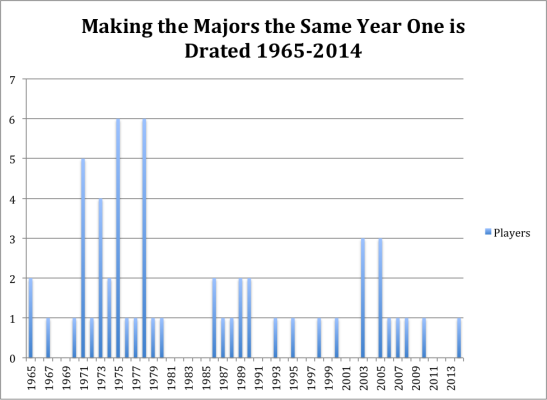
As you can see this was actually not an uncommon occurrence in the 70s. It was actually pretty popular, in 1975 and 1978 as a total of 6 players made the majors upon being drafted. In fact this event actually happened at least once a year for ten straight seasons (1970-1980). Now, however, the trend is far less frequent. Brandon Finnegan was the first player to accomplish the feat since 2010, when Chris Sale was promoted by the White Sox to the Major Leagues.

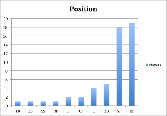
What you may have noticed at this point, is that both players are pitchers. In fact both players were promoted to the majors as relief pitchers. I think at this point most of us would assume that the vast majority of players promoted to the majors upon being drafted would be pitchers. It simply makes sense. Some pitchers coming out of college who have devastating stuff can theoretically come up and get batters out. A position player, however, probably needs more time in the minors to develop an acceptable hitting approach before he can help a team. Developing a hitting approach takes time. So below is the list of all 55 players separated by their different positions.

making majors by position


If you happened to read my latest Tommy John article you probably noticed that a relief pitcher was defined as GS/G < 0.5. I again used this barometer to define a relief pitcher. The position of the player was also defined as, the position that was most often played, the year of the promotion. So for example normally Chris Sale would be defined as a starter, but since he was primarily used as a reliever when promoted, I put him in the reliever group.

At this point you’ve probably noticed that the majority of players promoted are in fact pitchers. As for the reasons stated above this shouldn’t be very surprising.

So now let’s look at whether this is an effective strategy. Most teams are probably hoping that these players make an impact, or else why would they be promoting them, which would speed up their free agent clock, and theoretically affect their development.

Basically what I did was rather simple. I looked at the average stats of all the players when they were promoted. I also, obviously, split the pitchers and position players into two different groups. There were a total of 38 different pitchers and 17 position players.

Pitchers
Age Innings ERA+ PWARP
20.8 27.52 107.5 0.05


Position Players
Age PA wRC+ WAR
20.76 77 101.11 0.14

The results seem to look good, while ERA+ isn’t a perfect statistic by any measure it gives us a sense of the situation and here it looks like the pitchers who are promoted to the majors upon being drafted give above-average production. The hitters fare less well but again give an above-average production. For rookies who have just been called up, I’d say that’s pretty good. This is of course an average look at the players and one needs to consider that not all of them were productive. Also, this strategy for teams is only productive if they’re filling in a need. If a player for example, is performing below league average then this would be an effective strategy, if he were performing above league average then you’re probably better off keeping your everyday player in the lineup.

If we also take a look at the PA and innings, it seems that these players are being used as role players. So basically part-time fielders, or mostly relief pitchers. The position chart above, however, doesn’t support this claim, as the second-most frequent position was starting pitcher.

Another explanation therefore could be that these players are called up later in the season; for example, I would guess that most of them are called up in September. Fortunately though I don’t have to guess I have the results, so here they are.

Months Players
April 1
May 0
June 11
July 7
August 10
September 24

As one might have expected most players are called up by September. This is not surprising. What might be surprising was that a player was called up in April. This might be surprising to some especially considering that the draft begins in June. Some of you might think this is an error. It, however, is not. You see, initially baseball’s draft was divided into three separate drafts. The first and largest was in June. The second was in January, to adhere to the players who graduated in the winter semesters. The third and final round then took place in August. The August draft only lasted two years, while the January draft lasted until 1986. For those interested the one player who was called up in April was drafted in the January draft, his name was Dick Ruthven, and the Philadelphia Phillies called him up April 17th 1973.

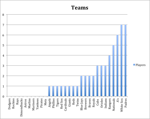
What might be even more interesting is that not only was Dick Ruthven the only player who was called up in April; he was the only players who was ever called up by the Phillies (The same year he was drafted). The Phillies though are not the only team who are squeamish about this strategy. In fact, there are 10 teams who have never called up a player the same year he was drafted. Below are the results.


making majors teams


As you can see the Padres and White Sox seem to be the ones who feel most comfortable promoting a player so early in his development process. That being said, while I have described this as a “strategy” earlier on, this is probably just statistical noise. It’s not like there’s a team or a few teams that are doing this a lot more than other teams. If I had to venture a hypothesis, I would guess that teams probably make the decision to promote someone so quickly, based on need and how advanced the player already is in his development. Personally, however, I would be hesitant to do so in fear that it might affect the player in the long run. For example, he might come up to the majors earlier than he should and therefore will not be able to develop into the player he could have been in the minors.

So now I’ll look to answer my final question and that’s how being promoted the first year a player is drafted affect his career production?

For this I looked at the average of all the player’s career stats. Again splitting the position players and pitchers. I wanted to see if these players ended up having successful careers.

Pitchers (Career)
MLB Games Innings ERA+ WARP
223.52 872.53 94.73 5.93


Position Players (Career)
MLB Games PA wRC+ WAR
961.58 3575.17 89.58 15.43


This time it looks like the position players were more successful than the starters, which was surprising to me. Maybe, it has something do to with the sample size, but I would have either way expected the pitchers to be better.

These career statistics also don’t leap off the screen. These are not superstars, for the most part, but seem to be serviceable Major League players. To me that’s a definite success. It’s a successful draft pick and it shows that the promotion doesn’t overly affect the players. (Of course I’m speaking generally here, I have no way of knowing if it affected a particular player.) This might be a controversial or surprising statement to some but the fact remains that most players who get drafted simply don’t make it to the Major Leagues, let alone have any semblance of a career. The fact that the position players, on average participate in 961.58 games shows that on average they’ve had a respectable career. The same thing goes for the pitchers. While being in 223.52 games might not seem like a lot, that’s more than an entire season’s worth of baseball, which most minor leaguers would kill to have.


Statistics were found at Baseball Prospectus, FanGraphs, and Baseball Reference.


The database for players making it to the majors the same year they were drafted was found at The Baseball Cube, which is a great website where a lot of good research can be done.


Baseball, Regression to the Mean, and Avoiding Potential Clinical Trial Biases

It’s baseball season. Which means it’s fantasy baseball season. Which means I have to keep reminding myself that, even though it’s already been a month and a half, that’s still a pretty short time in the long rhythm of the season and every performance has to be viewed with skepticism. Ryan Zimmerman sporting a 0.293 On Base Percentage (OBP)? He’s not likely to end up there. On the other hand, Jake Odorizzi with an Earned Run Average (ERA) less than 2.10? He’s good, but not that good. I try to avoid making trades in the first few months (although with several players on my team on the Disabled List, I may have to break my own rule) because I know that in small samples, big fluctuations in statistical performance in the end  are not really telling us much about actual player talent.

One of the big lessons I’ve learned from following baseball and the revolution in sports analytics is that one of the most powerful forces in player performance is regression to the mean. This is the tendency for most outliers, over the course of repeated measurements, to move toward the mean of both individual and population-wide performance levels. There’s nothing magical, just simple statistical truth.

And as I lift my head up from ESPN sports and look around, I’ve started to wonder if regression to the mean might be affecting another interest of mine, and not for the better. I wonder if a lack of understanding of regression to the mean might be a problem in our search for ways to reach better health.
Read the rest of this entry »


What in the World is Going on with James Shields?

Here at FanGraphs, it is gospel to say that a pitcher’s ERA is related to both skill and luck. The skill comes from being able to get batters to swing and miss or to induce weak contact, while limiting walks and home runs. The luck comes from how well the other players defend, and also the sequencing of events. That last element of luck, sequencing, merits a brief conversation.

There is little difference, from a pitcher’s skill point of view, between consecutive hits and hits in separate innings. That is to say, a pitcher’s skill is related to how many hard hit balls he gives up; a pitcher’s luck is related to when those hard hit balls occur. So, ERA is affected by the timing of hits, which we can measure easily using LOB%, which is the percentage of base runners that do not score at the end of an inning. It’s not this simple, but basically, a low LOB% rate means the pitcher has been unlucky, and a high LOB% rate means he has been lucky.

The average LOB% in 2015 so far is 72.4%. James Shields‘ LOB% is 87.8%. This is significant! Seven out of eight runners that reach base on him get stranded! His ERA should be anemic, right? Wrong. His ERA is a respectable 3.74, but this is unexpectedly high given what I have told you so far. Clearly, I haven’t told you everything.

There was concern during the offseason that James Shields’s fly ball tendencies would be problematic in the spacious Petco Park with a highly questionable outfield defensively. I guess his home ballpark isn’t spacious enough, because Shields is allowing a career high 2.28 home runs per nine innings, and 25.5% of the fly balls he surrenders leave the ballpark.

Meanwhile, Shields is also striking batters out at a significantly higher rate than his historical numbers indicate he should be. In fact, Shields is striking out batters at a greater rate than any other qualified starting pitcher (and most unqualified ones too!). Opposing hitters are also swinging and missing against Shields more frequently than any other pitcher, even more than highly sophisticated robot and Rust Cohle impersonator Corey Kluber!

When contact is made against Shields, though, it’s been hard contact. According to our new quality of contact statistics, only three starting pitchers have given up a higher percentage of hard contact than Shields. Batters rarely make contact, but paradoxically, when they do make contact, they’re hitting ropes.

This is confusing, and I don’t know why it’s happening, though I can speculate. Shields picked up a knuckle curve a few years ago, and he’s throwing it this year almost a quarter of the time. He’s a good pitcher, and it’s probably a good pitch, which explains the swinging and missing. However, it’s also a new pitch, and he’s probably also making a fair amount of mistakes, which hitters are taking advantage of.

That all made sense to me until a quick PitchF/X search told me that only one of the dingers off Shields were on curveballs. Back to Square 1; I have no idea why this is happening, and it will probably take someone smarter than me to figure it out, or it’s just a sample size issue.

In conclusion, let’s look back at the definition of LOB%. It measures the amount of batters that are left on base when an inning is over. Shields’s high K% probably helps inflate that LOB%. But, it’s also small sample size, and I’m not talking about early season small sample size (although that is probably also a factor). When a high percentage of hits given up are home runs, there are no runners to leave on base in the first place! James Shields is striking out and walking batters, and giving up home runs, all at a career high rate. And it’s kind of working.


Checking in on Starting Pitchers

The MLB season is nearing the one-quarter mark. Most teams are getting close to 40 games played and many starting pitchers have between 40 and 60 innings under their belts. With that in mind, I decided to take a look at fantasy-relevant starting pitchers. Fantasy-relevant can mean different things to different people, depending on the size of the league. For these purposes, I gathered information on all starting pitchers with four or more starts, then eliminated those who are projected by the FanGraphs Depth Charts to finish with an ERA over 4.25. This is arbitrary, I know, but I wanted to get the number of pitchers down to a smaller number. I was left with 90 pitchers.


Here is the key for the tables below:

IP—Current innings pitched (as of May 18)

ERA—Current ERA

FIP—Current FIP

xFIP—Current xFIP

DC-ERA—Rest-of-Season Projected Depth Charts ERA

ERA-xFIP—Current ERA minus current xFIP

ERA-DCERA—Current ERA minus Rest-of-Season Projected Depth Charts ERA


I used xFIP because I’ve read that it is a better predictor going forward than actual ERA or FIP.

I’ve separated the table into groups because a 90-pitcher spreadsheet just seems like too much to take in at one time. The groups will be sorted based on the difference between the pitcher’s current ERA and their current xFIP. With most of these pitchers having pitched around 50 innings, a difference of one earned run allowed is a difference of 0.18 in ERA, so I’ve used 0.54 and 1.08 as cutoff points in either direction for the charts.

The first group of pitchers includes those with an ERA at least 1.08 below their xFIP. These are the guys whose results are much better than you’d expect based on their peripherals.

The column on the far right shows the difference between their current xFIP and their Depth Charts RoS projections (DC-ERA). For pitchers who have a number close to zero, you could say they are pitching about as well as they’re projected to pitch going forward.

I will revisit these charts at the end of the year to see how things play out.

All of the pitchers in the top 17 have shown much better results than would be expected based on their peripherals and their projections. The column on the far right is interesting, though, and may be where we learn something at the end of the season. For example, Zack Greinke has a terrific 1.52 ERA, much lower than his 3.64 xFIP or his 3.20 FIP. His RoS Projection calls for a 3.14 ERA. At the end of the year, I will compare Greinke’s actual ERA from May 19th to the end of the season with these numbers. Greinke can be expected to have a higher ERA moving forward. The question is whether it will be closer to the 3.64 xFIP he has or the 3.14 DC-ERA.

A similar situation is true for Garrett Richards. Among this group of pitchers, Richards has the biggest difference between his xFIP and Depth Charts RoS projection (DC-ERA), at 0.69. Richards has a 2.29 ERA, 3.10 FIP, 4.04 xFIP, and 3.35 DC-ERA. He’s due for regression no matter which metric you favor, but is he closer to a 4.00 guy or a 3.30 guy?

A.J. Burnett has the biggest difference going the other direction, with a 3.58 xFIP and 3.98 DC-ERA. His current 1.38 ERA is ridiculous. He can be a useful pitcher with a 3.50-ish ERA but much less useful if his ERA is closer to 4.00 from this point on. Similar to Burnett is Dallas Keuchel, with a 1.87 ERA, 2.85 FIP, 3.28 xFIP, and 3.67 DC-ERA, and Jake Odorizzi (2.36 ERA, 2.49 FIP, 3.54 xFIP, 3.83 DC-ERA).

In theory (it’s my theory and I admit I am no Isaac Newton), the pitchers with the biggest negative difference in the column on the far right are pitchers who are more likely to beat their projections going forward. A big difference in the other direction could mean they are less likely to hit that projection. Again, I’ll revisit this at the end of the season.

This next group of pitchers also has results that are better than expected. The guy to target in this group based on my theory from above would be JA Happ:

JA Happ—2.98 ERA, 3.35 FIP, 3.58 xFIP, 4.07 DC-ERA. Happ is expected to regress but his FIP and xFIP say he won’t regress nearly as much as his projection would have you believe. In his first seven starts, Happ has a 1.8 BB/9, which is a much better walk rate than he’s had in any previous season of his career. His lifetime BB/9 is 3.7.

On the other hand, the following guys may not be all you want them to be:

John Lackey—2.96 ERA, 3.19 FIP, 4.00 xFIP, 3.63 DC-ERA. Lackey is striking out fewer batters and walking more than he did last year but has a much better ERA. The big difference has been a .269 BABIP and 0.4 HR/9. Last year he gave up 1.1 HR/9 and had a .305 BABIP. His xFIP suggests an ERA around 4.00 while his projection is for a 3.63 ERA going forward.

Jordan Zimmermann—3.66 ERA, 3.19 FIP, 4.21 xFIP, 3.32 DC-ERA. Zimmermann’s strikeout rate has dropped from 8.2 K/9 last year to 5.8 K/9 this year. That being said, last year looks like the outlier, as it was the first time in his first four years as a starter that his K/9 was over 7.1. Still, this year’s strikeout rate would be the lowest of Zimmermann’s career. His xFIP is at 4.21, while his rest-of-season projection is a much more optimistic 3.32.

These pitchers have ERAs within -0.54 and +0.54 of their xFIPs, which is the equivalent of two or three runs, so they could be considered the big group in the middle with numbers closest to what you’d expect. Still, the column to the right reveals some pitchers to target and avoid.

Guys who could outpitch their rest-of-season projections:

Gerrit Cole—2.40 ERA, 2.43 FIP, 2.75 xFIP, 3.32 DC-ERA. Cole could be taking a great leap forward to Ace status. He’s upped his strikeout rate and lowered his walk rate and his ERA, FIP, and xFIP are all below 3.00.

Jason Hammel—3.11 ERA, 3.36 FIP, 3.37 xFIP, 3.83 DC-ERA. Hammel is enjoying life back in the National League. In his career, Hammel has a 2.9 BB/9. Last year he sported a 1.9 BB/9 in his time with the Cubs but that went up to 2.8 BB/9 with the Athletics. He’s back with the Cubs and has walked just 1.2 per nine so far this year.

Chris Archer—2.47 ERA, 2.58 FIP, 2.73 xFIP, 3.47 DC-ERA. Through nine starts, Archer has jacked up his strikeout rate from last year’s 8.0 K/9 to 10.2 K/9. He’s also dropped his walk rate (3.3 BB/9 to 2.6 BB/9). He could be taking the leap along with Gerrit Cole to becoming a top tier-starting pitcher.

Jake Arrieta—2.77 ERA, 2.23 FIP, 2.69 xFIP, 3.39 DC-ERA. In his first four years in the major leagues (2010-2013), Jake Arrieta had a 5.23 ERA (4.75 FIP). Last year he broke out with the Cubs and posted a 2.53 ERA (2.26 FIP, 2.73 xFIP). Projections naturally expected some regression but he has been just as good this year as last year (2.23 FIP, 2.69 xFIP) so his Depth Charts Rest-of-Season Projection of 3.39 looks like it could be much too high.

Bartolo Colon—3.86 ERA, 3.60 FIP, 3.39 xFIP, 3.96 DC-ERA. Bartolo Colon saw what Phil Hughes did last year (186 strikeouts and 16 walks in 209 2/3 innings) and decided he would show the youngster how it’s done. Colon has 42 strikeouts and just one walk in 52 1/3 innings so far this year (he walked Ryan Zimmerman in his first outing this year, back on April 6th).


Guys to be cautious about:

Doug Fister—4.31 ERA, 4.71 FIP, 4.69 xFIP, 3.75 DC-ERA. Fister just went on the DL with forearm tightness so there’s a chance we won’t learn much from him over the rest of the season.

Madison Bumgarner—3.20 ERA, 3.52 FIP, 3.58 xFIP, 2.94 DC-ERA. Bumgarner pitched almost 270 innings last year when you include his stellar postseason and has seen his K/9 drop from 9.1 to 8.2 through his first eight starts. He can still be a positive contributor with an ERA in the 3.50 range but owners likely drafted him expecting an ERA near 3.00.

Alex Wood—3.83 ERA, 3.36 FIP, 4.02 xFIP, 3.49 DC-ERA. After striking out 8.9 batters per nine over his first 249 innings in the big leagues (2013 and 2014 combined), Wood’s K/9 has dropped to 6.1 this year. He’s upped his ground ball rate to over 50% but his fantasy owners would prefer he find those lost strikeouts.

Julio Teheran—4.33 ERA, 5.55 FIP, 4.18 xFIP, 3.66 DC-ERA. If you’re expecting Teheran to have a 3.66 ERA going forward, as his Depth Charts projection would suggest, you may be quite disappointed. Tehran is walking more batters than he ever has and giving up home runs at a ridiculous rate. Even adjusting to a league average home run rate doesn’t make him look very good, as his xFIP is over 4.00.

These pitchers all have ERAs that are worse than would be expected based on their xFIPs.

Guy from this group my theory would expect to be better than his rest-of-season projection:

Michael Pineda—3.31 ERA, 2.01 FIP, 2.41 xFIP, 3.27 DC-ERA. Pineda’s rookie year was back in 2011, when he struck out 9.1 batters per nine and walked 2.9. After missing two years because of injury, he came back last year to strike out 7.0 batters per nine and dropped his walk rate to 0.8 BB/9. This year, he has combined the best of both years, upping his strikeout rate to 9.6 K/9 and dropping his walk rate to 0.5 BB/9. He’s first in all of baseball with a 2.01 FIP and third in xFIP, at 2.41. Pineda’s rest-of-season projection calls for a 3.27 ERA but it looks like he could be on track to outdo that.

Guy my theory would not expect to be better than his rest-of-season projection:

Danny Duffy—5.87 ERA, 4.58 FIP, 4.82 xFIP, 3.86 DC-ERA. Duffy was a useful starting pitcher in fantasy league’s last year when he had a 2.53 ERA and 1.11 WHIP. His walk rate of 3.2 BB/9 was the best of his career. This year, he can’t get the walks under control (4.5 BB/9) and his ERA and WHIP have skyrocketed. Duffy’s FIP and xFIP don’t portend the improvement you might expect if you’re looking hopefully at his rest-of-season projection.

This final group of pitchers includes guys who have ERAs much worse than their xFIPs. These are the guys who have destroyed you ratios in the early going. You probably aren’t real happy with any of these chumps. Based on regression to the mean, they should all be better, but you knew that. Which guys should REALLY be better and which guys should you be a bit more skeptical about?

Should be MUCH better:

Danny Salazar—4.06 ERA, 3.52 FIP, 2.36 xFIP, 3.55 DC-ERA. Since returning from his minor league exile to start the season, Salazar has struck out 12.4 batters per nine and walked just 1.4. He’s given up too many home runs (7 in 37 2/3 innings, 1.7 HR/9), which has inflated his ERA. Salazar’s rest-of-season projection calls for an ERA around 3.50, which is the same as his current FIP. His xFIP, though, has him with an ERA under 2.50.

Clay Buchholz—4.93 ERA, 2.91 FIP, 2.99 xFIP, 3.95 DC-ERA. Based on the things a pitcher has the most control over—strikeouts, walks, and home runs allowed—Clay Buchholz is having his best season (10.6 K/9, 2.6 BB/9, 0.8 HR/9). Based on actual results (2-4 record, 4.93 ERA, 1.38 WHIP), he’s been pretty bad. He should be better. The caveat with Buchholz is that his ERA last year was 5.34, which was much higher than his FIP (4.01) and xFIP (4.04), so you just don’t know if maybe this is who he is now. For the record, in his career, Buchholz has a 3.97 ERA, 4.00 FIP, and 4.03 xFIP.

Finally, the guys who should be better but maybe not as good as you hope:

Chris Tillman—6.34 ERA, 5.42 FIP, 5.09 xFIP, 4.24 DC-ERA. From 2012-2014, Chris Tillman had a 3.42 ERA and 1.19 WHIP in 499 2/3 innings, although his FIP was a much less impressive 4.22. This year, Tillman currently has a 6.34 ERA through seven starts and his FIP and xFIP are both over 5.00. He’s projected to have a 4.24 ERA from this point forward but a sky-high walk rate (4.5 BB/9) will have to come down for him to approach that number.

Stephen Strasburg—5.98 ERA, 3.47 FIP, 3.66 xFIP, 3.14 DC-ERA. It’s shocking to see Stephen Strasburg with a 5.98 ERA. He’s striking out fewer batters than last year (9.3 K/9 to 10.1 K/9) and walking more (2.7 BB/9 TO 1.8 BB/9), but his strikeout and walk numbers are still quite good. The biggest problem appears to be a .389 BABIP and 60.6 LOB%. The Depth Chart projections expect a 3.14 ERA going forward but Strasburg’s FIP (3.47) and xFIP (3.66) aren’t as optimistic.

Using Markov Chains to Predict K% and BB%

There are 12 “states” of the count in baseball: 0-0, 0-1, 0-2, 1-0, 1-1, 1-2, 2-0, 2-1, 2-2, 3-0, 3-1, 3-2. In addition there are 3 “states” in which a plate appearance can end: strikeout, walk, and ball in play. This means that MLB plate appearances lend themselves wonderfully to analysis with Markov chains.

Every pitch thrown in MLB can be classified as a swinging strike, called strike, ball, foul, or ball in play. Each of these classifications has a defined effect in each count. For example, a swinging strike in an 0-1 count leads to an 0-2 count, and a foul in a 2-2 count leads to another 2-2 count.

Using PITCHf/x plate discipline statistics and a little algebra, it is possible to calculate the chance of each of these occurrences on any given pitch. Called strikes, swinging strikes, and balls are easy enough to calculate, but it gets tricky with fouls and balls in play. They both have the same requirements, in that the batter must swing and must make contact. To separate fouls from balls in play, then, we need to find how many pitches a pitcher allowed to be contacted, and then subtract the number of pitches that were put into play. This is easily found, since every batter faced by a pitcher either strikes out, walks, or puts the ball in play.

Unfortunately for the Markov process, major league players do not act randomly. In different counts, pitchers are more or less likely to throw the ball in the zone, and hitters are more or less likely to swing. This must be accounted for or the simulation will bear only a passing resemblance to the game actually played on the field. Using BaseballSavant, I found the rate at which pitchers throw in and out of the zone on every count, and then created an index stat like wRC+, where 100 is average and 110 is 10% more than average. For example, 3-0 counts have a Zone index of 129, and 0-2 counts have a Zone index of just 62. I did the same thing for Z-swing% and O-swing%. One caveat is that the Zone% numbers I got on BaseballSavant do not match those found in the PITCHf/x plate discipline stats. However, since these index stats are all RELATIVE to league average, it should not make a difference.

  ZONE+ ZSWING+ OSWING+
0-0 110 61 53
0-1 88 112 98
0-2 62 131 117
1-0 113 91 82
1-1 99 119 115
1-2 75 134 135
2-0 121 91 80
2-1 115 123 120
2-2 95 137 152
3-0 129 18 19
3-1 128 114 106
3-2 122 139 169

Once we have all this data for a pitcher, we can use a Markov chain to essentially simulate an infinite number of plate appearances for him. Every plate appearance starts at 0-0. By knowing the chances of all the per-pitch results, we can estimate how many 1-0 and 0-1 counts the pitcher would get into, and how many times the pitch would be put into play. From 1-0, we can estimate how many counts become 2-0 or 1-1 or balls in play, and from 0-1, we can estimate how many become 0-2 or 1-1 or balls in play. Simulating in this way, every plate appearance will eventually lead to a strikeout, walk, or ball in play.

For every pitcher who qualified for the ERA title in 2014, I imported his Zone%, Z-swing%, O-swing%, Z-contact%, O-contact%, TBF, K, BB, and HBP (the last 4 only to calculate fair/foul%). Using these, I created a transition matrix for each pitcher that shows the probabilities of moving to any state of the count from any other given count. For example, here is Clayton Kershaw’s 2014 transition matrix.

  0-0 0-1 0-2 1-0 1-1 1-2 2-0 2-1 2-2 3-0 3-1 3-2 K BB IP
0-0 0 0.546 0 0.344 0 0 0 0 0 0 0 0 0 0 0.110
0-1 0 0 0.471 0 0.350 0 0 0 0 0 0 0 0 0 0.180
0-2 0 0 0.207 0 0 0.395 0 0 0 0 0 0 0.221 0 0.177
1-0 0 0 0 0 0.542 0 0.290 0 0 0 0 0 0 0 0.168
1-1 0 0 0 0 0 0.509 0 0.283 0 0 0 0 0 0 0.208
1-2 0 0 0 0 0 0.240 0 0 0.317 0 0 0 0.238 0 0.204
2-0 0 0 0 0 0 0 0 0.564 0 0.260 0 0 0 0 0.175
2-1 0 0 0 0 0 0 0 0 0.541 0 0.225 0 0 0 0.234
2-2 0 0 0 0 0 0 0 0 0.283 0 0 0.231 0.246 0 0.241
3-0 0 0 0 0 0 0 0 0 0 0 0.664 0 0 0.298 0.038
3-1 0 0 0 0 0 0 0 0 0 0 0 0.567 0 0.203 0.229
3-2 0 0 0 0 0 0 0 0 0 0 0 0.332 0.242 0.144 0.282
K 0 0 0 0 0 0 0 0 0 0 0 0 1 0 0
BB 0 0 0 0 0 0 0 0 0 0 0 0 0 1 0
IP 0 0 0 0 0 0 0 0 0 0 0 0 0 0 1

The left column represents the count before a given pitch is thrown. The top row represents the count after that pitch has been thrown. The intersection of any column and row is the chance of that particular transition occurring. So, for 2014 Kershaw, there was a 54.6% chance that he would get ahead of a batter 0-1, a 34.4% chance he would fall behind 1-0, and an 11% chance the batter would put the first pitch into play. Since the transition matrix shows the probabilities associated with throwing one pitch, raising the matrix to the second power simulates throwing 2 pitches. Similarly, finding the limit of the matrix simulates throwing an infinite number of pitches, after which a plate appearance is certain to be over. This is why the limit of Kershaw’s matrix (shown below) only has non-zero probabilities in the last 3 columns; after an infinite number of pitches, a plate appearance will have finally reached a conclusion of a strikeout, walk, or ball in play.

  0-0 0-1 0-2 1-0 1-1 1-2 2-0 2-1 2-2 3-0 3-1 3-2 K BB IP
0-0 0 0 0 0 0 0 0 0 0 0 0 0 0.285 0.041 0.674
0-1 0 0 0 0 0 0 0 0 0 0 0 0 0.369 0.023 0.608
0-2 0 0 0 0 0 0 0 0 0 0 0 0 0.530 0.014 0.455
1-0 0 0 0 0 0 0 0 0 0 0 0 0 0.243 0.082 0.675
1-1 0 0 0 0 0 0 0 0 0 0 0 0 0.341 0.046 0.613
1-2 0 0 0 0 0 0 0 0 0 0 0 0 0.505 0.029 0.466
2-0 0 0 0 0 0 0 0 0 0 0 0 0 0.202 0.197 0.602
2-1 0 0 0 0 0 0 0 0 0 0 0 0 0.295 0.111 0.594
2-2 0 0 0 0 0 0 0 0 0 0 0 0 0.459 0.069 0.471
3-0 0 0 0 0 0 0 0 0 0 0 0 0 0.136 0.515 0.349
3-1 0 0 0 0 0 0 0 0 0 0 0 0 0.205 0.326 0.469
3-2 0 0 0 0 0 0 0 0 0 0 0 0 0.362 0.216 0.422
K 0 0 0 0 0 0 0 0 0 0 0 0 1 0 0
BB 0 0 0 0 0 0 0 0 0 0 0 0 0 1 0
IP 0 0 0 0 0 0 0 0 0 0 0 0 0 0 1

Now, to predict Kershaw’s K% and BB%, we need only look at the top row, since all plate appearances begin with an 0-0 count. After a 0-0 count, we estimate Kershaw has a 28.5% chance to strike out any given batter and a 4.1% chance to walk him. Kershaw in 2014 actually had a 31.9% strikeout rate and a 4.1% walk rate.

This method produces a very robust r-squared of .86 when plotting xK% vs. actual K%. Unfortunately, r-squared drops to .54 when plotting xBB% vs. actual BB%.

I then imported the same statistics for batters, because there really is no reason why this method should not work equally well for both pitchers and hitters. It actually seems to work better as a whole on batters, with an r-squared of .81 for batters’ strikeouts and .77 for batters’ walks.

If there are any players in particular you’re interested in, I have included the full list of all qualified pitchers and position players, with both their expected and actual strikeout and walk rates.

Player              xK%       2014 K%            xBB%    2014 BB%
Hughes 19.1 21.8 1.8 1.9
Kershaw 28.5 31.9 4.1 4.1
Price 25.6 26.9 3.7 3.8
Sale 31.3 30.4 6.1 5.7
Zimmermann 23.2 22.8 3.3 3.6
Scherzer 28.5 27.9 6.4 7
Bumgarner 24.9 25.1 5.1 4.9
Lackey 22 19.7 3.7 5.6
Kluber 28.1 28.3 4.9 5.4
Strasburg 26.8 27.9 5.6 5
Samardzija 24.4 23 4.8 4.9
Hamels 24.8 23.9 5.6 7.1
McCarthy 20.1 20.9 4.4 3.9
Cueto 23.6 25.2 6.8 6.8
Wood 24.9 24.5 6.3 6.5
Kennedy 24.8 24.5 7.5 8.3
Greinke 25.4 25.2 6.4 5.2
Odorizzi 24.1 24.2 9 8.2
Hutchison 23.1 23.4 7.2 7.6
Teheran 21.4 21 5.2 5.8
Harang 20.8 18.4 6 8.1
Eovaldi 17.9 16.6 4.9 5
Felix 26 27.2 6.8 5
Dickey 21.9 18.9 6.3 8.1
Fat Bartolo 17.4 17.8 4 3.5
Kazmir 20.9 21.1 6.5 6.4
Wainwright 21.4 19.9 5.1 5.6
Wheeler 25.2 23.6 9.8 9.9
Ventura 21.2 20.3 6.9 8.8
Fister 17.8 14.8 4.4 3.6
Chen 17.8 17.6 5.9 4.5
Norris 20 20.2 8.4 7.6
Lester 22.6 24.9 8.1 5.4
Richards 24.9 24.2 8 7.5
Porcello 18.3 15.4 4.6 4.9
Shields 20.8 19.2 6.5 4.7
Lewis 18.8 17.5 5.7 6.3
Simon 18.3 15.5 5.5 6.8
Iwakuma 18.6 21.7 5.5 3
Lynn 20.3 20.9 8.6 8.3
Wood 18.3 18.7 8.4 9.7
Hammel 22.5 22.1 7.7 6.2
Noesi 18.9 16.8 6.3 7.6
Verlander 18.5 17.8 6.8 7.3
Miller 17.9 16.6 6.9 9.6
Young 18.2 15.7 7.5 8.7
Koehler 20.3 19.1 6.6 8.8
Archer 22.9 21 8.1 8.8
Roark 19 17.3 5.9 4.9
Haren 19.1 18.7 7.6 4.6
Peavy 18.4 18.5 7.4 7.4
Ross 25.2 24 9 8.9
Niese 17.9 17.6 5.3 5.7
Tillman 17.5 17.2 7.9 7.6
Cobb 22.6 21.9 8.4 6.9
Danks 19.4 15.1 7.1 8.7
Garza 18.3 18.5 7.4 7.4
Santana 22.1 21.9 7.3 7.7
Quintana 20.4 21.4 9.1 6.3
Alvarez 15.7 14.4 3.9 4.3
Liriano 27.3 25.3 10.8 11.7
Volquez 20.5 17.3 7.1 8.8
Guthrie 16.1 14.4 6.3 5.7
Buchholz 18.7 17.9 7.3 7.3
Gray 20.5 20.4 7.7 8.2
Burnett 21.5 20.3 8.8 10.3
Collmenter 16.4 16 6.9 5.4
Vargas 19.2 16.2 6.9 5.2
Lohse 17.4 17.3 6.9 5.5
de la Rosa 19.2 18.1 10 8.7
Leake 16.7 18.2 6.9 5.5
Vogelsong 17.9 19.4 9.6 7.4
Cosart 18 15 8.4 9.5
Weaver 19.2 19 8.2 7.3
Hudson 16.1 15.2 5.8 4.3
Feldman 15.6 14 8.3 6.5
Kuroda 17.3 17.8 8 4.3
Hernandez 17.4 14.5 9 10.1
Buehrle 14.7 13.9 6.2 5.4
Keuchel 18.5 18.1 8.3 5.9
Peralta 16.5 18.4 9.5 7.3
Elias 19.5 20.6 11.1 9.2
Miley 18.3 21.1 10.3 8.7
Kendrick 15.1 14 7.3 6.6
Wilson 21 19.8 13.1 11.2
Gibson 15.8 14.1 8.5 7.5
Stults 14.5 14.5 8.7 5.9
Gallardo 16.3 17.9 11.1 6.6
McCutchen 19.8 17.7 11.7 13
V-Mart 13.9 6.6 8.3 10.9
Abreu 23.7 21.1 6.5 8.2
Stanton 27.6 26.6 12.9 14.7
Trout 27.9 26.1 12.4 11.8
Bautista 19.8 14.3 12 15.5
Rizzo 23.2 18.8 9.5 11.9
E5 20.3 15.1 9.5 11.4
Brantley 10.9 8.3 8 7.7
Cabrera 17.6 17.1 7.1 8.8
Beltre 16.6 12.1 6.7 9.3
Puig 17.5 19.4 10.4 10.5
Werth 24 18 11.4 13.2
Freeman 18.7 20.5 12.3 12.7
Morneau 11.8 10.9 5.7 6.2
Posey 15.5 11.4 7.5 7.8
Cruz 22 20.6 7 8.1
Kemp 24.8 24.2 7.9 8.7
Ortiz 16.7 15.8 11.1 12.5
Lucroy 18.3 10.8 6.4 10.1
Gomez 19.4 21.9 7.1 7.3
Harrison 17.9 14.7 3.8 4
Upton 27 26.7 8.2 9.4
Altuve 9 7.5 3.3 5.1
Han-Ram 16.2 16.4 9.9 10.9
Duda 25.3 22.7 11.5 11.6
Rendon 17.9 15.2 8.7 8.5
Cano 12.2 10.2 6.6 9.2
Holliday 14.3 15 9.5 11.1
Marte 25.2 24 6.3 6.1
Smith 20 16.7 11.6 13.2
LaRoche 19.8 18.4 12.5 14
Walker 15.2 15.4 9 7.9
Cabrera 13.5 10.8 7.1 6.9
Santana 22.6 18.8 14.2 17.1
Gonzalez 19.3 17 6.1 8.5
Donaldson 19.9 18.7 10.5 10.9
Frazier 22 21.1 8.4 7.9
Fowler 20.8 21.4 13.2 13.1
Seager 18.7 18 9.7 8
Gordon 22.9 19.6 9.9 10.1
Carter 32.4 31.8 9.1 9.8
Peralta 19 17.8 8.7 9.2
Valbuena 24.7 20.7 8.8 11.9
Span 14.3 9.7 5.6 7.5
Calhoun 19.7 19.4 6.3 7.1
Castro 18 17.6 7.3 6.2
Yelich 22.9 20.8 10.9 10.6
Pence 20.8 18.4 8.6 7.3
Jones 20 19.5 5.2 2.8
Gomes 23 23.2 5.6 4.6
Eaton 20.7 15.4 5.3 8
Pujols 14.7 10.2 5.7 6.9
Braun 19.9 19.5 6 7.1
Chisenhall 20.2 18.6 5.2 7.3
Dozier 25.9 18.2 8.6 12.6
Moss 27.8 26.4 9.7 11.6
Blackmon 16.3 14.8 5.7 4.8
Carpenter 25.1 15.7 9.9 13.4
Ozuna 27.8 26.8 6.8 6.7
Adams 19 20.2 5.6 4.6
Hunter 16 15.2 4.6 3.9
Ramirez 13.9 14.1 4.7 4
Dunn 30.9 31.1 14.1 13.9
Zobrist 17.6 12.8 9.4 11.5
Gardner 25.6 21.1 9.6 8.8
Plouffe 19.7 18.7 9.3 9.1
Davis 21.6 22.2 7.6 5.8
Gillaspie 14.9 15.4 6.7 7.1
Byrd 29.4 29 4.3 5.5
Heyward 18 15.1 9.7 10.3
Desmond 27.4 28.2 6.9 7.1
Kendrick 19.9 16.3 5.7 7.1
Ellsbury 14 14.6 7.9 7.7
Cespedes 20.6 19.8 5.4 5.4
Markakis 16.1 11.8 8.1 8.7
Utley 15.8 12.8 8.5 8
Suzuki 15.9 9.1 6.8 6.8
Prado 18.2 14 6.9 4.5
Murphy 13.4 13.4 6.4 6.1
Sandoval 12.1 13.3 4.9 6.1
Mauer 23.5 18.5 9.2 11.6
Choo 26.7 24.8 9.9 11
Reyes 12.7 11.1 5.6 5.8
Granderson 25.3 21.6 10.1 12.1
Aoki 11 8.9 8 7.8
Rollins 21.4 16.4 8.2 10.5
McGehee 16 14.8 8.5 9.7
Kinsler 11.3 10.9 5.7 4
Loney 12.7 12.3 7.2 6.3
Pedroia 19.3 12.3 6 8.4
Solarte 14.6 10.8 7.9 9.9
Teixeira 24.2 21.5 10.3 11.4
Longoria 20.3 19 6.2 8.1
Jones 20.4 21.2 8.9 8.4
Headley 21.9 23 10.9 9.6
Navarro 18 14.6 5.9 6.2
Ramirez 13.2 12.3 4.8 3.7
Crisp 18.3 12.3 8.9 12.3
Freese 24.9 24.3 7.3 7.4
Hosmer 17.4 17 7.7 6.4
Jennings 22.2 19.9 8.3 8.7
Gordon 20.5 16.5 4.5 4.8
Butler 17.3 15.9 5.6 6.8
de Aza 24.6 22.5 6.4 7.4
Crawford 24.8 22.9 7.4 10.5
Rios 18.7 17.9 7.1 4.4
Wright 18.7 19.3 7 7.2
Davis 34.1 33 10 11.4
Aybar 11 9.7 4.7 5.6
Cabrera 16.7 17.5 7.2 8
Montero 19.5 17.3 7.5 10
Castellanos 23.9 24.2 6.7 6.2
Escobar 14.8 13.4 4.6 3.7
Martin 20.5 19.6 5.5 6.7
Howard 30.1 29.3 9.8 10.3
McCann 16.9 14.3 7 5.9
Ackley 19.9 16.6 5.8 5.9
Revere 15.1 7.8 3.9 2.1
Perez 14 14 3.4 3.6
Hardy 24.8 18.3 5 5.1
Viciedo 20.2 21.7 6.5 5.7
Lowrie 13.6 14 7.3 9
Mercer 19.5 16 5.5 6.3
Escobar 10.9 11.3 8.9 8.1
Parra 14.8 17.4 7.3 5.6
Bogaerts 26.3 23.2 6.8 6.6
Jackson 23.4 22 8 7.2
LeMahieu 16.5 18 6 6.1
Castro 27 29.5 8.1 6.6
Andrus 18.5 14 8.5 6.7
Hechavarria 13.2 15 4 4.5
Hill 17.7 17 7.4 5.2
Kipnis 22.3 18 7.6 9
Johnson 26 26 3.9 3.8
Bruce 26.1 27.3 8.5 8.1
Hamilton 20.4 19.1 6 5.6
Brown 15.2 17.8 8.4 6.6
Infante 14.6 11.8 6.2 5.7
Jeter 12.1 13.7 5.5 5.5
Upton 29.3 29.7 7.4 9.8
Simmons 11.1 10.4 5.1 5.6
Segura 15.6 12.6 4.3 5
Craig 21.6 22.4 7.2 6.9
Dominguez 21.9 20.6 5.2 4.8
Cozart 15.3 14.5 5.3 4.6

One advantage of this method over any of the many regression based estimates using plate discipline stats is that this can be further tailored to each player. The reason for this is that ZONE+, ZSWING+, and OSWING+ are all league average indexes, and some players’ talents are just not captured by league averages. For example, Dustin Pedroia’s expected strikeout rate is nowhere near his actual strikeout rate. Presumably, Pedroia has swing tendencies in certain counts that are markedly different from the average hitter. By examining these swing tendencies, it is likely possible to predict Pedroia’s yearly strikeout rates with much greater accuracy, as those tendencies are probably part of his approach at the plate year after year. Still, as preliminary research into this area, these I think these results as a whole are very promising.


The Brewers’ Lament

The Brewers recently fired manager Ron Roenicke, using the same logic that primitive villagers employed when tossing virgins into the maw of a nearby volcano: It probably won’t work, but why take chances? As Dave Cameron has pointed out, the Brewers have fallen and they are unlikely to get up any time soon, and as others have pointed out, little of this was Roenicke’s fault. Yes, the team is enjoying a keg of Regression Pilsner under new manager Craig Counsell, who is 6-5 at the helm of the S.S. Benny, winning just one game fewer than Roenicke did in 25 attempts. But the Brewers are not a .500 team, and indeed not very close to being one. They are 23rd in the majors in runs scored, and 29th in runs allowed. Their fielding isn’t very good either.

And help isn’t on the way from the farm, at least not right away. The Brewers began the year as the 21st rated system, according to Baseball America. While Kiley McDaniel liked their 2014 draft, he also still has them in the bottom third of the league. Top prospect Orlando Arcia has put together 142 insane plate appearances at AA, where he’s slashing .354/.404/.496 with a pint-sized 7% K rate. The other young Brewers are probably less talented and/or farther away. Some of them will succeed, but most will not.

The surveyor of this doomed path is, of course, general manager Doug Melvin. Like many valuable things in life, GM jobs are much easier to lose than keep, and the sands are now running out of Melvin’s hourglass. That said, he’s had a long run, having been hired in September, 2002. During his tenure, the Brewers have been mediocre, finishing 17th in runs scored and 21st in runs allowed from 2003-2015. The aggregate mediocrity hides some occasional success: Melvin’s Brewers went to the postseason twice, and in 2011 finished with the most wins (96) in Brewers’ history. But overall the team is 969-1010 over that stretch, and only twice finished within 7 games of first in the not-always-intimidating NL Central.

Suspicion for this generally uninspiring performance immediately falls on the Brewers’ drafts, but here Melvin can claim some success. From 2003-2015, players drafted by Melvin have accumulated more net bWAR than any other NL Central team can claim.

Team                        bWAR from draft

Brewers                            163.3

Cardinals                          156.6

Reds                                  122.0

Pirates                               111.4

Cubs                                  109.3

Note that the drafting team did not always benefit from the bWAR displayed above. The Cubs, for example, get about 24 of their bWAR from Tim Lincecum, who did not sign with them after being drafted in 2003. The Brewers and Reds both get credit for 7.4 bWAR from Jake Arrieta, who the Orioles finally successfully inked in 2007. But in any case, Melvin and his team can’t fairly be accused of simply missing talent.

Melvin had some holes in his draft swing, however. From 2003-2011 Melvin got almost nothing from his first-round pitchers. Of nine first-round pitchers, six have thus far failed to make it to the majors, by far the worst rate in the division. (I’m using the 2011 cutoff to acknowledge that most players drafted since then probably would not have not made it to the majors.)

Team               1st round pitchers drafted     failed to make majors

Brewers                             9                                              6

Cardinals                          10                                            4

Cubs                                   3                                              2

Reds                                   6                                              2

Pirates                               6                                               1

The Brewers first-round pitchers who have made it to the majors have achieved little.

Player                                   bWAR

Jake Odorizzi                    3.3

Mark Rogers                      1.1

Jeremy Jeffress                1.1

Yep, that’s it. And Odorizzi never threw a pitch in anger for the Crew, although he did help Melvin to pry Zack Greinke from the Royals for the Brewers’ playoff season in 2011.

This pitching void has sucked in money – lots of it that a small-market team can ill afford. Only four Brewers are making more than $10 million this year; two of them are Kyle Lohse and Matt Garza. At least Lohse’s contract ends this year. Garza’s goes on through 2017, and will be one of the many puzzles the next Brewers GM will need to solve.

The Brewers’ path to redemption will go through several painful stations. The rotation next year may not be good, but it will be much cheaper. Three of the five starters (Peralta, Nelson, and Fiers) are home grown. FIP and I have yet to catch Peralta Fever, but Nelson and Fiers have good swing ‘n’ miss stuff. Fiers’ upside is limited though; a late bloomer, he will be 30 in June. Aramis Ramirez, the highest paid Brewmaster at $14 million, comes off the books at the end of the season and plans to hang up his cleats. Another $13 million might depart with Adam Lind and Gerardo Parra.

Rather than sign aging free agents to replace the departing aging free agents, the Brewers would be better served to take the bulk of this freed-up cash and pour it into scouting, player development, and perhaps the international market. The Brewers could use a couple of 90-loss seasons to get the high draft picks that they could use to augment a farm that is already on its way to yielding at least a handful of good produce in the next 2-3 years. The economics of tanking are complex, however. The Brewers have a bad local television deal and a small metro area from which to draw fans. They are thus probably more dependent than average for revenue from the occasional fan who attends one or two games a year with the family, and who will find other things to do if the Brewers are putting a replacement-level team on the field. The two most eminently watchable Brewers, Carlos Gomez and Jonathan Lucroy, are also probably the Brewers’ best trade pieces, but trading them will almost certainly lead to lower attendance and an associated revenue loss that reduces the benefit of shedding their salaries.

Ryan Braun has an untradeable contract and a damaged brand. His performance has collapsed since the suspension; before it he had a career OPS of .938, since then it’s been .781. Braun is by default the player around which the Brewers will attempt to market their team during the plague years to come, but that effort will be much less successful than it would have been without the suspension. Mark Attanasio seems like an intelligent and patient owner. He can only hope his next GM is similarly blessed.


Ian Kinsler’s Walking, Not Running

While the Detroit Tigers’ decision to trade Prince Fielder to the Texas Rangers for Ian Kinsler prior to last season initially came as a shock to Tigers fans, the positive early returns on the trade seemed to provide a calming influence. As I wrote in late April 2014,

Kinsler has provided some real spark, though. Looking at the right side of this graph, you can see that, while he and Prince posted similar batting averages last season, Kinsler has kept the pace this year, but Prince has dropped off sharply with the Rangers.

chart

While Fielder has the edge in on-base percentage, probably due to his ability to draw walks (of the intentional and unintentional varieties), Kinsler’s hitting for more power (.133 ISO vs. .121 ISO) and is posting a better wOBA— a catch-all offensive metric– than Fielder (.319 vs. .277). They also have the same number of home runs (two), with Kinsler driving in nearly twice as many runs as Fielder (14 vs. 8), while stealing three bases (to Fielder’s zero, obviously).

Less than a month later, Prince’s season would be over, a completely understandable side-effect of probably overdue neck surgery.

Kinsler powered right along, though, making 726 plate appearances in a career-high 161 games. His bat seemed to cool off in the second half of 2014 (.353 wOBA vs. .276), but he still managed to finish the season tied with Miguel Cabrera for the title of most valuable Tiger, as determined by fWAR (5.1 fWAR apiece), although much of that was due to Kinsler’s defense (and Cabrera’s lack thereof).

In reviewing last year’s statistics in anticipation of this season, Kinsler’s numbers jumped off the page for one main reason: his walks had disappeared. Read the rest of this entry »


Velocity and the Likelihood of Tommy John Surgery

Around a month ago I wrote an article entitled “Tommy John Surgery and Throwing 95+ MPH”. Basically what I was trying to find out was, are pitchers who throw harder more likely to have Tommy John. The article fell short of this discovery, mainly because I only looked at pitchers who threw 95 or more. I wanted to get more in-depth but as my semester was coming to an end, I simply didn’t have the time to do an expanded study. Since then my semester has ended and I do have the time to get more in-depth.

First, however, we’re going to tread back and look at old work. In November 2012, Jon Roegele came out with an article introducing his and Jeff Zimmerman’s Tommy John surgery list. At this point, I think it’s pretty safe to say it’s the most complete list of Tommy John surgeries. The list can be found on Jeff’s site baseballheatmaps.com. Below is an updated chart of the list.


TMJ


Then in July of 2013 Will Carroll came out with an article stating that 33% of opening day Major League pitchers had undergone the surgery. I, however, found the study problematic, which I discussed in my previous article.

In March of 2014, Jeff looked at players who threw a pitch 100MPH or harder and found that 25% of them had the surgery. And finally at this year’s Sloan Sports Analytics Conference, Dr. Glenn Fleisig found that 16% of all pitchers had Tommy John, 15% of Minor Leaguers had Tommy John, and 25% of Major Leaguers fell under the knife.

So how does this relate to velocity? Well in my previous article I found that 32% of pitchers who threw 95+ MPH on average had the surgery. If we are to believe Will Carroll’s findings then really there isn’t any significant risk of throwing harder. If we, however, choose to look Dr. Fleisig’s results then throwing harder does increase your chances of having Tommy John.

There are essentially two sources where velocity data can be found, PITCHfx, which dates back to 2007 and Baseball Info Solution (BIS), which dates back to 2002. Below is the yearly velocity data.


Year PITCHfx BIS
2002 89.56
2003 89.6
2004 89.77
2005 90.01
2006 90.17
2007 91.67 90.05
2008 91.39 90.43
2009 91.6 90.71
2010 91.82 91.01
2011 92.21 91.19
2012 92.34 91.32
2013 92.5 91.44
2014 93.05 91.43

As you can see velocity is on the rise. There are also discrepancies in the data. This is why when I did my study I looked at PITCHfx and BIS data separately to see if I would get different results.

Before we get into my results, however, I’ll explain my methodology. I gathered the PITCHfx data in Baseball Prospectus’ leaderboard. I looked at all the years available and did not set an innings limit, in order to get as large of a sample size as possible. This gave me 1484 pitchers to work with. I then looked up, which pitchers had Tommy John surgery. I basically did the same thing for the BIS data, which was gathered at FanGraphs. Again did not set an innings limit and this gave me a sample size of 2097 pitchers. I did not include position players as I felt they would skew the data.

I also set buckets for the velocity. The goal was to get as close to the exact velocity, while at the same time maintaining a respectable sample size. I did my best with this; you’ll find that in some cases there are some sample size issues.

So let’s begin. Below you will find the percent of pitchers who have had Tommy John surgery based on their velocity group.


PITCHfx

Velo Sample Size TMJ Count TMJ %
96+ 99 36 36.36%
95+ 196 61 31.12%
92 to 95 584 158 27.05%
89 to 92 530 106 20%
86 to 89 151 34 22.51%
86- 23 4 17.39%


BIS

Velo Sample Size TMJ Count TMJ %
96+ 36 8 22.22%
95+ 113 40 35%
92 to 95 547 147 26.87%
89 to 92 890 190 21.34%
86 to 89 429 83 19.34%
85- 118 16 13.55%


From this data it’s pretty clear that velocity does increase one’s likelihood of getting Tommy John surgery. The biggest increase happens from the 89-92 bucket to the 92-95 bucket. There is also a pretty big increase when looking at the 95+ bucket, in both tables, although I would argue that the sample size there is somewhat small. This doesn’t mean, however, that we can’t come to any conclusions. A 113 or 196 sample is definitely not as accurate as a 500 sample, but I don’t think that it’s unreasonable to suggest, based on this data, that throwing 95+ increases one’s likelihood of getting the surgery.

Also you might have noticed that in the PITCHfx table the 86 to 89 buckets are actually more likely to have Tommy John than the 89 to 92 group. This can be due to a couple of factors: A) We can definitely attribute some of this to a small sample size, especially since in the BIS table (where the sample is bigger) it shows a drop in percentage. B) The pitchers who are throwing in that group are probably older and therefore are more prone to the injury.

You’re at this point probably curious to see the results, so here they are. I was debating (with myself) whether I should show this or not. The sample is really small and I’m not sure we can really conclude anything from it. But I figured that showing some data is better than no data.


PITCHfx Age

Velo Sample Size Avg. Age
96+ 36 23.44
95+ 61 23.48
92 to 95 158 24.85
89 to 92 106 25.56
86 to 89 34 27.05
86- 4 33.5


BIS Age

Velo Sample Size Avg. Age
96+ 8 25.87
95+ 40 23.87
92 to 95 147 24.51
89 to 92 190 25.65
86 to 89 83 27.02
85- 16 28.68


So pitchers in the lower groups are older, this would seem to make sense, although again each sample is small. More data needs to be gathered here to come to an accurate conclusion. (The age chosen, for each individual pitcher, was the age of the year the Tommy John surgery occurred).

I also wanted to look at the difference between starting pitchers and relievers, or at least see if there was a difference. The logic being that on average relief pitchers will throw harder than starters so maybe they would have a higher likelihood of getting Tommy John surgery based on their velocity.

A relief pitcher was defined as this: GS/G < 0.5. Jeff Zimmerman deserves the credit here. For a while now I’ve been struggling to define what qualifies as a relief pitcher. Then I read Jeff’s latest article at The Hardball Times and stupidly asked how he defined a relief pitcher. Obviously he had defined it in the article (GS/G <0.5) and I missed it. I personally like this barometer for a relief pitcher. While I could have simply sorted the pitchers by there type on FanGraphs and BP, I don’t know where they draw the line on a relief pitcher. This at least gives us a concrete definition of what a reliever is. I also like this better than an arbitrary innings limit.

Important to also note is that the overall relief and starting pitcher data has nothing to do with velocity. It is rather the overall percentage of relief and starting pitchers who have undergone Tommy John. For BIS it dates back to 2002 and PITCHfx it’s 2007. Ok enough chitter-chatter, here are the results.


Overall PITCHfx RP

Sample Size TMJ Count TMJ %
1016 241 23.72%


Overall BIS RP

Sample Size TMJ Count TMJ %
1475 321 21.76%


PITCHfx RP

Velo Sample Size TMJ Count TMJ %
96+ 89 30 33.70%
95 + 175 51 29.14%
92 to 95 412 110 26.69%
89 to 92 340 61 17.94%
86 to 89 77 16 20.77%
86- 12 3 25%


BIS RP

Velo Sample Size TMJ Count TMJ %
96+ 35 8 22.85%
95+ 101 32 31.68%
92 to 95 437 121 27.68%
89 to 92 604 118 19.53%
86 to 89 262 42 16.03%
86- 71 8 11.26%


And now the starters.


Overall PITCHfx SP

Sample Size TMJ Count TMJ %
464 121 26.07%


Overall BIS SP

Sample Size TMJ Count TMJ %
623 155 24.87%


PITCHfx SP

Velo Sample Size TMJ Count TMJ %
95 to 98 20 9 45%
92 to 95 169 48 28.40%
89 to 92 190 45 23.68%
89- 85 19 22.35%


BIS SP

Velo Sample Size TMJ Count TMJ %
94 to 97 23 10 43.47%
91 to 94 191 47 24.60%
88 to 91 272 69 25.36%
88- 137 29 21.16%


Ok, let’s start with the relief pitchers, they’re less complicated. Basically the results aren’t very surprising, the harder one throws the higher chance one will fall under the knife. There again seems to be this vast increase between the 89 to 92 bucket and 92 to 95. Also, and this was surprising to me, the overall results for relievers show that they are actually less likely to have Tommy John, than the starters. Even more interesting was while BIS and PITCHfx data show different numbers, they seem to be telling the same story here. That starting pitchers are about 3% more likely to have Tommy John than relief pitchers.

Now let’s focus on the starters, and this is where there is a serious discrepancy in the data. With PITCHfx it shows that velocity does impact a starter’s likelihood of getting the surgery. While with the BIS data, the evidence is more ambiguous and the sample size is larger in the BIS data. I’m not sure what to personally make of this. Some might point out that the sample is not ideal. I would agree with that, a sample of 400 or 500 would be more accurate but a sample of 272 or even 169 are nothing to sneeze at. This is when the evidence is starting to take shape. What was even more surprising was that it was the BIS data that was more ambiguous because the sample is bigger.

There could also be a larger number of factors at play here. Starting pitchers throw more innings than relief pitchers, which puts added stress on the arm. They also throw more pitches, which based on which pitch they throw could also increase their chances of getting the surgery. Finally, and this is more of a hypothesis than anything, starting pitchers tend to have longer careers than relief pitchers. Therefore the older a pitcher gets the more likely he is to having a drop in velocity, while still maintaining the risk of Tommy John. This is of course a hypothesis. I think more data needs to be acquired to make a more accurate statement, but now at least I wouldn’t be surprised if the starting pitchers data was more ambiguous.

Finally let’s look at the overall results. This has nothing to do with velocity, just general Tommy John percentage.


Overall PITCHfx

Sample Size TMJ Count TMJ %
1484 363 24.46%


Overall BIS

Sample Size TMJ Count TMJ %
2097 476 23%


As you can see these results are more in line with Dr. Fleisig’s results (25% Major League pitchers). I don’t think it’s unreasonable there are some differences, however. This would depend on our methods of gathering the data and how we defined what a Major League pitcher is. My definition was very loose. Basically if a pitcher came up and threw one inning, then I put him in the results. The reason why I didn’t have a stricter definition of what a Major League pitcher was was because my goal wasn’t to find the percentage of Majors League pitchers who had Tommy John. Rather it was to examine the relationship between velocity and Tommy John surgeries. This is really just an added bonus. Also, Dr. Fleisig’s goal was to see how many current pitchers had Tommy John. My results are the percentage of pitchers who have had Tommy John since 2002 and 2007. We, however, now can accurately conclude, in my estimation, that Carroll’s results were way too high and that velocity does increase a player’s chance of having Tommy John.

This can make pitcher selection now very interesting. For example, if you are trying to decipher whether to get a pitcher who throws 96 MPH who is just as good as a pitcher who throws 90 MPH, you might be better off taking the guy who throws 90. By doing that you would be reducing the odds that that pitcher has Tommy John by about 7 to 10 percent, which is pretty good if you ask me. Also if you’re a GM or in fantasy and are terrified of relievers because you think they all tear their ulnar collateral ligaments, well you shouldn’t be. Your starters are actually slightly more likely to tear their UCL. There are of course other factors to consider here but these can serve as basic general guidelines. Finally velocity does increase your likelihood of tearing your UCL, although with starters the data is a little murkier.


Bonus: Pitchers who have had multiple Tommy John surgeries.

PITCHfx

Sample Size Velo Age
25 93.53 24.68


BIS

Sample Size Velo Age
31 92.17 25.12


Hardball Retrospective – The “Original” 2012 Los Angeles Dodgers

In “Hardball Retrospective: Evaluating Scouting and Development Outcomes for the Modern-Era Franchises”, I placed every ballplayer in the modern era (from 1901-present) on their original team. Therefore, Frank E. Thomas is listed on the White Sox roster for the duration of his career while the Yankees declare Fred McGriff and the Twins claim Rod Carew. I calculated revised standings for every season based entirely on the performance of each team’s “original” players. I discuss every team’s “original” players and seasons at length along with organizational performance with respect to the Amateur Draft (or First-Year Player Draft), amateur free agent signings and other methods of player acquisition.  Season standings, WAR and Win Shares totals for the “original” teams are compared against the “actual” team results to assess each franchise’s scouting, development and general management skills.

Expanding on my research for the book, the following series of articles will reveal the finest single-season rosters for every Major League organization based on overall rankings in OWAR and OWS along with the general managers and scouting directors that constructed the teams. “Hardball Retrospective” is available in digital format on Amazon, Barnes and Noble, GooglePlay, iTunes and KoboBooks. The print edition will be available soon. Additional information and a discussion forum are available at TuataraSoftware.com.

Don Daglow (Intellivision World Series Major League Baseball, Earl Weaver Baseball, Tony LaRussa Baseball) contributed the foreword for Hardball Retrospective. The foreword and preview of my book are accessible here.

Terminology

OWAR – Wins Above Replacement for players on “original” teams

OWS – Win Shares for players on “original” teams

OPW% – Pythagorean Won-Loss record for the “original” teams

Assessment

The 2012 Los Angeles Dodgers      OWAR: 47.1     OWS: 289     OPW%: .546

Five General Managers shaped the roster of the 2012 Dodgers over a 24-year period. Henry Blanco (1989) and Miguel Cairo (1990) were acquired before Paco Rodriguez was born! 37 of the 49 team members were selected through the Amateur Draft process. Notable exceptions (signed as amateur free agents) include Hiroki Kuroda, Adrian Beltre and Carlos Santana. Based on the revised standings the “Original” 2012 Dodgers edged the Diamondbacks by two games to secure the National League Western Division crown.

Adrian Beltre paced Los Angeles with 28 Win Shares, collected his fourth Gold Glove Award and posted a .321 BA with 36 round-trippers. Three backstops made significant contributions to the Dodgers in 2012 as A.J. Ellis, Russell Martin and Carlos Santana combined for 52 circuit clouts. Matt “The Bison” Kemp batted .303 with 23 jacks in an injury-shortened campaign and first-sacker Paul Konerko swatted 26 big-flies.

LINEUP POS WAR WS
Alejandro DeAza LF/CF 2.78 17.96
A. J. Ellis C 3.86 21.15
Adrian Beltre 3B 4.16 28.4
Matt Kemp CF 2.92 20.41
Paul Konerko 1B 2.24 18.69
Shane Victorino RF/LF 2.31 18.05
Tony Abreu 2B -0.07 1.24
Dee Gordon SS -0.36 3.86
BENCH POS WAR WS
Russell Martin C 3.26 11.15
Carlos Santana C 3.12 19.28
Justin Ruggiano CF 2.24 12.17
David Ross C 1.28 7.63
Franklin Gutierrez CF 0.9 4.56
Xavier Paul LF 0.34 2.91
Trayvon Robinson LF 0.32 2.54
Elian Herrera LF 0.28 4.7
Ivan De Jesus 2B -0.08 0.71
Jason Repko CF -0.13 0.2
Jerry Sands LF -0.15 0.11
Scott Van Slyke RF -0.31 0.39
Koyie Hill C -0.33 0.17
Blake DeWitt 2B -0.36 0.21
Henry Blanco C -0.4 1.46
Josh Bell 3B -0.45 0.25
Miguel Cairo 1B -1.08 1.01
James Loney 1B -1.28 4.62

Clayton Kershaw (14-9, 2.53) led the National League in ERA and WHIP (1.023) while placing runner-up in the Cy Young balloting. Hiroki Kuroda notched a career-best 16 victories along with a 3.32 ERA and a 1.165 WHIP. The bullpen excelled as Jonathan Broxton, Joel Hanrahan and Kenley Jansen saved a collective 90 games.

ROTATION POS WAR WS
Clayton Kershaw SP 6.1 19.56
Hiroki Kuroda SP 5.38 16.72
Eric Stults SP 1.71 6.82
Edwin Jackson SP 1.64 8.43
Chad Billingsley SP 1.53 8.3
BULLPEN POS WAR WS
Kenley Jansen RP 1.52 13.48
Jonathan Broxton RP 1.17 10.11
Joel Hanrahan RP 1.16 10.39
Wesley Wright RP 0.84 4.61
Javy Guerra RP 0.77 5.1
Steve Johnson SP 1.53 5.08
Nathan Eovaldi SP 0.7 3.86
James McDonald SP 0.64 7.12
Scott Elbert RP 0.63 3.36
Ted Lilly SP 0.3 3.36
Paco Rodriguez RP 0.2 0.65
Josh Lindblom RP 0.11 4.07
Bryan Morris RP 0.03 0.36
Josh Wall RP -0.05 0.34
Rubby De La Rosa RP -0.17 0
Shawn Tolleson RP -0.31 1.7
Takashi Saito RP -0.83 0
Cory Wade RP -1.18 0

The “Original” 2012 Los Angeles Dodgers roster

NAME POS WAR WS General Manager Scouting DIrector
Clayton Kershaw SP 6.1 19.56 Ned Colletti Logan White
Hiroki Kuroda SP 5.38 16.72 Ned Colletti Tim Hallgren
Adrian Beltre 3B 4.16 28.4 Fred Claire Terry Reynolds
A. J. Ellis C 3.86 21.15 Dan Evans Logan White
Russell Martin C 3.26 11.15 Dan Evans Logan White
Carlos Santana C 3.12 19.28 Paul DePodesta Logan White
Matt Kemp CF 2.92 20.41 Dan Evans Logan White
Alejandro De Aza CF 2.78 17.96 Kevin Malone Ed Creech
Shane Victorino LF 2.31 18.05 Kevin Malone Ed Creech
Paul Konerko 1B 2.24 18.69 Fred Claire Terry Reynolds
Justin Ruggiano CF 2.24 12.17 Paul DePodesta Logan White
Eric Stults SP 1.71 6.82 Dan Evans Logan White
Edwin Jackson SP 1.64 8.43 Kevin Malone Ed Creech
Chad Billingsley SP 1.53 8.3 Dan Evans Logan White
Steve Johnson SP 1.53 5.08 Paul DePodesta Logan White
Kenley Jansen RP 1.52 13.48 Paul DePodesta Logan White
David Ross C 1.28 7.63 Fred Claire Terry Reynolds
Jonathan Broxton RP 1.17 10.11 Dan Evans Logan White
Joel Hanrahan RP 1.16 10.39 Kevin Malone Ed Creech
Franklin Gutierrez CF 0.9 4.56 Kevin Malone Ed Creech
Wesley Wright RP 0.84 4.61 Dan Evans Logan White
Javy Guerra RP 0.77 5.1 Paul DePodesta Logan White
Nathan Eovaldi SP 0.7 3.86 Ned Colletti Tim Hallgren
James McDonald SP 0.64 7.12 Dan Evans Logan White
Scott Elbert RP 0.63 3.36 Paul DePodesta Logan White
Xavier Paul LF 0.34 2.91 Dan Evans Logan White
Trayvon Robinson LF 0.32 2.54 Paul DePodesta Logan White
Ted Lilly SP 0.3 3.36 Fred Claire Terry Reynolds
Elian Herrera LF 0.28 4.7 Dan Evans Logan White
Paco Rodriguez RP 0.2 0.65 Ned Colletti Logan White
Josh Lindblom RP 0.11 4.07 Ned Colletti Tim Hallgren
Bryan Morris RP 0.03 0.36 Ned Colletti Logan White
Josh Wall RP -0.05 0.34 Paul DePodesta Logan White
Tony Abreu 2B -0.07 1.24 Dan Evans Logan White
Ivan De Jesus 2B -0.08 0.71 Paul DePodesta Logan White
Jason Repko CF -0.13 0.2 Kevin Malone Ed Creech
Jerry Sands LF -0.15 0.11 Ned Colletti Tim Hallgren
Rubby De La Rosa RP -0.17 0 Ned Colletti Tim Hallgren
Scott Van Slyke RF -0.31 0.39 Paul DePodesta Logan White
Shawn Tolleson RP -0.31 1.7 Ned Colletti Logan White
Koyie Hill C -0.33 0.17 Kevin Malone Ed Creech
Blake DeWitt 2B -0.36 0.21 Paul DePodesta Logan White
Dee Gordon SS -0.36 3.86 Ned Colletti Tim Hallgren
Henry Blanco C -0.4 1.46 Fred Claire Ben Wade
Josh Bell 3B -0.45 0.25 Paul DePodesta Logan White
Takashi Saito RP -0.83 0 Ned Colletti Logan White
Miguel Cairo 1B -1.08 1.01 Fred Claire Ben Wade
Cory Wade RP -1.18 0 Paul DePodesta Logan White
James Loney 1B -1.28 4.62 Dan Evans Logan White

Honorable Mention

The “Original” 1973 Dodgers             OWAR: 45.9     OWS: 308     OPW%: .552

Jack Billingham (19-10, 3.04), Bill Singer (20-14, 3.22) and Don Sutton (18-10, 2.42) established a formidable rotation for the L.A. crew. Joe Ferguson (.263/25/88) topped the squad with 26 Win Shares. Ron Cey smashed 15 long balls and knocked in 80 runs in his rookie campaign. Los Angeles tied Cincinnati for second place with a record of 89-73 as Houston claimed the Western Division title with 92 victories.

On Deck

The “Original” 2005 Angels

References and Resources

Baseball America – Executive Database

Baseball-Reference

James, Bill. The New Bill James Historical Baseball Abstract. New York, NY.: The Free Press, 2001. Print.

James, Bill, with Jim Henzler. Win Shares. Morton Grove, Ill.: STATS, 2002. Print.

Retrosheet – Transactions Database

Seamheads – Baseball Gauge

Sean Lahman Baseball Archive