Archive for Research

Top 10 Picks in the ’90s: Irrational Trends

The annual MLB Draft is an exciting time for baseball. Dozens of high school and college players convince fans that they have the potential to be future All-Stars, and teams make selections to stock their farm systems with talent to win in the future. But obviously, not every pick can be savvy, and the majority of these selections turn out to be regrettable. The best a team can do is make rational choices to put themselves in a position to succeed. I decided to take a look at the draft classes in the 1990s to see if teams were making these rational decisions. I chose this decade because it’s the most recent one that is almost exclusively filled with players who have finished their careers.

In the 1990s, there was a fairly even distribution of pitchers and hitters selected with early draft picks. Since roster makeup isn’t skewed much in favor of either group, this seems to make sense. Teams are just as eager to get elite pitching as they are to acquire top-tier hitters. This year, 6 of baseball’s 12 highest paid players are pitchers, 6 are hitters.

It’s not surprising that during the ’90s, 45 of the 100 Top 10 picks were pitchers. In hindsight, this seems like it was probably the result of some pretty big mistakes. There are certainly some successful examples. In 1999, Josh Beckett was selected 2nd overall, Barry Zito was 9th, and Ben Sheets was picked 10th. The hope that a pick can turn into a future ace is enough to tempt any GM to take a pitcher. But that usually didn’t go well.

I gathered the career WAR for every draft pick, and here is the expected output for each Top 10 selection.

Draft Curve

This does not paint a pretty picture for teams who decided to go with pitchers. No matter where on the chart you look, picking a hitter gives a team a better expected outcome than a pitcher, and it’s not particularly close. The average hitter taken in the Top 10 achieved a career WAR of 16.0. The average pitcher reached 7.0. That’s a big gap, and the disparity was made on a large scale.

Here’s a year-by-year average for draft picks at each position:

Draft Bars

1999 was an excellent year for pitchers, as I already mentioned. In fact, it was the best year for pitchers. But if you add it to the list of years for hitters, it would rank 6th out of 11.

Clearly, picking hitters seems like the preferable strategy of the ’90s. But teams opted not to do so roughly half the time.

Similar to what position someone plays, there’s another core attribute about a player outside of his scouting reports: whether or not he went to college. College players will be more developed and will have less room to grow. High school picks are considered riskier with higher upside. The data seem to support that. Unlike the difference between hitters and pitchers, the age of a draft pick had a more nuanced effect.

Draft Source

High school players taken at the top (of the top) of the first round are more promising than college players. This is because elite players like A-Rod, Chipper Jones, and Josh Hamilton don’t often slip under the radar when they’re 17 or 18. But what’s interesting is when you make your way to the bottom of the Top 10, college players have a better expected career WAR. I don’t want to make too many guesses why, because honestly I’m not sure. But it’s a very noticeable trend. No matter the reason, it’s clear that teams should be more eager to draft high schoolers with picks 1-5, and college players with picks 6-10. But look at the frequency of high school draft picks by selection.

Draft Source Pick

Teams do the exact opposite of what they should. The earlier in the draft, the more likely a college player is to be selected. 32.5% of Top-4 picks are drafted out of high school, while 68.3% of picks 5-10 are.

To a strong extent, this analysis is not fair to these teams. I’m looking at these numbers in 2014, and it’s easy to go back in time and point out what mistakes teams made in drafts. But these aren’t scouting report mistakes, isolated misjudgments, or bad luck decisions. Teams in the 1990s made consistent poor strategic decisions on a large scale in the draft that were often indefensible.


Sabathia’s Decline = Lincecum’s Decline? Specific Patterns for Velocity Loss?

CC Sabathia‘s recent decline is looking more and more like Tim Lincecum’s also-much-scrutinized decline.  To make the point, here are some key year-by-year stats for each.

Lincecum
ERA FIP FBv K/9 BB/9 BABIP LD% LOB% HR/FB%
2009 2.48 2.34 92.4 10.42 2.72 0.282 19.2 75.9 5.5
2010 3.43 3.15 91.3 9.79 3.22 0.310 19.5 76.5 9.9
2011 2.74 3.17 92.3 9.12 3.57 0.281 19.1 78.5 8.0
2012 5.18 4.18 90.4 9.19 4.35 0.309 23.8 67.8 14.6
2013 4.37 3.74 90.2 8.79 3.46 0.300 23.1 69.4 12.1
2014* 9.90 6.24 89.9 10.80 0.90 0.393 37.5 48.1 40.0
Sabathia
ERA FIP FBv K/9 BB/9 BABIP LD% LOB% HR/FB%
2009 3.37 3.39 94.2 7.71 2.62 0.277 19.8 71.4 7.4
2010 3.18 3.54 93.5 7.46 2.80 0.281 15.1 75.6 8.6
2011 3.00 2.88 93.8 8.72 2.31 0.318 23.1 77.0 8.4
2012 3.38 3.33 92.3 8.87 1.98 0.288 21.1 71.6 12.5
2013 4.78 4.10 91.1 7.46 2.77 0.308 22.3 67.4 13.0
2014* 6.63 4.82 89.1 9.95 1.42 0.308 21.1 58.8 38.5
* – as of 4/14/14

The velocity loss is perhaps the most publicized common aspect.  Yet, while acknowledging that year 2 of Sabathia’s decline is only about 10% (19 innings) in, it’s shaping up as though there may be many other commonalities:

  • ERA above FIP when it wasn’t the case before
  • Sudden (and permanent?) spikes in HR/FB%
  • An apparent loss in ability to strand runners
  • (BABIP might also be trending up for each, but this is harder to tell, due to the regular noisiness of year-to-year BABIP.  Lincecum also saw his LD% spike, which might not be true for Sabathia.)

Having also been thinking about Nathan Eovaldi lately — who has both elite fastball velocity and an apparent ability to suppress HR/FB (7.0% in 279.2 IP) — I couldn’t help but wonder if these things are systematically related.

I remember there was some attention paid to these things when SIERA was being introduced.  But it turns out most of the attention there was on strikeouts, rather than velocity.  Obviously velocity and strikeouts are positively related.  But (1) Lincecum and Sabathia are actually still pretty good/decent at strikeouts, and this hasn’t prevented their recent struggles; (2) Eovaldi has only elite velocity, and pretty pedestrian strikeouts.  So the real question is: Does velocity itself matter, in addition to strikeouts?

(In the subsequent analysis, I’ll be looking primarily at effects on HR/FB%, LOB%, and ERA-FIP, since those seem to be problems plaguing both of the high-profile cases that prompted this line of thinking.  But there’s otherwise no reason to think those are the only intermediate outcomes where velocity may matter directly.

Also, it turns out that great velocity isn’t required for HR/FB suppression, as a look at the leaderboard in recent years includes some notable non-flamethrowers like Stults, Weaver, and Fister.  Obviously the ballpark matters a lot, too.  But there are also hard throwers near the top, and overall I remained intrigued enough to keep digging.)

Realistically, if there is something there, Sabathia and Lincecum are probably on the more extreme end of the spectrum.  Probably there have been other guys who lost similar velocity but that we didn’t hear as much about because they were better able to adapt or otherwise did not see their overall results decline so dramatically.

What do the results indicate?  By and large, it does appear that velocity matters directly, in addition to strikeouts.  (Regression results below)

HR/FB% LOB% ERA-FIP
OLS FE FD OLS FE FD OLS FE FD
K/9 -.122** .533*** .189 1.118*** .445** .509* .037*** .132*** .151
FBv -.124*** -.841*** -.656*** .140* .953*** 1.155*** -.022** -.155*** -.155***
N 1677 1677 1085 1677 1677 1085 1677 1677 1085
R2 0.015 0.511 0.009 0.125 0.575 0.0265 0.008 0.53 0.029

* = significant at 10%; ** = significant at 5%; *** = significant at 1%

I use 3 different estimation techniques for each outcome:

  • Plain-old OLS
  • Fixed effects (“FE”): estimates results within player, essentially comparing each pitcher’s own years of higher velocity/strikeouts against his years of lower velocity/strikeouts
  • First difference (“FD”): the outcome is now the one-year change in HR/FB% (etc.) for Pitcher A, while the explanatory variables are the one-year change in K/9 and FBv for Pitcher A

Of these, methods 2 and 3 are probably more convincing, since they give results for the same player, where anything else that’s distinct to the player (but invariant over time) gets washed out.  OLS doesn’t do this, and instead mostly compares across players, who may have many differences besides strikeouts and velocity.  In an exaggerated illustration, if our full sample consisted only of Tim Hudson and Felix Doubront, the fact that Hudson is altogether a better pitcher, but sort of a “pitch-to-contact soft tosser,” can make it look like strikeouts/velocity are bad, using OLS, even if having more strikeouts/more velocity is actually good for either player.

Some technical notes:

  • Sample includes player-seasons between 2010 and 2013 with at least 30 innings pitched
  • Standard errors (not displayed) are clustered by player
  • Don’t look too much into the fact that “FE” always gives the highest R2.  Most of this is from all the “specific player indicators” that are now present, rather than the “within-player” aspect, which is the actual point of using FE
  • Starters and relievers are both included.  Part of me prefers to look at just starters, but this allows for much more observations and statistical power.  I’m also not controlling for starter/reliever status, so you’d need to believe that that only matters through its effects on strikeouts and velocity.

You can maybe argue that there are other explanatory variables that should have been included, or perhaps that one needs to be more judicious about the sample to consider.   (I must admit that I threw this together fairly quickly.)  But even if the current analysis is somewhat imperfect, it appears at least plausible that velocity matters directly (for various outcomes), in addition to the rate of strikeouts.

It’s a little too bad, because coming into this season I’d thought there was a decent chance of a Sabathia bounceback, given his partial velocity rebound as 2013 went along.  But that seems to have been only temporary.  While he still may wind up bouncing back when all is said and done, I’m definitely less optimistic than I was a week ago.  Will CC be this year’s version of 2013 Lincecum, who might even tease by FIP/xFIP but continue to underwhelm?


Baseball America Top 10 Prospects Retrospective: Part 1

Part of being a Cubs fan these days is obsessing over prospects. When your product on the field is substandard you have to find something positive to look at and the Cubs farm system is a definite positive. With 2 prospects ranked in Baseball America’s Top 10 (Javier Baez and Kris Bryant) and 7 prospects in their Top 100 there is a lot to be excited about. The primary question that I have then is how successful has Baseball America been at predicting performance? I am going to analyze this over a series of posts that will examine the statistical outcomes of these top prospects while also giving some historical insight on why these players succeeded or failed. So to start off we will go through every Top 10 prospect list that Baseball America has created. Let’s begin with  the 1990 edition which is the first one listed on their website.


1990

Name

Position

Team

Career WAR

1

Steve Avery

LHP

ATL

20.3

2

Ben McDonald

RHP

BAL

20.7

3

John Olerud

1B/LHP

TOR

57.7

4

Juan Gonzalez

OF

TEX

36

5

Sandy Alomar

C

CLE

13.6

6

Kiki Jones

RHP

LAD

N/A

7

Todd Zeile

C

STL

22.4

8

Eric Anthony

OF

HOU

0.3

9

Greg Vaughn

OF

MIL

25.4

10

Jose Offerman

SS

LAD

13.7

  What are your initial reactions to this list? I was surprised there was only one player that didn’t make the majors on it. There are also a number of notable players that despite only being 22 years old I still remember playing. I think I had a lot of these guys’ baseball cards growing up. Now that you have had a chance to contemplate that list, let’s dig a little bit deeper into each player.

 Steve Avery-LHP- BRAVES

 Avery was drafted with the third overall pick by the Braves in the 1988 draft behind pitcher Andy Benes and shortstop Mark Lewis. He was a 6’4 lefty that moved through the Braves farm system rather quickly. In his first full professional season (1989) he made it up to AA putting up stellar numbers. Across both A and AA levels he posted a 2.11 ERA in 26 starts with an 8.7 K/9 and 2.8 BB/9 rate. So as a high draft pick that rocketed through the minors with great success it made sense that he ranked as the number one prospect in baseball. After 13 starts in AAA in 1990 he got the call to the Major Leagues. He made his debut against the Cincinnati Reds at Riverfront Stadium and was not very good, giving up 8 ER in just 2.1 IP. His first season in the Big Leagues did not go well as he posted a 5.64 ERA in 99 IP. There were some underlying numbers that indicated some bad luck though and in the next season he proved that he was much better than his debut indicated. Avery went on to become a very good pitcher over the next 3 years.

Year

IP

ERA

FIP

K/9

BB/9

WAR

1991

210.1

3.38

3.82

5.86

2.78

2.7

1992

233.2

3.20

3.37

4.97

2.73

3.6

1993

223.1

2.94

3.26

5.04

1.73

5.2

As he posted these increasingly good season at such a young age (21-23) and on some pretty good Braves teams, he looked to be one of the next great pitchers. Sadly this would be the peak of Avery’s career. At the end of the 1993 season Avery sustained an injury, straining a muscle below the armpit of his pitching arm. While the injury did not require surgery he never seemed to be the same pitcher and some have speculated that it forced him to change his mechanics. Many people have blamed the heavy workload that he had early in his career and the high pressure of a consistently playoff bound Atlanta Braves team. His next three seasons on the Braves while productive where a significant step down for Avery.

Year

IP

ERA

FIP

K/9

BB/9

WAR

1994

151.2

4.04

3.97

7.24

3.26

2.3

1995

173.1

4.67

4.13

7.32

2.7

2.4

1996

131

4.47

3.86

5.91

2.75

2.3

 Following the 1996 season he signed as a Free Agent with the Boston Red Sox. At this point his career was essentially over as he never would pitch more than 130 innings in a season or have an ERA below 5.00 in season again. He hung around the Red Sox for two years and one more season with the Cincinnati Reds in 1999. He was out of the big leagues for several years until he made a brief comeback in 2003 with the Tigers. So was Steve Avery deserving of being ranked as the number one prospect in baseball? Well from a talent perspective certainly, Avery is a perfect example of the volatility of pitching in baseball. That being said he was extremely effective early on in his career for the Braves so I would still consider him a success.

 Ben McDonald- RHP- ORIOLES

 McDonald was drafted first overall in the 1989 draft out of the LSU baseball program. He was a star at both basketball and baseball at LSU. He helped lead the 1988 Mens Olympic Baseball Team to a Gold Medal and also helped lead his LSU team to the College World Series twice. The 6’7 right-hander was one of the greatest College Pitching prospects of all time and had quite a resume coming into professional baseball. The same year he was drafted he made his major league debut against the Cleveland Indians pitching 2.2 innings in relief of Curt Schilling and allowing 1 ER. He would join the Orioles starting rotation in 1990 and performed quite well, finishing 8th in Rookie of the Year voting. He was very mediocre the next 2 seasons before putting up a 4.3 WAR season in 1993.

Year

IP

ERA

FIP

K/9

BB/9

WAR

1990

118.2

2.42

3.58

4.93

2.65

1.6

1991

126.1

4.84

4.20

6.06

3.06

1.3

1992

227

4.24

4.32

6.26

2.93

1.9

1993

220.1

3.39

3.68

6.98

3.51

4.3

It seems like he was rushed to the majors rather quickly and had a bit of an adjustment period. Sure the numbers are not as dazzling as the extreme hype that was on this kid but by 1993 he was becoming an effective pitcher. He would go on to pitch another 2 seasons with the Orioles before signing with the Milwaukee Brewers as a Free Agent.

Year

IP

ERA

FIP

K/9

BB/9

WAR

1994

157.1

4.06

4.16

5.38

3.09

3.1

1995

80

4.16

4.72

6.98

4.28

0.9

In 1995 McDonald had some tendinitis issues in his shoulder. He went on the DL multiple times that season which may have been a warning sign for things to come as his career would soon be derailed by shoulder injuries. He pitched 2 seasons with Milwaukee and then his career abruptly ended as he had a surgery to repair his rotator cuff which failed. He was traded to Cleveland in a deal that brought Jeff Juden and Marquis Grissom to Milwaukee but ended up being returned to the Brewers due to the unsuccessful surgery. His final two seasons looked like this.

Year

IP

ERA

FIP

K/9

BB/9

WAR

1996

221.1

3.90

4.31

5.94

2.72

4.6

1997

133

4.06

3.65

7.44

2.44

3.1

  Ben McDonald is yet another example of the volatility of pitching prospects. A lot of people have likened Stephen Strasburg to McDonald in terms of the hype and the potential injury risks. It is a valid concern and teams should try to learn from players like McDonald in order to figure out how to limit the risks of injury. That being said there is certain inevitability to pitchers getting injured that should be factored into expectations for top prospects.  

John Olerud- 1B- BLUE JAYS

 Olerud was drafted in the 3rd Round of the 1989 Draft out of Washington State University. He was a standout player at WSU as he was effective both as a hitter and pitcher. In 1988 he was a consensus All-American as both a 1B and Pitcher and was named Baseball America College Player of the Year. He was known for wearing his batting helmet while playing 1B. This was a precaution after having an operation to remove a brain hemorrhage (it was discovered after he collapsed during a workout). He was one of only a few players to jump immediately to the Big Leagues and skip the Minors. He quickly established himself as a quality Major League hitter and posted an 8 WAR campaign in just his 4th season.

Year

Slash Line

BB%

K%

HR

ISO

wRC+

WAR

1990

.265/.364/.430

13.5

17.8

14

.165

122

1.4

1991

.256/353/.438

12.6

15.5

17

.183

115

2.5

1992

.284/.375/.450

13.0

11.4

16

.166

127

3.1

1993

.363/.473/.599

16.8

9.6

24

.236

179

8.1

He played with the Blue Jays another 3 seasons and put up solid but unspectacular numbers. He would then be traded to the Mets in 1996 for right-hander Robert Person. He was very good during his 3 seasons with the Mets. He maintained a batting average over .290 and OBP over .400 and was worth no less than 4 WAR in any season over that stretch. This included another spectacular 8 WAR season in 1998.

Year

Slash Line

BB%

K%

HR

ISO

wRC+

WAR

1998

.354/.447/.551

14.4

11.0

22

.197

167

8.1

During the offseason before the 2000 season Olerud signed as a Free Agent with the Seattle Mariners. He would become a part of one of the best regular season teams in baseball history as the 2001 Mariners went on to win 116 games. He was a very effective player the first 3 seasons of his deal with the Mariners and had another decent season in his fourth year. He was released by the Mariners in 2004 and hung around on with the Yankees and finally the Red Sox before his career was over. His final career numbers are pretty impressive.

Year

Slash Line

BB%

K%

HR

ISO

wRC+

WAR

Career

.295/.398/.465

14.1

11.2

255

.170

130

57.7

 Olerud was a sweet swinging left handed hitter with a great eye at the plate (look at that walk to strike out rate). He was also considered a pretty good defensive first baseman and he collected 3 Gold Gloves for his work (if that really means anything). While he may not have been a Hall of Famer he was definitely a great player. He is an example of an elite collegiate hitter that makes a tremendous impact in the Major Leagues. Also a random bit of information, according to Baseball Reference he is the cousin of Dale Sveum.    


 Juan Gonzalez- OF- RANGERS

 Gonzalez was signed as an amateur free agent out of the Puerto Rico in 1986 as a 16 year old.  As one would expect it took him a few years in the minors to develop. He progressively moved up a level each year and by 1989 he was hitting very well and even got a September call-up. The 1990 season was a success for him as well as he managed to hit 29 HR HRHR at the AAA level and got another late season call-up. The 1991 season is where he firmly established himself as a big leaguer. He would continue to progress until he peaked in 1993.

Year

Slash Line

BB%

K%

HR

ISO

wRC+

WAR

1991

.264/.321/.479

7.1

19.8

27

.215

118

1.9

1992

.260/.304/.529

5.5

22.6

43

.269

131

3.0

1993

.310/.368/.632

6.3

16.9

46

.323

164

5.7

He quickly established himself as one of the premier power hitters in the game as he led the league in 92’ and 93’ in HR. This garnered him a significant amount of attention and he was elected into the All-Star game and finished 4th in MVP voting in 1993. He would go on to play with the Rangers through the 1999 season before leaving for the Tigers in 2000. Throughout that time he put up three more 40 HR seasons while also knocking in a lot of runs (157 RBI in 98’). He also garnered even more accolades as he brought home MVP Awards in 96’ and 98’. Just take a look at his peak seasons (age 26 to 29).

Year

Slash Line

BB%

K%

HR

ISO

wRC+

WAR

1996

.314/.368/.643

7.6

13.9

47

.329

141

3.5

1997

.296/.335/.589

5.7

18.5

42

.293

127

2.2

1998

.318/.366/.630

6.9

18.8

45

.312

145

4.9

1999

.326/.378/.601

8.1

16.7

39

.276

139

3.6

His bat was tremendously valuable during that stretch for the Rangers which helped propel them to the playoffs. His value takes a bit of hit due to his lack of defense but even as a bat only player he was pretty good. He is ranks very highly on the Rangers career offensive stats. Here are some of his ranks on the all-time Rangers leaderboard according to Baseball-Reference.

Category

His Numbers

Rank

Slugging %

.565

2nd

OPS

.907

3rd

Runs

878

3rd

Hits

1595

4th

Doubles

320

4th

HR

372

1st

RBI

1180

1st

So the team that signed him as a 16 year old kid out of Puerto Rico benefited greatly from their investment. I think that’s one very important point to think about when looking at these rankings. How did that player do with the team that developed them and that they were with at the time of their ranking by Baseball America? So far when looking through this list the players did have most of their success with the team they were on at the time of the ranking. While Gonzalez eventually left the Rangers in 2000 he was only gone for two years (with the Tigers and Indians) and accumulated 6 WAR. He returned to the Rangers for another 2 seasons accumulating another 2.6 WAR before briefly playing for the Royals and Indians. He played a season of Independent Minor League Baseball in 2006 and that was it. His overall career line looked like this.

Year

Slash Line

BB%

K%

HR

ISO

wRC+

WAR

Career

.295/.343/.561

6.4

17.8

434

.265

129

36.0

 Juan Gonzalez is still considered one of the best players to come out of Puerto Rico. The numbers may not seem quite as impressive as he played in the steroid era and he may have a bit of a cloud looming over him because of that. Still I think anytime that your top prospect goes on to become your all-time leader in HR that is a success.

Sandy Alomar-C- INDIANS

 Alomar came from a baseball family. His father was a moderately successful middle infielder in the 60’s and 70’s and his brother had a very successful career as a 2B that got him inducted into the Hall of Fame. Sandy Alomar Jr. was signed as an Amateur Free Agent out of Puerto Rico in 1983. He played his first professional season in 1984 as an 18 year old kid in the short season Northwest League. He slowly worked his way up through the minors and made his debut 1988 with 1 PA. In 1989 he put up some terrific numbers at AAA and got another brief call up to the majors. He really didn’t have much of an opportunity in San Diego as he was stuck behind Benito Santiago, so during the 1989 off-season he was involved in a big trade that sent him as well as Carlos Baerga and Chris James to the Indians for Joe Carter. The following season Alomar solidified himself at the major league level and would stay there for 18 seasons. He was quite effective in his first season which helped him bring home the Rookie of the Year Award and a Gold Glove. He was also elected to the All-Star team his first 3 seasons in the majors.

Year

Slash Line

BB%

K%

HR

ISO

wRC+

WAR

1990

.290/.326/.418

5.2

9.5

9

.128

105

2.4

1991

.217/.264/.266

4.0

12.1

0

.049

47

-0.6

1992

.251/.293/.324

4.1

10.0

2

.074

72

1.3

Well I guess that is another example of why looking at All-Star Game appearances as a measure of success is stupid. While he was solid defensively in those first 3 seasons he only had one above average offensive campaign. That being said much of the lack of production was a result of a rash of injuries. In 1991 he struggled with various hip and shoulder problems and in 1992 he tore cartilage in his knee. In 1993 he suffered a back injury that eventually led to surgery. Then of course the strike prevented everyone from playing. In 1996 he finally got healthy and for the next few seasons was able to be moderately productive, including an exceptional season in 1997.

Year

Slash Line

BB%

K%

HR

ISO

wRC+

WAR

1996

.263/.299/.397

4.3

9.5

11

.134

73

1.0

1997

.324/.354/.545

4.0

10.0

21

.222

131

4.2

1998

.235/.270/.352

4.1

10.3

6

.117

56

0.0

He made the All-Star team all three of these seasons as well. He definitely seemed to have a reputation as a good catcher and he certainly had the ability to be. The injuries he had struggled through prior to these three seasons would return and he would never again make more than 400 Plate Appearances in a season. He hung around with the Indians through the 2000 season before heading to the White Sox as a Free Agent. He would spend several years with the White Sox while also bouncing around to Colorado, Texas, Los Angeles (NL) and New York (NL). When you look back at Sandy Alomar Jr.’s career it can be a bit frustrating. He was obviously talented and had good bloodlines but suffered through a ridiculous amount of injuries. As a kid I always had a very positive opinion of him but looking at the numbers I am a bit disappointed.

Year

Slash Line

BB%

K%

HR

ISO

wRC+

WAR

Career

.273/.309/.406

4.4

10.3

112

.134

84

13.6

 Alomar appears to be the position player equivalent of Ben McDonald on this list. He had tremendous upside and did put together a few good seasons but his overall career was hampered by injuries. It makes sense as Catcher is arguably the most physically demanding position outside of being a pitcher. When thinking about him in the context of this list I would not consider him a bust but simply as a disappointment.

Kiki Jones- RHP- DODGERS

 Jones was drafted 15th overall in the 1989 draft out of Hillsborough High School. He had a very impressive professional debut in 1989 in Rookie Ball posting a 1.58 ERA in 62.2 IP while striking out 63 and walking 21. He pitched decently in 1990 but only appeared in 9 games which may have been an indication of injuries. 1991 was similar as he reached A+ but only appeared in 10 games. Sadly Kiki would never make it above AA and flamed out in 1993. He did pitch in the minors again in 1998-1999 and again in 2001 but never getting above A+. This is the first player who was a complete bust on the list.


Todd Zeile- C- CARDINALS

 Zeile was drafted in the 2nd Round of the 1986 draft out of UCLA. He hit well at every level of the minors and after 3 seasons, made his debut in 1989. When he was called up he was the Cardinals most anticipated prospect of the year. He had played Catcher both  at the collegiate and minor league level but was soon moved to third base to make room for Tom Pagnozzi. In 1990 he played a full season in the majors and would go on to play 5 solid seasons before being traded to the Cubs in 1995 for Francisco Morales, Paul Torres and Mike Morgan.

Year

Slash Line

BB%

K%

HR

ISO

wRC+

WAR

1990

.244/.333/.398

11.8

13.5

15

.154

102

2.5

1991

.280/.353/.412

9.7

14.7

11

.133

118

2.6

1992

.257/.352/.364

13.2

13.6

7

.107

108

1.9

1993

.277/.352/.433

10.8

11.7

17

.156

112

1.6

1994

.267/.348/.470

10.9

11.7

19

.202

113

2.0

What is interesting is that during Zeile’s time with the Cardinals they were in the midst of an 8 year stretch without making the playoffs. So he played in a rather forgettable era of Cardinals baseball. He was moderately productive during this stretch but certainly not what you would hope to get out of a Top 10 Prospect. After those initial years with the Cardinals he didn’t stick with one team for very long. He played the rest of the 1995 season with the Cubs and was pretty bad (-1.3 WAR) and then became a Free Agent. He signed with the Phillies in the off-season but was traded in August of 1996 to the Orioles. He was fairly productive that season posting a career high in HR (25). The next season he continued to improve and began a stretch of 4 seasons in which he was worth 2 or more WAR while playing for 4 different teams.

Year

Slash Line

BB%

K%

HR

ISO

wRC+

WAR

1997

.268/.348/.436

12.6

16.7

31

.191

122

2.5

1998

.271/.350/.437

10.6

13.8

19

.166

108

2.3

1999

.293/.354/.488

8.5

14.3

24

.196

109

2.5

2000

.268/.356/.467

11.9

13.6

22

.199

111

2.7

His ages 31 to 34 seasons seem to be his best and most consistent. While he may not have been a star level player, he was a useful major league hitter who posted solid walk rates and above average power. He became the epitome of a journey man as he played for 11 teams over the course of his career and has the distinction of hitting a HR with each one. That is probably his single greatest claim to fame as he is the only MLB player in history to have hit a HR with over 10 teams. He retired at the age of 38 in 2004 after playing his final season with the New York Mets. His final career line looked like this.

Year

Slash Line

BB%

K%

HR

ISO

wRC+

WAR

Career

.265/.346/.423

10.9

14.8

253

.159

104

22.4

  Are these the kind of numbers you would expect from a Top 10 Prospect? Probably not, but overall he still put up solid offensive numbers and managed to hang around the league for a while. After retiring Zeile began working in the Film Industry. He has his own film production company called Green Diamond Entertainment and has appeared in a few movies and TV shows. He is also married to former Olympic Gymnast Julianne McNamara, so he has done pretty well for himself.


Eric Anthony- OF- ASTROS-

 How Anthony got drafted is a truly fascinating story. According to a Sports Illustrated article from 1999, Anthony was a High School dropout working on an assembly line in Houston. Apparently he talked his way into a tryout with the Astros in 1986 and showed off amazing power. His tryout led to the Astros drafting him in the 34th round of the 1986 draft. He quickly showed off that excellent power in the minor leagues. After a 1989 season in which he hit .292/.353/.550 with 31 HR between AA and AAA he landed himself on the Baseball America Top 10 Prospects List. He was briefly called up in 1989 and would go back and forth between the minors and major leagues until 1992. He struggled to keep strikeouts in check and make contact. He did manage to play almost 2 full seasons for the Astros in 1992 and 1993.

Year

Slash Line

BB%

K%

HR

ISO

wRC+

WAR

1992

.239/.298/.407

7.9

20.3

19

.168

102

1.0

1993

.249/.319/.397

9.1

16.3

15

.148

97

2.1

During the off-season before the 1994 season he was traded to the Seattle Mariners for Mike Felder and Mike Hampton. That trade worked out pretty well for the Astros as Mike Hampton turned out to be a pretty good pitcher for them and Anthony never really panned out. He would never put up a season over 1 WAR again and only lasted another 4 seasons in the major leagues. After the 1997 season he went to Japan to play for the Yakult Swallows for a little bit before returning to the United States. He hung around in the minors until the 2001 season but never again got called up to the majors.

Year

Slash Line

BB%

K%

HR

ISO

wRC+

WAR

Career

.231/.305/.397

9.7

21.9

78

.166

90

0.3

 In terms of being ranked a Top 10 prospect, Anthony should be considered a bust. He only managed 2 full seasons and struggled to make enough contact for his power to be useful. That being said if you consider where he could be had he not gotten that tryout then it’s hard not to consider him a success. He went from working on an assembly line to be one of the top prospects in the game. Anthony is definitely a classic feel good story that deserves to have a movie made about it.

Greg Vaughn- OF- BREWERS-

 Vaughn was drafted 4th overall in the 1986 draft out of the University of Miami. He had some baseball bloodlines as he was cousin of both Jerry Royster (Middle Infielder in the 70’s and 80’s) and Mo Vaughn. He raked at every level of the minors and by the 1989 season he was hitting well at AAA and got a call up to the majors. He immediately hit for power and put together a 30 HR season in 1993. Here is a look at his numbers while with the Brewers.

Year

Slash Line

BB%

K%

HR

ISO

wRC+

WAR

1990

.220/.280/.432

7.7

21.2

17

.212

96

0.1

1991

.244/.319/.456

10.1

20.4

27

.212

114

2.4

1992

.228/.313/.409

10.5

21.5

23

.182

104

1.6

1993

.267/.369/.482

13.3

17.7

30

.214

124

5.0

1994

.254/.345/.478

12.1

22.0

19

.224

108

1.5

1995

.224/.317/.408

12.2

19.7

17

.184

84

-0.5

1996

.280/.378/.571

13.1

22.4

31

.291

130

2.3

Vaughn essentially was your prototypical power hitting corner outfielder who didn’t play defensive particularly well. His walk rates and power numbers where pretty good but he definitely had issues making contact. His power hitting prowess did garner enough attention to get him elected to two All-Star Games during his time with the Brewers. During the 1996 season he was traded to the San Diego Padres for Bryce Florie, Marc Newfield and Ron Villone. He finished the 1996 season setting (then) career highs in HR (41) and RBI (117). Vaughn struggled in the 1997 season but broke out big time in the 1998 season.

Year

Slash Line

BB%

K%

HR

ISO

wRC+

WAR

1998

.272/.363/.597

12.0

18.3

50

.325

151

5.8

His 1998 season secured him another All-Star appearance and also helped him bring home a Silver Slugger Award. Vaughn also finished 4th in MVP voting behind Sosa, McGwire and Moises Alou. His 50 HR’s were overshadowed by record setting seasons from Sosa and McGwire but he was still very impressive. Interestingly enough the Padres decided to trade him in the offseason after this impressive season to the Cincinnati Reds. He was sent with Mark Sweeney for Josh Harris, Damian Jackson and Reggie Sanders. There was initially some tension with Vaughn’s arrival to Cincinnati as the Reds had a no facial hair policy at the time and he had a goatee. According to a Cincinnati Enquirer article from Feb. 3rd 1999 he publicly pleaded for ownership to make an exception to this policy stating that “My two kids have never seen me without it. You guys (the media) gotta lobby for that (a relaxation of the Reds’ no-facial hair policy).” Owner Marge Schott eventually relented and Vaughn went on to post another strong power hitting season (45 HR). The Reds won 96 games that season but just missed making the postseason.

Year

Slash Line

BB%

K%

HR

ISO

wRC+

WAR

1999

.245/.347/.535

13.2

21.3

45

.289

116

3.5

He finished 4th in the MVP voting yet again behind Chipper Jones, Jeff Bagwell and Matt Williams. He only spent one season with the Reds and signed with Tampa Bay as a Free Agent. He put together two productive seasons for Tampa Bay before falling off the cliff and out of baseball after 2003. Like any power hitter of this era the cloud of steroids hangs over his numbers. There is no clear evidence that he used them as he does not appear on the Mitchell Report or any other report about steroids. Still many see the sudden increase in power in his 30’s and become suspicious. We likely will never know but what we do know is that he did put up some impressive numbers. Take a look at his career numbers.

Year

Slash Line

BB%

K%

HR

ISO

wRC+

WAR

Career

.242/.337/.470

12.2

21.4

355

.229

111

25.4

The combination of playing in the steroid era and playing in very few postseasons probably leads most people to forget about this guy. If you simply look at his numbers though, you realize as far as power hitters go he was pretty good. He had an above average BB% and ISO and stole some bases as well (121 career SB). While not a HOF talent he put together a pretty good career.


Jose Offerman- SS- DODGERS-

 Offerman was signed as an Amateur Free Agent out of the Dominican Republic in 1986. He tore up the minor leagues starting in 1988 and had made it up to the AA level by 1989. He would play a full season at AAA in 1990 before getting a brief call-up that year. Prior to the 1991 season Baseball America would once again rank him in the Top 10 and he would actually move up to the #4 Ranked Prospect. He split time between AAA and MLB in 1991 before establishing himself as the Dodgers starting Shortstop in 1992. He would receive significant playing time with the Dodgers from 1992-1995 before being traded to the Royals for LHP Billy Brewer.

Year

Slash Line

BB%

K%

HR

ISO

wRC+

WAR

1992

.260/.331/.333

9.5

16.4

1

.073

94

0.6

1993

.269/.346/.331

10.2

10.8

1

.061

89

1.4

1994

.210/.314/.288

13.1

13.1

1

.078

67

-1.3

1995

.287/.389/.375

13.5

15.2

4

.089

118

1.8

His final season with the Dodgers saw him get elected to his first All-Star game. He was considered pretty poor defensively at Shortstop which was part of the reason he was traded to the Royals in 1995. When you look at Offerman’s numbers he appears to be your typical no power, speedy middle infielder. He did have one season with the Dodgers in which he stole 30 bases although his success rate was only 69.7 percent. In Offerman’s first season with the Royals he moved around the diamond quite a bit, he saw time at SS, 2B and 1B. The following two seasons he settled in at 2B as he started 100 games there in 97’ and 152 in 98’. In 1998 Offerman would put together the finest season of his career.

Year

Slash Line

BB%

K%

HR

SB

ISO

wRC+

WAR

1998

.315/.403/.438

12.6

13.5

7

45

.124

121

4.6

His peak seasons where pretty good as he took lots of walks, hit for a high average and stole a lot of bases. From 1995-1999 Offerman posted his best offensive seasons at ages 26-30. After his strong 1998 season Offerman signed with the Boston Red Sox as a Free Agent. He would post another strong season in 1999 but would see his numbers start to decline after that. He would bounce around with a number of teams (Mariners, Expos, Twins, Phillies and Mets) until 2005. He would hang around the minor leagues until 2009 at the age of 40. His final career numbers look like this. 

Year

Slash Line

BB%

K%

HR

SB

ISO

wRC+

WAR

Career

.273/.360/.373

11.7

13.9

57

172

.100

97

13.7

  Overall Offerman was an above average middle infielder. He certainly was not someone to build around but more of a complementary piece. In my opinion for a Top 10 Prospect to be considered a success they need to become a player you build around. So from that perspective I consider Offerman a failure but he was still a pretty good ballplayer.

 Final Thoughts-

 Looking at these players in depth can be fascinating and filled with compelling stories. I can’t make a judgment on the effectiveness of Baseball America’s rankings yet as I have only looked at one year but I can give my initial reactions to this information. So far this has only further reinforced my beliefs about prospects. That would consist of one thing.

 1.      Pitching is extremely volatile so keep your expectations for elite pitching prospects in check.

 That is why I really respect the way the Cubs Front office has gone about building the farm system. Spending that first draft pick on an elite position prospect and attacking pitching in volume. I am sure I will develop more opinions as I continue analyzing these top lists but that’s all I can think of right now. I hope you enjoyed this expedition into the careers of Top Prospects and I look forward to posting the next edition of this series later in the week.


2014’s Most Underpaid and Overpaid Hitters

Winning is expensive in 2014. According to the FanGraphs “Dollar” variable, players in the current market should be paid $5.4m per win they contribute. But, as is the case in such an unpredictable sport, many players are paid too much, and others outperform their pay.

Although baseball is hard to predict, the Steamer projections do an exceptional job forecasting hitter performance. Using these numbers, I want to give a brief preview of what players are expected to be the best bargains and the ones who will be the most egregiously overpaid for this upcoming season. However, I want to avoid making just another list of players who are getting paid a lot and won’t play much (see Alex Rodriguez). Rather, for the overpaid players, I just want to look at guys who will play, but ineffectively. Therefore, I set a minimum at 300 projected plate appearances for each hitter.

The best and worst value players aren’t any surprise. Mike Trout, the supposed best position player in 2014, is getting paid twice the league minimum. The highest paid position player who will play in 2014, Ryan Howard, is projected to perform like a replacement level player.

This chart illustrates what severe outliers these two are.

Howard Trout Pay

That’s not groundbreaking or surprising. Instead of talking about how obviously overpaid and underpaid specific players are, I’ll just present the list of the biggest cases.

1. Mike Trout
WAR: 8.1
Salary: $1m
Value: $42.7m

2. Evan Longoria
WAR: 6.6
Salary: $8m
Value: $27.6m

3. Paul Goldschmidt
WAR: 5.2
Salary: $1.1m
Value: $27m

4. Andrew McCutchen
WAR: 6.3
Salary: $7.5m
Value: $26.5m

5. Buster Posey
WAR: 6.6
Salary: $11.3m
Value: $24.3m

6. Andrelton Simmons
WAR: 4.6
Salary: $1.1m
Value: $23.7m

7. Matt Carpenter
WAR: 4.3
Salary: $1.3m
Value: $21.9m

8. Josh Donaldson
WAR: 4.1
Salary: $0.5m
Value: $21.6m

9. Salvador Perez
WAR: 4.2
Salary: $1.5m
Value: $21.2m

10. Yasiel Puig
WAR: 4.5
Salary: $3.7m
Value: $20.6m

Value Best

This is certainly an exceptional group of players, and they got on this list for a few different reasons. For the most part, age and the renewal/arbitration system played a key role. The Rays’ deal with Longoria is widely considered one of the most team friendly deals in history. Andrelton Simmons just came off one of the greatest fielding seasons of all time, and Salvador Perez has already been worth nearly 3x his salary this season. Also, in hilarious Billy Beane fashion, Josh Donaldson is somehow getting paid the league minimum.

The front offices who have these players are hopefully counting their blessings. Some aren’t quite as lucky, though. Here are the 10 most overpaid players this year.

1. Ryan Howard
WAR: 0.1
Salary: $25m
Value: -$24.5m

2. Alfonso Soriano
WAR: 0.3
Salary: $19m
Value: -$17.4m

3. Mark Teixeira
WAR: 1.5
Salary: $23.1m
Value: -$15m

4. Adam Dunn
WAR: 0.1
Salary: $15m
Value: -$14.5m

5. Dan Uggla
WAR: 0.3
Salary: $13.1m
Value: -$11.5m

6. B.J. Upton
WAR: 0.7
Salary: $14.1m
Value: -$10.3m

7. Prince Fielder
WAR: 2.6
Salary: $24m
Value: -$10m

8. Carl Crawford
WAR: 2.1
Salary: $21.1m
Value: -$9.8m

9. Nick Markakis
WAR: 1.1
Salary: $15.4m
Value: -$9.5m

10. Victor Martinez
WAR: 0.6
Salary: $12m
Value: -$8.8m

Value Worst

A pretty common trend exists here: big free agency signings who aren’t expected to perform as well as they should this year. Prince Fielder is pretty easily the biggest surprise for me on this list, but a $24m first baseman really does need to hit remarkably well to be worth that. Derek Jeter, getting paid $12m and expected to get a WAR of 0.7, just missed the list at 11th.

Overall, young guys are more likely to be underpaid, and older guys are more likely to be overpaid, almost entirely due to the league’s free agency rules. This list is just another tiny reminder in the pile of research that a team filled with young talent will be more cost-effective than building a team through free agency.


MLB’s New Replay System: A Breakdown of Plays So Far

Well well well, MLB has a new replay system set up for every game of this year. Some people – although I would say most – are not too fond of this new system, myself included. They would say that it slows down an already slow enough game, which is true. The way the system is structured allows managers to be exploitative by confirming with their bench to see whether or not it the call should be challenged. This part of the process is what really gets me. Granted I haven’t seen too many games this year but already I miss the arguments between managers/coaches and the umpires; they were fun and made the game pretty interesting (especially when the manager of the team playing against yours got ejected). Regardless, this post is not intended to analyse the dynamics between managers and umpires but rather look at how successful the replay system has been and to examine the tendencies of the challenges. Using the twitter account @MLBReplays I examined all of the calls challenged so far this season. While the sample size is arguably small it did take quite a long time to examine various angles from the 49 calls made (as of the morning of April 9th 2014). For each replay I collected the following information which I then organized into a spreadsheet: Read the rest of this entry »


What the Cubs Need to Do to Be Successful

The Chicago Cubs have gotten off to a very slow start in the 2013-14 season scoring a total of 9 runs in their first 5 games and as a result of that they are 1-4. The buzz around the city of Chicago is all about the excitement of top prospects Javier Baez, Albert Almora, and Kris Bryant tearing up minor league pitching and rapidly moving up in the Cubs System. All of these players have fantastic stats but the stats don’t truly matter until these players can be productive big league players. The problem is is that these prospects have shown day in and day out that they are ready to move on to the bigs. Almora, might not be quite there yet but Baez and Bryant have proven they are by dominating minor league pitching and posting good spring training numbers. Cubs GM Theo Epstein won’t pull the trigger on sending these guys up. Bringing these players up will significantly improve the quality of the team but many more changes will need to take place in order for the Cubs to be a team to win games on a consistent basis. Here are 3 other things that need to happen for the cubs to start their path to being successful

1. The cubs need to find a reliable, all-around, everyday 2nd baseman. There are many different solutions the their problem at 2nd but first let’s establish what the problem is. Darwin Barney has proven that he is an excellent fielding 2nd baseman but he is an absolutely horrendous hitter. In 2013, Barney posted an atrocious slash line of .208/.266/.303. Not only does this show that he rarely gets hits or gets on base, but when he does it’s mostly because singles. The Cubs have many possible solutions to this problem. One possible solution is to bring up Javier Baez and play him at short and Starlin Castro at 2nd or vice versa. Doing this might slightly weaken the 2nd base spot defensively, but drastically improve it offensively. With the Cubs pitching being surprisingly good in the first few games of 2014, their offense is a glaring problem and Baez would improve it instantaneously.

Another solution would be to slide Luis Valbuena over to 2nd and make Mike Olt the everyday 3rd baseman. Currently, Olt and Valbuena are splitting time at third which is detrimental to the team because both players have shown offensive value to the cubs. Valbuena had an excellent eye and has proven to be adept at drawing walks. He also has shown solid power as he hit 12 homeruns in 108 games in 2013. Olt has also shown the ability to hit for power as he had 5 homeruns in a very good spring training that earned him a spot on the opening day roster. Either of these solutions would be a much better fit for the Cubs then having Barney as the everyday 2nd baseman.

2. If the Cubs want to be good now, their bullpen needs to be consistent, and deeper. The bullpen has been a problem for the Cubs for a very long time. However in 2014 they might show some signs of improvement. In 2013, reliever Pedro Strop Posted a solid 2.83 ERA in 35 innings with the Cubs. In his time in Chicago, he only gave up 11 earned runs, 5 of which were in one performance. Along with solid numbers Strop possesses a 97 MPH power sinker in addition to his best pitch which is his slider. Strop will be put into a much bigger role this season and if the cubs want to succeed he will need to continue to pitch at a high level. In the offseason the cubs also signed lefty Wesley Wright and Jose Veras who in recent history have proven themselves as reliable bullpen options to their clubs. Players like Brian Schlitter and Hector Rondon will also need to step up for the Cubs. If Strop can continue pitching at a high level and the rest of the pen can consistently pitch in late innings. The Cubs will improve as a team very much.

3. Lastly if the Cubs want to succeed Anthony Rizzo and Starlin Castro must have bounce back years. There are many things that I could criticize about these 2 players but there a few problems in their games that are in the most need of fixing. In 2013 Rizzo only hit .233 if Rizzo continues to hit in the heart of the cubs line up, a .233 average is unacceptable. If he was hitting 50 homeruns it might be a different story but .233 with only 23 HRs isn’t going to cut it. In order for the Cubs to succeed, Rizzo will either need to hit 10-15 more homers or improve is average by around 30 points.

Starlin Castro is a much bigger problem for the Cubs. Spending most of the season in the 3 spot, Castro posted a weak slash of .245/.284/.347. Castro’s numbers were only a bit better than Barney’s which makes him a big problem. In addition to his poor offensive play, Castro has been an extremely inconsistent defensive SS his entire career. There is optimism for Castro though. In Castro’s first 2 full big league seasons, he was voted to the All-Star Game and hit close to .300 in both of those seasons. Castro has shown in his career that he has the ability to hit, the question. is will he be able to have seasons reminiscent to his all-star years. Only time will tell for Castro but if he can bounce back along with Rizzo the Cubs might actually be a legitimate team.

Although many things need to happen for the Cubs to be a playoff contender, fans should be optimistic for the future. With a farm system fortified with elite prospects throughout and an improving bullpen, the cubs need their “key players” to perform at a higher level. If all of these things can happen, there might be October baseball played at Wrigley sometime in the near future.


Estimating Plate-Discipline Stats for Earlier Players

The plate discipline stats at FanGraphs are fantastic. Lots of stuff can be drawn from them – and the articles I’ve linked to are only scratching the surface both of what’s already been done and what we can still do with them. So many things are great about them: they’re very stable, they’re good indicators of other statistics that might be less stable, and they’re  completely isolated to the batter and pitcher. The problem is, they only go back to 2002 (for the BIS ones) or 2007 (for the Pitchf/x ones). So what if we want plate discipline numbers for players from before then? How do we know how often Babe Ruth or Willy Mays or Hank Aaron swung at pitches inside the zone, or how often they made contact on pitches outside the zone?

Regressions, that’s how.

Using the Baseball Info Solutions plate discipline data (only because it goes back farther, and also has the SwStr% and F-Strike% stats), I ran a multivariate regression with R to find all the plate discipline numbers provided on FanGraphs: O-Swing%, Z-Swing%, Swing%, O-Contact%, Z-Contact%, Contact%, Zone%, F-Strike%, and SwStr%. I used the following stats as variables in the regression: BB% and K% (for obvious reasons), ISO (I figured maybe power hitters were more prone to different types of numbers), BABIP (same goes for hitters who could maintain higher BABIPs), HR% (same thinking as ISO), and OBP (combining hitting ability and plate discipline, even if somewhat crudely). My dataset was every qualified hitting season from 2002 until now. I couldn’t use any batted ball data (GB%, FB%, etc.) as a variable because we don’t have that prior to 2002 either. So that was what I had.

Some stats worked better than others – for example, the r^2 for Contact% was an excellent 0.8089, while for Zone% it was a measly 0.1551. And of course, it’s possible that the coefficients would be different for prior eras than they are now. But, hey, what can you do. Here, first, are the r^2s for each statistic, so you know how much to trust each number:

Statistic r^2
O-Swing% 0.3615
Z-Swing% 0.2450
Swing% 0.5222
O-Contact% 0.3956
Z-Contact% 0.7328
Contact% 0.8089
Zone% 0.1551
F-Strike% 0.4374
SwStr% 0.7072

And now for the actual coefficients:

Statistic Intercept BB% K% ISO BABIP HR% OBP
O-Swing% 0.32183 -0.99231 0.09971 -0.18619 0.50728 1.96589 -0.54037
Z-Swing% 0.64669 -0.66798 -0.03129 0.16784 0.23244 1.43928 -0.15409
Swing% 0.4852 -1.15845 0.03932 0.08247 0.14074 1.05097 -0.05289
O-Contact% 1.0226 1.1915 -1.5965 -0.5266 1.4718 1.3388 -1.8966
Z-Contact% 1.0124 0.02288 -0.66107 0.05412 0.02545 -0.8396 -0.04233
Contact% 1.0084 0.40198 -0.95703 -0.01352 0.25118 -0.77417 -0.36001
Zone% 0.48603 -0.72667 0.01344 0.22752 -0.53755 -1.59305 0.71355
F-Strike% 0.61752 -0.66725 0.14433 0.01348 0.04169 -0.2285 -0.02461
SwStr% 0.000416 -0.433719 0.449711 0.014265 -0.125661 0.493577 0.204283

(If you can’t see the whole table, here)

Note that for all the percentages – including the plate discipline numbers – I turned them into decimals: for example,  a BB% of 12.5% will be turned into 0.125, and  an O-Swing% of 20.7 will be 0.207, so if you’re calculating these on your own, keep that in mind.

There are some strange things in that table that I wouldn’t really expect. Here’s one: a higher O-Contact% leads to a much lower OBP, or maybe vice-versa*. The only logical explanation that I can offer is that balls out of the zone that are hit fall for hits less often, so BABIP and therefore OBP will each be lower. League average BABIP on balls out of the zone in 2013 (based on a quick search I did at Baseball Savant) was .243, well below the league average of .297. But that -1.89 coefficient still seems like too much. Some more explainable ones: HR% and Zone% are strongly inversely correlated (the more dangerous a hitter’s power, the fewer pitches they’ll see in the zone), BB% and O-Swing% are strongly inversely correlated (the fewer pitches you swing out of the zone, the more you’ll walk), and K% and SwStr% are fairly strongly correlated (the more you swing and miss, the more you’ll strike out).

To first examine these stats a little bit more, let’s take a look at the regressed numbers for players who have played since 2002 and compare them to their real numbers. Here’s Barry Bonds’s 2002 (the asterisk means it is the regressed, not real, numbers)

O-Swing% Z-Swing% Swing% O-Contact% Z-Contact% Contact% Zone% F-Strike% SwStr%
11.5% 70.1% 36.7% 39.6% 89.8% 80.8% 43.1% 45.1% 6.5%
O-Swing%* Z-Swing* Swing%* O-Contact%* Z-Contact%* Contact%* Zone%* F-Strike%* SwStr%*
-7.1% 59.5% 24.3% 54.2% 91.3% 87.4% 46.7% 40% 1.5%

Hmmm… not off to the greatest start. Z-Contact, Zone, F-Strike, and Contact percentages were pretty good, but the rest were waaaay off. O-Swing gave out a negative number. As good as Barry Bonds might have been, that just isn’t possible. SwStr% is also pretty off – only pure contact hitter Marco Scutaro has ever posted a swinging strike percentage that low since the BIS data started being recorded, and nobody has every been lower. (Scutaro had 1.5% in 2013). Not terrible, though. How about Miguel Cabrera’s 2013 MVP season?

O-Swing% Z-Swing% Swing% O-Contact% Z-Contact% Contact% Zone% F-Strike% SwStr%
34.1% 77.5% 52.1% 69.6% 87.6% 80.8% 41.5% 60.3% 9.6%
O-Swing%* Z-Swing* Swing%* O-Contact%* Z-Contact%* Contact%* Zone%* F-Strike%* SwStr%*
22% 71% 45.2% 58.1% 87% 80% 47% 53.9% 8.8%

Hey, not bad! The O-Swing is pretty off, and the O-Contact is a little too low, but other than that they’re all fairly close to the real values. I think we’re getting somewhere here.

Now let’s look at some seasons for which we don’t have the real numbers. Ever wondered how Babe Ruth’s plate discipline was in 1927?

O-Swing%* Z-Swing* Swing%* O-Contact%* Z-Contact%* Contact%* Zone%* F-Strike%* SwStr%*
14% 70.9% 40.8% 52.5% 86.9% 80.2% 46.6% 49.2% 7.8%

Not bad. We obviously can’t verify this (at least not without a lot of painstaking effort, and likely not at all) but that seems reasonable enough. Average contact rates in the zone, good swinging strike percentage, not very many swings outside the zone. How about the king of plate discipline, Ted Williams? Here are his numbers from his 1957 season, in which he had a 223 wRC+ and nearly 10 WAR:

O-Swing%* Z-Swing* Swing%* O-Contact%* Z-Contact%* Contact%* Zone%* F-Strike%* SwStr%*
8.8% 66.1% 36.1% 61.1% 91.2% 86.5% 47.4% 47.5% 4.1%

Wow. Really, really good. That’s a crazy low O-Swing% and yet a fairly middle-of-the-pack Swing% overall, which goes exactly with what we would expect from a man with a famed, disciplined plate approach. He rarely swung and missed, making contact on nine out of ten swings and only whiffing on one out of every twenty five pitches he saw.

I could really go on and on, but I think I’ll end by showing you the (supposed) single worst season by these regressed plate discipline numbers between 1903 and 2001. See if you can guess who it is:

O-Swing%* Z-Swing* Swing%* O-Contact%* Z-Contact%* Contact%* Zone%* F-Strike%* SwStr%*
34.4% 75.1% 53.5% 43.3% 78% 67.1% 46.4% 60.8% 16.2%

This will shock you, I’m sure, but… It’s Dave Kingman.


* Most likely, high O-Contact% causes low OBP and not vice-versa. This brings us into dangerous territory, however, because we don’t want to assume that everyone with low OBP has high O-Contact%. There are other factors that go into low OBP as well, and somebody could very easily have a low O-Contact% and a low OBP. It is like this with each of the regressed stats. But this is the best I could really do.


Possible Side Impacts of Base Stealers

Having grown up playing catcher from Little League through college, I always recognized the temptation and situational changes that occurred in terms of strategy and pitch selection with runners on, particularly base stealers, versus with no runners on base.  As a catcher, my thought process with a base stealer on, is always to try and have my pitcher get the ball to me as quickly as possible.  An earlier study I read dealt with the correlation between pitchers’ times to home, and that being a much stronger factor in throwing out a base-stealer than catcher pop times.  Logically, in thinking of pitch selection as a way of controlling the run game, the quickest way to get the catcher the ball is with one’s fastest pitch.

To evaluate the impact of base-stealers I defined a base stealer as a player who swiped 20 plus bags in 2013.  Using Baseball Reference, I slotted 6 pairs of base stealers and their following hitters.  The criteria for those hitters being 400 plus plate appearances in the same slot in the batting order.  Nick Swisher however is an exception because he had 250 plus appearances behind both Michael Bourn and Jason Kipnis, but I decided to include him.  I should also note that all the statistics in this study are from 2013.  Using Baseball Savant’s Pitch f/x database I defined a fastball as a 4 seam, 2 seam, sinker, splitfinger, and cutter and every other pitch as a breaking ball.  I then compared the fastball and breaking ball rates with each hitter with a runner on 1st or nobody on.

It is taken from granted that for a hitter the best pitch to hit is a fastball.  While there are many different approaches, one of the most common is “fastball adjust,” meaning the hitter always looks, or anticipates, a fastball as you get in the box.  However, if you recognize something different out of the pitcher’s hand, you should have more time to adjust.  Hitters are always fastball hunters first, that’s why we call 2-0, 3-1 counts “hitter’s counts” because they will most likely get a fastball and at the same time are sitting fastball.  As proof we used the probability of scoring a run per 100 pitches of a certain pitch above the prototypical average players.  The league average probability of scoring runs against what I defined as a fastball type pitch for every 100 pitches in 2013 was 0.0167 and for every 100 off speed pitches was -0.07.  That is over an 8/100ths difference in the likelihood of scoring a run above average, which added up over the thousands of pitches a player can see a year can make an impact.  Below are the 6 hitters I used for this study and their run probability rates against different pitches:


Name Team wFB/C wSL/C wCT/C wCB/C wCH/C wSF/C wKN/C
David Wright Mets 1.74 -0.13 2.75 1.95 2.01 -4.82
Shane Victorino Red Sox 1.53 1.29 -1.28 -0.52 -0.33 1.16 0.11
Dustin Pedroia Red Sox 0.11 -0.72 3.87 1.86 1.47 9.6 -2.77
Nick Swisher Indians 1.02 0.23 0.97 0.37 -0.55 -0.77 -4.47
Jean Segura Brewers 0.19 0.45 0.82 -0.18 2.7 -5.61
Manny Machado Orioles 0.17 0.23 1.15 -1.73 1.2 2.31 -1.34


As the data above supports, the best pitch to hit, the pitch a hitter is most likely to score more runs from, is a fastball.

So that being said, if a reputed, or habitual, base stealer is on base, then will the hitter at bat see an unusually high rate of fastball-like pitches?  With a higher rate of fastballs the hitter should therefore have a greater chance of success.  The theory being that an offense built more on speed and base stealing should see a higher rate of fastballs which then gives that team a greater probability of scoring more runs.

Now the total overall fastball rate for the league as a whole for the 2013 season was 57.8%.  The total fastball rates I arrived at were derived from simply taking the situational fastball rate and dividing it by the total pitch percentage or fastball percentage plus breaking ball percentage: fastball% / (fastball% + breaking ball%).


Base Stealer: Following Hitter: Runners on Fastball%: Runners on Breaking Ball%: Nobody on Fastball%: Nobody on Breaking Ball%: Total Fastball% with runner on: Total Fastball% with Nobody on:
Norichika Aoki Jean Segura 20.3001% 9.5322% 37.5552% 20.4325% 68.05% 64.76%
Jacoby Ellsbury Shane Victorino 16.8302% 9.5191% 38.2237% 22.8165% 63.87% 62.62%
Daniel Murphy David Wright 21.0498% 9.534% 33.5833% 18.3717% 68.83% 64.64%
Nate McLouth Manny Machado 18.1782% 11.9856% 36.5961% 21.8138% 60.26% 62.65%
Shane Victorino Dustin Pedroia 22.1729% 11.0694% 34.1647% 17.2532% 66.70% 66.45%
Michael Bourn/Jason Kipnis Nick Swisher 19.8731% 12.0587% 31.4954% 21.4597% 62.24% 59.48%


Looking at the results, in particular the totals, there is no significant difference in percentages of fastballs vs off speed seen with a runner on first or not.  The biggest difference is a 4.46% difference with David Wright.  And David Wright scores 21.1 runs above average against fastball type pitches (wFB).  While maybe an extra 4.46% increase does not make a world of difference it still contributes to overall run production and as we know in baseball 1 run can decide a game and 1 game can decide a season.  However, it appears that my hypothesis is false and there is no significant difference in situational pitch selection with a base stealer on 1st.

Now I will be the first to admit that there are definitely ways to improve upon the accuracy of my theory.  The biggest problem being that I could not find a database on the internet that allowed me the option of isolating at bats with only specific runners on, so the next best thing was Baseball Savant’s option of isolating at bats with the option of runners on certain bases or a combination thereof.  So all these plate appearances measured are just with a generalized runner on 1st who could be anybody or nobody on at all.  This study is assuming that the runner on 1st, for a majority of the time, is the base stealer who hits 1 spot in front of the selected hitter.  BIG assumptions I realize.  Also this is only covering 6 hitters in their 2013 season, which is a small sample size considering.  Unfortunately I did not have all the resources necessary for the most accurate representation for this study as a whole and on that note I hope many of you who perhaps have more available to you, can dig deeper and build on my theory.

This is my first time posting something like this so if you have any helpful questions/comments/criticism/advice please feel free to comment.  And if you have a way to more thoroughly complete this study please do so!  Thanks and I hope you enjoyed.


Pitch Count Trends – Why Managers Remove Starting Pitchers

I. Introduction

A starting pitcher should have the advantage over opposing batters throughout a baseball game, yet as he pitches further into the game this advantage should slowly decrease.  The opposing manager hopes that his batters can pounce on the wilting starting pitcher before his manager removes him from the game.  But what would we see if the manager decided against removing his starting pitcher?  The goal of this analysis is to determine the consequences of allowing an average starting pitcher to pitch further into the game instead of removing him.  There are several different ways this situation can unfold for a starting pitcher, but we should be able to tether our expectations to that of an average starting pitcher.

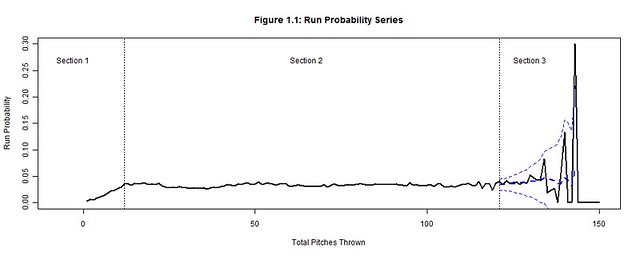
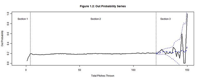
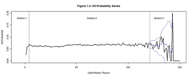
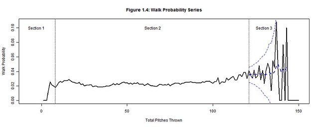
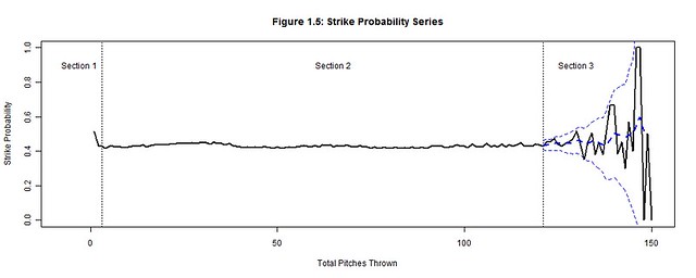
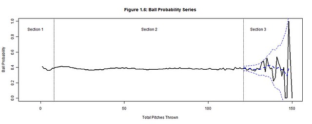
We will focus on how the total pitches thrown by starting pitchers (per game) affects runs, outs, hits, walks, strikes, and balls by analyzing their corresponding probability distributions (Figures 1.1-1.6) per pitch count; the x-axis represents the pitch count and the y-axis is the probability of the chosen outcome on the ith pitch thrown.  Each plot has three distinct sections:  Section 3 is where the uncertainty from the decreasing pitcher sample sizes exceeds our desired margin of error (so we bound it with a confidence interval); Section 1 contains the distinct adjustment trend for each outcome that precedes the point where the pitcher has settled into his performance; Section 2, stable relative to the others sections, is where we hope to find a generalized performance trend with respect to the pitch count for each outcome.  Together these sections form a baseline for what to expect from an average starting pitcher.  Managers can then hypothesize if their own starting pitcher would fare better or worse than the average starting pitcher and make the appropriate decisions.

Figure 1.1
Figure 1.2
Figure 1.3
Figure 1.4
Figure 1.5
Figure 1.6

II.  Data

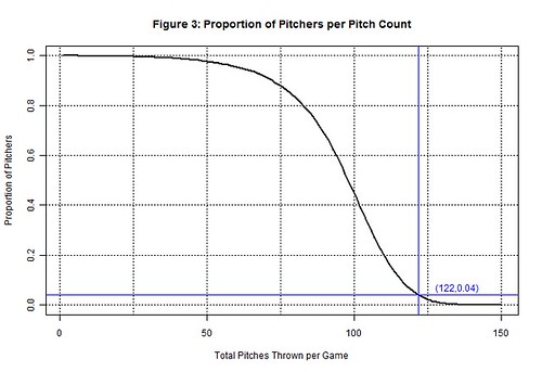
From 2000-2004, 12,138 MLB games were played; there should have been 12,150 games but 12 games were postponed and never made up.  During this period, starting pitchers averaged 95.12 pitches per game with a standard deviation of 18.21.  The distribution of pitch counts is normal with a left tail that extends below 50 pitches (Figure 2).  It is not symmetric about the mean because a pitcher is more likely to be inefficient or injured early (left tail) than to exceed 150 pitches.  In fact, no pitcher risked matching Ron Villone’s 150 pitch count from the 2000 season.

Figure 1.1

This brief period was important for baseball because it preceded a significant increase in pitch count awareness.  From 2000-2004, there averaged 192 pitching performances ≥122 pitches per season (Table 2); 122 is the sampling threshold explained in the next section.  Since then, the 2005-2009 seasons have averaged only 60 performances ≥122 pitches per season.  This significant drop reveals how vital pitch counts have become to protecting the pitcher and controlling the outcome of the game.  Now managers more frequently monitor their pitchers’ and the opposing pitchers’ pitch counts to determine when they will expire.

Table 2:  2000-2009 Starting Pitcher Pitch Counts ≥122

Year

2000

2001

2002

2003

2004

2005

2006

2007

2008

2009

Pitch Counts ≥122

342

173

165

152

129

81

70

51

36

62

III. Sampling Threshold (Section 3)

122 pitches is the sampling threshold deduced from the 2000-2004 seasons (and the pitch count minimum established for Section 3), but it is not necessarily a pitch count threshold of when to pull the starting pitcher.  Instead this is the point when starting pitcher data becomes unreliable due to sample size limitations.  Beyond 122 pitches, the probabilities of Figures 1.1-1.6 violently waver high and low as very few pitchers threw more than 122 pitches.  A smoothed trend, represented by a dashed blue line and bounded by a 95% confidence interval was added to Section 3 of Figures 1.1-1.6 to contain the general trend between these rapid fluctuations.  But the margin of error (the gap between the confidence interval and the smoothed trend) grows exponentially beyond 3%, so the actual trend could be anywhere within this margin.  Thereby, we cannot hypothesize whether it is more or less likely that the pitcher’s performance will excel or plummet after 122 pitches.

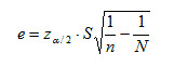
To understand how the 122 sampling threshold was determined, we first extract the margin of error formula (e) from the confidence interval formula (where  zα/2 = z-value associated with the (1-α/2)th percentile of the standard normal distribution, S = standard error of the sample population, n = sample size, N = population size):

Figure 1.1

Next, we back-solve this formula to find the maximum sample size n for when the margin of error exceeds 3%; we use S = 0.5, z2.5% = 1.96, N = 2 pitchers × 12,138 games = 24,276:

Figure 1.1

There is no pitch count directly associated with the sample size of 1,022, but 1,022 can be bounded between the 121 (n=1,147) and 122 (n=971) pitch counts.  At 121 pitches the margin of error is still less than 3%, but it becomes greater than 3% at 122 pitches and begins to increase exponentially.  This is the point the sample size becomes unreliable and the outcomes are no longer representative of the population.  Indeed only 4% (971 of 24,276) of the pitching performances from 2000-2004 equaled or exceeded 122 pitches thrown in a game (Figure 3).

Figure 1.1

A benefit of the sampling threshold is that it separates the outcomes we can make definitive conclusions about (<122 pitches) from those we cannot (≥122 pitches).  If were able to increase the sampling threshold another 10 pitches, we could make conclusions about the throwing up to 131 pitches in a game.  However, managers will neither risk the game outcome nor injury to their pitcher to accurately model their pitcher’s performance at high pitch counts.  Instead, the sampling thresholds have steadily decreased since 2005 and the 2000-2004 period is likely the last time we’ll be able to make generalizations about throwing 121 pitches in a game.

Yet, even for the confident manager, 121 pitches is still a fair point in the game to assess a starting pitcher.  Indeed the starting pitcher must have been consistent and trustworthy to pitch this deep into the game.  But if the manager wants to allow his starting pitcher to continue pitching, he is only guessing that this consistency will follow because there is not enough data to accurately forecast his performance.  Instead he should consider replacing his starting pitcher with a relief pitcher.  The relief pitcher is a fresh arm that offers less risk; he must have a successful record based on an even smaller sample size of appearances, smaller pitch counts, and a smaller margin of error.  The reliever and his short leash are the surer bet than a starting pitcher at 122 pitches.

IV.  Adjustment Period (Section 1)

The purpose of the adjustment period is to allow the starting pitcher a generous period to find a pitching rhythm.  No conclusions are made regarding the probabilities in the adjustment period as long as an inordinate amount of walks, hits, and runs are not allowed.  The most important information we can impart from this period is the point when the adjustment ends.  Once the rhythm is found, we can be critical of a pitcher’s performance and commence the performance trend analysis.

In order to be effective from the start, starting pitchers must quickly settle into an umpire’s strike zone and throw strikes consistently; most pitchers do so by the 3rd pitch of the game (Figure 1.5).  Consistent strike throwing keeps the pitcher ahead in the count and allows him to utilize the outside of the strike zone rather than continually challenging the batter in the zone.  Conversely, a pitcher must also include (pitches called) balls into his rhythm, starting approximately by the 8th pitch of the game (Figure 1.6).  Minimal ball usage clouds the difference between strikes and balls for the batter while frequent usage hints at a lack of control by the pitcher.  Strikes and balls furthermore have a predictive effect on the outcomes of outs, hits, runs, and walks:  a favorable count for the batter forces the pitcher to deliver pitches that catch a generous amount of the strike zone while one in favor of the pitcher forces the batter to protectively swing at any pitch in proximity of the strike zone.

On any pitch, regardless of the count, the batter could still hit the ball into play and earn an out or hit.  Yet as long as the pitcher establishes a rhythm for minimizing solid contact by the 4th pitch of the game (Figure 1.2-1.3), he can decrease the degree of randomness that factors into inducing outs and minimizing hits.  A walk contrarily cannot occur on any pitch because walks are the result of four accumulated balls.  Pitchers should settle into a rhythm of minimizing walks by using minimal ball usage; so when the ball rhythm stabilizes (on the 8th pitch of the game) the walk rhythm also stabilizes (Figure 1.4).  After each of these rhythms stabilizes, a rhythm can be established for minimizing runs (a string of hits, walks and sacrifices within an inning) by the 12th pitch of the game (Figure 1.1).  It is possible for home runs or other quick runs to occur earlier, but pitchers who regularly put their team in an early deficit are neither afforded the longevity to pitch more innings nor the confidence to make another start.

V.  Performance Trend (Section 2)

Each of the probability distributions in Figures 1.1-1.6 provides a generalized portrayal of how starting pitchers performed from 2000-2004, but in terms of applicability they do not depict how an average starting pitcher would have performed.  Not all pitchers lasted to the same final pitch (Figure 2).  The better a pitcher performed the longer he should have pitched into the game, so we would expect each successive subset of pitchers (lasting to greater pitch counts) to have been more successful than their preceding supersets.  Thereby, in order to accurately project the performance of an average starting pitcher the probability distributions need to be normalized, by factors along the pitch count, as if no pitchers were removed and the entire population of pitchers remained at each pitch count.

The pitch count adjustment factor (generalized for all pitchers) is a statistic that must be measurable per pitch rather than tracked per at-bat or inning, so we cannot use batting average, on-base percentage, or earned run average.  The statistic should also be distinct for each outcome because a starting pitcher’s ability to efficiently minimize balls, hits, walks, and runs and productively accumulate strikes and outs are skills that vary per pitcher.  Those who are successful in displaying these abilities will be allowed to extend their pitch count and those who are not put themselves in line to be pulled from the game.

We accommodate these basic requirements by initially calculating the average pitches per outcome x, Rx(t), for any pitcher who threw at least t pitches (where PCt = sum of all pitch counts and xt = sum of all x for all pitchers whose final pitch was t):

Figure 1.1

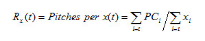
This statistic, composed of a starting pitcher’s final pitch count divided by his cumulative runs allowed (or the other outcome types), distinguishes the pitcher who threw 100 pitches and allowed 2 runs (50 pitches per run) versus the pitcher with 20 pitches and 2 runs (10 pitches per run).  At each pitch count t, we calculate the average for all starting pitchers who threw at least t pitches; we combine their various final pitch counts (all t), their run totals (occurring anytime during their performance), and take a ratio of the two for our average.  At pitch count 1, the average is calculated for all 24,276 starting pitcher performances because they all threw at least one pitch; the population of starting pitchers allowed a run every 32.65 pitches (Table 5.1).  At pitch count 122, the average is calculated for the 971 starting pitcher performances that reached at least 122 pitches; this subset of starting pitchers allowed a run every 57.75 pitches per game.

Table 5.1:  2000-2004 Pitches per Outcome

Pitch Rate

Pitches per Outcome
(t=1; All Pitchers)

Pitches per Outcome
(t=122; Pitchers w/ ≥122 pitches)

Pitches per Run

32.65

57.75

Pitches per Out

5.37

5.57

Pitches per Hit

15.44

20.38

Pitches per Walk

45.05

44.03

Pitches per Strike

2.38

2.23

Pitches per Ball

2.64

2.62

Starting pitchers will try to maximize the pitches per outcome averages for runs, hits, walks, and balls while minimizing the probabilities of these outcomes, because the pitches per outcome averages and the outcome probabilities have an inverse relationship.  Conversely, starting pitchers will also try to minimize the pitches per outs and strikes while trying to maximize these probabilities for the same reason.  Hence, we must invert the pitches per outcome averages into outcomes per pitch rates, Qx(t), to be able to create our pitch count adjustment factor, PCAx(t), that will compare the change between the population of starting pitchers and the subset of starting pitchers remaining at pitch count t:

Figure 1.1

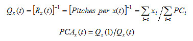
The ratio of change is calculated for each outcome x at each pitch count t.  The pitch count adjustment factor, PCAx(t), will scale px(t), the original probability of x from the starting pitchers at pitch count t back to the expected probability of x for an average starting pitcher from the entire population of starting pitchers at pitch count t.

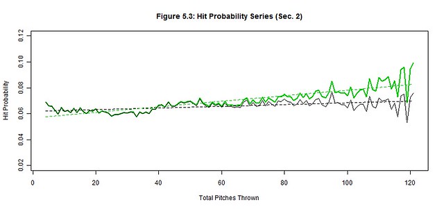
The increases to the pitches per run and pitches per hit rates strongly suggest that the 971 starting pitchers remaining at 122 pitches were more efficient at minimizing runs and hits than the overall population of starting pitchers.  The population performed worse than those pitchers remaining at 122 pitches by factors of 176.85% and 131.98% with respect to the runs per pitch and hits per pitch rates (Table 5.2).  Thereby, we would expect the probability of a run to increase from 3.40% to 6.01% and the probability of a hit to increase from 7.21% to 9.51% if we allowed an average starting pitcher from the population of starting pitchers to throw 122 pitches.

Table 5.2:  2000-2004 Average Pitcher Probabilities at 122 Pitches

Outcome

Original Pitcher Probability
px(t=122)

Pitch Count Adjustment
PCAx(t=122)

Average Pitcher Probability
px(t=122) x PCAx(t=122)

Run

3.40%

176.85%

6.01%

Out

19.26%

103.77%

19.98%

Hit

7.21%

131.98%

9.51%

Walk

3.50%

97.72%

3.42%

Strike

45.21%

93.78%

42.40%

Ball

39.44%

99.21%

39.13%

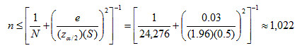
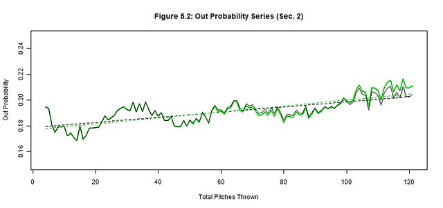
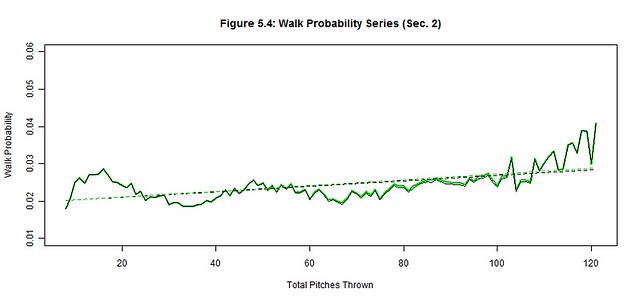
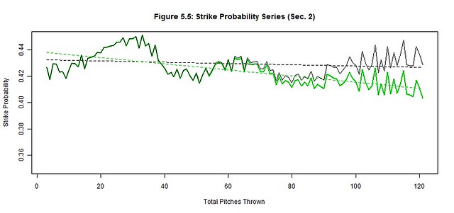
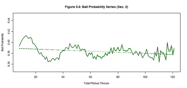
We apply the pitch count adjustment factors, PCAx(t), at each pitch count t to each of the original outcome probability distributions (black) to project the average starting pitcher outcome probabilities (green) for Section 2 (Figures 5.1-5.6); the best linear fit trends (dashed black and green lines) are also depicted.  The reintroduction of the removed starting pitchers noticeably worsened the hit, run, and strike probabilities and slightly improved the out probability in the latter pitch counts.  There were no significant changes to ball and walk probabilities.  These are the general effects of not weeding out the less talented pitchers from the latter pitch counts as their performances begin to decline.

Figure 5.1
Figure 5.2
Figure 5.3
Figure 5.4
Figure 5.5
Figure 5.6

Next we quantify our observations by estimating the linear trends of each original and average pitcher series and then compare their slopes (Table 5.3).  The linear trend (where t is still the pitch count) provides a simple approximation of the general trend of Section 2 while the slope of the linear trend estimates the deterioration rate of the pitcher’s ability to control these outcomes.  The original pitcher trends show that the way managers managed pitch counts, their starting pitchers produced relatively stable probability trends as if the pitch count little or no effect on their pitchers; only the out trend changed by more than 1% over 100 pitches (2.00%).  Contrarily, the average pitcher trends increased by more than 2% over 100 pitches for the run, out, hit, and strike trends, indicating a possible correlation between the pitch count and the average pitcher performance; the walk and ball trends were unchanged from the original to the average starting pitcher.

We must also measure these subtle changes between the original and average trends that occur in the latter pitch counts of Figures 5.1-5.6.  There is rapid deterioration in the ability to throw strikes and minimize hits and runs between the original and average starting pitchers as suggested by the changes in slope.  The 368.21% change in the strike slopes clearly indicates that fewer strikes are thrown by the average starting pitcher in the latter pitch counts.  The factors of 222.53% and 1206.13% for the respective hit and run slopes indicate that the average starting pitcher is not only giving up more hits but giving up more big hits (doubles, triples, home runs).  There is a slight improvement in procuring an out (14.45%), but the pitches that were previously strikes became hits more often than outs for the average starting pitcher.  Lastly, the abilities to minimize balls (4.87%) and walks (8.23%) barely changed between pitchers, so control is not generally lost in the latter pitch counts by the average starting pitcher.  Therefore, the average starting pitcher isn’t necessarily pitching worse as the game progresses but the batters may be getting better reads on his pitches.

Table 5.3:  Section 2 Linear Trend

Linear Trend

Correlation

Trend

Range

Original
Pitcher

Average
Pitcher

% Change in Slope

Original Pitcher

Average Pitcher

Run Probability

[12,121]

0.03+0.16×10⁻⁴t

0.02+2.13×10⁻⁴t

1206.13%

0.17

0.8

Out Probability

[4,121]

0.18+2.00×10⁻⁴t

0.18+2.30×10⁻⁴t

14.45%

0.75

0.76

Hit Probability

[4,121]

0.06+0.66×10⁻⁴t

0.06+2.12×10⁻⁴t

222.53%

0.54

0.85

Walk Probability

[8,121]

0.02+0.74×10⁻⁴t

0.02+0.78×10⁻⁴t

4.87%

0.57

0.6

Strike Probability

[3,121]

0.43-0.50×10⁻⁴t

0.44-2.33×10⁻⁴t

368.21%

-0.19

-0.7

Ball Probability

[8,121]

0.39-0.97×10⁻⁴t

0.39-1.05×10⁻⁴t

8.23%

-0.29

-0.32

The correlation coefficients also support our assertion that the average starting pitcher became adversely affected by the higher pitch counts, but even the original starting pitcher showed varied signs being affected by the pitch counts.  There were moderate correlations between the pitch count and hit and walks and a very strong correlation between the pitch count and outs.  So even though some batters improved their ability to read an original starting pitcher’s pitches, this improvement was not consistent and the increases to hits and walks were only modest.  Contrarily, the original starting pitcher did become more efficient and consistent at procuring outs as the pitch count increased.   We also found weak correlations between the pitch count and strikes and balls for the original starting pitcher, so strikes and balls were consistently thrown without any noticeable signs of being affected by the pitch count.   However, out of all of our outcomes, the pitch count of the original starting pitcher had the weakest correlation with runs.  Either the original starting pitchers could consistently pitch independent of the pitch count or their managers removed them before the pitch count could factor into their performance; the latter most likely had the greater influence.

It is also worth noting the intertwined patterns displayed in Figures 5.1-5.6 and Table 5.1.  Strikes and balls naturally complement each other, so it should come as no surprise that the Strike Probability Series and Ball Probability Series also complement each other; a peak in once series is a valley in the other and vice-versa.  The simple reason is that strikes and balls are the most frequent and largest of our outcome probabilities – they are used to setup other outcomes and avoid terminating at-bats in one pitch.  However, fewer strikes and balls are thrown in the latter pitch counts as evidenced by the decline in the Strike and Ball Probability Series, which make the at-bats shorter.  Consequently, there are fewer pitches thrown between the outs, hits, and runs, so these other probability series increase.  Hence, the probabilities of outs, hits, and runs become more frequent per pitch as the pitch count increases (further supported by the drop in pitches per strike and ball rates in Table 5.1).

VI.  Conclusions

Context is very important to the applicability of these results, without it we might conjecture that these trends would continue year over year.  Yet, the 2000-2004 seasons were likely the last time we’ll see a subset of pitchers this large pitching into extremely high pitch counts.   Teams are now very cautious about permitting starting pitchers to throw inconsequential innings or complete games, so the recent populations of starting pitchers have shifted away from the higher pitch counts and throw fewer pitches than before.  Yet, these pitch count restrictions should not affect the stability of our original probability trends.  The sampling threshold will indeed lower and the length of stable Section 2 will shorten, but the stability of the current original trends should not compromise.  Capping the night sooner for the starting pitchers only means they are less likely to tire or be read by batters.

We also cannot generalize that these original probability trends would be stable for any starting pitcher.  The probability trends and their stability are only representative of the shrinking subset of starting pitchers before their managers removed them due to performance issues, injury, strategy, etc.  These starting pitchers subsets may appear unaffected by the pitch count, but their managers created this illusion with the well-timed removal of their starting pitchers.  They understand the symptoms indicative of a declining pitcher and only extend the pitch count leash to starting pitchers who have shown current patterns of success.  Removing managers from the equation would result in an increased number of starting pitchers faltering in the latter pitch counts as their pitches are better read by batters.  Likewise, any runners left on base by the starting pitcher, but now the responsibility of a relief pitcher, would have an increased likelihood of scoring if the starting pitchers were not removed as originally planned by their managers.  Starting pitchers do notice these symptoms and may gravitate to finishing another inning, but each additional pitch could potentially damage the score significantly.  Trust in the manager and let him bear the responsibility at these critical points.


A Happy, Sad, Wonderful, Terrible April

If you’re anything like most fantasy players, you may find yourself investing in similar players across multiple leagues. If you’re anything like me, those players seem to get injured more than others. If you are me, this year you invested in Mat Latos and Doug Fister everywhere you could… and are furious.

But if you need a placeholder for April while your starters heal, full-season projections might not be as relevant to your replacement decisions. While it’s always smart to go with skill as your primary determination, often the free agent pitching pool is fraught with pitchers that are more similar. In such instances, the pitcher’s April schedule could be of use. If you need a pitcher for one month and one month only, his May – September prospects are of little concern.

Either because I’m a simple man, or because I’m receiving $0 in compensation for this short piece, I decided a fair estimator would be to simply use the FanGraphs 2014 Projected Rankings and input each opponents Runs Scored per Game (RS/G) for each team on a schedule grid for the month of April. I then averaged out the projected RS/G of all opponents for each game in April. This is what I found.

Team

Division

Games

Opponent

Avg RS/G

Atl

NLE

27

3.979

Cin

NLC

28

3.999

Was

NLE

28

4.000

Col

NLW

29

4.004

Mil

NLC

28

4.058

Ari

NLW

29

4.063

StL

NLC

29

4.070

NYM

NLE

27

4.087

ChC

NLC

27

4.093

LAD

NLW

26

4.095

Pit

NLC

28

4.110

Mia

NLE

27

4.127

Phi

NLE

28

4.153

SD

NLW

29

4.174

LAA

ALW

27

4.190

Tex

ALW

28

4.194

Det

ALC

26

4.195

KC

ALC

27

4.196

SF

NLW

28

4.203

Cle

ALC

29

4.212

Oak

ALW

29

4.244

Tor

ALE

27

4.254

Min

ALC

26

4.267

Sea

ALW

27

4.284

TB

ALE

29

4.301

ChW

ALC

29

4.318

NYY

ALE

27

4.319

Hou

ALW

28

4.345

Bos

ALE

28

4.370

Bal

ALE

27

4.383

What do we see here? First, as expected, on average the AL teams face more projected runs. You’re welcome for that valuable information. One interesting note, though, is that the San Francisco Giants will face an even tougher aggregate offense than four AL teams. What do we take from this? Maybe if you’re thinking about Tim Hudson vs. Marco Estrada in a shallow league for a rental, you take Hudson. In a shallower league in which this is a real decision, however, you can probably stream matchups with a high efficacy throughout the month. But as a FanGraphs reader (ego-stroke), there’s a fairly high probability that your most difficult decisions come in deeper leagues. So we shall redirect our attention to pitchers farther down the ranks.

“But DomRep,” you might smirk, “aren’t AL/NL differences factored into preseason rankings to a large degree?” Yes, observant reader, they are. This is why this table is much more useful when comparing pitchers in the same league. The NL is below:

NL

Rank

Team

Division

Games

Opponent

RS/G

1

Atl

NLE

27

3.979

2

Cin

NLC

28

3.999

3

Was

NLE

28

4.000

4

Col

NLW

29

4.004

5

Mil

NLC

28

4.058

6

Ari

NLW

29

4.063

7

StL

NLC

29

4.070

8

NYM

NLE

27

4.087

9

ChC

NLC

27

4.093

10

LAD

NLW

26

4.095

11

Pit

NLC

28

4.110

12

Mia

NLE

27

4.127

13

Phi

NLE

28

4.153

14

SD

NLW

29

4.174

15

SF

NLW

28

4.203

In the NL, there may be a built-in feeling that, when two pitchers are similar, you’re probably better off just taking the guy from San Diego. Poppycock! San Diego will face the Dodgers, Brewers, and two AL teams this month (Tigers and Indians). Exclamation point! It should be noted that San Diego likely has a less pitcher-friendly park factor than they used to, but even still, a quick glance at the table above should help you decide to maybe choose Jhoulys Chacin, Taylor Jordan, or Tanner Roark over Eric Stults if you think they’re similar pitchers.

Here’s the AL:

AL

Rank

Team

Division

Games

Opponent

RS/G

1

LAA

ALW

27

4.190

2

Tex

ALW

28

4.194

3

Det

ALC

26

4.195

4

KC

ALC

27

4.196

5

Cle

ALC

29

4.212

6

Oak

ALW

29

4.244

7

Tor

ALE

27

4.254

8

Min

ALC

26

4.267

9

Sea

ALW

27

4.284

10

TB

ALE

29

4.301

11

ChW

ALC

29

4.318

12

NYY

ALE

27

4.319

13

Hou

ALW

28

4.345

14

Bos

ALE

28

4.370

15

Bal

ALE

27

4.383

In the A.L., one might take a quick gander and be encouraged to use Garrett Richards over Bud Norris because they face the easiest and toughest April pitching schedules, respectively. Pseudo-sleeper Tyler Skaggs might also be expected to start out well.

As we mentioned before, preseason rankings and projections take league into consideration. So when considering two pitchers in different leagues, it might even help to take a quick peek at their respective schedule rankings within their own league. For instance, while San Diego (#14 NL schedule) can be expected to face less run-scoring potential this month on average than Anaheim (#1 AL schedule), this will be the case the whole season and is, therefore, factored in when rankings show Tyson Ross and Tyler Skaggs in similar places. But the rankings eke out that Ross’s month should be harder than his average month while Skaggs’s month should be easier.

If you’re in a position to stream relatively strong pitchers throughout April, this is probably useless to you. The sample size of a month’s worth of starts can also blow all of this up. It’s common practice to look at September strength of schedule for pitchers, but everyone tends to ignore April because their eyes are focused on the whole season. But if you’re anything like me, and Latos/Fister are giving you fits, hopefully you’ll keep strength of schedule in mind.