As a Red Sox fan, I got very excited opening day when Dustin Pedroia hit two home runs. One of the big questions of this offseason is whether he has upper-single-digit homer power, or upper-teens homer power. Of course, as a thinking baseball fan, my head tells me to avoid getting overly excited about a small sample size. But does the two-HR outbreak actually tell us nothing? I think the expectations going into the season combined with Pedroia’s performance in his first game is a perfect situation to use Bayes’ Theorem.
To elaborate, I think Pedroia’s expectations going into this season have a bimodal distribution. If you look at his 2008-2012 seasons, he averaged 16 HR per year. His last two seasons averaged 8 HR per year. Was this due to a real decline, or due to injuries that sapped his power? While someone like Mike Trout might have a nice normally-distributed expectation around 35 HR, I expected Pedroia to have an either/or season: he’d either get back to 2008-2012 production, or continue as a 8-HR guy.
Now for a review of Bayes’ Theorem: it tells you how to update your prior beliefs given an observation. The formula for this is P(A|B) = P(B|A)*P(A)/P(B), where A and B are events, P(A) and P(B) are the probabilities of those events, and P(A|B) or P(B|A) should be read as “Probability of A given B,” or “Probability of B given A,” respectively. Specifically, in this case, A is “Dustin Pedroia is a 16-HR guy”, and B is “Dustin Pedroia hit 2 HR in his first game of the season”. I had a preseason belief about P(A), but I want to update it given that event B has occurred.
As implied above, I’m going to simplify Pedroia’s season outcomes into two possible outcomes: He is an 8-HR guy, or a 16-HR guy. Before the season, I’m going to guess that I had about a 50-50 belief that he was either one. Another assumption I’m going to make, to make the math easier, is that a season will see 640 plate appearances. You can make your own assumptions, but this is a demonstration of how much Bayes’ Theorem helps us update beliefs based on just one observation.
We need to determine three quantities to do our calculation now:
1. P(A)—probability that Pedroia is a 16-HR guy
2. P(B|A)—probability that we would see Pedroia hit 2 HR in his first 5 plate appearances, given that he is a 16-HR guy
3. P(B)—probability that we would see Pedroia hit 2 HR in his first 5 plate appearances (taking our 50-50 chance that he’s a 16 or 8-HR guy as a given)
1. Probability that Pedroia is a 16-HR guy
Easy. By assumption, P(A) is 50%.
2. Probability that we would see Pedroia hit 2 HR in his first 5 plate appearances, given that he’s a 16-HR guy
Tougher, but we can use a binomial probability model. That is 5C2*P(HR)^2*(1-P(HR))^3. When we have 16 HR in 640 plate appearances, P(HR) is 1/40, and 1-P(HR) is 39/40. This turns out to be .00579. P(B|A)= 0.579%.
3. Probability that we would see Pedroia hit 2 HR in his first 5 plate appearances, with preseason assumptions
This is the weighted average of all his possible season outcomes—so probability of 2HR in 5PA, given that he is a 16-HR guy, times the chance that he’s a 16-HR guy, PLUS, probability of 2HR in 5PA, times the chance that he’s an 8-HR guy. The same calculation as in number 2 can be done for if he’s an 8-HR guy, yielding an answer that the chance that he’d hit 2HR in 5PA is 0.151%. Given our calculation in the above paragraph, and our preseason assumption that it’s 50-50 that he’s an 8 or 16-HR guy, that gives us a weighted average P(B) = 0.365%.
So now we can mash all of those numbers into Bayes’ equation, and we find that .50*.00579/.00365 = .794, or 79.4%! Turns out that my Red Sox-loving lizard brain was not wrong! If you believed preseason that there was a 50%-50% chance that Pedroia would return to his 2008-2012 form, you should rationally update your beliefs to 80%-20% on the minuscule sample size of just two home runs in five plate appearances! Another note is that we should be forward-looking: since he has nearly a full season of plate appearances remaining, it might be rational to think that he’s likely to be an 18-HR guy, now that he has 2 in the bag.
This method could be adapted to a continuous expectation of outcomes, allowing a chance that Pedroia might be something besides an 8HR guy or a 16HR guy (although you and I know that that is clearly absurd).
This is part 3 of the Player Evaluator and Calculated Expectancy (PEACE) model, which is an alternative to Wins Above Replacement. This article will introduce evidence that z-scores can be converted into runs (or points in other sports) with accuracy and reliability, as well as analyze the results that zDefense has produced.
Recall that zDefense is broken down into 4 components: zFielding, zRange, zOuts, and zDoublePlays. The fielding and range components depend on the accuracy of Calculated Runs Expectancy, which I introduced in Part 1. Outs and double plays, though, use a different technique: they take z-scores for the relevant rate statistics, then multiply by factors of playing time. Here were the equations:
zOuts = [(Player O/BIZ – Positional O/BIZ) / Positional O/BIZ Standard Deviation] * (Player Innings / Team Innings) * (√ Player BIZ / 2)
zDoublePlays = [(Player DP/BIZ – Positional DP/BIZ) / Positional DP/BIZ Standard Deviation] * (Player Innings / Team Innings) * (√ Player BIZ / 2) * Positional DP/BIZ
We can set up models in other sports that estimate point differentials using very similar techniques. I’ve developed one for college football and another for the NBA.
For the first model, I’ve used the data for every Division I FBS football team from 2000-2014 (1,802 teams), and I defined the relevant statistics and their “weights” as such:
zPassing = [[Completion Percentage z-score * Completions per Game] + [Passing Yards per Attempt z-score * Passing Attempts per Game]] / 10
zRushing = [Rushing Yards per Attempt z-score * Rushing Attempts per Game] / 10
zTurnovers = [Turnovers per Game z-score]
zPlays = [Number of Offensive Plays per Game z-score]
These 4 components summed make up zOffense, while taking each team’s opponents’ calculations results in zDefense.
What I found after summing the different components was that the resulting number, when divided by the number of games played, was a very accurate estimator for a team’s average point differential.
Among the nearly 2,000 college football teams, the average difference between zPoints (calculated margin of victory) and actual MOV was just 3.21 points, with a median of 2.77, and a max difference of 13.97 points. About 20% of teams’ MOV were calculated to within 1 point or less, 53% were accurate to 3 points or less, 79% to 5 points or less, and 99% to 10 points or less. The regression model for this dataset can be seen below:
zTurnovers = [Turnovers per Minute z-score * League Average Points per Possession] * 2
zORB (offensive rebounds) = [Offensive Rebounds per Minute z-score * League Average Points per Possession]
zDRB (defensive rebounds) = [Defensive Rebounds per Minute z-score * League Average Points per Possession]
Similar to the football model, these 6 components make up zOffense, while each team’s opponents’ calculations make zDefense. I particularly like z3P, z2P, and zFT because they multiply the z-score by the “weight”: 1, 2, or 3 points. Recall that zRange is multiplied by the IF/OF Constant, which is just the difference, on average, in runs between balls hit to the outfield vs. balls that remain in the infield.
I’ve only done the calculations for the 2013-2014 season, where teams averaged 1.033 points per possession. To convert to zPoints in this model, add zOffense and zDefense, then divide by 5.
In most seasons, elite teams will have an average point differential of +10, while terrible ones will hover around -10. On average, the NBA model had an average difference between the calculated and actual differential of just 1.331 points, with a median of 0.800. 17 out of 30 teams were calculated within 1 point, 25 within 2, and 29 out of 30 were accurate to within 5 points per game.
The fact that these models can be created using the same general principle (rate statistic z-scores multiplied by a factor of playing time equates relative points) provides some evidence that similar results are calculable in baseball. This is the basis for zDefense in PEACE. Let’s look at the results.
Most sabermetricians would turn to the Fielding Bible Awards for a list of the best fielders by position in any given year, so we’ll use those results to compare. If we assume that the Fielding Bible is accurate, then we would expect zDefense to produce similar conclusions. Comparing the 2014 winners to the players ranked as the best at their position by zDefense, we can see some overlap. The number in parentheses is the positional ranking of the Fielding Bible Award winner by zDefense.
The multi-position winner, Lorenzo Cain, was also rated very favorably by zDefense. While most positions don’t have a perfect match, every single Fielding Bible winner was near the very top of their position for zDefense. This is the case for almost every instance, which isn’t surprising: if there were drastic disagreements about who is truly elite, then we would suspect one of the metrics to be egregiously inaccurate. Instead, we see many similarities at the top, which provides some solid evidence that zDefense is a valid measure.
As always, feel free to comment with any questions, thoughts, or concerns.
Nowadays all the rage seems to be about Tommy John surgeries, as it should be. The number of players who’ve had the surgery is rising at an alarming rate. Therefore many studies have been done on the issue. Most notably by Jeff Zimmerman and John Roegele, who have combined forces to create the biggest and most complete list of Tommy John surgeries. This led them to delve into many studies, such as the effects of Tommy John on performance, the success rate of the surgery, the effects of velocity, the effects of certain pitches, etc… Therefore I decided to do my part.
While a lot has already been done on Tommy John surgeries, not a lot of studies have examined the percentage of hard-throwing pitchers who have had the surgery. Jeff Zimmerman did look at pitchers who hit 100 MPH or more and the percentage of them who have had Tommy John (25% had the surgery). What I will be doing, however, is somewhat different. I will look at the pitchers whose fastball averaged 95 or more and the percentage of them who have had Tommy John surgery, as requested by Jeff, “Help Out: While I looked at pitchers who threw over 100 mph, 100 may not me the key number. Maybe it’s 97 mph, or 95 mph. The increase in velocity and increase in TJS can’t be ignored. It is time to perform a more thorough assessment.”
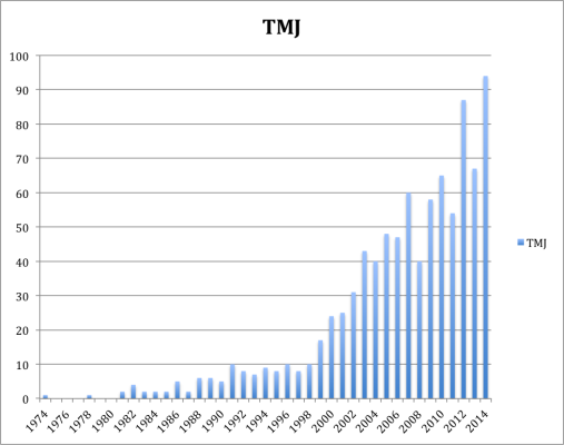
Before I dive into this, some of you reading might not be familiar with Tommy John surgeries, so I’ll give a brief explanation. If you are, however, then you can probably skip this paragraph. Tommy John surgeries or the ulnar collateral ligament (UCL) reconstruction is a surgical procedure where a ligament in the medial elbow is replaced with a tendon from elsewhere in the body. The procedure was first performed in 1974 on a pitcher called Tommy John, by Dr. Frank Jobe; the surgery was named after Tommy John. The procedure is rather devastating and it will usually take around a year for a pitcher to get back onto the field. Now, some pitchers of course never make it back, and some pitchers come back but are never the same. The success rate of the recovery varies and is debatable; some have estimated it at around 80%. For a more elaborate explanation of the success rate I recommend reading Jon Roegele’s article here. The final element you should know is that the Tommy John surgery is on the rise; it’s being performed at an alarming rate, which has spurred many studies. Below is a graph of all the Tommy John surgeries performed since 1974 (not including the ones that occurred in 2015).
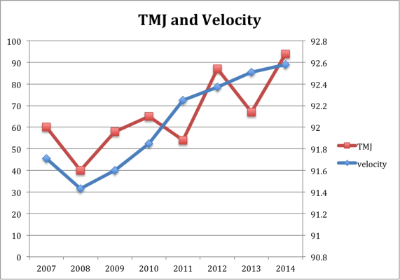
So Tommy Johns are on the rise, and reached an all-time high in 2014. You know what’s also on the rise? Pitcher velocity. Since PITCH f/x was made available in 2007, there has been a steady and consistent increase in pitcher velocity. Both the rise in Tommy John surgeries and the rise in velocity seem to be linked. (The velocity below is on an average per year basis).
This, however, doesn’t mean that one causes the other. A big question, at the end of almost every Tommy John article, is the attempt to figure out or contemplate what is causing the increase in the surgery. Especially since it seems practically every pitcher that throws hard is getting the surgery, Zack Wheeler being the latest example. Hopefully what follows will show or will give some inclination into whether pitchers who throw hard are more likely to have the surgery.
So first I’ll explain my process. I went on Baseball Prospectus and I looked at every pitcher’s average velocity from 2007 to 2014. I looked at both starters and relievers and I didn’t set an innings limit, in order to get as big of a sample size as possible. Then I took every pitcher who threw 95 or over as the arbitrary definition of hard throwers, which left me with 191 pitchers. After I got every pitcher who 95 MPH or more and I looked up their injury history, to see whether or not they had received the surgery. Here is what I found; I also included the pitchers who threw 96+ MPH because while I was compiling the data, I thought I noticed a slight increase in Tommy John surgeries. A final element to note is that I didn’t look at Minor League pitchers, only the Major Leaguers because unfortunately there is no PITCH f/x data available for minor leaguers (at least that I know of).
Sample Size
MPH
Percentage of TMJ
191
95+ MPH
32.46%
95
96+ MPH
36.45 %
Of those pitchers who threw 95+ here’s a list of those who have had more than one Tommy John surgery:
Brian Wilson
Pedro Figueroa
Tyler Yates
Christian Garcia
Okay, so now what to make of this? 32.46% seems like an awful lot, but one needs to put it into perspective. Jeff Zimmerman in his “100MPH = Tommy John Surgery?” article pointed out that, “The number of major league pitchers with the surgery now stands at 33% according to Will Carroll.” I personally felt that that number was awfully high.
So I read Will Carroll’s article and found it somewhat problematic. “One-third of current MLB pitchers have had Tommy John surgery. Of the about 360 who started the season, 124 share the all-too-familiar triangular scar.” While I do respect Will Carroll’s work, why did he limit himself to the pitchers who started the season? And what does that even mean? Is it the pitchers who threw on opening day? Was it the pitchers on opening day rosters? Did he use an innings limit? At this point, I’m simply befuddled at how he came to the number of “360 pitchers”. Due to baseball’s Minor League system one first needs to define what qualifies as a Major League pitcher. I’m not sure that Carroll did that or rather cannot tell from his article how he did that. I think a more thorough study needs to be done. For example, not simply looking at the pitchers who start the season. I think a good barometer could be, to set an innings limit, for a certain amount of years and looking at the percentage of those pitchers who had Tommy John. I think that will give us a better sense of the total percentage of pitchers who have had the surgery. Or hell one could do it on a year-by-year basis.
As for this study, what we can conclude is that around one in three pitchers who throw 95+ MPH have to suffer the surgery. If we simply go by Will Carroll’s study, this doesn’t seem like it increases a pitchers chance of getting the surgery at all. I, however, think that with a more thorough study we will find that throwing harder does actually lead to more Tommy Johns. This is of course just a hypothesis, and by no means should be taken as fact. Also saying that 95 MPH is the benchmark for hard throwers is relatively arbitrary, maybe 94+ or 93+ MPH will give us different results.
I really enjoyed Jeff Sullivan’s piece on the prospect pedigree of good players, and it was interesting to see how many solid players never cracked the Baseball America 100 in any year. This is an extension of that article, and not a particularly original one. In fact, I think it’s about the most obvious next step: how many great players were prospects?
It was interesting to see that someone can have a decent season as a totally unheralded player, but there are a lot of players who have a 3-win season and promptly fade into ignominy. Players at that threshold in 2010 included Cliff Pennington and Dallas Braden, and in 2011, Emilio Bonifacio and Alexi Ogando. Cherry-picked names, to be sure, but it’s easy to imagine they (and players like them) are the source of that ~33% of un-ranked good players, and the real elite players are usually identified as at least good. That doesn’t mean it’s true, though, so I tested it.
I pulled the top 10 pitchers and the top 10 position players by WAR for each year from 2010 through 2014. If there was a tie for 10th, I included both players, so the sample ended up at 101 players. Then, for each player, I found their highest ranking on the BA lists. The same caveats as in Jeff’s article apply here, but again, BA is the industry standard, and their lists go back long enough to make them very useful. Following: a giant table, with every qualifying player-year, their WAR in that year (and how that ranked among all players), and their highest prospect ranking and the year of that ranking.
Name
Season
Team
WAR
WAR Rank
Highest Prospect Rank
Prospect Rank Year
Mike Trout
2013
Angels
10.5
1
2
2011
Mike Trout
2012
Angels
10.3
1
2
2011
Jacoby Ellsbury
2011
Red Sox
9.4
1
13
2008
Josh Hamilton
2010
Rangers
8.4
1
1
2001
Roy Halladay
2011
Phillies
8.4
1
12
1999
Mike Trout
2014
Angels
8.0
1
2
2011
Clayton Kershaw
2014
Dodgers
7.6
1
7
2008
Clayton Kershaw
2013
Dodgers
7.0
1
7
2008
Cliff Lee
2010
– – –
6.9
1
30
2003
Justin Verlander
2012
Tigers
6.7
1
8
2006
Andrew McCutchen
2013
Pirates
8.4
2
13
2007
Matt Kemp
2011
Dodgers
8.3
2
96
2006
Carl Crawford
2010
Rays
7.7
2
59
2002
Buster Posey
2012
Giants
7.7
2
7
2010
Corey Kluber
2014
Indians
7.2
2
Unranked
Unranked
Clayton Kershaw
2011
Dodgers
7.1
2
7
2008
Andrew McCutchen
2014
Pirates
6.8
2
13
2007
Adam Wainwright
2013
Cardinals
6.6
2
18
2003
Roy Halladay
2010
Phillies
6.2
2
12
1999
Felix Hernandez
2012
Mariners
6.2
2
2
2005
Jose Bautista
2011
Blue Jays
8.1
3
Unranked
Unranked
Robinson Cano
2012
Yankees
7.6
3
Unranked
Unranked
Josh Donaldson
2013
Athletics
7.6
3
Unranked
Unranked
Evan Longoria
2010
Rays
7.5
3
2
2008
Cliff Lee
2011
Phillies
6.8
3
30
2003
Alex Gordon
2014
Royals
6.6
3
2
2007
Matt Harvey
2013
Mets
6.5
3
54
2012
Justin Verlander
2010
Tigers
6.2
3
8
2006
Felix Hernandez
2014
Mariners
6.1
3
2
2005
Clayton Kershaw
2012
Dodgers
5.7
3
7
2008
Dustin Pedroia
2011
Red Sox
7.8
4
77
2006
Carlos Gomez
2013
Brewers
7.5
4
52
2008
Chase Headley
2012
Padres
7.5
4
32
2008
Joey Votto
2010
Reds
7.0
4
43
2007
Anthony Rendon
2014
Nationals
6.5
4
19
2012
CC Sabathia
2011
Yankees
6.4
4
Unranked
Unranked
Jered Weaver
2010
Angels
6.1
4
57
2006
David Price
2014
– – –
6.1
4
2
2009
Max Scherzer
2013
Tigers
6.0
4
66
2008
David Price
2012
Rays
5.1
4
2
2009
David Wright
2012
Mets
7.4
5
21
2004
Miguel Cabrera
2013
Tigers
7.4
5
12
2003
Ian Kinsler
2011
Rangers
7.2
5
98
2005
Albert Pujols
2010
Cardinals
6.8
5
42
2001
Josh Donaldson
2014
Athletics
6.5
5
Unranked
Unranked
Dan Haren
2011
Angels
6.4
5
Unranked
Unranked
Felix Hernandez
2010
Mariners
6.0
5
2
2005
Anibal Sanchez
2013
Tigers
5.9
5
40
2006
Phil Hughes
2014
Twins
5.7
5
4
2007
Cliff Lee
2012
Phillies
5.1
5
30
2003
Ryan Braun
2012
Brewers
7.3
6
26
2007
Chris Davis
2013
Orioles
7.1
6
65
2008
Ryan Braun
2011
Brewers
7.1
6
26
2007
Ryan Zimmerman
2010
Nationals
6.6
6
15
2006
Michael Brantley
2014
Indians
6.3
6
Unranked
Unranked
Justin Verlander
2011
Tigers
6.3
6
8
2006
Ubaldo Jimenez
2010
Rockies
5.9
6
82
2005
Felix Hernandez
2013
Mariners
5.7
6
2
2005
Jon Lester
2014
– – –
5.6
6
22
2006
Gio Gonzalez
2012
Nationals
5
6
26
2008
Matt Carpenter
2013
Cardinals
6.9
7
Unranked
Unranked
Curtis Granderson
2011
Yankees
6.8
7
57
2005
Andrew McCutchen
2012
Pirates
6.8
7
13
2007
Jose Bautista
2010
Blue Jays
6.4
7
Unranked
Unranked
Giancarlo Stanton
2014
Marlins
6.2
7
3
2010
Jered Weaver
2011
Angels
5.9
7
57
2006
Josh Johnson
2010
Marlins
5.8
7
80
2006
Cliff Lee
2013
Phillies
5.5
7
30
2003
Jordan Zimmermann
2014
Nationals
5.3
7
41
2009
Zack Greinke
2012
– – –
5.0
7
14
2004
Evan Longoria
2013
Rays
6.7
8
2
2008
Alex Gordon
2011
Royals
6.6
8
2
2007
Adrian Beltre
2012
Rangers
6.5
8
3
1998
Adrian Beltre
2010
Red Sox
6.4
8
3
1998
Jose Bautista
2014
Blue Jays
6.2
8
Unranked
Unranked
Francisco Liriano
2010
Twins
5.7
8
6
2006
Doug Fister
2011
– – –
5.2
8
Unranked
Unranked
Chris Sale
2014
White Sox
5.1
8
20
2011
R.A. Dickey
2012
Mets
4.9
8
Unranked
Unranked
Mat Latos
2013
Reds
4.8
8
Unranked
Unranked
Miguel Cabrera
2011
Tigers
6.5
9
12
2003
Jason Heyward
2012
Braves
6.5
9
1
2010
Robinson Cano
2010
Yankees
6.3
9
Unranked
Unranked
Paul Goldschmidt
2013
Diamondbacks
6.3
9
Unranked
Unranked
Jonathan Lucroy
2014
Brewers
6.2
9
Unranked
Unranked
Adam Wainwright
2010
Cardinals
5.6
9
18
2003
Jake Arrieta
2014
Cubs
5.1
9
67
2009
Matt Cain
2011
Giants
5
9
10
2006
Justin Verlander
2013
Tigers
4.8
9
8
2006
Johnny Cueto
2012
Reds
4.7
9
34
2008
Joey Votto
2011
Reds
6.4
10
43
2007
Miguel Cabrera
2012
Tigers
6.4
10
12
2003
Andres Torres
2010
Giants
6.3
10
Unranked
Unranked
Manny Machado
2013
Orioles
6.2
10
11
2012
Carlos Gomez
2014
Brewers
5.7
T-10
52
2008
Adrian Beltre
2014
Rangers
5.7
T-10
3
1998
CC Sabathia
2010
Yankees
5.1
10
Unranked
Unranked
Max Scherzer
2014
Tigers
5.1
10
66
2008
Matt Garza
2011
Cubs
5.0
10
21
2007
CC Sabathia
2012
Yankees
4.7
10
Unranked
Unranked
Chris Sale
2013
White Sox
4.7
10
20
2011
That is a big, ugly table, so here are some summary facts. Of this 101-player sample, 20 were never ranked by Baseball America, so indeed, top players appear to be more likely to have been a ranked prospect (80%) than good players (66%, per Jeff’s article). None of the unranked players were ever the best position player or pitcher in 2010-2014; the 1st place player with the lowest ranking was Cliff Lee, who topped out at 30th in 2003. The unranked players tended to be concentrated toward the bottom of the WAR leaderboards; 75% of the unranked players had a rank of 5th through 10th. I expected more of the people in 8th through 10th in a given season to be beneficiaries of a fluke season, but there are a lot fewer of those than I expected. The unranked players with the least impressive careers outside their top seasons are probably Andres Torres and RA Dickey, but the other unranked players are pretty uniformly great. Maybe not top-10-WAR-every-year-great, but still, great.
What about pitchers versus position players? If the top 10 by WAR of one group was more likely to include unranked players than the other, that would suggest that group was more difficult to scout and accurately predict. But while the split between pitchers and hitters among the unranked players is not totally even, 12 to 8, it’s well within what I would expect from random variation. Maybe a bigger sample could pull something meaningful out, but I’m not comfortable concluding there’s a difference based on this alone.
The following chart digs more into the individual ranks in each season. The x-axis is the WAR rank, and the bar height is the percentage of players at that point that were in the BA top 100. The line running across the chart is the average BA ranking of the players that were ranked.
What this shows is a pretty steady decline in the percentage of players ranked in the BA Top 100 as you move down the WAR leaderboard, and a totally random average ranking of those ranked players. This fits with my perception of prospect rankings – being good enough to be ranked is pretty important, but the exact position on those rankings is not very predictive. As Jeff showed, it’s very tough to be good without being ranked, but this suggests it’s not tough for a prospect to be ranked as if he’ll be merely good, but be great some season.
What about consistent greatness? This list I created really doesn’t capture the best players of the last five years, but the best player-seasons. Can someone be really excellent over a sustained period of time if they weren’t ranked? For this, rather than looking at individual seasons, I grabbed the top 25 hitters and the top 25 pitchers by total WAR from 2010 through 2014. I thought about doing several five-year periods, but I didn’t want to double-count someone like Miguel Cabrera, who would show up for both 2010-14 and 2009-13. Below, a slightly less-giant table than the first, containing similar information: their WAR from 2010-2014, their highest BA ranking (if any), and the year that ranking came in.
Name
Team
WAR
Highest Prospect Rank
Year
Clayton Kershaw
Dodgers
32.2
7
2008
Miguel Cabrera
Tigers
31.4
12
2003
Andrew McCutchen
Pirates
30.9
13
2007
Robinson Cano
– – –
29.9
Unranked
Unranked
Mike Trout
Angels
29.5
2
2011
Adrian Beltre
– – –
29.1
3
1998
Felix Hernandez
Mariners
28.9
2
2005
Jose Bautista
Blue Jays
27.8
Unranked
Unranked
Justin Verlander
Tigers
26.7
8
2006
Ben Zobrist
Rays
26.7
Unranked
Unranked
Cliff Lee
– – –
26.2
30
2003
Joey Votto
Reds
26.2
43
2007
Evan Longoria
Rays
26.1
2
2008
Dustin Pedroia
Red Sox
24.9
77
2006
David Price
– – –
24.5
2
2009
Buster Posey
Giants
23.8
7
2010
Matt Holliday
Cardinals
22.8
Unranked
Unranked
Troy Tulowitzki
Rockies
22.7
15
2007
Chase Headley
– – –
22
32
2008
Cole Hamels
Phillies
21.9
17
2004
Alex Gordon
Royals
21.7
2
2007
Jason Heyward
Braves
21.7
1
2010
Ian Kinsler
– – –
21.3
98
2005
Zack Greinke
– – –
21.2
14
2004
Adam Wainwright
Cardinals
21.2
18
2003
Max Scherzer
Tigers
21.1
66
2008
Giancarlo Stanton
Marlins
21
3
2010
Yadier Molina
Cardinals
21
Unranked
Unranked
Chase Utley
Phillies
21
81
2003
Adrian Gonzalez
– – –
20.6
31
2003
Ryan Braun
Brewers
20.5
26
2007
David Wright
Mets
20.5
21
2004
Jacoby Ellsbury
– – –
20
13
2008
Josh Hamilton
– – –
19.8
1
2001
Anibal Sanchez
– – –
19.7
40
2006
Jered Weaver
Angels
19.7
57
2006
Jon Lester
– – –
19.2
22
2006
CC Sabathia
Yankees
18.8
Unranked
Unranked
James Shields
– – –
18.3
Unranked
Unranked
Hiroki Kuroda
– – –
17.8
Unranked
Unranked
Madison Bumgarner
Giants
17.8
9
2009
Gio Gonzalez
– – –
17.7
26
2008
Mat Latos
– – –
17.6
Unranked
Unranked
Doug Fister
– – –
16.9
Unranked
Unranked
Roy Halladay
Phillies
16.5
12
1999
Chris Sale
White Sox
16.1
20
2011
C.J. Wilson
– – –
15.6
Unranked
Unranked
Dan Haren
– – –
15.5
Unranked
Unranked
Jordan Zimmermann
Nationals
15.5
41
2009
Johnny Cueto
Reds
15.5
34
2008
Of these 50 players, 12 were unranked, or almost the exact same percentage as the single-season leaders (24% for the five-year vs. 20% for the single-season). Of the 12 unranked players, 7 came between 38th and 50th on the leaderboard, but 3 came in the top 10 (Robinson Cano, Jose Bautista, and Ben Zobrist). At first glance, there was no meaningful split in the unranked players between pitchers and hitters (7 vs. 5), but interestingly, all 7 of the unranked pitchers were in the bottom half of the pitcher leaderboard. All of the top 12 pitchers in the last five years were ranked, with Max Scherzer (#66 on BA’s 2008 list) the lowest, so perhaps it’s less likely a pitcher will be truly elite out of nowhere than a hitter. Again, with this small a sample, I’m not comfortable concluding anything, but it’s certainly interesting.
This is kind of an anticlimactic article, because none of my expectations were turned upside down. A great player was likely to have been ranked at some point, more likely than a merely good player, but there are still some who come out of nowhere. Of those ranked, the actual rank seems to matter less than the fact that they cracked the top 100. None of that is very surprising, but hopefully it’s still interesting to see it all laid out.
It’s September 10th, 1999, and the small flame-throwing right-hander from the Dominican Republic just struck out Scott Brosius and Darryl Strawberry. He’s about to get Chuck Knoblauch swinging (and missing) on 1-2 count for his 17th strikeout of the night to finish the game. He does, and the fans at the old Yankee Stadium go nuts, for they’ve just seen Pedro Martinez’ finest start in the greatest pitching season of all time. The final score is 3-1, with the only Yankee run, and hit, coming off a Chili Davis home run. Pedro is 5’11’’ and 170 lb, one of the smallest pitchers in baseball. While most players tower over him off the mound, Pedro writes a different story when he’s pitching. The Yankee hitters fail to notice his height when he kicks his leg up, down, and serves a 95-mph fastball from a three-quarters delivery at their eyes.
The average male height in the U.S. is 5’10’’. You’d never know this from watching a baseball game, where the average height is about 6’2’’, with pitchers just a little taller at about 6’3’’. We all remember the success Randy Johnson had at 6’10’’, and his height was always considered an advantage. When we watched Pedro Martinez, however, commentators and baseball men viewed him as an exception to some obscure and unwritten rule: that shorter athletes can’t become successful pitchers.
Six feet, like 30 home runs or a .300 batting average, has become a number associated with a distinct meaning. If you hit 30 home runs, you’re a power hitter. Hit 29 homers, and you have some pop. If you hit .300, you’re a great hitter. Hit .299, and you just missed hitting .300. Similarly, if you’re six feet, you can pitch. If not, you’re short, but at least you might get an interesting nickname like Tim Lincecum’s (5’11”) “The Freak.”
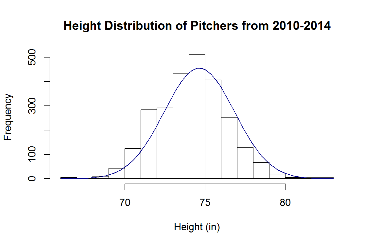
Most Major League pitchers fall between 6’1’’ and 6’4’’. We can look at the height distribution for pitching seasons of the last 5 years and see that it’s approximately normal:
By this approximation, the chance of randomly selecting a pitcher of the last 5 years who is shorter than 5’11’’ is about 5%.
Are short pitchers really destined to fail? We’ve all been told that it’s better to be taller if you pitch. But is this true? Let’s consider short pitchers to be 5’11’’ or under and examine their effectiveness and distribution in comparison to taller pitchers, who we’ll consider to be 6 feet or taller.
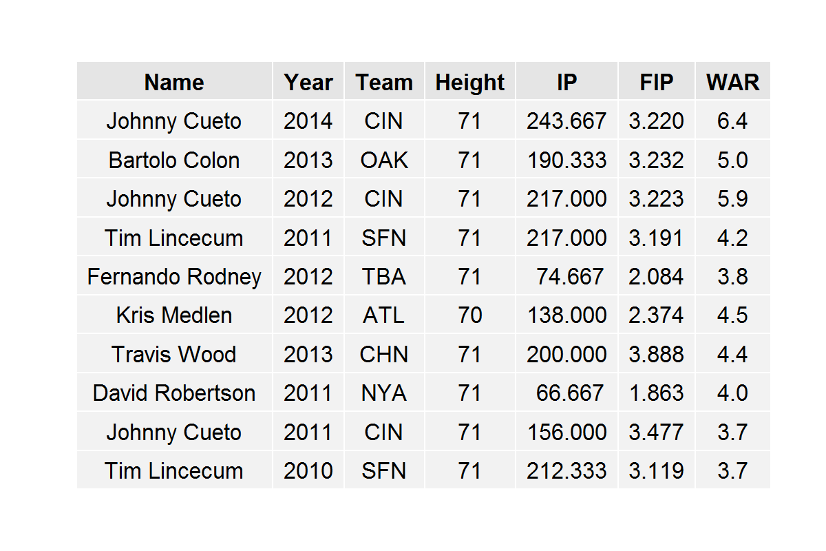
The top ten best pitching seasons for shorter pitchers of the last 5 years are:
We notice that Tim Lincecum appears on this list twice and Johnny Cueto appears on it three times. All of these pitchers are 5’11’’ with the exception of Kris Medlen, who is 5’10’’. So, we see that successful pitching seasons by short pitchers don’t come completely out of the blue. Short pitchers can be successful and can dominate batters, most of whom are much taller, as Cueto did last year and in 2012.
In fact, short pitchers aren’t all that rare to come by, although they’re considerably rarer than taller pitchers. In the last 5 years, there have been 23 instances of short starting pitchers throwing at least 150 innings. In comparison, there have been 402 instances of this type for taller starting pitchers.
Shorter pitchers are generally relegated to the bullpen; there have been 95 instances in the last 5 years of full-time short relief pitchers and 968 instances of full-time taller relief pitchers.
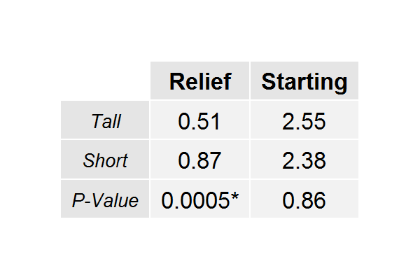
We can see the average WAR breakdowns for all of these pools of players in the following table, along with P-Values for a two-sided t-test comparing the short relievers against the tall relievers and the short starters against the tall starters:
What the 0.0005 is telling us, here, is that we would observe these results by chance alone with probability 0.0005. Thus, there is actually a significant difference in the mean WAR for short relievers and the mean WAR for tall relievers (obviously favoring short relievers). On the other hand, the difference between the starters is not significant. Either way, we have no evidence to suggest that shorter pitchers are any less effective than taller pitchers.
Are shorter pitchers undervalued in the baseball market? If so, to what extent? We can approach this by examining the WAR value of a pitcher relative to his salary in free agency. We can do this by comparing the height groups within relievers and starters (since relievers are generally valued differently than starters).
However, we find that in the last five years, there are only 4 instances of a starter 5’11’’ or shorter pitching for a team that acquired him via free agency; and all of them are Bartolo Colon seasons from 2011-2014.
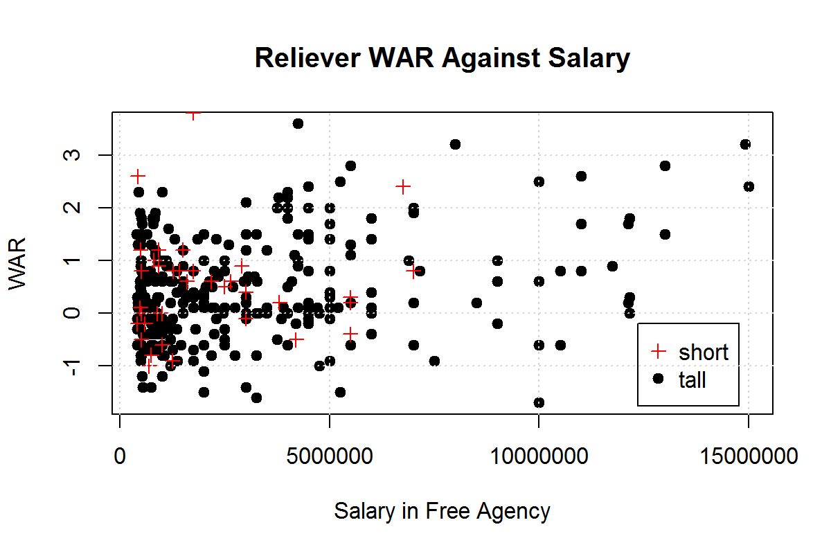
Fortunately, there are more instances of this in relievers, which is what we’ll examine. We notice the distribution of WAR and relievers’ salaries in free agency:
We see that short and tall relievers are clustered between -1 and 1 WAR and $1 million and $5 million dollars. However, we see several taller relievers past the $7.5 million mark with unremarkable WARs, which we don’t see for shorter relievers. From this, we would suspect that taller relievers are being overvalued while shorter relievers are being undervalued.
This is, in fact, the case: short relief pitchers are producing 2.33 WAR for every $10 million they earn in free agency while taller relievers are producing 1.36 WAR for every $10 million they earn. In comparing these values with a one-sided t-test, we acquire a P-Value of 0.0018, meaning these are results we would acquire by chance only .18% (a significant value) of the time. And so it goes, relievers under 6 feet are actually about 1.7 times as valuable as their taller counterparts.
Is there something inherently different about shorter pitchers that makes them less capable of pitching successfully in the big leagues? The evidence says no. In fact, it might be more worthwhile for General Managers to draft pitchers under 6 feet tall and reap the rewards.
Just because an athlete doesn’t tower over his opponents off the mound, doesn’t mean he can’t bring 55,000 dumbfounded Yankee fans to their feet on an unassuming September evening.
As a Blue Jays Fan, I’ve enjoyed the opportunity to watch Mark Buehrle pitch the last two years. Getting to see a player with below-average stuff (and that’s probably generous) retire major-league batters regularly is a real treat. On top of that, Mark Buehrle is one of the fastest-paced pitchers in all of baseball. He led all of baseball in 2014 in time between pitches, or pace. He was second in 2013 to teammate R.A. Dickey. He was first again in 2012. Games with Mark Buehrle on the mound move quickly. Often you will hear comments that this has the effect of keeping fielders “on their toes”.
Here’s his manager John Gibbons after a start last September – “He’s a teammate’s dream because he keeps his defence on their toes by working fast.” And here is a quote from Jose Bautista after a start last June – “He’s pitching great, throwing strikes, keeping people off balance and allowing us a chance to play defence behind him. It’s no surprise that every time he pitches there are plenty of good defensive plays made. He keeps everybody engaged in the game because he works quick.”
What Gibbons, Joey Bats, and many others, are saying is that, due to the quicker pace of play, fielders are more ready to react to balls towards them. The implication of this statement is that Mark Buehrle, and other similarly fast paced pitchers, receive better than expected defense, especially on the infield. I’ve often wondered if this belief had any merit so I decided to look into it myself.
I took a look at the rate at which groundballs hit off of Buehrle have been turned into outs throughout his career and compared his numbers to those of his teammates (Note that I would have liked to include only other starting pitchers from among Buehrle’s teammates but was unable to do so. I wouldn’t expect it to make much of a difference though). These numbers come from baseball-reference.com.
Here is what that data looks like:
We can see that Buehrle’s ability to “keep infielders on their toes” does not translate to more outs on groundballs relative to his teammates in every year. In fact, in only seven of his 14 full seasons has Mark Buehrle’s rate of groundballs converted into outs exceeded those of his teammates. If being a fast-paced pitcher improved the defense behind you then we’d expect to see Mark Buehrle consistently outperform his teammates. Only once in the past five years has this been the case.
That one time in the past five years though, 2012, is interesting. In 2012, Buehrle’s one year with the Miami Marlins, only 41 of the 259 groundballs hit off of Buehrle went for hits. This 82% out rate was well above that of the rest of the team, which stood at 72%. Perhaps we could conclude that the Miami infielders were particularly impacted by Buehrle’s fast pace. This is likely not the case though as the primary shortstop of that team, Jose Reyes, was also the primary shortstop behind Buehrle in 2013 & 2014 with the Blue Jays. In those two years, Buehrle actually had worse infield defense behind him than his teammates (and, sadly, the two worst rates of groundball to out conversion in his career), so it’s likely that Buehrle’s success in 2012 was more due to luck.
This analysis doesn’t consider the average velocity of groundballs hit off of Buehrle compared to his fellow pitchers or anything to do with groundball trajectories, but it seems clear that any defensive advantage Buehrle gains from pitching quickly is minimal at best. Over the course of Buehrle’s 14 complete seasons, groundballs have been converted into outs 75.3% of the time, while the groundballs hit off of his teammates have turned into outs 74.0% of the time. This difference equates to between 5 and 6 extra outs a year. This isn’t a huge advantage, but 5 or 6 extra outs a season and regular two and a half hour games is better than a kick in the teeth.
Next, I wanted to see if the ability to “keep fielders on their toes” was seen in pitchers other than Mark Buehrle. I looked at the ten fastest-paced starting pitchers from 2014 (min 100 IP) to see if there was a noticeable increase in groundballs converted into outs when compared to their teammates. I also did the same for the ten slowest-paced starting pitchers. In the fast-paced group are Buehrle, Dickey, Doug Fister, Wade Miley, Jon Niese, Andrew Cashner, Michael Wacha, TJ House, Dan Haren, & Chris Young. In the slow-paced group are plodders Jorge de la Rosa, Yusmeiro Petit, Clay Buchholz, Tyler Skaggs, Edinson Volquez, Chris Archer, Hiroki Kuroda, Masahiro Tanaka, Yu Darvish, & Edwin Jackson (One pitcher had to be excluded from each group as they were traded midseason and therefore exact split data for their teammates was unavailable. These pitchers were David Price from the slow-paced group and Vidal Nuno from the fast-paced group).
The results are below:
Rather than seeing the fast-paced pitchers receiving better groundball defense than their slow-paced peers, we actually see the reverse. Groundballs off the bats of slow-paced pitchers were converted to outs more often than those off of fast-paced pitchers. Once again, this analysis doesn’t consider batted-ball velocity or trajectory, but it seems clear that the supposed benefit of a faster pace doesn’t show up in infield defense. And although the data table above showed that slow-paced pitchers benefited from stronger infield defense, it seems unlikely that this is caused by the slow pace of the pitchers. Rather this is almost certainly statistical noise.
With pace of play concerns becoming more prevalent in baseball these days, there may be some pressure on pitchers to take less time between pitches. If pitchers do make such changes, they shouldn’t expect to receive any stronger defense behind them, even if some may suggest as much. So the next time a broadcaster or anyone applauds a guy for “keeping the defense on its toes” with his fast pace, you can remain skeptical that such a benefit exists. After all, these are major-league ballplayers, many of whom are being paid millions of dollars. I’m sure they can pay attention for an extra ten seconds.
This post will look at bunting for a hit and try to identify if it is a skill that can efficiently and effectively increase offensive production, and answer the general question of, should players bunt more?
Is Bunting for a Hit a Skill?
Before we answer the ultimate question of whether or not players should bunt more, we need to first identify whether or not bunting for a hit is a skill to begin with.
This is where data becomes an issue, but we should be able to make do.
Before 2002 there are no records on FanGraphs of bunt hits, so I looked at all qualified hitter seasons from 2002 to 2014 in which a player bunted three or more times in a season—since most players go a whole season without a bunt, three bunts or more in a season puts a player in the top fifty percentile for bunt attempts in a season.
From there I looked at the year-to-year correlation of a player’s bunt hit percentage—bunt hits divided by bunts (i.e. a player’s batting average on bunts)—for the entire population. Mind you, we only have record of the amount of times a player bunts, not the amount of times a player attempted to bunt for a hit. So in all reality, a player’s bunt hit percentage would be higher if we were able to tease out the amount of times that they laid down a sacrifice bunt from their total bunts. However, from the data we are still able to find a .33 year-to-year correlation on bunt hit percentage for our population of hitters.
Takeaway: bunting for a hit is a skill.
Should Players Bunt More?
Now that we’ve answered the question of whether or not bunting for a hit is skill, we can circle back to our original question of whether or not players should bunt more.
Because we want to have a large enough sample of attempted bunts for bunt hit percentage (BH%) to stabilize, we will look at all qualified hitter totals (i.e. multiple season totals), not individual seasons, from 2002 to 2012.
To answer our question we need to look at the expected value gained for a player when they have an at bat where they don’t attempt to bunt—a regular at bat—and subtract it from the expected value gained in at bats where they attempt to bunt for a hit—a bunt hit attempt.
To come up with the expected value of a regular at bat we have to look at the linear weight value added per plate appearance of a player’s at bats from 2002 to 2012, or their entire career value if their whole career falls within that period. We then multiply that linear weight value per plate appearance by probability that they achieve one of those outcomes.
Here’s the formula for Expected Value of a regular at bat (xRA):
This formula looks much more complicated than it actually is, but you’ll be able to click into the cells in the live excel document below and visually see how the values are computed. All of the decimals that are part of the formula are linear weight values, which you can find here.
We need to go through the same process to figure out what the expected value added is for a player on a bunt hit attempt—the average value added with a bunt times the probability of a successful bunt hit (BH%).
I was unable to find the linear weight value of a bunt hit, but we do have a sufficient substitute. A bunt hit essentially adds the same value as a base hit with no runners on base—.266 runs per inning. A single with no runners on base is a good proxy for the happening of a bunt hit. Like a base hit with no runners on base, a bunt hit offers no opportunity for a runner on base to score or advance past the next base in front of them. Short of looking at box score data to find the average amount of runners that scored per inning after a successful bunt hit, which will need to be done for a more conclusive answer to our question, we will use the average linear weight value of a single with no runners on for each of the out states as our linear weight value (i.e. I averaged the linear weight value of a single with no runners on base and no outs, a single with no runners on base and one out, and a single with no runners on base and two outs to get the average linear weight value; this is not the exact way to get the linear weights value of a single with no runners on base, because there are undoubtedly a different amount of singles with no runners on base that occurred for each out state, but this should be close).
This is the formula for expected value gained on a bunt attempt (xBA):
Bunt Hit Average (bunt hits/total bunts)*.266 (our estimated linear weight value for a bunt hit)
Now that we’re able to come up with the expected value added for a player in a regular at bat (xRA) and the expected value added for a player on a bunt hit attempt (xBA), we can subtract the two values from each other—xRA minus xBA—to see which players have lost the most value per plate appearance by not bunting.
This chart shows the players with a minimum of ten bunt attempts that have lost the most value by not bunting (i.e. which players have the biggest difference between their expected value gained from a regular at bat and a hit attempt):
RA%: Chance that a positive offensive event occurs, outside of bunt hit
BA%: Chance that a player gets a hit on a bunt
xRA: Expected value added from a regular at bat
xBA: Expected value added from a bunt attempt
Net Value: xRA minus xBA
Implications
This research doesn’t mean to suggest that all players who have a higher expected value added on a bunt attempt than they do in a regular at bat should bunt every time. Carlos Santana gets a hit in 78% of the at bats where he bunts, but he has only attempted 14 bunts in his career, so we don’t have a large enough sample of bunt attempts to know what his actual average on bunt attempts would be; this goes for most if not all of the players on this list. There is most likely an inverse correlation between BA% and bunt attempts (i.e. the more you try and bunt for a hit, the less likely you will get a hit as the infield plays further up on the grass).
This research means to suggest that players have not reached the equilibrium for bunt attempts (i.e. they haven’t maximized their value). Players should increase the percentage of the time they bunt until their xRA and xBA are the same; at this point their value will be maximized. The more a player with a negative net value tries to bunt for a hit, the more expected value he will add. This will happen until his expected value added from a bunt falls beneath what he is able to achieve through a regular at bat; this happens when the defense starts to defend him more optimally, they align for the bunt hit, and his BH% falls. Once this occurs he will force the defense to play more honestly—the infielders will have to play farther in on the grass—and increase his expected value added in a regular at bat as more balls get past the infield from shallow play.
What’s interesting is that there are two different types of players on this list. The first type of player is the type that you would traditionally think of as player who would try and bunt for a hit: the speedster with very little power. The second type of player is the player who, as a result of the recent, extensive use of defensive shifts, has a high BA%—batting average on bunt hits—because the defense is not in a position to cover a bunt efficiently: Carlos Santana, Carlos Pena, Colby Rasmus, etc.
The voice for the question about why players don’t try to beat the shift with bunts down the third base line has grown louder, but there still hasn’t been a good answer as to why it hasn’t been done more; the evidence seems to suggest that it is valuable and should be done more. I’m not able to confirm that the 11 hits that Carlos Santana had on bunt hits came when the defense was in a shift, but I think it would be somewhat unreasonable to believe that he was able to beat out a throw to first on a bunt hit attempt when the defense was in a traditional alignment more than a few times.
The image above is a spray chart of Carlos Santana’s ground ball distribution as a left-handed hitter; the white dots are hits and the red dots are outs. This chart suggests that it would be advantageous for teams to shift against Santana when he bats left-handed. I would argue that because of Santana’s success—his high BH%—at bunting for a hit, he should do this more, which will generate more value by itself, and increase the value generated in regular at bats as he forces the defense to change their defensive shift against him from the increase in bunt attempts. However, once he reaches the equilibrium, any further changes may ultimately be a zero sum game.
There are no silver bullets to get more runners on base, but there will always be more efficient, undervalued ways to achieve that goal. This research has proven that bunting for a hit is underutilized, and once more work is done to tease out sac bunts from a player’s bunt hit attempts and calculate an accurate BH%, along with the generation of linear weight values for a bunt hit, we will have a more definitive answer for what a bunt hit is worth.
Devon Jordan is obsessed with statistical analysis, non-fiction literature, and electronic music. If you enjoyed reading about pitcher value in Fantasy Baseball, follow him on Twitter @devonjjordan.
As long as I can remember, I’ve been a fan of good defense. Growing up my favorite player was Andy Van Slyke, and as a Braves fan I’ve had the privilege of rooting for defensive wizards such as Greg Maddux, Andruw Jones, and now Andrelton Simmons. Advanced defensive statistics are one of the things that drew me into sabermetrics and I spend entirely too much time obsessing over pitch framing.
Foremost among the new wave of statistics is UZR, Ultimate Zone Rating, which is the metric that is used to calculate the defensive portion of fWAR. In addition, Fangraphs also carries DRS and FSR, or Fans Scouting Report. While UZR is my preferred metric, I’ve always been intrigued by FSR. After all, I pride myself on my knowledge of the defensive ability of players on my favorite team and it makes sense to me that there is a wide population that has a pretty good idea of the quality of Chirs Johnson’s defense (namely, that it sucks but improved a lot in 2014).
I decided to take a look at the correlation between a player’s FSR and the components of his UZR (ARM, DPR, RngR, and ErrR, as well as total UZR). For this exercise, I pulled the defensive stats of every player who qualified (minimum of 900 innings) at a position from 2009-2014 (FSR data is only available for those 6 seasons on Fangraphs). I then disregarded catchers, as UZR does not cover the position. Likewise, pitchers are left out because they are not covered by UZR or FSR. That left me with 761 player seasons across the other seven positions. Here’s the correlations between FSR and UZR and its components for those seven positions:
There’s a lot to look at there, but first let me draw your attention to one fact: UZR has a higher correlation for every position than any one of its components at the same position. That’s a big plus for FSR, as it shows the fans don’t get so caught up in one area of a position to ignore how it fits into the whole. It also runs counter to my expectations, as I expected the fans to strongly favor players who avoided making errors (as it seems the voters of the Gold Gloves do). Instead, the component that averages the strongest correlation is range, with ARM (which is only calculated for outfielders) a distant second. Errors only beat out double play runs, which is an indication of how informed fans have moved from using errors as the primary way to evaluate defense. Indeed, errors had a strongest correlation of any component at only two positions: 1B and 2B. Further, errors had an extremely weak correlation with FSR in the outfield, with CF and RF featuring almost no relationship at all.
I was also struck by how strong the correlation between FSR and UZR was at every position. With the exception of 1B, every position’s correlation between the two metrics was above .5, with four of the seven positions above .6. The correlation between FSR and UZR was strongest at 3B, with LF a close runner up. 3B also features the strongest correlation between FSR and a component of UZR – in this case, RngR – and the smallest gap between UZR and one of its components. This finding surprised me, as I typically picture range as a CF tracking down a fly ball hit far over his head. Indeed, the average correlation between RngR and FSR is higher in the OF (0.520) than in the IF (0.454) despite the strength of the correlation at 3B.
I was also surprised to see the strongest correlation between ARM and FSR in LF, not RF which is typically known as the haven for strong arms. I have two theories to explain this incongruity: the first is that this simply is a small sample quirk. The other is that the selection bias for RF creates a situation where the distribution between the strongest and weakest arms is simply too small to make a significant difference in the data. Indeed, the range between the highest ARM in RF (Jeff Francoeur’s 9.7 in 2010) and lowest (Curtis Granderson’s -7.4 in 2014) was approximately 3 runs smaller than the difference in LF between Yoenis Cespedes’ 2014 (12.4) and Ryan Braun’s 2010 (-7.9).
Overall, this shows the strength of FSR. While its certainly not the same as UZR, the correlations are strongest between total UZR and FSR, and the components with the strongest correlations appear to generally be appropriate for the position. In Part 2, I will examine which components are over or under-emphasized by FSR.
In “Hardball Retrospective: Evaluating Scouting and Development Outcomes for the Modern-Era Franchises”, I placed every ballplayer in the modern era (from 1901-present) on their original team. Accordingly, Ken Griffey, Jr. is listed on the Mariners roster for the duration of his career while the Marlins claim Miguel Cabrera and the Nationals declare Vladimir Guerrero. I calculated revised standings for every season based entirely on the performance of each team’s “original” players. I discuss every team’s “original” players and seasons at length along with organizational performance with respect to the Amateur Draft (or First-Year Player Draft), amateur free agent signings and other methods of player acquisition. Season standings, WAR and Win Shares totals for the “original” teams are compared against the “actual” team results to assess each franchise’s scouting, development and general management skills.
Expanding on my research for the book, the following series of articles will reveal the finest single-season rosters for every Major League organization based on overall rankings in OWAR and OWS along with the general managers and scouting directors that constructed the teams. “Hardball Retrospective” is available in digital format on Amazon, Barnes and Noble, GooglePlay, iTunes and KoboBooks. Additional information and a discussion forum are available at TuataraSoftware.com.
Terminology
OWAR – Wins Above Replacement for players on “original” teams
OWS – Win Shares for players on “original” teams
OPW% – Pythagorean Won-Loss record for the “original” teams
Assessment
The 1992 Milwaukee Brewers OWAR: 48.2 OWS: 290 OPW%: .587
GM Harry Dalton acquired 85% (29 of 34) of the ballplayers on the 1992 Brewers roster. All of the team members were selected during the Amateur Draft with the exception of Frank DiPino and Dave Nilsson (signed as amateur free agents). Based on the revised standings the “Original” 1992 Brewers finished eight games ahead of the Yankees and secured the American League pennant.
Gary Sheffield (.330/33/100) paced the Brew Crew with 32 Win Shares, collected the batting crown and placed third in the MVP race. Paul “The Ignitor” Molitor nabbed 31 bags, drilled 36 doubles and delivered a .320 BA. Fleet-footed shortstop Pat Listach earned Rookie of the Year honors, swiping 54 bases and scoring 93 runs while batting .290 from the leadoff spot. Center fielder Robin Yount slashed 40 two-base hits in his penultimate campaign. Darryl Hamilton contributed a personal-best 41 stolen bases and posted a .298 BA.
Yount placed fourth behind Honus Wagner, Arky Vaughan and Cal Ripken Jr. in “The New Bill James Historical Baseball Abstract” for the best shortstop of All-Time. Molitor (3B – 8th), Greg Vaughn (LF – 68th) and B.J. Surhoff (LF – 97th) finished in the top 100 at their respective positions.
LINEUP
POS
WAR
WS
Pat Listach
SS
4.67
22.88
Darryl Hamilton
RF
3.55
18.71
Paul Molitor
DH
4.87
28.44
Gary Sheffield
3B
5.92
32.28
Robin Yount
CF
2.29
19.45
Greg Vaughn
LF
1.7
14.43
B. J. Surhoff
C
1.58
13.54
John Jaha
1B
0.31
2.63
Jim Gantner
2B
-0.24
4.96
BENCH
POS
WAR
WS
Mike Felder
CF
0.93
10.14
Dion James
RF
0.45
4.29
Glenn Braggs
LF
0.31
6.9
Dave Nilsson
C
0.27
5.19
Kevin Bass
LF
0.26
10.84
Dale Sveum
SS
0.08
3.61
Bill Spiers
SS
0.05
0.58
Ernie Riles
SS
0.03
1.34
Russ McGinnis
C
-0.11
0.71
Bert Heffernan
C
-0.15
0.06
Randy Ready
DH
-0.21
2.92
Tim McIntosh
C
-0.66
0.62
Bill Wegman compiled a 1.169 WHIP while supporting a workload of 261.2 innings. Jaime Navarro topped the pitching staff with 17 victories and an ERA of 3.33. Chris Bosio (16-6, 3.62) fashioned a 1.154 WHIP. Rookie right-hander Cal Eldred notched an 11-2 record with a 1.79 ERA and a 0.987 WHIP subsequent to a promotion from the Minor Leagues in mid-July.
Doug Jones (11-8, 1.85) rebounded from an off-year in ’91, posting 36 saves and leading the AL with 70 games finished in 80 relief appearances. Jeff Parrett (9-1, 3.02) and Dan Plesac (5-4, 3.68) held opponents at bay.
ROTATION
POS
WAR
WS
Bill Wegman
SP
3.73
15.72
Jaime Navarro
SP
3.47
15.6
Chris Bosio
SP
2.41
13.26
Cal Eldred
SP
3.76
11.58
Mike Birkbeck
SP
-0.3
0
BULLPEN
POS
WAR
WS
Doug Jones
RP
2.6
17.59
Dan Plesac
RP
0.92
5.9
Jeff Parrett
RP
0.91
8.43
Frank DiPino
RP
0.31
1.29
Brian Drahman
RP
0
0.58
Doug Henry
RP
-0.71
5.72
Tim Crews
RP
-1.11
0.05
Chuck Crim
RP
-1.52
2.41
The “Original” 1992 Milwaukee Brewers roster
NAME
POS
WAR
WS
General Manager
Scouting Director
Gary Sheffield
3B
5.92
32.28
Harry Dalton
Dan Duquette
Paul Molitor
DH
4.87
28.44
Jim Baumer
Dee Fondy / Al Widmar
Pat Listach
SS
4.67
22.88
Harry Dalton
Dick Foster
Cal Eldred
SP
3.76
11.58
Harry Dalton
Dick Foster
Bill Wegman
SP
3.73
15.72
Harry Dalton
Ray Poitevint
Darryl Hamilton
RF
3.55
18.71
Harry Dalton
Dan Duquette
Jaime Navarro
SP
3.47
15.6
Harry Dalton
Dan Duquette
Doug Jones
RP
2.6
17.59
Harry Dalton
Ray Poitevint
Chris Bosio
SP
2.41
13.26
Harry Dalton
Ray Poitevint
Robin Yount
CF
2.29
19.45
Jim Wilson
Jim Baumer
Greg Vaughn
LF
1.7
14.43
Harry Dalton
Dan Duquette
B. J. Surhoff
C
1.58
13.54
Harry Dalton
Ray Poitevint
Mike Felder
CF
0.93
10.14
Harry Dalton
Ray Poitevint
Dan Plesac
RP
0.92
5.9
Harry Dalton
Ray Poitevint
Jeff Parrett
RP
0.91
8.43
Harry Dalton
Ray Poitevint
Dion James
RF
0.45
4.29
Harry Dalton
Ray Poitevint
Frank DiPino
RP
0.31
1.29
Jim Baumer
Dee Fondy / Al Widmar
Glenn Braggs
LF
0.31
6.9
Harry Dalton
Ray Poitevint
John Jaha
1B
0.31
2.63
Harry Dalton
Ray Poitevint
Dave Nilsson
C
0.27
5.19
Harry Dalton
Dan Duquette
Kevin Bass
LF
0.26
10.84
Jim Baumer
Dee Fondy / Al Widmar
Dale Sveum
SS
0.08
3.61
Harry Dalton
Ray Poitevint
Bill Spiers
SS
0.05
0.58
Harry Dalton
Dan Duquette
Ernie Riles
SS
0.03
1.34
Harry Dalton
Ray Poitevint
Brian Drahman
RP
0
0.58
Harry Dalton
Dan Duquette
Russ McGinnis
C
-0.11
0.71
Harry Dalton
Ray Poitevint
Bert Heffernan
C
-0.15
0.06
Harry Dalton
Dick Foster
Randy Ready
DH
-0.21
2.92
Harry Dalton
Ray Poitevint
Jim Gantner
2B
-0.24
4.96
Jim Wilson
Jim Baumer
Mike Birkbeck
SP
-0.3
0
Harry Dalton
Ray Poitevint
Tim McIntosh
C
-0.66
0.62
Harry Dalton
Dan Duquette
Doug Henry
RP
-0.71
5.72
Harry Dalton
Ray Poitevint
Tim Crews
RP
-1.11
0.05
Harry Dalton
Ray Poitevint
Chuck Crim
RP
-1.52
2.41
Harry Dalton
Ray Poitevint
Honorable Mention
The “Original” 1987 Brewers OWAR: 46.1 OWS: 258 OPW%: .555
Milwaukee rallied to a 90-72 record and finished seven games ahead of Detroit to achieve its first pennant. Paul Molitor (.353/16/75) sparked the Brewers’ offense with a League-leading 41 doubles and 114 runs scored. He pilfered 45 stolen bases and placed fifth in the A.L. MVP balloting. Teddy Higuera whiffed 240 batsmen and registered an 18-10 mark in the course of a four-year run in which he averaged 17 wins, a 3.25 ERA and 192 strikeouts per season. Robin Yount (.312/21/103) tallied 99 runs and 198 base knocks.
To me, the first few weeks of baseball each year are small sample size season. It seems that every article is either a) drawing wildly irresponsible conclusions based on a few dozen plate appearances or innings (either with or without the routine “This is a small sample, but…” disclaimer), or b) showing why those claims are wildly irresponsible and not very useful. This is how we get articles comparing Charlie Blackmon and Mike Trout. It gets a little repetitive, but writing this in March, when the closest thing to real baseball I can experience is play-by-play tweeting of a spring training game, it honestly sounds lovely.
Fairly often in those early articles, I see analyses that use past calendar year stats, that incorporate the first x games of the current season and the last 162-x games of the previous season. The idea is to rely on more than a few games of evidence, but still incorporate hot first months in some way. I’m always conflicted about how much trust to put in those stats and the resulting conclusions.
On the one hand, they have a reasonable sample size, and aren’t drawing any crazy conclusions off a few good games. Including a large portion of the prior season limits the effect a first month can have on the results, which is probably a good thing. On the other hand, it seems like a lot of changes could be made in the offseason, and those changes could have major effects on a player’s performance basically immediately. If that were the case, stat lines that treated game 1 of 2014 as following game 162 of year 2013 in the same way game 162 of 2013 followed game 161 of 2013 would not be presenting an accurate picture of skill.
Consider the case of Brandon McCarthy, who made a lot of changes to his offseason training regimen between the 2013 and 2014 seasons (detailed in this Eno Sarris article). He went on to record his healthiest season to date in 2014, hitting 200 innings exactly with the second-best WAR (3.0) and best xFIP (2.87) of his career. Combining his results from September/October 2013 (42.0 IP, 7.6% K-BB%, 3.74 xFIP) and March/April 2014 (37.1 IP, 15.2% K-BB%, 2.89 xFIP) would not give an accurate sense of McCarthy going into 2014. But is he the exception, or the rule?
To test this, I looked at the correlations between players’ stats in the first and second halves of 2014, and compared that to the correlation between their stats in the second half of 2013 and the first half of 2014. I expect the six-month discontinuity in the second case to make the correlations weaker, but by how much? If it’s a lot, that’s a sign that analysis relying on stats from the last calendar year probably shouldn’t be trusted; if it’s not, then incorporating the last few months of the previous season to boost sample size is more likely to be a good idea. I also looked at the correlations between stats in 2013 and 2014, to provide a sort of baseline for how predictable each statistic is from season-to-season.
I tried to choose stats that reflect primarily the skill of each player, but that they can control to some extent. Hopefully these are stats that won’t change due to a player switching teams, but might if he changes his approach. I settled on BB%, K%, ISO, and BsR for batters, and BB%, K%, GB%, and HR% for pitchers. Those look reasonable to me, but I’d welcome any suggestions.
I set a minimum of 400 PAs or 160 IP for the full-year samples, and 200 PAs or 80 IP for the half-year samples, and looked at all the players that showed up in both of the time frames being compared. I’m going to look at position players first, then starters. In the following table, the value in each cell is the linear R2 of the stats in the two time periods, except in the last row, which shows the number of players in the sample. I bolded the stronger of the two half vs. half correlations.
2nd Half ’13 v. 1st Half ’14
1st Half ’14 v. 1st Half ’14
Full 13 v. Full 14
BB%
.552
.481
.608
K%
.672
.661
.771
ISO
.572
.519
.654
BsR
.565
.849
.605
n
140
138
142
So these are some seriously unintuitive results, to the point that I went back and triple-checked the data, but it’s accurate. BB%, K%, and ISO all tracked better from player to player from the second half of 2013 to the first half of 2014 than they did from the first half of 2014 to the second half of 2014. Of the four selected stats, only BsR had a stronger correlation inside 2014, but it was odd in its own way, as it was also the only stat for which the full year correlation wasn’t the strongest.
What could explain this? First, it’s possible that this is just randomness, and if we looked at this over a larger sample, the in-year correlations would tend to be stronger. But even if that’s the case, the fact that randomness can make the cross-year correlations stronger (as opposed to just making the lead of the in-year correlations larger) suggests that the difference between the two is relatively small. One possible explanation is survivor bias – perhaps players that get a lot worse between the first and second halves are still likely to see playing time until the end of the season, while players who get substantially worse between seasons might be benched in the first month or two and not get to the 200 PA/80 IP minimum. There’s no doubt that there is survivor bias in this sample, but I’m not convinced by that explanation. Settling on randomness always feels half-hearted, but I really have no idea what else it could be. If anyone has any thoughts, post them in the comments!
The table for the pitchers is set up in the same way.
2nd Half ’13 v. 1st Half ’14
1st Half ’14 v. 1st Half ’14
Full 13 v. Full 14
BB%
.533
.663
.738
K%
.489
.844
.723
GB%
.742
.799
.779
HR%
.243
.213
.357
n
38
45
47
This looks a lot more like I expected. Three of the four stats are more strongly correlated in season than between seasons, and the exception (HR%) also has the smallest gap between the two correlations, making me inclined to chalk that up to random variation. Interestingly, the gap between the season-to-season correlations and the half-to-half correlations is relatively small (again with the exception of HR%), which fits with my perception of BB%, K%, and GB% as stats that stabilize relatively quickly.
It also doesn’t surprise me that pitchers are less predictable than hitters from the second half of one season to the first half of the other, relative to their in-season predictability. Intuitively, pitchers seem to have a lot more control over their approach, and a much greater ability to shift significantly in the offseason by adding a new pitch, changing a grip, or just getting healthy for the first time in a while. Hitters, on the other hand, seem like they have less ability to change their approach drastically. Even when they can make a change, it’s not necessarily the sort of thing that has to happen in the offseason; if a hitter wants to be more aggressive, he can just decide to be more aggressive, whereas a pitcher looking to throw more strikes is probably going to have to work at that. If true, hitter changes would happen throughout the season and offseason, while pitcher changes would be clustered in the offseason. These correlations don’t provide nearly enough evidence to conclude that’s true, but they do fit these perceptions, which is encouraging.
Overall, this suggests that while going back to last season to get a year’s worth of PAs for a hitter might be a good way to beef up your sample size, it’s probably not as good idea for a pitcher, and also less necessary. After the first few starts, most starters have thrown enough innings that the interesting metrics – BB%, K%, Zone%, etc. – are more signal than noise, and not a lot is added by going to the previous season. This analysis also suggests that adding old stats may even reduce accuracy, by ignoring the potentially significant shifts made by pitchers in the offseason. So the next time you read about a starter’s performance in his last 30 starts, stretching back to May 2014, beware! Or at least be skeptical.