Archive for Research

Using Contact Rates to Evaluate Pitchers

A little over a month ago, I published this piece detailing the methods that I had created to alternately assess hitter performance. I highly recommend glancing at that article before reading this one; it will make a whole lot more sense. For the lazy, here is a brief primer: I focused on using rates (contact, hard%, etc.) to create rough estimates of what would happen on any given pitch. What is the probability that Mike Trout hits a hard line drive on a pitch in the strike zone? The more a player does that, is he more likely to be a successful hitter overall? One of the advantages of this approach is that it helps to remove the actions of a hitter from his circumstance; a hard line drive is a hard line drive, but the placement of it will greatly affect whether or not the player reaches base. Poor defense, such as one may find in the minor leagues or college ball, is made less important in judging a player.

On of the questions remaining was whether or not I could apply some of these same methods to evaluating pitching. So far, the answer is a qualified yes. We already have a number of metrics to determine pitching value without regard for circumstance, but these methods still provide useful insights. Using the existing methods, such as xFIP, we can determine which rate stats are strong indicators of success.

There is one result that emerged above all else: there is no such thing as a weak-contact pitcher. There is a significant amount of talk about pitchers “keeping the ball in the park” or “getting weak ground balls.” However, this method indicates no such thing. By simply multiplying contact rates with “Soft%” for all 2015 qualified pitchers and therefore creating the “SoftXCont” statistic, I was able to search for any correlation between this rate and xFIP. Judge the results for yourself:

View post on imgur.com

Clearly, almost no correlation. However, remember that this only examines the aggregate; perhaps some specific pitchers can leverage this so-called skill to great effect. But, it appears that at least on average, generating weak contact is a poor indicator of overall pitching success.

The opposite is absolutely true. Pitchers who allowed less hard contact saw substantial increases in xFIP, as measured by my “HardXCont” number.

View post on imgur.com

The correlation is relatively strong, especially compared to the correlations seen in other baseball metrics. Clearly there is something going on here; pitchers who allow less hard contact per pitch get better results. Duh. For an even more clean-cut view of this, we can look at GoodXCont, which uses a combination of “Hard” and “Medium” contact.

View post on imgur.com

That correlation is excellent, and indicates that measuring GoodXCont would be a significantly powerful way of evaluating pitchers.

So, we see that pitchers who limit hard contact and good contact are more successful than their peers. We also see that allowing a large amount of soft contact is not indicative of overall success. The “weak contact” type pitchers (think Rick Porcello) are not necessarily succeeding thanks to any particular ability to generate soft contact; any corresponding ability comes more from being able to allow less hard contact.

For scouts, this means finding pitchers who both limit total contact and allow only poor contact. By using these metrics, rather than the outdated ERA or a radar gun, they can get a strong impression of future big-league success.

In a future piece, I plan to dive deeper into research on “soft contact” pitchers. While these initial results indicate that soft contact is not a good indicator of overall success, there is further work to be done. Stay tuned.


The Mariners are Finally Using Safeco Field Correctly

It’s no trade secret that playing to the strengths of your ballpark helps your chances to succeed. To gain an advantage, franchises can exploit, and even sometimes manipulate their home ballpark. If you run the Astros or Reds, who play baseball in a lunchbox, you can succeed by employing otherwise-flawed home-run hitters with little regard for who gets on base ahead of them. When you play half your games in an airplane hangar, however, stubbornly attempting to put the ball over 900 foot fences is foolish. A foolish strategy common of recent Mariners teams. A foolish strategy that wasn’t working.

M’s Team Stats OBP ML Rank SLG Pct. ML Rank wOBA ML Rank
2015 .311 22 .411 12 .313 17
2014 .300 27 .376 21 .299 25
2013 .306 26 .390 20 .307 20
2012 .296 30 .369 30 .291 30
2011 .292 30 .348 30 .283 30
2010 .298 30 .339 30 .285 30

If you have a weak stomach, do not view the last few rows.

The Mariners wrote the Greatest Hits on failing to get on base and, not surprisingly, struggled to win games during those seasons. For years and years, the Mariners tried succeeding with players like Logan Morrison, Michael Morse, and Mark Trumbo, desperately clinging to the home run as the heralded harbinger of scoring runs. Whether this was evidence of a failing regime by general manager Jack Zduriencik remains up for debate, but the front office had seen enough. Around the same time, a wayward GM separated cleanly from the Mariners division rival Angels was seeking asylum, armed with his own vision of building a team.

Strategy 1: Get on Base

Jerry Dipoto, presumably having read Moneyball, understood the value of getting baserunners, and how to get players on base.

“Command the Strike zone” Dipoto told Justin Myers and Gee Scott on their ESPN 710 Seattle radio segment. “From the top of the lineup to the bottom, we will command the strike zone”.

Dipoto began addressing the team’s glaring need for baserunners by signing catcher Chris Iannetta, who had played for Dipoto in Anaheim, and had posted OBP numbers over .350 in 2011, 2013 and 2014. Dipoto found further help by trading for Adam Lind (.350 OBP in 2015) and  signing free agent Norichika Aoki (.353 OBP in 2015, 6.4 K%).

None of these moves were meant to be earth-shattering, but each undoubtedly made the Mariners lineup better. With a solid core of Robinson Cano, Nelson Cruz, and Kyle Seager, Dipoto’s goal was to fill the remaining slots with valuable role players, each of whom is more than capable of getting on base.

Here is a table of several key Mariners offseason additions, with 2015 statistics, and 2016 ZIPS projections courtesy of Dan Szymborski. Note that season projections are often more conservative estimates, as they account for a certain level of player regression.

OBP (2015, 2016) wOBA (2015, 2016) BB% (2015, 2016) K% (2015, 2016)
Chris Iannetta .293 .281 12.9 26.2
.329 .306 14.0 25.8
Adam Lind .360 .351 11.5 17.5
.334 .315 10.1 19.5
Nori Aoki .353 .326 7.7 6.4
.332 .313 7.0 7.8

Strategy 2: Prevent runs, Create runs

Dipoto, addressing the fallbacks of that revolutionary A’s season, also understood the value of defense and speed. “We see ourselves as a run-prevention club. You can create a lot of advantage playing good defense. We also see our overall team defense as our biggest area in need of improvement.”

Dipoto went primarily after well-rounded players, but several moves in particular focused on defense and speed. In November, Dipoto traded closer Tom Wilhelmsen to Texas in exchange for Leonys Martin, a light-hitting center fielder with blazing speed. Martin didn’t quite play enough innings (334) in 2015 to qualify for the CF leaderboard, but his 15.4 Ultimate Zone Rating/150 would have ranked him 5th best among MLB center fielders, just above Lorenzo Cain. Martin, by the FanGraphs arm strength statistic, also had the strongest arm of any center fielder in baseball.

In terms of speed, Martin is as fast as they come. He’s been consistently valuable on the basepaths, posting a 4.3 and 4.2 BRR in 2014 and 2013 respectively (BRR is Baseball Prospectus’s baserunning statistic, where 0 represents an average baserunner). Martin posted a lower total BRR in 2015 (1.5), mostly because his on-base percentage dropped 61 points from 2014, and he appeared at the plate 273 fewer times (generally it’s harder to be a valuable baserunner if you don’t get on base as often).

The second move was to acquire Boog Powell, young center field prospect, from Tampa Bay. Powell was part of a larger trade, wherein Seattle received starting pitcher Nate Karns and Powell, and sent Logan Morrison and shortstop Brad Miller to the Rays. We’ll talk about Karns in the last section, but Powell further embodies Dipoto’s vision of commanding the strike zone, getting on base, and playing defense.

Powell’s defensive statistics are less clear than Martin’s, since Powell has never stepped foot in the major leagues, but he’s consistently graded out in the minor leagues as a plus defender. Powell is 22, and serves as outfield depth should Martin fall down a well in center field.

It’s clear that Dipoto aggressively wanted to improve the outfield defense. In his wild spree of moves, he also made his infield defense better. In trading for Lind, he incrementally made first base a more well-defended position (Lind posted a 3.8 UZR in 2015, compared to Logan Morrison’s -2.9). Brad Miller was a plus defensive shortstop (1.1 UZR, 4.6 dWAR), but with the emergence of talented, young Ketel Marte (1.2 UZR, 2.8 dWAR in 310 fewer innings at SS), Dipoto knew he could afford to trade Miller.

If one looks around at the Mariners in the field, Robinson Cano and Nelson Cruz are currently the only remaining defensive liabilities, and Cruz might not see much right-field time this year. Kyle Seager is a plus defender, Aoki is capable in left, and Seth Smith improved his defense dramatically last season. The team re-signed Franklin Guitierrez (3.4 UZR, 1.9 dWAR) to split Right Field with Smith and Cruz. At the catcher position, both Iannetta and Mike Zunino are among the 10 best pitch framers in baseball, saving an aggregate 26.8 runs in 2015.

The Mariners were the 5th worst defensive team in 2015, but that looks likely to improve in 2016.

Strategy 3: Taking advantage of Dinger-hitting tendencies

When you play baseball in an extreme pitcher-friendly park, in a sea-level city whose summer nights are cool and humid, home runs are a rare commodity. The Mariners understand they won’t win by hitting home runs, but they also understand that the same difficulty exists for opposing teams. Thus, the Mariners can fill their starting rotation with pitchers with higher than average fly-ball rates. Here are the totals from Mariners starters in 2015. WARP is Baseball Prospectus’s cumulative wins above replacement player statistic.

IP FB % GB% BABIP WARP
Felix Hernandez 201.2 26.9 56.2 .288 3.3
Taijuan Walker 169.2 39.0 38.6 .291 1.8
Hisashi Iwakuma 129.2 31.1 50.3 .271 2.5
James Paxton 67.0 34.4 48.3 .289 0.0
Roenis Elias 115.1 36.4 44.2 .280 0.9

Normally we’d expect a higher GB rate to correlate with a higher BABIP, since it’s more likely for ground balls to find holes and become hits than it is for fly balls. Felix has the highest GB rate of that table, and still maintained a better-than-average BABIP. That’s because he’s Felix Hernandez, and he’s better than you. Iwakuma, 34, also posted a ground-ball rate of 50%, and he’s never posted a BABIP above .287. After 2000 balls in play, a pitchers BABIP will normalize, and Iwakuma is quickly approaching that. Walker has the highest FB rate, so it’s probably good that he pitches where he does.

Before you even get beyond the innings pitched column, however, it’s clear the Mariners were thin on reliable starting pitching depth in 2015. Out of the players above, only Hernandez and Walker eclipsed 130 innings, only those two and Iwakuma provided any sort of positive contribution, and Roenis Elias is now on the Red Sox.  So the offseason began, and Dipoto got to work.

Earlier we mentioned Boog Powell becoming a Mariner, but he came over as secondary piece that landed the team starting pitcher Nate Karns from Tampa Bay. Karns had a quasi-breakout season in 2015, posting a 3.67 ERA and 3.90 xFIP in 147.2 innings pitched (xFIP is a Fielding Independent Pitching statistic that takes fly-ball rate into account). This was the first full season for the 27-year-old Karns, who also had a 36.5% fly-ball rate in 2015. Of those fly balls, 12.5% went for home runs, an above-average rate for a starting pitcher. While Tropicana Field is not an especially friendly ballpark for hitters, every other park in the AL East dramatically favors home runs, and Karns’s HR rate was likely hurt by pitching frequently at parks like Yankee Stadium and Camden Yards.

Karns should be aided by the expansive parks of the American League West, where more fly balls will become outs. If Karns matches, or even exceeds his peripherals in 2016, while maintaining his high fly-ball rate (fly-ball rate normalizes after 70 fly balls, a total Karns exceeded long ago), he should lower his home-run rate, and his BABIP. Karns also has room for regression, as HR/FB doesn’t normalize until after about 500 IP.

There is a question of Karns’s durability, having only one major-league season with over 100 innings pitched, but no such question exists with Dipoto’s next trade target. A month after grabbing Karns, Dipoto traded Elias and closer Carson Smith to Boston for Wade Miley, one of the most consistently durable left-handed starters in the game. Smith was a bright spot in a bad Mariners bullpen, so Dipoto had to give up some value to acquire Miley, but the GM took that risk to bolster a shaky rotation. Miley has pitched more than 190 innings in four consecutive seasons: 2015 in Boston, and the previous three in Arizona. All of those years have featured FIPs below 4, and improvements across many categories in 2015, lowering his home run/9 rate by .24 despite pitching in the AL East. It’s no stretch of the imagination for Miley to improve even further in 2016, playing in front of an overhauled Mariners defense.

Miley and Karns, 2015 Statistics
Name            IP          FB%          GB%        BABIP        WARP
Nate Karns           147         36.5          41.9          .285            1.6
Wade Miley          193.2         30.5          48.8          .307            2.5

You start to see how exploiting these park advantages becomes mutually beneficial. A speedy outfield defense will turn more of Nate Karns’ fly balls into outs, and a more solid infield defense will help turn Miley’s ground-ball hits into outs as well. On the offensive side, players who don’t strike out will put the ball in play more often, and the increased speed of the lineup will turn more of those balls in play into hits, increasing the number of baserunners. If, with all of these improvements, we still believe in Nelson Cruz’s power, Kyle Seager’s upward trajectory, and continued King Felix domination, we believe in Mariners success.


The Truth About Power, Contact, and Hitting in General

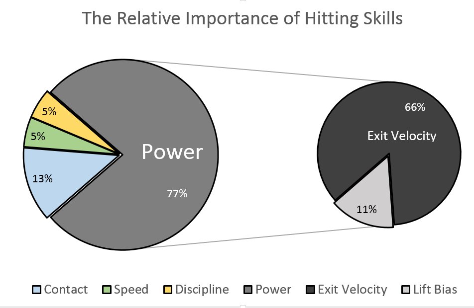
The overarching purpose of this study was to identify the core skills that underlie hitting performance and investigate the extent to which hitters must choose between these skills. The article unfolds in two parts.  In Part 1, I explore the ostensible trade-off between power and contact in search of the optimal approach. Then in Part 2, I show that 66% of variance in wRC+ can be explained by four skill-indicators: power, contact, speed, and discipline.  It will be revealed that increasing hard contact should be of paramount importance to hitting coaches, while contact and discipline are complimentary assets.

PART ONE: IS THERE A POWER-CONTACT TRADE-OFF?

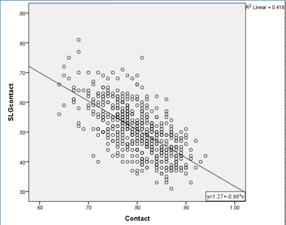
Eli Ben-Porat recently published a terrific study on the trade-off between contact ability and power and I will be building on his findings.  As such, I will be using the same sample as his study, which includes all players since 2008 who have swung at 1000 pitches or more. First, I want to explain why it is assumed that there is a trade-off between power and contact.  Not only is it intuitive that a hitter chooses between swinging for the fence and putting the ball in play — there is also clearly a trade-off between abilities among MLB hitters.  Here is a plot of the relationship between SLG on Contact and Contact%.

SLG and Contact
Figure 1. Contact Rate and SLG on Contact.

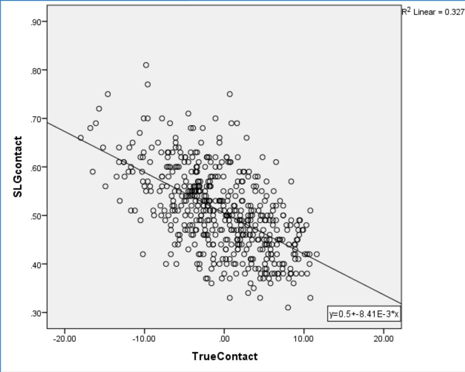
There is a strong inverse relationship between power and contact, explaining 42% of total variance.  However, Ben-Porat cited evidence that power hitters tend to face tougher pitches than light hitters, a factor that is likely to affect their contact rate.  When Ben-Porat controlled for effect of pitch location on contact rate, the relationship between contact and power dropped to an R2 of 33%. Figure 2 plots the relationship between Ben-Porat’s new True Contact, a location-independent measure of contact skill, and SLG on Contact.

SLG and True Contact
Figure 2. True Contact and SLG on Contact.

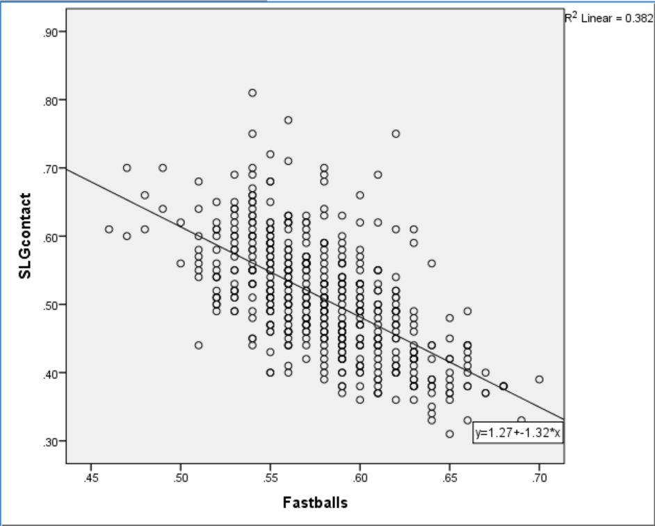
While controlling for location loosened the relationship between power and contact, there still appears to be a significant inverse correlation between the skills.  Is this lingering relationship due to a necessary trade-off between hitting for power and making contact? I propose not.  Instead, consider the relationship between Fastball% and SLG on Contact.

The graph in Figure 3 plots the relationship between percentage of fastballs faced and SLG on Contact.

SLG and Fastball%
Figure 3.  Percentage of Fastballs Faced and SLG on Contact.

Predictably, pitchers tend to throw fewer fastballs to more powerful hitters.  To parcel out the effect of pitch type, I examined the relationship between regular Contact% and SLG on Contact while controlling for Fastball%.  This strategy is similar to Ben-Porat’s approach but controls for pitch type rather than location.  The results of a simultaneous multiple regression analysis indicate that when holding Fastball% constant, Contact% explains just 12% of the variance in SLG on Contact.  In other words, most of the relationship between Contact% and SLG on Contact was due to differences in the amount of fastballs faced.

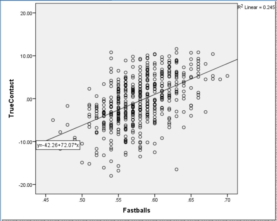
To do a little better, I examined the relationship between Fastball% and True Contact.  Figure 4 shows that Fastball% accounts for about a quarter of the variance in True Contact.  Understandably, as Fastball% increases so does True Contact.

Fastball% and True Contact
Figure 4.  Relationship between True Contact and Fastball%.

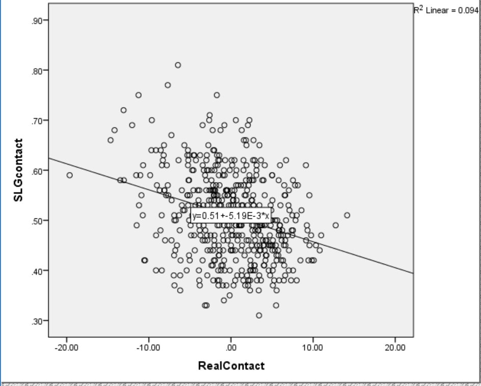
While True Contact controls for the location of pitches faced, it does not account for the proportion of fastballs faced.  When the effect of Fastball% is held constant, True Contact accounts for just 9% of the variance in SLG on Contact.  I computed a new Fastball%-independent version of True Contact, called Real Contact, and plotted it against SLG on Contact in Figure 5.

Real Contact and SLG
Figure 5. Relationship between Real Contact and SLG on Contact.

The plot resembles a shotgun distribution with only a slight relationship between power and contact left. It is possible this remaining relationship is due to what’s left of the “trade-off hypothesis.” If so, I suspected there would be evidence that an approach that maximizes slugging, such as hitting fly balls and pulling the ball, would be associated with lower Real Contact scores.  Instead, FB% explained only 2.6% and Pull% only 2.4% of total variance in Real Contact.  If there is real trade-off between contact and power, I still can’t isolate it.

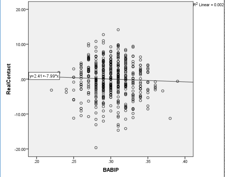
Dr. Alan Nathan has demonstrated that home runs and base hits are optimized by different swing strategies.  The implication is that there is a trade-off between base hits and power. Perhaps a contact swing is a base-hit swing. I tested this notion, and Figure 6 plots the relationship.

babip and contact

Figure 6.  BABIP and Real Contact.

Surprisingly, contact and BABIP are unrelated.  This is a counter-intuitive null finding, like the non-association between LD% and Hard%. In this case, I think base-hit skill requires more than not-missing.

I can’t test my final explanation, but I think selective sampling could explain the remaining small association between contact and power.  Since hitters need to achieve a minimum level of success to stay in the league, it seems unlikely for hitters to lack both power and contact skills.  Further, a hitter deficient in one skill would need to make it up with the other to avoid being released.  Since I could not find evidence to support an adjustment-based trade-off between power and contact, I assume the skills are independent moving forward.

PART TWO: POWER, CONTACT, SPEED, AND DISCIPLINE

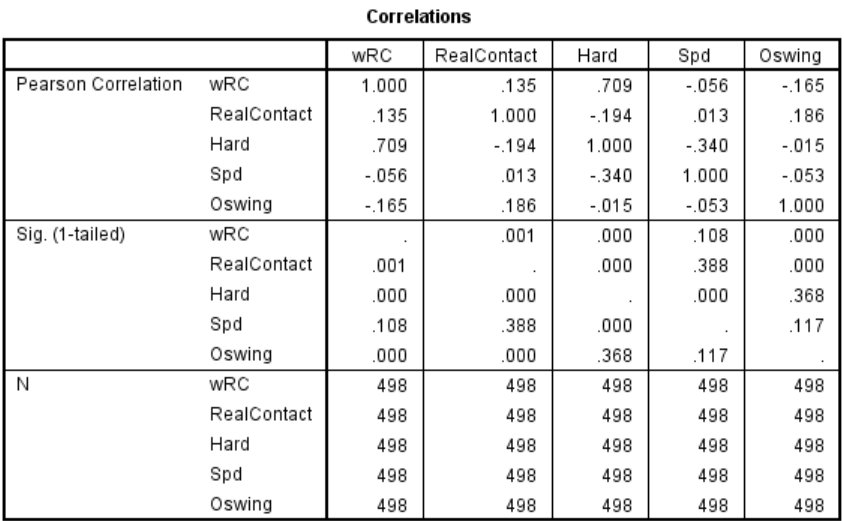
If power and contact are separate skills, how much does each contribute to a hitter’s overall production? What about speed and discipline?  To answer these questions, I conducted a multiple regression analysis with wRC+ as the dependent variable and Hard%, Real Contact, Spd, and O-Swing% included as predictors.  The predictors were chosen to reflect power, contact, speed, and discipline because they measure each construct without including outcome data that make up wRC+. A multiple regression allows us to measure the unique contribution of each predictor on wRC+ as well as the overall variance accounted for by all the predictors.

The correlation matrix for the four predictors and one dependent variable are presented in Figure 7.  Only Spd and Hard% have a zero-order correlation over .20, with an R2 of 11.6%.  The four skills are mostly unique, which means the model avoids statistical problems of multicollinearity and singularity.

Matrix
Figure 7. Correlation matrix indicating zero-order correlations in the top row, 1-tailed p-values in the second row, and sample size in the third row.

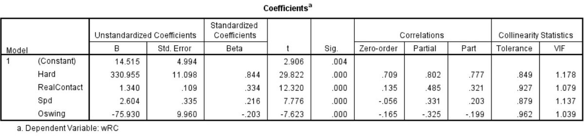
The results of the multiple regression are presented in Figure 8.  Note the adjusted R2 of .66 indicating that the four predictors explained 66% of total variance in wRC+.

Model Summary
Figure 8. Results of multiple regression.  Hard%, Real Contact, Spd, and O-Swing% predicted 66% of variance in wRC+.

The specific contribution of each measure is indicated in Figure 9.  The Part Correlation statistic describes the unique contribution (R) of each predictor to explaining wRC+. When considering all predictors together, Hard% accounts for 60% of the variance in wRC+. The remaining three skills provide only incremental value compared to hitting the ball hard.

Coefficients
Figure 9.  Coefficients and Correlations from multiple regression.

The Partial Correlation statistic indicates the proportion of the remaining variance explained by each predictor while controlling for the effects of the others.  In other words, when controlling for Hard%, Spd, and O-Swing%, Real Contact explains 24% of the remaining variance in wRC+.

The strength of the multiple regression approach is clear when comparing the zero-order correlations to the partial and part correlations.  In every case, the part and partial correlations are larger, suggesting that each predictor benefits from the inclusion of the others in the model. Further, the relationship between each skill and wRC+ seems more intuitive when the contribution of the other skills is accounted for.  For example, Spd has a slight negative association with wRC+ on its own, but a positive relationship accounting for 11% of the remaining variance when included with the other predictors. It makes sense that speed is helpful, all else being equal.  Similarly, Real Contact and O-swing% have larger, more intuitive relationships to wRC+ when controlling for all predictors.

CONCLUSION

I conducted this research from a coach and player’s perspective, with the goal of identifying the ideal composition of hitting skill. Previous research has already reported a strong association between Hard% and wRC+, and this study only reaffirms the contribution of Hard% to overall production.  Given the same amount of speed, discipline, and contact skill, hard-hit percentage accounts for over two-thirds of remaining variance in a hitter’s wRC+.

A novel finding of this study is that there is little to no trade-off between power and contact ability.  Almost all of the apparent effect was due to differences in how power hitters and light hitters are pitched.  Given the same pitches, power hitters can make as much contact as light hitters. For example, Albert Pujols ranks 10th in the sample in Hard% and 15th in Real Contact.

The truth about hitting is that every hitter is swinging the bat just about as fast as they can. They are racing 95+, so they don’t really have a choice.  That doesn’t leave a lot of room for a hitter to consciously swing easier.  The hitter can choose to take a “shorter” swing, but should only do so if it results in more hard contact (or the same amount and more overall contact). Hitting the ball hard is the name of the game. Making contact, running well, and being disciplined complete the package.


xHR%: Questing for a Formula (Part 3)

Part 3 of a series of posts regarding a new statistic, xHR%, and its obvious resultant, xHR. This article will examine formulas 2 and 3. 

As a reminder, I have attempted to create a new statistic, xHR%, from which xHR (expected home runs) can be derived. xHR% is a descriptive statistic, meaning that it calculates what should have happened in a given season. In searching for the best formula possible, I came up with three different variations, pictured below.

Today, I’m going to examine formulas 2 and 3 to measure their viability as formulas for xHR%. Hopefully the analysis will shine some light on a murky matter. Likely, formula 2 will end up being the best one because it probably balances in-season performance with prior performance better than formula 3, which has a heavier reliance on in-season performance. Thus, it will end up correlating too well with what actually happened (the same outcome is likely for formula 2).

Methodology

Luckily for myself and the readers, the process was a simple one. Pulling data from FanGraphs player pages, ESPN’s Home Run Tracker, and various Google searches, I compiled a data set from which to proceed. From FanGraphs, I collected all information for Part Two of the formula, including plate appearances and home runs. Unfortunately, because a few of the players from the sample were rookies or had fewer than three years of major league experience, I had to use regressed minor league numbers. In some cases, where that data wasn’t applicable, I dug through old scouting reports to find translatable game power numbers based off of scouting grades (and used a denominator of 600 plate appearances).

Then, from ESPN’s Home Run Tracker website, I obtained all relevant data for player home-run distance, average home-run distance for the player at home, and league average home-run distance. Due to my limited time, I only used players that qualified for the batting title during the 2015 season, yielding a potentially weak sample of only 130 players. Additionally, before anyone complains, please realize that the purpose of my research at this point is to obtain the most viable formula and refine it from there so that it can be applied across a wider population.

Results for Formula 2

Using Microsoft Excel, I calculated the resultant xHR% and xHR. Some key data points:

League Average HR% (actual):  3.03%

Average xHR%:  2.89%

Average Home Runs: 18.7

Expected Home Runs: 17.8

Please note that there is a significant amount of survivorship bias in this data. That is, because all of these players played enough to qualify for the batting title, they are likely significantly better than replacement level, which is why the percentages and home runs seem so high.

Correlation between xHR% and HR%: 0.974418884

R² for above: 0.949492162

HR% Standard Deviation: 1.5769373

xHR% Standard Deviation: 1.4265261

Correlation between xHR and HR: 0.977796283

R² for above: 0.956085571

HR Standard Deviation:  10.43771886

xHR Standard Deviation: 9.474596069

Results for Formula 3

League Average HR% (actual):  3.03%

Average xHR%:  2.92%

Average Home Runs: 18.7

Expected Home Runs: 18.1

Again, note the survivorship bias that comes with having a slightly skewed sample

Correlation between xHR% and HR%: 0.986440621

R² for above: 0.973065099

HR% Standard Deviation: 1.5769373

xHR% Standard Deviation: 1.4615323

Correlation between xHR and HR:0.988287804

R² for above:0.976712783

HR Standard Deviation:  10.43771886

xHR Standard Deviation: 9.698203408

Mostly Boring Analysis

I have opted to condense the analysis into one section instead of two because it would have otherwise been repetitive and boring.

I understand that that’s a lot to process, but the data really isn’t all that dissimilar. The expected home-run percentage is slightly lower than the actual home-run percentage for both of them, but it isn’t a massive difference by any means. When prorated to a 600 plate appearance season, xHR% for formula 2 predicts that the average player in the sample would have hit 17.3 home runs, while formula 3’s xHR% expects that the average home-run total would have been 17.5. In reality the average player hit 18.2 home runs per 600 plate appearances, so both were fairly close (maybe too close).

Both formulas had incredibly high correlations, with formula 3 correlating an insignificantly higher amount more. More importantly, formula 2 explains about 94% of the variance, while formula 3 accounts for 97%. The difference between those is relatively unimportant because they explain a very high amount of what occurred. Furthermore, p<.001, so the data must be statistically significant (actually many times lower than that).

Both formulas resulted in slightly lower standard deviations than what actually occurred, which is a recurring theme. In these formulas, the numbers have been clumped a little bit closer together and tend to underestimate rather than overestimate.

Players of Interest

Mr. Kole Calhoun – Last season he hit 26 home runs, but by both formulas he should have hit 3-4 fewer. Likely, this is because his only previous full season of home runs was in 2014, when he had only 17, in addition to the fact that I was forced to use scout grades for his third season. The scout grades were particularly off for Calhoun because he wasn’t even expected to be good enough for the majors, let alone be an above-average, high-value outfielder. Even though his overall offensive prowess declined slightly this past season (by 20 points of wRC+), he didn’t appear to be selling out for power, as his power profile numbers (FB%, Pull%, etc.) remained the same. Personally, I would expect him to regress next season, and I think the formula agrees with me.

Mr. Nolan Arenado – Arguably having the most unexpected offensive breakout of the season, he increased his home-run totals from 10 in 2013, to 18 in 2014, and finally to an astonishing 42 in 2015. While his totals were probably slightly Coors-inflated, they were real for the most part because his average home-run distance was excellent, in addition to the fact that 22 of his dingers came on the road. Arenado is young and likely to regress somewhat in the power department, but he is probably around to stay as a significant home-run threat. The formula was likely wrong on this one due to weighting of prior seasons, so go ahead and make the lazy Todd Helton comparison.

Mr. Carlos Gonzalez – Though Arenado’s teammate had the highest home-run total (40) of his career in 2015, it isn’t clear that he was anywhere near his peak statistically. His wRC+ was below his career average by six points, in addition to him being a net below-average player. All of this leads to the conclusion that he was selling out for power — which makes sense given that he lost over fifty points of batting average and on-base percentage from his 2010-13 peak years. While a viable argument could be made for his “subpar” performance being due to injuries, a better one could be made that his home runs were in part a result of playing half his games at Coors Field, where he hit 60% of his round-trippers. The formula says he should have hit about seven fewer home runs, which may be a best case scenario for next season given his penchant for injury. Additionally, while the Rockies are by no means full of talent, if Gonzalez continues his overall downward trend, he could get traded and lose the Coors advantage, or he could lose playing time.

Keep watch for a concluding piece in the next week. Criticism would be highly appreciated, but keep in mind that I’m still in high school and have yet to actually study statistics.


xHR%: Questing for a Formula (Part 2)

Part 2 of a series of posts regarding a new statistic, xHR%, and its obvious resultant, xHR, this article will examine formula 1. The primer, Part 1, was published March 4.

As a reminder, I have conceptualized a new statistic, xHR%, from which xHR (expected home runs) can be derived. Furthermore, xHR% is a descriptive statistic, meaning that it calculates what should have happened in a given season rather than what will happen or what actually happened. In searching for the best formula possible, I came up with three different variations, all pictured below with explanations.

HRD – Average Home Run Distance. The given player’s HRD is calculated with ESPN’s home run tracker.

AHRDH – Average Home Run Distance Home. Using only Y1 data, this is the average distance of all home runs hit at the player’s home stadium.

AHRDL – Average Home Run Distance League. Using only Y1 data, this is the average distance of all home runs hit in both the National League and the American League.

Y3HR – The amount of home runs hit by the player in the oldest of the three years in the sample. Y2HR and Y1HR follow the same idea. In cases where there isn’t available major league data, then regressed minor league numbers will be used. If that data doesn’t exist either, then I will be very irritated and proceed to use translated scouting grades.

PA – Plate appearances

(Apologies for my rather long-winded reminder, but if you really forgot everything from Part 1, then you should really invest in some Vitamin E supplements and/or reread the first post.)

The focus formula of this post is the first one, which also happens to be the one I think will work the least well because it relies too heavily on prior seasons to provide an accurate and precise estimate of what should have happened in a given season.

In the second piece of the formula, with only fifty percent of the results from the season being studied taken into account, it likely fails to take into account the fact that breakouts occur with regularity. As a result, it probably predicts stagnation rather than progress.

Methodology

Luckily for myself and the readers, the process was an incredibly simple one. Pulling data from FanGraphs player pages, ESPN’s Home Run Tracker, and various Google searches, I compiled a data set from which to proceed. From FanGraphs, I collected all information for Part Two of the formula, including plate appearances and home runs. Unfortunately, because a few of the players from the sample were rookies or had fewer than three years of major league experience, I had to use regressed minor league numbers. In some cases, where that data wasn’t applicable, I dug through old scouting reports to find translatable game power numbers based off of scouting grades (and used a denominator of 600 plate appearances).

Then, from ESPN’s amazingly in-depth Home Run Tracker website, I obtained all relevant data for player home run distance, average home run distance for the player at home, and league average home run distance. Due to my limited time, I only used players that qualified for the batting title during the 2015 season, yielding an iffy sample of only 130 players. Additionally, before anyone complains, please realize that the purpose of my research at this point is only to obtain the most viable formula and refine it from there.

Results

Using Microsoft Excel, I calculated the resultant xHR% and xHR. Some key data points:

League Average HR% (actual):  3.03%

Average xHR%:  2.85%

Average Home Runs: 18.7

Expected Home Runs: 17.7

Please note that there is a significant amount of survivorship bias in this data. That is, because all of these players played enough to qualify for the batting title, they are likely significantly better than replacement level, which is why the percentages and home runs seem so high.

Clearly, the numbers match up fairly well, with this version of the formula expecting that the league should have hit home runs at a .18% lower clip, and one fewer per player, which amounts to a significant difference. Over the course of a 600 plate appearance season, the difference between them is still only a little more than one home run, an acceptable distance.

Correlation between xHR% and HR%: 0.960506092

R² for above: 0.922571953

HR% Standard Deviation: 1.5769373

xHR% Standard Deviation: 1.3883746

Correlation between xHR and HR: 0.966224253

R² for above: 0.933589307

HR Standard Deviation:  10.43771886

xHR Standard Deviation: 9.201355342

While xHR% using this formula apparently explains about 92% of the variance, correlation may not be the best method of determining whether or not the formula works adequately. This holds at least for between xHR% and HR%, because there’s only a minuscule difference between their numbers (but one that matters), meaning it’s not a particularly explanatory method and that it may not have the descriptive power I’m looking for. Nevertheless, it is important to note that the correlation is not a product of random sampling, as p<.005. Unsurprisingly, the standard deviation for xHR% is smaller than that of HR% (nearly insignificantly so), indicating that the data is clumped together close to the mean as a result of using this formula, a potentially good thing (in terms of regression).

A better indicator of the success of the formula is the correlation between xHR and HR, a relatively high value of ≈.97. Here, presumably because the separation between home runs and expected home runs is greater, the formula ostensibly explains approximately 94% of the variance in outcomes and resultant data. However, in this case, the standard deviation for actual home runs is about 10.4, while for xHR it’s about 9.2, suggesting that, after being multiplied out by plate appearances, xHR is spaced nearly as evenly as HR. Ergo, it likely serves as a decent predictor of actual home runs.

Players of Interest

Mr. Bryce Harper – It’s likely there isn’t a better candidate for regression according to this formula than Bryce Harper, who the formula says have hit only 32 home runs as opposed to his actual total of 42. While he did lead his league in “Just Enough” home runs with 15, he’s also always been known for having prodigious power (or at least a potential for it). Furthermore, Mr. Harper dramatically changed his peripherals last season to ones more conducive to power. Suggesting this are the facts that he increased his pull percentage from 38.9% to 45.4%, his hard hit percentage from 32% to 40%, and his fly ball percentage from 34.6% to 39.3%. On their own, all of the previous statistics lend credence to the idea that Harper changed his profile to a more home-run-drive one, but when taken together they significantly suggest that. His season was no fluke, and the formula certainly failed him here because it weighted prior seasons far too heavily.

Mr. Brian Dozier – No surprises here. Mr. Dozier has certainly been trending upward for a long time, and in a model that heavily weights prior performance such as this one, upticks in performance are punished. Nevertheless, the data vaguely supports the idea that Dozier should have hit 24 home runs instead of 28. While he did significantly increase his pull percentage to an incredibly high 60% from 53%, he did play in a stadium where it’s of an average difficult to hit pull home runs as a right-handed hitter. Moreover, 10 of his 28 home runs were rated as “Just Enough” home runs, in addition to his average home-run distance being 12 feet below average (admittedly not a huge number, nor a perfect way of measuring power). If I were a betting man, I’d expect him to hit 4-6 fewer home runs this coming season.

Keep watch for Part 3 in the coming days, which will detail the results of the other formulas. Something to watch for in this series is the issue that the results of the formula correspond too closely to what actually happened, which would render it useless as a formula.

Note that because I have never formally taken a statistics course, I am prone to errors in my conclusions. Please point out any such errors and make suggestions as you see fit.


Hardball Retrospective – The “Original” 1905 New York Giants

In “Hardball Retrospective: Evaluating Scouting and Development Outcomes for the Modern-Era Franchises”, I placed every ballplayer in the modern era (from 1901-present) on their original team. Accordingly, Vada Pinson is listed on the Reds roster for the duration of his career while the Red Sox declare Amos Otis and the Rockies claim Chone Figgins. I calculated revised standings for every season based entirely on the performance of each team’s “original” players. I discuss every team’s “original” players and seasons at length along with organizational performance with respect to the Amateur Draft (or First-Year Player Draft), amateur free agent signings and other methods of player acquisition.  Season standings, WAR and Win Shares totals for the “original” teams are compared against the “actual” team results to assess each franchise’s scouting, development and general management skills.

Expanding on my research for the book, the following series of articles will reveal the finest single-season rosters for every Major League organization based on overall rankings in OWAR and OWS along with the general managers and scouting directors that constructed the teams. “Hardball Retrospective” is available in digital format on Amazon, Barnes and Noble, GooglePlay, iTunes and KoboBooks. The paperback edition is available on Amazon, Barnes and Noble and CreateSpace. Supplemental Statistics, Charts and Graphs along with a discussion forum are offered at TuataraSoftware.com.

Don Daglow (Intellivision World Series Major League Baseball, Earl Weaver Baseball, Tony LaRussa Baseball) contributed the foreword for Hardball Retrospective. The foreword and preview of my book are accessible here.

Terminology

OWAR – Wins Above Replacement for players on “original” teams

OWS – Win Shares for players on “original” teams

OPW% – Pythagorean Won-Loss record for the “original” teams

Assessment

The 1905 New York Giants          OWAR: 69.9     OWS: 348     OPW%: .634

Based on the revised standings the “Original” 1905 Giants edged the Phillies, seizing the pennant by three games. New York led the National League in OWS and posted the highest all-time OWAR.

Cy Seymour’s tremendous offensive outburst transformed the Giants’ attack. Seymour paced the circuit in seven major categories including batting average (.377), hits (219), doubles (40), triples (21), RBI (121), SLG (.559) and total bases (325). A .303 lifetime batter, Seymour never led the League in any categories during his other 15 MLB seasons. Harry H. Davis (.285/8/83) topped the home run charts in four consecutive campaigns. Danny F. Murphy ripped 34 two-base knocks and swiped 23 bags. Art Devlin pilfered a League-high 59 bases in his sophomore season. “Wee” Willie Keeler contributed 42 sacrifice hits along with a .302 BA – the twelfth of thirteen straight seasons with a batting average above the .300 mark. Keeler posted a career BA of .341 and collected at least 200 base knocks per year from 1894-1901.

Christy Mathewson leads the All-Time Second Basemen rankings according to Bill James in “The New Bill James Historical Baseball Abstract.” Teammates listed in the “NBJHBA” top 100 rankings include Seymour (30th-CF), Keeler (35th-RF), Murphy (51st-2B), Devlin (58th-3B) and Davis (60th-1B).

LINEUP POS WAR WS
Willie Keeler RF 2.22 19.56
Danny F. Murphy 2B 4.04 25.62
Cy Seymour CF 10.32 40.54
Harry H. Davis 1B 4.1 26.45
Art Devlin 3B 3.74 21.67
Dave Zearfoss C -0.35 0.5
Charlie Babb SS -1.07 3.32
Ike Van Zandt LF/RF -1.73 3.69
BENCH POS WAR WS
Moonlight Graham RF -0.01 0
Offa Neal 3B -0.17 0.15

Christy Mathewson (31-9, 1.28) dominated opposition batsmen as he topped the charts in victories, ERA, shutouts (8), strikeouts (206) and WHIP (0.933). Excluding 1902, “Big Six” tallied at least 20 wins per season from 1901-1914. The Hall of Fame hurler registered a lifetime won-loss record of 373-188 with an ERA of 2.13. Red Ames whiffed 198 batters and furnished a 22-8 mark with a 2.74 ERA. Dummy Taylor fashioned a 2.66 ERA and compiled 16 victories. Hooks Wiltse contributed a 15-6 mark with 2.47 ERA in 32 games (19 starts).

ROTATION POS WAR WS
Christy Mathewson SP 10.56 39.05
Hooks Wiltse SP 3.56 18.38
Dummy Taylor SP 2.04 14.76
Red Ames SP 1.75 17.71
BULLPEN POS WAR WS
Red Donahue SP -1.32 4.41


The “Original” 1905 New York Giants roster

NAME POS WAR WS General Manager Scouting Director
Christy Mathewson SP 10.56 39.05 John Brush
Cy Seymour CF 10.32 40.54 John Brush
Harry Davis 1B 4.1 26.45 John Brush
Danny Murphy 2B 4.04 25.62 John Brush
Art Devlin 3B 3.74 21.67 John Brush
Hooks Wiltse SP 3.56 18.38 John Brush
Willie Keeler RF 2.22 19.56 John Brush
Dummy Taylor SP 2.04 14.76 John Brush
Red Ames SP 1.75 17.71 John Brush
Moonlight Graham RF -0.01 0 John Brush
Offa Neal 3B -0.17 0.15 John Brush
Dave Zearfoss C -0.35 0.5 John Brush
Charlie Babb SS -1.07 3.32 John Brush
Red Donahue SP -1.32 4.41 John Brush
Ike Van Zandt RF -1.73 3.69 John Brush

Honorable Mention

The “Original” 1962 Giants    OWAR: 52.6     OWS: 355     OPW%: .589

The Giants engaged in fierce late-season combat with the Braves and the Reds. “The Say Hey Kid” and his San Francisco teammates emerged with a hard-fought victory. Willie Mays (.304/49/141) supplied career-bests in runs (130) and RBI yet finished runner-up in the 1962 NL MVP balloting. The twelve-time Gold Glove Award winner retired in 1973 with 660 home runs, 2062 runs scored and 3283 base hits. Orlando “Baby Bull” Cepeda mashed 35 long balls, amassed 114 ribbies and registered 105 tallies. Felipe Alou (.316/25/98) and Leon “Daddy Wags” Wagner (.260/37/107) merited their first All-Star invitations. Seven-time Gold Glove Award winner Bill D. White swatted 20 big-flies, drove in 102 baserunners and produced a career-best .324 BA. Eddie Bressoud drilled 40 doubles while third-sacker Jim Davenport (.297/14/58) earned an All-Star nod along with the Gold Glove Award. Juan Marichal began a string of 8 consecutive All-Star appearances in ’62. The “Dominican Dandy” amassed 18 victories, completed 18 of 36 starts and compiled a 3.36 ERA.

On Deck

What Might Have Been – The “Original” 1904 Phillies

References and Resources

Baseball America – Executive Database

Baseball-Reference

James, Bill. The New Bill James Historical Baseball Abstract. New York, NY.: The Free Press, 2001. Print.

James, Bill, with Jim Henzler. Win Shares. Morton Grove, Ill.: STATS, 2002. Print.

Retrosheet – Transactions Database

Seamheads – Baseball Gauge

Sean Lahman Baseball Archive


xHR%: Questing for a Formula (Part 1)

One of the most important developments in statistics — and its subordinate field, sabermetrics — is the usage of multiyear data to produce an expected outcome in a given year. It’s an old concept, one that’s been around for centuries, but it likely originated in sabermetrics circles with Bill James. In Win Shares (arguably the birth of WAR), the sabermetric response to Principia Mathematica, he details a procedure of finding park factors wherein the calculator uses a weighted average of several years of data in conjunction with league averages to find park factors for a certain ballpark.

Methods such as Mr. James’s allow the amateur sabermetrician (and even the mighty professional statistician) to determine what ought to have happened over a specific time period. Essentially, a descriptive statistic. The best example of a descriptive statistic for the unlearned reader is xFIP, which basically describes what a pitcher’s fielding-independent average runs allowed would have been if the pitcher had a league-average home runs per fly ball rate.

Several statistics fluctuate greatly from year to year and are thus considered unstable. Examples include BABIP, HR/FB% for pitchers, and line-drive percentage. HR/FB% in particular is very fluid because all sorts of variables go into whether a ball leaves the park or not. For instance, on a particularly windy day, an otherwise certain dinger might end up in the glove of an expectant center fielder on the warning track instead of in the beer glass of your paunchy friend in the cheap seats. Rendered down, xFIP takes the uncontrollable out of a pitcher’s runs-allowed average.

With this, and an excellent article about xLOB% from The Hardball Times, in mind, I started developing my own statistic a few days ago. xHR%, as I dubbed it, attempts to find an expected home-run percentage, and from there one can easily find expected home runs (xHR) by multiplying xHR% by plate appearances, a more understandable idea to the casual baseball fan. In order to calculate this, I wrote several different (albeit very similar) formulas:

More likely than not, your eyes glazed over in that section, so I will explain.

HRD – Average Home Run Distance. The given player’s HRD is calculated with ESPN’s Home Run Tracker.

AHRDH – Average Home Run Distance Home. Using only Y1 data, this is the average distance of all home runs hit at the player’s home stadium.

AHRDL – Average Home Run Distance League. Using only Y1 data, this is the average distance of all home runs hit in both the National League and the American League.

Y3HR – The amount of home runs hit by the player in the oldest of the three years in the sample. Y2HR and Y1HR follow the same idea. In cases where there isn’t available major-league data, then regressed minor-league numbers will be used. If that data doesn’t exist either, then I will be very irritated and proceed to use translated scouting grades.

PA – Plate appearances

(For the uninitiated, HR% is HR/PA)

Essentially, what I have created is a formula that describes home-run percentage. First off, I used (.5)(AHRDH) + (.5)(AHRDL) in the denominator of the first part because a player spends half his time at home and half on the road. If I were so inclined, I could factor in every single stadium that gets visited, weight the average of them, and make that the denominator, but that’s just doing way too much work for a negligible (but likely more accurate) effect. Besides, writing that out in a formula would be a disaster because then there essentially couldn’t be a formula. Furthermore, having half of the denominator come from the player’s home stadium factors in whether or not the stadium is a home-run suppressor or inducer, which helps paint a more accurate picture of the player.

Dividing the player’s average HRD by(.5)(AHRDH) + (.5)(AHRDL) allows the calculator to get a good idea of whether or not the player was “lucky” in his home runs. If his average home-run distance is less than the average of the league and his home stadium, then it follows that he is a below-average home-run hitter and his home-run totals ought to be lesser.

Since the values in the numerator and the denominator will invariably end up close in value to each other, I decided that this part of the formula could be used as the coefficient (as opposed to just throwing it out) because it will change the end number only slightly. Moreover, the xCo (as I call it) acts as a rough substitute for batted-ball distance and park dimensions in order to factor those into the formula.

The second part, the meat of the formula, uses a weighted average of multiple years of home-run-percentage data to help determine what should have been the home-run percentage in year one (the year being studied). Basically, it helps to throw out any extreme outlier seasons and regress them back a little bit to prior performance without stripping out everything that happened in that season (notice that in every formula the biggest weight is given to the season studied).

At this juncture, I cannot say for certain how much weight ought to be given to prior seasons. Obviously, a player can have a meaningful and lasting breakout season, with continued success for the rest of his career, making it inaccurate to heavily weight irrelevant data from a season two years ago. On the other hand, a player can have a false breakout, making it better to include more data from previous seasons. Undoubtedly that will be the subject of future posts. At present, the formula is a developmental one that will no doubt experience heavy changes in the future.

For the interested reader, some prior iterations of the formula are below:

As a reminder, with some small addenda, here is the explanation for each variable:

HRDY3 – Average Home Run Distance Year Three (year three being the oldest of the three years in the sample). HRD is calculated with ESPN’s home run tracker. HRDY2 and HRDY1 follow the same idea.

AHRDH – Average Home Run Distance Home. Using only Y1 data, this is the average distance of all home runs hit at the player’s home stadium by any player.

AHRDL – Average Home Run Distance League. Using only Y1 data, this is the average distance of all home runs hit in both the National League and the American League.

Y3HR – The amount of home runs hit by the player in the oldest of the three years in the sample. Y2HR and Y1HR follow the same idea. n cases where there isn’t available major league data, then regressed minor league numbers will be used. If that data doesn’t exist either, then I will be very irritated and proceed to use translated scouting grades.

PA – Plate appearances

(You should be initiated at this point, so figure out HR% for yourself.)

The reason these formulas were thrown out was that the xCo relied too heavily on seasons past to provide an accurate estimate. When I briefly tested this one on a few players, it delivered incredibly scattered results. Furthermore, there wouldn’t be any data available for rookies to use these iterations on because there’s no such thing as a minor-league or high-school home-run tracker (and if there were I probably wouldn’t trust it). The first formulas described are overall more elegant and more accurate.

Stay tuned for Part 2, when results will be delivered instead of postulations.


Using Recent History to Analyze Dee Gordon’s Defensive Improvement

Dee Gordon is a polarizing player. His all-speed, no-power approach on offense has both fans and projection systems divided on what to make of his bat. Is he an elite offensive second baseman? Is he a one-hit wonder that won’t be able to repeat his numbers from 2015? Reasonable people can really disagree on Gordon’s bat.

Reasonable people can also really disagree on Dee Gordon’s defense, and that’s where I intend to focus my analysis today. Dee Gordon led all second basemen with a 6.4 Ultimate Zone Rating (UZR), which means he was worth roughly six runs on defense compared to an average second baseman. That doesn’t sound too unreasonable, right? Here’s where things get interesting. Gordon, despite his obvious athleticism, had previously been considered a below-average defender, coming in with a -3.4 UZR last year at second base. He had been a massively below-average defender at shortstop (where he played a few years ago before moving to second base full-time in 2014), so there are years of data painting him as a minus defender relative to other middle infielders.

In 2015, Gordon’s advanced defensive metrics took a massive jump forward. Dee Gordon improved by exactly 10 runs according to UZR, which is roughly an entire win difference thanks to his defense. Which defender is the real Dee — the one that flailed around in 2014, or the elite defender from 2015?

Let’s find some historical comparisons, and see what they can teach us about the repeatability of Dee Gordon’s defensive statistics.

We know Dee Gordon improved 10 runs defensively at second base to become one of the best defenders in the league at the position. Let’s take a look at the past 10 years, and find all second basemen that improved by at least 10 runs in UZR from year to year and had a UZR of at least 5 in the improved year. There are 16 player seasons that fit this criteria. Excluding those that didn’t play enough innings to qualify at second, 11 player seasons were left fitting the criteria. The numbers are presented below, along with the UZR that the player recorded the season following his improved year.

Table of Dee Gordon Comparisons

Among the second basemen in the last 10 years that made a big jump into the elite of the defensive statistics, on average those players lost almost nine runs of UZR the following season after the leap. The group lost about 60% of the improvements they had made the following season, indicating that a big jump in UZR for a second baseman is unlikely to signal a new level of performance. Among the qualifying group, not a single second baseman improved their UZR the following year again and only one member of the group, Placido Polanco in 2009, regressed by less than four runs.

However, there is a slight bright side. Only one member of the group had a UZR that was lower the year after “the leap” than before the improvement, indicating that taking a leap of over 10 runs of UZR means you almost certainly have improved as a defender. It’s just not by nearly as much as you would think from the leap-year UZR, but the players kept about 40% of the improvement they made in their improved year.

What does this mean for the Marlins’ speedy second baseman? While Dee Gordon’s huge jump in UZR this year means he’s almost certainly a better defender than he was two years ago, the improvement to his talent is likely only modest and not nearly what you would hope for after his great 2015 defensively. To those who pointed to Dee Gordon’s greatly improved UZR this season as a reason to believe he’s made big strides as a defender, I’ll sadly have to point out that we can expect Dee Gordon to return much closer to the mediocre defender he was in 2014 than the star he was in 2015.


The Best Bets for Over/Under Team Win Totals

Typically, projections and conjecture about the upcoming baseball season serve the general purpose of piquing your interest. However, sometimes they are good for making money. In this instance, here are some gambles you can make based on the Atlantis Race and Sports Book. 

This article was written on February 28, 2016 and the initial lines from this Fox Sports article were published on February 12, 2016.

The team win projections referenced are some basic (keyword, “basic”) projections I made for this season. 

  1. Colorado Rockies — Over 68 1/2 Wins, -110

The projection for the Rockies is shockingly bullish at first glance. But, take a step back and put it in context. The Rockies gave up 844 runs last year, the highest amount in MLB. This year they are projected to surrender 757, or 87 less runs; an improvement of over a half-run per game.

This is not ridiculous considering what you can expect from their pitching staff. They will have a full season from a maturing Jon Gray and they bolstered their bullpen with Jason Motte, Chad Qualls, and Jake McGee. These highlights may not be awe-inspiring, but they don’t need to be. The 757 projected runs against is the worst projected runs against in the NL. The projection doesn’t signify the Rockies are good; they signify they are not as bad as last year.

The Rockies offense is projected to keep chugging along, with 761 runs scored, which would be the ninth-lowest runs scored for a Rockies team from 1995–2015, and only 24 runs greater than last year’s Rockies team. It’s not all that extreme.

You don’t need to buy into the projections to view this as a good bet. You just need to buy into the idea that the Rockies are better than they were last year (when they won 68 games). The Rockies are the best bet at the dawn of spring training.

  1. Chicago Cubs — Over 89, -110

A pessimist may ask some of the following questions of the Cubs: (1) It’s the Cubs. Will they find some way to blow it?; (2) Will Jake Arrieta be able to carry over his performance of the past season and a half?; (3) Will Kris Bryant and Kyle Schwarber suffer a decline in performance now the league has had an off-season to study their strengths and weaknesses?

A pessimist would probably have more questions along these lines, but a pessimist would have more of these types of questions about other teams. So, don’t be a pessimist; play the odds, particularly if you’re betting. The odds say the Cubs are the best team in the league.

You may not want to bet on the Cubs’ projected win figure of 100, but it seems foolish to not bet on 90+ wins. Teams can be ravaged by injuries (see 2015 Washington Nationals) and teams can be ravaged by bad luck, but don’t let the world of possibilities cloud the virtue of probabilities. The probability that the Cubs win over 90 games for the second year in a row is greater than the pessimistic possibilities that may (but probably aren’t) dancing through your head.

  1. Los Angeles Dodgers — Over 87, -115

How much can one man be vilified? Snark surrounded Andrew Friedman and the Dodgers’ offseason, beginning with the departure of Zack Greinke. It continued as the Dodgers added more starting pitchers to their pitching staff than they did former general mangers to their front office staff. But that’s okay. You know better, don’t you?

This writer is hard-pressed to think of a team so well-equipped to survive the maladies and booby traps that a major-league-baseball team may encounter in a trek through a 162-game season (well, all but Clayton Kershaw’s arm falling off). They have a cadre of infielders (Kendrick, Turner, Utley, Seager, Guerrero), outfielders (Puig, Pederson, Ethier, Crawford, Van Slyke, Thompson), and Enrique Hernandez is essentially baseball’s equivalent to the utility knife. As suggested in the first paragraph, the Dodgers’ positional depth may only blush when it encounters the depth of their own pitching staff.

If you doubt the Dodgers, you may be the kind of person who’d choose a wallet with a $100 bill over another with ten $20 bills. But, don’t fear if you did that, you can turn that $100 into $187 if you bet on the Dodgers to win more than 87 games this year.

If you’re still unsure, you should have chose the wallet with ten $20 bills. You wouldn’t need to gamble at all if you did that.

  1. Washington Nationals — Over 87, -115

I will not blame you if you begin to feel a greater degree of uncertainty at this point. The luster may have come off the Nationals last year, but don’t you believe they could be re-polished? It’s feasible the Mets and Nationals (and maybe the Marlins) take the battleground of the mid-80s to determine the NL East champion, but it’s more likely that the division winner will walk away with more than 90 wins, or the Nationals will surpass everyone at that level.

You may not want to bet on the health of Stephen Strasburg, Anthony Rendon, and Jayson Werth. Or, you may just want to bet. If the latter is the case, the Nationals are a good bet; not a sure bet. But what is a sure bet? The Nationals’ biggest offseason splash was Daniel Murphy, but their most effective offseason acquisitions likely went under the radar. They bolstered their bullpen with the additions of Shawn Kelley, Oliver Perez, Yusmeiro Petit, and Trevor Gott. They also have a farm system that can (1) patch holes this year (Lucas Giolito) and (2) be used to acquired talent to fill any other holes through trade.

Oh, and Dusty Baker is their manager. You can feel how you want about that, but that means Matt Williams isn’t their manager this year and there’s only one way to feel about that.

  1. Kansas City Royals — Under 87, -115

Lets establish two things: (1) The projected wins are low, and (2) the universe may haunt you for making this bet.

Disregard the universe for the moment. The Royals should be the favorites to win the AL Central. I don’t state that in a hypothetical way. There is no team in the AL Central that is so good that you should expect them to overcome the Royals’ Black Magic. But, for purposes of this exercise, ask the important question: Is the Royals’ Black Magic so good that it will propel them to win more than 87 games? I think not.

Much like the Nationals, I wouldn’t take my last $115 and make this bet, but if you want to bet on, say, five over/under win totals for a MLB team, I would make this your fifth bet. But realize, you’re not making a bet on a the performance of a baseball team; you’re making a bet on the rhythms of the universe.

If you’re hesitant to bet on the universe, here are some other reasonable (but not as reliable) choices:

6. Boston Red Sox — Over 85 1/2 Wins, -105

7. Toronto Blue Jays — Under 87 Wins, -110

8. Texas Rangers — Under 86 Wins, -110

9. Detroit Tigers — Under 85 Wins, -115

10. Baltimore Orioles — Under 80 1/2 Wins, -110


Using WAR to Project Wins by Team and by Team Position

When I think of WAR, I tend to think of it truly in terms of wins.  So when I see that a player is rated an 8 WAR player, to me I’m literally thinking this guy will get my team approximately eight additional wins.  Otherwise we should really just rename this “best player metric.”  Not that anything is wrong with a best player metric, but let’s not try to “connect” it to wins, if it’s not really connecting to wins, right?  So I wanted to see how accurate this really is.  So I downloaded the team WAR data from FanGraphs from 1985 – 2013, both hitting and pitching. I summed up the hitting & pitching WAR and plotted them versus the teams’ wins that year, hoping for a strong correlation.

You can see from the chart above, a correlation of 0.7525 was recorded. Great! This also shows a replacement-level team is about a 46.5-win team.  Not unreasonable. Things make sense.
So then I figured, maybe we could try to do this same drill, but instead of using complete team calculations, what if we used individual position components?  Would that result in a more accurate result?  It’s possible, since the sum of a team’s individual player WAR values is not necessarily representative of the team WAR calculation alone.  So what would this look like?  So I went to FanGraphs again and downloaded the same dataset, except by position this time, instead of by team.  For example, I’ve linked the catcher data below.
I went through and built a comprehensive list, tagging each player’s position.  For pitchers the FanGraphs link was comprehensive, so I determined the RP and SP tag by assigning anybody who had >75% of their games also be games-started, as a SP, and all others as RPs.  In some cases players showed up in multiple categories (i.e. Mike Napoli was listed as a C and 1b in 2011).  In those events, I simply equally split their total seasonal WAR evenly across however many positions.  So if a 6 WAR player showed up as a C & 1b & DH in a single season, each position was credited with 2 WAR. This prevented double or triple-counting of players.  So how did this work out?
This actually projected slightly better. I do mean slightly — 0.7559 R2 versus the 0.7525 R2 when viewed as just team hitting and pitching.  It also predicted basically the same replacement-level team, a 46-win one.  So you could probably make the argument that it’s slightly more accurate to try to actually use the sum of the individual player WARs on the team instead of just a team calculation.  But it is so close it’s probably not worth the extra effort for most exercises.
This then led me to think, why not try to tie wins in as a multi-variable regression using all the positions individually instead of just a linear one where we connect wins to some singular WAR total?
Since I already had the data i gave it a shot.
You can see here that we actually arrive at an R2 of a bit above 76%.  So this is ever so slightly more predictive again.  Again you also see that the intercept ends up very close to other methods, at 45.4 Wins for a replacement-level team.  But bottom line, it’s basically as accurate as the other approaches.  However, what I do find interesting in this approach is that it actually appears to value RP highest and the SS position the lowest.  And those values are substantial. Very substantial.
You could probably make the argument then that shortstops are being overvalued by the present system. This could possibly mean the defensive position adjustment value for SS defense is too high.  Reasons aside, this seems like a very legit finding, as the “WAR” metric appears to overstate SS value by 26.7% (1/0.789).  So for example, a typical FanGraphs contract analysis approach can use a standard $/WAR value for projections into the future. Yet from this perspective, spending that $/WAR on a SS will have you significantly overweighting the benefit you’ll get from that SS.  To a lesser extent that would also apply to 2b, CF and RFs.
Conversely, RP, SP and catcher figures are actually quite undervalued.  This would certainly lend some credence to the approaches of “smaller” and “rebuilding” teams to date (think Royals and Astros, even last year’s Yankees) who have focused, among other things, on RP groups.
Based on this data, it would seem that focusing on pitching, specifically RP, and getting an excellent catcher, would be the best ways to focus on turning around a team.  At least in the context of a singular $/WAR metric.
While this wasn’t what I went into this analysis looking for, it was a fairly surprising result. Yet one that seems to be in line with the approach many teams are currently taking.
NOTE: I do understand this could be refined even further to re-weight the players WAR values exactly correctly based upon their actual number of games at each position instead of the approach I took which was just to equally distribute those values.  Given the size of that specific sample and what type of change we’d be talking about, I would find it unlikely that would move the needle substantially here though. But I think it’s an interesting finding.