Archive for August, 2014

Is Nolan Ryan Overrated by FIP?

Nolan Ryan was a singular pitcher. He’s unique in baseball history, so distinct that it’s hard to know where to start. I’m going to begin with the obvious: strikeouts. Nolan Ryan struck out 5,714 batters, 17% more than second-place Randy Johnson. Only 16 pitchers in history recorded half as many strikeouts as Nolan Ryan. He led his league in strikeouts 11 times, the most since Walter Johnson (12).

Ryan also walked the most batters in history — 2,795. Steve Carlton is second on that list, with 1,833. Ryan averaged 4.67 BB/9 and 12.4 BB%. Both figures are higher than anyone else who pitched even half as many innings. Ryan led his league in walks eight times.

Ryan also threw 277 wild pitches, most since 1900. He allowed 757 stolen bases, almost 40% more than second-place Greg Maddux. Ryan led AL pitchers in errors four times, and retired with a ghastly .895 fielding percentage. Joe Posnanski summed up Ryan’s career, “He’s the most extraordinary pitcher who ever lived, I think. But I also think he’s not especially close to the best.”

Nolan Ryan is unique, and it makes him hard to evaluate. Casual fans and the old-school crowd have always worshiped Nolan Ryan. His uniform number was retired by three different teams, and he was the leading vote-getter, among pitchers, for the MLB All-Century Team. He got more than twice as many votes as Walter Johnson. But when you really look at his stats, Ryan doesn’t come off well.

Take wins. Yes, the pitcher win, because this is surprising. In a career that spanned 26 seasons (not including 1966, when he had only one decision), Ryan only led his team in wins 7 times. Actually, it’s 5 times outright — 7 counts two years he tied for the lead. In 11 of his 27 seasons (41%), Ryan had a lower winning percentage than the team. He lost more games (292) than anyone but Cy Young and Walter Johnson. What about ERA? Ryan led his league in ERA twice, but in one of those years, he went 8-16. The other year, strike-shortened 1981, he didn’t lead the league in strikeouts, but did lead the majors in wild pitches (16). His 1.25 WHIP ranks 278th all-time. Ryan never won a Cy Young Award and never finished among the top 10 in MVP voting.

They say a little knowledge is a dangerous thing. When you look at stats like wins and ERA, Ryan looks more like a good pitcher than a great one. He’s almost a compiler, just a guy who played forever, rather than a true standout. Then you look at FIP. Ryan had a FIP of 2.97 (84 FIP-), and he pitched 5,386 innings, giving him 106.6 WAR. By FIP, Nolan Ryan is the 6th-most valuable pitcher of all time: Roger Clemens, Cy Young, Walter Johnson, Greg Maddux, Randy Johnson, Nolan Ryan.

I suspect the percentage of FanGraphs readers who believe Nolan Ryan was one of the six best pitchers ever is south of 5%, maybe less than 1%. He rates considerably worse by RA9-WAR, 89.5 instead of 106.6, 25th all-time. Even that would seem high to many stat-oriented fans. It’s better than Bob Feller, basically equal to Pedro Martinez. Ryan also ranks 20th in rWAR (83.8), again much lower than when judged by FIP.

I gave this post a stupid title, with an obvious answer. Is Nolan Ryan overrated by FIP? Yes, clearly. His ERA was 20 points higher — in a 28-year, 807-game, 5,400-inning career. I think the numbers stabilize before 5,000 innings. Ryan’s RA9-WAR is 17 points lower than his fWAR, the biggest deficit of any pitcher in history. Ryan is overrated by FIP. That’s not a major revelation. The interesting question is why Nolan Ryan is overrated by FIP — and whether he is underrated by RA and ERA.
Read the rest of this entry »
Is This the True Jake Arrieta?

So far this season Jake Arrieta has looked like an ace, pitching to a 2.53 ERA which is over 2 points better than his career average.  His K/9 is at a career high and his BB/9 are at a career low — 9.19 and 2.32 respectively.  However, the biggest difference in Arrieta’s success comes from his ability to limit home runs this season.  His .36 HR/9 is significantly lower than his career average of 1.01.  People have been questioning whether or not Arrieta can sustain this or not and how he has become a completely different pitcher this season.

The key to this change in Arrieta could conceivably be coming from his change in pitch mix this season.

Season FA% FC% SI% SL% CU% CH%
2010 31.7% 30.2% 13.1% 14.6% 9.9%
2011 43.5% 17.0% 15.9% 15.4% 7.9%
2012 33.8% 1.0% 26.6% 14.9% 15.9% 7.5%
2013 28.2% 1.6% 37.6% 13.8% 15.0% 3.6%
2014 22.1% 1.6% 23.3% 29.3% 18.2% 5.3%

The major thing that stands out from looking at his pitch F/X data is that Arrieta has begun to use his slider more than ever before in his career this season.  Almost twice as much as his previous career high.  Arrieta has actually been using his slider as his most frequently used pitch.  The heavy increase in Arrieta’s usage of his slider has been at the expense of both his sinker and his four seam fastball which are both at or near career lows this season.  What is interesting is that Arrieta decreasing his usage of a sinker has actually lead to a career high in GB%.

This lead to an interesting idea of what other starters this season have been using a breaking pitch as their most-used pitch this season.  That found seven such starters including Arrieta.  Here is their pitch mixes according to pitch F/X.

Name FA% FT% FC% SI% SL% CU% CH%
Tyson Ross 24.2% 31.2% 0.1% 41.2% 3.0%
Madison Bumgarner 24.3% 17.1% 36.7% 13.8% 7.8%
Drew Smyly 28.9% 21.9% 12.6% 31.2% 5.2%
Jason Hammel 30.4% 27.4% 30.9% 7.0% 3.9%
Kevin Correia 14.6% 17.1% 6.0% 30.9% 16.4% 14.9%
Jake Arrieta 22.1% 1.6% 23.3% 29.3% 18.2% 5.3%
Josh Beckett 27.4% 13.5% 12.2% 30.7% 15.9%

What is interesting about this group is that most of these guys other than Arrieta have all featured their breaking stuff as either their number one or two pitch for much of their careers while Arrieta just began featuring it this season.  Although Tyson Ross did use the slider a lot early in his career, his usage of the pitch has significantly increased over the past two years — 25.5% in 2012 and 32.2% last season.  He has had a similar change in success to what Arrieta has seen this season.  Ross’s GB% is at a career high beating his previous career high that he set in 2013 by 3 percentage points.  His K/9 and BB/9 have also risen and dropped respectively over the past two seasons once he began to use the slider more and more.

Using Ross’s pitch usage changes as a blueprint for Arrieta’s potential future successes the trends seem to fit.  The only place Arrieta truly changed that Ross did not see a change is in his HR/9.  Arrieta was homer prone early in his career while Ross never was.  However, Ross’s pre-change groundball rate was higher than Arrieta’s which supports his ability to keep the ball in the yard.  Thus is it not insane to think that Arrieta could keep up the success he has had this season as long as he continues to feature his slider like he has this season.


The A’s and Hitting With Men On Base

Earlier this month I wrote about how the A’s front office is currently outpacing their competition when it comes to roster construction.  I focused primarily on how they’ve taken the platoon advantage to another level, loading up on defensively versatile players to allow for day-to-day lineup construction that maximizes the number of plate appearances where their hitters have the platoon advantage.  As a result of this, they get 70% of their PAs with the platoon advantage, as compared to the league average of 55%.  As part of my investigation into the platoon splits of A’s players, I also noticed another split of interest: offensive performance with runners on base as compared to with the bases empty.  After investigation, I’ve concluded that the A’s have identified and targeted players that have higher offensive production with runners on base.

League-wide trends
First, it should be noted that in general, everyone hits better with runners on base.  There are two primary reasons for this.  The first is sampling bias: if runners are on base, you’re more likely to be facing an inferior pitcher, as such pitchers allow more baserunners and hence face proportionally more batters with runners already on base.  Second, the defense is concerned with more than just the current batter.  With the bases empty, the defense presumably aligns themselves to maximize the chances of getting the batter out (or, more precisely, to minimize the overall output of the batter).  With runners on, there are other considerations – ensuring that the runners don’t steal, for example – that change the defensive alignment.  As a result, a given ball in play is more likely to be a hit if there are runners on base.  League-wide in 2014, the numbers look like this:

  PA OPS BAbip tOPS+
Bases Empty 80375 0.687 0.296 95
Runners on Base 61905 0.725 0.302 106

tOPS+ is a measure of the split, relative to average.  Roughly speaking, the above numbers mean that on average, hitters’ OPS is 6% higher (tOPS+ = 106) with runners on base compared to OPS in all scenarios.

Some teams have been better than others when it comes to hitting with runners on base:

Team OPS (Empty) OPS (RoB) OPS Diff BAbip (Empty) BAbip (RoB) BAbip Diff tOPS+
OAK 0.672 0.789 0.117 0.264 0.306 0.042 118
SEA 0.633 0.740 0.107 0.281 0.312 0.031 118
NYM 0.622 0.713 0.091 0.284 0.288 0.004 116
COL 0.740 0.820 0.080 0.319 0.332 0.013 112
CIN 0.648 0.719 0.071 0.291 0.288 -0.003 112
CLE 0.688 0.756 0.068 0.288 0.304 0.016 111
BAL 0.705 0.771 0.066 0.288 0.310 0.022 111
ATL 0.662 0.716 0.054 0.296 0.317 0.021 109
BOS 0.664 0.713 0.049 0.294 0.297 0.003 108
MIA 0.675 0.724 0.049 0.313 0.318 0.005 108
PHI 0.650 0.694 0.044 0.294 0.290 -0.004 107
CHW 0.700 0.743 0.043 0.308 0.311 0.003 107
LAA 0.717 0.752 0.035 0.290 0.327 0.037 106
PIT 0.710 0.744 0.034 0.302 0.313 0.011 106
CHC 0.666 0.700 0.034 0.300 0.279 -0.021 106
KCR 0.681 0.715 0.034 0.306 0.297 -0.009 106
MIL 0.710 0.740 0.030 0.299 0.295 -0.004 106
ARI 0.677 0.709 0.032 0.293 0.298 0.005 105
SFG 0.670 0.698 0.028 0.283 0.310 0.027 105
WSN 0.691 0.718 0.027 0.303 0.302 -0.001 104
MIN 0.691 0.710 0.019 0.293 0.308 0.015 103
HOU 0.696 0.711 0.015 0.292 0.294 0.002 102
NYY 0.686 0.697 0.011 0.282 0.293 0.011 102
DET 0.750 0.760 0.010 0.309 0.319 0.010 102
TBR 0.698 0.707 0.009 0.298 0.287 -0.011 102
SDP 0.637 0.644 0.007 0.278 0.274 -0.004 102
TEX 0.694 0.689 -0.005 0.308 0.299 -0.009 99
TOR 0.746 0.740 -0.006 0.303 0.291 -0.012 99
LAD 0.726 0.715 -0.011 0.313 0.310 -0.003 99
STL 0.699 0.688 -0.011 0.307 0.290 -0.017 98

Here, tOPS+ is the measure of the split relative to that team’s average.  So for example, the Tigers’ OPS with Runners on Base (RoB) is 0.760, vs. 0.750 with Bases Empty for a tOPS+ of 102.  The Reds on the other hand have a split of 0.648 vs. 0.719 for a tOPS+ of 112.  The Tigers are a better offensive team overall than the Reds, but the Reds’ split with runners on base is larger.

The A’s
The A’s and Mariners top the list as having the largest split with runners on base.  Let’s take a look at the A’s individual players and how they perform with RoB:

Name PA OPS BAbip tOPS+
Josh Donaldson 242 0.953 0.318 138
Brandon Moss 239 0.933 0.348 130
Yoenis Cespedes 208 0.798 0.310 114
Jed Lowrie 202 0.563 0.250 69
Alberto Callaspo 183 0.656 0.264 116
Derek Norris 147 0.878 0.316 109
John Jaso 144 0.842 0.351 120
Coco Crisp 143 0.857 0.333 130
Josh Reddick 134 0.837 0.283 122
Eric Sogard 115 0.587 0.258 108
Stephen Vogt 96 0.887 0.338 106
Nick Punto 94 0.679 0.368 135
Craig Gentry 85 0.676 0.333 116

Again, the tOPS+ column represents how well the player performs with runners on base relative to that player’s average performance.  We can see that across the board, with the notable exception of Jed Lowrie, all the A’s have been performing better with runners on this year.

Now typically this is where you’d say the A’s are just getting lucky, and expect them to regress to the mean.  Certainly some regression is expected, but I’m not sold on the idea that this is entirely luck-driven.  We know that there are some players who routinely and consistently perform better with runners on base – sometimes dramatically so.  Let’s take a look at these players’ career numbers to see if they might be such players:

Name PA OPS BAbip tOPS+
Donaldson – Empty 861 0.701 0.259 74
Donaldson – RoB 675 0.945 0.351 134
Moss – Empty 1084 0.737 0.263 85
Moss – RoB 944 0.864 0.348 117
Cespedes – Empty 844 0.746 0.277 90
Cespedes – RoB 768 0.824 0.304 111
Lowrie – Empty 1338 0.732 0.283 98
Lowrie – RoB 1096 0.756 0.299 104
Callaspo – Empty 2045 0.678 0.281 92
Callaspo – RoB 1580 0.741 0.287 110
Norris – Empty 471 0.694 0.292 87
Norris – RoB 390 0.813 0.309 116
Jaso – Empty 940 0.702 0.275 85
Jaso – RoB 697 0.835 0.308 120
Crisp – Empty 3609 0.742 0.298 100
Crisp – RoB 2237 0.739 0.291 100
Reddick – Empty 992 0.761 0.291 109
Reddick – RoB 820 0.692 0.249 89
Sogard – Empty 488 0.591 0.253 91
Sogard – RoB 362 0.654 0.274 112
Vogt – Empty 206 0.716 0.288 93
Vogt – RoB 183 0.773 0.300 107
Punto – Empty 2087 0.633 0.298 96
Punto – RoB 1627 0.664 0.298 106
Gentry – Empty 549 0.692 0.350 98
Gentry – RoB 432 0.709 0.325 103

Almost all of them have put up large splits with runners on.  Of course, it can take upwards of 1000 PAs for something like BABIP to stabilize (and even then you still need to account for regression to the mean), and many of these players aren’t at that threshold.  Nevertheless, taking these players’ careers in aggregate gives us 27,000 plate appearances; across these, the players show in an increase of 14 points of BABIP and 53 points of OPS with runners aboard.  When compared to league average (6 points of BABIP and 38 points of OPS), it really looks like the A’s are targeting players that have some inherent, non-random ability to perform better with runners on base (to a greater extent than average).

A quick look at the Mariners
The other team leading the league in the split is the Mariners.  What’s going on there?  A look at the individual players’ splits shows:

Name PA OPS BAbip tOPS+
Robinson Cano 221 1.032 0.327 137
Kyle Seager 219 0.905 0.336 120
Dustin Ackley 177 0.702 0.310 104
Mike Zunino 167 0.640 0.247 88
Brad Miller 139 0.619 0.293 108
Justin Smoak 117 0.697 0.268 119
James Jones 115 0.634 0.366 112
Logan Morrison 106 0.671 0.244 106
Corey Hart 101 0.580 0.269 97

The two biggest contributors, by far, are Cano and Seager.  If a genie were to give you one very specific wish which was, you get to pick 2 players on your team to magically perform dramatically better with runners on base, you’d want to pick the 2 guys who a) are clearly the best hitters on your team and b) get the most plate appearances.  For the Mariners, that’s Cano and Seager.

Here, I absolutely expect regression to the mean.  I don’t think the Mariners keep this up.  In fact, looking at Cano’s career numbers (over 6000 PA’s), he’s actually been better with the bases empty: OPS of .873 vs. 0.845, and BABIP of 0.335 vs. 0.313 — but for some reason so far this year he’s been far better with runners on.

What does it all mean?
The A’s have figured it out.  The Mariners have been lucky.  The Mariners will regress heavily to the mean for the remainder of the season.  The A’s might regress somewhat, but they’re on to something.  By building a roster of players that are more productive with runners on base, they score more runs.

This explains why the A’s are outperforming their Expected Runs, or BaseRuns.  BaseRuns predicts how many runs a team scores based purely on their aggregate totals (hits, homers, total bases, etc.), removing all sequencing from the picture entirely.  Based on BaseRuns, FanGraphs says they “should have” only scored 4.54 runs per game, when they’ve actually been scoring 4.82 runs per game.  If we can do a better job quantifying how much of this sequencing is luck-based versus skill-based, we can do a better job projecting run scoring, and by extension, win percentages.


Baseball’s 10 Most Unusual Hitters

Baseball, more than any other major team sport, has the reputation for having the least athletic athletes. Jose Molina is obligated to, at times, sprint. Jorge de la Rosa must swing a baseball bat. David Ortiz sometimes has to play in the field. Having skills like catcher defense, pitching, and hitting with power will earn you playing time, and many players have such elite strengths that it’s worth it just to deal with those weaknesses. So many of baseball’s skills are unrelated that players have to spend a lot of time doing things they aren’t good at, at least relative to other MLB talent. A good way to make anyone look unathletic is to make them perform a long list of skills that have little to do with one another and compare them to the best in the world at those tasks.

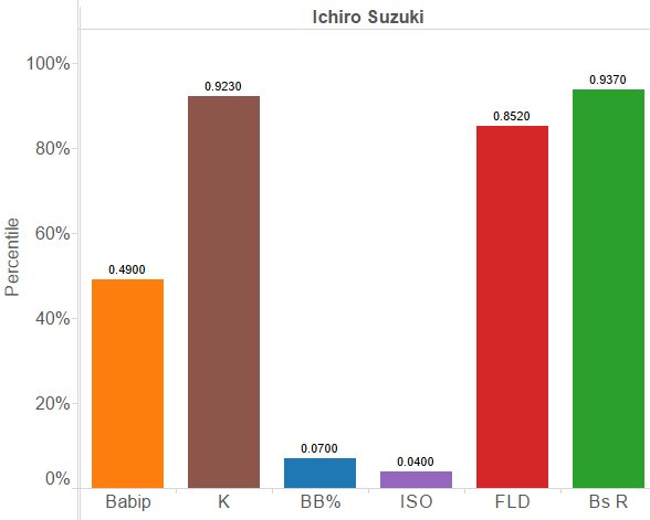
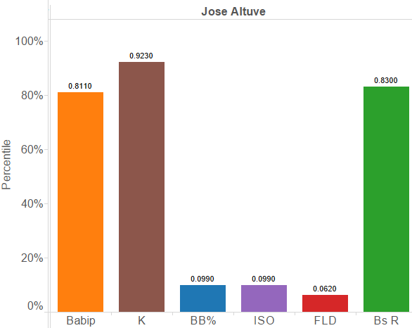
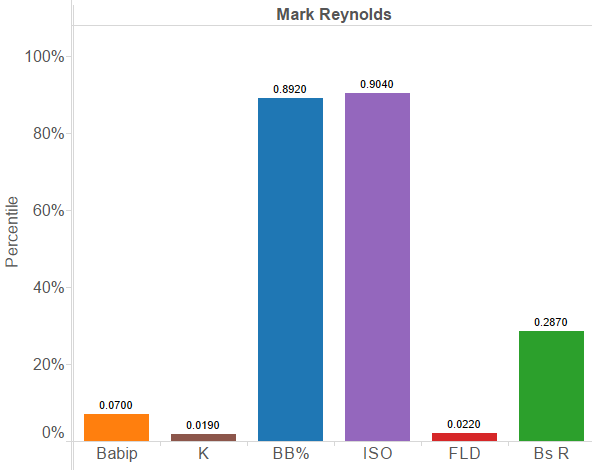
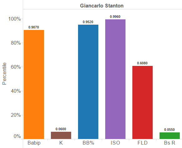
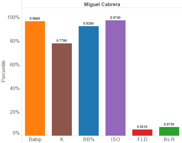
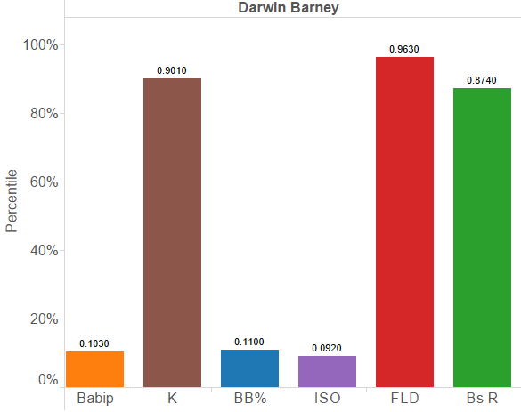
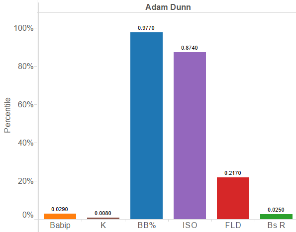
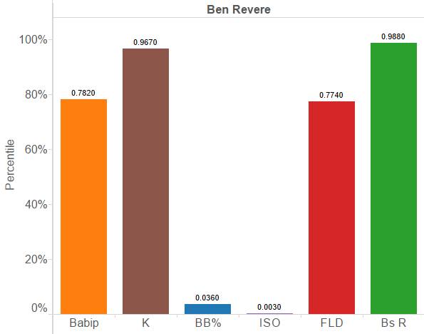
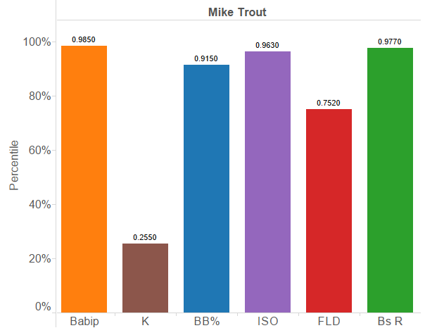
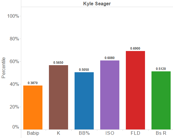
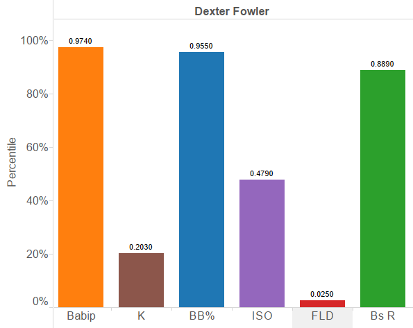
I wanted to assemble a list of players who experienced something like this phenomenon the most frequently. Essentially, I wanted to see what players’ strengths and weaknesses were the farthest apart. To determine those players whose skills varied the most between themselves, I gathered what I consider to be the six stats that best describe what a player’s strengths and weaknesses are. BABIP and K% for contact, BB% for discipline, ISO for power, and Fielding and Baserunning values. I then gathered stats from 2011-2014 to better control for less reliable fielding metrics, assigned each player’s stats a percentile rank, and calculated the standard deviation of those six stats for each player.

For instance, Mike Trout’s attributes look like this:

Mike Trout

His strikeout rate has been higher than MLB average, but he is otherwise an exceptionally well rounded player, as we know.

The most evenly talented player in baseball has been Kyle Seager, who is almost in the middle third at every stat.

Kyle Seager

Many players have much more severe strengths and weaknesses. Here are the 10 players whose stats show the greatest variation from one another.

10. Dexter Fowler

Dexter Fowler

9. Ichiro Suzuki

Ichiro Suzuki

8. Jose Altuve

Jose Altuve

7. Curtis Granderson

Curtis Granderson

6. Mark Reynolds

Mark Reynolds

5. Giancarlo Stanton

Giancarlo Stanton

4. Miguel Cabrera

Miguel Cabrera

3. Darwin Barney

Darwin Barney

2. Adam Dunn

Adam Dunn

1. Ben Revere

Ben Revere

The whole list is fun to look through and play around with, so feel free to click here and look through all the qualifying players.


The Rays, Drew Smyly, and the Changeup

In 2013, Baseball Prospectus chronicled the Rays’ “changeup revolution,” explaining how the Rays’ pitching development has succeeded in part because they teach pretty much everyone to offer a plus changeup in unusual situations. But while successful small market teams have thrived off using analytics to find market dislocations on players, the Rays’ changeup prowess has actually allowed them to create them.

Recently, the Rays were ridiculed for giving up David Price for a package whose most proven player was Tigers’ 5th starter Drew Smyly. At the time of the trade, Smyly had a 3.93 ERA and 4.08 FIP. In other words, he was an average starter. But looking closely, one can see that he pitches to a drastic LHH/RHH split, with opposing wOBA’s of .196/.355, respectively. The reason behind his inability to get righties out could very well be the lack of a good secondary pitch to use on them. For his career, his most effective pitch has been his slider, with hitters putting up a meager .226 wOBA against it. His worst pitch was none other than his changeup, which has been crushed to the tune of a .488 wOBA.

Knowing that his organization specializes in teaching the changeup, I don’t believe for a second that Rays GM Andrew Friedman gave up their ace without thinking that Smyly was essentially a good changeup away from being a potent starter. A free agent in 2019 at the earliest, Smyly should easily provide more long-term value than Price will over the next 1.5 seasons. (Obviously, the Tigers will try to extend Price, but the Rays did not have that option.)

The key takeaway here is that to most teams, Drew Smyly was probably viewed as a league-average pitcher without a secondary pitch that could put righties away. But to a team like the Rays, who have proven to be adept at implementing a changeup, Smyly’s ceiling can appear to be much more feasible. So far with Tampa (small sample size warning), Smyly has thrown 36 innings in 5 starts with an ERA/FIP/WHIP of 1.50/2.82/0.69. He will certainly come back down to earth, but a valuable lesson can be derived from this trade that appeared to be a blatant ripoff. By having an organization’s pitching development specialize so much, the Rays actually manufacture their own list of “buy low” pitchers, many of whom may have plateaued in the minds of other teams.

When they traded Matt Garza, they got current front-end starter Chris Archer in return. From Prospect Instinct’s 2011 scouting report:

The Rays got a haul for Matt Garza from the Cubs and Archer was considered the Cubs top pitching prospect. He has a plus fastball and above average slider, but he still has a lot of work to do before he becomes MLB ready. His changeup is lacking and his command has been erratic. But with enough time he does have #3+ upside.

With a Tampa Bay Rays changeup in his arsenal (.198 wOBA against it in 2014), Archer has done very well for a 3 starter, with a 3.15 ERA and 3.49 FIP over 286 innings since 2013.

Many have noted that Yankees’ starting pitcher Masahiro Tanaka has experienced so much success because he is one of the few pitchers who regularly throws a splitter in the MLB. Perhaps an organization can do what the Rays have done with the changeup and make the splitter a cornerstone of their pitching development. Obviously, such a plan comes with inherent risk. Making the splitter a more commonly offered pitch could take away some of its unfamiliarity-related effectiveness. Also, the splitter is believed to be very taxing on the elbow, a definite red flag given the recent wave of Tommy John surgeries. However, doing what the Rays did with the splitter could make it so that pitchers who are one additional plus pitch away from reaching their ceilings are safer to bet on.


Who Are the 2014 Giants?

The 2014 season has been weird for the San Francisco Giants. They began the year an MLB-best 42-21 (.667) and have gone 27-41 (.397) since. They led the N.L. West by 9.5 games on Jun. 8, but currently trail the first-place Los Angeles Dodgers by five games.

At 69-62 (.527), San Francisco leads the second wild card by one game over the Pittsburgh Pirates.

Marty Lurie, a host on the Giants’ flagship radio station, KNBR 680, says that a baseball season is like a mosaic: you can’t judge it by its individual parts, its moments, games, and plate appearances. Only when you step back and look at the big picture do things come into focus and make sense.

So, now that we’re about to enter the season’s final month (can you believe it’s September already?), it’s appropriate to look back on the season that has been and see how all the moments add up. That’s what baseball is all about.

It’s interesting (and fun) to look at a team’s overall numbers in some key areas, then find individual players whose career or single season statistics are comparable. Let’s get right to it:

2014 San Francisco Giants wRC+: 98

Notable hitters with a career 98 wRC+:

Rich Aurilia: .275/.328/.433, 7.2 BB%, 13.7 K%, .158 ISO, 23 SB, 6,278 PA

Delmon Young: .283/.317/.425, 4.2 BB%, 18.0 K%, .141 ISO, 35 SB, 4,143 PA

2014 San Francisco Giants starting pitcher FIP: 3.66

Notable starting pitcher(s) with a career 3.66 FIP:

Ben Sheets: 3.78 ERA, 7.47 K/9, 2.08 BB/9, 1.04 HR/9, .295 BABIP

Mike Krukow: 3.90 ERA, 6.07 K/9, 3.15 BB/9, 0.81 HR/9, .288 BABIP

Notable starting pitcher(s) with ~ 3.66 FIP in 2014:

Ryan Vogelsong: 3.68 FIP, 3.78 ERA 7.26 K/9, 2.58 BB/9, 0.78 HR/9, .299 BABIP

2014 San Francisco Giants relief pitcher FIP: 3.24

Notable relief pitcher(s) with a career 3.24 FIP:

John Smoltz: 7.99 K/9, 2.62 BB/9, 0.75 HR/9, .283 BABIP

2014 San Francisco Giants UZR/150: 0.0

Notable player(s) with ~ 0.0 UZR/150 in career:

Matt Holliday (0.0 UZR/150 spanning ~ 13K innings in LF)

Edgar Renteria: (0.2 UZR/150 spanning ~ 11K innings at SS)

As you can see, the Giants’ lineup this season (including the pitcher’s spot) has essentially been nine Rich Aurilias or Delmon Youngs, or any combination of the two. Having nine Delmon Youngs in your lineup (disregarding defense) is not the worst thing in the world, but it’s also far from the best. The potential for damage is there, but he’s going to let you down more often than not. If this sounds just about right for the Giants, that’s because the comps are accurate.

Next, the Giants’ starting rotation has been five Mike Krukows or Ben Sheets, or any combination of the two. Or it’s been five 2014 Ryan Vogelsongs. This means that Vogelsong is the typical Giants starter this year—he’s right in the middle of an up-and-down rotation.

The bullpen has been good. John Smoltz (in his career) is a pretty good comp to have for your bullpen as a whole in a season.

Lastly, the Giants defense as a whole in 2014 has been equivalent to how Matt Holliday plays left field or how Edgar Renteria plays shortstop. It’s possible to do worse, but it’s also possible to do a whole lot better.

Delving deeper into the Giants’ defensive issues, Michael Morse has an atrocious (and I mean atrocious) -24.6 UZR/150 in 577 innings in LF this season. His deplorable defense almost completely offsets his terrific 135 wRC+, as he’s been worth just 1.0 WAR this season.

Let’s take the comps a step further by looking at two elite teams in the N.L.:

The Dodgers’ 105 wRC+ this season means they’ve essentially had nine Ray Durhams in the lineup every night.

Durham’s career stats: 105 wRC+, .277/.352/.436, 9.7 BB%, 14.3 K%, .158 ISO, 273 SB, 8,423 PA

And the Dodgers’ 3.50 team FIP in 2014 means that their entire pitching staff has been Garrett Richards.

Richards’ career stats: 3.66 ERA, 3.50 FIP, 7.25 K/9, 3.07 BB/9, 0.63 HR/9, .288 BABIP

Even scarier, the Nationals’ 3.23 team FIP this season means they have been a staff of Curt Schillings.

Schilling’s career stats: 3.46 ERA, 3.23 FIP, 8.60 K/9, 1.96 BB/9, 0.96 HR/9, .293 BABIP

And Washington’s 1.5 UZR/150 team defense means they’ve collectively played as well as Justin Upton plays right field and Erick Aybar plays shortstop.

In summation, the Giants are a decent/pretty good MLB team, but they are clearly not as good as some other teams in the N.L. (and the A.L. for that matter) in some key categories.

On any given day, Ryan Vogelsong might pitch a shutout; Curt Schilling sometimes got rocked. Every now and then, Delmon Young goes 4 for 4 or hits a home run and a double; Ray Durham surely took his share of 0 for 5s. These things happen sometimes. That’s baseball.

But when you step back and look at the big picture, Schilling dealt, Durham outplayed Delmon, and Justin Upton made a fine running catch and throw while Matt Holliday just couldn’t quite get there in time.


Another Take on Pitches Taken

In a recent article on the Community Research pages Andrew Patrick looks at how players and teams fare when they take more or fewer pitches per plate appearance (P/PA), the idea being that you will benefit if you tire the opposing pitchers, see more of their repertoire, etc.  While there is a small correlation there, you’d be hard-pressed to tell a batter not to swing at a hanging breaking ball just because it’s the first pitch.  Take, for example, Madison Bumgarner’s start on June 21, 2011.  The Twins only took 2.5 P/PA, but those PAs resulted in one strikeout and nine hits, chasing Madison after 0.1 innings.  Maintaining a low P/PA didn’t help Bum on that day because he failed to convert those PAs into outs. To contrast with another Giants pitching performance, Tim Lincecum’s 148 pitch no-hitter on July 13 of last year saw more than 4.6 P/PA, an extraordinary number.  But only 4 of those PAs (all walks) failed to make an out.  Clearly not making an out trumps taking pitches.

All of this leads me to a question.  If P/PA correlates weakly with performance, perhaps that’s because we would be better served by looking at pitches seen per out made (P/Out)?  I went ahead and ran those numbers for 2014 to compare the results with Andrew’s P/PA graphs.  For “outs made” I’m considering only outs made at the plate without sac bunts (i.e. outs considered in OBP).  P/PA is in red (left) and P/Out is in blue (right).

The winner (in P/Out) is Mike Napoli, and he has it in a walk, so to speak.  You can see that the correlation gets a bit stronger once you consider outs rather than PAs.  This makes good sense: the spread in P/PA averages is only about 25%…not that big.  By not making an out you do more to increase a pitcher’s count than by making a longer-than-average out.  In fact, let’s just ignore pitches for a moment and look at PAs per out:

The winners here are Stanton and McCutchen; a little more in line with what we expect when we think of good hitters.  While they came in 6th and 5th in P/PA respectively, their OBPs of  0.412 and 0.409 drive them to the top of the PA/Out list.  Overall we see an even better correlation and higher slope.  In turns out the more we focus on outs the more fidelity we get to batting outcomes.  This isn’t to say that seeing pitches isn’t important, but a great way to elevate a pitch count is not to get out.

But let’s change gears for a moment.  Let’s hypothetically stick Mike Napoli on a team with a bunch of free swingers.  The fact that he’s doing all he can to elevate pitch counts won’t really matter if he’s the only one on his team.  He may not see a wOBA benefit from his hard work.  But if the entire team is trying to wear out the pitcher we might see a synergistic effect that drives everyone’s wOBA up.  Here is the same data in the first graph, but for teams instead of players.  The wOBA are also park adjusted.

Impressively there is no correlation between a team’s P/PA and wOBA.  The Red Sox, despite sporting the highest P/PA in the league, have a dismal park-adjusted wOBA while the Brewers’ league-low P/PA leads to a league-average park adjusted wOBA.  You do get a small correlation once you consider P/Out, again demonstrating the supremacy of not making outs.  I won’t put up the graph, but if you look at PA/Out on a team basis you get yet a stronger correlation, as you might expect.

The takeaway from this is that you should take pitches if it helps you be a better batter, but that taking pitches in an of itself does not appear to do that.  It certainly doesn’t add up to anything at the team level.  If you think about it, this makes sense — in order to win a war of attrition it’s not enough to run up the starter’s pitch count.  He’ll still start again in 4-5 days regardless.  What you really want is to chase the starter early and run up the bullpen’s pitch count.  That way in subsequent games they will have fewer options to close out a game or back up a starter who’s having a bad day.  Of course, you may not actually reap the benefits of your hard work if you are near the end of a series.  You might actually expect that if there was any effect to the Red Sox’s patience it would be to help the team their opponents face in the subsequent series.


Why Haven’t the A’s had Any Good Pitch-Framers?

The ability to quantify the value of catcher framing has been one of the biggest sabermetric breakthroughs of the last decade. By parsing through PITCHf/x data, analysts like Mike Fast, Max Marchi, Dan Brooks, and Harry Pavlidis have managed to shed light on which catchers are adept at turning balls into strikes, uncovering hidden value in otherwise unremarkable players, including Rene Rivera, Chris Stewart, and of course, Jose Molina.

MLB front offices have taken notice. Several teams, including the Yankees, Rays, Red Sox, Pirates, Padres, and Brewers have begun hoarding good-framing catchers over the past few years. But one team that’s missing from this list are the Oakland Athletics, who have historically been among the first adapters of sabermetric principles. One would think that the A’s would be all over the Jose Molina‘s and Chris Stewart’s of the world, yet Billy Beane and co. seem to have missed the memo on acquiring good framers. In fact, they’ve made a habit of employing poor ones. According to Baseball Prospectus‘ model, A’s catchers rank fourth from last in framing runs saved this season. This isn’t a one year anomaly, either. Here’s a look at all of the catchers the A’s have used since 2010, along with their career framing numbers.

Catcher Innings Share of A’s Innings FR Runs per 7,000
Kurt Suzuki 2,929 42% -9
Derek Norris 1,854 27% -1
John Jaso 755 11% -16
Landon Powell 540 8% -10
Stephen Vogt 421 6% -4
George Kottaras 217 3% -8
Anthony Recker 125 2% -17
Josh Donaldson 71 1% -9
Jake Fox 59 1% -15

That right there is a pretty sorry group of framers. There’s not a single catcher in the group who’s even above average. So what gives? Why has Billy Beane — who’s nearly synonymous with the term “market inefficiency” — been so reluctant to exploit the latest market inefficiency?

As far as I can tell, there are two possible explanations, and the real answer is probably some combination of the two:

1) The A’s have chosen to employ catchers who excel in areas other than pitch-framing.

2) The A’s aren’t completely buying into all of this pitch-framing stuff.

Let’s start with the first explanation. Since 2010, A’s catchers have accumulated 12.1 fWAR (which doesn’t account for framing), putting them 15th out of 30 MLB organizations. But since 2012, the year after Mike Fast’s research first brought the value of pitch framing to the public’s eye, the A’s rank 10th. The average wRC+ from a catcher is 93, but the A’s have done much better than that of late by employing guys like John Jaso (136 wRC+) and Derek Norris (110 wRC+). Even if you were to dock the Oakland’s catchers for their poor framing skills, they’d still fall somewhere in the middle of the pack in terms of total value. Basically, the A’s have managed to find good, cheap catchers, who generate value in ways other than framing pitches. Plus, for all we know, the A’s might have reason to believe these guys excel in other overlooked areas. They could be superb game callers, for example.

But that can’t be all that’s going on. Sure, the A’s have done a decent enough job of finding catching talent without prioritizing framing, but it’s not like they’ve had Mike Piazza or Johnny Bench behind the plate. Jaso and Norris are fine players, but aren’t exactly superstars. Plus, it should tell us something that they haven’t even brought in any bottom-of-the-barrel framing specialists. Eric Kratz or Chris Stewart were both traded for warm bodies last winter, but the A’s instead chose to roll with Vogt as their primary catching depth.

Perhaps the A’s have reason to believe that publicly available framing models overstate the value-add of a framed pitch? As Dave Cameron recently pointed out, its not entirely clear if the full value of a framed pitch should be attributed to the catcher, with none of the credit going to the pitcher. Current models don’t account for how a pitcher might change his approach based on the framing abilities of his catcher, and research shows that pitchers do in fact change their approach based on who’s catching, throwing a few more pitches outside of the strike zone:

Framing

Oakland’s brain trust is about as progressive as they come, and have a proven penchant for unearthing value from unlikely places. When a team like that zigs while others zag, it probably makes sense to ask why. This isn’t to say that the publicly-available framing data is useless, as having a good framer undeniably adds some value, even if it’s only a few runs. But the fact that the A’s have yet to employ a single plus framer should lead us to wonder if there’s a piece of the puzzle we might be missing.

Statistics courtesy of FanGraphs and Baseball Prospectus.


Team Similarity Scores and 2014 Contenders

Teams have both success and failure in quite a lot of ways, so I am playing with a way of showing what teams look the most alike.  To do this I have created a percent similar score as follows:

First I pulled team level WAR data split into what I am calling HWAR (position players/hitting) and PWAR (pitching) for all teams from 1947 to 2013.  I then converted each of those numbers into a percent above or below league average for that particular season.  For instance, the 2013 Rangers had 21.5 HWAR/19 HWAR league average minus one to convert to percentage, so they have an HWAR% of 13.1 or 13.1% better than average by cumulative war (actual HWARs above are not rounded in the data so it doesn’t round to 13.2% like it does in the example).  I did that for each team and also a PWAR% for each team in the same manner.

Next I compared each team to each other team with a giant 1610 by 1610 matrix, or a little over 2.5 million team pairs, to see how similar the teams were to each other.  The formula for this was 1/((1+ABS(HWAR%i – HWAR%j))*((1+ABS(PWAR%i-PWAR%j)), which gives a percent similarity based on nominal absolute deviation for each team from each other team multiplied together.  That way the deviations can’t cancel each other out and we are bounded between 0 and 1, and each team compared to itself will yield a similarity score of 100% as you would expect.

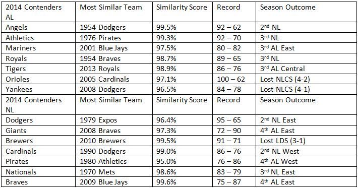
From this we can find some fun historic pairs, but also I will add 2014 YTD data and see who the best matches are for current teams and their results.  The two most similar teams out of the 2.5 million+ pairs were the 1999 Cardinals and the 2005 Nationals with a similarity score of 99.9%.  Both were slightly below-average teams.  The Cardinals were 15.5% below average by PWAR% and 9.6% below by HWAR%, and the Nats were 15.6 below and 9.5 below respectively.  That St. Louis team ended up going 75-86 on the season as we would expect from these numbers, but Washington managed to scrape by at an even .500 at 81-81.

On the other end of the spectrum, the least similar teams were the 1998 Braves and the 1979 Athletics.  That was a fantastic Braves team with PWAR 80.7% above league average and HWAR 97.5% above.  Meanwhile, the 1979 A’s were awful at 65% below average in PWAR and 151% below in HWAR, yes they had a negative HWAR as a team which is impressive if you like train wrecks.  These two teams had a similarity score of 11.7%, and their records show it.  That Braves team won 106 games and that A’s team lost 108 games, that is about as far apart as two teams can get.

There are some legitimately useful things I am planning on doing with these scores down the road, but for today I also thought it might be fun to see who is most like the 2014 contenders and how their respective seasons turned out.

 photo 2014SimilarityTable_zpsd854702b.jpg


The teams in the best probability for the playoffs have the best comps as you would expect with the exception of the Nationals who drew a very mediocre 83 – 79 team as most similar.  Baltimore had the only 100-game winner , but there are plenty of good teams in the mix like the Dodgers comp of a 95-win Expos team.  The different eras prevent us from seeing a ton of playoff outcomes, but none of the comparable teams made it to the World Series.  This year’s lack of any dominant teams might make that an expected outcome, even Buster Olney on the Baseball Tonight podcast today was discussing this very topic.  Of course everyone expected this year’s Detroit team to look like last year’s Royals.

Anyway, this could be a good way to create groups of historical comparisons for teams and the methodology could be broken out more if you want to separate defense, base running, bullpen vs. starters, which could all be done.  How you multiply them together to get appropriate weighting would be the sticky part with that.  It is a simple way to look at teams that had similar outcomes, and WAR allows us to control for ballpark factors and such.  I welcome any comments on other things you think could make it work better.


Not All One-Run Games are Created Equal

It’s the bottom of the fourth. No outs. Your beloved Milwaukee Brewers are up to bat trailing the Dodgers 1-0, with Clayton Kershaw on the mound. They’ve picked up two scattered hits and drawn a walk over four innings, but the sentiment in the dugout and the stands seems to read if they haven’t scored yet, chances don’t look so good.

Consider the same situation, now, with one small change. Your Brewers are still down by a run. It’s still the bottom of the fourth. Kershaw is still dealing. But it’s 2-1 Los Angeles this time. Milwaukee has still only gotten two hits and drawn a single walk, but the timing has worked out such that a run scored. By the numbers, things are almost exactly the same. No question about it. The sentiment, though, is certainly different. We’ve broken through once already, think the players, manager, and fans. We can do it again. Well, of course the Brewers can do it again. But, statistically speaking, will they? That is: when trailing by one run as they enter a half-inning, is a team more likely to come back in a non-shutout than in a game in which they haven’t yet scored?

The answer is “yes,” although only by what initially appears to be a small margin. In 2013, 5705 half-innings began with the batting team trailing by a run. 11.4% (651) of those half-innings ended with the batting team tied or in the lead. The same year, 2915 half-innings began with the batting team trailing specifically by the score of 1 to 0. 11.1% (324) of those ended in a lead change or tie.

At first glance, a 0.3% difference between odds of scoring when down by a run versus the specific case of being down 1-0 seems minor. And it is, really. For years with complete-season data available since 1871, the percent of half-innings started where it’s a one-run game and the losing team up to bat which resulted in a lead change or tie (let’s call this %ORLC) averages out to 11.5% ± 1.3% (1 σ). The subset of these in which the batting team was being shutout (let’s call this %ORSLC) has an average of 10.6% ± 1.1% (1 σ). Middle-school statistics will tell you that while, yes, %ORSLC is on average nearly a percent lower than %ORLC, they fall within a standard deviation of each other and, thus, their difference is not statistically significant.

That’s true. But baseball isn’t middle-school statistics and two subsets whose error ranges overlap are not for all practical purposes equal. Quite remarkably, %ORLC has exceeded %ORSLC for each consecutive season of Major League Baseball since 1977 (when %ORSLC was 0.2% higher) and every year since 1871 except for five seasons (out of the 111 years of complete-season data that were available).

That is: in 106 out of the last 111 seasons for which box scores have been logged every game, a batting team behind in a one-run ballgame has successfully erased the deficit more often when not trailing 1-0. The margin isn’t huge, of course, but the trend is meaningful.

Above: Percentage of one-run game situations and specific 1-0 game situations (%ORLC and %ORSLC, respectively) in which the team losing scores to tie or take the lead

After all, baseball is a game of small but meaningful margins. The 111-year average relative difference between these two metrics (10.6% vs 11.5%) is proportional to a .277 batting average versus .300, or 89 wins in a 162-game season instead of 97. The latter is perhaps a more relevant comparison, since it is gaining (and maintaining) a lead that is crucial to winning games.

Among teams in 2013, however, these differences aren’t so marginal. In %ORLC (percentage of half-innings in which a team trailing by a run ties it up or takes the lead) the Royals finished first at 16.7% and the Cubs finished last at 6.5%. In %ORSLC (same stat but for the score 1-0), the Rays finished first at 16.7% (same number, coincidentally) and the Red Sox finished last at 4.9%. Considering the Royals didn’t make the playoffs in 2013 and the Red Sox won the World Series, I wouldn’t use %ORLC and %ORSLC as indicators of a team’s ultimate success unless you’re looking to lose a lot of money in Vegas.

While one could theorize for hours on the meaning and utility of each made-up statistic, it sure doesn’t seem like %ORLC and %ORSLC are indicative of much on a team-by-team basis. But that doesn’t mean they’re useless. Let’s go back to the long-term trend of %ORLC and %ORSLC, where the former was higher than the latter 106 out of 111 times.

Some underlying process, it would seem, must be responsible for this impressive stat. If we are to believe that teams truly underperform, ever so slightly, when they’re losing 1-0 due only to the fact that they’re being shut out, shouldn’t we able to see the effect of psychology on performance somewhere else?

As it turns out, you don’t have to look far. Let’s consider the general situation of a team coming up to bat down by a run (not only the specifically 1-0 case), which is colloquially termed a “one-run game.” We’ll abbreviate any instance of this (a trailing team coming to bat in any half-inning) as OR. Now this situation could happen at any point in a game. A visiting team leads off with a run in the top of the 1st, the home team comes up to bat – that’s an OR. It’s all tied-up in the top of the 13th, the third baseman slugs a solo shot to left, three outs are recorded, the home team steps up the plate with one chance to stay alive – that’s an OR. So, in what inning on average does an OR occur?

In 2013, the answer was the 4.95th inning. In 2012 and also for the last 111 years of available records, the 4.91st inning. Baseball amazes us once again with its year-to-year consistency in obscure statistics. But this obscure stat isn’t all that meaningful on its own. Okay, so most one-run situations occur near the 5th inning – so what?

Well, let’s take a look now at the average inning in which a team scored in an OR to tie or take the lead. We’ll call this a one-run game situation where the lead changes, or ORLC. In 2013, of all the instances of ORLCs, the average time they occurred was the 5.18th inning. In 2012, the 5.10th inning. And for the same 111 seasons of recorded game data, the 5.20th inning. Once again, we see a marginal but nonetheless compelling deviation from the average, just as we saw with %ORSLC. Teams score in one-run situations about a third of an inning later than the one-run situations tend to occur themselves. That may not seem like a whole lot, but consider that in our 111-season dataset only two years – 1902 and 1912 – saw earlier ORLCs than ORs on average. Just two years in one-hundred eleven.

Above: Average innings of occurrence for one-run game situations (OR) and one-run game situations in which the trailing team scores to tie or take the lead (ORLC)

So what’s going on? I like to think of average ORLC minus average OR as a league-wide statistic for urgency. Consider the following: if the inning number had no effect on the performance of a trailing team in a one-run situation, then we would see roughly the same average inning of occurrence for both OR and ORLC. Out of 111 years, we’d expect to see about 55 years in which OR occurred earlier on average than ORLC and around 55 in which it didn’t. But we don’t see this at all, which strongly suggests that inning number has an effect on how a team does at the plate when down by a run. This is the urgency statistic. It describes a trend that has rung true for the past 101 consecutive seasons of Major League Baseball – when time is running out and the 9th inning is rapidly approaching, teams in close games get their acts together and produce runs. Not every time, of course, but we’re speaking in averages of massive sample sizes here.

So, while your Brewers are likely to fare worse trailing Kershaw and the Dodgers 1-0 than 2-1, take solace in the fact that it’s the fourth inning. Statistically speaking, they’ll have a better chance breaking through as the game goes on and their need for a run becomes more urgent. The effect of team psychology has left its imprint on the records of baseball games since the sport’s earliest days.