Team Similarity Scores and 2014 Contenders
Teams have both success and failure in quite a lot of ways, so I am playing with a way of showing what teams look the most alike. To do this I have created a percent similar score as follows:
First I pulled team level WAR data split into what I am calling HWAR (position players/hitting) and PWAR (pitching) for all teams from 1947 to 2013. I then converted each of those numbers into a percent above or below league average for that particular season. For instance, the 2013 Rangers had 21.5 HWAR/19 HWAR league average minus one to convert to percentage, so they have an HWAR% of 13.1 or 13.1% better than average by cumulative war (actual HWARs above are not rounded in the data so it doesn’t round to 13.2% like it does in the example). I did that for each team and also a PWAR% for each team in the same manner.
Next I compared each team to each other team with a giant 1610 by 1610 matrix, or a little over 2.5 million team pairs, to see how similar the teams were to each other. The formula for this was 1/((1+ABS(HWAR%i – HWAR%j))*((1+ABS(PWAR%i-PWAR%j)), which gives a percent similarity based on nominal absolute deviation for each team from each other team multiplied together. That way the deviations can’t cancel each other out and we are bounded between 0 and 1, and each team compared to itself will yield a similarity score of 100% as you would expect.
From this we can find some fun historic pairs, but also I will add 2014 YTD data and see who the best matches are for current teams and their results. The two most similar teams out of the 2.5 million+ pairs were the 1999 Cardinals and the 2005 Nationals with a similarity score of 99.9%. Both were slightly below-average teams. The Cardinals were 15.5% below average by PWAR% and 9.6% below by HWAR%, and the Nats were 15.6 below and 9.5 below respectively. That St. Louis team ended up going 75-86 on the season as we would expect from these numbers, but Washington managed to scrape by at an even .500 at 81-81.
On the other end of the spectrum, the least similar teams were the 1998 Braves and the 1979 Athletics. That was a fantastic Braves team with PWAR 80.7% above league average and HWAR 97.5% above. Meanwhile, the 1979 A’s were awful at 65% below average in PWAR and 151% below in HWAR, yes they had a negative HWAR as a team which is impressive if you like train wrecks. These two teams had a similarity score of 11.7%, and their records show it. That Braves team won 106 games and that A’s team lost 108 games, that is about as far apart as two teams can get.
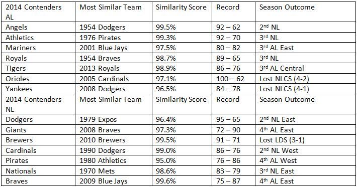
There are some legitimately useful things I am planning on doing with these scores down the road, but for today I also thought it might be fun to see who is most like the 2014 contenders and how their respective seasons turned out.
The teams in the best probability for the playoffs have the best comps as you would expect with the exception of the Nationals who drew a very mediocre 83 – 79 team as most similar. Baltimore had the only 100-game winner , but there are plenty of good teams in the mix like the Dodgers comp of a 95-win Expos team. The different eras prevent us from seeing a ton of playoff outcomes, but none of the comparable teams made it to the World Series. This year’s lack of any dominant teams might make that an expected outcome, even Buster Olney on the Baseball Tonight podcast today was discussing this very topic. Of course everyone expected this year’s Detroit team to look like last year’s Royals.
Anyway, this could be a good way to create groups of historical comparisons for teams and the methodology could be broken out more if you want to separate defense, base running, bullpen vs. starters, which could all be done. How you multiply them together to get appropriate weighting would be the sticky part with that. It is a simple way to look at teams that had similar outcomes, and WAR allows us to control for ballpark factors and such. I welcome any comments on other things you think could make it work better.

Very interesting idea. You may have some lookup issues in the example table with 2014 contenders. Didn’t check the whole thing, but the 2010 Brewers didn’t make the playoffs. That “Most Similar Team” there appears to be the 2010 Reds.
That should definitely say Reds, sorry about that and I can’t fix it once it is posted so it stays.