Archive for visualization

2016 Cubs Run Differential

In this post, I take a look at the 2016 Chicago Cubs though their first 100 games. I’ll start out by focusing on the Cubs’ run differential (Runs Scored – Runs Allowed). After a historic start, they reached their pinnacle after the 67th game of the year against the Pirates. At this point, the Cubs were 47-20 and had outscored opponents by 171 runs! Since then, the ball club is 13-20 and their current run differential is at +153.

Still, the Cubs’ +153 mark is 42 runs better than the next-closest team (Washington Nationals). The Cubs and Nationals are the only clubs to have a run differential that is greater than +100. The second-place Cardinals rank third in the league at +95 right now. While the Cubs dominate the top end of the spectrum, the Reds and Braves are running away with the worst run differentials in the league. The Reds have a -143 mark, largely due to the thrashings they have taken at the hands of the Cubs so far in 2016. The Braves have the second-to-worst differential at -134 runs.

Projected Runs to Wins

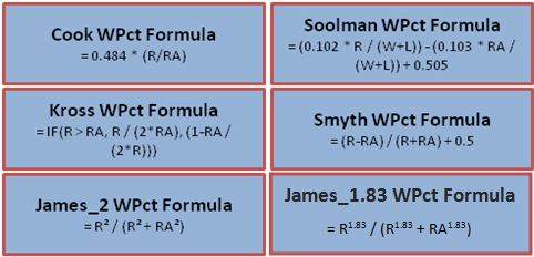
In another place, I introduced the “Pythagorean Theorem’s of Baseball” which basically tries to determine the number of games a team will win based on their number of runs scored and number of runs allowed. Here are the formulas for six of the most common win-percentage projection formulas:
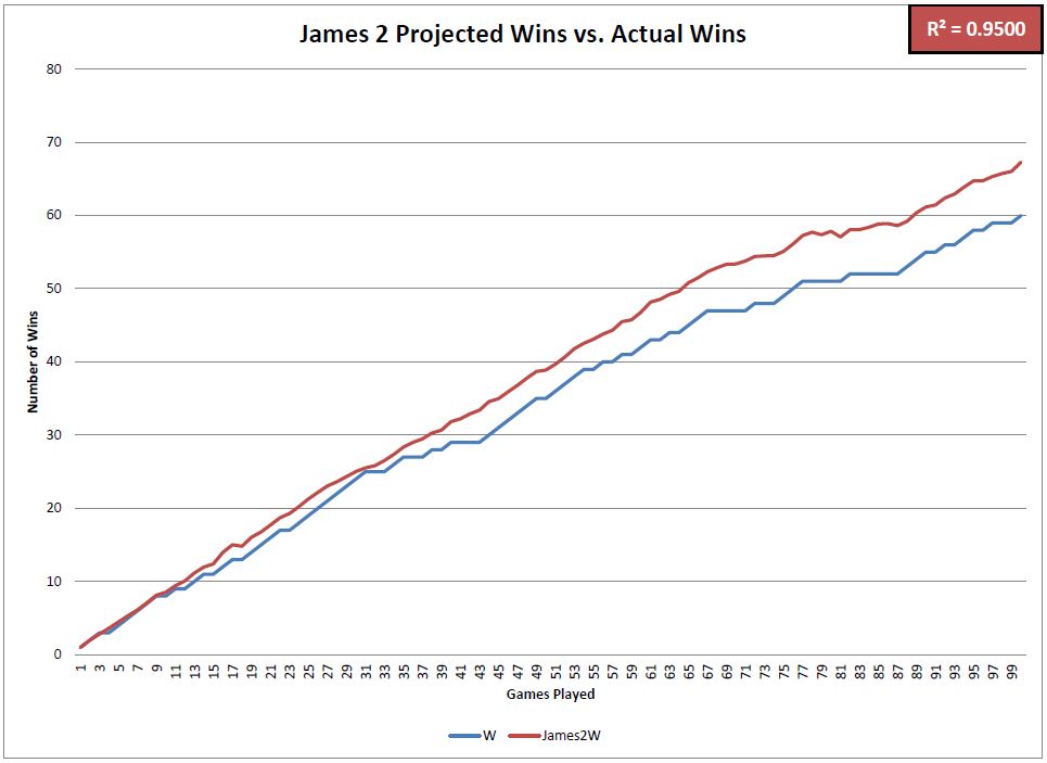
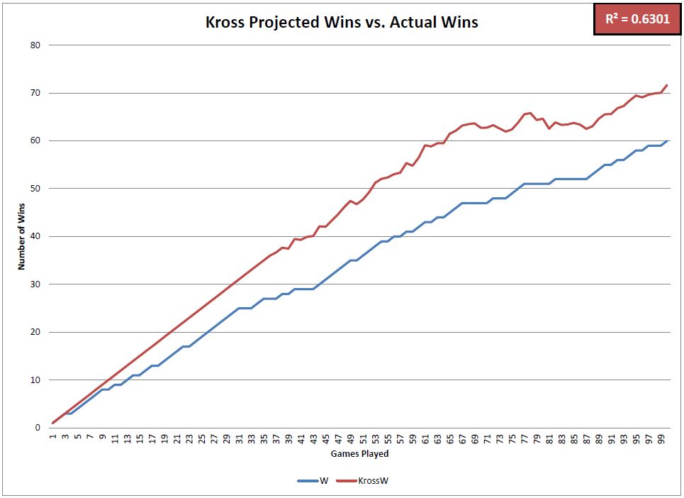
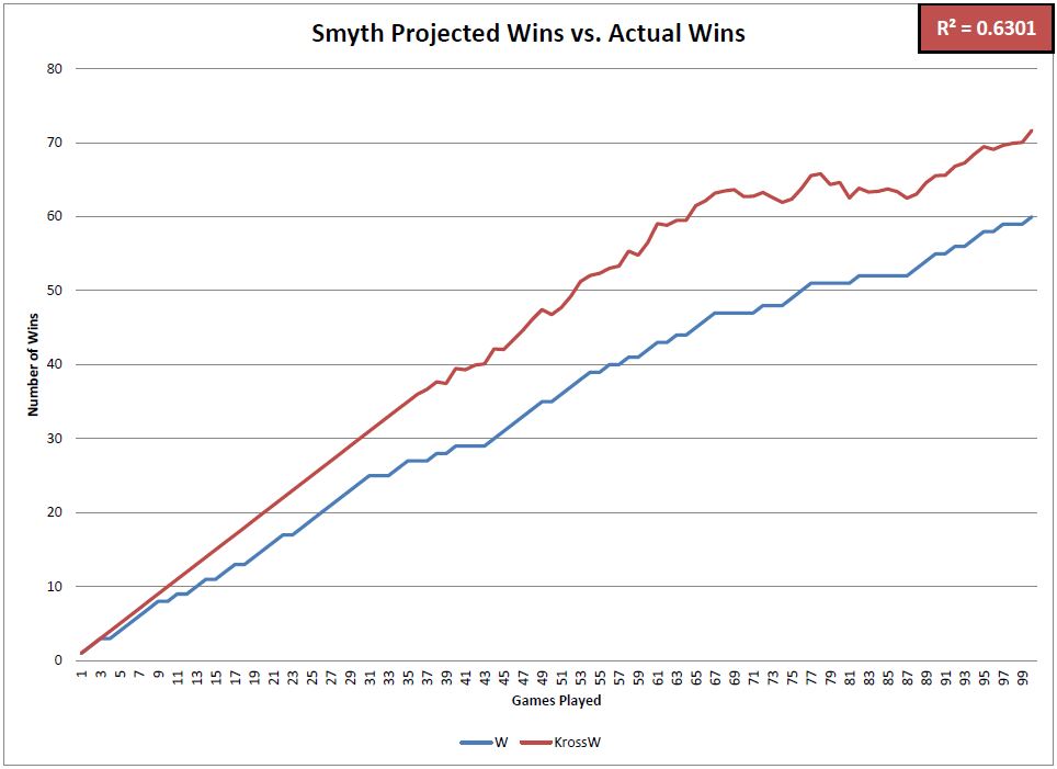
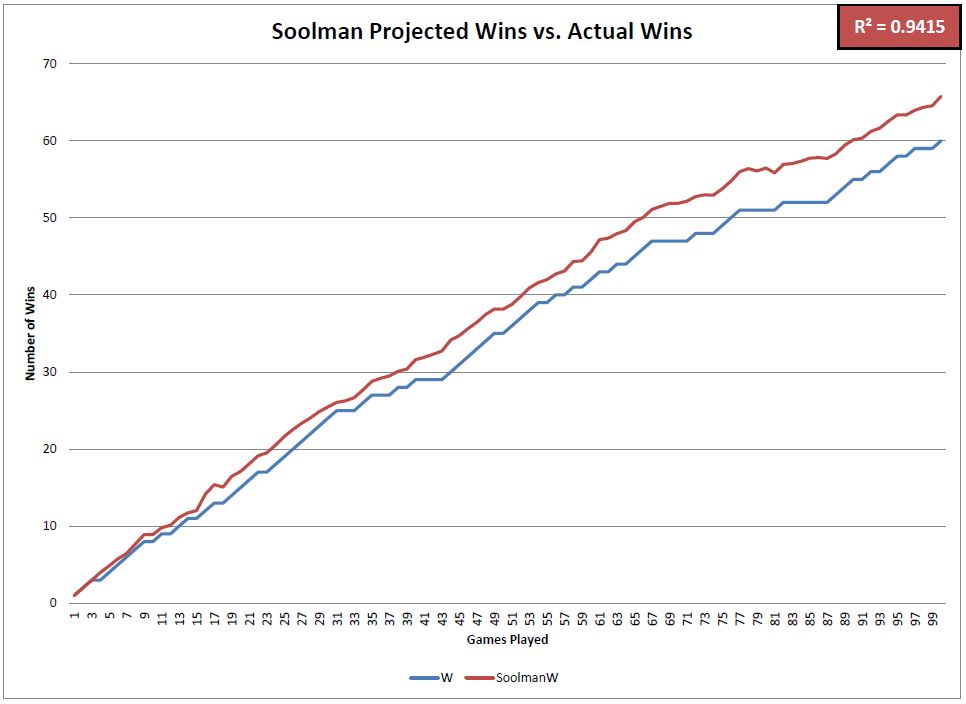
I added up the Cubs’ total runs scored and total runs allowed after each game this year and compared their actual number of wins to the projected number of wins based on each formula. These charts visualize the differences between those numbers.

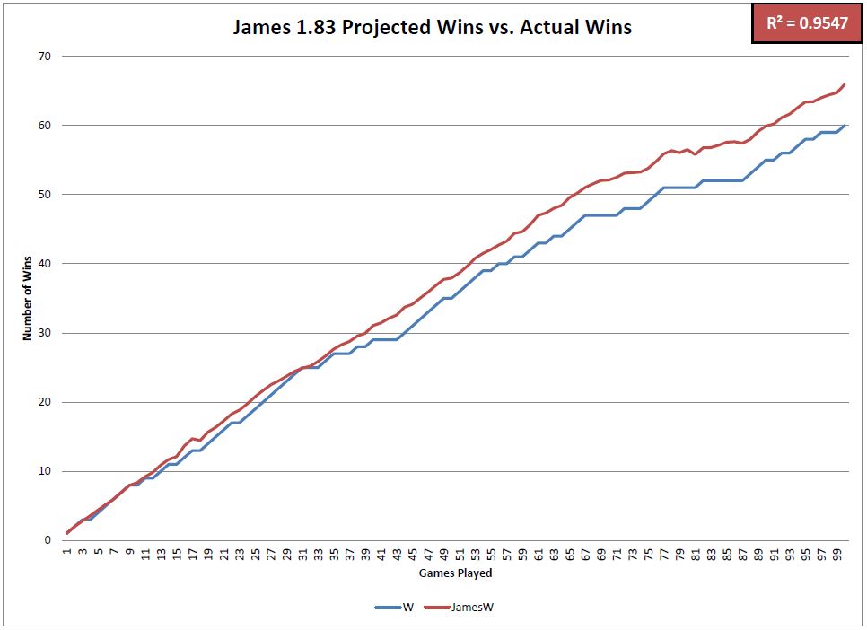
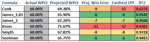
This matrix summarizes how accurate each of the projection formulas has been in predicting the Cubs’ winning percentage and total number of wins so far in 2016. The most accurate formulas was the James_1.83 followed by the James_2 and Soolman. Four of the six formulas were very good predictors, but the Cook and Kross formulas overforecasted the number of wins that they expected the Cubs to have. Notice that at one point this year, each of those formulas projected the Cubs to have over 15 more wins than they actually had. The R^2 value (coefficient of determination) is indicative of how well the projected win percentage matched up to the actual win percentage after each game this season.

All in all, the Cubs have should have at least six more wins this year based on these formulas. Scoring as many runs as they have (4th most in the MLB) and allowing as few runs as they have (T-1st in the MLB) should result in an even better record than 60-40. We knew it was unlikely that they would keep up their record-setting start in the run-differential category, but it will be interesting to see how these numbers match up as the season progresses.

@CubsAdvMetrics on Twitter


MLB Past and Future Payrolls

I’m a big fan of Bill Simmons’ BS Report podcast. Some of my favorite parts are when Bill talks about trade possibilities between teams. It’s always fun to try and step into a general manager’s shoes and imagine what they can and can’t do to improve their teams. During one of these shows, Jonah Keri was on, and he and Bill were doing a pretty good job of breaking down the options that some MLB teams had in the coming years. It seemed like Jonah had a great command of the restrictions on some of these teams and even what the free agent market is going to look like at various points in the future. I found myself trying to picture and organize all this information in my head. I was inspired to map all this out in a big visualization.

Also, I just wanted to find out how screwed my beloved Phillies are in the coming years.

The image below is a link to the visualization:

MLB Payrolls Thumbnail

The first thing you can do is to click the arrows or use the left and right arrow keys to scroll through past and future years. I collected data back to 1998, when the Baltimore Orioles led the league in payroll with players like Mike Mussina and Rafael Palmeiro. Scrolling back to the present day shows a lot of story lines: how the Yankees expanded their payroll way faster than the rest of the league in the early 2000s, fire sales of the Marlins in 2006 and to a lesser extent in 2013, and the Dodgers’ rapid leapfrog to post the absolute largest payroll this year.

When you scroll to future years, the 2013 payroll hangs around as a ghost image to provide a rough benchmark of what you might expect the team to eventually pay. The solid bars drop down to show the contracts that the teams are currently obligated to pay in that particular year. Here, you can clearly see the Dodgers and Angels leading the league in earmarked money over the next few seasons. Going all the way to 2023 shows that the Reds have actually signed the longest contract so far.

Clicking on a team in that upper chart will show a time series of that team’s payrolls over the years broken out by player. For example, clicking on the Reds shows large green boxes way out into the future. Clicking on any of those boxes will show you that first baseman Joey Votto can expect to be paid $25M to play baseball in the year 2023. Each color in these bottom charts corresponds to a position.

There are some caveats here. I grabbed the data from Baseball Reference who gets their data from Cot’s Baseball Contracts. As far as I can tell, the data is not updated very regularly because I know of a couple contract extensions that have not made it onto their pages yet. Those contracts won’t be displayed here.

Also, when a player misses a whole season to injury, that player’s salary doesn’t show up on the Baseball Reference page. I took care to add the biggest instances of these missed seasons back into the data by hand, but I’m sure I didn’t get them all. There’s also the question of whether those salaries really should be here. I believe most teams take out insurance policies on players and thus they aren’t responsible for paying injured players. Since I have no details about that sort of thing, I just tried to include all the missed seasons I could find.

Lastly, teams sometimes agree to pay part of a player’s salary when they trade them away to another team. A good recent example of that is the Cubs paying most of Alfonso Soriano’s salary while he plays for the Yankees. The Baseball Reference site has good information about these arrangements in the current and future years. But the site does not have information about past arrangements. Again, I took care of a couple of the biggest discrepancies by hand (hello Mike Hampton!), but I’m sure there are lots still in there.

Despite those couple issues, I believe this chart does a great job of showing a snapshot of the MLB economy. I learned a lot just clicking around the whole thing while building it. I think it’s a great indication that you’re building something interesting if you constantly get distracted playing with the thing instead of working on it.


Visualizing Major League Baseball During the Aughts

2010 marks the end of the “aught” decade for Major League Baseball.  I thought I would take the opportunity to analyze the last 10 years by visualizing team data.  I used Tableau Public to create the visualization and pulled team data from ESPN.com (on-field statistics) and USA Today (team payroll).

The data is visualized through three dashboards.  The first visualizes the relationship between run differential (RunDiff) and OPS differential (OPSDiff) as well as the cost per win for teams.  The second visualization is in table form and can be sorted and filtered along a number of dimensions.  The final visualization looks at expected wins and actual wins.

Read the rest of this entry »