Archive for UZR

Kiermaier Takes Guaranteed Cash, Rays Upgrade Asset

Center fielder/sabermetric superstar Kevin Kiermaier signed an extension with the Tampa Bay Rays for 6/$53.5M this week. Dave Cameron of FanGraphs notes that he will receive roughly $30M for three arbitration seasons and $12M per year for three free-agency seasons. There will also likely be a $12M team option. Cameron’s article, while rightfully criticizing Major League Baseball’s flawed arbitration system, will run counter to my argument. Kiermaier is an excellent player, no doubt – a defensive whiz, a great base runner, and a league-average bat to boot. One thing that is not on his side is age. Kiermaier will be 27 this season, would have been 30 in free agency, and will be 33 or 34 when his contract is over. Much of Kiermaier’s value is derived from his defensive prowess; he has recorded a 44 UZR for his work in center field in his career. While this is impressive, the precedent for Kiermaier to continue this excellence through his free-agent years is unlikely. Let’s consider the center fielders of the UZR era who have signed significant free-agent contracts.

Major Free Agent Center Fielders’ UZR

Player FA Age Contract CF UZR (Pre-Contract) CF UZR (Post-Contract)
Carlos Beltran 28 7/119M 16.1 15.1
Juan Pierre 29 5/44M 32.6 -0.8
Gary Matthews Jr. 32 5/50M 12.4 -24.4
Torii Hunter 32 5/90M 11.9 -17.7
Aaron Rowand 30 5/60M 46.2 7
Melvin Upton Jr. 28 5/75.25M 18.6 1.6
Angel Pagan 31 4/40M -1.5 -25.6
Michael Bourn 30 4/48M 51.6 -14.2
Jacoby Ellsbury 30 7/153M 28.9 -2

*data via FanGraphs

Here we see a list of center fielders with (mostly) fantastic defensive records before signing a free-agent contract around the age of 30. With the exception of Carlos Beltran, the youngest player on this list, every single one of these players’ defensive values in center cratered. All of them were or will be rendered unplayable in center before the expiration of their contracts. Kevin Kiermaier is a fantastic center fielder, but even he is no immortal among these men. With the stench of the Jacoby Ellsbury deal still fresh in the air, it is likely that most executives around the game will prefer developing defense rather than buying it.

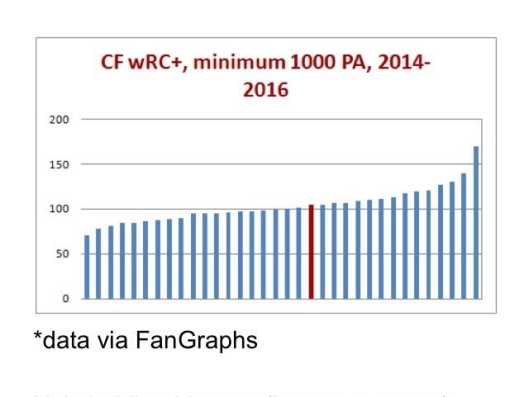
The Rays get to pay Kiermaier $24-36M for 3-4 free-agent seasons in exchange for the guaranteed money during his arbitration years, but if Kiermaier the hypothetical free agent isn’t going to be paid for his defense, is his bat really going to be worth 3/$24M or 4/$36M? Looking at Kiermaier’s place among center fielders with at least 1000 plate appearances in the previous three seasons, his wRC+ made him this red mark on the graph.

wRC+ chart

He’s holding his own (league average), and this is around where he has been for his whole career, but this is also supposed to be his prime. If this is the offensive peak (plateau?) of Kevin Kiermaier, it’s hard to imagine him creating $24-36M worth of value if the plateau crumbles around the age-30 mark.

While Kevin Kiermaier is a bona fide stud, it’s likely he will only be one until he reaches what would have been his free-agent years. By signing this extension, I believe Kiermaier increased his career earnings, while taking that money guaranteed. However, don’t presume that Tampa was reckless about the $24-36M they will allocate to Kiermaier over those last three or four years; precedents can be broken, and he is an awesome player. It’s also important to consider the new asset that Tampa upgraded to, a nice Adam Eaton-esque carrot to dangle in front of interested teams – seven years of control of Kevin Kiermaier.


Using Recent History to Analyze Dee Gordon’s Defensive Improvement

Dee Gordon is a polarizing player. His all-speed, no-power approach on offense has both fans and projection systems divided on what to make of his bat. Is he an elite offensive second baseman? Is he a one-hit wonder that won’t be able to repeat his numbers from 2015? Reasonable people can really disagree on Gordon’s bat.

Reasonable people can also really disagree on Dee Gordon’s defense, and that’s where I intend to focus my analysis today. Dee Gordon led all second basemen with a 6.4 Ultimate Zone Rating (UZR), which means he was worth roughly six runs on defense compared to an average second baseman. That doesn’t sound too unreasonable, right? Here’s where things get interesting. Gordon, despite his obvious athleticism, had previously been considered a below-average defender, coming in with a -3.4 UZR last year at second base. He had been a massively below-average defender at shortstop (where he played a few years ago before moving to second base full-time in 2014), so there are years of data painting him as a minus defender relative to other middle infielders.

In 2015, Gordon’s advanced defensive metrics took a massive jump forward. Dee Gordon improved by exactly 10 runs according to UZR, which is roughly an entire win difference thanks to his defense. Which defender is the real Dee — the one that flailed around in 2014, or the elite defender from 2015?

Let’s find some historical comparisons, and see what they can teach us about the repeatability of Dee Gordon’s defensive statistics.

We know Dee Gordon improved 10 runs defensively at second base to become one of the best defenders in the league at the position. Let’s take a look at the past 10 years, and find all second basemen that improved by at least 10 runs in UZR from year to year and had a UZR of at least 5 in the improved year. There are 16 player seasons that fit this criteria. Excluding those that didn’t play enough innings to qualify at second, 11 player seasons were left fitting the criteria. The numbers are presented below, along with the UZR that the player recorded the season following his improved year.

Table of Dee Gordon Comparisons

Among the second basemen in the last 10 years that made a big jump into the elite of the defensive statistics, on average those players lost almost nine runs of UZR the following season after the leap. The group lost about 60% of the improvements they had made the following season, indicating that a big jump in UZR for a second baseman is unlikely to signal a new level of performance. Among the qualifying group, not a single second baseman improved their UZR the following year again and only one member of the group, Placido Polanco in 2009, regressed by less than four runs.

However, there is a slight bright side. Only one member of the group had a UZR that was lower the year after “the leap” than before the improvement, indicating that taking a leap of over 10 runs of UZR means you almost certainly have improved as a defender. It’s just not by nearly as much as you would think from the leap-year UZR, but the players kept about 40% of the improvement they made in their improved year.

What does this mean for the Marlins’ speedy second baseman? While Dee Gordon’s huge jump in UZR this year means he’s almost certainly a better defender than he was two years ago, the improvement to his talent is likely only modest and not nearly what you would hope for after his great 2015 defensively. To those who pointed to Dee Gordon’s greatly improved UZR this season as a reason to believe he’s made big strides as a defender, I’ll sadly have to point out that we can expect Dee Gordon to return much closer to the mediocre defender he was in 2014 than the star he was in 2015.


The Improvement of the Indians Starting Rotation

Remember at the end of last season and before this season when we all foresaw an Indians rotation that could possibly feature somewhere between 2 and 5 really good, and possibly great, starting pitchers?  Don’t get bogged down on the slight exaggeration of that 1st sentence – To recap what we were looking at coming into this season for the Indians’ rotation:  Corey Kluber won the 2014 AL Cy-Young; Carlos Carrasco had a string of starts to end 2014 in which he seemingly (finally) figured out how to harness all of his powers in a bid to ascend his name to an echelon where only Clayton Kershaw’s name resides; Danny Salazar has always had elite swing and miss stuff and was also excellent in the second half of 2014;  Trevor Bauer and his Costco-sized arsenal of pitches have made some of us incredulously, if not warily optimistic since he was taken 3rd overall in 2011; and even T.J. House made us pause and take notice with his strong second half of 2014.

Then, like hype men with a special blend of Cleveland Kool-Aid being intravenously administered, Eno Sarris and Daniel Schwartz posted one of my favorite FanGraphs articles ever, Pitch Arsenal Score Part Deux, and the anticipation over the Indians’ rotation pulsated like a vein in the neck of John Rambo in the midst of fleeing from man-hunters.

The supporting cast, the lineup, looked poised to support the staff with plenty of runs.  Returning would be: break out star Michael Brantley; bounce-back candidate Jason Kipnis; now-full-time-first-basemen, Carlos Santana; a supposedly healthy Michael Bourn; an offense-first but totally-respectable-defensively, Yan Gomes; and an actually-not-that-horrible-in-2014, Lonnie Chisenhall.  Slugger Brandon Moss, and contact-happy-supposedly-glove-first Jose Ramirez had secured full-time spots as well in RF and SS respectively.  So even though it wasn’t without flaws, it seemed like they would allow the pitchers to rack up plenty of fantasy-relevant wins.

Note: This post isn’t about the disappointment of the Indians, though they have been disappointing; it’s more about what factors beyond luck have contributed to the numbers of the Indians’ starting rotation at various points throughout the year, and the disparity (big or small) between the pitchers’ rates and predictors at those points.

The Indians’ starting pitchers, or at least the top 4 (Kluber, Carrasco, Salazar, and Bauer) have, for the most part, been putting up good, albeit, inconsistent numbers all year despite posting some elite peripheral rates and ERA indicators.  A number of reasons have caused these numbers to grow apart (bad), come together, and then grow apart again (good).  Luck can work like a bit of a pendulum, swinging from one extreme, through the middle, and to the other extreme before evening out and that is at the core of what the Indians’ starting pitchers have experienced this year — although they have yet to experience the final stabilization phase.

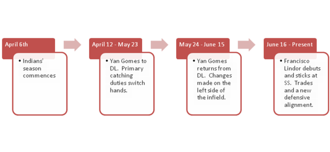
We will examine plenty of numbers (Beginning of season to August 18th) based on this time frame: (Spoiler alert – this article is long and dense, and this timeline serves as a sort of cliff notes as to how the staff’s numbers have improved throughout the year – so if you’re the type of person who feels like looking at a bunch of data is superfluous when the bullet points are in front of your eyes, just read the timeline and be done with it.)
timeline

April 6th – May 23rd/May 24th – June 15th

One week into the season, before it was evident that the team’s defense was very sub-par, Yan Gomes hurt his knee and hit the disabled list for over a month.  Roberto Perez filled in quite nicely, and looking at just a couple numbers, could be considered the more valuable catcher (1.4 WAR compared to 0.5 WAR for Gomes).  Brett Hayes (0.0 WAR) was called up and was the secondary catcher during this period.  Behold, a table from StatCorner:

statcorner


Perez has had the least amount of pitches in the zone called balls and the most amounts of pitches out of the zone called strikes.  Overall, despite receiving fewer pitches than Gomes, he has saved more runs (4 DRS to Gomes’ 1) and their caught stealing rates are basically identical with a slight edge going to Perez – 38% to Gomes’ 35%.  Gomes was much better in terms of framing in 2014, and it’s possible the knee injury has limited his skills all around this season.  Anyways, from April 6th – May 23rd, the combined stats of Kluber, Salazar, Carrasco, and Bauer look like this:

ERA FIP xFIP SIERA K-BB% GB%
Kluber 3.49 2.16 2.46 2.51 25.3 48.6
Salazar 3.50 3.27 2.46 2.30 28.7 43.8
Carrasco 4.74 2.60 2.67 2.82 22.3 48.9
Bauer 3.13 3.23 4.09 3.94 14.2 35.7
3.75 22.7 44.7

Gomes returned as the primary catcher on 05/24, and from that point through June 15th, the cumulative numbers aren’t too different, although there is a dip in both K-BB% and GB% that we’ll have to look into.

ERA FIP xFIP SIERA K-BB% GB%
Kluber 3.67 3.26 3.20 3.19 19.8 43.8
Salazar 3.60 3.72 3.36 3.43 17.3 47.7
Carrasco 3.65 2.83 3.29 3.17 20.2 44.1
Bauer 3.96 4.72 4.47 4.30 11.5 36.8
3.74 17.2 43.1

So despite lower K-BB and ground ball percentages (leading to higher ERA predictors), the group’s ERA in the segment of the season when Gomes was reinstated is essentially exactly the same as from the first block of time with Perez.  Now, I am not a big believer in CERA because there is a high level of variation and too many unknown variables pertaining to how much of the responsibility/credit goes to the catcher, the coaching staff, or the pitcher; but I do think that it’s possible Gomes’ extra service time has enabled him to be more in tune with his staff as well as understand hitter tendencies better than Perez and Hayes.  I realize we’re getting into a gray area of intangibles, so I’ll reel it in with some results based on pitch usage%.

% Difference in Pitch Usage with Yan Gomes compared to Roberto Perez

Pitcher FB% CT% SL% CB% CH% SF%
Corey Kluber -9.0 8.8 -17.3 5.0
Danny Salazar 9.8 -12.6 -4.4 17.1
Carlos Carrasco -6.5 9.4 49.2 13.3
Trevor Bauer -2.9 -15.0 -8.9 78.5 25.8

Using BrooksBaseball Pitch f/x data, let’s painstakingly find out how different each pitcher’s pitch usage was in regards to different counts, or better known as Pitch Sequencing.  We’ll look at first pitches, batter ahead counts, even counts, pitcher ahead counts, and 2 strike count situations.  As good as pitch f/x is, the data still isn’t perfect.  There may be discrepancies if you look at usage at Brooks compared to the usage at FanGraphs, so for each pitcher we’ll split the pitches up into three categories: Fastballs (four-seam, sinkers, cutters), Breaking Balls (sliders, curve balls), and Change Ups (straight change/split finger) – I’m aware that splitters are “split fingered fastballs”, but I liken them to change ups more because of the decreased spin rate and generally lower velocity.

*Having a table for each pitcher in regards to pitch sequencing made this article quite messy, so I’ve included a downloadable Excel file, and briefly touched on each pitcher below.

Pitch Sequencing Excel Doc.

Corey Kluber

Looking at the data, Gomes stays hard with Kluber more than Perez until they get ahead in the count.  Perez swaps some early count fastballs for curve balls, but they both see his curve ball as a put-away pitch.  Gomes tends to trust Kluber’s change-up more than Perez later in counts and Perez likes it more earlier in counts.

Danny Salazar

Much like with KIuber, when Gomes catches Salazar, they have a tendency to stay hard early.  Gomes pulls out Salazar’s wipe out change up after they’re ahead whereas Perez will utilize it in hitter’s counts as well.

Carlos Carrasco

Carrasco has 5 good pitches and he’s pretty adept at throwing them for strikes in various counts which is why there is some pretty even usage across the board, at least in comparison to Kluber and Salazar.  There is quite a bit more usage of Carrasco’s secondary pitches in all counts and there are pretty similar patterns when Gomes and Perez are behind the plate.  With Hayes, it doesn’t look like there is much that changes in sequencing until there are two strikes on a hitter.

Trevor Bauer

Bauer is probably a difficult pitcher to catch because of the number of pitches he has and the constant tinkering in his game.  Side note: Gomes is the only catcher to have caught a game in which Bauer threw cutters, and in their last game together, Bauer threw absolutely no change-ups or splits.  Bauer’s highest level of success has come with Hayes behind the plate and perhaps that’s from their willingness to expand his repertoire in more counts than Gomes and Perez do, but there is no way I can be certain of that.

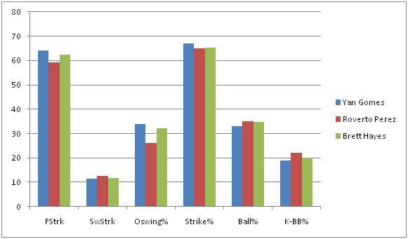
Pitch sequencing can effect the perceived quality of each pitch and therefore, can produce more favorable counts as well as induce higher O-Swing and SwStrk percentages (or less favorable and lower).  So despite the framing metrics favoring Perez, the group throws more strikes with Gomes and also induces more swings at pitches outside the zone – although, as previously noted, there is some regression with Gomes behind the dish in terms of SwStrk% and K-BB%.
swing tendencies


aaa0ide


**These graphs represent numbers through the entire season to garner a bigger sample size.

With lower line drive rates and more medium + soft contact, and (in the case of the Indian’s defense), more fly balls, a conclusion could be jumped to that the staff’s BABIP has trended downward since Gomes regained his role.  A look at BABIP throughout the course of the season:

babip


Woah!  It was well above league average in April and then plateaued at just above league average through mid June, but has been plummeting ever since.  Obviously a catcher is not responsible for this dramatic of a swing in BABIP, so the Indians’ defense must have improved.

June 16th – August 18th

The rotations’ traditional stats look even better if you use June 16th as the starting point:

Pitcher IP H K BB W ERA WHIP
Corey Kluber 84 61 82 16 5 3.11 0.92
Danny Salazar 71 46 69 23 5 2.79 0.97
Carlos Carrasco 77.1 56 77 13 3 2.91 0.89
Trevor Bauer 68.1 69 63 24 4 5.80 1.37
300.2 232 291 76 17 3.59 1.03


So let’s take a look at the Indians’ defensive alignment by month (Player listed is the player who received the most innings played at the position).


POS April May June 1 – 8 June 9 – 15 June 16 – 30 July August
C Perez Perez Gomes Gomes Gomes Gomes Gomes
1B Santana Santana Santana Santana Santana Santana Santana
2B Kipnis Kipnis Kipnis Kipnis Kipnis Kipnis Ramirez
3B Chisenhall Chisenhall Chisenhall Urshela Urshela Urshela Urshela
SS Ramirez Ramirez Aviles Aviles Lindor Lindor Lindor
LF Brantley Brantley Brantley Brantley Brantley Brantley Brantley
CF Bourn Bourn Bourn Bourn Bourn Bourn Almonte
RF Moss Moss Moss Moss Moss Moss Chisenhall

If you’ve paid attention to the Indians at all, you know they’ve made some trades and called up a couple prospects.  But just how different is the new defense?  Well, we only have a small sample with the current configuration, but it appears to be A LOT better. If BABIP wasn’t enough of an indicator, and it’s not, because there has to be some regression to the mean – it can’t stay that low – here are some numbers from the players who were playing the most in May compared to the players who are playing the most in August (again, numbers represent full-season stats):


MAY PLAYER FLD% rSB CS% DRS RngR Arm UZR UZR/150
C Perez .994 2.0 38.5 4
1B Santana .997 -6 0.0 0.7 1.2
2B Kipnis .988 4 4.5 3.6 7.0
3B Chisenhall .963 7 3.1 3.3 10.5
SS Ramirez .948 -2 -2.4 -5.2 -21.9
LF Brantley .992 1 0.3 -2.1 -1.4 -3.3
CF Bourn 1.000 4 -7.2 1.1 -5.8 -11.4
RF Moss .975 -4 1.7 -2.5 -1.1 -1.8
AUG PLAYER FLD% rSB CS% DRS RngR Arm UZR UZR/150
C Gomes .996 0.0 35.0 1
1B Santana .997 -6 0.0 0.7 1.2
2B Ramirez 1.000 1 1.1 2.8 23.2
3B Ursehla .973 2 4.5 6.0 15.7
SS Lindor .967 6 6.0 4.9 14.9
LF Brantley .992 1 0.3 -2.1 -1.4 -3.3
CF Almonte 1.000 2 0.4 -0.2 0.9 10.0
RF Chisenhall 1.000 4 1.6 0.5 2.3 27.3

What’s interesting is that the biggest difference in the infield is Francisco Lindor (Giovanny Urshela has been very solid, but Chisenhall was pretty similar this season at 3B).  I’m sure someone at FanGraphs could churn out a really cool article (if someone hasn’t already) that shows us a quantifiable difference an above average to well above average shortstop makes for a team even if you just keep the rest of the infield the same, as the control.  The 2015 Tigers come to mind – a healthy Jose Iglesias has made a difference for a team that still features Nick Castellanos at 3B and Miguel Cabrera at 1B.  Teams are willing to sacrifice offensive contributions if a SS has elite defensive skills (Pete Kozma, Andrelton Simmons, Zack Cozart to name a couple off the top of my head).  Lindor, to this point, has been an above average offensive player, too, so this could be special.

At this point the Indians are in last place and are out of contention.  Abraham Almonte is their starting center fielder and with Kipnis back from the DL, Jose Ramirez is not playing 2B, but is instead getting reps in left field while Michael Brantley DHs due to his ailing shoulder.  Perhaps all this means is that they don’t have better replacements; OR PERHAPS they’re planning to establish a more defense-oriented squad next year…

Now there’s no doubt that this research has led to some frustrating conclusions.  With Gomes behind the plate, the K rate and GB rate of the staff has trended in the wrong direction in regards to ERA indicators; so is the difference in the batted ball profile plus an improved defense enough to make up for these facts?  This small sample size thinks so, but it could 100% just be noise.  However, there are clubs that are succeeding by using similar tactics right now:

Team ERA FIP ERA-FIP GB% (rank) SOFT% (rank) OSWING% K-BB% (rank)
Royals 3.57 3.93 -0.36 42.1 (29th) 18.1 (16th) 30.9 (19th) 10.5 (26th)
Rays 3.63 3.79 -0.16 42.4 (28th) 18.7 (13th) 31.2 (17th) 14.8 (7th)
Indians (as a reference) 3.85 3.65 0.20 44.7 (17th) 18.2 (15th) 33.3 (2nd) 16.9 (1st)

Granted, the Royals and Rays have the 1st and 2nd best defenses in baseball, and their home parks play differently than the Indians, but they also don’t boast the arms the Indians do.

The Indians have their noses deep in advanced metrics and having rid themselves of Swisher, Bourn, and Moss during 2015’s trading period has allowed them to deploy a better defensive unit which has amplified their biggest strength – their starting pitching.  Furthermore, their unwillingness to move any of their top 4 starting pitchers also leads me to believe they see next year as a time for them to compete.  I’m not going to speculate what moves the Indians will make in the offseason, but I hope they stick with this defense-oriented situation they have gone with recently because it’s been working (and because I own a lot of shares of Kluber, Carrasco, and Salazar in fantasy).

Testing the Eye Test: Part 2

Sorry for the relatively long delay – sometimes life gets in the way of our best laid plans. In case you want a refresher, here is part 1: http://www.fangraphs.com/community/testing-the-eye-test-part-1/

In part 1, I found that, counter to my expectations, range correlated most strongly with FSR data of all the UZR components (UZR itself had a stronger correlation with FSR). I expected the strongest-correlated component to be errors, which was actually one of the least-correlated components. However, I wanted to go a little bit farther and look at the difference between correlations between the UZR components and FSR and the correlations between the UZR components and UZR itself to get a sense of what the fans weight more than UZR does. As a reminder, here is the data set I compiled for this analysis:

“I pulled the defensive stats of every player who qualified (minimum of 900 innings) at a position from 2009-2014 (FSR data is only available for those six seasons on FanGraphs). I then disregarded catchers, as UZR does not cover the position. Likewise, pitchers are left out because they are not covered by UZR or FSR. That left me with 761 player seasons across the other seven positions.”

Without further ado, here are the correlations between UZR and its components:

Position |# |ARM |DPR |RngR |ErrR
1B |118 |N/A |0.207 |0.930 |0.326
2B |117 |N/A |0.275 |0.907 |0.465
3B |107 |N/A |0.166 |0.948 |0.386
SS |130|N/A |0.459 |0.866 |0.384
LF | 71 |0.584 |N/A |0.895 |0.196
CF |115 |0.357 |N/A |0.935 |0.069
RF |103|0.310 |N/A |0.906 |0.061

I always had a suspicion that range was the most important component of UZR but these results are insane. It turns out range is far and away the most important component of UZR. Interestingly, the weakest correlation for range is at SS, perhaps because shortstops without proper range are moved to another position. ARM, although only calculated for outfielders (a real shame as Andrelton Simmons deserves credit for being able to make this throw), has the second-strongest correlation but lags range by a large amount. Like the FSR correlation, it is surprising that LF has a stronger ARM correlation than CF or RF. DPR narrowly edges out errors, although the correlation for errors is far stronger when you only consider infielders. Now, to get a sense of the difference, here’s the two sets of correlation subtracted from each other (positive numbers mean the correlation with UZR is higher and negative numbers mean the correlation with FSR is higher):

Position | # | ARM | DPR | RngR | ErrR
1B | 118 | N/A | -0.005 | 0.644 | 0.006
2B | 117 | N/A | 0.116 | 0.437 | -0.082
3B | 107 | N/A | 0.011 | 0.315 | 0.125
SS | 130 | N/A | 0.095 | 0.437 | 0.041
LF | 71 | 0.074 | N/A | 0.369 | 0.010
CF | 115 | 0.120 | N/A | 0.441 | -0.002
RF | 103 | 0.096 | N/A | 0.365 | -0.006

There are two different ways to look at this: one is that FSR has nearly the same correlation as UZR in most categories. That’s good! It lends a lot of credibility to FSR to know that you can predict FSR nearly as well as UZR with ErrR or DPR. On the other hand, look at the huge difference in the range column. It appears that the fans are severely underestimating the importance of having great range (or have different ideas of how to evaluate range). That’s a problem! As we just saw, range is the most important component of UZR for every position. It is also not terribly surprising as I hypothesized at the beginning of this series that the fans are underestimating the importance of range in favor of flashier tools. This also explains a lot of the discussion about Derek Jeter’s defensive ability (or lack thereof).

This sums up the research portion of this series. I think all of this does lend a lot of credence to FSR: it does reflect that range is the most important component of defense and it does a good job of properly ranking the importance of the other components. In addition, the correlation between FSR and UZR is fairly strong but not so strong that the two systems are interchangeable. However, when considering FSR, be sure to mentally adjust when a player has particularly good (or bad) range.

In part 3, I will examine some of the player seasons that produced the most disparity in the two rankings.


Testing the Eye Test: Part 1

As long as I can remember, I’ve been a fan of good defense. Growing up my favorite player was Andy Van Slyke, and as a Braves fan I’ve had the privilege of rooting for defensive wizards such as Greg Maddux, Andruw Jones, and now Andrelton Simmons. Advanced defensive statistics are one of the things that drew me into sabermetrics and I spend entirely too much time obsessing over pitch framing.

Foremost among the new wave of statistics is UZR, Ultimate Zone Rating, which is the metric that is used to calculate the defensive portion of fWAR. In addition, Fangraphs also carries DRS and FSR, or Fans Scouting Report. While UZR is my preferred metric, I’ve always been intrigued by FSR. After all, I pride myself on my knowledge of the defensive ability of players on my favorite team and it makes sense to me that there is a wide population that has a pretty good idea of the quality of Chirs Johnson’s defense (namely, that it sucks but improved a lot in 2014).

I decided to take a look at the correlation between a player’s FSR and the components of his UZR (ARM, DPR, RngR, and ErrR, as well as total UZR). For this exercise, I pulled the defensive stats of every player who qualified (minimum of 900 innings) at a position from 2009-2014 (FSR data is only available for those 6 seasons on Fangraphs). I then disregarded catchers, as UZR does not cover the position. Likewise, pitchers are left out because they are not covered by UZR or FSR. That left me with 761 player seasons across the other seven positions. Here’s the correlations between FSR and UZR and its components for those seven positions:

Position |#    |ARM |DPR  |RngR  |ErrR   |UZR
1B           |118 |N/A   |0.213 |0.285 |0.320 |0.396
2B          |117  |N/A   |0.159 |0.470 |0.547  |0.637
3B          |107 |N/A   |0.154 |0.632 |0.261  |0.673
SS           |130|N/A   |0.363 |0.428 |0.344 |0.592
LF           | 71  |0.510 |N/A  |0.526  |0.186  |0.664
CF           |115 |0.237 |N/A  |0.493 |0.071  |0.548
RF           |103|0.214 |N/A  |0.541  |0.067  |0.613

There’s a lot to look at there, but first let me draw your attention to one fact: UZR has a higher correlation for every position than any one of its components at the same position. That’s a big plus for FSR, as it shows the fans don’t get so caught up in one area of a position to ignore how it fits into the whole. It also runs counter to my expectations, as I expected the fans to strongly favor players who avoided making errors (as it seems the voters of the Gold Gloves do). Instead, the component that averages the strongest correlation is range, with ARM (which is only calculated for outfielders) a distant second. Errors only beat out double play runs, which is an indication of how informed fans have moved from using errors as the primary way to evaluate defense. Indeed, errors had a strongest correlation of any component at only two positions: 1B and 2B. Further, errors had an extremely weak correlation with FSR in the outfield, with CF and RF featuring almost no relationship at all.

I was also struck by how strong the correlation between FSR and UZR was at every position. With the exception of 1B, every position’s correlation between the two metrics was above .5, with four of the seven positions above .6. The correlation between FSR and UZR was strongest at 3B, with LF a close runner up. 3B also features the strongest correlation between FSR and a component of UZR – in this case, RngR – and the smallest gap between UZR and one of its components. This finding surprised me, as I typically picture range as a CF tracking down a fly ball hit far over his head. Indeed, the average correlation between RngR and FSR is higher in the OF (0.520) than in the IF (0.454) despite the strength of the correlation at 3B.

I was also surprised to see the strongest correlation between ARM and FSR in LF, not RF which is typically known as the haven for strong arms. I have two theories to explain this incongruity: the first is that this simply is a small sample quirk. The other is that the selection bias for RF creates a situation where the distribution between the strongest and weakest arms is simply too small to make a significant difference in the data. Indeed, the range between the highest ARM in RF (Jeff Francoeur’s 9.7 in 2010) and lowest (Curtis Granderson’s -7.4 in 2014) was approximately 3 runs smaller than the difference in LF between Yoenis Cespedes’ 2014 (12.4) and Ryan Braun’s 2010 (-7.9).

Overall, this shows the strength of FSR. While its certainly not the same as UZR, the correlations are strongest between total UZR and FSR, and the components with the strongest correlations appear to generally be appropriate for the position. In Part 2, I will examine which components are over or under-emphasized by FSR.


Which Center Fielders Made the Plays that Mattered Most?

Jeff Zimmerman posted an interesting article on Friday. It prompted me to try to analyze the relationship between (i) an outfielder’s ability to make plays, and (ii) an outfielder’s ability to save runs. From my analysis below, the relationship is not as hand-in-glove as I initially would have thought.

From what I understood about Jeff’s article, he advanced a new defensive metric called “PMR,” which stands for Plays Made Ratio. Jeff calculated this ratio using data from Inside Edge, which categorizes every ball in play into one of six buckets. Jeff explains:

Most of the fielding data falls into two categories. The zero percentage plays are just that, impossible plays, and make up 23.2% of all the balls in play. Balls in this bucket are never caught and always have a 0% value. The other major range is the Routine Plays or the 90% to 100% bin. Defenders make outs on 97.9% of these plays, which make up 64.0% of all the plays in the field; the 2.1% which aren’t made are mostly errors. In total, 87.2% of all plays are graded out as either automatic hits or outs; it is the final ~13% which really determine if a defender is above or below average.

Between almost always and never, four categories remain. Even though each category has a defined range, like 40% to 60%, the average amount of plays made is not exactly in the middle of each range. Here are the actual percentage of plays made in each of the four ranges.

Range

Actual Percentage

1% to 10%

6%

10% to 40%

29%

40% to 60%

58%

60% to 90%

81%

With these league average values and each individual player’s values, a ratio of number of plays made compared to the league average value can be calculated. To have the same output of stats like FIP- and wRC+, I put Plays Made Ratio on a 100 scale where a value like 125 is 25% better than the league average. Here is the long form formula and Jason Heyward’s value determined for an example.

Plays Made Ratio = ((Plays made from 1% to 90%)/((1% to 10% chances * .063%)+( 10% to 40% chances * .289)+ (40% to 60% chances * .576) + (60% to 90% chances * .805))) * 100

Heyward’s Plays Made Ratio = ((1+10+9+26)/((14*.063)+(16*.289)+(9*.576)+(27*.805)))*100

Heyward’s Plays Made Ratio = (46/32.4)*100

Heyward’s Plays Made Ratio = 142

Heyward had a heck of a season. Of the 66 playable balls hit to him, normally only 32 of them would have been caught for an out. Heyward was able to get to 46 of them, or 42% better than the league average. He has consistently had above league average values with a 133 value in 2012 and 125 in 2013.

Jeff posits that the new PFM metric gives us new insight that FanGraphs current go-to defensive metric (Ultimate Zone Rating) does not:

Now remember this stat [PMR] only looks at how often a fielder would have made the play considering their position on the field. The team could be playing its outfielders back to prevent a double or their infielders in for a bunt which could put the defender out of position. Additionally, it doesn’t look at the final results of the play (at least for now). If Sir Dive Alot is playing in the outfield and he loves to try to catch every ball hit his way, then he will get to a few extra flyballs by diving all the time, but those he doesn’t get to will pass him by for more doubles and triples. Also, an outfielder could be good at making plays while coming in versus going deep; balls which fall in over his head would be more damaging than those which fall for shallow singles. While his Plays Made Ratio may be high, the number of runs he saves, as seen by UZR or Defensive Runs Saved, may be lower by comparison.

This got me thinking about the relationship between a player’s PMR and his UZR, and, more specifically, his RngR. As I understand RngR, it is the component of UZR that estimates the number of runs a player saves, or surrenders, due to his range. RngR isolates the contribution a player’s range makes to his Ultimate Zone Rating by ignoring the contributions from his arm and his ability to limit errors.

Intuitively, it would make sense that a player’s PMR and his RngR would be strongly correlated. In other words, a player whose range allows him to make more plays than average would also be the same type of player whose range would allow him to save more runs than average. A simple two-by-two matrix, with RngR along the left side and PMR along the top would show the following quadrants:

Below Average PMR Above Average PMR
Above Average RngR (1) Poor range/saves runs(?) (2) Good range/saves runs
Below Average RngR (3) Poor range/surrenders runs (4) Good range/surrenders runs(?)

My intuition is that players would fall in either quadrant (2) or quadrant (3). The interesting questions arise with players that would fall in quadrant (1) (those who exhibit poor range, but whose range saves runs), and in quadrant (4) (those who exhibit good range, but whose range does not save runs). There are several explanations for why a player may fall into quadrant (1) or (4).

Jeff noted three possible explanations.  First, a player may be overly aggressive, which would may lead to more outs (a higher PMR) but also more misplays resulting in doubles and triples (a lower RngR). Second, “an outfielder could be good at making plays while coming in versus going deep; balls which fall in over his head would be more damaging than those which fall for shallow singles. While his Plays Made Ratio may be high, the number of runs he saves, as seen by UZR or Defensive Runs Saved, may be lower by comparison.” Third, a player (or his team) may be particularly well adept at positioning himself, which would amplify his RngR rating, but not necessarily his PMR (as Jeff noted when discussing Nick Markakis).

How does the relationship between PMR and RngR look if it is applied to actual players? To find out, I looked at all center fielders who between 2012 and 2014 had at least 70 “total chances” (defined by Inside Edge as balls hit to that fielder where there is between a 1% and 90% likelihood that the ball is caught). That provided me a list of 18 center fielders. Next, I calculated each player’s rate-based RngR/150 (calculated by his total RngR divided by the innings he played in center field, multiplied by nine, multiplied by 150). That revealed the following table:

Name PMR RngR/150
Jacoby Ellsbury 128 11.5
Lorenzo Cain 127 19.5
Mike Trout 126 3.9
Michael Bourn 122 4.4
Ben Revere 122 -3.0
Andrew McCutchen 120 -1.5
Denard Span 116 4.0
Carlos Gomez 114 11.2
Dexter Fowler 114 -12.0
Juan Lagares 108 18.7
Coco Crisp 106 -2.3
Jon Jay 105 3.2
Adam Jones 90 -5.7
Leonys Martin 89 0.6
Austin Jackson 88 -1.2
Colby Rasmus 87 2.7
Angel Pagan 87 -2.4
B.J. Upton 80 -0.6

A scatter chart of this information looks like this. I also added a best-fit line to the scatter plot. My intuition that a player’s RngR/150 would be strongly correlated with his PMR is contradicted by this data. In fact, according to this data, (and based on my very limited skillset at statistical analysis, which may be completely incorrect), only 15% of the runs saved due to these 18 center fielders’ range can be explained by their Plays Made Ratio.

Even more interesting than the two-by-two matrix characterization introduced above, are the points on the scatter plot that are either way above (Juan Lagares and Lorenzo Cain) and way below (Dexter Fowler) the linear trendline.

The data suggest that Lagares/Cain and Fowler have similar range in center field, but that the former use their range to save more runs than the latter. One possible implication of this information is that Fowler is not optimizing his ability and that through better decision-making (such as being more aggressive or less aggressive on fly balls) or better positioning he could save more runs. As discussed earlier, it could also mean that Fowler is not (relatively) adept at playing balls hit over his head or in the gap, which leads to more doubles and triples.

On a larger scale, a possible implication of this data is that teams could significantly improve the amount of runs their center fielders save by (i) coaching their center fielders to make optimal decisions regarding their aggressiveness and (ii) properly positioning their center fielders. I would be curious to analyze what is the optimal amount of aggression a center fielder would have in going after balls hit to the outfield, the optimal way to position himself. For example, is it better to play shallow and be aggressive in cutting off singles (which Lagares has a reputation of doing) or to play deep? Those questions are best answered in a follow-up post/article.


Why is Bronson Arroyo Still Throwing a Changeup?

I respect the change-up. As a pitcher myself, I know how difficult it is to throw a good one (thus I don’t). It’s not the most glamorous pitch in baseball, but certainly an effective one if executed correctly. Plus, what constitutes a good off-speed offering reads like a laundry list of mechanical and ball path attributes that have to be repeated over and over again. Proper grip on the baseball. Delivery and arm speed must be identical to the fastball. Velocity needs to be lower than the fastball. The ball should move (ideally both horizontally and vertically) and spotted in a good location. And lastly, there’s the intangible pitching IQ of understanding when to throw it.

The Diamondbacks Bronson Arroyo and his change-up seem to be missing a majority of these qualities… but for some reason he continues to throw the darned thing. 16% of the time in 2013, in fact, and already almost 18% of the time this season. I’m baffled.

Now, of course I can’t know what’s going on in his head (although if someone can point me to an all-encompassing Pitching IQ metric I would be more than happy to apply it). And I also can’t measure his arm velocity at release. So I can’t quantify all of his deficiencies. But there is, fortunately, hard numerical and visual data showing he’s lacking the necessary skills to throw a change-up well.

Let’s look at Arroyo compared to pitchers who threw more than 200 change-ups between 2011 and 2013:

Movement:

Since change-ups (especially the circle change) tend to move down and to the right for right-handed pitchers versus down and to the left for southpaws, absolute value of x-Mov and z-Mov is used to standardize axis movement for both.

2011-2013 Abs(x-Mov) Abs(z-Mov)
League Average 7.17 4.30
Arroyo 6.00 3.60

I’ll give him a C- for movement. F’s are left for the likes of a Samuel Deduno, who posted a whopping 0.3″ of lateral and 1.6″ vertical (ignoring the natural pull of gravity) movement in 2013.

Velocity:

Again, keep in mind this does not include all pitchers, just ones who have thrown 200 or more change-ups between 2011 and 2013.

2011-2013 vFA (pfx) vCH (pfx)
League Average 90.9 82.9
Arroyo 86.6 78.2

When batters are already sitting on a below average fastball, it’s fair to say it won’t take much of an adjustment to catch up to the change. Below average may even be an understatement. There are only 12 guys in this data set of 275 with a lower average vFA. Jamie Moyer is one of them.

D+.

Location:

There are very few pitchers that can have success locating the change-up for called strikes.  Fernando Rodney being the freak off-speed guru who fools batters looking with a career 46.2 Swing%, 48.8 Zone% and 1.51 Val/C on the change. Typically the best change hurlers induce swings. And those swings either result in bad contact or a flat out whiff. But location of the pitch is still overwhelmingly crucial to achieve either.

I’ll use 2013 poor contact master Hyun-Jin Ryu and Braves injured whiff king Kris Medlen for illustration.

Ryu, with his 56.2 Swing% and 70.9 Contact% is looking to get bat on ball with the change. Ending 2013 with a .187 BABIP, the pitch worked beautifully to induce dribbling grounders (54.7 GB%) to an already above average Dodgers defense (3.1 UZR/150). How did he do it? Pin-perfect location (courtesy of Brooks Baseball).

 photo 74025e6d-0ca0-4068-802d-d2575977591e_zps07ccd3d1.png

Arroyo also induces hitters to get the bat on the ball with the change… at a whopping 85.5 Contact% rate. But is he getting poor contact with the pitch? I somehow don’t think .600+ SLG and 23 HR  over the past three full seasons would constitute bad contact. Let’s compare his zone chart with that of Ryu.

 photo 53238386-6da5-4f8b-9c21-44707dbd34a3_zpsc37ace95.png


Not quite, Bronson.

“But what about whiffs?” you ask. With a 6.8 career SwStr%, batters aren’t swinging and missing Arroyo’s meatballs either.

Let’s look at Medlen who owns a 27.5 career SwStr% on the pitch for comparison.
 photo 312d97a3-59b7-474d-8d46-43e4196b2988_zps9c5924cd.png

Pretty, no?

I’ll give Arroyo a D- for location. At least he’s not hanging them up and in on lefties.

So overall grade: barely passing.

I really don’t know what to say at this point. I’m miffed. Confounded. And who is the culprit to blame in the grand mystery of why he continues to throw this sub-par pitch? Batters have already gone deep on it twice in 2014. Is it the catchers? Do we point the finger at Devin Mesoraco, Ryan Hanigan, and now Miguel Montero for keeping blind faith and confidence? Are these guys cursed with chronic short-term memory loss? Or do we blame Arroyo for stubbornly going out there outing after outing and continuing to shove that ball in the back of his palm and firing away? If that’s the case, I get it. I’m a pitcher. I’ve stood there on the mound and though, “This next one will be better, guys. I swear!”

So, please, Bronson. In the end, there is really nothing good that has come from you throwing the thing so often. I like you. I really do. I will forever be indebted to you for giving my beloved 2004 Red Sox their first World Series since “tarnation” was a common curse word. But please. Enough change-ups already.


The Impact of Defensive Prowess on a Pitcher’s Earned Runs Average

EXECUTIVE SUMMARY

  • This study attempts to determine how much the fielders’ prowess, measured by the metric UZR (Ultimate Zone Range), affects a pitcher’s Earned Runs Average.
  • The data used for the regression (collected from FanGraphs.com) includes collective ERA, BABIP, HR/9, BB/9, K/9 and UZR for every Major League Baseball team for the past three years.
  • ERA (Earned Runs Average) is the amount of earned runs a pitcher allows per nine innings pitched. BABIP (Batting Average per Balls in Play) is the batting average against any given pitcher, but only including the at bats where the hitter puts the ball in play. HR/9 is home runs allowed per nine innings pitched. BB/9 is walks allowed per nine innings pitched. K/9 is batter struck out per nine innings pitched. UZR (Ultimate Zone Range) is a widely used metric to evaluate defense. It summarizes how many runs any given fielder saved or gave up during a season compared to the league average in that position.
  • The model passed the F-test, the adjusted “R” squared came out at 91.2 percent and every one of the independent variables passed their respective t-test.
  • The model tested negative for both Multicollinearity (using Variance Inflation Factors) and Heteroskedasticity (using the second version of the White’s test).
  • The regression equation looks like this: ERA = -2.55 – 0.187 K/9 + 0.413 BB/9 +16.9 BABIP + 1.72 HR/9 – 0.00157 UZR. Even though the independent variable UZR has a low coefficient, it definitely affects a pitcher’s ERA, and in the way it was suspected. As the UZR goes up the ERA goes down.

INTRODUCTION

Since Bill James started to write about baseball in the late 1970’s and started to defy the traditional stats used to evaluate players, hundreds of baseball fans have tried to follow his footsteps creating new ways to evaluate players and defy the existing ones. One of the stats that has been brought to light lately is Earned Runs Average (ERA).

According to several baseball analysts ERA is not an efficient way to evaluate how good or bad a pitcher performs. The rationale behind this thinking is pretty simple; ERA is the amount of earned runs that any given pitcher allows per nine innings pitched, but the pitcher is not always 100 percent responsible for every earned run allowed. Sometimes, a fielder’s lack of defensive prowess will allow hitters to reach base safely (I am not talking about errors), and when it happens, rather often, those hits will translate into earned runs, thus affecting the pitcher’s ERA.

One of the metrics that has been used to determine any given fielder’s prowess is UZR (Ultimate Zone Range). UZR compiles data on the outfielders arms, fielder range and errors and summarizes the amount of runs those fielders saved or gave up during a season compared to the league average in that position. Using that metric along with other metrics that affect the ERA, we can answer the question “How much does defensive prowess impacts a pitcher’s ERA?”

If in fact defensive prowess affects ERA, we could also determine how much it affects it. With that kind of information, cost-effective teams (Tampa Bay Rays and Oakland Athletics) can help improve their pitching staff without investing heavily on new pitchers.

DATA

The unit of observation for this study is one Major League Baseball team. And the number of observations is 90. Currently, there are 30 Major League Baseball teams, so data was collected for the past three Major League Baseball seasons. So the time period covered goes from 2010 to 2012, including both seasons.

The dependent variable used in this project was Earned Runs Average, and the independent variables are as follow:

  • BABIP: Batting average per balls in play
  • HR/9: Homeruns allowed per nine innings pitched
  • BB/9: Walks allowed per nine innings pitched
  • K/9: Hitters struck out per nine innings pitched
  • UZR: Runs saved or given up by any given fielder during a season

All the data for this study is cross-sectional because all the observations have been collected at the same point of time.

All the data for this study was collected from the baseball website FanGraphs.com. FanGraphs is a widely known source of baseball stats and news, but the data they publish on their website is collected by another company called Baseball Info Solutions.

REGRESSION ESTIMATIONS

            Regression Analysis: ERA versus BABIP, HR/9, BB/9, K/9 and UZR

The regression equation is

ERA = – 2.55 – 0.187 K/9 + 0.413 BB/9 + 16.9 BABIP + 1.72 HR/9 – 0.00157 UZR


Predictor       Coef         SE Coef              T           P             VIF

Constant      -2.5474     0.5594        -4.55    0.000

K/9              -0.18718    0.02428     -7.71     0.000    1.099

BB/9            0.41261     0.04671        8.83     0.000    1.052

BABIP          16.914        1.876             9.02     0.000     1.741

HR/9            1.7222       0.1105          15.58    0.000    1.180

UZR        -0.0015743  0.0006219  -2.53  0.013       1.669


S = 0.133650   R-Sq = 91.7%   R-Sq(adj) = 91.2%


Analysis of Variance


Source                  DF        SS            MS              F             P

Regression          5     16.5663   3.3133   185.49   0.000

Residual Error  84   1.5004     0.0179

Total                     89   18.0668

The first step used to evaluate the model was the F-test, and since the model has a p-value less than 0.05, it is safe to say that the model passed the F-test. The adjusted “R” squared for the model was 91.2 percent, which means that 91.2 percent of the variation in ERA is explained by at least one of the independent variables used in this model. The method used to evaluate the relevance of the independent variables was the t-test, and each one of them, as mentioned earlier, had a p-value below 0.05, so in conclusion, they all passed the t-test. The p-value for K/9, BB/9, BABIP and HR/9 was 0.000 for each one of them, and the p-value for UZR was 0.013.

MODEL ESTIMATION SEQUENCE

  1. Correct functional form: To check for correct functional form, each one of the independent variables was plotted against the dependent variable. The scatter plots that resulted from this check show a linear relationship between each one of the independent variables and the dependent variable.
  2. Test for Heteroskedasticity: The data for this study is cross-sectional, so it was necessary to test for Heteroskedasticity, and such test was conducted by the second version of White’s test. To do so, the residuals for the original regression were stored. Those squared residuals were regressed against the Independent variables and the independent variables squared. After running the regression, an the F-test was applied to it and since the p-value was over 0.05, it can be concluded that the regression fails the F-test, therefore Heteroskedasticity does not exist in the initial model.
  3. Multicollinearity: This model also tested for Multicollinearity and it is done by using the correlation matrix and the Variance Inflation Factors, observed in the initial regression.
    1. Since none of the VIF’s is larger than 10, it can be concluded that Multicollinearity does not exist and the p-values from the t-tests can be trusted.
    2. A correlation matrix was calculated using all the independent variables but since every one of them passed the t-test, none will be dropped from the model.
  • K/9: p-value (0.000), VIF (1.099), rho (0.252)
  • BB/9: p-value (0.000), VIF (1.052), rho (0.195)
  • BABIP: p-value (0.000), VIF (1.741), rho(0.604)
  • UZR: p-value (0.013), VIF (1.669), rho (0.604)
  1. Drop any irrelevant variable from the model: Since all the independent variables in this model are relevant, none of them will be dropped from the model.

FINAL MODEL

The final model is exactly the same as the initial model because the it passed the F-test, all of the independent variables passed their t-tests and neither Heteroskedasticity or Multicollinearity are present in the model, so it was not necessary to run another regression or drop any variable.

COEFFICIENT INTERPRETATION

  • K/9: When the team strikes out one extra batter per nine innings, the team’s ERA should go down by 0.187 runs per nine innings holding everything else constant.
  • BB/9: When the team walks one extra batter per nine innings, the team’s ERA should go up by 0.413 runs per nine innings holding everything else constant.
  • BABIP: If every time a batter puts the ball in play he records a hit, the ERA will go up by 16.9 runs per nine innings. This variable is hard to explain since it will never go up by 1, it will go up or down depending on how many hits the team allows in any given number of at-bats where the batter puts the ball in play. For example, if a team averages eight hits every 27 outs, the BABIP will be 0.296 throughout the entire season. Taking into account that every batter put the ball in play (no strikeouts). The expected increase in ERA given a 0.296 BABIP during a season, and holding everything else constant, would be 5.00.
  • HR/9: When the team allows one more homerun per nine innings, ERA should go up by 1.72 runs per nine innings holding everything else constant.
  • UZR: When the team saves one extra run defensively, ERA should go down by 0.00157 runs per nine innings holding everything else constant.

SUMMARY

The null hypothesis for this project stated that defensive prowess didn’t affect ERA, but the results showed otherwise, so it is safe to reject the null hypothesis. Defensive prowess appears to affect ERA although in a small scale. This might not seem like much, but cost-effective teams like the Rays and Athletics can acquire premium defensive players at a much cheaper cost than a premium pitcher, and although they won’t be “game changers,” they will definitely improve the team’s ERA.

Baseball is a game of numbers, and these numbers don’t lie. A good defender will help his team save runs; a lot of good defenders will help their team save multitude of runs. Is this enough to get to the postseason or win a World Series? Absolutely not, but it has been proven already that finding edges in the game, as little as they might be, will help a team in the long run. The findings in this study are a concise proof that taking advantage of defense is an edge that can be exploited for the betterment of the organization.


A Pure Measure of Fielding Ability: Predictive Ultimate Zone Rating

image from thefarmclub.net

Throughout the pre-sabermetric revolution days of baseball, the statistics that determine fielding ability (namely errors and fielding percentage) had generated much criticism of fielding stats and undeserving gold glove award winners (Derek Jeter et al), and had kept fielding ability a mystery. However, this mystery in part led to the sabermetric revolution in baseball statistics. In the current day and age, with improved measures of performance available publicly, measuring fielding ability is somewhat less of an enigma, but still far from perfect.

One of the most often used fielding metrics in this day and age is UZR or Ultimate Zone Rating (click the link for an excellent FanGraphs explanation). Instead of counting perceived plays and errors, UZR records every batted ball hit to each of the numerous zones on the baseball field at each trajectory and the runs lost/saved as the fielder gets to the ball or falls short. This is found by matching the average result of the play with the Run Expectancy Matrix. Therefore, UZR provides a very accurate measure of how valuable that fielder was in terms of runs saved/lost over the course of the season.

However, there are major problems with UZR. Sample size issues cause large fluctuations from month to month and even year to year. Moreover, it does not provide a stable basis of fielding ability. Even when all players’ impacts are averaged to a constant, UZR/150, averaged to runs saved/lost per 150 defensive games, the metric is very volatile.

The reasons behind this might actually be easier to identify and correct than you might think. Let’s face it: not all fielders get the same amount of balls hit to them in the same place at the same trajectory within the same number of outs or innings. Infielders with a good knuckleballer on the mound and a slap hitter at the plate are going to get more grounders to each zone than infielders whose teams have fly ball pitchers on the mound and face lots of power hitters at the plate.

However, while the actual amounts may fluctuate from pitcher to pitcher and hitter to hitter, many fielders get a decent sample size of each batted ball to each zone over the course of multiple seasons. Even with a staff of fly ball pitchers, infielders will still handle their fair share of ground balls to each zone over the course of a season. So if there was a way to average all the pitchers and hitters together and measure the value and frequency of making a play in each zone based on the entire AL, NL, or MLB* average batted ball chart, then we could create a similar metric that would be more predictive, rather than purely descriptive.

*The purpose of separating the leagues is the discrepancy of hitting ability with the DH in the AL and the increased frequency of bunts (from pitchers) in the NL.

If we take the average percentage of batted balls to each zone with each trajectory for the AL, NL, or MLB and multiply that by the average runs saved/lost for plays made or missed in that zone, we can find a universal batted ball sample from which to apply the fielders’ impact. While this would not be directly proportional to the runs saved/lost for the fielder during that season for that pitching staff and the batters faced, it would be a metric independent of the impact that the pitcher and hitter has on the fielders. It would measure pure fielding ability over multiple seasons in the form of runs saved, but unbiased by the specific ratio of batted balls per zone and trajectory hit to the fielder over the seasons.

Predictive UZR will have sample size issues but when taken over multiple seasons, a starting fielder should get his fair share of batted balls hit to each zone with each trajectory. The percentages for his success rates at each zone and trajectory can then be applied not to the actual ratio of batted balls per zone hit his way (from his team’s pitching staff and hitters faced) but rather the average ratio of batted balls per zone hit in the entire AL, NL, or MLB.

Both UZR and Predictive UZR are very valuable for different things. UZR is a good reflection of the fielder’s direct impact on defense for the season. However, this might not accurately reflect the fielder’s true talent level because of the assortment of batted balls hit his way. Predictive UZR, while not a concrete reflection of the past runs saved, is a more pure measure of fielding ability. It can provide a number that, when compared to UZR, tells which fielder got lucky and which fielder did not, based on his pitching staff and the hitters faced. Another interesting twist the concept of Predictive UZR brings is that it can be based on the average batted ball chart of teams, divisions, and differing pitching staffs in addition to the AL, NL, or MLB. So a fielder’s projected direct impact, or UZR, can be transferred more easily as he moves from team to team, forming the basis of more accurate fielding projections.

Predictive UZR is not by any means a substitute to UZR, but rather complements it and works with it in intriguing ways. It is a concept worth looking into that has the potential to leave fans, media and front office personnel better informed about the game of baseball.

Nik Oza
Georgetown Class of 2016
Follow GSABR on twitter: @GtownSports


The Clint Hurdle Effect? – The Pirates’ Improved Defense

The success of the Pirates has become arguably the biggest narrative of this season. They sit pretty at 67-44, with a game and a half lead on the St. Louis Cardinals. While some fans of the Pirates are merely thirsting for fourteen more wins to guarantee the end of the 20-year losing skid, analysts widely regard the Pirates as playoff-bound, if not contenders for the division.

Presently, we’ll continue the endless discussion of why the Pirates have succeeded thus far, but perhaps with a new spin.

The Pirates have been trending up under the tenure of Clint Hurdle, but a closer look at the numbers doesn’t necessarily indicate an offensive success, but a noticeable improvement in the defense.

Run Differential

In 2010, the last season before Clint Hurdle, the Pirates finished 57-105 with a despicable -279 run differential. Since then, the run differential has improved incrementally to -102 in 2011 and -23 in 2012, when finishing .500 felt inevitable. This year, the Bucs have outscored their opponents by 49 runs, which isn’t much, but is in an improvement over where it was on August 3rd in 2010 (-205,) 2011 (-12,) and 2012 (+33.)

Metrics

Additionally, a look at some of the advanced metrics indicate an improvement in the defense of the Pirates. In 2010, the Pirates had -77 DRS and a -7.7 UZR/150. In 2011, that improved to -29 and -3.5 (respectively,) and in 2012, -25 and -2.6. Still not great numbers, but they reflect an ostensible difference under Clint Hurdle. In 2013, these numbers are all in the green: 43 DRS, 5.1 UZR/150. Obviously, these are subject to change, but the trend continues.

BABIP

Perhaps it is an illogical step to go backwards from advanced stats like DRS and UZR/150 to one as simple as BABIP, but it seems to me that this one sticks out the most and combines the picture of improved pitching and an improved defense. The noticeable trend has continued, as these are the defensive BABIPs of the Pirates over the last few years:

2010: .311

2011: .300

2012: .286

2013: .270 (1st in MLB)

My simplistic mind appreciates BABIP in this particular instance, because this tells me something clear. These numbers are microcosmic of the fact that the Pirates are improving in the area of simply converting batted balls into outs, and that is nothing but a good sign for a club looking to win games, but it is especially good for a club with the offensive woes the Pirates endure.

Say what you will about the overuse of the Pirates bullpen, and it will not be argued at present. It is my hope that someone can combine these defensive numbers with pitch f/x data and create a more clear picture of how the Pirates have succeeded with a group of ragamuffins. This is a start to a conversation and hopefully a case study into the effectiveness of a good defense and how it can counteract and overcome an anemic offense such as that of the Bucs. We may just see how it works out in the postseason.