Archive for strikeouts

Marcus Semien Looks Remarkably Different

Marcus_Semien_on_August_15__2015.0.jpg

Marcus Semien on August 15, 2015 / Keith Allison, Wikimedia Commons

Over the course of his career, Marcus Semien has been nothing if not consistent. It’s quite remarkable, really — the 28-year-old shortstop has posted between a 95 and 98 wRC+ in each of his three full seasons (and one half season) since being traded to the Oakland Athletics by the Chicago White Sox in 2014. He has long provided a modest blend of power and speed, and his well-documented defensive improvements last year boosted him to a career-high 3.7 WAR and placed him squarely in the tier of not-great-but-pretty-darn-good shortstops in a league flush with some pretty darn good ones.

It may seem a bit strange, then, to suggest that such a player could be on the verge of a breakout, having already “broken out” last year and being on the wrong side of baseball’s aging curve. And yet, in the early weeks of the 2019 season, Semien appears to be suggesting that he is ready to do just that.

A bit of context: Semien has really flashed all the various facets of his potential at one time or another as he’s settled into a regular at shortstop for the A’s, but he hasn’t quite managed to put together a season that has wrapped it all up. He knocked 27 home runs in 2016 (although there was little in his batted ball profile to suggest any sort of adjustment), has consistently stolen around a dozen bags a year, and takes walks at a rate a tick or two above league average (8.2% across his career) — plus the aforementioned improvements on defense.

But, I ask you, what if he made a little more contact? Contact is good for hitters! It’s generally something you strive for. Allow me to present you with an incredibly simple graph:

That is what we in the industry (which one? Not sure) like to call “trending in the right direction.” A career-best 11.2 K% plus a stellar 10.3 BB% have helped Semien hit the ground running in 2019, posting a line of .311/.379/.505 over 116 plate appearances. Am I suggesting that Semien is going to hit .310 for the rest of the year? I am not (yet). Am I suggesting that an early display of improved plate discipline from him could foreshadow a step forward for him this year? We’re getting warmer! Read the rest of this entry »


How to Make Yourself Interesting

Allow me to start this post off with a couple of charts without any context about the player we are talking about.


Let’s talk about this player for a second. His name is not of consequence, yet. This player has fluctuated from being an above-average producer of runs and slightly-below-average producer of runs for close to 10 years now. This means he’s been around a long time, so his profile as a hitter is solidified; he has a reputation. Something funny has happened in 2016 and 2017 as evidenced by the LARGE upward line. That’s good! Can you guess who this player is? No? Come on, one guess. Okay, fine. It’s Mark Reynolds! Yes, that Mark Reynolds!

Mark Reynolds once hit 44 home runs. Do you remember that? When I said, he had a reputation, I meant to say that he’s well-known for the three true outcomes: walks, strikeouts, and home runs. Not much else. He’s a first baseman, which means his defensive value is minimal at best. So basically, his value is his offense. He’s signed for $1.5 million this year and is currently a top-10 first baseman in the MLB by fWAR. He’s top-8 by wRC+, and top-4 by wOBA. He’s already exceeded the value of his contract. The obvious caveat here: it’s May 9th. The other obvious caveat is he plays for the Rockies now, which means he gets to play 81 games (give or take) at Coors Field.

I don’t know if he can sustain this. I too see the name Mark Reynolds and think, 30% K rate, with a decent amount of power. The thing is, he’s not striking out in 30% of his plate appearances. He’s not even striking out in 25% of his plate appearances. You want to know how often he’s striking out? After today’s day game with the Cubs, he’s striking out only 21.1% of the time. That’s, dare I say, below league average (League wide K% currently is 21.5%). I’m going to throw some more numbers together to try and articulate an idea: Mark Reynolds is up to something.

This doesn’t seem to be a one-year fluke. Reynolds is a slightly different player than he was two years ago. His K% has been on the decline since 2015, when it was 28%. Last year it was 25.4% and obviously now it’s 21.1%. So let’s go to his plate discipline to see what’s changed.

Looking at his O-Swing% and PITCHf/x O-Swing%, there isn’t a huge difference. They both hover in and around his rate of 26-27%, though PITCHf/x has him at 29.5%. The real difference is in his Z-Swing%, where he has decreased his percentage over the last two years. In 2015, it was around his career norm of 70% by Baseball Info Solutions and 67% by PITCHf/x. The last two years: 69.4% and 66.2% respectively by Baseball Info Solutions, 66.2% and 64.9% respectively by PITCHf/x. He seems to be pickier in the zone overall and there is a tangible result.

His Z-Contact% career average as calculated by PITCHf/x and Baseball Info Solutions is 74.3% and 74%, respectively. In 2015, he made contact with pitches in the zone 80% of the time by both systems. Last year? 81.9% by Baseball Info Solutions and 84.6% by PITCHf/x. This year? 85.4% and 84%. He’s making more contact overall for the last two years, as it’s been in the 70% range rather than the 60% range. His SwStr% has been decreasing too! It’s been below 13% the last two years, where his career average is 15.7%. This is a different Mark Reynolds.

Maybe Reynolds is trying to take more pitches in the zone so he can focus in on his best pitch. The power is there — his ISO is .339, with 12 home runs thus far. Probably not sustainable, but 30 home runs can be reached even with a return to the average.

About that park factor, though. He really hasn’t hit much differently at Coors versus away from Coors.

The same amount of hits, admittedly more home runs, same amount of strikeouts, same amount of walks. Slightly odd thing — he has a reverse platoon split. Let’s chalk that up to small sample size. One more chart that I feel is important:

This chart befuddles me. He’s hitting fewer fly balls than league average (opposite league trend as touched on at FG main page), more ground balls than league average, and slightly more line drives than league average. Something funny is happening here. So, here’s the thing. His HR/FB is 44%. Aaron Judge is at 46.4% and no one expects him to sustain it. League average is 12.8% and Reynolds’ career high is 26%. His career average is 19.4%, which he hasn’t reached since 2011.
It all comes back to small samples, but even if he comes crashing back down, there’s still proof he’s trying to make a change. He’s making more contact and we know contact is a good thing, and this has been happening for more than just 30 games. If he sustains a fraction of this pace, he becomes trade bait at the deadline, or he stays part of a contender, and he may even get a pay raise in free agency. Mark Reynolds has made himself interesting.

Collateral Damage of the Strikeout Scourge

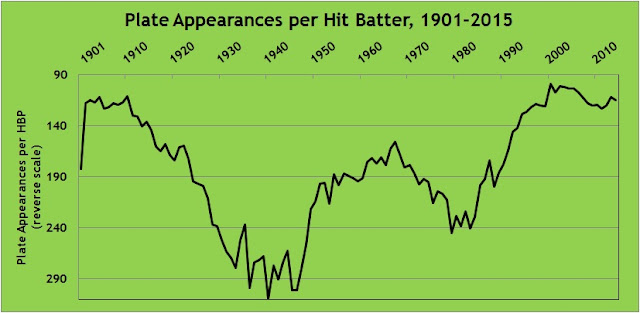
In my first article for FanGraphs Community, I noted, in the summer of 2014, that batters were being hit by pitches at a near-record pace. Here is a graph showing the number of plate appearances per hit batter, from 1901 to present. I’ve reversed the scale—fewer plate appearances between HBP mean that batters are getting hit more frequently—in order to illustrate the steady climb from the World War II years to today. While the hit batter rate has flattened out since 2001 (the high point on the chart), the rate in 2015, a hit batter in every 115 plate appearances, is the 14th highest in major league history.
After I cast about for an explanation for the rise, a commenter came up with what I believe is the best explanation: strikeouts (or, as the Cistulli-designated viscount of the internet, Rob Neyer, has dubbed it, the strikeout scourge). Or, more specifically, the increase in pitchers’ counts vs. hitters’ counts during at bats. When the pitcher is ahead in the count, he is more likely to target the margins of the strike zone, either to try to get the batter to chase or to set up the batter for the next pitch. When the batter’s ahead, the pitcher doesn’t have that luxury, and must focus more on pitching in the zone for fear of losing the batter to a walk. When a pitcher’s aiming for the inside edge of the zone and misses inside, the batter can get hit.

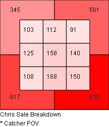
For example, here are career zone breakdowns for Chris Sale (who was a co-leader in hit batters in 2015) against right-handed hitters. At left is his location on 0-1, 0-2, and 1-2 counts. The chart at right shows 1-0, 2-0, 3-0, 2-1, 3-1, and 3-2 counts. The charts are from the catcher’s point of view, so the left side represents inside pitches. When Sale’s ahead in the count, 38% of his pitches are in the five leftmost zones. When he’s behind, that proportion drops to 31%. That’s typical. (What’s not typical is that Sale is ahead in the count a lot more than he’s behind, but you probably already knew that. Images from Baseball Savant.)

              Ahead in the count                          Behind in the count
This dynamic was clearly evident in the past season. When looking at plate appearances that ended when the pitcher was ahead in the count, batters were hit once in every 90 plate appearances. In plate appearances that ended with the batter ahead in the count, batters were hit once in every 254 plate appearances. Batters were nearly three times as likely to be hit by the pitch when they were behind in the count.

This raises a question: what other outcomes are affected by the count? We know that batters don’t do as well in general when the pitcher’s ahead. Are there outcomes other than batting average and slugging percentage that are affected by pitcher’s count?

Before answering that, I wanted to verify that pitchers are, in fact, increasingly ahead in the count. With rising strikeout rates and falling walk rates, this would seem to be tautological, but I checked anyway. I looked at the counts on which plate appearances ended for every year from 2001 to 2015. For example, in 2015, there were 183,628 plate appearances in the majors. 60,513 ended with the batter ahead (1-0, 2-0, 3-0, 2-1, 3-1, 3-2), 62,0553 ended with the count even (0-0, 1-1, 2-2), and 61,062 ended with the pitcher ahead (0-1, 0-2, 1-2). Here’s how they’ve tracked:

I didn’t go back further than 2001, but that’s not because I was being selective; it’s because the data from 2001 forward tells the story. Prior to 2001 the trends simply continued. In 2000, batters were ahead in 38% of plate appearances and pitchers in 28%, compared to 35% and 30% in 2001. The advantage to pitchers has fairly steadily expanded. I think we can say with some confidence that the past two seasons are the first two in modern baseball history in which more plate appearances ended with the batter behind than with the batter ahead.

So, having established that there are indeed more pitchers’ counts, what events are most affected by this change? To find out, I calculated the frequency of outcomes in 2015 on plate appearances with the batter ahead compared to plate appearances with the pitcher ahead. For example, in the 60,513 plate appearances that ended with the batter ahead, there were 13,501 hits. That works out to 4.5 plate appearances per hit. In the 61,062 plate appearances that ended with the pitcher ahead, there were 12,311 hits, or 5.0 plate appearances per hit. The p value for those two proportions, given the sample sizes, is 0. In other words, the difference is statistically significant, and we can safely say there is a difference in hit frequency when ahead in the count compared to behind in the count.

Here’s the full list:

According to this analysis, when the pitcher’s ahead in the count, it results in a decrease in hits, doubles, triples, home runs, and sacrifice flies. When the pitcher’s ahead, it results in an increase in stolen-base success rate, hit batters, sacrifices, and wild pitches. Those mostly make intuitive sense: when the pitcher’s ahead, the batter’s more cautious with his swings, resulting in fewer hits and less power. Similarly, when the pitcher’s ahead, he’ll work away from the heart of the plate, and misses become wild pitches and hit batters. By contrast, when the pitcher’s behind, he works closer in to the strike zone, resulting in pitches that are easier for the catcher to handle, lowering his pop time and increasing the chance of catching the runner on a steal attempt. (Max Weinstein illustrated last year that caught stealings are more likely on pitches in the strike zone.) The increase in sacrifices seems non-intuitive, since 0-2 and 1-2 counts usually shoo away the bunt due to the risk of a strikeout on a foul ball, but 0-1 counts make up for it. Batters were more likely to successfully sacrifice on 0-1 counts (1.4% of 0-1 plate appearances) than any count other than 0-0 (2.7%) in 2015.

Given that pitchers’ counts have increased and hitters’ counts have decreased, this model would predict changes in outcomes for which the differences are statistically significant. I looked at the frequency of hit batters, sacrifice flies, and wild pitches, along with the stolen base success rate, for 1979-1981 (the recent low-water mark for strikeout rate) and 2013-15. I excluded sacrifices because they’re both down sharply due to strategic reasons (managers are calling for fewer bunts) more than anything else. They results are consistent with the model.

  • Strikeouts per plate appearance: up 61%
  • Hit batters per plate appearance: up 98%
  • Sacrifice flies per plate appearance: Down 16%
  • Wild pitches per plate appearance: up 39%
  • Stolen-base success rate: up 7% (though that increase, from 66% to 73%, is probably largely strategic, since there are were 54% fewer stolen base attempts per plate appearance in 2013-15 than 1979-81, even though that may not make sense)

The graphs below, while admittedly busy, track the offensive events for which the analysis of 2015 count-related data indicated statistical significance (again, excluding sacrifices). I’ve selected the past 30 seasons. First, the affected base hits (total hits, doubles, triples and homers):

Offense rose through the 1990s despite rising strikeouts but has fallen since.

Now, the less intuitive outcomes of hit batters, wild pitches, sacrifice flies, and stolen-base success:

As the 2015 count data suggest, increased strikeouts, and therefore increased pitchers’ counts, has yielded more wild pitches, fewer sacrifice flies, a higher stolen-base success rate (though, again, that’s probably a reflection more of strategy), and, most significantly, way more hit batters (73% higher than in 1986; I truncated the scale in order to make the rest of the graph more readable).

This isn’t to suggest that these changes are solely a result of pitchers getting ahead in the count more frequently, but it does seem to be a contributing factor. Admittedly, much of the fallout from the rise in strikeouts is pretty unremarkable. There are more strikeouts and fewer walks now than in the past, so the pitcher’s ahead in the count more and the batter’s ahead in the count less; that’s unremarkable. That’s resulted in less offense — specifically, fewer hits overall and fewer extra-base hits; that’s also unremarkable. What I find more interesting are the other trends trends unrelated to strategy: the increase in hit batters and wild pitches and the decrease in sacrifice flies. It’s easy to get upset about batters getting hit by pitches, pitches rolling to the backstop, and difficulties in driving in runners from third with fewer than two outs. What’s less apparent is the degree to which those events can be linked, like lower scoring, to the rise in strikeouts.


Battle of the Ks: K/9, K/BB and K%

The great debate has been raging for years: which strikeout-related metric is a better predictor of actual pitching success? Some would say there is no right or wrong answer — that each metric has it’s own unique merit and value. That one must look at certain strikeout-related metrics in combination with others. Unfortunately, as tragic as it may seem, statistical evidence begs to differ. Statistics tell us there is in fact a right answer, and it’s a whopper.

Let’s start with K/9. Looking at all 2013 pitchers with 80+ innings, the correlation (R2) between strikeouts per 9 and ERA is a solid  .1081. This correlation has been consistent, plus or minus a few hundredths, for the past five years. So nothing exciting or anomalous can be found in looking at other seasons. Yu Darvish leads the category with Tony Cingrani, Max Scherzer, Anibal Sanchez, and A.J. Burnett rounding out the top five. Additionally, eight of the top ten K/9 leaders ended up with sub 3.10 ERAs. So a decent indicator all-around.

 photo 53a65e17-24d6-482d-b2de-766753f09051_zps2940fbe7.png

K/BB get’s a bit more interesting. We see a jump in linear correlation to .1671 — more than a 50% increase over K/9. Clayton Kershaw, Cliff Lee, and Adam Wainwright  all leap into the top ten of this metric, with Hisashi Iwakuma climbing into the top fifteen — four elite hurlers in 2013 left out of the K/9 leaderboard.

 photo 98225caf-a307-44c3-850b-d610a9444d32_zps70ee67d9.png

But the real gem is K%. It shows double the correlation versus K/9. Plus, the top fifteen in this category ended the year with sub 3.30 ERA — whereas Scott Kazmir (4.04) and Josh Johnson (6.20) smeared the good name of the K/9 leaderboard; with Kevin Slowey (4.11) and Dan Haren (4.67) unpleasantly loitering on the K/BB board.

The reason K% is so powerful is that it simplifies how effective a pitcher is at simply striking out each batter he faces. When BABIP gets involved — as it does for K/9 (high BABIP pitchers are rewarded on K/9 since the number of outs remains the same even if they’re giving up, say, 10+ hits per game) — the value of each strikeout is severely reduced.

 photo 17feabf1-8665-45c5-af39-48d69923e54a_zpsf45972cf.png


To recap:

2013 R2 (correlation to ERA)
K/9 .1081
K/BB .1671
K% .2089

So should we end the debate completely? No. But if you asked me to put money on Tim Lincecum, a career 25.8 K% pitcher with no decline in the stat over the past 2 years, over Tyler Chatwood, a career 13.0 K% who had a breakout year in 2013 with his freakish 76.3% LOB, I would bet on Lincecum every doggone time.


Wainwright Throws Fewer Fastballs, Increases Effectiveness

Adam Wainwright’s strikeout rates keep increasing. In over 400 innings in AA and AAA during his age 21-23 seasons, his strikeout rate was 7.8 per nine innings. When he was elevated to the majors in 2006 as a relief pitcher his strikeout rate took an expected jump to 8.64 K/9. At the time he was throwing his curveball 25.9% of his pitches. A return to starting the following year led to a decrease in both his curveball use (18.6% in 2007 and 17.9% in 2008) and his strikeout rate (6.06 K/9 in 2007 and 6.20 K/9 in 2008).

In 2009, Wainwright made a change in his pitch selection, reverting back to the curveball percentages from his bullpen tenure. The increase in curveball use (24.0% in 2009) increased his strikeouts per nine to 8.19 and turned him from an above-average pitcher (3.90 and 3.78 FIP in 2007 and 2008, respectively) to a Cy Young contender (3.11 FIP). The increased use of the curveball in 2009 also increased its effectiveness, doubling to 2.71 wCB/C. The effectiveness on his slider tripled. Unfortunately, his fastball decreased in effectiveness, going from essentially average to -.75 wFB/C.

In 2010, Wainwright has taken his curveball use to another level, increasing to 28.5% of his pitches and his strikeout rate to 8.26 K/9 and lowering his FIP to 2.86. He has not sacrificed control, lowering his walk rate to 2.21 BB/9. His curveball and slider, which may be more of a cutter, have been slightly less effective, but still very useful pitches. The significant change has occurred in the effectiveness of his fastball. Wainwright has decreased the number of fastballs thrown to a career low 46.5% of pitches. With this decrease has come a drastic increase in the effectiveness of the fastball without changing the velocity, moving to 1.00 wFB/C from last year’s total of -0.75 wFB/C.

Also of note, increasing his strikeouts has not affected his efficiency, with 15.7 P/IP in 2007, 14.8 P/IP in 2008, 15.5 P/IP in 2009 and a career low 14.6 P/IP in 2010.

Wainwright has remained effective this season throwing the third highest percentage of curveballs of any pitcher. (Only Wandy Rodriguez and Gio Gonzalez have thrown a greater percentage of curveballs this year.) When you have the curve he has, you can’t blame him. The consequence, whether inteneded or not, is a sea change in the effectiveness of his fastball.  Another Cy Young-caliber season at a bargain price for the Cardinals.