Archive for PitchFX

Studying Release Point Standard Deviation From Center

A few summers ago, Walker Buehler and the Los Angeles Dodgers came to Baltimore at the very end of the season. That night my buddy and I couldn’t figure out why the Dodgers, and the overwhelming mass of their fans in attendance, were so pumped about winning a single game in Baltimore. Once we saw staffers in ties and headsets running out with the “Division Champions” t-shirts, we realized what was going on.

Needless to say, Buehler was excellent, going 7 innings with 11 Ks and — because it was the 2019 Orioles — gave up no runs on four hits. During the game, while surrounded by very excited Dodgers fans, I mentioned that Buehler’s delivery seemed so efficient that his motion looked exactly the same every time he threw the ball. If you’ve ever worked on physical mechanics of any kind, be it baseball swings, golf swings, freestyle swim stroke, running stride, or maybe just proper form sitting at a desk to avoid that “work from home/pandemic backache,” you know how hard it can be to exactly replicate a motion over and over again. Buehler amazed us in his ability to do just that. We know that repetition in delivery mechanics leads to success in various forms, so with that in mind, the point of this analysis is to look at release point consistency and how that correlates with resulting pitching metrics. Read the rest of this entry »


The Most- and Least-Potent Pitch Combos in 2018

I believe that pitches aren’t thrown in a vacuum, and the effectiveness of one pitch is certainly affected by the pitches that preceded it. Thus, I wanted to identify the most- and least-potent 1-2 pitch combinations in the 2018 Major League Baseball season. To accomplish this, I built a Pitch Combo Effectiveness Tool based on all 2018 pitches thrown in the major leagues.

The approach I took was to evaluate every pitch as the second pitch in a 1-2 combo (forcing us to exclude first pitches in an at-bat). I defined these pitch combos using the pitcher, the pitch types of both the first and second pitches (e.g. “four-seam fastball followed by a curveball”), and the pitch location change from the first to the second pitch (e.g. “the second pitch was further down and more inside than the first pitch”). I then gauged the effectiveness or value of these pitch combinations using the sum of the wOBA added for both the first and second pitches. Lastly, to ensure we were only looking at common pitch combos, we filtered the results to pitch combos observed at least 10 times in 2018.

The chart showing every pitch combo is below, and you can click it to go to the full tool and results:

Most and Least Effective Pitch Combos by wOBA Added

Read the rest of this entry »


Making Baseball Slow Again

If you’re a baseball fan, you may have noticed you’ve been watching on average 10-15 minutes more baseball then you were 10 years ago.  Or maybe you are always switching between games like me and never stop to notice. If you’re not a fan, it’s probably why you don’t watch baseball in the first place: 3+ hour games, with only 18 minutes of real action. You are probably more of a football guy/gal right?  Believe it or not NFL games are even longer, and according to a WSJ study, deliver even less action.

The way the MLB is going, however, it may not be long before it dethrones the NFL as the slowest “Big Four” sport in America (and takes away one of my rebuttals to “baseball is boring”). Currently, the MLB is proposing pitch clocks and has suggested limiting privileges such as mound visits.

Before I get into the specific proposal and the consequences of these changes, let me give you some long winded insight into pace of play in the MLB.

A WSJ study back in 2013 broke down the game into about 4 different time elements:

  1. Action ~ 18 minutes (11%)
  2. Between batters ~ 34 minutes  (20%)
  3. Between innings ~ 43 minutes (25%)
  4. Between pitches ~ 74 minutes  (44%)

The time between pitches or “pace” is what everyone is focused on, and rightly so. It makes up almost twice as much time as any other time element and is almost solely responsible for the 11-12 minute increase in game length since 2008. Don’t jump to the conclusion that this is all the fault of the batter dilly-dallying or the pitcher taking his sweet time. This time also includes mound conferences, waiting for foul balls or balls in the dirt to be collected, shaking off signs and stepping off, etc. Even if we take all of those factors out, there are still two other integral elements that increase the total time between pitches: the total batters faced and the number of pitches per plate appearance (PA).  If either of these increase, the total time between pitches will increase by default. In the graph below, I separated the effects of each by holding the rest constant to 2008 levels to see how each factor would contribute to the total time added.

Any modest game time reduction due to declining total batters faced was made up by a surge in pitches per PA. Increasing pace between pitches makes up the rest.

As we have heard over and over again in the baseball world, the average game time has increased and is evident in the graph above. It’s not just that the number of long outlier games has increased; the median game time has actually crept up by about the same amount.

Plenty of players are at fault for the recent rise in game time. You can check out Travis Sawchik’s post about “Daniel Nava and the Human Rain Delays” or just check out the raw player data at FanGraphs. Rather than list the top violators here, I thought it would be amusing to make a useless mixed model statistic about pace of play.

A mixed model based statistic, like the one I created in this post, helps control for opposing batter/pitcher pace and for common situations that result in more time between pitches. Essentially, for the time between each pitch, we allocate some of the “blame” to the pitcher, batter, and the situation or “context”.

I derive the pace from PITCHf/x data, which contains details about each play and pitch of the regular season. I define pace as the time between any two consecutive pitches to the same batter excluding intervals that include pickoff throws, stolen bases, and other actions documented in PITCHF/x (This is very similar to FanGraphs’ definition, but they calculate pace by averaging over all pitches in the PA, while I calculate by pitch). For more specifics, as always, the code is on GitHub.

It’s a nice idea and all, but does context really matter?

The most obvious example comes from looking at the previous pitch. Foul balls or balls in the dirt trigger the whole routine involved in getting a new ball, which adds even more time. The graph below clearly shows that time lags when pitches aren’t caught by the catcher.

The biggest discrepancy comes with men on base. Even though pickoff attempts and stolen bases are removed from the pace calculation, it still doesn’t account for the game’s pitchers play with runners on base. This includes changing up their timing after coming set or stepping off the rubber to reset.

The remainder of the context I’ve included illustrates how pace slows with pressure and fatigue as players take that extra moment to compose themselves.

As the game approaches the last inning and the score gets closer, time between pitches rises (with the exception of a score differential of 0, since this often occurs in the early innings).

And similarly, as we get closer to the end of a PA from the pitcher’s point of view, pace slows.

Context plays a large part in pace meaning that some players who find themselves in notably slow situations, are not completely at fault. I created the mixed model statistic pace in context, or cPace, which accounts for all of the factors above. cPace can essentially be interpreted as the pace added above the average batter/pitcher, but can’t be compared across positions.

When comparing the correlation of Pace and cPace across years, cPace seems like a better representation of batters’ true tendencies. My guess is that, pitchers’ pace varies more than the average hitter, so many batters’ cPace values benefited from controlling for the pitcher and other context.

After creating cPace, I came up with a fun measure of overall pace: Expected Hours Added Per Season Above Average or xHSAA for short. It’s essentially what it sounds like: how many hours would this player add above average given 600 PA (or Batters Faced) in a season and league average pitches per PA (or BF).

The infamous tortoise, Marwin Gonzalez, leads all batters with over 3 extra hours per season more than the average batter.

That was fun. Now back to reality and MLB’s new rule changes. Here is the latest proposal via Ken Rosenthal:

The MLB tried to implement pace of play rules in 2015, one of which required batters to keep one foot inside the box with some exceptions. The rules seemed to be enforced less and less, but an 18- or 20-second pitch clock is not subjective and will potentially have drastic consequences for a league that averages 24 seconds in-between pitches. Some sources say the clock actually starts when the pitcher gets the ball. Since my pace measure includes the time between the last pitch and the pitcher receiving the ball, the real pace relative to clock rules may be 3-5 seconds faster.

Let’s assume that it’s five seconds to be safe. If a pitcher takes 20 seconds between two pitches, we will assume it’s 15 seconds. To estimate the percentage of pitches that would be affected by these new rules I took out any pitches not caught by the catcher, assuming all the pitches left were returned to the pitcher within the allotted five seconds.

The 18-second clock results in about 14% of the pitches with no runners on in 2017 resulting in violations of the pitch clock. This doesn’t even include potential limits on batters times outside the box or time limits between batters, so we can safely say this is a lower bound. If both of the clocks are implemented in 2020, at least 23% of all pitches would be in violation of the pitch clock(excluding first pitch of PA). Assume it only takes three seconds to return the ball to the pitcher instead of five, and that number jumps to 36%!

And now we are on the precipice of the 2018 season, which could produce the longest average game time in MLB history for the second year in a row as drastic changes loom ahead. I don’t know who decided that 3:05 was too long or that 15 minutes was a good amount of time to give back to the fans. Most likely just enough time for fans to catch the end of a Shark Tank marathon.

Anyways, if game times keep going up, something will eventually have to be done. However, even I, a relatively fast-paced pitcher in college, worry that pitch clocks will add yet another element to countless factors pitchers already think about on the mound.

There are certainly some other innovative ideas out there: Ken Rosenthal suggests the possibility of using headsets for communication between pitchers and catchers, and Victor Mather of the NYT suggests an air horn to bring in new pitchers instead of the manager. Heck, maybe it’ll come down to limiting the number of batting glove adjustments per game. Whatever the league implements will certainly be a jolt to players’ habits and hardcore baseball fans’ intractable traditionalist attitude. The strategy, technology, and physicality of today’s baseball is changing more rapidly than ever. When the rules catch up, I have a feeling we will still like baseball.


Two of the Most Similar Pitchers in Baseball

In baseball analysis, we often use comparable players or “comps” to discuss what we think the player is likely to do in the future. Prospects are the most comped players because the general baseball public does not know much about minor leaguers. Comparing these young players to major leaguers allows fans to imagine what these prospects could someday become. Comps are also often used in projection systems. Data analysis has found that similar players often perform similarly throughout their careers. Thus, using former players who compare well with current players aids projection systems in forecasting what a particular player is likely to do in the coming years. Comparable players are also used in contract negotiations and arbitration battles. Players at similar ages with similar careers can expect to get roughly the same contract. In fact, the arbitration process is almost solely interested in comparing similar players and their wages.

Sometimes, players aren’t viewed as being similar when in reality they are actually quite alike. Recently, I found that Julio Teheran and Jose Quintana top each other’s similarity score lists on Baseball Reference. I had usually thought of Quintana as one of the game’s best pitchers and a true ace, while Teheran was at least a rung below that and probably more of a number 2 or 3 starter, so I did some research and found that these two pitchers are more alike than many probably realize.

Both pitchers are from Colombia and they were actually born only miles apart. Colombian-born baseball players are actually quite rare as there have only been 19 such players in MLB history, and this includes at least one set of brothers and a set of cousins. In fact, just this past season Teheran and Quintana became the first Colombian-born pitchers to ever start against each other in the same game. The two are apparently also quite good friends off the field and even work out together in the offseason. They each have also decided that they will pitch for Colombia in the upcoming World Baseball Classic. That will make for a formidable 1-2 punch for the Colombian pitching staff and will be hard for any other team in the tournament to match up against.

These two pitchers also match up quite well statistically, as their numbers look quite similar in a multitude of categories.

Player bWAR ERA+ ERA FIP xFIP WHIP H/9 HR/9 BB/9 K/9 K/BB GB% HR/FB%
Julio Teheran 4.8 129 3.21 3.69 4.13 1.05 7.5 1.1 2.0 8.0 4.07 39.1% 10%
Jose Quintana 5.2 125 3.20 3.56 4.03 1.16 8.3 1.0 2.2 7.8 3.62 40.4% 9.5%


You might be able to find two pitchers with more similar numbers, but it wouldn’t be easy. They were both virtually 5-win pitchers according to Baseball-Reference, and the difference there likely comes from Quintana throwing a few more innings than Teheran. Their ERA, FIP, and xFIP are all almost identical and they both achieved their numbers in similar ways, too. Neither pitcher allows many baserunners, and they both strike out about eight batters per nine innings. In 2016, they both also had nearly identical ground-ball rates, and they suppressed homers to the same degree. Both pitchers had incredible seasons in 2016 and were both deserving All Stars, and while Jose Quintana did have a slightly better year and has been the better pitcher for the past several years, Julio Teheran has considerably closed the gap on his fellow statesman.

After seeing how closely the two pitchers’ 2016 stats aligned, I wanted to see how closely their styles of pitching matched up as well. While the approaches are not quite as similar as the statistics, you can see by the pitching styles how the stats could end up so similar. Using PITCHf/x data from Brooksbaseball.com I found that the biggest similarity in their repertoires is their four-seam fastballs. They both rely heavily on this pitch while throwing them about as hard and with similar amounts of movement.

Player Four Seam Usage Four Seam Velocity Four Seam Horizontal Movement Four Seam Vertical Movement
Julio Teheran 46.4 92.0 -5.1 8.2
Jose Quintana 41.1 92.6 4.6 9.5


These fastballs are not particularly special for two pitchers with such pedigree. They are each thrown with just average velocity and with roughly an average amount of downward and horizontal movement. They produce roughly the same amount of ground balls as the average pitcher and miss about as many bats as the average fastball. The most unique aspect of either of these pitchers’ fastballs is that Jose Quintana induces an exorbitant amount of pop-ups, which are basically as good as a strikeout. This allows his otherwise average fastball to play up better than the average starter.

After the four-seamer, their repertoires begin to deviate quite a bit. Quintana relies heavily on his sinker and his curveball as secondaries and mixes in a changeup occasionally. He throws his sinker just as hard as his four-seamer, but he gets more movement from the sinker. Julio Teheran uses his slider as his main secondary, throwing it over 26 percent of the time, while he mixes in a sinker, a changeup, and a curveball as his tertiary offerings. His slider is a plus pitch and he uses it to miss bats, while the other pitches are basically used as change-of-pace offerings to keep hitters off of his fastball and slider combination. Both of these guys get by with just average or better stuff, but command of their arsenal coupled with their mastery of the art of pitching have made them two of the upper-echelon pitching talents in the game.

It would only make sense that two players this similar would have similar contracts, but these contracts go way past similar — they are borderline identical. They are each under team control for the next four years. Teheran will make $37,300,000 and Quintana will make just a few hundred thousand more at $37,850,000, assuming that their respective option years are picked up, which is a pretty safe bet. Their yearly salaries are basically identical as well:

Year Julio Teheran Jose Quintana
2017 $    6,300,000.00 $    7,000,000.00
2018 $    8,000,000.00 $    8,850,000.00
2019 $  11,000,000.00 $  10,500,000.00
2020 $  12,000,000.00 $  11,500,000.00
Total $  37,300,000.00 $  37,850,000.00


Neither player’s salary ever deviates more than just a few hundred thousand dollars in any year under these current contracts. It only makes sense that two players with so many similarities would be compensated so similarly, but should they actually be valued the same?

Probably not; while they did have virtually the same season statistically this year, Quintana’s track record for this level of success is longer. Teheran does also have a successful track record, but he did struggle in 2015, and Quintana just seems to be the surer bet at this point. Steamer projects Quintana to be worth over a win more than Teheran in 2017. However, I do believe that their values should be a great deal closer than public perception. Teheran is two years younger than Quintana and could just be hitting his prime, he is signed to the same contract as Quintana, and his stuff may actually be better. Quintana is currently being aggressively shopped and the asking price is said to be roughly the same as the Chris Sale package. Julio Teheran is not worth that kind of package, but it might be closer than you think.


Taking a Look at David Price’s Turnaround

After signing a massive seven-year, 217-million-dollar contract with the Red Sox this past offseason, David Price got off to a slow start. After his May 7th start against the Yankees in which he gave up six earned runs in just 4.2 innings, Price’s ERA stood at a whopping 6.75 yet his peripherals remained strong. He had a 2.98 FIP and 11.5 K/9. However, he was giving up hard contact over 41 percent of the time. The immediate fix was a mechanical issue noticed by Dustin Pedroia that was limiting Price’s leg lift and diminishing his velocity. Frustrated with his failures, Price vowed to be better.

And better he has been. After throwing a gem in Sunday’s win over the Mariners where he went eight innings allowing his only run on a solo shot by Franklin Gutierrez, Price lowered his season ERA to a still high 4.24 and had his eighth straight quality start. Over those eight starts, Price has been much better, allowing 16 runs over 58.1 innings for an ERA of 2.47. During this stretch, he has a 3.88 FIP and 8.6 K/9 and has only allowed hard contact around 27 percent of the time. Although his strikeouts have gone down and his FIP went up due to his decrease in strikeouts to go with an increase in home runs allowed, Price has limited the amount of hard contact he has given up. This can be seen in the BABIP over the two stretches. In his first seven starts, his BABIP against was around .370, while in this current eight-start stretch it is hovering around .230.

This in turn, has allowed him to be very successful while pitching to contact. His biggest issue remains his ability to keep the ball in the park. Over his last eight starts, Price has allowed at least one home run in seven of them. So while he has limited hard contact against him, the few mistakes that he makes each game are punished. Despite this increase in home runs allowed, he continues to pitch well and go deep into games, allowing the Red Sox bullpen a chance to recover after the consistently shaky starts from their 4th and 5th starters.

There are a few main reasons to this improvement. The first was his ability to regain his velocity. Looking at his velocity each month thanks to data from Brooks Baseball, there is a small but steady increase in his average four-seam and sinker velocity. Before May 8th, his velocity was low by his standards. Typically a pitcher averaging 94 to 95 MPH with his fastball, he had been sitting 93 MPH.

Year Fourseam Sinker Change Curve Cutter
2016, Before May 8th 93.2 93.0 84.3 78.8 88.8

Although just a small dip in velocity, it made him much more hittable.

Since May 8th, his velocity has been back on the rise.

Year Fourseam Sinker Change Curve Cutter
2016, Since May 8th 94.2 93.4 85.0 78.3 89.0

After the mechanical change, his four-seam has been averaging around 94 MPH and his sinker has been averaging around 93 MPH, but still slightly up from what it was before. Although it is a small increase, this added velocity has helped Price dominate hitters, gain confidence, and re-establish himself as an ace.

Another key factor in this improvement has been his pitch usage. Using pitch data from Brooks Baseball, I was able to look at Price’s pitch usage. In his first seven starts, Price relied on mixing different types of fastballs with his main offspeed pitch being a change-up while also displaying the occasional curve.

Year Fourseam Sinker Cutter Curve Change
2016, Before May 8th 27.6 22.6 19.8 6.6 23.4

His four-seam was used around 28 percent of the time yet it lacked the movement displayed by his cutter and sinker. The high four-seam usage to go with decreased velocity spelled trouble for Price.

However, since May 8th, Price has made an adjustment displayed by the fact that he is now using his sinker as his primary pitch while also using his four-seam far less frequently.

Year Fourseam Sinker Cutter Curve Change
2016, Since May 8th 9.0 36.1 22.4 8.3 24.3

His sinker is now used around 36 percent of the time compared to his four-seam being used around nine percent of the time. With this added movement and velocity, Price has been able to be more effective while keeping the use of his curve, cutter, and changeup around the same. This simple switch from a four-seam to a sinker has allowed him to go on a tear.

Looking forward, the Red Sox need Price to continue to be the pitcher that he has been over his last eight starts. They are paying him ace money and he is expected to pitch like one down the stretch as Boston hopes to continue their great turnaround year. If Price continues to have outings like these, the Sox should like their chances come October with him taking the mound with their season on the line.


Will the Real Tyler Goeddel Please Stand Up?

Similarly to a large portion of the FanGraphs community, I am a Philadelphia Phillies fan.  I was born in South Jersey just 20 minutes away from the stadium and grew up watching every game.  I was there for the tough times in the late 90’s / early 2000’s, and I was there for the glory days of 2007-2011.  After an abysmal last few seasons of baseball in Philadelphia, we have finally seen some promise this season leading us to believe that better days are coming soon.  One of the bright spots on the team so far this year has been Rule 5 pick, Tyler Goeddel.

After being selected in the first round of the 2011 MLB Rookie Draft, Tyler Goeddel began his professional career with the Tampa Bay Rays.  Goeddel was drafted out of high school as a third baseman and for the first three years of his minor league career that would be the only position he played.  In 2015, however, the Rays decided to move Goeddel to the outfield.  His athleticism allows him to play all three outfield positions and that type of versatility is very sought after by big league clubs.  While defense was never his problem, Goeddel’s bat didn’t develop as quickly as the Rays had hoped.  He was a career .262 hitter with 31 home runs across four full seasons in the minor leagues.  Ultimately the Rays made a tough decision and left him off their 40-man roster, knowing there was a great chance another team would select him in the Rule 5 Draft.  Shortly after, the Phillies did just that and selected Goeddel with the first overall pick of the 2015 Rule 5 Draft.

The Philadelphia Phillies have historically been excellent in finding talent in the Rule 5 Draft.  (2004 – Shane Victorino, 2012 – Ender Inciarte, 2014 – Odubel Herrera).  In the early going, I (like most Phillies fans) was very skeptical as to whether or not Goeddel could follow in the footsteps of players like Shane Victorino and Odubel Herrera and become a valuable contributor to our big league team.  Goeddel had a mediocre spring training but with no other serious competition in the corner outfield spots, there was no harm in keeping him around for a rebuilding year and seeing what the kid could do.

The beginning of Tyler Goeddel’s major league career could not have gone much worse.  Take a look below at his stats through his first nine games:

4:6 - 4:19 Stats

In only 16 at-bats, Goeddel recorded only one hit (a single), and struck out a whopping eight times!  Now obviously this is a VERY small sample size, and we should expect some struggles while adjusting to big league pitching.  Up until this point, Goeddel has never seen pitching above the Double-A level.  Now let’s take a look at his plate discipline stats over the same time frame:

4/6 - 4/19 Plate DisciplineO-Swing % – Percentage of time a batter swings on pitches outside the strike zone
Z-Swing % – Percentage of time a batter swings on pitches inside the strike zone
Swing % – Percentage of time a batter swings at a pitch, regardless of location
O-Contact % – Percentage of times a batter makes contact with a ball when swinging outside of the strike zone
Z-Contact % – Percentage of times a batter makes contact with a ball when swinging inside of the strike zone
Contact % – Percentage of times a batter makes contact with the ball when swinging
Zone % – Percentage of overall pitches thrown to batter that were in the strike zone

There is nothing noteworthy about his swing percentages as they are all just about equal to the league averages, but the contact percentages are quite alarming.  Through his first nine games, Goeddel only made contact 53% of the time he swung his bat.  Rather than just writing this off as a rookie being over-matched by big league pitching, I decided to dig deeper into these stats and figure out exactly where Goeddel was struggling.  Check out the video below that I put together which basically sums up the beginning of Goeddel’s career in 30 seconds:

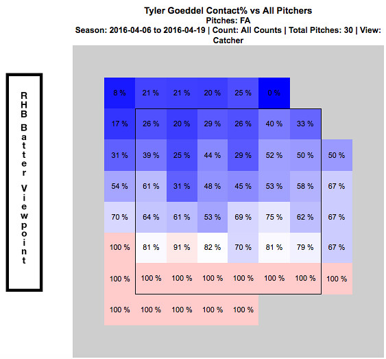
Whether or not you realized from watching the above video, every one of these swing and misses came on a fastball.  They all also came in the upper portion of the strike zone.  Just by watching Goeddel’s at-bats through this point of the season, it was clear as day to see opposing pitchers were attacking Goeddel with fastballs up in the zone.  The chart below shows every fastball that was thrown to Goeddel over his first nine games.  It is broken up by hot and cold zones and shows his contact percentage versus the fastball at every portion of the strike zone:

4:6 - 4:19 Contact % vs Fastball

This chart verifies for us what we saw in the video…Goeddel really struggled to hit fastballs up in the zone to begin the season.  At this point, everyone was frustrated.  Tyler Goeddel was frustrated because he knew he was much more talented than his results thus far have showed.  The Phillies organization was frustrated because they had such high hopes for Goeddel entering the season.  And most importantly, the Phillies fans were frustrated and began questioning what the Phillies could possibly see in this guy.  (Search for Tyler Goeddel’s name on Twitter and read old tweets from this time period if you don’t believe me!!)

An important thing to remember while looking at these stats, is that up until this point of his career Goeddel has been an every-day player.  Not only is he adjusting to big league pitching, but he is also trying to adjust to not having consistent at-bats.  Since the Phillies unexpectedly got off to such a hot start, an important decision needed to be made.  On one hand, they have this young promising player who will need consistent at bats in order to show his true potential.  But on the other hand, this team is surprisingly in the hunt in the NL East and may not want to allow Goeddel to go through his growing pains while they are competing for the division title.  Eventually, a decision was made and manager Pete Mackanin started to put Goeddel in the every-day lineup. Below are some quotes from Goeddel at this time speaking of the decision:

“Getting regular playing time and the confidence [from that] is huge, but I try to get started a little earlier on my swing so I can be on time with the fastball. You need to hit the fastball if you want to play up here, obviously. I feel like I’ve made that adjustment and it’s been a huge help.” – Tyler Goeddel

“I didn’t play how I wanted to play in April.  And I’m glad he’s (Pete Mackanin) giving me a chance, because I really didn’t play my way into a chance; he just gave it to me. So I’m trying to make the most of it.” – Tyler Goeddel

The video below (from 4/23/16) summarizes Goeddel’s early season struggles and the decision to give him more playing time:

The Phillies coaching staff deserves a lot of credit.  They recognized early on that Goeddel was struggling with fastballs up in the zone and prior to this game really worked with him in that area and promised him more playing time moving forward.  Here is a video of his next at bat in the game, where the pitcher tries once again to attack Goeddel with some high heat:

Goeddel responds with another base hit and his first RBI of the season.  Take a look below at how his stats over his next seven games compare to his stats from his first nine games.

4:23 - 5:6 Stats

4:23 - 5:6 Contact %

You can very easily see that Goeddel drastically improved his contact percentage over this time frame, which resulted in a huge drop in his strikeout rate.  The video below is from 5/8/16, right after the stretch of stats we just evaluated.  Goeddel had a big hit late to tie the game for the Phillies and later came in to score the winning run.

As you could see, the hit came on a high fastball.  A few weeks ago, Goeddel could not touch this pitch…but all of a sudden he is beginning to prove that he can.  The next video is from after that game.  Tyler discusses the adjustments he has made and also how playing every day has contributed to his recent success:

This hit was the start of a new Tyler Goeddel.  Pitchers continued to attack him with fastballs up in the zone and Goeddel really started to make them pay.  This is what he did to a Brandon Finnegan fastball just a few days later:

Ever since that hit on May 8th against the Marlins, Goeddel has been the player the Phillies could have only hoped he one day would become.  He has flashed signs of brilliance in just about every game since that have Phillies fans drooling over what the future outfield could look like.  Even though he has made adjustments and is seemingly now catching up to big league fastballs, opposing pitchers continue to test him.  Check out the video below that I put together showing what Goeddel has done to fastballs in the upper portion of the strike zone over the last few weeks.

As you can clearly see, this is a different player than we saw early on in the season.  Take a look at how his recent stats compare to those early on:

5:6-5:20 Stats

5:6-5:20 Contact %

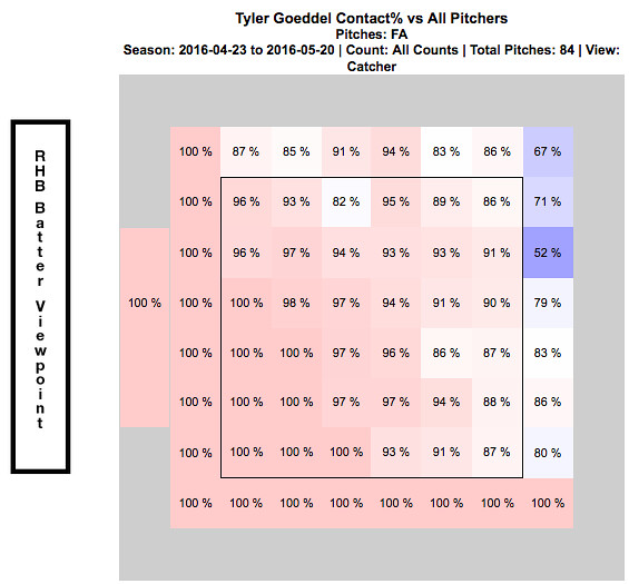
Goeddel’s contact percentage over his first nine games was only 53%.  Over his last 10 games, it is 91%.  That is an incredible difference and clearly his adjustments are paying off.  In turn, his improved contact has led to a strikeout percentage of only 5.4% over his last 10 games.  The chart below shows how Goeddel has fared against the fastball since he noted his adjustments on April 23, 2016.

4:23 - 5:20 Contact % vs Fastball

Now go back up to the top of the article and compare this chart to what it looked like at the beginning of the season.  More consistent at bats have clearly translated into him catching up to the fastball and the results thus far have been phenomenal.  I have to admit that I was a doubter early on, but I am now completely on board the Tyler Goeddel bandwagon.  This kid is only 23 years old and the fact that he was able to so quickly make an adjustment like this and immediately see results is remarkable.  Now that he is having some success, opposing pitchers will start to change their game-plan against him.  While the pace he is on now may not be sustainable over the course of a full season, I am confident that Goeddel will continue to make the necessary adjustments and help this Phillies team continue to find ways to win ball games.  Although the video below doesn’t exactly relate to his success at the plate, I had to throw this in here and it is a must watch if you have not seen it already:

The last video I will show features Goeddel’s post game interview after this throw:

Recent Quotes:

“It’s exciting.  Coming to the field everyday I’m expecting to see myself in the lineup. That’s a feeling I didn’t have last month. It’s a lot more relaxing, less stressful.” – Tyler Goeddel

“It was definitely a big adjustment, going from playing everyday my whole career to having a specific role, and then not performing well in my role, it was a little tough.  But, you know, they’re giving me an opportunity now and I feel like I’m playing better, which is nice. I’m happy for myself. I always knew I could play up here, but I needed some results to prove it to myself. I’m glad, finally, there are some results to show.” – Tyler Goeddel

I love how confident Goeddel is when he speaks of his game and I am so glad the numbers back him up.  I continue to be blown away watching him play every day, especially due to the fact that he has only been playing the outfield for one year.

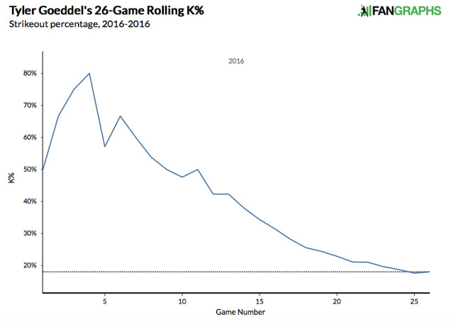
Lastly, I want to show a few graphs.  The first one shows a rolling total of Goeddel’s strike out percentage so far this season.  The statistics earlier show you that it has decreased, but this graph makes it much easier to see his progression:

Rolling K%

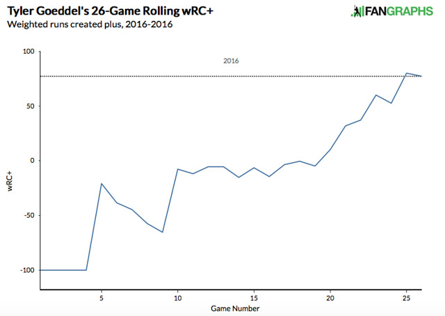
The next graph is another rolling total showing how Goeddel’s wRC+ has progressed throughout the season.  For those of you who are unfamiliar with the stat, wRC+ stands for weighted runs created plus.  It attempts to quantify a player’s offensive value in terms of runs.  An average wRC+ is 100.  Check out how Goeddel’s wRC+ has improved throughout the season:

Rolling WRC+

What do you think, Phillies fans?  Can Tyler Goeddel keep this up?  Is the Tyler Goeddel that we have seen over the last few weeks the real Tyler Goeddel?  Are you ready to hop on the bandwagon yet or do you need to see more from him to believe?  Only time will tell, but I’m buying into the hype and am excited to see what the future holds for this promising young player.

Twitter – @mtamburri922


Tyler Wilson and His Five Plus Pitches

Let me preface this article by saying that I watch A LOT of baseball.  I also have an extensive analytical background and am always analyzing baseball stats looking for value in players.  Last week, I was watching an Orioles game and the starting pitcher was a player I have never heard of.  His name is Tyler Wilson.  While watching the game, I was very impressed with his overall make-up and the confidence he displayed in each one of his pitches.  Many times what separates a pitcher from being able to start at the big-league level versus being destined for the bullpen is the ability to throw multiple pitches.  The ability to throw each of those pitches effectively, however, can be what separates a good starting pitcher from a great starting pitcher.  The more I watched of Wilson, the more intrigued I became about his future outlook, and the more motivated I became to write this article.  (I went back and watched all of Wilson’s starts this year before writing this article.)

To give you a little background, Tyler Wilson has never been an elite prospect.  He attended college at the University of Virginia, where he was overlooked by fellow staff-mate, and future 1st round pick, Danny Hultzen.  Wilson was drafted by the Orioles in the 10th round of the 2011 MLB Draft.  Ever since being drafted, he has quietly excelled at every level.  He doesn’t have the dominant strikeout numbers that you look for in pitching prospects, which is a big reason he has gone overlooked for much of his career.

After climbing his way through the organizational ladder, Wilson made his major league debut with the Orioles last year and eventually made the team this year out of spring training.  Although he made the team in a bullpen role, early season injuries to the Orioles pitching staff opened up an opportunity and Wilson has really taken advantage of it.  Enough of the background though.  Let’s move on to what I saw while actually watching him pitch.

Tyler Wilson features a cutter and a two-seam fastball.  Each of these pitches sit in the 89-91 mph range and both show a great amount of movement.  The cutter is most effective against right-handed batters when thrown on the outside portion of the plate.  Check out the video below to watch him fool Kansas City Royals outfielder Lorenzo Cain with three straight cutters:

He essentially gave Cain, a very good hitter, three of the exact same pitches in a row…and Cain couldn’t touch them.  In every start this year, Wilson has pounded the outside corner with this cutter and has had fantastic results.  Don’t think by any means though that he is a one trick pony.  As soon as you start to expect that cutter on the outside corner, Wilson will come right back in on you with a two-seam fastball:

Look at the horizontal movement on that pitch!  Absolutely filthy!  Wilson has showed a ton of confidence in both of those pitches so far this season as he uses them to pound both sides of the strike zone and his command of them has been exceptional.  He is not afraid to throw them in any count and they are equally effective vs both left-handed and right-handed batters.

While his fastballs both seemed to be plus pitches upon first glance, I started to have thoughts that this guy might be for real as soon as he started throwing his curveball.  Wilson’s breaking ball sits in the 77-79 mph range.  I was astonished by how well he was able to locate his curve and the amount of movement on each and every one he threw.  Watch him send White Sox slugger Jose Abreu down swinging in the video below:

Abreu had no chance.  In his most recent start against the Twins, Wilson’s curve looked even better.  Check out the one he threw to Byung-Ho Park:

Both of those pitches came in a 2-2 count.  Many pitchers are scared to throw a breaking ball in a 2-2 count, especially to players with plus power such as Abreu and Park.  If you miss your target, two things can happen.  One — you leave the ball up in the zone and it gets hit out of the stadium.  Two — you throw it in the dirt; the hitter lays off; and now you have to pitch to this slugger with a full count.  Wilson isn’t scared to throw his curveball in any count and that is what makes him so dangerous.  You never know when to expect it, but at the same time you have to expect that he can throw it at any moment.

The last pitch in Wilson’s arsenal is his changeup.  This pitch has a ton of downward movement and produces a lot of groundballs.  While there were many better examples that I could have shown you of his change-up in action, I wanted to show one of his bad ones.  Even when he missed his target, the batter was still fooled by the amount of movement on this pitch.  Check out the following pitch to Royals SS Alcides Escobar:

The catcher set up down in the zone and Wilson clearly misses his target.  Luckily it didn’t seem to matter as the pitch had an insane amount of horizontal movement, running in on Escobar and jamming him.

Take a look at the chart below, showing the vertical and horizontal movement on each of Wilson’s pitches:

Tyler Wilson Movement

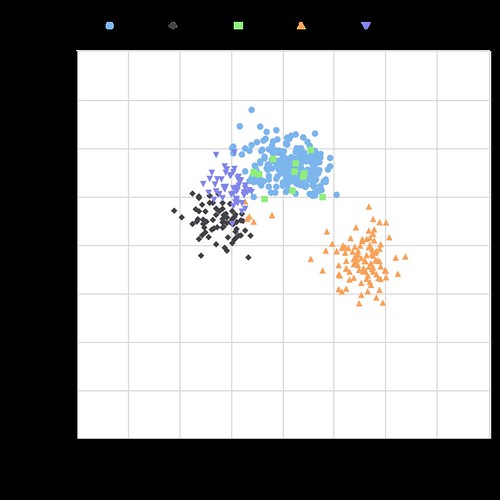
The middle portion of this chart is empty.  All five of his pitches have a tremendous amount of movement, and none of them move in the same direction.  The fact that he is able to command each of these pitches so well and keep hitters guessing with which one will come next is the reason why he has had so much success.  A big reason why hitters are having trouble guessing his pitches is because of how well Wilson is able to repeat his delivery.  The chart below shows Wilson’s release point for each type of pitch:

Tyler Wilson Release Point
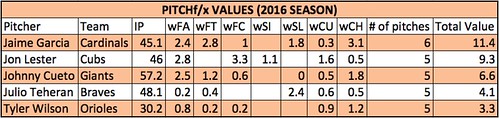
As you can see, his release point is almost identical with all five of his pitches.  At this point, I have watched all of his starts from this season and was very impressed.   I then decided to do some research and was immediately impressed with stats such as his career BB rate and low WHIP, but wanted to dig further.  I began to look through the PITCHf/x data because I was curious to see how effective each of his pitches actually were.  Based on the PITCHf/x value metric, all of his pitches so far this year have graded as above average.  If you are not familiar with the PITCHf/x value scale, someone who has a fastball ranking of zero means that he possesses an average fastball.  Any value above zero means that pitch is above average.  Obviously the higher the number, the better the pitch.  The same goes for negative numbers and pitches being below average.  See the table below for the breakdown of Wilson’s arsenal:

Screen Shot 2016-05-15 at 1.19.17 AM

Based on the above values, the change-up has been Wilson’s most valuable pitch this season with his curveball close behind.  Obviously it is very early in the season and we are working with a small sample size…but that doesn’t mean we can’t have fun!  While doing this research, I set out the goal to find every starting pitcher who throws five or more above-average pitches.  Below is the list of players who fit that description:

Screen Shot 2016-05-15 at 1.41.09 AM
IP = Innings Pitched
FA = Fastball
FT = Two-Seam Fastball
FC = Cut Fastball
SI = Sinker
SL = Slider
CU = Curveball
CH = Change-up
KC = Knuckle Curveball
EP = Eephus

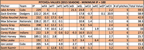
There are only five pitchers who have thrown five or more pitches above average so far this season!  Wilson is in great company, as the other four pitchers are all All-Star-caliber players and borderline household names.  Being that this is such a small sample size, I decided to look back at last year’s stats to see how many players fit this description over a full season.  Using the same parameters and setting the minimum IP to 100, the following table was produced:

Screen Shot 2016-05-15 at 2.05.17 AM

Once again, the names on this list are some of the top pitchers in baseball.  A few of these pitchers have a pitch that graded out as below average, but since they had five or more different pitches all individually grade as above average, they made the final cut.

As you can see, it is very rare to have a pitcher who has five legitimate plus pitches.  I am very interested to see if Tyler Wilson can maintain these results over the course of a full season, and I really hope he is given the opportunity to do so.  If he continues to pitch the way he has been, the Orioles will have no choice but to leave him in the rotation.  Although he has had limited success, Wilson has struggled in each of his starts when facing the lineup the third time around.  This could be due to the fact that he is still in the process of being stretched out from his bullpen role.  When in the bullpen, you don’t have to prepare to face the same hitter three times.  I am hopeful that once he is fully stretched out and back into his starter mentality, he will be able to make the necessary adjustments and continue to throw all of his pitches with confidence.  If he can continue to make quality pitches as he faces the lineup for a third time, I believe Tyler Wilson has the chance to become a very special pitcher.

Memorable quotes I heard during the TV broadcasts:

“Everyone thinks that I pitch with a chip on my shoulder but I really don’t.  I just go out and compete.  I don’t think of it that way.” – Tyler Wilson

“I think he understands himself.  He can maintain his game-plan throughout the game.  He’s going to keep us in the game and give us a chance to win.  What more can you ask for?” – Pitching Coach Dave Wallace

“I love that he can make the ball run in and then cut away.  He pitches to both sides of the plate.  Not a lot of young pitchers can do that.” – Manager Buck Showalter

…no Buck, not a lot of young pitchers can do that.

Twitter – @mtamburri922


Can PitchFX Data Be Used to Identify Muscle Fatigue?

Introduction

Muscle fatigue is a process that results in decreased force generating capacity, and impaired performance [1]. Reduced force due to muscle fatigue may result in less stable joints, which can increase the risk of injury [2].  Furthermore, muscle fatigue is known to reduce joint proprioception  [3]–[6], which can result in further compromised joint stability and increased injury risk. Baseball pitchers have been shown to alter their kinematics (joint angles) when fatigued, which may strain different tissues when compared to pitching without fatigue [7].  Repetitive strain on these tissues can result in injury, and in baseball pitchers, injuries such as Ulnar Collateral Ligament tear.

Fatigue has been named the number one cause of injuries in baseball pitchers, leading to a 500% increase in injury likelihood [8]. Handgrip strength has decreased by up to 5% after simulated baseball games [9], and pitch velocity decreases over the the course of a game [10]. Pitcher kinematics also change with fatigue, with the elbow dropping lower, and the stride getting shorter.

The PITCHf/x system was created by Sportvision, and installed in every MLB stadium since 2006. The system allows for tracking of pitch movement, velocity and release point for every pitch thrown at the major league level. Two cameras are mounted in each stadium, and are used to track each pitch and display data during live broadcasts and websites. With the use of free software, like the programming package R, and database software MySQL, anyone can download gigabytes of data within hours, allowing for detailed analyses of pitching and hitting. With this detailed data, it would theoretically be possible to track changes associated with muscle fatigue. The purpose of this study was to examine how pitch velocity and release point changed in starting pitchers during the 2015 season.

Methods

Data Acquisition

I queried the pitchFX data from the 2015 season, grouping pitches by pitch type, pitcher, and inning. A pitch had to be thrown 20 times in an inning to be included for further analysis. The pitchers included in this analysis were those who pitched a minimum of 100 innings as a starting pitcher. The main focus of this analysis was to examine peak velocity changes, so only fastball type pitches were included in the analysis (four-seam, two-seam, split finger, sinking, cut, and general fastball).

I calculated the average velocity for each pitcher during their first inning of pitching. I then calculated the minimum average velocity for these pitches during either the 5th, or 6th inning – which ever value was the lowest.

For release point, I calculated the resultant distance of the release point (at z0, x0), from 0,0 (Figure 1). I also examined the change in vertical release point (z0) between the first inning, and the minimum of the 5th and 6th innings. Using the horizontal release point, and the vertical release point, I also calculated the absolute release angle (normalizing for left-handed and right-handed pitchers).

View post on imgur.com

Figure 1. Demonstration of how calculations were made for the vertical release point, resultant release distance, and release angle.

Statistics

For this analysis, the independent variable was inning (first inning, minimum of 5th/6th inning).

To examine the effect of inning, I performed a dependent samples t-test on variables of peak velocity, resultant release point, vertical release point, and release angle, with p < 0.05. I also calculated Cohen’s D to determine the effect size of the inning.

Results

Peak velocity significantly decreased between the first inning (91.19 ± 2.91 mph) and 5th/6th inning of the start (90.61 ± 3.01 mph, p< 0.05; d=0.20) (Figure 2). Vertical release point significantly decreased from 5.9 ± 0.35 feet to 5.84 ± 0.36 feet (p < 0.05, d=0.17)(Figure 3a). Resultant release point also decreased from 6.15 ± 0.35 feet to 6.09 ± 0.35 feet (p < 0.05, d=0.18) (Figure 3b). All of these changes were statistically significant, however, represented small effect sizes.

Release angle was significantly different between the first and final inning, moving from 74.9 ± 6.17 degrees to 75.1 ± 6.31 degrees. This represents a release angle that is closer to the vertical plane, or, closer to the midline of the body. While this change was statistically significant, the effect size was negligible (d=-0.04) (figure 4).

View post on imgur.com

Figure 2. Fastball velocity significantly decreased between the first inning (91.19 ± 2.91 mph) and the minimum between the 5th and 6th inning (90.61 ± 3.01 mph) (p < 0.05). This represented a small effect size, of 0.20.

View post on imgur.com

Figure 3. Both vertical release point, and resultant release distance decreased between the first inning and the 6th inning, representing a possible change in pitcher kinematics. This represented a small effect size, of 0.18 and 0.17, respectively.


View post on imgur.com

Figure 4. Release angle increased (representing a release point closer to the midline of the body) between the first and final inning, though the effect size for this relationship was negligible.

Discussion

In line with previous research on baseball pitching and fatigue, fastball velocity decreased between the beginning and the end of the average game. A decrease in release point distance and height also indicates that kinematics have changed during the course of a baseball game.

The following examples are from pitchers in the top ten for fatigue-related changes between innings. Andrew Heaney has a nearly 2mph decline between the 1st and the 6th inning (Figure 5a), and Ervin Santana has his resultant release point decrease by 2.21% (Figure 5b). In both cases, it could be expected that performance would be impaired by these fatigue-related changes. Conversely, Jacob deGrom actually increases his release point by 0.58% (Figure 5d), and Max Scherzer increases fastball velocity by 0.38% between the 1st and 6th inning (figure 5c). In general, 70% of pitchers experience a decreased velocity between the first and final inning, 85% of pitchers have a decrease in their resultant release point, and 83% of pitchers have a decrease in their vertical release point.


View post on imgur.com

Figure 4. Case studies to illustrate changes in pitching velocity (A and C), and resultant release point (B and D), using average data for each pitcher during the 2015 season.

The velocity change demonstrated in this analysis represents a decrease of only 0.5 mph from the 1st to the 6th inning. This represents approximately a 1% change in velocity. Previous research has shown up to a 5mph decrease in velocity, decreasing from 90 mph to 85 mph during spring training games [10]. This greater decrease in velocity may represent decreased conditioning from the pitchers at this time of the season. Crotin, et al., [11] found that fastball velocity increased during a season, as a result of conditioning and improved strength. These factors may wash out some of the differences that could be seen throughout the course of a game, when average velocities are calculated over the course of an entire season and by inning, like in this analysis.

The pitchers included in this analysis represent a highly elite subset of the population. Previous research that has examined fatigue in baseball pitchers has included pitchers in spring training [10], college [9], or even Japanese high school players [12]. The fatigue effects for the elite population may not be as severe, as elite athletes are able to moderate the detrimental effects of fatigue when performing their sport specific task [13].

Limitations

Despite the easy access to PitchFX data, there are concerns with the accuracy and reliability of the system. For one, the release point displayed by the PitchFX system is at a distance of 50 feet from the plate. Typically, pitchers release the ball at 54-55 feet from the plate, so the true release point is not exactly known [14] Additionally, inter-stadium differences may also contribute to inaccurate PitchFX data – as cameras are not always in the exact same place in all stadiums.

Conclusions

Examining PitchFX data for fastball velocities and release points, averaged by inning for qualifying starters in the 2015 season, have produced results comparable to more controlled, lab based studies, on fatigue during pitching. However, limitations with the PitchFX system, and averaging data throughout the entire season can possibly remove some of the differences that could possible be seen as a pitcher fatigues. Additional research should be performed to examine in-game changes in velocity for both good, and bad starts, to see if fatigue effects are more prominent as a pitcher becomes less effective.

References

[1]       R. M. Enoka and J. Duchateau, “Muscle fatigue: what, why and how it influences muscle function.,” J. Physiol., vol. 586, no. 1, pp. 11–23, Jan. 2008.

[2]       G. S. Fleisig, J. R. Andrews, C. J. Dillman, and R. F. Escamilla, “Kinetics of baseball pitching with implications about injury mechanisms,” Am. J. Sports Med., vol. 23, no. 2, 1995.

[3]       L. A. Hiemstra, I. K. Lo, and P. J. Fowler, “Effect of fatigue on knee proprioception: implications for dynamic stabilization.,” J. Orthop. Sports Phys. Ther., vol. 31, no. 10, pp. 598–605, Oct. 2001.

[4]       F. Ribeiro, J. Mota, and J. Oliveira, “Effect of exercise-induced fatigue on position sense of the knee in the elderly,” Eur. J. Appl. Physiol., vol. 99, no. 4, pp. 379–385, 2007.

[5]       M. Sharpe and T. Miles, “Position sense at the elbow after fatiguing contractions,” Exp. Brain Res., vol. 94, no. 1, May 1993.

[6]       H. B. Skinner, M. P. Wyatt, J. A. Hodgdon, D. W. Conrad, and R. . Barrack, “Effect of fatigue on joint position sense of the knee,” J. Orthop. Res., vol. 4, no. 1, pp. 112 – 118, 1986.

[7]       R. F. Escamilla, S. W. Barrentine, G. S. Fleisig, N. Zheng, Y. Takada, D. Kingsley, and J. R. Andrews, “Pitching biomechanics as a pitcher approaches muscular fatigue during a simulated baseball game.,” Am. J. Sports Med., vol. 35, no. 1, pp. 23–33, Jan. 2007.

[8]       J. Lemire, “Preventing Athlete Injuries With Data-Driven Tech – Athletic Business,” Athletic Business, 2015. [Online]. Available: http://www.athleticbusiness.com/athlete-safety/preventing-athlete-injuries-with-data-driven-tech.html. [Accessed: 21-Dec-2015].

[9]       M. J. Mullaney, “Upper and Lower Extremity Muscle Fatigue After a Baseball Pitching Performance,” Am. J. Sports Med., vol. 33, no. 1, pp. 108–113, Jan. 2005.

[10]     T. a Murray, T. D. Cook, S. L. Werner, T. F. Schlegel, and R. J. Hawkins, “The effects of extended play on professional baseball pitchers.,” Am. J. Sports Med., vol. 29, no. 2, pp. 137–42, 2001.

[11]     R. L. Crotin, S. Bhan, T. Karakolis, and D. K. Ramsey, “Fastball velocity trends in short-season minor league baseball.,” J. Strength Cond. Res., vol. 27, no. 8, pp. 2206–12, Aug. 2013.

[12]     L.-H. Wang, K.-C. Lo, I.-M. Jou, L.-C. Kuo, T.-W. Tai, and F.-C. Su, “The effects of forearm fatigue on baseball fastball pitching, with implications about elbow injury.,” J. Sports Sci., pp. 1–8, Oct. 2015.

[13]     M. Lyons, Y. Al-Nakeeb, and A. Nevill, “The impact of moderate and high intensity total body fatigue on passing accuracy in expert and novice basketball players.,” J. Sports Sci. Med., vol. 5, no. 2, pp. 215–27, Jan. 2006.

[14]     M. Fast, “The Internet cried a little when you wrote that on it – The Hardball Times,” The Hardball Times, 2010. [Online]. Available: http://www.hardballtimes.com/the-internet-cried-a-little-when-you-wrote-that-on-it/. [Accessed: 21-Dec-2015].


Automate the Strike Zone, Unleash the Offense

Hello World! As a software developer, automation is my way of life. It kills me to see the tedious yet important job of calling balls and strikes performed at less than 90% accuracy. Worse, catcher framing is now a thing, which is essentially baseball’s equivalent of selling the flop.

Today, I want to talk about how automating the strike zone would affect the MLB run-scoring environment. Don’t we all want to save the environment?

Let’s pretend that before the 2014 season, home plate umpires were fitted with earpieces giving them a simplified Pitch f(x) feed of balls and strikes. They heard a high beep for a strike, a low beep for a ball. They then called balls/strikes exactly as they were told, resulting in a perfect zone.

Experiment 1: Walks/Strikeouts overturned

The most damaging ball/strike errors happen when ball 4 or strike 3 was thrown but not called. Sometimes the umpire is redeemed by luck, and a walk/strikeout happens eventually anyway, but not nearly every time. Think of how many times you’ve seen a 3–0 count where a ball was called a strike, only to have the hitter swing and ground out harmlessly on the 3–1 pitch.

For these experiments, let’s look at short description of the situation, the number of instances of that situation in 2014, and net runs that would have been added if a perfect zone had been called.

Data courtesy of Baseball Savant; click on a situation to see the query I used.

Situation Instances Net Runs (Rough)
Strike 3 thrown, batter safe 146 -88
Ball 4 thrown, eventual out 691 415
Difference 545 327 (.07 team runs per game)

Are you surprised? The umpires made 545 more extra outs than extra ‘safes’. Using a rough walk minus out run differential of 0.6 runs, we see that a perfect zone would have added 0.07 runs per game. Interesting, but not huge.

But think again—this effect isn’t limited to plate appearances that should have ended with a bad call. We all know that the count affects the expected run value all on its own. So let’s expand this to all ‘bad calls’ in 2014.

Experiment 2: All balls/strikes called correctly

Balls and strikes don’t obviously translate to runs. So I’ll use someone else’s much more careful research and use a ball minus strike run value of approximately 0.14 runs. Here’s what happens when we apply a perfect zone to all balls and strikes. Brace yourself!

Situation Instances Net Runs (Rough)
Strike thrown, ball called 8724 -1212
Ball thrown, strike called 40557 5633
Difference 31833 4422 (.91 runs per game per team)

Whoa. Are you kidding me? If we’d run last season with a perfect strike zone, the run environment would go from 4.07 runs/game to nearly 5! That’s the highest level since 2000. I know what you’re thinking: this is crazy, and probably wrong.

Sanity checking

I also found this result to be larger than expected, to say the least. So let’s back up, check the mirrors, and look at the frequency of called strikes vs. balls.

Called Ball 233421
Called Strike 123922
Difference 109499

There are a ton more called balls than called strikes. This makes sense because batters are more likely to swing at strikes. But the ratio of balls to strikes is only about 2:1, that doesn’t account for the 5:1 ratio among ‘mistaken’ balls/strikes! How do we account for this?

A possible explanation

Here we dive into speculation, but stay with me for a minute. Maybe there’s a logical explanation.

What sequence of events must occur in order for a Pitch f(x) strike to become a ball?

  1. Pitcher throws in strike zone: ~45% (Zone %)
  2. Hitter takes said pitch in the strike zone: ~35% (100% – Z-Swing %)
  3. Umpire makes bad ‘ball’ call: ~10%

By this ridiculously rough method, we would expect bad ‘ball’ calls about 1.5% of the time (0.10 * 0.35 * 0.45). Compare that with the observed value of 1.2%

Conversely, the sequence for a Pitch f(x) ball becoming a called strike is as follows:

  1. Pitcher throws out of zone: ~55% (100% – Zone %)
  2. Hitter takes said pitch outside the strike zone: 70% (100% – O-Swing %)
  3. Umpire makes bad ‘strike’ call ~15%

We therefore expect bad ‘strike’ calls about 5.7% of the time (0.15 * 0.7 * 0.55). Again, compare that to the observed value of, wait for it, 5.7%. Boom!

More reasons to automate

  1. Automatic things happen faster. As a professional automator, I guarantee this will speed up play, by more than you think. I bet the umpire thinks for about 1 second on every pitch. That’s just the obvious part.
  2. Set the umpires free. Focusing on something as difficult as calling balls/strikes squeezes out the umpire’s attention on other important matters, such as enforcing pace of play.
  3. Crazy cool things will happen. For example, we will finally see what happens to an insane control pitcher’s K-BB%. V-Mart might never strike out!

I welcome your comments, criticisms, or even praise 🙂


Hit Batters as Collateral Damage of Rising Strikeout Rates

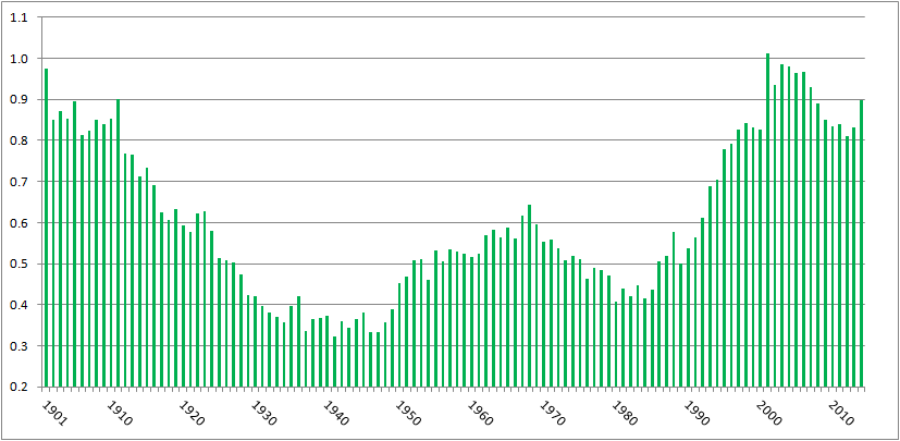
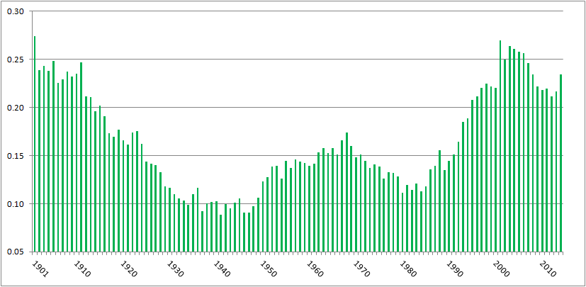
In the past, I’ve written about batters being hit by pitches–specifically, how the rate of hit batters is near all-time highs yet it hasn’t generated much, if any, outcry. Here’s a chart of hit batters per game, from 1901 (the start of the two-league era) to 2014:

HBP per game, 2001-2014

There were 0.68 hit batters per game in 2014, the eleventh-highest total over 115 years of two-league play. The top ten years, in order, have a 21st century slant: 2001, 2004, 2003, 2006, 1901, 2005, 2007, 2002, 2008, 1911.

Or, pretty much the same chart, here’s hit batters per 100 plate appearances:

HBP per 100 PA

There were 0.898 batters hit per 100 plate appearances in 2014, the tenth highest amount in the two-league era. The ten top years are, in order, 2001, 2003, 2004, 1901, 2006, 2005, 2002, 2007, 1911, and 2014.

Commenter jaysfan suggested that the modern emphasis on going deep into counts has changed the number of pitches thrown per game, so perhaps hit batters per pitch haven’t changed much. It turns out the pattern still holds. Here’s a graph of hit by pitch per 100 pitches, using actual pitch counts from FanGraphs for 2002 to present, and Tom Tango’s formula of Pitches = 3.3 x plate appearances + 1.5 x strikeouts + 2.2 x walks for the preceding years:

HBP per 100 pitches

With 0.234 hit batters per 100 pitches, 2014 ranks 16th all time, behind 1901-1905, 1908, 1910, 1911, and every year from 2001 to 2007. Again, a pronounced millennial bias. (Source for all the above graphs: Baseball Reference and FanGraphs)

It’s clear, then, that we’re seeing batters getting hit at the highest rate in a century. I tried to figure out why, and came up dry. Left-handed batters, who face a wider strike zone than righties, aren’t leaning across the plate and thereby getting hit at a proportionately higher rate. HBPs are not inversely correlated to power, with pitchers more willing to pitch inside now to hitters who less frequently pull inside pitches down the line and over the fence. College graduates are slightly more likely to get hit by pitches than other hitters, but not enough to explain the change. Batters setting up deeper in the batter’s box, as measured by catcher’s interference calls, isn’t correlated to HBPs.

However, commenter Peter Jensen noted, “I don’t think there is any question that pitchers throw more to the edges of the strike zone when they are ahead in the count. This could be confirmed with a pretty simple Pitch Fx study. And if they pitch to the edge more they are also going to miss inside more (and outside more) so this could partially or even wholly account for why there are more HBPs in pitcher counts.”

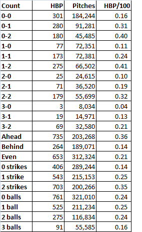
I did the PITCHf/x study Peter suggested. Using Baseball Savant data, I looked at hit by pitch by count, and as Peter found when he studied the data from 1997 and 2013, HBPs occur more when pitchers are ahead on the count. Here are the data from 2014:

2014 HBP

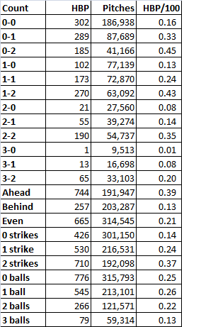
When the pitcher was ahead on the count, the batter was nearly three times as likely to get hit as when the batter was ahead. The most common counts for hit batters: 1-2, 0-2, and 2-2, and 0-1, all counts that encouraged pitchers to try to get batters to chase pitches on the border of the strike zone. Is this trend consistent? Baseball Savant’s data go back only to 2008, but using that season’s data, yes, the trend’s unchanged:

2008 HBP

Same thing. Batters are three times more likely to get hit when the pitcher’s ahead on the count, and the three most common HBP counts are two strikes with zero, one, or two balls, followed by 0-1.

So why the increase in hit batters? It appears that, as Peter implied, it’s because of the increase in strikeouts. Every three strike count requires a two strike count, obviously. In 2008, 22% of at bats went to 0-2 counts, 34% went to 1-2, and 29% went to 2-2. In 2014, those percentages had risen to 25%, 36%, and 30%, respectively, in line with the increase in strikeouts from 17.5% of plate appearances to 20.4%. The route to three strikes, which is being traveled more frequently, includes the four counts most likely to result in a hit batter. That’s why we’re seeing batters hit by pitches at rates not seen since before the first World War.

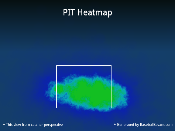
Here’s a graphical representation. In 2014, the Pirates led the majors in hit batters, handily, with 88. Here’s where Pirates pitchers threw on the hitters’ counts of 1-0. 2-0, 3-0, and 3-1:

Those greenish-yellow areas in the middle of the zone indicate that when the pitchers fell behind, they tended to locate their pitches in the strike zone. By contrast, check out the location for pitches thrown on 0-1, 0-2, 1-2, and 2-2 counts, when the pitcher could waste a pitch trying to get the batter to chase it:

That’s a much less concentrated blob, with a higher percentage of pitches outside the strike zone, where the batter can get hit.

As a final check, I ran a correlation between strikeouts per plate appearance and hit batters per plate appearance post-World War II. The correlation coefficient’s 0.82. That’s pretty high, suggesting a link between strikeouts and batters getting hit. Granted, correlation is not causation. But given that there’s an empirical link–to get to three strikes, you have to get to two, and batters with two strikes are at the highest risk of getting hit by a pitch–it’s enough to make me believe that while there are a lot of reasons more batters are getting hit by pitches, a major explanation is that hit batters are a consequence of rising strikeout rates.

CODA: If there were a day last season that I thought might’ve turned to tide on batters getting hit by pitch, it was Thursday, September 11. That day, there were 15 HBPs in 11 games. That doesn’t include the horrific fastball to the face that ended Giancarlo Stanton’s season; that pitch was a strike. A lot of stars got hit: Stanton, Mike Trout (twice), Yoenis Cespedes, Carlos Gomez, Jayson Werth. Tampa Bay’s Brad Boxberger hit Derek Jeter in the elbow. Had that pitch ended Jeter’s farewell tour, I really think it would’ve created an issue of rising HBP rates. Fortunately for Jeter and purveyors of Jeter memorabilia, it didn’t. But taking the 15 hit batters together, plus Stanton, and excluding two obvious retaliation jobs (Anthony DeSclafani hitting Gomez after Stanton got hit, Joe Smith hitting Tomas Telis after Trout got hit a second time), the fourteen hit batsmen occurred on six 0-1 counts (including Stanton and Jeter), three 1-2 counts, two 1-1 counts, and one count each of 0-0, 2-1, and 2-2. There was only one HBP with the batter ahead on the count, and ten occurred on the four counts identified here as the most dangerous for batters.