Studying Release Point Standard Deviation From Center
A few summers ago, Walker Buehler and the Los Angeles Dodgers came to Baltimore at the very end of the season. That night my buddy and I couldn’t figure out why the Dodgers, and the overwhelming mass of their fans in attendance, were so pumped about winning a single game in Baltimore. Once we saw staffers in ties and headsets running out with the “Division Champions” t-shirts, we realized what was going on.
Needless to say, Buehler was excellent, going 7 innings with 11 Ks and — because it was the 2019 Orioles — gave up no runs on four hits. During the game, while surrounded by very excited Dodgers fans, I mentioned that Buehler’s delivery seemed so efficient that his motion looked exactly the same every time he threw the ball. If you’ve ever worked on physical mechanics of any kind, be it baseball swings, golf swings, freestyle swim stroke, running stride, or maybe just proper form sitting at a desk to avoid that “work from home/pandemic backache,” you know how hard it can be to exactly replicate a motion over and over again. Buehler amazed us in his ability to do just that. We know that repetition in delivery mechanics leads to success in various forms, so with that in mind, the point of this analysis is to look at release point consistency and how that correlates with resulting pitching metrics.
Release Point Standard Deviation from Center
Much like Alex Chamberlain’s work on launch angle tightness, release point variance seeks to quantify a pitcher’s ability to repeat a motion. Pitchers with consistent mechanics are known to be more efficient, and if my thinking is correct, have more control. This research seeks to answer the question “does the ability to consistently release a fastball from the same location improve a pitcher’s control?”
Thanks to Baseball Savant, we can easily visualize release points by pitch type. Here’s a look at Buehler’s four-seam fastball:
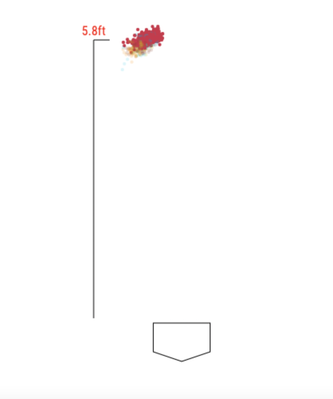
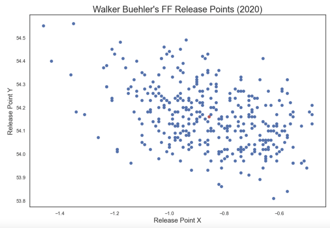
Looking at the clump of red dots being roughly 5.8 feet off the ground doesn’t tell us much, so instead I used “pitch_release_x” and “pitch_release_y” metrics from Statcast data to analyze the red dot clump. Looking at starting pitchers who threw four-seamers in 2020, I calculated the center of each pitchers’ release points, or the centroid. Once I had the centroid and any other individual pitch or release point, that meant I could calculate the distance between them. Once I had that data for each pitch (the pitcher’s centroid and the distance of each individual pitch from that centroid) I could find the standard deviation of each pitchers’ distance from the center. In the image below, you’ll see Buehler’s four-seamer release points in blue and a red dot representing the calculated centroid:
Next, I merged in 2020 season stats and looked at the correlations between this new “metric” and more tangible, meaningful metrics.
Results
Here are the correlations with standard deviation of release point and the associated r-squared:
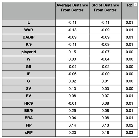
I was hoping to see a stronger correlation and r-squared between the standard deviation from center and control metrics like BB/9. Unfortunately, this feels like a dead end. But, before you totally write it off and close the tab, look at the pitchers who had the highest standard deviation from center to see who we’re talking about:
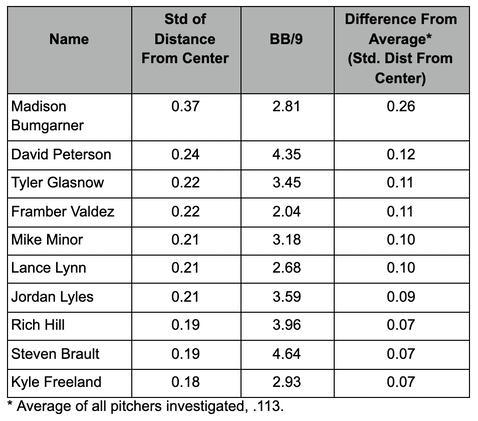
It’s an interesting list of pitchers, particularly the old vet Madison Bumgarner. To be honest, I’m not sure what this means. The league-average BB/9 in 2020 among starters was 3.17, and this list has below- and above-average pitchers, though again, my research does not show a correlation between BB/9 and the release point standard deviation from center. Interestingly, six of these 10 pitchers have higher than average BB/9 rates. It is also interesting to see Tyler Glasnow on this list given his command issues early in his career.
Conclusion
In truth, you’re probably not going to make it to a major league start if your fastball release point map looks like a Battleship game board. In comparison to launch angle tightness where there’s more margin, release point tightness should, theoretically, be very tight for starting pitchers. There is not enough evidence here to suggest that release point variability of the fastball is much of an indicator of success.
As mentioned before, we shouldn’t expect these major league starters to show much variability in their release point. However, this feels like it could be useful in younger player development, especially as pitchers in high school and college start to develop their arms. Looking at bullpen session data on release point variability, where it is available, could be telling for pitching coaches. It’s hard to notice these things with the naked eye, and a high release point standard deviation from center could be useful for coaches to focus more on the mechanical efficiency of young players.
Future Work
It would be interesting to see if there are any correlations between release point standard deviation from center and injury. Could it be an indicator that there is something wrong with a player’s arm when he is not likely to admit it? If a pitcher is on the cusp of injury, or simply fatigued, and begins overcompensating, could their release point become more sporadic?
If you have any thoughts on how release point variability could be useful, please submit a comment. If you are interested in seeing the Python code that went into this calculation, please take a look at my GitHub. Thanks for reading!
I don’t know if this was thought of but you could consider comparing it to less traditional metrics and go for statcast options. I’d be curious how it relates to meatballs and wasted pitches not close. I hope this helps because it seems like your hypothesis has something to it.
Thanks for the suggestion. Looking for correlations with Statcast metrics seems like a great way to keep the study going.