Archive for Diamondbacks

Determining Which Free Agent Contract Is a Success or a Bust

I was born, raised and am currently residing in South Korea, where Chan Ho Park, Shin-Soo Choo, and some Korean-born Major League players spent their school days before moving to the US with a big dream. Many Korean MLB fans recognize that their free agent contracts with the Texas Rangers have been something that very far from what we call a success.  Choo is currently having a great year and has been rewarded with his first trip to the All-Star Game.

Spending more than a decade of time to observe the ongoing conversations about those free-agent contracts, I have been wondering if it is possible to view this matter rather mathematically and/or statistically. And I think I have found a way for it, if it is not an absolute solution. I have named it proW/sal, which stands for proportional fWAR divided by proportional salary.

The equation is rather simple: proW/sal = (fWAR of the selected player in a particular year/fWAR of the player whose fWAR was the highest in that year)/(salary of the selected player in a particular year/salary of the most expensive player of that year).

The following are the exemplary applications:

1. This can be used in comparing individual players’ performances in one year in their FA contracts. Alex Rodriguez won the AL MVP award in 2007 after having a monster season with 54 homers and 156 RBIs, batting stellar .314, .422, .645. This enabled him to sign another 10-year FA contract with the Yankees. Let’s compare his year to that of Albert Pujols, who was in the middle of the extension contract with the St. Louis Cardinals.

A-Rod recorded the highest fWAR of the year: 9.6. The most expensive player of the year was Jason Giambi, whose salary of the year was $23,428,571. Since A-Rod’s salary for that year was $22,708,525, his proW/sal would be (A-Rod’s fWAR in 2007/A-Rod’s fWAR in 2007)/(A-Rod’s salary in 2007/Giambi’s salary in 2007) = (9.6/9.6)/($22,708,525/$23,428,571), which would be rounded to about 1.07. This is a great number because this means A-Rod’s fWAR and salary made an equilibrium with the highest fWAR and the highest salary of the year.

Let’s look at Pujols in 2007. His fWAR was 7.7, which is amazing, but not quite like that of A-Rod. His salary, however, was only $12,937,813. So his proW/sal of the year would be (Pujols’ fWAR in 2007/A-Rod’s fWAR in 2007)/(Pujols’ salary in 2007/Giambi’s salary in 2007) = (7.7/9.6)/($12,937,813/$23,428,571), which is about 1.45.

Yes. Pujols’ fWAR was lower than that of A-Rod. But due to his low salary, Pujols can be considered to have had a way more number-efficient year than that of A-Rod.

2. This also can be used to determine the efficiency of an individual FA contract in a year or as a whole. Let’s look at Randy Johnson during his first six years as a Diamondback.

Johnson’s FA contract with the Arizona Diamondbacks in December 1998 is considered one of the most successive FA contracts ever. But how good was it? Let’s determine it by using proW/sal.

In 1999, Johnson’s first year as a Diamondback, the player who recorded the highest fWAR was Pedro Martinez(11.6). Randy was at 9.5. And the most expensive player of that year was Albert Belle, whose salary was $12,868,670, while that of Randy was only $9.7M. So his proW/sal in 1999 was (9.5/11.6)/($9.7M/$12,868,670), which is about 1.09.

In the same manner, Johnson’s proW/sal in 2000, 2001, 2002, 2003, and 2004 can be calculated. According to my calculation, they were 1.18, 1.65, 1.44, 0.43, and 1.41, respectively. The big jump was due to A-Rod’s record-breaking FA contract with the Rangers, as well as Johnson’s great performances.

So the average of those six years’ proW/sal would demonstrate the efficiency of Johnson’s first six years in Phoenix. It’s at 1.19–a huge number because this means he was either the best in fWAR in those years, while his salary was quite below that of the most expensive player of each year.

For comparison, the average proW/sal of Carlos Lee’s FA contract with the Houston Astros was 0.29, and that of Choo’s FA contract with the Rangers was 0.26 until last year. I would not even bother with Park’s contract with the Rangers.

This equation, however, is far from perfection. First, I have not considered about distinction between fWARs of pitchers and batters, as well as salaries of pitchers and batters. I wonder if it would be necessary to differentiate them so that the number becomes fairer.

In addition, this equation is yet to function properly in regards to the fWARs in negative numbers. Using this equation may improperly evaluate a player with a negative fWAR with a cheap salary. For example, let’s suppose a player, A, whose fWAR was -1.0, and whose salary was $1M, another player, B, with the same fWAR but $10M of salary. And let’s assume that the highest fWAR that year was 1.0, and the most expensive salary was $10M. Despite the same fWAR and the lower salary, A’s proW/sal would be -10, while that of B is only -1. I have not found a solution to this yet due to my lack of proficiency in mathematics and statistics.

Moreover, this equation only functions well within the comparison between/among FA contracts. If this gets to rookie players, the value skyrockets  to an absurd degree. For example, the proW/sal of Mike Trout in his Rookie-of-the-Year year of 2012 is about 569.63. Every FA contract will be viewed as a bust if it is compared to that.

So here it is. I hope people with much proficiency take a look at this and improve it.

Paul Goldschmidt Has a Pop-Up Problem

When we were growing up, my dad would sometimes refer to my sister and me as ingrates. I always had a sneaking suspicion that statement was ruthless. I was young and under the assumption that he provided us everything we needed and wanted because that was what he was designed to do. In a sense, that perception of him probably does reflect the “ungratefulness” that young children tend to posses, innocent as it may be, what with a child’s inherently feeble comprehension of interpersonal relationships. I am now the parent of a two-year-old boy and just the other night he saw a commercial for a Power Wheels Jeep Wrangler that elicited the following outburst:

“I want to go in there!”

“I want one!”

Finally he turned to peer into my eyes and, in order to accentuate the severity of his next mandate, he raised his index finger and spoke;

“Daddy, better buy me one.”

His tone became dramatically more somber than it had been for the first two exclamations, and it made me laugh the hardest. I am certain I was the narrator of many statements similar to this as a kid, but the reality is, when kids are given everything they want, it’s up to the parent to understand that if there is a perceived lack of gratitude, it is a direct byproduct of the parent’s efforts to make them happy or even to keep them alive.

Lately I’ve been thinking of how I can be really ungrateful for even truly fine baseball seasons. Even some All-Star seasons disappoint me, and I know I’m not alone. If Mike Trout was in the middle of putting up a 5-win season, we’d all be talking about what could be wrong with Mike Trout. When players set the bar so ridiculously high we tend to hold them to that standard for better or worse. As an actual example, it’s completely understandable to be disappointed by Bryce Harper’s 2016 season after last year’s masterpiece. The reality is, however, that he’s 23 and has currently produced 3.4 WAR. His baserunning and defense have been positives and he’s compiled over 20 home runs and 20 stolen bases while hitting 14 percent better than league average; that’s damn fine and yet it’s still a damn shame.

Paul Goldschmidt, meanwhile, is hitting .301/.414/.494 and has accrued 4.7 WAR and might surpass 30 SB this year. His 136 wRC+ is still great even if it’s not quite the 158 he’s put up over the last three seasons. So why do I feel the loathsome inklings of disappointment bubbling inside of me? Firstly, and admittedly shallow of me, I like my Goldschmidt with more extra-base hits. For the first time in his professional career, at any level, Goldschmidt’s ISO starts with a number under 2. It’s possible he has a nice final week and brings that number up into the .200 range, but there are still some potentially concerning blips in his batted-ball profile that could portend of further decline in production. What I’m referring to most specifically, as the title suggests, is that Paul Goldschmidt has developed a pop-up problem.

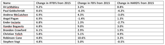
From 2011 through 2015, Goldschmidt’s cumulative IFFB% was 4.8%. This year it sits at 14%. He has 17 IFFB this year, which is the same amount he had in the three previous seasons combined. Pop-ups aren’t good as they’re essentially as productive as a strikeout. Here are the 10 players with the biggest increases in IFFB% in 2016 compared to 2015 among qualified hitters in both years.

top-10-chart

I’m not suggesting there’s a positive correlation between popping up and performance, but it’s easy to make sense of some of the names that appear on this list. If you watched Josh Donaldson break down his swing on the MLB Network, you know that a lot of players are thinking about not hitting the ball on the ground because damage is done in the air. Did you know that DJ LeMahieu, at the time of this writing, has a higher slugging percentage than Goldschmidt? That’s bonkers. The league’s slugging percentage last year was .405, and this year it’s .418, but this group of players, minus Goldschmidt, have added, on average, 21 points to their slugging percentage, and part of that, for this group, has to be chalked up to putting more balls in the air.

popupsimprove

What I’m hoping to highlight is that what is even more troublesome for Goldschmidt is that he is the only player in this top 10 who had an increase in their IFFB% while also seeing his fly-ball rate and hard-hit rate drop.

goldschmidtpopsdown

So I have what could be an insultingly obvious hypothesis: since Goldschmidt has long been a quality opposite-field hitter, I am theorizing that pitchers are exploiting him with more fastballs up and in where he can’t quite get his hands extended. A cursory glance at his heat map vs. fastballs in 2015 and 2016 reveals a minor shift in approach by the league.


 goldschmidt-fb-2015goldschmidt-fb-2016

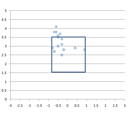
Besides the obvious, which is that pitchers are avoiding the zone even more than they had before, we can see just a bit more red in the specific zone I was referring to. It’s not so glaring or even enough information to make any conclusions, so let’s see if that area is where pitchers are getting Goldy to pop up. On the year, per Brooks Baseball, he has 22 pop-ups, 19 from fastballs and three from offspeed pitches. The 17 that are classified as IFFB by FanGraphs are plotted in the graph below.homemade-heatmap

*the two pitches towards the outside corner (for Goldschmidt) are sliders.

However, it’s not as if pitchers have previously avoided throwing Goldschmidt up and in; it just appears, despite his overall swing rate being at a career-low 39%, he’s upped his swing rate against fastballs by over five percentage points in that specific area just above 3.5 ft. And that area has the largest concentration of his pop-ups.  Looking at the entire area middle/up/and in to Goldschmidt, he has increased his swing rate from 57.2% in 2015 to 60.7% in 2016 while staying away from lower pitches in general. It’s a philosophy that is being echoed throughout baseball right now, and it is not at all a bad plan, but it has caused him, either deliberately or due the effect of swinging at these pitches more often, to go to the opposite field this season less than he ever has. This also is not necessarily a negative shift in regards to a batted-ball profile, but from 2013 – 2015 Goldschmidt was the fifth-most productive hitter in baseball going the other way, and in 2016 he’s 33rd. That represents a drop in wRC+ from 204 to 158, and from a .729 SLG (.329 ISO) to a .647 SLG (.255 ISO). I’ve long since regarded Goldschmidt to be in the same tier of hitters as Trout, Votto, Cabrera, and pre-2016 McCutchen, and it would be a shame for him to move away from a facet of his game that enables him to produce at that elite level.

At the end of this season I don’t think I’ll actually be all that worried about Goldschmidt; I can reconcile a 136 wRC+, even if it would feel a little disappointing. I wrote about Paul Goldschmidt last year and I wasn’t worried then, either. But I do think if I’m going to take a 136 wRC+ for granted I should place that appreciation toward the catalyst for this change in Goldschmidt’s performance, and a lot of that credit has to go to the pitchers who have induced 17 IFFB from a player who only averaged 5.7 over the last three seasons.

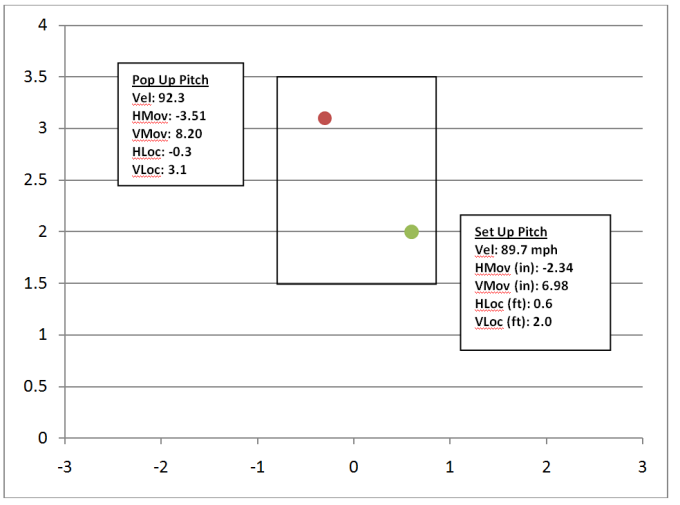
Now I know that setting up a pitch has so much more to do with an entire at-bat, game, or even season than the pitch that was thrown immediately before it, but for this exercise I want to look at the pitch that caused Goldschmidt to pop up and how it relates to the pitch thrown immediately before it. It’s crude and does not tell the whole story, but it still shows a definite approach — and, for all intents and purposes, it’s probably a decent representation of a general tactic used across the league for inducing pop-ups. I found all the data I needed using PITCHf/x at Brooks Baseball and I recorded the velocity, horizontal movement, vertical movement, horizontal location, and vertical location of each pitch Goldschmidt popped out on as well as the same data set for each set-up pitch if there was one (which would be in any situation where Goldschmidt did not pop up on the first pitch of an-bat). Below you’ll find a plot that shows the average location and characteristics of each pitch.

poppy-uppies

And here is that data in a table represented as the average difference between the two plot points.

pitchdiff

Doesn’t it make you feel warm when something fits into the shape you had pegged it to be? That’s just really simple and makes a hell of a lot of sense. Or maybe I feel warm for taking something that was disappointing and turning it into something I can really appreciate.  Now if you’ll excuse me, I have a Power Wheels Jeep Wrangler to buy.


Is A.J. Pollock Really This Good?

A.J. Pollock is, at the moment, one of the best fantasy outfielders in major league baseball.  He’s 4th according to the ESPN player rater but since most of you and I don’t REALLY know what that means, let’s say it a different way.  He is one of only four players with at least a .290 AVG, 10 HR, and 15 SB.  Still, whenever I talk with anyone about Pollock’s performance, the consensus opinion on him is more of a resonating question: “Is A.J. Pollock really this good?”  Let’s attempt to answer that.  Dating back to the beginning of 2014,  Pollock has played in 161 games.  We could round that up to 162 games, especially since players rarely play every single game of a season, and call it a full season, but I’m going to go the extra mile here and pull the last game from his 2013 campaign to have a constant 162 games for this exercise.  The stat line he has produced is impressive.


G   PA   H   AB   R   2B   3B   HR   RBI   SB   BB   K  HBP   SF   AVG   OBP   SLG   OPS
162   657   181   603   99   37   8   18    67   33   46  103    3    4 .300 .351 .477 .827

Let’s lower the bar a little bit so that we can find more players in THIS search: how many other players over their last 162 games have hit at the very minimum: .290, 90 R, 15 HR, 60 RBI, 25 SB?  The answer is 1, and that man is Starling Marte.

  G   PA   H   AB   R   2B   3B   HR   RBI   SB   BB   K   HBP   SF   AVG   OBP   SLG   OPS
  162   652   181   596   90   36    3    22   88   33   36   148     16    2   .304   .358   .485   .843

I’m not sure if that makes Marte a fair comparison.  We can compare them, but Marte delivers more line drives and raw power than Pollock does.  Marte, despite having a paltry 19.3% FB rate, has averaged 312 feet on his fly balls this year, 4th best in the majors, allowing him him to post an absurd 29.5% HR/FB rate – and we’re not even ready to get into park factors yet.  Pollock is just a bit more refined than Marte, posting a better BB rate and K rate than Marte has, by, obviously, swinging at better pitches to hit.

2015   BB%     K%     OSWING%     ZSWING%     SWING%     CONTACT%
  Pollock     7.4   15.6        31.2        59.1      44.3        82.7
  Marte   5.3   24.1        38.9        77.8      56.8        74.5

Pollock, too, has a fine average fly ball distance.  It’s 295 (a number he’s increased each year), which is good for 39th overall, smack dab in between Adam LaRoche to the north and Nolan Arenado to the south.  But Pollock has also been incrementally improving his BB/K ratio over the last three years, bringing it from 0.40 to 0.47 this year.  It could be as simple as that – a good player that has made strides in his approach at the plate, but I can’t just leave it at that.  Despite these improvements, albeit, very small ones, his batted ball profile looks right around league average.


2015   LD%    GB%    FB%    IFFB%    HR/FB    IFH%    BUH%    PULL    CENT    OPPO    SOFT    MED 
Pollock 19.4 51.4 29.1 12.3 13.5 10.5 100 36.7 36.3 27.0 17.4 50.2
League AVG 20.9 45.4 33.6 9.4 10.7 6.7 24.3 39.0 35.6 25.5 18.6 52.9

Pollock is fast, so hitting a lot of ground balls works in his favor.  He’s been able to have higher than average IFH and BUH percentages in each of the last three years because of his speed.  However, despite being a below average line drive hitter this year, and throughout his career, he is less susceptible to BABIP fluctuations than other high frequency GB hitters like Alcides Escobar, Elvis Andrus, Jean Segura, because Pollock produces a hard hit rate higher than the league average – he is an authoritative hitter.  Curious though, that with his below average LD rate, this is the case.  So his hard hit% is driven by either hard contact on fly balls or ground balls relative to league average.  Since he has an IFFB% above league average I’m going to predict that he’s a high authority GB hitter.  There’s logic in that, right?


  2015   GB   AVG     HARD  GB   PULL GB      CENT GB     OPPO GB     FB AVG     HARD FB     PULL FB     CENT FB     OPPO FB  
  Pollock    0.301   23.1   46.9   41.3   11.9   0.234   35.8   19.8   34.6   45.7
League AVG   0.234   17.1   52.9   34.1   13.1   0.223   36.2   22.2   38.0   39.8

He’s right at about league average for hard hit fly balls, but he does seem to have a hard hit ground ball percentage markedly higher than league average.  In fact, his 23.1% hard hit GB rate is 18th best in the league.  The 17 players in front of him have combined for an average line of:

    2015   H   AB     R     HR     RBI     SB     AVG     LD%     GB%     FB%     HARD%  
  Top 17     84   300   41    13     45     3    .280    20.4    44.5    35.1      33.7
  Pollock     100   334   58    11     42    19    .299    19.4    51.4    29.1      32.4

The list also includes names like Tulo, Miguel Cabrera, Posey, Pederson, Upton, Donaldson, Trout, Jose Abreu, and Yoenis Cespedes.  It’s guys that we generally perceive to be hard contact hitters, or I guess, more specifically, power hitters.  But he’s 18th on the list and produced a quality hard hit ground ball rate last year, too.

But, he still has a league average hard hit fly ball rate and a below average line drive rate.  These are reflected in his numbers compared to the league.

  2015     LD%     LD AVG     GB%     GB AVG     FB%     FB AVG  
  Pollock     19.4     0.667   51.4     0.301   29.1     0.234
  League     20.9     0.684   45.4     0.234   33.6     0.223

Lastly, he plays in Chase Field, which, throughout its history, has been a hitters park.  From 2008-2014 it had an adjusted park factor of +111.  For right handed hitters (and left handed hitters) like A.J. Pollock, it has had only positive affects, but this table is solely for righties:

  HR     3B     2B     1B     AVG     OBP     SLG     R  
  1.09   1.45   1.14   1.00    1.04    1.03    1.07   1.11

Put Pollock in a neutral park and his numbers for the last 162 games would theoretically look like this:

  G   PA   H   AB   R   2B   3B   HR   RBI   SB   BB   K   HBP   SF   AVG   OBP   SLG   OPS
162   657   174  603   89   33    6    17    60   31   46   103     3    4   .288   .340   .448 .788

I was kind of hoping to see more signs that Pollock is experiencing more luck.  Not because I don’t like Pollock, I love him as a baseball player and I’m sure he’s a fine person, but because of the questions regarding the sustainability of his play in the first half of the 2015 season by many of my peers.  The answer to, “is he really this good”, is that he is pretty darn close and I can see him performing to any of the projection systems’ expectations the rest of the way (ZiPS, Steamer, or Depth Charts).  He should experience some fluctuation in BABIP because of his GB rate, but so far he really hasn’t – and again that’s partially due to the authority with which he hits them.

In terms of finding a player closest in comparison to Pollock, Marte might be a pretty decent choice.  If I can just brainstorm using the cloud technique, I would probably have, with A.J. Pollock’s name in the middle: Starling Marte, Jason Heyward, Christian Yelich, Charlie Blackmon, Brett Gardner, and Lorenzo Cain as smaller clouds extending off the big, middle cloud.  Here are stats based on the last 162 games played.


PLAYER   PA   H   AB   R   HR   RBI   SB   BB   K   HBP   SF   AVG   OBP   SLG   OPS
Yelich   709   181   628   91    9    56   22   75   155      4    1   .288   .367   .390   .757
Cain   641  180   592   91   11   66  39   37  128      8    4  .304   .351   .448   .799
Heyward   636   163   576   76   12   60  22   51   96      4    4   .283  .343  .403  .746
Blackmon   698   179   628   87   18   66   36   41  123    19    5  .285  .345  .436  .781
Gardner   707   162   611 108   21   72  22   70  147     6    6  .265  .343  .458  .801
Marte  652   181   596   90   22   88  33   36 148    16    2  .304  .358  .485  .843


This group kind of works as a spectrum.  I see the players on the extreme north and south columns least like Pollock and the players in the middle most like Pollock.  There is no one player to compare A.J. Pollock with that is playing currently, although Mitch Webster would be a pretty good historical comparison using his ages 26 – 28 seasons.

Mitch Webster ages 26-28 162 G AVG:

  G   PA   H   AB   R   HR   RBI   SB   BB   K   HBP   SF   AVG   OBP   SLG   OPS
  162   656   165   580   94    15    60   36   62   87      5    5   .283   .354   .441   .795

Probably too high of a walk rate, but that looks pretty good.

The average season of the group above would look like this:

  G   PA   H   AB   R   HR   RBI   SB   BB   K   HBP   SF   AVG   OBP   SLG   OPS
  162   674   174   605   91    16    68   29   52   133     10    4   .288   .352   .437   .789

A little too high of a K rate, but that also looks pretty good.

And finally A.J. Pollock ages 25-27 162 G AVG

  G   PA   H   AB   R   HR   RBI   SB   BB   K   HBP   SF   AVG   OBP   SLG   OPS
  162   618   163   567   89    15     57   25    43   101      3    3   .287   .339   .449   .788

In conclusion, A.J. Pollock is very close to this good if he’s not actually THIS GOOD and I think these players are pretty good comparisons.  And hopefully Pollock has more long lasting success than Mitch Webster.  In a time when speed/power combo players are in decline, what Pollock is doing is clearly elite in that sense.  What I really would like to see would be the history of authoritative ground ball hitters with good speed who have played in parks that have buoyed their power numbers.  Unfortunately, I don’t have access to batted ball profiles for hitters throughout history – how many Pollocks does it take to gather that information?