The Correlation Between BABIP Rate and Three True Outcomes

First things first, I would like to credit my friend Elling Hofland for coming up with the main idea of this piece. He’s the one who provided me with his thoughts and theories that allowed me to expand on this topic in the first place. Give him a follow on Twitter for sports and stats-related banter; his handle is @ellinghofland.

BABIP, or batting average on balls in play, is an incredibly useful stat. It does a fantastic job at using both luck and quality of contact to give a better grasp as to how a player actually performs during batted-ball events. These batted-ball events only take up a certain percentage of a player’s plate appearances. BABIP rate focuses on how many plate appearances a player has relative to the number of batted-ball events they have. To calculate BABIP rate, you take at bats minus strikeouts and home runs, plus sacrifice flies, and divide that by plate appearances. For example, if a player has 600 PA during a single season along with a 300 batted-ball events, they have a BABIP rate of .500.

Now, if you look at the three variables taken out of that equation, you’re left with walks, strikeouts, and home runs, otherwise known as the “three true outcomes.” These are called true outcomes due to the fact that none of them (for the most part) involve defense on the field. A shortstop can’t screw up a strikeout, walk, or a home run. You can take these three true outcomes and turn them into a rate as well. If you add up a player’s strikeouts, walks, and home runs and then divide them by plate appearances, you get TTO rate.

Let’s look at Mike Trout. In 2017, Trout’s BABIP currently sits at .369. However, he has a BABIP rate of .550 along with a TTO rate of .435, meaning that 55% of his at bats end with a ball in play, while 43.5% of his plate appearances result in a strikeout, walk, or home run. Both BABIP rate and TTO rate are useful stats, as they essentially show how well and how often a player makes contact. While BABIP itself is useful, it can be hard to tell how luck is involved in a batted-ball event when it isn’t hit over a fence for a homer. BABIP rate attempts to bridge the gap between BABIP and the three true outcomes.

Miguel Sano is a well-known slugger. In his three seasons in the majors, he’s smashed the ball when he’s hit it, boasting exit velocities of 94.0 in 2015, 92.3 in 2016, and 93.1 in 2017. Despite these consistent EVs, his BABIP has fluctuated from 2015 to 2017, with marks of .396, .329, and .385, respectively. If we look at his BABIP rate from 2015-2017, they look like this: .429, .478, and .473. Despite the difference in his BABIP from 2016 to 2017, his BABIP rate has stayed nearly the same, meaning that he’s still making the same amount of contact with the ball despite fewer balls falling for hit in 2016. Looking solely at BABIP, it could be argued that 2016 was his “regression” to where he should be after sporting an incredibly high BABIP in 2015. In 2017, one could say his high BABIP is a cause for concern, as he may just be getting lucky. However, his BABIP rate shows that isn’t the case.

Let’s look at another player, Brandon Phillips. Phillips’ BABIP has been incredibly consistent during his past three years, sitting at .315 in 2015, .312 in 2016, and .305 in 2017. Additionally, his BABIP rates have been .820, .816 and .802. Phillips puts the ball in play nearly 80% of the time on a regular basis.

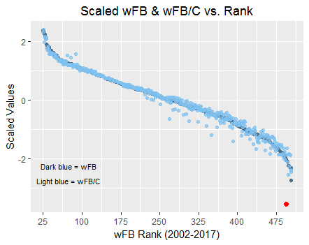
So, as you can imagine, there is a real link between BABIP rate and TTO rate. The more contact a player makes, less they tend to walk or strikeout. Thus, a high BABIP rate equals a low TTO rate. This is exactly what we see if we attempt to correlate these two stats. Below is a snapshot of a graph that shows TTO rate vs. BABIP rate.

TTO vs BABIP rate

Players names aren’t included because, A) it clutters the graph, and B) they aren’t necessary at this point. Accompanying this graph is a trend line with an R squared value, otherwise known as a correlation coefficient. Essentially, an R squared value measures how well your model fits your data, or in this case, how closely correlated  TTO and BABIP rate are to each other. It turns out that the R-squared value is .991, which means that the relationship between BABIP rate and TTO rate fit very well together: in fact, you’ll find that TTO rate and BABIP rate are almost the exact opposites of each other. The players with the top 10 lowest BABIP rates in the MLB all have TTO rates of .437 or higher, meaning that their at bats result in an outcome of a walk, home run or strikeout 43.7% of the time. Inversely, players with the lowest BABIP rates all have TTO rates of .225 or lower.

We can also derive more information from these numbers using this correlation. Players who have a low BABIP rate have a very high OPS. Remember, these players also have high TTO rates. The top 10 players, Judge, Sano, K. Davis, Souza Jr., Reynolds, Morrison, J. Upton, C. Santana, Lamb, and Stanton all have an OPS of .841 or higher. The players with the highest BABIP rates (or lowest TTO rates) have an OPS of .798 or lower.

BABIP rate can tell us a lot of about a player. Just by glancing at a player’s BABIP rate, you can have an instant idea of how often the player walks, strikes out, or hits dingers. Not only that, but it you can tell you a lot about their offensive production. High TTO rates usually mean high hard-hit rates along with high exit velocities. BABIP rate also helps understand BABIP itself better and teaches that you can’t judge a player by BABIP all the time. In most cases, players with an over-inflated BABIP (relative to past performances), just tend to mash the absolute heck out of the ball, as told by their low BABIP rates and high TTO rates. On the opposite end, players with a steady BABIP will have very high BABIP rates and tend to be contact hitters that put the ball in play and don’t hit for power. BABIP rate, along with its correlation to TTO rate, has the potential to be a powerful, tell all offensive stat.


Why the Mets Should Call Up Tim Tebow in September

As of August 21st, 2017 Tim Tebow was slashing .220/.304/.343 between the New York Mets’ High-A team, the Columbia Fireflies (South Atlantic League), and their Advanced-A squad, the St. Lucie Mets (Florida State League). In 442 minor-league plate appearances, he is the owner of a .304 wOBA, and is striking out at a 26% clip while walking in 8% of his plate appearances. For every one ball that Tebow elevates, he is hitting the ball on the ground three times over. Right off the bat (pun intended), it is evident that Tebow’s offensive game leaves something to be desired.

Let’s take a quick look at how Tebow stacks up with the average hitter, in each A-ball league, that has had a minimum of 200 plate appearances and has primarily played the same position(s) as Mr. Tebow (outfield & designated hitter):

*Data as of 8/21/2017
Player Age BB% K% AVG OBP SLG OPS wOBA wRC+
Tim Tebow 30 8.8% 26.5% 0.220 0.304 0.343 0.647 0.304 90
Avg. SAL OF/DH 21.5 7.7% 21.9% 0.253 0.322 0.378 0.700 0.322 104
Avg. FSL OF/DH 23 8.2% 21.4% 0.255 0.324 0.370 0.694 0.324 103

Only his walk rate appears to be on par with each respective league’s average. Additionally, Tebow has logged a .913 fielding percentage while playing (primarily) left field this year. It is widely understood that fielding percentage is a “far-from-perfect” measurement when objectifying defensive ability, but it can provide a high-level perspective on one’s aptitude as it relates to fielding the baseball. To put Tebow’s number into context, the lowest fielding percentage in the major leagues this year by an outfielder (minimum 100 innings played) is Mark Canha of the Oakland A’s, at .922.

Many words come to mind when attempting to summarize the 30-year-old’s all-around quality of play while in A-ball; ‘excellent’, ‘incredible’, or ‘promising’ would not be any of those words. However, despite the subpar statistical measuring points, the Mets should seriously consider calling up Tim Tebow to the big leagues come September.

No, that is not a typo. Yes, you read the last sentence of the above paragraph correctly. When rosters expand to include anyone on the 40-man roster on September 1st, the New York Mets should give sincere thought to adding Tim Tebow to their roster/big-league club. Now, why would the New York Mets, a team that owns a 55 – 71 win-loss record and trails the NL Wild Card race by 13.5 games and NL East Division title by 21 games, bother calling up a poorly-performing 30-year-old high-A-ball player? The answer, as it is with many things in life, is money.

Baseball clubs generate revenue in many ways: merchandise sales, concessions sales, corporate sponsorships, media deals, etc. One of the largest and most obvious ways in which income at the major-league club level is generated is through home-park ticket sales. Tim Tebow excels at putting fans in the stands:

YoY Average Home Game Attendance Figures

Year Columbia Fireflies St. Lucie Mets
2016 3,768 1,405
2017 4,783 1,996
YoY % Change 21% 30%

As you can see, both teams that Tebow has played for this year have experienced huge jumps in home attendance figures. This has occurred despite the fact that in 2016 the Columbia Fireflies were celebrating their inaugural season at a brand new stadium, and the St. Lucie Mets were 11 games over .500 in the thick of a playoff race (compared to 11 games under .500 in 2017 at the time of this publication).

As I alluded to above, a lot of circumstances can impact attendance figures: new stadium, weather, promotions, team quality, opponent, etc. However, I think that it’s pretty evident that Tim Tebow’s arrival on the Mets’ minor-league scene has driven a majority of the jump. To confirm this, let’s look at attendance figures from a different angle – specifically, 2017 home attendance numbers and how they vary for each team from when Tebow was actively rostered vs. when he was not:

*Data as of 8/19/2017
Team Tebow Rostered # of Home Games Avg. Home Game Attendance % Change
Columbia Fireflies No 20 3,757
Columbia Fireflies Yes 41 5,308 29%
St. Lucie Mets No 37 1,745
St. Lucie Mets Yes 24 2,419 28%

Again, it’s evident that Tim Tebow’s roster presence has enticed people to come to the home team’s ballpark at a clip nearly 30% greater than if he were not on the team.

So how do we translate these attendance figures into dollars and cents? Since I do not have access to either team’s ticketing database, this is where some assumptions about average per-cap and ticket value will have to come into play. Baseball America’s JJ Cooper & Josh Norris have recently written articles that similarly examine Tebow’s impact at the box office – however, their stories concentrate heavily on road attendance and overall league attendance impacts, rather than the home ballpark’s ticket sales (which are critical to driving a organization’s recognized revenue). In his article, Norris notes that most minor-league operators use a $21 per-cap estimate for fan spending. This figure is an estimate of what each fan that enters the ballpark will have paid in tickets, concessions, merchandise, and parking.

For the first 39 home game dates (41 games due to two doubleheaders) of their 2017 season, the Columbia Fireflies were able to showcase Tim Tebow in uniform. They attracted 207,031 fans. In the first 39 home game dates of their inaugural 2016 season, the Fireflies drew 155,132 fans. The difference between 2017 and 2016 for these first 39 home game dates is 51,899 fans. If we apply the $21 per-cap estimate referenced above, we are looking at about $1.1 million in additional revenue that can be largely attributed to Tebow being in uniform. Tebow’s last game for the Fireflies was on June 25th, his first game for the St. Lucie Mets was on June 28th. Through August 18th, Tebow has been a member of St. Lucie’s roster for 22 home game dates (24 games due to two doubleheaders) and has helped attract 53,207 fans. In 2016, the St. Lucie Mets were able to draw 21,097 during the same stretch. If we apply the $21 per-cap estimate, it will have amounted to $674,310 in additional revenue over the course of the 22 home game dates at this point in the season. Additionally, Tebow has undoubtedly drawn in an abundance of new consumers to each team’s ballparks and databases. This is information that can be leveraged for future sales and marketing initiatives. It would not be ludicrous to state that, combined, the Mets’ A-ball affiliates have increased home-park revenues by roughly $2 million due to Tim Tebow.

Let’s take a hypothetical look at these trends from the 2017 New York Mets point of view. Their current 40-man roster sits at 36 occupants – so there is no risk of having to DFA a player in order to bring on a newcomer. They are far removed from the playoffs, and already have their sights set on next year. Even by adding Tebow to the 40-man roster, they would have three additional spots to work with should they want to expose some of their MLB-ready prospects to low(er)-leverage big-league games in September. The Mets would have to pay Tebow a pro-rated MLB minimum salary, which would come to be about $65K for the final four weeks of the season, pennies compared to what he would bring back in return.

Here is a table of the historical attendance at Citi Field for the month of September since 2010:

Year Citi Field Sept. Attendance # of Games
2010 382,306 14
2011 433,251 16
2012 385,292 16
2013 340,799 15
2014 337,343 13
2015 353,005 11
2016 468,283 14
2017 ? 14

I’ve highlighted 2014 because it most closely resembles the environment that the 2017 Mets will be embarking upon, as you can see below:

*Through 122 games
Year Winning % GB – Division GB – Wild Card Weekday Home Games Weekend Home Games
2014 0.467 10.5 7.5 7 6
2017 0.443 20 12 8 6

You will notice, the 2014 and 2017 Mets were/are both clearly out of the playoff picture and had/have a similar distribution of home games throughout the month of September. Despite one more overall September game in 2017, the 2014 season should prove to be a good starting point for us; because of the extra game, let’s estimate that the Mets will bring in around 339,000 people to Citi Field in September of 2017.

Now, the fun part. How does that audience, and consequentially revenue, project to increase if Tim Tebow were added to the roster? It would be rather difficult to forecast how a marketplace like New York City would react to a move of that nature. There are infinite amounts of variables that could be considered: chilly September temperature and weather volatility, inability to purchase season packages so late in the year, the comparison of the NYC marketplace to that of Columbia, SC and St. Lucie, FL, the matter of the media, the beginning of football season, etc. the list could go on and on. For simplicity’s sake, let’s assume that New York’s market would react in a similar manner as that of Columbia & St. Lucie’s – home attendance gains of near 30%. That would push an additional 102,000 customers through the Citi Field turnstiles during the last four weeks of the season.

The average MLB ticket price in 2016 was $31.00, a 7% increase from the previous year. A 7% increase from the 2016 ticket price would put us just over $33.00 for 2017. This gives us a place to start with regards to estimating revenue impact. I don’t have access to the Mets’ ticketing database, so this barometer will do for the time being. My gut tells me that the $33.00 price point is low; typically season-ticket prices are used when calculating the league-wide annual average ticket price, and season tickets are sold at a discount compared to single-game ticket prices. Being that it is September, most fans that would turn out to see Tebow would be purchasing at the single-game ticket price point (or group-ticket price point, but that complicates things further) since season packages are likely no longer being sold for 2017.

Irrespectively, at this point the math becomes clear: 102,000 additional fans at $33.00/ticket would generate an estimated $3.4 million in surplus revenue. This doesn’t even include the additional revenue that would accrue via a multitude of other outlets. Concessions, merchandise, and parking – all revenue streams that the Mets split with their respective vendors – would experience huge jumps. Strategies to boost season-ticket-holder retention for 2018 (Tim Tebow meet and greet anyone?) would likely yield positive results. As stated before, entirely new ticket buyers would flood into the Mets’ ticketing database — which should boost returns in some form or fashion in future years.

Tim Tebow is not going to play baseball forever. He may choose to call it quits on his “pro-ball quest” after this year. Who’s to say he even wants to go through another year toiling away in the low minor leagues? A promising and young (albeit injury-prone) starting pitching staff should have the Mets within shouting distance of playoff contention for the next couple of years. If that is the case, they will not want to waste an NL roster spot on a subpar, 31-year-old, designated hitter. Roughly $3.5 million should allow the Mets to chase around 0.5 WAR on the open market. It could provide them additional wiggle room to take on extra salary in a deadline trade next year. It would allow the acquisition of players along the likes of Trevor Cahill, Logan Morrison, or Drew Storen…all of whom signed for under $3 million this past offseason. It could be put toward additional infrastructure, baseball analytics, or scouting staff.

Sure, there are certainly more deserving players in the Mets’ minor-league system that have ‘paid their dues’ to a greater extent than Tim Tebow — all in the hopes of getting a call-up to the Show. But baseball is a business, and at the end of the day, no one in the Mets’ system will be able to have an impact on fans the same way that Tim Tebow does/can. The Mets need to capitalize on their current situation before the former Heisman trophy winner tires of the long and uncomfortable bus rides, motel stops, and food spreads that dot the minor-league landscape. The Mets need to cash in on their investment before Tebow bids baseball adieu.


A Surprising Benefit of Throwing a Good Sinker

*Note: all stats are as of August 1, 2017

I originally intended to write a post about the aspects of a four-seam fastball that are most important in generating whiffs. The correlation between fastball velocity and whiff rate on the fastball is only about 25%, so I was interested to find out whether other factors, such as vertical movement, location, or pitch usage, are better indicators of a fastball’s swing-and-miss tendencies. While some of the names at the top of the fastball whiff list were not surprising at all (Chris Sale, Jacob deGrom, James Paxton), there were several others who I was surprised to see, including Brandon McCarthy, Rick Porcello, J.A. Happ, and Clayton Richard. There was one glaring similarity between these seemingly overachieving pitchers: they throw a high percentage of sinkers.

So I looked at the correlation between whiff rate on the four-seam fastball and sinker usage, only to find that it was not only small, but also negative. However, looking at the correlation between these two variables is somewhat like a chicken-and-egg problem: does sinker usage affect a pitcher’s four-seam fastball whiff rate, or does his four-seam fastball whiff rate affect his sinker usage? The latter option certainly seems reasonable: a pitcher who is ineffective with his four-seamer is more likely to develop a sinker than a pitcher with a dominant four-seamer. For this reason, we have to dig deeper to determine if sinker usage has any effect on four-seam whiff rate.

I looked instead at only the 48 qualifying pitchers who throw a sinker at least 10% of the time (and a four-seam fastball at least 5% of the time). I found the correlation between several variables — some relating to the sinker and some unrelated to it — and four-seam whiff rate. If the variables related to the sinker have a significant correlation with four-seam whiff rate, then that implies that a pitcher’s sinker can have an effect on his four-seam fastball. The variables I looked at were the four-seam fastball’s velocity and vertical movement, the sinker’s velocity and vertical movement, and the difference between a pitcher’s four-seam fastball and sinker in both velocity and vertical movement. Here are their correlations with four-seam fastball whiff rate:

   4-Seam Fastball                                        Sinker                                       Difference
Velocity 0.3022 0.2249 0.3011
V-Movement -0.0544 -0.2875 0.4348


There are a few interesting things to note here. First, the four-seam fastball’s velocity seems to be just as important as the difference in velocity between the four-seamer and the sinker. While velocity is often the first thing most people look for to determine if a pitcher has a swing-and-miss fastball, relative velocity is equally as important as absolute velocity, at least when it comes to pitchers who also throw a sinker. This confirms the notion that changing speeds can upset the hitter’s timing and make a fastball seem faster than it is.

Relativity is even more important when it comes to vertical movement. While there is no correlation between four-seam whiff rate and four-seam vertical movement, there is a significant correlation between four-seam whiff rate and the difference in vertical movement between the four-seamer and the sinker (I’ll call this “v-movement difference”). This seems to show that the downward movement of the sinker makes hitters more likely to swing under the four-seam fastball; they keep the sinker in mind, so the four-seamer appears to have more vertical movement than it actually does. If this is true, then we should expect v-movement difference to have a greater effect on pitchers who throw a higher percentage of sinkers. To test whether this is true, I increased the requirement of minimum percentage of sinkers thrown in intervals of 5%, from 10% to 35%. I then found the correlation between four-seam whiff rate and v-movement difference at these different thresholds. Here are the results:

threshold correlation
10 % 0.4348
15 % 0.4125
20 % 0.4752
25 % 0.4752
30 % 0.5121
35 % 0.5025


Just as we expected, the correlation between v-movement difference and four-seam whiff rate is higher for pitchers who throw more sinkers. If the relatively high correlation we observed at the 10% threshold were pure luck, then the correlations at higher thresholds would be scattered randomly. The fact that there is a clear upward trend in correlations as the threshold increases proves that v-movement difference does, in fact, have an effect on four-seam whiff rate. While this does not necessarily mean that adding a sinker will help a pitcher get more whiffs on his fastball, it does prove that the quality of a pitcher’s sinker can affect the effectiveness of his fastball. More specifically, we also learn that a good sinker, in terms of generating whiffs on the four-seamer, is one that has little vertical movement (or a lot of sink) in relation to the four-seamer.


Starting Pitching: Not Dead Yet

Starting pitching constitutes the most persistently difficult roster-management problem in baseball. The laws of supply and demand make starters exceedingly expensive, while the laws of biomechanics make starters exceedingly unreliable. When Terry Francona had uberreliever Andrew Miller throw 151 innings (or something) during the 2016 postseason, people began to say “why not do that all the time?” And with MLB offenses scoring 4.67 runs per game, a level not seen since the tail end of Vitamin B-12 Era in 2007, the entire concept of starting pitching has come under withering scrutiny. The answer to “why not use relievers all the time” used to be “because it wouldn’t work, you remarkably silly person.” But now, with starters routinely getting shelled, it’s becoming clearer that the current default approach isn’t necessarily working either.

The internets are positively chock full of people anticipating the post-starter world (see, e.g., here and here). Cubs broadcaster Len Kasper, who has given starting pitching a lot of thought over the years, recently suggested removing the five-inning minimum as a condition for a win, in order to encourage managers to be more creative with starter usage (and, perhaps, to discourage Jon Lester from flattening Joe Maddon when he gets yanked after 4 2/3). The arguments for moving beyond traditional pitcher usage are creative and intriguing.

This future may seem exciting, but it still appears to be a long way off. While starter innings have certainly ebbed since the days of Big Ed Walsh, who led the charted universe with 422 IP in 1907, the number of innings per start has stabilized somewhat in recent years. And there is little evidence that shortening starters’ outings necessarily enhances run suppression.

Since 2007, innings/start has varied from a high of 6.0 in 2010 and 2011, to a low of 5.6, last season and this. From 2007 – 2009 the average was 5.8. Since 2011, innings per start, and the average number of pitches per start, have been generally declining, but run scoring has been increasing since 2014. The correlation between runs and the other variables seems weak, and to the extent a relationship exists at all, it appears to be an inverse one: from 2007 to the present, innings per start declined from the previous year when, and only when, run scoring rose (2012, 2015, and 2016). If a conclusion can be drawn from this limited and noisy data, it’s that starter innings fall more as the result of hitter success than clever managerial design. (This year is so far an exception — runs are up over last year but innings per start and average starter pitch count have remained the same.)

Many readers are surely now reaching for their 2015 Kansas City Royals World Series key chains, and The Fighting Yosts were indeed third in the American League in run suppression that year with a below-average innings per start of 5.6. The famous trio of Wade Davis, Ryan Madson, and Kelvin Herrera (and the less famous Franklin Morales) led a unit that amassed 5.0 WAR, good for a four-way tie for third in the majors. This was a significant achievement, but just as importantly, one hard to maintain. Just three teams have amassed 15.0 bullpen WAR over the last three full seasons: the Royals, Orioles, and Yankees. Of those teams, only the Orioles were in the top 10 in bullpen innings over the same period. Conversely, many of the teams that led the way in bullpen innings didn’t get stellar results: seven of the top 10 teams in bullpen usage failed to get even 10 WAR out of their bullpens over the three-year span.

This isn’t to say a pen-first strategy can’t work, but that it hasn’t worked so far in a sufficiently repeatable manner to dislodge traditional starting pitching. And a lot of that probably has to do with the relative quality of relievers. Many, if not most, are failed starters. They either lack the stamina to go deep into games or they never developed an adequate third pitch. A move to the pen mitigates those shortcomings, but does not eliminate them. An injury-prone starter may still be injury-prone coming out of the pen, and the absence of the third pitch will really hurt on those days, and there will be some, when the first two just aren’t working. And then there’s the statistical problem — it’s simply more difficult to get a good numerical read of a reliever because there are fewer innings by which to judge him. However unreliable starters are, relievers are for the most part even unreliable-er.

Change is happening. Managers are becoming slightly more averse to having their starters face hitters a third time. It happened in roughly 3,000 fewer plate appearances in 2016 than it did in 2007, a small but noticeable change. Tandem starts are perhaps becoming more common out of the nominal fifth-starter slot, even if these are officially unacknowledged. The Cubs survived the Eddie Butler Intermediate Period earlier this year by having Mike Montgomery come in and throw three innings after Butler’s usually early exit. MLB teams averaged 106 relief appearances of more than one inning last season, the highest in recent years.

That said, at the end of the day, talent probably wins a lot more baseball games than creative pitcher usage. There may be a vast storehouse of as yet unlocked wins lying around the bullpen amidst the ball bags, spent seed husks, and vaguely creepy masks. It seems more likely, however, that any improvement in pitcher deployment would bring marginal improvements in team performance rather than revolutionary changes. The remarkable resistance to sustained experimentation with pitching usage may stem from hidebound traditionalism or the timidity of the herd. But that explanation carries less force than it once did, given that there are today few front offices that can safely be characterized as hidebound or herdlike. It’s at least equally possible that teams have not taken hammers to pitching orthodoxy because they have concluded that this would be a waste of perfectly good hammers. Teams searching for more wins appear to be spending most of their time looking elsewhere.

This is not a paean to The Good Old Days, but rather a suggestion that shifting more innings to the bullpen may be more about moving risk than reducing it. The real hidden treasure buried somewhere in the pitching portion of the roster lies in unlocking the secrets of durable elbows and shoulders, and then being able to identify those in players still too young to legally drink. This would expand the supply of sustainable run-suppression talent, making pitchers a more predictable investment. This in turn could finally lead baseball away from its fascination with 14-man staffs, allowing for better-balanced rosters, more interesting game play, and fewer four-pitcher innings, since managers would be able to trust the men they are sending out to the mound, rather than placing all their faith in platoon splits. Heck, it might even lead to peace on the Korean peninsula and whiter, brighter teeth, too.

One way to deal with a presently unsolvable problem is to de-emphasize it. The Mets tried to build around young starting pitching and failed. The Astros didn’t, and didn’t. Their approach has been to invest modest resources in a more or less traditionally-deployed rotation while building around a MOAB offense and a high-quality, if not an extraordinarily high-quantity, bullpen. Expect more teams to follow this path until the buried treasure is unearthed.


If the Season Ended Today, Who Is the NL MVP?

This year, the NL MVP will be a highly-contested race among players such as Cody Bellinger, Nolan Arenado, Kris Bryant, Justin Turner, Paul Goldschmidt, and the superior all-around player, Joey Votto. If the season ended today (as of August 14, 2017), Votto, an average defender who has the best combination of power and OBP at the plate, should win the NL MVP this year.

According to Baseball Reference, Joey Votto boasts the highest-ranking OBP — of .446 — in the National League, along with having the third-most home runs, with 31. He ranks sixth in slugging at .600, second in OPS+ at 169, and second in runs created with 114. He ranks first in batting runs and batting wins with 48 and 4.5, respectively. Votto may not be the biggest slugger in the league, but there is no other player who hits for as much power while also getting out as infrequently and getting on base as frequently. In fact, he is the only current NL player with a .400 OBP and at least 30 HR. Compared to all other players with at least 20 home runs, nobody has been on base more times without reaching on error than Joey Votto.

Among players with 60 or fewer strikeouts, he ranks first in home runs, second in SLG, first in runs produced, first in WAR, and first in win probability added. Among players with 300 or fewer outs made, Votto is second in home runs, second in OPS+, and second in total bases.

Stanton and Bellinger, the only players in the NL with more home runs than Votto, have a combined 104 strikeouts more than Votto.

According to FanGraphs, Joey ranks first in wOBA (.431), second in wRC+ (165), and first in wRC (111). His 11.5 K% is the sixth-lowest in the league among qualified hitters, and his 47.9 wRAA (weighted runs above average) ranks first, along with his 18.5 BB%. His .287 ISO is fifth in the National League.

Joey has 3.7 Wins Above Average, which ranks third among all players in the National League. His 5.3 WAR in second among all position players, his 4.8 oWAR is second, and his 4.0 WPA is third.

At 33 years old, Joey Votto is having a career year, and if the season were to end now, he should have an MVP season. Hitters who get on base as often and strike out as rarely as Votto while also hitting for as much power are increasingly rare. I think he has a decent shot of winning this year; however, the ludicrous belief that the MVP should be on a playoff team is still rather prevalent, unfortunately. The Reds are not a good team this year, but this does not detract anything from what Votto has done this year. Hopefully, voters will recognize the value that he has brought to the Reds, and the exceptional way in which he has done it.


A Baseball World Without Intentional Walks

There are at-bats. And the possible positive outcomes of those come down to three: hits, walks and batters hit by pitches. Hits can be separated in singles, doubles, triples and home runs. Hits by pitch are pretty much what they sound like. Walks, on the other hand, are bases on balls awarded by the pitcher to the batter either unintentionally due to lack of control or intentionally to supposedly prevent the hitter for inflicting more than single-valued damage by giving him the first base for free.

The intentional base by balls have always been present in baseball. They have been tracked, though, since 1955. From that point in time to 2016 (the last complete season with data available), a total of 73,272 IBB have been awarded to batters, for an average of around 1,182 per season. If we look at the full picture, though, there have been more than 11 times more BB than IBB in the same period of time. Obviously, hitters are not awarded a base for free if they have not gained a certain status in which pitchers “fear” the possibility of them being punished by a bomb to the outfield that holds high value and could turn into runs for the opposing team.

Even with that, IBB rates are at their lowest since 1955 due to strategical improvements and the study of the game, which has led to the conclusion that awarding bases to hitters for free is more than probably not the best approach. But with more than a thousand instances per season on average, we have a big enough sample size as to have some fun with the numbers and try to think of a baseball world in which IBB had been somehow vetoed by the MLB and therefore not awarded to hitters from 1955 on. What could have this meant for batters during this span? How much could have it impacted the hitting totals for some of the already-great hitters of baseball history? Let’s take a look at the data.

Counting from 1955, only five players have had careers in which they have posted an IBB/PA larger than 2% in at least 10,000 PA. Barry Bonds, Hank Aaron, Ken Griffey, Albert Pujols and David Ortiz. Those are some scary names to have at the home plate staring at you while playing the role of the pitcher. If we lower the threshold to 1% IBB/PA, we end with a group of 39 players, more than enough to get some interesting testing. The first thing that jumps out and we could expect is that only one of the 39 players fell short of the 100 HR mark (Rod Carew, with 92) and that all of them surpassed 2223 hits during their careers (for that matter, only 110 MLB players since 1955 have got to that mark, so players from our group make for 34% of them).

So, back to our group, the correlation between IBB and HR yields an R-value of 0.256, which is more or less significant. This means that power hitters have historically tended to be awarded more bases by balls than any other type of batter. If no IBB had been allowed in baseball, we would only have hits, unintentional walks and hits by pitch left as our possible plate appearance outcomes. By making a simple set of calculations we can come up with how many extra hits, home runs, etc. each of our players could have ended their careers with had they not being walked on purpose during their playing time. It is just about knowing the rates they hit singles, doubles, triples and homers per PA (subtracting IBB outcomes from the total number of PA) and then multiplying those rates for the IBB each of them were awarded in their careers. This way we can have a simple look at how much better numbers those hitters could have reached based on their pure hitting ability.

The case of Barry Bonds is truly unique. The all-time home run leader not only lead the IBB leaderboard with 688, but the difference between him and the second ranked player (Albert Pujols, 302 IBB) is a staggering 386 IBB, more than doubling him. The difference between Pujols and third-ranked Hank Aaron is of 9 IBB, just for comparison’s sake. In order to get a comprehensive list of the most improved players in this alternative world, we can sort them by the number of extra hits (no matter the type) they would have got had they not received a single intentional base on balls. The next table includes the 20 players with the most expected extra hits to gain in this scenario.

Unsurprisingly, Bonds comes out first – and by a mile. Again, Barry doubles the EEH of second-ranked Pujols and would have finished his career with over 3,000 hits, at a 3,104 mark. That would make him the eighth player in terms of hits among those analyzed, while Pete Rose (not in the table above) would have gained 45 hits to surpass the 4,300-hit mark and reach exactly 4,301.

By breaking the hits by category the outcome at the top is the expected, with Barry Bonds always topping the simulations. Clearing him from the picture, Hank Aaron would have hit the most extra singles with 49, followed by Pujols and Tony Gwynn with 48. Speaking of doubles, Pujols would have got an extra 18, and three players would have 13 more than what they reached in their careers. Triples are much less frequent and only two players, Roberto Clemente and George Brett, would have batted for three extra triples. Finally, in the home-run category, Bonds would have hit for an extra 44 homers, followed by Pujols and Aaron (13 plus) and Ken Griffey.

Had all these numbers been real and IBB cleared from the face of Earth, historical career leaderboards would have not changed a lot, at least at the highest positions, but some records would be seen as even more unbreakable than they are now. Someone would have to break the 4,300-hit barrier again to surpass Pete Rose. Bonds’ new mark of 806 HR would be unimaginable to reach by anyone nowadays (Pujols, still active, would be almost 200 HR away while entering his age-38 season next fall).

It may not had been a critical change, but baseball would have been (and be) way more fun to watch. Just looking at our starting 39 guys, we would have seen the ball being hit 1,928 more times (out of 7,423 IBB, which is a 26% more than we have), witnessed 300 more home runs being called and annotated a couple of unthinkable numbers in MLB’s history books. Now just imagine how much baseball-fun we’ve lost if I remind you that there have been 73,272 walks awarded during the past 61 seasons (yes, your calculation is correct, around 19,000 extra hits by our group’s measures).


Aaron Nola, Charlie Morton, and World Series Aspirations

Last night brought another Astros game and another win for the club. On the hill and pitching pretty darn well was Charlie Morton, whose career has been as compelling for his talent as for his injuries. He went 6.1 innings and gave up a single run, on three hits, with four walks and nine strikeouts.

If you do a quick search, you’ll see a lot of comparisons of Morton to Roy Halladay, and, depending on the year, a lot of bad jokes about how such a comparison is crazy. But it’s really just about their size and motion to the plate. Curiously, there might be a more relevant comparison to make between Morton and a current Phillie based on mechanics and arsenal: Aaron Nola.

Morton and Nola are two right-handed pitchers who use a three-quarters arm slot. They also both rely on two-seamers and curveballs, which make for a fun pitch mix. The two-seamer zips away from the throwing arm while the curve snaps late glove-side, potentially allowing for full plate control.

mortonnola

And now, we can see just how similarly these pitches move for Morton and Nola. When I watch these guys and the way their offerings break, I think of them keenly casting a fishing line or maneuvering a whip. It’s snappy but fluid, and reaches the target deliberately.

That’s what makes the combo so useful. Even if a hitter knows one or the other is coming, the movement on each can keep them unpredictable.

This informs how they try to mess with hitters, too: the curve from Morton moves in on lefties and gets them to hack and whiff, while the two-seamer from Nola to the same hitters is designed to get them to take a strike. To righties, Morton’s two-seamer backs them up while Nola’s curve can coax more swings. Take a look at these gifs:

Image result for charlie morton gif            Image result for aaron nola gif

In general, Morton also gets more movement on his pitches and comes with more velocity. But he also has about four inches and 40 pounds on Nola, which could certainly influence the 6 milliseconds when spin is put on the baseball and force with which it gets to the plate.

Saying Nola is more valuable than Morton is a no-brainer, though. He’s nearly 10 years younger and one of his best skills — control — can be one of Morton’s weaker ones. He’s already accounted for a full win more than Morton this season despite throwing only 12 more innings. The comparison isn’t so much about the players at their peak as it is how their perhaps unsuspected similarities gives a glimpse into the way each can contribute to a team with legitimate World Series aspirations.

Morton is a sound complementary piece on an Astros team that’s on pace for 100 wins. Nola could be a main reason a Phillies team charges at the World Series in a few years. The ride watching each will be fun.

Morton gif from GramUnion. Nola gif from Phuture Phillies.


Kevin Pillar Doesn’t Swing and Miss Enough

Although strikeouts are at an all-time high, Kevin Pillar has continued to make consistent contact. Pillar’s swinging-strike rate is 8.0%, the 115th highest mark out of 158 qualified major-league hitters. What makes Pillar interesting, however, is that he is near the top of the O-Swing% list (the percent of pitches outside the zone that a batter swings at), where he ranks 15th in the majors with a mark of 38.1%. A low swinging-strike rate and high O-Swing% is an odd combination to have; it means that Pillar is making more contact than most, despite swinging at more would-be balls than most. It also means that he’s putting in play a lot of bad pitches to hit. Although some hitters are notoriously good at hitting pitches out of the zone (Vladimir Guerrero and Pablo Sandoval come to mind), Kevin Pillar is not, and it’s leading to a lot of weak contact for him.

Pillar’s 27.9 Hard% ranks 141st in the majors. His 21.9 Soft% ranks as the 20th highest. Here are Pillar’s average exit velocity, wOBA, and expected wOBA on balls in play, split into pitches in the zone and out of the zone (courtesy of Baseball Savant):

In Zone Out of Zone
Exit Velocity 87.6 78.3
wOBA 0.351 0.223
xwOBA 0.367 0.221


Clearly, Pillar’s weak contact is mostly coming on pitches out of the zone. I used Brooks Baseball’s zone charts to figure out exactly what pitches Pillar is chasing and hitting weakly. The main culprits appear to be fastballs in off the plate and fastballs above the zone.  He swings at these pitches 46.6% of the time and whiffs with only 11.5% of his swings. Here you can see how often he swings at fastballs in each location; here you can see how often he whiffs at them.

According to Baseball Savant, he has an average exit velocity of 73.1 mph, a .224 wOBA, and a .223 xwOBA on fastballs that are in, up, or both. For comparison, on all fastballs, he has an average exit velocity of 85.4 mph, a .302 wOBA, and a .332 xwOBA. Pillar is not only chasing fastballs out of the zone, but he’s putting them in play with regularity. This would not be a problem if he was squaring these balls up, but he’s actually one of the worst hitters in the majors when he puts these pitches in play. Out of the 135 right-handed hitters who have put at least 25 fastballs up and/or in in play, Kevin Pillar ranks 126th in xwOBA. Meanwhile, only 15 other hitters have put more of these pitches in play.

Pillar’s biggest issue is his pitch selection. He not only swings at a lot of pitches out of the zone, but he swings at pitches that he is especially bad at hitting. However, his ability to make contact on these pitches also seems to be hurting him. Most hitters that chase pitches out of the zone as often as Pillar swing and miss much more often than Pillar does. So when they swing at a pitch out of the zone, it often only costs them a strike. Because Pillar tends to put these pitches in play with weak contact, it generally costs him an out. In fact, this is one of the reasons why we’re seeing so many hitters swing out of their shoes. Of course, part of the reason is a new emphasis on power and the belief that a strikeout is no worse than any other kind of out. But another reason is that with fewer than two strikes, swinging and missing is preferable to putting the ball in play weakly and making an out. Hitters certainly don’t come up to bat trying to swing and miss, but with fewer than two strikes, they would much rather swing and miss than make an out.

Now, I am not suggesting that Kevin Pillar should swing harder. Swinging harder would also lead to more swings and misses on pitches in the zone, which he currently hits very well. The best thing Pillar could do is lower his chase rate, as this would improve the quality of contact he makes while also putting him in more hitter-friendly counts. Of course, this is much easier said than done. While I am not going to try to predict the hitter that Pillar would be if he swung and missed more often — and I definitely won’t try to argue that he should try to miss when he swings — we can at least learn from Pillar that although contact is a good skill to have, it is not very useful without good pitch selection.


Reds Pitchers Are Setting Records in Fastball Futility

Entering the 2017 season, projections were not particularly friendly to the Cincinnati Reds. FiveThirtyEight projected a 70-win season for the team, and FanGraphs was even more pessimistic, predicting just 68 wins and the league’s second-worst run differential. They also projected the Reds to allow 5.02 runs per game — trailing only the Coors Field-dwelling Colorado Rockies — so it’s fair to conclude that expectations for the Reds’ pitching staff were low coming into the season.

And, really, why wouldn’t expectations have been low? Last season, the Reds’ pitching staff really struggled; as Dan Szymborski noted in his pre-season ZiPS preview, Reds starting pitchers produced the lowest WAR among all major-league rotations, and their relief corps owned the second-worst bullpen WAR since 2000. After trading Dan Straily to the Marlins over the offseason, the outlook for this year wasn’t much better — of all Reds starting pitchers, ZiPS expected only Anthony DeSclafani and Brandon Finnegan (both currently on the 60-day disabled list) to accumulate a WAR over 1.0. The remaining three members of their Opening Day rotation – Homer Bailey, Scott Feldman, and Robert Stephenson — were all projected a WAR of somewhere between -0.3 and 0.6.

The winter projections hadn’t set a very high bar for the Reds to clear, but so far, they haven’t been able to do so. As it happens, Cincinnati’s 2017 starting rotation has been even worse than advertised. Consider these facts, all current as of August 12:

  • Reds starting pitchers have a collective ERA of 5.98. If this number was to stand, it’d be the worst since the 2005 Royals.
  • The team’s starters have also combined for a FIP of 5.75, which would be the highest since the 2000 Angels.
  • Cincinnati starters have accumulated a WAR of 0.1. If this number holds steady for the last six weeks of the season, it would be the lowest WAR figure – by far – of any starting rotation ever. The 2007 Nationals’ starters, currently the worst in that field, still managed to put up nearly one win above replacement.

That’s not all, though — on the x-axis of the following chart, we see each team since 2002 ordered by fastball runs per pitch (wFB). The dark blue dots in the back represent each team’s total wFB, and the lighter blue dots show each team’s standardized wFB (known as wFB/C). Note that for the purposes of showing both sets of values on the same scale, I standardized both teams’ wFB and their wFB/C using R’s scale() function. For the purposes of the following chart, then, wFB/C can be interpreted as the standardized standardized runs per pitch.

As illustrated below, the correlation between wFB/C and wFB begins to moderately weaken about halfway through the ranked order, but in general, the relationship between the two is strong:

fastballs_scaled (442x351)

There is, however, a notable outlier. Draw your attention to the lower-right corner of the graph, and you’ll see the 2017 Cincinnati Reds’ wFB/C, highlighted (appropriately enough) in red. The point’s position along the x-axis illustrates just how unsuccessful the Reds’ fastballs have been this year. Out of the 480 individual team seasons since 2002, the Reds’ starters currently rank 470th in wFB. Even worse, there are still six weeks left in the season, so Cincinnati is likely to eventually overtake the 2002 Rangers’ -118.4 wFB for worst in recorded history.

Further, the Reds’ wFB/C, as shown on the y-axis, is historically low; no other team — including the ten teams with lower wFB figures — comes anywhere close to the 2017 Reds’ vertical position in the graph. For additional context, the White Sox currently own the second-lowest wFB/C in the league at -0.80; Reds starters’ wFB/C is -1.72. There’s also an enormous discrepancy between Cincinnati’s 2017 wFB/C (the red point) and wFB (the corresponding dark blue point). As illustrated above, no team’s rotation in the last 15 years has ever had a season with such a large difference. Interestingly, deviations like this are far more present in sliders and slightly more so in changeups, but standardized wFB and wFB/C are generally very close to each other.

For the 2017 Reds, this means that although they’ve thrown far fewer fastballs than teams whose statistics comprise a full 162-game season, their average fastball’s run expectancy has been detrimental enough to already give them the tenth-worst wFB since 2002. I should note that pitches’ linear weights are descriptive rather than predictive, as explained on FanGraphs’ Linear Weights page, An awful pitch value doesn’t necessarily mean that the pitch itself is equally bad, so Cincinnati starters’ historically terrible collective wFB/C isn’t evidence that each of them throws a similarly terrible fastball. And to be fair, the Reds’ rotation hasn’t been helped out much by Tucker Barnhart and Devin Mesoraco’s -2.9 and -3.0 FRAA figures, which are ranked 67th and 68th, respectively, out of 90. But it’d be hard to argue that the Reds rotation’s historically low wFB figure isn’t meaningful.

I didn’t notice anything particularly unusual about the usage, velocities, or movements of the Reds’ fastballs themselves, which fits with the “descriptive, not predictive” note above. The team’s starters have thrown the 20th-highest percentage of fastballs in the league, and their fastballs’ average velocity ranks similarly. Instead, I interpret their horrific wFB/C as more of a general indication of the state of the Reds’ rotation, which (as their ERA and FIP also suggest) leaves much to be desired.


Rafael Devers: Boston’s Rising Star

The Red Sox’s third-base problem was not solved by a veteran rental. No, it was solved by a sweet-hitting 20-year-old Dominican named Rafael Devers.

But before I explain Devers’ spectacular rise, I must set the stage for his entrance.

~~July 24th~~

It’s July 24th and the Red Sox have ground to a halt. Baseball’s non-waiver trade deadline is just eight days away and nearly the entire baseball community expects the Sox to trade for Todd Frazier.

Frazier, the third baseman for the White Sox, is in the midst of the worst season of his career. He’s hitting just .210 and his contract expires at the end of the year.

The Red Sox haven’t been able to gain traction since the All-Star break, going just 5-6. The Yankees, their ever-present rivals, are creeping up on them in the standings and have swooped in on a trade for Todd Frazier, even though many executives and analysts were sure the slugger would join the Red Sox.

Third base has been a huge issue for Boston, who has used eight (!) different players there. Collectively, Red Sox third basemen are slashing .227/.280/.320, marks that rank 27th, 29th, and 30th in the league, respectively. They have not only been terrible hitters, but they also lead the league in errors.

Dave Dombrowski decides to rectify the Red Sox’ third base issue by promoting top prospect Rafael Devers to the big leagues.

~~A Rafael Devers Profile~~

Rafael Devers was born on October 24th, 1996 in Sanchez, an aging port city in the Dominican Republic. He first started playing baseball at the age of five, inspired by his father, who played amateur ball. Devers grew up with baseball all around him and quickly showed immense talent.

In 2013, Devers signed with the Red Sox at just 17 years old. He was ranked as the number three international prospect in his class, and he signed with the Red Sox, his childhood favorite team, for $1.5 million. Devers entered the Red Sox organization as their 20th ranked prospect in a deep farm system.

Upon joining the Red Sox, Devers was placed in the Dominican Summer League (DSL), a place where new international signings go to work on their skills. Devers took the DSL by storm, batting .337/.445/.538 with three home runs in 28 games. He impressed everyone, by his ability to hit for both average and power, and also by his great batting eye — Devers walked more times than he struck out.

After tearing up the Dominican League, Devers was sent to the States, where he played in the Gulf Coast League. The Gulf Coast League, or GCL, is where first-year minor-league players are sent after being drafted or signed by their teams. Most of the players in the GCL have been drafted out of college or have just finished high school, meaning that at age 17, Devers was one of the youngest players in the league. Devers carved up the GCL, batting .312 with 11 doubles and four homers in 42 games.

After Devers’ wildly successful first year, he was rated as the Red Sox’ sixth-best prospect, and baseball’s 99th-best, all at just 18 years old. This was an incredible accomplishment, as Devers was the youngest player on Baseball America’s top-100 list that year.

In 2015, Devers was promoted to the Red Sox’ Low-A affiliate, the Greenville Drive, where he experienced full-season ball for the first time. There, he was matched up against much older opponents, being one of just seven position players under the age of 19 in the South Atlantic League. Devers played well in Greenville too, batting .288 with 38 doubles and 11 home runs in 115 games. During the 2015 season, Devers was selected to the Futures Game, an event during All-Star weekend that showcases baseball’s best young talent. After a season in Low-A, Devers was ranked as Boston’s second-best prospect, and baseball’s 18th-best. Devers jumped 81 spots on Baseball America’s top-100 in just one year, a remarkable achievement.

In 2016, Devers was promoted to the Red Sox’ High-A affiliate, the Salem Red Sox, at the age of 19. However, Devers hit a bump in the road in Salem. Among players much older than him, it appeared that Devers had finally met his match. In the first half of the season, he scuffled to a .233/.300/.305 line with just four home runs in 63 games.

However, Devers bounced back brilliantly after the All-Star break. He slashed an incredible .326/.367/.539, with seven home runs and 11 steals in 64 games. After this second-half breakout, Devers has not looked back in his meteoric rise to the majors.

In 2016, Devers’ defense finally started to catch up with his offense. Early on in his career, scouts considered moving him to first base, because of his heavy build. But Devers has worked hard on his defense, and has stayed at the hot corner. In High-A, Devers led all Carolina league third basemen in fielding percentage (.960), putouts (104), and assists (258).

After his outstanding second half in High-A, Devers earned a non-roster invitation to 2017 spring training with the Red Sox. This was a big step up for the 20-year-old Devers, but he wasn’t ready for it, batting 3 for 22 against big-league competition. Nevertheless, he earned a promotion to Double-A Portland, where he played for most of this year.

Devers was the Portland Red Sox’ standout player this year, socking 18 homers in addition to achieving an excellent .296/.366/.571 slash line. In 77 games, Devers jumped to number six in Baseball America’s most recent prospect rankings. He was also selected to participate in the MLB Futures Game for the second time.

Devers was promoted to Triple-A on July 14th, and continued to hit for both average and power while in Pawtucket. Devers became the third-youngest player ever to be promoted by the Red Sox to Triple-A, yet another reminder that he was playing extremely well for his age. The Dominican lefty hit an astounding .400 for the Pawtucket Red Sox, and he earned a promotion to the big leagues after just nine games in Triple-A.

When Devers debuted on July 25th, he was the youngest player in the major leagues, but you’d never know it. His first major-league hit was a home run (!), and during his 16 career major-league games, Devers has surprised everyone.

Scouting report

Devers has a very promising future, thanks to his ability to hit for both average and power. He has incredible raw power, and can spray the ball to all fields. His opposite-field power is unsurpassed among players his age. For example, when Devers hit two homers against the Indians on August 14th; one was a laser into the Green Monster seats in left field, and the other was a high drive into the Red Sox bullpen in right field.

Devers also has great bat speed, and he is able to hit pitches very far, and to any part of the field. On August 13th, Devers hit a 102.8 mph pitch into the Yankees bullpen, the fastest pitch ever hit for a home run in the pitch-tracking era.

Devers is not as polished as other recent Red Sox prospects like Andrew Benintendi, but he has a higher ceiling. I project that in his prime years he will hit around .285 with 30 home runs, 40 doubles, and five to ten stolen bases.

He has improved his defensive skills, but don’t expect him to be a Gold Glove-winning third baseman. I believe he will stay at the hot corner, as he is becoming more reliable and is improving his range. Overall, Devers projects to be an All-Star with a dependable glove and a reliable, middle-of-the-order bat.

Conclusion

As of August 15th, Devers is hitting .339 with six home runs, incredible statistics that show his ability is way beyond his years. I don’t mean to read too closely into Devers’ 62 career at-bats, but he has a very promising future.

Pairing Devers with other young Red Sox stars like Mookie BettsJackie Bradley jr. and Xander Bogaerts should help Boston stay at the top of the AL East for years. Devers gives Boston an entirely homegrown lineup, the dream of every major-league team.


Special thanks to Baseball Reference, Baseball America, and milb.com for the statistics I used in this post.

I would also like to thank NESN.com, the New Haven Register, and SB Nation’s Minor League Ball blog.

Prospect rankings are from Baseball America

Fenway Park Photo Credit: User: (WT-shared) Jtesla16 at wts wikivoyage [CC BY-SA 1.0 (http://creativecommons.org/licenses/by-sa/1.0)], via Wikimedia Commons