Starter or Reliever: The Josh Hader Story

I’ve always wondered if certain players are aware of the comparisons floated with their names.
For one, it could be valuable to observe and learn from a player with similar mechanics. Struggle can be an unexpected teacher, and if their look-alike possesses a career with peaks and valleys, those turning points make invaluable late-night research material for a baseball nut. On the other hand, comparing can create unrealistic expectations.
Because I have not had the pleasure of speaking to Brewers pitcher Josh Hader, knowing whether he sees value in comparisons eludes me. What I do know is the most frequent comparison attached to Hader immediately creates those lofty expectations: Chris Sale.
Not as lanky, or elite, Hader’s sidearm-lefty slot causes Sale-like deception.
David Laurila of FanGraphs spoke with Hader about mechanics, and a few points resonated with me.
Hader is cognizant of the value biomechanical analysis can have, disclosing his run-in with motion-capture cotton balls affixing themselves to his body as he pops a glove with 95-mph heat. His max-effort delivery may cause worry for some, but reading about Hader’s confidence in his concoction of a motion is settling, even if it’s coming from the horse’s mouth. If you subscribe to the theory that past injury predicts future injury, Hader eclipsing 100 innings every year since 2013 should ease your concerns. (Thanks to Laurila for getting Hader’s thoughts in the column linked above.)
Hader also confirmed his awareness of the deception he creates when talking with Laurila. The less time a hitter has to pick up the ball out of his hand, the better. Left-handed hitters, in particular, have been decimated by Hader’s fastball-slider combo.

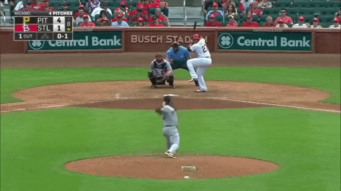
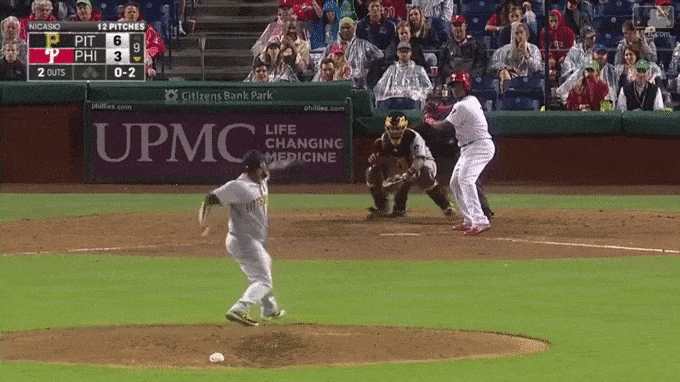
Lefties combined for a .158 slugging percentage against Hader last season. That was second in baseball, behind Pittsburgh Pirates closer Felipe Rivero (minimum 70+ total batters faced). Firmly inside the 99th percentile; when you drill down to how effective Hader’s slider was, I fear for any lefty who had to deal with this release point and horizontal bite (see gif above). Hader threw his slider 77 times last year to left-handed hitters and the resulting slugging percentage was .071. When they swung at this slider, 44% of the time they missed. Both metrics sit comfortably above average in relation to average slugging percentages and whiff rates for hitters, adding statistical backing to Hader’s dominance.
Unique about Hader is not only this slider, his hair, and his effectiveness, but his role heading into the offseason.
Since his move to Milwaukee from the Houston Astros in 2015’s Carlos Gomez swap, Hader was a starting pitcher for every one of his minor-league appearances. Craig Counsell & Co. entertained the reliever role for Hader only upon his promotion to the major leagues on June 10. Culprits for the switch could be situational — the Brewers were contending, and needed bullpen arms — but you could also convince me they were performance-based. A 13.6% walk rate over 52 Triple-A innings doesn’t inspire confidence.
This isn’t breaking news to Brewers fans.
Control issues have always been a problem for Hader, but as a reliever, the Wayne’s World look-alike had a good enough fastball to utilize it 75 percent of the time to lefties, upwards of 85 percent to righties, and net himself a shiny 36 percent strikeout rate (47 2/3 innings). In the process, Hader cut his walk rate to 11.7 percent in the majors, from north of 13 percent at Triple-A.
Unfortunately for Hader, even that improvement shouldn’t inspire confidence. We haven’t had a qualified pitcher at the major-league level, with a walk rate greater than 11.6%, since Francisco Liriano in 2014. I wouldn’t fault Hader for making a deal with the devil and taking Liriano’s 1,500-inning career, but my intentions are to consider a pitch vital to determining Hader’s 2018 role.
***
“Considering everything” headlines an MLB.com column from Brewers beat writer Adam McCalvy just over a week ago.
The vocalist of that quote was Craig Counsell, and the topic was our very own Josh Hader.
Indifference exists because Hader pitched so well in his 35 relief appearances and because of the smattering of question marks. The biggest of which is emerging ace Jimmy Nelson’s shoulder health. One depth chart has Hader as Corey Knebel’s set-up man. With an individual named “B. Suter” in the Brewers 2018 rotation. (Not “Bruce” Suter, just to confirm. Sorry, Brent.)
One question mark Hader can control is the development of his changeup. Stop me if you’ve heard this before, but a developed third pitch — so often the changeup — is how many minor-league arms get a chance to work for five-plus innings in the upper levels.
One of my favorite finds from 2017 has been the scout Chris Kusiolek (@CaliKusiolek on Twitter). In regards to changeups, Kusiolek mentioned on the Fantrax Baseball Show how much of a feel pitch it truly is. He detailed how he looks not at the present state of a pitcher’s changeup when determining the viability of the pitch’s future, but the athleticism of the pitcher, his arm action, fastball, and other aesthetics, to make that call. I’m nowhere near as seasoned of a scout as Kusiolek, but Hader hits a few of those points.
Even Hader will admit changeups are a feel pitch, and found in that same McCalvy column, the Brewers beat writer tweeted out the grip Hader was working on back in March of 2017.

“Messed up” can often prime one to think inconsistent, but that may apply to the resulting action Hader achieved on the pitch, rather than the results.
FanGraphs has Hader’s changeup just below 86 mph. This average velocity was the more common action on the pitch I observed watching tape of Hader. Other times, however, I’ve seen Hader’s change kick up to 88 mph. From my crude observation, the harder changeup only came spontaneously and later in counts. You’re about to see an 88-mph changeup on a two-strike pitch to Adam Duvall.

Harry Pavlidis has conducted extensive research on why some changeups are effective, noting those who generate elevated levels of ground balls and swinging strikes with the pitch are ideal (Stephen Strasburg is the poster-child).
Hader’s changeup hits one of those two criteria. Among starters and relievers with 50 or more changeups thrown, when Hader’s is put in play, it generates grounders at a 75-percent clip, sixth-highest in all of baseball (320 total starters and relievers). I understand it’s a pipe dream to ask Hader to replicate the arm action or grip that leads to the harder offering — if it is spontaneous — but if the structure of his general changeup leads to an elevated level of ground balls, this harder changeup might push him further into worm-killer territory.
Given Hader’s changeup has a sub-par whiff-per-swing rate in the bottom quarter of the league, playing to his strengths and embracing the harder version could make an interesting case for change.
You could argue Hader needs to continue mixing the two, but if the hittable, 86-mph changeup is thrown more as an early-count offering to righties, exploiting Hader’s attempt to pitch backwards could become an game plan. Or, in a perfect world, Hader can refine the swinging-strike rate on the slightly softer offering and turn into a two-changeup lefty. (A boy can dream, right?)
***
Considering Hader for a rotation spot is not a spontaneous decision, especially with Hader’s talent and polished, 23-year-old arm.
Both of his raw pitch count season-highs throwing his changeup came in consecutive appearances during late September. His usage with the pitch crept towards 19 percent, and both outings lasted north of two innings.
Hader can survive as a starting pitcher if his changeup becomes a legitimate weapon to right-handed hitters, especially if opposing managers understand Hader’s dominance against lefties and stack against his natural platoon split.
While Hader’s changeup is often knocked for being inconsistent, I counter that sentiment by saying he has a substantially better feel for the pitch than most, especially given the tendency of hitters to pound it into the ground, regardless of the velocity.
My gut tells me Hader will be utilized as a multi-inning reliever, and dominate both sides of the plate in 2018. My heart tells me to give Hader starts to further refine his feel for a pitch he’ll have to use effectively the second and third time through major-league lineups in order to survive.
In Craig Counsell and Derek Johnson I trust.
A version of this post can be found on my website, BigThreeSports.com
Statistics all from BrooksBaseball, BaseballSavant, Baseball Prospectus, and FanGraphs, unless otherwise noted.