The Impact of Defensive Prowess on a Pitcher’s Earned Runs Average

EXECUTIVE SUMMARY

  • This study attempts to determine how much the fielders’ prowess, measured by the metric UZR (Ultimate Zone Range), affects a pitcher’s Earned Runs Average.
  • The data used for the regression (collected from FanGraphs.com) includes collective ERA, BABIP, HR/9, BB/9, K/9 and UZR for every Major League Baseball team for the past three years.
  • ERA (Earned Runs Average) is the amount of earned runs a pitcher allows per nine innings pitched. BABIP (Batting Average per Balls in Play) is the batting average against any given pitcher, but only including the at bats where the hitter puts the ball in play. HR/9 is home runs allowed per nine innings pitched. BB/9 is walks allowed per nine innings pitched. K/9 is batter struck out per nine innings pitched. UZR (Ultimate Zone Range) is a widely used metric to evaluate defense. It summarizes how many runs any given fielder saved or gave up during a season compared to the league average in that position.
  • The model passed the F-test, the adjusted “R” squared came out at 91.2 percent and every one of the independent variables passed their respective t-test.
  • The model tested negative for both Multicollinearity (using Variance Inflation Factors) and Heteroskedasticity (using the second version of the White’s test).
  • The regression equation looks like this: ERA = -2.55 – 0.187 K/9 + 0.413 BB/9 +16.9 BABIP + 1.72 HR/9 – 0.00157 UZR. Even though the independent variable UZR has a low coefficient, it definitely affects a pitcher’s ERA, and in the way it was suspected. As the UZR goes up the ERA goes down.

INTRODUCTION

Since Bill James started to write about baseball in the late 1970’s and started to defy the traditional stats used to evaluate players, hundreds of baseball fans have tried to follow his footsteps creating new ways to evaluate players and defy the existing ones. One of the stats that has been brought to light lately is Earned Runs Average (ERA).

According to several baseball analysts ERA is not an efficient way to evaluate how good or bad a pitcher performs. The rationale behind this thinking is pretty simple; ERA is the amount of earned runs that any given pitcher allows per nine innings pitched, but the pitcher is not always 100 percent responsible for every earned run allowed. Sometimes, a fielder’s lack of defensive prowess will allow hitters to reach base safely (I am not talking about errors), and when it happens, rather often, those hits will translate into earned runs, thus affecting the pitcher’s ERA.

One of the metrics that has been used to determine any given fielder’s prowess is UZR (Ultimate Zone Range). UZR compiles data on the outfielders arms, fielder range and errors and summarizes the amount of runs those fielders saved or gave up during a season compared to the league average in that position. Using that metric along with other metrics that affect the ERA, we can answer the question “How much does defensive prowess impacts a pitcher’s ERA?”

If in fact defensive prowess affects ERA, we could also determine how much it affects it. With that kind of information, cost-effective teams (Tampa Bay Rays and Oakland Athletics) can help improve their pitching staff without investing heavily on new pitchers.

DATA

The unit of observation for this study is one Major League Baseball team. And the number of observations is 90. Currently, there are 30 Major League Baseball teams, so data was collected for the past three Major League Baseball seasons. So the time period covered goes from 2010 to 2012, including both seasons.

The dependent variable used in this project was Earned Runs Average, and the independent variables are as follow:

  • BABIP: Batting average per balls in play
  • HR/9: Homeruns allowed per nine innings pitched
  • BB/9: Walks allowed per nine innings pitched
  • K/9: Hitters struck out per nine innings pitched
  • UZR: Runs saved or given up by any given fielder during a season

All the data for this study is cross-sectional because all the observations have been collected at the same point of time.

All the data for this study was collected from the baseball website FanGraphs.com. FanGraphs is a widely known source of baseball stats and news, but the data they publish on their website is collected by another company called Baseball Info Solutions.

REGRESSION ESTIMATIONS

            Regression Analysis: ERA versus BABIP, HR/9, BB/9, K/9 and UZR

The regression equation is

ERA = – 2.55 – 0.187 K/9 + 0.413 BB/9 + 16.9 BABIP + 1.72 HR/9 – 0.00157 UZR


Predictor       Coef         SE Coef              T           P             VIF

Constant      -2.5474     0.5594        -4.55    0.000

K/9              -0.18718    0.02428     -7.71     0.000    1.099

BB/9            0.41261     0.04671        8.83     0.000    1.052

BABIP          16.914        1.876             9.02     0.000     1.741

HR/9            1.7222       0.1105          15.58    0.000    1.180

UZR        -0.0015743  0.0006219  -2.53  0.013       1.669


S = 0.133650   R-Sq = 91.7%   R-Sq(adj) = 91.2%


Analysis of Variance


Source                  DF        SS            MS              F             P

Regression          5     16.5663   3.3133   185.49   0.000

Residual Error  84   1.5004     0.0179

Total                     89   18.0668

The first step used to evaluate the model was the F-test, and since the model has a p-value less than 0.05, it is safe to say that the model passed the F-test. The adjusted “R” squared for the model was 91.2 percent, which means that 91.2 percent of the variation in ERA is explained by at least one of the independent variables used in this model. The method used to evaluate the relevance of the independent variables was the t-test, and each one of them, as mentioned earlier, had a p-value below 0.05, so in conclusion, they all passed the t-test. The p-value for K/9, BB/9, BABIP and HR/9 was 0.000 for each one of them, and the p-value for UZR was 0.013.

MODEL ESTIMATION SEQUENCE

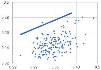
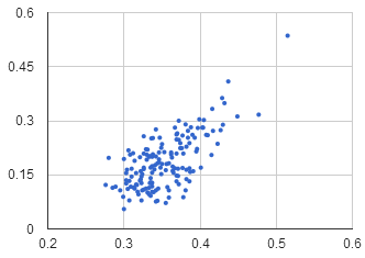
  1. Correct functional form: To check for correct functional form, each one of the independent variables was plotted against the dependent variable. The scatter plots that resulted from this check show a linear relationship between each one of the independent variables and the dependent variable.
  2. Test for Heteroskedasticity: The data for this study is cross-sectional, so it was necessary to test for Heteroskedasticity, and such test was conducted by the second version of White’s test. To do so, the residuals for the original regression were stored. Those squared residuals were regressed against the Independent variables and the independent variables squared. After running the regression, an the F-test was applied to it and since the p-value was over 0.05, it can be concluded that the regression fails the F-test, therefore Heteroskedasticity does not exist in the initial model.
  3. Multicollinearity: This model also tested for Multicollinearity and it is done by using the correlation matrix and the Variance Inflation Factors, observed in the initial regression.
    1. Since none of the VIF’s is larger than 10, it can be concluded that Multicollinearity does not exist and the p-values from the t-tests can be trusted.
    2. A correlation matrix was calculated using all the independent variables but since every one of them passed the t-test, none will be dropped from the model.
  • K/9: p-value (0.000), VIF (1.099), rho (0.252)
  • BB/9: p-value (0.000), VIF (1.052), rho (0.195)
  • BABIP: p-value (0.000), VIF (1.741), rho(0.604)
  • UZR: p-value (0.013), VIF (1.669), rho (0.604)
  1. Drop any irrelevant variable from the model: Since all the independent variables in this model are relevant, none of them will be dropped from the model.

FINAL MODEL

The final model is exactly the same as the initial model because the it passed the F-test, all of the independent variables passed their t-tests and neither Heteroskedasticity or Multicollinearity are present in the model, so it was not necessary to run another regression or drop any variable.

COEFFICIENT INTERPRETATION

  • K/9: When the team strikes out one extra batter per nine innings, the team’s ERA should go down by 0.187 runs per nine innings holding everything else constant.
  • BB/9: When the team walks one extra batter per nine innings, the team’s ERA should go up by 0.413 runs per nine innings holding everything else constant.
  • BABIP: If every time a batter puts the ball in play he records a hit, the ERA will go up by 16.9 runs per nine innings. This variable is hard to explain since it will never go up by 1, it will go up or down depending on how many hits the team allows in any given number of at-bats where the batter puts the ball in play. For example, if a team averages eight hits every 27 outs, the BABIP will be 0.296 throughout the entire season. Taking into account that every batter put the ball in play (no strikeouts). The expected increase in ERA given a 0.296 BABIP during a season, and holding everything else constant, would be 5.00.
  • HR/9: When the team allows one more homerun per nine innings, ERA should go up by 1.72 runs per nine innings holding everything else constant.
  • UZR: When the team saves one extra run defensively, ERA should go down by 0.00157 runs per nine innings holding everything else constant.

SUMMARY

The null hypothesis for this project stated that defensive prowess didn’t affect ERA, but the results showed otherwise, so it is safe to reject the null hypothesis. Defensive prowess appears to affect ERA although in a small scale. This might not seem like much, but cost-effective teams like the Rays and Athletics can acquire premium defensive players at a much cheaper cost than a premium pitcher, and although they won’t be “game changers,” they will definitely improve the team’s ERA.

Baseball is a game of numbers, and these numbers don’t lie. A good defender will help his team save runs; a lot of good defenders will help their team save multitude of runs. Is this enough to get to the postseason or win a World Series? Absolutely not, but it has been proven already that finding edges in the game, as little as they might be, will help a team in the long run. The findings in this study are a concise proof that taking advantage of defense is an edge that can be exploited for the betterment of the organization.


Confounding: Are the Rockies Rebuilding?

In the 2014 Hardball Times Baseball Annual, Jeff Moore analyzes six teams undergoing some form of “rebuilding.” He correctly notes that the concept has become a platitude in sports media, but that it still has explanatory value. In order to highlight the utility of “rebuilding,” he parses the concept to represent different forms of practice implemented by a variety of organizations. Moore covers the “ignorance” of the Philadelphia Phillies who continue on as if their core of players wasn’t aging and Ryan Howard was ever a reliable contributor; the “recognition” of the New York Mets that they have to be patient for one or two more years before the pieces come together and, they hope, work as well as Matt Harvey’s new elbow should; the “overhauling” of the Houston Astros evident in their fecund farm system and arid big league squad; the “perpetual” rebuilding of the Miami Marlins in a different key from anyone else, most recently using the public extortion and fire sale method; the Kansas City Royals’ “deviation” by trading long-term potential for a short-term possibility; and the “competition” exemplified by the 2013 Pittsburgh Pirates as they seemingly put everything together in 2013, though it remains to be seen whether or not they will need to rebuild again sooner rather than later.

Although the Colorado Rockies are not on Moore’s radar, I think they fall into an altogether different category. They appear to be in a confoundingly stagnant state of non-rebuilding. The mode of rebuilding can be as stigmatizing as it is clichéd, and it is as if the Rockies are avoiding the appellation at the cost of the foresight it might bring. Or, I don’t know what the hell is going on, and I’m not convinced there is a clear plan.

That might sound unfair. But if we, like Moore, take the definition of rebuilding to essentially mean identifying a future window of opportunity and working towards fielding a competitive team to maximize that opportunity, but with the acceptance of present limitations, then I don’t think I’m far off. General Manager Dan O’Dowd is, inexplicably, the fourth-longest tenured general manager in all of baseball, despite overseeing just four winning clubs in 14 full seasons. The only GMs who have held their current job longer are the dissimilarly successful Brian Sabean of the San Francisco Giants, Brian Cashman of the New York Yankees, and Billy Beane of the Oakland Athletics. The possible moves that have been rumored suggest that Dan O’Dowd and de facto co-GM Bill Geivett are frozen by anything more than a one-year plan.

Let’s look at some of the possible moves that are garnering notice. Beat writer Troy Renck reports that the Rockies are eying first baseman Justin Morneau to replace the retired Todd Helton. Of all of the speculative deals, this one is most likely to happen. But what would this accomplish in the short and long-term? In the short term, it would provide a replacement for Todd Helton and possibly provide a bridge for either Wilin Rosario or prospect Kyle Parker to take over full-time at first. The long-term effects are not as easy to identify, as his contract probably wouldn’t exceed two years.

It might sound just fine, until you realize that Morneau would be a “replacement” in more than one sense. Per FanGraphs’ Wins Above Replacement (WAR), Morneau hasn’t accrued an average major-league season since the half-season he played in 2010. Hayden Kane over at Rox Pile notes that he slashed .345/.437/.618 before a concussion ended his 2010 season and most of the next, but those numbers were inflated by a .385 Batting Average on Balls in Play (BABIP), over .100 points higher than his career average. He was still well on his way to a successful season, but the effects the concussion had on his productivity cannot be overstated. Morneau accrued 4.9 war in the 81 games he played in 2010, and 0.4 since. Optimistically, if Morneau out-produces his projected line next year (.258/.330/.426, per Steamer projections), which he likely would do playing half of his games in Coors Field (except against lefties, who he can’t hit), he would at best be a league-average hitter to go along with his average defense. Sure, it would be an improvement from the lackluster production from first base in 2013, but not enough to build beyond current listlessness.

Fundamentally, I believe that the Rockies do need a bridge before easing Rosario into a defensive position where he is less of a liability or seeing what the team has in Parker. But they already have the link in Michael Cuddyer. While he’s unlikely to reproduce the career year he had in his age 34 season in 2013, having Cuddyer play out his contract sharing time at first seems to be the better allocation of resources in the short-term. In January of 2013, Paul Swydan characterized the Rockies as an organization on a “quest for mediocrity.” Signing Morneau would go a long way toward realizing that goal.

In addition to possible additions via free agency, trade rumors are aren’t helping to clarify where the team is. It has been rumored that the Rockies are interested in trading for Anaheim’s Mark Trumbo, which would also fill the hole at first base that I don’t think actually exists yet. Trumbo, a power hitter, is misleadingly tantalizing. As opposed to Morneau, Trumbo is at least on the right side of 30; similarly though, Trumbo doesn’t get on base enough to provide the offense the boost it needs, especially on the road. He’d be a virtual lock to hit 30+ home runs, but he would also be sure to have an OBP hovering around .300. It’s unclear who would be involved in such a deal, as the Angels wouldn’t be interested in the Rockies’ primary trading piece, Dexter Fowler.

Speaking of Fowler, he’s going to be traded. In an interview with Dave Krieger, O’Dowd said that the organization has given up on him. Not in those words of course—rather, he noted that Fowler lacks “edge,” which is a bullshit baseball “intangible” that doesn’t tell us anything about the player in question, but rather that the front office seeks amorphous traits that can only be identified retrospectively. Reports have the Rockies in talks with Kansas City that would result in the teams swapping Fowler for a couple of relievers, likely two of Aaron Crow, Tim Collins, and Wade Davis. This, too, would maintain organizational stagnation.

The Rockies are practicing a confounding type of non-rebuilding, wherein veterans are brought in not with the idea that they can be valuable role players (like Shane Victorino, Mike Napoli, and Stephen Drew were for the Boston Red Sox last off-season), but as immediate solutions to problems that should be viewed in the long-term. I’m not as pessimistic as I might sound. The Rockies finished in last place for the second straight season in 2013, but with just two fewer wins than the Padres as Giants, and a true-talent level of about a .500 team. The thing about teams with a win projection of about 80 is that they can reasonably be expected to finish with as much as 90 wins—and as few as 70. If the Rockies are competitive in 2014, it will likely be due to health and a lot of wins in close games. I do, however, think they can be competitive starting in 2015. That’s the rebuilding window of opportunity the team should be looking at. If they are, it won’t be because of who is playing first base or right field, or even an improvement in hitting on the road, but progress in the true source of their problems: run prevention.

Last year, only the Twins and the lowly Astros allowed more runs per game. Despite this, for the first time in a while Rockies’ fans can be optimistic about the engine of run prevention, quality starting pitching. This is an area where the team can build a clear agenda for the future. Tyler Chatwood and Jhoulys Chacin should be reliable starters for the next few years. It’s unclear how many good years Jorge de la Rosa has left in him, and it’s also unclear whether or not Juan Nicasio can be a legitimate starter. But the Rockies have two polished, nearly big-league-ready pitching prospects in Jonathan Gray and Eddie Butler—Rockies’ fans should be really excited about these two—so long as one of them is not one of the “young arms” rumored to be in play for Trumbo. If Gray and Butler can be shepherded to the big leagues in a timely manner and learn to pitch to major leaguers quickly, they could join Chatwood and Chacin for possibly the best rotations in Rockies history. And if the front office really wants to make a big free-agent splash, the answers aren’t in the Brian McCanns or Jose Abreus of the world, but in splitter-throwing, ground-ball inducing, 25-year-old starting pitcher Masahiro Tanaka. His presence would likely push a rotation in 2015-2016 and possibly beyond from dependable to exceptional. Of course, it won’t happen. The Rockies, if they bid, will be outbid, and it’s precisely starting pitchers in demand that tend to stay away from Colorado.

In a sense, every major-league team is always in some stage of rebuilding, whether they admit it or not. My point is that I think there can be power in the admission of it. De-stigmatizing the “rebuilding process” might contribute to the recognition that it’s not necessarily a multiyear process, and that being in the process is not an acknowledgement of failure. Recognition of this, which by itself should provide more foresight, should lead the organization and armchair observers like myself from a state of confusion due to the team’s pursuit of stagnation, to one of encouragement where progress can be visualized.


Weighting Past Results: Starting Pitchers

My article on weighting a hitter’s past results was supposed to be a one-off study, but after reading a recent article by Dave Cameron I decided to expand the study to cover starting pitchers. The relevant inspirational section of Dave’s article is copied below:

“The truth of nearly every pitcher’s performance lies somewhere in between his FIP-based WAR and his RA9-based WAR. The trick is that it’s not so easy to know exactly where on the spectrum that point lies, and its not the same point for every pitcher.”

Dave’s work is consistently great. This, however, is a rather hand-wavy explanation of things. Is there a way that we can figure out where pitchers have typically laid on this scale in the past  so that we can make more educated guesses about what a pitcher’s true skill level is? We have the data–so we can try.

So, how much weight should be placed on ERA and FIP respectively?  Like Dave said, the answer will be different in every case, but we can establish some solid starting points. Also since we’re trying to predict pitching results and not just historical value we’re going to factor in the very helpful xFIP and SIERA metrics.

Now for the methodology paragraph: In order to test this I’m going to use every pitcher season since 2002 (when FanGraphs starts recording xFIP/SIERA data) where a pitcher had at least 100 innings pitched, and then weight all of the relevant metrics for that season in order to create an ERA prediction for the following season. I’ll then look at the difference between the following season’s predicted and average ERA, and then calculate the average miss. The smaller the average miss, the better the weights. Simple. As an added note, I have weighted the importance of a pitcher’s second (predicted – actual) season by innings pitched so that a pitcher who pitched 160 innings in his second (predicted – actual) season will assume more merit than the pitcher who pitched only 40 innings.

How predictive are each of the relevant stats without weights? I am nothing without my tables, so here we go (There are going to be a lot of tables along the way to our answers. If you’re just interested in the final results, go ahead and skip on down towards the bottom).

Metric Miss Average
ERA .8933
FIP .7846
xFIP .7600
SIERA .7609

This doesn’t really tell us anything we don’t already know: SIERA and xFIP are similar, and FIP is a better predictor than ERA. Let’s start applying some weights to see if we can increase accuracy, starting with ERA/SIERA combos.

ERA% SIERA% Miss Average
50% 50% .7750
75% 25% .8218
25% 75% .7530
15% 85% .7527
10% 90% .7543
5% 95% .7571

We can already see that factoring in ERA just a slight amount improves our results substantially. When you’re predicting a pitcher’s future, therefore, you can’t just fully rely on xFIP or SIERA to be your fortune teller. You can’t lean on ERA too hard either, though, since once you start getting up over around 25% your projections begin to go awry. Ok, so we know how SIERA and ERA combine, but what if we use xFIP instead?

ERA% xFIP% Average Miss
25% 75% .7530
15% 85% .7530
10% 90% .7549
5% 95% .7560

Using xFIP didn’t really improve our results at all. SIERA consistently outperforms xFIP (or is at worst only marginally beaten by it) throughout pretty much all weighting combinations, and so from this point forward we’re just going to use SIERA. Just know that SIERA is basically xFIP, and that there are only slight differences between them because SIERA makes some (intelligent) assumptions about pitching. Now that we’ve established that, let’s try throwing out ERA and use FIP instead.

FIP% SIERA% Average Miss
50% 50% .7563
25% 75% .7543
15% 85% .7560
10% 90% .7570

It’s interesting that ERA/SIERA combos are more predictive than FIP/SIERA combos, even though FIP is more predictive in and of itself. This is likely due to the fact that a lot of pitchers have consistent team factors that show up in ERA but are cancelled out by FIP. We’ll explore that more later, but for now we’re going to try to see if we can use any ERA/FIP/SIERA combos that will give us better results.

ERA% FIP% SIERA% Average Miss
25% 25% 50% .7570
15% 15% 70% .7513
10% 10% 80% .7520
5% 15% 80% .7532
10% 15% 75% .7517
15% 25% 60% .7520
15% 25% 65% .7517

There are three values here that are all pretty good. The important thing to note is that ERA/FIP/SIERA combos offer more consistently good results than any two stats alone. SIERA should be your main consideration, but ERA and FIP should not be discarded since the combo offers a roughly .05 better predictive value towards ERA than SIERA alone. It’s a small difference, but it’s there.

Now I’m going to go back to something that I mentioned previously–should a player be evaluated differently if he isn’t coming back to the same team? The answer to this is a pretty obvious yes, since a pitcher’s defense/park/source of coffee in the morning will change. Let’s narrow down our sample to only pitchers that changed teams, to see if different numbers work better. These numbers will be useful when evaluating free agents, for example.

ERA% FIP% SIERA% Average Miss (changed teams)
10% 15% 80% .7932
5% 15% 80% .7918
2.5% 17.5% 80% .7915
2.5% 20% 77.5% .7915
2.5% 22.5% 75% .7917

As suspected ERA loses a lot of it’s usefulness when a player is switching teams, and FIP retains its marginal usefulness while SIERA carries more weight. Another thing to note is that it’s just straight-up harder to predict pitcher performance when a pitcher is changing teams no matter what metric you use. SIERA itself goes down in accuracy to .793 when only dealing with pitchers that change teams, a noticeable difference from the .760 value above for all pitchers.

For those of you who have made it this far, it’s time to join back in with those who have skipped down towards to bottom. Here’s a handy little chart that shows previously found optimal weights for evaluating pitchers:

Optimal Weights

Team ERA% FIP% SIERA% Average Miss
Same 10% 15% 75% .7517
Different 2.5% 17.5% 80% .7910

Of course, any reasonable projection should take more than just one year of data into account. The point of this article was not to show a complete projection system, but more to explore how much weight to give to each of the different metrics we have available to us when evaluating pitchers. Regardless, I’m going to expand the study a little bit to give us a better idea of weighting years by establishing weights over a two-year period. I’m not going to show my work here mostly out of an honest effort to spare you from having to dissect more tables, so here are the optimal two year weights:

ERA% Year 1 FIP% Year 1 SIERA% Year 1 ERA% Year 2 FIP% Year 2 SIERA% Year 2 Average Miss
5% 5% 30% 7.5% 7.5% 45% .742

As expected using multiple years increases our accuracy (by roughly .15 ERA per pitcher). Also note that these numbers are for evaluating all pitchers, and so if you’re dealing with a pitcher who is changing teams you should tweak ERA down while uptweaking FIP and SIERA. And, again, as Dave stated each pitcher is a case study–each pitcher warrants their own more specific analysis. But be careful when you’re changing weights. When doing so make sure that you have a really solid reason for your tweaks and also make sure that you’re not tweaking the numbers too much, because when you begin to start thinking that you’re significantly smarter than historical tendencies you can start getting in trouble. So these are your starting values–carefully tweak from here. Go forth, smart readers.

As a parting gift to this article, here’s a list of the top 20 predictions for pitchers using the two-year model described above. Note that this will inherently exclude one-year pitchers such as Jose Fernandez and pitchers that failed to meet the 100IP as a starter requirement in either of the past two years. Also note that these numbers do not include any aging curves (aging curves are well outside the scope of this article), which will obviously need to be factored in to any finalized projection system.

# Pitcher Weighted ERA prediction
1 Clayton Kershaw 2.93
2 Cliff Lee 2.94
3 Felix Hernandez 2.95
4 Max Scherzer 3.01
5 Stephen Strasburg 3.03
6 Adam Wainwright 3.11
7 A.J. Burnett 3.22
8 Anibal Sanchez 3.22
9 David Price 3.24
10 Madison Bumgarner 3.33
11 Alex Cobb 3.36
12 Cole Hamels 3.36
13 Zack Greinke 3.41
14 Justin Verlander 3.41
15 Doug Fister 3.46
16 Marco Estrada 3.48
17 Gio Gonzalez 3.53
18 James Shields 3.53
19 Homer Bailey 3.57
20 Mat Latos 3.60

What if: Prince Fielder Were an Everyday Shortstop?

I was recently involved in an online discussion of the Prince Fielder/Ian Kinsler trade and the signing of Jhonny Peralta by the St. Louis Cardinals. Someone stated that Peralta was no more than a utility infielder who could sometimes hit. I pointed out that, over the last three seasons, Peralta was actually a top-five SS. Someone else stated that Prince, were he to play SS, would also be a top-five SS. I thought that was ridiculous, but decided I’d try to look at it as objectively as possible.

Over the last three seasons, Fielder has 111 batting runs, -18 base running runs, 61 replacement runs and -10 fielding and -37 positional runs for 107 total runs.

If we assume that his batting, base running and overall playing time would stay the same, which is probably an optimistic assumption given the likely additional strain of playing SS instead of 1B, then we only need to adjust his positional and defensive runs.

The positional adjustment is the easiest to adjust. The adjustment for 1B is -12.5 runs per 1350 innings, the adjustment for SS is +7.5 runs per 1350 innings. Fielder’s -37 positional runs represent (-37/-12.5) 3.0 defensive seasons. Three defensive seasons at SS is worth (3 * 7.5) 23 runs.

At this point Fielder at SS is worth 111 batting runs+-18 base running runs+23 positional runs+61 replacement runs. That’s 167 runs all told. That’d make him, by far, the best SS in the league. Troy Tulowitzki has 114 runs.

But we still haven’t factored in Fielder’s defense compared to the average SS. I’m not really sure that we can.

Fielder has been about six runs worse than the average 1B each season of his career. But the average SS is a much better defensive player than the average 1B.

I think it’s safe to assume that Fielder would be the worst defensive SS in baseball.

Since 2002, the UZR era, the worst season by a SS (minimum 650 innings, about half a season) is Dee Gordon’s 2012 season in which UZR says he was worth -27 runs per 1350 innings.

That’s a somewhat amusing comparison. Dee Gordon is listed at 5’11” 160 lbs. Prince is listed at 5’11” 275 lbs. Those are listed weights and I think it’s entirely possible that Prince weighs twice as much as Gordon.

I’m going to go out on a limb as say that Prince would be a worse defensive SS than Gordon. I’d go so far as to say that he would be considerably worse. But how much is considerably?

UZR can be broken down into different components.
Range runs – attempts to measure a player’s range; how many balls he does/doesn’t get to compared to average.
Error runs – attempts to measure how many runs a player saves/costs his team by avoiding/making errors
Double play runs – attempts to measure how many runs a player saves/costs his team by turning/not turning double plays.

I’m going to assume that Fielder would be the worst at all three of the above. So, what would that look like for Fielder’s overall defensive worth at SS?

It’s worth noting here that most of Gordon’s poor UZR was due to making errors, his range and double plays were bad, but not historically bad. His errors were.

The worst SS in terms of double play runs (per 1350 innings) was, go figure, 2012 Dee Gordon at -5 runs per 1350 innings. If we say that Fielder was equally as bad as Gordon, I’ve little doubt he’d be much worse than Gordon, that’d be (3*-5)-15 runs over the 3 seasons.

The worst SS in terms of range runs was, not surprisingly, 2012 Derek Jeter at -17.5 runs per 1350 innings. Anyone think that Fielder has Jeter’s range? I don’t. But if we give Fielder three seasons as poor as Jeters’ 2012 that’s (3*-17.5) -53 runs for 3 seasons.

The worst SS in terms of error runs, bet you guessed that it, was 2012 Dee Gordon at -13 runs per 1350 innings. Again, I think that Dee’s footwork and hands around 2B would be much better than Fielder’s, but if we say that Fielder was as good as Gordon then he’d be worth (3*-13) -39 runs per the three seasons.

If we add all of that up (and remembering that this is-I believe-an optimistic look at Fielder’s possible performance at SS, we get Fielder being (-15-53-39) -107 runs worse than the average SS. Quite a bit worse than Gordon’s -27 runs

Let’s add that to his other performance from above:
111 batting runs, -18 base running runs, -107 fielding runs, 23 positional runs, 61 replacement runs = 71 total runs.

71 total runs between 2011 and 2013 would have put Fielder 12th among major league SS, between Hanley Ramirez (84 runs) and Marco Scutaro (70 runs), and worth about 2.5 WAR per season.

To emphasize again, I think these are the most ridiculously optimistic assumptions that I can present with a straight face. I think it much more likely that Fielder would be a -50 (per 1350 innings) or worse SS were he to play there everyday. Not to mention the additional strain on his body that would decrease his hitting, baserunning, and ability to play every day.


Thoughts on the MVP Award: Team-Based Value and Voter Bias

You are reading this right now.  That is a fact.  Since you are reading this right now, many things can be reasonably inferred:

1.  You probably read FanGraphs at least fairly often

2. Since you probably read FanGraphs at least fairly often, you probably know that there are a lot of differing opinions on the MVP award and that many articles here in the past week have been devoted to it.

3. You probably are quite familiar with sabermetrics

4. You probably are either a Tigers fan or think that Mike Trout should have won MVP, or both

5. You might know that Josh Donaldson got one first-place vote

6. You might even know that the first-place vote he got was by a voter from Oakland

7. You might know that Yadier Molina got two first-place votes, and they both came from voters from St. Louis

8. You might even know that one of the voters who put Molina first on his ballot put Matt Carpenter second

9. You might be wondering if there is any truth to the idea that Miguel Cabrera is much more important to his team than Mike Trout is

I have thought about many of those things myself.  So, in this very long 2-part article, I am going to discuss them.  Ready?  Here goes:

Part 1: How much of an impact does a player have on his team?

Lots of people wanted Miguel Cabrera to win the MVP award. Some of you reading this may be shocked, but it’s actually true. One of the biggest arguments for Miguel Cabrera over Mike Trout for MVP is that Cabrera was much more important and “valuable” than Trout.  Cabrera’s team made the playoffs.  Trout’s team did not.  Therefore anything Trout did cannot have been important.  Well, let’s say too important.  I don’t think that anybody’s claiming that Trout had zero impact on the game of baseball or the MLB standings whatsoever.

OK.  That’s reasonable. There’s nothing flawed about that thinking when it’s not a rationale for voting Cabrera ahead of Trout for MVP.  As just a general idea, it makes sense:  Cabrera had a bigger impact on baseball this year than Trout did.  I, along with many other people in the sabermetric community, disagree with the fact that that’s a reason to vote for Cabrera, though.  But the question I’m going to ask is this: did Cabrera have a bigger impact on his own team than Trout did?

WAR tells us no.  Trout had 10.4 WAR, tops in MLB.  Cabrera had 7.6 – a fantastic number, good for 5th in baseball and 3rd in the AL, as well as his own career high – but clearly not as high as Trout.   Miggy’s hitting was out of this world, at least until September, and it’s pretty clear than he could have at least topped 8 WAR easily had he stayed healthy through the final month and been just as productive as he was April through August.  But, fact is, he did get hurt, and did not finish with a WAR as high as Trout.  So if they were both replaced with a replacement player, the Tigers would suffer more than the Angels.  Cabrera was certainly valuable – if replaced by a replacement, the 7 or 8 wins the Tigers would lose would probably not be enough to win them the AL Central.  But take Trout out, and the Angels go from a mediocre-to-poor team to a really bad one. The Angels had 78 wins this year, and that would have been around 68 (if we trust WAR) without Trout.  That would have been the 6th worst total in the league.  So, by WAR, Trout meant more to his team than Cabrera did.

But WAR is not the be all and end all of statistics (though we may like to think it is sometimes).  Let’s look at this from another angle.  Here’s a theory for you: the loss of a key player on a good team would probably not hurt that team as much because they’re already good to begin with.  If a not-so-good team loses a key player, though, the other players on the team aren’t as good so they can’t carry the team very well.

How do we test this theory?  Well, we have at our disposal a fairly accurate and useful tool to determine how many wins a team should get.  That tool is pythagorean expectation – a way of predicting wins and losses based on runs scored and allowed.  So let’s see if replacing Trout with an average player (I am using average and not replacement because all the player run values given on FanGraphs are above or below average, not replacement) is more detrimental to the Angels than replacing Cabrera with an average player is to the Tigers.

The Angels, this year, scored 733 runs and allowed 737.  Using the Pythagenpat (sorry to link to BP but I had to) formula, I calculated their expected win percentage, and it came out to .497 – roughly 80.6 wins and 81.4 losses*.  That’s actually significantly better than they did this year, which is good news for Angels fans.  But that’s not the focus right here.

Trout, this year, added 61.1 runs above average at the plate and 8.1 on the bases for a total of 69.2 runs of offense.  He also saved 4.4 runs in the field (per UZR).  So, using the Pythagenpat formula again with adjusted run values for if Trout were replaced by an average hitter and defender (663.8 runs scored and 741.4 runs allowed), I again calculated the Angels’ expected win percentage.  This came out to be .449 – roughly 72.7 wins and 89.3 losses.  7.9 fewer wins than the original one.  That’s the difference, for that specific Angels team, that Trout made.  Now, keep in mind, this is above average, not replacement, so it will be lower than WAR by a couple wins (about two WAR signifies an average player, so wins above average will be about two less than wins above replacement).  7.9 wins is a lot.  But is it more than Cabrera?

Let’s see.  This year, the Tigers scored 796 runs and allowed 624.  This gives them a pythagorean expectation (again, Pythagenpat formula) of a win percentage of .612 – roughly 99.1 wins and 62.9 losses.  Again much better than what they did this year, but also not the focus of this article.  Cabrera contributed 72.1 runs above average hitting and  4.4 runs below average on the bases for a total of 67.7 runs above average on offense.  His defense was a terrible 16.8 runs below average.

Now take Cabrera out of the equation.  With those adjusted run totals (728.3 runs scored and 607.2 runs allowed) we get  a win percentage of .583 – 94.4 wins and 67.6 losses.  A difference of 4.7 wins from the original.

Talk about anticlimactic.  Trout completely blew Cabrera out of the water (I would say no pun intended, but that was intended).  This makes sense if we think about it – a team with more runs scored will be hurt less by x fewer runs because they are losing a lower percentage of their runs.  In fact, if we pretend the Angels scored 900 runs this year instead of 733, they go from a 96.5-win team with Trout to an 89.8-win team without.  Obviously, they are better in both cases, but the difference Trout makes is only 6.7 wins – pretty far from the nearly 8 he makes in real life.

The thing about this statistic is that it penalizes players on good teams. Generally,  statistics such as the “Win” for pitchers are frowned upon because they measure things that the pitcher can’t control – just like this one.  But if we want to measure how much a team really needs a player, which is pretty much the definition of value, I think this does a pretty good job. Obviously, it isn’t perfect: the numbers that go into it, especially the baserunning and fielding ones, aren’t always completely accurate, and when looking at the team level, straight linear weights aren’t always the way to go; overall, though, this stat gives a fairly accurate picture.  The numbers aren’t totally wrong.

Here’s a look at the top four vote-getters from each league by team-adjusted wins above average (I’ll call it tWAA):

Player tWAA
Mike Trout 7.9
Andrew McCutchen 6.4
Paul Goldschmidt 6.2
Chris Davis 6.1
Josh Donaldson 4.9
Miguel Cabrera 4.7
Matt Carpenter 4.0
Yadier Molina 3.1

This is interesting.  Like expected, the players on better teams have a lower tWAA than the ones on good teams, just as we discussed earlier. One notable player is Yadier Molina, who despite being considered one of, if not the best catcher in the game, has the lowest tWAA of anyone on that list.  This may be because he missed some time. But let’s look at it a little closer: if we add the 2 wins that an average player would provide over a replacement-level player, we get 5.1 WAR, which isn’t so far off of his 5.6 total from this year. And the Cardinals’ pythagorean expectation was 101 wins, so obviously under this system he won’t be credited as much because his runs aren’t as valuable to his team.  Another factor is that we’re not adjusting by position here (except for the fielding part), and Molina is worth more runs offensively above the average catcher than he is above the average hitter, since catchers generally aren’t as good at hitting. But if Molina was replaced with an average catcher, I’m fairly certain that the Cardinals would lose more than the 3 games more that this number suggests. They might miss Molina’s game calling skills – if such a thing exists – and there’s no way to quantify how much Molina has helped the Cardinal pitchers improve, especially since they have so many rookies. But there’s also something else, something we can quantify, even if not perfectly.  And that’s pitch framing. Let’s add the 19.8 runs that Molina saved (measured by Statcorner) to Molina’s defensive runs saved (for which, by the way, I used the Fielding Bible’s DRS, since there is no UZR for catchers – that may be another reason Molina’s number may seem out of place, because DRS and UZR don’t always agree; Trout’s 2013 UZR was 4.4, and his DRS was -9. Molina did play 18 innings at first base, where he had a UZR of -0.2. We’ll ignore that, though, since it is such a small sample size and won’t make such a big difference).

Here is the table with only Molina’s tWAA changed, to account for pitch framing:

Player tWAA
Mike Trout 7.9
Andrew McCutchen 6.4
Paul Goldschmidt 6.2
Chris Davis 6.1
Yadier Molina 5.4
Josh Donaldson 4.9
Miguel Cabrera 4.7
Matt Carpenter 3.9

Now we see Molina move up into 5th place out of 8 with a much better tWAA of 5.4 – more than 2 wins better than without the pitch framing, and about 7.4 WAR if we want to convert from wins above average to wins above replacement.  Interesting. I don’t want to get into a whole argument now about whether pitch framing is accurate or actually based mostly on skill instead of luck, or whether it should be included in a catcher’s defensive numbers when we talk about their total defense. I’m just putting that data out there for you to think about.

But as I mentioned before, I used DRS for Molina and not UZR. What if we try to make this list more consistent and use DRS for everyone? (We can’t use UZR for everyone.)  Let’s see:

Player tWAA DRS UZR
Mike Trout 6.5 -9 4.4
Andrew McCutchen 6.4 7 6.9
Paul Goldschmidt 7.0 13 5.4
Chris Davis 5.5 -7 -1.2
Molina w/ Framing 5.4 31.8 N/A
Josh Donaldson 5.0 11 9.9
Miguel Cabrera 4.6 -18 -16.8
Matt Carpenter 4.1 0 -0.9
Yadier Molina 3.1 12 N/A

We see Trout go down by almost a win and a half here. I don’t really trust that, though, because I really don’t think that Mike Trout is a significantly below average fielder, despite what DRS tells me. DRS actually gave Trout a rating of 21 in 2012, so I don’t think it’s as trustworthy. But for the sake of consistency, I’m showing you those numbers too, with the DRS and UZR comparison so you can see why certain people lost/gained wins.

OK. So I think we have a pretty good sense for who was most valuable to their teams. But I also think we can improve this statistic a little bit more. Like I said earlier, the hitting number I use – wRAA – is based off of league average, not off of position average. In other words, if Chris Davis is 56.3 runs better than the average hitter, but we replace him with the average first baseman, that average first baseman is already going to be a few runs better than the average player. So what if we use weighted runs above position average? wRAA is calculated by subtracting the league-average wOBA from a player’s wOBA, dividing by the wOBA scale, and multiplying by plate appearances. What I did was subtract the position average wOBA from the player’s wOBA instead. So that penalizes players at positions where the position average wOBA is high.

Here’s your data (for the defensive numbers I used UZR because I think it was better than DRS, even though the metric wasn’t the same for everyone):

Player position-adj. tWAA Pos-adj. wRAA wRAA
Trout 7.7 59.4 61.1
McCutchen 6.2 40.1 41.7
Molina w/ Framing 5.6 23.3 20.5
Goldschmidt 5.0 39.5 50.1
Davis 5.0 46.4 56.3
Donaldson 4.9 36.6 36.7
Cabrera 4.7 72.0 72.1
Carpenter** 4.3 41.7 37.8
Molina 3.4 23.3 20.5

I included here both the regular and position-adjusted wRAA for all players for reference. Chris Davis and Paul Goldschmidt suffered pretty heavily – each lost over a win of production – because the average first baseman is a much better hitter than the average player. Molina got a little better, as did Carpenter, because they play positions where the average player isn’t as good offensively. Everyone else stayed almost the same, though.

I think this position-adjusted tWAA is probably the most accurate. And I would also use the number with pitch framing included for Molina. It’s up to you to decide which one you like best – if you like any of them at all. Maybe you have a better idea, in which case you should let me know in the comments.

 Part 2: Determining voter bias in the MVP award

As I mentioned in my introduction, Josh Donaldson got one first-place MVP vote – from an Oakland writer. Yadier Molina got 2 – both from St. Louis writers. Matt Carpenter got 1 second-place vote – also from a St. Louis writer. Obviously, voters have their bias when it comes to voting for MVP. But how much does that actually matter?

The way MVP voting works is that for each league, AL and NL, two sportswriters who are members of the BBWAA are chosen from each location that has a team in that league – 15 locations per league times 2 voters per location equals 30 voters total for each league. That way you won’t end up with a lot of voters or very few voters from one place who may be biased one way or another.

But is there really voter bias?

In order to answer this question, I took all players who received MVP votes this year (of which there were 49) and measured how many points each of them got per 2 voters***.  Then I took the amount of points that each of them got from the voters from their chapter and found the difference. Here’s what I found:

AL:

Player, Club City Points Points/2 voter Points From City voters % Homer votes Homer difference
Josh Donaldson, Athletics OAK 222 14.80 22 9.91% 7.20
Mike Trout, Angels LA 282 18.80 23 8.16% 4.20
Evan Longoria, Rays TB 103 6.87 11 10.68% 4.13
David Ortiz, Red Sox BOS 47 3.13 7 14.89% 3.87
Adam Jones, Orioles BAL 9 0.60 3 33.33% 2.40
Miguel Cabrera, Tigers DET 385 25.67 28 7.27% 2.33
Coco Crisp, Athletics OAK 3 0.20 2 66.67% 1.80
Edwin Encarnacion, Blue Jays TOR 7 0.47 2 28.57% 1.53
Max Scherzer, Tigers DET 25 1.67 3 12.00% 1.33
Salvador Perez, Royals KC 1 0.07 1 100.00% 0.93
Koji Uehara, Red Sox BOS 2 0.13 1 50.00% 0.87
Chris Davis, Orioles BAL 232 15.47 16 6.90% 0.53
Adrian Beltre, Rangers TEX 99 6.60 7 7.07% 0.40
Yu Darvish, Rangers TEX 1 0.07 0 0.00% -0.07
Felix Hernandez, Mariners SEA 1 0.07 0 0.00% -0.07
Shane Victorino, Red Sox BOS 1 0.07 0 0.00% -0.07
Jason Kipnis, Indians CLE 31 2.07 2 6.45% -0.07
Torii Hunter, Tigers DET 2 0.13 0 0.00% -0.13
Hisashi Iwakuma, Mariners SEA 2 0.13 0 0.00% -0.13
Greg Holland, Royals KC 3 0.20 0 0.00% -0.20
Carlos Santana, Indians CLE 3 0.20 0 0.00% -0.20
Jacoby Ellsbury, Red Sox BOS 3 0.20 0 0.00% -0.20
Dustin Pedroia, Red Sox BOS 99 6.60 5 5.05% -1.60
Manny Machado, Orioles BAL 57 3.80 2 3.51% -1.80
Robinson Cano, Yankees NY 150 10.00 8 5.33% -2.00

NL:

Player, Club City Points Points/2 voter Points from City Voters % Homer votes Homer difference
Yadier Molina, Cardinals STL 219 14.60 28 12.79% 13.40
Hanley Ramirez, Dodgers LA 58 3.87 7 12.07% 3.13
Joey Votto, Reds CIN 149 9.93 13 8.72% 3.07
Allen Craig, Cardinals STL 4 0.27 3 75.00% 2.73
Jayson Werth, Nationals WAS 20 1.33 4 20.00% 2.67
Hunter Pence, Giants SF 7 0.47 3 42.86% 2.53
Yasiel Puig, Dodgers LA 10 0.67 3 30.00% 2.33
Matt Carpenter, Cardinals STL 194 12.93 15 7.73% 2.07
Andrelton Simmons, Braves ATL 14 0.93 2 14.29% 1.07
Paul Goldschmidt, D-backs ARI 242 16.13 17 7.02% 0.87
Michael Cuddyer, Rockies COL 3 0.20 1 33.33% 0.80
Andrew McCutchen, Pirates PIT 409 27.27 28 6.85% 0.73
Clayton Kershaw, Dodgers LA 146 9.73 10 6.85% 0.27
Craig Kimbrel, Braves ATL 27 1.80 2 7.41% 0.20
Russell Martin, Pirates PIT 1 0.07 0 0.00% -0.07
Matt Holliday, Cardinals STL 2 0.13 0 0.00% -0.13
Buster Posey, Giants SF 3 0.20 0 0.00% -0.20
Adam Wainwright, Cardinals STL 3 0.20 0 0.00% -0.20
Adrian Gonzalez, Dodgers LA 4 0.27 0 0.00% -0.27
Troy Tulowitzki, Rockies COL 5 0.33 0 0.00% -0.33
Shin Soo Choo, Reds CIN 23 1.53 1 4.35% -0.53
Jay Bruce, Reds CIN 30 2.00 1 3.33% -1.00
Carlos Gomez, Brewers MIL 43 2.87 1 2.33% -1.87
Freddie Freeman, Braves ATL 154 10.27 8 5.19% -2.27

Where points is total points received, points/2 voter is points per two voters (points/15), points from city voters is points received from the voters in the player’s city, % homer votes is the percentage of a player’s points that came from voters in his city, and homer difference is the difference between points/2 voter and points from city voters. Charts are sorted by homer difference.

I don’t know that there’s all that much we can draw from this. Obviously, voters are more likely to vote for players from their own city, but that’s to be expected. Voting was a little bit less biased in the AL – the average player received exactly 1 point more from voters in their city than from all voters in the AL, whereas that number in the NL was 1.21. 8.08% of all votes in the AL came from homers compared to 8.31% in the NL. If you’re wondering which cities were the most biased, here’s a look:

AL:

City Points Points/2 voter Points From City voters Difference
OAK 225 15.00 24 9.00
LA 282 18.80 23 4.20
TB 103 6.87 11 4.13
DET 412 27.47 31 3.53
BOS 152 10.13 13 2.87
TOR 7 0.47 2 1.53
BAL 298 19.87 21 1.13
KC 4 0.27 1 0.73
TEX 100 6.67 7 0.33
SEA 3 0.20 0 -0.20
CLE 34 2.27 2 -0.27
NY 150 10.00 8 -2.00

NL:

City Points Points/2 voters Points From City Voters Difference
STL 422 28.13 46 17.87
LA 218 14.53 20 5.47
WAS 20 1.33 4 2.67
SF 10 0.67 3 2.33
CIN 202 13.47 15 1.53
ARI 242 16.13 17 0.87
PIT 410 27.33 28 0.67
COL 8 0.53 1 0.47
ATL 195 13.00 12 -1.00
MIL 43 2.87 1 -1.87

Where all these numbers are just the sum of the individual numbers for all players in that city.

If you’re wondering what players have benefited the most from homers in the past 2 years, check out this article by Reuben Fischer-Baum over at Deadspin’s Regressing that I found while looking up more info. He basically used the same method I did, only for 2012 as well (the first year that individual voting data was publicized).

So that’s all for this article. Hope you enjoyed.

———————————————————————————————————————————————————–

*I’m using fractions of wins because that gives us a more accurate number for the statistic I introduce by measuring it to the tenth and not to the single digit. Obviously a team can’t win .6 games in real life but we aren’t concerned with how many games the team won in real life, only their runs scored and allowed.

**Carpenter spent time both at second base and third base, so I used the equation (Innings played at 3B*average wOBA for 3rd basemen + Innings played at 2B*average wOBA for 2nd basemen)/(Innings played at 3B + Innings played at 2B) to get Carpenter’s “custom” position-average wOBA. He did play some other positions too, but very few innings at each of them so I didn’t include those.  It came out to about .307.

***Voting is as such: Each voter puts 10 people on their ballot, with the points going 14-9-8-7-6-5-4-3-2-1.


Power and Patience (Part V of a Study)

One, two, one, two, three, four.

Sorry. Those were links to the first four parts. Anyway, now it’s time to fill the circle of this series. This final piece isn’t really much of an analysis, but sort of a potpourri of interesting trivia. Trivia’s where these five weeks started, after all. Hopefully there was sufficient analytical substance to the first four parts. (Or any.)

Here is an interesting tidbit to start: only two batting title qualifiers have ever had a higher ISO than OBP in a season. One was Barry Bonds in his insane, 73-HR 2001 season (.536 ISO, .515 OBP–I told you it was insane). The other was Matt Williams in 1994. Take a look at the 1994 OBP and ISO scatter chart among qualifiers, with a line of y=x for reference:

I trust you to figure out which one belongs to the current manager of the Washington Nationals. He had a .319 OBP and a .339 ISO that season. (And, FYI, that lonely dot in the lower left belongs to 24 year old Twins catcher Matt Walbeck and his .204/.246/.284 in 359 PA. And that one insanely close to the .500 OBP? Frank Thomas.)

And Barry Bonds’s 2001? Well, just take a look:

Yeah.

(I kind of wanted just to show that chart.)

That only two players ever had a single season, let alone career, with a higher ISO than OBP, a good way to measure a player’s relative prowess at each facet of hitting is to look at the gap between those statistics.

Care to guess the player with a career OBP below the historical average of .333 who has the smallest gap between his career OBP and ISO? To the surprise of nobody, it’s:

Dave Kingman

Kingman posted a career .302 OBP and .242 ISO, making him the ultimate in empty power. By Kingman’s last year, 1986 with Oakland, all he could do was hit home runs. He had 35, while hitting .210/.255/.431, which even in 1986 was only good for a wRC+ of 86. Kingman also has the 2nd highest ISO period among those with a sub-.333 OBP, behind Russell Branyan (.253 ISO, .329 OBP).

Expand this list, by the way, and it feels like a pretty accurate indicator of players who provided solid and at times even great power, but weren’t great offensive players. The top 10: Kingman, Steve Balboni, Ron Kittle, Branyan, Tony Armas, Alfonso Soriano, Dick Stuart, Matt Williams, Tony Batista and Mark Reynolds. The debuts of those players range from 1958 (Stuart) to 2007 (Reynolds), so this phenomenon is not exactly a 21st century one. It does, however, divide pretty well along pre- and post-expansion lines.

Among players who debuted before Stuart, the next smallest gap here belongs to a Hall of Famer: Ernie Banks, with a .330 OBP and .226 ISO. He’s 18th on the list, so that’s about where the last paragraph’s thesis breaks down. During his career, 1953-71, the league-wide non-pitcher OBP was .329, so Banks was about average reaching base, but provided a ton of value from his years at shortstop and his power (1953-71 ISO: .135).

Wally Post is 19th, and he debuted in 1949, making him the top pre-1950 debut player on the OBP minus ISO list, and the smallest gap belonging to someone who debuted before 1940 belongs to DiMaggio, who debuted in 1937. He ended up with a .324 OBP and .164 ISO in his 10 seasons with the Bees, Reds, Pirates and Giants. We’re talking, of course, about Vince DiMaggio, not Dom.

Go back all the way to 1901 and you find the career of:

Albert Samuel “Hobe” Ferris

Hobe Ferris played from 1901-09 and never led the league in home runs, but was in the top 7 five times in a nine-year career on his way to 40 career home runs. His .102 career ISO came in a time frame when league-wide non-pitcher ISO was .077, but he only produced a career .265 OBP (vs. the league’s .310). A second- and third-baseman with a good defensive reputation (backed up today by his +70 career fielding runs on Baseball Reference), he also may have been the first power threat in MLB history who didn’t reach base effectively. His best season was actually during the nadir of the dead ball era, his penultimate year in 1908 when he hit .270/.291/.353 for a 109 wRC+. This was mostly due to an unusually efficient year reaching base, but even his .083 ISO was better than the league’s .069.

All-time, however, Ferris’s OBP-ISO gap ranks as just the 166th smallest out of 692 who meet the 3000 PA, sub-.333 thresholds. The 167th smallest belongs to another turn-of-the-century player, the infamous Bill Bergen, who was just bad at everything. In general, you’re just not going to find turn of the century players whose ISO’s are particularly close to their OBP’s, because ISO’s were so low 100 years ago.

To start getting into the other types of players–good OBP, not so good power–let’s remove any cap on the OBP and see what happens at both ends of the list of OBP and ISO gaps. Again, 3000 PA is the cutoff.

10 Lowest Gaps: Kingman, Mark McGwire, Balboni, Kittle, Branyan, Juan Gonzalez, Sammy Sosa, Ryan Howard, Armas, Soriano

10 Highest: Roy Thomas, Miller Huggins, Eddie Stanky, Eddie Collins, Max Bishop, Richie Ashburn, Ferris Fain, Johnny Pesky, Luke Appling, Muddy Ruel

So, apparently Mark McGwire’s .263 career batting average is a little misleading…as in, perhaps the most misleading batting average of all time. He posted a .394 OBP and .325 ISO. The other three players who weren’t on this list when sub-.333 OBP’s were removed are Gonzalez, Sosa, and Howard. None of them have spotless resumes, but they are bound to be the 2nd to 4th best hitters on that list in most any ranking of these players, subjective or objective. After Howard, the next few players on this list who had an OBP above .333: Richie Sexson (15th), Albert Belle (20th), Jose Canseco (25th), Andruw Jones (28th) and Greg Vaughn (30th). All probably better hitters than Kingman and certainly better hitters than Balboni.

Meanwhile, Roy Thomas has the highest such difference, with a line from 1901-11 of .282/.403/.329. (He debuted in 1899.) From 1900-06, Thomas led the majors in walks every year except 1905. He hit a fascinating .327/.453/.365 in 1903, for a 138 wRC+.

We might think that everybody with a large gap is from the dead ball era, but such is not the case. Richie Ashburn (1948-62) and Luke Appling (1930-50) carved out Hall of Fame careers. They got away with a lack of power by hitting .300 in their careers. These next two players weren’t career .300 hitters, providing value more so with high walk rates, and how can we talk about players who got on base but didn’t hit for power without them:

Eddie Stanky and Ferris Fain

Stanky (.410 OBP, .080 ISO) played from 1943-53 and Fain (.424 OBP, .106 ISO) from 1947-55, and they might be the two most famous players in MLB history in terms of reaching base without being much of a power threat. They were pioneers of the you’re-never-pitching-around-me-but -I-will-foul-off-pitches-and-work-a-walk-anyway school of hitting, especially Stanky, who only hit .268 and slugged .348 in his career. (Roy Thomas could have been the “pioneer” of this if power were more of a thing when he played.) Stanky’s most striking season in this regard was probably 1946 when he hit .273/.436/.352. Fain, meanwhile, had a .455 OBP and .066 ISO in his last season in 1955.

Just as the first list in this piece lacked many dead-ball era players, this list of large OBP-ISO gaps seems to lack 21st (and late 20th) century players. The first player to debut after 1980 that we meet on the list, in the 13th place?

Luis Castillo

Castillo’s offensive production was almost entirely in his .290 batting average. If batting average says little about McGwire, it says almost as little about Castillo, who posted a career .368 OBP and .061 ISO.

The first good hitter on the list (with his career 97 wRC+, Castillo was decidedly average) is Dave Magadan, 23rd, with a .390 OBP and just a .089 ISO. He had a 117 career wRC+. Magadan’s 1995 season with Houston was his wildest as he managed an OBP of .428 with an ISO of just .086.

Two spots below Magadan is one of the three who started us down this month-plus-long path:

Wade Boggs

Boggs had a .328/.415/.443 career line for a 132 wRC+. In his rookie season in 1982 (381 PA), he was already producing a .406 OBP…with an ISO of just .092.

We might as well wrap up with our other two above-.400 OBP, under-.200 ISO players since 1961. Joe Mauer (.405 OBP, .146 ISO) and Rickey Henderson (.401 OBP, .140 ISO) have wRC+’s of 134 and 132 respectively. Their OBP-ISO gaps of .261 and .259 rank among the 200 largest gaps, or roughly the 90th percentile.

There are plenty more angles, more than I can cover, that one could take with this. At this link you can find the list of players with 3000 PA since 1901, ordered from the largest OBP-ISO to the smallest, with extra stats (as I didn’t change or remove the default dashboard stats).


The R.A. Dickey Effect – 2013 Edition

It is widely talked about by announcers and baseball fans alike, that knuckleball pitchers can throw hitters off their game and leave them in funks for days. Some managers even sit certain players to avoid this effect. I decided to analyze to determine if there really is an effect and what its value is. R.A. Dickey is the main knuckleballer in the game today, and he is a special breed with the extra velocity he has.

Most people that try to analyze this Dickey effect tend to group all the pitchers that follow in to one grouping with one ERA and compare to the total ERA of the bullpen or rotation. This is a simplistic and non-descriptive way of analyzing the effect and does not look at the how often the pitchers are pitching not after Dickey.

Dickey's Dancing Knuckleball
Dickey’s Dancing Knuckleball (@DShep25)

I decided to determine if there truly is an effect on pitchers’ statistics (ERA, WHIP, K%, BB%, HR%, and FIP) who follow Dickey in relief and the starters of the next game against the same team. I went through every game that Dickey has pitched and recorded the stats (IP, TBF, H, ER, BB, K) of each reliever individually and the stats of the next starting pitcher, if the next game was against the same team. I did this for each season. I then took the pitchers’ stats for the whole year and subtracted their stats from their following Dickey stats to have their stats when they did not follow Dickey. I summed the stats for following Dickey and weighted each pitcher based on the batters he faced over the total batters faced after Dickey. I then calculated the rate stats from the total. This weight was then applied to the not after Dickey stats. So for example if Janssen faced 19.11% of batters after Dickey, it was adjusted so that he also faced 19.11% of the batters not after Dickey. This gives an effective way of comparing the statistics and an accurate relationship can be determined. The not after Dickey stats were then summed and the rate stats were calculated as well. The two rate stats after Dickey and not after Dickey were compared using this formula (afterDickeySTAT-notafterDickeySTAT)/notafterDickeySTAT. This tells me how much better or worse relievers or starters did when following Dickey in the form of a percentage.

I then added the stats after Dickey for starters and relievers from all four years and the stats not after Dickey and I applied the same technique of weighting the sample so that if Niese’12 faced 10.9% of all starter batters faced following a Dickey start against the same team, it was adjusted so that he faced 10.9% of the batters faced by starters not after Dickey (only the starters that pitched after Dickey that season). The same technique was used from the year to year technique and a total % for each stat was calculated.

The most important stat to look at is FIP. This gives a more accurate value of the effect. Also make note of the BABIP and ERA, and you can decide for yourself if the BABIP is just luck, or actually better/worse contact. Normally I would regress the results based on BABIP and HR/FB, but FIP does not include BABIP and I do not have the fly ball numbers.

The size of the sample was also included, aD means after Dickey and naD is not after Dickey. Here are the results for starters following Dickey against the same team.

Dickey Starters

It can be concluded that starters after Dickey see an improvement across the board. Like I said, it is probably better to use FIP rather than ERA. Starters see an approximate 18.9% decrease in their FIP when they follow Dickey over the past 4 years. So assuming 130 IP are pitched after Dickey by a league average set of pitchers (~4.00 FIP), this would decrease their FIP to around 3.25. 130 IP was selected assuming ⅔ of starter innings (200) against the same team. Over 130 IP this would be a 10.8 run difference or around 1.1 WAR! This is amazingly significant and appears to be coming mainly from a reduction in HR%. If we regress the HR% down to -10% (seems more than fair), this would reduce the FIP reduction down to around 7%. A 7% reduction would reduce a 4.00 FIP down to 3.72, and save 4.0 runs or 0.4 WAR.

Here are the numbers for relievers following Dickey in the same game.

Dickey Bullpen

Relievers see a more consistent improvement in the FIP components (K, BB, HR) between each other (11.4, 8.1, 4.9). FIP was reduced 10.3%. Assuming 65 IP (in between 2012 and 2013) innings after Dickey of an average bullpen (or slightly above average, since Dickey will likely have setup men and closers after him) with a 3.75 FIP, FIP would get reduced to 3.36 and save 3 runs or 0.3 WAR.

Combining the un-regressed results, by having pitchers pitch after him, Dickey would contribute around 1.4 WAR over a full season. If you assume the effect is just 10% reduction in FIP for both groups, this number comes down to around 0.9 WAR, which is not crazy to think at all based off the results. I can say with great confidence, that if Dickey pitches over 200 innings again next year, he will contribute above 1.0 WAR just from baffling hitters for the next guys. If we take the un-regressed 1.4 WAR and add it to his 2013 WAR (2.0) we get 3.4 WAR, if we add in his defence (7 DRS), we get 4.1 WAR. Even though we all were disappointed with Dickey’s season, with the effect he provides and his defence, he is still all-star calibre.

Just for fun, lets apply this to his 2012. He had 4.5 WAR in 2012, add on the 1.4 and his 6 DRS we get 6.5 WAR, wow! Using his RA9 WAR (6.2) instead (commonly used for knucklers instead of fWAR) we get 7.6 WAR! That’s Miguel Cabrera value! We can’t include his DRS when using RA9 WAR though, as it should already be incorporated.

This effect may even be applied further, relievers may (and likely do) get a boost the following day as well as starters. Assuming it is the same boost, that’s around another 2.5 runs or 0.25 WAR. Maybe the second day after Dickey also sees a boost? (A lot smaller sample size since Dickey would have to pitch first game of series). We could assume the effect is cut in half the next day, and that’d still be another 2 runs (90 IP of starters and relievers). So under these assumptions, Dickey could effectively have a 1.8 WAR after effect over a full season! This WAR is not easy to place, however, and cannot just be added onto the teams WAR, it is hidden among all the other pitchers’ WARs (just like catcher framing).

You may be disappointed with Dickey’s 2013, but he is still well worth his money. He is projected for 2.8 WAR next year by Steamer, and adding on the 1.4 WAR Dickey Effect and his defence, he could be projected to really have a true underlying value of almost 5 WAR. That is well worth the $12.5M he will earn in 2014.

For more of my articles, head over to Breaking Blue where we give a sabermetric view on the Blue Jays, and MLB. Follow on twitter @BreakingBlueMLB and follow me directly @CCBreakingBlue.


The Effect of Devastating Blown Saves

It’s a pretty well documented sabremetric notion that pitching your closer when you have a three run lead in the ninth is probably wasting him. You’re likely going to win the game anyways, since the vast majority of pretty much everyone allowed to throw baseballs in the major leagues is going to be able to keep the other team from scoring three runs.

But we still see it all the time. Teams keep holding on to their closer and waiting until they have a lead in the ninth to trot him out there. One of the reasons for this is that blowing a lead in the ninth is devastating—it’ll hurt team morale more to blow a lead in the ninth than to slip behind in the seventh. And then this decrease in morale will cause for the players to play more poorly in the future, which will result in more losses.

Or will it?

We’re going to look at how teams play following games that they devastatingly lose to see if there’s any noticeable drop in performance. The “devastating blown save” stat can be defined as any game in which a team blows the lead in the ninth and then goes on to lose. Our methodology is going to look at team records in both the following game as well as the following three games to see if there’s any worsening of play. If the traditional thought is right (hey, it’s a possibility!), it will show up in the numbers. Let’s take a look.

All Games (2000-2012)

9+ Inning Games

Devastating BS’s

Devastating BS%

Following Game W%

Three Game W%

31,405

1,333

4.24%

.497

.484

In the following game, the team win percentage was very, very close to 50%. Over a sample size of 1,333 that’s completely insignificant. But what about the following three games, where the win percentage drops down to roughly 48.4%? Well, that’s a pretty small deviation from the 50% baseline, and is of questionable statistical significance. And wouldn’t it make sense that if the devastating blow save effect existed at all it would occur in the directly following game, and not wait until later to manifest itself? It seems safe to say that the “morale drop” of devastatingly losing is likely nonexistent—or at most incredibly small. We’re dealing with grown men after all. They can take it.

Another thing you might want to consider when looking at these numbers is that teams with lots of blown saves are probably more likely to be subpar. Not so fast. The win% of teams weighted to their amount of blown 9th innings over the years is .505. This is probably because better teams are more likely to be ahead in the first place, and so they are going to be on the bubble to blow saves more often even if they blow them a smaller percentage of the time. Just for the fun of seeing how devastation-prone your team has been over the past 13 years, however, here’s a table of individual team results.

 Devastating Blown Saves By Team (2000-2012)

Team

Devastating Blown Saves

Next Game W%

Milwaukee

63

0.460

Chicago Cubs

60

0.4

Kansas City

57

0.315

Toronto

54

0.592

Chicago White Sox

52

0.615

Houston

51

0.372

NY Mets

50

0.56

St. Louis

48

0.625

Texas

46

0.543

Cleveland

46

0.586

Texas

46

0.543

Florida

45

0.511

Baltimore

45

0.377

Oakland

44

0.545

Seattle

44

0.5

Boston

41

0.585

Cincinnati

41

0.585

Los Angeles

40

0.425

Detroit

39

0.384

Atlanta

39

0.743

Detroit

39

0.384

San Diego

35

0.4

Anaheim

34

0.529

New York Yankees

33

0.666

Minnesota

33

0.515

Pittsburgh

32

0.468

Montreal

25

0.2

Washington

18

0.555

Miami (post-change)

8

0.375

Congratulations Pittsburgh, you’ve been the least devastated full-time team over the past 13 years! Now if there’s a more fun argument against the effects of devastating losses than that previous sentence, I want to hear it. Meanwhile the Braves have lived up to their nickname, winning in an outstanding 74.3% of games following devastating losses (it looks like we’ve finally found our algorithm for calculating grit, ladies and gentleman) while the hapless Expos rebounded in just 20% of their games. Milwaukee leads the league in single-game heartbreak, etc. etc. Just read the table. These numbers are fun. Mostly meaningless, but fun.

Back to the point: team records following devastating losses tend to hover very, very close to .500. Managers shouldn’t worry about how their teams lose games—they should worry about if their teams lose games. Because, in the end, that’s all that matters.


Raw data courtesy of Retrosheet.


Weighting Past Results: Hitters

We all know by now that we should look at more than one year of player data when we evaluate players. Looking at the past three years is the most common way to do this, and it makes sense why: three years is a reasonable time frame to try and increase your sample size while not reaching back so far that you’re evaluating an essentially different player.

 The advice for looking at previous years of player data, however, usually comes with a caveat. “Weigh them”, they’ll say. And then you’ll hear some semi-arbitrary numbers such as “20%, 30%, 50%”, or something in that range. Well, buckle up, because we’re about to get a little less arbitrary.

 Some limitations: The point of this study isn’t to replace projection systems—we’re not trying to project declines/improvements here. We’re simply trying to understand how past data tends to translate into future data.

 The methodology is pretty simple. We’re going to take three years of player data (I’m going to use wRC+ since it’s league-adjusted etc., and I’m only trying to measure offensive production), and then weight the years so that we can get an expected 4th year wRC+. We’re then going to compare our expected wRC+ against the actual wRC+*. The closer the expected to our actual, the better the weights.

 *Note: I am using four-year spans of player data from 2008-2013, and limiting to players that had at least 400 PA in four consecutive years. This should help throw out outliers and to give more consistent results. Our initial sample size is 244, which is good enough to give meaningful results.

 I’ll start with the “dumb” case. Let’s just weigh all of the years equally, so that each year counts for 33.3% of our expected outcome.

 Expected vs. Actual wRC+, unweighted

Weight1

Weight2

Weight3

Average Inaccuracy

33.3%

33.3%

33.3%

16.55

 Okay, so we’re averaging missing the actual wRC+ by roughly 16.5. That means that we’re averaging 16.5% inaccuracy when extrapolating the past into the future with no weights. Now let’s try being a little smarter about it and try some different weights out.

 Expected vs. Actual wRC+, various weights

Weight1

Weight2

Weight3

Average Inaccuracy

20%

30%

50%

16.73

25%

30%

45%

16.64

30%

30%

40%

16.58

15%

40%

45%

16.62

0%

50%

50%

16.94

0%

0%

100%

20.15

Huh! It seems that no matter what we do, “intelligently weighting” each year never actually increases our accuracy. If you’re just generally trying to extrapolate several past years of wRC+ data to try and predict a fourth year of wRC+, your best bet is to just unweightedly average the past wRC+ data. Now, the differences are small (for example, our weights of [.3, .3, .4] were only .03 different in accuracy the unweighted total, which is statistically insignificant), but the point remains: weighing data from past years simply does not increase your accuracy. Pretty counter-intuitive.

Let’s dive a little deeper now—is there any situation in which weighting a player’s past does help? We’ll test this by limiting our ages. For example: are players that are younger than 30 better served by weighing their most previous years heavily? This would make sense, since younger players are most likely to experience a true-talent change. (Sample size: 106)

 Expected vs. Actual wRC+, players younger than 30

Weight1

Weight2

Weight3

Average Inaccuracy

33.3%

33.3%

33.3%

16.17

20%

30%

50%

16.37

25%

30%

45%

16.29

30%

30%

40%

16.26

15%

40%

45%

16.20

0%

50%

50%

16.50

0%

0%

100%

20.16

Ok, so that didn’t work either. Even with young players, using unweighted totals is the best way to go. What about old players? Surely with aging players the recent years would most represent a player’s decline. Let’s find out (Sample size: 63).

 Expected vs. Actual wRC+, players older than 32

Weight1

Weight2

Weight3

Average Inaccuracy

33.3%

33.3%

33.3%

16.52

16%

30%

50%

16.18

25%

30%

45%

16.27

30%

30%

40%

16.37

15%

40%

45%

16.00

0%

50%

50%

15.77

0%

55%

45%

15.84

0%

45%

55%

15.77

0%

0%

100%

18.46

Hey, we found something! With aging players you should weight a player’s last two seasons equally, and you should not even worry about three seasons ago! Again, notice that the difference is small (you’ll be about 0.8% more correct by doing this than using unweighted totals). And as with any stat, you should always think about why you’re coming to the conclusion that you’re coming to. You might want to weight some players more aggressively than others, especially if they’re older.

In the end, it just really doesn’t matter that much. You should, however, generally use unweighted weights since differences in wRC+ are pretty much always results of random fluctuation and very rarely the result of actual talent change. That’s what the data shows. So next time you hear someone say “weigh their past three years 3/4/5” (or similar), you can snicker a little. Because you know better.


Two Different Scenarios of a Mike Trout Extension

There has been plenty of conjecture on the timing and amount of Mike Trout’s next contract.  People gravitate towards round numbers and that’s why you often hear talk about ten years and $300 million.  I heard one pundit refer to 10/300 after his first season, and have heard several refer to these figures during this off season.  But is 10/300 even realistic?

The first step of his analysis is to look at the early years of a contract extension.  For a player that hasn’t even hit his arbitration years, we’ve seen discounting of the players pre-arbitration and arbitration years on their way to seven- or eight-year contracts.  So while the disbursement of money in a player’s early years might not be a one for one match with what they would be from the arbitration process, they’re generally close, if not a little smaller for some players.  The theory seems to go that the player trades off the potentially bigger payoff of arbitration awards, in return for secure, guaranteed and somewhat smaller annual contract value on a multi-year deal.

Mike Trout will break records, but not only on the playing field.  If he goes to arbitration, we’ll see amounts not seen for 1st, 2nd and 3rd-year arbitration-eligible players.  We can quibble about what those amounts will be but I’m guessing on the low end they might be $10 M/$15 M/$20 M, and on the high end $15/$20/$25.  Mike Trout has achieved so much in so little time that he might have quite a bit of leverage to earn a full payout of potential arbitration amounts, in the early years of a multi-year contract extension.

So the value of the early years of Mike’s next contract might look like this:

Year signed 1 2 3 4
2014 0.5 15 20 25
2015 15 20 25

Note: the table shows possible values of the early years of his contract.  Actual payments will probably be much different.  If he signs in 2014, then he will likely get much more than $500,000 in year 1.  Or there might be a bonus that gets spread across these early seasons.  I’m stipulating values here because I believe they’re easier to predict.

The rest gets easier, in one sense.  What is Mike Trout worth during his free-agent years, from the age of 26 to approximately 32.  Is he worth $30 million, $35? or even $40 million per year?  Remember, the Angels are buying out his peak seasons.  This is creme de la creme.  It’s similar to A-Rod from the age of 26-32 where he earned $25 million per year in 2001 dollars and was worth every penny.

Angels management might be a little worried about not signing Mike this year because those free-agent years could get really expensive if next season he puts up even more stupendous numbers.  But my question is, should they be worried?  That’s why I look at two different scenarios.  One, sign him this offseason.  The second, pay him minimum again this year and give him the big contract next offseason.

Year signed 1 2 3 4 5 6 7 8 9 10 11 Total
2014 0.5 15 20 25 35 35 35 35 35 35 270.5
2015 15 20 25 40 40 40 40 40 40 40 340

What you notice about scenario one, right off, is that $35 million per year seems like a lot of money.  But when you total it up over the seemingly magic number of big baseball contracts, ten years, it only totals to $270 million.  For Trout to be paid 10/300, the Angels would have to value his free agent years at $40 million per year.  Dave Cameron’s crowd sourcing project of predicting the salary of signing Trout to a single season came out to be around $40 million.  To guarantee $40 mill for 6 consecutive seasons which are four years off from occurring seems to be one helluva lot of risk for the Angels to assume at this point.

Especially because the Angels don’t necessarily need to be in a rush to assume that much risk.  So I’m making a prediction here.  If Mike Trout gets a ten-year contract extension this year, it will be for less than $300 million.  I think of $270 as being a sort of ceiling for him this year.  $220 to $250 million, might be much more realistic.

That leads us to scenario 2.  Sign him in 2015.  And let’s assume Trout puts up another monstrous season, one where the Angels will supposedly rue not securing the big fish to a long-term contract, the year before.  What are his free agent seasons valued at this point?  $40 million is still probably absurd but let’s follow this along and see where it goes.  The contract now is 10/$340.  But when you look at the average cost of Mike Trout across the years he remains an Angel, you get $27 million across ten seasons in the first scenario, and $30.9 million across 11 seasons in the second scenario.  So you’re paying a premium of $3.9 million per year for waiting one extra season before signing him.  But don’t forget, in return for waiting that extra year, you also tack on another year of Mike Trout goodness at the end of his contract.

When you consider the extra year, the real difference between the two scenarios is $3o to $35 million.  That’s not pocket change.  But consider this, the Angels have paid the Yankees $30+ million to take Vernon Wells off their hands for two years.

The other thing to consider here is if there is some natural market ceiling on annual salary for any player.  If so, Mike Trout might approach it.  Dave Cameron mentioned this possibility in the crowdsourcing piece.  If $40 million is just too high a number for any player to be valued at annually, then waiting til next off season could be the much better scenario if his free-agent seasons top off at $36 or $37 million.

If the Angels can get Mike Trout at say 10/240 this season, they should probably jump on it.  But if him and his agent aren’t budging off 10/270, or higher, it’s probably best to wait one more season.