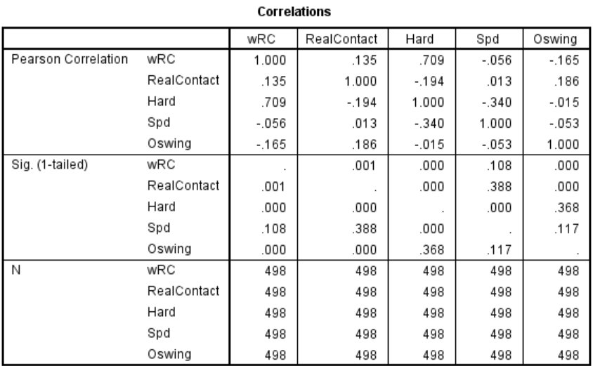
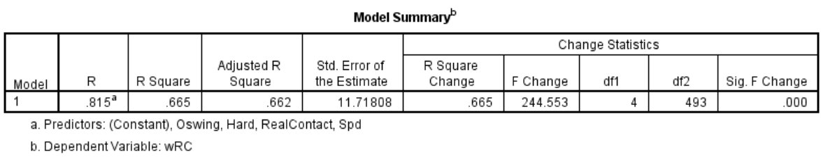
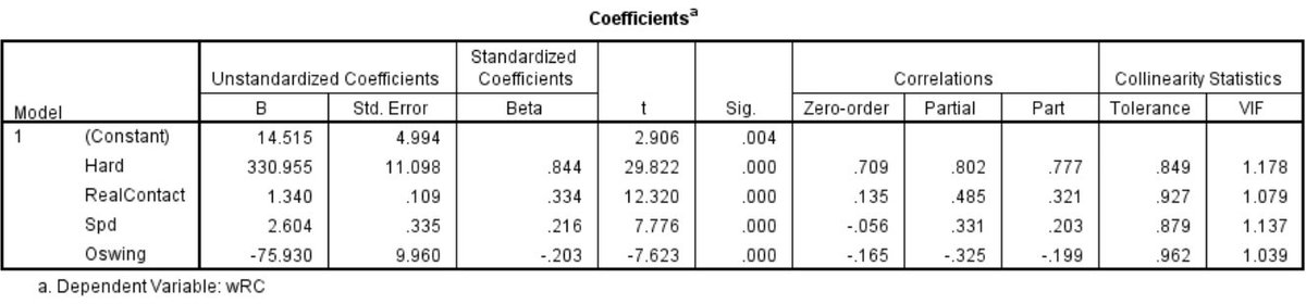
How Much Is a “W” Worth in Major League Baseball?

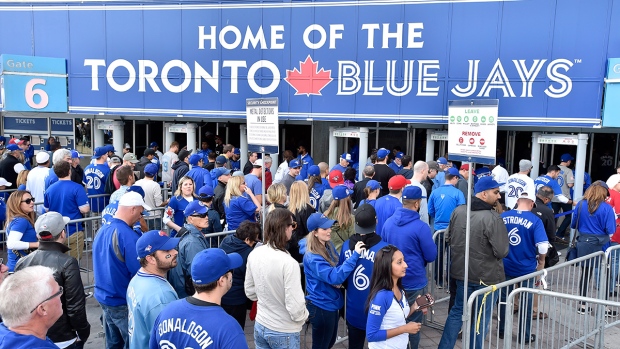
Here in Canada, the Toronto Blue Jays’ recent playoff run in 2015 gave us a reminder of how exciting postseason can be when management, players, and fans all share the same goal and vision. Yet, as thrilling as playoff baseball can be, the true definition of success for a team comes down to it being able to win the last postseason game. Why? All teams that bow out of the playoffs — be it the League Division Series, the League Championship Series, or the World Series, ultimately lose their last postseason game. Only one team — the World Series Champion — ends its season by winning its last game in the calendar year!
Before we get ahead of ourselves about winning the last game in October/November, however, we must be reminded that a team cannot participate in the playoffs — let alone advance — unless it wins its division or a wild-card spot. Even with the newly-expended postseason format that saw both leagues (American and National) having two (as opposed to one) wild cards, it remains a challenge to secure one of the 10 playoff berths. One only needs to see how much obstacles Toronto overcame in the 2015 season, aided by then-GM Alex Anthopoulos’ fury of trade deadline activities (acquiring Troy Tulowitzki, LaTroy Hawkins, David Price, and Ben Revere within a span of four days from July 28th to July 31st) to bring an end to the Blue Jays’ 22-year postseason drought. To this end, the first order of business for a team should be getting into the playoffs.
In the simplest form, there are arguably three ways to try to make the postseason. One way is to try to “buy” a championship by signing one or more (if not all) the elite unrestricted free agents on the open market. Of course, this approach requires an ownership that has deep pockets and is willing to spend (sometimes without limitations). Traditional big spenders that come to mind include but are not limited to the New York Yankees, the Boston Red Sox, and the Los Angeles Dodgers. An alternative approach, put on full display by Pat Gillick when he guided Toronto to four American League East Division titles, two American League pennants, and two World Series championships from 1989 to 1993, is to build the core of the 25-man roster through smart drafting and player development and then bolster the lineup, starting rotation, and/or bullpen through trade-deadline deals (including rentals if the cost of prospect capital is within reason). Perhaps the least popular method (at least from the fans’ perspective due to the long-term patience required) — albeit arguably just as effective as the other two means — is to rely on continuous and sustainable home-grown talents strictly, much like the Cleveland Indians (which managed to win an impressive six American League Central Division titles and two American League pennants from 1995 to 2001) and Tampa Bay Rays (which managed to win an American League pennant, two American League East Division titles, and two American League Wild Cards from 2008 to 2013 despite having a very modest payroll).
If money is no object, it would be logical to conclude that most baseball executives would opt for the first route given that it is the shortest avenue to get to the promised land, at least in theory. After all, the Yankees are the owner of 27 World Series championships, by far the most championships of any teams among the four North American major sports, i.e., Major League Baseball, National Baseball Association, National Football League, and National Football League. The greatest strength of “buying” a championship is two-fold. On one hand, by taking an elite talent off the unrestricted free-agent market and/or the trade market, you can prevent your rivals from acquiring that talent, meaning that you are strengthening yourself while simultaneously weakening your opponent. On the other hand, you can afford to “make mistakes” because if the player that you signed and/or traded for did not pan out as anticipated, you can always go out and sign and/or trade for another elite talent as a replacement until you find the right one!

Yet, there is no guarantee that being a big spender would necessarily get you a championship. In the 2015 season, the eight ball clubs with the highest payrolls — and I purposely limited the scope of my coverage to eight teams because there are only eight “true” playoff spots — as of the 2015 season are as follow: (1) Los Angeles Dodgers at $ 301,735,080; (2) New York Yankees at $221,256,867; (3) Boston Red Sox at $214,789,749; (4) San Francisco Giants at $187,088,630; (5) Washington Nationals at $165,655,095; (6) Detroit Tigers at $162,218,297; (7) Texas Rangers at $152,445,607, and (8) Los Angeles Angels at $151,348,162. As we can observe, among the eight teams with highest payrolls, all of which have a payroll in excess of $150,000,000, only three (3/8 = 37.5%) of the ball clubs — the Dodgers, the Yankees, and Rangers — made the cut! In other words, even if you spend money without reservation, it does not necessarily mean that success is guaranteed! In fact, based on this small sample, there is a (5/8 = 62.5%) chance that your team will be watching (as opposed to playing) postseason baseball even if your ball club has one of the highest payrolls in all of Major League Baseball.

Conversely, having a modest or low payroll does not necessarily mean that your team is completely out of running for the grand prize. Even though the odds may stack against you, at least from the surface, recent history suggests that the probability of a low-budget ball club making it to the playoffs is actually not terrible. Below are the eight teams with the lowest payrolls — again, I deliberately limited the range of my coverage to eight ballclubs because there are only eight real playoff spots — in the 2015 season: (1) Miami Marlins at $63,590,525; (2) Tampa Bay Rays at $73,582,652; (3) Arizona Diamondbacks at $76,639,242; (4) Cleveland Indians at $77,404,413; (5) Oakland Athletics at $80,376,830; (6) Houston Astros at $81,450,835; (7) Milwaukee Brewers at $94,010,873; and (8) Pittsburgh Pirates at $99,435,606. As we can decipher, among the eight teams with lowest payrolls, all of which have a payroll south of $100,000,000, there are actually two (2/8 = 25%) ballclubs that managed to secure playoff berths. Indeed, the difference between the number of the “rich” teams from among the eight ballclubs with the highest payroll that made the postseason — three in total — and the number of “poor” teams from among the eight ballclubs with the lowest payroll that made the playoffs — two in total — is only one team.
Hence, in statistical terms, there is not a massive gap in the chances of making the postseason between being one of the “rich” teams from among the eight ballclubs with the highest payroll (37.5%) and being one of the “poor” teams from among the eight ballclubs with the lowest payroll (25%) as the difference is only a mere (3/8 – 2/8 = 1/8 or 12.5%). As a matter of fact, if we were to take the average payroll of the eight teams with the highest payroll [($301,735,080 + $221,256,867 + $214,789,749 + $187,088,630 + $165,655,095 + $162,218,297 + $152,445,607 + $151,348,162)/8 = $194,567,186] and subtract the average payroll of the eight teams with the lowest payroll [($63,590,525 + $73,582,652 + $76,639,242 + $77,404,413 + $80,376,830 + $81,450,835 + $94,010,873 + $99,435,606)/8 = $80,811,372], which yields ($194,567,186 – $80,811,372 = $113,755,814), and then divide this difference by 12.5, i.e., the chances of making the postseason between being one of the “rich” teams from among the eight ballclubs with the highest payroll and being one of the “poor” teams from among the eight ballclubs with the lowest payroll, we can deduce that for every additional one percent (1%) in which a team wants to augment its odds of making the playoffs, it would cost that ballclub just less than 10 million dollars ($9,100,465.11). While the math suggest that you are inching closer to the promised land (at a rather slow pace of one percent) for each additional nine million ($9,100,465.11 strictly speaking) that you are dishing out, I am not so sure that the trade-off makes sense from a value (or cost-benefit) perspective unless money is no object whatsoever.

If spending money blindly is not the way to go, then it seems logical that the second or third approach (perhaps even a combination of the two) is the preferred option. Recent trends in the baseball industry seem to back this rational strategy as more and more teams are demanding “value” for their investments, meaning that they want to get the most bang for their bucks. Below are the eight teams with the lowest average cost per win in Major League Baseball for the 2015 season, as calculated and ranked by dividing the total payroll of all 30 teams by the number of wins (“W”) they have in the 2015 season: (1) Miami Marlins at $895,641.20 per “W;” (2) Tampa Bay Rays at $919,783.15 per “W;” (3) Houston Astros at $947,102.73 per “W;” (4) Cleveland Indians at $955,610.04 per “W;” (5) Arizona Diamondbacks at $970,116.99 per “W;” (6) Pittsburgh Pirates at $1,014,649.04 per “W;” (7) Oakland Athletics at $1,182,012.21 per “W;” and Minnesota Twins at $1,282,311.06 per “W.”
Among the eight teams with the lowest average cost per win in Major League Baseball for the 2015 season, there are once again two (2/8 = 25%) ballclubs that managed to secure playoff berths. This means that the probability of teams that emphasize values for their spending making it to the postseason is the same as that of ballclubs with lowest payroll in Major League Baseball for the 2015 season. Better yet, the chances of teams that emphasize values for their spending and ballclubs with lowest payroll in Major League Baseball for the 2015 season making it to the playoffs are only slightly worse than teams with highest payroll in Major League Baseball for the 2015 season (3/8 – 2/8 = 1/8 or 12.5%).

Source of 2015 MLB standing: http://mlb.mlb.com/mlb/standings/index.jsp?tcid=mm_mlb_standings#20151004
All things taken into account, I would opt for smart drafting and player development rather going for the shortcut of “buying” a championship if I were a GM, unless my budget is a bottomless pit. Bottom line, not only is there no absolute certainty that having one of the eight highest payrolls would mean a ticket to the playoffs, but as we have witnessed, the odds of making it to the postseason are not really that different for the eight teams with the lowest payrolls and for the eight teams with the lowest average cost per win in Major League Baseball for the 2015 season. Coupled with the unattractive fact that it would cost me nearly 10 million dollars to increase my team’s chance of making the playoffs by a mere one additional percent (and each percent thereafter), it seems obvious that smart drafting and player development is by far the most optimal plan.