Archive for Uncategorized

Aaron Nola, Charlie Morton, and World Series Aspirations

Last night brought another Astros game and another win for the club. On the hill and pitching pretty darn well was Charlie Morton, whose career has been as compelling for his talent as for his injuries. He went 6.1 innings and gave up a single run, on three hits, with four walks and nine strikeouts.

If you do a quick search, you’ll see a lot of comparisons of Morton to Roy Halladay, and, depending on the year, a lot of bad jokes about how such a comparison is crazy. But it’s really just about their size and motion to the plate. Curiously, there might be a more relevant comparison to make between Morton and a current Phillie based on mechanics and arsenal: Aaron Nola.

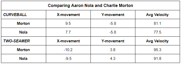
Morton and Nola are two right-handed pitchers who use a three-quarters arm slot. They also both rely on two-seamers and curveballs, which make for a fun pitch mix. The two-seamer zips away from the throwing arm while the curve snaps late glove-side, potentially allowing for full plate control.

mortonnola

And now, we can see just how similarly these pitches move for Morton and Nola. When I watch these guys and the way their offerings break, I think of them keenly casting a fishing line or maneuvering a whip. It’s snappy but fluid, and reaches the target deliberately.

That’s what makes the combo so useful. Even if a hitter knows one or the other is coming, the movement on each can keep them unpredictable.

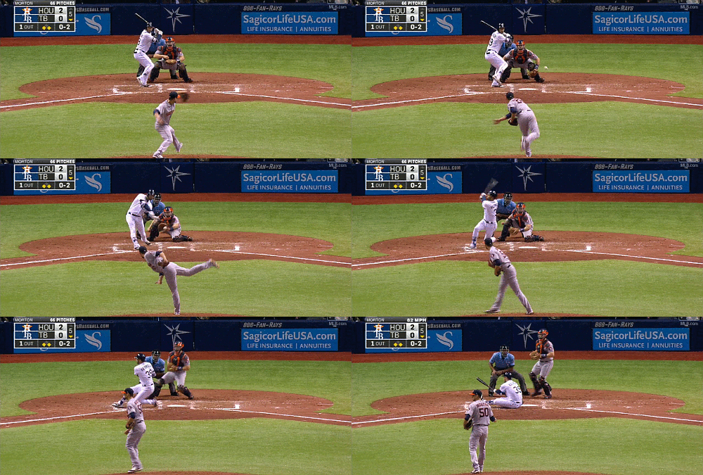
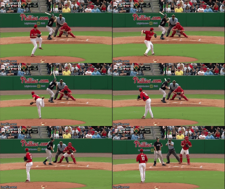
This informs how they try to mess with hitters, too: the curve from Morton moves in on lefties and gets them to hack and whiff, while the two-seamer from Nola to the same hitters is designed to get them to take a strike. To righties, Morton’s two-seamer backs them up while Nola’s curve can coax more swings. Take a look at these gifs:

Image result for charlie morton gif            Image result for aaron nola gif

In general, Morton also gets more movement on his pitches and comes with more velocity. But he also has about four inches and 40 pounds on Nola, which could certainly influence the 6 milliseconds when spin is put on the baseball and force with which it gets to the plate.

Saying Nola is more valuable than Morton is a no-brainer, though. He’s nearly 10 years younger and one of his best skills — control — can be one of Morton’s weaker ones. He’s already accounted for a full win more than Morton this season despite throwing only 12 more innings. The comparison isn’t so much about the players at their peak as it is how their perhaps unsuspected similarities gives a glimpse into the way each can contribute to a team with legitimate World Series aspirations.

Morton is a sound complementary piece on an Astros team that’s on pace for 100 wins. Nola could be a main reason a Phillies team charges at the World Series in a few years. The ride watching each will be fun.

Morton gif from GramUnion. Nola gif from Phuture Phillies.


Reds Pitchers Are Setting Records in Fastball Futility

Entering the 2017 season, projections were not particularly friendly to the Cincinnati Reds. FiveThirtyEight projected a 70-win season for the team, and FanGraphs was even more pessimistic, predicting just 68 wins and the league’s second-worst run differential. They also projected the Reds to allow 5.02 runs per game — trailing only the Coors Field-dwelling Colorado Rockies — so it’s fair to conclude that expectations for the Reds’ pitching staff were low coming into the season.

And, really, why wouldn’t expectations have been low? Last season, the Reds’ pitching staff really struggled; as Dan Szymborski noted in his pre-season ZiPS preview, Reds starting pitchers produced the lowest WAR among all major-league rotations, and their relief corps owned the second-worst bullpen WAR since 2000. After trading Dan Straily to the Marlins over the offseason, the outlook for this year wasn’t much better — of all Reds starting pitchers, ZiPS expected only Anthony DeSclafani and Brandon Finnegan (both currently on the 60-day disabled list) to accumulate a WAR over 1.0. The remaining three members of their Opening Day rotation – Homer Bailey, Scott Feldman, and Robert Stephenson — were all projected a WAR of somewhere between -0.3 and 0.6.

The winter projections hadn’t set a very high bar for the Reds to clear, but so far, they haven’t been able to do so. As it happens, Cincinnati’s 2017 starting rotation has been even worse than advertised. Consider these facts, all current as of August 12:

  • Reds starting pitchers have a collective ERA of 5.98. If this number was to stand, it’d be the worst since the 2005 Royals.
  • The team’s starters have also combined for a FIP of 5.75, which would be the highest since the 2000 Angels.
  • Cincinnati starters have accumulated a WAR of 0.1. If this number holds steady for the last six weeks of the season, it would be the lowest WAR figure – by far – of any starting rotation ever. The 2007 Nationals’ starters, currently the worst in that field, still managed to put up nearly one win above replacement.

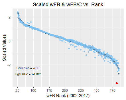
That’s not all, though — on the x-axis of the following chart, we see each team since 2002 ordered by fastball runs per pitch (wFB). The dark blue dots in the back represent each team’s total wFB, and the lighter blue dots show each team’s standardized wFB (known as wFB/C). Note that for the purposes of showing both sets of values on the same scale, I standardized both teams’ wFB and their wFB/C using R’s scale() function. For the purposes of the following chart, then, wFB/C can be interpreted as the standardized standardized runs per pitch.

As illustrated below, the correlation between wFB/C and wFB begins to moderately weaken about halfway through the ranked order, but in general, the relationship between the two is strong:

fastballs_scaled (442x351)

There is, however, a notable outlier. Draw your attention to the lower-right corner of the graph, and you’ll see the 2017 Cincinnati Reds’ wFB/C, highlighted (appropriately enough) in red. The point’s position along the x-axis illustrates just how unsuccessful the Reds’ fastballs have been this year. Out of the 480 individual team seasons since 2002, the Reds’ starters currently rank 470th in wFB. Even worse, there are still six weeks left in the season, so Cincinnati is likely to eventually overtake the 2002 Rangers’ -118.4 wFB for worst in recorded history.

Further, the Reds’ wFB/C, as shown on the y-axis, is historically low; no other team — including the ten teams with lower wFB figures — comes anywhere close to the 2017 Reds’ vertical position in the graph. For additional context, the White Sox currently own the second-lowest wFB/C in the league at -0.80; Reds starters’ wFB/C is -1.72. There’s also an enormous discrepancy between Cincinnati’s 2017 wFB/C (the red point) and wFB (the corresponding dark blue point). As illustrated above, no team’s rotation in the last 15 years has ever had a season with such a large difference. Interestingly, deviations like this are far more present in sliders and slightly more so in changeups, but standardized wFB and wFB/C are generally very close to each other.

For the 2017 Reds, this means that although they’ve thrown far fewer fastballs than teams whose statistics comprise a full 162-game season, their average fastball’s run expectancy has been detrimental enough to already give them the tenth-worst wFB since 2002. I should note that pitches’ linear weights are descriptive rather than predictive, as explained on FanGraphs’ Linear Weights page, An awful pitch value doesn’t necessarily mean that the pitch itself is equally bad, so Cincinnati starters’ historically terrible collective wFB/C isn’t evidence that each of them throws a similarly terrible fastball. And to be fair, the Reds’ rotation hasn’t been helped out much by Tucker Barnhart and Devin Mesoraco’s -2.9 and -3.0 FRAA figures, which are ranked 67th and 68th, respectively, out of 90. But it’d be hard to argue that the Reds rotation’s historically low wFB figure isn’t meaningful.

I didn’t notice anything particularly unusual about the usage, velocities, or movements of the Reds’ fastballs themselves, which fits with the “descriptive, not predictive” note above. The team’s starters have thrown the 20th-highest percentage of fastballs in the league, and their fastballs’ average velocity ranks similarly. Instead, I interpret their horrific wFB/C as more of a general indication of the state of the Reds’ rotation, which (as their ERA and FIP also suggest) leaves much to be desired.


Nick Markakis’ Forgotten 2008 Season

While browsing Baseball Reference’s database, I encountered a strange thing. I was looking at the WAR leaders for each season. WAR stands for Wins Above Replacement, which is a statistic that measures how many wins a team gained by having a certain player instead of a replacement player, who would have a WAR of 0. The leaders were all recognizable names — MVPs, World Series Champions, Cy Young award winners, etc.

Surely the leader in WAR in 2008 finished near the top in the MVP voting. And of course he was an All-Star. And sure, maybe he even won a Silver Slugger or a Gold Glove.

Nope.

Nick Markakis led the American League in WAR with 7.4 and did not receive an MVP vote, make the All-Star team, win a Silver Slugger or take home a Gold Glove.

Markakis is now a veteran outfielder for the Atlanta Braves. But back in 2008, he was a stud for the Baltimore Orioles, and he led his team in hits, walks, batting average, and on-base percentage. Markakis had a reputable slash line of .306/.406/.491, scored 106 runs, drove in 87, clobbered 20 homers and stole 10 bases. These stats are excellent, and Markakis finished near the top of many leaderboards once the season ended.

He finished in the top ten in the AL in batting average, OPS (on-base + slugging), hits, extra-base hits, and Offensive WAR. The right fielder also closed the year in the top five in the AL in on-base percentage, runs, doubles, and walks. Markakis was also a great asset in the field, leading AL right fielders in games played and putouts while leading all AL outfielders in outfield assists.

According to Baseball Reference, there have only been 32 seasons when a player either matched or exceeded Markakis’ WAR, Offensive WAR, Defensive WAR, batting average and on-base percentage.

Markakis’ excellent stats were matched by only 32 players ever, but he was snubbed from every award.

Markakis was not selected as one of the six outfielders to compete in the All-Star Game despite his achievements.

Instead, Ichiro Suzuki, Josh Hamilton, Manny Ramirez, J.D. Drew, Carlos Quentin, and Grady Sizemore were selected. None of them recorded more than 6.0 WAR, while Drew did not even record 3.0 WAR. Markakis was thoroughly robbed of an All-Star appearance.

Looking back on it, it’s an injustice that Nick Markakis had such a standout year and did not even receive a single vote for MVP. His 7.4 WAR outnumbered every other candidate, including winner Dustin Pedroia, who recorded 6.9 WAR.

Markakis had arguably a better year than anyone in the American League in 2008, and yet was not recognized at all.

Markakis was also a standout defensively, and recorded 1.7 Defensive WAR. Yet he was not appreciated for this achievement either, as Torii Hunter (-0.1 dWAR), Ichiro Suzuki (0.8 dWAR), and Grady Sizemore (0.1 dWAR) took home the outfield Gold Gloves in 2008.

Another intriguing aspect of Markakis’ season, besides being slighted from every award, was that this explosion came out of the blue. Markakis’ 7.4 WAR in 2008 soars above his career average of 2.6 and towers above his next-best season, when he recorded 4.2 WAR in 2007.

Markakis’ defensive exploits in 2008 were also very surprising. He has never been a great defender, and he has only two years in his 12-year career in which he has a positive dWAR, 2008 (1.7) and 2016 (0.3). Markakis has a career dWAR of -6.5, which shows that his excellent 2008 season was an anomaly.

Markakis also logged a career high in Offensive WAR in 2008, as he achieved career highs in runs, doubles, walks, batting average, on-base percentage, slugging, and OPS.

I’ll never know why Markakis could not even come close to matching his exploits from 2008. Markakis was just 24 in his breakout season, but his stats decreased as he headed toward his prime. I can’t find an explanation for his decline, as injuries weren’t a factor — Markakis has played at least 155 games in every season from 2007-2016, with the lone exception of 2012. Markakis was a bit lucky in 2008, as his BABIP (batting average on balls in play) was .350, higher than his actual batting average of .306. However, his career year cannot be explained away by luck.

The lack of recognition of Markakis’ magnificent season is puzzling. He did play in one of baseball’s smallest media markets (Baltimore) for a team that stayed in the basement of the AL East, but at a certain point, efforts like his need to be noted.

Markakis never again reached the heights of his 2008 season, and I’ll always wonder two things: why he wasn’t recognized for his achievements, and why he was never able to match his production again.

Special thanks to Baseball Reference for all of these helpful statistics


Do Big-Name Trades Have an Impact on the Division?

I can’t remember if it was in a podcast or over the radio but when the trade deadline was approaching, there was talk about the effects of how a team trading away their stars would affect the playoff picture. Not in the way where a team has a hole in their rotation so they trade for a solid starter. No, this piece was talking about how trading a great player would make it easier for teams in that division to get ahead and how the newly-acquired player would make his new division harder to play in.

My first thought was there’s no way a player’s performance can impact a division so heavily, right? Baseball is a team sport and while affecting their own roster is one thing, affecting the outcome of four other teams in the process seems like a stretch. So I did a little bit of digging and here’s what I found.

For this study, I’ve included players that had a WAR of 2 or greater before being traded from 2007-2016. Additionally, I gathered data from the day they were traded of their old team’s winning percentage, new team’s winning percentage, old division’s winning percentage, and new division’s winning percentage. I also took the difference of their WAR per games played before and after the trade as a percentage.


Player Year Hitter/Pitcher New Team Old Team WAR/G Dif New Team Win% Change Old Team Win% Change New Div Win% Change Old Div Win% Change Playoffs
Drew Pomeranz 2016 P Red Sox Padres -75.7% 0.53% -1.64% 0.25% -3.96% ALDS
Carlos Beltran 2016 H Rangers Yankees -91.3% 0.17% 2.77% 0.21% 0.29% ALDS
Jonathan Lucroy 2016 H Rangers Brewers 18.5% 0.17% -0.22% 0.21% 1.12% ALDS
Alex Wood 2015 P Dodgers Braves -50.0% 1.61% -9.01% -3.53% 3.05% NLDS
David Price 2015 P Blue Jays Tigers 39.3% 13.66% -6.12% 0.55% -0.67% ALCS
Scott Kazmir 2015 P Astors Athletics -100.0% -4.67% -7.49% -0.10% 0.29% ALDS
Cole Hamels 2015 P Rangers Phillies -22.6% 10.82% 1.04% -1.87% 0.79% ALDS
Johnny Cueto 2015 P Royals Reds -46.4% -3.62% -11.83% -1.02% 2.56% Won
Austin Jackson 2015 H Cubs Mariners -64.9% 5.27% 1.52% -2.95% 1.41% NLCS
Yoenis Cespedes 2015 H Mets Tigers 20.8% 7.96% -5.15% -1.24% -0.19% World Series
Jeff Samardzija 2014 P Athletics Cubs 6.3% -11.85% -0.22% 1.33% -4.29% Wild Card
David Price 2014 P Tigers Rays 26.6% 0.72% -3.26% 0.88% -0.10% ALDS
John Lester 2014 P Athletics Red Sox -28.4% -11.99% -1.35% 3.60% -0.57% Wild Card
Yoenis Cespedes 2014 H Red Sox Athletics -1.0% -1.35% -11.99% -0.57% 3.60% No
John Lackey 2014 P Cardinals Red Sox -47.5% 4.32% -1.35% -1.50% -0.57% NLCS
Marlon Byrd 2013 H Pirates Mets -42.6% 0.00% 0.66% 0.25% 0.98% NLDS
Shane Victorino 2012 H Dodgers Phillies -4.7% -0.38% 11.86% 5.71% -1.90% No
Adrian Gonzalez 2012 H Dodgers Red Sox -2.4% -2.21% -9.75% 1.04% 2.12% No
Anibal Sanchez 2012 P Tigers Marlins -2.0% 0.18% -9.17% -3.91% 3.78% World Series
Omar Infante 2012 H Tigers Marlins -51.7% 0.18% -9.17% -3.91% 3.78% World Series
Zack Greinke 2012 P Angels Brewers -47.6% 0.73% 13.78% 2.15% -4.67% No
Ubaldo Jimenez 2011 P Indians Rockies -18.2% -3.14% -5.45% -0.26% 3.37% No
Edwin Jackson 2011 P Cardinals White Sox -63.5% 5.10% -1.41% 1.94% -0.83% Won
Michael Bourn 2011 H Braves Astros -19.3% -5.02% 6.79% -3.17% 1.74% No
Doug Fister 2011 P Tigers Mariners 44.8% 12.05% -2.59% -4.44% 1.35% ALCS
Hunter Pence 2011 H Phillies Astros 122.2% -0.94% 6.79% -4.38% 1.74% NLDS
Carlos Beltran 2011 H Giants Mets -25.8% -8.61% -7.59% 4.32% -2.12% No
Roy Oswalt 2010 P Phillies Astros 12.4% 9.11% 12.74% -2.23% 0.34% NLCS
Alex Gonzalez 2010 H Braves Blue Jays -75.4% -4.91% 6.28% 0.35% -1.16% NLDS
Dan Haren 2010 P Angels Diamondbacks 35.0% -4.08% 7.22% -3.83% 3.40% No
Cliff Lee 2010 P Rangers Mariners -31.1% -4.30% -4.56% -1.65% -1.90% World Series
Victor Martinez 2009 H Red Sox Indians 43.1% -0.34% -3.84% -1.95% 0.98% NLDS
Scott Rolen 2009 H Reds Blue Jays -29.0% 3.63% -2.73% -3.39% -1.34% No
Cliff Lee 2009 P Phillies Indians 12.8% -1.71% -3.84% 2.42% 0.98% World Series
Matt Holliday 2009 H Cardinals Athletics 37.1% 5.05% 9.98% -4.89% -2.01% NLDS
Xavier Nady 2008 H Yankees Pirates -47.5% -1.79% -11.16% -0.37% 1.48% No
Manny Ramirez 2008 H Dodgers Red Sox 88.7% 3.80% 4.64% 2.05% -0.71% NLCS
CC Sabathia 2008 P Brewers Indians 87.3% 0.91% 19.05% -0.55% -3.51% NLDS
Mark Teixeira 2008 H Angels Braves 96.4% -1.44% -3.06% -4.11% 2.19% ALDS
Kyle Lohse 2007 P Reds Phillies -30.8% 3.00% 4.47% -1.06% 0.25% NLDS
Mark Teixeira 2007 H Braves Rangers 99.8% -0.76% 4.51% 0.20% -1.06% No
Kenny Lofton 2007 H Indians Rangers -66.3% 1.72% 3.58% -4.23% -0.81% ALCS

First things first, let’s see if a great player can really impact a divisional outcome. Out of the 42 players in this study, only six (14.3%) had a positive WAR/G difference, a positive difference in winning percentage of their old division, and a negative difference in winning percentage of their new division:

Victor Martinez – 2009

Doug Fister – 2011

Hunter Pence – 2011

Mark Teixeira – 2008

Roy Oswalt – 2010

CC Sabathia – 2008

For Fister, Oswalt, and Sabathia, their new teams’ win percentage improved. For Martinez, Pence, and Teixeira, the win percentage decreased. All teams made the playoffs, however, with Fister and Oswalt making in to their respective league championship games. It’s interesting to see that the three players whose teams’ win percentage also improved are all pitchers, while the other three were all hitters.

The split between hitters and pitchers in the study was right down the middle, with 21 pitchers and 21 hitters. After their respective trades, 16 out of the 42 players had a positive WAR/G differential. Again, the results were right down the middle, with eight pitchers and eight hitters posting the positive WAR/G difference. Looking at the 26 players that had a negative WAR/G differential after the trade, you could’ve guessed it; half (13) were pitchers and the other half were hitters. I’m not 100% sure what that could mean, but I found it as a fascinating observation.

Out of the 42 teams that made trades in this study, three were under .500 when they made the trade; Reds for Scott Rolen (missed the playoffs), Red Sox for Cespedes (missed the playoffs), and Rangers for Hamels (ALDS). Let’s see how the rest of the teams that were .500 or better fared with their new trade pieces:

No Playoffs – 9 (23%)

Wild Card – 2 (5.1%)

DS – 14 (35.9%)

CS – 7 (17.9%)

WS – 5 (12.8%)

Won – 2 (5.1%)

It should be noted that the WAR/G differential doesn’t include playoff statistics. This is important to note while looking at players in this study that went to or won the World Series. For example, in 2015 the Royals acquired Johnny Cueto from the Reds. Looking at the data alone, Cueto had a -46.4% WAR/G differential and the Royals’ winning percentage dropped by 3.62% after the trade. Looks like a bad trade so far. Fast-forward to the ALCS where Cueto gives up eight earned runs in two innings against the Blue Jays. This trade looks like a disaster. Until Cueto takes the mound against the Mets in Game 2, allowing one run on two hits for the complete-game victory, edging the Royals closer to a World Series title. If given the opportunity again, do the Royals make the trade? Absolutely.

On the other side of the spectrum is Edwin Jackson, the only other player in this study to win the World Series. He as well sported a -63.5% WAR/G differential after the trade. The next question would be, would the Cardinals make the trade again? With a 5.76 ERA that postseason, my guess would be no.

The main question in this study is, “Does an impact player have so much influence in the game around them that they can shift the outcomes of a division?” The quick answer, and one that I’m sure everyone already knew, is not really. There is no correlation between the new division winning percentage change and the old division winning percentage change. A lot of the outcomes of divisional win percent changes seem to be circumstantial. Just because the new team’s division has gotten worse and the old division has gotten better doesn’t always mean that it’s the result of the player. It does seem apparent that a pitcher may have more of an influence than a hitter in these terms however (see Sabathia, Oswalt, and Fister above).

The biggest takeaway for me is that teams seem to be reluctant to overpay and make the smaller, longer-term deals as opposed to big-name rentals as seen at the deadline this year. It’s become apparent that just because you make the trade for the big-name player doesn’t guarantee a World Series victory, trip, or even a spot in the playoffs. Speaking of those big pieces, it will also be interesting to see how Quintana and Darvish affect the data after the season is over. Additionally, I would love to see the implications of a Harper or Trout trade to see if a hitter can ever truly be able to affect a divisional outcome. We can only dream.


wOBA Flippers and the Playoff Charge

Early on in a season, we get to talk about eye-popping numbers that players put up. We warn of sample sizes, though, and almost crave stability. We wait impatiently for the season to steady itself and almost breathe a sigh of relief when it happens — when we can start to buy into what an individual is doing.

But as the season wades on and we move toward the postseason, the biggest stories often come from singular moments. And while we can’t predict who, exactly, will define his team’s season with a single play, we might be able to take a pretty good guess.

With weighted on-base average from Statcast, we get to see just how much a player is contributing each time they step to the plate. With expected weighted on-base average, we get to see how well their results line up with their approach.

woba flippers

The differences in expected and actual wOBA for these players in the early going is no small thing. The 20-to-45 point gap would have put them in a completely different class of players had things gone as expected. Manny Machado figured to rank ahead of Kris Bryant; in reality, he lingered above Freddy Galvis. There’s an example like that for each of the other three, too. While the early performances of these guys might have lasted long enough to make us feel like they were a certain kind of reliable this season, their recent play highlights how fast things can change.

The rankings associated with each player give a sense of what their teams would have enjoyed had circumstances fell more in their favor. Rankings aren’t included since the start of July because the sample size may emphasize a gap that could be misleading — Kyle Seager, for instance, has the smallest difference of the four in wOBA-based production but drops 76 spots because of it.

That’s also to intentionally emphasize something else: all of these players’ teams are in the playoff hunt. Seager’s Mariners are tied for the Wild Card lead and Machado’s Orioles, despite abysmal pitching, are only 1.5 games out. Moreland’s Red Sox and Santana’s Indians each lead their division by four games. And for better or worse, their turnarounds could be playing a big role in who’s playing in October.

So consider the implications. Do the Mariners possibly lead the Wild Card at this point if Seager’s production more closely matched what was expected? Are the Orioles smashing expectations again if the same were true for Machado?

Could Santana have delivered a more comfortable divisional lead for Cleveland earlier? Is he doing that now by exceeding expectations with a white-hot bat? Moreland broke his toe in June — what impact has that had on the Red Sox building similar divisional comfort, and how big of a role could him simply being able to put pressure on his back foot play?

The answers to these questions may or may not be rhetorical, but all of these players are having a string of moments that could help define their team’s season. While we’ve longed for stable samples to dig into, their turns in production are showing us the ebb and flow of a game that remembers snapshots more than anything. As we come down to the wire, the big picture is telling us how it’s constructed of little ones.


Ronald Acuna Is Already Setting Records by Improving at Every Level

There have been several surprising prospect performances this year, but the one that seems to top the rest has been Atlanta Braves outfielder Ronald Acuna. The 19-year-old began his season in high-A and, by my notes, was unranked in the MLB pipeline top-100 (he was 36th on Keith Law’s list and 67th on Baseball America).

Fast forward to now, and Acuna has been promoted twice and is a consensus top-10 prospect. In the recent prospect hot sheet chat, Baseball America’s Josh Norris speculated that Acuna was a frontrunner for minor league player of the year and next season’s #1 prospect overall.

The aspect that I could not get my head around is that Acuna is improving faster than he can be promoted. With at least 100 PA at each level, he has improved every relevant rate stat with each stop.

Name Team Age G AB PA HR AVG BB% K% OBP SLG OPS ISO wRC wRC_plus
Ronald Acuna Braves (A+) 19 28 115 126 3 0.287 6.30% 31.70% 0.336 0.478 0.814 0.191 18 135
Ronald Acuna Braves (AA) 19 57 221 243 9 0.326 7.40% 23.00% 0.374 0.52 0.895 0.195 41 159
Ronald Acuna Braves (AAA) 19 24 92 107 4 0.348 12.10% 18.70% 0.434 0.576 1.01 0.228 22 183

This led me to answer the question of whether this had ever been observed before.

I pulled every minor league player season from 2006-2017 (the farthest back FanGraphs can go). I filtered on at least 100 PA, and consolidated a list where players appeared in at least three levels. I used wRC+ as a catchall stat for offensive production and scored players that improved their output in the jump from one level to the next.

It is worth observing that this list is quite artificial — not many players appear in three different minor league teams in a single season, and only 22 have done so in the past 11 years. And the list certainly isn’t a who’s-who of top prospects, so take this analysis with a grain of salt.

Since 2006, Acuna is the only minor-league player to have posted improved wRC+ at three different stops in the same season (see chart below, labeled players with blue lines showed improvement in at least one jump). While Acuna’s high-A 135 wRC+ wasn’t setting the world on fire, posting a 183 wRC+ at his third league level in a single season is untouchable.

See graph

Owing to Acuna’s excellent hit tool, he is also the only prospect to have posted similar improvements in AVG, OBP or OPS since 2006.

On plate-discipline statistics, the only other player to show the consistent improvement in BB% is Ryan Court (2013). Two other players show a consistent decline in K% across each level (Brett Wallace and Sawyer Carroll in 2009).

For power statistics, Acuna also finds a little company. Two other players showed improvements in isolated power at each level, Tyler Pastornicky in 2015 and Rando Moreno in 2016, though their improvements went from horrific (0.038 and 0.040, respectively) to simply not good (0.111 and 0.082). Pastornicky was the only non-Acuna player to increase his SLG at each level (.314 to .394 compared to Acuna’s .478 to .576).

As was said at the outset, the players that reach 100 PA in three levels in a single season are not any sort of elite bunch. But it is telling that among them, Acuna is the only one that has shown a consistent ability to improve while facing better and older talent. I’m not holding my breath for a 200 wRC+ when Acuna makes it to The Show, but I will be watching.


An Index to Gauge the Quality of a Four-Seam Fastball

What is SPV?

Have you ever heard about “SPV”?  SPV: Spin rate Per Velocity (spin rate/ velocity) 

This is a useful index to gauge the quality of a four-seam fastball. SPV came up in Japan’s All-Star Game this year and came to baseball fans’ attention.

Many people might think spin rate is the most important metric for measuring the quality of four-seam because we often hear TV commentators talking about it. In MLB, pitchers who throw with a high spin rate have attracted a lot of attention and respect since we started using tracking data from systems such as TrackMan and Rapsodo, but I have some questions about this focus on spin rate, however, and think that we should consider using SPV instead.

As you know, spin rate bears a proportionate relationship to ball speed. It’s hard to guess which factors more effectively into pitching stats, high ball speed or high spin rate. Because the ball speed is high when the spin rate is high. It’s not enough to explain pitching performance only from spin rate.

As a note, Driveline has also written about the metric we call SPV, except they refer to it as “Bauer Units”.

I agree with Driveline’s analysis and would like to present some new data to promote the effective use of SPV. I will also discuss some of the limitations of using SPV and the importance of knowing the direction of the spin axis of a pitch. In the end, I will mention the challenges of promoting the popular use of tracking data in our home market of Japan.

Let’s take a look Fig. 1 below. This graph shows the relationship of spin rate and ball speed, based on a data set from Baseball Savant covering 115,759 four-seam pitches in 2016. As the red line in the graph shows, spin rate is proportionate to ball speed.

Fig. 1 Relationship between spin rate and ball speed, distribution of high SPV and low SPV

When trying to judge the quality of a pitch such as a four-seam, you cannot look in isolation at either the spin rate or ball speed. Using the ratio of SPV makes it possible to compare pitches – for the speed thrown, did the ball have more or less spin (more or less hop) than average?

Effect of SPV on a batted ball

Table 1 and 2 below rank high and low SPV pitchers, respectively. Each of the pitchers threw over 1,000 four-seams in 2016. The data shows that, in general, high-SPV pitchers have a high FB% (fly ball%) and that low SPV pitchers have a high GB% (ground ball%).

Unfortunately, Koji Uehara is not in this ranking, because he didn’t throw over 1,000 four-seams last year. But it would be fun to take a look at his data, since we could know his interesting character from it. As you know, his ball speed is not so high, but his SPV is really high. We can make a good guess about his ball quality. Also, in other pitchers, we can know their character from this data.

I wrote in a paragraph above that spin rate is proportionate to ball speed. A spinning ball obtains lift and appears to break due to the Magnus effect, but this only occurs when the spin axis is tilted perpendicular to the line of ball travel, providing useful spin. In the case of a four-seam, the more the spin axis is tilted toward the horizontal, the more backspin there is, and the backspin creates lift force and apparent hop. If the spin axis tilts towards the direction of ball travel, the component of spin in that direction (gyro spin) does not contribute to ball movement.

A batter at the plate creates a mental image of the ball trajectory. There is an average trajectory for each pitch type, and the batter extrapolates the trajectory from pitching form. In general, balls which follow a familiar trajectory, or have an average SPV, are easier to hit than non-average pitches. For example, when a high-SPV pitcher throws a four-seam, the lift force obtained from useful spin is higher than average, causing the ball to hang in the air, or hop, more than the batter had expected. In other words, when a ball’s trajectory is higher than average, the batter tends to swing low and hit a fly ball.

On the other hand, when a low-SPV pitcher throws a four-seam, the ball is affected by less lift than average pitches, and therefore drops more than expected, leading to an increase in ground balls.

Limitations of SPV

SPV is useful and a great index to know the quality of a ball, but it also has a negative side. As discussed above and according to a study (Jinji T. and Sakurai S, 2006: Direction of Spin Axis and Spin Rate of the Pitched Baseball, Sports Biomechanics), the direction of the spin axis has a huge effect on ball break. For example, the spin of a perfect gyro ball (spin axis is parallel to the direction of travel) does not create lift, regardless of how high the spin rate is. Consequently, a four-seam with a lot of gyro spin does not appear to hop even if the SPV is high.

We also need to consider the direction of the spin axis in order to understand how much of the total spin contributes to the desired ball movement. Table 3 below shows angle of spin axis (the ball direction and the velocity vector of spin rate) for each skill level. This angle was measured by motion capture systems (VICON MX). As the player skill level rises, “α” generally increase, meaning that more of the total spin is backspin and therefore contributes to apparent ball movement. And there is a tolerance in “α” of professional pitchers. So when we gauge the quality of ball, we should care about the effect of spin axis for each player.

We understand that SPV is possible to judge four-seam quality, but some balls are impossible. We might need to see how each is changing toward horizontal direction or vertical direction to judge the pitched ball exactly. A convenient tracking device such Rapsodo is available to measure not only spin rate, but also spin axis. That would help us to know the quality of the ball.

Popularity of tracking data in Japan

Although baseball is very popular in Japan, most baseball fans are not interested in seeing live tracking data or hearing discussions about it when they are watching games. Just recently, in July of this year, a Japanese TV station tried to indicate SPV during a live game, but there was negative feedback from many fans. In the future, I hope Japanese baseball fans take an interest in tracking data and start discussing points, such as how many inches a ball breaks. I expect that the more Japanese fans get exposed to tracking data and become familiar with the concepts, the more they will enjoy it, especially metrics such as SPV.
Are the Yankees Following the Red Sox Blueprint For Success?

The Yankees and Red Sox are battling it out atop the AL East, which brings one back to the early 2000s, when these two teams were virtually competing solely against one another to crown a division champion, with the Yankees more often than not edging out Boston. However, the tables have turned, and since 2004 the Red Sox have three world titles while the Yankees have only had one. In the last two seasons in particular, the Red Sox have relied on the emergence of young prospects, veteran leadership, and savvy trades/free-agent signings to be successful. Are the 2017 Yankees an original creation of Cashman and Steinbrenner, or were they inspired by the strategy employed by other teams in more recent years, such as the Royals, Cubs, and even (in an ironic twist) their arch rivals, the Boston Red Sox?

The Red Sox recently called up highly-talented prospect Rafael Devers to fix their gaping hole at third base, and he has revitalized the lineup. He, along with Xander Bogaerts, can grow to be one of, if not the best 3B/SS combo in the majors, not to mention their presence at the plate, with Bogaerts being considered the best two-strike hitter in all of baseball. The Red Sox also have an outfield stocked with young talent. The Killer B’s (Benintendi, Bradley, and Betts) have each regressed slightly at the plate this season, but are still putting up respectable numbers. Bradley and Betts are also playing outstanding defense, as Betts leads the AL with 2.1 dWAR this season. However, one shouldn’t forget about Dustin Pedroia, who provides veteran leadership to help these young prospects adjust to life in the big leagues while remaining a staple at second base, as well as in the lineup.

One can’t say that the Red Sox rebuilding strategy has been perfect, as they currently have a revolving door at catcher, first base, and DH. They are clearly affected by the departure of David Ortiz’s intimidating reputation in the DH spot. Hanley Ramirez has been productive at the plate, but his defense is less than stellar, to put it mildly. Mitch Moreland and Christian Vazquez are just now getting hot bats after struggling at the onset of this season. More than anything, the Red Sox have been plagued by injuries to their starting pitching, as well as poor free-agent signings, most notably Pablo Sandoval, David Price, and even Rusney Castillo, who many forget is still in AAA-Pawtucket.

Overall, I believe the Yankees have learned a thing or two from the Red Sox. It’s important to give Dave Dombrowski credit for sticking with Devers at third, rather than trying to orchestrate a trade to acquire Josh Donaldson, as tempting as the idea was. The Yankees have groomed a host of young talent including Gary Sanchez, Aaron Judge, and now Clint Frazier. They also made good trades for Sonny Gray and others by not having to give up too many big names within their stacked farm system, and added Matt Holliday in the offseason to add some veteran leadership in the lineup at a low-risk contract. Like the Sox, the Yankees aren’t perfect, and are sitting on their hands with some expensive free-agent contracts (I think I hear Jacoby Ellsbury’s name somewhere). While the Red Sox rebuilding efforts have been more or less successful, I believe the Yankees should look at themselves when deciding how the team will shape out in the coming years. The Yankees from the mid to late 90s are one of the best examples of how teams can keep sustaining success. The Yankees in that era were built with a core group of prospects (the core four comes to mind), some established veterans such as Paul O’Neill and Tino Martinez, and other guys that helped create unbreakable clubhouse chemistry. All of these elements, and also a little bit of luck, are the keys to shaping the next great baseball dynasty, whomever that may be.


Analyzing the Big Boys’ Team Peripherals

There are a few really good teams this year. The Dodgers and Astros are really destroying their divisions, although the Astros have been slowed down by injuries a little. The Nats are also really good despite their bullpen struggles, that they tried to fix with a few trades.  There are also the Red Sox and the Yankees, who started really well. I will also include last year’s World Series finalists, who had a mediocre first half but really turned it on in July and on paper have very strong teams that should compete with the other top teams.

Let’s start with hitting. I used wRC+, K, BB, ISO, my own K-BB-ISO, xWOBA and BABIP.

wRC+ K BB ISO K%-BB%-ISO BABIP xWOBA
Astros 129 17.3 8.2 0.211 -0.120 0.317 0.336
Dodgers 111 22.5 10.6 0.194 -0.075 0.307 0.332
Nats 108 20.4 8.8 0.199 -0.083 0.315 0.329
Yankees 108 22.6 9.8 0.183 -0.055 0.308 0.328
Indians 107 18.3 9.8 0.178 -0.093 0.300 0.330
Cubs 98 21.8 9.8 0.188 -0.068 0.286 0.318
Boston 92 18.6 9.1 0.144 -0.049 0.304 0.314

The Astros have clearly been the best hitting team. Their BABIP might regress some, but they also lead in xXOBA, K-BB-ISO, ISO and contact. Behind them, the Dodgers, Yankees, Nats and Indians form a group that is pretty close together by all the stats. The Cubs are clearly behind in wRC+ but they also have the lowest BABIP at .286 that might be due to some regression. The Statcast-based xWOBA suggests that it was not all bad luck but in ISO, contact and my combined stat, only the Astros clearly are superior to them. The Cubs also have a July WRC+ of 113, which is fourth of the group behind the Astros (152), Dodgers (120) and Indians (115) with a not outrageous .307 BABIP.

Boston, however, clearly is the last team out of the bunch. They are last by xwOBA, wRC+, K-BB-ISO and ISO. Contact, walks and BABIP are OK, but Boston this year simply doesn’t have power; their ISO is actually second-last in MLB.

If we want to create tiers of hitting, the Astros are alone in their own tier. Of course, currently half of their lineup is on the DL, but hopefully that changes and then they should be number one again. After them, there is a tier out of the Nats, Dodgers, Indians and also the Cubs. The Cubs have been clearly worse in results and are closer to Boston in that regard, but their lowish BABIP, their preseason projections and their last very good month, as well as their peripherals, make me grade them on par with the other non-Astros teams. All those teams are pretty close in talent and should be projected for about a 105-110 wRC+ the rest of the way.

And then there is Boston, clearly the worst out of the pack no matter how you slice it.

Then there is pitching:

xWOBA FIP K-BB
Dodgers 0.273 3.42 18.7
Houston 0.295 3.88 18.3
Yankees 0.297 3.86 17.0
Washington 0.301 4.10 15.8
Boston 0.306 3.80 17.5
Cubs 0.309 4.21 14.1
Indians 0.304 3.61 19.2

Here the Dodgers clearly lead the field, being first in xwOBA against and FIP and second in K-BB. After them, we have the Indians, who are a weaker team in xwOBA but second in FIP and first in K-BB, and Houston, who is second in xwOBA, third in K-BB and fourth in FIP. Boston is second in FIP and fourth in K-BB, and the Yankees are in the same tier. Washington and the Cubs are a bit weaker in that regard, but overall there are not huge differences, plus the Yankees and Cubs both had really big upgrades.

Tiers here would be the Dodgers and Indians first, then Red Sox and Yankees and third the Nats and Cubs, but the recent trades might have moved the Cubs into the second tier and the Yankees into the first tier.

By xWOBA differential you have:

Dodgers 0.059
Astros 0.041
Yankees 0.031
Nats 0.028
Red Sox 0.008
Indians 0.026
Cubs 0.009

the Dodgers ahead of the Astros, Yankees, Indians and Nats and the Red Sox and Cubs last. I think, however, that with the recent trades and their hitters getting hot, the Cubs are pretty close to at least the Yankees, Indians and Nats and not that far off the big two from LA and Houston, especially because they excel in defense, which was not included in my analysis. Boston unfortunately I don’t see quite in that tier, especially if Price doesn’t come back strong.


What Is a Pitcher? What Is a Batter?

When we consider individual baseball players, we think that we understand how to divide them into pitchers and hitters. Clayton Kershaw is a pitcher, we say confidently, and the recently-traded Nori Aoki is a hitter. But from the perspective of the statistical record, the question can be a little harder to answer. Kershaw, after all, had appeared in six more games as a pinch-hitter or pinch-runner than he has as a pitcher through 2016, and Mr. Aoki stood on the mound and induced a fly out from Aaron Judge earlier this season (among other less satisfactory results). Is there a programmatic way to divide baseball players into hitters and pitchers from the perspective of the statistical record?

For me, the question isn’t merely academic: I am building a baseball trivia game, and it is very important for the rules of the game that I be able to programmatically divide baseball players into hitters and pitchers. In particular, I need to divide players into pitchers and hitters over the course of their careers, not merely from the standpoint of a particular season or game. And I need to do so definitively: a player can’t be both a pitcher and a hitter. The data that I am working with for my baseball trivia game comes from Sean Lahman’s database, and includes batter seasons and pitcher seasons back to the 1870s.

The Lahman database does not attempt to disambiguate between hitters and pitchers, merely including hitting seasons and pitching seasons. If a player only hit, that’s a hitter; if he only pitched, that’s a pitcher. Easy enough, but there are of course complications. Pitchers bat in real baseball, so there are lots of hitting seasons by pitchers in the data. And sometimes, as noted above, hitters pitch in blowouts, so there are pitching seasons by batters included as well.

Then there’s Babe Ruth, who really was both a pitcher and a hitter, you might say, throwing lots of innings in the 1910s before becoming a full-time hitter in the ‘20s. What does it mean to pitch and hit “a lot”? Carlos Zambrano was a pitcher, informed baseball fans presumably agree. He was also a decent hitter and was used as a pinch-hitter fairly often. He’s not a batter, though. Right?

Here’s the programmatic metric that I’ve decided on and used to divide players in my game:

According to the Lahman database, there have been 5,277,522 batter games and 1,064,580 pitcher games in baseball history through 2016. That’s a ratio of about 4.95 batter games to 1 pitcher game. Any player with a higher ratio should be classified as a hitter, any lower as a pitcher. That is my claim: any player with a higher ratio of “Games appeared in as a batter” to “Games appeared in as pitcher” is a batter, and the player is otherwise a pitcher. Some data points that fall out of this classification:

Ruth: 2503 hitter games, 193 pitcher games: 12.9 ratio: Hitter

Kershaw (through 2016): 288 hitter, 282 pitcher: 1.02 ratio: Pitcher (Kershaw has been used as a pinch-hitter and pinch-runner, stupidly, from time to time)

Zambrano: 384 hitter, 354 pitcher, 1.08 ratio: Pitcher

Rick Ankiel: 653 hitter, 51 pitcher: 12.8 ratio: Hitter

We might be interested in “hittery” pitchers or “pitchery” hitters: players whose ratio of batter games to pitcher games approach the dividing ratio of 4.95 to 1. By this metric, the “hittery-est pitcher” with a career of any length is Jimmy “Nixey” Callahan, who pitched and played left field for various Chicago teams and the Phillies in the late 1890s and early 1900s.

The “Pitchery-est hitter” is John Ward, who was mostly a pitcher for the Providence Grays for seven years and then a middle infielder for various New York teams for a decade. He’s about twice as “pitchery” of a hitter as Ruth.

Most of the real double-duty guys played in the dead-ball era. A man named Hal Jeffcoat played CF and often provided relief innings for some lousy Cubs and Reds teams in the 1950s. Eno Sarris mentioned him in the context of an article on two-way players earlier this year. In our modern era of extreme specialization, not-too-good OF turned not-too-good pitcher Brooks Kieschnick is about as close as it gets.

It might be slightly more precise to use Innings Pitched and Innings As A Batter Or Fielder, but that would introduce some problems (that I am eliding here) and probably wouldn’t move the ratio very much. What do you think? How would you programmatically and consistently divide players into batters and pitchers?

If you’d like to be a beta tester for the trivia game, or be kept in the loop for when the game is released, sign up here.