Pitch sequencing is a complicated topic of study. Given the previous pitch(es) to a batter, the next pitch may depend on factors such as the game-based information (e.g., count, number of outs, runners on base); the previous pitch(es), including their location, type, and batter’s response to them; and the scouting report against the batter as well as the repertoire of the pitcher. In order to approach pitch sequencing from an analytical prospective, we need to first simplify the problem. This may involve making several assumptions or just choosing a single dimension of the problem to work from. We will do the latter and focus only on the location of pitches at the front of the strike zone. Since we are interested in pitch sequencing, we will consider at-bats where at least two pitches were thrown to a given batter. The idea is to use this information to generate a simple model to indicate, given the previous pitch, where the next pitch might be located.
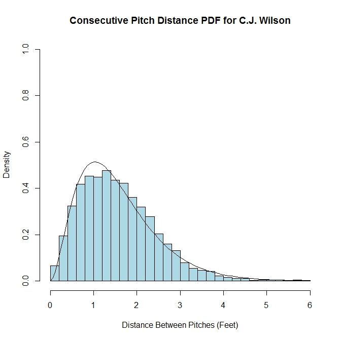
We can start with examining the distance between pitches, regardless of the location of the initial pitch. If this data, for a given pitcher, is plotted in a histogram, the spread of the data appears similar to a gamma distribution. Such a distribution can be characterized many ways, but for our purposes, we will use the version which utilizes parameters k and theta, where k is the shape parameter and theta is the scale parameter. With a collection of distances between pitches in hand, we can fit the data to a gamma distribution and estimate the values of k and theta. As an example, we have the histogram of C.J. Wilson’s distances between pitches within an at-bat from 2012 overlaid with the gamma distribution where the values of k and theta are chosen via maximum likelihood estimation.
Author’s note: I started working on this quite a few weeks ago and so, at the time, the last complete set of data available was 2012. So rather than redo all of the calculations and adjust the text, I decided to keep it as-is since the specific data set is not of great importance in explaining the method. I will include the 2013 data in certain areas, denoted by italics.
While this works for the data set as a whole, this distribution will not be too useful for estimating the location of a subsequent pitch, given an initial pitch. One might expect that for pitches in the middle of the strike zone, the distribution would be different than for pitches outside the strike zone. To take this into account, we can move from a one-dimensional model to a two-dimensional one. Also, instead of using pitch distance, we are going to use average pitch location, since this will include directional information as well. To start, we will divide the area at the front of the strike zone into a grid of three-inch by three-inch squares. We choose this discretization because the diameter of a baseball is approximately three inches and therefore seems to be a reasonable reference length. The domain we consider will be from the ground (zero feet) to six feet high, and three feet to the left and right of the center of home plate (from the catcher’s perspective).
We will refer to pairs of sequential pitches as the “first pitch” and the “second pitch”. The first pitch is one which has a pitch following it in a single at-bat. This serves as a reference point for the subsequent pitch, labeled as the “second pitch”. Adopting this terminology, we find all first pitches and assign them to the three-inch by three-inch square which they fall in on the grid. Then for each square, we take its first pitches and find the vector between them and their associated second pitches (each vector points from the first pitch to the second pitch). We then average the components of the vectors in each square to provide a general idea of where the next pitch in headed for the first pitches in that square.
In areas where the magnitude of the average vector is small, the location of the next pitch can be called isotropic, meaning there is no preferred direction. This is because average vectors of small magnitude are likely going to be the result of the cancellation of vectors of similar magnitude in all directions (from the histogram, the average distance between pitches was approximately 1.5 feet with most lying between 0.5 and 2.5 feet apart). One can create contrived examples where, say, all pitches are oriented either left or right and so there would be two preferred directions rather than isotropy, but these cases are unlikely to show up at locations with a reasonable amount of data, such as in the strike zone. In areas where the average vector has a large magnitude, the location of the next pitch can be called anisotropic, indicating there is some preferred direction(s). Here, the large magnitude of the average vector is due to the lack of cancellation in some direction. For illustrative purposes, we can look at one example of an isotropic location and one of an anisotropic location. First, for the isotropic case:
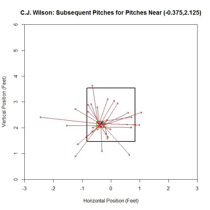
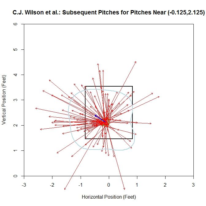
In this plot, the green outline indicates the square containing the first pitches and the red arrows are the vectors between the first and second pitches. The blue arrow in the center of the green square is the average vector. For the grid square centered at (-0.375,2.125), we have a fairly balanced, in terms of direction and distance, distribution of pitches. Therefore the average vector is small in magnitude. In other cases, we will have the pitches more heavily distributed in one direction, leading to an anisotropic location:
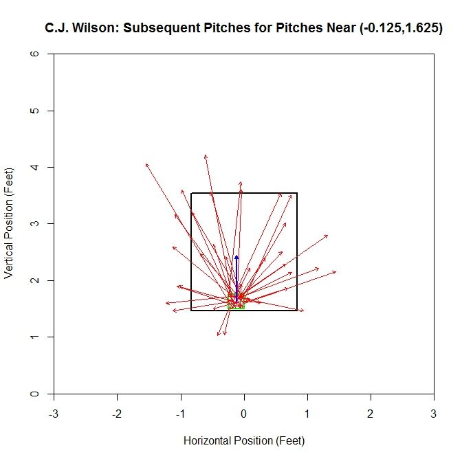
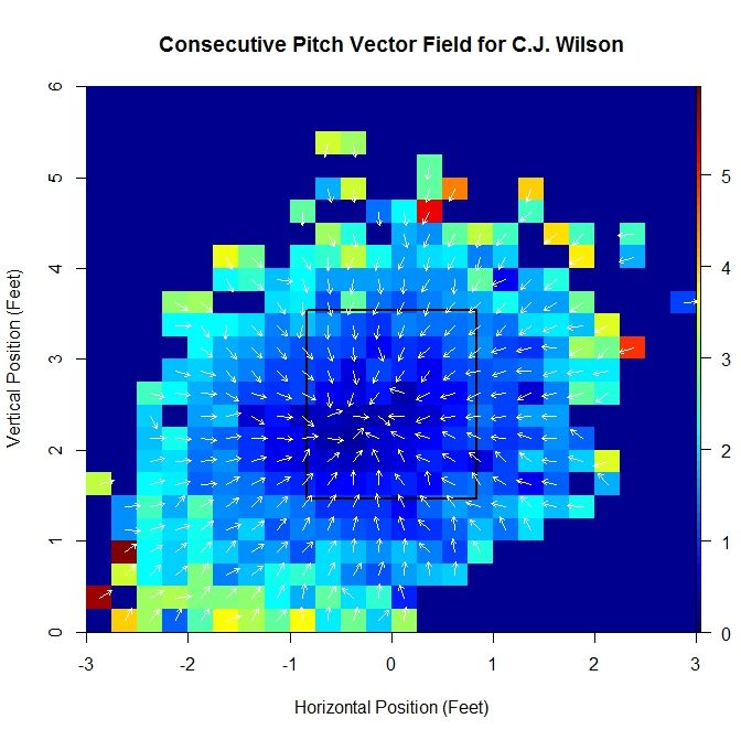
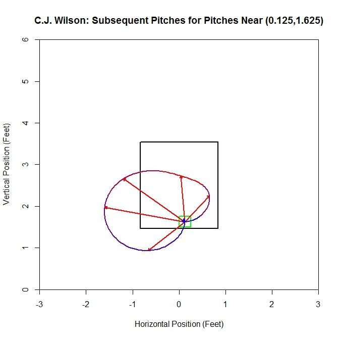
As opposed to the previous case, there is a distinct pattern of pitches up from the position (-0.125,1.625), which is shown by the average vector having a substantially larger magnitude. This is due to most of the vectors having a large positive vertical component. Running over the entire grid where at least one pitch had a pitch following it, we can generate a series of these average vectors, which make up a vector field. In order to make the vector field plot more legible, we remove the component of magnitude from the vector, normalizing them all to a standard length, and instead assign the length of the vector to a heat map which covers each grid square.
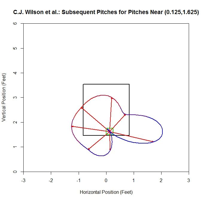
For the 2013 data set:
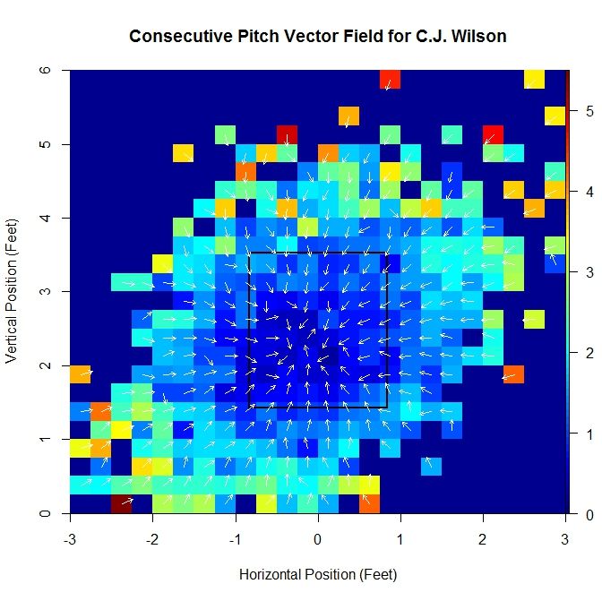
By computing these vectors over the domain, we are able to produce a vector field, albeit incomplete. Computing this vector field based on empirical data also lends itself to outliers influencing the average vectors as well as problems with small sample size. We can attempt to handle these issues and gain further insight by finding a continuous vector field to approximate it. To do this, we will begin with a function of two variables, to which we can apply the gradient operator to produce a gradient field. We can zoom in near the strike zone to get a better idea of what the data looks like in this area:
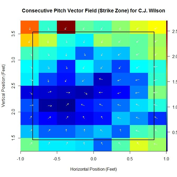
Note that as we move inward, toward the middle of the strike zone, the magnitude of the average vector shrinks. In addition, the direction of all vectors seems to be toward a central point in the strike zone. Based on these observations, we choose a function of the form
P(x,z) = (1/2)c_x(x – x_0)^2 + (1/2)c_z(z – z_0)^2.
The x-variable is the horizontal location, in feet, and z the vertical location. This choice of function has the property that there is a critical point for P and when the gradient field is calculated, all vectors will radially point toward or away from this critical point. The constants in the equation of this paraboloid are (x_0,z_0), the critical point (in our case, it will be a maximum), and (c_x,c_z) are, for our purposes, scaling constants (this will be clear once we take the gradient). The gradient of function P is
grad(P) = [c_x(x – x_0), c_z(z – z_0)].
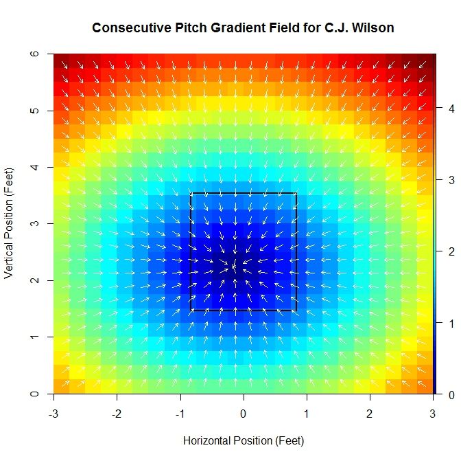
Then c_x and c_z are constants that scale the distances from the x- and z-locations to the critical point to determine the vector associated with point (x,z). Note that grad(P)(x_0,z_0) = [0,0]. In fact, we will give this point a special name for future reference: the pitching sink. For vector fields, a non-mathematical description of a sink is a point where, locally, all vectors point toward (if one imagines these vectors to be velocities, then the sink would be the point where everything would flow into, hence the name). This point is, presumably, the location where we have the least information about the direction of the next pitch, since there is no preferred direction. Again using Wilson’s data as an example:
For the 2013 data set:
The gradient field is fit to the average vectors using linear least squares minimization for the x- and z-components. This produces estimates for c_x, c_z, x_0, and z_0. For the original vector field, if we are interested in the location where the average vector is smallest in magnitude (or the location where there is the least bias in terms of direction of the next pitch), we are limited by the fact that we are using a discretized domain and therefore can only have a minimum location at a small, finite number of points.
One advantage to this method is that it produces a minimum that comes from a continuous domain and so we will be able to get unique minimums for different pitchers. Another piece of information that can be gleaned from this approximation is the constants, c_x and c_z. If c_x is large in magnitude, there may be a large east-west dynamic to the pitcher’s subsequent pitch locations. For example, if a first pitch is in the left half of the strike zone, the next pitch may have a proclivity to be in the right half and vice versa. A similar statement can be made about c_z and north-south dynamics. Alternatively, if c_x is small in magnitude, then less information is available about the direction the next pitch will be headed. For Wilson, the constants obtained from the best fit approximation are a pitching sink of (-0.163,2.243) and scaling constants (-0.925,-1.055).
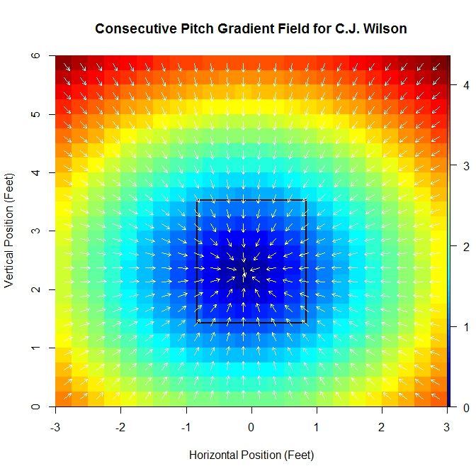
For C.J. Wilson’s 2013 season, we have the sink at (-0.109,2.307) and scaling constants (-0.902,-0.961), so the values are relatively close between these two seasons.
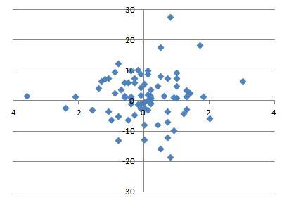
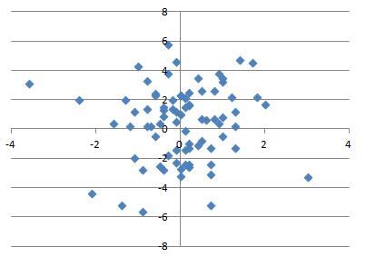
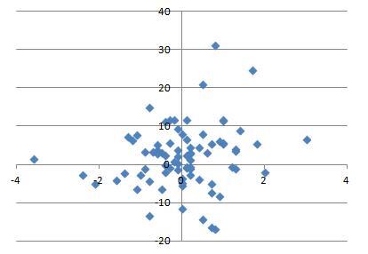
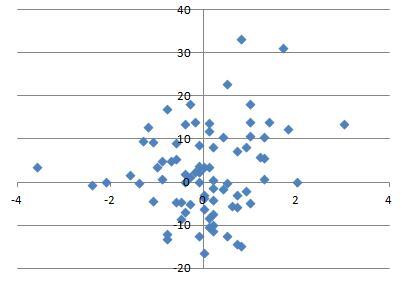
We can now obtain this set of parameters for a large collection of pitchers. For each pitcher, we can find the vector field based on the data and then find the associated gradient field approximation. We can then extract the scaling constants and the pitching sink. We can run this on the most recent complete season (2012, at the start of this research) for the 200 pitchers who threw the most pitches that year and look at the distribution of these parameters.
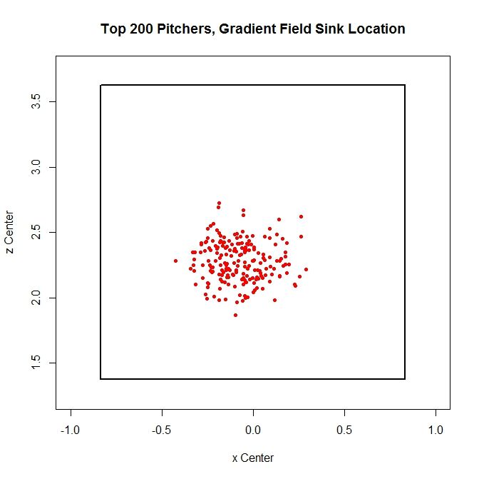
The sinks cluster in a region roughly between 1.75 and 2.75 feet vertically and -0.5 and 0.5 feet horizontally. This seems reasonable, since we would not expect this location to be near the edge or outside of the strike zone. Similarly, we can plot the scaling constants:
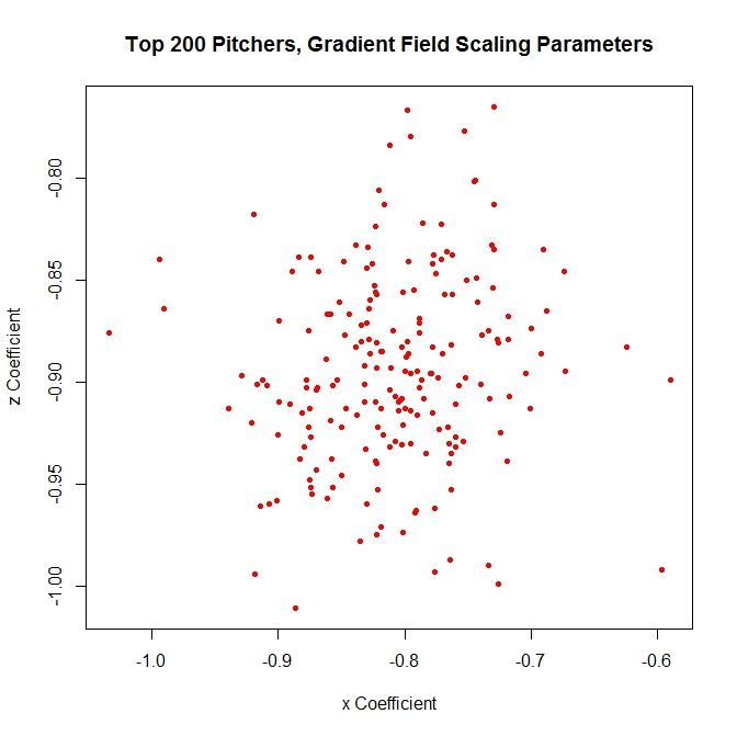
The scaling constants are distributed around a region of -1 to -0.8 vertically and -0.7 and -0.9 horizontally.
One problem that arises from this method is that since we are averaging the data, we are simplifying the analysis at the cost of losing information about the distribution of second pitches. Therefore, we can take a different approach to try to preserve that information. To do so, at a grid location, we can calculate several average vectors in different directions, instead of one, which will keep more of the original information from the data. This can be accomplished by dividing the area around a given square radially into eight slices and calculating the average in each octant.
However, since each nonempty square may contain anywhere from one to upwards of thirty plus pitches, using octants spreads the data too thin. To better populate the octants, we can find pitchers with similar data and add that to the sample. To do this, we will go back to the aforementioned average vectors and use them as a means of comparison. At a given square, with a pitcher in mind whose data we wish to add to, we can compute the average vector for a large collection of other pitchers, compare average vectors, and add the data from those pitchers whose vector is most similar to the pitcher of reference. In order to do this, we first need a metric. Luckily, we can borrow and adapt one available for comparing vector fields:
M(u,v) = w exp(-| ||u||-||v|| |) + (1-w) exp(-(1 – <u,v>/||u|| ||v||))
Here, u and v are vectors, and w is a weight for setting the importance of matching the vector magnitudes (left) and the vector directions (right). For the calculations to follow, we take w = 0.5. The term multiplied to w on the left is an exponential function where the argument is the negative of the absolute value of the difference in the vector magnitudes. Note that when ||u|| = ||v||, the term on the left reduces to w. As the magnitudes diverge, the term tends toward zero. The term multiplied to (1-w) is an exponential function with argument negative quantity 1 minus the dot product between u and v, divided by their magnitudes. When u and v have the same direction, <u,v>/||u|| ||v|| = 1, and the exponent as a whole is zero. When u and v are anti-parallel, <u,v>/||u|| ||v|| = -1 and the exponent is -2 so the term on (1-w) is exp(-2) which is approximately 0.135, which is close to zero. So when u = v, M(u,v) = 1 and when u and v are dissimilar in magnitude and/or direction, M(u,v) is closer to zero.
We now have a means of comparing the data from different pitchers to better populate our sample. To demonstrate this, we will again use C.J. Wilson’s data. First, we will run this method at a point near his sink: (-0.125,2.125). Since we will have up to eight vectors, we can fit an interpolating polynomial in between their heads to get an idea of what is happening for the full 360 degrees around the square. The choice of interpolating polynomial in this case will be a cubic spline function. This will give a smooth curve through the data without large oscillations. Working with only Wilson’s data, which is made up of 30 pitches, this looks like:
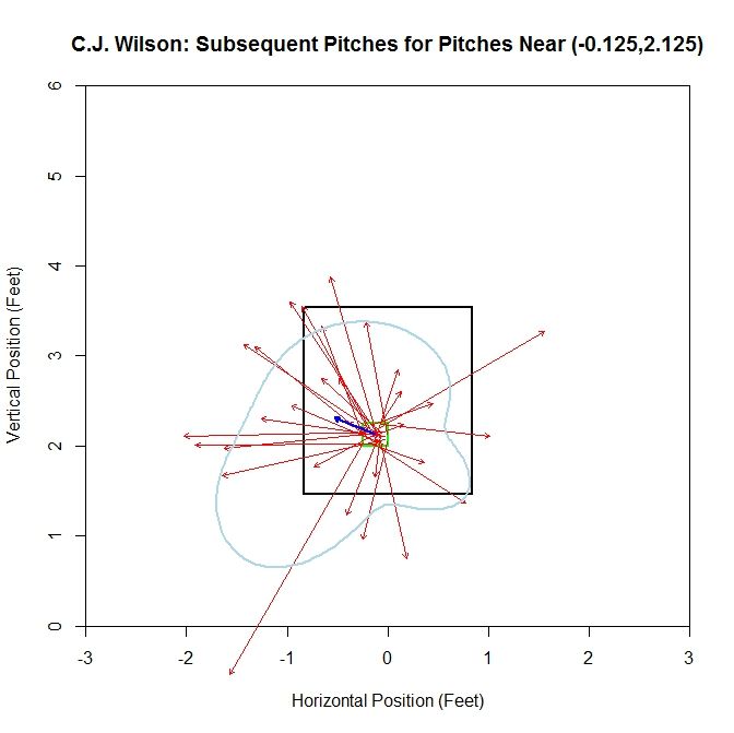
The vectors are spread out in terms of direction, but one vector which extends outside the lower-left quadrant of the plot leads to the cubic spline (light blue curve) bulging to the lower left of the strike zone. Otherwise, the cubic spline has some ebb and flow, but is of similar average distance all around.
When we remove the vectors and replace them with the average vector of each octant (red vectors), we have a better idea of where the next pitch might be headed. We also color-code the spline to keep the data about the frequency of the pitches in each octant. Red indicates areas where the most pitches were subsequently thrown and blue the least. We see that the vectors are longer to the left and, based on the heat map on the spline, more frequent. However, a few short or long vectors in areas that are otherwise data-deficient will greatly impact the results. Therefore, we will add to our sample by finding pitchers with similar data in the square. We will compute the value of M between Wilson at that square and the top 200 pitchers in terms of most pitches thrown for the same season.
For Wilson, the top five comparable pitchers in the square (-0.125,2.125), with the value of M in parentheses, are Liam Hendriks (0.995), Chris Young (0.986), A.J. Griffin (0.947), Kyle Kendrick (0.943), and Jonathan Sanchez (0.923). Recall that this considers both average vector length and direction. Adding this data to the sample increases its size to 94 pitches.
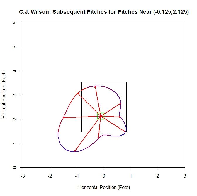
For this plot, the average vector (the blue vector in the center of the cell) is similar to that of Wilson’s solo data. However, since the number of pitches has essentially tripled, the plot has become hard to read. To get a better idea of what is going on, we can switch to the average vector per octant plot:
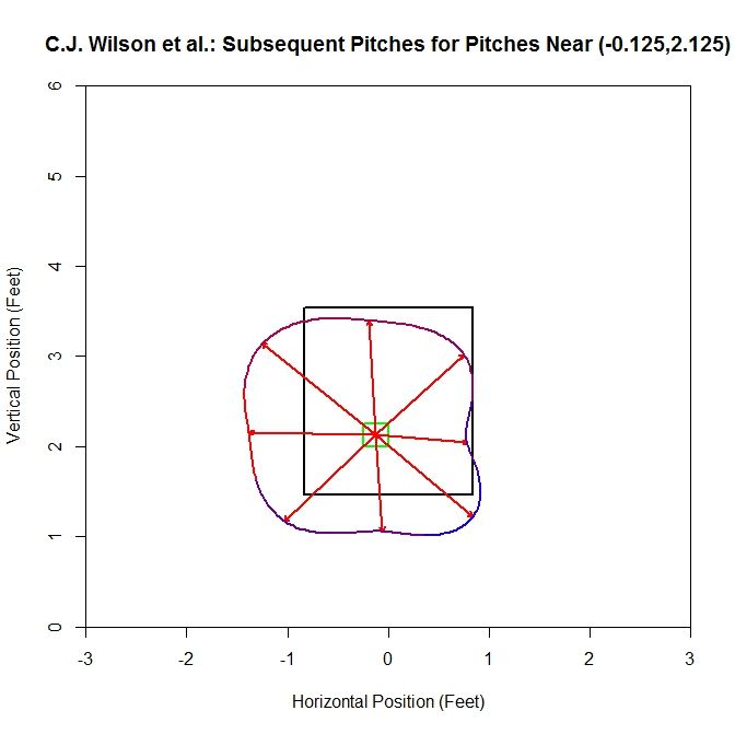
Examining this plot, most of the average vectors are in the range of 1-1.5 feet. The shape of the interpolation is square-like and seems to align near the edge of the strike zone, extending outside the zone, down and to the left.
We can also run this at points nearer to the edge of the strike zone. On the left side of the strike zone, we can work off of the square centered at (-0.875,2.375) (note that we drop the plots of the original data in lieu of the plots for the octants).
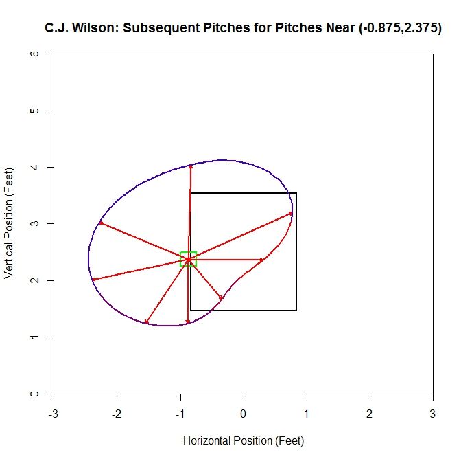
For the original sample, the dominant direction (where most of the vectors are pointed, indicated by the red part of the spline) is to the right, with an average distance of one to two feet in all directions. Now we will add in data based on the average vectors, increasing our sample from 15 to 97 pitches.
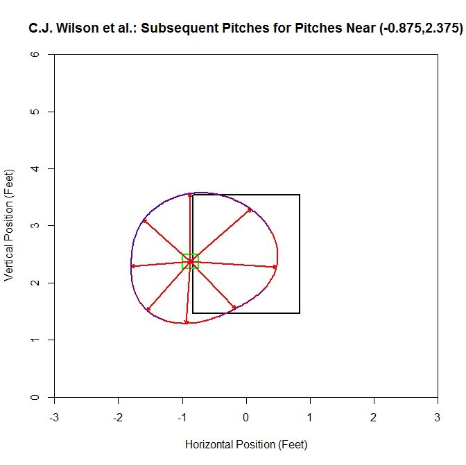
For the larger sample, the spline, which is almost circular, has average vectors approximately 1 to 1.5 feet in length. The preferred directions are to the right (into the strike zone) and downward (below the left edge of the strike zone). Also note that comparing the two plots, the vectors in the areas where there are the most pitches in the original sample (between three and six o’clock) have average vectors that retain a similar length and direction.
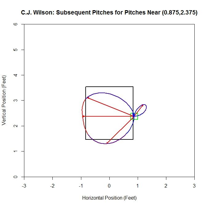
Switching sides of the strike zone, we can examine the data related the square centered at (0.875,2.375). For the original sample, the dominant direction is to the left with little to no data oriented to the right. Since there are octants that contain no data, we get a pinched area of the cubic spline. This is due to the choice of how to handle the empty octants. We choose to set the average distance to zero and the direction to the mean direction of the octant. This choice leads to pinching of the curve or cusps in these areas. Another choice would be to remove this octant from the sample and do the interpolation with the remaining nonempty octants.
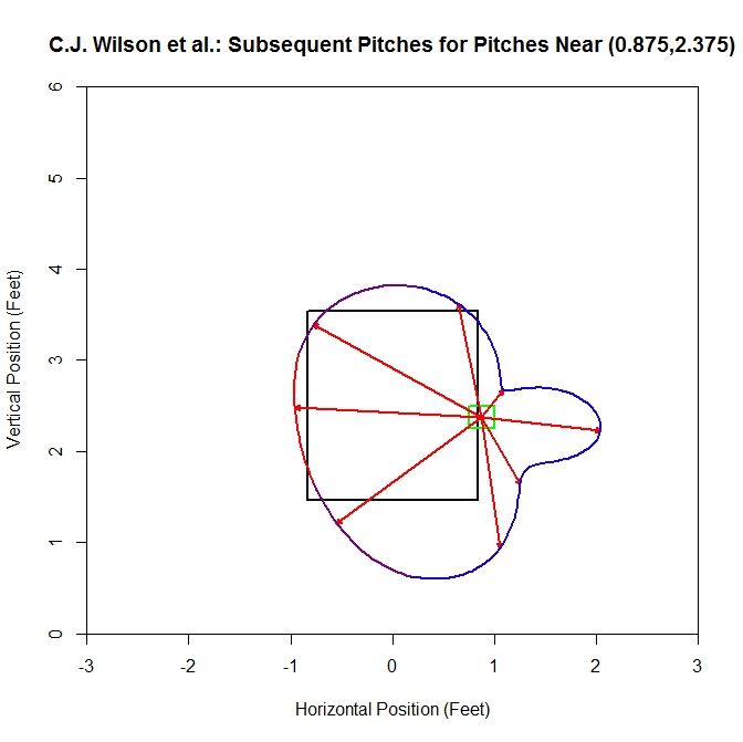
Adding data to this sample increases it from 9 pitches to 67, and the average vector and spline jut out on the right side due to a handful of pitches oriented further in this direction (this is evident from the blue color of the spline). In the areas where most of the subsequent pitches are located, the spline sits near the left edge of the strike zone. Again, the average vectors in the red area of the spline maintain a similar length and direction.
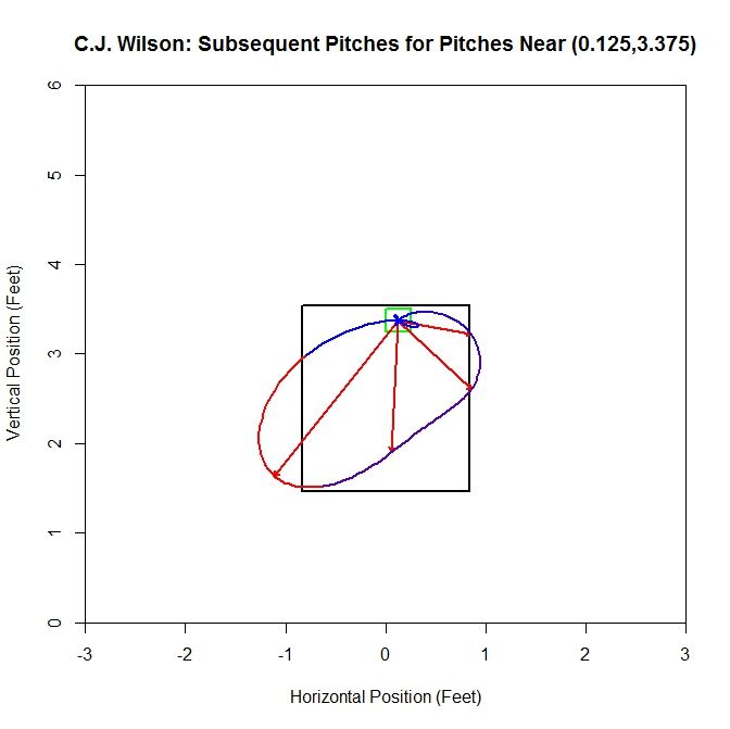
Moving to the top of the strike zone, we choose the square centered at (0.125,3.375). The original plot for a square along the top contains 11 pitches and no second pitches are oriented upward. There are only have four non-zero vectors for the spline and the dominant direction is down and to the left.
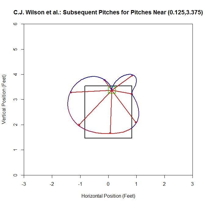
In this square, the sample changes from 11 to 72 pitches by adding similar data. Note the cusp that occurs at the top since we are missing an average vector there. Unsurprisingly, at the top of the strike zone, the preferred direction for the subsequent pitch is downward, and as we rotate away from this direction, the number of pitches in each octant drops.
Finally, along the bottom of the strike zone, we choose (0.125,1.625). Starting with 27 pitches produces five average vectors, with the dominant direction being up and to the left.
With the additional data from other pitchers, the number of pitches moves up to 87. The direction with the most subsequent pitches is up and to the left. In areas where we have the most data in the original sample (the red spline areas), the average vectors and splines are most alike.
There are several obvious drawbacks to this method. For the model fitting, we have some points in the strike zone with 30+ pitches and as we move away from the strike zone, we have less and less data for computing the averages. However, as we move away, the general behavior becomes more predictable: the next pitch will likely be closer to the strike zone. So the small sample should have less of a negative effect for points far away. This is also a potential problem since we use these, in some cases, small samples to calculate the average vector in each square, which is used as a reference point for adding data to the sample. It may be better to use the vector from the gradient field for comparison since it relies on all of the available data to compute the average vector (provided the gradient field approach is a decent model).
Another problem is that in computing the average vector, we are not taking into account the distribution of the vectors. The same average vector can be formed from many different combination of vectors. However, based on the limited data presented above, adding to the sample, using M and the average vectors, does not seem to have a large effect on octants where there is the most data in the original sample. These regions, even with more data, tend to retain their shape. These are also the areas that are going to contribute most to the average vector that is used for comparison, so this seems like a reasonable result.
A smaller problem that shows up near the edge of the zone is that we still occasionally, even after adding more data, get directions with only one or two pieces of data and this causes some of the aberrant behavior seen in some of the plots, characterized by bulges in blue areas of the spline. One solution to this would be to only compute the average vector in that octant if there were more than some fixed number of pitches in that direction. Otherwise, we could set the average vector to zero and the direction to the mean direction in that octant.
Obviously, an analysis of one pitcher over a small collection of squares in the grid does not a theory make. It is possible to examine more pitchers, but because the analysis must be done visually, it will be slow and imprecise. Based on these limited results, there may be potential if the process can be condensed. The pitching sink approach gives an idea of where the next pitch may be headed. As we move toward the sink, we have less information on where the next pitch is headed since near this point, the directions will be somewhat evenly distributed. As we move toward the edge of the strike zone, we get a clearer picture of where the next pitch is headed if only for the reason that it seems unlikely that the next pitch will be even further away.
While this model seems reasonable in this case, there may be cases where a more general model is needed to fit with the behavior of the data. To recover more accurate information on the location of the next pitch, we can switch to the octant method. Since some areas with this method will have very small samples, we can pad out the data via comparison of the average vectors. This seems to do well at filling out the depleted octants and retains many of the features of the average vectors in the most populated octants of the original samples. At this point, both these models exist as novelties, but hopefully with a little more work and analysis, they can be improved and simplified.