Archive for Research

Power and Patience (Part IV of a Study)

We saw in Part Three that the R^2 between OBP and ISO for the annual average of each from 1901-2013 is .373. To find out the correlation between OBP and ISO at the individual level, I set the leaders page to multiple seasons 1901-2013, split the seasons, and set the minimum PA to 400, then exported the 16,001 results to Open Office Calc.

(Yes, sixteen thousand and one. You can find anything with FanGraphs! Well, anything that has to do with baseball. Meanwhile, Open Office operating on Windows 7 decides it’s tired the moment you ask it to sum seven cells. At least it gets there in the end.)

The result was .201, so we’re looking at even less of a correlation in a much larger sample compared to the league-wide view. Are there periods where the correlation is higher?

Recall from Part Two that from 1994-2013 the R^2 for the league numbers was .583. Using individual player lines (400+ PA) from those seasons increases our sample size from 20 to 4107 (again splitting seasons). This gives us an R^2 of .232. That’s a little higher than .201, but not very much so.

All in all, it’s not the most surprising thing. On-base percentage and isolated power, mathematically, basically have nothing in common other than at-bats in the denominator. Given that, any correlation between them at all (and there is some) suggests that it either helps players hit for power to be an on-base threat, or vice versa. Not that one is necessary for the other, but there’s something to it. And throughout history, as we saw in Part One, a majority of players are either good at both aspects of hitting, or neither.

In fact, it’s the exceptions to that rule that triggered this whole series, those higher-OBP, lower-ISO players. Again from part one, there were 12 19th century, 21 pre-1961 20th century, and 3 post-1961 20th-21st century players with a career OBP over .400 and ISO below .200.

Much of this can probably be attributed to that consistency OBP has had historically relative to ISO that we observed a couple weeks ago. Continuing with the somewhat arbitrary 1961 expansion era cutoff, from 1961-present, 168 players with 3000 PA have an ISO over .200 and 18 have an OBP over .400; from 1901-60, it was 43 with the ISO over .200 and 31 with the OBP over .400. The .200+ ISO’s are split 80-20% and the .400+ OBP’s are split about 60-40%. The latter is the much smaller gap, as we’d expect. (Some players whose careers straddled 1961 are double-counted, but you get the basic idea.)

But let’s see if we can trace the dynamics that brought us to this point. What follows is basically part of part one in a part three format (part). In other words, we’re going to look at select seasons, and in those seasons, compare the number of players above and below the average OBP and ISO. Unfortunately, it’s hard to park-adjust those numbers, so a player just above the average ISO at Coors and a player just below it at Safeco are probably in each other’s proper place. But that’s a minor thing.

After the league-wide non-pitcher OBP and ISO are listed, you’re going to see what might look like the results of monkeys trying to write Hamlet. But “++” refers to the number of players with above-average OBP and ISO; “+-” means above-average OBP, below-average ISO; “-+” means below-average OBP and above-average ISO; and “- -” means, obviously, below-average OBP and ISO. The years were picked for various reasons, including an attempt at spreading them out chronologically. Notes are sparse as the percentages are the main thing to notice.

1901: .330 OBP, .091 ISO. Qualified for batting title: 121. 35% ++, 25% +-, 12% -+, 28% – –

1908: .295 OBP, .069 ISO. Qualified for batting title: 127. 41% ++, 23% +-, 8% -+, 28% – –

The sum of OBP and ISO was its lowest ever in 1908.

1921: .346 OBP, .117 ISO. Qualified for batting title: 119. 42% ++, 24% +-, 8% -+, 26% – –

Baseball rises from the dead ball era. Still relatively few players are hitting for power while not getting on base as much.

1930: .356 OBP, .146 ISO. Qualified for batting title: 122. 45% ++, 23% +-, 3% -+, 29% – –

The best pre-WWII season for OBP and ISO. Almost nobody was about average at hitting for power while not as good at reaching base. Two-thirds of qualifiers had an above-average OBP vs. fewer than half with an above-average ISO.

1943: .327 OBP, .096 ISO. Qualified for batting title: 106. 41% ++, 24% +-, 10% -+, 25% – –

World War II, during which OBPs stayed near the average but ISOs tanked. That would not necessarily appear in these numbers, because the players in this segment are categorized vs. each year’s average.

1953: .342 OBP, .140 ISO. Qualified for batting title: 88. 44% ++, 22% +-, 14% -+, 20% – –

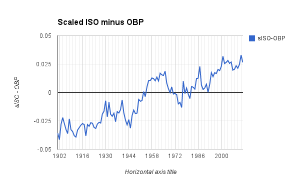
The first year where sISO exceeded OBP was easily the lowest so far in terms of players below average in both OBP and ISO. (Note: So few players qualified on account of the Korean War.)

1969: .330 OBP, .127 ISO. Qualified for batting title: 121. 45% ++, 17% +-, 14% -+, 23% – –

1983: .330 OBP, .131 ISO. Qualified for batting title: 133. 43% ++, 16% +-, 17% -+, 25% – –

1969 and 1983 were picked because of their historically average league-wide numbers for both OBP and ISO. The percentages for each of the four categories are about equal in both seasons.

2000: .351 OBP, .171 ISO. Qualified for batting title: 165. 39% ++, 16% +-, 15% -+, 29% – –

The sum of OBP and ISO was its highest ever in 2000.

2011: .325 OBP, .147 ISO. Qualified for batting title: 145. 50% ++, 17% +-, 12% -+, 21% – –

2012: .324 OBP, .154 ISO. Qualified for batting title: 144. 44% ++, 24% +-, 14% -+, 18% – –

2013: .323 OBP, .146 ISO. Qualified for batting title: 140. 45% ++, 24% +-, 17% -+, 14% – –

Originally, this part ended with just 2013, but that showed an abnormally low “- -” percentage, so now 2011-13 are all listed. From 2011 to 2012, the split groups (above-average at 1 of the 2 statistics, “+-” or “-+”) increased sharply while the number of generally good and generally bad hitters decreased. From 2012 to 2013, there was almost no change in qualifiers based on OBP (the “++” and “+-” groups). Among those with below-average OBPs, the number with above-average power increased as the number with below-average power decreased. Most significantly, 2011-13 has produced an overall drop in players who are below average at both.

I don’t want to draw too many conclusions from this set of 12 out of 113 seasons. But a few more things come up besides the recent decline in players below average in both OBP and ISO.

Regarding “++” Players

Unsurprisingly, limiting the samples to qualifiers consistently shows a plurality of players to be good at both the OBP and ISO things.

Regarding “- -” Players 

Essentially, until 2012, this group was always at least 1/5 of qualifiers, and usually it was 1/4 or more. The last couple years have seen a decline here. Is it a trend to keep an eye on in the future (along with the league-wide OBP slump from Part 3)?

Regarding “++” and “- -” Players

Meanwhile, the majority of players will be above average at both getting on base or hitting for power, or below average at both. The sum of those percentages is just about 60% at minimum each year. Of the ten seasons above, the lowest sum is actually from 2013, mostly on account of the 14% of players who were below average at both.

This also means that it’s a minority of players who “specialize” in one or the other.

Regarding “+-” vs. “-+” Players

The “-+” players, those with below-average OBPs and above-average ISOs, show the best-defined trends of any of the four categorizations. In general, before 1953, when OBP was always “easier” to be good at than ISO (via OBP vs. sISO as seen in Parts 2 and 3), you saw fewer ISO-only players than you see today. Either they were less valuable because power was less a part of the game and of the leagues’ offenses, or they were less common since it was harder to exceed the league average.

The number of OBP-only players is more complicated, because they too were more common in the pre-1953 days. But they have jumped in the last two years from 1/6 of qualifiers from ’69-’11 to 1/4 of qualifiers in 2012 and 2013. Overall, the recent decline in “- -” players has come at the expense of “+-” players. This can also be interpreted as indicating that players are becoming better at reaching base while remaining stagnant at hitting for power (important distinction: that’s compared to the annual averages, not compared to the historical average; as we saw last week, OBP is in a historical decline at the league level).

Conclusion

The key takeaway for all of this is that there are always going to be more players who are above-average in both OBP and ISO or below average in both. Even if the correlations between OBP and ISO on the individual level aren’t overly high, clearly more players are good at both or at neither.

This isn’t just on account of players with enough PA to qualify for the league leaders being better hitters in general, because while the number of players above-average in both who qualify is always a plurality, it’s almost never a majority. It takes a number of players who are below-average at both to create a majority in any given year.

In terms of OBP-only players and ISO-only players, the former have almost always outnumbered the latter. This is sufficiently explained in that reaching base is often key to being a good hitter, while hitting for power is optional. (That’s why OPS has lost favor, because it actually favors slugging over OBP.) Even when batting average was the metric of choice throughout baseball, those who got the plate appearances have, in general, always been good at getting on base, but not necessarily at hitting for power.

Next week this series concludes by looking at the careers of some selected individual players. The most interesting ones will be the either-or players, with a significantly better OBP or ISO. We won’t look much at players like Babe Ruth or Bill Bergen, but instead players like Matt Williams or Wade Boggs. Stay tuned.


How Much Work are AL Starters Doing, and What Difference Has It Made in Team Success?

Baseball fans have been treated to incredible starting pitching performances in recent years, with several ace staffs leading their teams to regular-season and postseason success. Initially, I set out to examine the number of innings pitched by AL starting rotations because I expected that there would be a big disparity from team to team. And more specifically, I thought that the percentage of innings pitched by a team’s starting rotation would correlate positively to either its W-L record, or more likely, its Pythagorean W-L record.

I gathered five years of data (2009 – 2013 seasons) and calculated the Starting Pitcher Innings Pitched Percentage (SP IP%). This number is simply the number of innings a team’s starters pitched divided by the total innings the team pitched. If a starter was used in relief, those innings didn’t count. I only looked at AL teams, because I assumed that NL starting pitchers could be pulled from games prematurely for tactical, pinch-hitting purposes, while AL starters were likely to stay in games as long as they weren’t giving up runs, fatigued, or injured.

Two things struck me about the results:

1. There was little correlation between a team’s SP IP% and its W-L record or its SP IP % and Pythagorean W-L record

2. The data showed little variance and was normally distributed

I looked at 71 AL team seasons from 2009 – 2013 and found that on average, AL Teams used starting pitchers for 66.8% of innings, with a standard deviation of 2.83%. The data followed a rather normal distribution, with teams SP IP% breaking down as follows:

Standard Deviations # of Teams % of Total Teams
-2 or lower 2 2.82%
-1 to -2 10 14.08%
-1 to 0 22 30.99%
0 to 1 26 36.62%
1 to 2 10 14.08%
2 or higher 1 1.41%

Over two-thirds of the teams (48 of 71) fell within the range of 63.6 to 69.2 SP IP%, which is much less variance than I expected to find.  And only three seasons fall outside the range of two standard deviations from the mean: two outliers on the negative end and one on the positive end. Those teams are:

Negative Outliers:

2013 Minnesota Twins: 60.06 SP IP%

2013 Chicago White Sox 60.25 SP IP%

Positive Outlier:

2011 Tampa Bay Rays 73.02 SP IP%

Taken at the extreme, these numbers show a huge gap in the number of innings the teams got out of their starters. Minnesota, for example, got only 871 innings out of starters in 2013, while the 2011 Tampa Bay Rays 1,058 innings in a season with fewer overall innings pitched. Another way of conceptualizing it would be to say that Minnesota starters pitched averaged just over 5 1/3 innings of each nine-inning game in 2013, while the 2011 Rays starters pitched nearly 6 2/3 innings. But when the sample is viewed as a whole the number of innings is quite close, as seen on this graph of SP IP% for the last five years:

Scatter plot diagram


The correlation between SP IP% and team success (measured via W-L or Pythagorean W-L) was minimal. (The Pearson coefficient values of the correlations were .1692 and .1625, respectively).  Team victories are dependent on too many variables to isolate a connection between team success (measured via team wins) and  SP IP%;  a runs scored/runs allowed formula for calculating W-L record was barely an improvement over the traditional W-L measurement. Teams like the Seattle Mariners exemplify the issue with correlating the variables: their starters have thrown above-average numbers of innings in most of the years in the study, but rarely finished with a winning record.

What I did find, to my surprise, was a relatively narrow range of SP IP% over the last five years, with teams distributed normally around an average of 66% of innings. In the future, it might be helpful to expand the sample, or look at a historic era to see how the SP IP% workload has changed over time. The relative consistency of SP IP% over five seasons and across teams could make this metric useful for future studies of pitching workloads, even if these particular correlations proved unsuccessful.


Revenue Sharing Deal Cubs Struck with Rooftop Owners Holding Up Wrigley Field Renovations

During the 2013 baseball season, the City of Chicago approved a $500 million plan to renovate Wrigley Field and build an adjacent office building and hotel.  Included in the renovation plan is the proposed construction of a large video board behind the left field bleachers and signs advertising Budweiser behind the right field bleachers.  The Cubs have delayed the start of this project, however, because the owners of the rooftop businesses across from the ballpark have threatened to file a lawsuit against the Cubs because the proposed signage will obstruct the views of the field from their respective rooftop businesses.

Rooftop Litigation History

Detroit Base-Ball Club v. Deppert, 61 Mich. 63, 27 N.W. 856 (Mich., 1886)

Disputes over neighbors viewing ballgames are nothing new.  In 1885, John Deppert, Jr. constructed a rooftop stand on his barn that overlooked Recreation Park, home to the National League’s Detroit Wolverines, future Hall of Famer Sam Thompson and a rotation featuring the likes of men named Stump Wiedman, Pretzels Getzien and Lady Baldwin.  The Wolverines claimed that they had to pay $3000 per month for rent and that the 50 cent admission fees, helped to offset this cost.  They were thereby “annoyed” by Deppert charging people, between 25 to 100 per game, to watch the games from his property and asked the court to forever ban Deppert from using his property in this manner.

Deppert countered that the ballgames had ruined the quiet enjoyment of his premises, that ballplayers often trespassed on his land in pursuit of the ball and that he often had to call the police to “quell fights and brawls of the roughs who assemble there to witness the games.”  He further claimed that his viewing stand had passed the city’s building inspection and that he had the legal right to charge admission and sell refreshments.

The trial court dismissed the Wolverines case and the ball club appealed.  The Supreme Court of Michigan agreed that the Wolverines had no right to control the use of the adjoining property; therefore, Deppert was within his rights to erect a stand on his barn roof and sell refreshments to fans that wanted to watch the game.  Furthermore, there was no evidence that Deppert’s rooftop customers would otherwise have paid the fees to enter Recreation Park.

Similarly, the rooftops of the buildings across the street from Shibe Park were frequently filled with fans wanting a view of the Philadelphia Athletics game action.  While never happy about the situation, Connie Mack was pushed too far in the early 1930s when the rooftop operators started actively poaching fans from the ticket office lines.  Mack responded by building the “Spite Fence,” a solid wall that effectively blocked the view of the field from the buildings across 20th Street.

Lawsuits were filed but the “Spite Fence” remained in place throughout the remainder of the use of Shibe Park, later renamed Connie Mack Stadium.

The Current Dispute

Chicago National League Ball Club, Inc. v. Skybox on Waveland, LLC, 1:02-cv-09105 (N.D.IL.)

In this case, the Cubs sued the rooftop owners on December 16, 2002 seeking compensatory damages, disgorgement to the Cubs of the defendants’ profits and a permanent injunction prohibiting the rooftop owners from selling admissions to view live baseball games at Wrigley Field, among other remedies and under several causes of action.  According to the complaint, the Cubs alleged that the defendant rooftop operators “…have unlawfully misappropriated the Cubs’ property, infringed its copyrights and misleadingly associated themselves with the Cubs and Wrigley Field.  By doing so, Defendants have been able to operate multi-million dollar businesses in and atop buildings immediately outside Wrigley Field and unjustly enrich themselves to the tune of millions of dollars each year, while paying the Cubs absolutely nothing.”

In their statement of undisputed facts, the defendants countered that the rooftops had been used to view games since the park opened on April 23, 1914 as home of the Chicago Federal League team and that the Cubs conceded that their present management knew the rooftop businesses were selling admissions since at least the late 1980s.

In May 1998, the City of Chicago enacted an ordinance authorizing the rooftops to operate as “special clubs,” which allowed them to sell admissions to view Cubs games under city license.  The City wanted their piece of the action and interestingly, the Cubs made no formal objection to the ordinance.  Based on the licensure and lack of any opposition from the Cubs, the rooftop owners made substantial improvements to enhance the experience and to meet new City specifications.

By January 27, 2004, the Cubs had reached a written settlement with owners of 10 of the defendant rooftop businesses which assured that the Cubs “would not erect windscreens or other barriers to obstruct the views of the [settling rooftops]” for a period of 20 years.  The remaining rooftop owners later settled and the case was dismissed on April 8, 2004, just days ahead of the Cubs home opener set for April 12th.

After the 2004 agreement legitimized their businesses, the rooftop owners made further improvements to the properties.  Long gone are the days that a rooftop experience meant an ice-filled trough of beer and hot dogs made on a single Weber.  The rooftop operations are now sophisticated businesses with luxurious accommodations, enhanced food and beverage service and even electronic ticketing.

As a result of the settlement agreement of Cubs’ 2002 lawsuit, the team now has legitimate concerns that a subsequent lawsuit by the rooftop owners to enforce the terms of the contract could ultimately result in the award of monetary damages to the rooftop owners; cause further delays in the commencement of the construction project due to a temporary restraining order; or, be the basis of an injunction preventing the Cubs from erecting the revenue-producing advertising platforms for the remainder of the rooftop revenue sharing agreement.

It is obvious that the rooftop owners need the Cubs more than the Cubs need them; however, the Cubs wanted their piece of the rooftop owners’ profits (estimated to be a payment to the Cubs in the range of $2 million annually) and now the Cubs have to deal with the potential that their massive renovation project will be held up by the threat of litigation over the blocking of the rooftop views.


Power and Patience (Part III of a Study)

So, last week we hopefully learned a few things. Let’s continue looking at league-wide trends.

In terms of getting on base, not getting on base, hitting for power, and not hitting for power, there are actually four mostly-distinct periods in baseball history for each combination. Define these terms against the historical average and you get:

  • 1901-18 – Players aren’t getting on base or hitting for power

  • 1919-52 – Players are getting on base but not hitting for power

  • 1953-92 – Players aren’t getting on base but are hitting for power

  • 1993-pres-Players are getting on base and hitting for power

There are some exceptions, but this paradigm mostly holds true. Here’s another depiction of the “eras” involved:

YEAR (AVG)

OBP (.333)

ISO (.130)

1901-18

.316

.081

1919-52

.343

.120

1953-92

.329

.131

1993-present

.338

.158

The periods from 1901-52 and since 1993 really are quite distinct, but the 1953-92 period is the hardest to truly peg and kind of has to be squeezed in there. In fact, those figures are quite close to the historical average. Well, actually, the OBP before 1993 is just as much below the average as the OBP after 1993 is above it. When the same era, categorized by offense, includes both 1968 and 1987, there is going to be some finagling.

So, really, there hasn’t been a clear period in MLB history with above-average power and below-average on-base percentages, while the “Ruth-Williams Era” (1919-52) had below-average power (again, vs. the historical average) but above-average on-base percentages.

Still, breaking things down into four eras is too simplistic. What follows is a walk-through, not of every season in MLB history, but key seasons, using some of the “metrics” from the first two parts of this series.

1918: .207 XB/TOB, -.038 sISO-OBP, 95 OBP+, 57 ISO+

In 1918, MLB hitters earned .207 extra bases on average. By 1921, they were earning .300 extra bases after year-to-year gains of 19%, 8%, and 12%. How much of this was on account of the Sultan of Swat? In 1918, Babe Ruth was already earning .523 extra bases, but had only 382 plate appearances. In 1921, however, he had 693 plate appearances and averaged .717 extra bases. Without him, the 1918 and 1921 ratios change to .205 and .295, respectively. So he’s only responsible for .003 of the increase. (My guess from a couple weeks ago was way off. He’s still just one player.) Perhaps the effect on the power boom of his individual efforts is overstated. However, his success was clear by 1921, so his influence on how other hitters hit seems properly stated. While Ruth’s 11 HR in 1918 tied Tillie Walker for the MLB lead, five other players had 20+ home runs in 1921.

OBP was low in 1918, and most seasons up to that point, but the dead ball era really was mostly a power vacuum. OBP already had two seasons (1911-12) around the current average, even though it would not get back there until 1920.

1921: .300 XB/TOB, -.027 sISO-OBP, 104 OBP+, 90 ISO+

So we touched on the 1918-21 period moments ago. Power skyrocketed, but still to about 10% below its current norm. Meanwhile, OBP was well on its way to a long above-average stretch: OBP+ was 100 or higher every single year from 1920 through 1941.

1930: .364 XB/TOB, -.007 sISO-OBP, 107 OBP+, 112 ISO+

1930 was the most power-heavy MLB season until 1956 and is even today the second-highest OBP season in MLB history at .35557, just behind the .35561 mark set in 1936. Non-pitchers hit .303/.356/.449 in 1930. Ten players hit 35 or more home runs, including 40+ for Wilson, Ruth, Gehrig and Klein.

Like we’ll see in 1987, however, 1930 was really the peak of a larger trend: XB/TOB grew 6+% for the third straight year before dropping 14% in 1931 and another 12% in 1933 (with a 9% spike in 1932).

1943: .261 XB/TOB, -.028 sISO-OBP, 98 OBP+, 74 ISO+

World War II in general was a bad time for hitters, at least from a power standpoint, with 1943 the worst season among them, but 1945 almost as bad. From 1940-45, the XB/TOB ratio fell 23%. It remained low until 1947. (But even at its lowest point in this time frame in 1942, it was still a better year for power than 1918.) OBP, however, was actually at about its current historical average during the war (within one standard deviation of the mean throughout), so there wasn’t a total offensive collapse. However, it was the first time since the deadball era that OBP+ was below 100. Either way, perhaps the coming look at individual players will tell us what happened.

1953: .365 XB/TOB, .001 sISO-OBP, 103 OBP+, 108 OPS+

Thanks to an 11% increase in XB/TOB, it was finally “easier,” relatively, to hit a double or homer than it was to make it to base in the first place. Also playing a role, however, was the OBP; in 1950 it was only harder to hit for power because players were reaching base at a pretty good clip; the OBP+ and ISO+ that year (1950) were 106 and 110.

1968: .320 XB/TOB, .003 sISO-OBP, 93 OBP+, 84 ISO+

1968 is often considered perhaps the all-time nadir for Major League hitters outside of the dead ball era, and non-pitchers only earned an average of .320 extra bases per time on base that year. It wasn’t just power that suffered, however, although it did, but it was also the worst league-wide OBP in 51 years. In fact, OBP was so low, it was actually ever so slightly easier to hit for power in 1968 than it was to reach base.

The thing about 1968 is that, while 1969 featured a lower mound, no 1.12 ERA’s, and a solid recovery for both OBP and ISO, it didn’t automatically revert baseball hitters to their pre-mid-60s form. Power fluctuated wildly in the roughly 25-year period between 1968-93.

1977: .378 XB/TOB, .010 sISO-OBP, 100 OBP+, 108 ISO+

1977, rather than 1930 or 1987, may be really the flukiest offensive season in MLB history. ISO+ shot up from 83 to 108, after having not been above 96 since 1970. MLB hitters earned 26% more extra bases per times on base than in 1976, easily the biggest one-year increase in MLB history. XB/TOB then promptly decreased 10% in 1978; it’s the only time that figure has gone up 10% in one year and declined 10% the next. It was the only season where sISO was .010 above OBP from 1967-84. 35 players homered 25 times or more, the most in MLB history until 1987. 1977 was a banner year for getting on base as well, although, as usual, not as much as ISO. It was the highest OBP season from 1970-78 and one of four seasons from 1963-92 with an average OBP vs. the historical average.

1987: .416 XB/TOB, .023 sISO-OBP, 101 OBP+, 120 ISO+

1987 has a big reputation as a fluky power season, and players earned .416 extra bases per time on base that year, but that was “only” a 9% spike from the prior season. Additionally, XB/TOB had actually increased every year from 1982-87, except for a 2% drop in 1984. The 1987 season was mostly the peak of a larger trend, which came crashing down in 1988, when the ratio dropped more than 15% to .353 extra bases. The .400 mark would not be broken again until 1994’s .412, but after that point, this ratio would never fall below the 0.400 it was in 1995.

This season was, however, the only one in the Eighties with an OBP+ over 100. From 1963-92, in fact, OBP was at or above the historical norm in just four seasons (1970, 1977, 1979, 1987). As with power, however, OBP collapsed in 1988 more so than it had gained in 1987, falling to 1981 levels (97 OBP+).

1994: .412 XB/TOB, .017 sISO-OBP, 103 OBP+, 122 ISO+

XB/TOB leapt over 10% from 1992-93, and another 9.5% in 1994, ushering in a power era that hasn’t quite yet flamed out. 1994 was the year power really took off relative to OBP: in 1992, sISO and OBP were even; in 1993, the gap was still about half of what it would be in favor of sISO in 1994. 1994 also featured the highest ISO to that point, higher than even in the culmination of the mid-80’s power trend in 1987. While there would be some years between 1993 and 2009 with modest decreases in power, even in 2013, ISO+ was 112–its lowest mark since 1993. More on the current power and OBP environment momentarily.

1901-2013: Changes in XB/TOB

Extra bases per time on base was our first choice of metric. How has this particular one changed in certain years?

Overall, nine times has this ratio spiked at least 10% in one season: 1902-03 (+12%), 1918-19 (+19%), 1920-21 (+12%), 1945-46 (+11%), 1949-50 (+10%), 1952-53 (+11%), 1976-77 (+26%), 1981-82 (+12%), and 1992-93 (+10%).

Meanwhile, it decreased by 10 or more percent on six occasions: 1901-02 (-11%), 1930-31 (-14%), 1932-33 (-12%), 1941-42 (-11%), 1977-78 (-10%), 1987-88 (-15%).

2014-???

We’ll try to make this a little more interesting: where is baseball going from here? Can we look at these trends throughout history and determine what the next few years might look like?

XB/TOB dropped 4.8% in 2013. It was the sharpest one-year drop since a 5.6% fall in 1992, but that season only preceded a power boom. Both were modest declines historically, and this one is unlikely to portend much. However, this year’s 112 ISO+ was a new low for the post-strike era.

Yet the bigger issue in 2013 was a stagnant OBP, which has been below the current average since 2009 after being above it every year since 1992. OBP never deviates very much from its norm, but 26/30 seasons from 1963-92 featured a below average OBP.

Will OBP continue to stay low? It has fallen every year since 2006, from .342 to .323, which represents the longest continuous decline in MLB history. It may be unlikely that it decreases further, but the below-average-since-2009 fact is worrisome if you enjoy offense. Stagnation for such a length of time has nearly always been part of a larger trend, mostly in the dead ball era and that 30 year period from 1963-92.

One thing we can probably say is that the “Steroid Era” is over. From 1993-2009, OBP+ was never below 101 and ISO+ never below 109. Take 1993 out of the sample, and ISO+ is never below 118, and from 1996-2009, 14 years, ISO was 20% or more above the historical norm every time.

But since 2009, that 20% threshold has never been reached, although 2012’s ISO+ of 119 comes close. Nonetheless, power from 2010-present has yet to reach mid-90s, early 2000s levels. Power could still increase in the future, but likely for reasons other than PED’s (although the Melky Cabreras and Ryan Brauns of the world always leave a doubt).

If I had to guess, power and home runs are here to stay, even if 2000’s .171 stands as the highest non-pitcher ISO for years to come. (That really is a crazy figure if you think about it: non-pitchers that year hit for power at roughly the career rates of Cal Ripken or Ken Caminiti. In 2013, they were down to more “reasonable” levels similar to Johnny Damon or Barry Larkin.)

The on-base drought is more of a concern for offenses, however, but because OBP is so consistent, that OBP drought could be persistent, but minor.

This concludes the league-wide observations of power and patience. Part IV next week will look at things like “X players with an OBP of Y and ISO of Z in year 19-something.” Part V will then look at individual players. Maybe we can even wrap up with the ones who started this whole series: Joe Mauer, Rickey Henderson, and Wade Boggs. I guess we’ll have to find out.


Current Edwin Encarnacion vs. Vintage Albert Pujols

Toronto Blue Jays 1B/DH Edwin Encarnacion had another great year with the bat in 2013. He posted a .272/.370/.534 line with a 148 wRC+ that was 6th in the AL. This was on the heels of a 2012 season where Encarnacion managed a .280/.384/.557 line with a 151 wRC+.

In his late-career resurgence, Encarnacion has become the rarest of players, a power hitter that rarely strikes out. Only Chris Davis and Miguel Cabrera had more home runs than Encarnacion’s 36. The previous year, Encarnacion slammed 42 home runs.

Meanwhile, Encarnacion struck out in only 10% of his plate appearances. Only seven qualified hitters struck out at a lower rate than Encarnacion. None of them had more than 17 home runs.

In fact, you’ll have to go back to the glory days of Albert Pujols (2001-11) to find someone who matched Encarnacion’s home run total with a similarly low strikeout rate.

Here’s a look at their numbers side by side.

HR BB% K%
Vintage Pujols 40 13.1 9.5
Encarnacion ’12-13 39 13.1 12.3

Pretty impressive, huh? Well, let’s dig even further. From 2001-11, the MLB average walk and strikeout rates were 8.5% and 17.3%, respectively. In 2012-13, they were 7.9%, and 19.9%, respectively. So, here are Pujols’ and Encarnacion’s numbers expressed as a percentage of the MLB average.

HR/PA BB% K%
Vintage Pujols 222% 154% 55%
Encarnacion ’12-13 238% 165% 62%

So if we adjust for the MLB average, Edwin Encarnacion’s home run and walk rates from 2012-13 were better than those of vintage Albert Pujols. His strikeout rate was a shade worse. If I restricted the comparison to 2013, Encarnacion would be better in all three categories.

Does this mean that Encarnacion from 2012-13 has been the offensive equivalent of vintage Pujols? Well, not quite. Let’s revisit wRC+. Pujols’ average from 2001-11 was a robust 167. Encarnacion’s wRC+ from 2012-13 is 148. Where does this big difference come from?

Pujols in-play batting average in his prime years was .311. On the other hand, Encarnacion has just a .256 in-play average from 2012-13. That’s a very big difference. Only Darwin Barney had a worse in-play batting average than Encarnacion in that time frame.

Does Pujols hit more line drives? What’s the reason for this big split? Here are their batted-ball ratios.

LD% GB% FB% IFFB%
Vintage Pujols 19.0 40.9 40.0 13.0
Encarnacion ’12-13 19.6 34.1 46.3 10.7

Pretty similar. Pujols hits more ground balls, Encarnacion does a better job of avoiding the infield fly. In fact, based on these ratios, you would expect Encarnacion to have a higher in-play average than Pujols.

Recently teams have been using a unique shift against Encarnacion, where they put three infielders on the left side of second base. Here’s a picture below.

This shift has been successful in taking away hits from Encarnacion. Since 2012, he’s hit just .222 on ground balls, compared to .262 for vintage Pujols. In 2013, just 25 of the 170 groundballs Encarnacion hit found a hole. Here’s a link to his spray chart.

On balls he pulls, Encarnacion has a .376 batting average. That might sound very good, but compare it to Pujols, who hit .477 on balls he pulled in his vintage years.

Edwin Encarnacion is an elite hitter. In terms of walks, strikeouts, and home runs, he’s every bit the hitter that Albert Pujols was during his prime years. Sure, his pull-heavy approach might allow the shift to take away some hits, but the shift can’t do anything about the balls he puts over the fence.


SkaP: A New Metric to Measure Hitting Prowess

Before I explain to you what this new metric – SkaP – does, I am first going to warn you that I can’t provide you with a formula or individual statistics for it.  It’s a theory right now, and something for which I need access to data I don’t have in order to find a formula.

This statistic was inspired in part by Colin Dew-Becker’s article the other day here on FanGraphs Community Research.  In his article, he argued that the the way a hit or out is made matters – not just the result of the hit or out.  A single to the outfield, for example, is more likely to send a runner from first to third or from second to home than an infield single.  Likewise, a flyout is more likely to advance runners than a strikeout is.

This statistic was also inspired in part by UZR.  UZR attempts to quantify runs saved defensively by a player partially by measuring if they make a play that the average fielder would not.  In the FanGraphs UZR Primer, Mitchel Lichtman explains that

“With offensive linear weights, if a batted ball is a hit or an out, the credit that the batter receives is not dependent on where or how hard the ball was hit, or any other parameters.”

This means that a line drive into the gap in right-center that is a sure double but is caught by Andrelton Simmons ranging all the way from shortstop (OK, maybe that was an exaggeration) will only count for an out, even though in almost any other situation it would be a double.  The nature of linear-weight based hitting statistics (and most other hitting statistics as well) is that they are defense-dependent.  Hitters have been shown to have much more control over their batted balls than pitchers do, which is why so far only pitchers have commonly used defense-independent statistics, but it would probably be useful for hitting too, no?

Now, if we want a defense-independent and linear weights-based hitting statistic, it would not be possible to formulate something similar to the hitting equivalent of the current model  of tERA (or tRA) because that generalizes all batted balls into categories such as grounders, line drives, or fly balls, because hitters can control where and how hard and at what angle their batted balls are hit at least to some extent.  Instead, what I would use is something more similar to a hitting equivalent of this version of tERA I found on a baseball blog.  What that article proposes is something much more detailed than what we have now (by the way, tERA has been supplanted by SIERA, but is still an interesting theory).  Their idea is that instead of finding expected run and out values for grounders, line drives, and fly balls, find the expected run value for a ball, to use their words, “with x velocity and y trajectory [that] lands at location z.”  This is similar to UZR in that exact (or as close to exact as possible) batted-ball data is processed and the expected run/out values are calculated.

So now for the statistic:  SkaP, or Skill at (the) Plate, is a number that uses all that batted-ball data to find the expected run and out values of each at-bat.  It would weight the following things:  home runs (although maybe a regressed version could use lgHR/FB%*FB instead), walks, strikeouts, HBP, and each ball put in play by the player.  This makes it so that it is not defense-dependent, and so that Andrelton Simmons catching that sure double does not penalize the hitter.  I haven’t calculated this statistic, though, so I don’t know if this would be best as a rate, counting, or plus-minus statistic (maybe all three?).

There’s one catch to this, however:  Skill at the Plate is really only a measure of skill at the plate.  It doesn’t account for some batters’ ability to stretch hits or beat out infield singles.  Billy Hamilton is going to be more likely to reach on an infield single than Prince Fielder.  However, this stat would treat them both the same, and not reward Hamilton’s speed for allowing him to reach base on what might have most likely been an out.  It would be very hard to separate defense independence and batter-speed independence for hitting statistics, though, and I’m not sure it’s possible to do without an extreme amount of effort.  Maybe a crude solution would be to quantify a player’s speed using Spd, UBR or BsR and add it somehow to this statistic.

I can’t calculate this myself, as I don’t have access to Baseball Info Solutions’s (or some other database that tracks batted balls) data.  FanGraphs does, however, and I would love to see this looked into further.


Power and Patience (Part II of a Study)

Last week’s post ended with a chart comparing power and patience, or, more accurately, league-wide extras bases and times on base (excluding pitchers), year-by-year. Here it is again:

Fig. 1 – No, Not a Fig Leaf

One question this chart does raise, at least to me: does it merely indicate the general effectiveness of offenses, or are there actually times where power goes up relative to getting on base, but offense stagnates or declines? After all, it dipped in 1968 when offense dipped; it increased from 1918-21 as the dead ball era ended; it rose in 1987.

There have been 113 seasons since 1901. Running some R^2 numbers when comparing XB/TOB to various statistics over these 113 seasons gets us some interesting results. I suppose it’s possible than in the year 2514, these stats will correlate better or worse, and that a sample size of 113 seasons is too small. I don’t really have the time to wait and see, though, and I’m fairly sure you don’t either, so:

  • wOBA .0014 (.016 w/pitchers–and for only pitchers, .004)
  • OBP .217 (.083 w/pitchers–and for only pitchers, .006)
  • R/G .246 (.238 w/pitchers)
  • HR/PA .958 (.960 w/pitchers)
  • ISO .968 (.971 w/pitchers)

So, no, we’re not looking at a proxy for overall offense here. But we are looking at a proxy for power itself. The plan here was to investigate the relationship between hitting for power and getting on base through the years. And instead, all we have done with this chart is look at league-wide power proficiency, not even really compared to league-wide getting-on-base proficiency.

Well, there is an alternative explanation, which we will get to.

The good news is, we don’t have to throw away these numbers. We just have to bring OBP and ISO back into the picture, re-separating the two elements of that chart. You can’t really guess a league’s OBP in any given season from ISO, or vice versa, as the R^2 for OBP and ISO is .373:

Fig. 2 – No, Not a Fig Newton

To some, this may indicate a problem with the premise of this series: there’s a solid but not overwhelming correlation between power and patience, it turns out. Well, first, it’s still worth looking into. Part of the reason for that is that is, in smaller sample sizes, there often is more of a correlation: the R^2 between OBP and ISO from 1901-20 is .792; in the last 20 years, it’s .583. Granted, you can mess with the numbers all you want here; for instance, go back 21 years, and suddenly the R^2 between OBP and ISO is .461. Nevertheless, there are brief stretches in baseball where OBP and ISO correlate quite well, and each season is a set of tens of thousands of plate appearances, for what that’s worth. (Little, I know; it just means that the figures for each season were unlikely to change much if the season were longer.)

Also, while they don’t correlate well, or at least well enough that you can predict one from the other, OBP and ISO do correlate pretty well for two independent rate statistics. For example, the R^2 for BB% and K% is .007. There seems to be something to the idea that power threats can get on base more effectively, or that it’s easier to get on base as a power threat. How much is part of the point.

Now for some graphical representations of annual changes in OBP and ISO.

First, here they are on one chart, with the all time figures represented for comparative purposes.

Fig. 3 – Yum, Fig Newtons

Next, we remove the lines representing the all-time marks and then scale ISO to OBP. FIP is scaled to ERA by adding a constant, so we’ll try a similar technique. The all-time OBP, remember from last week, is .333, and the all-time ISO is .130. So, we’re now going to add .203 to each year’s ISO. I call it scaled ISO, or sISO. (I don’t expect this to catch on as anything as it really just has a purpose limited to this series.) Since we’re just adding a constant to ISO, “sISO” and ISO have a perfect correlation, so we’re cool in that regard. Regard:

Fig. 4

The line for “sISO” is the same shape as the line for ISO. (I’m sure this point is patently obvious to some, but perhaps not everyone.) Now we can see really see the seasons ISO was above its all-time norm relative to OBP, so let’s graph those gaps between each line above. Scaled ISO vs. OBP:

Fig. 5 – I Thought It Would Be More Fun For You to Guess the “Horizontal axis title” and That’s My Story and I’m Sticking to It

ISO peeked above OBP in 1953, dipped back below in 1954, and then sharply increased in 1955 and 1956. Before that, however, getting on base was always “easier” vs. the historical norms than hitting for power was. This was true even in the post-Ruth era, with players such as Ruth, Gehrig, Foxx, Ott, and even the beginning of Ted Williams’ career, right up until the end of the Korean War. Actually, league OBP through 1952 was slightly higher, .334, than the current average, while ISO was at .107, still well below the current average.

If baseball ended in 1952 (perish the thought!), the dead ball era would still be a distinct period in baseball history. From 1901-18, league OBP was .316 and ISO .081. From 1919 to 1952, the figures were a .343 OBP and .120 ISO.

Since 1956, power has mostly been above its historical norms relative to OBP, with some exception. Part III will look further into all of this.

Astute observers might have noticed something, though:
   

The R^2 of the figures comprising each chart (sISO-OBP and XB/TOB) is .885.

So, what do we have here, then?

One possible conclusion is still that we’re still only looking at power. But having now observed changes in OBP over time as part of this exercise, perhaps something else is at play. I think there is.

It’s not particularly obvious in the chart that shows OBP vs. its historical average, but OBP, despite what we know about the dead ball era, and other seasons such as 1968, has actually been relatively consistent historically. Even at the hardest time in history for players to reach base, during the dead ball era, it was still much harder to hit for power. When I looked at a sort of OBP+ and ISO+ vs. their historical averages (just using 100*OBP/historical OBP), here were some things:

  • Range: OBP+ 18 (89-107), ISO+ 80 (51-131)
  • Standard Deviation: OBP+ 3.79, ISO+ 19.6

It’s not necessarily that looking at extra bases per times on base, or the arithmetical difference between OBP and ISO, is the same at looking at power. Rather, OBP has been so consistent historically relative to ISO, that the observations in this article are effectively only an observation of ISO, regardless of the specific numbers that go into them. This is a not uninteresting takeaway to me.

Next week, we’ll use four factors–XB/TOB, sISO-OBP, OBP+, and ISO+–to run through the relationship between power and patience throughout baseball history, and maybe even try to look into the future a little bit. Parts IV and V will then bring us back to the beginning of Part I as we return to observing OBP and ISO through the lens of the efforts of individual players. That’s the tentative plan at least.


Estimating the Advantage of Switch Hitting on BB/K Splits

It is generally a marked advantage for a batter to face an opposite-handed pitcher. Platoon splits across the league are evidence of this well documented phenomenon, and managers are quick to take advantage of matchups.

One of the chief advantages of switch-hitting is that the opposite-handed pitcher’s release point is closer to the center of the hitter’s field of vision. This allows him to get a better look at the ball, and judge whether the pitch is worth swinging at. If a switch-hitter generally gets a better look at the incoming pitch he should, in theory, be better at commanding the strike zone than his one-sided counterparts, walking more and striking out less. Do switch hitters have a better BB/K split than other hitters?

While we are limited by a small sample size of switch-hitters who accrue a enough at bats against lefties to possibly stabilize (according to work done by Russell Carleton), we can calculate their splits and compare it to the average split for batters who always hit from one side.

If we assume that switch-hitters would ‘naturally’ hit from the side in which they throw, we can roughly estimate what their split might be if they were not switch-hitters by calculating BB/K split for righties when facing left-handed pitchers (LHP) and right-handed pitchers (RHP).

Right-handed batters (RHB), on average, post a healthy BB/K ratio of .63 against LHP and more dismal .38 against RHP. The table below shows how splits for switch-hitters who throw right-handed compared to those righties who do not swing from both sides of the plate.

Right-Handed Players

BB/K vs. LHP BB/K vs. RHP Difference
Alberto Callaspo 1.5 1.03 0.47
Andres Torres 0.52 0.26 0.26
Dexter Fowler 0.82 0.57 0.25
Kendrys Morales 0.55 0.37 0.18
Jarrod Saltalamacchia 0.44 0.26 0.18
Jed Lowrie 0.63 0.52 0.11
Shane Victorino 0.38 0.31 0.07
Nick Franklin 0.42 0.35 0.07
Everth Cabrera 0.63 0.58 0.05
Emilio Bonifacio 0.32 0.28 0.04
Ryan Doumit 0.5 0.48 0.02
Pablo Sandoval 0.6 0.59 0.01
Eric Young Jr. 0.45 0.46 -0.01
Asdrubal Cabrera 0.3 0.31 -0.01
Chase Headley 0.45 0.48 -0.03
Carlos Santana 0.77 0.88 -0.11
Jimmy Rollins 0.53 0.68 -0.15
Matt Wieters 0.31 0.48 -0.17
Erick Aybar 0.21 0.48 -0.27
Ben Zobrist 0.57 0.9 -0.33
Victor Martinez 0.59 1.09 -0.5
Coco Crisp 0.68 1.18 -0.5

Left-Handed Players

BB/K vs RHP BB/K vs. LHP Difference
Daniel Nava 0.64 0.38 0.26
Carlos Beltran 0.48 0.27 0.21
Justin Smoak 0.57 0.46 0.11
Nick Swisher 0.42 1.07 -0.65


Or if you prefer to see the splits visually, and compared to the mean for all non-switch hitters:
Difference vs RHP

Difference vs RHP


We can see the results are relatively mixed. If switch-hitters really did display a better ability to draw walks and avoid strikeouts we would expect to see smaller than league-average (below the red line) splits, in the positive direction. Among righties, hitters from Kendrys Morales to Chase Headley in the chart above do not display as severe a split as the average right-handed batter, and may derive a significant benefit to never seeing a same-handed pitcher. However, a surprising number of hitters display reverse splits, improving their ratio considerably when batting from their own weak side.

The extreme negative splits of Coco Crisp, Victor Martinez, and Nick Swisher are all consistent with their recent career numbers. Indeed, these negative splits are even evident when examining their wOBA splits for the last several years.

Alberto Callaspo’s outlier split belies a an impressive ability to avoid strikeouts while taking walks at a accelerated pace. Against lefties he posts an outstanding BB/K of 1.5, and his ratio of 1.03 vs. RHP is still impressive. The dropoff from facing LHP to RHP is steep in absolute terms, but his knowledge of the strike zone is still elite.

The BB/K ratio for Jarrod Saltalamacchia, and Justin Smoak both see a slight benefit in switch-hitting, featuring splits a bit lower than the league average. Justin Smoak, however, suffers from a serious power outage, posting a .218 ISO when hitting from his left side, and a miserable .082 ISO from his left. Salty’s power split is not as egregious, but the .128 point drop in ISO is troubling for a player who’s contact % is only slightly above Dan Uggla and Pedro Alvarez. Andres Torres, a natural right hander, sees a similar decline in his wOBA splits– .318 against LHP but a paltry .249 against RHP. These players enjoy a nonexistent or marginal advantage in BB/K ratio as a switch hitter, and hitting primarily from their strong side might be an experiment worth performing.

The Shane Victorino Experiment

 Shane Victorino’s ratio of walks to strikeouts reduces by .07 when facing RHP as opposed to LHP. After tweaking his hamstring in the second half of 2013, he decided to at least temporarily abandon switch-hitting for the remainder of the season. Since mid-August had almost 50 plate appearances as a RHB vs. RHP,  offering a real-life counterfactual case. How does not switch-hitting affect a productive hitter’s BB/K ratio?

From September and into the postseason, Victorino has managed to walk just twice and strike out over 20 times, giving him a miniscule BB/K ratio of just .09, much smaller than his .33 season average. Still, with a wOBA of .356 right in line with his season long average, his overall production at the plate has not suffered despite the more aggressive and less patient approach.

Victorino’s small sample size of hitting exclusively right-handed fails to reliably estimate the counterfactual scenario. However, his case is interesting because, while switch-hitters like J.T. Snow did abandon their dual approach, most did so because of a decline in production from their weak side. Players who eventually decided the advantages of switch-hitting did not offset the challenges of being ambidextrous were already in decline mode—Victorino on the other hand is coming off a great season. While he has officially achieved veteran status, the 32-year old proved this season that reports of his bat’s death have been greatly exaggerated. If he and his coaches are encouraged by his recent wOBA spike, and he abandons hitting from the left side entirely, his BB/K may continue to steadily decline even if his power improves.

Conclusions

The results seen here do not strongly support the hypothesis that switch-hitters have an inherent advantage over others when considering the ratio of bases on balls to strikeouts. While there is some evidence that switch-hitters do enjoy better splits, it is not overwhelming and may provide only marginal benefit to players like Andres Torres, Dexter Fowler and Justin Smoak. Overall, lefties like Carlos Beltran and Daniel Nava joined Alberto Callaspo as possible examples of the reverse, a larger than average split when going from the strong side to weak side.

There are obvious limitations to this study, starting with a  small sample size. We only examined 2013 splits, and the number of left-handed hitters who switch-hit is very low. It may be possible moving forward to use career splits for lefties going back decades to determine if left handed switch-hitters generally have worse BB/K splits than their counterparts.

Currently, switch-hitters account for slightly less than 15% of major league hitters.  To say that having the platoon advantage is always an advantage for the hitter may not be accurate– players whose weak side bat is significantly less powerful, like Justin Smoak or Jarrod Saltalamacchia, may inadvertently harm their value as a hitter by sticking to switch-hitting in all cases. Baseball is a game of adjustments and gaining incremental advantages, and switch-hitting is no different. Some players use it to gain an upper hand, and others may be wasting their potential.


Seeing the Complete Picture: Building New Statistics to Find Value in the Details

Attempting to accurately estimate the number of runs produced by players is one of the most important tasks in sabermetrics. While there is value in knowing that a player averages four hits every ten at-bats, that value comes from knowing that more hits tend to lead to more runs. On-base percentage became popularized through Moneyball in the early 2000s because the Oakland Athletics, among other teams, realized that getting more runners on base would lead to more opportunities to score runs.

Knowing a player’s batting average or on-base percentage can be informative, but that information does nothing to quantify how the player contributed to a team’s ability to score runs. The classic method for determining how many runs a player contributes to his team is to look at his RBI and runs scored totals. However, both of those statistics are extremely dependent on timely hitting and the quality of the rest of the team. A player will not score many runs nor have many RBI opportunities if the rest of the players on his team, particularly the players around him in the lineup, are not productive.

One of the more popular sabermetric methods to estimate a player’s run production is to find the average number of runs that certain offensive events are worth across all situations and then apply those weights to a player’s stat line. In this way, it doesn’t matter if a player comes to the plate with the bases loaded every time or the bases empty every time, just that he produced the specific type of event.

Here is a chart that shows the average number of runs that scored in an inning following each combination of base and out states in 2013^^.

Base State

0 OUT

1 OUT

2 OUT

0**

0.47

0.24

0.09

1

0.82

0.50

0.21

2

1.09

0.62

0.30

3

1.30

0.92

0.34

1-2

1.39

0.84

0.41

1-3

1.80

1.11

0.46

2-3

2.00

1.39

0.56

1-2-3

2.21

1.57

0.71

We can see in the chart that in 2013, with no men on base and zero outs, teams scored an average of 0.47 runs through the end of the inning.  If a batter came to the plate in that situation and hit a single, the new base/out state is a man on first with zero outs, a state in which teams scored an average of 0.82 runs through the end of the inning. If the batter had instead caused an out, the new base/out state would have become bases empty with one out, a state in which teams only averaged 0.24 runs through the remainder of the inning. Consequently, we can say that a single in that situation was worth 0.58 runs in relation to the value of an out in the same situation. If we repeat this process for every single hit in 2013, and apply the averages from the chart to each single depending on when they occur, we find that an average single in 2013 was worth approximately 0.70 runs in relation to the average value of an out.

This is known as the linear weights method for calculating the context-neutral value of certain events. Check this article from the FanGraphs Library, and the links within, for more information on linear weights estimation methods.

There have been a variety of statistics created to estimate a player’s performance in a context-neutral environment using the linear weights method over the last few decades. Recently, one of the more popular linear weight run estimators, particularly here at FanGraphs, has been weighted On-Base Average (wOBA) introduced in The Book: Playing the Percentages in Baseball. wOBA is arguably the best, publically-available run estimator, but I think it has potential for improvement by incorporating more specific and different kinds of events into its estimate.

wOBA is traditionally built with seven statistics: singles, doubles, triples, home runs, reaches on error, unintentional walks, and hit by pitches. While some versions may exclude reaches on error and others may include components like stolen bases and caught stealing, I will focus exclusively on the version presented in The Book that uses those seven statistics. By limiting the focus to just those seven components, wOBA can be calculated perfectly in every season since at least 1974 (as far back as most play-by-play data goes), and can be calculated reasonably well for the entire history of the game.

While it can be informative to see what Babe Ruth’s wOBA was in 1927, when analyzing players in recent history, particularly those currently playing, accuracy in the estimation should be the most important consideration. Narrowing the focus to just seven statistics, some broadly defined, will limit how accurately we can estimate the number of runs a player produced in a context-neutral environment. The statistics I refer to as “broadly defined” are singles and doubles. I say that because it is a relatively easy task to convince even a casual baseball fan that not all singles are created equally.

If we compare singles hit to the infield with singles hit to the outfield, we’ll notice that outfield singles will cause runners on base to move further ahead on the basepaths on average than infield singles. For example, in 2013, with a man on first, only 3.2% of infield singles ended with men on first and third base compared to 29.9% of outfield singles. If outfield singles create more “1-3” base states than infield singles, and we know from the chart above that “1-3” base states have a higher run expectancy than “1-2” base states in the same out state, then we know that outfield singles are producing more runs on average than infield singles. If outfield and infield single are producing different amounts of runs on average, then we should differentiate between the two events.

Beyond just breaking down hits by fielding location, we can refine hit types even further. If we differentiate singles and doubles by direction (left, center, right) and by batted ball type (bunt, groundball, line drive, fly ball, pop up) we can more accurately reflect the value of each of those offensive events. While the difference in value between a groundball single to right field compared to a line drive single to center field is minimal, about 0.04 runs, those minimal differences add up over a season or career of plate appearances. Reach on error events should also be broken down like singles and doubles, as balls hit to the third baseman that cause errors are going to have a different effect on the base state than balls hit to the right fielder that cause errors.

The two other ways that wOBA accounts for run production by a batter are through unintentional walks and hit by pitches, notably excluding intentional walks. If a statistic is attempting to estimate the number of runs produced by a player at the plate, I believe the value created by unskilled events should also be counted. While it takes no skill to stand next to home plate and watch four balls go three feet wide of the strike zone, the batter is still given first base and affects his team’s run expectancy for the remainder of the inning. Distinguishing between runs produced from skilled and unskilled events is something that should be considered when forecasting future performance as unskilled events may be harder to repeat. However, when analyzing past performance, all run production should be accounted for, no matter the skill level it required to produce those runs.

There is an argument that the value from an intentional walk should just be assigned to the batting team as a whole, as the batter himself is doing nothing to cause the event to occur; that is, the batter is not swinging the bat, getting hit be a pitch, or astutely taking balls that could potentially be strikes. However, as the players on the field are the only ones who directly affect run production — it isn’t an abstract “ghost runner” on first base after an intentional walk, it’s the batter — the value from the change in run expectancy must be awarded to players on the field. While it can be difficult to determine how to award that value for the pitching team with multiple fielders involved in every event (pitcher and catcher most notably and the rest of the fielders for balls put into play), the only player on the batting team who can receive credit for the event is the batter.

If we accept that the intentional walk requires no skill from the batter, but agree that he should still receive credit for the event, then we can extend that logic to all unskilled events in which the batter could be involved. Along with intentional walks, that would include “reaching on catcher’s interference” and “striking out but reaching on an error, passed ball, or wild pitch.” In those cases, it is the catcher rather than the pitcher causing the batter to reach base but it doesn’t matter to the batting team. If the team’s run expectancy changed due to the batter reaching base, it makes no difference if it was the pitcher, catcher, or any other fielder causing the event to occur.

When building wOBA, the value of the weight for each component is calculated with respect to the value of an average out, like in the example above. Using the average value of all outs is very similar to using the broad definition of “single,” as discussed earlier. Very often we hear about productive outs, and yet we rarely see statistics quantify the value of different types of outs in a context-neutral manner. If a batter were to exclusively make all of his outs as groundballs to the right side of the infield, he would hurt his team less than if he were to make all of his outs as groundballs to the center of the infield. Groundouts to the right side of the infield allow runners on second and third base to advance more easily than groundouts to the center of the infield. Additionally, groundouts to the center of the infield have more potential to turn into double plays than groundouts to the right side of the infield. As above, the differences in value are minimal — around 0.04 runs in this case — but they add up over a large enough sample.

To deal with the difference in the value of outs, all specific types of outs should also be included in any run estimation, weighted in relation to the average value of an out. For instance, in 2013 the average value of all outs in relation to the average value of a plate appearance was -0.258 runs while the average value of a fly out to center field in relation to the average value of a plate appearance was -0.230 runs. Consequently, we can say that a fly out to center field is worth +0.028 runs in relation to the average value of an out. We can do the same for groundouts to the left side of the infield (-0.015) or lineouts to center field (+0.021), as well as every other type of out broken down by direction, batted ball type, and fielding location. Interestingly, and perhaps not surprisingly, all fly outs and lineouts to the outfield are less damaging than an average out while all types of outs in the infield are more damaging than an average out, except for groundouts to the right side of the infield and sacrifice bunts.

Taking the weights for each of these 104 components, applying them to the equivalent statistics for a league average hitter, and dividing by plate appearances, generates values that tend to fall between .280 and .300 based on the scoring environment, somewhat similar to the batting average for a league average player. In 2013, a league average player would have a score of .256 from this statistic compared to a batting average of .253. To make the statistic easily relatable in the baseball universe, I’ve chosen to scale the values in each season to batting average. The end result is a statistic called Offensive Value Added rate (OVAr) which has an average value equal to that of the batting average of a league average player in each season. So, if a .400 batting average is an historic threshold for batters, the same threshold can be applied to OVAr. Since 1993, as far back as this statistic can be calculated with current data, Barry Bonds is the only qualified player to post an OVAr above .400 in a single season, and he did it in four straight seasons (2001-2004).

Where OVAr mirrors the construction of the rate statistic wOBA, another statistic, Offensive Value Added (OVA), mirrors the construction of the counting statistic weighted Runs Above Average (wRAA). Here is the equation for OVA followed by the equation for wRAA.

OVA = ((OVAr – league OVAr) / OVAr Scale) x PA

wRAA = ((wOBA – league wOBA) / wOBA Scale) x PA

OVA values tend to be very similar to their wRAA counterparts, though they can potentially vary by over 10 runs at the extremes. In 2013, David Ortiz produced 48.1 runs above average according to OVA and “just” 40.3 runs above average according to wRAA, a 19.4% increase from his wRAA value. Of Ortiz’s extra 7.8 runs estimated by OVA, 4.3 of those runs came from the inclusion of intentional walks, and 2.5 of those runs came from Ortiz’s ability to produce slightly less damaging outs through his tendency to pull the ball to the right side of the field.

You won’t find many box scores or player pages that list direction, batted ball type, or whether the ball was fielded in the infield or outfield, but the data is publicly available for all seasons since 1993. While wOBA gives non-programmers the ability to calculate an advanced run estimator relatively easily, if we have data that makes the estimation more precise, then programmers should take advantage. Due to the relative difficulty in calculating these values, I’m providing links to spreadsheets with yearly OVAr and OVA values for hitters, Opponent OVAr and OVA values for pitchers, splits for hitters and pitchers based on handedness of the opposing player, and team OVA and OVAr values for offense and defense, with similar splits. Additionally, I’ve included wRAA values for comparison. Those values may not exactly match those you would find on FanGraphs due to rounding differences at various steps in the process, but they should give a general feel for the difference between OVA and wRAA.

I’ve obviously omitted the meat of the programming work, as I felt it was too technical to include every detail in an article like this. For more information on run estimators built with linear weights methodology I’d highly recommend reading The Book, The Hidden Game of Baseball by John Thorn and Pete Palmer, or any of a variety of articles by Colin Wyers over at Baseball Prospectus, like this one. I used ten years of play-by-play data to get a substantive sample++ of when each type of event happened on average, and I used a single season of data to create the run environments. Otherwise, the general construction of OVAr mirrors the work done by Tom Tango, Mitchel Lichtman, and Andrew Dolphin in The Book.

The next step for this statistic is to make it league and park neutral (nOVAr and nOVA). I chose to omit this step for the initial construction of these statistics as it was also omitted in the initial construction of wOBA and wRAA. Also, the current methods to determine park factors used by FanGraphs and ESPN, among other sites, are somewhat flawed and not something I want to implement. Until that next step, enjoy a pair of new statistics.

OVAr and OVA, Ordered Batters

OVAr and OVA, Alphabetical Batters

OVAr and OVA, Ordered Batter Splits

OVAr and OVA, Alphabetical Batter Splits

OVAr, Ordered Qualified Batters

OVAr, Ordered Qualified Batter Splits

Opponent OVAr and OVA, Ordered Pitchers

Opponent OVAr and OVA, Alphabetical Pitchers

Opponent OVAr and OVA, Ordered Pitcher Splits

Opponent OVAr and OVA, Alphabetical Pitcher Splits

Opponent OVAr, Ordered Qualified Pitchers

Opponent OVAr, Ordered Qualified Pitcher Splits

OVAr and OVA, Teams

OVAr and OVA, Team Splits

OVAr and OVA, Ordered Weights

OVAr and OVA, Alphabetical Weights


^^ These averages exclude all events in home halves of the 9th inning or later to avoid biases created by walk-off hits and the inability of the home team to score an unlimited number of runs in 9th inning or later like they can in any other inning.

** A number in the Base State column represents a runner on that base, with 0 representing bases empty.

++ I have one note on sample size that I didn’t think fit anywhere comfortably in the main body of the article. The biggest issue with a statistic built with very specific events is that some of those events are extremely rare. For instance, groundouts to the outfield have happened just 111 times since 1993, compared to groundouts to the infield that have happened 891,175 times since 1993. Consequently, the average value of outfield groundouts, split up direction, can vary substantially from year to year as different events are added or taken away from the sample. I choose to use a ten-year sample to attempt to limit those effects as much as possible but they still will be evident upon close examination. With that sample size, in 2013 a groundout to left field was worth -0.447 runs in relation to the average value of an out. In 2006 the same event was worth -0.089 runs, while in 2000 it was worth +0.154 runs.

As long as the statistic is built in a logically consistent manner, I don’t mind that low frequency events like outfield groundouts and infield doubles vary somewhat from year to year in estimated value, as the cumulative effect will be quite minimal. That being said, as I am trying to estimate the value of events as accurately as possible, the variation in value is a bit off-putting. It may be that a sample of 20 or more years would be necessary for those rare events, with a smaller sample size for the more common events. That adjustment will be considered for the nOVAr and nOVA implementations, but for OVAr and OVA I wanted the construction to be completely consistent.


TIPS, A New ERA Estimator

FIP, xFIP, SIERA are all very good ERA estimators, and their predictability is well documented. It is well known that SIERA is the best ERA estimator over samples that occur from season to season, followed very close by xFIP, with FIP lagging behind. FIP is best at showing actual performance though, because is uses all real events (K, BB, HR). Skill is commonly best attributed to either xFIP or SIERA. ERA is also well known to be the worst metric at predicting future performance, unless the sample size is very large <500IP with the pitcher remaining in the same or a very similar pitching environment.

FIP, xFIP, and SIERA are supposed to be Defense Independent Metrics, and they are. Well, they are independent of field defense, but there is one small error in the claim of defense independent. K’s and BB’s are not completely independent of defense. Catcher pitch framing plays a role in K’s and BB’s. Catchers can be good or bad at changing balls into strikes and this affects K’s and BB’s. Umpire randomness and umpire bias also play a role in K’s and BB’s. It is unknown how much of getting umpires to call more strikes is a skill for a pitcher or not. Some pitchers are consistent at getting more strike calls (Buehrle, Janssen) or less strike calls (Dickey, Delabar), but for most pitchers it is very random (especially in small sample sizes). For example Jason Grilli was in the top 5% in 2013 but was in bottom 10% in 2012.

I wanted to come up with another ERA estimator that eliminates catcher framing, umpire randomness and bias, and eliminates defense. I took the sample of pitchers who have pitched at least 200IP since 2008 (N=410) and analyze how different statistics that meet this criteria affect ERA-. I used ERA- since it takes out park factors and adjusts for the changes in the league from year to year. I looked at the plate discipline pitchf/x numbers (O-Swing, Z-Swing, O-Contact, Z-Contact, Swing, Contact, Zone, SwStr), the six different results based off plate discipline (zone or o-zone, swing or looking, contact or miss for ZSC%, ZSM%, ZL%, OSC%, OSM%, OL%), and batted ball profiles (GB%, LD%, FB%, IFFB%). *Please note that all plate discipline data is PitchF/X data, not the the other plate discipline on FanGraphs, this is important as the values differ*

The stats with very little to absolutely no correlation (R^2<0.01) were: Z-Swing%, Zone%, OSC%, ZSC%, ZL% (was a bit surprised as this would/should be looking strike%), GB%, and FB%. These guys are obviously a no-no to include in my estimator.

The stats with little correlation (R^2<0.1) were: Swing%, LD%, and IFFB%. I shouldn’t use these either.

O-Contact% (0.17), Z-Contact%, (.302), Contact% (.319), OSM% (0.206), and ZSM% (.248) are all obviously directly related to SwStr%. SwStr% had the highest correlation (.345) out of any of these stats. There is obviously no need to include all of the sub stats when I can just use SwStr%. SwStr% will be used in my metric.

OL% (0.105) is an obvious component of O-Swing% (0.192). O-Swing had the second highest correlation of the metrics (other than the components of SwStr%). I will use it as well. The theory behind using O-Swing% is that when the batter doesn’t swing it should almost always be a ball (which is bad), but when the batter swings, there are a two outcomes, a swing and miss (which is a for sure strike) or contact. Intuitively, you could say that contact on pitches outside the zone is not as harmful to pitchers as pitches inside the zone, as the batter should get worse contact. This is partially supported in the lower R^2 for O-Contact% to Z-Contact%. It is more harmful for a pitcher to have a batter make contact on a pitch in the zone, than a pitch out of the zone. This is why O-Swing is important and I will use it.

Using just SwStr% and O-Swing%, I came up with a formula to estimate (with the help of Excel) ERA-. I ran this formula through different samples and different tests, but it just didn’t come up with the results I was looking for. The standard deviation was way too small compared to the other estimators, and the root mean square error was just not good enough for predicting future ERA-.

I did not expect/want this estimator to be more predictive than xFIP or SIERA. This is because xFIP and SIERA have more environmental impacts in them that remain fairly constant. K% is always a better predictor of future K% than any xK% that you can come up with. Same with BB% Why? Probably because the environment of catcher framing, and umpire bias remain somewhat constant. Also (just speculation) pitchers who have good control can throw a pitch well out of the zone when they are ahead in the count, just to try and get the batter to swing or to “set-up” a pitch. They would get minus points for this from O-Swing, depending on how far the pitch is off the plate, but it may not affect their K% or BB% if they come back and still strike out the batter.

So I didn’t expect my statistic to be more predictive, but the standard deviation coupled with not that great of RMSE (was still better than ERA and FIP with a min of 40IP), caused me to be unhappy with my stat.

I then started to think about if there were any stats that were only dependent on the reaction between batter an pitcher that are skill based that FanGraphs does not have readily available? I started thinking about foul balls and wondered if foul ball rates were skill based and if they were related to ERA-. I then calculated the number of foul balls that each pitcher had induced. To find this I subtracted BIP (balls in play or FB+GB+LD+BU+IFFB) from contacts (Contact%*Swing%*Pitches). This gave me the number of fouls. I then calculated the rates of fouls/pitch and foul/contacts and compared these to ERA-. Foul/Contact or what I’m calling Foul%, had an R^2 of .239. That’s 2nd to only SwStr%. This got me excited, but I needed to know if Foul% is skill based and see what else it correlates with.

This article from 2008 gave me some insight into Foul%. Foul% correlates well to K% (obviously) and to BB% (negative relationship), since a foul is a strike. Foul% had some correlation to SwStr%, this is good as it means pitchers who are good at getting whiffs are also usually good at getting fouls. Foul% also had some correlation to FB% and GB%. The more fouls you give up, the more fly balls you give up (and less GB). This doesn’t matter however, as GB% and FB% had no correlation to ERA-. Foul% is also fairly repeatable year to year as evidenced in the article, so it is a skill. I will come up with a new estimator that includes Foul% as well.

I decided to use O-Looking% instead of O-Swing%, just to get a value that has a positive relationship to ERA (more O-looking means higher ERA), because SwStr% and O-Swing are negatively related. O-Looking is just the opposite of O-Swing and is calculated as (1 – O-Swing%).

The formula that Excel and I came up with is this: (I am calling the metric TIPS, for True Independent Pitching Skill)

TIPS = 6.5*O-Looking(PitchF/x)% – 9.5*SwStr% – 5.25*Foul% + C

C is a constant that changes from year to year to adjust to the ERA scale (to make an average TIPS = average ERA). For 2013 this constant was 2.68.

I converted this to TIPS- to better analyze the statistic. FIP, xFIP, and SIERA were also converted to FIP-, xFIP-, and SIERA-. I took all pitchers’ seasons from 2008-2013 to analyze. The sample varied in IP from 0.1 IP to 253 IP. I found the following season’s ERA- for each pitcher if they pitched more than 20 IP the next year and eliminated any huge outliers. Here were the results with no min IP. RMSE is root mean square error (smaller is better), AVG is the average difference (smaller is better), R^2 is self explanatory (larger is better), and SD is the standard deviation.

N=2316 ERA- FIP- xFIP- SIERA- TIPS-
RMSE 77.005 51.647 43.650 43.453 40.767
AVG 43.941 34.444 30.956 30.835 30.153
R^2 0.021 0.045 0.068 0.147 0.169
SD 69.581 38.654 24.689 24.669 15.751

Wow TIPS- beats everyone! But why? Most likely because I have included small samples and TIPS- is based off per pitch, as opposed to per batter (SIERA) or per inning (xFIP and FIP). There are far more pitches than AB or IP so TIPS will stabilize very fast. Let’s eliminate small sample sizes and look again.

Min 40 IP
N=1619 ERA- FIP- xFIP- SIERA- TIPS-
RMS 40.641 36.214 34.962 35.634 35.287
AVG 29.998 26.770 25.660 25.835 26.115
R^2 0.063 0.105 0.120 0.131 0.101
SD 26.980 19.811 15.075 17.316 13.843


Min 100 IP
N=654 ERA- FIP- xFIP- SIERA- TIPS-
RMSE 32.270 29.949 29.082 28.848 29.298
AVGE 24.294 22.283 21.482 21.351 22.038
R^2 0.080 0.118 0.143 0.145 0.095
SD 20.580 16.025 12.286 12.630 10.985

Now, TIPS is beaten out by xFIP and SIERA, but beats ERA and and is close to FIP (wins in RMSE, loses in R^2). This is what I expected, as I explained earlier K% and BB% are always better at predicting future K% and BB% and they are included in SIERA and xFIP. SIERA and xFIP take more concrete events (K, BB, GB) than TIPS. I didn’t want to beat these estimators, but instead wanted a estimator that is independent of everything except for pitcher-batter reaction.

TIPS won when there was no IP limit, so it obviously is the best to use in smaller sample sizes, but when is it better than xFIP and SIERA, and where does it start falling behind? I plotted the RMSE for my entire sample at each IP. Theoretically these should be an inverse relationship. After 150 IP it gets a bit iffy, as most of my sample is less than 100 IP. I’m more interested in IP under 100 anyhow.

Orange is TIPS, Blue is ERA, Red is FIP, Green is xFIP, and Purple is SIERA. If you can’t see xFIP, it’s because it is directly underneath SIERA (they are almost identical). This is roughly what the graph should look like to 100 IP:

Looking at the graph, at what IPs is TIPS better than predicting future ERA than xFIP and SIERA? It appears to be from 0 IP to around 70 IP.

Here is the graph for 1/RMSE (higher R^2). Higher number is better. This is the most accurate graph as the relationship should be inverse.

The 70-80 IP mark is clear here as well.

I’m not suggesting my estimator is better than xFIP or SIERA, it isn’t in samples over 75 IP, but I think it is, and can be, a very powerful tool. Most bullpen pitchers stay under 75 IP in a season. This means that my unnamed estimator would be very useful for bullpen arms in predicting future ERA. I also believe and feel that my estimator is a very good indicator of the raw skill of a pitcher. It would probably be even more predictive if we had robo-umps that eliminated umpire bias and randomness and pitch framing.

2013 TIPS Leaders with 100+IP

Name ERA FIP xFIP SIERA TIPS
Cole Hamels 3.6 3.26 3.44 3.48 3.02
Matt Harvey 2.27 2 2.63 2.71 3.09
Anibal Sanchez 2.57 2.39 2.91 3.1 3.23
Yu Darvish 2.83 3.28 2.84 2.83 3.23
Homer Bailey 3.49 3.31 3.34 3.39 3.26
Clayton Kershaw 1.83 2.39 2.88 3.06 3.32
Francisco Liriano 3.02 2.92 3.12 3.5 3.34
Max Scherzer 2.9 2.74 3.16 2.98 3.36
Felix Hernandez 3.04 2.61 2.66 2.84 3.37
Jose Fernandez 2.19 2.73 3.08 3.22 3.42


And Leaders from 40IP to 100IP

Name ERA FIP xFIP SIERA TIPS
Koji Uehara 1.09 1.61 2.08 1.36 1.87
Aroldis Chapman 2.54 2.47 2.07 1.73 2.03
Greg Holland 1.21 1.36 1.68 1.5 2.29
Jason Grilli 2.7 1.97 2.21 1.79 2.36
Trevor Rosenthal 2.63 1.91 2.34 1.93 2.42
Ernesto Frieri 3.8 3.72 3.49 2.7 2.45
Paco Rodriguez 2.32 3.08 2.92 2.65 2.50
Kenley Jansen 1.88 1.99 2.06 1.62 2.50
Glen Perkins 2.3 2.49 2.61 2.19 2.54
Edward Mujica 2.78 3.71 3.53 3.25 2.54